Hands-On Sencha Touch 2 (2014)
Part II. Building the FindACab App
Chapter 11. View Components
This chapter is all about view components. I will discuss how to implement messageboxes, lists, panels, toolbars, charts, and maps. Of course, there are many other components included in Sencha Touch, such as tabpanels, carousels, dataviews, progressbars, and touch grids.
Whatever view component you choose, the implementation for all components is more or less the same because components all extend from Ext.Component. To display views on your screen, you will either nest them via the xtype property (the object literal way), or you create an instance via Ext.create(). You can also define your own blueprint of a view component by extending from an existing Sencha Touch view component.
Nobody knows all the component class properties off the top of her head, and the thing is, you don’t need to. This is where the API docs come into play. Just open the docs, search for the view component (e.g., Ext.List) and browse through all its configs and methods.
The FindACab app does not have a face yet. We need to start creating views. This chapter will show you a couple of techniques for creating view component instances used for the FindACab app. Knowing these, you can easily master all the view components in general. Let’s start with the very early basics, such as implementing a messagebox.
In this chapter, you’ll learn how to implement:
§ A messagebox
§ Toolbars and title bars
§ Buttons
§ Lists
§ A Google Map
§ Overlays
§ Charts
Implementing a Messagebox
Unlike the standard JavaScript alert method, a messagebox in Sencha Touch is asynchronous. In standard JavaScript, the browser pauses execution until you press OK. In Sencha Touch, showing a messagebox will not cause the code to stop. For this reason, if you have code that should run only after some user feedback from the messagebox, you should use a callback function.
When you want to implement a messagebox, you will have to require Ext.MessageBox at the top of your view class. You don’t need to instantiate a messagebox (although you could); Ext.Msg is a global shared singleton instance of the Ext.MessageBox class that you can use in most cases:
Ext.Msg.alert('Title', 'The quick brown fox jumped over the lazy dog.',
function(){
//callback
console.log(arguments);
});
The previous code describes the alert() method, which you can visually compare with the standard alert messagebox in JavaScript. See Figure 11-1.
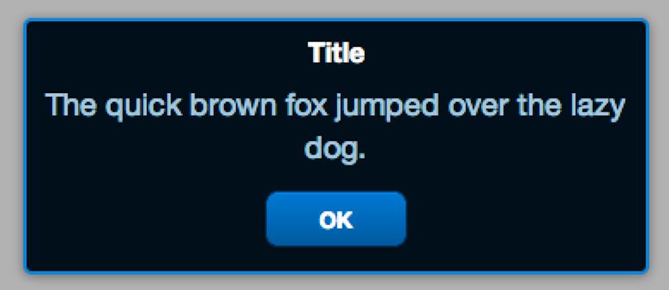
Figure 11-1. An alert messagebox in Sencha Touch
It displays a small window, with a title, a message, and an OK button. In addition to the alert, there are these types of messageboxes:
§ prompt(), shown in Figure 11-2, which is a messagebox with a title, message, a textfield, and Cancel and OK buttons
§ confirm(), shown in Figure 11-3, which is a messagebox with a title, a message, and No and Yes buttons
§ show(), which provides even more options.
Here’s an example of the prompt() messagebox; the callback contains the button id and the entered value. The button id can be Yes, No, or Cancel (Cancel means close the messagebox without pressing the Yes and No buttons):
Ext.Msg.prompt('Welcome', 'Please enter your name', function(btn, val){
//callback
console.log(btn, val);
});
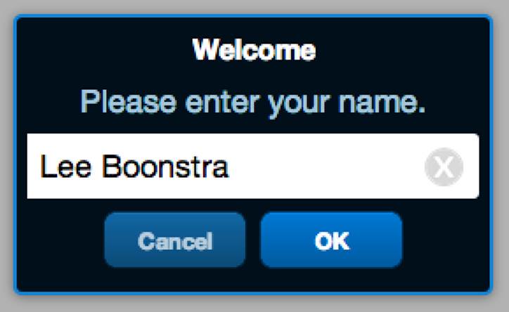
Figure 11-2. A prompt() messagebox in Sencha Touch
Here’s an example of the confirm() messagebox; the callback contains the button id, which can be Yes, No, or Cancel (Cancel means close the messagebox without pressing the Yes and No buttons):
Ext.Msg.confirm('Reload', 'Do you want to reload the page?', function(btn){
//callback
console.log(btn);
});
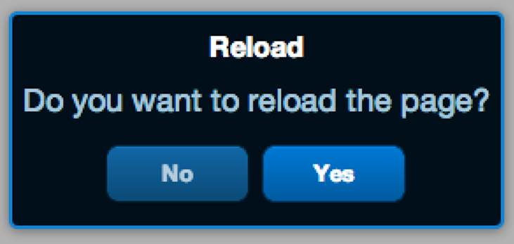
Figure 11-3. A confirm() messagebox in Sencha Touch
There is one more messagebox method that is worth mentioning: show(). As you can see, the alert(), prompt(), and confirm() methods are pretty basic. The show() method will give you many more options; you can pass in a config object. Here I set up a customized prompt()messagebox. It has a width of 500 pixels, it accepts multiline input, it has an info icon, and I want to specify my own set of buttons. Also, I will define a callback function:
var myPromptBox = Ext.Msg.show({
title: 'Address',
message: 'Please enter your address:',
width: 500,
buttons: Ext.MessageBox.YESNOCANCEL,
iconCls: Ext.MessageBox.QUESTION,
multiLine: true,
prompt : { maxlength : 180, autocapitalize : true },
fn: function(buttonId) {
alert('You pressed the "' + buttonId + '" button.');
}
});
The iconCls can set an icon CSS class on the messagebox to showcase an icon. You can maintain this in your theme, but out of the box Sencha Touch ships with the following messagebox icons:
§ Ext.MessageBox.ERROR (a round error sign)
§ Ext.MessageBox.INFO (a round info sign)
§ Ext.MessageBox.QUESTION (a question mark)
§ Ext.MessageBox.WARNING (a warning sign)
The following sets of buttons are available in Sencha Touch:
§ Ext.MessageBox.OK (OK button with action UI skin)
§ Ext.MessageBox.YES (Yes button with action UI skin)
§ Ext.MessageBox.NO (No button)
§ Ext.MessageBox.CANCEL (Cancel button)
§ Ext.MessageBox.YESNOCANCEL (Cancel button, No button, and Yes button with action UI skin)
§ Ext.MessageBox.OKCANCEL (Cancel button, and OK button with action UI skin)
§ Ext.MessageBox.YESNO (No button, and Yes button with action UI skin)
TIP
You can test these button sets in the Sencha API docs, which contain an iframe with live preview and code example (JS Duck). It allows you to directly test and preview view components.
If these button sets are in the wrong order, or you would like to specify your own button text and UI skins, you can pass in an array with Ext.Buttons into the buttons config, as you can see in Figure 11-4:
var pirateBox = Ext.Msg.show({
title: 'Ahoy!',
message: 'Stop pirate, would ye like t\' proceed?',
iconCls: Ext.MessageBox.ERROR,
width: 200,
buttons: [
{text: 'Aye', itemId: 'yes', ui: 'action'},
{text: 'Avast', itemId: 'no', ui: 'decline'}
],
fn: function(buttonId) {
alert('You pressed the "' + buttonId + '" button.');
}
});
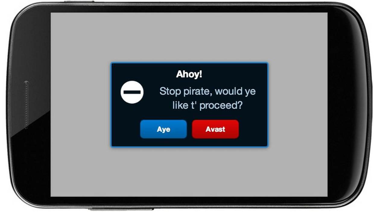
Figure 11-4. A customized messagebox, with custom icon and buttons
To hide the previous messagebox, just run the hide() method on the pirateBox.
The FindACab app also uses an Ext.MessageBox. Take a look at app.js; this autogenerated code has a confirmation messagebox. If there is a newer version of your app available online, the Sencha Touch app will automatically update the dependencies (saved in the deltas folder after a production build). After updating the code, the confirmation messagebox will ask you to reload the page:
Ext.Msg.confirm(
"Application Update",
"This application has just successfully been" +
" updated to the latest version. Reload now?",
function(buttonId) {
if (buttonId === 'yes') {
window.location.reload();
}
}
);
The confirm method takes three arguments: a title, a message, and a callback function that reloads the page if the user pressed the Yes button. This is nice, but knowing how to code a messagebox still won’t give our FindACab app a face. So let’s discuss how to implement toolbars next.
Implementing Toolbars and Title Bars
When you want to implement a toolbar (or title bar) view component (Figure 11-5), you will have to add the Ext.Toolbar (or Ext.TitleBar) to the requires at the top of your view class. After that, you can instantiate the component by using the Ext.create("Ext.Toolbar", {})syntax, or by lazy instantiating (nesting the xtype called toolbar). Using the xtype is the best practice for coding real-world MVC applications.
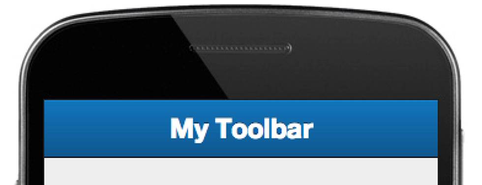
Figure 11-5. A preview of a toolbar in Sencha Touch
Either way, you will use the object literal notation for specifying the configs, such as title for setting the title or docked for making the toolbar dock to the top, bottom, left, or right:
{
xtype: 'toolbar', //or 'title bar'
docked: 'top',
title: 'Text',
items: [{
text: 'Button'
}]
}
There are many additional configs you can set for Ext.Toolbar, so check the API docs for more in-depth information.
Implementing a title bar works exactly the same. The only difference is that the class from which you implement the instance is called Ext.TitleBar and the xtype is called titlebar. Although the title bar does not extend from Ext.Toolbar, they have a very similar appearance and setup, as you can see in Figure 11-6. The main difference between a Ext.TitleBar and a Ext.Toolbar is that the title config is always centered horizontally in a title bar, between any items aligned left or right. By default, any item in a title bar or toolbar is a button, so you do not need to explicitly set it. Items in a title bar, such as buttons, can be docked to the left or right side of the bar, via the align config.
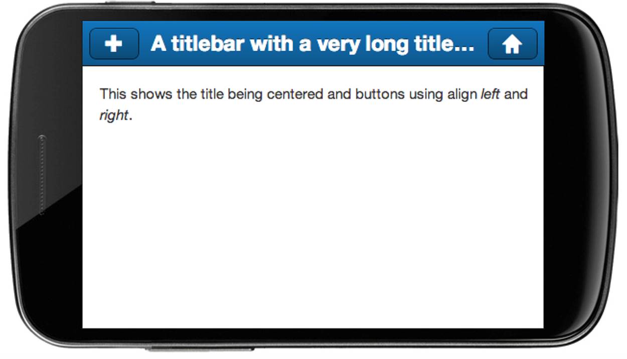
Figure 11-6. A preview of a title bar in Sencha Touch
When you create a tool or title bar, your view immediately looks mobile. Let’s take a look again at the FindACab app. I have created three new views (or actually two, because app/view/Main.js was already generated, but I have changed the contents): FindACab.view.Main,FindACab.view.Overview, and FindACab.view.DetailView.
The Main view is nothing more than an Ext.Container with the layout set to hbox to horizontally align the two new views, overview and detailview. Take a look at view/Main.js and also notice the requires:
Ext.define('FindACab.view.Main', {
extend: 'Ext.Container',
requires: [
'FindACab.view.Overview',
'FindACab.view.DetailView'
],
config: {
layout: 'hbox',
items: [{
xtype: 'overview',
flex: 1,
store: 'Cabs'
}, {
xtype: 'detailview',
flex: 3
}]
}
});
We created an empty overview component. Later you will build an Ext.List view there.
What else? You can set a flex property. Flexing means that you divide the available area based on the flex value of each child component (i.e., sizes are a ratio). For more information about flexing and layouts, flip back to Chapter 5.
Next, let’s code the view/Overview.js view:
Ext.define('FindACab.view.Overview', {
extend: 'Ext.Container',
xtype: 'overview',
requires: [
'Ext.TitleBar',
],
config: {
items: [{
xtype: 'titlebar',
docked: 'top',
title: 'Overview'
}],
html: 'list here'
}
});
The overview component is just a simple container. It has an html config to stub out the view. The fancy stuff is the titlebar in the items array.
The code for view/DetailView.js will be almost the same, only this time you’ll use the titlebar. It contains one child item with the xtype set to titlebar. (Make sure that the requires array requires Ext.TitleBar so the class loader loads the correct class.) Dock the toolbar to the top by setting docked:'top', use a lighter variant of the UI by setting ui:'light', and pass the title FindACab.
{
xtype: 'titlebar',
ui: 'light',
docked: 'top',
title: 'FindACab',
},
That’s not all. The title bar should have a settings button aligned to the right of the title bar. This button should display a gear icon. Take a look at the items array, which has one child item (by default, a button) with the following configs: iconCls for choosing the icon CSS class (thesettings icon CSS class points to the gear icon that ships with the framework), align for setting the alignment, and ui for changing the skin of the button:
items: [{
iconCls: 'settings',
ui: 'plain',
align: 'right'
}]
By now, you should see two toolbars, and a stubbed-out overview and detail view (see Figure 11-7). Here is the complete code for view/DetailView.js:
Ext.define('FindACab.view.DetailView', {
extend: 'Ext.Container',
xtype: 'detailview',
requires: [
'Ext.TitleBar',
'Ext.Button'
],
config: {
items: [{
xtype: 'titlebar',
ui: 'light',
docked: 'top',
title: 'FindACab',
items: [{
iconCls: 'settings',
ui: 'plain',
align: 'right'
}]
}],
html: 'detail view'
}
});
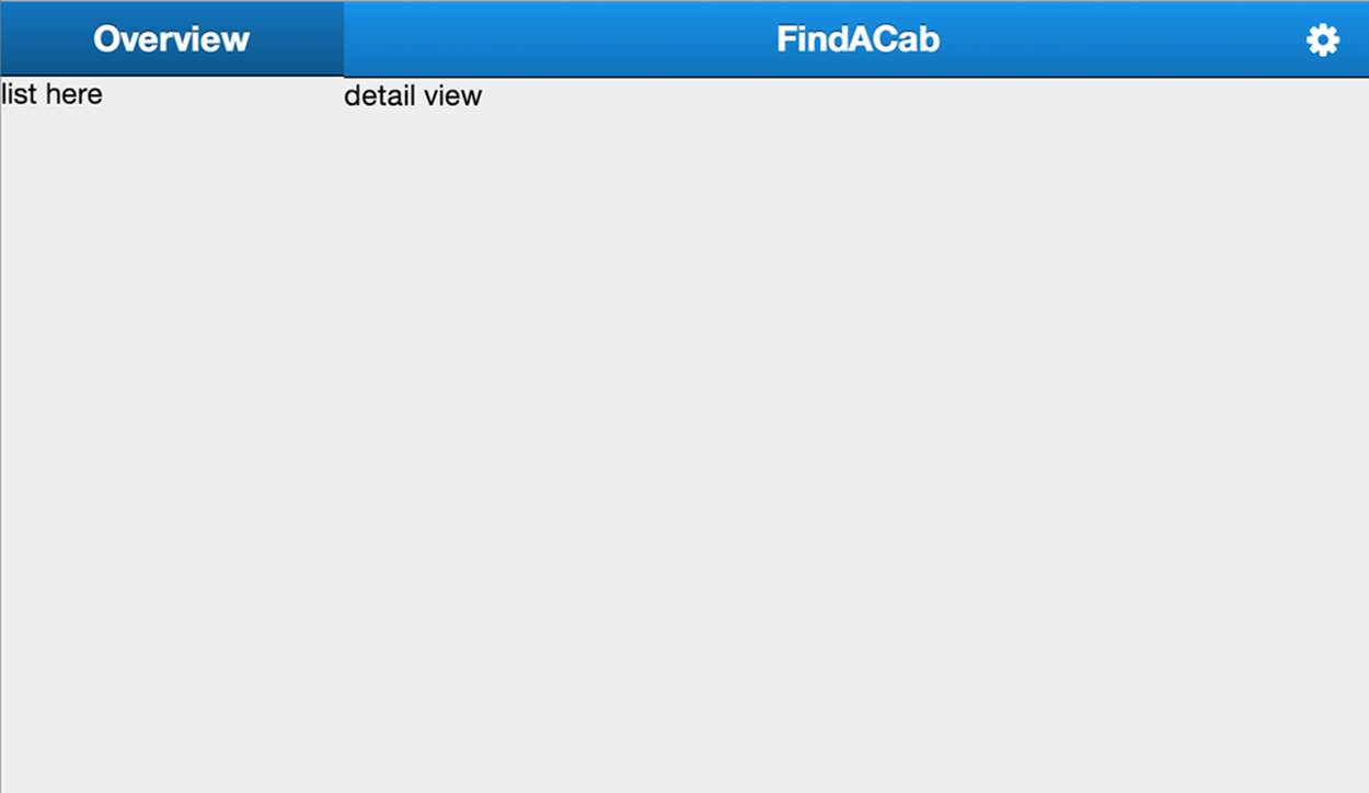
Figure 11-7. Your FindACab app should look like this after you implement the title bars
Implementing Buttons
When you are implementing buttons, it makes the most sense to create a new instance from the Ext.Button class by nesting the xtype called button. You will use the object literal notation for specifying the configs, such as text to set the button text:
{
xtype: 'button',
handler: function(){
//Do something
},
iconCls: 'compose',
text: 'Compose',
ui: 'confirm'
}
Again, make sure you have added the Ext.Button to the requires array at the top of your view class so the Ext.Loader can load the framework class.
Buttons have events. When talking about buttons, you think about events. You can click on it. When it’s a Touch application you can’t really click on it, you tap it. Mobile browsers that support touch event bindings (e.g., WebKit) also have to support click bindings on the components; otherwise, you couldn’t use the app on desktop environments. So for every tap in an app, a click is fired right along with it.
The tap event fires when the button is tapped. It takes the following arguments tap(this, e, eOpts), where this is the button component Ext.Button, e is the event object Ext.EventObject, and eOpts is the options object that is passed theExt.util.Observable.addListener method.
The release event fires when the button is released. It takes the arguments as the tap event. Both event actions are preventable. When any of the listeners returns false, the action is cancelled, to prevent execution.
TIP
Some devices are both a laptop and a touch device. They support tap, pinch, and swipe gestures as well as keyboard/mouse events. Think about the Microsoft Surface Pro or Chromebook Pixel. With the release of Sencha Touch 2.2, both mouse and touch events are allowed at the same time. You don’t need to code anything special! Want to read more about creating apps for the Chromebook Pixel? Check out this great blog post on DailyJS.
Buttons can also contain an icon. Out of the box, Sencha Touch ships with a nice set of icons. All of these icons are from an icon font, a font built from scalable vector icons. This is pretty awesome. A font is small and fast to download, plus it’s easy to scale and style these vector icons with CSS code—which means they look beautiful on retina displays. Sencha Touch is using the Pictos icon font, but if you want, you can add or create your own custom icon fonts as well.
TIP
Check Chapter 13 for more information about implementing (icon) fonts. The icons implemented in the Pictos font by Sencha Touch are mapped to readable text strings. You can use these mapping names as iconCls values. See Figure 11-8 for a complete overview of all the icons shipped with Sencha Touch. Not all of these mappings work out of the box; some need to be enabled in the Sass stylesheet.
There are different button skins (see Figure 11-9). In Sencha terminology this is called a UI. Some components in Sencha Touch can have a different skin, a different look than the default design. Under the hood, these UIs are Sass mixins (we will discuss mixins in Chapter 13). The mixin for Sencha Touch buttons is called $sencha-button-ui.
You can create your own skins for buttons in the Sass stylesheet (as described in Chapter 13). You can set the UI with the ui config.
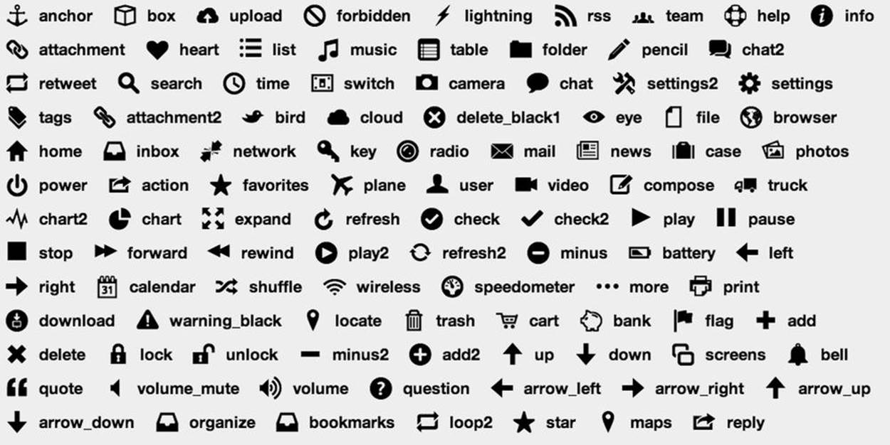
Figure 11-8. An overview of all the font icon mappings included in Sencha Touch
Out of the box, buttons can apply the following UIs:
§ normal (a basic gray button)
§ back (a back button in the shape of an arrow to the left)
§ forward (a forward button in the shape of an arrow to the right)
§ small (a small button)
§ round (a round button)
The following UIs are like the normal button UI but with a different color, which can be handy for visualizing an action:
§ action (dark blue by default; use $active-color in the Sass stylesheet to change the color)
§ decline (red by default; use $alert-color in the Sass stylesheet to change the color)
§ confirm (green by default; use $confirm-color in the Sass stylesheet to change the color)
You can also append -round or -small to each of the last three colored UIs to give it a round or small shape:
§ action-round
§ decline-round
§ confirm-round
§ action-small
§ decline-small
§ confirm-small
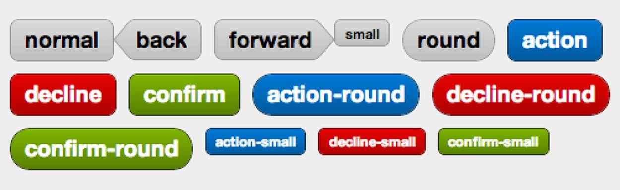
Figure 11-9. An overview of all button UIs in Sencha Touch
There are many different kinds of buttons—confirmation buttons, decline buttons, round buttons—and they all show up in different places, such as toolbars, title bars, or forms. In fact, Sencha tabpanels also consist of buttons! Every tab extends from the Ext.Button class, so you can use the same properties and methods on tabs. So an Ext.TabPanel (Figure 11-10) is nothing more then a collection of containers stacked on top of each other (with a card layout, Ext.layout.Card) and a set of buttons docked on the top or bottom of the tabpanel.
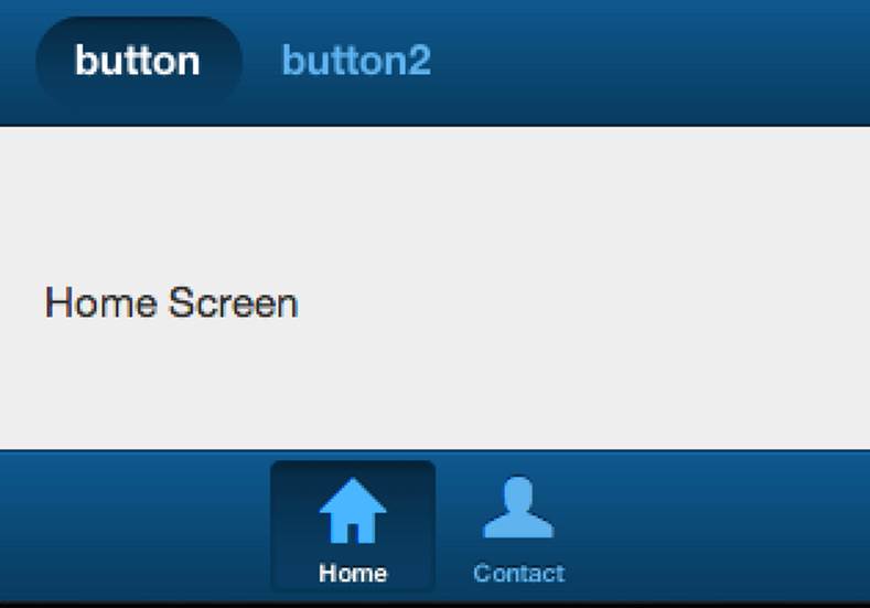
Figure 11-10. A preview of a tabpanel in Sencha Touch
Buttons may also have a badge (see Figure 11-11). When you hear the word badges, you might think about some emblem or token to showcase some achievement. This is exactly what a button badge is in Sencha Touch. It’s a little bullet that displays information about something that’s been achieved. For example, in iOS when you receive a new email, you will see a red badge with a counter on top of the app icon. Sencha Touch badges are just like that. You can set or get a badge text string badgeText—getBadgeText() and setBadgeText()—or add a CSS class with thebadgeCls config.
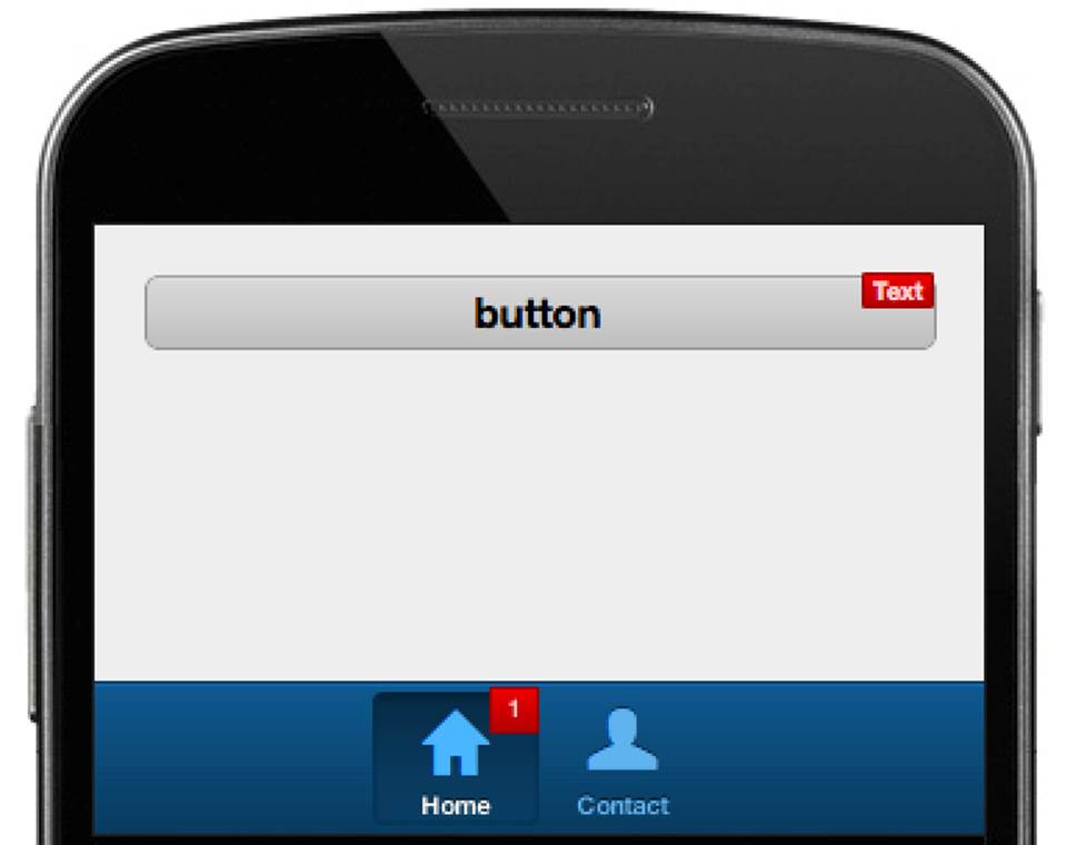
Figure 11-11. A preview of button badges in Sencha Touch
There is another type of button that might be interesting: the segmented button (shown in Figure 11-12). The Ext.SegmentedButton is a container for a group of buttons. It looks like a big pill and by default you can press just one “segment” (like the behavior of HTML radio buttons), although you can allow for pressing multiple segments with the allowMultiple config. The segmentedbutton has a toggle event that takes the arguments toggle(this, button, isPressed, eOpts), where this is the full segmentedbutton, button is the button that is toggled, and isPressed is a boolean that indicates whether the button is pressed in or out. Generally, a segmented button would be a child of a Ext.Toolbar and would be used to switch between different views.
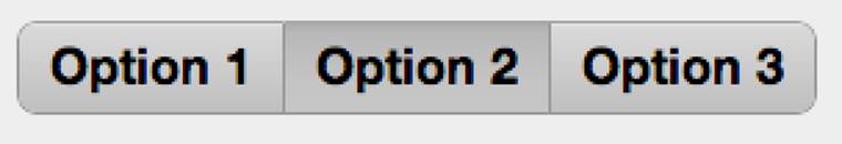
Figure 11-12. A preview of the segmented button in Sencha Touch
There are a lot more configs you can set for Ext.Button, so check the API docs for more in-depth information.
Implementing Lists
Let’s talk about one of the Sencha Touch components that Sencha Touch is most famous for: the list component (list scroller). Sencha Touch has a list scroller that gives you the total native experience—not only in the way it looks but also in its performance.
A list is a data-aware component. You will need to hook up a data store to the list (with a fields model) to display any items. Following is an example of an Ext.List. First you must make sure you add the Ext.List to the requires array at the top of your view class so theExt.Loader can load the framework class. Afterward you will use the object literal notation to create a Sencha Touch list:
{
xtype: 'list',
store: {
fields: ['name'],
data: [
{name: 'Leonardo'},
{name: 'Donatello'},
{name: 'Michelangelo'},
{name: 'Raphael'}
]
},
itemTpl: '{name}'
}
A Sencha Touch Ext.List extends from Ext.dataview.DataView. The dataview renders all the items of a store into the component. What makes a list a Sencha Touch list is the custom styling (it looks just like a native list), which allows mechanisms for grouping, indexing, or filtering data with an optional index bar or pinned headers, and optional disclosure icons and labels on each item.
Because stores are attached to a dataview or list, any changes to the store are immediately reflected on the screen. For example, if you add a new record to the store it will be rendered into the list immediately. The list component will use the tpl config for rendering the data (model fields) in curly bracket placeholders.
You can also attach listeners to events on the list. The following events are available:
§ refresh(list)
§ select(list, record)
§ deselect(list, record)
These all have the same signature of (list, index, target, record, event):
§ itemtap
§ itemdoubletap
§ itemtaphold
§ itemsingletap
§ itemswipe
§ itemtouchstart
§ itemtouchend
§ itemtouchmove
Events can be implemented via the listeners object:
listeners: {
select: function(view, record) {
Ext.Msg.alert('Selected!', 'You selected ' + record.get('name'));
}
}
When you want to dock items to the bottom or top of a list, use the scrollDock configuration on child items in the list. Here is an example of a toolbar docked under the list:
items: [{
xtype: 'toolbar',
scrollDock: 'bottom', //magic!
docked: 'bottom',
title: 'people'
}]
Sencha Touch lists are optimized for the best performance. Figure 11-13 shows how this works. Previously, in Sencha Touch 1.x, you would render all your store items in the DOM. This would be inefficient on a mobile phone with less processing power. It becomes an even larger issue when every list item has CSS3 shadows, gradients, and so on. Luckily, this is changed. As you can see in Figure 11-13, list items are being reused. This makes it much faster to repopulate a list item as soon it is out of the screen, rather than having all items already in the DOM.
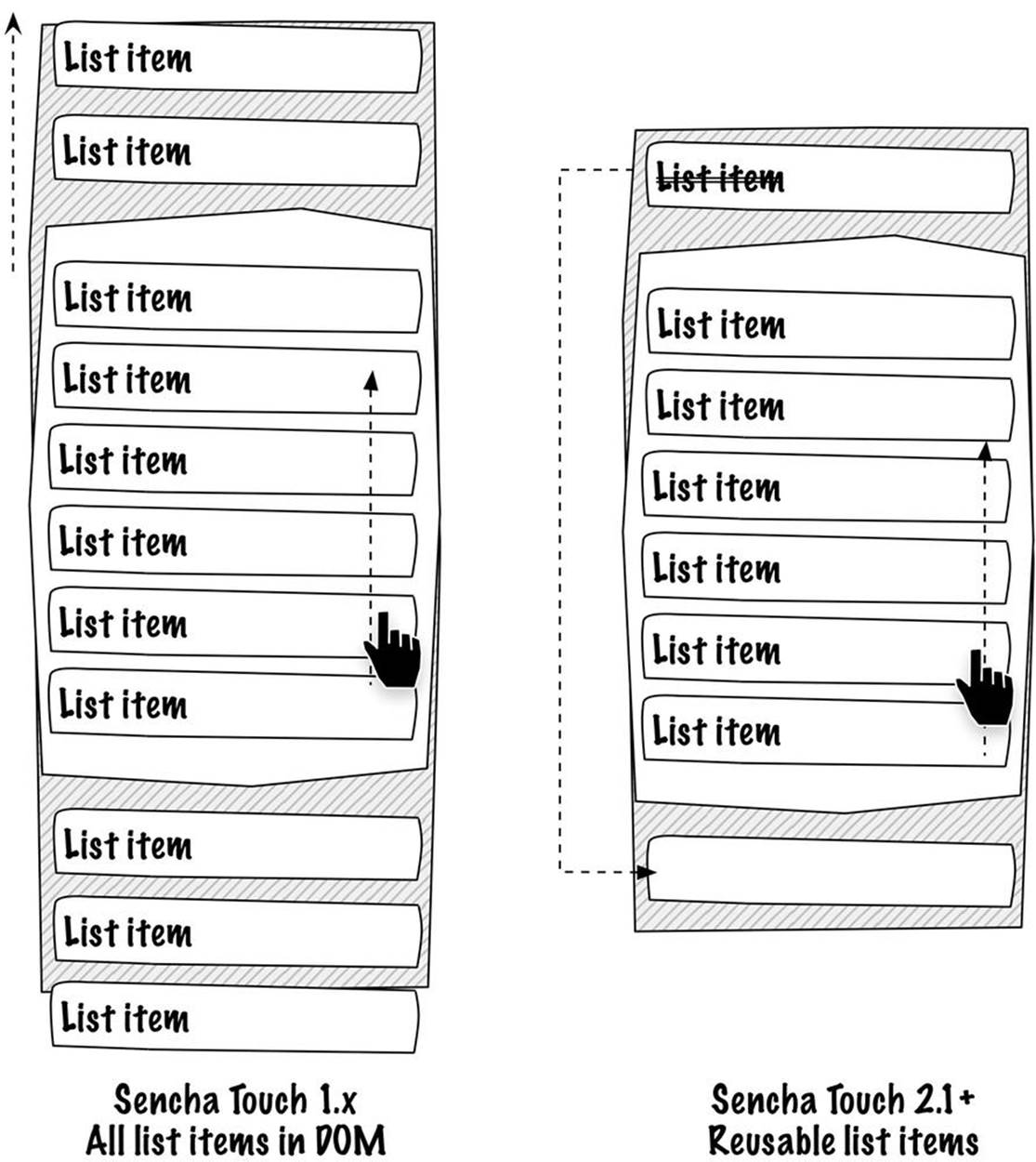
Figure 11-13. List items are being reused in Sencha Touch 2
Implementing a List for the FindACab App
Let’s take a look at the FindACab app. You will finalize the previously stubbed-out custom Overview class. First, you will extend from Ext.List. This list has an emptyText config set to the string "No data", which will be displayed when there are no items in the store. Remember, the store was set in the FindACab.view.Main class. You can set the Cabs store while defining the overview xtype in the Main.js view. This way, you can reuse the overview list for other stores too:
Ext.define('FindACab.view.Overview', {
extend: 'Ext.List',
xtype: 'overview',
requires: [
'Ext.TitleBar',
],
config: {
emptyText: 'No data',
}
});
You can enable grouping with the grouped config. The groupers themselves are set in the Cabs store. You can also enable the disclosure icon with the onItemDisclosure config. This is an icon next to the item text. You do need to build logic for displaying the detail page after tapping this disclose icon, but we will implement this later:
grouped: true,
onItemDisclosure: true,
You will also set the itemTpl to display the distance in 2 digits and the name in 16 characters:
itemTpl: "<span class="distance">{[values.distance.toFixed(2)]}
</span> {name:ellipsis(16, true)} "+.
You will pass in true in the ellipsis formatter function to find a common word break:
itemTpl: '<span class="distance"> {[values.distance.toFixed(2)]}' +
' </span> {name:ellipsis(16, true)} ',
Next, we will add an extra toolbar to the bottom of the list. Define in the items array another docked toolbar and dock it to the bottom:
items: [{
xtype: 'titlebar',
docked: 'top',
title: 'Overview'
},{
xtype: 'toolbar',
layout: {
type: 'hbox',
pack: 'center'
},
docked: 'bottom',
ui: 'light',
}
This toolbar will contain two buttons to filter the list. You will nest another items array into this toolbar component. One small button will filter on the TaxiService name and one button will filter on the TaxiService distance. You don’t need to specify the xtype as button, because a toolbar and title bar have buttons as items by default.
When a filter button is tapped (handler), it will fire a custom event to CabController. This button will listen to it and filter the overview list:
items: [{
handler: function(){
this.fireEvent('filtername');
},
ui: 'small',
text: 'name'
},{
handler: function(){
this.fireEvent('filterdistance');
},
ui: 'small',
text: 'distance'
}],
Here is the complete code for view/Overview.js:
Ext.define('FindACab.view.Overview', {
extend: 'Ext.List',
xtype: 'overview',
requires: [
'Ext.TitleBar',
],
config: {
emptyText: 'No data',
grouped: true,
onItemDisclosure: true,
itemTpl: '<span class="distance">' +
'{[values.distance.toFixed(2)]}' +
'</span> {name:ellipsis(16, true)} ',
items: [{
xtype: 'titlebar',
docked: 'top',
title: 'Overview'
},{
xtype: 'toolbar',
layout: {
type: 'hbox',
pack: 'center'
},
docked: 'bottom',
ui: 'light',
items: [{
handler: function(){
this.fireEvent('filtername');
},
ui: 'small',
text: 'name'
},{
handler: function(){
this.fireEvent('filterdistance');
},
ui: 'small',
text: 'distance'
}],
}]
}
});
The two filter buttons have no logic yet. Filtering the list (actually, the store) shouldn’t be so hard. See the following code: first you will reference the overview titlebar and the overview list in controller/CabController.js, and you will use the refs object so you can refer to the list and the list title bar:
refs: {
'titlebar' : 'overview titlebar',
'overview': 'overview'
},
Next, you will listen to the two custom events, filtername and filterdistance (defined in the view/Overview.js button handlers), using the control object:
control: {
'overview toolbar button' : {
filtername: 'setFilterName',
filterdistance: 'setFilterDistance'
}
}
When these events occur, you will invoke one of the two new methods in controller/CabController.js: setFilterName and the setFilterDistance. The bodies of setFilterName and setFilterDistance functions run a sort() function. In this example, they also need a storeload() function because the data comes from the local Web SQL database and needs to be loaded. If the data had already been in the store, then this step would not be necessary:
setFilterName: function() {
Ext.getStore('Cabs').sort('name');
Ext.getStore('Cabs').load();
},
setFilterDistance: function() {
Ext.getStore('Cabs').sort('distance');
Ext.getStore('Cabs').load();
}
That’s it. Now that you have finalized the list overview of the FindACab app (see Figure 11-14), let’s see how to implement a Google Map. Check out the next technique.
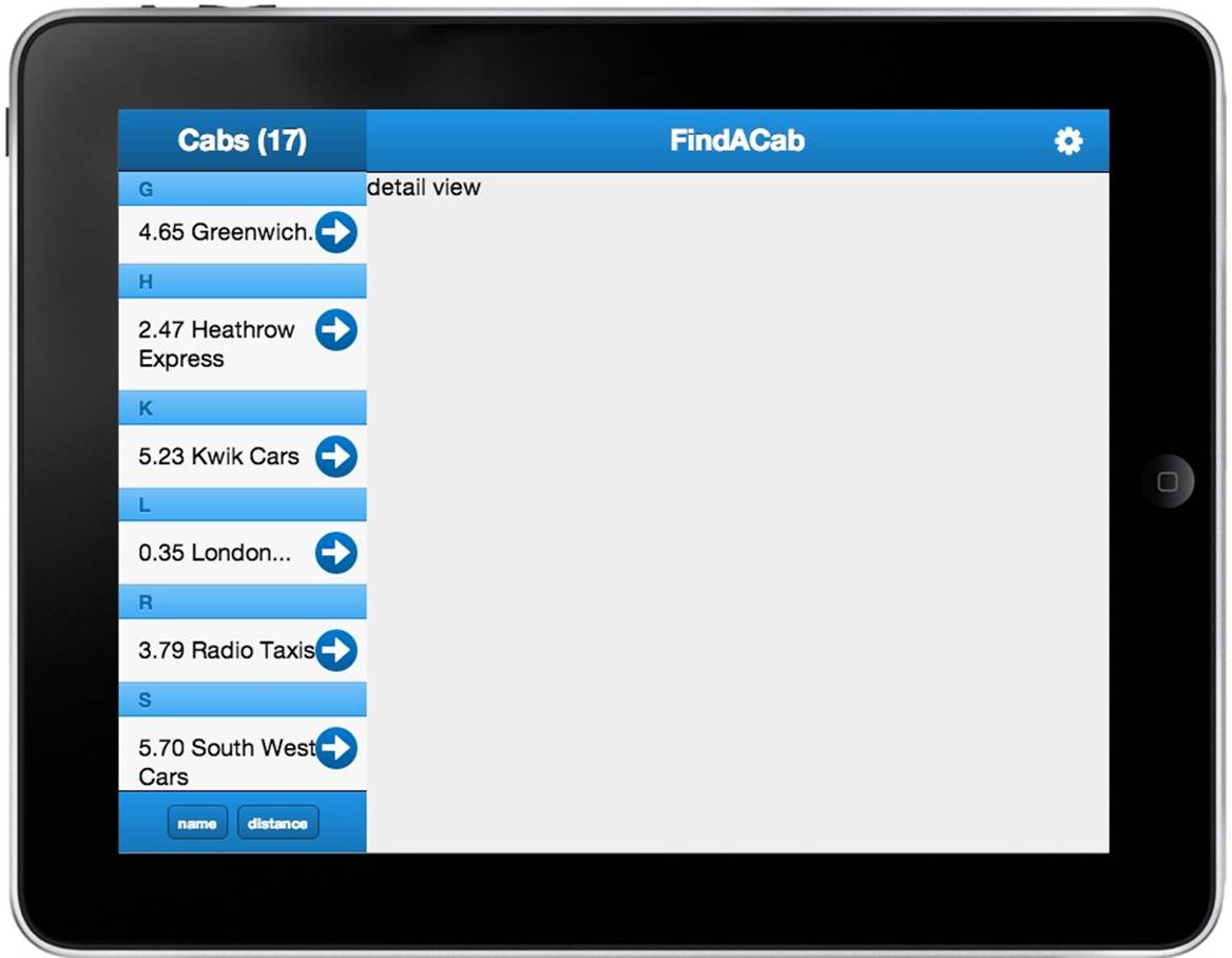
Figure 11-14. Your FindACab app should look like this after you implement the list component
Implementing a Google Map
Sencha Touch uses Google Maps to display geographical data on mobile devices. The Ext.Map component wraps a Google Map in an Ext.Component using the Google Maps API.
You do need to have a remote connection, which loads the Google API into memory before creating the Sencha Google Map wrapper. Therefore, you can add the URL to the Google Maps API into the app.json file’s js array:
"js": [
{
"path" : "http://maps.google.com/maps/api/js?sensor=true",
"remote" : "true"
},
..
]
You have to specify the remote (true) property to make sure the Google Maps script will download (even when all the other nonremote scripts are loaded from the cache). When the device is offline, you can’t download scripts that are specified as "remote": "true".
Implementing the map in your Sencha Touch layout works the same way as implementing any other view component. You will nest the xtype: "map" into the items array of the parent component, and you have to add the Ext.Map to the requires array at the top of your view class:
{
xtype: 'map',
mapOptions: {
zoom : 12,
mapTypeId : google.maps.MapTypeId.ROADMAP,
//more google maps options here
},
useCurrentLocation: false
}
The Google Map has a couple of additional properties, mapOptions and useCurrentLocation, that you will use as follows:
§ useCurrentLocation is a boolean setting that defaults to false. When set to true, it will center the map based on the geolocation coordinates of the device. It’s also possible to specify a Geolocation object instead to have more control over the geolocation used. TheExt.util.Geolocation class provides a cross-browser solution for retrieving location information.
§ The mapOptions object specifies the Google API-specific properties. It’s possible to specify the key/value pairs as written in the Google Maps API documentation, such as enabling panControl or scaleControl. However, the zoom level (in integers) needs to be set and the map needs to have a default location to center to.
Take a look at the view/DetailView.js code to see how the map for the FindACab app is configured:
First, add two more classes into the requires array to load the Ext.layout.Card and Ext.Map in the memory:
requires: [
'Ext.TitleBar',
'Ext.Button',
'Ext.layout.Card', //add the layout class
'Ext.Map' //add the map class
],
To create a stack of cards (panels) on top of each other, set the layout to card; you can add this to the config object. With the card layout, you can navigate through the different cards by setting an active card (see Chapter 5):
config: {
layout: 'card',
//below is the code (items array) for the toolbar with settings button...
Add to the items array the Ext.Map view component. This map will have a Google API mapOptions object to disable most of the interface controls of the Google Map, like pan, rotate, map type, street view, and overview control. Also disable geolocation (via useCurrentLocation):
{
xtype: 'map',
mapOptions: {
overviewMapControl: false,
panControl: false,
rotateControl: false,
streetViewControl: false,
mapTypeControl: false,
zoom : 12,
mapTypeId : google.maps.MapTypeId.ROADMAP
},
useCurrentLocation: false
},
Add another item to the items array to create a second panel in the card layout deck. This will be the detail panel, which contains an Ext.XTemplate with placeholders that can be populated with the data of the selected record. Also, specify padding and a CSS class for future styling:
{
padding: '20',
cls: 'taxitpl',
tpl: Ext.create('Ext.XTemplate', '<h1>{name}</h1>' +
'<address>{address1}<br/>' +
'{zip} {city} {state_code} {country_code}' +
'</address>' +
'<a href="tel:{phone}" class="x-button callnow">' +
'Call now: {phone} </a><p>Distance: {distance}</p>'),
}
Now, the last step: create an items array in the detail panel card, with a button docked to the right side of the details panel. This button fires a custom close event. The CabController can listen to this custom event and switch back to the map view:
items: [{
docked: 'right',
xtype: 'button',
action: 'close',
cls: 'closebtn',
iconCls: 'delete',
padding: 20,
height: 50,
handler: function() {
this.fireEvent('close');
},
ui: 'plain'
}],
Here’s the complete view/DetailView.js code:
Ext.define('FindACab.view.DetailView', {
extend: 'Ext.Container',
xtype: 'detailview',
requires: [
'Ext.TitleBar',
'Ext.Button',
'Ext.layout.Card',
'Ext.Map'
],
config: {
layout: 'card',
items: [{
xtype: 'titlebar',
ui: 'light',
docked: 'top',
title: 'FindACab',
items: [{
iconCls: 'settings',
itemId: 'settingsbtn',
ui: 'plain',
align: 'right'
}]
},
{
xtype: 'map',
mapOptions: {
overviewMapControl: false,
panControl: false,
rotateControl: false,
streetViewControl: false,
mapTypeControl: false,
zoom : 12,
mapTypeId : google.maps.MapTypeId.ROADMAP
},
useCurrentLocation: false
}, {
padding: '20',
cls: 'taxitpl',
tpl: Ext.create('Ext.XTemplate','<h1>{name}</h1>' +
'<address>{address1}<br/>' +
'{zip} {city} {state_code} {country_code}' +
'</address>' +
'<a href="tel:{phone}" class="x-button callnow">' +
'Call now: {phone} </a><p>Distance: {distance}</p>'),
items: [{
docked: 'right',
xtype: 'button',
action: 'close',
cls: 'closebtn',
iconCls: 'delete',
padding: 20,
height: 50,
handler: function() {
this.fireEvent('close');
},
ui: 'plain'
}],
}
]
}
});
The Google Maps view might be finished for the FindACab app, but there is still no logic implemented for this app. What this app needs are markers plotted on the Google Map for each taxi company. Once you tap a marker or a taxi company from the overview list, it should open the detail panel and display the TaxiService information. When you press the close button, it should close the detail panel and navigate back to the Google Map.
Sit back and read it carefully; the controller/CabController.js is going to be quite long, but we have discussed most of the script already, so I will skip those parts.
First, define a markers array in the config (line 1). This will automatically create a magic getter function. The getter function makes it possible to retrieve the markers array. Later, when markers need to be removed from the map, this array is required to loop through all the markers. After this, add a reference to the detailview (line 2):
markers: [], //1
refs: {
'titlebar': 'overview titlebar',
'overview': 'overview',
'detailView': 'detailview' //2
},
The next step is to add three more event listeners to the control object. You will listen to the maprender event (line 3). As soon as the map is rendered, it should invoke the loadMarkers() function. You will also listen to the select event on the overview list (line 4). As soon as a taxi company is selected, it should invoke the prefillDetail() function. When the close button is tapped, it will fire a custom close event. The controller will listen to the close event (line 5). As soon as this event is fired, it should invoke the onDetailClose() function:
control: {
'overview toolbar button': {
filtername: 'setFilterName',
filterdistance: 'setFilterDistance'
},
'map': {
maprender: 'loadMarkers' //3
},
'overview': {
select: 'prefillDetail' //4
},
'detailview button[action=close]': {
close: 'onDetailClose' //5
},
}
In order to display, the map requires a point to center on. When there is data available (the else in the loadLocal() check), let’s center the map on the lat/long position of the first item (line 6). Then load the markers in the map with the loadMarkers() function and pass in the reference to the Ext.Map wrapper and the reference to the Google Map itself (line 7). Because you know the total of TaxiService items in the store, you can update the list overview title bar with the correct number (line 8). Remember, although you can request 20 items from the web service through the proxy, only 16 items will display because of the filter implemented in the store:
var lat = item[0].get('latitude');
var lng = item[0].get('longitude');
var position = new google.maps.LatLng(lat,lng);
var map = Ext.ComponentQuery.query('map')[0];
map.getMap().setCenter(position); //6
me.loadMarkers(map, map.getMap()); //7
me.setTitleCount(count); //8
Ext.Viewport.unmask();;
Every time the Cabs store is synced (the retrieval of new records), it should update the map with new markers. At the bottom of the syncRecords() class method, in the second sync() callback, invoke loadMarkers() and pass in the reference to the map:
me.loadMarkers(Ext.ComponentQuery.query('map')[0]);
Unfortunately, the Google API has no remove-marker-from-map method. The idea is to loop through all the markers and remove the connection from the marker to the map (line 10). You will write this removeMarkers() function:
removeMarkers: function() {
var me = this,
markers = me.getMarkers(),
total = markers.length;
for (var i = 0; i < total; i++) {
markers[i].setMap(null); //10
}
markers.splice(0, total);
me.setMarkers(markers);
},
This next big function, loadMarkers(), looks complicated, but this is what it does: first it gets references to the store, markers, overview list, and the map. Then it removes all the current markers from the map (line 11).
It will loop through every item in the data store and create from every model latitude and longitude floating-point numbers, a real Google Maps LatLng object (line 12). With this LatLng object, a marker can be created and plotted to the map.
Center the map based on the lat/long coordinates of the first item in the store (line 13).
Create Google Markers with the Google LatLng object, a reference to the map, and a marker image (line 14). After creation, add the marker to the class markers array, so later you can refer to it.
Add an event listener (line 15), which listens for a marker click, and bind a record to it. Every time a marker gets selected, select the matching record in the overview list. The overview list will handle the event listeners for every selection and invoke the prefillDetail() method.
At last, plot the marker on the Google Map (line 16).
loadMarkers: function(comp, map) {
var me = this,
store = Ext.getStore('Cabs'),
markers = me.getMarkers(),
gm = comp.getMap(),
list = me.getOverview();
//clear markers when stored
if (markers.length > 0) me.removeMarkers(); //11
store.each(function(item, index, length) {
var latlng = new google.maps.LatLng(item.get('latitude'),
item.get('longitude')); //12
//center the map based on the latlng of the first item.
if (index === 0) comp.setMapCenter(latlng); //13
var marker = new google.maps.Marker({ //14
map: gm,
position: latlng,
icon: 'resources/images/marker.png'
});
markers.push(marker);
google.maps.event.addListener(marker, 'click', function() { //15
var i = store.indexOf(item);
list.select(i);
});
me.setMarkers(markers); //16
});
},
Every time an item in the list gets selected, navigate to the detail panel. The map and the detail panel are both in a card layout, so you can navigate by setting the detail panel card to active. (It’s the second card in the [zero-based] card deck.) Finally, set the detail panel by setting the record data to the selected record (line 17):
prefillDetail: function(list, record) { //17
this.getDetailView().getLayout().setAnimation({
type: 'slide',
direction: 'up'
});
this.getDetailView().setActiveItem(1);
this.getDetailView().getActiveItem().setData(record.getData());
},
Every time the panel close button gets tapped, navigate back to the map. The map and the detail panel are both in a card layout, so you can navigate by setting the map card to active. (It’s the first card in the [zero-based] card deck.) Finally, deselect the item from the overview list (line 18):
onDetailClose: function() { //18
this.getDetailView().getLayout().setAnimation({
type: 'slide',
direction: 'down'
});
this.getDetailView().setActiveItem(0);
this.getOverview().deselectAll();
}
Here’s the complete controller/CabController.js code:
Ext.define('FindACab.controller.CabController', {
extend: 'Ext.app.Controller',
config: {
models: ['Cab'],
stores: ['Cabs'],
markers: [], //1
refs: {
'titlebar': 'overview titlebar',
'overview': 'overview',
'detailView': 'detailview' //2
},
control: {
'overview toolbar button': {
filtername: 'setFilterName',
filterdistance: 'setFilterDistance'
},
'map': {
maprender: 'loadMarkers' //3
},
'overview': {
select: 'prefillDetail' //4
},
'detailview button[action=close]': {
close: 'onDetailClose' //5
},
}
},
launch: function() { },
loadLocal: function() {
/*
* Load the data from the local database and
* check if database has some records.
* if not, then download data else hide the loading mask.
*/
var me = this;
Ext.getStore('Cabs').load(function(item) {
var count = Ext.getStore('Cabs').getCount();
if (count < 1) {
me.downloadData();
} else {
var lat = item[0].get('latitude');
var lng = item[0].get('longitude');
var position = new google.maps.LatLng(lat,lng);
var map = Ext.ComponentQuery.query('map')[0];
map.getMap().setCenter(position); //6
me.loadMarkers(map, map.getMap()); //7
me.setTitleCount(count); //8
Ext.Viewport.unmask();;
}
});
},
downloadData: function(location) { },
syncRecords: function(records, userinput) {
/*
* Loop through all the items that are downloaded
* and add these to the items array.
*/
//...
/*
* Switch the Cabs store proxy back to the
* SQL local proxy
*/
//...
/*
* remove current items from the database.
* and sync this first.
*/
store.removeAll();
store.sync({
success: function(batch){
/*
* Add the downloaded items array to the Cabs store
* and sync() the store to start saving the
* records locally.
* When it is done, we can remove the loading mask.
*/
store.add(items);
store.sync({
success: function(batch){
// BEGIN COMPONENTS-CAB-CONTROLLER-4
me.loadMarkers(Ext.ComponentQuery.query('map')[0]);
// END COMPONENTS-CAB-CONTROLLER-4
me.setTitleCount(store.getCount());
store.load();
Ext.Viewport.unmask();
}
});
}
});
},
setFilterName: function() { },
setFilterDistance: function() { },
setTitleCount: function(count) { },
removeMarkers: function() {
var me = this,
markers = me.getMarkers(),
total = markers.length;
for (var i = 0; i < total; i++) {
markers[i].setMap(null); //10
}
markers.splice(0, total);
me.setMarkers(markers);
},
loadMarkers: function(comp, map) {
var me = this,
store = Ext.getStore('Cabs'),
markers = me.getMarkers(),
gm = comp.getMap(),
list = me.getOverview();
//clear markers when stored
if (markers.length > 0) me.removeMarkers(); //11
store.each(function(item, index, length) {
var latlng = new google.maps.LatLng(item.get('latitude'),
item.get('longitude')); //12
//center the map based on the latlng of the first item.
if (index === 0) comp.setMapCenter(latlng); //13
var marker = new google.maps.Marker({ //14
map: gm,
position: latlng,
icon: 'resources/images/marker.png'
});
markers.push(marker);
google.maps.event.addListener(marker, 'click', function() { //15
var i = store.indexOf(item);
list.select(i);
});
me.setMarkers(markers); //16
});
},
prefillDetail: function(list, record) { //17
this.getDetailView().getLayout().setAnimation({
type: 'slide',
direction: 'up'
});
this.getDetailView().setActiveItem(1);
this.getDetailView().getActiveItem().setData(record.getData());
},
onDetailClose: function() { //18
this.getDetailView().getLayout().setAnimation({
type: 'slide',
direction: 'down'
});
this.getDetailView().setActiveItem(0);
this.getOverview().deselectAll();
}
});
Now that the Google Map for the FindACab app is implemented (Figure 11-15), let’s prepare a form view so the user can enter a proper location. The next technique will discuss how to invoke a pop-up overlay that will later display a form.
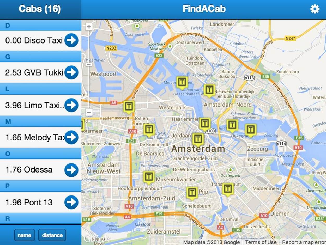
Figure 11-15. After we implement the Google Map, the FindACab app looks like this
Implementing Overlays
Panels extend from Ext.Container. When you don’t touch the configurations, they can even look like containers. What’s the difference between panels and containers? Panels can float as an overlay on top of your app, as shown in Figure 11-16. They can contain extra styling like a rounded black border with a shade, or they might contain an arrow pointing to a referring component so it will look like a speech bubble or tool tip.
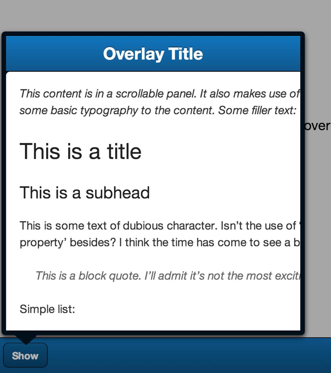
Figure 11-16. A tip overlay shown by a button
If you don’t need all these capabilities, you should use Ext.Container instead; it will create less overhead in the DOM code. This is different than in Sencha Ext JS. In Ext JS, the panel also subclasses the container, but it’s not used for overlays; instead it’s used to display a title header and to visually define a block with borders. The closest comparable component to Sencha Touch panel overlays is the Ext JS Ext.window.Window class.
To show an overlay centered in the screen, you could add the panel to the viewport. (There is just one viewport, the highest parent container that is generated in the DOM and resizes based on device screen size.) See the following code:
Ext.Viewport.add({
xtype: 'panel',
centered: true,
modal: true
});
Make sure you add Ext.Panel into the requires array in the top of your view class. Often, when I create overlays I add those once, hidden to the viewport:
if(!this.overlay){
this.overlay = Ext.Viewport.add({
xtype: 'panel',
itemId: 'settingsview',
modal: true,
hideOnMaskTap: true,
centered: true,
width: 320,
height: 380,
hidden: true,
html: 'Content here',
showAnimation: {
type: 'popIn',
duration: 250,
easing: 'ease-out'
},
hideAnimation: {
type: 'popOut',
duration: 150,
easing: 'ease-out'
}
});
}
As soon as I want to invoke them, I inject the data and show() the panel:
Ext.ComponentQuery.query('#settingsview')[0].show();
While closing the panel I just hide() the overlay again. This way, I am 100% sure that I created the overlay just once in the DOM:
Ext.ComponentQuery.query('#settingsview')[0].hide();
You can center overlays on the screen by setting the boolean centered to true. Instead of showing the overlay in the center, it’s also possible to show the overlay as a tool tip or speech bubble by pointing to some referring component. Instead of the show() method, you will use theshowBy(component) method. For an argument you can pass in the referring component (e.g., a button) that invoked the overlay:
var button = Ext.ComponentQuery.query('settingsbutton')[0];
Ext.ComponentQuery.query('#settingsview')[0].showBy(button);
To gray out the background underneath the overlay, and to block the user from interacting with the underlying components, you can create a mask that covers those components by setting modal to true. With the (boolean) setting hideOnMaskTap, you can dismiss the modal mask and overlay by tapping on the modal mask. If you don’t use this functionality, you will need to programmatically hide the overlay:
this.overlay = Ext.Viewport.add({
xtype: 'panel',
modal: true,
hideOnMaskTap: true,
//more settings
});
showAnimation and hideAnimation do what their names say: they create an animation for showing and hiding overlays. In both objects you can set an animation type, such as fadeIn, fadeOut, popIn, popOut, flip (flip over the panel), slideIn (slide in from the right), andslideOut (slide out to the left). You can set a duration in milliseconds and the easing property to either ease-in or ease-out, which are aliases for Ext.fx.easing.EaseIn and Ext.fx.easing.EaseOut. Easing is an animation technique that gives a different interaction by varying the rate at which animations move and whether the animation begins, ends, or transitions at different speeds:
this.overlay = Ext.Viewport.add({
xtype: 'panel',
showAnimation: {
type: 'popIn',
duration: 250,
easing: 'ease-out'
},
hideAnimation: {
type: 'popOut',
duration: 150,
easing: 'ease-out'
}
//more settings
});
Let’s build the overlay for the FindACab app. You will stub out the settingsform, a floating panel that contains a title bar with a close button. Later, in Chapter 12, you will implement a nice form that listens to the user input in view/SettingsView.js:
Ext.define('FindACab.view.SettingsView', {
extend: 'Ext.Panel',
xtype: 'settingsview',
requires: [
'Ext.TitleBar'
],
config: {
items: [{
xtype: 'titlebar',
ui: 'light',
docked: 'top',
title: 'Settings',
items: [{
iconCls: 'delete',
itemId: 'close',
ui: 'decline',
align: 'right'
}]
},
{
padding: '20',
html: 'Forms here'
}]
}
});
This settingsform view is a view that extends from Panel (which is a container). Containers need a layout to position items. This settings panel will have a fit layout, to display one single item. It also has an Ext.TitleBar docked to the top of the panel, with a close button. This close button contains an itemId: "close", which sets an id in the scope of the settingsform. For the rest, just stub out an html string.
The previous code does not let the panel float. You will create the overlay in the controller/SettingsController.js. Currently, your controller/SettingsController will look like this:
Ext.define('FindACab.controller.SettingsController', {
extend: 'Ext.app.Controller',
config: {
models: ['Setting'],
stores: ['Settings']
}
});
Most importantly, you must add settingsform to the requires array, so the settingsform will be in the memory and you can add the xtype to the viewport:
requires: ['FindACab.view.SettingsView'],
In the config object, create a reference to the settingsview and listen to the close and settings buttons. You can get a reference to the close button via the #close itemId in the settingsview, and the settings button via the itemId #settingsbtn in the detailview. When any of these buttons are tapped, invoke the toggleSettings() function:
refs: {
'settingsView': 'settingsview'
},
control: {
'detailview #settingsbtn': {
tap: 'toggleSettings'
},
'settingsview #close': {
tap: 'toggleSettings'
}
}
This toggleSettings function just toggles the visibility. When the overlay is shown, hide it. When the overlay is hidden, show it. You will use the settingsView reference for this, defined in the refs object. It will autocreate a getSettingsView() getter method that points to thesettingsview xtype. Here’s the code for the toggleSettings function; you can define it below the config object:
toggleSettings: function(){
if(this.getSettingsView().getHidden()) {
this.getSettingsView().show();
} else {
this.getSettingsView().hide();
}
}
Now let’s check to see if there is an overlay already added to the viewport. You can code this while initializing the controller:
init: function(){
if (!this.overlay) {
//create overlay here
}
}
If there is no overlay, proceed to add a new overlay to the viewport. This overlay contains the settingsform xtype, which subclasses a panel and therefore can float. It has a couple of settings: a modal mask (modal), to gray out the background and to hide the overlay when you click on it (hideOnMaskTap). The panel also has a fixed height and a dynamic 50% width, and it will be centered to the absolute center of the screen. In addition, the overlay will stay hidden on the page until the toggleSettings() function invokes it to show:
this.overlay = Ext.Viewport.add({
xtype: 'settingsview',
modal: true,
hideOnMaskTap: true,
centered: true,
width: 320,
height: 380,
hidden: true,
});
The last step is to create some animations while hiding and showing the overlay. Add to the overlay the following two objects: showAnimation and hideAnimation. showAnimation pops the overlay in, in 250 milliseconds. The animation starts fast and ends more smoothly because of the ease-out setting. hideAnimation pops the overlay away, in 250 milliseconds. The animation starts fast and ends more smoothly because of the ease-out setting:
showAnimation: {
type: 'popIn',
duration: 250,
easing: 'ease-out'
},
hideAnimation: {
type: 'popOut',
duration: 250,
easing: 'ease-out'
}
When you’re done coding, the overlay should look like Figure 11-17. Here’s the complete code for controller/SettingsController.js:
Ext.define('FindACab.controller.SettingsController', {
extend: 'Ext.app.Controller',
requires: ['FindACab.view.SettingsView'],
config: {
models:['Setting'],
stores: ['Settings'],
refs: {
'settingsView': 'settingsview'
},
control: {
'detailview #settingsbtn': {
tap: 'toggleSettings'
},
'settingsview #close': {
tap: 'toggleSettings'
}
}
},
init: function(){
if (!this.overlay) {
this.overlay = Ext.Viewport.add({
xtype: 'settingsview',
modal: true,
hideOnMaskTap: true,
centered: true,
width: 320,
height: 380,
hidden: true,
showAnimation: {
type: 'popIn',
duration: 250,
easing: 'ease-out'
},
hideAnimation: {
type: 'popOut',
duration: 250,
easing: 'ease-out'
}
});
}
},
toggleSettings: function(){
if(this.getSettingsView().getHidden()) {
this.getSettingsView().show();
} else {
this.getSettingsView().hide();
}
}
});
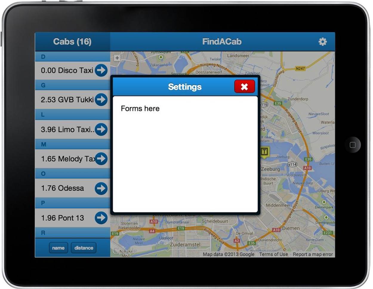
Figure 11-17. The FindACab app overlay
This stubbed-out overlay panel is all for now. Before we discuss forms, let’s take a look at another data-aware component: charts. Charts are a nice way to display data.
Implementing Charts
Charts are an effective way to visualize data. A chart is a data-aware component, so you’ll have to hook up a store to it. Every chart needs one or more series objects. This object describes the type of chart you wish to use and how you want to visualize your data. See Table 11-1 for an overview of all the different series.
Table 11-1. The different series types
|
Type |
Base chart |
Description |
|
pie |
Ext.chart.PolarChart |
Displays quantitative information for different categories. |
|
pie3d |
Ext.chart.PolarChart |
Displays quantitative information for different categories, but in 3D. |
|
radar |
Ext.chart.PolarChart |
Compares different quantitative values for a constrained number of categories. |
|
bar |
Ext.chart.CartesianChart |
Compares among categories. One axis of the chart shows the specific categories being compared, and the other axis represents a discrete value. |
|
line |
Ext.chart.CartesianChart |
Displays quantitative information for different categories or other real values that can show some progression (or regression). |
|
area |
Ext.chart.CartesianChart |
Displays graphically quantitive data. It is based on the line chart. The area between axis and line is commonly emphasized with colors. Commonly used to compare multiple quantities. |
|
candlestick |
Ext.chart.CartesianChart |
Similar to a bar chart but mostly used to describe price movements of a security, derivative, or currency over time. |
|
scatter |
Ext.chart.CartesianChart |
Displays more than two data variables in the same visualization. |
|
gauge |
Ext.chart.SpaceFillingChart |
Displays a value from 0 to 100%. The value is displayed as a gauge. Typically used for dashboards. |
Charts are classified in the following base charts:
Cartesian charts
A Cartesian chart (Figure 11-18) has two directions, the x- and y-axes. Series are coordinated along these axes. Examples are bar and line charts.
Polar charts
These charts have polar coordinates. Examples are pie or radar charts.
Space-filling charts
This is a more unique chart. It fills the entire area with the chart. An example is the gauge chart.
Take a look at the following code. Basically every chart extends from one of its base charts, as described in Table 11-1. Almost every chart requires a store (except the gauge chart). Every chart needs to have a series object that describes the type and the data, and possibly visual styling. All Cartesian charts (and also the radar chart) need to have an axes array, with axis objects. An axis could have a title, a position, and record fields that map along the axis:
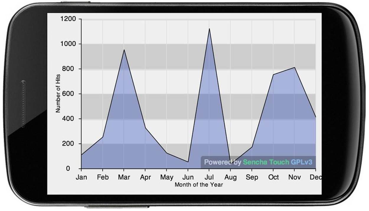
Figure 11-18. Example of a Cartesian chart, a line chart with a fill
var chart = Ext.create('Ext.chart.CartesianChart', {
renderTo: Ext.getBody(),
store: [],
axes: [{
type: 'numeric',
position: 'left',
title: 'Y Title',
fields: 'data'
}, {
type: 'category',
position: 'bottom',
title: 'X Title'
fields: 'categoryname'
}],
series: [{
type: 'bar',
xField: 'categoryname',
yField: 'data'
}]
});
Ext.Viewport.setLayout('fit');
Ext.Viewport.add(chart);
TIP
Ext JS includes both a bar chart and a column chart. The difference between these two Cartesian charts is that a column chart has the category plotted on the x-axis and the numeric value plotted on the y-axis, while the bar chart has the category plotted on the y-axis and the numeric value plotted on the x-axis. So how does this work for Sencha Touch? How do you create a bar chart with the category on the y-axis and the numeric values on the x? Just extend from Ext.chart.CartesianChart and pass a flipXY:true boolean value as a config. Of course you also need to specify the axes. The category axis should have a position:'left' and the numeric axis should have a position:'bottom'.
Sencha Touch charts use the Sencha Touch drawing package. On the desktop, Ext JS 4 charts use either VML or SVG as the underlying browser drawing API. In the mobile space, VML is obviously not present (because it’s IE-specific) and SVG is inconsistently available (Android didn’t provide SVG capability until 3.x). So in order to get a high performance native feel, the drawing package in Sencha Touch uses the HTML5 canvas. That has some great benefits (e.g., leveraging drop-shadow capabilities that are hardware accelerated on many browsers). By utilizing HTML5 Canvas on mobile devices, Sencha Touch Charts draws faster and more efficiently than its desktop counterparts.
Another great reason why I like Sencha Touch charts more then Ext JS charts is because of the animations and interactions based on gestures. On any chart, you can change or modify the kinds of interactions you want to use by adding an interactions array to the chart config. For example, you can enable a pie chart to spin with a drag or a pinch. On a bar graph you can let your users pinch to zoom, drag to pan, and so on.
The Sencha Touch charts are available as part of the Sencha Touch GPL framework, and as part of the Sencha Touch/Complete bundles.
Let’s visualize the avg_rating from Yelp in the FindACab app. You will use the gauge chart for the review score of every TaxiService. See Figure 11-19. You will even make it look like a taxi meter.
Figure 11-19. The FindACab app rating gauge chart
Create the file view/RatingChart.js. The gauge chart extends from an Ext.chart.SpaceFillingChart base class and will get the xtype ratingchart as an alias name:
Ext.define('FindACab.view.RatingChart', {
extend: 'Ext.chart.SpaceFillingChart',
xtype: 'ratingchart',
});
To display it properly, you need to load some extra classes into memory: Ext.chart.series.Gauge for the gauge series, which makes use of Ext.chart.series.sprite.PieSlice:
requires: [
'Ext.chart.series.Gauge',
'Ext.chart.series.sprite.PieSlice',
],
Next you will create a series object into the config and set the series type to gauge, to display a gauge chart:
config: {
series: [{
type: 'gauge',
//chart configuration here
}]
}
Now you will configure the gauge chart. Assign the avg_rating data model field to this chart. It points to the data of the Cab model (i.e., the data from the Yelp web service). The remaining configurations are simply visual: a default value of 0, a minimum and maximum value, a value to set the radius of the inner (half) circle (donut) of the gauge chart, and an array with chart colors:
field: 'avg_rating',
labelField: 'Rating',
value: 0,
minimum: 0,
maximum: 5,
donut: 80,
colors: ["#ffb13a", "lightgrey"]
Here’s the complete code for .view/RatingChart.js:
Ext.define('FindACab.view.RatingChart', {
extend: 'Ext.chart.SpaceFillingChart',
xtype: 'ratingchart',
requires: [
'Ext.chart.series.Gauge',
'Ext.chart.series.sprite.PieSlice',
],
config: {
series: [{
type: 'gauge',
field: 'avg_rating',
labelField: 'Rating',
value: 0,
minimum: 0,
maximum: 5,
donut: 80,
colors: ["#ffb13a", "lightgrey"]
}]
}
});
Implement the ratingchart into the items array of the DetailView class. Make sure you also include it into the requires array, to load the FindACab.view.RatingChart class into the memory:
{
docked: 'bottom',
xtype: 'ratingchart',
height: '30%'
}, {
docked: 'bottom',
xtype: 'component',
html: '<h1>User Rating:</h1>',
padding: '0 20'
}
The chart needs a layout, like a height or padding in order to be displayed. You will set the height on the DetailView class so the RatingChart can be reused for other purposes. In addition to the chart, which will be docked to the bottom, you will also dock a header, which is just anExt.Component with an html string.
Finally, in the CabController prefillDetail() method, add the following line to update the RatingChart with the current record:
Ext.ComponentQuery.query('ratingchart')[0].getSeries()[0].setValue(
record.get('avg_rating')
);
Summary
You’re almost done with the logic of the FindACab app. The only thing that is left is entering and listening to user input. How else could the app display taxi data? This is a topic I will discuss in the next chapter, which covers everything you want to know about Sencha Touch forms!