JavaScript and jQuery for Data Analysis and Visualization (2015)
PART III Visualizing Data Programmatically
Chapter 12 Incorporating Symbols
What's in This Chapter
· Learning how symbols can benefit charting
· Leveraging D3 to render symbols using SVG
· Making symbols react to the proximity of the mouse
· Animating changes to symbols.
· Using the Ignite UI igDataChart to automagically plot symbols
· Displaying metrics on a symbol with bubble charts
CODE DOWNLOAD The wrox.com code downloads for this chapter are found at www.wrox.com/go/javascriptandjqueryanalysis on the Download Code tab. The code is in the chapter 12 download and individually named according to the names throughout the chapter.
Chapters 9 through 11 cover some of the mechanics of various chart types using D3, Raphaël, and the Google Charts API. A large focus of these chapters was on charting types where each discrete data value was represented by a separate visual element. This chapter explores charting types, such as line and area, that provide an interpolated shape that connects all the data points. When dealing with such an interpolated shape, it can be useful to use a symbol, or marker, to indicate exactly where the underlying data values occur in the x-y space of the plot area.
You can use symbols for more than delineating the exact location of data values in an interpolated shape. In fact, some chart types consist only of symbols, such as a scatter chart or a bubble chart. Or, you might want to use a custom symbol to indicate the location of an event on a time series chart, for example.
So, this chapter explains the mechanics of displaying symbols in charts. You start by using D3 to construct and display symbols at a very low level. This not only allows for studying the basics of how a symbol is implemented in visualization application programming interfaces (APIs), but it also gives you the tools to build ad-hoc marker scenarios in Scalable Vector Graphics (SVG) using the D3 API.
NOTE Although most of this book is designed so that you can digest the chapters individually, and potentially out of sequence, it's highly recommended that you read Chapter 11 before you read this chapter. For brevity, I'll assume you've already absorbed some of the details of D3 because revisiting the basics would be rather redundant and would make this chapter considerably longer.
Later in the chapter, you see how markers can be represented in a comparatively high-level API that can do a lot of the footwork for you. In Chapter 9, you used the Google Charts API for this purpose, but for variety this chapter investigates a different API. Also, at the time of this writing, the Google Charts API seems to have rather limited facilities to display and customize symbols.
Working with SVG Symbols with D3
Recall from Chapter 11 that D3 is a very powerful tool for creating very dynamic visualizations. It's especially good at helping you to create ad-hoc visualizations that don't quite fit with what most charting APIs anticipated you would want to do with your data. Because of its low-level nature, D3 is also a good instructional tool as you begin to explore a new charting concept. If you aren't so interested in the mechanics of how to implement symbols in a chart, and don't have the need to step outside the bounds of what high-level charting APIs will do for you, feel free to skip ahead to the “Creating a Line Chart with Ignite UI igDataChart” section of this chapter where you find out how to use a much higher-level API that handles all the low-level details automatically.
Creating a D3 Line Chart
In Chapter 11, you created lots of different visualizations using D3, but line charts were only touched upon briefly. Listing 12-1 creates a line chart.
Listing 12-1
var data = [
{ "product": "Shoes", "amount": 40 },
{ "product": "Hats", "amount": 50 },
{ "product": "Coats", "amount": 35 },
{ "product": "Scarves", "amount": 20 }
];
var data2 = [
{ "product": "Shoes", "amount": 25 },
{ "product": "Hats", "amount": 40 },
{ "product": "Coats", "amount": 45 },
{ "product": "Scarves", "amount": 15 }
];
var currentData = data;
var chartTotalWidth = 500;
var chartTotalHeight = 500;
var margin = {
left: 100,
right: 50,
top : 20,
bottom: 40
};
var width = chartTotalWidth - margin.left - margin.right;
var height = chartTotalHeight - margin.top - margin.bottom;
var main = d3.select("body").append("svg")
.attr("width", chartTotalWidth)
.attr("height", chartTotalHeight)
.append("g")
.attr("transform", "translate(" + margin.left + "," + margin.top + ")");
var xScale = d3.scale.ordinal()
.rangePoints([0, width], 0.4)
.domain(data.map(function (d) { return d.product; }));
var yScale = d3.scale.linear()
.range([height, 0])
.domain([0, d3.max(data, function (d) { return d.amount; })]);
var xAxis = d3.svg.axis()
.scale(xScale)
.orient("bottom")
.outerTickSize(0);
var yAxis = d3.svg.axis()
.scale(yScale)
.orient("left");
main.append("g")
.attr("class", "x axis")
.attr("transform", "translate(0," + height + ")")
.call(xAxis);
main.append("g")
.attr("class", "y axis")
.call(yAxis);
var updateLine = function () {
var lineBuilder = d3.svg.line()
.x(function (d) {
return xScale(d.product);
})
.y(function (d) {
return yScale(d.amount);
})
.interpolate("linear");
var line = main.selectAll(".line")
.data([currentData]);
line
.enter().append("path")
.attr("class", "line")
.attr("d", function (d) {
return lineBuilder(d);
});
line
.transition()
.duration(1000)
.attr("d", function (d) {
return lineBuilder(d);
});
};
updateLine();
d3.select("body").append("input")
.attr("type", "button")
.attr("value", "click")
.on("click", function () {
if (currentData === data) {
currentData = data2;
} else {
currentData = data;
}
updateLine();
});
The JavaScript in Listing 12-1 depends on this HTML:
<!DOCTYPE html>
<html>
<head>
<title>Basic Line Chart With Axes</title>
<script src="d3/d3.min.js" charset="utf-8"></script>
<link rel="stylesheet" href="D3BasicLineChartWithAxes.css">
</head>
<body>
<script type="text/javascript" src="D3BasicLineChartWithAxes.js">
</script>
</body>
</html>
And this CSS:
.line {
stroke: #4DDB94;
fill: transparent;
stroke-width: 3px;
}
.y.axis path {
display: none;
}
.axis {
font: 20px Verdana;
fill: #444444;
}
.axis path,
.axis line {
fill: none;
stroke: #999999;
shape-rendering: crispEdges;
}
The CSS and HTML for the D3 samples in this chapter are all roughly similar, so there's no further discussion of them in this chapter. You can find them on the companion website.
Listing 12-1 produces a line chart like the one shown in Figure 12.1. You can find the D3BasicLineChartWithAxes.js/html/css files on the companion website.
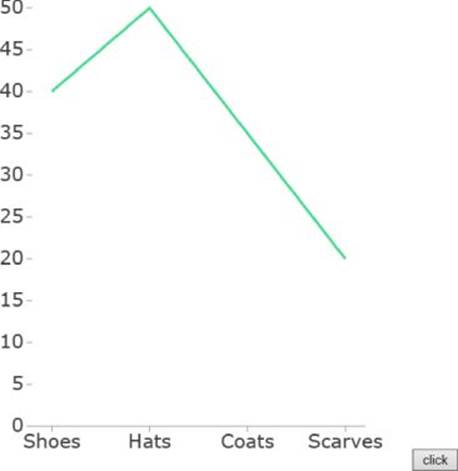
Figure 12.1 This shows a line chart using D3.
Most of the preceding code is similar to the examples in Chapter 11 when you were visualizing data using columns. The main difference is that now you are generating a single shape that is a linear interpolation between all the discrete data points rather than a separate shape per data point. Now, let's drill into how that is done:
var lineBuilder = d3.svg.line()
.x(function (d) {
return xScale(d.product);
})
.y(function (d) {
return yScale(d.amount);
})
.interpolate("linear");
This code is creating a line builder that will turn a set of x-y positions into some linearly interpolated path geometry (straight lines that connect all the points). Functions declaring how to fetch the x and y values are assigned. These call the x and y scales in order to map the incoming data into the coordinate system of the plot area. Finally, you set the interpolation mode to linear, which declares that the line builder should use straight lines between the data points. There are many other options you can provide here, however, such as basis which will use a B-spline (a smoothed mathematical function over the data points) to connect all the points. When you call this builder on the incoming data, it generates some path data that you can assign to the d attribute on a <path> element.
var line = main.selectAll(".line")
.data([currentData]);
line
.enter().append("path")
.attr("class", "line")
.attr("d", function (d) {
return lineBuilder(d);
});
In the preceding snippet, a data join is done on a selection containing all the elements that use the line class. This is similar to how you would construct a bar or column chart, however, rather than passing in the array of data points to the join, this is passing in a one-element array where the one element is the subarray with your data. This is because you want there to be just one line produced for the data, but this line needs to refer to the full array of data to be visualized.
Next, a path is appended to represent all the data, and the lineBuilder is called to produce the path geometry for the input data.
To add some neat animations, you are also declaring what should occur when the updateLine method is called successively on new data:
line
.transition()
.duration(1000)
.attr("d", function (d) {
return lineBuilder(d);
});
This code basically regenerates the line geometry and assigns it within the context of a transition animation.
Adding Symbols to the Line
NOTE You might find it a bit surprising that you don't need to do anything more complicated to animate the shape of the line between different configurations. It is straightforward, here because the line geometry being generated has the same number of control points every time the data is updated, and the sequence of commands in the path geometry remains constant. In this case, every command is a “line to” command. Because this is such a straightforward geometry, it is sufficient that D3 matches by index, then interpolates, all of the floating-point numbers in the two path geometries and produces a “tween” geometry that blends between the two. If the number of control points varied or, worse, the commands used varied, you would probably need to use a custom interpolator.
Now that you have a line displayed, it's time to move on to marking it up with some symbols. Fortunately, much like the way D3 provides some builders/generators for things like arcs and lines, it also provides a configurable builder for symbol geometry:
var symbol = main.selectAll(".symbol")
.data(currentData);
var symbolBuilder = d3.svg.symbol()
.type("circle")
.size(180);
When you were rendering the line portion of the chart, you joined the data so as to produce one visual that incorporated all the data points, but in the case of the symbols, the scenario is more like when you were creating the column visuals in Chapter 11. The symbols all have the class symbol applied to them, and each is associated with a single data item.
Next, d3.svg.symbol() creates a symbol geometry builder. You declare that you want circle shapes for each symbol and provide a desired size. Like most operators in D3, these actions could just as easily be functions that use the contextual data to drive the shape or the size of the symbols.
NOTE One common charting scenario for which you would probably want to data-drive the size or shape of a marker is a bubble chart. Bubble charts usually map a third value (beyond what is mapped to x and y) to the area of the chart's symbols. Sometimes a fourth value (or the third doubled up) is also mapped to the color selected for the symbols. Mapping four separate values into one chart series can be a bit much to easily digest, however.
symbol
.enter().append("path")
.attr("class", "symbol")
.attr("transform", function (d) {
return "translate(" + xScale(d.product) +
"," + yScale(d.amount) + ")";
})
.attr("d", function (d) {
return symbolBuilder(d);
});
This snippet is adding a path for each data item and marking it with the class symbol. The symbol builder generates the geometry for each symbol centered around the coordinate origin, so you generate a translate transform based on scaling the current category and amount into the plot area's coordinate system. After the coordinate origin has been placed at the center of where you want to render the marker, the symbol geometry builder is called on the data item in order to get the geometry data to assign to the d attribute of the<path>.
symbol
.transition()
.duration(1000)
.attr("transform", function (d) {
return "translate(" + xScale(d.product) +
"," + yScale(d.amount) + ")";
});
Finally, just as the line was animated, it would be great if the symbols would animate to new positions when new data is introduced. So, for the update selection, you start a transition, apply a duration, and animate a change to the translate transform to the new target position for each symbol.
You can see the resulting symbols applied to the line chart in Figure 12.2, and you can find the D3BasicLineChartWithAxesAndSymbols.html/css/js files on the companion website.
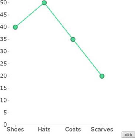
Figure 12.2 Symbols have been applied to a line chart using D3.
Making the Symbols Interactive
Another useful aspect of introducing symbols to a line chart is that they give you a way to annotate or highlight individual data values within the line. With no symbols, if you want to highlight a line, the easiest thing to do is to highlight the entire line. After introducing symbols, however, you can highlight an individual symbol to bring a particular data value into focus. The following code shows you how you would highlight the symbol currently under the mouse:
symbol
.enter().append("path")
.attr("class", "symbol")
.attr("fill", "#4DDB94")
.attr("transform", function (d) {
return "translate(" + xScale(d.product) + "," + yScale(d.amount) + ")";
})
.attr("d", function (d) {
return symbolBuilder(d);
})
.on("mouseenter", function() {
d3.select(this).transition()
.duration(300)
.attr("fill", "#f2ed96")
.attr("transform", function (d) {
return "translate(" + xScale(d.product) + "," +
yScale(d.amount) + ")";
});
})
.on("mouseleave", function () {
d3.select(this).transition()
.duration(300)
.attr("fill", "#4DDB94")
.attr("transform", function (d) {
return "translate(" + xScale(d.product) + "," +
yScale(d.amount) + ")";
});
});
The differences here are that you've pulled the default fill color out of the CSS and are using D3 to apply it, and you've attached a mouse enter and a mouse leave handler to the symbol paths so that you can enact changes as the symbols are hovered over. In each handler, d3.select(this).transition() selects the hovered node and starts a transition. The transition either applies the highlight color or sets the color back to the default depending on whether the mouse is entering or leaving the symbol.
You may be wondering why both the transform and the color are being animated in the handler. This is actually to deal with a situation in which you hover over a symbol while a data change transition is being applied. In D3, only one transition can be running at a time for an element (though more than one can be queued). As a result, if you hover over a node during a data transition, it will essentially cancel the translation animation that is occurring. To resolve this, you repeat the target translate transform in this transition in addition to the fill color change.
You can see the result of hovering the mouse over one of the symbols in Figure 12.3. You can find the D3BasicLineChartWithAxesAndSymbolsHover.js/html/css files on the companion website.
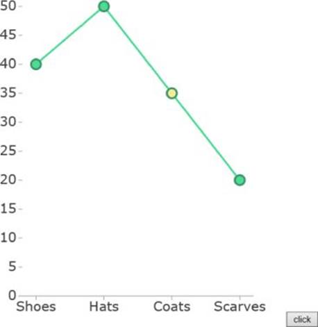
Figure 12.3 This shows the effect of hovering over an interactive symbol in your D3 line chart.
There is a discoverability issue here, however. Consumers of the visualization may not even realize that they can hover over the markers to highlight the specific data. You can take it a bit further, and, instead of hovering over a marker to highlight it, you can always highlight the closest symbol to the user's cursor.
The first change is to insert a rectangle into the background of the plot area, like so:
var bg = main.append("rect")
.attr("fill", "#FFFFFF")
.attr("width", width)
.attr("height", height);
Creating this rectangle is done because your plot area has a transparent backing by default and most SVG implementations seem to not catch mouse events on transparent backgrounds. As a result, you need a background to get constant mouse move updates as the user moves the mouse cursor around the plot area.
var getClosestProduct = function (mouse) {
var minDist = NaN;
var minIndex = -1;
for (var i = 0; i < xScale.domain().length; i++) {
var position = xScale(xScale.domain()[i]);
var dist = Math.abs(position - mouse[0]);
if (isNaN(minDist)) {
minDist = dist;
minIndex = i;
} else {
if (dist < minDist) {
minDist = dist;
minIndex = i;
}
}
}
return xScale.domain()[minIndex];
};
This method helps find the category value that is closest to the current x position of the mouse. It does this by looping through all the categories, mapping each into the coordinate system of the plot area (the range), and measuring the x distance to the mouse cursor. The minimum distance category is found and returned.
var previousProduct = null;
main.on("mousemove", function () {
console.log("here");
var mouse = d3.mouse(this);
var closestProduct = getClosestProduct(mouse);
if (closestProduct != previousProduct) {
previousProduct = closestProduct;
var symbol = main.selectAll(".symbol");
symbol
.transition()
.duration(300)
.attr("fill", function (d) {
if (d.product == closestProduct) {
return "#f2ed96";
}
return "#4DDB94";
})
.attr("transform", function (d) {
var trans = "translate(" + xScale(d.product) + "," +
yScale(d.amount) + ")";
if (d.product == closestProduct) {
return trans + " scale(2,2)";
}
return trans;
});
}
});
Given this mousemove handler, you listen to the mouse position changes even on the plot area background. For every move, you determine the current closest category to the cursor. Then, given the category you want to highlight, you apply a transition to all the symbols and modify the color and render scale of just the symbol that has the data value for the closest category.
You can see the result of hovering near to one of the symbols in Figure 12.4. You can find the D3BasicLineChartWithAxesAndSymbolsHoverClosest.js/html/css files on the companion website.
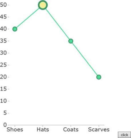
Figure 12.4 The closest symbol to the cursor is highlighted.
Canvas Symbols with Ignite UI igDataChart
Now that you've been exposed to some of the basics of adding symbols to charts and making them interactive, it's time to look at a much higher-level charting API to see what more complex built-in (but more constrained) behaviors you can take advantage of.
Chapter 9 focuses on the Google Charts API, but at the time of this writing, that API didn't have very flexible configuration when it came to symbols/markers. Consequently, the latter part of this chapter focuses on the Ignite UI igDataChart by Infragistics (http://www.igniteui.com). The igDataChart is not a free component, but you can find a trial of it at https://igniteui.com/download. After you have signed up, there are also some CDN links for the trial version that are published on the download page, or you can download the trial. This chapter assumes you have extracted Ignite UI into a subfolder called IgniteUI.
The igDataChart is a desktop-grade charting component that focuses on performance, high volumes of data, ease of use, and breadth of features. There are so many features, in fact, that it is split between many different JavaScript files in order to reduce load times.
NOTE For simplicity, the samples in this chapter will load a combined JavaScript file that contains all the data visualization tools that Ignite UI offers, but for production scenarios it's better to load only the subset of features required. Custom downloads for just the feature sets desired can be obtained from http://igniteui.com/download.
Creating a Line Chart with Ignite UI igDataChart
A lot less code is required to represent the preceding D3 symbol scenario using the igDataChart. The first code snippet shows the HTML:
<!DOCTYPE html>
<html>
<head>
<title>Area Chart</title>
<script src="jquery/jquery-1.11.1.min.js"></script>
<script src="jquery-ui-1.11.1/jquery-ui.min.js"></script>
<link rel="stylesheet" href="IgniteUI/css/themes/infragistics/↩
infragistics.theme.css" />
<link rel="stylesheet"
href="IgniteUI/css/structure/infragistics.css" />
<link rel="stylesheet" href="IgniteUI/css/structure/modules/↩
infragistics.ui.chart.css" />
<script src="IgniteUI/js/infragistics.core.js"></script>
<script src="IgniteUI/js/infragistics.dv.js"></script>
<link rel="stylesheet"
href="IgniteUIChartArea.css" />
</head>
<body>
<div id="chart"></div>
<div id="legend"></div>
<script type="text/javascript" src="IgniteUIChartArea.js">
</script>
</body>
</html>
The preceding code assumes that the Ignite UI trial was extracted into a subfolder called IgniteUI. Also, the download from the companion site contains the trial of Ignite UI in the appropriate location. The HTML content will be roughly the same for the remaining code in the chapter, so this chapter doesn't refer to it again, but the full listings are available in the companion media for the chapter. The same is true for the CSS, which follows:
#chart
{
width: 500px;
height: 500px;
float: left;
}
#legend
{
float: left;
}
The CSS classes here apply to the elements that contain the chart and its legend. They define some sizing and layout. The following is the actual code that defines the chart:
$(function () {
var data = [
{ "product": "Shoes", "amount": 40 },
{ "product": "Hats", "amount": 50 },
{ "product": "Coats", "amount": 35 },
{ "product": "Scarves", "amount": 20 }
];
var data2 = [
{ "product": "Shoes", "amount": 25 },
{ "product": "Hats", "amount": 40 },
{ "product": "Coats", "amount": 45 },
{ "product": "Scarves", "amount": 15 }
];
$("#chart").igDataChart({
dataSource: data,
title: "Product Sales",
subtitle: "Sales in various product categories over time",
rightMargin: 30,
legend: { element: "legend" },
axes: [{
type: "categoryX",
name: "xAxis",
label: "product",
labelExtent: 40
}, {
type: "numericY",
name: "yAxis",
title: "Sales",
minimumValue: 0,
strip: "rgba(230,230,230,.4)",
maximumValue: 60,
labelExtent: 40
}],
series: [{
name: "productSales",
type: "area",
xAxis: "xAxis",
yAxis: "yAxis",
valueMemberPath: "amount",
showTooltip: true,
isTransitionInEnabled: true,
isHighlightingEnabled: true,
transitionInDuration: 1000,
title: "Q1"
}, {
name: "productSales2",
dataSource: data2,
type: "area",
xAxis: "xAxis",
yAxis: "yAxis",
valueMemberPath: "amount",
showTooltip: true,
isTransitionInEnabled: true,
isHighlightingEnabled: true,
transitionInDuration: 1000,
title: "Q2"
}, {
name: "itemToolTips",
type: "itemToolTipLayer",
transitionDuration: 300
}]
});
});
This code produces the area chart that's shown in Figure 12.5. (You can find the IgniteUIChartArea.js/html/css files on the companion website.) It may not even be appropriate to refer to the preceding as code because it's basically just some JavaScript objects that represent the data to plot in a chart, and some additional JavaScript objects that store the configuration for the chart.
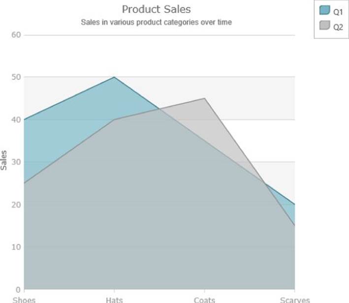
Figure 12.5 This area chart was created using the Ignite UI igDataChart.
You'll notice some interesting things if you run the sample in a browser:
· The chart has some nice-looking built-in titles for itself and its axes.
· The series animate into view in an aesthetically pleasing way.
· Some automatically formatted tooltips display when you hover over the data, and the tooltips are shown simultaneously for each data series.
· When you hover over a series, you get a glow highlight.
· The axes have tick and gridline visuals and alternating color strips.
· There is a separate legend component that displays the title for the series and has a color swatch to correlate items with the series in the chart.
It would have taken a rather large amount of code in D3 to build all of these features, and a lot of these behaviors are much more complex and customizable than they appear at first blush. D3's strengths stem from its low-level nature and its ability to tackle out-of-the-box ad-hoc scenarios, but high-level APIs such as igDataChart can massively simplify things if your story fits within their constraints. Luckily, igDataChart is very configurable and flexible so a wide range of scenarios can be represented.
Here's a breakdown of some of the settings used in the configuration for the preceding example:
· dataSource assigns the data to the chart. All the axes and series in the chart inherit this data source unless they have one specified locally.
· title assigns the chart-level title or series-level title. The chart title is displayed above the chart, and the series titles are displayed in the legend or in the tooltips.
· subtitle is a smaller title line that is displayed under the main title for the chart.
· legend specifies some suboptions for the legend for the chart. Here you point out which element, using a selector, should accept the legend content.
· axes specifies the axes that you are associating with the chart. These can be positioned on the top, bottom, left, or right of the chart, and you can add as many as you want. When you add a series to the chart, you just need to indicate which axes it uses.
· type specifies the axis type that is being added. In this case, we are adding a category (ordinal) axis and a numeric axis to map the values into the plot area. There is also a type option for the series that specifies which series type is being added. There are a lot of available series types. You can find some of the available types at http://help.infragistics.com/Doc/jQuery/2014.1/CLR4.0?page=igDataChart_Series_Types.html, but that page doesn't even touch on all the financial indicators and annotation layers available.
· label specifies which property holds the label to use for the category labels.
· labelExtent specifies the amount of space to reserve for the axis labels for an axis. If you leave this unspecified, the chart calculates this automatically, but if you modify the data or zoom level, the label areas update dynamically, so often it's best to fix this value.
· minimumValue/maximumValue specifies the minimum and maximum of the axis range. Otherwise, the axis ranges are also automatically calculated by default.
· strip specifies alternating color strips for an axis.
· series specifies the series being added to the chart.
· name adds identifiers for axes and series.
· xAxis/yAxis identify which axes a series will use to map its values by name.
· valueMemberPath indicates which property the series will fetch values from.
· showTooltip indicates that a tooltip should be shown when the series is hovered.
· isTransitionInEnabled/isHighlightingEnabled turns on the transition effect and the highlighting effect for a series.
· transitionInDuration specifies how long, in milliseconds, a transition should take.
All that amounts to is that you are adding a category axis and a numeric axis to the chart, two area series for the two data sets to be displayed, and an item tooltip layer that displays the simultaneous item tooltips. If this layer were omitted, you would get non-simultaneous tooltips depending on which series you were currently over.
That's all okay, but this chapter is about symbols, so where are they?
Adding Symbols to the Chart
Adding symbols to a chart with igDataChart is dead simple. You can either select a symbol shape that you want, or you can select automatic, which means that each series that has the automatic setting attempts to select a unique symbol shape (until they run out). Here's how:
markerType: "automatic",
That's it. You would just add that to the options for each series. If you want to select a particular marker, you use a string such as circle or triangle. You can see the result in Figure 12.6, and you can find the IgniteUIChartAreaWithSymbols.js/html/css files on the companion website.

Figure 12.6 This area chart with symbols was created using igDataChart.
Notice that there are some other interesting behaviors that have come into play now, too. When you hover over a series, not only is the main series shape highlighted, but the closest data marker is also highlighted, as you achieved earlier with D3.
It's not just line or area charts that support markers; if you change the type of the series to type column, you'll see that the columns also have markers. Figure 12.7 shows the result. The IgniteUIChartColumnWithSymbols.js/html/css files are on the companion website.
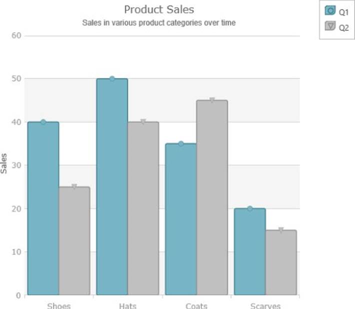
Figure 12.7 This shows a column chart with symbols.
Symbols aren't only for delineating where the actual data values are in a chart, though; you can use them as an additional channel for information. Here's how you would turn the markers in the column chart from the preceding example into some textual markers that display each column's value directly above it:
var markerFont = "18px Verdana";
var measureSpan = $("<span>M</span>");
measureSpan.css("font", markerFont);
measureSpan.css("visibility", "hidden");
$("body").append(measureSpan);
var approxFontHeight = parseFloat(measureSpan.prop("offsetHeight"));
measureSpan.remove();
var markerTextMargin = 2.5;
var textualMarker = {
measure: function (measureInfo) {
var cont = measureInfo.context;
cont.font = markerFont;
var data = measureInfo.data;
var name = "null";
if (data.item() !== null) {
name = data.item().amount.toString();
}
var height = approxFontHeight + markerTextMargin * 2.0;
var width = cont.measureText(name).width + markerTextMargin * 2.0;
measureInfo.width = width;
measureInfo.height = height;
},
render: function (renderInfo) {
var ctx = renderInfo.context;
ctx.font = markerFont;
if (renderInfo.isHitTestRender) {
ctx.fillStyle = renderInfo.data.actualItemBrush().fill();
} else {
ctx.fillStyle = "black";
}
var data = renderInfo.data;
if (data.item() === null) {
return;
}
var name = data.item().amount.toString();
var halfWidth = renderInfo.availableWidth / 2.0;
var halfHeight = renderInfo.availableHeight / 2.0;
var x = renderInfo.xPosition - halfWidth;
var y = renderInfo.yPosition - (halfHeight * 2.0);
if (y < 0) {
y += (halfHeight * 4.0);
}
if (renderInfo.isHitTestRender) {
ctx.fillRect(x, y, renderInfo.availableWidth,
renderInfo.availableHeight);
} else {
ctx.globalAlpha = 0.5;
ctx.fillStyle = renderInfo.data.actualItemBrush().fill();
ctx.fillRect(x, y, renderInfo.availableWidth,
renderInfo.availableHeight);
ctx.fillStyle = renderInfo.data.outline().fill();
ctx.strokeRect(x, y, renderInfo.availableWidth,
renderInfo.availableHeight);
ctx.globalAlpha = 1;
ctx.fillStyle = "black";
ctx.textBaseline = "top";
ctx.fillText(name, x + markerTextMargin, y + markerTextMargin);
}
}
};
You would then assign this textualMarker variable to the series using markerTemplate: textualMarker. igDataChart uses the HTML5 canvas for rendering (as opposed to SVG like D3). The preceding code lets you step in and issue commands to the canvas to render some custom symbol content when required. You have access to the data that would be in context for a symbol, and the colors that the chart would have used, and you are responsible for rendering content in the provided context. The code just renders some text in a rectangle to produce the result shown in Figure 12.8. You can find the IgniteUIChartColumnWithTextSymbols.js/html/css files on the companion website.
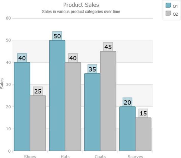
Figure 12.8 This column chart includes textual symbols.
Creating a Bubble Chart
Some chart series are entirely composed of symbols, such as the one you can create with the following code:
$(function () {
$.ajax({
type: "GET",
url: "Food_Display_Table.xml",
dataType: "xml",
success: loadXml
});
var data = [];
function loadXml(xmlData) {
$(xmlData).find("Food_Display_Row")
.each(function () {
var row = $(this);
var displayName = row.find("Display_Name").text();
var saturatedFat = parseFloat(row.find("Saturated_Fats").text());
var calories = parseFloat(row.find("Calories").text());
var milk = parseFloat(row.find("Milk").text());
data.push({
displayName: displayName,
saturatedFat: saturatedFat,
calories: calories,
milk: milk
});
});
data.sort(function (v1, v2) {
if (v1.milk < v2.milk) {
return -1;
}
if (v1.milk > v2.milk) {
return 1;
}
return 0;
});
console.log("records loaded: " + data.length);
renderChart();
}
function renderChart() {
$("#chart").igDataChart({
dataSource: data,
title: "Saturated Fat vs. Calories",
subtitle: "Amounts of saturated fat vs. calories
in common foods. Data: Data.gov",
horizontalZoomable: true,
verticalZoomable: true,
axes: [{
type: "numericX",
name: "xAxis",
title: "Saturated Fat",
strip: "rgba(230,230,230,.4)"
}, {
type: "numericY",
name: "yAxis",
title: "Calories",
strip: "rgba(230,230,230,.4)"
}],
series: [{
name: "saturatedFatVsCalories",
type: "bubble",
xAxis: "xAxis",
yAxis: "yAxis",
xMemberPath: "saturatedFat",
yMemberPath: "calories",
radiusMemberPath: "milk",
fillMemberPath: "milk",
labelMemberPath: "displayName",
showTooltip: true,
tooltipTemplate: "tooltipTemplate",
title: "Saturated Fat Vs. Calories",
maximumMarkers: 3000,
radiusScale: {
minimumValue: 10,
maximumValue: 25
},
fillScale: {
type: "value",
brushes: ["red", "orange", "yellow"]
}
}]
});
}
});
For this code, you need to snag some data from the http://data.gov website. http://catalog.data.gov/dataset/mypyramid-food-raw-data-f9ed6 has some data, including calories and saturated fat content, for many different common food types. Using the strategies described in Chapter 4, you can load the file using an AJAX call and put its contents in data. Then, provided with two numeric axes, rather than the category and numeric axis combo you were using before, you are able to load a type: "bubble" series.
NOTE When attempting to run the previous sample, if you did not load it via a web server you may have run into some interesting issues. Most browsers block AJAX requests if they are targeted at the local file system. If you are running IIS or Apache on your machine, you can resolve the issue by placing the files from this chapter someplace that you can serve them via IIS/Apache and access them from a http://localhost address. Alternatively, if you have Python installed, you can navigate to the directory that contains the files for this chapter and run the command python -m SimpleHTTPServer; then you should be able to access the files via: http://localhost:8000/.
A bubble series enables its symbols to carry more than just x-y position data. Additionally, you can convey at least two additional values by mapping them to the size and color of the symbols. This is done by specifying the fillMemberPath and the radiusMemberPath to indicate which properties should be used to map to those attributes. radiusScale and fillScale further customize the look of the symbols so that the chart looks like the one shown in Figure 12.9. The IgniteUIBubbleChart.js/html/css files are on the companion website.
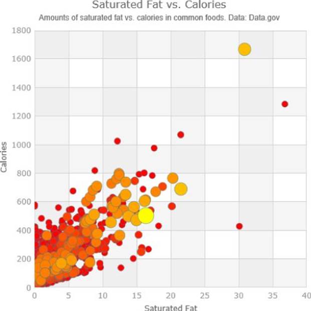
Figure 12.9 This bubble chart was created using igDataChart.
Data source: http://catalog.data.gov/dataset/mypyramid-food-raw-data-f9ed6
Notice also that zooming has been turned on for the chart:
horizontalZoomable: true,
verticalZoomable: true,
In Figures 12.10 and 12.11, you can see how you can zoom into the bubble chart to drill down into the dense areas and perceive the fine detail. Every series in igDataChart supports zooming and panning in this manner. Also note, that it is not just an optical zoom that is occurring here, as the level of detail changes as more data points are revealed or hidden.
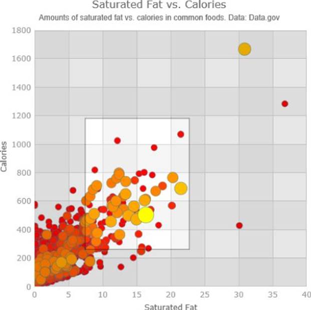
Figure 12.10 This shows zooming into a bubble chart.
Data source: http://catalog.data.gov/dataset/mypyramid-food-raw-data-f9ed6
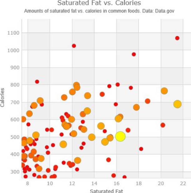
Figure 12.11 The bubble chart has been zoomed.
Data source: http://catalog.data.gov/dataset/mypyramid-food-raw-data-f9ed6
Although features such as these are possible, with enough code, using low-level visualization APIs such as D3, they certainly aren't as simple to enable as setting a few properties to true, as with the igDataChart. The strength of products such as Ignite UI is that they can turn very complex scenarios into turnkey solutions.
Summary
Now you've learned all about adding symbols to charts. Symbols help to annotate individual items in your data and present their location to the consumer of the visualization. Also, as you saw, some charting types consist entirely of symbols. In this chapter, you
· Created a line chart using D3 and added symbols to it
· Made these symbols more dynamic and made them respond to mouse interaction
· Created an area series using the Ignite UI igDataChart charting API.
· Added symbols to the igDataChart Area series
· Added symbols to a column chart in igDataChart and turned these markers into textual markers
· Created a bubble chart using igDataChart
All materials on the site are licensed Creative Commons Attribution-Sharealike 3.0 Unported CC BY-SA 3.0 & GNU Free Documentation License (GFDL)
If you are the copyright holder of any material contained on our site and intend to remove it, please contact our site administrator for approval.
© 2016-2026 All site design rights belong to S.Y.A.