JavaScript and jQuery for Data Analysis and Visualization (2015)
PART III Visualizing Data Programmatically
Chapter 13 Mapping Global, Regional, and Local Data
What's in This Chapter
· Learning how to plot an interactive map on a web page using the Google Maps API
· Plotting markers at desired locations on a map
· Plotting point clouds of data on a map
· Displaying density information on a map using a heat map
· Turning publically available vector map geometry into GeoJSON
· Plotting GeoJSON as SVG using D3 and TopoJSON
· Using D3 to display animated choropleth maps
CODE DOWNLOAD The wrox.com code downloads for this chapter are found at www.wrox.com/go/javascriptandjqueryanalysis on the Download Code tab. The code is in the chapter 13 download and individually named according to the names throughout the chapter.
This chapter is all about visualizing data on maps. It starts with visualizing data that has some form of associated geographic position as markers on a map and then moves on to conveying statistical information about geographic regions by varying their color through what is known as choropleth mapping.
If you've used the Internet at all in the past decade, chances are you've used the Google Maps web application at some point. It enables you to search for points of interest, find directions between one place and another, and to smoothly zoom and pan around the map to examine things. Fortunately, Google also released an application programming interface (API) that enables you to build web applications that plot various data over the Google Maps tile images and allow this data to be navigable using the same mechanisms as the Google Maps application.
You've already used the D3 JavaScript API in some of the preceding chapters—mostly in the context of charts—but D3 also provides mechanisms for plotting map geometry. In the latter part of this chapter, you use D3 to plot dynamic geometry on a map to convey statistical information about various regions.
The data or geometry you might want to plot on a map can be very large and unwieldy. Furthermore, the APIs you use may have practical limitations in terms of plotting dynamic imagery in an online, interactive fashion (as opposed to doing offline rendering ahead of time). Thus, you have to process the data used in this chapter in various ways to ready it for display on a map. There are countless programming languages you could use to preprocess the data for this purpose, but as this is a book on using JavaScript to present visualizations, here, you also use JavaScript to process the data via the Node.js platform.
Working with Google Maps
At the time of this writing, you can freely use the Google Maps API as long as your website is free to use and is publically accessible, but be sure to review all the terms of use of the Google Maps API before you proceed with using it in a production website. If your website is not free to use, or is not publically accessible, Google also provides a Google Maps for Business products. Your first step, after reviewing the terms of use of the API, should be to sign up for a Google Maps API key. Although not technically required (none of the code samples in this chapter include an API key, and they function without it, as of the time of writing), Google recommends that you use an API key so that you, and they, can track your usage. Thus empowered, you can stay within the quotas they place on the free level of usage for the service. You can obtain an API key here:
1. https://developers.google.com/maps/documentation/javascript/tutorial#api_key
After you've obtained your API key, make sure that, when you try to use any of the code in this chapter, you include your API key in the script URL for the Google Maps API scripts:
<script type="text/javascript"
src="https://maps.googleapis.com/maps/api/js?key=KEY&sensor=false">
</script>
In the preceding code, KEY is the API key that you obtained from Google.
The Basics of Mapping Visualizations
Maps of the earth are an attempt to take the 3D geography of the planet, which is roughly an oblate spheroid, and show it on the 2D Cartesian plane of a sheet of paper. If you want to describe a point on the 3D spheroid of the earth, one popular way is to use latitude, longitude, and elevation values, which represent the angular and radial displacements from the origin point of the spheroid. The origin point is conventionally decided to be the intersection of the equator of the earth and the Prime Meridian, which divides the western and eastern hemispheres of the earth.
Over the years, cartographers have defined various projections, or mathematical formulas, that map from the coordinate system over this spheroid, into a 2D Cartesian coordinate system that you can easily display on a sheet of paper or computer screen.
Your data, when it has a geographic context, will likely be expressed in terms of geographic coordinates (latitude, longitude, and, optionally, elevation) and the mapping tools that you are using will help you take the values and express them in the 2D Cartesian space of the computer screen.
Sometimes you'll be able to select from the many different projections that have been conceived for mapping geometry between these spaces, but sometimes this choice will be dictated for you by the tool in use. The primary use case for the Google Maps API is to plot data over the map tile imagery that Google Maps provides and helps you navigate. These tiles are rendered using a modified version of the Mercator map projection, so when you request that data be plotted over them, you present the data using geographic coordinates, which the Google Maps API applies this projection to in order to map them into 2D Cartesian coordinates over the map.
Thanks to the Google Maps API, you don't often need to think about the fact that your geographic coordinates are not already Cartesian values because the API deals with the transformation into the Cartesian plane, but you will sometimes need to remember that map projections have distorted the actual geometry being plotted. In Figure 13.1 (which you can find in companion files GoogleMapsProjectionDistortion.html/css/js), I've asked the Google Maps API to plot a set of randomly placed circles on the map. These circles all have exactly the same radius in geographic coordinates, but you can see how the projection distorts their shape in the Cartesian plane when they are plotted in different places over the map.
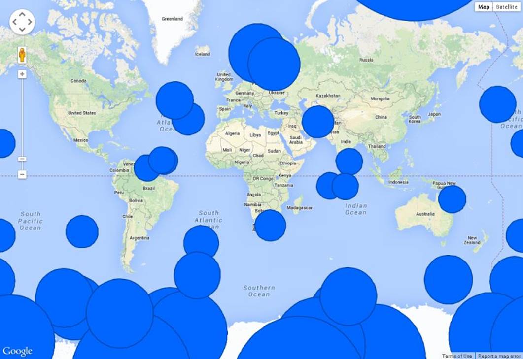
Figure 13.1 This is an example of map projection distortion.
The Google Maps API v3
First, you start by getting a basic map to display, using the API, before you try to plot data over it. The following is the HTML markup:
<!DOCTYPE html>
<html>
<head>
<title>Basic Map</title>
<script src="https://maps.googleapis.com/maps/api/js?v=3.exp&sensor=false">
</script>
<link rel="stylesheet" href="GoogleMapsBasic.css">
<script type="text/javascript" src="GoogleMapsBasic.js">
</script>
</head>
<body>
<div id="map"></div>
</body>
</html>
The maps script reference is where you would introduce your API key, as previously alluded to. The main content of the page is a <div> that will hold the map created by the Google Maps API. Most HTML markup for the Google Maps API code in this chapter looks exactly the same, except it loads different JavaScript, so this is the only time it's covered.
Similarly, all the Google Maps API code for this chapter uses roughly the same CSS, which essentially makes the map take all the available space of the page:
html, body, #map {
margin: 0;
padding: 0;
height: 100%
}
Listing 13-1 is the actual code that displays the map.
Listing 13-1
var map;
var statueOfLiberty = new google.maps.LatLng(40.6897445, -74.0451452);
var options = {
zoom: 12,
center: statueOfLiberty
};
function createMap() {
var mapElement = document.getElementById("map");
map = new google.maps.Map(mapElement, options);
}
google.maps.event.addDomListener(window, 'load', createMap);
The idea here is to center the map view on the Statue of Liberty monument at a specified zoom level. Let's break things down before adding any additional complexity.
var map;
var statueOfLiberty = new google.maps.LatLng(40.6897445, -74.0451452);
This creates a variable that holds the map, so that it can be interacted with after initial creation and creates a latitude and longitude pair that represents the geographic position of the Statue of Liberty monument. An easy way to discover these coordinates is to search for a point of interest in the Google Maps application. For example, if you search for “Statue of Liberty” in Google Maps and look at the returned Uniform Resource Identifier (URI) in the address box after you select it from the search results, you see:
1. https://www.google.com/maps/place/Statue+of+Liberty+National+Monument/@40.689757,-74.0451453,17z/data=!3m1!4b1!4m2!3m1!1s0x89c25090129c363d:0x40c6a5770d25022b
After the @ sign, you see two coordinates that represent the position of the point of interest. This technique isn't guaranteed to always work, as Google might change the structure of this URI, but, as of the time of this writing, this represents an easy ad hoc way to obtain some coordinates. For a more resilient method, you could look into using the Google Maps Geocoding API for looking up the coordinates of a point of interest or finding the closest point of interest to some geographic coordinates:
1. https://developers.google.com/maps/documentation/geocoding/
var options = {
zoom: 12,
center: statueOfLiberty
};
The preceding code defines the creation options of the map. It declares that the map should start centered around the statue at zoom level 12.
NOTE The Google Maps image tiles are a tree of tiles. At the top level, you have four tiles, and each level you descend, one tile is subdivided into four sub-tiles. The zoom level represents how deep in this tile tree you are currently displaying images from. Each tile level introduces progressively more resolution to the map imagery. This is actually the same way that most map tile providers work. For example, if you investigate the OpenStreetMap API, you find that the tile level and tile coordinates are a human readable part of the resource path you are requesting from the server. For example, http://b.tile.openstreetmap.org/5/7/12.png represents a tile from zoom level 5 with x tile coordinate 7 and y tile coordinate 12.
function createMap() {
var mapElement = document.getElementById("map");
map = new google.maps.Map(mapElement, options);
}
The preceding function creates the map when the DOM is ready to receive it. It locates the DOM element that you want to add the map to and then instantiates the map with the options that indicate it should center on the Statue of Liberty at zoom level 12.
google.maps.event.addDomListener(window, 'load', createMap);
Finally, this line waits until the window is loaded to call the preceding code and thus creates the map. Not too complicated yet, right? You can see the results in Figure 13.2, and you can find the GoogleMapsBasic.html/css/js files on the companion website.

Figure 13.2 A basic map is displayed using Google Maps.
The code might have been simple, but the results are very complex. You can zoom and pan and do many things that you can do with the full Google Maps web application, except, with this code, you can embed the experience in your own web application. This book, however, is about visualizing data, so where is the data?
Customizing Maps with Iconography
One of the most straightforward ways to visualize data on a map is to position icons (or symbols/markers) over the surface. Google Maps API uses the term markers, so this chapter uses that term to describe how you render point data on your maps.
If you consider most of the maps that you interact with often, one of the most common visualization types that you see is markers. And those markers are usually indicating the locations of various points of interest. When you visit a shopping mall, for instance, and look at a directory, markers indicate the locations of the restrooms and elevators, and textual markers indicate where the various shops are located. When you are looking up the location of the restaurant that you are going to for dinner, using its website, there is a pushpin marker indicating its location on a map. In fact, oftentimes it is the Google Maps API that is used when you use a restaurant's location finder page.
Displaying a Map Marker
So, how do you display a marker using the Google Maps API? It turns out this is extremely simple to do, which is not especially surprising given that it is one of the primary use cases for the API. Given Listing 13-1, you can add the following to the createMap function after the map instantiation:
statueMarker = new google.maps.Marker({
position: statueOfLiberty,
map: map,
title: "Statue of Liberty"
});
Here you instantiate a marker, providing the position of the Statue of Liberty monument, indicate that it should be rendered on the map you just created, and provide it the title “Statue of Liberty.” The title will be shown in the tooltip when the user hovers over the marker on the map. Figure 13.3 shows the results of the code; you can find the GoogleMapsBasicMarker.html/css/js files on the companion website.

Figure 13.3 The Statue of Liberty monument has been called out with a marker.
Notice that the default marker style for Google Maps API is the now-familiar Google Maps stylized pushpin, but there are many ways to customize the look and feel of this marker. For example, you can assign various vector imagery to the marker, rather than using the default look:
statueMarker = new google.maps.Marker({
position: statueOfLiberty,
map: map,
icon: {
path: google.maps.SymbolPath.CIRCLE,
scale: 12,
strokeColor: 'red',
strokeWeight: 5
},
title: "Statue of Liberty"
});
You see how this looks in Figure 13.4, and the GoogleMapsBasicMarkerVector.html/css/js files is on the companion website. This is just a single point of data, though. What if you want to plot a point cloud over the map?
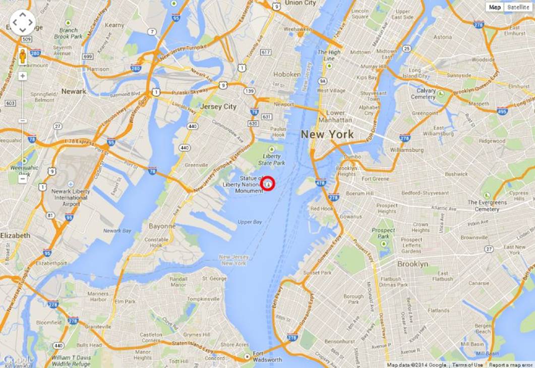
Figure 13.4 The marker on this map is a circle icon.
Preparing Data to Plot on a Map
With the markers in the Google Maps API you are dynamically rendering content interactively, and there is an overhead associated with each piece of retained geometry you add to the map. As such, there are practical limits to the number of markers that you can display, especially if you want to target low-power devices such as smartphones and tablets, which generally don't have as much oomph to their CPUs or as much spare memory (graphics or otherwise) to go around as desktop and laptop computers.
There are various strategies you can use to make it easier to render a large point cloud as markers on a map, but the one covered first is culling the number of displayed markers down to a more manageable limit. This helps to avoid overtaxing the system during rendering.
First, however, you need to find an interesting data set to display on the map. A good source of public domain data is the www.data.gov website. Most of the data sets have unrestricted usage, and they are nicely cataloged and searchable by data type. Because the goal is to use JavaScript to display the data over the map, you can make your life much easier by finding a data set that is already expressed as JSON. In fact, there is an extended grammar of JSON called GeoJSON that standardizes how to convey geographic data and geometry in JSON format.
NOTE Although it's especially simple to use, GeoJSON can have some downsides when it comes to sending geographic data over a network connection. If you want high-precision geographic positions, this usually means high-precision floating-point numbers, and when these numbers are serialized as text in a JSON file, they can take up quite a few text characters per number. When this is combined with highly detailed geometry, or large point clouds, the size of a GeoJSON file can grow very quickly. There are mechanisms to avoid this. One solution, which comes up later in this chapter, is to use TopoJSON, which is a modification to the spec that allows for quantized coordinates and topology sharing, in order to reduce the amount of space all the coordinates take up (among other things). Another strategy is to send binary packed floating points over the wire rather than focusing on human readable string values (which is one of the main attractions to using JSON).
Browsing around data.gov, I ran into this data set, which was already in GeoJSON format: http://catalog.data.gov/dataset/public-library-survey-pls-2011. This represents all the libraries that responded to the Public Library Survey for 2011. There are more than 9,000 items in this data source, though, so it would be quite a load on the system to render them all, which might result in sluggish performance. To combat this, you create a subset of the data to only the libraries in one state. To do this, as alluded to earlier, you use Node.js.
Node.js is an application platform for running applications written in JavaScript. It leverages Google's V8 JavaScript engine to efficiently run programs at native-like speeds. There are many interesting reasons you might want to leverage Node.js, including writing simple non-blocking web services, but, here, you leverage it simply to not have to use a separate language to cull down the library data. First, use the following steps:
1. Navigate to http://nodejs.org/.
2. Install Node.js for your platform.
3. Create a folder on your computer and unzip the public library data into it.
4. In that same folder, create a text file called process.js, and open it in a text editor.
Then, add the code in Listing 13-2 to the file you created.
Listing 13-2
var fs = require("fs");
fs.readFile("pupld11b.geojson", function (err, data) {
if (err) {
console.log("Error: " + err);
return;
}
var content = JSON.parse(data);
var features = [];
var newCollection = {
"type": "FeatureCollection",
"features": features
};
var currFeature;
var count = 0;
if (content.features && content.features.length) {
for (var i = 0; i < content.features.length; i++) {
currFeature = content.features[i];
if (currFeature !== null &&
currFeature.properties !== null &&
currFeature.properties.STABR) {
if (currFeature.properties.STABR === "NJ") {
features.push(currFeature);
count++;
}
}
}
}
var output = JSON.stringify(newCollection);
fs.writeFile("pupld11b_subset.geojson",
output, function (err) {
if (err) {
console.log("Error: " + err);
return;
}
console.log("done, wrote " + count + " features.");
});
});
Let's break down Listing 13-2. First you have
var fs = require("fs");
which loads the Node.js file system module so that you can read and write files from disk. Immediately following is this line:
fs.readFile("pupld11b.geojson", function (err, data) {
Most of the APIs available for the Node.js platform are designed to be fully asynchronous, to avoid blocking the main event loops of the system. As such, input/output (IO) operations, like this one, involve providing a callback that will be invoked when the operation has completed. In the previous code, you are requesting that the GeoJSON file that you downloaded, with the library information, should be read into a string.
if (err) {
console.log("Error: " + err);
return;
}
var content = JSON.parse(data);
var features = [];
var newCollection = {
"type": "FeatureCollection",
"features": features
};
var currFeature;
If an error occurs during the file load, the preceding code prints it to the console and then aborts. Otherwise, it parses the GeoJSON into a JavaScript object and then preps a new output array that holds the subset of the data.
var count = 0;
if (content.features && content.features.length) {
for (var i = 0; i < content.features.length; i++) {
currFeature = content.features[i];
if (currFeature !== null &&
currFeature.properties !== null &&
currFeature.properties.STABR) {
if (currFeature.properties.STABR === "NJ") {
features.push(currFeature);
count++;
}
}
}
}
With this code, you loop over the input collection and shift values into the subset if the STABR property is equal to NJ. Thus, features should only contain libraries within the state of New Jersey.
var output = JSON.stringify(newCollection);
fs.writeFile("pupld11b_subset.geojson", output, function (err) {
if (err) {
console.log("Error: " + err);
return;
}
console.log("done, wrote " + count + " features.");
});
Finally, you serialize the subset collection back out to JSON and write it out to a new file called pupld11b_subset.geojson. Alternatively, an error prints out if it's unable to write the new file.
To run the resulting logic, you should start a Node.js command prompt. Because the strategy to achieve this varies depending on the platform on which you are running Node.js, please refer to the Node.js documentation for more information. On Windows, I run a shortcut that was installed along with Node.js that creates a command prompt and ensures that Node.js is accessible to use therein. Given a command prompt, you should navigate to the folder in which you placed process.js and the input GeoJSON data. Then you can run the following command:
node process.js
which should result in the file pupld11b_subset.geojson being created. You can see an example of running this command on Windows in Figure 13.5. File pupld11b.geojson, process.js is on the companion website.
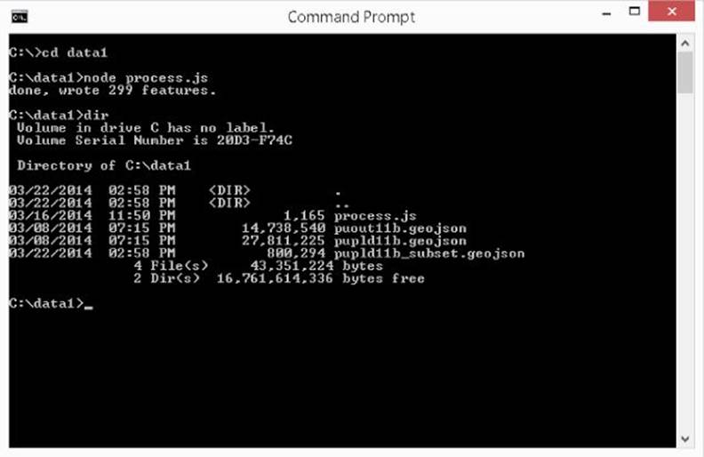
Figure 13.5 This shows using Node.js to cull down a GeoJSON file.
Plotting Point Data Using Markers
Given the subset of the GeoJSON file, you can proceed to plot it on the map.
$(function () {
$.ajax({
type: "GET",
url: "pupld11b_subset.geojson",
dataType: "json",
success: createMap
});
});
As you can see, jQuery is used to get the GeoJSON file and parse it.
When the file is successfully parsed, the createMap function is called.
var map;
var markers = [];
var njView = new google.maps.LatLng(40.3637892, -74.3553047);
NOTE If you are loading the HTML file off your local disk, rather than running a local web server and using an HTTP URL, some browsers, such as Google Chrome, give you security errors. Chrome is trying to keep malicious websites from accessing files on your local disk with this restriction. Other browsers allow the access as long as you don't try to leave the directory from which the page is loaded. To avoid these issues, you might want to host the pages for the rest of this chapter on a local web server and access them through http://localhost; alternatively, you could use Mozilla Firefox to load them, which, as of the time of writing, does not have the same restriction.
var options = {
zoom: 8,
center: njView
};
Similar to how you centered the view around the Statue of Liberty earlier, this centers the view over the state of New Jersey.
function createMap(data) {
var mapElement = document.getElementById("map");
var currentFeature, geometry, libraryName;
map = new google.maps.Map(mapElement, options);
for (var i = 0; i < data.features.length; i++) {
currentFeature = data.features[i];
if (!currentFeature.geometry) {
continue;
}
geometry = currentFeature.geometry;
libraryName = "Unknown";
if (currentFeature.properties) {
libraryName = currentFeature.properties.LIBNAME;
}
markers.push(new google.maps.Marker({
position: new google.maps.LatLng(
geometry.coordinates[1],
geometry.coordinates[0]),
map: map,
title: libraryName
}));
}
}
In the preceding code, the following things happen:
· The map is instantiated, as before.
· You loop through all the features in the GeoJSON file.
· For each feature, the geometry of the feature is extracted, which is a latitude and longitude pair, in this case.
· For each feature, a marker is added to the map, which is centered on the feature point, and the marker title is set to the associated name of the library.
You can see the result of this in Figure 13.6; GoogleMapsManyMarkers.html/css/js are the files on the companion website.
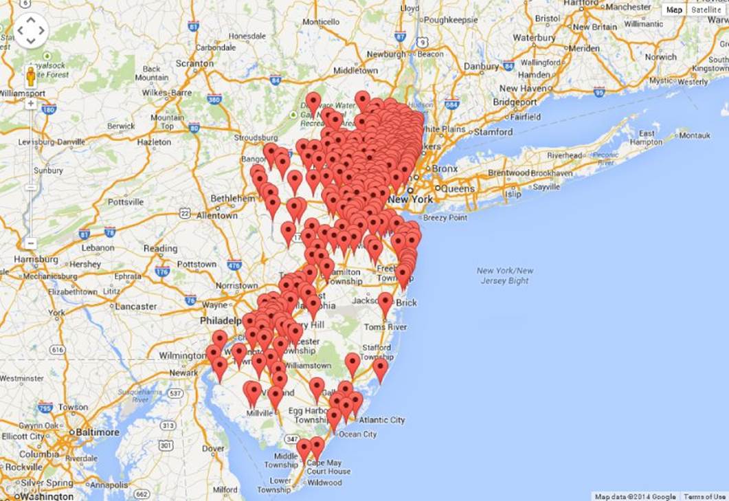
Figure 13.6 These markers plot the public libraries in New Jersey.
Source for library data: http://catalog.data.gov/dataset/public-library-survey-pls-2011
Also notice that you can hover over the markers with your mouse and (eventually) see a tooltip that contains the name of the library in question. At the initial zoom level, all of the markers are clustered together and occlude each other, but you can zoom in for greater detail and the markers begin to resolve into more dispersed entities. Figure 13.7 shows what the map looks like and an example of a tooltip.
NOTE Rendering an individual marker for each and every data point is simple to implement, but it is not a very satisfactory strategy as the number of points to visualize increases. As the point count rises, performance issues start to crop up in the tools you are using, and the data simply gets harder to analyze as it increasingly occludes itself. A smarter way of going about rendering larger amounts of point data on a map includes clustering clumps of neighboring markers into a single marker that represents the group, and then splitting apart the grouped marker as the map zooms in further on that area. Another valid strategy would be to switch to using a heat map to visualize the data, which is discussed in the “Displaying Data Density with Heat Maps” section of this chapter.
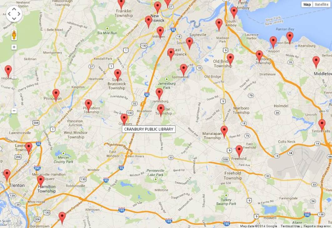
Figure 13.7 The map from Figure 13.6 has been zoomed in.
Source for library data: http://catalog.data.gov/dataset/public-library-survey-pls-2011
So far, you've only dealt with simple icons that delineate a latitude/longitude location on the map, but with a little tweaking, the markers can convey extra channels of data to your user. If you think back to Chapter 12 and bubble charts, you can anticipate the next move.
Plotting an Additional Statistic Using Marker Area
When plotting markers, especially circular ones, you can use the size of the marker to convey another data channel to the consumer of a visualization. If you examine the GeoJSON file you loaded for the previous scenario, you see that there are many extra properties associated with each library that you may choose to visualize above and beyond the library's location.
An interesting statistic that jumps out is the number of visits to each library. Mapping this value to the size of the markers should make their size proportional to the traffic to an individual library, which is a pretty natural usage for relative marker sizes. The following is an altered version of the createMap function, which, instead of creating Marker objects, creates Circle objects and associates them with the map:
function createMap(data) {
var mapElement = document.getElementById("map");
var currentFeature, geometry, libraryName, visits,
minVisits, maxVisits, area, radius, i;
map = new google.maps.Map(mapElement, options);
for (i = 0; i < data.features.length; i++) {
currentFeature = data.features[i];
visits = currentFeature.properties.VISITS;
if (i === 0) {
minVisits = visits;
maxVisits = visits;
} else {
minVisits = Math.min(minVisits, visits);
maxVisits = Math.max(maxVisits, visits);
}
}
for (i = 0; i < data.features.length; i++) {
currentFeature = data.features[i];
if (!currentFeature.geometry) {
continue;
}
geometry = currentFeature.geometry;
visits = currentFeature.properties.VISITS;
libraryName = "Unknown";
if (currentFeature.properties) {
libraryName = currentFeature.properties.LIBNAME;
}
area = (visits - minVisits) / (maxVisits - minVisits)
* 500000000 + 100000;
radius = Math.sqrt(area / Math.PI);
circles.push(new google.maps.Circle({
center: new google.maps.LatLng(
geometry.coordinates[1],
geometry.coordinates[0]),
map: map,
radius: radius,
fillOpacity: .7,
strokeOpacity: .7,
strokeWeight: 2,
title: libraryName,
visits: currentFeature.properties.VISITS,
fillColor: '#0066FF',
strokeColor: '#0047B2'
}));
google.maps.event.addListener(circles[i],'mouseover',onMouseOver);
google.maps.event.addListener(circles[i], 'mouseout', onMouseOut);
}
function onMouseOver() {
map.getDiv().setAttribute('title',this.get('title') + ": " +
this.get('visits'));
}
function onMouseOut() {
map.getDiv().removeAttribute('title');
}
}
Let's examine the new and interesting parts of the code. First you have
for (i = 0; i < data.features.length; i++) {
currentFeature = data.features[i];
visits = currentFeature.properties.VISITS;
if (i === 0) {
minVisits = visits;
maxVisits = visits;
} else {
minVisits = Math.min(minVisits, visits);
maxVisits = Math.max(maxVisits, visits);
}
}
which is just trying to gather the minimum and maximum number of visits in order to help establish the domain of the values that you are trying to map onto the size range of the markers.
visits = currentFeature.properties.VISITS;
In the preceding code, you extract the VISITS property from each item, to reference it in deciding the size of the marker. The Google Maps API is going to expect a radius value (in meters) to define the size of the circles. It's actually much more appropriate to map theVISITS value to area, rather than radius, so you can use a bit of math to convert from the area of a circle to the appropriate radius.
area = (visits - minVisits) / (maxVisits - minVisits)
* 500000000 + 100000;
radius = Math.sqrt(area / Math.PI);
This maps from the input domain (the visits) to the output range (the area of the circles). If you are wondering why the numbers are so large, this is because the Circle object expects radius to be specified in meters, so the area of the circle is in square meters. So if you want the circles to be visible from far away, the area has to be very large. This is also why the circles get larger as you zoom in rather than remaining a constant size. They have a fixed geographical area, rather than a fixed pixel area.
circles.push(new google.maps.Circle({
center: new google.maps.LatLng(
geometry.coordinates[1],
geometry.coordinates[0]),
map: map,
radius: radius,
fillOpacity: .7,
strokeOpacity: .7,
strokeWeight: 2,
title: libraryName,
visits: currentFeature.properties.VISITS,
fillColor: '#0066FF',
strokeColor: '#0047B2'
}));
This instantiates a Circle that
· Is centered at the position of the library
· Is associated with the map you created
· Has the radius you previously calculated
· Has 70 percent opacity
· Has a two-pixel-wide stroke
· Has a title and associated number of visits, which you'll refer to later
· Has shades of blue for fill and stroke colors
google.maps.event.addListener(circles[i],'mouseover',onMouseOver);
google.maps.event.addListener(circles[i], 'mouseout', onMouseOut);
function onMouseOver() {
map.getDiv().setAttribute('title',this.get('title') + ": " +
this.get('visits'));
}
function onMouseOut() {
map.getDiv().removeAttribute('title');
}
Finally, these event handlers change the title attribute of the map container as the Circle elements are hovered to approximate a tooltip that displays the name of the library and the number of visits. You can see the result of all this work in Figure 13.8, and you can find the GoogleMapsManyCircleMarkers.html/css/js files on the companion website.
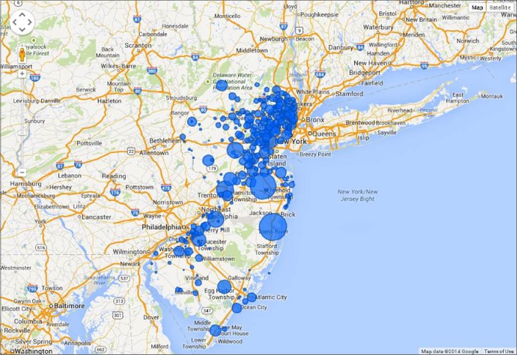
Figure 13.8 This shows Google Maps with bubble markers displaying library visits.
Source for library data: http://catalog.data.gov/dataset/public-library-survey-pls-2011
Displaying Data Density with Heat Maps
Notice that even though you culled down the number of points displayed when using markers or circles to display the library locations, there was still a lot of occlusion because some regions boast a large number of libraries. The problem with the occlusion is that, even when using semi-transparent circles, it can be difficult for the eye to judge the density of points at various positions without any color differentiation. As a result, 3 or 4 libraries very close together can end up looking identical to 300 libraries very close together.
So, if the density of data points plotted over geographic space is an important part of the story you are trying to tell with the data, it can be desirable to make it as clear as possible what the data density is at each position on the map. One way to achieve this is with aheat map, which interpolates between two or more colors so that pixels over the map are colored with a more “hot” color the denser the data points are at that location. A heat map generally renders color around a data point for some configurable radius, and everywhere that the pixels intersect with pixels from other data points, their “heat” is increased, resulting in a hotter color.
Luckily, given what you've built so far, it's actually extremely easy to switch to rendering the library locations using a heat map with the Google Maps API, as shown in Listing 13-3.
Listing 13-3
var map;
var njView = new google.maps.LatLng(40.3637892, -74.3553047);
var options = {
zoom: 8,
center: njView
};
function createMap(data) {
var mapElement = document.getElementById("map");
var geometry, points, heatmap, heatData;
map = new google.maps.Map(mapElement, options);
heatData = [];
for (var i = 0; i < data.features.length; i++) {
geometry = data.features[i].geometry;
heatData.push(new google.maps.LatLng(
geometry.coordinates[1],
geometry.coordinates[0]));
}
points = new google.maps.MVCArray(heatData);
heatmap = new google.maps.visualization.HeatmapLayer({
data: points,
radius: 20
});
heatmap.setMap(map);
}
$(function () {
$.ajax({
type: "GET",
url: "pupld11b_subset.geojson",
dataType: "json",
success: createMap
});
});
The new and significant section in Listing 13-3 has been highlighted. If you run the code, you should see the same results as those shown in Figure 13.9 (this figure is in the GoogleMapsHeatMap.js/html/css files are on the companion website). The code itself is extremelysimilar to what you've done already with markers and circles. The main differences are that the HeatmapLayer expects an MVCArray of point data. Note also that you can configure the radius of the heat map during construction. Some other values you can configure on the heat map include opacity, gradient, maxIntensity, and dissipating.
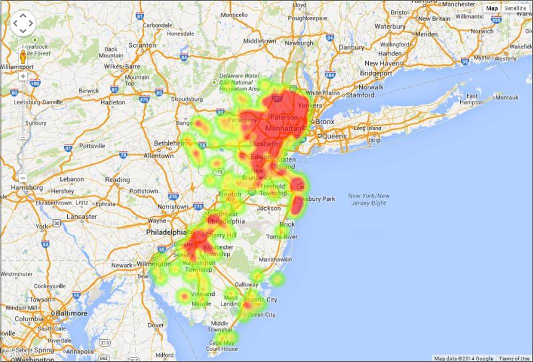
Figure 13.9 This shows a heat map of New Jersey library density using the Google Maps API.
Source for library Data: http://catalog.data.gov/dataset/public-library-survey-pls-2011
This is great, but it's a bit lacking in comparison to the circles example from earlier in the chapter. The circles example was showing more than just the locations of the libraries in that it was also plotting a statistical value associated with each library represented using circle area. Now, with the heat map, you are showing the density of the points in a much clearer fashion, but, data-wise, you've gone back to only conveying the location of the libraries. With a small tweak, however, you can reintroduce a data value into the mix and use it to weight the various points so that they contribute more or less heat to the heat map.
heatData = [];
for (var i = 0; i < data.features.length; i++) {
geometry = data.features[i].geometry;
weighted = {};
visits = data.features[i].properties.VISITS;
weighted.location = new google.maps.LatLng(
geometry.coordinates[1],
geometry.coordinates[0]);
weighted.weight = visits;
heatData.push(weighted);
}
The preceding code has made the small adjustment to create some objects that contain a LatLng position and a weight, which is mapped to VISITS, as before. This results in some heat map output where the hottest areas indicate where the most library visits are occurring, as shown in Figure 13.10.
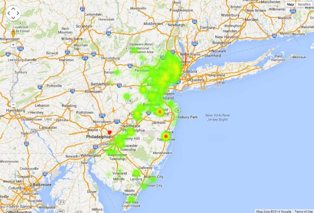
Figure 13.10 This weighted heat map shows visits to libraries in New Jersey using the Google Maps API.
Source for library data: http://catalog.data.gov/dataset/public-library-survey-pls-2011
A heat map can make it much more possible to render a large point cloud over a map without losing any information due to occlusion, but, as the point count rises, heat maps can be a bit expensive—in terms of both CPU and memory—to render interactively. Because of these performance realities, depending on the speed of your computer, or device, you might notice some slowdown when running either of the preceding examples. A common strategy to mitigate this cost is to do some up-front, server-side processing of the data to make it easier to display the content interactively. In the case of the Google Maps API, if you set up your data in a Google Fusion Table, you can display an optimized heat map with many more points than you can feasibly use with the HeatmapLayer. This does, however, require you to define the data you want to pull into the heat map ahead of time.
Switching to showing a density surface rather than individually resolved objects has helped provide a way to show more data on the map, and in a less information-lossy way, than you can easily do with markers. It is not the only strategy that you have available to you, however.
Plotting Data on Choropleth Maps
Throughout the previous sections, you saw some of the limitations in visualizing large amounts of point data on a map. Heat maps were discussed as a solution, but there is another strategy for conveying large amounts of data in a map visualization. If your statistics are first aggregated by region, you can color the various regions of a map to convey a channel of information to the visualization consumer. In this section, you see how to build such a visualization.
First, you find out how to acquire some region geometry so that it can be rendered to the screen and dynamically colored. Then you see how to convert this geometry into a format that makes it easier to consume in a browser. Finally, you use D3 to render the regional geometry and create apply a color scale to the result.
Obtaining Geometry to Plot on a Map
When working with the Google Maps API, most geometry you were displaying was in the form of images downloaded from the server. Tile imagery is great in that it requires very little processing power to render on the client, which is especially important on low-power mobile devices, but this isn't really conducive to dynamically coloring the map geometry, or knowing, for example, which piece of geometry the mouse is over.
In order to make things more dynamic, you can acquire some geometry, in the form of vector graphics data, to render on the client. Public government data comes to the rescue again here. The United States Census Bureau, among other government entities, publishes many Esri shapefiles containing geometry for various regional boundaries.
NOTE An Esri shapefile is a vector graphics file format for storing geospatial vector geometry. It was created by Esri, and has been prevalent for long enough that there is a vast library of shapefiles to choose from when visualizing map data, not to mention many tools for displaying, editing, and managing them. Another benefit of shapefiles is that they are an efficient binary format for transferring vast amounts of geometry without wasted space. Some browser-based mapping products can even load them directly rather than needing to convert to GeoJSON or another JavaScript-based format first: www.igniteui.com/map/geo-shapes-series. Another interesting aspect of shapefiles is that they actually consist of a set of several different related files and oftentimes there is a paired database file that offers data that can be correlated with each group of displayed geometry.
At www.census.gov/geo/maps-data/data/cbf/cbf_state.html, you can find a set of shapefiles that have variously detailed versions of the state boundary geometries for the United States of America. For the purposes of this visualization, only the least-detailed are required: www2.census.gov/geo/tiger/GENZ2010/gz_2010_us_040_00_20m.zip. D3 won't directly load the shapefile, so you have to start by converting it to GeoJSON.
Actually, one of the creators of D3 came to the conclusion that GeoJSON had a few inadequacies, so he created a set of extensions to the format called TopoJSON, along with a tool for converting shapefiles to TopoJSON format. The advantage of TopoJSON is that it goes beyond defining geometry and delineates the shared topology of the geometries in the file and helps compress GeoJSON, which is quite a verbose format, by using various quantization tricks.
There is a common problem when dealing with geospatial geometry in that if you are dealing with a file that has too much detail to be efficiently rendered, it can help to reduce the number of points in the polygons or polylines that make it up. Most geospatial file formats would store two separate closed polygons for the states of New Jersey and Pennsylvania, which directly abut each other. As such, their shared border would be contained twice in the two separate polygons, and a straightforward polygon simplification routine, which would simplify one polygon at a time, would not necessarily simplify the shared border the same way both times. This can, unfortunately, create gaps along the abutting borders.
Converting Geometry for Display Using Topojson
TopoJSON addresses this issue and saves some space by making sure that shared borders are only stored once in the file. Provided a file in TopoJSON format, D3 can convert it back to GeoJSON on the client, and then render it to the page. The tool provided for converting shapefiles to TopoJSON uses Node.js. Good thing you already have it installed, huh?
Before installing TopoJSON, you also need to have Python installed. You can install Python from www.python.org/. At the time of this writing, you want the 2.x version rather than the 3.x version of Python, as the 3.x version is not compatible for these purposes. After you have Python installed, if you are using Windows, you might need to add it to your path environment variable. When that is complete, from a node command prompt you should be able to run
npm install -g topojson
You should see a lot of output stream past, as in Figure 13.11.
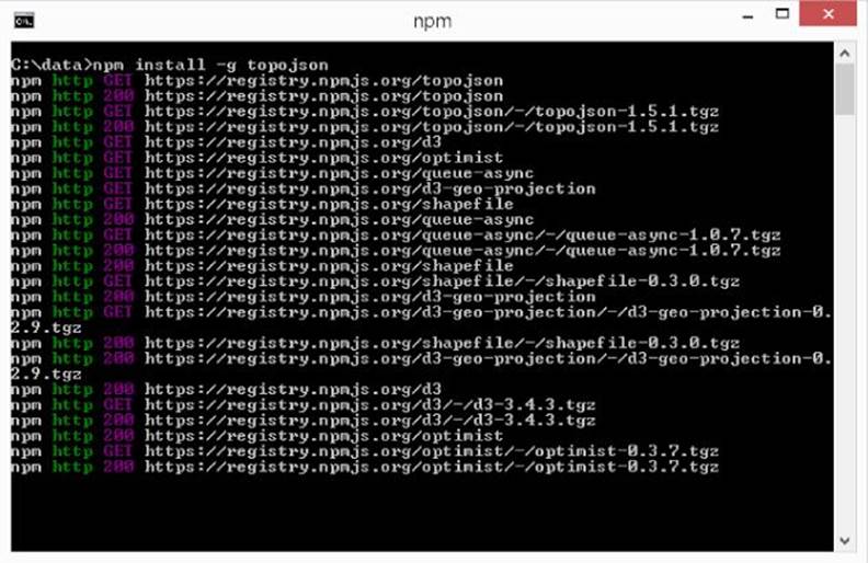
Figure 13.11 This shows installing TopoJSON using npm
If you have errors during the installation, make sure that Python is installed and configured to be in your path, and make sure that node is in context for your command prompt (there is a shortcut for this for Windows, or you could make sure Node.js is in your path environment variable).
After TopoJSON is installed, you should be able to go to the folder where you extracted the shapefile and run this command line:
topojson -p STATE -p NAME -o states.json gz_2010_us_040_00_20m.shp
This loads the shapefile and converts it to TopoJSON in an output file called states.json. It also makes sure that two properties, STATE and NAME, are extracted from the accompanying database and injected as properties in the TopoJSON for each shape. Given thisstates.json file, you should be able to get a basic map rendered. You should see output similar to Figure 13.12.
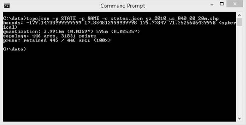
Figure 13.12 A shapefile is converted to TopoJSON.
Rendering Map Geometry Using D3
First of all, much like earlier in this chapter, you are about to load a JavaScript file off the local disk using AJAX, so remember the caveat from earlier in the chapter. As such, unless you are loading the page from a local web server, I'd either recommend using Firefox, which does not, at the time of this writing, block this interaction. Listing 13-4 shows how to load the TopoJSON geometry into D3.
Listing 13-4
var mapWidth = 900;
var mapHeight = 500;
var main = d3
.select("body")
.append("svg")
.attr("width", mapWidth)
.attr("height", mapHeight);
d3.json("states.json", function (error, states) {
var statesFeature = topojson.feature(
states,
states.objects.gz_2010_us_040_00_20m);
var path = d3.geo
.path();
main
.selectAll(".state")
.data(statesFeature.features)
.enter().append("path")
.attr("class", "state")
.attr("d", path);
});
This requires the HTML defined as such:
<!DOCTYPE html>
<html>
<head>
<title>D3 Basic Map</title>
<link rel="stylesheet" href="D3Map.css">
</head>
<body>
<script src="d3/d3.min.js"></script>
<script src="topojson/topojson.js"></script>
<script type="text/javascript" src="D3Map.js"></script>
</body>
</html>
The code produces the image in Figure 13.13, which are the D3Map.html/css/js files on the companion website.
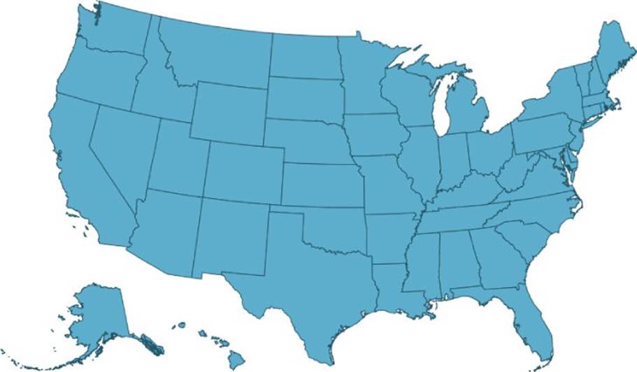
Figure 13.13 This is the result of loading geometry in D3 using TopoJSON.
Geometry source: http://www.census.gov/geo/maps-data/data/cbf/cbf_state.html
Listing 13-4 decides a width and height for the map and then creates an <svg> element with this size to hold the various map visuals. If you aren't familiar with D3 yet, review Chapter 11 for more detail on some of the mechanics.
Next you have
d3.json("states.json", function (error, states) {
This causes D3 to load states.json as a JSON file, and, when ready, invoke the callback function you are providing with the hydrated JavaScript object. Provided the JavaScript object containing the geometry data:
var statesFeature = topojson.feature(
states,
states.objects.gz_2010_us_040_00_20m);
this code asks TopoJSON to extract the GeoJSON features from the input TopoJSON file. These features are used to generate the path geometry to display the shapes on the map.
var path = d3.geo
.path();
This creates a geographic path builder that interprets the GeoJSON feature data and converts it into SVG path data, when you perform the data join, to create the shapes for the states:
main
.selectAll(".state")
.data(statesFeature.features)
.enter().append("path")
.attr("class", "state")
.attr("d", path);
The previous code performs the data join. You select all elements that have the state class. Remember that there are none of these the first time this code executes, but this declaratively lays out the expectation of where those elements should be, which helps D3 to know how to group the data items being joined and identifies to which parent any new elements should be added to.
Next, you operate on the enter set and append a <path> for each state feature; these paths are then marked with the class state, and then the path builder is assigned to transform the feature data into SVG path geometry. As shown in Figure 13.13, this provides a map of the United States where all the individual state polygons have the same color. That color comes from the CSS file and the rule for the state class:
.state {
fill: #5daecc;
stroke: #225467;
}
Displaying Statistics Using a Choropleth Map
Now that you have some polygons displayed for all the separate states, it's time to display an interesting statistic mapped to the polygon color, which is also known as a choropleth map.
The U.S. Department of Agriculture provides some Microsoft Excel files that provide various farming statistics broken down by state. I found this by browsing http://data.gov, but the actual link to the data's page is http://www.ers.usda.gov/data-products/agricultural-productivity-in-the-us.aspx. The file you will use is at
1. http://www.ers.usda.gov/datafiles/Agricultural_Productivity_in_the_US/StateLevel_Tables_Relative_Level_Indices_and_Growth_19602004Outputs/table03.xls
which has interesting information about the total farm output for each state broken down by year. The easiest thing to do to get this data loaded is to save that .xls file as a .csv file and then pull out any extraneous rows except for the header row (with the titles for each column) and the actual data for each year. You can see what I mean in Figure 13.14.
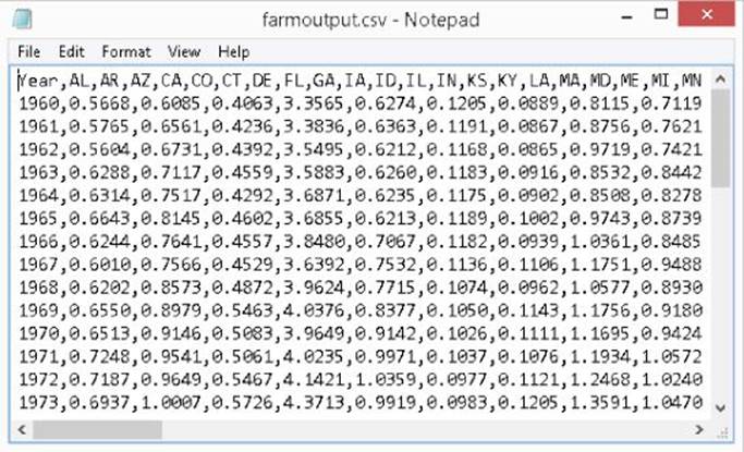
Figure 13.14 This shows the layout of the farm output CSV file.
On the companion website, the file is farmoutput.csv. D3 has no problems loading CSV files, but you have a bit of a challenge to overcome here in that the data in this CSV file has abbreviated names for each state, whereas the STATE property in your GeoJSON file has only full names. To deal with this, you can construct, or download from the companion website, a CSV file that maps back and forth between the full state names and their abbreviations. This file helps correlate items in the TopoJSON file with items in the farm output CSV file. You can see what this CSV file should look like in Figure 13.15, and you can find it as stateabbreviations.csv on the companion website.
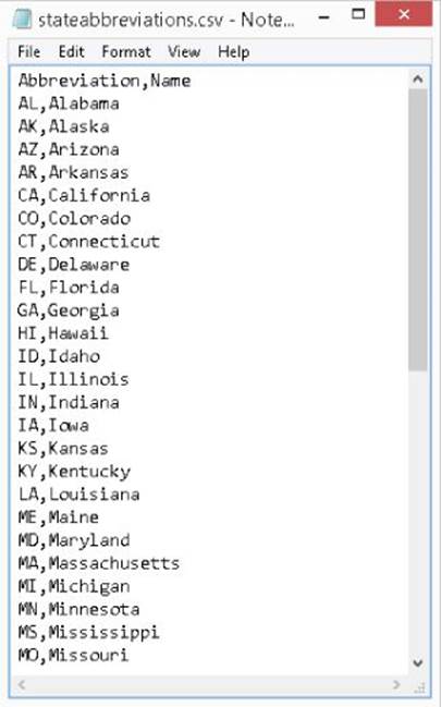
Figure 13.15 This is what the layout of the state abbreviations CSV file looks like.
The following code snippet assumes you have both these CSV files:
var mapWidth = 900;
var mapHeight = 500;
var main = d3
.select("body")
.append("svg")
.attr("width", mapWidth)
.attr("height", mapHeight);
First, you have this familiar code, which creates the SVG element
var colors = ['#D0E5F2', '#729EBA',
'#487896', '#2F6180',
'#143D57', '#08293D'];
var currentYear = 2004;
var firstYear = 0;
var data = [];
var currentData;
var currentMap;
var statesFeature;
In the preceding code, some useful variables are defined for use later. You allow for the current year to be changed with a <select> box. So you store both a matrix of all the years' data, and a separate variable holds just the currently selected year's data. colorsrepresents an aesthetically pleasing set of colors to use as a color scale with a discrete range of outputs.
d3.json("states.json", function (error, states) {
d3.csv("farmoutput.csv", function (error, farmoutput) {
d3.csv("stateabbreviations.csv", function (error,
stateAbbreviations) {
The reason for the three-level deep nesting is to chain the callbacks so that you end up with all three files loaded before proceeding to render the map. To refresh, the files are
· states.json: The TopoJSON file you created by converting the Esri shape file earlier.
· farmoutput.csv: The CSV file containing all the farm output state per state per year.
· stateabbreviations.csv: A mapping between the short state abbreviations and the long name of the states. This helps mash up the two data sources.
Now, you can move on to loading the map:
statesFeature = topojson.feature(
states,
states.objects.gz_2010_us_040_00_20m);
This part is unchanged from the previous code, and is, again, converting the TopoJSON input back into GeoJSON features.
var i, j, currItem;
var abbreviationsMap = {};
var allAbbrev = [];
for (i = 0; i < stateAbbreviations.length; i++) {
abbreviationsMap[stateAbbreviations[i].Abbreviation] =
stateAbbreviations[i].Name;
allAbbrev.push(stateAbbreviations[i].Abbreviation);
}
In the preceding snippet a map (dictionary/hashtable) is built that maps between the abbreviated state names and the full state names, based on the input CSV file. Notice D3 handled parsing the CSV for you, and from within this callback it just looks like a JavaScript object: stateAbbreviations.
Next, you transform the farm output data a bit. The input is a CSV where every state has a column, but it is much easier to consume this data from D3 if the values for each state are an array of values where each item in the array has the state name and output value. Also, you need the state names to be the full names because that is what you need to match against in the GeoJSON.
for (i = 0; i < farmoutput.length; i++) {
var year = farmoutput[i];
var yearNumber = parseInt(year.Year, 10);
if (i === 0) {
firstYear = yearNumber;
}
currItem = {};
currItem.year = yearNumber;
currItem.states = [];
for (j = 0; j < allAbbrev.length; j++) {
currItem.states.push({
name: abbreviationsMap[allAbbrev[j]],
value: parseFloat(year[allAbbrev[j]])
});
}
data.push(currItem);
}
While performing that transformation, the value of the first year in the data (assuming an ascending sort) is captured to help find the index of the current year later on.
Up to this point in your D3 adventures, you've often been using D3 to manipulate SVG elements, but D3 is just as capable at manipulating the HTML Document Object Model (DOM) also. To select the current year's data being displayed, it would help to have an HTML <select> element populated with all the valid years that there are data for, and to react to the selection changing. Here's how you would accomplish that using D3:
var select = d3.select("select");
select
.selectAll("option")
.data(data)
.enter()
.append("option")
.attr("value", function (d) { return d.year; })
.text(function (d) { return d.year; })
.attr("selected", function (d) {
if (d.year == currentYear) {
return "selected";
}
return null;
});
select.on("change", function () {
currentYear = this.value;
renderMap();
});
Following the familiar pattern, you first select the existing <select> element by type and then select all the child <option> elements (in potentia, as they won't exist the first time), join them with the data (which holds an element for each year), and operate on the enterset. For each placeholder in the enter set (the first time, there will be one per year), append an <option> element and then configure its value and text based on the current year on the contextual data item. Select the option if and only if its year is equal to the current year. Lastly, this binds a change handler that switches the current year variable and re-renders the map.
Pretty neat, huh? Not a lick of SVG, and you are using the same transformational techniques to concisely operate on DOM objects. To finish up your nested callback you have the following:
renderMap();
d3.select("body")
.append("div")
.text(
"Source: http://www.ers.usda.gov/data-products/↩
agricultural-productivity-in-the-us.aspx");
});
});
});
This renders the map for the first time and appends a source line describing where the data came from. So that just leaves rendering the colors on the map. To render the map, use the following:
function renderMap() {
var index = currentYear - firstYear;
var i;
currentData = data[index];
currentMap = {};
for (i = 0; i < currentData.states.length; i++) {
currentMap[currentData.states[i].name] =
currentData.states[i].value;
}
var path = d3.geo
.path();
var max = d3.max(currentData.states, function (d) {
return d.value;
});
var min = d3.min(currentData.states, function (d) {
return d.value;
});
In this code, you do the following:
1. Figure out the index into the data collection based on the current selected year and the first year you recorded earlier.
2. Obtain the row for the current year based on the index.
3. Build a hashtable to efficiently retrieve the farm output value from a state name.
4. Create a geographic path builder.
5. Determine the maximum farm output value for the current row.
6. Determine the minimum farm output value for the current row.
Next, you prepare more precursors to rendering the content:
var tooltip = d3.select("body")
.append("div")
.attr("class", "tooltip")
.style("position", "absolute")
.style("z-index", 500)
.style("visibility", "hidden");
var colorScale = d3.scale.quantize()
.domain([min, max])
.range(colors);
var states = main
.selectAll(".state")
.data(statesFeature.features);
In the preceding code, you do the following:
1. Define an initially hidden tooltip (which is just a styled <div> set to be absolutely positioned).
2. Define a color scale as a quantized scale that maps from the linear input domain of the farm output values to a discrete output range.
3. Select all elements in the SVG element with the class state and join some data against them, storing the update set in states
Now to render the actual content:
states
.enter().append("path")
.attr("class", "state")
.attr("d", path)
.on("mouseenter", function () {
tooltip.style("visibility", "visible");
})
.on("mouseleave", function () {
tooltip.style("visibility", "hidden");
})
.on("mousemove", function (d) {
tooltip.style("top", (d3.event.pageY + 10) + "px")
.style("left", (d3.event.pageX + 15) + "px")
.text(d.properties.NAME + ": " + currentMap[d.properties.NAME]);
});
For the enter set, you append a path for each placeholder. You assign the geographic path builder to operate on the GeoJSON feature and produce SVG path data to get assigned to the d attribute on the SVG path. Also, three handlers are bound to toggle the visibility of the tooltip <div> and shift it close to the user's mouse cursor. The state name and farm output value are displayed as the tooltip content.
states
.transition()
.duration(1000)
.delay(function (d) {
return (path.bounds(d)[0][0] / mapWidth) * 2000;
})
.style("stroke", "#FF6600")
.style("stroke-width", "2")
.style("fill", function (d) {
return colorScale(currentMap[d.properties.NAME]);
})
.transition()
.duration(500)
.style("stroke", "#29658A")
.style("stroke-width", "1");
}
And last, but certainly not least, you declare how the update set is handled, which
1. Starts a transition for each element with a 1-second duration.
2. Injects a delay in the start to each element's transition proportional to how far to the right the bounds of the element begin. This helps to create an animation that sweeps across the map from left to right, which is aesthetically pleasing and helps the consumer of the visualization's eye to scan across and notice the changes as they occur.
3. Animates each element's stroke color toward orange during the transition, and temporarily increases the stroke thickness. This has an effect of a glow sweeping across the states during the animation.
4. Animates the fill color toward the color value from the color scale based on the value for the current state for the newly selected year.
5. Chains an additional animation at the end, which returns the stroke color and thickness to normal.
If you run the sample (D3MapChoropleth.html/css/js) from the companion website, you see a really pleasant sweeping animation as you change between separate years from the selector. It's quite a complex piece of animation to not be driven by very much code! You can see the results in Figure 13.16, which was snapped while an animation was in progress.
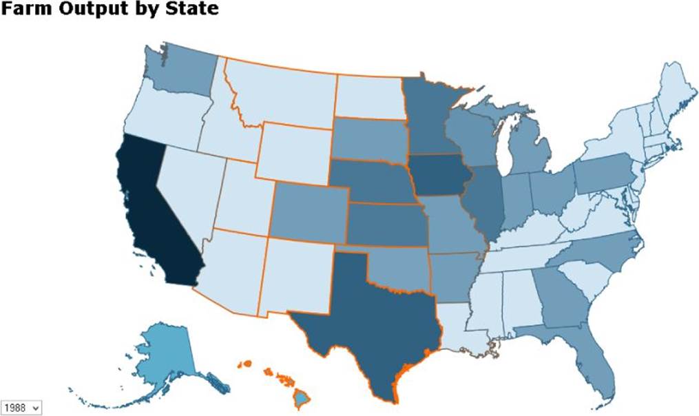
Figure 13.16 This animated choropleth map was created using D3.
Data source: http://www.ers.usda.gov/data-products/agricultural-productivity-in-the-us.aspx
Summary
This chapter offered some useful strategies and tools for visualizing data on maps. It also addressed some of the interesting challenges that come up when dealing with the sheer quantity of geometry and data involved when designing map visualizations. In this chapter you
· Learned how to host components from the Google Maps API in your web applications
· Controlled the initial focus and zoom level of the map
· Placed markers on the geographic positions you wanted to visualize
· Varied the size of markers to convey extra statistics over the map
· Learned some of the challenges of having too many markers to visualize
· Learned how to use a heat map to illuminate data density or to convey a statistic
· Considered using choropleth maps as an alternative to displaying individual data values
· Learned how to prepare map geometry for display using D3
· Plotted a choropleth map using D3
· Animated transitions over your choropleth map
All materials on the site are licensed Creative Commons Attribution-Sharealike 3.0 Unported CC BY-SA 3.0 & GNU Free Documentation License (GFDL)
If you are the copyright holder of any material contained on our site and intend to remove it, please contact our site administrator for approval.
© 2016-2026 All site design rights belong to S.Y.A.