JavaScript and jQuery for Data Analysis and Visualization (2015)
PART III Visualizing Data Programmatically
Chapter 14 Charting Time Series with Ignite UI igDataChart
What's in This Chapter
· The basics of working with financial data
· Using the Ignite UI igDataChart to visualize stock data
· Navigating financial data with a zoom bar
· Exploring financial data using overlays and indicators
· Updating data in real time in a chart
· Using Node.js and Socket.IO to push data to the browser
· Plotting extreme amounts of data using the Ignite UI igDataChart
CODE DOWNLOAD The wrox.com code downloads for this chapter are found at www.wrox.com/go/javascriptandjqueryanalysis on the Download Code tab. The code is in the chapter 14 download and individually named according to the names throughout the chapter.
This chapter introduces you to plotting time series data on a chart. One of the biggest calls for plotting time series data in the software engineering world is to present stock data for analysis. So, the first part of this chapter shows you how to acquire and plot stock data on a chart.
Next, you move on to plotting real-time updates into a time series. Real-time updates in a browser using only JavaScript, you say? Surely impossible. Not at all. Not only are real-time updates possible using pure JavaScript, but they are getting easier and easier to implement as newer browser revisions start to support technologies such as WebSockets.
To plot the stock data and the real-time data for this chapter, you use the Infragistics Ignite UI igDataChart. As shown elsewhere in this book, there are plenty of charting components available for use with JavaScript (including free options) but igDataChart stands apart in terms of the amount of data volume it can display without pre-processing and the frequency of real-time updates it can handle, so it is most appropriate for this chapter. You might remember that igDataChart is discussed briefly in Chapter 12. This chapter retreads a few areas covered there, in case you are reading out of sequence, but you might find it easier to first read and understand the concepts from that chapter before proceeding.
At the end of this chapter, you take charting time series to the limit and plot some massive data on igDataChart. You also discover a strategy for loading massive amounts of data from the server using minimal amounts of bandwidth.
Working with Stocks
This isn't a book on how to analyze stock data or how to use technical analysis techniques to make trading decisions, so this chapter focuses solely on the mechanics of how to display stock data in a chart. The examples in this section use some open stock data from Quandl (www.quandl.com/) because it is unencumbered by any usage constraints. Keep in mind that this data was produced in a user-driven wiki environment, but it suits the purposes of this chapter fine because you are simply learning the concepts of plotting this type of content.
The Basics of Stock Data
Data for plotting on stock charts generally consists of five values per data item: Open, High, Low, Close, and Volume. Depending on the visualization you are trying for, you might be using a different subset of these values. Here is the significance of each of these values:
· Open: This represents the opening price for a stock over a given period of time.
· High: This represents the high price of a stock over a given period of time.
· Low: This represents the low price of a stock over a given period of time.
· Close: This represents the close price of a stock over a given period of time.
· Volume: The volume (amount) of shares of a stock traded over a given period of time.
The main visualizations you implement in this chapter are OHLC and candlestick, which use Open, High, Low, and Close. Volume is optionally incorporated into a visualization if it is very important to show the trade volatility over time. OHLC and candlestick visualizations usually don't attempt to directly convey trade volume (there are some extended versions that do, though) and instead usually depend on a synchronized plot to show volume, if desired. This synchronized plot is usually a second chart aligned under the first chart so that the two charts can be compared time-wise with each other.
Conventionally, a stock time series is displayed from left to right with the earlier prices leftmost and the most recent prices rightmost. You could consider the time axis to be a linear axis (rather than a category axis) because it's representing time, which is a linear scale. But, in practice, most stock data is recorded at a fixed interval, and most stock visualizations contain no data for weekends and should not necessarily display a gap where the data is missing. These aspects add up to it often being more natural to plot stock data on a category axis, where the date value for each item represents the discrete category of that item. If these terms are unfamiliar to you, please review Chapter 9 as they are discussed in more detail there.
A category axis is less appropriate for a time series when your data arrives at a non-fixed interval and you want to show large gaps or large interpolated stretches on the axis where there are no data values present. The data that you'll be visualizing in this chapter does not really fit with those scenarios, though, so this chapter will be focusing exclusively on plotting time series on category axes.
Obtaining Some Stock Data
Before you start plotting stock data on charts, it would help to have some! Quandl is a useful website that provides data, along with application programming interfaces (APIs) that use REST calls to access that data. They also run an initiative called Quandl Open Data that strives to provide user-created and unencumbered open data for use in all manner of applications. You can find the directory of available data at www.quandl.com/search/*?page=1&source_ids=4922. The examples in this chapter use some historical Apple Inc. stock data from
1. www.quandl.com/WIKI/AAPL-Apple-Inc-AAPL-Prices-Dividends-Splits-and-Trading-Volume
One of the neat aspects of Quandl is that you can use that page to filter and sort the data and then retrieve a URL that enables you to pull that data as JSON into a web application through an AJAX request to Quandl, or, alternatively, download it and deploy it, as a static file, on your web server. Here, you'll do the latter by downloading this link:
1. www.quandl.com/api/v1/datasets/WIKI/AAPL.json?&trim_start=1984-09-07&trim_end=1994-09-07&sort_order=asc
That link was arrived at by selecting a date filter using the date pickers and then clicking the Download button. This should result in a file called AAPL.json, which you should place in the same directory as the examples to follow. This file is also available on the companion website as AAPL.json.
Candlesticks and OHLC Visualizations
Before you jump into the implementation of some stock visualizations, it's a good idea to review the anatomy of candlestick and OHLC visualizations. Both visualizations convey roughly the same information, but they are quite different aesthetically. First, examine a candlestick visualization up close in Figure 14.1 (the IgniteUIFinancialChart.js/html/css file is on the companion website).
NOTE When you load some of the code samples in this chapter, you may notice an error, or not see the sample load at all. This is because the data is being loaded via an AJAX request, and if you load the files from your local file system, many browsers reject the request as unsafe. You do not run into this scenario in a production environment because the site and the data will be loaded from the same domain, over HTTP. If you skip ahead to the section “Implementing a Stock Chart Using Ignite UI igDataChart” in this chapter you see a solution discussed for running these samples in a development environment.
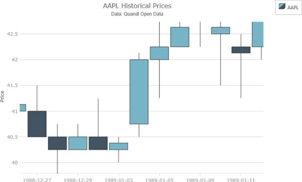
Figure 14.1 This shows a candlestick visualization, close up.
Data source: www.quandl.com/api/v1/datasets/WIKI/AAPL.json?&trim_start=1984-09-07&trim_end=1994-09-07&sort_order=asc
A candlestick is made up of a rectangular body and a thin wick (or shadow) that extends from its top and bottom. The top and bottom of the rectangular body represent the open and close prices; the top wick position and the bottom wick position represent the high value and the low value, respectively. Now, the high value is always greater than the low value, so the top wick is always mapped to the high value. For open and close, however, open may be higher, or close may be higher, depending on whether prices ended up higher or lower compared to the previous time period.
The simple geometry of the candlestick cannot alone disambiguate whether the price ended higher or lower at the end of the period, so this is usually encoded in the color of the candlestick. One color is used if close is greater than open and another color is used if close is less than open. Alternatively, the candlestick may be filled or left unfilled to represent which direction the prices moved.
OHLC visualizations, on the other hand, can unambiguously indicate which portion of the visual maps to the open price and which portion maps to the close price. You can see a close-up of this visualization in Figure 14.2 (which is on the companion website asIgniteUIFinancialChartOHLC.js/html/css). If you load the sample, it starts zoomed out, but you can zoom in by clicking and dragging a rectangle on the area you want to zoom to or by rolling the mouse wheel. If you have a computer with a touchscreen (or a tablet) you can even pinch/spread to zoom in and out.
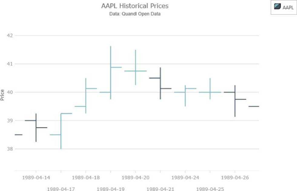
Figure 14.2 This shows an OHLC visualization, close up.
Data source: www.quandl.com/api/v1/datasets/WIKI/AAPL.json?&trim_start=1984-09-07&trim_end=1994-09-07&sort_order=asc
The top and bottom of the central line in an OHLC bar means the same thing as in the candlestick visualization, but rather than having a rectangular body that can't unambiguously convey the direction of the price movement over that period, the OHLC bar uses a left-oriented tick for the open price, and a right-oriented tick for the close price over that period. Often, however, the OHLC bar is nevertheless colored to indicate the direction of the movement.
Implementing Ignite UI igDataChart
As mentioned earlier, this chapter uses the Infragistics Ignite UI igDataChart component. The essentials of the examples in this chapter may be possible to implement using other components, but these scenarios perform especially well using igDataChart, so you may run into performance issues when using a component that hasn't been designed to express these volumes of data or these frequencies of real-time updates.
The igDataChart component uses the HTML5 <canvas> element to do its rendering; it's especially good at pumping out lots of 2D visuals with minimal overhead and high-frequency updates. Furthermore, the chart was designed from the ground up to manage the complexities of displaying millions of data points for you, without requiring you to simplify your data. This makes it possible for you to present large amounts of data to the user and enables them to zoom and pan through it to discover interesting insights at various levels of detail. These capabilities are especially important when you're dealing with time series data. You will often want to be zoomed out so that you can observe the overall shape of the data, but then you'll want to drill down to a specific area to resolve fine detail.
Making complex things simple comes at a cost, however, and thus igDataChart is not a free component, so please see www.igniteui.com or www.infragistics.com for details and to sign up for the trial version before running the examples in this chapter. The examples in this chapter point at the trial for Ignite UI, extracted in the IgniteUI subfolder; you will notice a watermark that is put in place by the trial version. The watermark is removed if you use a licensed version of the product.
Obtaining Ignite UI
If you visit www.igniteui.com/download, you will find information about how to download and install Ignite UI, and also the CDN links that you can alternatively use for the examples for this chapter. After you've downloaded the trial, you can extract the js and cssfolders from the Ignite UI install; and copy these to the IgniteUI subfolder where you have put the code for this chapter.
The Ignite UI links used in this chapter load the full Ignite UI trial product, which contains a lot of functionality. In a production scenario, you would want to load just the features you need. If you peruse the download section of the Ignite UI site, you see a download tool (www.igniteui.com/download) that enables you to select only the features you need, and the site serves up a combined and minified version of the requested features.
Alternatively, you can accomplish specific feature loading via the igLoader from http://igniteui.com/loader/overview.
NOTE When optimizing the load times for JavaScript, there are many important factors, but some of the most important are script size, number of separate files, and the number of different hosts being downloaded from. For production scenarios, loading code for just the features that you need, and loading minified code—which has had all the unnecessary space and characters squeezed out of it—helps a lot. The number of discrete files downloaded, however, can be just as important. There is significant overhead for each round trip to fetch an individual file, so increasing the number of files can negatively affect the load time for your page, whereas decreasing the number of files loaded, conversely, can positively affect load times. So, when possible, it can be very beneficial for JavaScript resources to be packed into a combined file rather than every module being served separately.
Implementing a Stock Chart Using igDataChart
You have your data, and you have a charting component to use to render it, so now it's time to move on to getting things done. First, Listing 14-1 shows how the HTML would look, and the snippet that follows shows how the CSS would look.
Listing 14-1
<!DOCTYPE html>
<html>
<head>
<title>Financial Chart</title>
<script src="jquery/jquery-1.11.1.min.js"></script>
<script src="jquery-ui-1.11.1/jquery-ui.min.js"></script>
<link rel="stylesheet" href="IgniteUI/css/themes/infragistics/
infragistics.theme.css" />
<link rel="stylesheet" href="IgniteUI/css/structure/infragistics.css" />
<link rel="stylesheet" href="IgniteUI/css/structure/modules/
infragistics.ui.chart.css" />
<script src="IgniteUI/js/infragistics.core.js"></script>
<script src="IgniteUI/js/infragistics.dv.js"></script>
<link rel="stylesheet" href="IgniteUIFinancialChart.css" />
</head>
<body>
<div id="chart"></div>
<div id="legend"></div>
<script
src="IgniteUIFinancialChart.js">
</script>
</body>
</html>
And here's the CSS:
#chart
{
float: left;
}
#legend
{
float: left;
}
Most of the examples in this chapter use very similar HTML and CSS, so only the deltas from the preceding code will be discussed from here in. Listing 14-1 and the CSS code create a container to store the chart and its legend, and floats them both left so that the legend appears to the right of the chart unless there isn't sufficient space to display it. In that case, the legend gets wrapped below the chart.
NOTE This is just one example of how to arrange the chart and legend containers. You could, alternatively, float the legend over the chart surface, or put it anywhere else in the Document Object Model (DOM). You could even, for example, put it in a collapsible container. The legend is treated as a separate widget to give you this kind of layout flexibility.
Given the preceding markup and CSS, Listing 14-2 is the JavaScript to render the financial data into a candlestick chart.
Listing 14-2
$(function () {
$.ajax({
type: "GET",
url: "AAPL.json",
dataType: "json",
success: renderChart,
error: function (xhr, textStatus, errorThrown) {
console.log(errorThrown +
". Loading from a file:// uri won't work in some browsers");
}
});
function renderChart(data) {
var columnNames = data.column_names;
var transformed = data.data.map(function (item) {
var newItem = {};
for (var i = 0; i < columnNames.length; i++) {
newItem[columnNames[i]] = item[i];
}
return newItem;
});
var chartOptions = {
dataSource: transformed,
width: "700px",
height: "500px",
title: "AAPL Historical Prices",
subtitle: "Data: Quandl Open Data",
horizontalZoomable: true,
verticalZoomable: true,
rightMargin: 30,
legend: { element: "legend" },
axes: [{
type: "categoryX",
name: "xAxis",
label: "Date",
labelExtent: 60
}, {
type: "numericY",
name: "yAxis",
title: "Price"
}],
series: [{
name: "aapl",
type: "financial",
xAxis: "xAxis",
yAxis: "yAxis",
openMemberPath: "Open",
highMemberPath: "High",
lowMemberPath: "Low",
closeMemberPath: "Close",
showTooltip: true,
isTransitionInEnabled: true,
isHighlightingEnabled: true,
transitionInDuration: 1000,
title: "AAPL",
resolution: 8
}, {
name: "itemToolTips",
type: "itemToolTipLayer",
useInterpolation: false,
transitionDuration: 300
}]
};
$("#chart").igDataChart(chartOptions);
}
});
This should give you the result shown in Figure 14.3, and you can find the Ch16_IgniteUIFinancialChart.js/html/css file on the companion website. Also, you should notice some really neat interactivity features when you run the sample live:
· Hovering over a candlestick highlights it.
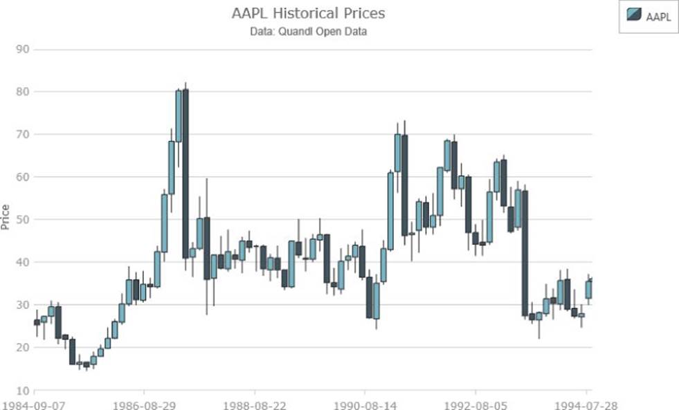
Figure 14.3 This candlestick chart was created using the Ignite UI igDataChart.
Data source: www.quandl.com/api/v1/datasets/WIKI/AAPL.json?&trim_start=1984-09-07&trim_end=1994-09-07&sort_order=asc
· A tooltip follows your cursor and displays the prices that are closest to the cursor. This punches down to the closest real data value that can't even be easily discerned from the initial zoom level.
· There is more data in the chart than can readily be seen at the initial zoom level. The time periods represented by the candlesticks are dynamically adjusted as you zoom in and out.
· You can zoom in and out by rolling your mouse wheel, clicking and dragging a rectangle, hitting the Page Up and Page Down keys, or pinching and spreading if you are using a touch device. As you zoom in, further extra detail that wasn't initially visible is resolved, and though there is lots of data in the chart, everything stays buttery smooth.
· When zoomed in, you can hold the Shift button and click and drag over the chart surface to pan around the view.
· You can also use the arrow keys to pan when the chart is focused.
· When you first load the page, there is a pleasant animation to transition the candlesticks into view.
· At zoom levels that would cause the axis labels to collide, they instead automatically stagger their heights to avoid colliding. Pretty neat, huh?
To break down what's going on in this example, first you have
$.ajax({
type: "GET",
url: "AAPL.json",
dataType: "json",
success: renderChart,
error: function (xhr, textStatus, errorThrown) {
console.log(errorThrown +
". Loading from a file:// uri won't work in some browsers");
}
});
which is using jQuery to do an AJAX GET of the AAPL.json file that you downloaded earlier from Quandl. type: "GET" indicates that this is an HTTP GET operation, and dataType: "json" warns jQuery to expect the returned data type to be a JSON document.
Did you see an error in the console when you first tried to run the code? Chances are you were trying to load the page from a file:/// URL, and some of the browsers throw a security exception when you try to do this. This isn't a problem in production—when you will be loading the files from a web server—but some of the browsers are trying to make extra sure that rogue websites cannot load files from your local file system in an unauthorized fashion. To work around this, you can often tell your browser, via the command line, to suppress this error while you are debugging the code for your page.
Another way of going about this, however, is to host the files in a local web server when loading them. If you have Apache or IIS installed, you could go that route, but if you came to this chapter directly after reading Chapter 13, then you already have Python and Node installed, and have some quicker methods available to you. For example, if you open a command prompt and change the directory to the one that that holds the files for this chapter, you can run the following command:
python -m SimpleHTTPServer 8080
This command starts a Python module that serves pages from that directory on port 8080. So, for example, you should be able to load the previous example using this URL:
1. http://localhost:8080/IgniteUIFinancialChart.html
And if you were receiving an error before, now it should load properly. Later in this chapter, you see how to do a similar thing with a Node.js module.
NOTE The Python method in the preceding code is as simple as can possibly be, but it seems to have some stability issues in some scenarios. If you encounter any trouble with pages loading reliably, refer to the Node.js + express method used in the latter stages of this chapter.
The error handler in the previous code was what rendered an error into the console if you tried to load this page from a file URL. If there is no error with the request, jQuery calls the success handler, where you have provided a function called renderChart, which is the next topic of discussion.
function renderChart(data) {
var columnNames = data.column_names;
var transformed = data.data.map(function (item) {
var newItem = {};
for (var i = 0; i < columnNames.length; i++) {
newItem[columnNames[i]] = item[i];
}
return newItem;
});
The preceding code is the first part of a function that renders the chart based on the contents of the downloaded JSON file. An examination of the JSON file shows that the top-level object has a property called column_names and then an array called data that has a set of subarrays that represent each row. To ease the loading and binding of this data, it's better that each row had some named properties rather than indexed cells, so the preceding code uses Array.map to iterate over the data array and transform each row into an object that contains properties for each named column.
var chartOptions = {
dataSource: transformed,
width: "700px",
height: "500px",
title: "AAPL Historical Prices",
subtitle: "Data: Quandl Open Data",
horizontalZoomable: true,
verticalZoomable: true,
rightMargin: 30,
The preceding code includes the options that are directed at the chart as a whole, rather than its axes or series. This code specifies
· dataSource: This expects an array (among other options) that you set to the transformed data received from AAPL.json. Here, the data is set at the chart level, but it is possible to set separate collections of data at the axis and series levels.
· width: The pixel width of the chart. It's also possible to use percent values here to size the chart to its containing elements.
· height: The pixel height of the chart. It's also possible to use percent values here to size the chart to its containing elements. Remember that if you do this, you might need to set the height of the html and body elements to 100 percent if there is no intervening element with an actual size specified.
· title: The title of the chart will be displayed above the plot area.
· subtitle: The subtitle of the chart will be displayed below the title in a smaller font.
· horizontalZoomable: Indicates that the chart should be zoomable in the horizontal direction.
· verticalZoomable: Indicates that the chart should be zoomable in the vertical direction.
· rightMargin: Leaves some dead area to the right of the chart to make sure there is enough spillover room for the x-axis labels. Some space is left automatically, but when dealing with longer x-axis labels, it can help to provide a larger figure here.
The next line
legend: { element: "legend" },
indicates that the chart should use an element with ID "legend" as the container for its legend. Multiple charts can share the same legend, or individual chart series can split themselves among multiple legends.
axes: [{
type: "categoryX",
name: "xAxis",
label: "Date",
labelExtent: 60
}, {
type: "numericY",
name: "yAxis",
title: "Price"
}],
The preceding code snippet defines the two axes for the chart. As discussed earlier, for stock data, it can make more sense to plot the time data on a category axis, rather than a linear axis. A category x axis is defined here, and it displays the Date properties of all the data items as the labels on the axis. labelExtent increases the size of the axis labels area here, so the labels have room to switch to a staggered view if they start colliding. If this step isn't performed, the labels are automatically shortened with the ellipsis character when they begin to collide.
A numeric y axis with standard settings is also created to map the price values into the plot area.
Now it's time to define the series that will display the candlesticks:
series: [{
name: "aapl",
type: "financial",
xAxis: "xAxis",
yAxis: "yAxis",
openMemberPath: "Open",
highMemberPath: "High",
lowMemberPath: "Low",
closeMemberPath: "Close",
showTooltip: true,
isTransitionInEnabled: true,
isHighlightingEnabled: true,
transitionInDuration: 1000,
title: "AAPL",
resolution: 8
This code defines the following:
· name: This is a unique identifier that you are required to assign to a series.
· type: This indicates the type of series to render. In this case, you want to render a financial series (which can render as candlesticks or OHLC bars).
· xAxis: Points to, by name, the x axis to use for this series.
· yAxis: Points to, by name, the y axis to use for this series.
· openMemberPath: Indicates the property on the data items from which to fetch the opening price.
· highMemberPath: Indicates the property on the data items from which to fetch the high price.
· lowMemberPath: Indicates the property on the data items from which to fetch the low price.
· closeMemberPath: Indicates the property on the data items from which to fetch the closing price.
· showTooltip: Indicates that a tooltip should be displayed for this series. If no tooltipTemplate is specified, an automatic selection of values is displayed as the tooltip.
· isTransitionInEnabled: Indicates that the series should be animated into view.
· transitionInDuration: Specifies the number of milliseconds over which the transition in animation should stretch.
· title: Provides a value that can be used in the legend and the tooltips to identify the current series.
· resolution: Controls how aggressively the series coalesces data. The meaning that this has for the financial series, in this instance, is that it coalesces the price data so that no candlesticks thinner than approximately 8 pixels wide are displayed. As you zoom in, more candlesticks are visible until you reach a point where each individual value in the source array has an individual candlestick. You can increase and decrease this value in order to adjust how aggressively this coalescing is performed.
}, {
name: "itemToolTips",
type: "itemToolTipLayer",
useInterpolation: false,
transitionDuration: 300
}]
};
Finally, the preceding code creates a layer where floating tooltips annotate the values closest to the mouse cursor, in the x direction. If this weren't specified you would still get tooltips, but only when you were directly over the visuals for the series. The following things are defined:
· name: Indicates the unique identifier for the tooltip layer
· type: Specifies that this series is an item tooltip layer
· useInterpolation: Indicates that the tooltips should snap to the closest values rather than picking an interpolated position between the two closest values
· transitionDuration: Indicates how long it should take the tooltips to animate from one annotated item to the next
Finally, the container with the ID chart is transformed into an igDataChart with the options you defined:
$("#chart").igDataChart(chartOptions);
}
});
As with the last time you interacted with igDataChart, in Chapter 12, very little code is actually required to achieve the desired effect. Instead, there are lots of declarative options that indicate the precise behaviors you want from all the pieces of the chart. These straightforward options add up to some very complex behaviors when you load the page and interact with the chart.
Now that you have some candlesticks displayed, how would you change to an OHLC bar visualization? The answer is extremely simple. All you need to do is add the highlighted line to the definition of the financial series:
series: [{
name: "aapl",
type: "financial",
displayType: "ohlc",
xAxis: "xAxis",
yAxis: "yAxis",
openMemberPath: "Open",
highMemberPath: "High",
lowMemberPath: "Low",
closeMemberPath: "Close",
showTooltip: true,
isTransitionInEnabled: true,
isHighlightingEnabled: true,
transitionInDuration: 1000,
title: "AAPL",
resolution: 8
You can see the results in Figure 14.4, and the file is on the companion website as IgniteUIFinancialChartOHLC.js/html/css.
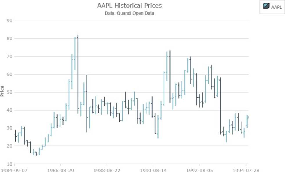
Figure 14.4 This shows an OHLC chart using the Ignite UI igDataChart.
Data source: www.quandl.com/api/v1/datasets/WIKI/AAPL.json?&trim_start=1984-09-07&trim_end=1994-09-07&sort_order=asc
Adding a Zoom Bar to the Chart
If you compare the results from Listing 14-2 to what you get if you were to, say, view some stock data on Yahoo! Finance, you have achieved some interesting dynamic effects that aren't represented in Yahoo! Finance, but there are also some things you are missing. Fortunately, these are not especially tricky to add with Ignite UI.
Ignite UI provides a component called igZoombar, which acts as a date range selector that enables you to pan a time series chart as well as change the zoom level. To add it, all you need to do is create it, and make sure it is positioned under the plot area, based on the size you picked for the chart:
$("#zoom").igZoombar({
width: "660px",
target: "#chart",
zoomWindowMinWidth: 1.2
});
$("#zoom").css("margin-left", "24px");
This code creates the zoom bar, and targets it at the upper stock price chart. This causes the zoom bar to create a clone of the chart visualization, at default zoom level, to act as a thumbnail to guide you around the overall shape of the time series. This code adjusts the width and the left margin to position the zoom bar under the main chart.
By default, the cloned thumbnail chart has most of the visual settings of the main chart, but, in this instance, it would actually be preferable to display a simpler visual in the thumbnail rather than an exact copy. Also, while the zoom bar filters out some aspects of the top chart's settings that you'd likely not want to see in the thumbnail (axis gridlines, for example), it doesn't necessarily adjust the settings exactly as you'd like, so the zoom bar gives you access to the cloned chart in order to tweak additional settings:
$("#zoom").igZoombar("clone").igDataChart({
subtitle: null,
rightMargin: 0,
axes: [{ name: "xAxis", interval: NaN }],
series: [{
name: "aapl", remove: true
}, {
name: "close",
type: "area",
xAxis: "xAxis",
yAxis: "yAxis",
valueMemberPath: "Close"
}]
});
The preceding code filters out a few properties that the zoom clone currently doesn't automatically filter from the top chart and then removes the financial series and replaces it with a simple area series bound to the close property of the data items.
The closing price is largely considered to be the most important aspect of a stock price to watch. So when displaying a simple thumbnail, mapped to just one value, it makes the most sense as a value to display. Another option is to display the typical price, which is generally calculated as the average of the high, low, and close prices for the given period.
The last thing you need to do is to add an element that holds the zoom bar visual to the HTML:
<div id="chart"></div>
<div id="legend"></div>
<div id="zoom"></div>
And to amend the CSS such that the zoom bar doesn't try to float left with the chart and legend:
#chart
{
width: 700px;
height: 500px;
float: left;
}
#legend
{
float: left;
}
#zoom
{
clear: left;
}
The code changes produce the results in Figure 14.5, and you can find the IgniteUIFinancialChartZoombar.js/html/css file on the companion website. Notice how you can drag the range of the zoom bar to pan through time and examine various values. You can also grab the handles on either edge of the range to resize the range and change the zoom level of the chart.
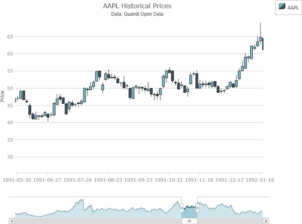
Figure 14.5 This financial chart includes a zoom bar to adjust the viewable area.
Data source: www.quandl.com/api/v1/datasets/WIKI/AAPL.json?&trim_start=1984-09-07&trim_end=1994-09-07&sort_order=asc
Adding a Synchronized Chart
Another aspect of Yahoo! Finance that you might want to emulate is the synchronized chart of the trade volume that is plotted underneath the price chart. Ignite UI also makes this exceedingly simple. The basic strategy is to create a second chart underneath the first and then put both the charts in the same syncChannel. When two charts are in the same syncChannel, not only do zoom interactions from one chart get replayed on others in the same syncChannel, but additionally the cursor position is synchronized between the charts so that annotations such as the item tooltips show for all synced charts simultaneously.
$("#volumeChart").igDataChart({
dataSource: transformed,
width: "700px",
height: "150px",
horizontalZoomable: true,
syncChannel: "channel1",
rightMargin: 30,
legend: { element: "legend" },
axes: [{
type: "categoryX",
name: "xAxis",
label: "Date",
labelExtent: 60,
labelVisibility: "collapsed"
}, {
type: "numericY",
name: "yAxis",
title: "Volume",
labelExtent: 60,
formatLabel: function (v) {
if (v > 1000000) {
v /= 1000000;
return v + "M";
}
if (v > 1000) {
v /= 1000;
return v + "K";
}
return v.toString();
}
}],
series: [{
name: "aaplVolume",
type: "area",
xAxis: "xAxis",
yAxis: "yAxis",
brush: "#7C932F",
outline: "#556420",
valueMemberPath: "Volume",
showTooltip: true,
isTransitionInEnabled: true,
isHighlightingEnabled: true,
transitionInDuration: 1000,
title: "AAPL Volume",
}, {
name: "itemToolTips",
type: "itemToolTipLayer",
useInterpolation: false,
transitionDuration: 300
}]
});
The preceding code defines a second chart that sits below the chart you defined before. You also need to add the following line to the top chart:
syncChannel: "channel1",
In addition, you would need to add an element to hold the second chart to the page:
<div id="chart"></div>
<div id="legend"></div>
<div id="volumeChart"></div>
<div id="zoom"></div>
and you should move the clear: left to the volumeChart CSS rule:
#volumeChart {
clear: left;
}
In the volumeChart options, the settings are mostly the same as the financial chart, but some of the differences have been highlighted and the results are as follows:
· The category x-axis labels have been collapsed. This is because they would be the same as the labels in the upper chart, and they really only need to be displayed in one location.
· A formatLabel function has been added to the y axis for this lower chart. The volume of trades is very high, so in order to reduce the length of the labels, this function shortens and adds a unit specifier if the labels are over certain amounts.
· The type of the series used is area.
· A different brush and outline are set to distinguish this series from the price chart.
· The area series is mapped to the Volume property of the data items.
· An item tooltip layer is also added to the lower chart, so that as the mouse cursor is moved over either chart, you see the item tooltips for the closest data values in both charts.
You can see the result of this in Figure 14.6, and you can find the IgniteUIFinancialChartZoombarAndVolume.js/html/css file on the companion website.
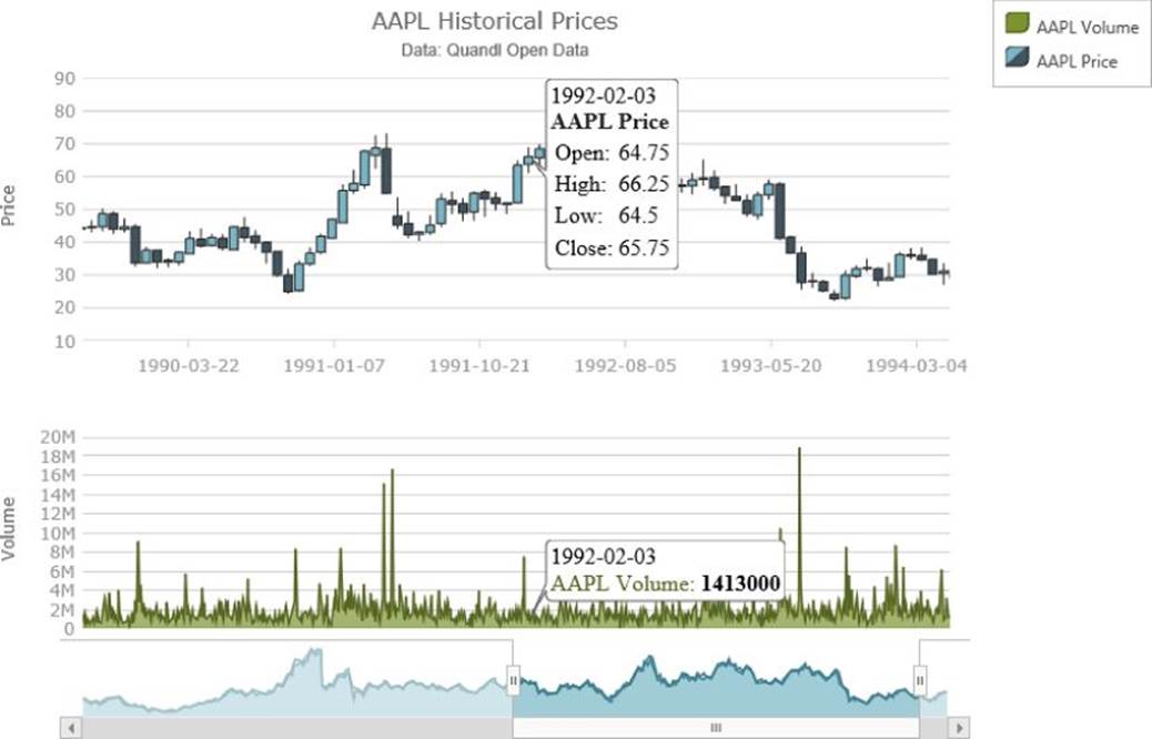
Figure 14.6 A volume chart is synchronized with a price chart.
Data source: www.quandl.com/api/v1/datasets/WIKI/AAPL.json?&trim_start=1984-09-07&trim_end=1994-09-07&sort_order=asc
Working with Technical Analysis Tools
As mentioned at the beginning of the chapter, this is not a book on doing technical analysis for stock data, and the chapter doesn't go into this in much detail. It is worth knowing, however, that Ignite UI has a lot of built-in technical indicators and overlays that can help you make sense of stock price plots and try to eke out information that might help with trading decisions.
The following code provides an example of how you would add some price channels to the previous example. Just add this code before the candlestick or OHLC series in the chart:
series: [{
name: "aaplPriceChannel",
type: "priceChannelOverlay",
xAxis: "xAxis",
yAxis: "yAxis",
openMemberPath: "Open",
highMemberPath: "High",
lowMemberPath: "Low",
closeMemberPath: "Close",
volumeMemberPath: "Volume",
isTransitionInEnabled: true,
isHighlightingEnabled: true,
transitionInDuration: 1000,
title: "AAPL Price Channels"
Price channels plot the highest of highs and the lowest of lows for a given back period at each given point on the chart. This can give you a good idea when the stock is having some quick up or down movement, because if it moves fast enough it will “break” from the channel. How the prices move within the channel can indicate interesting things to an analyst. You can see the results of adding this price channel series in Figure 14.7. (The file on the companion website is IgniteUIFinancialChartPriceChannels.js/html/css.)
NOTE You can see some of the other technical analysis tools available in Ignite UI at http://www.igniteui.com/data-chart/financial-indicators.
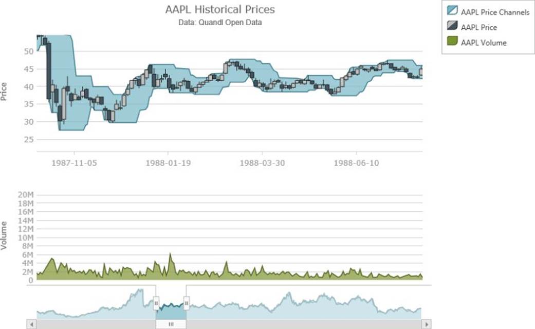
Figure 14.7 This shows adding price channels to the stock chart.
Data source: www.quandl.com/api/v1/datasets/WIKI/AAPL.json?&trim_start=1984-09-07&trim_end=1994-09-07&sort_order=asc
Plotting Real-Time Data
So everything you've seen so far is all very neat, if analyzing financial data is something that interests you. In case it isn't, this section explores another aspect of plotting time series. Everything up to this point in this chapter has been pretty static. The interactions with the chart have been pretty dynamic, but the data itself has not been. So, now it's time for some dynamic data.
For dynamic data, you build a web service that pushes the current CPU and memory usage from the server down to the browser client. In the client, you dynamically update some chart series to display the real-time data streaming down from the server. If you think about it, the following examples have some true real-world applicability because it is often necessary to monitor the performance of a remote machine.
Creating a Node Push Data Service
If you followed along through Chapter 13, then you already have Node.js installed. Otherwise, please follow the instructions in Chapter 13 to install Node.js, and then return here because you use Node.js to create the push data service.
Socket.IO is a really neat client/server JavaScript library that lets you set up a WebSockets connection between the browser and the server. The especially neat part is that, because there are not many browser versions that support WebSockets yet, if they are not available for a particular client, Socket.IO gracefully falls back on another technology, such as Flash or HTTP long polling, in order to emulate the WebSockets behavior. These fallbacks do not necessarily provide a perfect emulation performance-wise, but should be sufficient for you to rely on the basic functionality. If you have ever used SignalR, the idea is roughly the same as with that framework.
NOTE HTTP is not a full duplex communication channel. The web server cannot send unsolicited information to the client. It can only respond to direct requests for resources from the client. This makes it difficult to push data from the server to the client to, say, implement a notification system. There are various strategies that one can use to try to emulate true bidirectional communication over the HTTP protocol, such as HTTP long polling. These strategies, although very clever, are somewhat inefficient and, unfortunately, introduce latency into the communication channel. WebSockets details how the client and server can agree, using a HTTP-based handshake, to subsequently sidestep HTTP and open a true full duplex (bidirectional simultaneous) communication channel. This is done in order to enable truly efficient low-latency communication and is very important for real-time communication and gaming.
So, you use Node.js and Socket.IO to open a WebSockets connection, or some approximation thereto, between the server and the client browsers, and on an interval the server broadcasts performance data down to the client. To do this, create a file calledcpuLoadServer.js or grab the one from the companion website. Fill in the contents of Listing 14-3.
Listing 14-3
var express = require("express");
var application = express();
var server = require("http").createServer(application);
var io = require("socket.io").listen(server);
var os = require("os");
var osUtils = require("os-utils");
var interval = -1;
var currCPU = 0;
application.use(express.static(_____dirname));
server.listen(8080);
io.sockets.on('connection', function () {
if (interval < 0) {
interval = setInterval(function () {
var freeMem = os.freemem();
var totalMem = os.totalmem();
io.sockets.emit("cpuUpdate", {
cpuUsage: currCPU * 100.0,
freeMem: freeMem,
totalMem: totalMem,
usedMem: totalMem - freeMem
});
}, 100);
}
});
function updateCPU() {
setTimeout(function () {
osUtils.cpuUsage(function (value) {
currCPU = value;
updateCPU();
});
}, 0);
}
updateCPU();
Not much code huh? Let's dig into it a bit.
var express = require("express");
var application = express();
var server = require("http").createServer(application);
var io = require("socket.io").listen(server);
var os = require("os");
var osUtils = require("os-utils");
var interval = -1;
var currCPU = 0;
Here you are asking Node.js to load various modules. You are loading the module for express, which builds on the web serving facilities of Node.js and provides some web application middleware behaviors. The main use for it here is to allow for the static HTML, CSS, and JavaScript files to be loaded when you request the client pieces in the browser. Next, the http module is loaded and a server is created. The server delegates to the express application to process its requests.
From there, you load the Socket.IO module and assign it to listen on the HTTP server you created. In this way, you've chained a lot of disparate frameworks together to handle various types of requests. Express handles serving static files down to the client, and Socket.IO handles serving up the client-side script that it needs to function (which you see when you get to the client piece of this) and also responds to the socket handshaking and messages sent back and forth using its protocols.
NOTE When we refer to handshaking here, we're referring to the process of Socket.IO negotiating between the client and the server over HTTP and discovering which protocol the client and server are able to support. The primary goal is that the connection should be established using WebSockets, which provides a nice low-latency channel for sending two-way information back and forth to the client. If the server or client doesn't support this, however, Socket.IO attempts to fall back on successively distant approximations of this ideal. When the connection has been established, messages can be sent in either direction along the socket channel. In this instance, you are mostly concerned with pushing data down to the client.
In the previous snippet, you are loading the os and os-utils modules. The os module is distributed with Node.js, whereas os-utils represents some neat downloadable utilities that sit on top of the os module to normalize and process some of the info for you.
All the pieces you need to set up the server are hooked up, so now you can proceed to making it actually do something:
application.use(express.static(_____dirname));
server.listen(8080);
Here you tell express to serve up static content from the current directory so that when you request the client file later, it—and its referenced files—will be downloadable from this directory to the client browser. Normally you would create a subdirectory here, perhaps called public, and serve static files from there so that the Node.js code running on the server wouldn't also be downloadable. For simplicity's sake, though, here you keep everything in the same folder.
You also tell the HTTP server to listen on port 8080 for requests. This is why, later on, you provide port 8080 in your requests for the client page.
io.sockets.on('connection', function () {
if (interval < 0) {
interval = setInterval(function () {
var freeMem = os.freemem();
var totalMem = os.totalmem();
io.sockets.emit("cpuUpdate", {
cpuUsage: currCPU * 100.0,
freeMem: freeMem,
totalMem: totalMem,
usedMem: totalMem - freeMem
});
}, 100);
}
});
The preceding code defines what happens when a Socket.IO connection request is received from a client. When this occurs, unless you are already doing so, you start emitting CPU and memory information, every 100ms, as a JSON object, to all connected sockets.
NOTE There is no logic anywhere here to tear down this interval later. For production logic, you'd want to listen for connections to be torn down and, when no sockets are left connected, cancel the broadcast interval. This example, however, is more focused on the mechanics of updating the charts than taking a deep dive into Socket.io mechanics. Also note that although a high-frequency broadcast will work well over localhost, it might not scale well to wide area network (WAN) scenarios or having lots of clients connected. But, again, the focus here is on chart updates, not necessarily Socket.io performance semantics and tuning.
The broadcasting code you just used was relying on a currCPU reading to broadcast to the clients. So, finally, this is how that is achieved:
function updateCPU() {
setTimeout(function () {
osUtils.cpuUsage(function (value) {
currCPU = value;
updateCPU();
});
}, 0);
}
updateCPU();
console.log("computer performance server running");
The os-utils module needs to average some values over the space of a second to get a CPU utilization reading. As such, it requires a callback function to call when it has finished determining an average value. This code basically continually runs that method and waits for the callback to be invoked, storing the result where it can be broadcast on the next interval.
To be able to run any of this logic, you have to download some of the Node.js modules that aren't included by default. First navigate to the directory containing cpuLoadServer.js and the static files, and then run the following:
npm install express
Provided you have Node.js installed, and configured in your path, or in context for your command prompt, you should be able to run the preceding command to install the express module.
npm install socket.io
Similarly, this causes the Socket.IO module to be downloaded and installed.
npm install os-utils
And, finally, after you have run the preceding command and downloaded the os-utils module, you should be able to run the server:
node cpuLoadServer.js
You can see what it looks like for the server to be running in Figure 14.8; the cpuLoadServer.js file is on the companion website. As a side note, you now have a simple way to serve static files out of the current directory, much like you were achieving with Python earlier in the chapter.
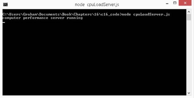
Figure 14.8 This shows running the real-time computer performance server.
Receiving Updates in the Client
With some Node.js wrangling you've managed to create a pretty succinct server that broadcasts CPU and memory updates to clients, but how do you display those results? With the power of Socket.IO and the Ignite UI igDataChart this is exceedingly simple, as shown in Listing 14-4.
Listing 14-4
$(function () {
var cpuData = [];
function toDisplayCPU(v) {
return v.toFixed(2);
}
function toDisplayMem(v) {
if (v >= (1024 * 1024 * 1024)) {
v /= (1024 * 1024 * 1024);
return v.toFixed(2) + "GB";
}
if (v >= (1024 * 1024)) {
v /= (1024 * 1024);
return v.toFixed(2) + "MB";
}
if (v >= (1024)) {
v /= (1024);
return v.toFixed(2) + "KB";
}
return v;
}
function renderChart() {
var chartOptions = {
dataSource: cpuData,
width: "700px",
height: "500px",
title: "System Performance",
subtitle: "CPU utilization over time until present",
horizontalZoomable: true,
verticalZoomable: true,
rightMargin: 30,
legend: { element: "legend" },
axes: [{
type: "categoryX",
name: "xAxis",
label: "displayTime",
labelAngle: 45
}, {
type: "numericY",
name: "yAxis",
title: "CPU Utilization",
minimumValue: 0,
maximumValue: 100,
formatLabel: toDisplayCPU
}, {
type: "numericY",
name: "yAxisMemory",
title: "Memory Utilization",
labelLocation: "outsideRight",
minimumValue: 0,
maximumValue: 8 * 1024 * 1024 * 1024,
interval: 1024 * 1024 * 1024,
formatLabel: toDisplayMem,
majorStroke: "transparent"
}],
series: [{
name: "cpu",
type: "line",
xAxis: "xAxis",
yAxis: "yAxis",
valueMemberPath: "cpuUsage",
showTooltip: true,
tooltipTemplate:
"<div><em>CPU:</em> <span>${item.displayCPU}</span></div>",
title: "CPU Utilization"
}, {
name: "mem",
type: "line",
xAxis: "xAxis",
yAxis: "yAxisMemory",
valueMemberPath: "usedMem",
showTooltip: true,
tooltipTemplate:
"<div><em>Memory:</em> <span>${item.displayMem}</span></div>",
title: "Memory Utilization"
}, {
name: "itemToolTips",
type: "itemToolTipLayer",
useInterpolation: false,
transitionDuration: 300
}]
};
$("#chart").igDataChart(chartOptions);
}
renderChart();
var socket = io.connect("http://localhost:8080");
socket.on("cpuUpdate", function (update) {
var currTime = new Date();
var displayString = currTime.toLocaleTimeString();
update.displayCPU = toDisplayCPU(update.cpuUsage);
update.displayMem = toDisplayMem(update.usedMem);
update.displayTime = displayString;
cpuData.push(update);
$("#chart").igDataChart("notifyInsertItem",
cpuData, cpuData.length - 1, update);
});
});
If you save this as IgniteUICPULoadChart.js or grab the file from the companion website, along with the HTML and CSS for this example, and provided the Node.js server is running, you should be able to visit the following site:
1. http://localhost:8080/IgniteUICPULoadChart.html
As a result you should see the chart updating in real time. There are two series displayed: one plotting CPU utilization over time and one plotting memory utilization over time. Figure 14.9 shows the result of letting this run for a while (IgniteUICPULoadChart.js/html/css is the file on the companion website).
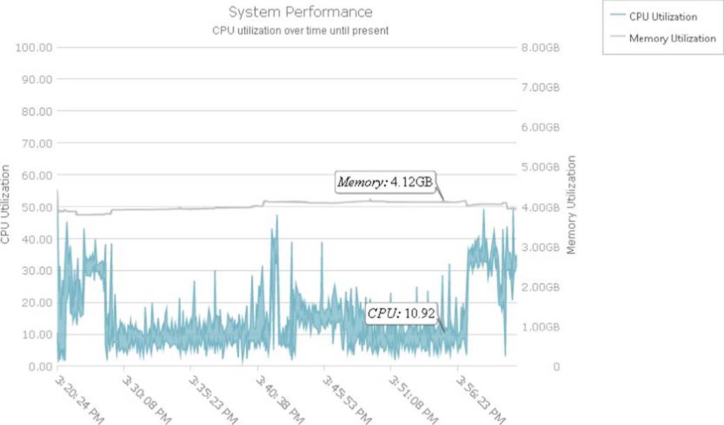
Figure 14.9 This shows real-time performance data in the Ignite UI igDataChart using Socket.IO.
But how is this accomplished? You start with the following:
var cpuData = [];
function toDisplayCPU(v) {
return v.toFixed(2);
}
function toDisplayMem(v) {
if (v >= (1024 * 1024 * 1024)) {
v /= (1024 * 1024 * 1024);
return v.toFixed(2) + "GB";
}
if (v >= (1024 * 1024)) {
v /= (1024 * 1024);
return v.toFixed(2) + "MB";
}
if (v >= (1024)) {
v /= (1024);
return v.toFixed(2) + "KB";
}
return v;
}
An empty array, cpuData, is defined to hold the real-time data as it is pushed from the server. Two functions are defined that will help to convert the raw numeric values from the server into nice display values for use in the axes of the chart and in the tooltips.
function renderChart() {
var chartOptions = {
dataSource: cpuData,
width: "700px",
height: "500px",
title: "System Performance",
subtitle: "CPU utilization over time until present",
horizontalZoomable: true,
verticalZoomable: true,
rightMargin: 30,
legend: { element: "legend" },
axes: [{
type: "categoryX",
name: "xAxis",
label: "displayTime",
labelAngle: 45
}, {
type: "numericY",
name: "yAxis",
title: "CPU Utilization",
minimumValue: 0,
maximumValue: 100,
formatLabel: toDisplayCPU
}, {
type: "numericY",
name: "yAxisMemory",
title: "Memory Utilization",
labelLocation: "outsideRight",
minimumValue: 0,
maximumValue: 8 * 1024 * 1024 * 1024,
interval: 1024 * 1024 * 1024,
formatLabel: toDisplayMem,
majorStroke: "transparent"
}],
series: [{
name: "cpu",
type: "line",
xAxis: "xAxis",
yAxis: "yAxis",
valueMemberPath: "cpuUsage",
showTooltip: true,
tooltipTemplate:
"<div><em>CPU:</em> <span>${item.displayCPU}</span></div>",
title: "CPU Utilization"
}, {
name: "mem",
type: "line",
xAxis: "xAxis",
yAxis: "yAxisMemory",
valueMemberPath: "usedMem",
showTooltip: true,
tooltipTemplate:
"<div><em>Memory:</em> <span>${item.displayMem}</span></div>",
title: "Memory Utilization"
}, {
name: "itemToolTips",
type: "itemToolTipLayer",
useInterpolation: false,
transitionDuration: 300
}]
};
$("#chart").igDataChart(chartOptions);
}
renderChart();
The renderChart function is pretty much the same as when you were dealing with financial data. The significant differences have been highlighted, though. The differences boil down to a different strategy for displaying the long x-axis label values, and making sure that some nice looking formatting is used on the large memory utilization numbers to make them more palatable. If you stopped here, this would provide you a static chart, much like the financial chart before (albeit with no actual data), but it would not respond to any updates from the server. So let's continue.
var socket = io.connect("http://localhost:8080");
socket.on("cpuUpdate", function (update) {
var currTime = new Date();
var displayString = currTime.toLocaleTimeString();
update.displayCPU = toDisplayCPU(update.cpuUsage);
update.displayMem = toDisplayMem(update.usedMem);
update.displayTime = displayString;
cpuData.push(update);
$("#chart").igDataChart("notifyInsertItem",
cpuData, cpuData.length - 1, update);
});
The preceding snippet is the heart and soul of the real-time update. First you connect to the Socket.IO server on port 8080. Note, you would use a different value for the URL here for deploying to a production server with a real DNS name.
Next, you define that when a "cpuUpdate" message is received on the socket, you would like to
· Examine the associated JavaScript object that was received and create some human-readable strings for easy use in the tooltips
· Create a human-readable time string for use in the axis labels and the tooltips
· Add the data to the array being displayed in the chart with cpuData.push(update);
· Notify the chart that you have modified an associated data array by adding a value to the end: $("#chart").igDataChart("notifyInsertItem", cpuData, cpuData.length - 1, update);
JavaScript doesn't have a built-in observable array type for automatically notifying consumers of data changes, so this is why it is necessary to notify the chart that one of its arrays has been modified. Given that notification, igDataChart handles all the necessary update work for you. Alternatively, if you use a framework such as Knockout.js, igDataChart is capable of listening for updates on the observable array types provided and managing these updates for you. Note, however, that some of these frameworks add some additional processing overhead, so the optimal performance scenario might be to invoke the notification methods on the chart directly.
The last thing required is to make sure that the HTML page references the Socket.IO client library. Notice that you don't actually have this file on disk in the directory that Node.js is serving files from; the Socket.IO server is managing serving up this script reference dynamically when asked:
<script src="/socket.io/socket.io.js"></script>
To see the kind of astonishing update performance you can get out of this combination of Socket.IO and igDataChart, try editing cpuLoadServer.js and changing the broadcast interval from 100ms to 10ms:
io.sockets.on('connection', function () {
if (interval < 0) {
interval = setInterval(function () {
var freeMem = os.freemem();
var totalMem = os.totalmem();
io.sockets.emit("cpuUpdate", {
cpuUsage: currCPU * 100.0,
freeMem: freeMem,
totalMem: totalMem,
usedMem: totalMem - freeMem
});
}, 10);
}
});
Now, quit your server and restart it. The updates should be coming in really quickly now. Pretty neat, huh?
Exploring Update Rendering Techniques
The previous example continues to add new data points to the end of the series perpetually. Although the igDataChart can gracefully display more than a million points interactively, you still might want to employ some strategies to roll out old data that is no longer interesting. To end this chapter, here's a quick peek at a few strategies:
socket.on("cpuUpdate", function (update) {
var currTime = new Date();
var displayString = currTime.toLocaleTimeString();
update.displayCPU = toDisplayCPU(update.cpuUsage);
update.displayMem = toDisplayMem(update.usedMem);
update.displayTime = displayString;
cpuData.push(update);
$("#chart").igDataChart("notifyInsertItem",
cpuData, cpuData.length - 1, update);
if (cpuData.length > 1000) {
var oldItem = cpuData.shift();
$("#chart").igDataChart("notifyRemoveItem",
cpuData, 0, oldItem);
}
});
This variant on the socket message handler from the previous example achieves a sliding window effect where, after the maximum number of points is displayed, it begins removing the oldest points as new ones are added. The result is that the data appears to slide through the view from right to left. This is achieved by notifying the chart not just of the additions to the data at the end of the array but also of the removals at the beginning of the array. There's no need to worry about the chart rendering twice from the two notifications; it's smart enough to wait until your modification is done before updating the visuals. You can see the result on the companion website in the IgniteUICPULoadChartSlidingWindow.js/html/css file.
var cpuData = [];
for (var i = 0; i < 1000; i++) {
cpuData.push({
displayTime: new Date().toLocaleTimeString(),
usedMem: NaN,
cpuUsage: NaN
});
}
var insertionPoint = 0;
Another strategy is to change the definition of the array to look like the preceding code, where you start with 1000 data points defined with no initial values. Then, combine that with this:
socket.on("cpuUpdate", function (update) {
var currTime = new Date();
var displayString = currTime.toLocaleTimeString();
update.displayCPU = toDisplayCPU(update.cpuUsage);
update.displayMem = toDisplayMem(update.usedMem);
update.displayTime = displayString;
cpuData[insertionPoint] = update;
$("#chart").igDataChart("notifySetItem",
cpuData, insertionPoint, update);
for (var i = insertionPoint + 1;
i < Math.min(insertionPoint + 21, 1000);
i++) {
cpuData[i] = {
displayTime: new Date().toLocaleTimeString(),
usedMem: NaN,
cpuUsage: NaN
};
$("#chart").igDataChart("notifySetItem",
cpuData, i, cpuData[i]);
}
insertionPoint++;
if (insertionPoint > 999) {
insertionPoint = 0;
}
});
which creates an updating style reminiscent of an EKG machine. The number of points in the series remains static, and when the updates reach the right edge of the chart they wrap back around to the left edge and begin overwriting the oldest content. An extra tweak empties some values ahead of the most recent value to make it more apparent where the most recent values are, at a glance. You can see a snapshot of this behavior in Figure 14.10, and you can find the IgniteUICPULoadChartEKGStyle.js/html/css file on the companion website.
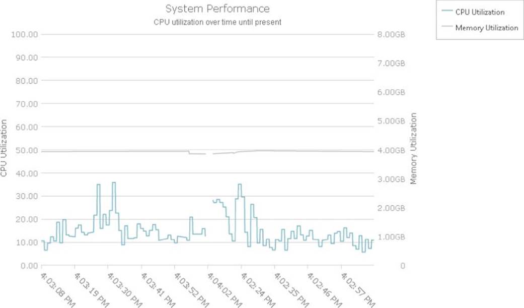
Figure 14.10 This real-time updating chart includes EKG-style wrapping.
Plotting Massive Data
To wrap up this chapter, you use the igDataChart to plot massive amounts of data in the browser. Would you believe us if we told you that you could plot one million data points in a JavaScript chart? No? Well, next, you do just that. In fact, plotting that amount of data will prove less of a challenge than transmitting the data, over the wire, to the client.
JSON is pretty wonderful. It's human readable, and there is good support for deserializing it in any decent JavaScript engine, but it does have a bit of a verbosity problem. It is nowhere near as verbose as XML, but is still much more verbose than a packed binary format.
Browsers have not traditionally been very good at processing binary data in JavaScript, but recent versions have begun to improve upon this through the advent of the ArrayBuffer API. Your strategy to load mass amounts of data is to encode a packed binary file containing one million single-precision floating-point numbers, using Node.js. Provided that file, you load it into an ArrayBuffer using an XmlHTTPRequest and then use a DataView to extract the floating-point numbers back into an array on the client side. This data can then be loaded into the chart.
First, you start with the data creation as shown in Listing 14-5.
Listing 14-5
var fs = require("fs");
var numItems = 1000000;
var buf = new Buffer(numItems * 4);
var currValue = 1000.0;
for (var i = 0; i < numItems; i++) {
currValue += -2.0 + Math.random() * 4.0;
buf.writeFloatLE(currValue, i * 4);
}
fs.writeFile("data.bin", buf, function (err) {
if (err) {
console.log("Error writing file: " + err);
}
console.log("file written.");
});
This creates a Node.js Buffer that is large enough to store one million single-precision floating-point numbers. A single-precision floating-point number is generally encoded using 4 bytes, so the buffer needs to be 4 million bytes long. Provided such a buffer, the code in Listing 14-5 calls writeFloatLE for each data point to write each float value, using little endian byte ordering, into the buffer. Given this filled buffer, Node.js's fs.writeFile function, which you used earlier in this chapter, can write this buffer to disk as the contents of a file. This produces a file called data.bin, which contains the one million data points.
If you create a file called createMassData.js and fill it with the contents of Listing 14-5, you should be able to navigate to the directory containing this file and run this command from a Node.js command prompt (on the companion website, the file iscreateMassData.js):
node createMassData.js
As a result, you should end up with an output file called data.bin, which should be 3,907KB in size. This is large, but is nowhere near as large as the data would be if it were encoded as JSON. For comparison, Listing 14-6 contains code that creates the same data but is encoded as a JSON array.
Listing 14-6
var fs = require("fs");
var numItems = 1000000;
var data = [];
var outputObject = {};
var currValue = 1000.0;
for (var i = 0; i < numItems; i++) {
currValue += -2.0 + Math.random() * 4.0;
data.push(currValue);
}
outputObject.data = data;
fs.writeFile("data.json", JSON.stringify(outputObject), function (err) {
if (err) {
console.log("Error writing file: " + err);
}
console.log("file written.");
});
Running that code results in a file called data.json, which has the same content as data.bin but is encoded as JSON. The resulting size of the file is 18,166KB. That's just over 4.5 times larger than the binary encoded version! If you gzip compress the files, then their sizes are reduced as follows:
· data.bin.gz: 3,253KB
· data.json.gz: 7,067KB
The plaintext JSON file, predictably, benefited far more from the compression, but the compressed binary file is still much smaller than the compressed JSON equivalent. You can see, however, that the feasibility of slinging so much JSON around in web applications, as we do today, hangs largely on the fact that it compresses reasonably well, and that web servers and browsers can generally seamlessly gzip compress/decompress files without adding too much additional processing overhead to a request. When you are dealing with mass data, however, every byte counts.
Given the binary file with the one million data points, the remaining challenge is how to pull that down into the browser and load it into a chart. Modern browsers have some APIs to help deal with downloading and processing data at the raw level, but some of it is so new that some of the major high-level JavaScript libraries don't have especially good support for it yet, so you'll be using XmlHTTPRequest directly to pull down the data.
Next you define the actual chart as shown in Listing 14-7.
Listing 14-7
$(function () {
function renderChart(data) {
$("#chart").igDataChart({
dataSource: data,
width: "700px",
height: "500px",
horizontalZoomable: true,
verticalZoomable: true,
axes: [{
name: "xAxis",
label: "label",
type: "categoryX",
labelAngle: 45
}, {
name: "yAxis",
type: "numericY"
}],
series: [{
name: "line",
xAxis: "xAxis",
yAxis: "yAxis",
type: "line",
showTooltip: true,
valueMemberPath: "value",
isHighlightingEnabled: true,
isTransitionInEnabled: true
}],
});
};
var xhr = new XMLHttpRequest();
xhr.onload = function () {
if (xhr.status == 200) {
var arrayBuffer = xhr.response;
var dataView = new DataView(arrayBuffer);
var numItems = arrayBuffer.byteLength / 4;
var data = [];
for (var i = 0; i < numItems; i++) {
data.push({
label: "Item " + i.toString(),
value: dataView.getFloat32(i * 4, true)
});
}
renderChart(data);
}
};
xhr.open("GET", "data.bin");
xhr.responseType = "arraybuffer";
xhr.send(null);
});
The actual creation of the chart is nothing new—if you've read the rest of this chapter. No special settings are required to load this quantity of data into an igDataChart series, so let's break down just the highlighted section of Listing 14-7. For starters you have:
var xhr = new XMLHttpRequest();
This creates a new XMLHttpRequest, which is the backbone of every AJAX request. If you are used to using $.ajax and its kin in jQuery, they are eventually, under the covers, dealing with this API. Next, you define the callback function that will get invoked when the request completes:
var xhr = new XMLHttpRequest();
xhr.onload = function () {
if (xhr.status == 200) {
var arrayBuffer = xhr.response;
Here, provided that the response is OK (HTTP code 200), you extract it for processing. Provided the response to the request, which should be an ArrayBuffer, you extract the data from it:
var dataView = new DataView(arrayBuffer);
var numItems = arrayBuffer.byteLength / 4;
var data = [];
for (var i = 0; i < numItems; i++) {
data.push({
label: "Item " + i.toString(),
value: dataView.getFloat32(i * 4, true)
});
}
First, you create a DataView over the ArrayBuffer, which will assist in extracting the floating-point values from the binary data response. Because each single-precision floating-point is 4 bytes, and they make up the entire file, you divide by 4 to get the number of items. Then you loop over all of the items and extract each in turn from the array buffer.
dataView.getFloat32(i * 4, true)
Here, the first parameter is the byte offset into the buffer, which is determined by multiplying the index times 4 (for the number of bytes in each single-precision floating-point number). The second parameter indicates that the floating points will be encoded in little endian fashion, which you ensured earlier by calling buf.writeFloatLE(currValue, i * 4) rather than buf.writeFloatBE(currValue, i * 4), when creating the data file.
renderChart(data);
}
};
xhr.open("GET", "data.bin");
xhr.responseType = "arraybuffer";
xhr.send(null);
});
Finally, when the data has finished being decoded, you render the chart. Having fully set up the callback that will be called upon successful return of the binary data response, the only thing remaining is to perform an HTTP get for the file data.bin, indicate that the response type should be an ArrayBuffer, and initiate the asynchronous request. If you run the preceding code, you should see one million data points loaded into the chart as demonstrated in Figure 14.11 (the IgniteUIMassData.js/html/css file on the companion website).
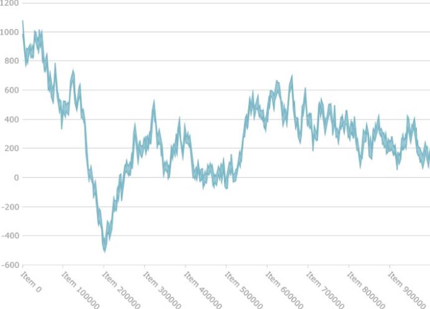
Figure 14.11 This chart displays one million data points in igDataChart.
Notice that you can zoom in with your mouse wheel or by clicking and dragging on the chart. After you're zoomed in, you can press Shift and click and drag to pan around. Because igDataChart is good at processing these extreme amounts of data and helping you visualize them, everything stays buttery smooth even under these conditions.
Summary
In this chapter, you learned all about charting time series. One of the most popular time series visualizations is a stock data chart, so you started there, but you ended with some real-time visualizations of computer performance data. You learned:
· The anatomy of a candlestick or OHLC chart
· How to obtain and load financial data using JavaScript
· How to display financial data in the Ignite UI igDataChart
· Some of the differences between plotting time series data on a category axis versus a linear axis
· How to use a zoom bar to navigate the Ignite UI igDataChart
· How to plot a synchronized chart to display trade volatility
· How to plot technical indicators against your financial data
· How to create a real-time push update server using Node.js
· How to render real-time data in the igDataChart
· Various strategies for managing real-time data in the igDataChart
· Strategies for displaying massive amounts of data in igDataChart