JavaScript and jQuery for Data Analysis and Visualization (2015)
PART I The Beauty of Numbers Made Visible
Chapter 2 Working with the Essentials of Analysis
What's in This Chapter
· Basic analytic concepts
· Key mathematical terms commonly applied when evaluating data
· Techniques for uncovering patterns within the information
· Strategies for forecasting future trends
The current Google definition of analysis is a perfect fit when applied to data visualization:
Detailed examination of the elements or structure of something, typically as a basis for discussion or interpretation.
You know the expression, “Can't see the forest for the trees”? When you analyze data with visualization in mind, you potentially are looking at both the forest and the trees. The individual data points are, of course, extremely important, but so is the overall pattern they form: the structure referenced in the Google definition. Moreover, the whole purpose of analyzing data for visualization is to discuss, interpret, and understand—to paint a picture with the numbers and not by the numbers.
This chapter covers the basic tenets of analysis in order to lay a foundation for the material ahead. It starts by defining a few of the key mathematical terms commonly applied when evaluating data. Next, the chapter discusses techniques frequently used to uncover patterns within the information and strategies for forecasting future trends based on the data.
Key Analytic Concepts
At its heart, most data is number based. For every text-focused explication that starts with “One side feels this way and another side feels that way,” the next question is inevitably numeric: “How many are on each side?” Such simplified headcounts are rarely the full scope of a data visualization project and it is often necessary to bring more sophisticated numeric analysis into play. This section explores the more frequently applied concepts.
Mean Versus Median
One of the most common statistical tasks is to determine the average—or mean—of a particular set of numbers. The mean is the sum of all the considered values divided by the total number of those values. Let's say you have sales figures for seven different parts of the country, shown in Table 2.1.
Table 2.1 Sample Sales by Region
|
Region |
Sales |
|
Northeast |
$100,000 |
|
Southeast |
$75,000 |
|
Midwest |
$125,000 |
|
Mid-Atlantic |
$125,000 |
|
Southwest |
$75,000 |
|
Northwest |
$100,000 |
|
California |
$400,000 |
All the dollar amounts added together equal $1,000,000. Divide the total by 7—the total number of values—to arrive at the mean: $142,857. Although this is significant in terms of sales as a whole, it doesn't really indicate the more typical figure for most of the regions. The significantly higher amount from California skews the results. Quite often when someone asks for the average, what they are really asking for is the median.
The median is the midpoint in a series of values: quite literally, the middle. Let's list regional sales in descending order, from highest to lowest (see Table 2.2).
Table 2.2 Sample Sales by Region, Descending Order
|
Region |
Sales |
|
California |
$400,000 |
|
Midwest |
$125,000 |
|
Mid-Atlantic |
$125,000 |
|
Northeast |
$100,000 |
|
Northwest |
$100,000 |
|
Southeast |
$75,000 |
|
Southwest |
$75,000 |
The median sales figure (the Northeast region's $100,000) is actually much closer to what most of the other areas are bringing in. To quantify variance in the data—like that shown in the preceding example—statisticians rely on a concept called standard deviation.
Standard Deviation
Standard deviation measures the distribution of numbers from the average or mean of any given sample set. The higher the deviation, the more spread out the data. Knowing the standard deviation allows you to determine, and thus potentially map, which values lie outside the norm.
Following are the steps for calculating the standard deviation:
1. Determine the mean of the values set.
2. Subtract the mean from each value.
3. Square the results. Cleverly, this is called the squared differences.
4. Find the mean for all the squared differences.
5. Get the square root of the just-calculated mean. The result is the standard deviation.
Let's run our previous data set through these steps to identify its standard deviation.
1. The mean, as calculated before, is 142,857.
2. Subtract the mean from the values to get the following results:
|
Region |
Sales |
Mean |
Difference |
|
Northeast |
100,000 |
142,857 |
–42,857 |
|
Southeast |
75,000 |
142,857 |
–67,857 |
|
Midwest |
125,000 |
142,857 |
–17,857 |
|
Mid-Atlantic |
125,000 |
142,857 |
–17,857 |
|
Southwest |
75,000 |
142,857 |
–67,857 |
|
Northwest |
100,000 |
142,857 |
–42,857 |
|
California |
400,000 |
142,857 |
257,143 |
3. To handle the negative values properly, square the results:
|
Region |
Difference |
Squared Difference |
|
Northeast |
–42,857 |
1,836,734,694 |
|
Southeast |
–67,857 |
4,604,591,837 |
|
Midwest |
–17,857 |
318,877,551 |
|
Mid-Atlantic |
–17,857 |
318,877,551 |
|
Southwest |
–67,857 |
4,604,591,837 |
|
Northwest |
–42,857 |
1,836,734,694 |
|
California |
257,143 |
66,122,448,980 |
4. Add all the squared values together to get 79,642,857,143; divide by 7 (the number of values) and you have 11,377,551,020.
5. Calculate the square root of that value to find that 106,665 is the standard deviation.
When you know the standard deviation from the mean, you can say which figures might be abnormally high or abnormally low. The range runs from 36,191 (the mean minus the standard deviation) to 249,522 (the mean plus the standard deviation). The California sales figure of $400,000 is outside the norm by slightly more than $150,000.
To demonstrate how values can change the standard deviation, try recalculating it after dropping the California sales to $150,000—a figure much more in line with the other regions. With that modification, the standard deviation is 44,031, indicating a much narrower variance range from 98,825 to 186,888.
Working with Sampled Data
Statisticians aren't always able to access all the data as we were with the regional sales information referenced earlier in this chapter. Polls, for example, almost always reflect the input of just a portion—or sample—of the targeted population. To account for the difference, three separate concepts are applied: a variation on the standard deviation formula, the per capita calculation for taking into account the relative size of the data population, and the margin of error.
Standard Deviation Variation
There's a very simple modification to the standard deviation formula that is incorporated when working with sampled data. Called Bessel's Correction, this change modifies a single value. Rather than divide the sum of the squared differences by the total number of values, the sum is divided by the number of values less one. This seemingly minor change has a significant impact statisticians believe represents the standard deviation more accurately when working with a subset of the entire data set rather than the complete order.
Assume that the previously discussed sales data was from a global sales force and thus the data is only a portion rather than the entirety. In this situation, the sum of the squared differences (79,642,857,143) would be divided by 6 rather than 7, which results in 13,273,809,523 as opposed to 11,377,551,020—a difference of almost 2 trillion. Taking the square root of this value results in a new standard deviation of 115,212 versus 106,665.
Per Capita Calculations
Looking at raw numbers without taking any other factors into consideration can lead to inaccurate conclusions. One enhancement is to bring the size of the population of a sampled region into play. This type of calculation is called per capita, Latin for “each head.”
To apply the per capita value, you divide the given number attributed to an area by the population of that area. Typically, this results in a very small decimal, which makes it difficult to completely comprehend. To make the result easier to grasp, it is often multiplied by a larger value, such as 100,000, which would then be described as per 100,000 people.
To better understand this concept, compare two of the sales regions that each brought in $75,000: the Southeast and the Southwest. According to the U.S. 2010 census, the population of the Southeast is 78,320,977, whereas the Southwest's population is 38,030,918. If you divide the sales figure for each by their respective population and then multiply that by 100,000, you get the results shown in Table 2.3.
Table 2.3 Regional Sales per Capita
|
Region |
Sales |
Population |
Per Capita |
Per 100,000 |
|
Southeast |
75,000 |
78,320,977 |
0.000957598 |
95.8 |
|
Southwest |
75,000 |
38,030,918 |
0.00197208 |
197.2 |
When the per capita calculation is figured in, the perceptive difference is quite significant. Essentially, the Southwest market sales were better than the Southeast by better than 2-to-1. Such framing of the data would be critical information for any organization making decisions about future spending based on current data.
Margin of Error
If you're not sampling the entire population on any given subject, your data is likely to be somewhat imprecise. This impreciseness is known as the margin of error. The term is frequently used with political polls where you might encounter a note that it contains a “margin of error of plus or minus 3.5%” or something similar. This percentage value is very easy to calculate and, wondrously, works regardless of the overall population's size.
To find the margin of error, simply divide 1 by the square root of the number of samples. For example, let's say you surveyed a neighborhood about a household cleaning product. If 1,500 people answered your questions, the resulting margin of error would be 2.58 percent. Here's how the math breaks down:
1. Find the square root of your sample size. The square root of 1,500 is close to 38.729.
2. Divide 1 by that square root value. One divided by 38.729 is around 0.0258.
3. Multiply the decimal value by 100 to find the percentage. In this case, the final percentage would be 2.58 percent.
The larger your sample, the smaller the margin of error—stands to reason, right? So if the sample size doubles to 3,000, the margin of error would be 1.82 percent. Note that the percentage value for double the survey size is not half the margin of error for 1,500; the correlation is proportional, but not on a 1-to-1 ratio.
Because this calculation is true regardless of the overall population size—your sampled audience could be in New York or in Montana—it has wide application. Naturally, there are many other factors that could come into play, but the margin of error is unaffected.
Detecting Patterns with Data Mining
Data visualizations are often used in support of illustrating one or more perceived patterns in targeted information. Another term for identifying these patterns and their relationship to each other is data mining. The most common data-mining tool is a relational database that contains multiple forms of information, such as transactional data, environmental information, and demographics.
Data mining incorporates a number of techniques for recognizing relationships between various bits of information details. The following are the key techniques:
· Associations: The Association technique is often applied to transactions, where a consumer purchases two or more items at the same time. The textbook example—albeit a fictional one—is of a supermarket chain discovering that men frequently buy beer when they purchased diapers on Thursdays. This association between the seemingly disparate products enables the retailer to make key decisions, like those involving product placement or pricing. Of course, any association data should be taken with a grain of salt because correlation does not imply causation.
· Classifications: Classification separates data records into predefined groups or classes according to existing or predictive criteria. For example, let's say you're classifying online customers according to whether they would buy a new car every other year. Using relational, comparative data—identifying other factors that correlated with previous consumers who bought an automobile every two years—you could classify new entries in the database accordingly.
· Decision trees: A decision tree follows a logic flow dictated by choices and circumstances. In practice, the decision tree resembles a flow chart, like the one shown in Figure 2.1. Decision trees are often used in conjunction with classifications.
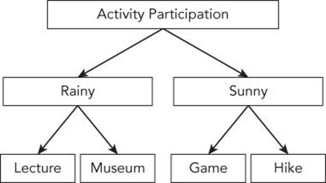
Figure 2.1 In a decision tree, environmental factors, such as the weather, along with personal choices, can impact the final decision equally.
· Clusters: Clustering looks at existing attributes or values and groups entries with similarities. The clustering technique lends itself to more of an exploratory approach than classification because you don't have to predetermine the associated groups. However, this data mining method can also identify members of specific market segments.
· Sequential patterning: By examining the sequential order in which actions are taken, you can determine the action likely to be taken next. Sequential patterning is a foundation of trend analysis, and timelines are often incorporated for related data visualization.
These various techniques can be applied separately or in combination with one another.
Projecting Future Trends
The prediction of future actions based on current behavior is a cornerstone of data visualization. Much projection is based on regression analysis. The simplest regression analysis depends on two variables interconnected in a causal relationship. The first variable is considered independent and the second, dependent. Let's say you're looking at how long a dog attends a behavioral school and the number of times the dog chews up the furniture. As you analyze the data, you discover that there is a correlation between the length of the dog's training (the independent variable) and its behavior (the dependent variable): The longer the pet stays in the training, the less furniture destruction. Table 2.4 shows the raw data.
Table 2.4 Data for Regression Analysis
|
Days Training |
Chewing Incidents |
|
5 |
8 |
|
10 |
5 |
|
15 |
6 |
|
20 |
3 |
|
25 |
4 |
|
30 |
2 |
To get a better sense of how regression analysis works, Figure 2.2 shows the basic points plotted on a graph. As you can see, the points are slightly scattered across the grid. Because it involves only two variables, this type of projection is referred to as simple linear regression.
NOTE Some statisticians refer to the independent and dependent variables in regression analysis as exogenous and endogenous, respectively. Exogenous refers to something that was developed from external factors, whereas endogenous is defined as having an internal cause or origin.
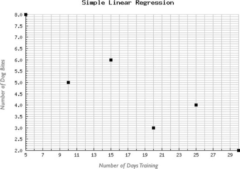
Figure 2.2 The number of days training (the independent variable) is shown in the X axis and the number of dog bites (the dependent variable) in the Y.
To clarify the data trend direction, a regression analysis formula is applied that plots a straight line to encapsulate the point distribution (see Figure 2.3). This trend line provides insight to the scattered point distribution—it's a great example of how data visualizations can be used for discovery and understanding.
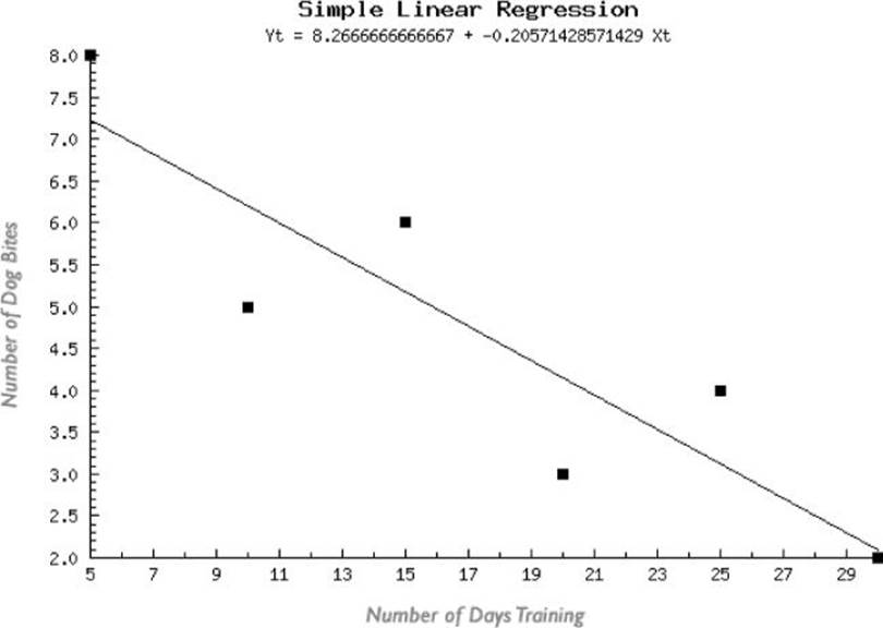
Figure 2.3 When a linear progression formula is applied to the data, a straight trend line is indicated.
Of course, there won't always be a one-to-one relationship. It's axiomatic that correlation isn't causation. There are often other factors in the mix. However, narrowing the outside variables—such as limiting the study to one breed—increases the predictive possibilities.
REFERENCE The actual mathematics of regression analysis and other concepts covered in this chapter are outside the scope of this book. However, there are numerous online and offline tools to handle the heavy arithmetic lifting. To learn more about these tools and the techniques for using them, see Chapter 8.
Summary
The analysis of data is an integral aspect of its visualization. A wide range of mathematical and statistical techniques are available to examine both the individual informational components and their overall structure. Here are a few important points regarding the basics of data analysis:
· For the most part, data analysis is a numbers game and a core understanding of key mathematical concepts is necessary.
· The mean of a series of numbers is found by dividing the sum of the values by their number.
· The midpoint in a set of values is referred to as the median.
· To find the average distribution of your data, calculate its standard deviation.
· Special considerations—including a variation in the standard deviation, per capita calculations, and margin of error—must be kept in mind when analyzing data from a sample of a given population versus the entire population.
· Various techniques in data mining can be used to uncover current and predictive patterns. These techniques include associations, classifications, decision trees, clusters, and sequential patterning.
· Regression analysis looks at independent and dependent variables to determine trendlines of future behavior.
All materials on the site are licensed Creative Commons Attribution-Sharealike 3.0 Unported CC BY-SA 3.0 & GNU Free Documentation License (GFDL)
If you are the copyright holder of any material contained on our site and intend to remove it, please contact our site administrator for approval.
© 2016-2026 All site design rights belong to S.Y.A.