JavaScript and jQuery for Data Analysis and Visualization (2015)
PART I The Beauty of Numbers Made Visible
Chapter 3 Building a Visualization Foundation
What's in This Chapter
· Getting to know charting primitives, including point, bar, and pie charts
· Understanding specialized charts, including candlestick, bubble, and surface charts
· Examining the underlying technology for these charts, such as HTML5 and SVG
CODE DOWNLOAD The wrox.com code downloads for this chapter are found at www.wrox.com/go/javascriptandjqueryanalysis on the Download Code tab. The code is in the chapter 4 download and individually named according to the names throughout the chapter.
After you have your data in hand, the big question is how to present it. Before you can make the choice that best communicates your message, you need a thorough grasp of what's possible—in the universe of visualization options as well as in the technology to create them online.
This chapter lays the groundwork for both realms. First, it takes a look at visualizations from the most basic (point, bar, and pie charts among others) to the more specialized (bubble and candlestick charts). Then it examines some of the underlying technology for displaying these visualizations online, primarily HTML5 and SVG.
Exploring the Visual Data Spectrum
Trying to choose the right representation for your data is like being a child and walking into a toy store for the first time. There are just so many shiny, attractive options from which to choose. Whether you go with basic building blocks, such as a pie or bar chart, or opt for a more sophisticated conveyance, such as a timeline-based infographic, depends on many factors. To ensure you're making the correct selection, it's important you understand the full range of choices available to you. This section examines a wide range of data visualization possibilities from the simple to the robust.
Charting Primitives
Graphic artists refer to core elements such as lines, rectangles, and ovals as drawing primitives. We borrowed that concept, applied it to data visualizations, and christened it charting primitives. Included in this collection are the most familiar members of the visualizations family: plotted points, line charts, bar charts, pie charts, and area charts.
Even though these visualization types are the most basic, there is a thriving set of variations for each one. Although many options are design-oriented—such as 2D versus 3D—others are crucial for representing sophisticated data in a meaningful way.
Data Points
The data point is perhaps the most basic of the charting primitives. A data point is a single element plotted on a graph, typically via the X and Y axes. For this reason, data point charts are also known as XY charts. Moreover, because they can appear as dots scattered across the plane (see Figure 3.1), you may often see them referred to as scatter charts.
NOTE It's important to note that data points require two numeric values to be plotted, unlike some other types of charts that may combine one number with a category such as 3rd Quarter Revenue.
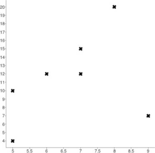
Figure 3.1 Data points plotted according to their X and Y values.
Plotted data points are used to illustrate the interconnection between two different sets of data; this interconnection is referred to as the correlation. If the data points on the graph appear to be random, without a discernable pattern, there is said to be no correlation.Positive correlation occurs when the values generally increase together. The correlation is considered negative when one value goes down while the other goes up. If there is a one-to-one correspondence in either case, the correlation is considered perfect.
REFERENCE If there is a strong correlation in one direction or the other, calculated lines are often drawn for emphasis or to indicate trends. This technique is used in regression analysis, which is covered in Chapter 2.
Line Charts
When you connect two data points with a continuous line, you create the first segment in a line chart. Line charts are among the most common and form the basis for other types of charts: area, stacked line, and curve fit (also known as smooth line) among others. A single data series is rendered as one line moving from point to point, as shown in Figure 3.2.
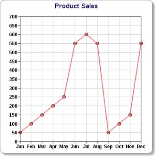
Figure 3.2 In line charts, markers are often used to highlight the data points on the grid.
Often used to depict data points over time, line charts of sufficient breadth can effectively become trend lines, although they are not necessarily predictive. Stock price charting frequently incorporates line charts, which can be depicted in numerous ways, including a day-to-day change and a percentage change from the median over a set period (see Figure 3.3).
NOTE Although it is possible to present line charts in 3D, we don't find the 3D perspective in line charts as effective as in other charting elements, such as a bar or pie chart. That's because the 3D perspective can actually obscure the values. Regardless of your stylistic preferences, you should never compromise the information in your charts.
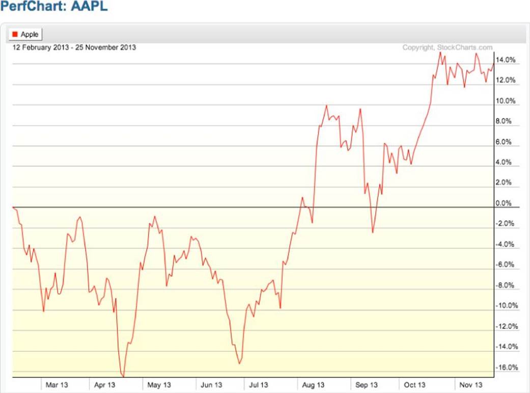
Figure 3.3 Stock prices, like these percentage variations for Apple, Inc. over a period of 200 days, provide ample material for a line chart.
Source: Chart courtesy of StockCharts.com
Variations in color, weight (or thickness), and type of line—solid, dotted, dashed, and so forth—by themselves or in combination with each other, can be used to depict different data series. Figure 3.4 shows such a line chart with five data series, varied by line color and placement. Another technique is to apply different markers, identifying the data points; markers can be a variety of shapes, such as circles, squares, or diamonds, or even different graphics.
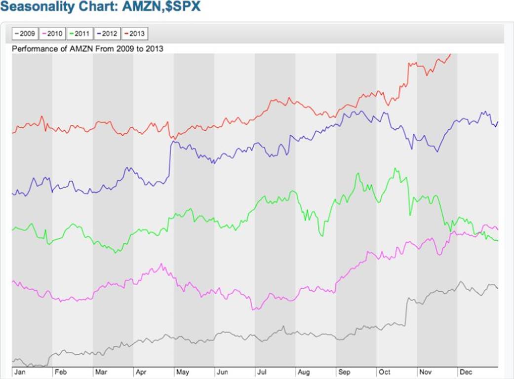
Figure 3.4 When comparing data sets with the same unit of measure, as with this seasonality chart of Amazon stock prices over 5 years, line charts can be shown one above the other.
Source: Chart courtesy of StockCharts.com
To clarify a data point in a line segment, the exact information can be displayed when the user hovers his or her cursor over a point on the line or taps the point on a mobile device screen.
Stacked line charts, as the term suggests, essentially display one line chart data set above one or more others, but unlike the example shown in Figure 3.4, they typically include the different Y-axis scales. This layout allows for varying units of measure. You could, for example, stack one chart of profit data, another of the percentage of market share, and a third of number of employees over the same time range. All three have different measurement units, yet by offering the visual comparison brought by a stacked line chart, patterns emerge and trends can be identified (see Figure 3.5).
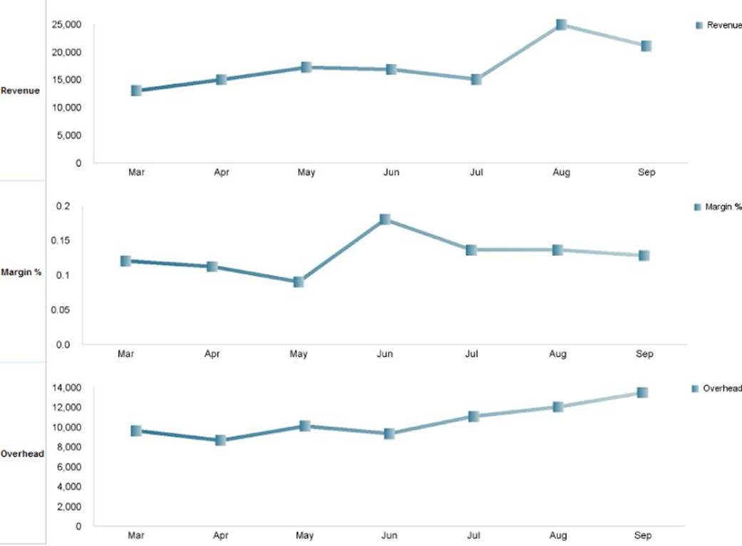
Figure 3.5 This example of a stacked line chart by Christoph Papenfuss compares revenue, margin, and overhead over the same timeframe.
Source: http://www.performance-ideas.com/2012/03/27/stacked-line-charts/
Most often, the lines are drawn straight from one point to another. However, some line charts incorporate arcing lines for a more curved, smooth appearance, like those shown in a bell curve. The lines in these types of charts (see Figure 3.6) are said to be curved orspline line charts.
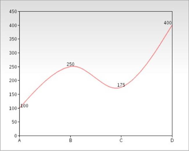
Figure 3.6 The smoothness of a curved line chart is achieved through the application of a mathematical function to draw the line.
Polynomial or other mathematical functions—such as quadratic, exponential, or periodic—are applied to the points to smooth the line. A consideration to keep in mind when converting a straight line chart to a curved line chart is that applying any sort of mathematical curving function introduces an approximation of data rather than the precise data itself. However, in some instances, this approximation may be acceptable and even desirable.
Bar Charts
Bar charts use one or more proportionately sized rectangular elements to represent specific data values. The rectangles are presented either horizontally or vertically; if the latter, the bars may be referred to as columns. Frequently, multiple bars are placed side-by-side to illustrate relative differences, and the impact of the chart relies on this comparison (see Figure 3.7).
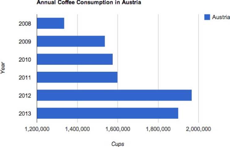
Figure 3.7 Bar charts are great for at-a-glance comparisons, such as this one that shows a big spike in Austrian coffee drinking in 2012.
In a bar chart, one axis sets the categories being considered; these categories may be date related, such as a series of months or quarters; locations, such as states or sales offices; or other relevant groupings. The opposing axis shows a series of values in a single unit of measure, most often in an ascending, bottom-to-top, arrangement. The scale of measurement varies, but often starts at zero and extends to a number at or slightly above the highest value entry.
In addition to the simple bar graph, there are two other distinct types of bar charts: grouped and stacked. As the name implies, a grouped bar chart places bars representing related members of a subcategory adjacent to each other—grouped, if you will—beside other similar collections of bars, as shown in Figure 3.8.
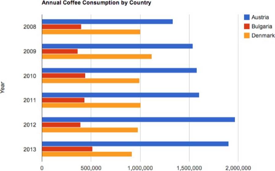
Figure 3.8 A grouped bar chart can add another perspective to the data; here you see that Austrians drink much more coffee year-to-year than other European countries.
Stacked bar charts work with subgroups as well, but instead of presenting each cluster as its own individual bar, the subgroups are placed on top of each other to represent a cumulative total value (see Figure 3.9). The subgroups are differentiated in some manner, such as varying colors or patterns, each of which is identified with a legend.
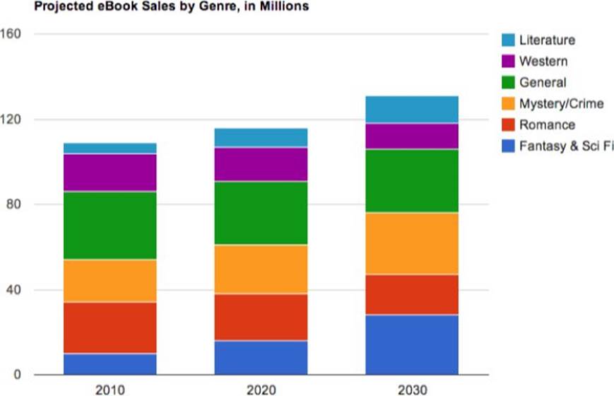
Figure 3.9 Stacked bar charts, like this column version, show aggregate totals as well as individual levels.
All manner of bar charts lend themselves very well to 3D styling. The illusion of depth is heightened by the perspective angle of the viewer relative to the charting elements combined with the rotation, pitch, and yaw of the three-dimensional space itself around the X, Y, and Z axes, respectively. There are so many variations possible when working with 3D bar charts that it can be difficult to decide which one is most fitting. The bar chart shown in Figure 3.10—as simple as it is—went through numerous iterations before being finalized in order to convey the basic information, as well as create the desired impact.
NOTE There are numerous shape variations for bar charts, including cylinders, cones, and pyramids. Some specific constructions, like pyramids, may at first glance appear to work exceedingly well with stacked bar graphs. However, the representation of the data can be misleading because although the height of the element is used to depict the value, the varied volume of the object conveys a different impression. For example, the pyramid chart shown in Figure 3.11 indicates that the top level is 26.76 percent of the total, and the bottom is 23.32 percent. Although the top slice of the pyramid is appropriately a bit taller than the lowest level, volumetrically the bottom is many times larger. For bar charts such as these, labeling is critical.
Figure 3.10 3D bar charts typically incorporate shadows and shading to render the three-dimensional imagery in a 2D medium.
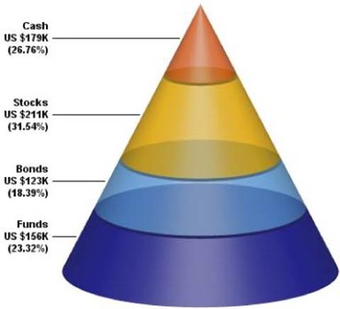
Figure 3.11 Pyramid and other alternative bar chart shapes can be compelling visually but must be labeled properly to avoid data misinterpretation.
Source: www.advsofteng.com/gallery_pyramid.html
Pie Charts
A pie chart is a circular graph composed of separate portions of the circle—a.k.a. sectors—to represent relative data sizes of the overall sample, or, in other words, the entire pie. Whereas the data series in a bar chart are open ended and do not need to match any particular total, by their very nature the data series percentages in a pie chart must equal 100 percent. Pie charts like the one shown in Figure 3.12 are great for showing simple relationships between various data segments.
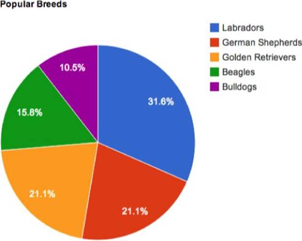
Figure 3.12 When labeled with data values, a pie chart gives you the hard numbers as well as the visual percentage.
The proportionate size of the sectors or pie slices are determined formulaically where the data value is divided by the total of all values and then multiplied by 100 to find the percentage of the total. That percentage is then multiplied by 360, the number of degrees in a circle, to get the size of the arc for each sector in degrees. For example, consider the following data points.
|
North |
South |
East |
West |
Total |
|
|
Data |
200 |
125 |
175 |
150 |
650 |
The total for all values is 650. Dividing the value of each segment by the total provides that segment's percentage (see Table 3.1).
Table 3.1 Percentage of Pie Chart Data
|
North |
South |
East |
West |
Total |
|
|
Data |
200 |
125 |
175 |
150 |
650 |
|
Percentage (Data / Total Data) |
30.8% |
19.2% |
27.9% |
23.1% |
100% |
Multiplying the percentages by 360 results in the degrees for each data point, as shown in Table 3.2.
Table 3.2 Degrees of Pie Chart Data
|
North |
South |
East |
West |
Total |
|
|
Data |
200 |
125 |
175 |
150 |
650 |
|
Percentage (Data / Total Data) |
30.8% |
19.2% |
27.9% |
23.1% |
100% |
|
Degree (Percentage × 360) |
111° |
69° |
97° |
83° |
360° |
As you can see, the total for all degrees is equal to 360, a complete circle. Pie charts frequently display both the raw data and the calculated percentages, either all the time or when the user hovers over or taps a particular slice, as shown in Figure 3.13.
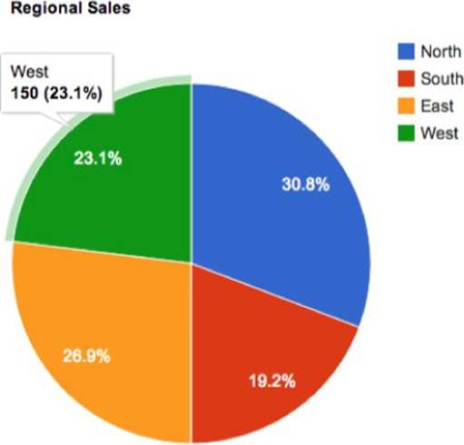
Figure 3.13 The underlying data is available for this pie chart interactively.
To emphasize a particular data point, the associated pie slice is moved slightly from the center or exploded. The exploded pie chart is particularly effective in 3D (see Figure 3.14). As with bar charts, 3D pie charts can be tilted in any orientation and are typically rendered with shading and shadows.
Figure 3.14 Explode one or more slices of a pie chart—whether 2D or 3D—to highlight them.
Source: FusionCharts
Occasionally, it is helpful to drill down further into a particular pie segment to provide more detail. One technique for accomplishing this is to create a “pie of pie” type chart, where the percentage values of the entire child pie equal the value of the parent slice, as shown in Figure 3.15.
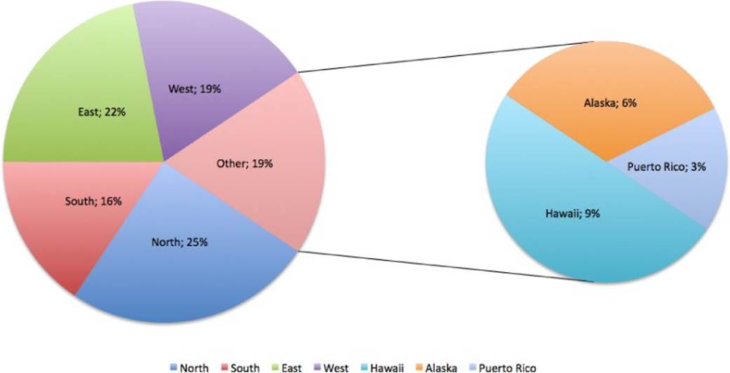
Figure 3.15 The pie-of-pie approach breaks a sector out for more detail rather than creating a series of smaller slices.
Other types of circular charts include donut charts, which can be used to represent multiple series of data. The chart in Figure 3.16, for example, shows a series of countries and their related sales percentages with the total in the middle of the donut.
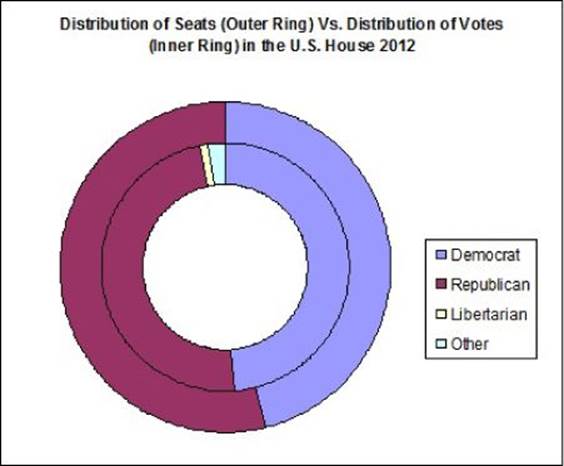
Figure 3.16 The donut chart uses multiple rings to display a range of related data.http://commons.wikimedia.org/wiki/File:2012_US_House_Donut_Graph.jpg
Another type of circular chart, the polar area diagram, equates the data values to the distance from the center of the circle rather than the percentage degrees of the standard pie chart. Such graphs are often used by meteorologists to chart wind speeds from varying directions in what is referred to as a wind rose like the one shown in Figure 3.17.
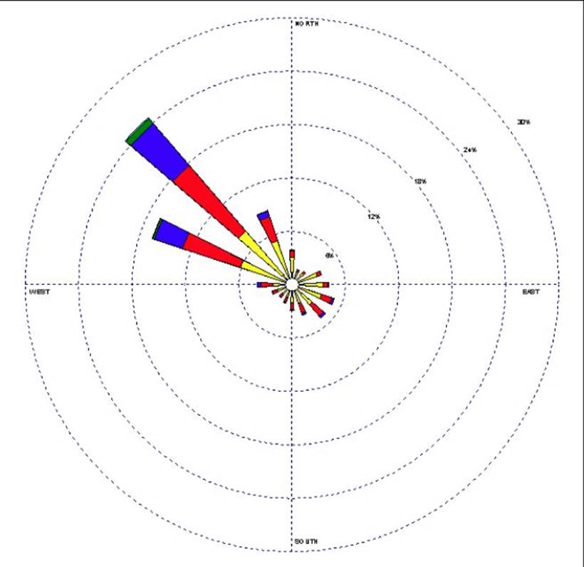
Figure 3.17 In this polar chart, the wind coming from the northwest is clearly the strongest.
Source: Natural Resources Conservation Service, USDA.
Area Charts
An area chart is, essentially, a line chart where the area between the line and the chart bottom are filled in with a pattern or solid color, as shown in Figure 3.18. Emphasizing the area brings focus to the overall volume indicated by the data.
Figure 3.18 The simplest area chart depicts a single set of data points.
Area charts really come into their own when multiple data series are displayed, either as a side-by-side comparison or overlapping regions. When separate data sets overlap, consider using semi-transparent colors so that all data is visible (see Figure 3.19).
Figure 3.19 Combine multiple data sets with overlapping area charts.
When cumulative data is important, another approach is to stack the area charts, one on top of the other. Similar to stacked bar charts, stacked area charts show relative data values for numerous data sets, typically over a date range as well as displaying the total. For example, Figure 3.20 shows the number of cars, motorcycles, and bicycles involved in traffic incidents from 1999 to 2012. Because of the nature of the stacked area chart, it is immediately apparent that the overall incidents declined, mostly because of the drop in motorcycles accidents, whereas both bicycle and automobiles (after 2001) stayed relatively the same.
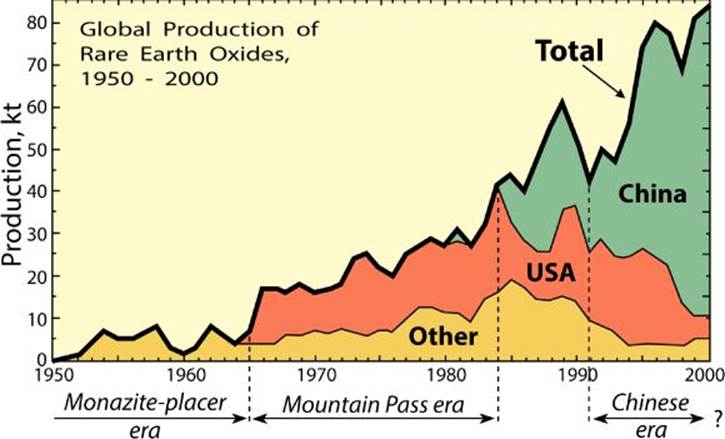
Figure 3.20 Stacked area charts enable you to quickly grasp overall trends as well as specific data set changes.http://commons.wikimedia.org/wiki/File:Rareearth_production.svg
Exploring Advanced Visualizations
Beyond charting primitives lies a vast and expansive field of visualizations. At first glance, some of these more exotic options may seem like so much eye-candy, but the possibilities covered in this section are purpose driven rather than merely decorative. A candlestick chart, for example, is not just a fancy bar chart with different iconography; the candlestick shapes are typically used to plot the high and low points of specified stock prices as well as their open and closing prices. You'll find similar need-based foundations in all the chart types covered in this section, including candlestick, bubble, surface, map, and infographics.
Candlestick Chart
Candlestick charts can convey a great deal of information in a very compact package. A complete candlestick chart combines aspects of both line and bar charts and is generally used in tracking stocks, commodities, and similar exchange items over a range of time.
The primary element is really only a literal candlestick if you consider the old saying “burning the candle at both ends” to be a real possibility. The various elements of the candlestick are derived from four different values, each related to a trading price:
· High: The top of the upper candlestick wick or shadow
· Close: The bottom of the upper shadow and the top of the candle or body
· Open: The top of the lower shadow and the bottom of the body
· Low: The bottom of the lower shadow
Each candlestick displays a data set of values at a specific point in time and complete candlestick charts comprise many such elements as you can see in Figure 3.21. What's really great about candlestick charts is the depth of the information that is conveyed. In addition to tracking the movement of prices over a given period, the length of the candle body indicates the relative pressure in either selling or buying. An additional convention is added to indicate the direction of the pressure: If the body is hollow, the close is greater than the open and buying is more prevalent, whereas if the body is filled with a color, the closing price is less than the opening and selling is predominant.
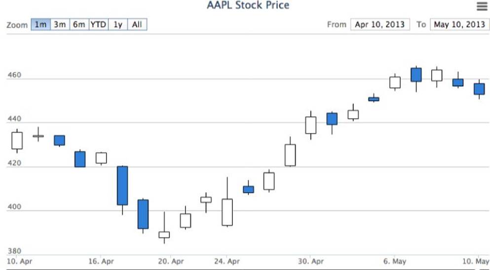
Figure 3.21 Candlestick charts convey both detailed data, such as opening and closing stock prices, as well as general trends.
Bubble Chart
Bubble charts add an extra dimension to the standard data point chart. A single bubble in a bubble chart utilizes three values: one for each axis that determines position on the graph and a third value, indicated by the bubble's size, which could represent any other relevant value. For example, in Figure 3.22 the bubbles are mapped according to life expectancy (X axis) and fertility rate (Y axis) while their size is derived from the population of the countries. Bubble charts like this can help illustrate “apple-to-apple” comparisons; in this example, you can see that although Great Britain and Germany have about the same population size and life expectancy, the fertility rate in the UK is much higher.
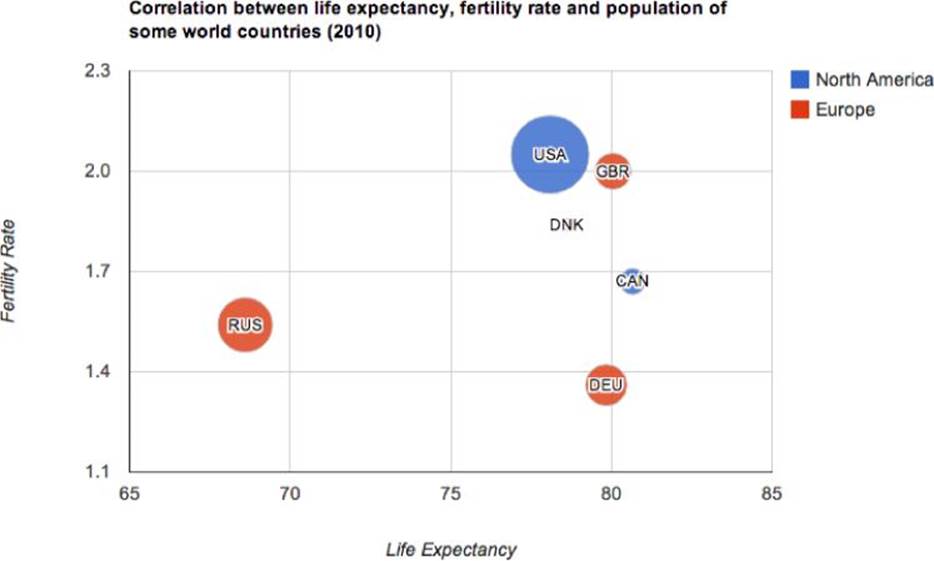
Figure 3.22 Bubble charts allow for three data values per element.
The chart shown in Figure 3.22 also demonstrates one of the issues with bubble charts. See the data point below the USA and GBR? Well, maybe you can and maybe you can't. The much smaller circle with the initials DNK is for Denmark. If the third value is relatively too small—as is the case here in Denmark's population—it may not be noticeable. The problem is exacerbated when the third value is zero or negative. Be sure to review all of your data carefully to ensure that all values are fully represented before opting for the bubble chart.
Surface Charts
Whereas many charts use 3D graphics for visual flare, the surface chart is, by its very definition, three dimensional. Similar to bubble charts, surface charts allow you to convey data in three dimensions, for instance Figure 3.23 uses a surface chart to show rainfall distribution across both latitude and longitude.
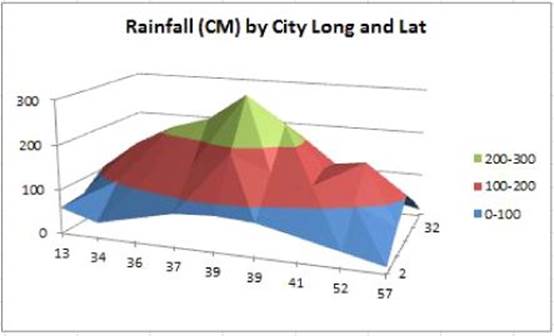
Figure 3.23 Surface maps show three dimensions of data.
Source: http://dedicatedexcel.com/an-overview-of-charts-in-excel-2010/
Another factor that distinguishes surface charts from other chart types is the use of color. Typically, with line and bar graphs, color is used to identify data sets across one or more axes. With a surface chart, separate colors are used to represent a range of data as it maps to the three axes (X, Y, and Z) as shown in Figure 3.24.
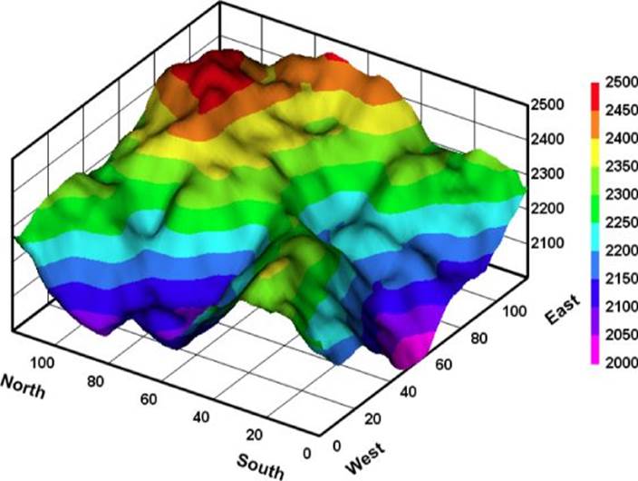
Figure 3.24 Surface maps use color to identify a range of data, as shown by the legend on the right of the figure.
Source: DPlot Graph Software
Instead of 2D and 3D options, the surface chart can be displayed with solid, color-filled regions or as a wireframe. Wireframes are useful when plotting a great deal of data and it's essential to render results quickly and illustrate the data point more clearly. However, because color is such a critical differentiator in surface charts, the lack of a solid colored area in a surface wireframe makes them somewhat difficult to read. A good compromise is to overlay a standard surface map with a grid-like wireframe (see Figure 3.25).
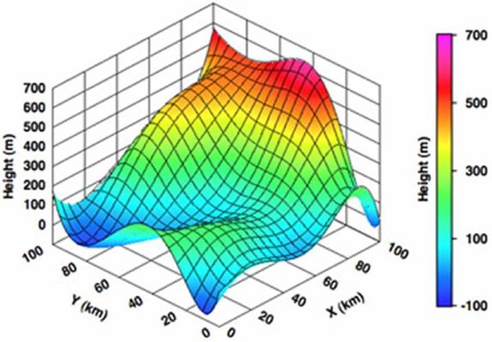
Figure 3.25 Combine solid and wireframe surface charts to get a finer degree of data visualization with the easy readability of color ranges.
Source: Gigawiz
Map Charts
Surface charts may appear to be terrain-like, but data visualization offers actual topographic alternatives when needed. In this context, a map chart combines the rendering of a geographic area with selected data, which may be represented as highlighted regions with or without custom markers. The maps themselves can be as detailed as necessary—up to and including being depicted with satellite photography—or they can be rendered as one-color outlines, like the one in Figure 3.26.
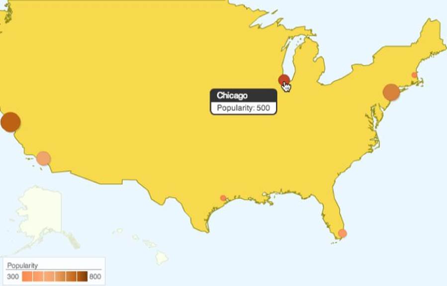
Figure 3.26 This map chart shows city locations and populations.
Another type of map chart is the geomap or geochart. Map charts used actual mapping data, which is overlaid with data-driven markers; typically, you can zoom into and scroll around a map chart, just as you could an online map. A geomap, on the other hand, is typically not scrollable and has only limited zoomability. Geomaps also can incorporate bubble-type markers, where the size of the marker is related to a data set. It is possible, however, to include interactivity to reveal data point details on both types of map charts (see Figure 3.27).
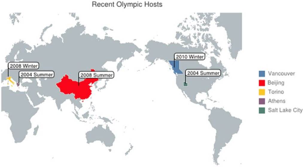
Figure 3.27 Map charts can reference the globe while highlighting targeted countries.
Infographics
Like the word itself, an infographic combines information and graphics. In a sense, the term could be applied to any kind of chart, but it has come to encompass a much broader range of conveying knowledge through design. Infographics appeal to the aspect of people that learns visually to both impart relevant information and persuade observers of the inherent message. They range from the simplest USA Today front-page graphic on what's happening to densely detailed posters published by the U.S. government (seeFigure 3.28) and everything in between—and beyond.
NOTE Whether imparting serious or frivolous information, infographics are a designer's playground. It's no wonder that there are many online sites that highlight infographics. You can find amazing, inspirational examples at Visual.ly (http://visual.ly), Daily Infographic (http://dailyinfographic.com), and Cool Infographics (http://www.coolinfographics.com).
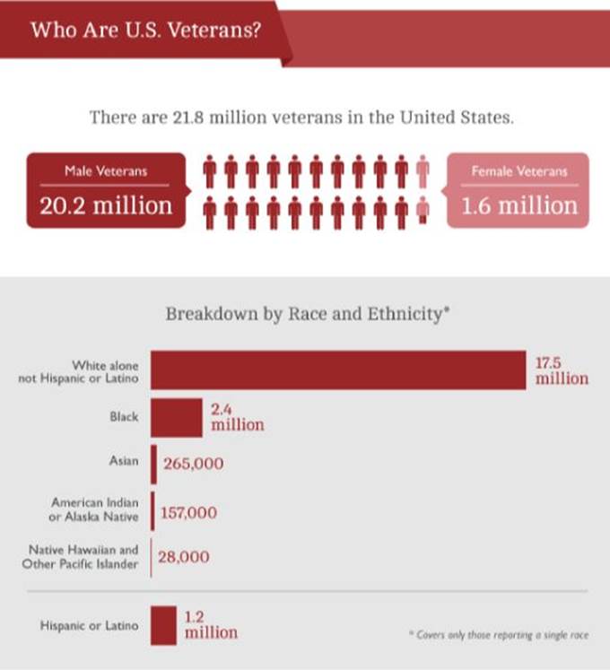
Figure 3.28 This excerpt from an infographic on veterans published by the U.S. Census bureau combines iconography, bar charts, and detailed information.
Edward Tufte—affectionately known as ET—is one of the champions of infographics in the modern era. In his book Visual Display of Qualitative Information (Graphics Press, 2001), he outlines a number of key principles of infographics, including the following:
· Show your data. The data itself is critical to an infographic.
· Engender thought on the infographic's subject. The goal is to keep the focus on the substance rather than on the prettiness of the graphics or the methodology.
· Keep true to your data. Distorting information to make a specific point undercuts the very nature of data.
· Encourage comparisons. Numerous data visualizations, such as bar charts, create easy-to-grasp correlations and should be incorporated where possible.
You can see many of these principles in the work of government agencies, such as the infographic from the Jet Propulsion Laboratory shown in Figure 3.29.
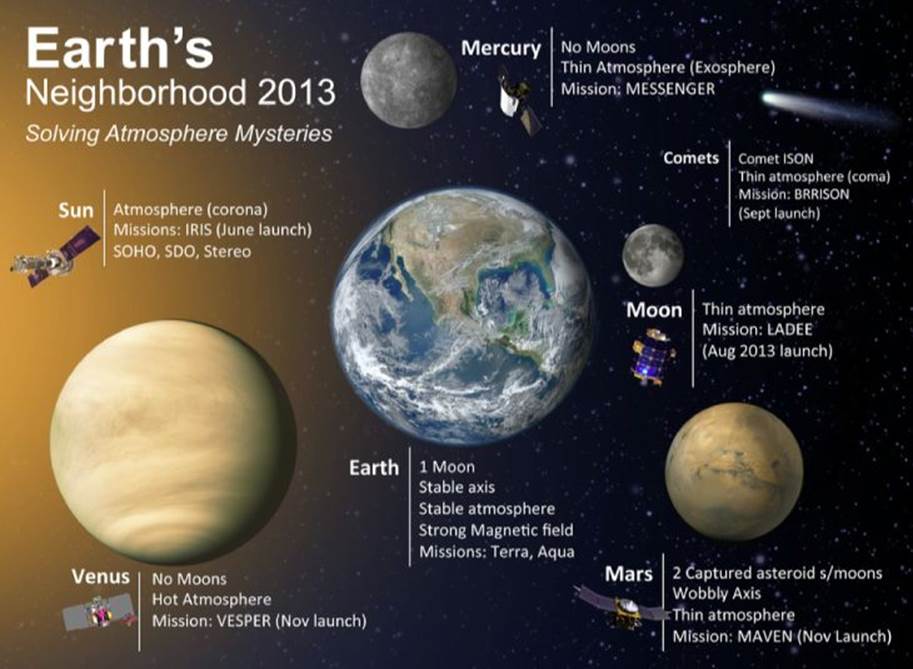
Figure 3.29 This infographic from NASA's JPL provides proportional planets with key details about the atmospheres of neighboring planets.
Source: NASA
Making Use of the HTML5 Canvas
Canvas is one of the most innovative and impactful elements of the HTML5 language, especially in regard to data visualization. With the <canvas> tag, a designer creates a reserved open-ended area on the web page to contain programmatically created graphics at run-time. HTML5 canvas imagery is powered by a robust JavaScript API—the vast majority of which enjoys a healthy degree of cross-browser support currently and can be put to use immediately.
The first step in working with <canvas> is to include the tag in the <body> section of your HTML page. You only need to include three attributes: ID, width, and height. Should this tag not be supported by a browser, you can display an alternative. Any content—whether an alternative image or text message—can be inserted between the opening and closing <canvas> tags. Here's a complete <canvas> tag listing:
<canvas id="chart1" width="600" height="400">
<img src="images/altchart1.jpg">
</canvas>
At this stage, nothing would be displayed on the page in this reserved space, assuming the browser supported the HTML5 <canvas> tag. It's quite literally a blank canvas. To draw on the canvas, it needs to be “primed” or initialized with JavaScript. Typically, you do this by placing the necessary JavaScript function in the <head> and calling it when the document is ready. The following are the basic steps for initializing the canvas:
1. Create a variable to hold the canvas object, as identified by its ID.
2. Check to see if the canvas API getContext() method (and thus, the <canvas> tag) is supported.
3. If so, create a variable and apply the getContext() method for the targeted canvas object.
In practice, the code looks like this:
<script type="text/javascript">
function drawCanvas(){
var theChart = document.getElementById('chart1');
if (theChart.getContext){
var theContext = theChart.getContext('2d');
}
}
</script>
After the context of the canvas is defined, all drawing calls reference this variable with the canvas area treated as coordinate space. The declared width and height attributes of the <canvas> tag determine the number of pixels available in the grid. In this example:
<canvas id="chart1" width="600" height="400">
There are 600 pixels in the X axis and 400 in the Y. The grid origin (0,0) is, by default, placed in the upper-left corner of the canvas. Armed with this information, a primitive canvas object—a filled rectangle—can be drawn with the fillRect() function. This function takes four arguments: x, y, width, and height. The first two values identify the upper-left corner of the rectangle, whereas the latter two, obviously, supply the dimensions; all values are specified in pixels. For example, to draw a simple filled rectangle 100 pixels wide by 200 tall, where the upper-left corner starts at 50 pixels from the left edge of the canvas and 200 from the top edge, the basic function would look like this:
NOTE In their development of the canvas specification, the W3C indicated that the canvas context value initially defined was two-dimensional or “2d”. This action was taken with the thought of possibility extending the specification to include a “3d” context. Although that extension has not really taken hold, a viable replacement, WebGL, has. WebGL libraries specifically for data visualization, such as the one from InCharts3D (http://incharts3d.com/) are beginning to emerge.
fillRect(50,200,100,200)
The output in Figure 3.30 shows the start of a basic bar chart.

Figure 3.30 With canvas, you can begin to programmatically create bar charts using the rectangle drawing primitive.
Here's the complete HTML page code for drawing the first rectangle. We've added some basic CSS styling and a tad more HTML to center and outline the canvas.
<!doctype html>
<html>
<head>
<meta charset="UTF-8">
<title>Canvas Example 1</title>
<script type="text/javascript">
function drawCanvas(){
var theChart = document.getElementById('chart1');
if (theChart.getContext){
var theContext = theChart.getContext('2d');
theContext.fillRect(50,200,100,200);
}
}
</script>
<style>
#outerWrapper {
width: 800px;
margin: 1em auto;
}
canvas {
border: 1px solid #000;
}
</style>
</head>
<body onload="drawCanvas();">
<div id="outerWrapper">
<canvas id="chart1" width="600" height="400">
<img src="images/altchart1.jpg" width="600" height="400">
</canvas>
</div>
</body>
</html>
NOTE Note that in this simple example, the JavaScript onload() function is used in the <body> tag to call the previously defined drawCanvas() function. In a production scenario, you'd be more likely to use the DOMContentLoaded() or jQuerydocument.ready() function to trigger drawCanvas().
The canvas API is fairly robust and you can programmatically perform many different illustrating operations. Here's a partial list of what's possible:
· Rectangles, both solid and outlined
· Points of any dimension
· Connected straight lines
· Arcs
· Circles and ovals, both solid and outlined
· Text, with specified font, size, and color
· Import images
· Complete color control, including alpha transparency
· Gradients of any color combination, linear or radial
· Shadows of any object or text
· Patterns of any object, repeated in a specified direction
In addition to the basic drawing options listed here, canvas objects can be scaled, rotated, and moved (or translated) anywhere on—or off—the canvas. These features can be applied to create animated canvas graphics, such as zooming timelines, all under programmer or user control.
Finally, it's worth noting that canvas typically provides better performance than other drawing alternatives. When you combine that with the plethora of styling options, it's no wonder that many charting plug-ins—such as ChartJS, RGraph, FusionCharts, and Flot—offer <canvas> tag–based output.
Integrating SVG
SVG, short for Scalable Vector Graphics, is a useful alternative to HTML5 canvas. Like canvas, SVG enables run-time graphics in a format supported by most modern browsers. Unlike the pixel-based canvas, SVG is, as the name plainly states, vector based. Vectors are resolution independent—which means they do not degrade in quality if rescaled or magnified—and often result in a smaller file size than rasterized graphics.
SVG has been a W3C-approved specification since 2003 and, consequently, enjoys rich tool support, notably Adobe Illustrator and the open-source Inkscape. When a file has been exported as SVG, it can be integrated into a web page with the basic <img> tag, like this:
<img src="images/chartLogo.svg" width="400" height="150" >
REFERENCE There are some dedicated and enthusiastic supporters of SVG. For a great visual sampler, visit SVG Wow (http://svg-wow.org).
SVG can also be created as an XML file or placed inline in an HTML page. The code requires the use of an XML namespace as well as a particular syntax. Unlike canvas, you don't need JavaScript to create graphics programmatically, although an SVG DOM component is available. Rather, the drawing instructions are detailed in the XML. For example, the following code creates a blue circle in the middle of an area 400 pixels square:
<svg height="400" xmlns="http://www.w3.org/2000/svg">
<circle id="circle1" cx="400" cy="200" r="50" fill="blue" />
</svg>
After the SVG area is defined (complete with namespace declaration), the <circle> tag includes attributes for cx, cy, r, and fill—the center-x, center-y, radius, and fill color, respectively. You can see the result in Figure 3.31.

Figure 3.31 This SVG was drawn using XML in the markup.
In addition to offering the same core drawing capabilities as canvas, like rectangles, ovals, lines, polygons, text, gradients, and so forth, SVG also includes a number of filters to provide special effects. Some of the possibilities of SVG effects include the following:
· Blend
· Offset
· Gaussian blur
· Color matrix
· Composite
· Convolve matrix
· Diffuse lighting
· Specular lighting
· Tiling
· Turbulence
NOTE SVG filters are compatible with the latest round of browsers but would not be a good choice if you needed to support older versions.
SVG filters can be combined. Figure 3.32, for example, shows a combination of blending, offset, and Gaussian blur to add a drop shadow to the previously drawn blue circle.
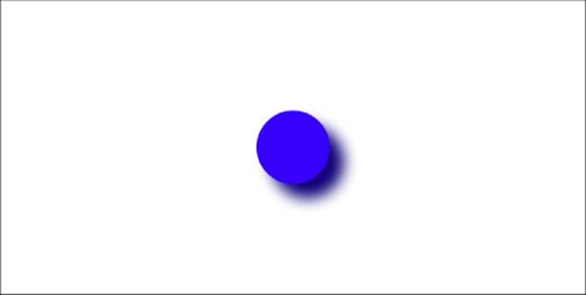
Figure 3.32 Four different filters were combined to create the drop shadow of this SVG drawn circle.
With the scalable vector graphics capability and inherent small size, SVG is an extremely viable medium for data visualization. On the pro side, SVGs are DOM accessible, meaning that you can reference and adjust the values in an SVG, in turn seeing those changes reflected on the screen. On the con side, this DOM accessibility comes at the cost of performance; SVG typically performs worse than canvas.
REFERENCE Numerous online tools, including the Google Charts API and Raphaël, support SVG. For a closer look at each, see Chapters 9 and 10.
Summary
When it comes to data visualization, there are a ton of options, both in final rendered output and the underlying technology used to get there. Here are a few things to keep in mind when considering the possibilities:
· There are numerous basic charts—or charting primitives—to choose from, most of which include many variations.
· Primarily used to chart stock prices, candlestick charts contain a wealth of details, including opening, closing, high, and low prices.
· One axis of a bar chart is presented as a single unit of measure, whether numeric, currency, or time-based.
· Grouped bar charts compare one collection of bars in related subcategories to other collections; stacked bar charts show a combined value.
· To show percentages with multiple data series, use several rings in a donut chart.
· When rendering more than one data set in an area chart, be sure to choose semi-transparent colors for the fill color to enable all data to be viewed.
· Both bubble and surface charts relay three dimensional data.
· Integrated map visualizations can range from photo-realistic to simple outlined regions or borders.
· Infographics combine detailed information with related graphics and often incorporate a variety of different charting types.
· HTML5 canvas and SVG are two effective tools for drawing graphics in the browser, each with different pros and cons.
All materials on the site are licensed Creative Commons Attribution-Sharealike 3.0 Unported CC BY-SA 3.0 & GNU Free Documentation License (GFDL)
If you are the copyright holder of any material contained on our site and intend to remove it, please contact our site administrator for approval.
© 2016-2026 All site design rights belong to S.Y.A.