JavaScript and jQuery for Data Analysis and Visualization (2015)
PART II Working with JavaScript for Analysis
Chapter 8 Statistical Analysis on the Client Side
What's In This Chapter
· Basic statistics concepts
· Statistical analysis with the jStat library
· Charting probability distributions with Flot
CODE DOWNLOAD The wrox.com code downloads for this chapter are found at www.wrox.com/go/javascriptandjqueryanalysis on the Download Code tab. The code is in the chapter 08 download and individually named according to the names throughout the chapter.
This chapter introduces jStat, a client-side statistical analysis library. With jStat, you learn how to compute basic values, such as the mean and standard deviation, and then how to leverage these values to create probability distributions. This chapter explores some rudimentary statistics but focuses mostly on how to use these tools.
This chapter also introduces the jQuery charting plug-in Flot, which is designed for plotting coordinate data. With Flot, you interface with jStat's probability distributions to render statistical charts like the normal curve.
By the end of this chapter, you'll have a handy toolkit for not only statistical analysis but also for rendering that data on the client side.
Statistical Analysis with jStat
jStat is a statistical analysis library that you can use on the client side. It isn't as robust as server-side statistics tools such as MATLAB or R, but it does provide similar features. With jStat, you can calculate everything from basic means and standard deviations to more complex probability distributions, such as the normal curve shown in Figure 8.1.
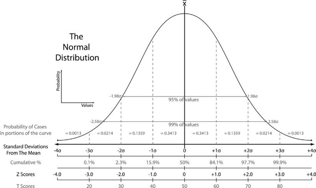
Figure 8.1 The normal curve is a useful probability distribution.
You can download and contribute to the jStat project on Github: http://jstat.github.io/.
Getting Started with jStat
jStat primarily works with vectors and matrices. Vectors are arrays of values—for example, [1,2,3,4]—whereas matrices are tables of values—such as [[1,2],[3,4],[5,6]]. For example, one student's test scores could be expressed as a vector, and the whole class's test scores could be expressed as a matrix.
To get started, first define a vector:
var myVector = [3, 6, 1, 9, 7, 5, 3, 2, 2, 1];
You can then use jStat to calculate the sum:
jStat( myVector ).sum();
// returns 39
or the mean and standard deviation:
jStat( myVector ).mean();
// returns 3.9
jStat( myVector ).stdev();
// returns 2.5865034312755126
NOTE Note The mean is the average of the values. For example, the mean of [1,2] is 1.5.
The standard deviation indicates the amount of fluctuation in a data set. For instance, the vectors [4,5,6] and [0,5,10] both have a mean of 5, but the latter has a much higher standard deviation.
You can also perform similar operations across matrices. For example:
var myMatrix = [[2, 5, 8], [6, 1, 4]];
jStat( myMatrix ).sum();
// returns [8, 6, 12]
Here, jStat calculates the values using each column in the matrix, for example, the sum of the first values, second values, and third values: [(2+6), (5+1), (8+4)] => [8, 6, 12].
Likewise, you can calculate the mean:
jStat( myMatrix ).mean();
// returns [4, 3, 6]
or the min and the max:
jStat( myMatrix ).min();
// returns [2, 1, 4]
jStat( myMatrix ).max();
// returns [6, 5, 8]
You can find this example in the Chapter 08 folder on the companion website. It's named jstat-basics.html.
Stat 101
Although jStat handles a variety of tasks, its primary purpose is statistical analysis. To this end, the library provides a number of tools for computing probability distributions such as beta, gamma, normal, log-normal, and chi-square.
This chapter doesn't talk too much about statistics, but it is useful if you understand simple concepts such as normal distribution, PDF, and CDF.
Normal Distribution Basics
Assuming that the values in your vector are normally distributed (for example, randomly fluctuating around a center point), a normal distribution becomes a useful way to model the system and predict various outcomes. With this particular type of distribution there tend to be a large number of values surrounding the center point, and fewer values as you move further away. Thus the normal distribution produces the classic bell curve shown in Figure 8.2.
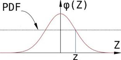
Figure 8.2 A normal distribution has the classic bell curve.
This distribution helps predict the likelihood of a given value in the system, which is why the y-values around the center point are higher than those further away. These y-values represent the PDF, or “probability density function,” you saw earlier.
It can also be useful to assess the CDF or “cumulative distribution function.” Unlike the PDF, which represents the probability of just a single value, the CDF represents the probability of all values up to that value. When thinking graphically, the CDF is the area underneath the PDF curve, as shown in Figure 8.3.
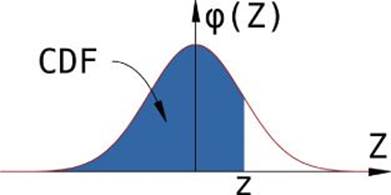
Figure 8.3 The shaded area is the CDF of a normal distribution up to point z.
Normal Distributions in Real Life
Normal distributions are all around us; one common example is human heights. The average height of adult males in the United States is 176.3 cm, with a standard deviation of around 7 cm. If you plug these values into jStat, you can get the PDF and CDF for a given height:
jStat.normal( 176.3, 7 ).pdf( 178 );
// returns 0.05533561870891004
jStat.normal( 176.3, 7 ).cdf( 178 );
// returns 0.5959419666157191
Here, jStat.normal() accepts two arguments—the mean and standard deviation. That creates a normal distribution, which is then used to calculate the pdf() and cdf() for a given value: 178 cm.
Thus, if you're a man from the United States, there's a 5.5 percent probability that you're 178 cm tall (PDF), and a 59.6 percent probability that you're 178 cm tall or shorter (CDF). Of course, if you are from the United States, there's also a pretty high probability that you don't know what 178 cm means—it's about 5'10”.
Rendering Probability Distributions with Flot
Although computing discrete probabilities for different values is useful, there are also times that you want to render the entire probability distribution graphically. Fortunately, jStat has all the functionality you need to massage the data and export it to a charting tool such as Flot.
Getting Started with Flot
Flot is a simple jQuery charting solution that is particularly good at plotting lines from coordinates. After you've downloaded the plug-in from http://www.flotcharts.org/, you need to define a wrapper with dimensions in your document:
<div id="flot" style="width: 500px; height: 300px"></div>
Next, pass a reference to this wrapper, along with a set of coordinates, into Flot's plot() application programming interface (API):
$('#flot').plot([ [[0,0], [1,2], [2,6], [3,5], [4,0]] ]);
Here, the plot() API renders the line graph shown in Figure 8.4.
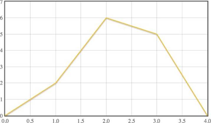
Figure 8.4 This basic line graph was rendered in Flot.
You may have noticed that the array of coordinates is itself contained in an array. That allows you to render multiple lines, as shown in Figure 8.5:
$('#flot').plot([
[[0,0], [1,2], [2,6], [3,5], [4,0]],
[[0,7], [1,6], [2,1], [3,2], [4,6]]
]);
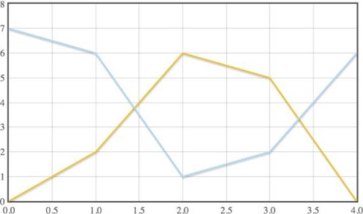
Figure 8.5 Flot renders multiple lines with ease.
There are a number of options you can set for Flot. For instance, you can render the bar chart as shown in Figure 8.6:
$('#flot').plot([ [[0,7], [1,6], [2,1], [3,2], [4,6]] ], {
lines: { show: false },
bars: { show: true }
});
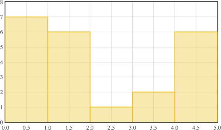
Figure 8.6 You can render a bar chart in Flot.
Or you can render a point chart, changing the colors of the dots, as shown in Figure 8.7:
$('#flot').plot([ [[0,7], [1,6], [2,1], [3,2], [4,6]] ], {
lines: { show: false },
points: { show: true },
colors: ['#F0F']
});
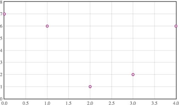
Figure 8.7 This point chart was rendered in Flot.
You can find this example in the Chapter 08 folder on the companion website. It's named flot-basics.html.
Rendering the Normal Curve
Now that you understand the Flot basics, you can get started with rendering probability distributions. Take another look at the normal distribution for adult male heights in the United States:
var myNormal = jStat.normal( 176.3, 7 );
Here, jStat creates a normal distribution based on a mean of 176.3 cm and a standard deviation of 7 cm. You already know how to compute a given PDF and CDF using myNormal.pdf() and myNormal.cdf(). The next step is to create a sequence of these values that can be rendered as a chart. Luckily, jStat has a utility method for this exact purpose—the seq() API:
var normalPdf = jStat.seq( 160, 192, 100, function(x) {
// return as coordinates
return [x, myNormal.pdf(x)];
});
As you can see, seq() accepts a few arguments:
· 160 is the bottom bound for the sequence.
· 192 is the top bound.
· 100 is the number of values between 160 and 192.
Lastly, the callback massages the data into the format you want to use for the sequence. In this case, a set of coordinates establishes the normal value for each point in the sequence. For instance, the start of this particular sequence is
[
[ 160, 0.00378779534905057 ],
[ 160.32323232323233, 0.004213283430410283 ],
[ 160.64646464646464, 0.004676584972725774 ]
...
]
Now that you've created a sequence, the only thing left is passing those coordinates to Flot:
$('#flot').plot([ normalPdf ]);
As you can see in Figure 8.8, this code renders the familiar normal curve.
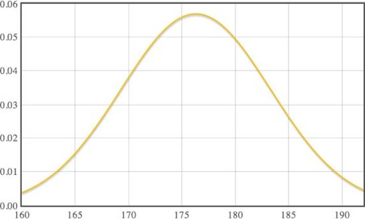
Figure 8.8 This normal distribution of heights was rendered with Flot.
Similarly, you can also render a visualization of the CDF for this distribution:
// create a coordinate sequence for CDF
var normalCdf = jStat.seq( 160, 192, 100, function(x) {
return [x, myNormal.cdf(x)];
});
// render it
$('#flot').plot([ normalCdf ]);
That renders the CDF chart in Figure 8.9.
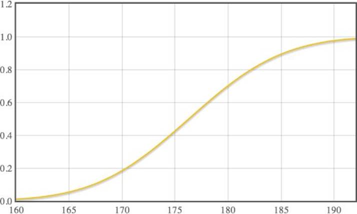
Figure 8.9 Flot has been used to render the CDF of the normal distribution.
You can find this example in the Chapter 08 folder on the companion website. It's named jstat-and-flot.html.
The normal distribution is only the tip of the iceberg when it comes to jStat. The library provides a variety of additional analysis tools and probability distributions. To learn more, visit the jStat documentation at http://jstat.github.io/.
NOTE As an exercise, try using Flot to render another probability distribution, such as a beta distribution.
Summary
In this chapter, you discovered the client-side statistics library jStat. You first figured out how to compute basic values such as mean and standard deviation. Next, you learned about normal distributions and how both the probability density function (PDF) and cumulative distribution function (CDF) relate to the normal curve.
You then explored Flot, the jQuery charting plug-in that builds visualizations from coordinate data. After learning the basics of line, bar, and point charts, you combined Flot with jStat to render the normal curve as well as its CDF.
This chapter is the last that covers data acquisition and manipulation. In the coming chapters, you leverage these data skills to build highly interactive charts. Now that you have a firm foundation in data structures, it's time to dig in and discover fun charting tools you can use to impress your audience.