MICROSOFT BIG DATA SOLUTIONS (2014)
Part V. Big Data and SQL Server Together
Chapter 11. Visualizing Big Data with Microsoft BI
What You Will Learn in This Chapter
· Learning What Microsoft BI Tools Are Available for Big Data Visualizations
· Setting Up the ODBC Driver for Data Access
· Loading Data into a PowerPivot Model
· Adding Measures to a PowerPivot Model
· Creating Pivot Tables to Analyze the Data
· Using Power View to Explore Big Data
· Using Power Map for Spatial Exploration of Data
One of the most important aspects of any business intelligence (BI) solution is making sense of the data to drive intelligent decision-making processes. This usually includes creating visualizations in the form of charts, graphs, and maps that allow the user to easily spot trends and anomalies in the data. The old adage “a picture is worth a thousand words” could not be truer when it comes to data analysis.
Hadoop does not provide native reporting and visualization capabilities, but plenty of tools out there do a good job of providing data visualization. Using standard ODBC drivers, you can easily connect these tools to Hadoop, and use Hive queries to pull the data into reports and dashboards. Microsoft provides an outstanding set of tools in their self-service BI suite that make it easy to build interactive reports and dashboards. This chapter covers these various tools and how you can use them to gain insight into your Hadoop data repositories.
An Ecosystem of Tools
Microsoft provides a whole ecosystem of tools for reporting on and visualizing data. Which tool you use depends on factors such as data latency requirements, static versus interactive capabilities, and the need to combine data from multiple sources. The following subsections cover the available tools and when you should consider using each.
Excel
Excel is one of the most popular data analysis tools on the market today. Most data analysts are Excel power users and are quite comfortable slicing and dicing data using this tool. This excellent tool proves especially useful for users who want to explore data on their own. They can connect to various data sources, create pivot tables and charts, filter and slice the data, and perform what-if analysis. Excel contains an extensive set of built-in functions to analyze the data, including financial, statistical, and engineering functions. Excel also contains features to help clean the data, such as removing duplicates, consolidating data, and validating data. Figure 11.1 shows some of the menu items on the data tab that help you clean, validate, and shape the data.
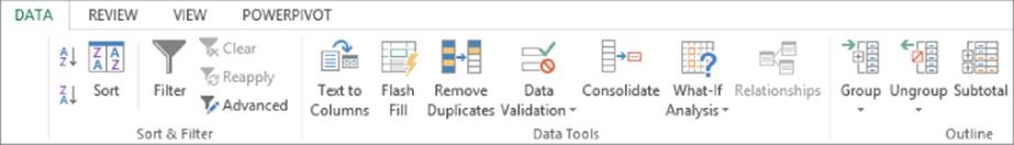
Figure 11.1 Data cleansing features in Excel.
PowerPivot
When the amount of data you need to analyze pushes the limits (about 1 million rows for Excel 2013) of Excel's capabilities, consider moving to PowerPivot. PowerPivot is a free add-in to Excel. It is based on a columnar database structure and data compression that allows it to support millions of rows. It builds on top of Excel's feature set and enables users to create pivot tables and charts and supports slicing and filtering and time-based analysis.
Instead of basing pivot tables and charts on data contained in a data sheet, PowerPivot is based on a data model that contains tables and relationships between the tables. This proves extremely beneficial when the user needs to combine data from various sources into a single mode for the analysis. For example, it is easy to combine data from a relational database with data contained in a Hadoop file structure.
In addition, PowerPivot supports creating custom calculations and measures using Data Analysis Expressions (DAX), a feature that supports efficient querying and sophisticated calculations on very large data sets. Figure 11.2 shows a model being developed in PowerPivot. It is combining census data from Hadoop and rainfall data from a SQL Server database.
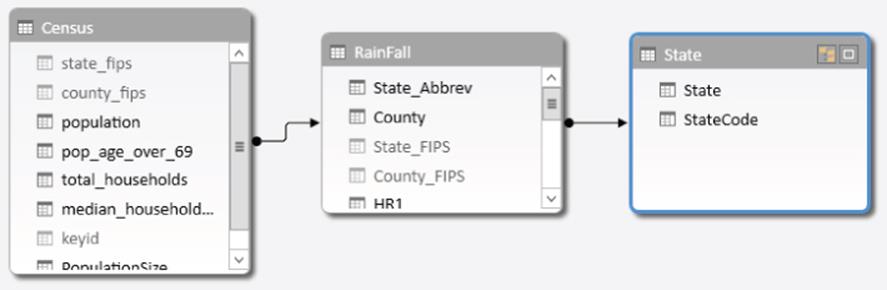
Figure 11.2 Creating a data model in PowerPivot.
Power View
Power View is an add-in to Excel that enables users to create highly interactive data visualizations. You can easily create tables and matrices, along with charts such as bar, pie, line, and bubble charts. Power View reports use PowerPivot models as the data source. Because the model provides both the tables and the relations between the tables, Power View can link the various charts and tables together. Filtering one chart in a view automatically propagates to other visualizations in the same view. Furthermore, if the data model has hierarchies defined, you automatically get the ability to drill up or down through the hierarchy in your charts and matrices. Another useful feature of Power View is support for highlighting, which allows you to examine a subset of the data while still showing the rest of the data. Figure 11.3 shows how highlighting a chart in the view also highlights a chart with related data (State).
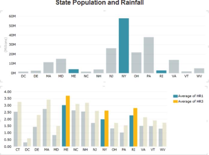
Figure 11.3 Chart highlighting in Power View.
If you have data that contains a date/time field, you can create a bubble chart that includes a play axis that shows how the data changes over time. Power View includes a mapping feature that enables visualization of the data on a Bing map layer that includes the ability to zoom in and out. Figure 11.4 shows a map of rainfall for counties in Pennsylvania. The size of the bubble represents the rainfall, and the color of the bubble represents the relative size of the county's population.
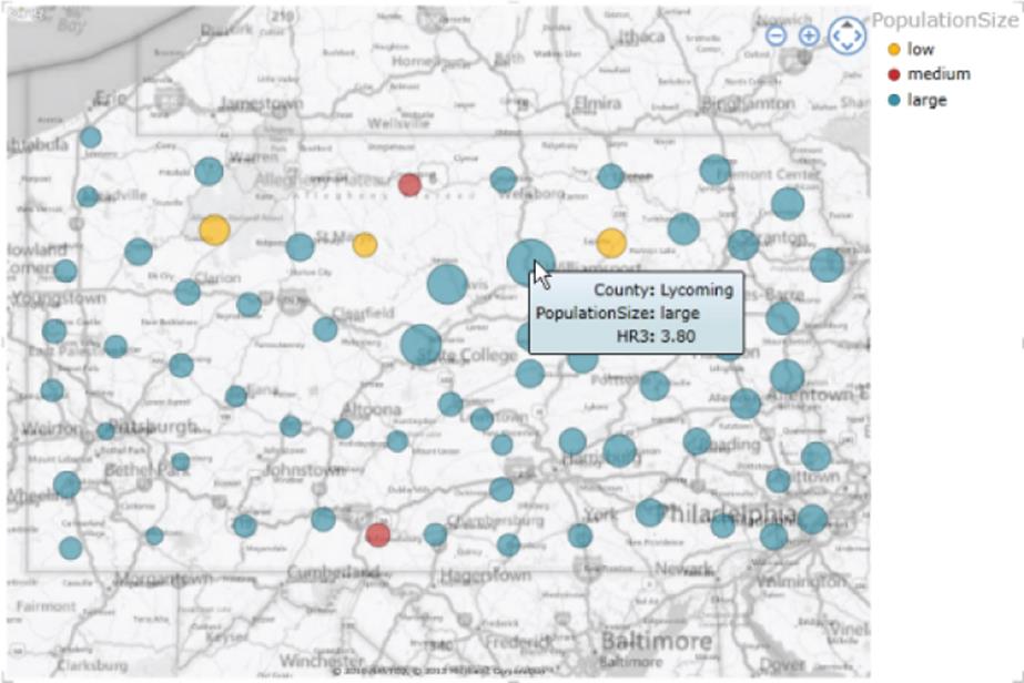
Figure 11.4 Power View map showing rainfall and population data.
Power Map
Although you can create rudimentary maps in Power View, they are limited and do not have much functionality. A much more useful tool for mapping data is Power Map. Power Map is a powerful add-in for Excel that enables you to plot three-dimensional maps for large data sets that contain geospatial data. You can create heat maps, bar charts, and bubble charts. You can also zoom and rotate the maps to gain unique perspectives and insight into the data. If the data is time-stamped, you can even create recordings that show how the data changes over time. One thing to be aware of is that Power Map uses Bing maps to facilitate spatial data exploration and you need to send the data to Bing through a secured connection for geocoding. Figure 11.5 shows rainfall data plotted on a Bing map using Power Map.
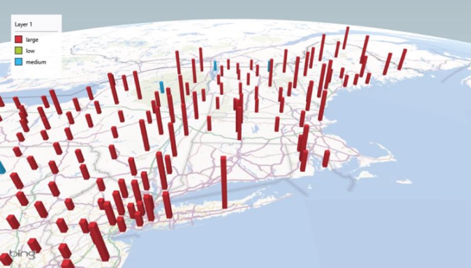
Figure 11.5 Three-dimensional rainfall plot in Power Map.
Reporting Services
Although the preceding tools excel at providing self-service data visualization and exploration, most organizations still need a traditional reporting solution that consists of highly formatted distributed reports. These reports are usually highly structured to meet a specific set of requirements, formatted for printing, and are pushed out to users on a periodic basis.
SQL Server Reporting Services (SSRS) is an excellent tool for creating and managing your structured reporting requirements. It provides a rich development environment, supports conditional formatting, and enables parameter-driven reports and linking of reports for drilling across different views of the data. Reports can include tables, matrices, various graphs, and images. Figure 11.6 shows a typical tabular report created using the report designer.
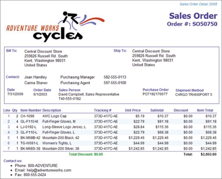
Figure 11.6 Tabular invoice report created using SSRS.
Reporting Services also has a robust report management environment. This can be set up as a standalone portal or integrated with a SharePoint collaboration site. Reports can be organized, secured, and monitored. The same report definition can be distributed and printed in different rendering formats, such as PDF or Microsoft Word. Reports can be automatically refreshed and delivered through a portal, e-mail, or file share. Another cool feature is the ability to create data-driven report distribution, where the same report can be run using different parameter values depending on who is getting the report. For example, the same report can be rendered using a department ID parameter that is tied to the recipient's department. Figure 11.7 shows a report rendered in a SSRS report portal.
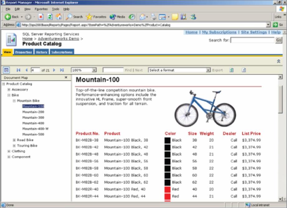
Figure 11.7 SSRS report rendered in a report portal.
Self-service Big Data with PowerPivot
As mentioned previously, you can use PowerPivot to create data mash-ups using data from various sources and combine them into a data model. Because of the underlying database compression and columnar structure, PowerPivot can handle tens of millions of rows. This is the recommended solution when you need to actively slice and dice large amounts of data. In this section, you will set up an ODBC driver to connect to Hadoop and load the data into a PowerPivot model.
Setting Up the ODBC Driver
To load data from Hadoop, you need to install an ODBC driver on the computer on which you are using PowerPivot. Several ODBC drivers for Hadoop are available. Microsoft provides one you can download from their website (http://www.microsoft.com/en-us/download/details.aspx?id=40886). The ODBC driver uses Hive and HiveQL to retrieve the data. After you download and install the driver, you need to set up a data source name (DSN) to use in PowerPivot:
1. To begin, launch the ODBC Data Source Administrator and click the System DSN tab (see Figure 11.8).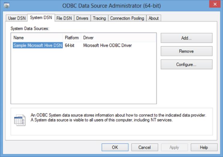
Figure 11.8 Setting up a new system DSN.
2. Add a new DSN using the Microsoft Hive ODBC driver, as shown in Figure 11.9.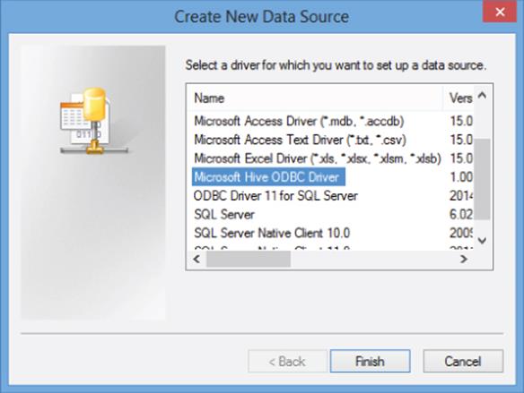
Figure 11.9 Selecting the Hive driver.
3. Fill in the appropriate connection information for your Hadoop cluster in the setup screen shown in Figure 11.10. Remember that your settings will differ. Consult with your Hadoop administrator for the correct settings.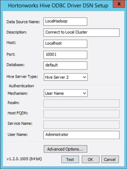
Figure 11.10 Setting up connection information.
Don't forget to verify the connection by clicking the Test button at the bottom of the setup screen.
Loading Data
If you want to follow along loading data into PowerPivot, you can download the sample flight data from (www.wiley.com/go/microsoftbigdatasolutions). This contains three CSV files:
· Flight_Dept_Perf.csv: Contains flight date, carrier code, airport code, departure times, and departure delays. Although this file only contains flights during October 2012, this is the type of data that would be contained in Hadoop spanning multiple years. A Hadoop map-reduce process would perform an aggregation and load it into a results table that is then consumed by PowerPivot.
· Carriers.csv: Contains the carrier codes and names.
· US_Airports.csv: Contains the airport code, name, and its latitude and longitude.
You will load the data from these files directly into PowerPivot:
1. Open the Hadoop command line console and type hive to start the Hive command-line console. Using the Hive command-line console, create a flight_dept table using the following script:
2. Create Table flight_dept (flight_date string,carrier_cd string,
3. airport_cd string,dep_time int,delay int)
Row Format Delimited Fields Terminated By ',';
4. Use the following script to load the table:
5. LOAD DATA LOCAL INPATH 'c:\sampledata\Flight_Dept_Perf.csv'
OVERWRITE INTO TABLE flight_dept;
6. Run the following query to verify the data was loaded. You should see results similar to those shown in Figure 11.11:
Select * from flight_dept limit 10;
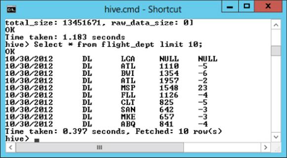
Figure 11.11 Verifying the data load.
7. Now that the data is accessible through a Hive table, you can load it into PowerPivot using the ODBC driver. Open Excel and click the PowerPivot tab. On the PowerPivot tab, click Manage to open the PowerPivot window (see Figure 11.12).
NOTE
You may need to enable the PowerPivot add-in if you are using Excel 2013 (see http://office.microsoft.com/en-us/excel-help/start-power-pivot-in-microsoft-excel-2013-add-in-HA102837097.aspx).
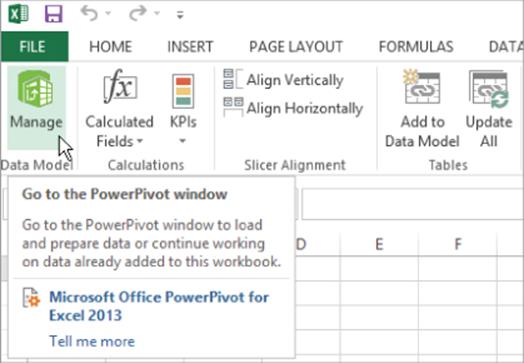
Figure 11.12 Launching the PowerPivot model designer.
8. In the PowerPivot model designer, click Get External Data from Other Sources to launch the Table Import Wizard. Select the Others (OLEDB/ODBC) data source, as shown in Figure 11.13, and then click Next.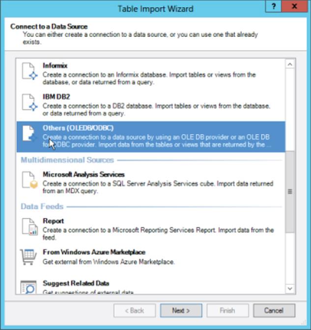
Figure 11.13 Connecting to a data source.
9. In the Specify a Connection String window, click Build to open the Data Link Properties window (see Figure 11.14).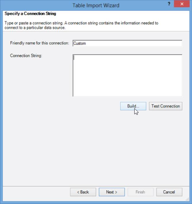
Figure 11.14 Building the connection string.
10.From the Provider tab, choose Microsoft OLEDB Provider for ODBC Drivers. From the Connection tab, select the Use Data Source Name option button and choose the DSN you created earlier to connect to your Hadoop cluster and test the connection (see Figure 11.15).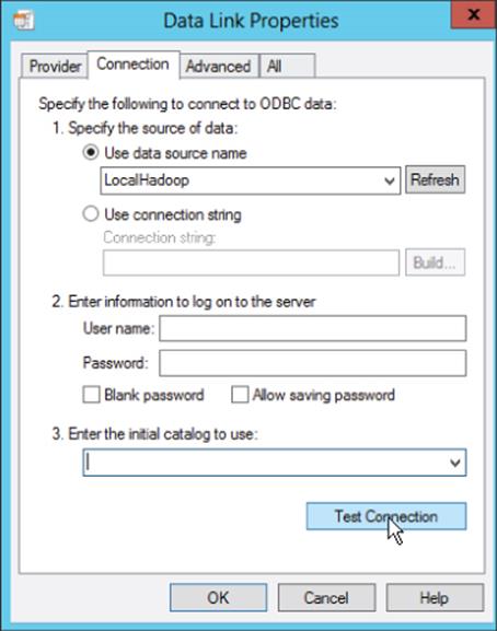
Figure 11.15 Setting data link properties.
11.In the next screen choose to write a query to return the data (see Figure 11.16).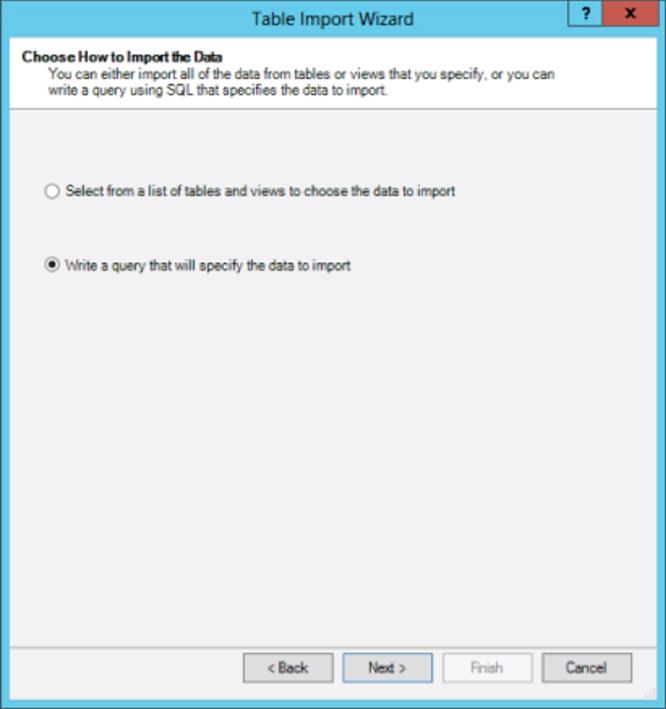
Figure 11.16 Choosing how to import the data.
12.Enter the following query to retrieve the data. If you launch the query designer, you can test the query to see whether you get results back as in Figure 11.17:
13. Select flight_date, carrier_cd, airport_cd, dep_time, delay from
14. flight_dept
where delay > 0
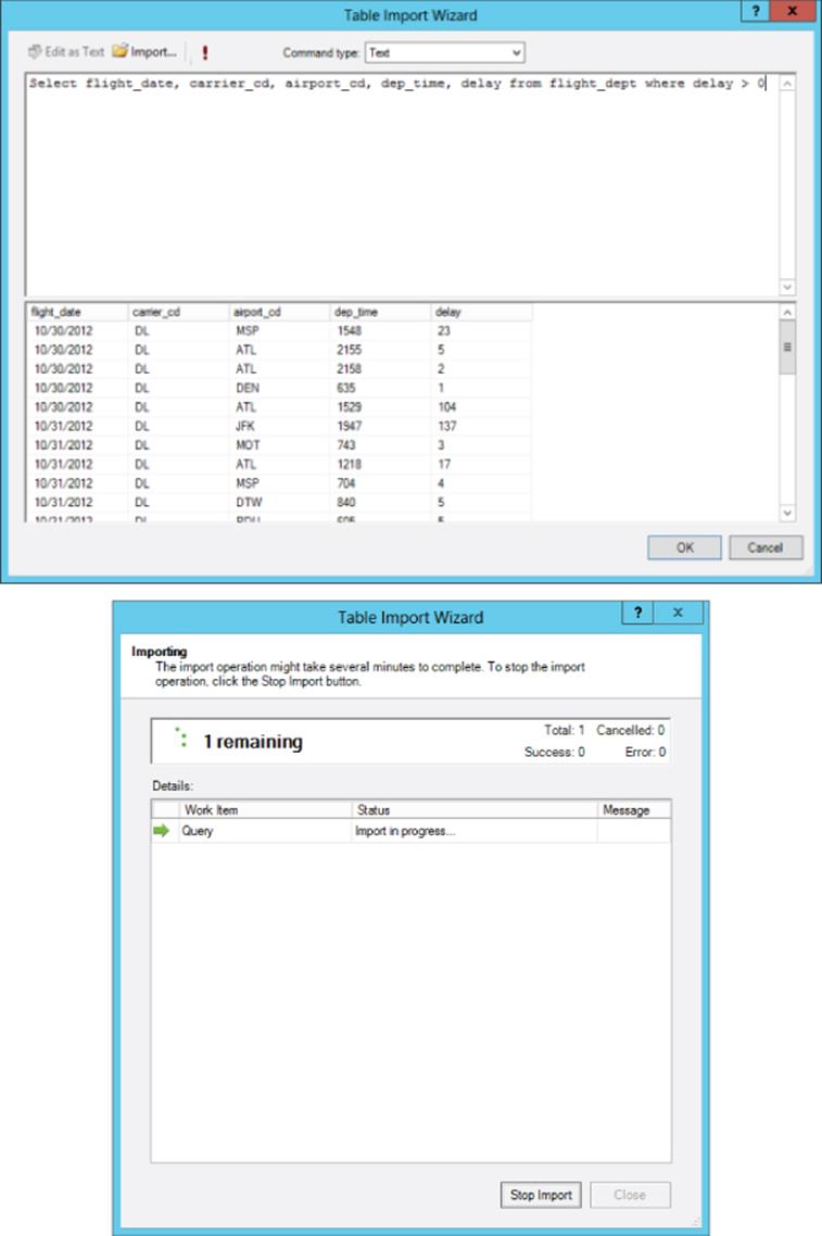
Figure 11.17 Testing the query.
15.After you have tested the query close the designer, rename the query to flight_dept and click Finish. The data will be imported into a table in the model called flight_dept.
The next step is to import the data contained in the Carriers.csv and US_Airports.csv files.
16.In the PowerPivot model designer, click Get External Data from Other Sources to launch the Table Import Wizard again. This time select the text file source. Browse to the Carriers.csv file and select the Use First Row as Column Headers check box. Also change the Friendly connection name to Carriers. You should see sample data similar to Figure 11.18.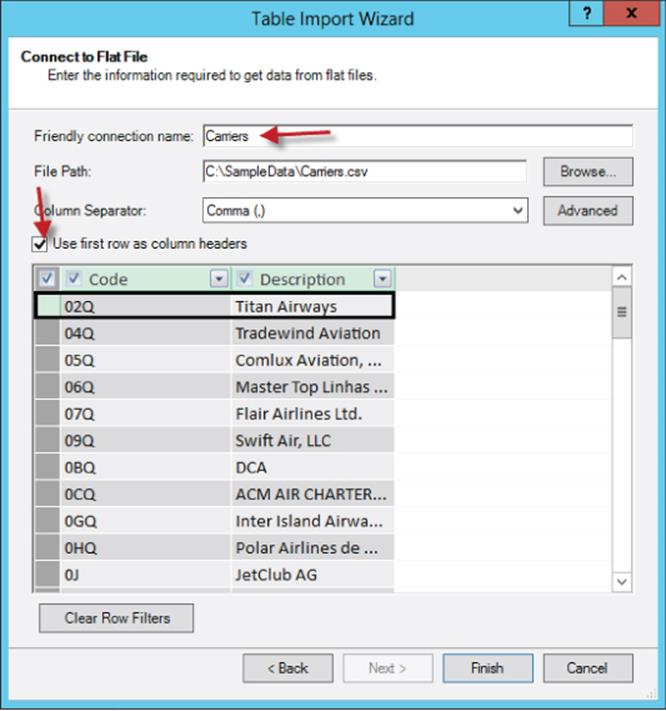
Figure 11.18 Importing CSV data.
17.Repeat the procedure to import data from the US_Airports.csv file with a connection name of US_Airports. You should end up with three tables in the designer.
You use two views to work with the model: the data view and the diagram view. The data view shows each table in a tab with the data in a grid (see Figure 11.19). The area below the grid is where you define measures such as sum or count to aggregate the data.
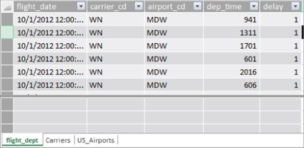
Figure 11.19 The data view of the model.
The diagram view of the model shows the tables and relationships between the tables in the model. Figure 11.20 shows the tables in the diagram view; no relationships are defined between the tables yet. To toggle between the views, click the icons in the View area of the Home tab.
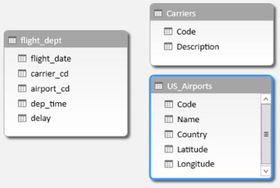
Figure 11.20 The diagram view of the model.
Now that the tables and data have been imported into the model, you need to establish relationships between the tables in the model.
Updating the Model
To establish relationships between the tables in the model complete the following steps:
1. In the diagram view, drag the carrier_cd field from the flight_dept and drop it on the Code field in the Carriers table.
2. Repeat the procedure in step 1 to create a relationship between the airport_cd field in the flight_dept table and the code field in the US_Airports table.
3. Right-click the carrier_cd field in the flight_dept table and select Hide from Client Tools.
4. Repeat the procedure in step 3 for the airport_cd field.
Your model should look like Figure 11.21.
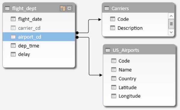
Figure 11.21 The updated model.
The next step you need to do is create some measures in the model that will aid in analyzing the data.
Adding Measures
In this section, you create aggregations to count, average, and find the maximum delays:
1. Switch to the data view of the model and click the flight_dept tab. Select the first cell in the measure area below the grid and add the following DAX code to the formula bar to count the number of delays (see Figure 11.22):
TotalDelays:=Count([delay])
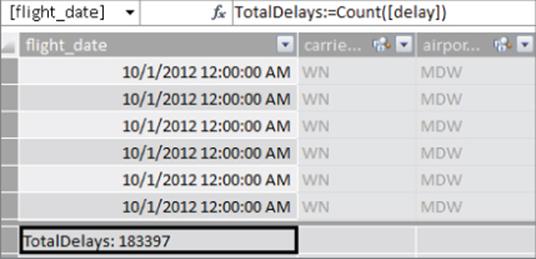
Figure 11.22 Adding a measure to the model.
2. In a similar fashion, add the following measures to the model:
3. MaxDelay:=Max([delay])
AveDelay:=AVERAGE([delay])
In addition to measures, you can add calculated columns to the model.
4. Click the cell under the Add Column header in the flight_dept table tab. Enter the following formula to bucket the delays into ranges:
=IF([delay]<=15,"small",IF([delay]<=60, "medium","large"))
5. Right-click the column header and rename it to DelaySeverity.
6. Repeat the process to determine the flight day of the week using the following DAX formula:
=Format([flight_date],"DDD")
7. Rename the column to DepartureDay. Create another column called DayOfWeek using the following formula:
=WEEKDAY([flight_date])
8. Select the DepartureDay column and under the Home tab select Sort by Column. Sort the column by the DayOfWeek column.
Now that the model has been created, you can create pivot tables to analyze the data.
Creating Pivot Tables
To create a pivot table based on the model, complete the following:
1. To create the pivot table, click the PivotTable drop-down on the Home tab of the PowerPivot model designer (see Figure 11.23).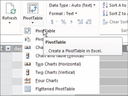
Figure 11.23 Adding a pivot table in Excel.
2. When asked, choose to create the pivot table in a new sheet. You should see an empty pivot table with a pivot table field list that shows the tables and fields in the PowerPivot model. Expand the flight_dept table node and select the TotalDelays and AveDelay fields. Under the Carriers table node, select the Description field. The pivot table field list should look like Figure 11.24, and the pivot table should be similar to Figure 11.25.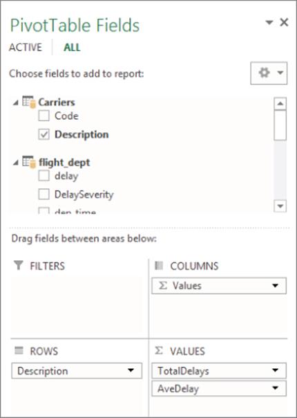
Figure 11.24 The pivot table field list.
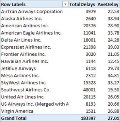
Figure 11.25 The pivot table showing total delays and average delays.
3. With the pivot table selected, on the Insert tab of Excel, select Slicer. In the Insert Slicers selection window, select DelaySeverity and DepartureDay. Click the OK button to insert the slicers. Clicking the slicers will filter the pivot table.
Along with pivot tables, you can create pivot charts to help easily spot trends in the data, as follows:
1. To create the pivot chart, click the PivotTable drop-down on the Home tab of the PowerPivot model designer.
2. Select the Pivot Chart option and choose to create it on a new sheet.
3. Add the DepartureDay to the Axis, DelaySeverity to the Legend, and the TotalDelays to the Values drop area (see Figure 11.26).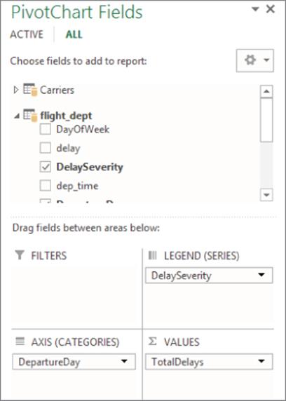
Figure 11.26 Selecting pivot chart fields.
The resulting pivot chart is shown in Figure 11.27.
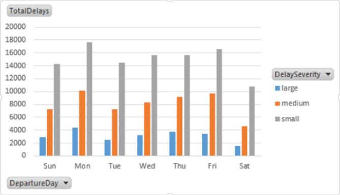
Figure 11.27 Pivot chart comparing delays for different days of the week.
Using PowerPivot models, pivot tables, and pivot charts in combination with Excel formatting, you can create powerful interactive visualizations and dashboards to explore the data. These Excel workbooks can be hosted on SharePoint, where you can automate the refreshing of the data using a schedule. You can also restrict access to the workbooks using SharePoint security.
Rapid Big Data Exploration with Power View
As powerful as the pivot tables and pivot charts are in Excel, unless you are an Excel power user, creating and formatting them can be quite a challenge. With that in mind, Microsoft has created Power View as an add-in for Excel. Power View still uses the PowerPivot model as its data source, but it makes it easier to create highly interactive data visualizations. It is ideal for the Excel casual user who needs to explore the data for trends and insights:
1. Open the Excel workbook you created in the previous section. On the Insert tab, you should see a Power View button. Click the button to launch the Power View designer. It will create a new tab called Power View 1. You should see the Power View Fields window, which contains the tables and fields you created previously in the PowerPivot model (see Figure 11.28). Notice the calculator icon associated with measures you created in the model. In addition, a globe icon is associated with any field that can be interpreted as a geolocation type field, such as latitude, longitude, city, state, or county.
The design surface includes a view area where you create the visualizations such as charts, tables, and tiles. It also contains a filter area you can use to filter the entire view or individual visualization contained in the view.
The first step to creating a visualization is to add fields from the field list to the field area below.
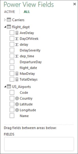
Figure 11.28 The Power View Field window.
2. Drag and drop the DepartureDay and AveDelay to the field drop area. You should see a table created in the view area, as shown in Figure 11.29.
All visualizations start out as a table that can then be converted to a different type of visualization.
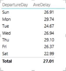
Figure 11.29 Creating the initial table.
3. Click the table in the view and select the Stacked Column Chart in the Design tab. The table is converted to a stack column chart, as shown in Figure 11.30.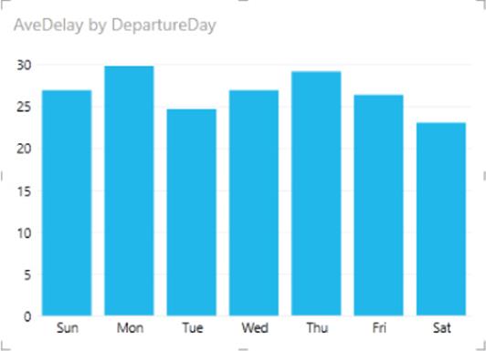
Figure 11.30 Creating a column chart.
4. Drag and drop the Carrier Description field to the filters area beside the view area. Use the filter to select Delta and Southwest airlines. Once the carrier filter is set, drag and drop the Carrier Description field to the Legend drop area, as shown in Figure 11.31. The chart is updated as shown in Figure 11.32.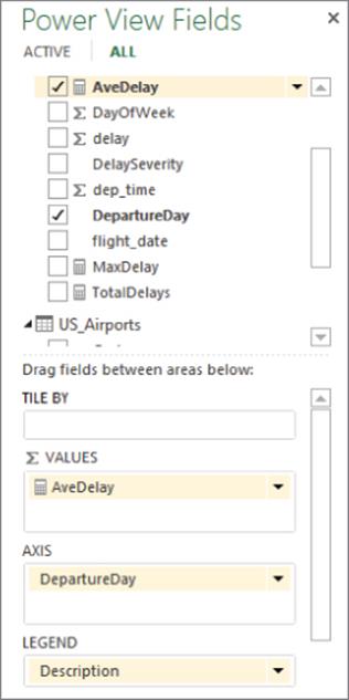
Figure 11.31 Adding carrier description to the legend.
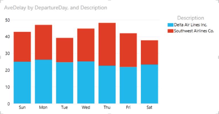
Figure 11.32 The updated stacked column chart.
5. To add another chart to the view, click an empty area of the view. Drag and drop the DepartureDay and TotalDelays to the field drop area in the Power View Field window. Click the resulting table in the view area. Select the Line chart from the Other Chart drop-down on the design ribbon.
You now have two charts on the same view. Because the charts are based on related fields in the model, highlighting the data in one chart will also affect the other chart. Try clicking the different airlines in the legend of the bar chart and notice how it updates the data in the line chart (see Figure 11.33).
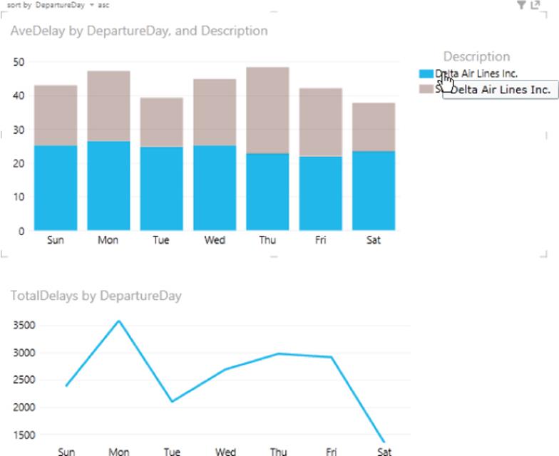
Figure 11.33 Chart interaction in Power View.
Another interesting type of chart you can create in Power View is the bubble chart with an associated play axis. The bubble chart in Figure 11.34 compares the delays for the month of October for four busy airports. The y-axis measures total delays, the x-axis measures the average delays, and the size of the bubble measures the maximum delay. If you click the time axis, you will see how the values change from day to day. It is left to the reader to see whether you can re-create this report.
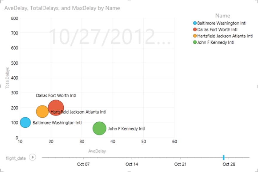
Figure 11.34 A bubble chart comparing airport delays.
One of the most interesting ways to analyze data that contains a geographic component, such as latitude and longitude, is to graph the data on a map. In the next section, you will use a new tool from Microsoft, Power Map, to visualize the data.
Spatial Exploration with Power Map
Although you can create a map-based visualization using Power View and geocoded data such as city and state, it is very limited and provides only two-dimensional maps, where data is represented by the size of a bubble (see Figure 11.4). If you need to conduct more powerful spatial analysis of your geocoded data, Power Map is definitely the tool to use. Power Map is a free add-in to Excel, just like PowerPivot and Power View. It uses Bing mapping technology to create a map layer using geocoded data such as longitude and latitude, city, state, country, and ZIP code. You can display the data on top of the map as a three-dimensional bar chart, heat map, bubble chart, or color shading of regional boundaries. For example, Figure 11.35 shows the rainfall amounts for the various counties as columns and the population of the county represented by the county shading:
1. To map some data using Power Map, open the Excel workbook you used in the previous sections.
2. On the Insert tab, find the Power Map drop-down on the ribbon. Click the drop-down and select Launch Power Map. You should see a global map along with a list of the tables and fields in the PowerPivot model. The first thing you need to do is select the geography data fields to use on the map. Choose the longitude and latitude fields under the US_Airports table (see Figure 11.36).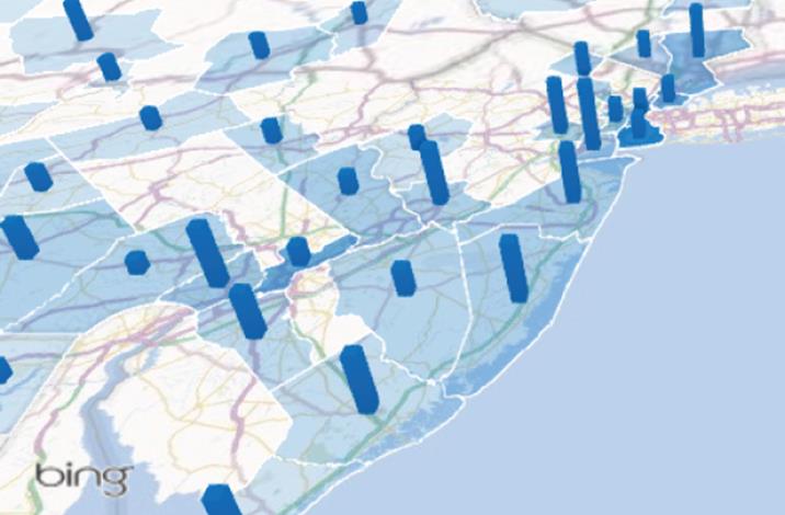
Figure 11.35 Mapping rainfall and county population.
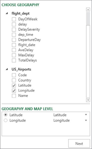
Figure 11.36 Selecting the geography fields.
3. Click Next to select the graph type and values to map. Choose the Column type and AveDelay as the height. On the Home tab, click the Map Labels button to show the city names.
4. Rotate and zoom into the map to view the data.
5. You can map several values by dragging additional fields into the height drop box. Drag the MaxDelay field into the Height box. You can either create adjacent columns or stacked columns by selecting the appropriate toggle button above the Height box. Figure 11.37 shows the completed map.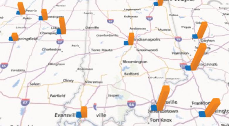
Figure 11.37 Mapping airport flight delays.
6. You can also show how the values vary over time. Drag and drop the flight_date field to the time box under the field list. You should see a play axis appear on the map. Click the Play button and observe how the values change over time.
As you can see, Power Map has some compelling features and allows you to visualize the data in new and interesting ways.
Summary
Humans often rely on visualizations to make sense of data. This usually includes creating visualizations in the form of charts, graphs, and maps that enable the user to easily spot trends and anomalies in the data. Although Hadoop does not inherently provide native reporting and visualization capabilities, plenty of tools are available to consume and visualize the data. In this chapter, you saw how standard ODBC drivers are used to connect Microsoft's BI toolset to Hadoop data. You saw how Hive queries are used to pull the data into Excel and PowerPivot. Using the PowerPivot model, you can build pivot tables and pivot charts in Excel. For even more robust visualizations, you can use Power View to build interactive charts and graphs to present your findings. If you need powerful spatial mapping of the data, you can use Power Map.
This chapter just scratched the surface of the capabilities of these tools. You should definitely dig further into these products. They will undoubtedly become an important part of your BI arsenal.