Excel 2016 Formulas (2016)
PART V
Miscellaneous Formula Techniques
Chapter 18
Pivot Tables
In This Chapter
· An introduction to pivot tables
· How to create a pivot table from a worksheet database or table
· How to group items in a pivot table
· How to create a calculated field or a calculated item in a pivot table
· The Data Model feature
· How to create pivot charts
Excel’s pivot table feature is perhaps the most technologically sophisticated component in Excel. This chapter may seem a bit out of place in a book devoted to formulas. After all, a pivot table does its job without using formulas. That’s exactly the point. If you haven’t yet discovered the power of pivot tables, this chapter demonstrates how using a pivot table can serve as an excellent alternative to creating many complex formulas.
About Pivot Tables
A pivot table is essentially a dynamic summary report generated from a database. The database can reside in a worksheet or in an external file. A pivot table can help transform endless rows and columns of numbers into a meaningful presentation of the data.
For example, a pivot table can create frequency distributions and cross-tabulations of several different data dimensions. In addition, you can display subtotals and any level of detail that you want. Perhaps the most innovative aspect of a pivot table lies in its interactivity. After you create a pivot table, you can rearrange the information in almost any way imaginable and insert special formulas that perform calculations. You can even create post-hoc groupings of summary items: for example, combining Northern Region totals with Western Region totals. And the icing on the cake is that with but a few mouse clicks, you can apply formatting to a pivot table to convert it to boardroom-quality attractiveness.
Pivot tables were introduced in Excel 97, and this feature improves with every version of Excel. You can create pivot tables from multiple data tables. Unfortunately, many users avoid pivot tables because they think that they are too complicated. Our goal in this chapter is to dispel that myth.
One minor drawback to using a pivot table is that unlike a formula-based summary report, a pivot table does not update automatically when you change the source data. This does not pose a serious problem, however, because a single click of the Refresh button forces a pivot table to update itself with the latest data.
A Pivot Table Example
The best way to understand the concept of a pivot table is to see one. Start with Figure 18.1, which shows a portion of the data used in creating the pivot table in this chapter.
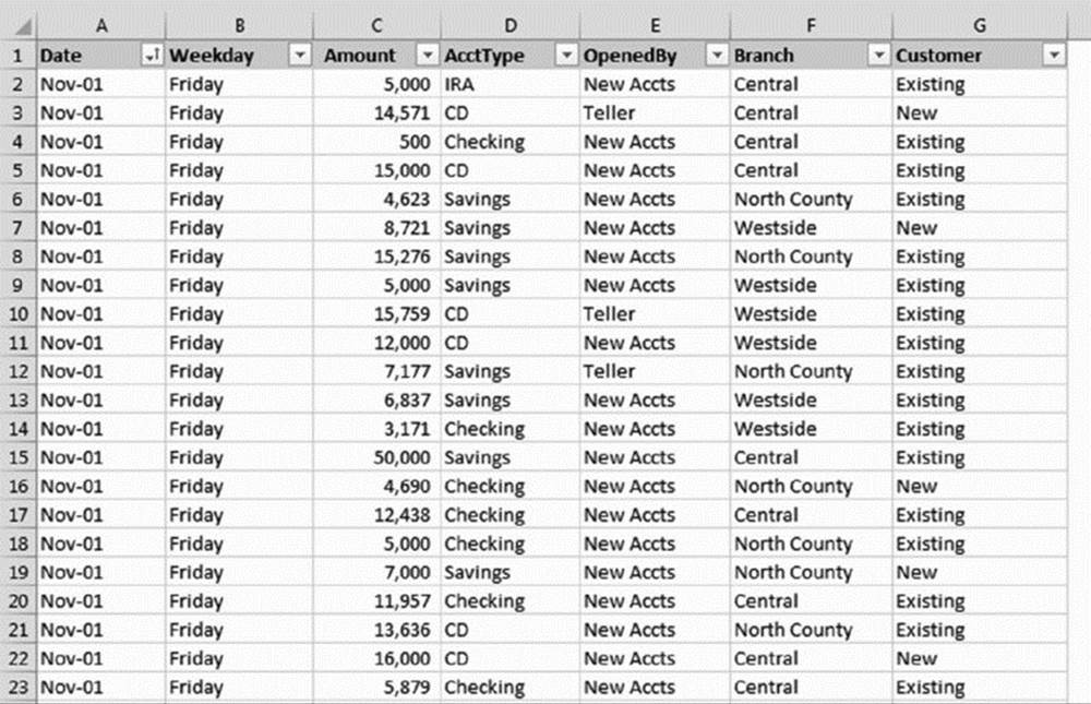
Figure 18.1 This table is used to create a pivot table.
This table consists of a month’s worth of new account information for a three-branch bank. The table contains 712 rows, and each row represents a new account opened at the bank. The table has the following columns:
§ The date when the account was opened
§ The day of the week the account was opened
§ The opening amount
§ The account type: CD, checking, savings, or IRA (Individual Retirement Account)
§ The person who opened the account: a teller or a new-account representative
§ The branch at which it was opened: Central, Westside, or North County
§ The type of customer: an existing customer or a new customer
![]() On the Web
On the Web
This workbook, named bank accounts.xlsx, is available at this book’s website.
The bank accounts database contains quite a bit of information, but in its current form, the data doesn’t reveal much. To make the data more useful, you need to summarize it. Summarizing a database is essentially the process of answering questions about the data. Following are a few questions that may be of interest to the bank’s management:
§ What is the daily total new deposit amount for each branch?
§ Which day of the week accounts for the most deposits?
§ How many accounts were opened at each branch, broken down by account type?
§ What’s the dollar distribution of the different account types?
§ What types of accounts do tellers open most often?
§ How does the Central branch compare with the other two branches?
§ In which branch do tellers open the most checking accounts for new customers?
You can, of course, spend time sorting the data and creating formulas to answer these questions. Often, however, a pivot table is a much better choice. Creating a pivot table takes only a few seconds, doesn’t require a single formula, and produces a nice-looking report. In addition, pivot tables are much less prone to error than creating formulas.
By the way, we provide answers to these questions later in the chapter by presenting several additional pivot tables created from the data.
Figure 18.2 shows a pivot table created from the bank data. Keep in mind that no formulas are involved. This pivot table shows the amount of new deposits, broken down by branch and account type. This particular summary represents one of dozens of summaries that you can produce from this data.
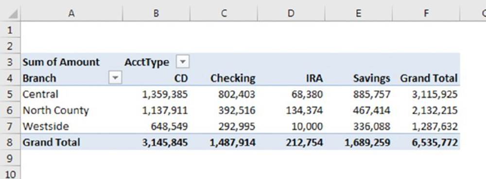
Figure 18.2 A simple pivot table.
Figure 18.3 shows another pivot table generated from the bank account data. This pivot table uses the drop-down filter for the Customer field (in row 2). In the figure, the pivot table displays the data only for Existing customers. The user can also select New or All from the drop-down control.
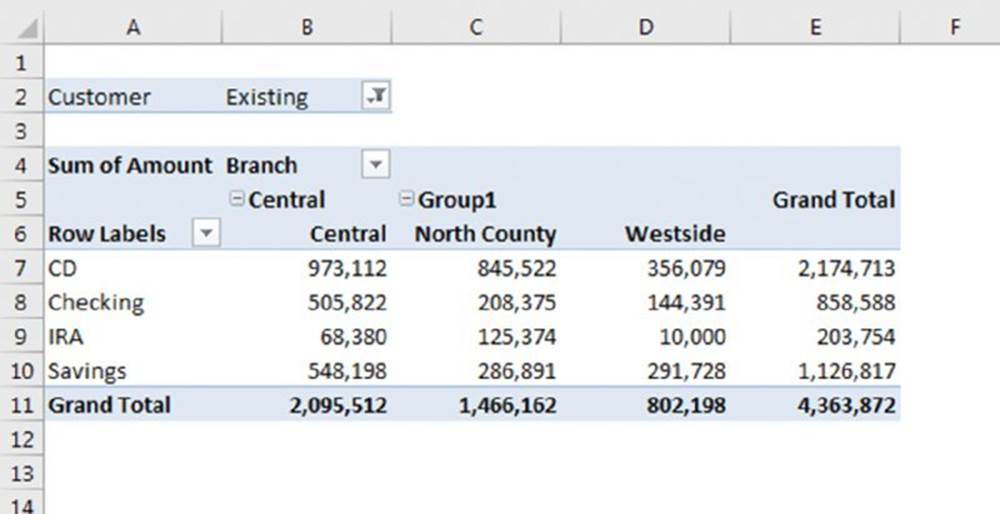
Figure 18.3 A pivot table that uses a report filter.
Notice the change in the orientation of the table. For this pivot table, branches appear as column labels, and account types appear as row labels. This change, which took about five seconds to make, is another example of the flexibility of a pivot table.
Data Appropriate for a Pivot Table
A pivot table requires that your data be in the form of a rectangular table. You can store the data in either a worksheet range (which can either be a normal range or a table created by choosing Insert ➜ Tables ➜ Table) or an external database file. Although Excel can generate a pivot table from any table, not all tables are appropriate.
Generally speaking, fields in the database table consist of two types of information:
§ Data: Contains a value or data that you want to summarize. For the bank account example, the Amount field is a data field.
§ Category: Describes the data. For the bank account data, the Date, Weekday, AcctType, OpenedBy, Branch, and Customer fields are category fields because they describe the data in the Amount field.
A single table can have any number of data fields and category fields. When you create a pivot table, you usually want to summarize one or more of the data fields. Conversely, the values in the category fields appear in the pivot table as row labels, column labels, or filters.
Exceptions exist, however, and you may find Excel’s pivot table feature useful even for a table that doesn’t contain numerical data fields. In such a case, the pivot table provides counts rather than sums.
Figure 18.4 shows an example of an Excel range that is not appropriate for a pivot table. Although the range contains descriptive information about each value, it does not consist of normalized data. In fact, this range actually resembles a pivot table summary, but it is much less flexible.
![]() On the Web
On the Web
This workbook, named normalized data.xlsx, is available at this book’s website.
Figure 18.4 This range is not appropriate for a pivot table.
Figure 18.5 shows the same data but rearranged in such a way that makes it normalized. Normalized data contains one data point per row, with an additional column that classifies the data point.
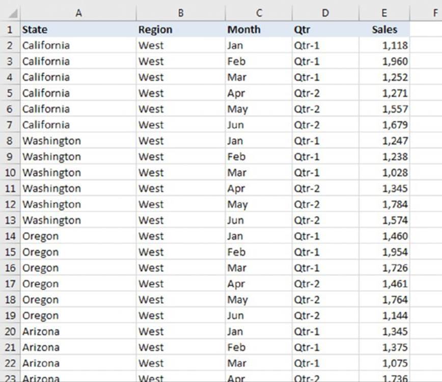
Figure 18.5 This range contains normalized data and is appropriate for a pivot table.
The normalized range contains 78 rows of data—one for each of the six monthly sales values for the 13 states. Notice that each row contains category information for the sales value. This table is an ideal candidate for a pivot table and contains all the information necessary to summarize the information by region or quarter.
Figure 18.6 shows a pivot table created from the normalized data. As you can see, it’s virtually identical to the nonnormalized data shown in Figure 18.4.
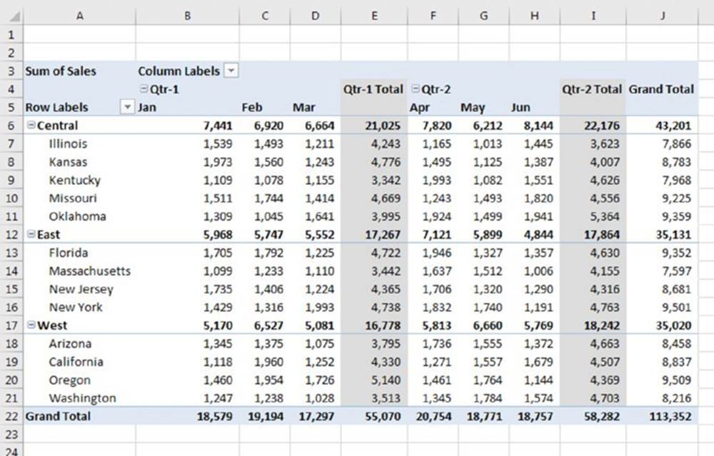
Figure 18.6 A pivot table created from normalized data.
![]() A reverse pivot table
A reverse pivot table
Excel’s pivot table feature creates a summary table from a list. But what if you want to perform the opposite operation? Often, you may have a two-way summary table, and it would be convenient if the data were in the form of a normalized list.
In this figure, range A1:E13 contains a summary table with 48 data points. Notice that this summary table is similar to a pivot table. Column G:I shows part of a 48-row table that was derived from the summary table. In other words, every value in the original summary table gets converted to a row, which also contains the region name and month. This type of table is useful because it can be sorted and manipulated in other ways. And you can create a pivot table from this transformed table.
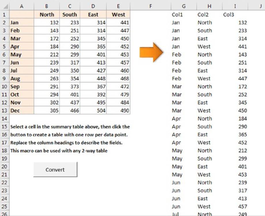
This book’s website contains a workbook, reverse pivot.xlsm, which has a macro that will convert any two-way summary table into a three-column normalized table.
Creating a Pivot Table Automatically
How easy is it to create a pivot table? This task requires practically no effort if you choose a recommended pivot table.
If your data is in a worksheet, select any cell within the data range and choose Insert ➜ Tables ➜ Recommended PivotTables, Excel quickly scans your data, and the Recommended PivotTables dialog box presents thumbnails that depict some pivot tables that you can choose from (see Figure 18.7).
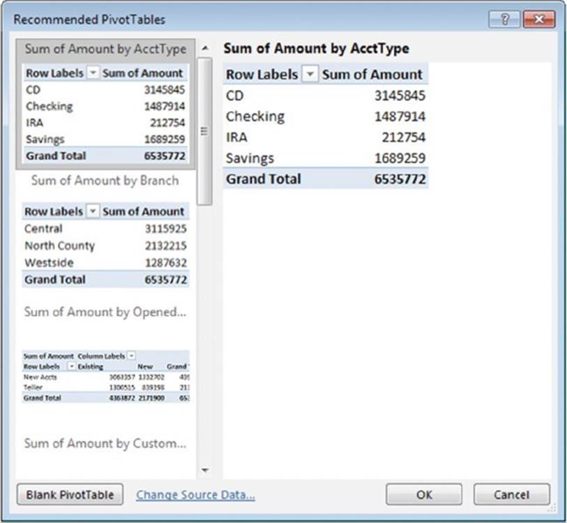
Figure 18.7 Selecting a recommended pivot table.
The pivot table thumbnails use your actual data, and there’s a good chance that one of them will be exactly what you’re looking for, or at least close. Select a thumbnail, click OK, and Excel creates the pivot table on a new worksheet.
When any cell in a pivot table is selected, Excel displays the PivotTable Fields task pane. You can use this task pane to make changes to the layout of the pivot table.
![]() Note
Note
If your data is in an external database, start by selecting a blank cell. When you choose Insert ➜ Tables ➜ Recommended PivotTables, Excel displays the Choose Data Source dialog box. Select Use an External Data Source and then click Choose Connection to specify the data source. You will then see the thumbnails of the list of recommended pivot tables.
If none of the recommended pivot tables is suitable, you have two choices:
§ Create a pivot table that’s close to what you want and then use the PivotTable Fields task pane to modify it.
§ Click the Blank PivotTable button (at the bottom of the Recommended PivotTables dialog box) and create a pivot table manually. See the next section.
Creating a Pivot Table Manually
Using a recommended pivot table is easy, but you might prefer to create a pivot table manually. And if you use a version prior to Excel 2013, manually creating a pivot table is your only option.
In this section, we describe the basic steps required to create a pivot table using the bank account data from earlier in this chapter. Creating a pivot table is an interactive process. It’s not at all uncommon to experiment with various layouts until you find one that you’re satisfied with.
Specifying the data
If your data is in a worksheet range or table, select any cell in that range and then choose Insert ➜ Tables ➜ PivotTable, which displays the dialog box shown in Figure 18.8.
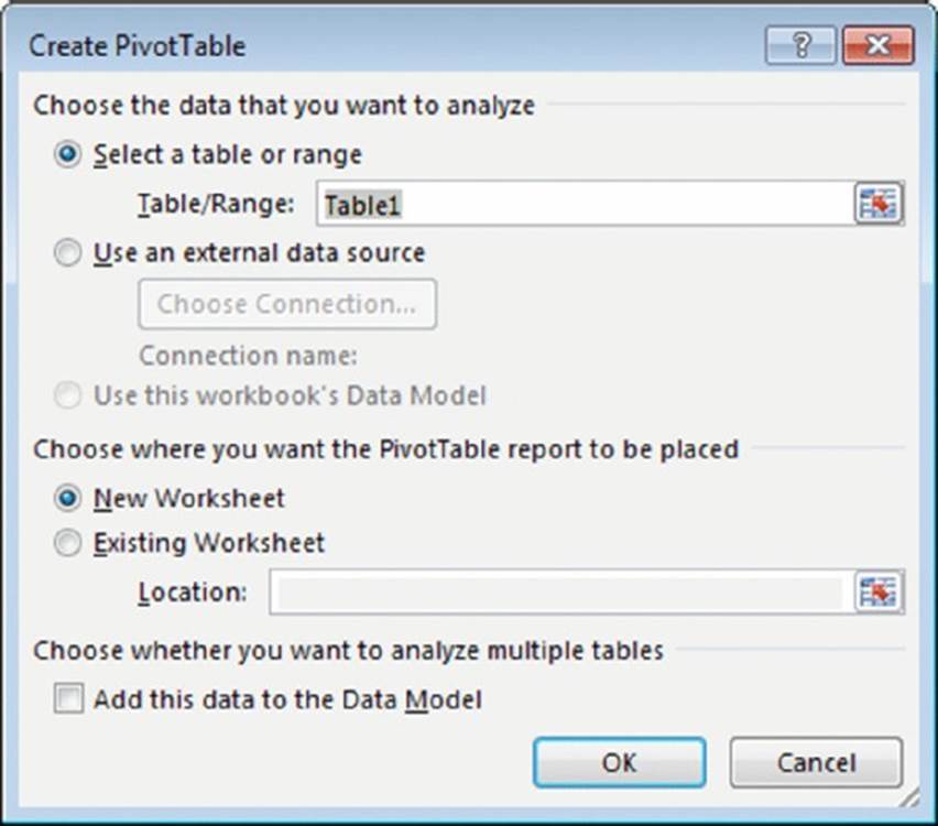
Figure 18.8 In the Create PivotTable dialog box, you tell Excel where the data is and then specify a location for the pivot table.
Excel attempts to guess the range, based on the location of the active cell. If you’re creating a pivot table from an external data source, you need to select that option and then click the Choose Connection button to specify the data source.
![]() Note
Note
The Create PivotTable dialog box includes this check box: Add This Data to the Data Model. Use this option only if your pivot table will use data from more than one table or from an external data connection that uses multiple tables. We provide an example of using the Data Model later in this chapter.
![]() Tip
Tip
If you’re creating a pivot table from data in a worksheet, it’s a good idea to first create a table for the range (by choosing Insert ➜ Tables ➜ Table). Then, if you expand the table by adding new rows of data, Excel refreshes the pivot table without your needing to manually indicate the new data range.
Specifying the location for the pivot table
Use the bottom section of the Create PivotTable dialog box to indicate the location for your pivot table. The default location is on a new worksheet, but you can specify any range on any worksheet, including the worksheet that contains the data.
Click OK, and Excel creates an empty pivot table and displays its PivotTable Fields task pane, as shown in Figure 18.9.
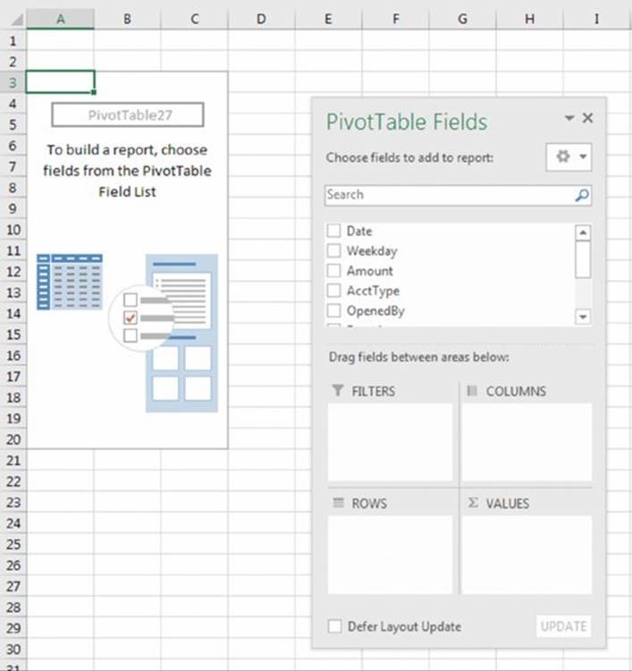
Figure 18.9 Use the PivotTable Fields task pane to build the pivot table.
![]() Tip
Tip
The PivotTable Fields task pane is normally docked on the right side of Excel’s window. By dragging its title bar, you can move it anywhere you like. Also, if you click a cell outside the pivot table, the PivotTable task pane is temporarily hidden. To dock the task pane back on the right side, simply double-click the title bar.
![]() Pivot table terminology
Pivot table terminology
Understanding the terminology associated with pivot tables is the first step in mastering this feature. Refer to the accompanying figure to get your bearings.
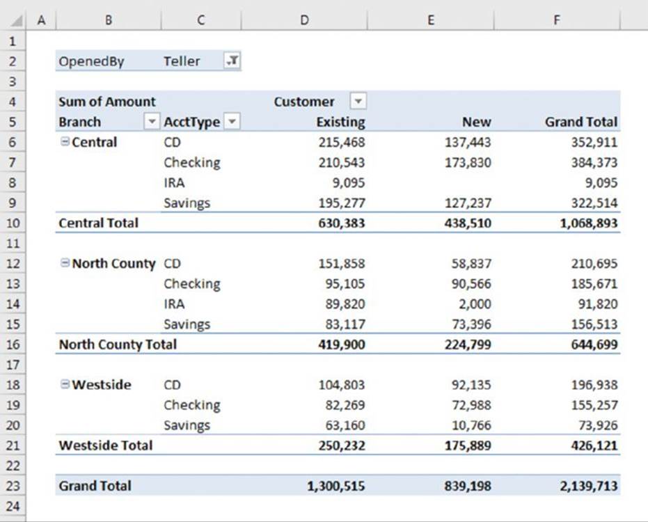
· Column Labels: A field that has a column orientation in the pivot table. Each item in the field occupies a column. In the figure, Customer represents a column field that contains two items: Existing and New. You can have nested column fields.
· Grand Total: A row or column that displays totals for all cells in a row or column in a pivot table. You can specify that grand totals be calculated for rows, columns, or both (or neither). The pivot table in the figure shows grand totals for both rows and columns.
· Group: A collection of items treated as a single item. You can group items manually or automatically (group dates into months, for example). The pivot table in the figure does not have defined groups.
· Item: An element in a field that appears as a row or column header in a pivot table. In the figure, Existing and New are items for the Customer field. The Branch field has three items: Central, North County, and Westside. AcctType has four items: CD, Checking, IRA, and Savings.
· Refresh: Recalculates the pivot table after making changes to the source data.
· Row Labels: A field that has a row orientation in the pivot table. Each item in the field occupies a row. You can have nested row fields. In the figure, both Branch and AcctType represent row fields.
· Source Data: The data used to create a pivot table. It can reside in a worksheet or an external database.
· Subtotals: A row or column that displays subtotals for detail cells in a row or column in a pivot table. The pivot table in the figure displays subtotals for each branch below the data. You can also display subtotals below the data or hide subtotals.
· Report Filter: A field that limits what data is shown in the pivot table. You can display one item, multiple items, or all items in a table filter. In the figure, OpenedBy represents a table filter that displays the Teller item.
· Values Area: The cells in a pivot table that contain the summary data. Excel offers several ways to summarize the data (sum, average, count, and so on).
Laying out the pivot table
Next, set up the actual layout of the pivot table. You can do so by using any of these techniques:
§ Drag the field names (at the top of the PivotTable Fields task pane) to one of the four areas at the bottom of the PivotTable Field task pane.
§ Place a check mark next to the item. Excel places the field into one of the four areas at the bottom. You can drag it to a different area if necessary.
§ Right-click a field name at the top of the PivotTable Fields task pane and choose its location from the shortcut menu (for example, add to Row Labels).
The following steps create the pivot table presented earlier in this chapter. (See the earlier “A Pivot Table Example” section.) For this example, we drag the items from the top of the PivotTable Field task pane to the areas in the bottom of the PivotTable Field task pane.
1. Drag the Amount field into the Values area. At this point, the pivot table displays the total of all the values in the Amount column of the data source.
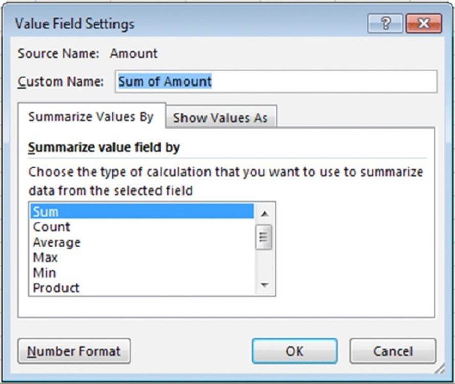
2. Excel guesses at the way you want to aggregate the Values data. Sometimes it guesses wrong. For example, it may guess that you want to count the data when you want to sum it. To change the aggregation, right-click on the data, choose Summarize Values By, and choose the proper aggregate (see Figure 18.10). For more aggregation options, see the “Pivot table calculations” sidebar later in this chapter.
3. Drag the AcctType field into the Rows area. Now the pivot table shows the total amount for each of the account types.
4. Drag the Branch field into the Columns area. The pivot table shows the amount for each account type, cross-tabulated by branch (see Figure 18.11). The pivot table updates itself automatically with every change you make in the PivotTable Fields task pane.
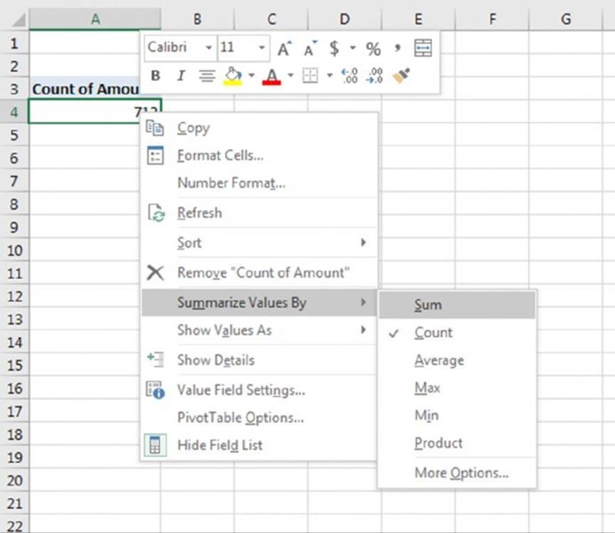
Figure 18.10 Right-click anywhere in the data to summarize using a different aggregate.
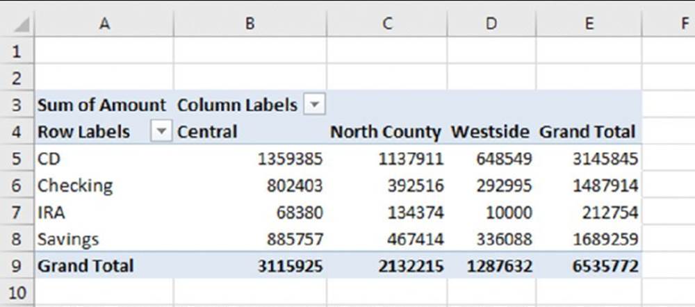
Figure 18.11 After a few simple steps, the pivot table shows a summary of the data.
Formatting the pivot table
Notice that the pivot table uses General number formatting. To change the number format for all data, right-click any value and choose Number Format from the shortcut menu. Then use the Format Cells dialog box to change the number format for the displayed data.
![]() Tip
Tip
You might be tempted to use the cell formatting controls on the Home tab of the Ribbon. When you use those controls, it only formats the cells you have selected. However, when you use the Number Format option on the right-click menu, all the data is formatted.
You can apply any of several built-in styles to a pivot table. Select any cell in the pivot table and choose PivotTable Tools ➜ Design ➜ PivotTable Styles to select a style. Fine-tune the display by using the controls in the PivotTable Tools ➜ Design ➜ PivotTable Style Options group.
You also can use the controls in the PivotTable ➜ Design ➜ Layout group to control various elements in the pivot table. You can adjust any of the following elements:
§ Subtotals: Hide subtotals or choose where to display them (above or below the data).
§ Grand Totals: Choose which types, if any, to display.
§ Report Layout: Choose from three different layout styles (compact, outline, or tabular). You can also choose to hide repeating labels.
§ Blank Row: Add a blank row between items to improve readability.
The PivotTable Tools ➜ Analyze ➜ Show group contains additional options that affect the appearance of your pivot table. For example, you use the Field Headers button to toggle the display of the field headings.
Still more pivot table options are available in the PivotTable Options dialog box, shown in Figure 18.12. To display this dialog box, choose PivotTable Tools ➜ Analyze ➜PivotTable ➜ Options. Or right-click any cell in the pivot table and choose PivotTable Options from the shortcut menu.
The best way to become familiar with all these layout and formatting options is to experiment.
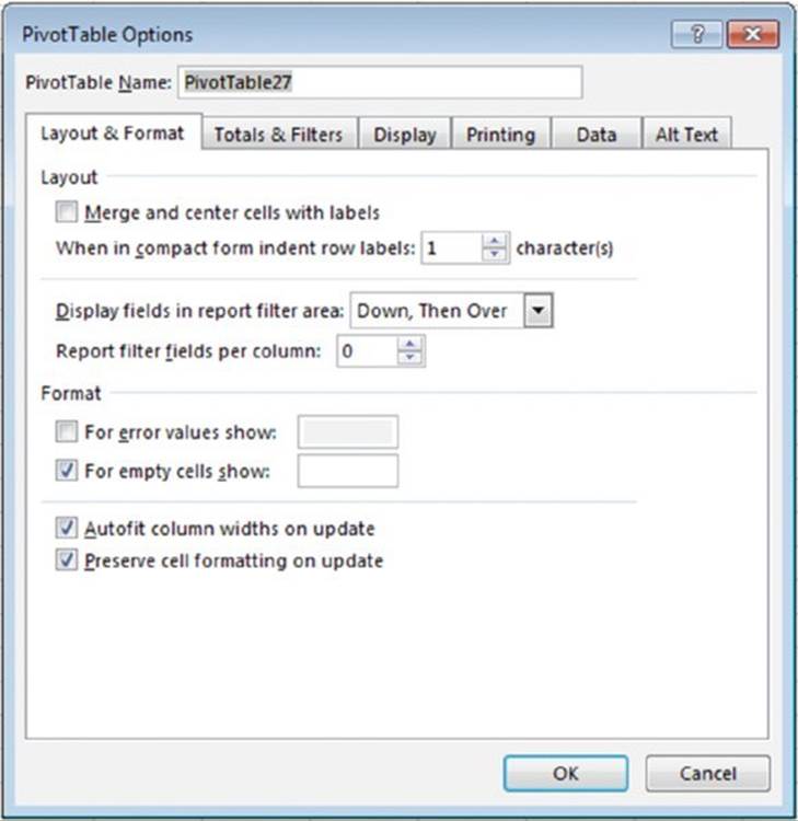
Figure 18.12 The PivotTable Options dialog box.
![]() Pivot table calculations
Pivot table calculations
Pivot table data is most frequently summarized using a sum. However, you can display your data using a number of different summary techniques, specified in the Value Field Settings dialog box. The quickest way to display this dialog box is to right-click any value in the pivot table and choose Value Field Settings from the shortcut menu. This dialog box has two tabs: Summarize Values By and Show Values As.
Use the Summarize Values By tab to select a different summary function. Your choices are Sum, Count, Average, Max, Min, Product, Count Numbers, StdDev, StdDevp, Var, and Varp.
To display your values in a different form, use the drop-down control on the Show Values As tab. You have many options to choose from, including as a percentage of the total or subtotal.
This dialog box also provides a way to apply a number format to the values. Just click the button and choose your number format.
Modifying the pivot table
After you create a pivot table, changing it is easy. For example, you can add further summary information by using the PivotTable Field task pane. Figure 18.13 shows the pivot table after we dragged a second field (OpenedBy) to the Rows section in the PivotTable task pane.
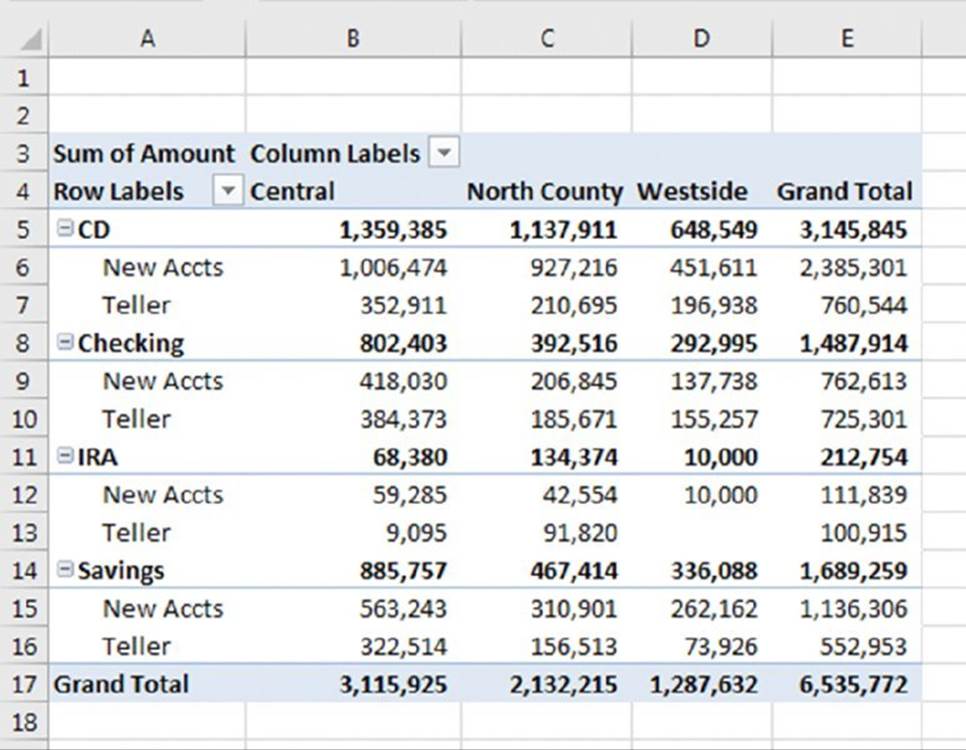
Figure 18.13 Two fields are used for row labels.
Following are some tips on other pivot table modifications that you can make:
§ To remove a field from the pivot table, select it in the bottom part of the PivotTable Field task pane and drag it away.
§ If an area has more than one field, you can change the order in which the fields are listed by dragging the field names. Doing so determines how nesting occurs and affects the appearance of the pivot table.
§ To temporarily remove a field from the pivot table, remove the check mark from the field name in the top part of the PivotTable Field task pane. The pivot table is redisplayed without that field. Place the check mark back on the field name, and it appears in its previous section.
§ If you add a field to the Filters section, the field items appear in a drop-down list, which allows you to filter the displayed data by one or more items. Figure 18.14 shows an example. We dragged the Date field to the Filters area. The pivot table is now showing the data only for a single day (which we selected from the drop-down list).
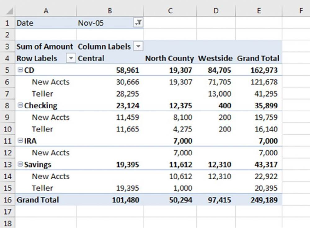
Figure 18.14 The pivot table is filtered by date.
![]() Copying a pivot table’s content
Copying a pivot table’s content
A pivot table is flexible, but it does have some limitations. For example, you can’t insert new rows or columns, change any of the calculated values, or enter formulas within the pivot table. If you want to manipulate a pivot table in ways not normally permitted, make a copy of it so it’s no longer linked to its source data.
To copy a pivot table, select the entire table and choose Home ➜ Clipboard ➜ Copy (or press Ctrl+C). Then select a new worksheet and choose Home Clipboard ➜ Paste➜ Paste Values. The contents of the pivot table are copied to the new location so that you can do whatever you like to them. You also may want to copy the formats from the pivot table. Select the entire pivot table and then choose Home ➜ Clipboard ➜ Format Painter. Then click the upper-left corner of the copied range.
Note that the copied information is not a pivot table, and it is no longer linked to the source data. If the source data changes, your copied pivot table does not reflect these changes.
More Pivot Table Examples
To demonstrate the flexibility of pivot tables, we created some additional pivot tables. The examples use the bank account data and answer the questions posed earlier in this chapter. (See the “A Pivot Table Example” section.)
Question 1
What is the daily total new deposit amount for each branch?
Figure 18.15 shows the pivot table that answers this question:
§ The Branch field is in the Columns section.
§ The Date field is in the Rows section.
§ The Amount field is in the Value section and is summarized by Sum.
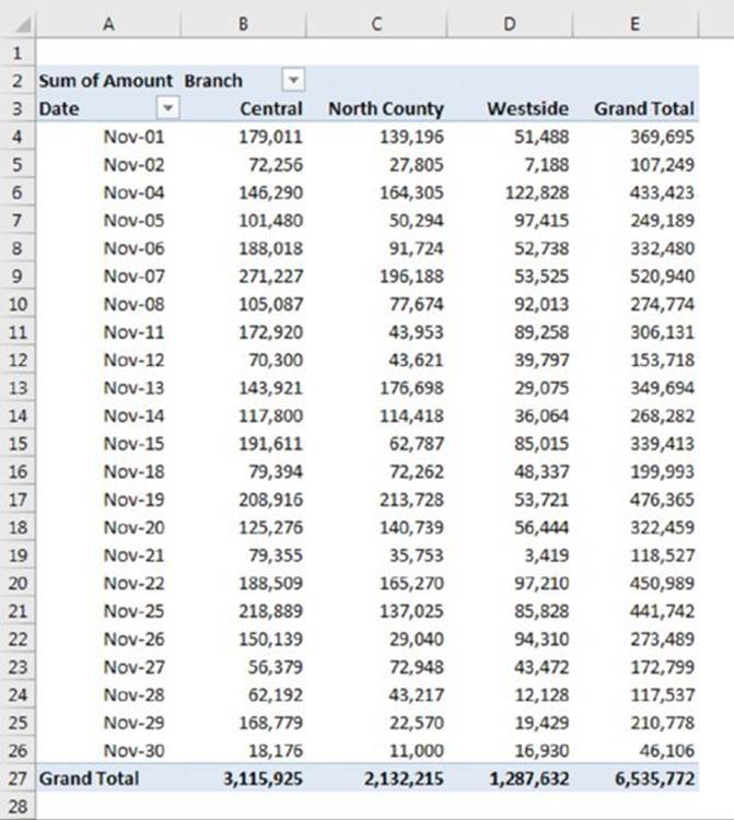
Figure 18.15 This pivot table shows daily totals for each branch.
Note that you can sort the pivot table by any column. For example, you can sort the Grand Total column in descending order to find out which day of the month had the largest amount of new funds. To sort, just right-click any cell in the column and choose Sort from the shortcut menu.
Question 2
Which day of the week accounts for the most deposits?
Figure 18.16 shows the pivot table that answers this question:
§ The Weekday field is in the Rows section.
§ The Amount field is in the Values section and is summarized by Sum.
Conditional formatting data bars have been added to make it easier to visualize how the days compare.
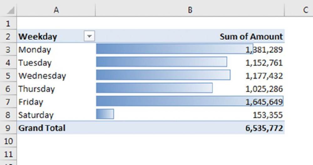
Figure 18.16 This pivot table shows totals by day of the week.
Question 3
How many accounts were opened at each branch, broken down by account type?
Figure 18.17 shows a pivot table that answers this question:
§ The AcctType field is in the Columns section.
§ The Branch field is in the Rows section.
§ The Amount field is in the Value section and is summarized by Count.
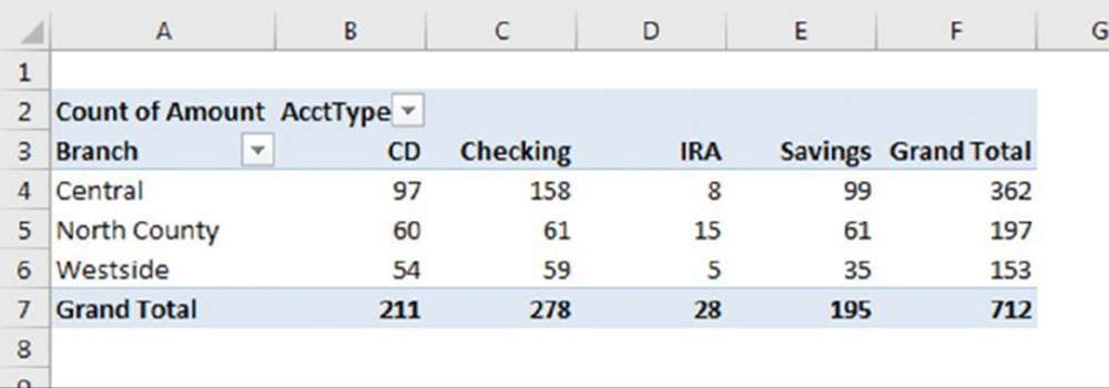
Figure 18.17 This pivot table uses the Count function to summarize the data.
So far, all the pivot table examples have used the Sum summary function. In this case, though, the summary function has been changed to Count. To change the summary function to Count, right-click any cell in the Values area and choose Summarize Data By ➜ Count from the shortcut menu.
Question 4
What’s the dollar distribution of the different account types?
Figure 18.18 shows a pivot table that answers this question. For example, 253 (or 35.53%) of the new accounts were for an amount of $5,000 or less.
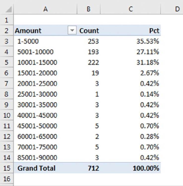
Figure 18.18 This pivot table counts the number of accounts that fall into each value range.
This pivot table is unusual because it uses three instances of a single field: Amount.
§ The Amount field is in the Rows section (grouped, to show dollar ranges).
§ The Amount field is also in the Values section and is summarized by Count.
§ A third instance of the Amount field is the Values section, summarized by Percent of Total.
When we initially added the Amount field to the Rows section, the pivot table showed a row for each unique dollar amount. To group the values, we right-clicked one of the amounts and chose Group from the shortcut menu. Then we used Excel’s Grouping dialog box to set up bins of $5,000 increments. Note that the Grouping dialog box does not appear if you select more than one Row label.
The second instance of the Amount field (in the Values section) is summarized by Count. We right-clicked a value and chose Summarize Data By ➜ Count.
We added another instance of Amount to the Values section, and we set it up to display the percentage. We right-clicked a value in column C and chose Show Values As ➜% of Column Total. This option is also available on the Show Values As tab of the Value Field Settings dialog box.
Question 5
What types of accounts do tellers open most often?
The pivot table in Figure 18.19 shows that the most common account opened by tellers is a checking account:
§ The AcctType field is in the Rows section.
§ The OpenedBy field is in the Filters section.
§ The Amount field is in the Values section (summarized by Count).
§ A second instance of the Amount field is in the Values section (shown as Percent of GrandTotal).
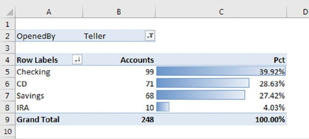
Figure 18.19 This pivot table uses a report filter to show only the teller data.
This pivot table uses the OpenedBy field as a filter and is showing the data only for tellers. We sorted the data so that the largest value is at the top, and we used conditional formatting to display data bars for the percentages.
When we added the first instance of Amount to the Value section, Excel labeled it Count of Amount. For the second instance, it labeled it as Count of Amount2. To change these to Accounts and Pct as shown in the figure, select the cell with the title (cells B3 and B4, respectively) and simply type the desired name.
Question 6
How does the Central branch compare with the other two branches?
Figure 18.20 shows a pivot table that sheds some light on this rather vague question. It shows how the Central branch compares with the other two branches combined:
§ The AcctType field is in the Rows section.
§ The Branch field is in the Columns section.
§ The Amount field is in the Values section.
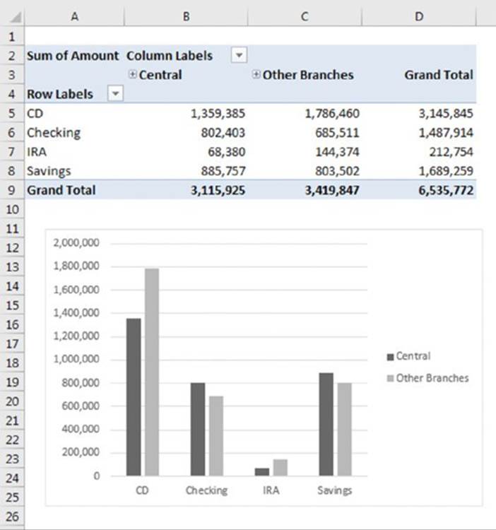
Figure 18.20 This pivot table (and pivot chart) compares the Central branch with the other two branches combined.
We selected the North County and Westside labels, right-clicked, and chose Group to combine those two branches into a new category. Grouping also creates a new field in the PivotTable Fields task pane. In this case, the new field is named Branch2. We changed the label in the pivot table to Other Branches.
![]() Note
Note
The new field, Branch2, is also available for use in other pivot tables created from the data.
After grouping the North County and Westside branches, the pivot table allows easy comparison between the Central branch and the other branches combined.
We also created a pivot chart for good measure. We discuss pivot charts later in this chapter.
Question 7
In which branch do tellers open the most checking accounts for new customers?
Figure 18.21 shows a pivot table that answers this question. At the Central branch, tellers opened 23 checking accounts for new customers:
§ The Customer field is in the Filters section.
§ The OpenedBy field is in the Filters section.
§ The AcctType field is in the Filters section.
§ The Branch field is in the Rows section.
§ The Amount field is in the Values section, summarized by Count.
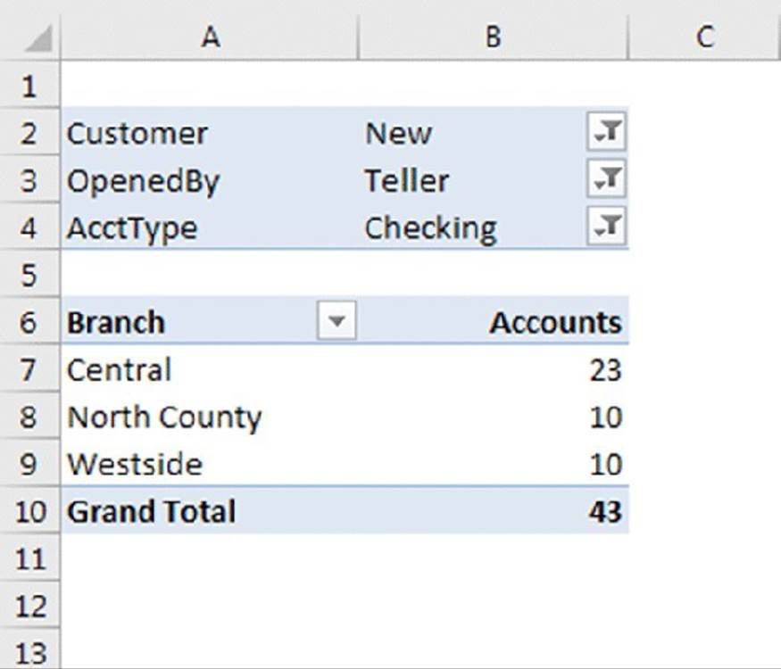
Figure 18.21 This pivot table uses three report filters.
This pivot table uses three filters. The Customer field is filtered to show only New, the OpenedBy field is filtered to show only Teller, and the AcctType field is filtered to show only Checking.
Grouping Pivot Table Items
One of the more useful features of a pivot table is the ability to combine items into groups. You can group items that appear as Row Labels or Column Labels. Excel offers two ways to group items:
§ Manually: After creating the pivot table, select the items to be grouped and then choose PivotTable Tools ➜ Options ➜ Group ➜ Group Selection. Or you can right-click and choose Group from the shortcut menu.
§ Automatically: If the items are numeric (or dates), use the Grouping dialog box to specify how you would like to group the items. Select any item in the Row Labels or Column Labels and then choose PivotTable Tools ➜ Options ➜ Group ➜ Group Selection. Or you can right-click and choose Group from the shortcut menu. In either case, Excel displays its Grouping dialog box.
![]() Note
Note
If you create a pivot table using the Data Model, grouping is not an option.
A manual grouping example
Figure 18.22 shows a pivot table created from an employee list in columns A:C, which has the following fields: Employee, Location, and Sex. The pivot table, in columns E:H, shows the number of employees in each of six states, cross-tabulated by sex.
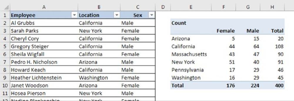
Figure 18.22 A pivot table before creating groups of states.
The goal is to create two groups of states: Western Region (Arizona, California, and Washington) and Eastern Region (Massachusetts, New York, and Pennsylvania). One solution is to add a new column (Region) to the data table and enter the Region for each row. In this case, it’s easier to create groups directly in the pivot table.
To create the first group, we held the Ctrl key while selecting Arizona, California, and Washington. Then we right-clicked and chose Group from the shortcut menu. We repeated the operation with the remaining states to create the second group. Then we replaced the default group names (Group 1 and Group 2) with more meaningful names (Eastern Region and Western Region). Figure 18.23 shows the result of the grouping.
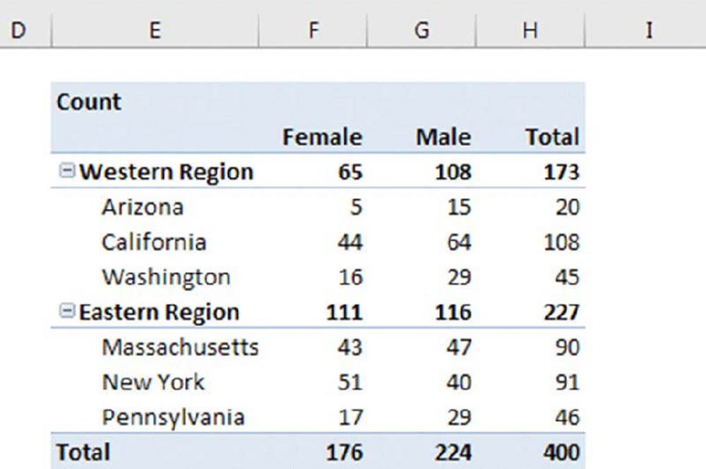
Figure 18.23 A pivot table with two groups and subtotals for the groups.
You can create any number of groups and even create groups of groups.
![]() On the Web
On the Web
The workbook used in this example is available at this book’s website. The file is named employee list.xlsx.
![]() Multiple groups from the same data source
Multiple groups from the same data source
If you create multiple pivot tables from the same data source, you may have noticed that grouping a field in one pivot table affects the other pivot tables. Specifically, all the other pivot tables automatically use the same grouping. Sometimes, this is exactly what you want. Other times, it’s not at all what you want. For example, you might like to see two pivot table reports: one that summarizes data by month and year, and another that summarizes the data by quarter and years.
Grouping affects other pivot tables because all the pivot tables are using the same pivot table “cache.” Unfortunately, there is no direct way to force a pivot table to use a new cache. But there is a way to trick Excel into using a new cache. The trick involves giving multiple range names to the source data.
For example, name your source range Table1 and then give the same range a second name: Table2. The easiest way to name a range is to use the Name box, to the left of the Formula bar. Select the range, type a name in the Name box, and press Enter. Then, with the range still selected, type a different name and press Enter. Excel will display only the first name, but you can verify that both names exist by choosing Formulas ➜ Define Names ➜ Name Manager.
When you create the first pivot table, specify Table1 as the Table/Range. When you create the second pivot table, specify Table2 as the Table/Range. Each pivot table will use a separate cache, and you can create groups in one pivot table, independent of the other pivot table.
You can use this trick with existing pivot tables. Make sure that you give the data source a different name. Then select the pivot table and choose PivotTable Tools ➜Analyze ➜ Data ➜ Change Data Source. In the Change PivotTable Data Source dialog box, type the new name that you gave to the range. This will cause Excel to create a new pivot cache for the pivot table.
Viewing grouped data
Excel provides a number of options for displaying a pivot table, and you may want to experiment with these options when you use groups. These commands are on the PivotTable Tools ➜ Design ➜ Layout tab of the Ribbon. There are no rules for these options. The key is to try a few and see which makes your pivot table look the best. In addition, try various PivotTable Styles, with options for banded rows or banded columns. Often, the style that you choose can greatly enhance readability.
Figure 18.24 shows pivot tables using various options for displaying subtotals, grand totals, and styles.
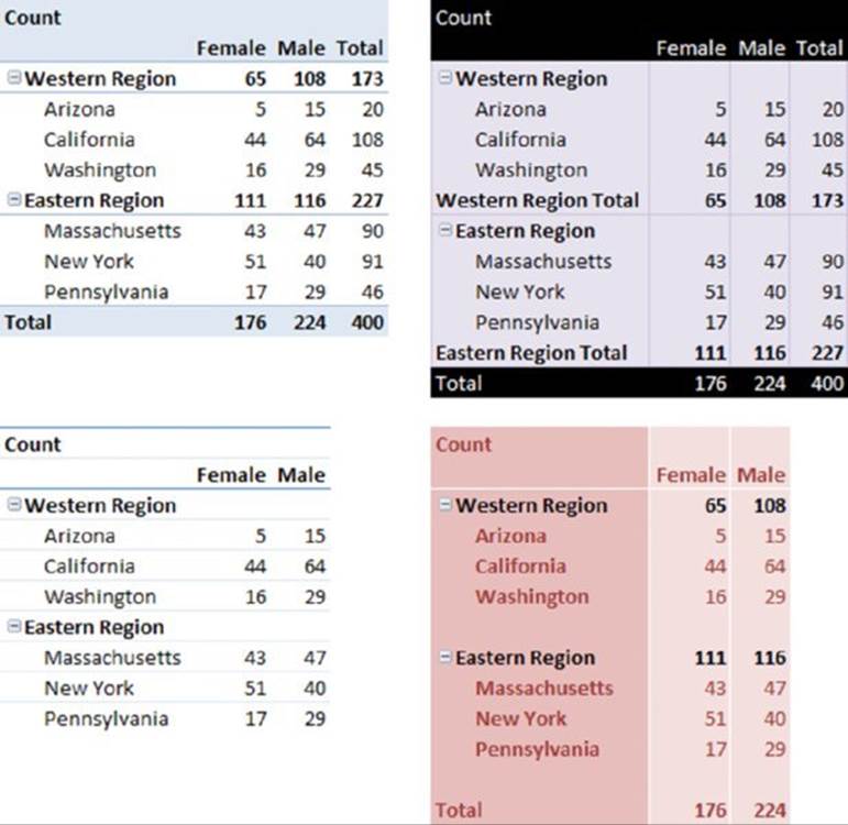
Figure 18.24 Pivot tables with options for subtotals and grand totals.
Automatic grouping examples
When a field contains numbers, dates, or times, Excel can create groups automatically by assigning each item to a bin. The two examples in this section demonstrate automatic grouping.
Grouping by date
Figure 18.25 shows a portion of a simple table with two fields: Date and Sales. This table has 730 rows of data and covers the dates between January 1, 2015 and December 31, 2016. The goal is to summarize the sales information by month.
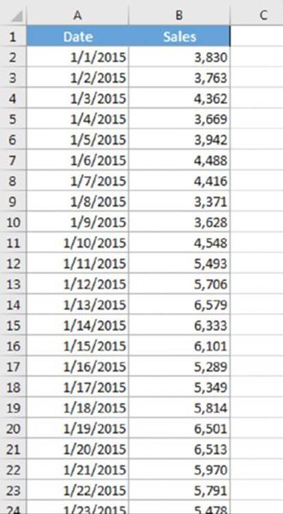
Figure 18.25 You can use a pivot table to summarize the sales data by month.
![]() On the Web
On the Web
A workbook demonstrating how to group pivot table items by date is available at this book’s website. The file is named grouping sales by date.xlsx.
Figure 18.26 shows part of a pivot table created from the data. The Date field is in the Row Labels section, and the Sales field is in the Values section. Not surprisingly, the pivot table looks exactly like the input data because the dates have not been grouped.
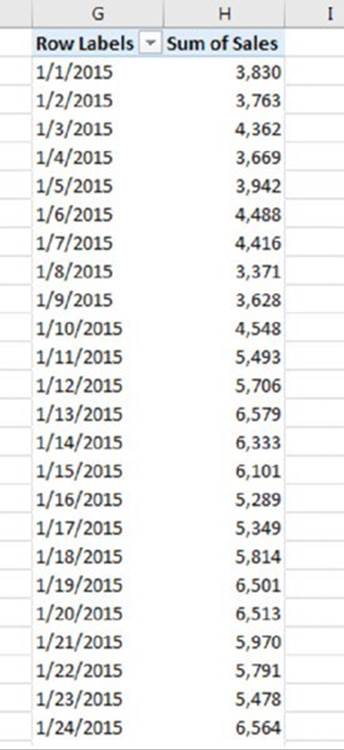
Figure 18.26 The pivot table, before grouping by month.
To group the items by month, select any date and choose PivotTable Tools ➜ Analyze ➜ Group ➜ Group Field (or, right-click and choose Group from the shortcut menu). You see the Grouping dialog box in Figure 18.27.
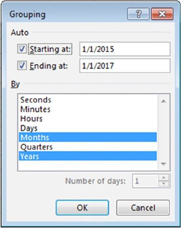
Figure 18.27 Use the Grouping dialog box to group pivot table items by dates.
In the By list box, select Months and Years and verify that the starting and ending dates are correct. Click OK. The Date items in the pivot table are grouped by years and by months, as shown in Figure 18.28.
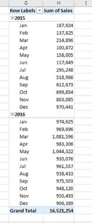
Figure 18.28 The pivot table, after grouping by years and months.
![]() Note
Note
If you select only Months from the By list box of the Grouping dialog box, months in different years combine. For example, the January item would display sales for both 2015 and 2016.
Figure 18.29 shows another view of the data, grouped by quarter and by year.
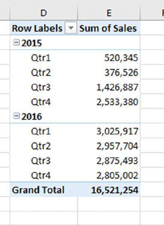
Figure 18.29 This pivot table shows sales by quarter and by year.
Grouping by time
Figure 18.30 shows a pivot table that groups instrument reading data into hours. Each row of the source data is a reading from an instrument, taken at one-minute intervals throughout an entire day. The source table has 1,440 rows, each representing one minute. The pivot table summarizes the data by hour.
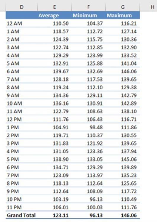
Figure 18.30 This pivot table is grouped by hours.
![]() On the Web
On the Web
This workbook, named time based grouping.xlsx, is available at this book’s website.
Following are the settings we used for this pivot table:
§ The Values area has three instances of the Reading field. We used the Data Field Setting dialog box (the Summarize Values By tab) to summarize the first instance by Average, the second instance by Min, and the third instance by Max.
§ The Time field is in the Row Labels section, and we used the Grouping dialog box to group by Hours.
Creating a Frequency Distribution
Excel provides a number of ways to create a frequency distribution, but none of those methods is easier than using a pivot table. Figure 18.31 shows part of a table of 221 students and the test score for each. The goal is to determine how many students are in each ten-point range (1–10, 11–20, and so on).
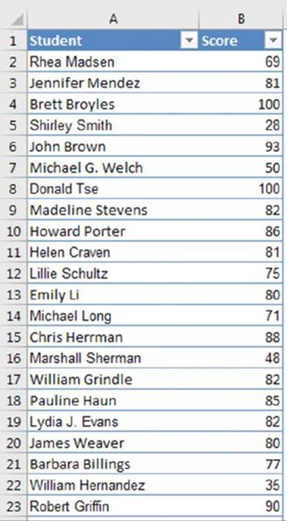
Figure 18.31 Creating a frequency distribution for these test scores is simple.
![]() On the Web
On the Web
This workbook, named test scores.xlsx, is available at this book’s website.
The pivot table is simple:
§ The Score field is in the Rows section (grouped).
§ Another instance of the Score field is in the Values section (summarized by Count).
The Grouping dialog box that generated the bins specified that the groups start at 1 and end at 100, in increments of 10.
![]() Note
Note
By default, Excel does not display items with a count of zero. In this example, no test scores are below 21, so the 1–10 and 11–20 items are hidden. To display items that have no data, choose PivotTable Tools ➜ Analyze ➜ Active Field ➜ Field Settings. In the Field Settings dialog box, click the Layout & Print tab. Then select the Show Items with No Data check box.
Figure 18.32 shows the frequency distribution of the test scores, along with a pivot chart, created by choosing PivotTable Tools ➜ Analyze ➜ Tools ➜ PivotChart.
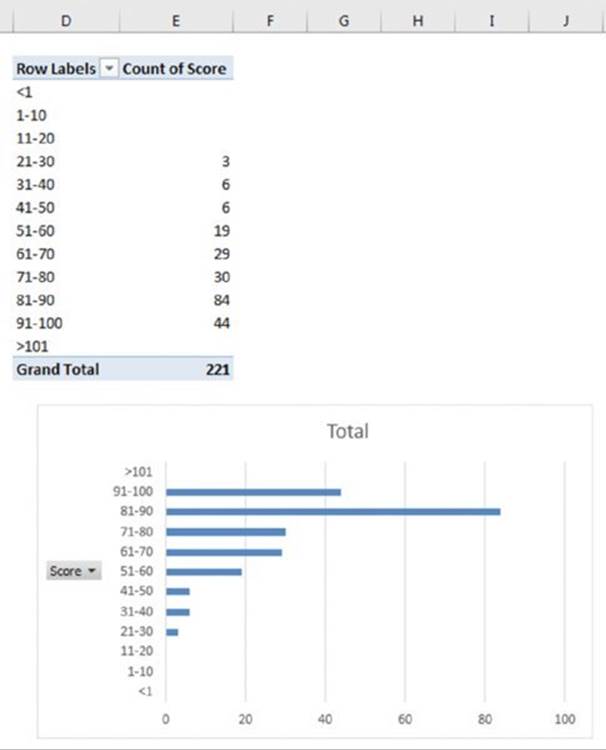
Figure 18.32 The pivot table and pivot chart show the frequency distribution for the test scores.
![]() Note
Note
This example uses Excel’s Grouping dialog box to create the groups automatically. If you don’t want to group in equal-sized bins, you can create your own groups. For example, you may want to assign letter grades based on the test score. Select the rows for the first group and then choose Group from the shortcut menu. Repeat these steps for each additional group. Then replace the default group names with more meaningful names.
Creating a Calculated Field or Calculated Item
Perhaps the most confusing aspect of pivot tables is calculated fields versus calculated items. Many pivot table users simply avoid dealing with calculated fields and items. However, these features can be useful, and they really aren’t that complicated after you understand how they work.
First, some basic definitions:
§ Calculated field: A calculated field is a new field created from other fields in the pivot table. If your pivot table source is a worksheet table, an alternative to using a calculated field is to add a new column to the table and then create a formula to perform the desired calculation. A calculated field must reside in the Values area of the pivot table. You can’t use a calculated field in the Columns area, Rows area, or Filter area.
§ Calculated item: A calculated item uses the contents of other items within a field of the pivot table. If your pivot table source is a worksheet table, an alternative to using a calculated item is to insert one or more rows and write formulas that use values in other rows. A calculated item must reside in the Columns area, Rows area, or Filter area of a pivot table. You can’t use a calculated item in the Values area.
The formulas used to create calculated fields and calculated items aren’t standard Excel formulas. In other words, you don’t enter the formulas into cells. Rather, you enter these formulas in a dialog box, and they’re stored along with the pivot table data.
The examples in this section use the worksheet table shown in Figure 18.33. The table consists of 5 fields and 48 rows. Each row describes monthly sales information for a particular sales representative. For example, Amy is a sales rep for the North region, and she sold 239 units in January for total sales of $23,040.
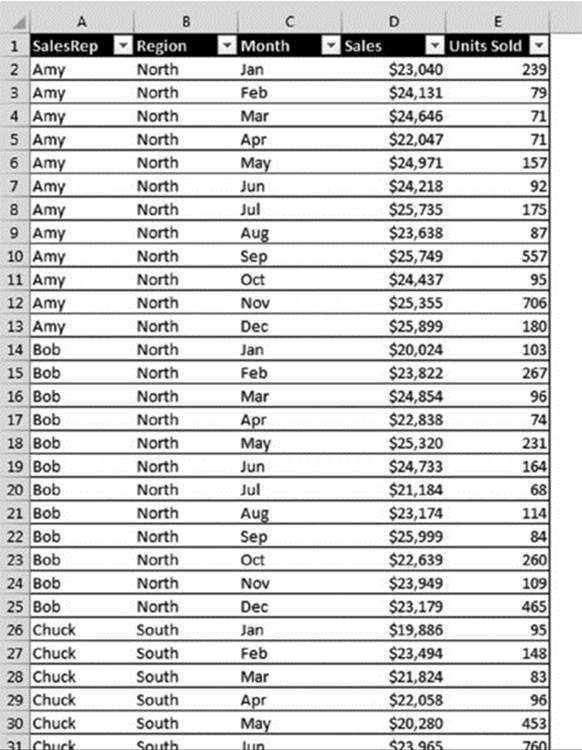
Figure 18.33 This data demonstrates calculated fields and calculated items.
![]() On the Web
On the Web
A workbook that demonstrates calculated fields and items is available at this book’s website. The file is named calculated fields and items.xlsx.
Figure 18.34 shows a pivot table created from the data. This pivot table shows Sales (Values area), cross-tabulated by Month (Rows area) and by SalesRep (Columns area).
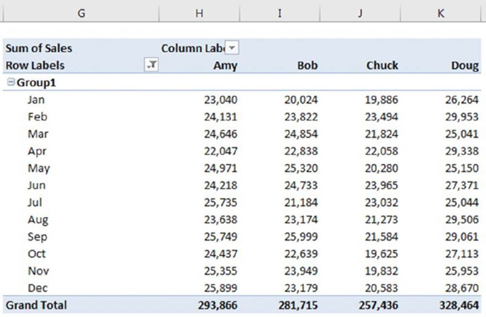
Figure 18.34 This pivot table was created from the sales data.
The examples that follow create the following:
§ A calculated field, to compute average sales per unit
§ Four calculated items, to compute the quarterly sales commission
Creating a calculated field
Because a pivot table is a special type of range, you can’t insert new rows or columns within the pivot table, which means that you can’t insert formulas to perform calculations with the data in a pivot table. However, you can create calculated fields for a pivot table. Acalculated field consists of a calculation that can involve other fields.
A calculated field is basically a way to display new information in a pivot table: an alternative to creating a new column field in your source data. In many cases, you may find it easier to insert a new column in the source range with a formula that performs the desired calculation. A calculated field is most useful when the data comes from a source that you can’t easily manipulate, such as an external database.
![]() Note
Note
Calculated fields can be used in the Values area of a pivot table. They cannot be used in the Columns, Rows, or Filter areas of a pivot table.
In the sales example, for example, suppose that you want to calculate the average sales amount per unit. You can compute this value by dividing the Sales field by the Units Sold field. The result shows a new field (a calculated field) for the pivot table.
Use the following procedure to create a calculated field that consists of the Sales field divided by the Units Sold field:
1. Select any cell within the pivot table.
2. Choose PivotTable Tools ➜ Analyze ➜ Calculations ➜ Fields, Items & Sets ➜ Calculated Field.
Excel displays the Insert Calculated Field dialog box.
3. Type a descriptive name in the Name field and specify the formula in the Formula field (see Figure 18.35).
The formula can use worksheet functions and other fields from the data source. For this example, the calculated field name is Average Unit Price, and the formula is
=Sales/'Units Sold'
4. Click the Add button to add this new field.
5. Click OK to close the Insert Calculated Field dialog box.
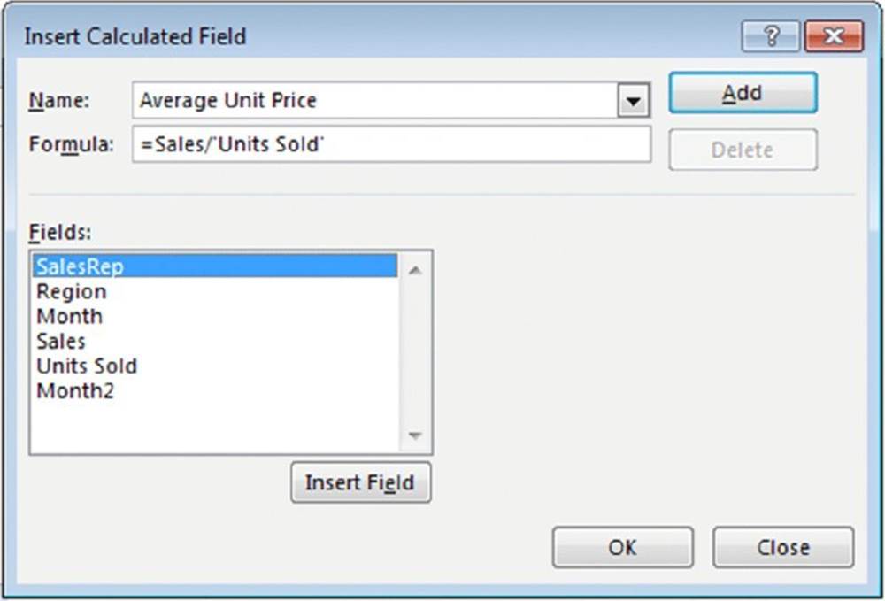
Figure 18.35 The Insert Calculated Field dialog box.
![]() Note
Note
You can create the formula manually by typing it or by double-clicking items in the Fields list box. Double-clicking an item transfers it to the Formula field. Because the Units Sold field contains a space, Excel adds single quotes around the field name.
After you create the calculated field, Excel adds it to the Values area of the pivot table (and it appears in the PivotTable Field task pane). You can treat it just like any other field, with one exception: you can’t move it to the Rows, Columns, or Filter areas. It must remain in the Values area.
Figure 18.36 shows the pivot table after adding the calculated field. The new field displayed Sum of Avg Unit Price, but we changed this label to Avg Price.
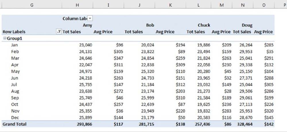
Figure 18.36 This pivot table uses a calculated field.
![]() Tip
Tip
The formulas that you develop can also use worksheet functions, but the functions can’t refer to cells or named ranges.
Inserting a calculated item
The preceding section describes how to create a calculated field. Excel also enables you to create a calculated item for a pivot table field. Keep in mind that a calculated field can be an alternative to adding a new field (column) to your data source. A calculated item, on the other hand, is an alternative to adding new rows to the data source—rows that contain formulas that refer to other rows.
In this example, you create four calculated items. Each item represents the commission earned on the quarter’s sales, according to the following schedule:
§ Quarter 1: 10% of January, February, and March sales
§ Quarter 2: 11% of April, May, and June sales
§ Quarter 3: 12% of July, August, and September sales
§ Quarter 4: 12.5% of October, November, and December sales
![]() Note
Note
Modifying the source data to obtain this information would require inserting 16 new rows, each with formulas. So, for this example, creating four calculated items may be an easier task.
To create a calculated item to compute the commission for January, February, and March, follow these steps:
1. Move the cell pointer to the Rows area of the pivot table and choose PivotTable Tools ➜ Analyze ➜ Calculations ➜ Fields, Items, & Sets ➜ Calculated Item. Excel displays the Insert Calculated Item dialog box.
2. Type a name for the new item in the Name field and specify the formula in the Formula field (see Figure 18.37).
The formula can use items in other fields, but it can’t use worksheet functions. For this example, the new item is named Qtr1 Commission, and the formula appears as follows:
=10%*(Jan+Feb+Mar)
3. Click the Add button.
4. Repeat steps 2 and 3 to create three additional calculated items:
· Qtr2 Commission: =11%*(Apr+May+Jun)
· Qtr3 Commission: =12%*(Jul+Aug+Sep)
· Qtr4 Commission: =12.5%*(Oct+Nov+Dec)
5. Click OK to close the dialog box.
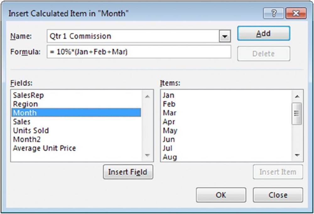
Figure 18.37 The Insert Calculated Item dialog box.
![]() Note
Note
A calculated item, unlike a calculated field, does not appear in the PivotTable Field task pane. Only fields appear in the field list.
![]() Warning
Warning
If you use a calculated item in your pivot table, you may need to turn off the Grand Total display for columns to avoid double counting. In this example, the Grand Total includes the calculated item, so the commission amounts are included with the sales amounts. To turn off Grand Totals, choose PivotTable Tools ➜ Design ➜ Layout ➜Grand Totals.
After you create the calculated items, they appear in the pivot table. Figure 18.38 shows the pivot table after adding the four calculated items. Notice that the calculated items are added to the end of the Month items. You can rearrange the items by selecting the cell and dragging its border. Another option is to create two groups: one for the sales numbers and one for the commission calculations. Figure 18.39 shows the pivot table after creating the two groups and adding subtotals.
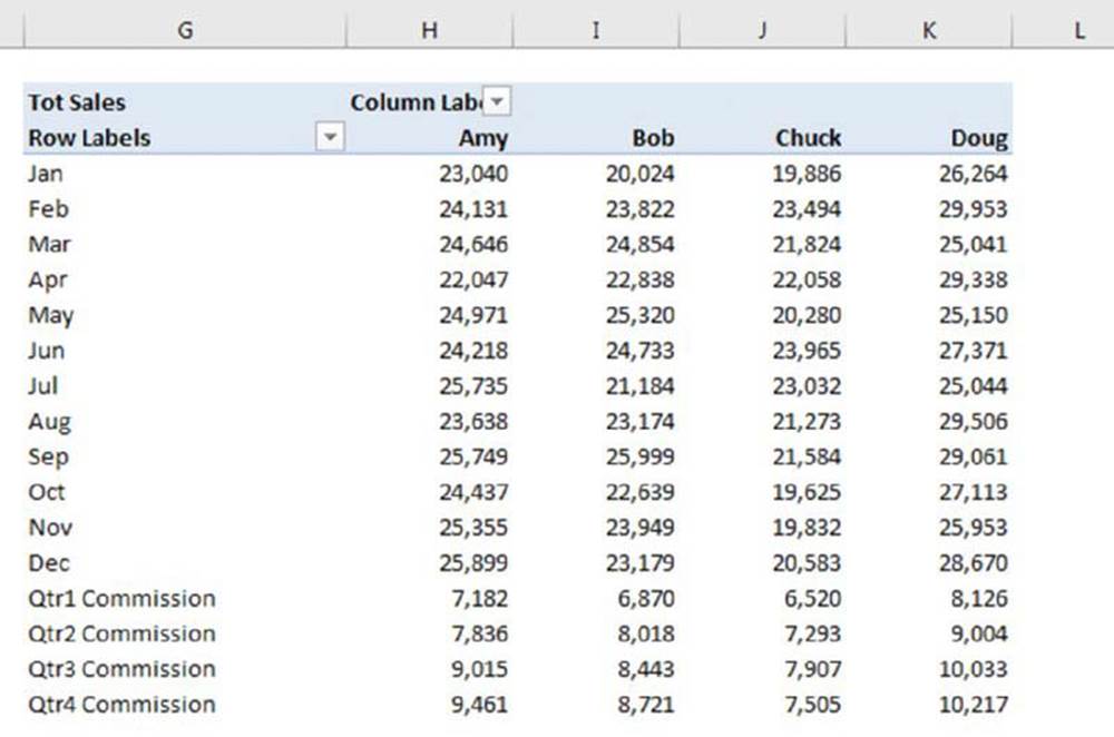
Figure 18.38 This pivot table uses calculated items for quarterly totals.
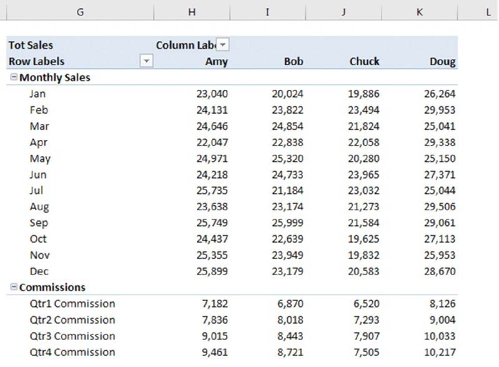
Figure 18.39 The pivot table, after creating two groups and adding subtotals.
Filtering Pivot Tables with Slicers
A slicer makes it easy to filter data in a pivot table. Figure 18.40 shows a pivot table with three slicers. Each slicer represents a particular field. In this case, the pivot table is displaying data for new customers, opened by tellers at the Central branch.
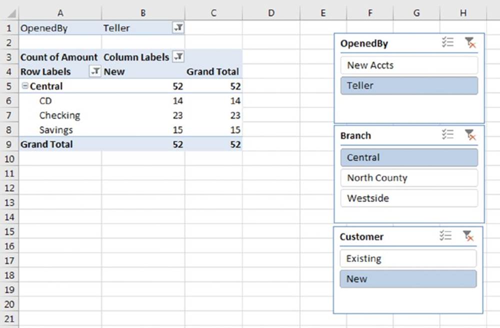
Figure 18.40 Using slicers to filter the data displayed in a pivot table.
The same type of filtering can be accomplished by using the field labels in the pivot table, but slicers are intended for those who might not understand how to filter data in a pivot table. You can also use slicers to create an attractive and easy-to-use interactive “dashboard.”
To add one or more slicers to a worksheet, start by selecting any cell in a pivot table and then choose PivotTable Tools ➜ Filter ➜ Insert Slicer. The Insert Slicers dialog box appears with a list of all fields in the pivot table. Place a check mark next to the slicers you want and then click OK.
![]() Note
Note
Slicers aren’t limited to pivot tables. Slicers can also be used with a table (choose Insert ➜ Tables ➜ Table).
To use a slicer to filter data in a pivot table, just click a button. To display multiple values, press Ctrl while you click the buttons in a Slicer. Press Shift and click to select a series of consecutive buttons.
Figure 18.41 shows a pivot table and a pivot chart. Two slicers are used to filter the data (by state and by month). In this case, the pivot table (and pivot chart) shows only the data for Kansas, Missouri, and New York for the months of January through March. Slicers provide a quick and easy way to create an interactive chart.
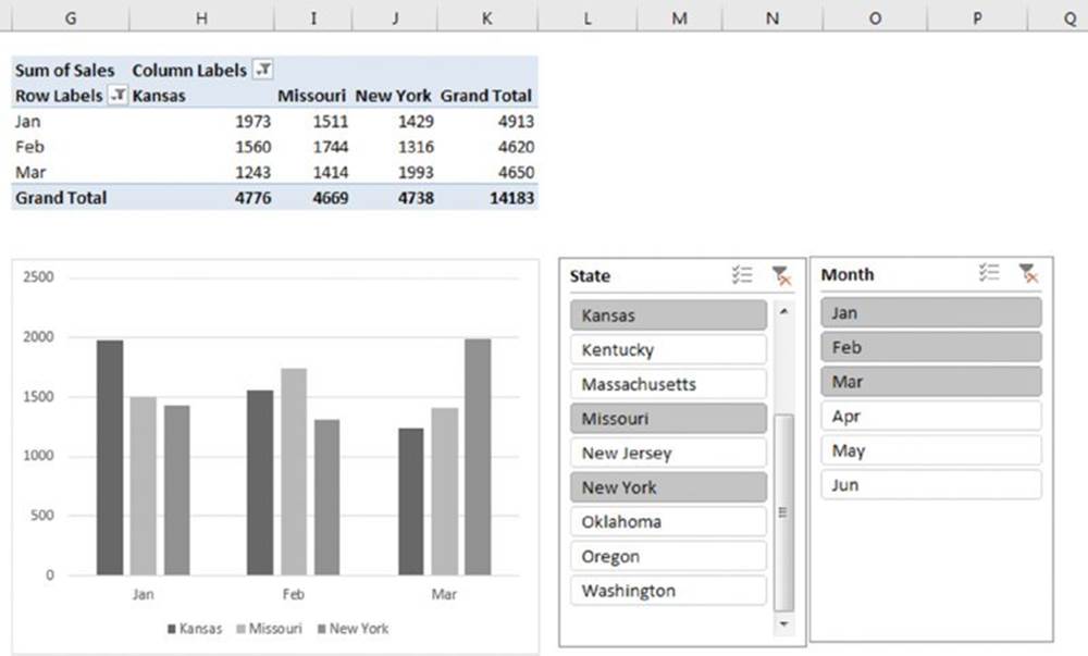
Figure 18.41 Using a slicer to filter a pivot table by state.
![]() On the Web
On the Web
This workbook, named pivot table slicers.xlsx, is available at this book’s website.
Filtering Pivot Tables with a Timeline
A timeline is conceptually similar to a slicer, but this control is designed to simplify time-based filtering in a pivot table.
A timeline is relevant only if your pivot table has a field formatted as a date. This feature does not work with times. To add a timeline, select a cell in a pivot table and choose Insert ➜ Filter ➜ Timeline. Excel displays a dialog box that lists all date-based fields. If your pivot table doesn’t have a field formatted as a date, Excel displays an error.
Figure 18.42 shows a pivot table created from the data in columns A:E. This pivot table uses a timeline, set to allow date filtering by quarters. Click a button that corresponds to the quarter you want to view, and the pivot table is updated immediately. To select a range of quarters, press Shift while you click the first and last buttons in the range. Other filtering options (selectable from the drop-down in the upper-right corner) are Year, Month, and Day. In the figure, the pivot table displays data from the last two quarters of 2011 and the first quarter of 2012.
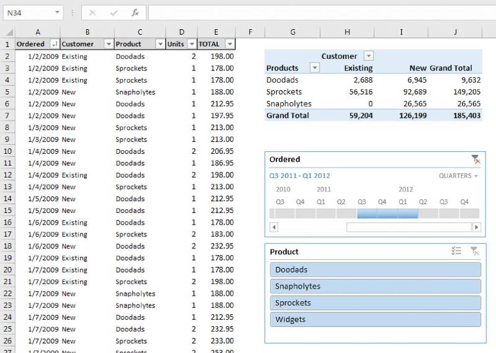
Figure 18.42 Using a timeline to filter a pivot table by date.
![]() On the Web
On the Web
A workbook that uses a timeline is available at this book’s website. The filename is pivot table timeline.xlsx.
You can, of course, use both slicers and a timeline for a pivot table. A timeline has the same type of formatting options as slicers, so you can create an attractive interactive dashboard that simplifies pivot table filtering.
Referencing Cells Within a Pivot Table
In some cases, you may want to create a formula that references one or more cells within a pivot table. Figure 18.43 shows a simple pivot table that displays income and expense information for three years. In this pivot table, the Month field is hidden, so the pivot table shows the year totals.
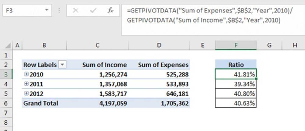
Figure 18.43 The formulas in column F reference cells in the pivot table.
![]() On the Web
On the Web
This workbook, named pivot table referencing.xlsx, is available at this book’s website.
Column F contains formulas, and this column is not part of the pivot table. These formulas calculate the expense-to-income ratio for each year. We created these formulas by pointing to the cells. You may expect to see this formula in cell F3:
=D3/C3
In fact, the formula in cell F3 is
=GETPIVOTDATA("Sum of Expenses",$B$2,"Year",2010)/GETPIVOTDATA("Sum of Income",$B$2,"Year",2010)
When you use the pointing technique to create a formula that references a cell in a pivot table, Excel replaces those simple cell references with a much more complicated GETPIVOTDATA function. If you type the cell references manually (rather than pointing to them), Excel does not use the GETPIVOTDATA function.
The reason? Using the GETPIVOTDATA function helps ensure that the formula will continue to reference the intended cells if the pivot table layout is changed. Figure 18.44 shows the pivot table after expanding the years to show the month detail. As you can see, the formulas in column F still show the correct result even though the referenced cells are in a different location. Had we used simple cell references, the formula would have returned incorrect results after expanding the years.
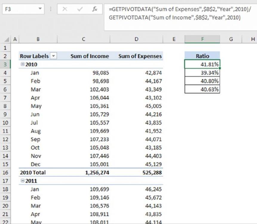
Figure 18.44 After expanding the pivot table, formulas that used the GETPIVOTDATA function continue to display the correct result.
![]() Warning
Warning
Using the GETPIVOTDATA function has one caveat: the data that it retrieves must be visible in the pivot table. If you modify the pivot table so that the value used by GETPIVOTDATA is no longer visible, the formula returns an error.
![]() Tip
Tip
You may want to prevent Excel from using the GETPIVOTDATA function when you point to pivot table cells when creating a formula. If so, choose PivotTable Tools ➜Analyze ➜ PivotTable ➜ Options ➜ Generate GetPivot Data. (This command is a toggle.)
Another Pivot Table Example
The pivot table example in this section demonstrates some useful ways to work with pivot tables. Fig-ure 18-18.45 shows a table with 3,144 data rows, one for each county in the United States. The fields are
§ County: The name of the county
§ State Name: The state of the county
§ Region: The region (Roman number ranging from I to XII)
§ Census 2000: The population of the county, according to the 2000 Census
§ Census 1990: The population of the county, according to the 1990 Census
§ Land Area: The area, in square miles (excluding water-covered area)
§ Water Area: The area, in square miles, covered by water
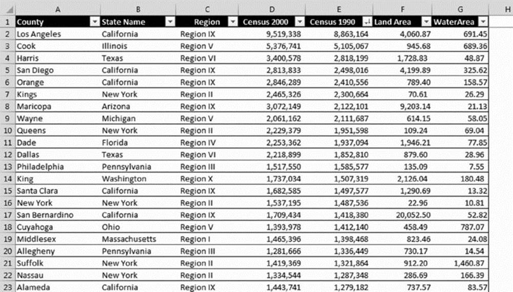
Figure 18.45 This table contains data for each county in the United States.
![]() On the Web
On the Web
This workbook, named county data.xlsx, is available at this book’s website.
I created three calculated fields to display additional information:
§ Change (displayed as Pop Change): The difference between Census 2000 and Census 1990
§ Pct Change (displayed as Pct Pop Change): The population change expressed as a percentage of the 1990 population
§ Density (displayed as Pop/Sq Mile): The population per square mile of land
You might want to document your calculated fields and calculated items. Choose PivotTable Tools ➜ Analyze ➜ Calculations ➜ Fields, Items, & Sets ➜ List Formulas, and Excel inserts a new worksheet with information about your calculated fields and items. Figure 18.47 shows an example.
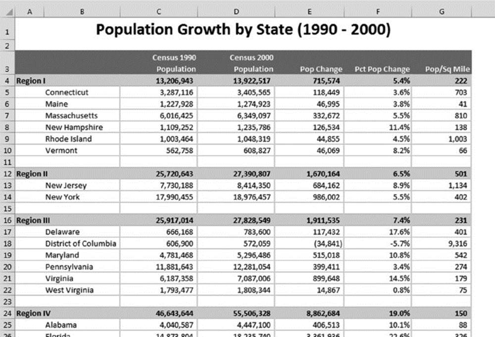
Figure 18.46 This pivot table was created from the county data.
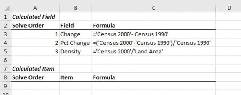
Figure 18.47 This worksheet lists calculated fields and items for the pivot table.
This pivot table is sorted on two columns. The main sort is by Region, and states within each region are sorted alphabetically. To sort, just select a cell that contains a data point to be included in the sort. Right-click and choose Sort from the shortcut menu.
Sorting by Region required some additional effort because Roman numerals are not in alphabetical order. Therefore, we had to create a custom list. To create a custom sort list, access the Excel Options dialog box, click the Advanced tab, and scroll down and click Edit Custom Lists. In the Custom Lists dialog box, select New List, type your list entries, and click Add. Figure 18.48 shows the custom list that we created for the region names.
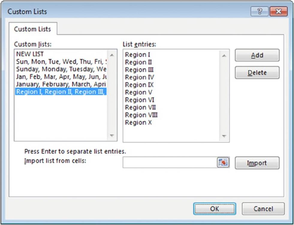
Figure 18.48 This custom list ensures that the Region names are sorted correctly.
Using the Data Model
This chapter, so far, has focused exclusively on pivot tables that are created from a single table of data. With the Data Model, you can use multiple tables of data in a single pivot table. You will need to create one or more “table relationships” so that the data can be tied together.
Figure 18.49 shows parts of three tables that are in a single workbook. (Each sheet is in its own worksheet and is shown in a separate window.) The tables are named Orders, Customers, and Regions. The Orders table contains information about product orders. The Customers table contains information about the company’s customers. The Regions table contains a region identifier for each state.
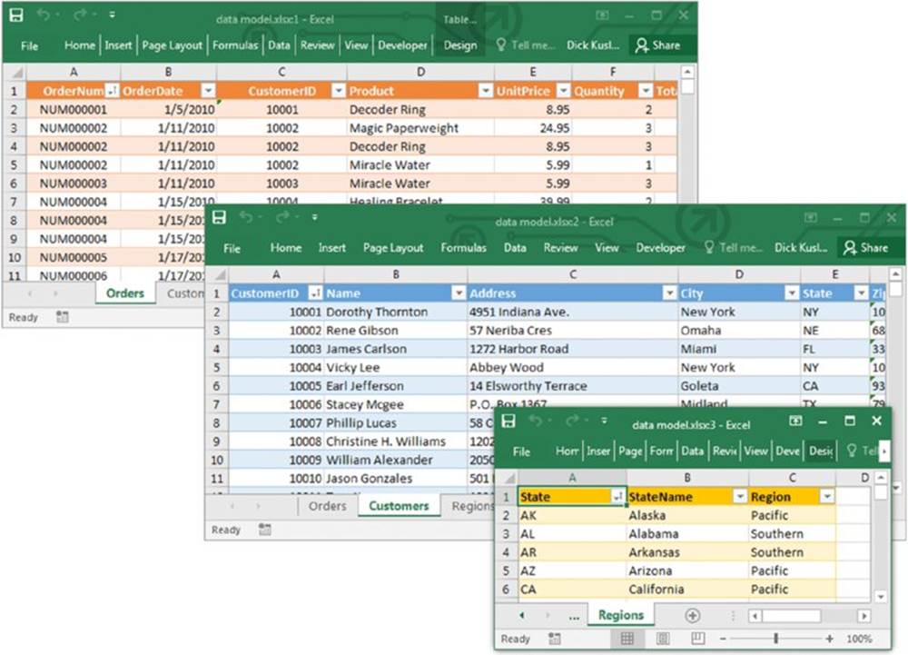
Figure 18.49 These three tables will be used for a pivot table, using the Data Model.
Notice that the Orders and Customers tables have a CustomerID column in common, and Customers and Regions tables have a State column in common. The common columns will be used to form relationship among the tables.
![]() On the Web
On the Web
The example in this section is available at this book’s website. The workbook is named data model.xlsx.
![]() Note
Note
Compared with a pivot table created from a single table, pivot data created using the Data Model has some restrictions. Most notably, you cannot create groups. In addition, you cannot create calculated fields or calculated items.
The goal is to summarize sales by state, region, and year. Notice that the sales (and date) information is in the Orders table, the state information is in the Customers table, and the region names are in the Regions table. Therefore, all three tables will be used for this pivot table.
Start by creating a pivot table (in a new worksheet) from the Orders table. Select any cell within the table and choose Insert ➜ Tables ➜ Pivot Tables. In the Create PivotTable dialog box, make sure you select the Add This Data to the Data Model check box.
Notice that the PivotTable Fields task pane is a bit different when you’re working with the Data Model. The task pane contains two tabs: Active and All. The Active tab lists only the Orders table. The All tab lists all of the tables in the workbook. To make things easier, switch to the All tab, right-click the Customers table, and choose Show in Active Tab. Then do the same for the Regions table.
Figure 18.50 shows the active tab of the PivotTable Fields task pane, with all three tables expanded to show their column headers.
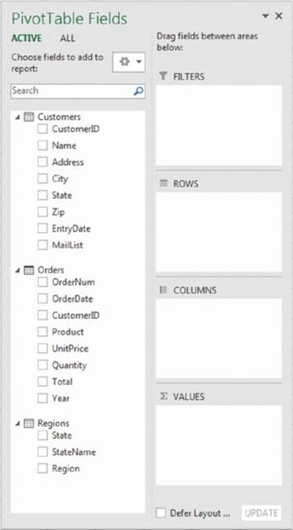
Figure 18.50 The PivotTable Fields task pane, with three active tables.
The next step is to set up the relationships among the tables. Choose PivotTable Tools ➜ Analyze ➜ Calculations ➜ Relationships. Excel displays its Manage Relationships dialog box. Click the New button, and the Create Relationship dialog box appears.
For the Table, specify Orders; for the Foreign Column, specify CustomerID. For the Related Table, specify Customers; for the Related Column (Primary), specify CustomerID (see Figure 18.51).
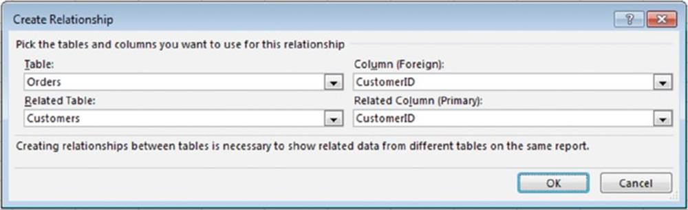
Figure 18.51 Creating a relationship between two tables.
Click OK to return to the Manage Relationships dialog box. Click New again and set up a relationship between the Customers table and the Regions table. Both will use the State column. The Manage Relationships dialog box will now show two relationships.
![]() Note
Note
If you don’t set up the table relationships in advance, Excel prompts you to do so when you add a field to the pivot table that’s from a different table than you started with.
Now it’s simply a matter of dragging the field names to the appropriate section of the PivotTable Fields task pane:
1. Drag the Total field to the Values area.
2. Drag the Year field to the Columns area.
3. Drag the Region field to the Rows area.
4. Drag the StateName field to the Rows area.
Figure 18.52 shows part of the pivot table. We added two slicers to enable filtering the table by customers who are on the mailing list, and by product.
![]() Tip
Tip
When you create a pivot chart using the Data Model, you can convert the pivot table to formulas. Select any cell in the pivot table and choose PivotTable Tools ➜ Analyze➜ OLAP Tools ➜ Convert to Formulas. The pivot table is replaced by cells that use formulas. These formulas use CUBEMEMBER and CUBEVALUE functions. Although the range is no longer a pivot table, the formulas update when the data changes.
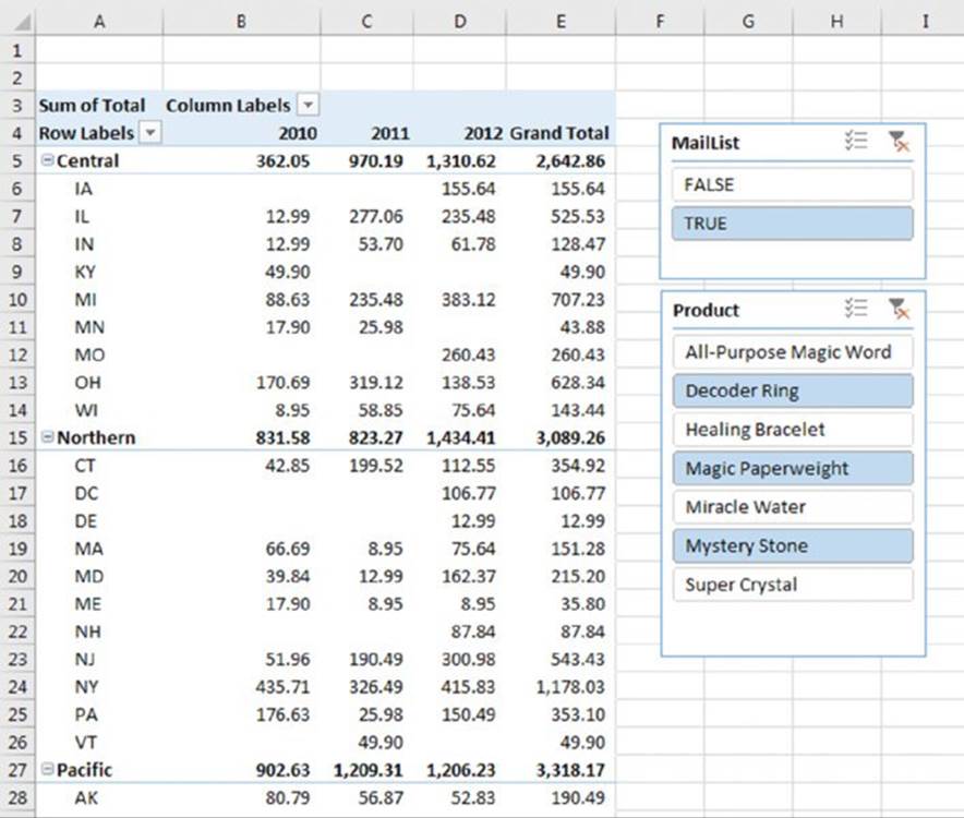
Figure 18.52 The pivot table, after adding two slicers.
Creating Pivot Charts
A pivot chart is a graphical representation of a data summary displayed in a pivot table. If you’re familiar with creating charts in Excel, you’ll have no problem creating and customizing pivot charts. All Excel charting features are available in a pivot chart.
Excel provides several ways to create a pivot chart:
§ Select any cell in an existing pivot table and then choose PivotTable Tools ➜ Analyze ➜ Tools ➜ PivotChart.
§ Select any cell in an existing pivot table and then choose Insert ➜ Charts ➜ PivotChart.
§ Choose Insert ➜ Charts ➜ PivotChart ➜ PivotChart. Excel prompts you for the data source and creates a pivot chart.
§ Choose Insert ➜ Charts ➜ Pivot Chart ➜ PivotChart & PivotTable. Excel prompts you for the data source and creates a pivot table and a pivot chart.
A pivot chart example
Figure 18.53 shows part of a table that tracks daily sales by region. The Date field contains dates for the entire year (excluding weekends), the Region field contains the region name (Eastern, Southern, or Western), and the Sales field contains the sales amount.
Figure 18.53 This data will be used to create a pivot chart.
![]() On the Web
On the Web
This workbook, named sales by region pivot chart.xlsx, is available at this book’s website.
Figure 18.54 shows the pivot table created from the table. The Date field is in the Rows area, and the daily dates have been grouped into months. The Region field is in the Columns area. The Sales field is in the Values area.
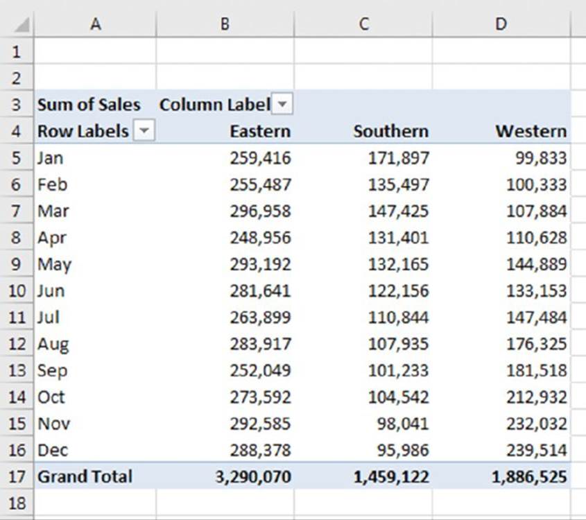
Figure 18.54 This pivot table summarizes sales by region and by month.
The pivot table is certainly easier to interpret than the raw data, but the trends are easier to spot in a chart.
To create a pivot chart, select any cell in the pivot table and choose PivotTable Tools ➜ Analyze ➜ Tools ➜ PivotChart. Excel displays its Insert Chart dialog box, from which you can choose a chart type. For this example, select a Line with Markers chart and then click OK. Excel creates the pivot chart shown in Figure 18.55.
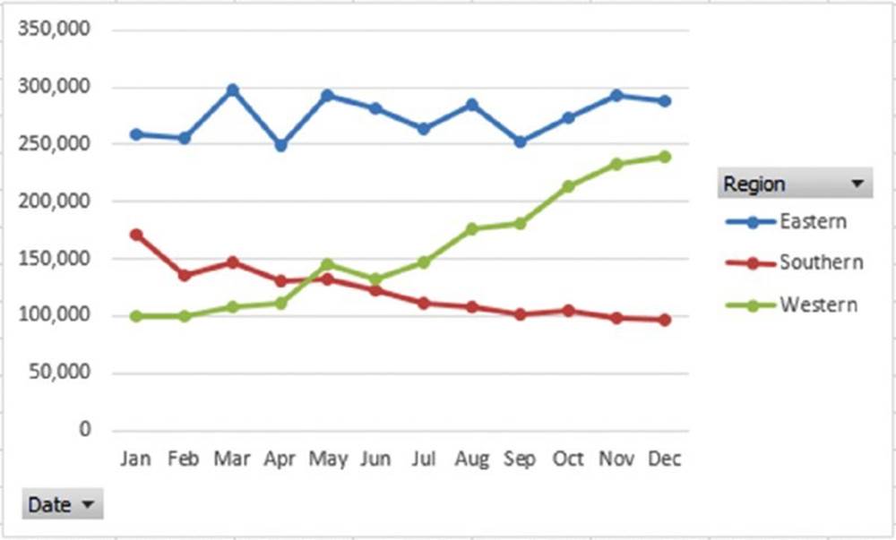
Figure 18.55 The pivot chart uses the data displayed in the pivot table.
The chart makes it easy to see an upward sales trend for the Western division, a downward trend for the Southern division, and relatively flat sales for the Eastern division.
A pivot chart includes field buttons that let you filter the chart’s data. To remove the field buttons, right-click a button and choose the Hide command from the shortcut menu.
When you select a pivot chart, the Ribbon displays a contextual tab: PivotChart Tools. The commands are virtually identical to those for a standard Excel chart, so you can manipulate the pivot chart any way you like.
If you modify the underlying pivot table, the chart adjusts automatically to display the new summary data. Figure 18.56 shows the pivot chart after we changed the Date group to quarters.
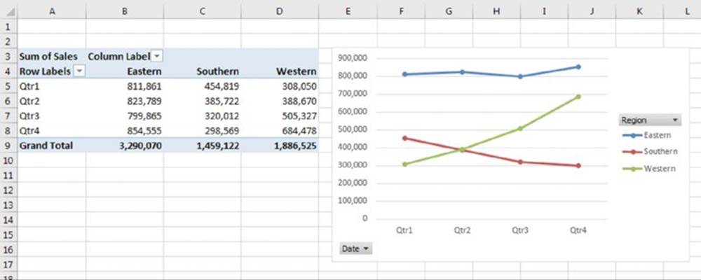
Figure 18.56 If you modify the pivot table, the pivot chart is also changed.
More about pivot charts
Keep in mind these points when using pivot charts:
§ A pivot table and a pivot chart are joined in a two-way link. If you make structural or filtering changes to one, the other is also changed.
§ When you activate a pivot chart, the PivotTable Fields task pane changes to the PivotChart Fields task pane. In this task pane, Legend (Series) replaces the Columns area, and Axis (Category) replaces the Rows area.
§ The field buttons in a pivot chart contain the same controls as the pivot chart’s field headers. These controls allow you to filter the data that’s displayed in the pivot table (and pivot chart). If you make changes to the chart using these buttons, those changes are also reflected in the pivot table.
§ If you have a pivot chart and you delete the underlying pivot table, the pivot chart remains. The chart’s SERIES formulas contain the original data, stored in arrays.
§ By default, pivot charts are embedded in the sheet that contains the pivot table. To move the pivot chart to a different worksheet (or to a Chart sheet), choose PivotChart Tools ➜ Analyze ➜ Actions ➜ Move Chart.
§ You can create multiple pivot charts from a pivot table, and you can manipulate and format the charts separately. However, all the charts display the same data.
§ Slicers and timelines also work with pivot charts. See the examples earlier in this chapter.
§ Don’t forget about themes. You can choose Page Layout ➜ Themes ➜ Themes to change the workbook theme, and your pivot table and pivot chart will both reflect the new theme.
All materials on the site are licensed Creative Commons Attribution-Sharealike 3.0 Unported CC BY-SA 3.0 & GNU Free Documentation License (GFDL)
If you are the copyright holder of any material contained on our site and intend to remove it, please contact our site administrator for approval.
© 2016-2026 All site design rights belong to S.Y.A.