Excel 2016 Formulas (2016)
PART V
Miscellaneous Formula Techniques
Chapter 17
Charting Techniques
In This Chapter
· Understanding how a chart’s SERIES formula works
· Plotting functions with one and two variables
· Creating awesome designs with formulas
· Working with linear and nonlinear trendlines
· Using new forecasting functions
· Useful charting examples that demonstrate key concepts
When most people think of Excel, they think of analyzing rows and columns of numbers. As you probably know already, though, Excel is no slouch when it comes to presenting data visually in the form of a chart. In fact, it’s a safe bet that Excel is the most commonly used software for creating charts.
After you create a chart, you have almost complete control over nearly every aspect of each chart. This chapter, which assumes that you’re familiar with Excel’s charting features, demonstrates some useful charting techniques—most of which involve formulas.
Understanding the SERIES Formula
You create charts from numbers that appear in a worksheet. You can enter these numbers directly, or you can derive them as the result of formulas. Normally, the data used by a chart resides in a single worksheet, within one file, but that’s not a strict requirement. A single chart can use data from any number of worksheets or even from different workbooks.
A chart consists of one or more data series, and each data series appears as a line, column, bar, and so on. Each series in a chart has a SERIES formula. When you select a data series in a chart, Excel highlights the worksheet data with an outline, and its SERIES formula appears in the Formula bar (see Figure 17.1).
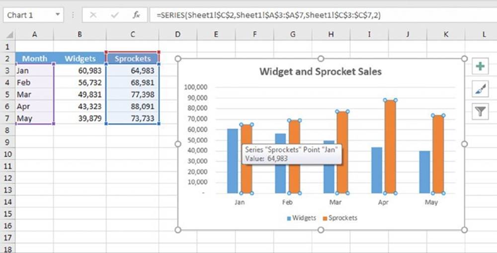
Figure 17.1 The Formula bar displays the SERIES formula for the selected data series in a chart.
![]() Note
Note
A SERIES formula is not a “real” formula. In other words, you can’t use it in a cell, and you can’t use worksheet functions within the SERIES formula. You can, however, edit the arguments in the SERIES formula to change the data that’s used by the chart. You can also drag the outlines in the worksheet to change the chart’s data.
A SERIES formula has the following syntax:
=SERIES(series_name, category_labels, values, order, sizes)
The arguments that you can use in the SERIES formula include
§ series_name: (Optional) A reference to the cell that contains the series name used in the legend. If the chart has only one series, the series_name argument is used as the title. The series_name argument can also consist of text, in quotation marks. If omitted, Excel creates a default series name (for example, Series1).
§ category_labels: (Optional) A reference to the range that contains the labels for the category axis. If omitted, Excel uses consecutive integers beginning with 1. For XY charts, this argument specifies the x values. A noncontiguous range reference is also valid. (The range’s addresses are separated by a comma and enclosed in parentheses.) The argument may also consist of an array of comma-separated values (or text in quotation marks) enclosed in curly brackets.
§ values: (Required) A reference to the range that contains the values for the series. For XY charts, this argument specifies the y values. A noncontiguous range reference is also valid. (The range’s addresses are separated by a comma and enclosed in parentheses.) The argument may also consist of an array of comma-separated values enclosed in curly brackets.
§ order: (Required) An integer that specifies the plotting order of the series. This argument is relevant only if the chart has more than one series. Using a reference to a cell is not allowed.
§ sizes: (Only for bubble charts) A reference to the range that contains the values for the size of the bubbles in a bubble chart. A noncontiguous range reference is also valid. (The range’s addresses are separated by a comma and enclosed in parentheses.) The argument may also consist of an array of values enclosed in curly brackets.
Range references in a SERIES formula are always absolute, and (with one exception) they always include the sheet name. Here’s an example of a SERIES formula that doesn’t use category labels:
=SERIES(Sheet1!$B$1,,Sheet1!$B$2:$B$7,1)
A range reference can consist of a noncontiguous range. If so, each range is separated by a comma, and the argument is enclosed in parentheses. In the following SERIES formula, the values range consists of B2:B3 and B5:B7:
=SERIES(,,(Sheet1!$B$2:$B$3,Sheet1!$B$5:$B$7),1)
Although a SERIES formula can refer to data in other worksheets, all the data for a series must reside on a single sheet. The following SERIES formula, for example, is not valid because the data series references two different worksheets:
=SERIES(,,(Sheet1!$B$2,Sheet2!$B$2),1)
Using names in a SERIES formula
You can substitute range names for the range references in a SERIES formula. When you do so, Excel changes the reference in the SERIES formula to include the workbook name. For example, the SERIES formula shown here uses a range named MyData (located in a workbook named budget.xlsx). Excel added the workbook name and exclamation point.
=SERIES(Sheet1!$B$1,,budget.xlsx!MyData,1)
Using names in a SERIES formula provides a significant advantage: if you change the range reference for the name, the chart automatically displays the new data. In the preceding SERIES formula, for example, assume that the range named MyData refers to A1:A20. The chart displays the 20 values in that range. You can then use the Name Manager to redefine MyData as a different range—say, A1:A30. The chart then displays the 30 data points defined by MyData. (No chart editing is necessary.)
![]() Note
Note
A SERIES formula does not use structured table referencing. If you edit the SERIES formula to include a table reference such as Table1[Widgets], Excel converts the table reference to a standard range address. However, if the chart is based on data in a table, the references in the SERIES formula adjust automatically if you add or remove data from the table.
As noted previously, a SERIES formula cannot use worksheet functions. You can, however, create named formulas (which use functions) and use these named formulas in your SERIES formula. As you see later in this chapter, this technique enables you to perform some useful charting tricks.
Unlinking a chart series from its data range
Normally, an Excel chart uses data stored in a range. If you change the data in the range, the chart updates automatically. In some cases, you may want to “unlink” the chart from its data ranges and produce a static chart—a chart that never changes. For example, if you plot data generated by various what-if scenarios, you may want to save a chart that represents some baseline so you can compare it with other scenarios.
There are two ways to create a static chart:
§ Paste it as a picture. Activate the chart and then choose Home ➜ Clipboard ➜ Copy ➜ Copy as Picture. (Accept the default settings from the Copy Picture dialog box.) Then activate any cell and choose Home ➜ Clipboard ➜ Paste (or press Ctrl+V). The result is a picture of the copied chart. You can then delete the original chart if you like. When a chart is converted to a picture, you can use all of Excel’s image editing tools. Figure 17.2 shows an example.
§ Convert the range references to arrays. Click a chart series and then click the Formula bar to activate the SERIES formula. Press F9 to convert the ranges to arrays. Repeat this for each series in the chart. This technique (as opposed to creating a picture) enables you to continue to edit and format the chart. Here’s an example of a SERIES formula after the range references were converted to arrays:
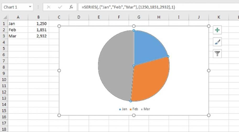
Figure 17.2 A chart after being converted to a picture (and then edited).
=SERIES(,{"Jan","Feb","Mar"},{1869,2085,2451},1)
Creating Links to Cells
You can add cell links to various elements of a chart. Adding cell links can make your charts more dynamic. You can set dynamic links for chart titles, data labels, and axis labels. In addition, you can insert a text box that links to a cell.
Adding a chart title link
The chart title is normally not linked to a cell. In other words, it contains static text that changes only when you edit the title manually. You can, however, create a link so that a title refers to a worksheet cell.
Here’s how to create a linked title:
1. Select the title in the chart.
2. Activate the Formula bar and type an equal sign (=).
3. Click the cell that contains the title text.
4. Press Enter.
The result is a formula that contains the sheet reference and the cell reference as an absolute reference (for example, =Sheet3!$A$1). Figure 17.3 shows a chart in which the chart title is linked to cell A1 on Sheet3.
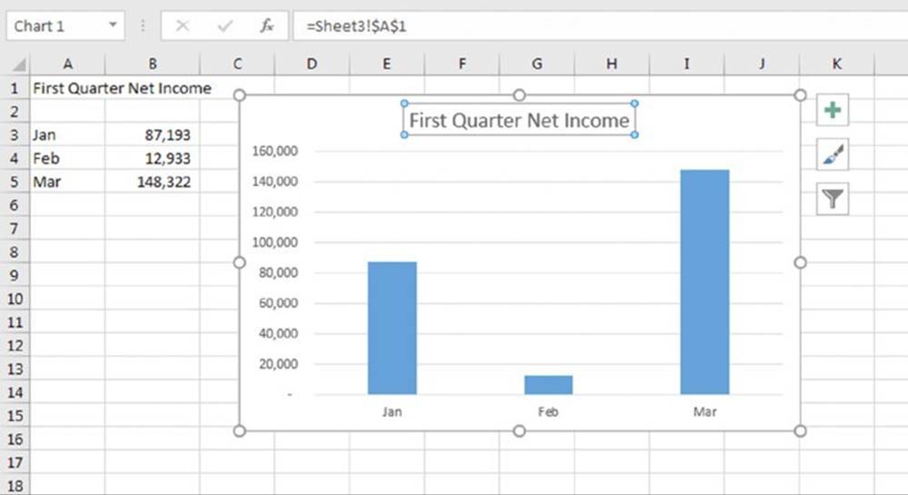
Figure 17.3 The chart title is linked to cell A1.
Adding axis title links
The axis titles are optional and are used to describe the data for an axis. The process for adding a link to an axis title is identical to that described in the previous section for a chart title.
Adding text links
You can also add a linked text box to a chart. The process is a bit tricky, however. Follow these steps exactly:
1. Select the chart and then choose Insert ➜ Text ➜ Text Box.
2. Drag the mouse inside the chart to create the text box.
3. Press Esc to exit text entry mode and select the text box object.
4. Click in the Formula bar and then type an equal sign (=).
5. Use your mouse and click the cell that you want linked.
6. Press Enter.
You can apply any type of formatting you like to the text box.
![]() Tip
Tip
After you add a text box to a chart, you can change it to any other shape that supports text. Select the text box and choose Drawing Tools ➜ Format ➜ Insert Shapes ➜Edit Shape ➜ Change Shape. Then choose a new shape from the gallery.
Adding a linked picture to a chart
A chart can display a “live” picture of a range of cells. When you change a cell in the linked range, the change appears in the linked picture. Again, the process isn’t exactly intuitive. Start by creating a chart. Then do this:
1. Select the range that you want to insert into the chart.
2. Press Ctrl+C to copy the range.
3. Activate a cell (not the chart) and choose Home ➜ Clipboard ➜ Paste ➜ Linked Picture (I).
Excel inserts the linked picture of the range on the worksheet’s draw layer.
4. Select the linked picture and press Ctrl+X.
5. Activate the chart and press Ctrl+V.
The linked picture is cut from the worksheet and pasted into the chart. However, the link no longer functions.
6. Select the picture in the chart, activate the Formula bar, type an equal sign, and select the range again.
7. Press Enter, and the picture is now linked to the range.
Chart Examples
This section contains a variety of chart examples that you may find useful or informative. At the very least, they may inspire you to create charts that are relevant to your work.
Single data point charts
Effective charts don’t always have to be complicated. This section presents some charts that display a single data point.
![]() On the Web
On the Web
A workbook with these examples is available at this book’s website. The filename is single data point charts.xlsx.
Figure 17.4 shows five charts, each of which uses one data point. These are minimalistic charts. The only chart elements are the single data point series, the data label for that data point, and the chart title (displayed on the left). The single column fills the entire width of the plot area.
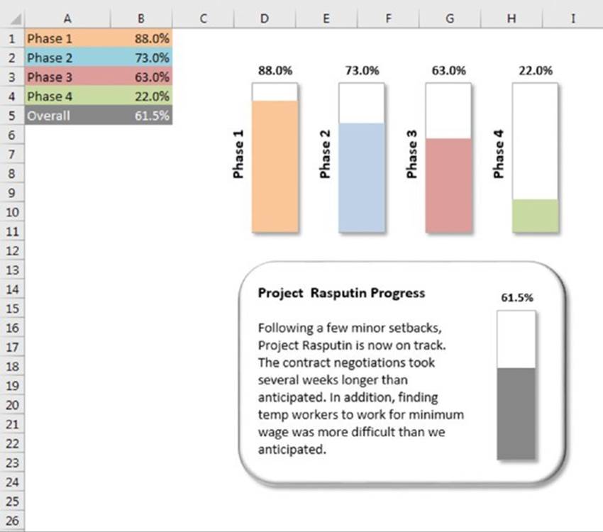
Figure 17.4 Five single data point charts.
One of the charts is grouped with a shape object that contains text.
Figure 17.5 shows another single data point chart. The chart, which shows the value in cell B21, is actually a line chart with markers. A shape object was copied and pasted to replace the normal line marker. The chart contains a second series, which was added for the secondary axis.
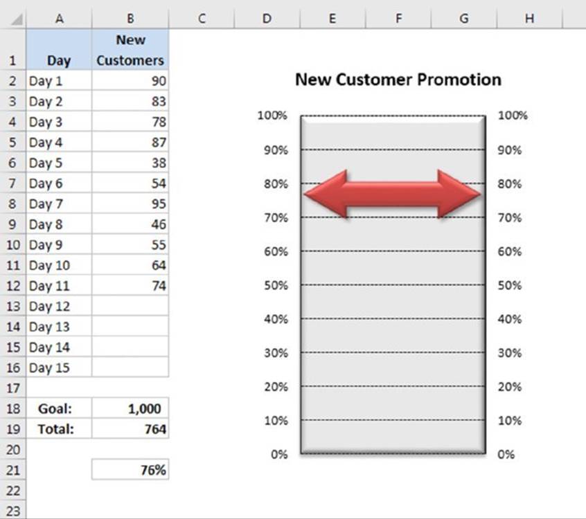
Figure 17.5 This single data point chart is a line chart, with a shape used as the marker.
Figure 17.6 shows another chart based on a single cell. It’s a pie chart set up to resemble a gauge. Although this chart displays only one value (entered in cell B1), it actually uses three data points (in A4:A6).
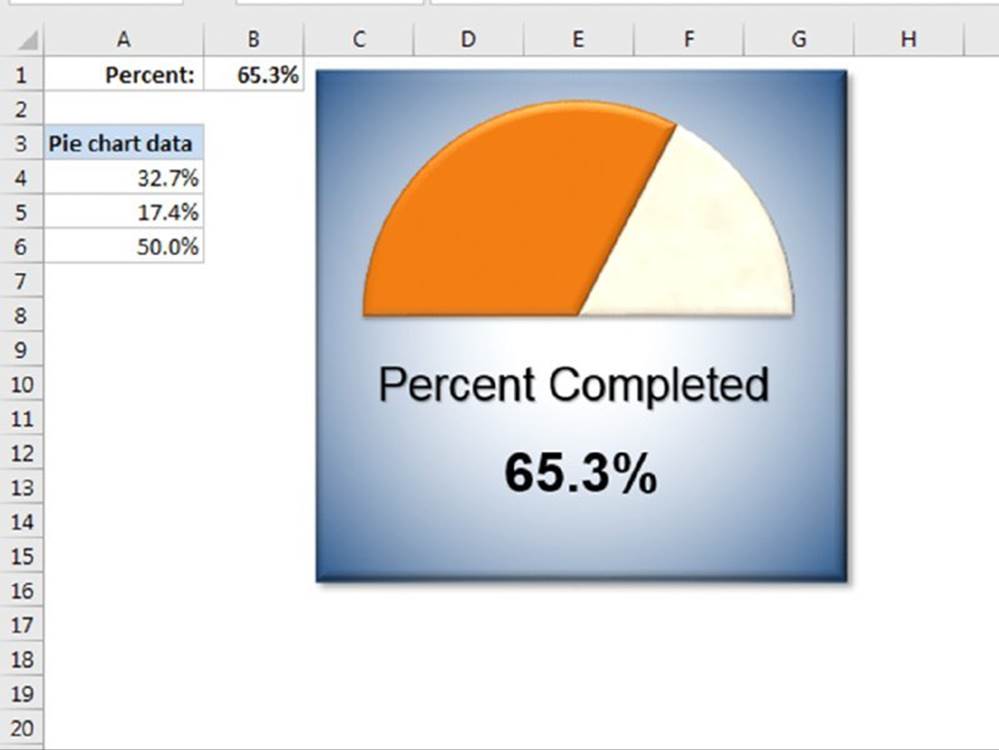
Figure 17.6 This chart resembles a speedometer gauge and displays a value between 0 and 100 percent.
One slice of the pie—the slice at the bottom—always consists of 50 percent. The pie has been rotated so that the 50 percent slice is at the bottom. Then that slice was hidden by specifying No Fill and No Border for the data point.
The other two slices are apportioned based on the value in cell B1. The formula in cell A4 is
=MIN(B1,100%)/2
This formula uses the MIN function to display the smaller of two values: either the value in cell B1 or 100 percent. It then divides this value by 2 because only the top half of the pie is relevant. Using the MIN function prevents the chart from displaying more than 100 percent.
The formula in cell A5 simply calculates the remaining part of the pie—the part to the right of the gauge’s “needle”:
=50%–A4
The chart’s title (Percent Completed) was moved below the half-pie. A linked text box displays the percent completed value in cell B1.
Displaying conditional colors in a column chart
This section describes how to create a column chart in which the color of each column depends on the value that it’s displaying. Figure 17.7 shows such a chart. (It’s more impressive when you see it in color.) The data used to create the chart is in range A2:F14.
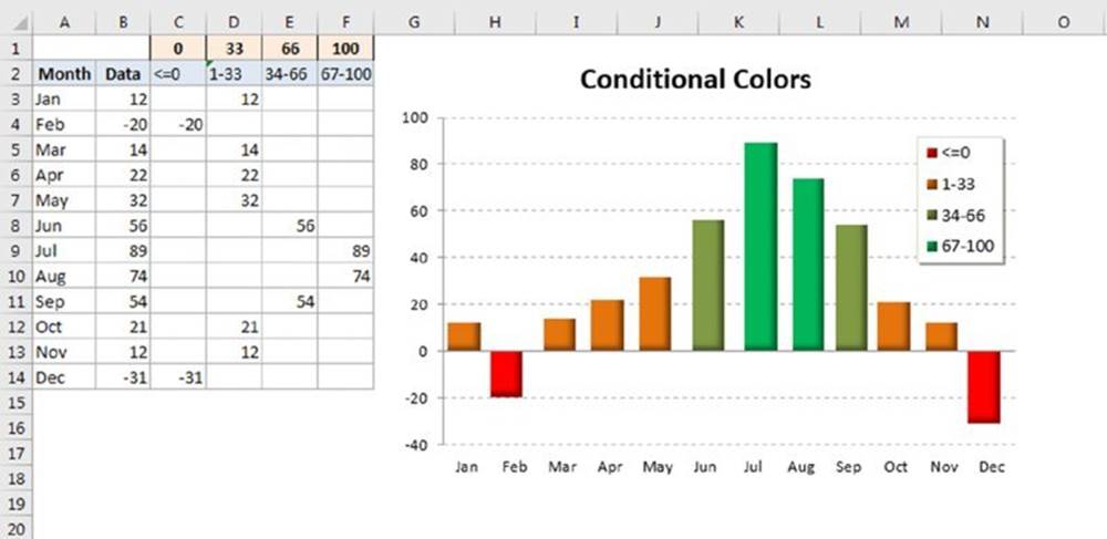
Figure 17.7 The color of the column varies with the value.
![]() On the Web
On the Web
A workbook with this example is available at this book’s website. The filename is conditional colors.xlsx.
This chart actually displays four data series, but some data is missing for each series. The data for the chart is entered into column B. Formulas in columns C:F determine which series the number belongs to by referencing the cut-off values in row 1. For example, the formula in cell C3 is
=IF(B3<=$C$1,B3,"")
If the value in column B is less than the value in cell C1, the value goes in this column. The formulas are set up such that a value in column B goes into only one column in the row.
The formula in cell D3 is a bit more complex because it must determine whether cell C3 is greater than the value in cell C1 and less than or equal to the value in cell D1:
=IF(AND($B3>C$1,$B3<=D$1),$B3,"")
The four data series are overlaid on top of each other in the chart. The trick involves setting the Series Overlap value to a large number. This setting determines the spacing between the series. Use the Series Options section of the Format Data Series task pane to adjust this setting. That section has another setting, Gap Width. In this case, the Gap Width essentially controls the width of the columns.
![]() Note
Note
Series Overlap and Gap Width apply to the entire chart. If you change the setting for one series, the other series change to the same value.
Creating a comparative histogram
With a bit of creativity, you can create charts that you may have considered impossible. For example, Figure 17.8 shows a chart sometimes referred to as a comparative histogram chart. Such charts often display population data.
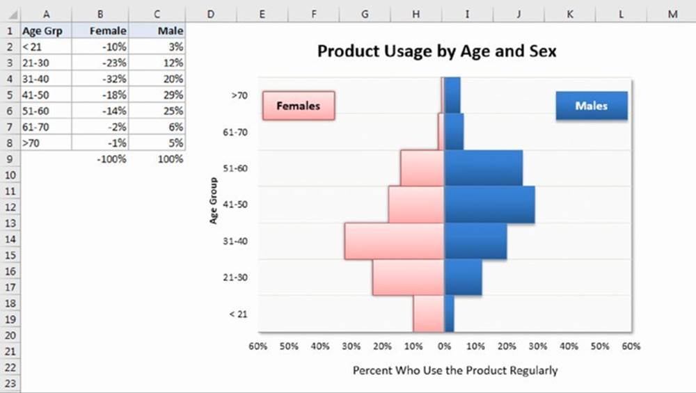
Figure 17.8 A comparative histogram.
![]() On the Web
On the Web
A workbook with this example is available at this book’s website. The filename is comparative histogram.xlsx.
Here’s how to create the chart:
1. Enter the data in A1:C8, as shown in Figure 17.8.
Notice that the values for females are entered as negative values.
2. Select A1:C8 and create a bar chart. Use the subtype labeled Clustered Bar.
3. Select the horizontal axis and display the Format Axis task pane.
4. Expand the Number section and specify the following custom number format:
0%;0%;0%
5. This custom format eliminates the negative signs in the percentages.
6. Select the vertical axis and display the Format Axis task pane.
In the Tick Marks section, set all tick marks to None, and in the Labels section, set the Label Position option to Low.
7. This setting keeps the vertical axis in the center of the chart but displays the axis labels at the left side.
8. Select either of the data series and display the Format Data Series task pane.
9. In the Series Options section, set the Series Overlap to 100% and the Gap Width to 0%.
10.Delete the legend and add two text boxes to the chart (Females and Males) to substitute for the legend.
11.Apply other formatting and labels as desired.
Creating a Gantt chart
A Gantt chart is a horizontal bar chart often used in project management applications. Although Excel doesn’t support Gantt charts per se, creating a simple Gantt chart is fairly easy. The key is getting your data set up properly.
Figure 17.9 shows a Gantt chart that depicts the schedule for a project that is in the range A2:C13. The horizontal axis represents the total time span of the project, and each bar represents a project task. The viewer can quickly see the duration for each task and identify overlapping tasks.
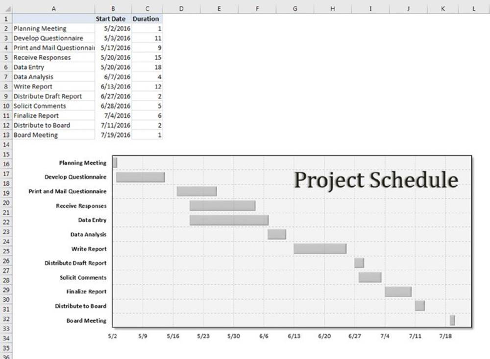
Figure 17.9 You can create a simple Gantt chart from a bar chart.
![]() On the Web
On the Web
A workbook with this example is available at this book’s website. The filename is gantt chart.xlsx.
Column A contains the task name, column B contains the corresponding start date, and column C contains the duration of the task, in days. Note that cell A1 does not have a descriptive label. Leaving that cell empty ensures that Excel does not use columns A and B as the category axis.
Follow these steps to create this chart:
1. Select the range A1:C13 and create a Stacked Bar Chart.
2. Delete the legend.
3. Select the category (vertical) axis and display the Format Axis task pane.
4. In the Axis Options section, specify Categories in Reverse Order to display the tasks in order, starting at the top. Choose Horizontal Axis Crosses at Maximum Category to display the dates at the bottom.
5. Select the Start Date data series and display the Format Data Series task pane.
6. In the Series Options section, set the Series Overlap to 100%. In the Fill section, specify No Fill. In the Border section, specify No Line.
These steps effectively hide the data series.
7. Select the value (horizontal) axis and display the Format Axis task pane.
8. In the Axis Options, adjust the Minimum and Maximum settings to accommodate the dates that you want to display on the axis.
You can enter a date value, and Excel converts it to a date serial number. In the example, the Minimum is 5/2/2016, and the Maximum is 7/24/2016.
9. Apply other formatting as desired.
![]() Handling missing data
Handling missing data
Sometimes data that you’re charting may be missing one or more data points. As shown in the accompanying figure, Excel offers three ways to handle the missing data:
· Gaps: Missing data is simply ignored, and the data series will have a gap.
This is the default.
· Zero: Missing data is treated as zero.
· Connect with Line: Missing data is interpolated—calculated by using data on either side of the missing point(s).
This option is available only for line charts, area charts, and XY charts.
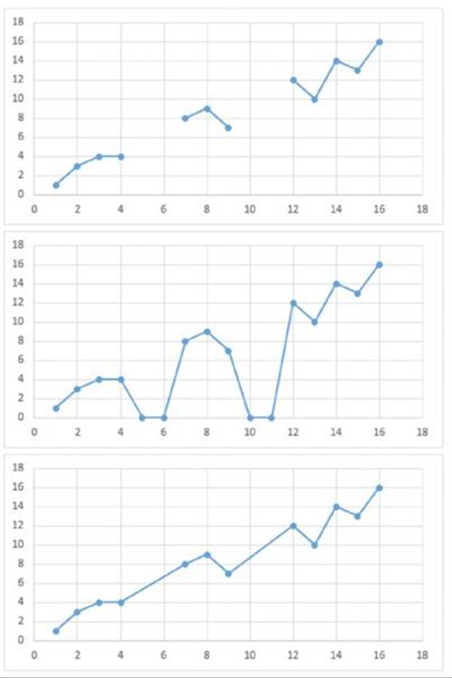
To specify how to deal with missing data for a chart, choose Chart Tools ➜ Design ➜ Data ➜ Select Data. In the Select Data Source dialog box, click the Hidden and Empty Cells button. Excel displays its Hidden and Empty Cell Settings dialog box. Make your choice in the dialog box. The option that you select applies to the entire chart, and you can’t set a different option for different series in the same chart.
Normally, a chart doesn’t display data that’s in a hidden row or columns. You can use the Hidden and Empty Cell Settings dialog box to force a chart to use hidden data.
Creating a box plot
A box plot (sometimes known as a quartile plot) is often used to summarize data. Figure 17.10 shows a box plot created for four groups of data. The raw data appears in columns A through D. The range G2:J7, used in the chart, contains formulas that summarize the data. Table 17.1 lists the formulas in column G (which were copied to the three columns to the right).
Table 17.1 Formulas Used to Create a Box Plot
|
Cell |
Calculation |
Formula |
|
G2 |
25th Percentile |
=QUARTILE(A2:A26,1) |
|
G3 |
Minimum |
=MIN(A2:A26) |
|
G4 |
Mean |
=AVERAGE(A2:A26) |
|
G5 |
50th Percentile |
=QUARTILE(A2:A26,2) |
|
G6 |
Maximum |
=MAX(A2:A26) |
|
G7 |
75th Percentile |
=QUARTILE(A2:A26,3) |
Figure 17.10 This box plot summarizes the data in columns A through D.
![]() On the Web
On the Web
A workbook with this example is available at this book’s website. The filename is box plot.xlsx.
Follow these steps to create the box plot:
1. Select the range F1:J7 and create a line chart with markers.
2. Choose Chart Tools ➜ Design ➜ Data ➜ Switch Row/Column to change the orientation of the chart.
3. Choose Chart Tools ➜ Design ➜ Chart Layouts ➜ Add Chart Element ➜ Up/Down Bars to add up/down bars that connect the first data series (25th Percentile) with the last data series (75th Percentile).
4. Remove the markers from the 25th Percentile series and the 75th Percentile series.
5. Choose Chart Tools ➜ Design ➜ Chart Layouts ➜ Add Chart Element ➜ Lines ➜ High-Low Lines to add a vertical line between each point to connect the Minimum and Maximum data series.
6. Remove the lines from each of the six data series.
7. Change the series marker to a horizontal line for the following series: Minimum, Maximum, and 50th Percentile.
8. Make other formatting changes as required.
The chart shown here does not have a legend. It’s been replaced with a graphic that explains how to read the chart. The legend for this chart displays the series in the order in which they are plotted—which is not the optimal order and can be very confusing. Unfortunately, you can’t change the plot order because the order is important. (The up/down bars use the first and last series.) Creating a descriptive graphic seems like a good alternative to a confusing legend.
![]() Tip
Tip
After performing all these steps, you may want to create a template to simplify the creation of additional box plots. Right-click the chart and choose Save as Template.
Plotting every nth data point
Normally, Excel doesn’t plot data that resides in a hidden row or column. You can sometimes use this to your advantage because it’s an easy way to control what data appears in the chart.
Suppose you have a lot of data in a column and you want to plot only every 10th data point. One way to accomplish this is to use filtering in conjunction with a formula. Figure 17.11 shows a two-column table with filtering in effect. The chart plots only the data in the visible (filtered) rows and ignores the values in the hidden rows.
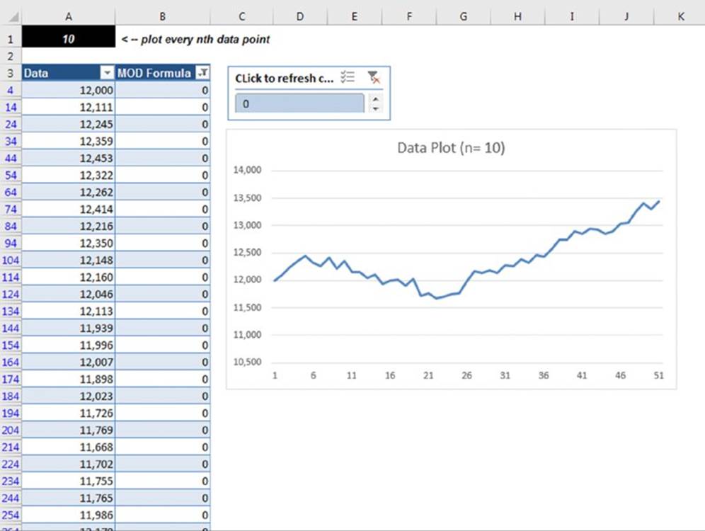
Figure 17.11 This chart plots every nth data point (specified in A1) by ignoring data in the rows hidden by filtering.
![]() On the Web
On the Web
The example in this section, named plot every nth data point.xlsx, is available at this book’s website.
Cell A1 contains the value 10. The value in this cell determines which rows to hide. Column B contains identical formulas that use the value in cell A1. For example, the formula in cell B4 is as follows:
=MOD(ROW()–ROW($A$4),$A$1)
This formula subtracts the current row number from the first data row number in the table and uses the MOD function to calculate the remainder when that value is divided by the value in A1. As a result, every nth cell (beginning with row 4) contains 0. Use the filter drop-down list in cell B3 to specify a filter that shows only the rows that contain a 0 in column B.
![]() Note
Note
If you change the value in cell A1, you must respecify the filter criteria for column B because the rows will not hide automatically. Just click the filter icon in the column heading and then click OK. The example uses a table Slicer, so clicking the 0 value applies the filter. Add a Slicer to a table by choosing Table Tools ➜ Design ➜ Tools ➜Insert Slicer.
Although this example uses a table (created using Insert ➜ Tables ➜ Table), the technique also works with a normal range of data as long as it has column headers. Choose Data ➜ Sort & Filter ➜ Filter to enable filtering.
Identifying maximum and minimum values in a chart
Figure 17.12 shows a line chart that has its maximum and minimum values identified with a circle and a square, respectively. These identifiers are the result of using two additional series in the chart. You can achieve this effect manually, by adding two shapes, but using the additional series makes it fully automated.
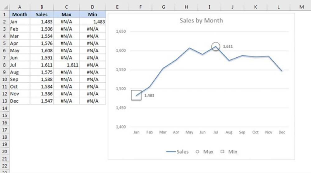
Figure 17.12 This chart uses two XY series to highlight the maximum and minimum data points in the line series.
![]() On the Web
On the Web
This example is available at this book’s website. The filename is identify max and min data points.xlsx.
Start by creating a line chart using the data in range A1:B13:
1. Enter the following formula in cell C2:
=IF(B2=MAX($B$2:$B$13),B2,NA())
2. Enter this formula in cell D2:
=IF(B2=MIN($B$2:$B$13),B2,NA())
3. Copy range C2:D2 down, ending in row 13. These formulas display the maximum and minimum values in column B, and all other cells display #NA.
4. Select C1:D13 and press Ctrl+C.
5. Select the chart and choose Home ➜ Clipboard ➜ Paste ➜ Paste Special. In the Paste Special dialog box, choose New series, Values (Y) in Columns, and Series Names in First Row. This adds two new series, named Max and Min.
6. Select the Max series and access the Format Data Series task pane. Specify a circle marker, with no fill, and increase the size of the marker.
7. Repeat step 6 for the Min series, but use a large square for the marker.
8. Add data labels to the Max and Min series. (The #NA values will not appear.)
9. Apply other cosmetic formatting as desired.
![]() Note
Note
The formulas entered in steps 1 and 2 display #NA if the corresponding value in column B is not the maximum or minimum. In a line chart, an #NA value causes a gap to appear in the line, which is exactly what is needed. As a result, only one data point is plotted (or more, if there is a tie for the maximum or minimum). If two or more values are tied for the minimum or maximum, all the values will be identified with a square or circle.
Creating a Timeline
Figure 17.13 shows a scatter chart, set up to display a timeline of events. The chart uses the data in columns A and B, and the series uses vertical error bars to connect each marker to the timeline (the horizontal value axis). The text consists of data labels from column C. The vertical value axis for the chart is hidden, but it is set to display Values In Reverse Order so that the earliest events display higher in the vertical dimension.
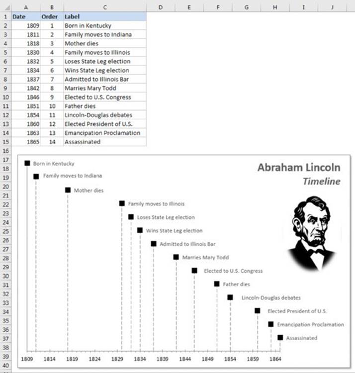
Figure 17.13 A scatter chart disguised as a timeline.
This type of chart is limited to relatively small amounts of text. Otherwise, the data labels wrap, and the text may be obscured.
![]() On the Web
On the Web
This example is available at this book’s website. The filename is scatter chart timeline.xlsx.
Plotting mathematical functions
The examples in this section demonstrate how to plot mathematical functions that use one variable (a 2D line chart) and two variables (a 3D surface chart). Some of the examples make use of Excel’s Data Table feature, which enables you to evaluate a formula with varying input values.
![]() Note
Note
A Data Table is not the same as a table, created by choosing Insert ➜ Tables ➜ Table.
Plotting functions with one variable
An XY chart (also known as a scatter chart) is useful for plotting various mathematical and trigonometric functions. For example, Figure 17.14 shows a plot of the SIN function. The chart plots y for values of x (expressed in radians) from –5 to +5 in increments of 0.5. Each pair of x and y values appears as a data point in the chart, and the points connect with a line.
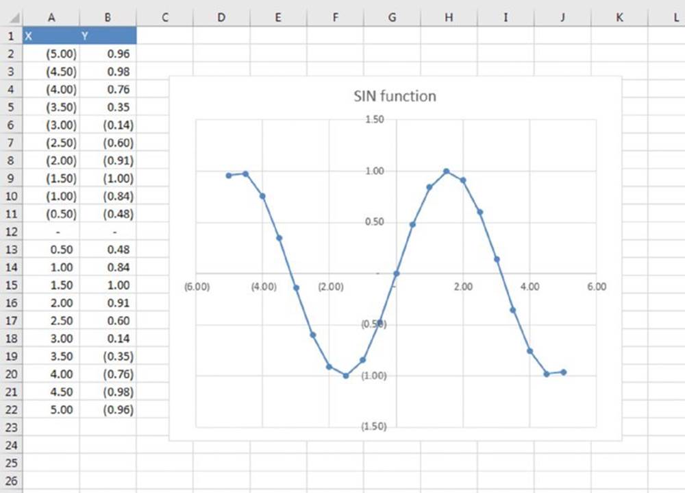
Figure 17.14 This chart plots the SIN(x).
![]() Tip
Tip
Excel’s trigonometric functions use angles expressed in radians. To convert degrees to radians, use the RADIANS function.
The function is expressed like this:
y = SIN(x)
The corresponding formula in cell B2 (which is copied to the cells below) is
=SIN(A2)
Figure 17.15 shows a general-purpose, single-variable plotting application. The data for the chart is calculated by a data table in columns I:J. Follow these steps to use this application:
1. Enter a formula in cell B7. The formula should contain at least one x variable.
In the figure, the formula in cell B7 is
=SIN(x^3)*COS(x^2)
2. Type the minimum value for x in cell B8.
3. Type the maximum value for x cell B9.
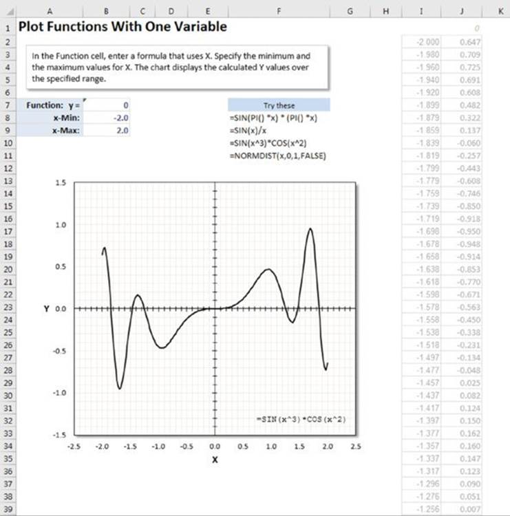
Figure 17.15 A general-purpose, single-variable plotting workbook.
The formula in cell B7 displays the value of y for the minimum value of x. The data table, however, evaluates the formula for 200 equally spaced values of x, and these values appear in the chart.
![]() On the Web
On the Web
This workbook, named function plot 2D.xlsx, is available at this book’s website.
Plotting functions with two variables
The preceding section describes how to plot functions that use a single variable (x). You also can plot functions that use two variables. For example, the following function calculates a value of z for various values of two variables (x and y):
z = SIN(x)*COS(y)
Figure 17.16 shows a surface chart that plots the value of z for 25 x values ranging from –1 to 1 (in 0.1 increments) and for 25 y values ranging from –2 to 2 (in 0.2 increments).
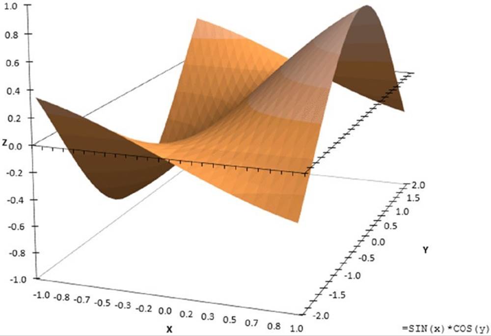
Figure 17.16 Using a surface chart to plot a function with two variables.
Figure 17.17 shows a general-purpose, two-variable plotting application, similar to the single-variable workbook described in the previous section. The data for the chart is a 25 × 25 data table in range M7:AL32 (not shown in the figure). To use this application
1. Enter a formula in cell B3. The formula should contain at least one x variable and at least one y variable.
In the figure, the formula in cell B3 is
=SIN(SQRT(x^2 + y^2))
2. Enter the minimum x value in cell B4 and the maximum x value in cell B5.
3. Enter the minimum y value in cell B6 and the maximum y value in cell B7.
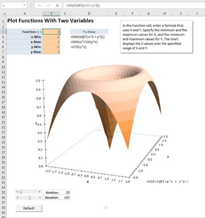
Figure 17.17 A general-purpose, two-variable plotting workbook.
The formula in cell B3 displays the value of z for the minimum values of x and y. The data table evaluates the formula for 25 equally spaced values of x and 25 equally spaced values of y. These values are plotted in the surface chart.
![]() On the Web
On the Web
This workbook, which is available at this book’s website, contains simple macros that enable you to easily change the rotation and elevation of the chart by using scrollbars. The file is named function plot 3D.xlsm.
Plotting a circle
You can create an XY chart that draws a perfect circle. To do so, you need two ranges: one for the x values and another for the y values. The number of data points in the series determines the smoothness of the circle. Or you can simply select the Smoothed Line option in the Format Data Series dialog box (Line Style tab) for the data series.
Figure 17.18 shows a chart that uses 13 points to create a circle. If you work in degrees, generate a series of values such as the ones shown in column A. The series starts with 0 and increases in 30-degree increments. If you work in radians (column B), the first series starts with 0 and increments by π/6.
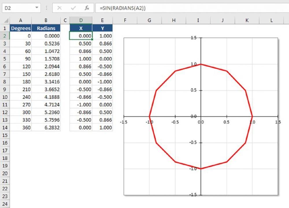
Figure 17.18 Creating a circle using an XY chart.
The ranges used in the chart appear in columns D and E. If you work in degrees, the formula in cell D2 is
=SIN(RADIANS(A2))
The formula in cell E2 is
=COS(RADIANS(A2))
If you work in radians, use this formula in cell D2:
=SIN(B2)
And use this formula in cell E2:
=COS(B2)
The formulas in cells D2 and E2 are copied down to subsequent rows.
To plot a circle with more data points, you need to adjust the increment value and the number of data points in column A (or column B if working in radians). The final value should be the same as those shown in row 14. In degrees, the increment is 360 divided by the number of data points minus 1. In radians, the increment is π divided by (the number of data points minus 1, divided by 2).
Figure 17.19 shows a general circle plotting application that uses 37 data points. In range H27:H29, you can specify the x origin, the y origin, and the radius for the circle (these are named cells). A second series plots the origin as a single data point. In the figure, the circle’s origin is at 2,3, and it has a radius of 7.25.
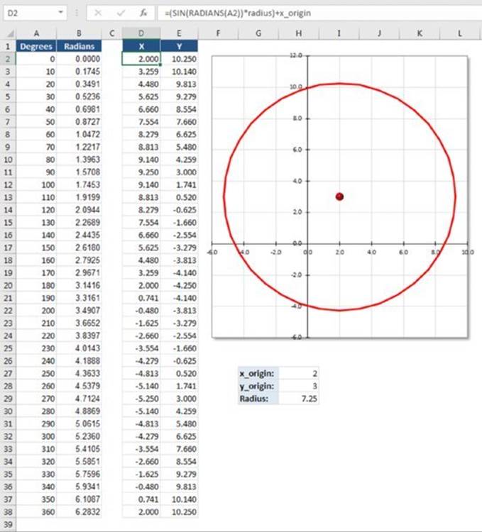
Figure 17.19 A general circle plotting application.
The formula in cell D2 is
=(SIN(RADIANS(A2))*radius)+x_origin
The formula in cell E2 is
=(COS(RADIANS(A2))*radius)+y_origin
![]() On the Web
On the Web
This example, named plot circles.xlsx, is available at this book’s website.
Creating a clock chart
Figure 17.20 shows an XY chart formatted to look like a clock. It not only looks like a clock but also functions like a clock. There is really no reason why anyone would need to display a clock such as this on a worksheet, but creating the workbook was challenging, and you may find it instructive.
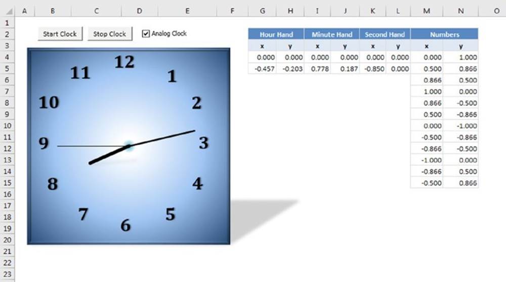
Figure 17.20 This fully functional clock is actually an XY chart in disguise.
The chart uses four data series: one for the hour hand, one for the minute hand, one for the second hand, and one for the numbers. The last data series draws a circle with 12 points (but no line). The numbers consist of manually entered data labels.
The formulas listed in Table 17.2 use basic trigonometry to calculate the data series for the clock hands. (The range G4:L4 contains zero values, not formulas.)
Table 17.2 Formulas Used to Generate a Clock Chart
|
Cell |
Description |
Formula |
|
G5 |
Origin of hour hand |
=0.5*SIN((HOUR(NOW())+(MINUTE(NOW())/60))*(2*PI()/12)) |
|
H5 |
End of hour hand |
=0.5*COS((HOUR(NOW())+(MINUTE(NOW())/60))*(2*PI()/12)) |
|
I5 |
Origin of minute hand |
=0.8*SIN((MINUTE(NOW())+(SECOND(NOW())/60))*(2*PI()/60)) |
|
J5 |
End of minute hand |
=0.8*COS((MINUTE(NOW())+(SECOND(NOW())/60))*(2*PI()/60)) |
|
K5 |
Origin of second hand |
=0.85*SIN(SECOND(NOW())*(2*PI()/60)) |
|
L5 |
End of second hand |
=0.85*COS(SECOND(NOW())*(2*PI()/60)) |
This workbook uses a simple VBA procedure that schedules an event every second, which causes the formula to recalculate.
In addition to the clock chart, the workbook contains a text box that displays the time using the NOW function, as shown in Figure 17.21. Normally hidden behind the analog clock, you can display this text box by deselecting the Analog Clock check box. A simple VBA procedure attached to the check box hides and unhides the chart, depending on the status of the check box.
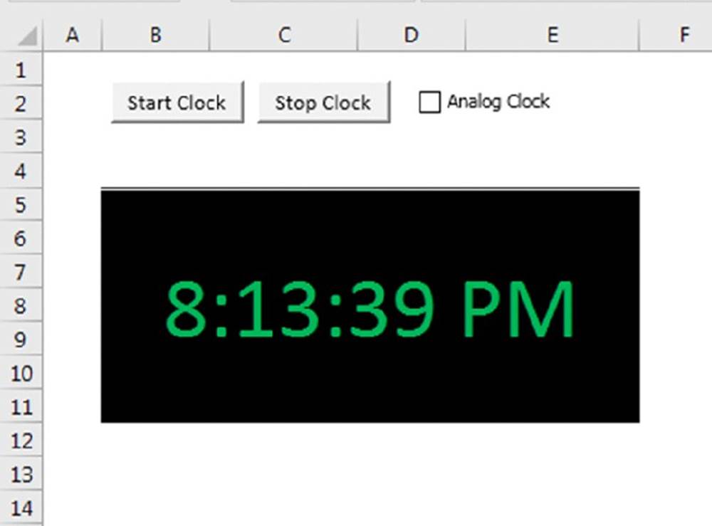
Figure 17.21 Displaying a digital clock in a worksheet is much easier but not as much fun to create.
![]() On the Web
On the Web
The workbook with the animated clock example appears at this book’s website. The filename is clock chart.xlsx.
When you examine the workbook, keep the following points in mind:
§ The ChartObject, named ClockChart, covers up a range named DigitalClock, which is used to display the time digitally.
§ The two buttons on the worksheet are from the Forms group (Developer ➜ Controls ➜ Insert), and each has a VBA procedure assigned to it (StartClock and StopClock).
§ Selecting the check box control executes a procedure named cbClockType_Click, which simply toggles the Visible property of the chart. When the chart is hidden, the digital clock is revealed.
§ The UpdateClock procedure uses the OnTime method of the Application object. This method enables you to execute a procedure at a specific time. Before the UpdateClock procedure ends, it sets up a new OnTime event that occurs in one second. In other words, theUpdateClock procedure is called every second.
§ The UpdateClock procedure inserts the following formula into the cell named DigitalClock:
=NOW()
§ Inserting this formula causes the workbook to calculate, updating the clock.
Creating awesome designs
Figure 17.22 shows an example of an XY chart that displays hypocycloid curves using random values. This type of curve is the same as that generated by Hasbro’s popular Spirograph toy, which you may remember from childhood.
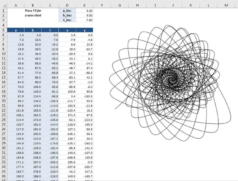
Figure 17.22 A hypocycloid curve.
![]() On the Web
On the Web
This book’s website contains two hypocycloid workbooks: the simple example shown in Figure 17.22 (named hypocycloid chart.xlsx) and a much more complex example (named hypocycloid animated.xlsm) that adds animation and a few other accoutrements. The animated version uses VBA macros.
The chart uses data in columns D and E (the x and y ranges). These columns contain formulas that rely on data in columns A through C. The formulas in columns A through C rely on the values stored in E1:E3. The data column for the x values (column D) consists of the following formula:
=(A6–B6)*COS(C6)+B6*COS((A6/B6–1)*C6)
The formula for the y values (column E) is as follows:
=(A6–B6)*SIN(C6)–B6*SIN((A6/B6–1)*C6)
Pressing F9 recalculates the worksheet, which generates new random increment values for E1:E3 and creates a new display in the chart. The variety (and beauty) of charts generated using these formulas may amaze you.
Working with Trendlines
With some charts, you may want to plot a trendline that describes the data. A trendline points out general trends in your data. In some cases, you can forecast data with trendlines. A single series can have more than one trendline.
To add a trendline in Excel 2016, select the chart series, click the Chart Elements icon (to the right of the chart), and select Trendline. The default trendline is Linear, but you can expand the selection choice and choose a different type. For additional options (and more control over the trendline), choose More Options to display the Format Trendline task pane (see Figure 17.23).
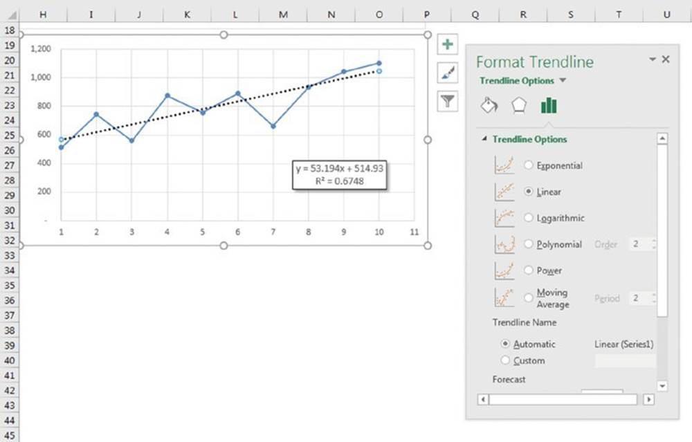
Figure 17.23 Use the Format Trendline task pane to fine-tune trendlines.
The type of trendline that you choose depends on your data. Linear trends are the most common type, but you can describe some data more effectively with another type.
On the Trendline Options tab, you can specify a name to appear in the legend and the number of periods that you want to forecast (if any). Additional options there enable you to set the intercept value, specify that the equation used for the trendline should appear on the chart, and choose whether the R-squared value appears on the chart.
When Excel inserts a trendline, it may look like a new data series, but it’s not. It’s a new chart element with a name, such as Series 1 Trendline 1. And, of course, a trendline does not have a corresponding SERIES formula.
Linear trendlines
Figure 17.24 shows two charts. The first chart depicts a data series without a trendline. As you can see, the data seems to be “linear” over time. The next chart is the same chart but with a linear trendline that shows the trend in the data.
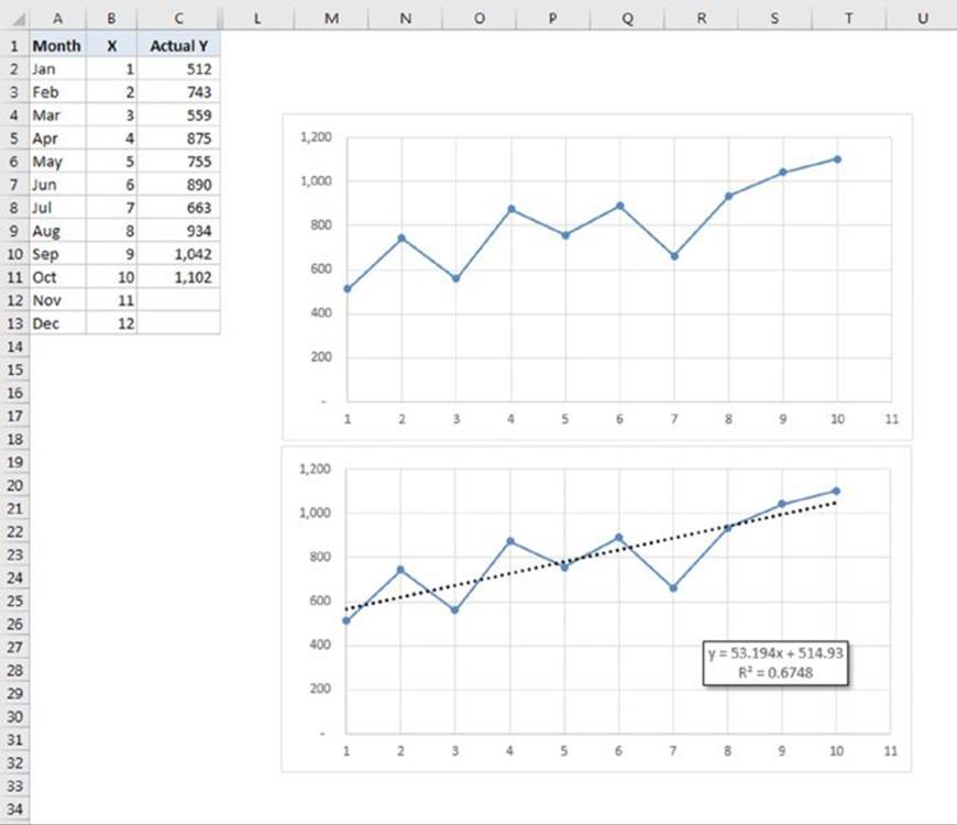
Figure 17.24 Adding a linear trendline to an existing chart.
![]() On the Web
On the Web
The workbook used in this example is available at this book’s website. The file is named linear trendline.xlsx.
The second chart also uses the options to display the equation and the R-squared value. In this example, the equation is as follows:
y = 53.194x + 514.93
The R-squared value is 0.6748.
What do these numbers mean? You can describe a straight line with an equation of the form:
y = mx +b
For each value of x (the horizontal axis), you can calculate the predicted value of y (the value on the trendline) by using this equation. The variable m represents the slope of the line, and b represents the y-intercept. For example, when x is 3 (for March), the predicted value of y is 674.47, calculated with this formula:
=(53.19*3)+514.9
The R-squared value, sometimes referred to as the coefficient of determination, ranges in value from 0 to 1. This value indicates how closely the estimated values for the trendline correspond to the actual data. A trendline is most reliable when its R-squared value is closer to 1.
Calculating the slope and y-intercept
This section describes how to use the LINEST function to calculate the slope (m) and y-intercept (b) of the best-fit linear trendline.
Figure 17.25 shows ten data points (x values in column B, actual y values in column C).
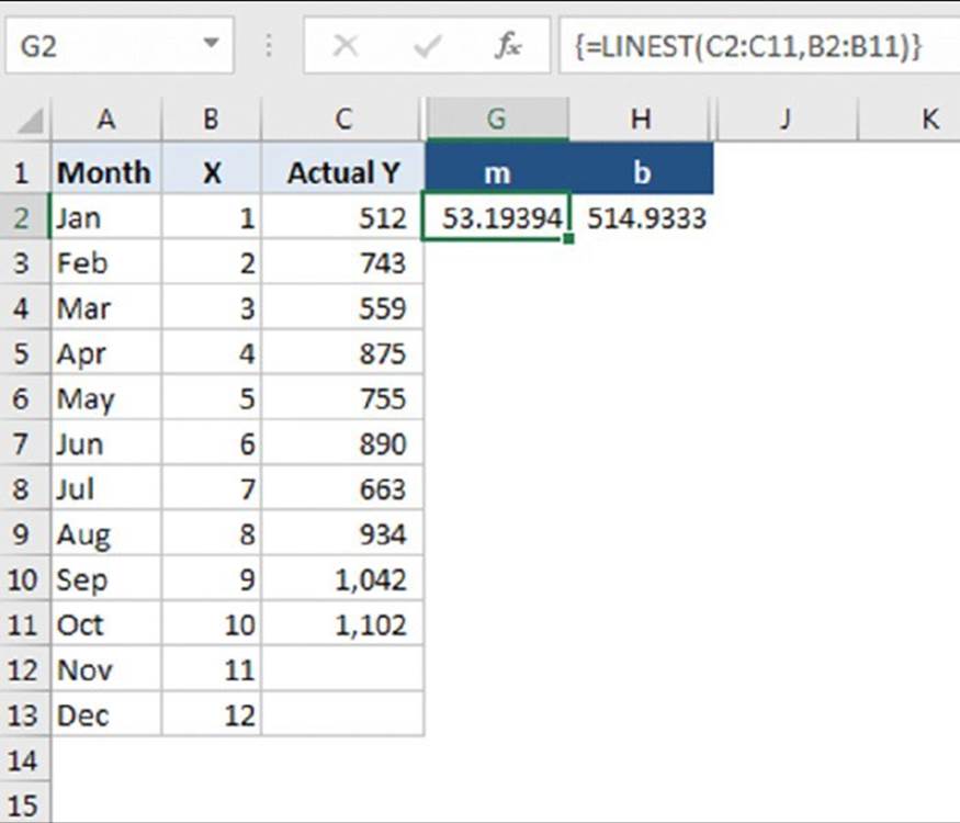
Figure 17.25 Using the LINEST function to calculate slope and y-intercept.
The formula that follows is a multicell array formula that displays its result (the slope and y-intercept) in two cells:
{=LINEST(C2:C11,B2:B11)}
To enter this formula, start by selecting two cells (in this example, G2:H2). Then type the formula (without the curly brackets) and press Ctrl+Shift+Enter. Cell G2 displays the slope; cell H2 displays the y-intercept. Note that these are the same values displayed in the chart for the linear trendline.
Calculating predicted values
After you know the values for the slope and y-intercept, you can calculate the predicted y value for each x. Figure 17.26 shows the result. Cell E2 contains the following formula, which is copied down the column:
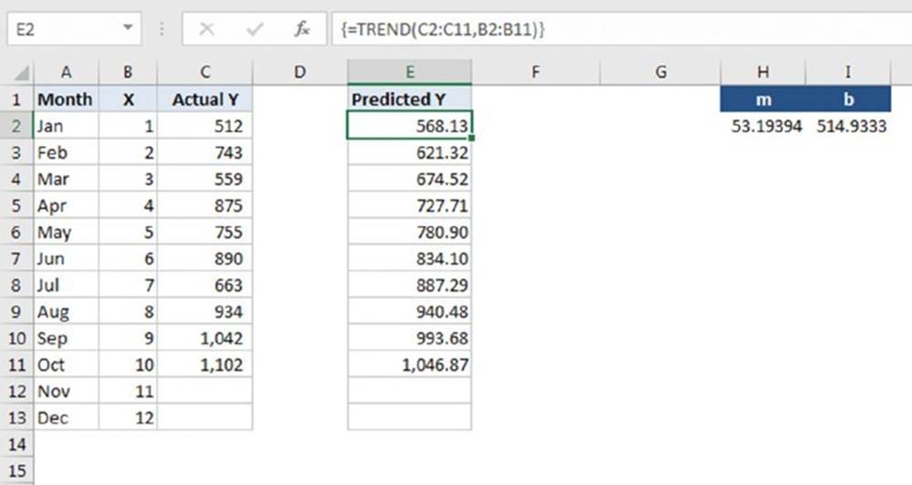
Figure 17.26 Column E contains formulas that calculate the predicted values for y.
=(B2*$G$2)+$H$2
The calculated values in column E represent the values used to plot the linear trendline.
You can also calculate predicted values of y without first computing the slope and y-intercept. You do so with an array formula that uses the TREND function. Select D2:D11, type the following formula (without the curly brackets), and press Ctrl+Shift+Enter:
{=TREND(C2:C11,B2:B11)}
Linear forecasting
When your chart contains a trendline, you can instruct Excel to extend the trendline to forecast additional values. You do this on the Trendline Options section of the Format Trendline task pane. (Read earlier in this section to see how to open this task pane.) Just specify the number of periods to forecast. Figure 17.27 shows a chart with a trendline that’s extended to forecast two subsequent periods.
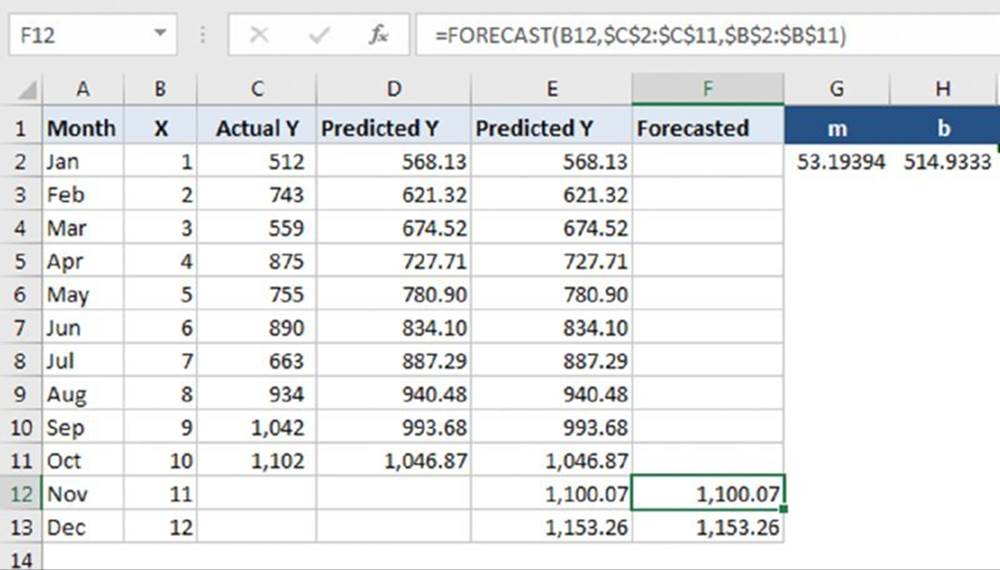
Figure 17.27 Using a trendline to forecast values for two additional periods of time.
If you know the values of the slope and y-intercept (see the “Calculating the slope and y-intercept” section, earlier in the chapter), you can calculate forecasts for other values of x. For example, to calculate the value of y when x = 11 (November), use the following formula:
=(53.194*11)+514.93
You can also forecast values by using the FORECAST function. The following formula, for example, forecasts the value for November (that is, x = 11) using known x and known y values:
=FORECAST(11,C2:C11,B2:B11)
Forecasting future values with forecasting functions
The preceding example uses the FORECAST function to predict future months’ values. Excel 2016 introduces five new forecasting functions to give you more algorithm options. The new functions use advanced machine learning algorithms, which are beyond the scope of this book. But we include a brief summary and the syntax of the new functions here:
FORECAST.LINEAR(x, known_y's, known_x's)
FORECAST.LINEAR is the direct replacement for the deprecated FORECAST function. It uses linear regression to predict a y value for the given x value:
FORECAST.ETS(target_date, values, timeline, seasonality, data_completion, aggregation)
FORECAST.ETS uses the AAA version of an algorithm called Exponential Smoothing, or ETS. The first three arguments—target_date, values, and timeline—are similar to the arguments for FORECAST.LINEAR. Target_date can be any number, not just a date, but it must be larger than the largest date in timeline. That is, it only predicts future values.
The timeline argument is a series of dates that have a consistent step. That is, each element of the series must be one day apart, one month apart, one year apart, or any other value as long as it’s consistent. There are a few exceptions to this rule depending on the values you provide for the optional arguments.
The remaining arguments are optional.
§ Seasonality: Adjusts the forecast for changes in values based on seasons. A seasonality of 0 indicates no seasonality, 1 tells the algorithm to detect seasonality based on the provided values, and any other positive number indicates the interval to use for seasonality. For example, a seasonality of 3 instructs the algorithm to use three periods as a season.
§ Data completion: Accounts for up to 30% missing data in timeline. You can indicate that missing values are zeros or tell the algorithm to use an average of the missing data’s neighbors.
§ Aggregation: Allows you to have duplicate values in the timeline. If you have duplicate data, aggregation will combine it into one data point using an aggregate you specify here:
FORECAST.ETS.SEASONALITY(target_date, values, timeline, seasonality, data_completion)
FORECAST.ETS.SEASONALITY uses many of the same arguments as FORECAST.ETS. If you specify 1 as the seasonality argument of FORECAST.ETS, the algorithm determines the seasonality. This function returns what the algorithm calculates for seasonality. InFigure 17.28, cell G12 shows that two periods is the seasonality computed from the data.
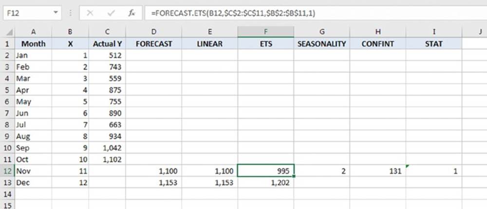
Figure 17.28 Using Excel 2016’s new forecasting functions.
FORECAST.ETS.CONFINT(target_date, values, timeline, confidence_level, seasonality, data_completion, aggregation)
FORECAST.ETS.CONFINT returns the confidence interval for the forecasted data using ETS. It has the same arguments as FORECAST.ETS except for confidence_level. Confidence_level is a number between 0 and 1. (The default is 95%.) Cell H12 in Figure 17.28uses a confidence_level of .9 (90%) and calculates that there is 90% confidence that the actual future values will be +/-131 of the predicted values in column F:
FORECAST.ETS.STAT(target_date, values, timeline, statistic_type, seasonality, data_completion, aggregation)
FORECAST.ETS.STAT returns one of several statistical measures from the data provided. Again, the arguments are mostly the same as FORECAST.ETS. The exception is statistic_type, where you indicate which statistic you want the formula to return. The list of statistics can be found in Excel’s help. Figure 17.28 uses the Step size detected statistic in cell I12 to report that it determined that the values in column B incremented by 1.
Calculating R-Squared
The accuracy of forecasted values depends on how well the linear trendline fits your actual data. The value of R-squared represents the degree of fit. R-squared values closer to 1 indicate a better fit—and more accurate predictions. In other words, you can interpret R-squared as the proportion of the variance in y attributable to the variance in x.
As described previously, you can instruct Excel to display the R-squared value in the chart. Or you can calculate it directly in your worksheet using the RSQ function. The following formula calculates R-squared for x values in B2:B11 and y values for C2:C11:
=RSQ(B2:B11,C2:C11)
![]() Caution
Caution
The value of R-squared calculated by the RSQ function is valid only for a linear trendline.
Working with nonlinear trendlines
Besides linear trendlines, an Excel chart can display trendlines of the following types:
§ Logarithmic: Used when the rate of change in the data increases or decreases quickly and then flattens out.
§ Power: Used when the data consists of measurements that increase at a specific rate. The data cannot contain zero or negative values.
§ Exponential: Used when data values rise or fall at increasingly higher rates. The data cannot contain zero or negative values.
§ Polynomial: Used when data fluctuates. You can specify the order of the polynomial (from 2 to 6) depending on the number of fluctuations in the data.
![]() Note
Note
The Trendline Options tab of the Format Trendline task pane offers the option of Moving Average, which really isn’t a trendline. This option, however, can be useful for smoothing out “noisy” data. The Moving Average option enables you to specify the number of data points to include in each average. For example, if you select 5, Excel averages every group of five data points and displays the points on a trendline.
Figure 17.29 shows charts that depict each of the trendline options.
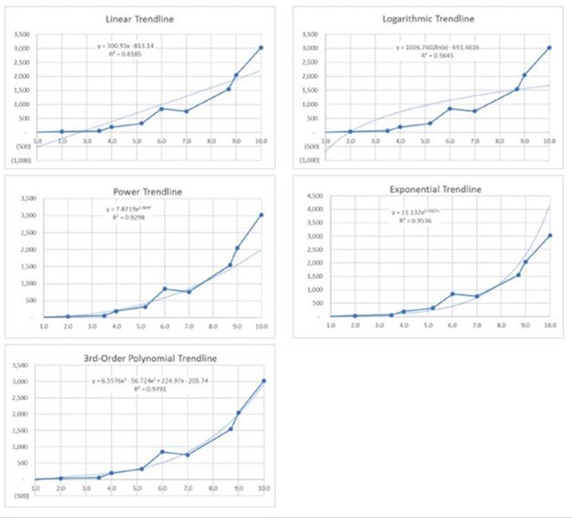
Figure 17.29 Charts with various trendline options.
Earlier in this chapter, you learned how to calculate the slope and y-intercept for the linear equation that describes a linear trendline. Nonlinear trendlines also have equations, and they are a bit more complex.
![]() On the Web
On the Web
This book’s website contains a workbook with nonlinear trendline examples. The file is named nonlinear trendlines.xlsx.
Summary of trendline equations
This section contains a concise summary of trendline equation. These equations assume that your sheet has two named ranges: x and y.
Linear trendline
Equation: y = m * x + b
m: =SLOPE(y,x)
b: =INTERCEPT(y,x)
Logarithmic trendline
Equation: y = (c * LN(x)) + b
c: =INDEX(LINEST(y,LN(x)),1)
b: =INDEX(LINEST(y,LN(x)),1,2)
Power trendline
Equation: y=c*x^b
c: =EXP(INDEX(LINEST(LN(y),LN(x),,),1,2))
b: =INDEX(LINEST(LN(y),LN(x),,),1)
Exponential trendline
Equation: y = c *e ^(b * x)
c: =EXP(INDEX(LINEST(LN(y),x),1,2))
b: =INDEX(LINEST(LN(y),x),1)
Second order polynomial trendline
Equation: y = (c2 * x^2) + (c1 * x ^1) + b
c2: =INDEX(LINEST(y,x^{1,2}),1)
c1: =INDEX(LINEST(y,x^{1,2}),1,2)
b = INDEX(LINEST(y,x^{1,2}),1,3)
Third order polynomial trendline
Equation: y = (c3 * x^3) + (c2 * x^2) + (c1 * x^1) + b
c3: =INDEX(LINEST(y,x^{1,2,3}),1)
c2: =INDEX(LINEST(y,x^{1,2,3}),1,2)
c1: =INDEX(LINEST(y,x^{1,2,3}),1,3)
b: =INDEX(LINEST(y,x^{1,2,3}),1,4)
Creating Interactive Charts
An interactive chart allows the user to easily change various parameters that affect what’s displayed in the chart. Often, VBA macros are used to make charts interactive. The examples in this section use no macros and demonstrate what can be done using only the tools built into Excel.
Selecting a series from a drop-down list
Figure 17.30 shows a chart that displays data as specified by a drop-down list in cell F2. Cell F2 uses data validation, which allows the user to select a month from a list. The chart uses the data in F1:I2, but the values depend on the selected month. The formulas in range G2:I2 retrieve the values from columns B:D that correspond to the selected month.
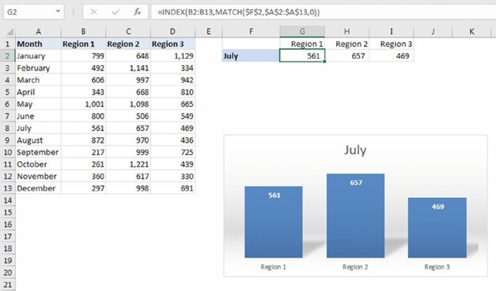
Figure 17.30 Selecting data to plot using a drop-down list.
The formula in cell G2, which was copied to the two cells to the right, is
=INDEX(B2:B13,MATCH($F$2,$A$2:$A$13,0))
![]() On the Web
On the Web
This example is available at this book’s website. The filename is series from drop-down.xlsx.
Plotting the last n data points
You can use a technique that makes your chart show only the most recent data points in a column. For example, you can create a chart that always displays the most recent six months of data. Figure 17.31 shows a worksheet set up so the user can specify the number of data points.
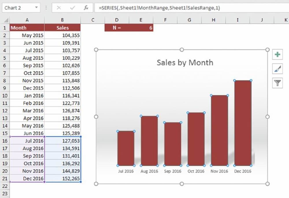
Figure 17.31 This chart displays the most recent data points.
The workbook uses three names. N is the name for cell E3, which holds the number of data points to plot.
MonthRange is a dynamic named formula, defined as
=OFFSET(Sheet1!$A$1,COUNTA(Sheet1!$A:$A)–Sheet1!N,0,Sheet1!N,1)
SalesRange is a dynamic named formula, defined as
=OFFSET(Sheet1!$B$1,COUNTA(Sheet1!$B:$B)–Sheet1!N,0,Sheet1!N,1)
The chart’s SERIES formula uses the two named formulas:
=SERIES(,Sheet1!MonthRange,Sheet1!SalesRange,1)
![]() On the Web
On the Web
The example in this section, named plot last n data points.xlsx, is available at this book’s website.
Choosing a start date and number of points
This example uses dynamic formulas to allow the user to display a chart with a specified number of data points, beginning with a selected starting date. Figure 17.32 shows a worksheet with 365 rows of daily sales data.
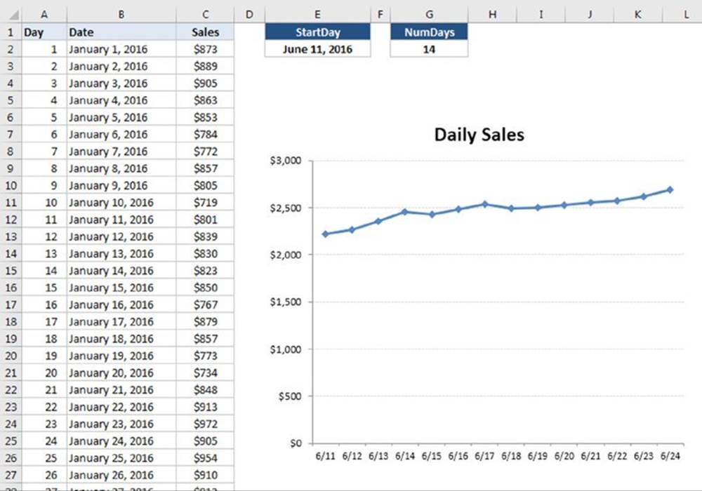
Figure 17.32 This chart displays data based on values specified by the user.
The start date is indicated in cell E2 (named StartDay), and the number of data points is specified in cell G2 (named NumDays). Both cells use data validation to display a drop-down list of options.
What makes this work is two named formulas. The formula named Date is
=OFFSET(Sheet1!$B$2,MATCH(StartDay,Sheet1!$B:$B,1)–2,0,NumDays,1)
The formula named Sales is
=OFFSET(Sheet1!$B$2,MATCH(StartDay,Sheet1!$B:$B,1)–2,1,NumDays,1)
These are both dynamic names that return a range that depends on the value of StartDay and NumDays. The two names are used in the chart’s SERIES formula. (The filename qualifier was removed for simplicity.)
=SERIES(,Date,Sales,1)
![]() On the Web
On the Web
The example in this section, named first point and number of points.xlsx, is available at this book’s website.
Displaying population data
The example in this section uses the population pyramid technique described earlier in this chapter. (See “Creating a comparative histogram.”) Here, the user can choose two years to view population by age groups side by side.
Figure 17.33 shows the age distribution for 1950 and 2013.
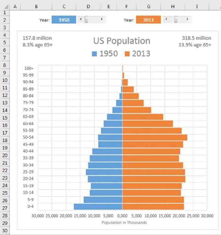
Figure 17.33 Population by age group, for two years.
The years are entered in cells C2 and G2. The years can be entered manually or specified by using a scrollbar linked to a cell. Formulas below the chart retrieve data from a table that has population statistics (and projections) from 1950 through 2100.
For each year, the chart also displays the total population and the percentage of people age 65 or older. That information is displayed by using text boxes linked to cells.
![]() On the Web
On the Web
This workbook, named US population chart.xlsx, is available at this book’s website.
Displaying weather data
The example shown in Figure 17.34 is a useful application that allows the user to choose two U.S. cities (from a list of 284 cities) and view a chart that compares the cities by month in any of the following categories: average precipitation, average temperature, percent sunshine, and average wind speed.
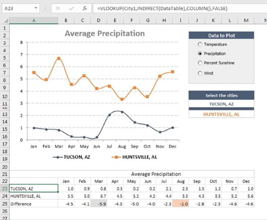
Figure 17.34 This application uses a variety of techniques (but no VBA code) to plot monthly climate data for two selected U.S. cities.
The cities are chosen from a drop-down list using Excel’s data validation feature, and the data option is selected using four OptionButton controls, which are linked to a cell. All the pieces are connected using a few formulas.
![]() On the Web
On the Web
This workbook, named climate data.xlsx, is available at this book’s website.
The key to this application is that the chart uses data in a specific range. The data in this range is retrieved from the appropriate data table by using formulas that use the VLOOKUP function.
The formula in cell A23, which looks up data based on the contents of City1, is
=VLOOKUP(City1,INDIRECT(DataTable),COLUMN(),FALSE)
The formula in cell A24 is the same except that it looks up data based on the contents of City2:
=VLOOKUP(City2,INDIRECT(DataTable),COLUMN(),FALSE)
These formulas were entered and then copied across to the next 12 columns (see Figure 17.34).
![]() Note
Note
You may be wondering about the use of the COLUMN function for the third argument of the VLOOKUP function. This function returns the column number of the cell that contains the formula. This is a convenient way to avoid hard-coding the column to be retrieved and allows the same formula to be used in each column.
Row 25 contains formulas that calculate the difference between the two cities for each month. Conditional formatting was used to apply a different color background for the largest difference and the smallest difference.
The label above the month names is generated by a formula that refers to the DataTable cell and constructs a descriptive title. The formula is
="Average " & LEFT(DataTable,LEN(DataTable)–4)
After you’ve completed the previous tasks, the final step—creating the actual chart—is a breeze. The line chart has two data series and uses the data in A22:M24. The chart title is linked to cell B21. The data in A23:M24 changes, of course, whenever an OptionButton control is selected or a new city is selected from either of the Data Validation lists.
All materials on the site are licensed Creative Commons Attribution-Sharealike 3.0 Unported CC BY-SA 3.0 & GNU Free Documentation License (GFDL)
If you are the copyright holder of any material contained on our site and intend to remove it, please contact our site administrator for approval.
© 2016-2025 All site design rights belong to S.Y.A.