Marketing Analytics: Data-Driven Techniques with Microsoft Excel (2014)
Part III. Forecasting
Chapter 9: Simple Linear Regression and Correlation
Chapter 10: Using Multiple Regression to Forecast Sales
Chapter 11: Forecasting in the Presence of Special Events
Chapter 12: Modeling Trend and Seasonality
Chapter 13: Ratio to Moving Average Forecast Method
Chapter 14: Winter's Method
Chapter 15: Using Neural Networks to Forecast Sales
Chapter 9. Simple Linear Regression and Correlation
Often the marketing analyst needs to determine how variables are related, and much of the rest of this book is devoted to determining the nature of relationships between variables of interest. Some commonly important marketing questions that require analyzing the relationships between two variables of interest include:
· How does price affect demand?
· How does advertising affect sales?
· How does shelf space devoted to a product affect product sales?
This chapter introduces the simplest tools you can use to model relationships between variables. It first covers finding the line that best fits the hypothesized causal relationship between two variables. You then learn to use correlations to analyze the nature of non-causal relationships between two or more variables.
Simple Linear Regression
Every business analyst should have the ability to estimate the relationship between important business variables. In Microsoft Office Excel, the Trendline feature can help you determine the relationship between two variables. The variable you want to predict is the dependent variable. The variable used for prediction is the independent variable. Table 9.1 shows some examples of business relationships you might want to estimate.
Table 9.1 Examples of Relationships
|
Independent Variable |
Dependent Variable |
|
Units produced by a plant in 1 month |
Monthly cost of operating a plant |
|
Dollars spent on advertising in 1 month |
Monthly sales |
|
Number of employees |
Annual travel expenses |
|
Daily sales of cereal |
Daily sales of bananas |
|
Shelf space devoted to chocolate |
Sales of chocolate |
|
Price of bananas sold |
Pounds of bananas sold |
The first step to determine how two variables are related is to graph the data points so that the independent variable is on the x-axis and the dependent variable is on the y-axis. You can do this by using the Scatter Chart option in Microsoft Excel and performing the following steps:
1. With the Scatter Chart option selected, click a data point (displayed in blue) and click Trendline in the Analysis group on the Chart Tools Layout tab.
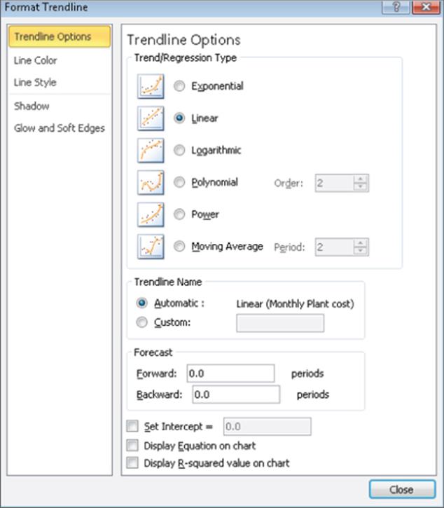
2. Next click More Trendline Options…, or right-click and select Add Trendline… You'll see the Format Trendline dialog box, which is shown in Figure 9.1.
Figure 9-1: Trendline dialog box
3. If your graph indicates that a straight line can be drawn that provides a reasonable fit (a reasonable fit will be discussed in the “Defining R2” section of this chapter) to the points, choose the Linear option. Nonlinear relationships are discussed in the “Modeling Nonlinearities and Interactions” section of Chapter 10, “Using Multiple Regression to Forecast Sales.”
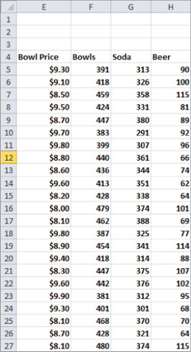
Analyzing Sales at Mao's Palace Restaurant
To illustrate how to model a linear relationship between two variables, take a look at the daily sales of products at Mao's Palace, a local Chinese restaurant (see Figure 9.2). Mao's main product is bowls filled with rice, vegetables, and meat made to the customer's order. The file Maospalace.xlsxgives daily unit sales of bowl price, bowls, soda, and beer.
Figure 9-2: Sales at Mao's Palace
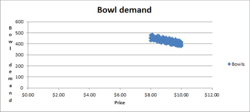
Now suppose you want to determine how the price of the bowls affects daily sales. To do this you create an XY chart (or a scatter plot) that displays the independent variable (price) on the x-axis and the dependent variable (bowl sales) on the y-axis. The column of data that you want to display on the x-axis must be located to the left of the column of data you want to display on the y-axis. To create the graph, you perform two steps:
1. Select the data in the range E4:F190 (including the labels in cells E4 and F4).
2. Click Scatter in the Charts group on the Insert tab of the Ribbon, and select the first option (Scatter with only Markers) as the chart type. Figure 9.3 shows the graph.
Figure 9-3: Scatterplot of Bowl demand versus Price
If you want to modify this chart, you can click anywhere inside the chart to display the Chart Tools contextual tab. Using the commands on the Chart Tools Design tab, you can do the following:
· Change the chart type.
· Change the source data.
· Change the style of the chart.
· Move the chart.
Using the commands on the Chart Tools Layout tab, you can do the following:
· Add a chart title.
· Add axis labels.
· Add labels to each point that gives the x and y coordinate of each point.
· Add gridlines to the chart.
Looking at the scatter plot, it seems reasonable that there is a straight line (or linear relationship) between the price and bowl sales. You can see the straight line that “best fits” the points by adding a trend line to the chart. To do so, perform the following steps:
1. Click within the chart to select it, and then click a data point. All the data points display in blue with an X covering each point.
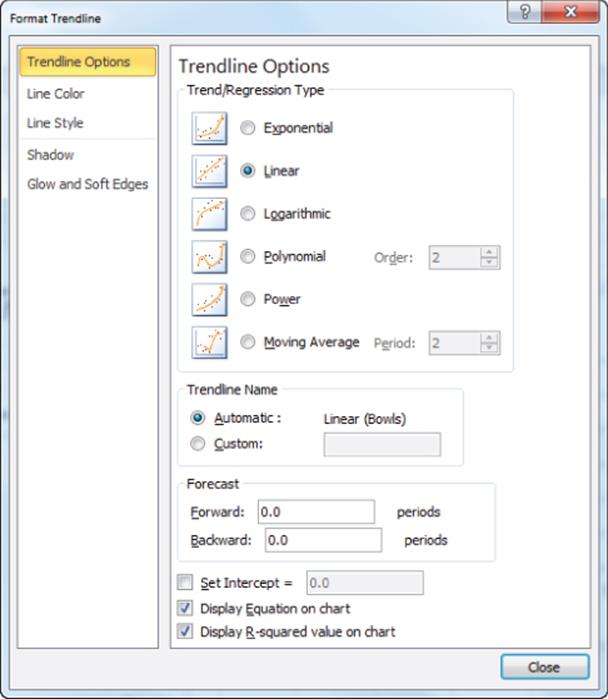
2. Right-click and then click Add Trendline…
3. In the Format Trendline dialog box, select the Linear option, and then check the Display Equation on chart and the Display R-squared value on chart boxes, as shown in Figure 9.4. The R-Squared Value on the chart is defined in the “Defining R2” section of this chapter.
Figure 9-4: Trendline settings for Bowl demand
4. Click Close to see the results shown in Figure 9.5. To add a title to the chart and labels for the x-and y-axes, select Chart Tools, click Chart Title, and then click Axis Titles in the Labels group on the Layout tab.
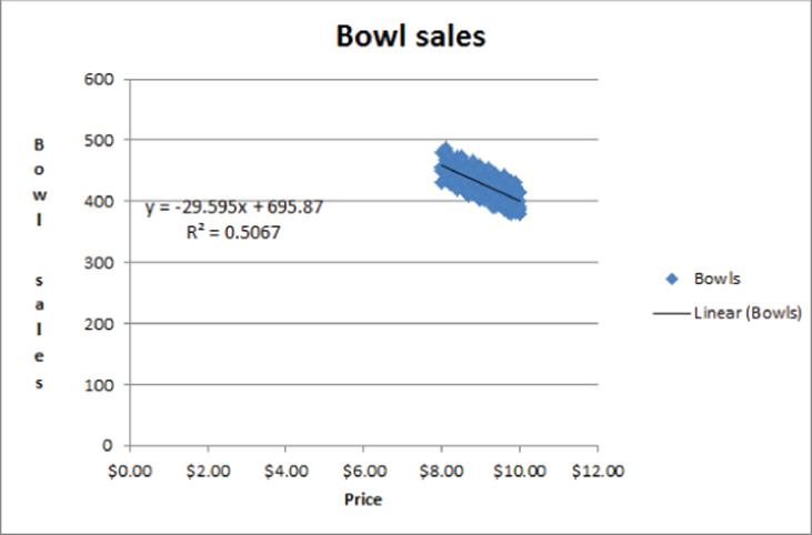
Figure 9-5: Trendline for Bowl demand
5. To add more decimal points to the equation, select the trend-line equation; after selecting Layout from Chart Tools, choose Format Selection.
6. Select Number and choose the number of decimal places to display.
How Excel Determines the Best-Fitting Line
When you create a scatter chart and plot a trend line using the Trendline feature, it chooses the line that minimizes (over all lines that could be drawn) the sum of the squared vertical distance from each point to the line. The vertical distance from each point to the line is an error, or residual. The line created by Excel is called the least-squares line. You minimize the sum of squared errors rather than the sum of the errors because in simply summing the errors, positive and negative errors can cancel each other out. For example, a point 100 units above the line and a point 100 units below the line cancel each other if you add errors. If you square errors, however, the fact that your predictions for each point are wrong will be used by Excel to find the best-fitting line. Another way to see that minimizing the sum of squared errors is reasonable is to look at a situation in which all points lie on one line. Then minimizing the least squares line would yield this line and a sum of squared errors equal to 0.
Thus, Excel calculates that the best-fitting straight line for predicting daily bowl sales from the price by using the equation Daily Bowl Sales=-29.595*Price + 695.87. The -29.595 slope of this line indicates that the best guess is that a $1 increase in the price of a bowl reduces demand by 29.595 bowls.
WARNING
You should not use a least-squares line to predict values of an independent variable that lies outside the range for which you have data. Your line should be used only to predict daily bowl sales for days in which the bowl price is between $8 and $10.
Computing Errors or Residuals
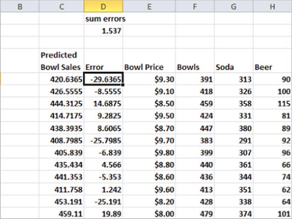
Referring back to the Mao's Palace example, you can compute predicted bowl sales for each day by copying the formula =-29.595*E5+695.87 from C5 to C6:C190. Then copy the formula =F5-C5 from D5 to D6:D190. This computes the errors (or residuals). These errors are shown in Figure 9.6. For each data point, you can define the error by the amount by which the point varies from the least-squares line. For each day, the error equals the observed demand minus the predicted demand. A positive error indicates a point is above the least-squares line, and a negative error indicates that the point is below the least-squares line. In cell D2, the sum of the errors is computed, which obtained 1.54. In reality, for any least-squares line, the sum of the errors should equal 0. 1.54 is obtained because the equation is rounded to three decimal points.) The fact that errors sum to 0 implies that the least-squares line has the intuitively satisfying property of splitting the points in half.
Figure 9-6: Errors in predicting Bowl demand
Defining R2
As you can see in the Mao's Palace example, each day both the bowl price and bowl sales vary. Therefore it is reasonable to ask what percentage of the monthly variation in sales is explained by the daily variation in price. In general the percentage of the variation in the dependent variable explained by the least squares line is known as R2. For this regression the R2 value is 0.51, which is shown in Figure 9.5. You can state that the linear relationship explains 51 percent of the variation in monthly operating costs.
Once you determine the R2 value, your next question might be what causes the other 49 percent of the variation in daily bowl sales costs. This value is explained by various other factors. For example, the day of the week and month of the year might affect bowl sales. Chapter 10, “Using Multiple Regression to Forecast Sales” explains how to use multiple regression to determine other factors that influence operating costs. In most cases, finding factors that increase R2 increases prediction accuracy. If a factor only results in a slight increase in R2, however, using that factor to predict the dependent variable can actually decrease forecast accuracy. (See Chapter 10 for further discussion of this idea.)
Another question that comes up a lot in reference to R2 values is what is a good R2 value? There is no definitive answer to this question. As shown in Exercise 5 toward the end of the chapter, a high R2 can occur even when a trend line is not a good predictor of y. With one independent variable, of course, a larger R2 value indicates a better fit of the data than a smaller R2 value. A better measure of the accuracy of your predictions is the standard error of the regression, described in the next section.
Accuracy of Predictions from a Trend Line
When you fit a line to points, you obtain a standard error of the regression that measures the spread of the points around the least-squares line. You can compute the standard error associated with a least-squares line with the STEYX function. The syntax of this function is STEYX(known_y's, known_x's), where yrange contains the values of the dependent variable, and xrange contains the values of the independent variable. To use this function, select the range E4:F190 and use FORMULAS CREATE FROM SELECTION to name your price data Bowl_Price and your sales data Bowls. Then in cell K1, compute the standard error of your cost estimate line with the formula =STEYX(Bowls,Bowl_Price). Figure 9.7 shows the result.
Figure 9-7: Computing standard error of the regression
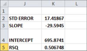
Approximately 68 percent of your points should be within one standard error of regression (SER) of the least-squares line, and approximately 95 percent of your points should be within two SER of the least-squares line. These measures are reminiscent of the descriptive statistics rule of thumb described in Chapter 2, “Using Excel Charts to Summarize Marketing Data.” In your example, the absolute value of approximately 68 percent of the errors should be 17.42 or smaller, and the absolute value of approximately 95 percent of the errors should be 34.84, or 2 * 17.42, or smaller. You can find that 57 percent of your points are within one SER of the least-squares line, and all (100 percent) of the points are within two standard SER of the least-squares line. Any point that is more than two SER from the least-squares line is called an outlier.
Looking for causes of outliers can often help you to improve the operation of your business. For example, a day in which actual demand was 34.84 higher than anticipated would be a demand outlier on the high side. If you ascertain the cause of this high sales outlier and make it recur, you would clearly improve profitability. Similarly, consider a month in which actual sales are over 34.84 less than expected. If you can ascertain the cause of this low demand outlier and ensure it occurred less often, you would improve profitability. Chapters 10 and 11 explain how to use outliers to improve forecasting.
The Excel Slope, Intercept, and RSQ Functions
You have learned how to use the Trendline feature to find the line that best fits a linear relationship and to compute the associated R2 value. Sometimes it is more convenient to use Excel functions to compute these quantities. In this section, you learn how to use the Excel SLOPE and INTERCEPTfunctions to find the line that best fits a set of data. You also see how to use the RSQ function to determine the associated R2 value.
The Excel SLOPE(known_y's, known_x's) and INTERCEPT(known_y's, known_x's) functions return the slope and intercept, respectively, of the least-squares line. Thus, if you enter the formula SLOPE(Bowls, Bowl_Price) in cell K3 (see Figure 9.7) it returns the slope (–29.59) of the least-squares line. Entering the formula INTERCEPT(Bowls, Bowl_Price) in cell K4 returns the intercept (695.87) of the least-squares line. By the way, the RSQ(known_y's, known_x's) function returns the R2 value associated with a least-squares line. So, entering the formula RSQ(Bowls, Bowl_Price) in cell K5 returns the R2 value of 0.507 for your least-squares line. Of course this R2 value is identical to the RSQ value obtained from the Trendline.
Using Correlations to Summarize Linear Relationships
Trendlines are a great way to understand how two variables are related. Often, however, you need to understand how more than two variables are related. Looking at the correlation between any pair of variables can provide insights into how multiple variables move up and down in value together. Correlation measures linear association, not causation.
The correlation (usually denoted by r) between two variables (call them x and y) is a unit-free measure of the strength of the linear relationship between x and y. The correlation between any two variables is always between –1 and +1. Although the exact formula used to compute the correlation between two variables isn't very important, interpreting the correlation between the variables is.
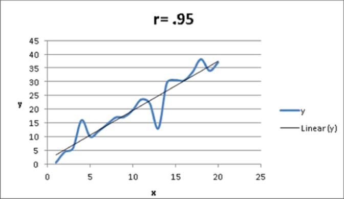
A correlation near +1 means that x and y have a strong positive linear relationship. That is, when x is larger than average, y is almost always larger than average, and when x is smaller than average, y is almost always smaller than average. For example, for the data shown in Figure 9.8, (x = units produced and y = monthly production cost), x and y have a correlation of +0.95. You can see that in Figure 9.8 the least squares line fits the points very well and has a positive slope which is consistent with large values of x usually occurring with large values of y.
Figure 9-8: Correlation = +0.95
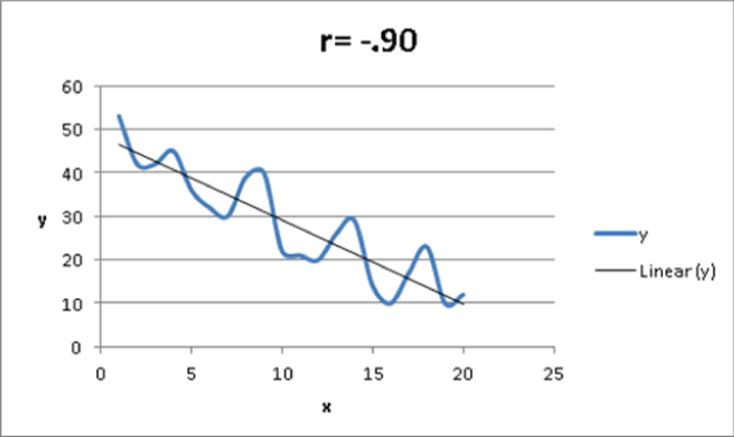
If x and y have a correlation near –1, this means that there is a strong negative linear association between x and y. That is, when x is larger than average, y is usually be smaller than average, and when x is smaller than average, y is usually larger than average. For example, for the data shown inFigure 9.9, x and y have a correlation of –0.90. You can see that in Figure 9.9 the least squares line fits the points very well and has a negative slope which is consistent with large values of x usually occurring with small values of y.
Figure 9-9: Correlation = -0.90
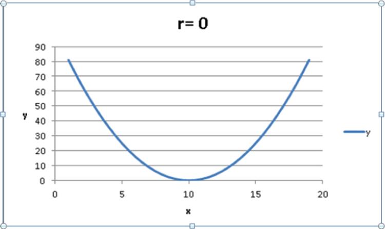
A correlation near 0 means that x and y have a weak linear association. That is, knowing whether x is larger or smaller than its mean tells you little about whether y will be larger or smaller than its mean. Figure 9.10 shows a graph of the dependence of unit sales (y) on years of sales experience (x). Years of experience and unit sales have a correlation of 0.003. In the data set, the average experience is 10 years. You can see that when a person has more than 10 years of sales experience, sales can be either low or high. You also see that when a person has fewer than 10 years of sales experience, sales can be low or high. Although experience and sales have little or no linear relationship, there is a strong nonlinear relationship (see the fitted curve in Figure 9.10) between years of experience and sales. Correlation does not measure the strength of nonlinear associations.
Figure 9-10: Correlation near 0
Finding a Correlation with the Data Analysis Add-In
You will now learn how Excel's Data Analysis Add-in and the Excel Correlation function can be used to compute correlations. The Data Analysis Add-In makes it easy to find correlations between many variables. To install the Data Analysis Add-in, perform the following steps:
1. Click the File tab and select Options.
2. In the Manage box click Excel Add-Ins, and choose Go.
3. In the Add-Ins dialog box, select Analysis ToolPak and then click OK.
Now you can access the Analysis ToolPak functions by clicking Data Analysis in the Analysis group on the Data tab.
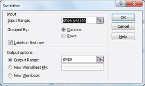
You can use this functionality to find the correlations between each pair of variables in the Mao's Palace data set. To begin select the Data Analysis Add-In, and choose Correlation. Then fill in the dialog box, as shown in Figure 9.11.
Figure 9-11: Correlation dialog box
To compute correlations with the Data Analysis Add-in proceed as follows:
1. Select the range which contains the relevant data and data labels. The easiest way to accomplish this is to select the upper-left cell of the data range (E5) and then press Ctrl+Shift+Right Arrow, followed by Ctrl+Shift+Down Arrow.
2. Check the Labels In First Row option because the first row of the input range contains labels. Enter cell M9 as the upper-left cell of the output range.
3. After clicking OK, you see the results, as shown in Figure 9.12.
Figure 9-12: Correlation matrix
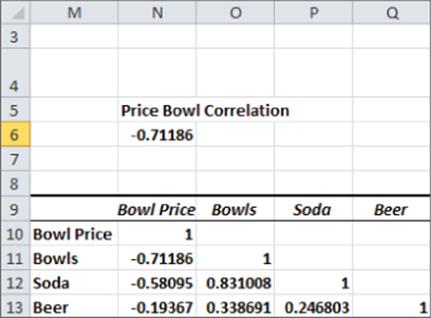
From Figure 9.12, you find there is a –0.71 correlation between Bowl Price and Bowl Sales, indicating a strong negative linear association The .0.83 correlation between Soda Sales and Bowl Sales indicates a strong positive linear association. The +0.25 correlation between beer and soda sales indicates a slight positive linear association between beer and soda sales.
Using the CORREL Function
As an alternative to using the Correlation option of the Analysis Toolpak, you can use the CORREL function. For example, enter the formula =CORREL(Bowl_Price,F5:F190) in cell N6 and you can confirm that the correlation between price and bowl sales is -0.71.
Relationship Between Correlation and R2
The correlation between two sets of data is simply –√R2 for the trend line, where you choose the sign for the square root to be the same as the sign of the slope of the trend line. Thus the correlation between bowl price and bowl sales is –√.507= –0.711.
Correlation and Regression Toward the Mean
You have probably heard the phrase “regression toward the mean.” Essentially, this means that the predicted value of a dependent variable will be in some sense closer to its average value than the independent variable. More precisely, suppose you try to predict a dependent variable y from an independent variable x. If x is k standard deviations above average, then your prediction for y will be r × k standard deviations above average. (Here, r = correlation between x and y.) Because r is between –1 and +1, this means that y is fewer standard deviations away from the mean than x. This is the real definition of “regression toward the mean.” See Exercise 9 for an interesting application of the concept of regression toward the mean.
Summary
Here is a summary of what you have learned in this chapter:
· The Excel Trendline can be used to find the line that best fits data.
· The R2 value is the fraction of variation in the dependent variable explained by variation in the independent variable.
· Approximately 95 percent of the forecasts from a least-squares line are accurate within two standard errors of the regression.
· Given two variables x and y, the correlation r (always between –1 and +1) between x and y is a measure of the strength of the linear association between x and y.
· Correlation may be computed with the Analysis ToolPak or the CORREL function.
· If x is k standard deviations above the mean, you can predict y to be rk standard deviations above the mean.
Exercises
1. The file Delldata.xlsx (available on the companion website) contains monthly returns for the Standard & Poor's stock index and for Dell stock. The beta of a stock is defined as the slope of the least-squares line used to predict the monthly return for a stock from the monthly return for the market. Use this file to perform the following exercises:
(a) Estimate the beta of Dell.
(b) Interpret the meaning of Dell's beta.
(c) If you believe a recession is coming, would you rather invest in a high-beta or low-beta stock?
(d) During a month in which the market goes up 5 percent, you are 95 percent sure that Dell's stock price will increase between which range of values?
2. The file Housedata.xlsx (available on the companion website) gives the square footage and sales prices for several houses in Bellevue, Washington. Use this file to answer the following questions:
(a) You plan to build a 500-square-foot addition to your house. How much do you think your home value will increase as a result?
(b) What percentage of the variation in home value is explained by the variation in the house size?
(c) A 3,000-square-foot house is listed for $500,000. Is this price out of line with typical real estate values in Bellevue? What might cause this discrepancy?
3. You know that 32 degrees Fahrenheit is equivalent to 0 degrees Celsius, and that 212 degrees Fahrenheit is equivalent to 100 degrees Celsius. Use the trend curve to determine the relationship between Fahrenheit and Celsius temperatures. When you create your initial chart, before clicking Finish, you must indicate (using Switch Rows and Columns from the Design Tab on Chart Tools) that data is in columns and not rows because with only two data points, Excel assumes different variables are in different rows.
4. The file Electiondata.xlsx (available on the companion website) contains, for several elections, the percentage of votes Republicans gained from voting machines (counted on election day) and the percentage Republicans gained from absentee ballots (counted after election day). Suppose that during an election, Republicans obtained 49 percent of the votes on election day and 62 percent of the absentee ballot votes. The Democratic candidate cried “Fraud.” What do you think?
5. The file GNP.xls (available on the companion website) contains quarterly GNP data for the United States in the years 1970–2012. Try to predict next quarter's GNP from last quarter's GNP. What is the R2? Does this mean you are good at predicting next quarter's GNP?
6. Find the trend line to predict soda sales from daily bowl sales.
7. The file Parking.xlsx contains the number of cars parked each day both in the outdoor lot and in the parking garage near the Indiana University Kelley School of Business. Find and interpret the correlation between the number of cars parked in the outdoor lot and in the parking garage.
8. The file Printers.xlsx contains daily sales volume (in dollars) of laser printers, printer cartridges, and school supplies. Find and interpret the correlations between these quantities.
9. NFL teams play 16 games during the regular season. Suppose the standard deviation of the number of games won by all teams is 2, and the correlation between the number of games a team wins in two consecutive seasons is 0.5. If a team goes 12 and 4 during a season, what is your best prediction for how many games they will win next season?
All materials on the site are licensed Creative Commons Attribution-Sharealike 3.0 Unported CC BY-SA 3.0 & GNU Free Documentation License (GFDL)
If you are the copyright holder of any material contained on our site and intend to remove it, please contact our site administrator for approval.
© 2016-2026 All site design rights belong to S.Y.A.