Microsoft Excel 2016 BIBLE (2016)
Part III
Creating Charts and Graphics
Chapter 20
Learning Advanced Charting
IN THIS CHAPTER
1. Understanding chart customization
2. Changing basic chart elements
3. Working with data series
4. Discovering some chart-making tricks
Excel makes creating a basic chart easy. Select your data, choose a chart type, and you're finished. You may take a few extra seconds and select one of the prebuilt chart styles and maybe even select one of the chart layouts. But if your goal is to create the most effective chart possible, you probably want to take advantage of the additional customization techniques available in Excel.
Customizing a chart involves changing its appearance, as well as possibly adding new elements to it. These changes can be purely cosmetic (such as changing colors, modifying line widths, or adding a shadow) or quite substantial (say, changing the axis scales or adding a second value axis). Chart elements that you might add include such features as a data table, a trend line, or error bars.
The preceding chapter introduced charting in Excel and described how to create basic charts. This chapter takes the topic to the next level. You learn how to customize your charts to the maximum so that they look exactly as you want. You also pick up some slick charting tricks that will make your charts even more impressive.
Selecting Chart Elements
Modifying a chart is similar to everything else you do in Excel: First, you make a selection (in this case, select a chart element), and then you issue a command to do something with the selection.
You can select only one chart element (or one group of chart elements) at a time. For example, if you want to change the font for two axis labels, you must work on each set of axis labels separately.
Excel provides three ways, described in the following sections, to select a particular chart element:
· Mouse
· Keyboard
· Chart Elements control
Selecting with the mouse
To select a chart element with your mouse, just click the element. The chart element appears with small circles at the corners.
Tip
Some chart elements can be a bit tricky to select. To ensure that you select the chart element that you intended to select, view the Chart Elements control, located in the Chart Tools ![]() Format
Format ![]() Current Selection group of the Ribbon (see Figure 20.1). Or, if the Format task pane is displayed, you can identify the selected chart element by the title of the task pane. Press Ctrl+1 to display the Format task pane.
Current Selection group of the Ribbon (see Figure 20.1). Or, if the Format task pane is displayed, you can identify the selected chart element by the title of the task pane. Press Ctrl+1 to display the Format task pane.
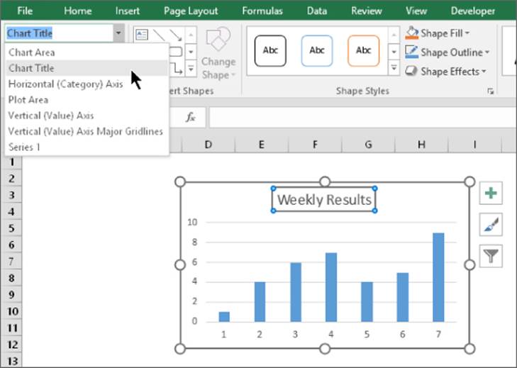
Figure 20.1 The Chart Elements control (in the upper-left corner) displays the name of the selected chart element. In this example, the “chart title” is selected.
When you move the mouse over a chart, a small chart tip displays the name of the chart element under the mouse pointer. When the mouse pointer is over a data point, the chart tip also displays the value of the data point.
Tip
If you find these chart tips annoying, you can turn them off. Choose File ![]() Options and select the Advanced tab in the Excel Options dialog box. Locate the Chart section and clear either or both the Show Chart Element Names on Hover or the Show Data Point Values on Hover check boxes.
Options and select the Advanced tab in the Excel Options dialog box. Locate the Chart section and clear either or both the Show Chart Element Names on Hover or the Show Data Point Values on Hover check boxes.
Some chart elements (such as a series, a legend, and data labels) consist of multiple items. For example, a chart series element is made up of individual data points. To select a particular data point, click twice: first, click the series to select it, and then click the specific element within the series (for example, a column or a line chart marker). Selecting the element enables you to apply formatting to only a particular data point in a series.
You may find that some chart elements are difficult to select with the mouse. If you rely on the mouse for selecting a chart element, you may have to click it several times before the desired element is actually selected. Fortunately, Excel provides other ways to select a chart element, and it's worth your while to be familiar with them. Keep reading to see how.
Selecting with the keyboard
When a chart is active, you can use the up-arrow and down-arrow navigation keys on your keyboard to cycle among the chart's elements. Again, keep your eye on the Chart Elements control to ensure that the selected chart element is what you think it is.
· When a chart series is selected: Use the left-arrow and right-arrow keys to select an individual item within the series.
· When a set of data labels is selected: You can select a specific data label by using the left-arrow or right-arrow key.
· When a legend is selected: Select individual elements within the legend by using the left-arrow or right-arrow key.
Selecting with the Chart Elements control
The Chart Elements control is located in the Chart Tools ![]() Format
Format ![]() Current Selection group. This control displays the name of the currently selected chart element. It's a drop-down control, and you can use it to select a particular element in the active chart.
Current Selection group. This control displays the name of the currently selected chart element. It's a drop-down control, and you can use it to select a particular element in the active chart.
The Chart Elements control also appears in the Mini toolbar, which is displayed when you right-click a chart element (see Figure 20.2).
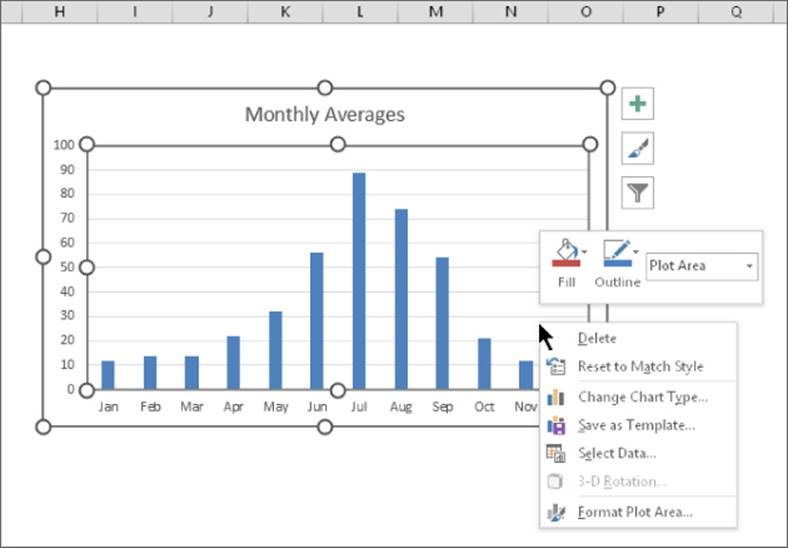
Figure 20.2 Using the Chart Elements control in the Mini toolbar.
The Chart Elements control enables you to select only the top-level elements in the chart. To select an individual data point within a series, for example, you need to select the series and then use the navigation keys (or your mouse) to select the desired data point.
Note
When a single data point is selected, the Chart Elements control will display the name of the selected element even though it's not actually available for selection from the drop-down list.
Tip
If you do a lot of work with charts, you may want to add the Chart Elements control to your Quick Access toolbar. That way, it will always be visible regardless of which Ribbon tab is showing. To add the control to your Quick Access toolbar, right-click the down arrow in the Chart Elements control in the Ribbon and choose Add to Quick Access Toolbar.
User Interface Choices for Modifying Chart Elements
You have four main ways of working with chart elements: the Format task pane, the icons that display to the right of the chart, the Ribbon, and the Mini toolbar.
Using the Format task pane
When a chart element is selected, use the element's Format task pane to format or set options for the element. Each chart element has a unique Format task pane that contains controls specific to the element (although many Format task panes have controls in common). To access the Format task pane, use any of these methods:
· Double-click the chart element.
· Right-click the chart element and then choose Format xxxx from the shortcut menu (where xxxx is the name of the element).
· Select a chart element and then choose Chart Tools ![]() Format
Format ![]() Current Selection
Current Selection ![]() Format Selection.
Format Selection.
· Select a chart element and press Ctrl+1.
Any of these actions displays the Format task pane from which you can make many changes to the selected chart element. For example, Figure 20.3 shows the task pane that appears when a chart's value axis is selected. The task pane is free floating, not docked. Note that a scrollbar is displayed, which means that all the options can't fit in the vertical space for the task pane.
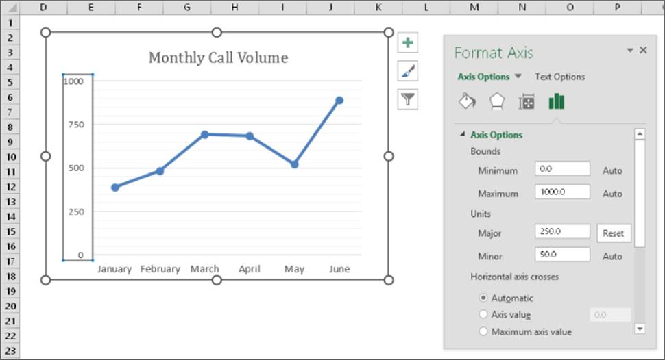
Figure 20.3 Use the Format task pane to set the properties of a selected chart element — in this case, the chart's value axis.
Tip
Normally, the Format task pane is docked on the right side of the window. But you can click the title and drag it anywhere you like and resize it. To redock the task pane, maximize the Excel window, and then drag the task pane to the right side of the window. If you select a different chart element, the Format task pane changes to display the options appropriate for the new element.
Using the chart customization buttons
When a chart is selected, three buttons appear to the right of the chart (see Figure 20.4). These buttons, when clicked, expand to show various options. The icons are
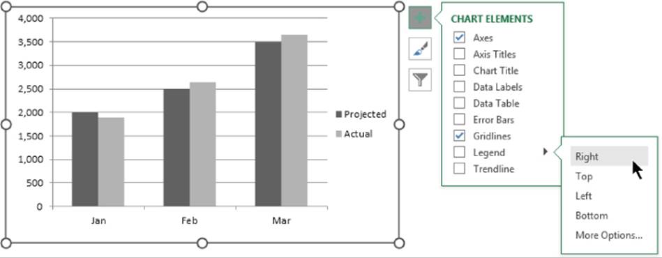
Figure 20.4 Chart customization buttons.
· Chart Elements: Use these tools to hide or display specific elements in the chart. Note that each item can be expanded to show additional options. To expand an item in the Chart Elements list, hover your mouse over the item and click the arrow that appears.
· Chart Styles: Use this icon to select from prebuilt chart styles or change the color scheme of the chart.
· Chart Filters: Use this icon to hide or display data series and specific points in a data series, or hide and display categories. Some chart types do not display the Chart Filters button.
Using the Ribbon
When a chart element is selected, you can also use the commands on the Ribbon to change some aspects of its formatting. For example, to change the color of the bars in a column chart, use the commands from the Chart Tools ![]() Format
Format ![]() Shape Styles group. For some types of chart element formatting, you need to leave the Chart Tools tab. For example, to adjust font-related properties, use the commands from the Home
Shape Styles group. For some types of chart element formatting, you need to leave the Chart Tools tab. For example, to adjust font-related properties, use the commands from the Home ![]() Font group.
Font group.
The Ribbon controls do not comprise a comprehensive set of tools for chart elements. The Format task pane usually presents options that aren't available on the Ribbon.
Using the Mini toolbar
When you right-click an element in a chart, Excel displays a shortcut menu and the Mini toolbar. The Mini toolbar contains icons (Style, Fill, Outline) that, when clicked, display formatting options. For some chart elements, the Style icon isn't relevant, so the Mini toolbar displays the Chart Elements control (which you can use to select another chart element).
Modifying the Chart Area
The Chart Area is an object that contains all other elements in the chart. You can think of it as a chart's master background or container.
The only modifications that you can make to the Chart Area are cosmetic. You can change its fill color, outline, or effects such as shadows and soft edges.
Note
If you set the Chart Area of an embedded chart to use No Fill, the chart becomes transparent and the underlying cells are visible. Figure 20.5 shows a chart that uses No Fill and No Outline in its Chart Area. The Plot Area, Legend, and Chart Title do use a fill color. Adding a shadow to these other elements makes them appear to be floating above the worksheet.
Figure 20.5 The Chart Area element uses No Fill, so the underlying cells are visible.
The Chart Area element also controls all the fonts used in the chart. For example, if you want to change every font in the chart, you don't need to format each text element separately. Just select the Chart Area and then make the change from options of the Home ![]() Font group or the Format Chart Area task pane.
Font group or the Format Chart Area task pane.
Resetting Chart Element Formatting
If you go overboard formatting a chart element, you can always reset it to its original state. Just select the element and choose Chart Tools ![]() Format
Format ![]() Current Selection
Current Selection ![]() Reset to Match Style. Or right-click the chart element and choose Reset to Match Style from the shortcut menu.
Reset to Match Style. Or right-click the chart element and choose Reset to Match Style from the shortcut menu.
To reset all formatting changes in the entire chart, select the Chart Area before you issue the Reset to Match Style command.
Modifying the Plot Area
The Plot Area is the part of the chart that contains the actual chart. More specifically, the Plot Area is a container for the chart series.
Tip
If you set the Shape Fill property to No Fill, the Plot Area will be transparent. Therefore, the fill color applied to the Chart Area will show through.
You can move and resize the Plot Area. Select the Plot Area and then drag a border to move it. To change the size of the Plot Area, drag one of the corner handles.
Different chart types vary in the way they respond to changes in the Plot Area dimensions. For example, you can't change the relative dimensions of the Plot Area of a pie chart or a radar chart. The Plot Area of these charts is always square. With other chart types, though, you can change the aspect ratio of the Plot Area by changing either the height or the width.
Figure 20.6 shows a chart in which the Plot Area was resized to make room for an inserted Shape that contains text.
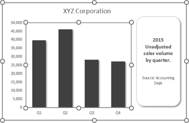
Figure 20.6 Reducing the size of the Plot Area makes room for the Shape.
In some cases, the size of the Plot Area changes automatically when you adjust other elements of your chart. For example, if you add a legend to a chart, the size of the Plot Area may be reduced to accommodate the legend.
Tip
Changing the size and position of the Plot Area can have a dramatic effect on the overall look of your chart. When you're fine-tuning a chart, you'll probably want to experiment with various sizes and positions for the Plot Area.
Working with Titles in a Chart
A chart can have several different types of titles:
· Chart title
· Category axis title
· Value axis title
· Secondary category axis title
· Secondary value axis title
· Depth axis title (for true 3-D charts)
The number of titles that you can use depends on the chart type. For example, a pie chart supports only a chart title because it has no axes.
The easiest way to add a chart title is to use the Chart Elements button (the plus sign), which appears to the right of the chart. Activate the chart, click the Chart Elements button, and enable the Chart Title item. To specify a location, move the mouse over the Chart Title item and click the arrow. You can then specify the location for the Chart Title. Click More Options to display the Format Chart Title task pane.
The same basic procedure applies to Axis Titles. You have additional options to specify which axis title(s) you want.
After you add a title, you can replace the default text and drag the title to a different position. However, you can't change the size of a title by dragging its borders. The only way to change the size of a title is to change the font size.
Tip
The chart title or any of the axis titles can also use a cell reference. For example, you can create a link so the chart always displays the text contained in cell A1 as its title. To create a link, select the title, type an equal sign (=), point to the cell, and press Enter. After you create the link, the Formula bar displays the cell reference when you select the title.
Adding Free-Floating Text to a Chart
Text in a chart is not limited to titles. In fact, you can add free-floating text anywhere you want. To do so, activate the chart and choose Insert ![]() Text
Text ![]() Text Box. Click in the chart to create the text box and enter the text. You can resize the text box, move it, change its formatting, and so on. You can also add a Shape to the chart and then add text to the Shape (if the Shape is one that accepts text). Refer to Figure 20.6 for an example of an inserted Shape with text.
Text Box. Click in the chart to create the text box and enter the text. You can resize the text box, move it, change its formatting, and so on. You can also add a Shape to the chart and then add text to the Shape (if the Shape is one that accepts text). Refer to Figure 20.6 for an example of an inserted Shape with text.
Working with a Legend
A chart's legend consists of text and keys that identify the data series in the chart. A key is a small graphic that corresponds to the chart's series (one key for each series).
To add a legend to your chart, activate the chart and click the Chart Elements icon to the right of the chart. Place a check mark next to Legend. To specify a location for the legend, click the arrow next to the Legend item and choose a location (Right, Top, Left, or Bottom). After you add a legend, you can drag it to move it anywhere you like.
Tip
If you move a legend manually, you may need to adjust the size of the chart's Plot Area.
The quickest way to remove a legend is to select it and then press Delete.
You can select individual items within a legend and format them separately. For example, you may want to make the text bold to draw attention to a particular data series. To select an element in the legend, first select the legend and then click the desired element.
If you didn't include legend text when you originally selected the cells to create the chart, Excel displays Series 1, Series 2, and so on, in the legend. To add series names, choose Chart Tools ![]() Designv
Designv ![]() Data
Data ![]() Select Data to display the Select Data Source dialog box (see Figure 20.7). Select the series name and click the Edit button. In the Edit Series dialog box, type the series name or enter a cell reference that contains the series name. Repeat for each series that needs naming.
Select Data to display the Select Data Source dialog box (see Figure 20.7). Select the series name and click the Edit button. In the Edit Series dialog box, type the series name or enter a cell reference that contains the series name. Repeat for each series that needs naming.
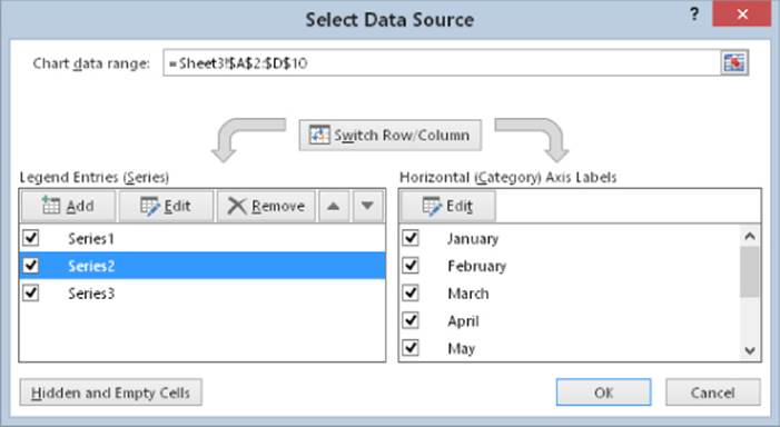
Figure 20.7 Use the Select Data Source dialog box to change the name of a data series.
In some cases, you may prefer to omit the legend and use callouts to identify the data series. Figure 20.8 shows a chart with no legend. Instead, it uses Shapes to identify each series. These Shapes are from the Callouts section of the Chart Tools ![]() Format
Format ![]() Insert Shapes gallery.
Insert Shapes gallery.
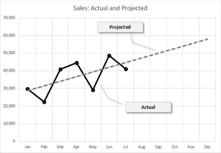
Figure 20.8 Using Shapes as callouts in lieu of a legend.
Copying Chart Formatting
You created a killer chart and spent hours customizing it. Now you need to create another one just like it, but with a different set of data. What are your options? You have several choices:
· Copy the formatting. Create your new chart with the default formatting. Then select your original chart and choose Home ![]() Clipboard
Clipboard ![]() Copy (or press Ctrl+C). Click your new chart and choose Home
Copy (or press Ctrl+C). Click your new chart and choose Home ![]() Clipboard
Clipboard ![]() Paste
Paste ![]() Paste Special. In the Paste Special dialog box, select the Formats option.
Paste Special. In the Paste Special dialog box, select the Formats option.
· Copy the chart and change the data sources. Press Ctrl while you click the original chart and drag. This creates an exact copy of your chart. Then choose Chart Tools ![]() Design
Design ![]() Data
Data ![]() Select Data. In the Select Data Source dialog box, specify the data for the new chart in the Chart Data Range field.
Select Data. In the Select Data Source dialog box, specify the data for the new chart in the Chart Data Range field.
· Create a chart template. Select your chart, right-click the Chart Area, and choose Save as Template from the shortcut menu. Excel prompts you for a name. When you create your next chart, use this template as the chart type. For more information about using chart templates, see “Creating Chart Templates,” later in this chapter.
Working with Gridlines
Gridlines can help the viewer determine what the chart series represents numerically. Gridlines simply extend the tick marks on an axis. Some charts look better with gridlines; others appear more cluttered. Sometimes horizontal gridlines alone are enough, although XY charts often benefit from both horizontal and vertical gridlines.
To add or remove gridlines, activate the chart and click the Chart Elements button to the right of the chart. Place a checkmark next to Gridlines. To specify the type of gridlines, click the arrow to the right of the Gridlines item.
Note
Each axis has two sets of gridlines: major and minor. Major units display a label. Minor units are located between the labels.
To modify the color or thickness of a set of gridlines, click one of the gridlines and use the commands from the Chart Tools ![]() Format
Format ![]() Shape Styles group. Or use the controls in the Format Major (or Format Minor) Gridlines task pane.
Shape Styles group. Or use the controls in the Format Major (or Format Minor) Gridlines task pane.
If gridlines seem too overpowering, consider changing them to a lighter color or use one of the dashed line options.
Modifying the Axes
Charts vary in the number of axes they use. Pie, doughnut, sunburst, and treemap charts have no axes. All 2-D charts have two axes but can have three (if you use a secondary value axis) or four (if you use a secondary category axis in an XY chart). True 3-D charts have three axes.
Excel gives you a great deal of control over these axes via the Format Axis task pane. The content of this task pane varies depending on the type of axis selected.
Value axis
To change a value axis, right-click it and choose Format Axis. Figure 20.9 shows one panel (Axis Options) of the Format Axis task pane, for a value axis. In this case, the Axis Options section is expanded, and the other three sections are contracted. The other icons along the top of this task pane deal with cosmetic and number formatting for the axis.
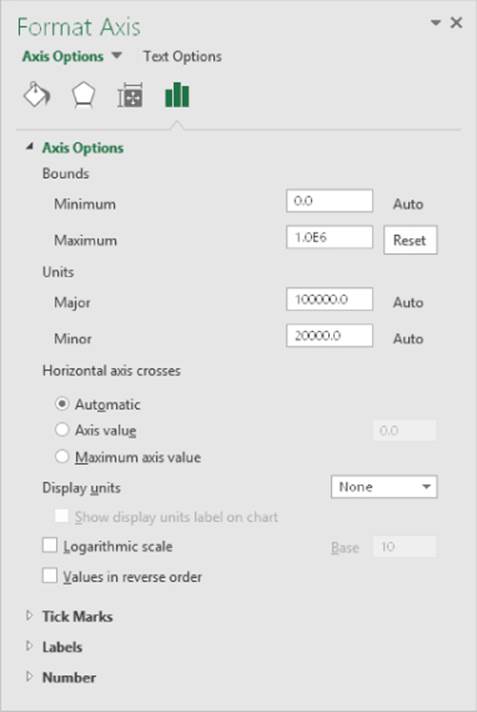
Figure 20.9 The Format Axis task pane for a value axis.
By default, Excel determines the minimum and maximum axis values automatically, based on the numerical range of the data. To override this automatic axis scaling, enter your own minimum and maximum values in the Bounds section. If you change these values, the word Auto changes to a Reset button. Click Reset to revert to automatic axis scaling.
Excel also adjusts the major and minor axis units automatically. Again, you can override Excel's choice and specify different units.
Adjusting the bounds of a value axis can dramatically affect the chart's appearance. Manipulating the scale, in some cases, can present a false picture of the data. Figure 20.10 shows two line charts that depict the same data. The chart on the left uses Excel's default (Auto) axis bounds values, which extend from 1,600 to 1,950. In the chart on the right, the Minimum bound value was set to 0, and the Maximum bound value was set to 3,000. The first chart makes the differences in the data seem more prominent. The second chart gives the impression that there isn't much change over time.
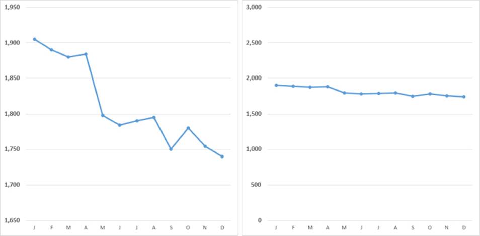
Figure 20.10 These two charts show the same data but use different value axis bounds.
The actual scale that you use depends on the situation. There are no hard-and-fast rules regarding setting scale values except that you shouldn't misrepresent data by manipulating the chart to prove a point that doesn't exist.
Tip
If you're preparing several charts that use similarly scaled data, keeping the bounds the same is a good idea so that the charts can be compared more easily.
Another option in the Format Axis task pane is Values in Reverse Order. The left chart in Figure 20.11 uses default axis settings. The right chart uses the Values in Reverse Order option, which reverses the scale's direction. Notice that the Category Axis is at the top. If you would prefer that it remain at the bottom of the chart, select the Maximum Axis Value option for the Horizontal Axis Crosses setting.
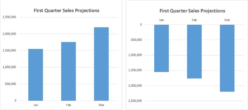
Figure 20.11 The right chart uses the Values in Reverse Order option
If the values to be plotted cover a large numerical range, you may want to use a logarithmic scale for the value axis. A log scale is most often used for scientific applications. Figure 20.12 shows two charts. The top chart uses a standard scale, and the bottom chart uses a logarithmic scale.
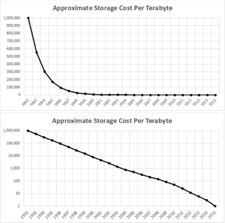
Figure 20.12 These charts display the same data, but the bottom chart uses a logarithmic scale.
Note
For a logarithmic scale, the Base setting is 10, so each scale value in the chart is ten times greater than the one below it. Increasing the major unit to 100 results in a scale in which each tick mark value is 100 times greater than the one below it. You can specify a base value between 2 and 1,000.
 This workbook, log scale.xlsx, is available on this book's website at www.wiley.com/go/excel2016bible.
If your chart uses large numbers, you may want to change the Display Units settings. Figure 20.13 shows a chart (left) that uses large numbers. The chart on the right uses the Display Units as Millions settings, with the option to Show Display Units Labels on Chart. I added “of Miles” to the label.
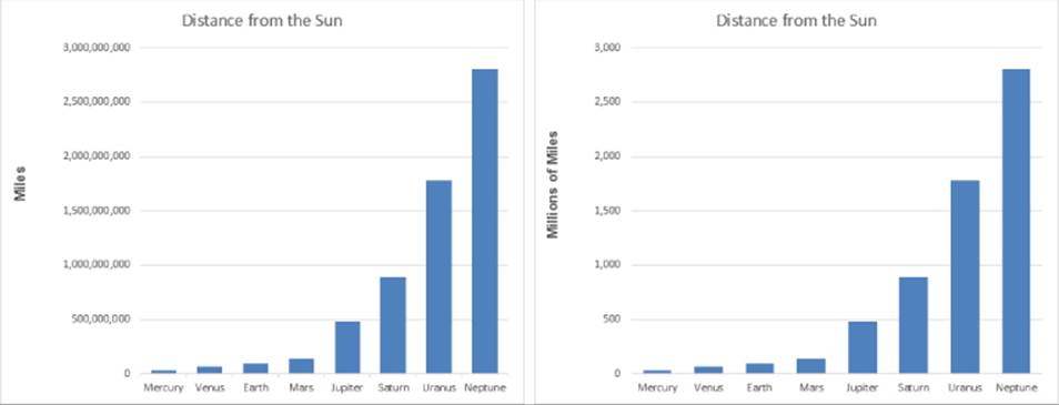
Figure 20.13 The chart on the right uses display units of millions.
To adjust the tick marks displayed on an axis, click the Tick Marks section of the Format Axis dialog box to expand that section. The Major and Minor Tick Mark options control the way the tick marks are displayed. Major tick marks are the axis tick marks that normally have labels next to them. Minor tick marks fall between the major tick marks.
If you expand the Labels section, you can position the axis labels at three different locations: Next to Axis, High, and Low. Refer to Figure 20.14. Each axis extends from –10 to +10. When you combine these settings with the Axis Crosses At option, you have a great deal of flexibility.
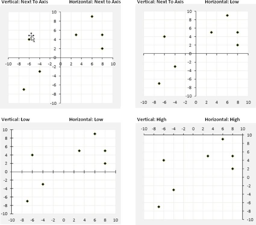
Figure 20.14 Various ways to display axis labels and crossing points.
The final section of the task pane, Number, lets you specify the number formatting for the value axis. Normally, the number formatting is linked to the source data, but you can override that.
Category axis
Figure 20.15 shows part of the Axis Options section of the Format Axis task pane when a category axis is selected. Some options are the same as those for a value axis.
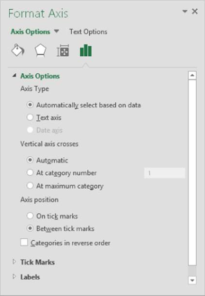
Figure 20.15 Some of the options available for a category axis.
An important setting is the Axis Type: Text or Date. When you create a chart, Excel recognizes whether your category axis contains date or time values. If it does, it uses a Date category axis. Figure 20.16 shows a simple example. Column A contains dates, and column B contains the values plotted in the column chart. The data consists of values for only 10 dates, yet Excel created the chart with 30 intervals on the category axis. It recognized that the category axis values were dates and created an equal-interval scale.
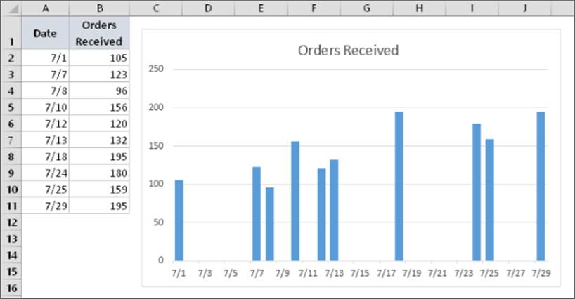
Figure 20.16 Excel recognizes dates and creates a time-based category axis.
You can override Excel's decision to use a Date category axis by choosing the Text Axis option for Axis Type. Figure 20.17 shows the chart after making this change. In this case, using a time-based category axis (as shown in Figure 20.16) presents a much truer picture of the data.
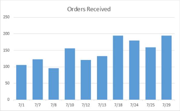
Figure 20.17 Overriding the Excel time-based category axis.
Excel chooses the way to orient the category labels, but you can override its choice. Figure 20.18 shows a column chart with month labels. Because of the lengthy category labels, Excel displays the text at an angle. If you make the chart wider, the labels will then appear horizontally. You can also adjust the labels using the Alignment controls in the Size & Properties section of the Format Axis task pane.
Figure 20.18 Excel determines the way to display category axis labels.
In some cases, you really don't need every category label. You can adjust the interval between Labels settings to skip some labels (and cause the text to display horizontally). Figure 20.19 shows such a chart; the interval between the Labels setting is 3.
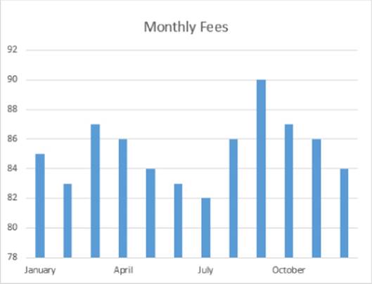
Figure 20.19 Changing the interval between the Labels setting makes labels display horizontally.
Keep in mind that category axis labels can consist of more than one column. Figure 20.20 shows a chart that displays three columns of text for the category axis. I selected the range A1:E10 and created a column chart, and Excel figured out the category axis.
Figure 20.20 This chart uses three columns of text for the category axis labels.
Don't Be Afraid to Experiment (But on a Copy)
I'll let you in on a secret: the key to mastering charts in Excel is experimentation, otherwise known as trial and error. Excel's charting options can be overwhelming, even to experienced users. This book doesn't even pretend to cover all the charting features and options. Your job, as a potential charting master, is to dig deep and try out the various options in your charts. With a bit of creativity, you can create original-looking charts.
After you create a basic chart, make a copy of the chart for your experimentation. That way, if you mess it up, you can always revert to the original and start again. To make a copy of an embedded chart, click the chart and press Ctrl+C. Then activate a cell and press Ctrl+V. To make a copy of a chart sheet, press Ctrl while you click the sheet tab and then drag it to a new location among the other tabs.
Working with Data Series
Every chart consists of one or more data series. This data translates into chart columns, bars, lines, pie slices, and so on. This section discusses some common operations that involve a chart's data series.
When you select a data series in a chart, Excel does the following:
· Displays the series name in the Chart Elements control (located in the Chart Tools ![]() Format
Format ![]() Current Selection group
Current Selection group
· Displays the Series formula in the Formula bar
· Highlights the cells used for the selected series by outlining them in color
You can make changes to a data series by using options on the Ribbon or from the Format Data Series task pane. This task pane varies, depending on the type of data series you're working on (column, line, pie, and so on).
Caution
If the Format task pane isn't already displayed, the easiest way to display the Format Data Series task pane is to double-click the chart series. Be careful, however: If a data series is already selected, double-clicking brings up the Format Data Point task pane. Changes that you make affect only one point in the data series. To edit the entire series, make sure that a chart element other than the data series is selected before you double-click the data series. Or just press Ctrl+1 to display the task pane.
Deleting or hiding a data series
To delete a data series in a chart, select the data series and press Delete. The data series disappears from the chart. The data in the worksheet, of course, remains intact.
Note
You can delete all data series from a chart. If you do so, the chart appears empty. It retains its settings, however. Therefore, you can add a data series to an empty chart, and it again looks like a chart.
To temporarily hide a data series, activate a chart and click the Chart Filters button on the right. Remove the check mark from the data series that you want to hide, click Apply, and that data series is hidden — but it's still associated with the chart, so you can unhide it later. You can't hide all the series, though. At least one must be visible. The Chart Filters button also lets you hide individual points in a series. Note that the six new chart types introduced in Excel 2016 do not display a Chart Filters button.
Adding a new data series to a chart
If you want to add another data series to an existing chart, one approach is to re-create the chart and include the new data series. However, adding the data to the existing chart is usually easier, and your chart retains any customization that you've made.
Figure 20.21 shows a column chart that has one data series (Pre-Test). The Post-Test scores just became available and were entered into the worksheet in column C. Now the chart needs to be updated to include the new data series.
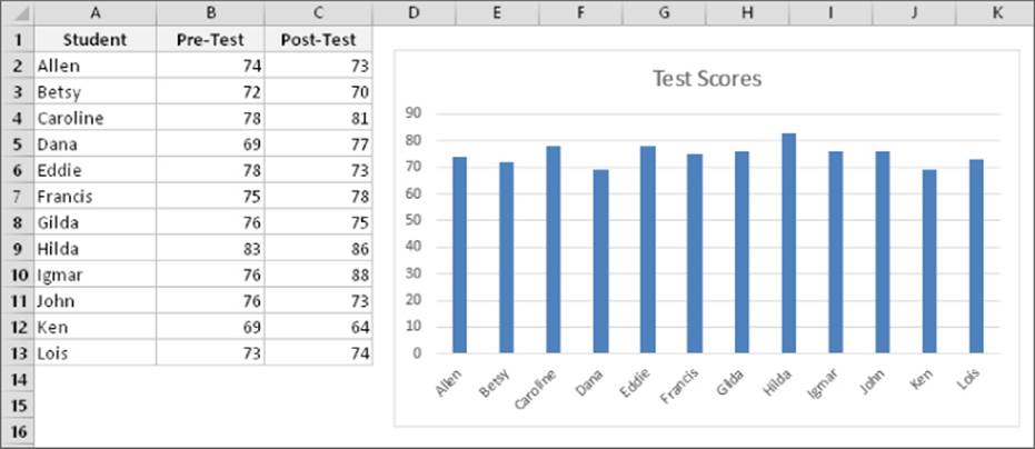
Figure 20.21 This chart needs a new data series.
Excel provides three ways to add a new data series to a chart:
· Use the Select Data Source dialog box. Activate the chart and choose Chart Tools ![]() Design
Design ![]() Data
Data ![]() Select Data. In the Select Data Source dialog box, click the Add button, and Excel displays the Edit Series dialog box. Specify the Series Name (as a cell reference or text) and the range that contains the Series Values. The Select Data Source dialog box is also accessible from the shortcut menu displayed by right-clicking many elements in a chart.
Select Data. In the Select Data Source dialog box, click the Add button, and Excel displays the Edit Series dialog box. Specify the Series Name (as a cell reference or text) and the range that contains the Series Values. The Select Data Source dialog box is also accessible from the shortcut menu displayed by right-clicking many elements in a chart.
· Drag the range outline. If the data series to be added is contiguous with other data in the chart, you can click the Chart Area in the chart. Excel highlights and outlines the data in the worksheet. Click one of the corners of the outline and drag to highlight the new data. This method works only for embedded charts.
· Copy and paste. Select the range to add and press Ctrl+C to copy it to the Clipboard. Then activate the chart and press Ctrl+V to paste the data into the chart.
Tip
If the chart was originally made from data in a table (created via Insert ![]() Tables
Tables ![]() Table), the chart is updated automatically when you add new rows or columns to the table (or remove rows or columns). If you have a chart that is updated frequently with new data, you can save time and effort by creating the chart from data in a table.
Table), the chart is updated automatically when you add new rows or columns to the table (or remove rows or columns). If you have a chart that is updated frequently with new data, you can save time and effort by creating the chart from data in a table.
Changing data used by a series
You may find that you need to modify the range that defines a data series. For example, say you need to add new data points or remove old ones from the data set. The following sections describe several ways to change the range used by a data series.
Changing the data range by dragging the range outline
If you have an embedded chart, the easiest way to change the data range for a data series is to drag the range outline. When you select a series in a chart, Excel outlines the data range used by that series. You can drag the small dot in the lower-right corner of the range outline to extend or contract the data series. In Figure 20.22, the range outline will be dragged to include two additional data points.
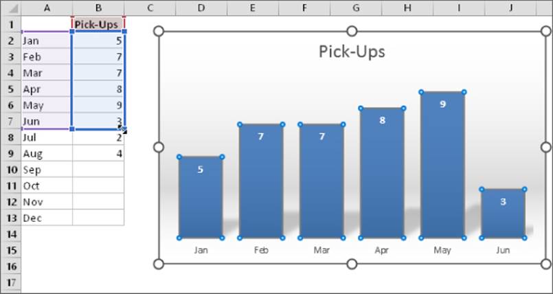
Figure 20.22 Changing a chart's data series by dragging the range outline.
You can also click and drag one of the sides of the outline to move the outline to a different range of cells.
In some cases, you'll also need to adjust the range that contains the category labels. The labels are also outlined, and you can drag the outline to expand or contract the range of labels used in the chart.
If your chart is on a chart sheet, you need to use one of the two methods described next. These methods also work with embedded charts.
Using the Edit Series dialog box
Another way to update the chart to reflect a different data range is to use the Edit Series dialog box. A quick way to display this dialog box is to right-click the series in the chart and then choose Select Data from the shortcut menu. The Select Source Data dialog box appears. Select the data series in the list, and click Edit to display the Edit Series dialog box, shown in Figure 20.23.
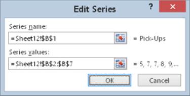
Figure 20.23 The Edit Series dialog box.
You can change the entire data range used by the chart by adjusting the range references in the Chart Data Range field. Or select a series from the list and click Edit to modify the selected series.
Editing the Series formula
Every data series in a chart has an associated SERIES formula, which appears in the Formula bar when you select a data series in a chart. If you understand the way a SERIES formula is constructed, you can edit the range references in the SERIES formula directly to change the data used by the chart. Note that the six new chart types introduced in Excel 2016 do not display a SERIES formula when a data series is selected.
Note
The SERIES formula is not a real formula. In other words, you can't use it in a cell, and you can't use worksheet functions within the SERIES formula. You can, however, edit the arguments in the SERIES formula.
A SERIES formula has the following syntax:
=SERIES(series_name, category_labels, values, order, sizes)
The arguments that you can use in the SERIES formula include
· series_name: (Optional) A reference to the cell that contains the series name used in the legend. If the chart has only one series, the name argument is used as the title. This argument can also consist of text in quotation marks. If omitted, Excel creates a default series name (for example, Series 1).
· category_labels: (Optional) A reference to the range that contains the labels for the category axis. If omitted, Excel uses consecutive integers beginning with 1. For XY charts, this argument specifies the X values. A noncontiguous range reference is also valid. The ranges' addresses are separated by commas and enclosed in parentheses. The argument could also consist of an array of comma-separated values (or text in quotation marks) enclosed in curly brackets.
· values: (Required) A reference to the range that contains the values for the series. For XY charts, this argument specifies the Y values. A noncontiguous range reference is also valid. The range addresses are separated by a comma and enclosed in parentheses. The argument could also consist of an array of comma-separated values enclosed in curly brackets.
· order: (Required) An integer that specifies the plotting order of the series. This argument is relevant only if the chart has more than one series. Using a reference to a cell is not allowed.
· sizes: (Only for bubble charts) A reference to the range that contains the values for the size of the bubbles in a bubble chart. A noncontiguous range reference is also valid. The range addresses are separated by commas and enclosed in parentheses. The argument can also consist of an array of values enclosed in curly brackets.
Range references in a SERIES formula are always absolute (contain two dollar signs), and they always include the sheet name. For example
=SERIES(Sheet1!$B$1,,Sheet1!$B$2:$B$7,1)
Tip
You can substitute range names for the range references. If you do so, Excel changes the reference in the SERIES formula to include the workbook name (if it's a workbook-level name) or to include the worksheet name (if it's a sheet-level name). For example, if you use a workbook-level range named MyData (in a workbook named budget.xlsx), the SERIES formula looks like this:
=SERIES(Sheet1!$B$1,,budget.xlsx!MyData,1)
For more information about named ranges, see Chapter 4, “Working with Cells and Ranges.”
Displaying data labels in a chart
Sometimes, you may want your chart to display the actual numerical value for each data point. To add labels to data series in a chart, select the series and click the Add Elements button on the right side of the chart. Place a check mark next to Data Labels. Click the arrow next to the Data Labels item to specify the position for the labels.
To add data labels for all series, use the same procedure, but start by selecting something other than a data series.
Figure 20.24 shows three minimalist charts with data labels.
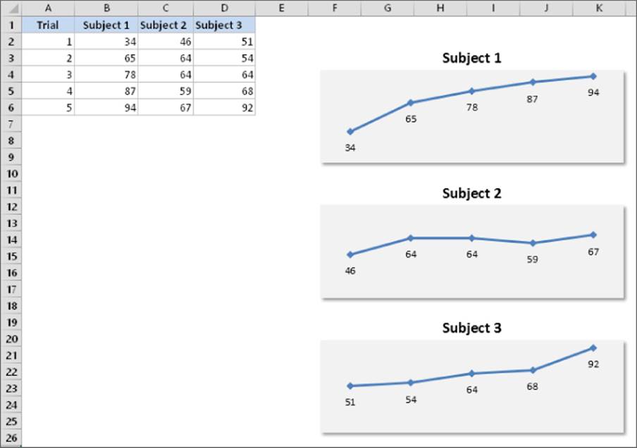
Figure 20.24 These charts use data labels and don't display axes.
To change the type of information that appears in data labels, select the data labels for a series and use the Format Data Labels task pane. (If the task pane isn't visible, press Ctrl+1.) Then use the Label Options section to customize the data labels. For example, you can include the series name and the category name along with the value.
The data labels are linked to the worksheet, so if your data changes, the labels also change. If you want to override the data label with other text, select the label and enter the new text.
In some situations, you may need to use other data labels for a series. In the Format Data Labels task pane, select Value from Cells (in the Label Options section) and click Select Range to specify the range that contains the data point labels.
Figure 20.25 shows an XY chart that uses data labels stored in a range. In versions prior to Excel 2013, adding these data labels had to be done manually or with the assistance of a macro. Because it's a new feature (introduced in Excel 2013), data labels applied using this method will not be displayed in Excel 2007 or earlier.
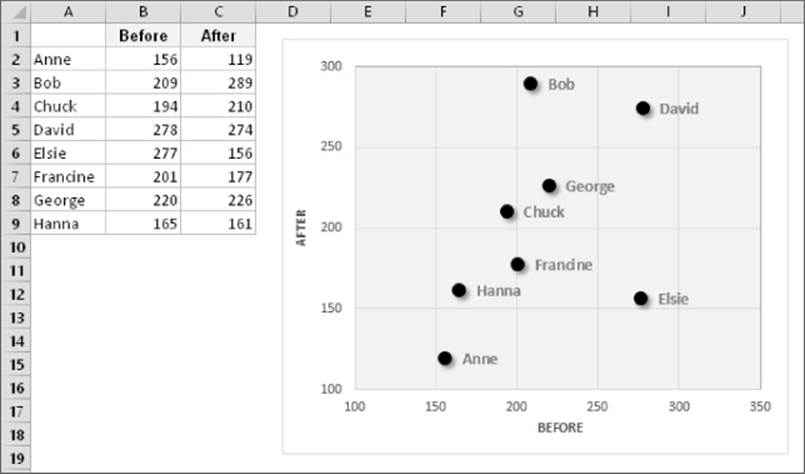
Figure 20.25 Data labels linked to text in an arbitrary range.
Tip
Often, the data labels aren't positioned properly. For example, a label may be obscured by another data point or another label. If you select an individual data label, you can drag the label to a better location. To select an individual data label, click once to select them all and then click the single data label.
Handling missing data
Sometimes, data that you're charting may be missing one or more data points. As shown in Figure 20.26, Excel offers three ways to handle the missing data:
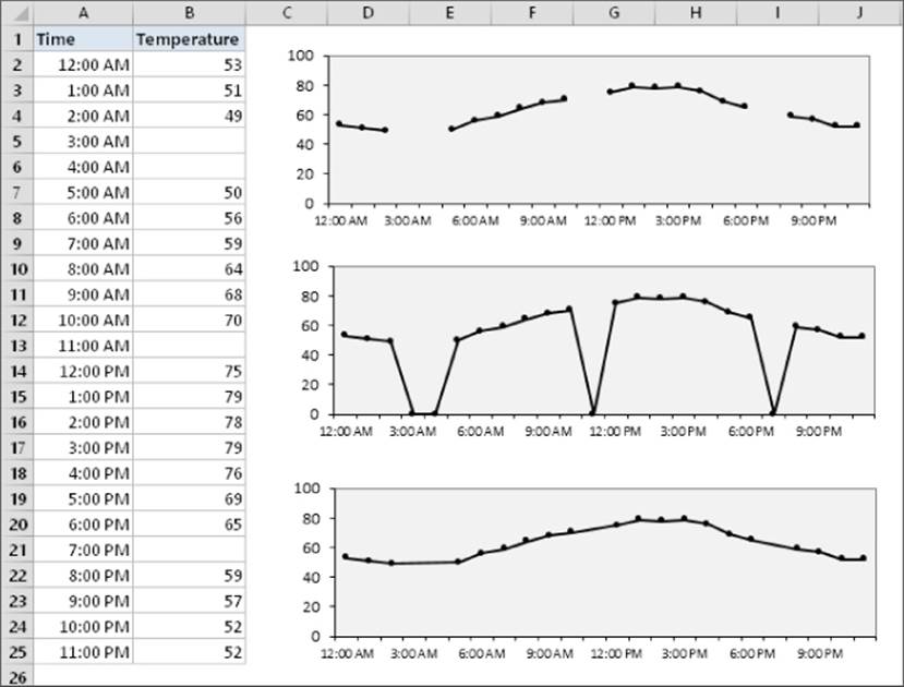
Figure 20.26 Three options for dealing with missing data.
· Gaps: Missing data is simply ignored, and the data series will have a gap. This is the default.
· Zero: Missing data is treated as zero.
· Connect Data Points with Line: Missing data is interpolated, calculated by using data on either side of the missing point(s). This option is available for line charts, area charts, and XY charts only.
To specify how to deal with missing data for a chart, choose Chart Tools ![]() Design
Design ![]() Data
Data ![]() Select Data. In the Select Data Source dialog box, click the Hidden and Empty Cells button. Excel displays its Hidden and Empty Cell Settings dialog box. Make your choice in the dialog box. The option that you choose applies to the entire chart, and you can't set a different option for different series in the same chart.
Select Data. In the Select Data Source dialog box, click the Hidden and Empty Cells button. Excel displays its Hidden and Empty Cell Settings dialog box. Make your choice in the dialog box. The option that you choose applies to the entire chart, and you can't set a different option for different series in the same chart.
Tip
Normally, a chart doesn't display data that's in a hidden row or column. You can use the Hidden and Empty Cell Settings dialog box to force a chart to use hidden data, though.
Adding error bars
Some chart types support error bars. Error bars often are used to indicate “plus or minus” information that reflects uncertainty in the data. Error bars are appropriate for area, bar, column, line, and XY charts only.
To add error bars, select a data series and then click the Add Elements icon to the right of the chart. Add a check mark next to Error Bars. Click the arrow next to the Error Bars item to specify the type of error bars. If necessary, you can fine-tune the error bar settings from the Format Error Bars task pane. The types of error bars are
· Fixed value: The error bars are fixed by an amount that you specify.
· Percentage: The error bars are a percentage of each value.
· Standard deviation(s): The error bars are in the number of standard deviation units that you specify. (Excel calculates the standard deviation of the data series.)
· Standard error: The error bars are one standard error unit. (Excel calculates the standard error of the data series.)
· Custom: You set the error bar units for the upper or lower error bars. You can enter either a value or a range reference that holds the error values that you want to plot as error bars.
The chart shown in Figure 20.27 displays error bars based on percentage.
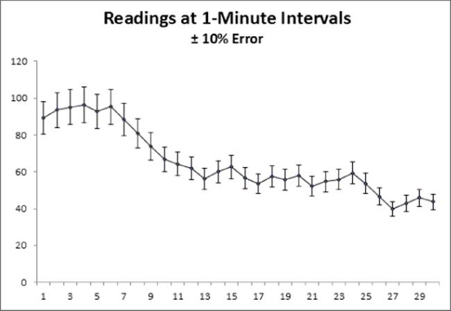
Figure 20.27 This line chart series displays error bars based on percentage.
Tip
A data series in an XY chart can have error bars for both the X values and the Y values.
A workbook with several other error bar examples is available on this book's website at www.wiley.com/go/excel2016bible. The filename is error bars examples.xlsx.
Adding a trendline
When you're plotting data over time, you may want to display a trendline that describes the data. A trendline points out general trends in your data. In some cases, you can forecast future data with trendlines.
To add a trendline, select the data series and click the Add Elements button to the right of the chart. Place a check mark next to Trendline. To specify the type of trendline, click the arrow to the right of the Trendline item. The type of trendline that you choose depends on your data. Linear trends are most common, but some data can be described more effectively with another type.
Figure 20.28 shows a line chart with two linear trendlines. Although the raw data is quite variable, the trendlines show that income is increasing and expenses are decreasing (but at a slower rate).
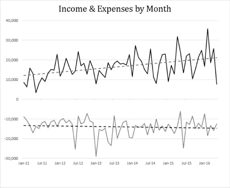
Figure 20.28 A line chart with two linear trendlines.
For more control over a trendline, use the Format Trendline task pane.
Figure 20.29 shows another trendline example, in an XY chart. The trendline depicts the relationship between height and weight for 15 people.
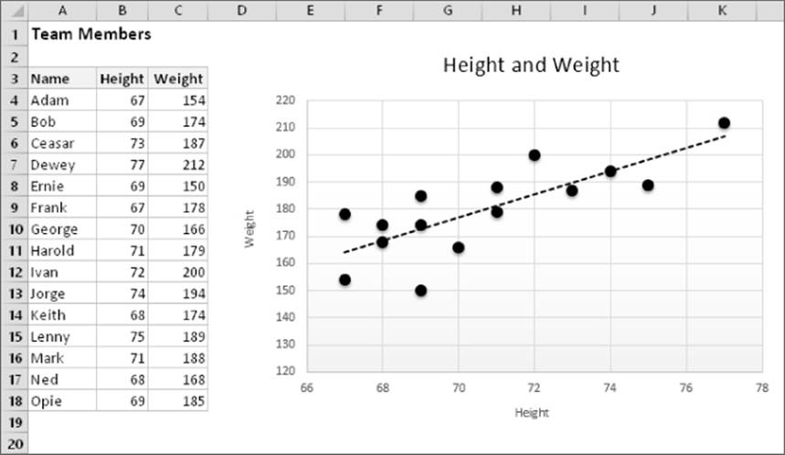
Figure 20.29 The trendline depicts the relationship between height and weight.
Modifying 3-D charts
3-D charts have a few additional elements that you can customize. For example, most 3-D charts have a floor and walls, and true 3-D charts also have an additional category axis. You can select these chart elements and format them to your liking using the Format task pane.
One area in which Excel 3-D charts differ from 2-D charts is in the perspective — or viewpoint — from which you see the chart. In some cases, the data may be viewed better if you change the order of the series.
Figure 20.30 shows six views of a 3-D column chart with two data series. The top-left chart is the original, and the others are variations. In some of the charts, I changed the series order to make the columns more visible. As you can see, you can accidentally distort the chart to make it virtually worthless in terms of visualizing information. If accuracy of presentation is important, a 3-D chart is hardly ever the best choice.
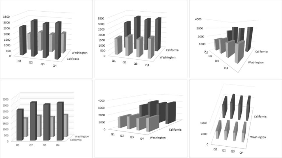
Figure 20.30 Variations on a simple 3-D column chart.
Changing the viewing angle of a 3-D chart may reveal portions of the chart that are otherwise hidden. To rotate a 3-D chart, use the Format Chart Area task pane. Then choose Chart Options ![]() Effects and expand the 3-D Rotation section. You can make your rotations and perspective changes by clicking the appropriate controls.
Effects and expand the 3-D Rotation section. You can make your rotations and perspective changes by clicking the appropriate controls.
Creating combination charts
A combination chart is a single chart that consists of series that use different chart types. A combination chart may also include a second value axis. For example, you may have a chart that shows both columns and lines, with two value axes. The value axis for the columns is on the left, and the value axis for the line is on the right. A combination chart requires at least two data series.
Figure 20.31 shows a column chart with two data series. The values for the Precipitation series are so low that they're barely visible on the Value Axis scale. This is a good candidate for a combination chart.
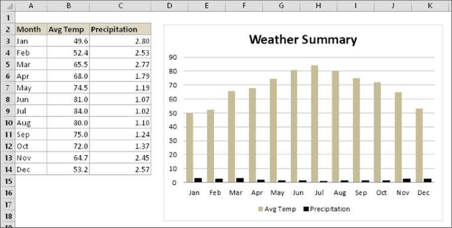
Figure 20.31 The Precipitation series is barely visible.
The following steps describe how to convert this chart into a combination chart (column and line) that uses a second Value Axis:
1. Activate the chart and choose Chart Tools ![]() Design
Design ![]() Type
Type ![]() Change Chart type. The Change Chart Type dialog box appears.
Change Chart type. The Change Chart Type dialog box appears.
2. Select the All Charts tab.
3. In the list of chart types, click Combo.
4. For the Avg Temp series, specify Clustered Column as the chart type.
5. For the Precipitation series, specify Line as the chart type, and click the Secondary Axis check box.
6. Click OK to insert the chart.
Figure 20.32 shows the Change Chart dialog box after specifying the parameters for each series.
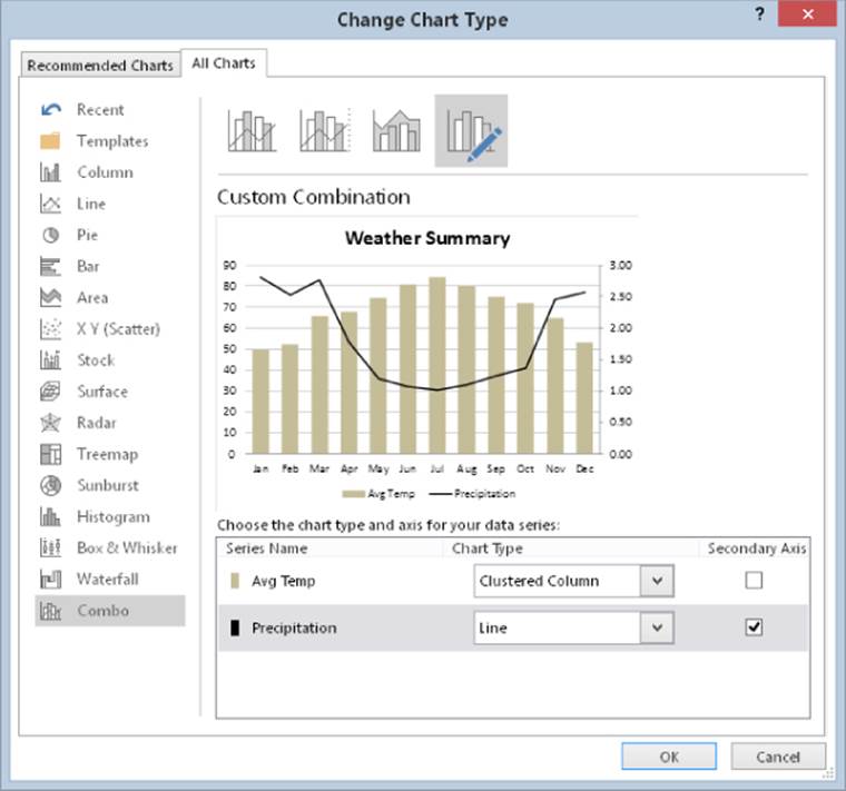
Figure 20.32 Using the Change Chart dialog box to convert a chart into a combination chart.
This workbook is available on this book's website at www.wiley.com/go/excel2016bible. The filename is weather combination chart.xlsx.
Note
In some cases, you can't combine chart types. For example, you can't create a combination chart that involves a bubble chart or a 3-D chart. In the Change Chart dialog box, Excel displays only the chart types that can be used.
Figure 20.33 demonstrates just how far you can go with a combination chart. This chart combines five different chart types: Pie, Area, Column, Line, and XY. I can't think of any situation that would warrant such a chart, but it's an interesting demo.
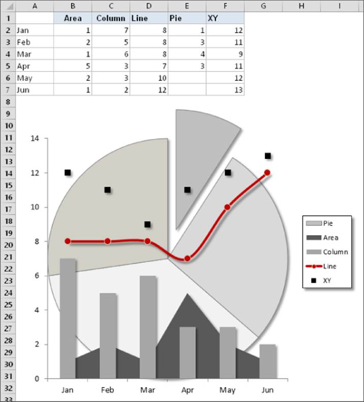
Figure 20.33 A five-way combination chart.
This workbook is available on this book's website at www.wiley.com/go/excel2016bible. The filename is five-way combination chart.xlsx.
Displaying a data table
In some cases, you may want to display a data table, which displays the chart's data in tabular form, directly in the chart.
To add a data table to a chart, activate the chart and click the Add Element button to the right of the chart. Place a check mark next to Data Table. Click the arrow to the right of the Data Table item for a few options. Figure 20.34 shows a combination chart that includes a data table.
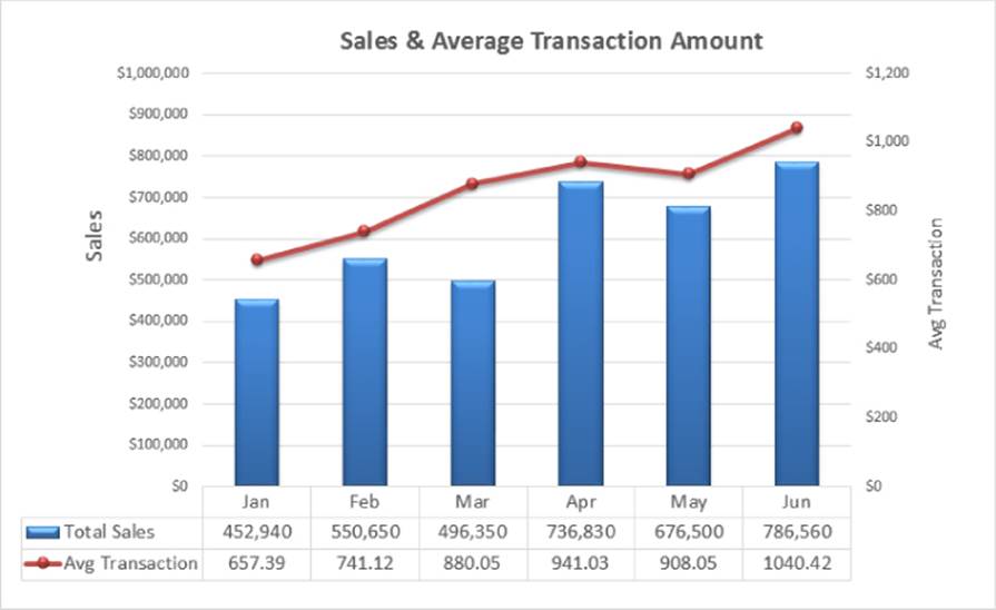
Figure 20.34 This combination chart includes a data table that displays the values of the data points.
Not all chart types support data tables. If the Data Table option isn't available, that means the chart doesn't support this feature.
Tip
Using a data table is probably best suited for charts on chart sheets. If you need to show the data used in an embedded chart, you can do so using data in cells, which gives you more formatting flexibility.
Creating Chart Templates
This section describes how to create custom chart templates. A template includes customized chart formatting and settings. When you create a new chart, you can choose to use your template rather than a built-in chart type.
If you find that you're continually customizing your charts in the same way, you can probably save some time by creating a template. Or if you create lots of combination charts, you can create a combination chart template and avoid making the manual adjustments required for a combination chart.
To create a chart template, follow these steps:
1. Create a chart to serve as the basis for your template. The data you use for this chart isn't critical, but for best results, it should be typical of the data that you'll eventually be plotting with your custom chart type.
2. Apply any formatting and customizations that you like. This step determines the appearance of the charts created from the template.
3. Activate the chart, right-click the Chart Area or the Plot Area, and choose Save as Template from the shortcut menu. The Save Chart Template dialog box appears.
4. Provide a name for the template and click Save. Make sure you don't change the proposed directory for the file.
To create a chart based on a template, follow these steps:
1. Select the data to be used in the chart.
2. Choose Insert ![]() Charts
Charts ![]() Recommended Charts. The Insert Chart dialog box appears.
Recommended Charts. The Insert Chart dialog box appears.
3. Select the All Charts tab.
4. From the left side of the Insert Chart dialog box, select Templates. Excel displays a thumbnail for each custom template that has been created.
5. Click the thumbnail that represents the template you want to use, and then click OK. Excel creates the chart based on the template you selected.
Note
You can also apply a template to an existing chart. Select the chart and choose Chart Tools ![]() Design
Design ![]() Type
Type ![]() Change Chart Type to display the Change Chart Type dialog box, which is identical to the Insert Chart dialog box.
Change Chart Type to display the Change Chart Type dialog box, which is identical to the Insert Chart dialog box.
Learning Some Chart-Making Tricks
This section describes some interesting (and perhaps useful) chart-making tricks. Some of these tricks use little-known features, and several tricks enable you to make charts that you may have considered impossible to create.
Creating picture charts
Excel makes it easy to incorporate a pattern, texture, or graphics file for elements in your chart.
Figure 20.35 shows a chart that uses a photo as the background for a chart's Chart Area element.

Figure 20.35 The Chart Area contains a photo.
To display an image in a chart element, use the Fill section in the element's Format task pane. Select the Picture or Texture Fill option and then click the button that corresponds to the image source (File, Clipboard, or Online). If you use the Clipboard button, make sure that you copied your image first. The other two options prompt you for the image.
Figure 20.36 shows two more examples: a pie chart that uses a clip art image as its fill; and a column chart that uses a Shape, which was inserted on a worksheet and then copied to the Clipboard.
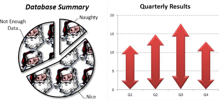
Figure 20.36 The left chart uses clip art, and the right chart uses a Shape that was copied to the Clipboard and pasted to the chart's data series.
The examples in this section are available on this book's website at www.wiley.com/go/excel2016bible. The filename is picture charts.xlsx.
Using images in a chart offers unlimited potential for creativity. The key, of course, is to resist the temptation to go overboard. Usually, a chart's primary goal is to convey information, not to impress the viewer with your artistic skills.
Caution
Using images, especially photos, in charts can dramatically increase the size of your workbooks.
Creating a thermometer chart
You're probably familiar with a “thermometer” type display that shows the percentage of a task that has been completed. Creating such a display in Excel is easy. The trick involves creating a chart that uses a single cell (which holds a percentage value) as a data series.
Figure 20.37 shows a worksheet set up to track daily progress toward a goal: 1,000 new customers in a 15-day period. Cell B18 contains the goal value, and cell B19 contains a simple formula that calculates the sum. Cell B21 contains a formula that calculates the percent of goal:
=B19/B18
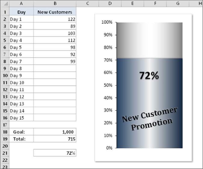
Figure 20.37 This single-point chart displays progress toward a goal.
As you enter new data in column B, the formulas display the current results.
A workbook with this example is available on this book's website at www.wiley.com/go/excel2016bible. The filename is thermometer chart.xlsx.
To make the thermometer chart, select cell B21 and create a column chart from that single cell. Notice the blank cell above cell B21. Without this blank cell, Excel uses the entire data block for the chart, not just the single cell. Because B21 is isolated from the other data, only the single cell is used.
Other changes required are to
· Select the horizontal category axis and press Delete to remove the category axis from the chart.
· Remove the legend.
· Add a text box linked to cell B21 to display the percent accomplished.
· In the Format Data Series task pane (Series Options section), set the Gap width to 0, which makes the column occupy the entire width of the plot area.
· Select the Value Axis and display the Format Value Axis task pane. In the Axis Options section, set the Minimum to 0 and the Maximum to 1.
Make any other cosmetic adjustments to get the look you desire.
Creating a gauge chart
Figure 20.38 shows another chart based on a single cell. It's a pie chart set up to resemble a gauge. Although this chart displays only one value (entered in cell B1), it actually uses three data points (in A4:A6).
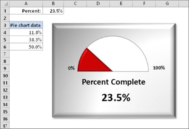
Figure 20.38 This chart resembles a speedometer gauge and displays a value between 0 and 100 percent.
A workbook with this example is available on this book's website at www.wiley.com/go/excel2016bible. The filename is gauge chart.xlsx.
One slice of the pie — the slice at the bottom — always consists of 50 percent. I rotated the pie so that the 50 percent slice was at the bottom. Then I hid that slice by specifying No Fill and No Border for the data point.
The other two slices are apportioned based on the value in cell B1. The formula in cell A4 is
=MIN(B1,100%)/2
This formula uses the MIN function to display the smaller of two values: either the value in cell B1 or 100 percent. It then divides this value by 2 because only the top half of the pie is relevant. Using the MIN function prevents the chart from displaying more than 100 percent.
The formula in cell A5 simply calculates the remaining part of the pie — the part to the right of the gauge's “needle.”
=50%-A4
The chart's title was moved below the half-pie. The chart also contains a text box, linked to cell B1, that displays the percent completed.
Creating a comparative histogram
With a bit of creativity, you can create charts that you may have considered impossible. For example, Figure 20.39 shows a chart sometimes referred to as a comparative histogram. Such charts often display population data and are sometimes known as population pyramids.
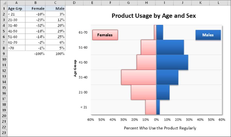
Figure 20.39 A comparative histogram.
A workbook with this example is available on this book's website at www.wiley.com/go/excel2016bible. The filename is comparative histogram.xlsx.
Here's how to create the chart:
1. Enter the data in A1:C8, as shown in Figure 20.39. Notice that the values for females are entered as negative values, which is important.
2. Select A1:C8 and create a bar chart. Use the subtype labeled Clustered Bar.
3. Select the horizontal axis and display the Format Axis task pane.
4. Expand the Number section and specify the 0%;0%;0% custom number format in the Format Code box. This custom number format eliminates the negative signs in the percentages.
5. Select the vertical axis and display the Format Axis task pane.
6. In the Axis Options section, set all tick marks to None and set the Axis Labels option to Low. This setting keeps the vertical axis in the center of the chart but displays the axis labels at the left side.
7. Select either data series and display the Format Data Series task pane.
8. In the Series Options section, set the Series Overlap to 100% and the Gap Width to 0%.
9. Delete the legend and add two text boxes to the chart (Females and Males) to substitute for the legend.
10.Apply other formatting and labels as desired.
Creating a Gantt chart
A Gantt chart is a horizontal bar chart often used in project management applications. Although Excel doesn't support Gantt charts per se, creating a simple Gantt chart is possible. The key is getting your data set up properly.
Figure 20.40 shows a Gantt chart that depicts the schedule for a project, which is in the range A2:C13. The horizontal axis represents the total time span of the project, and each bar represents a project task. The viewer can quickly see the duration for each task and identify overlapping tasks.
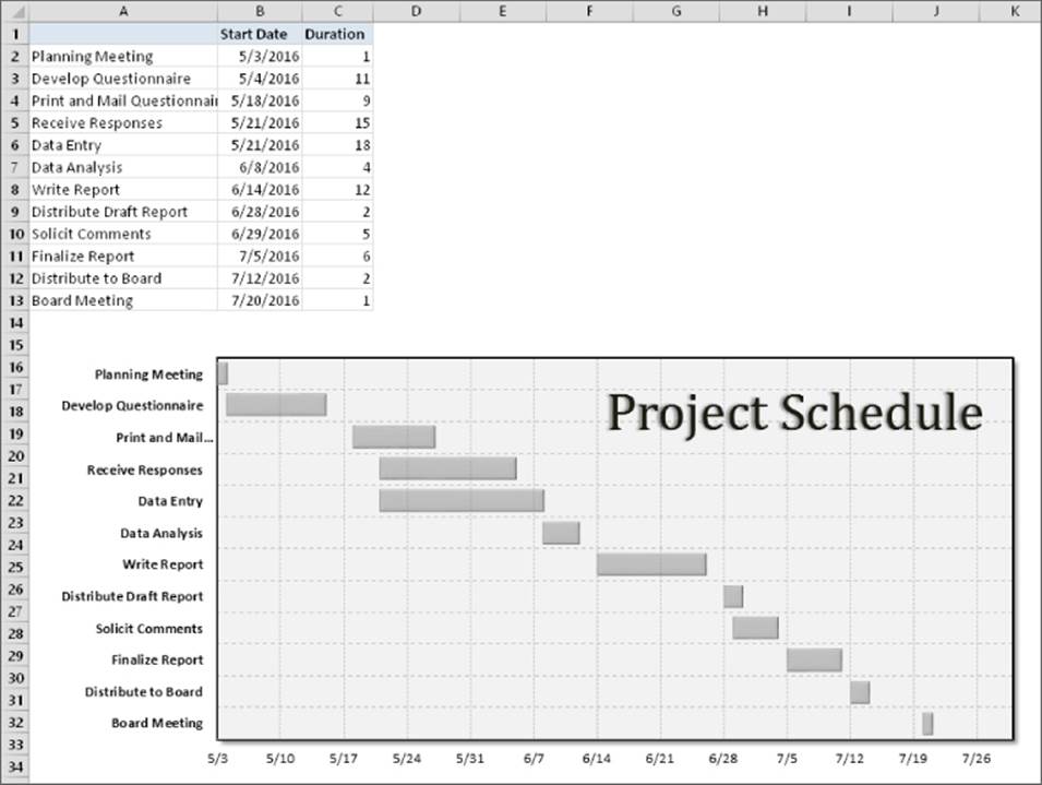
Figure 20.40 You can create a simple Gantt chart from a bar chart.
A workbook with this example is available on this book's website at www.wiley.com/go/excel2016bible. The filename is gantt chart.xlsx.
Column A contains the task name, column B contains the corresponding start date, and column C contains the duration of the task, in days. Note that column A does not have a column header. That's important. If cell A1 contains text, Excel will use columns A and B for the category axis labels.
Follow these steps to create this chart:
1. Select the range A1:C13, and create a stacked bar chart.
2. Delete the legend.
3. Select the category (vertical) axis and display the Format Axis task pane.
4. In the Axis Options section, specify Categories in Reverse Order to display the tasks in order, starting at the top; choose Horizontal Axis Crosses at Maximum Category to display the dates at the bottom.
5. Select the Start Date data series and display the Format Data Series task pane.
6. In the Series Options section, set the Series Overlap to 100%; in the Fill section, specify No Fill; in the Border section, specify No Line. These steps effectively hide the data series.
7. Select the value (horizontal) axis and display the Format Axis task pane.
8. In the Axis Options section, adjust the Minimum and Maximum settings to accommodate the dates that you want to display on the axis. When you enter a date value, Excel converts it to a date serial number. In the example, the Minimum is 5/3/2016 and the Maximum is 7/30/2016.
9. Apply other formatting as desired.
A Chart on a Map?
Excel 2016 includes a 3-D mapping add-in that allows you to display data on a map. The example here shows the population for the largest cities in the United States. The 3D map is highly interactive and is even capable of saving animated videos that depict your data from different perspectives and zoom levels.
3D mapping is a powerful tool — it's also so complex that it's well beyond the scope of this book. In fact, it deserves an entire book. If 3D Map is a feature that interests you, I urge you to explore it, experiment with it, and seek out more information on the Web.
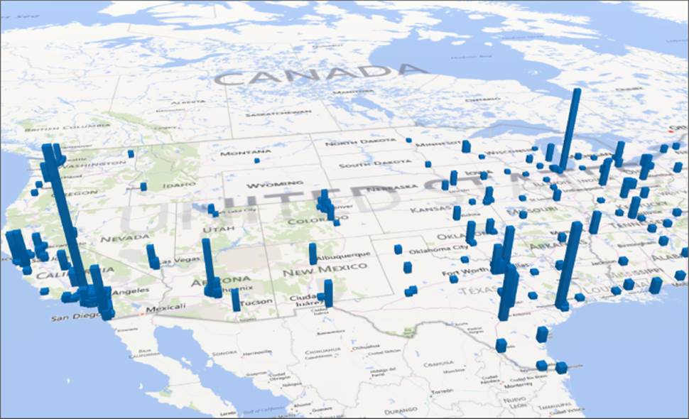
The simple example shown here is available at this book's website at www.wiley.com/go/excel2016bible. The file is named us cities in 3d map.xlsx. When you open the file, choose Insert ![]() Tours
Tours ![]() 3D Map
3D Map ![]() Open 3D Maps. Then click in Tour 1 and start exploring.
Open 3D Maps. Then click in Tour 1 and start exploring.
Plotting mathematical functions with one variable
An XY chart is useful for plotting various mathematical and trigonometric functions. For example, Figure 20.41 shows a plot of the SIN function. The chart plots y for values of x (expressed in radians) from –5 to +5 in increments of 0.5. Each pair of x and y values appears as a data point in the chart, and the points connect with a line.
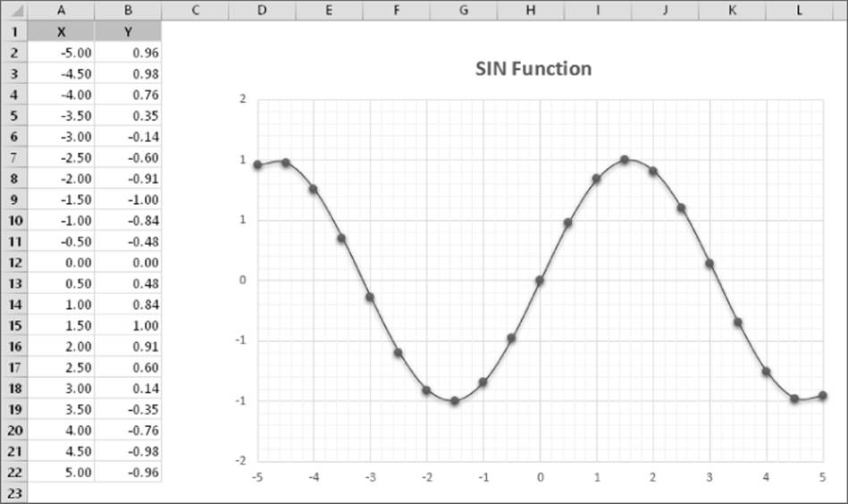
Figure 20.41 This chart plots the SIN(x).
The function is expressed as
y = SIN(x)
The corresponding formula in cell B2 (which is copied to the cells below) is
=SIN(A2)
This book's website at www.wiley.com/go/excel2016bible contains a general-purpose, single-variable plotting application. The file is named function plot 2D.xlsx.
Plotting mathematical functions with two variables
The preceding section describes how to plot functions that use a single variable (x). You also can plot functions that use two variables. For example, the following function calculates a value of z for various values of two variables (x and y):
z = SIN(x)*COS(y)
Figure 20.42 shows a surface chart that plots the value of z for 21 x values and 21 y values, ranging from –2.0 to +2.0. Both x and y use an increment of 0.2.
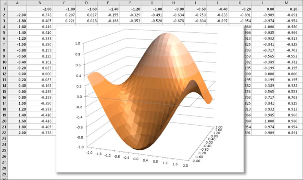
Figure 20.42 Using a surface chart to plot a function with two variables.
The formula in cell B2, copied across and down, is
=SIN($A2)*COS(B$1)
This book's website at www.wiley.com/go/excel2016bible contains a general-purpose, two-variable plotting application. The file is named function plot 3D.xlsm. This workbook contains a few simple VBA macros to allow you to change the chart's rotation and elevation.
All materials on the site are licensed Creative Commons Attribution-Sharealike 3.0 Unported CC BY-SA 3.0 & GNU Free Documentation License (GFDL)
If you are the copyright holder of any material contained on our site and intend to remove it, please contact our site administrator for approval.
© 2016-2026 All site design rights belong to S.Y.A.