Microsoft Office for iPad Step by Step (2015)
Part 3: Microsoft Excel for iPad
8. Process and present numeric data
In this chapter
![]() Create and manage Excel tables
Create and manage Excel tables
![]() Perform data-processing operations
Perform data-processing operations
![]() Display data in charts
Display data in charts
![]() Display data from PivotTables
Display data from PivotTables
![]() Collaborate on workbook content
Collaborate on workbook content
One of the primary purposes of storing numeric data in Excel is so that you can process that data programmatically. You can create simple to complex equations to perform calculations based on the numeric content of specific cells or data ranges. By using the many and varied functions built in to Excel, you can interpret raw data stored in a workbook in meaningful ways. You can increase the consistency and reliability of the information you extract from the data by using formulas to calculate, evaluate, and express it.
It is sometimes difficult to comprehend or draw conclusions from raw or processed data, especially when there is a lot of it. You can organize data in tables that provide added functionality, and visually represent data in charts. You can create many types of charts in Excel for iPad, and easily give tables and charts a consistent and professional appearance by applying styles.
Practice files
For this chapter, use the practice files from the iPadOfficeSBS\Ch08 folder. For practice file download instructions, see the Introduction.
This chapter guides you through procedures related to creating Excel tables, using formulas and functions to perform calculations, creating charts from worksheet data, and working with PivotTables and comments that other people create in shared workbooks.
Create and manage Excel tables
An Excel table is a series of contiguous cells that have been formatted as a named Excel object that has functionality beyond that of a simple data range. When working with data in an Excel table, you can do things that you can’t do with a data range, such as automatically apply and update purpose-specific formatting and quickly insert column totals and other statistics.
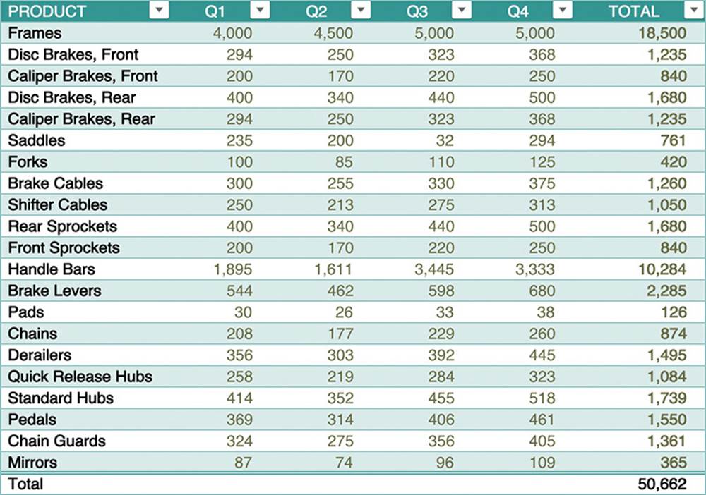
Excel tables have added functionality
The simplest way to create a table is by converting an existing data range. Alternatively, you can create a blank table and then add data to it. (Adding data to a table is often referred to as populating the table).
Regardless of the method you use to create a table, Excel displays Sort & Filter buttons in each column header and applies thematic formatting (a table style). The table style defines the shading, borders, and font colors used in the table. It also incorporates formatting and functionality based on the default style options. After you create the table, you can apply a different table style and specify the style options you want to use.
As with other object styles in the Office for iPad apps, the available table styles are governed by the color scheme of the file you’re working in. Excel table styles are divided into Light, Medium, and Dark categories. These designators refer to the color and coverage of the table cell shading. The default table style in a new workbook is near the middle of the Medium category and incorporates several shades of blue.
When you create a table from existing data, Excel evaluates the table content to identify the cells that are included in the table and to define functional table elements (such as header rows and Total rows). You can specify the table elements you want to emphasize by selecting the following style options:
![]() Header Row This option emphasizes the first row of the table and is intended for use in tables that have column headings.
Header Row This option emphasizes the first row of the table and is intended for use in tables that have column headings.
![]() First Column and Last Column These options emphasize the first or last column of the table by applying font effects or shading.
First Column and Last Column These options emphasize the first or last column of the table by applying font effects or shading.
![]() Banded Row and Banded Column These options shade every other row of the table to help readers track horizontal entries, or every other column of the table to help readers track vertical entries.
Banded Row and Banded Column These options shade every other row of the table to help readers track horizontal entries, or every other column of the table to help readers track vertical entries.
![]() Total Row This option adds a row at the bottom of the table that is preconfigured to display common statistics. By default, the Total row displays either the sum of numeric values or count of nonempty cells in the final column of the table. Tapping any cell in the row displays an arrow. Tapping the arrow displays the following list of statistics and options for you to choose from:
Total Row This option adds a row at the bottom of the table that is preconfigured to display common statistics. By default, the Total row displays either the sum of numeric values or count of nonempty cells in the final column of the table. Tapping any cell in the row displays an arrow. Tapping the arrow displays the following list of statistics and options for you to choose from:
• None The default option for all cells in the row other than the last column in which Excel locates numeric values, this option leaves the cell blank.
• Average This function displays the average of the numeric values in the table column.
• Count This function displays the number of nonempty cells in the table column.
• Count Numbers This function displays the number of cells in the table column that contain numbers.
• Max This function displays the largest numeric value in the table column.
• Min This function displays the smallest numeric value in the table column.
• Sum The default option for the last column in the row in which Excel locates numeric values, this function displays the sum of all numeric values in the table column.
• StdDev This statistical function estimates the amount of variation from the average within the table column, ignoring logical values and text.
• Var This statistical function estimates the spread of values within the table column, ignoring logical values and text.
 Tip
Tip
The StdDev and Var functions are available for compatibility with Excel 2007 and earlier. More-specific functions were introduced in Excel 2010.
• More Functions Tapping this option activates the Formula Bar. If the cell already contains a formula, it’s shown in the Formula Bar and the function’s arguments are color-coded in the table. If the cell is currently blank, Excel inserts an equal sign (=), and activates the on-screen keyboard so you can enter a formula that uses any function you want.
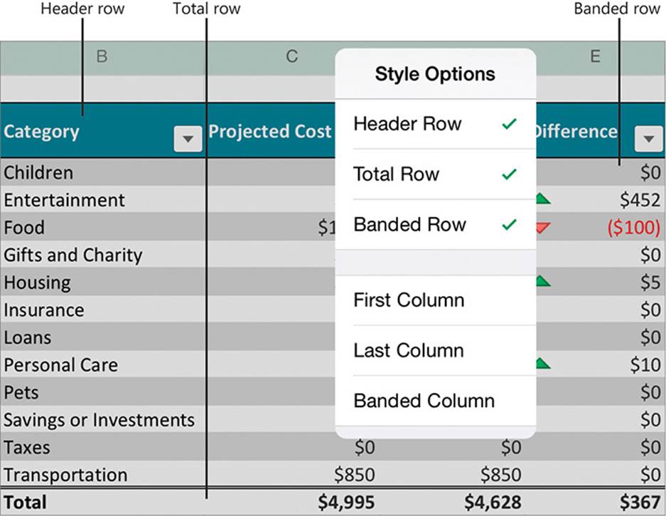
Style options emphasize or enable table features
Tip
The format-related style options available for Excel tables (such as banded columns and rows) are the same as those for Word tables. For more information, see “Present content in tables” in Chapter 5, “Add visual elements to documents.”
When you’re working in an Excel table, the Table tool tab appears on the ribbon. You can manage the table structure and styles from this tab and from the shortcut bar that appears when you double-tap a table cell.
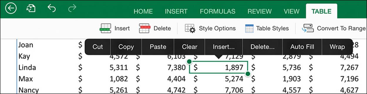
Table management tools
Tip
Excel assigns a name to each table based on its order of creation in the workbook (Table1, Table2, and so on). The table name isn’t exposed in Excel for iPad but is available when you open the workbook in a desktop version of Excel. You can reference tables and fields by name in formulas.
Inserting, deleting, or moving columns or rows in the table automatically updates the table formatting to gracefully include the new content. For example, adding a column to the right end of a table extends the formatting to that column, and inserting a row in the middle of a table that has banded rows updates the banding. You can modify the table style options at any time.
Tip
Filters are turned on by default when you create a table or format a data range as a table. If you want to copy or cut an existing table from a worksheet and paste it into a different worksheet, first clear any filters that have been applied, to ensure that all the table content is copied. For more information about filters, see “Manage the display of data” in Chapter 7, “Store and retrieve data.”
When a table includes formulas, Excel automatically copies a new formula to the rest of the table column. If you make a change to a formula, Excel updates the other instances of the formula so you don’t have to. When you create a formula that references data stored in a table, you can refer to the table and the data in each column of the table by name rather than by columns and rows.
For example, the following formula returns the total of the December column of an Excel table named SalesTable.
=SalesTable[[#Totals],[December]]
If you want to remove the table functionality from a table, you can easily convert it to a data range. Note that the conversion does not remove formatting (such as cell colors and fonts) from the data range. You can retain the formatting or clear it.
To format a data range as a table
1. Select the data range.
Or
If the data range is clearly defined, tap anywhere in the data range.
2. On the Insert tab, tap the Table button.
To create a blank table
1. To create a single-column table with a header row and one content row, tap the cell you want to designate as the upper-left corner of the table.
Or
To create a table of a specific size, select the cells you want to convert to a table.
2. On the Insert tab, tap the Table button.
To select a table
1. Tap any cell in the table.
2. Tap the table selector that appears outside the upper-left corner of the table.
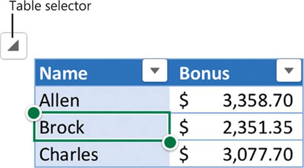
The table selector appears when the table is active
To specify the style options for a table
1. Tap any cell in the table.
2. On the Table tool tab, tap the Style Options button.
3. On the Style Options menu, tap to select each of the table elements you want to format, and tap to clear the selection of each element you want to remove formatting from.
4. Tap away from the Style Options menu to return to the worksheet.
Tip
When you add a Total row to a table, a statistical value is displayed in its rightmost cell. For numeric values, the default is the sum of the numbers in the column, and for nonnumeric values, it is the count of the nonempty cells. You can insert or change the statistic in any cell of the Total row by tapping the cell, tapping the arrow that appears beside it, and then tapping a function in the list.
To apply a different style to a table
1. Tap any cell in the table.
2. On the Table tool tab, tap the Table Styles button.
3. On the Table Styles menu, tap the style you want to apply.
Tip
To return to the worksheet without changing the style, tap outside the Table Styles gallery.
To extend a table by dragging
1. Move the table in the app window so the lower-right corner of the table is displayed in the content area. Then tap any cell in the table.
2. Drag the table sizing handle that appears outside the lower-right corner of the table in one of the following directions:
• To add rows, drag down.
• To add columns, drag to the right.
• To add columns and rows, drag diagonally down and to the right.
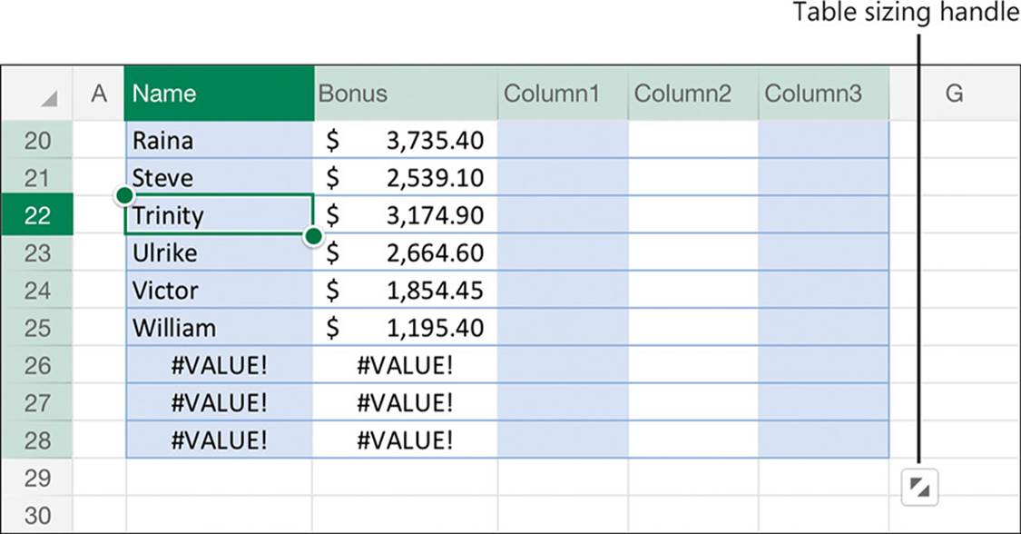
Excel attempts to fill the new rows with content
To extend a table by adding columns or rows to the edges
1. To extend the table by only one column, do one of the following:
• Select the cell to the right of the rightmost column header and switch to Edit mode. Enter the new column heading, and then tap the Return key.
• Tap any cell in the rightmost column of the table, or select the column. On the Table tool tab, tap the Insert button, and then on the Insert menu, tap Insert Columns Right.
2. To extend the table by multiple columns, do the following:
a. Select the same number of cells or columns as you want to insert, with one end of the selection in the last column of the table.
b. On the Table tool tab, tap the Insert button, and then tap Table Columns Right.
3. To extend the table by only one row, tap any cell in the last row of the table, or select the row. On the Table tool tab, tap the Insert button, and then tap Table Rows Below.
4. To extend the table by multiple rows, do the following:
a. Select the same number of cells or rows as you want to insert, with one end of the selection in the last row of the table.
b. On the Table tool tab, tap the Insert button, and then tap Table Rows Below.
To insert blank columns or rows inside a table
1. To specify the number and location of columns or rows to insert, do one of the following:
• To insert a single column, tap a cell to the right of the insertion location.
• To insert multiple columns, select that number of cells or rows to the right of the insertion location.
• To insert a single row, tap a cell below the insertion location.
• To insert multiple rows, select that number of cells or rows below the insertion location.
2. On the Table tool tab, tap the Insert button.
3. On the Insert menu, tap Table Columns Left or Table Rows Above.
To remove columns or rows from a table
1. Tap the heading of the column or row you want to remove, or any cell in the column or row.
2. On the Table tool tab, tap the Delete button.
3. On the Delete menu, tap Table Columns or Table Rows.
Or
1. With the lower-right corner of the table displayed on the screen, tap any cell in the table.
2. Drag the table sizing handle that appears outside the lower-right corner as follows:
• To remove rows, drag up.
• To remove columns, drag to the left.
 Important
Resizing a table to remove columns or rows doesn’t delete the contents of the columns or rows; it only converts those columns or rows to normal worksheet cells.
To convert a table to a data range
1. Tap any cell in the table.
2. On the Table tool tab, tap the Convert to Range button.
Perform data-processing operations
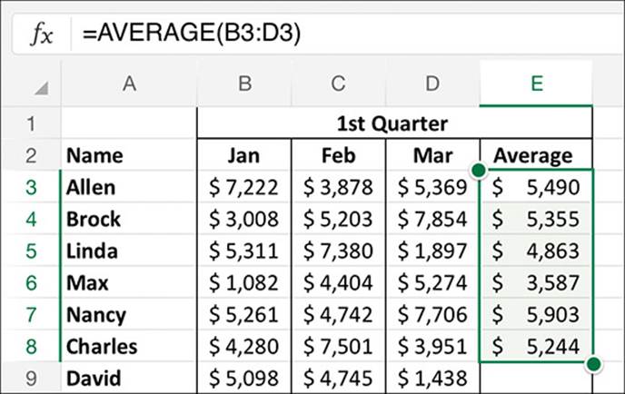
You process data by creating formulas that take the input from one or more cells and perform calculations. You can create formulas that evaluate independent data points or entire data series stored in data ranges or Excel tables.
Every formula begins with an equal sign (=) to indicate to Excel that it must perform a calculation. The equal sign can precede a simple equation, a function that evaluates the arguments defined by a series of parameters, or a formula that combines both elements.
Excel for iPad automatically builds formulas for five common mathematical functions—SUM, AVERAGE, COUNT, MAX, and MIN—and leads you through the process of building formulas that use other functions.
When you create a formula in a table, Excel automatically copies the formula that you enter in one cell to the other cells in that column, and to new rows that you add to the table later. When you reference data stored in an Excel table, you can reference the content of an entire column by name rather than specifying the range of cells within the column. For example, if column C of a table has the heading Cost in row 1 and rows 2 through 98 contain data, a formula that calculates values based on the cost data can reference Cost instead of C2:C98. The benefit of this is that adding or removing rows won’t invalidate the formula; the Cost reference will always include all and only the cells in that column.
Tip
This book provides basic information about formulas and the mechanics of creating formulas in Excel for iPad. Hundreds of functions are available for use in formulas. The Formula Builder leads you through the process of constructing a formula with the correct syntax for the function you’re using. To learn about specific functions in more depth, consult a book such as Microsoft Excel 2013 Inside Out by Craig Stinson and Mark Dodge (Microsoft Press, 2013), or Microsoft Excel 2010 Formulas and Functions Inside Out by Egbert Jeschke, Helmut Reinke, Sara Unverhau, and Eckehard Pfeifer (Microsoft Press, 2011).
Create simple formulas
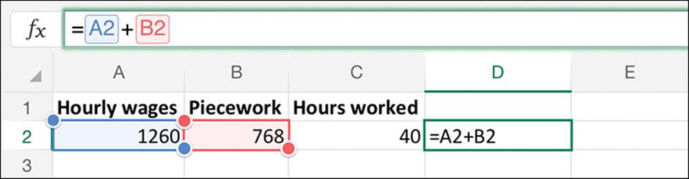
The most basic formulas involve only operands (numbers or cell references) and operators. For example, the formula =A2+B2 returns the sum of the numbers in cells A2 and B2.
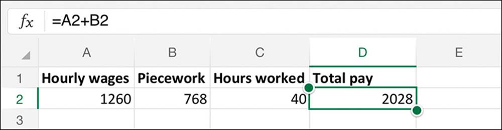
The formula adds the hourly wages and piecework compensation to calculate the total pay
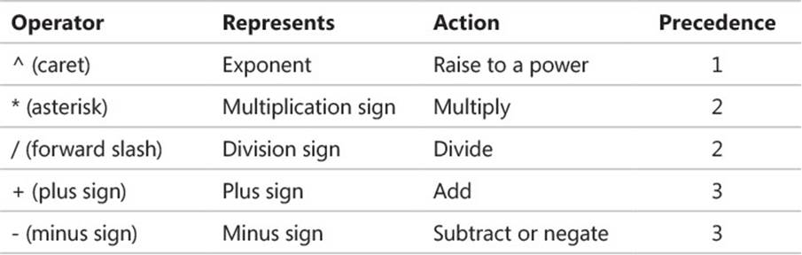
You can perform simple calculations by using basic mathematical operators, such as those in the following table.
A simple formula can include one operation or multiple operations. Formulas that involve multiple operations can include suboperations enclosed in parentheses. For example, the formula =(A2+B2)/C2 divides the sum of the numbers in cells A2 and B2 by the number in cell C2.
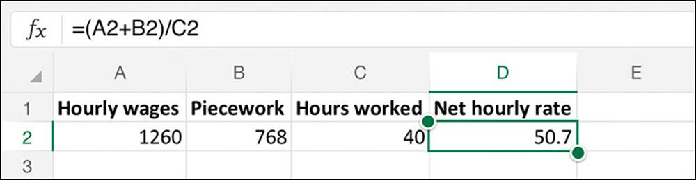
The formula divides the total pay by the hours worked to calculate the hourly rate
Tip
Excel processes operations of equal precedence in order from left to right and operations that include multiple parenthetical calculations from the innermost parentheses to the outermost.
After performing parenthetical calculations, Excel processes operations in the order of precedence indicated in the preceding table. For example, the formula =A2+B2/C2 first divides the number in cell B2 by the number in cell C2, and then returns the sum of A2 and the result of the first operation.
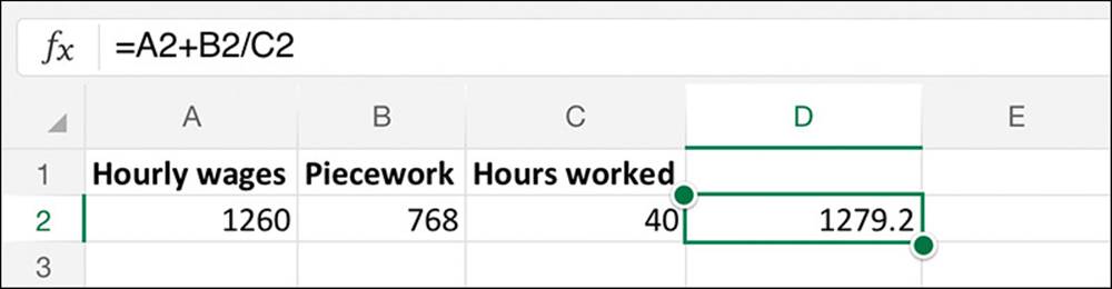
The formula incorrectly calculates the hourly rate
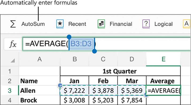
When you begin entering a formula in a cell, the Formula Bar opens automatically if it isn’t already open, and the formula appears both in the cell and in the Formula Bar. If you prefer, you can enter the formula directly into the Formula Bar. While you’re entering a formula that includes cell references, Excel color-codes the cells and the corresponding references so you can easily verify the data used by the formula.
Cell references and selectors are color-coded so you can more easily parse long formulas
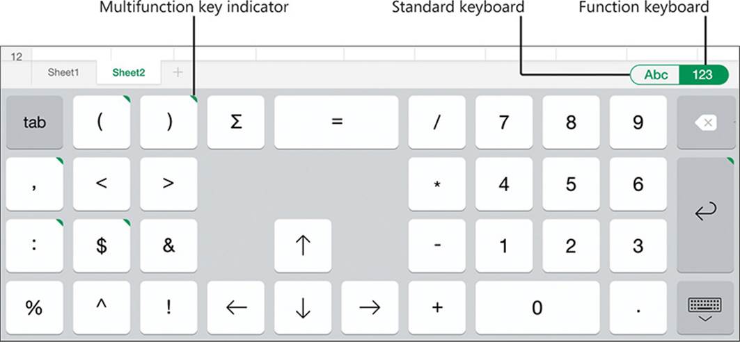
You can enter formula components from the standard on-screen keyboard or from an external keyboard if your iPad is connected to one. Excel also has a version of the on-screen keyboard called the function keyboard that contains the non-text characters most commonly used in formulas. Green corners indicate multifunction keys on the function keyboard. Pressing a multifunction key displays a list of other characters; you can insert one of these characters by sliding from the multifunction key to the character in the list. You can easily switch between the standard keyboard and the function keyboard by tapping the toggle button located at the right end of the status bar.
The standard keyboard also has multifunction keys, but they aren’t labeled.
 See Also
For information about multifunction keys on the standard on-screen keyboard, see “Enter text in documents” in Chapter 4, “Create professional documents.”
The function keyboard
You can begin the entry of a formula in a cell or directly in the Formula Bar. Either way, the formula appears in the Formula Bar. When you complete the formula, Excel validates it to ensure that it meets the syntactic requirements.
The Formula Bar
Formulas can reference cells in other worksheets within the workbook and in other workbooks. The syntax for these references is as follows:
![]() References to cells on other worksheets are preceded by the worksheet name (the name on the worksheet tab) and an exclamation mark. For example, the formula =December!A2 displays the content of cell A2 of the December worksheet.
References to cells on other worksheets are preceded by the worksheet name (the name on the worksheet tab) and an exclamation mark. For example, the formula =December!A2 displays the content of cell A2 of the December worksheet.
![]() References to other workbooks are preceded by the workbook file name, the worksheet name, and an exclamation point. The workbook name is enclosed in square brackets; that phrase and the worksheet name are enclosed in single quotes. For example, the formula=’[Sales.xlsx]December’!A2 displays the content of cell A2 of the December worksheet of the Sales workbook.
References to other workbooks are preceded by the workbook file name, the worksheet name, and an exclamation point. The workbook name is enclosed in square brackets; that phrase and the worksheet name are enclosed in single quotes. For example, the formula=’[Sales.xlsx]December’!A2 displays the content of cell A2 of the December worksheet of the Sales workbook.
You can include the values of external cells in formulas that perform calculations, or you can simply display the values.
Efficiently reference cells in formulas
Formulas in an Excel worksheet usually involve functions performed on the values contained in other cells on the worksheet (or on another worksheet). A reference that you make in a formula to a worksheet cell is either a relative reference, an absolute reference, or a mixed reference. It is important to understand the difference and know which to use when creating a formula.
A relative reference to a cell takes the form A1. When you copy, fill, or move a formula from its original cell to other cells, a relative reference changes to maintain the relationship between the cell containing the formula and the referenced cell. For example, if a formula refers to cell A1, copying the formula one row down changes the A1 reference to A2; copying the formula one column to the right changes the A1 reference to B1.
An absolute reference takes the form $A$1; the dollar sign indicates an unchanging reference to the column or row. When you copy, fill, or move a formula from its original cell to other cells, an absolute reference will not change—regardless of the relationship to the referenced cell, the reference stays the same. For example, if a formula refers to cell $A$1 and you fill the formula five cells to the right, the formula in each cell still refers to $A$1.
A mixed reference refers absolutely to either the column or the row and relatively to the other. The mixed reference $A1 always refers to column A, and A$1 always refers to row 1.
If you want help entering absolute and mixed cell references or don’t want to enter a lot of dollar signs, Excel provides a simple way of changing a reference from one type to another. Follow these steps:
1. Enter any version of a cell reference (relative is easiest) in the formula.
2. Select the cell reference in the Formula Bar, and then tap the selection to display the shortcut bar.
3. On the shortcut bar, tap Reference Types to display a menu of reference options.
4. On the Cell Reference Types menu, tap any reference to replace the original reference in the Formula Bar.
It is common to use a version of one formula in multiple cells. For example, if you enter a formula in cell C2 that adds the values in cells A2 and B2, you might want to perform the same operation in row 3 and the remaining rows of the table. You can copy a formula to other cells or fill adjacent cells with the formula. When you use either method, Excel adjusts any relative references in the formula to maintain the relative relationship to the cell that contains the formula.
A formula filled into adjacent cells to provide averages for each row
To enter numbers and special symbols from the on-screen keyboard
1. To display numbers and basic symbols, tap the Number key (labeled .?123) on the left or right side of the standard on-screen keyboard.
2. On the number keyboard, tap the key corresponding to the number or symbol you want to enter.
Or
To display additional symbols, tap the Symbol key (labeled #+=) on the left or right side of the number keyboard.
To display and use the function keyboard and use the multifunction keys
1. Switch to Edit mode to display the on-screen keyboard.
2. At the right end of the status bar, tap the Function button (labeled 123).
3. Enter the visible numbers and symbols by tapping the keys.
Or
To display additional symbols, tap and hold any key that has a green upper-right corner. Slide to the symbol you want to enter, and lift your finger from the screen to enter the selected symbol.
To switch from the function keyboard to the standard keyboard
1. At the right end of the status bar, tap the Alphanumeric button (labeled Abc).
To enter an equation in a cell
1. To enter the formula directly in the cell, double-tap the cell to activate it for editing and display the on-screen keyboard, and then enter an equal sign (=) to begin the formula.
Or
To enter the formula in the Formula Bar, tap the cell to select it, and then tap the Insert Function button at the left end of the Formula Bar to enter an equal sign (=).
The Functions menu opens.
2. If you want to close the Functions menu, tap the Formula Bar or worksheet.
Tip
An open Functions menu does not prevent you from entering text. If you enter characters that don’t match a built-in function, the menu closes automatically. The menu displays functions that match your entry. You can tap the information button next to any function name to display a description of the function, or you can tap the function name to insert the function and its parameters in the Formula Bar.
3. Enter the following formula elements:
a. The first operand (a number, cell reference, or cell range)
b. The operator
c. The second operand
To reference a cell or cell range in a formula
1. To reference a single cell, do one of the following:
• Tap the cell in the worksheet.
• Enter the cell reference from the keyboard.
Tip
You can enter the letter of a cell reference in uppercase or lowercase text. Excel converts it to uppercase when you complete the formula.
2. To reference a range of cells, do one of the following:
• Tap the cell at either end of the cell range, and then drag the selection handles to select the range.
• Enter the cell range from the keyboard.
3. After entering the cell or cell range, enter an operator or complete the formula.
To create an absolute or mixed reference
1. Enter a dollar sign before each column letter or row number that you want to reference absolutely.
Or
1. In the Formula Bar, tap the reference you want to change.
2. Tap the selected reference again and then, on the shortcut bar that appears, tap Reference Types.
3. On the Cell Reference Types menu, tap the absolute or mixed reference you want to use.
Tip
When you’re working with a cell on a worksheet, Excel is in either Ready mode, in which the cell is selected and not active for editing, or Edit mode, in which the cell is active for editing. For information about entering, working in, and exiting Ready mode and Edit mode, see “Enter and edit data on worksheets” in Chapter 7, “Store and retrieve data.”
To complete the entry of a formula
1. Use one of the following methods:
• To complete the formula and move to the next cell, tap Return on the on-screen keyboard.
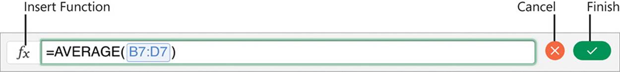
• To complete the formula and select the active cell, tap the Finish button (labeled with a check mark) at the right end of the Formula Bar.
• To cancel the creation of the formula and select the active cell, tap the Cancel button (labeled with an X) at the right end of the Formula Bar.
To copy a formula to adjacent cells
1. Tap the cell that contains the formula you want to copy.
Important
Ensure that the cell references in the formula are correctly entered as relative, absolute, or mixed cell references before copying the formula.
2. Tap the selected cell, and then on the shortcut menu that appears, tap Fill.
Arrows appear on the bottom and right borders of the active cell.
3. Drag the bottom border of the active cell down to fill the formula to the adjacent rows or to the right to fill the formula to the adjacent columns.
Tip
You can’t fill formulas up or to the left in Excel for iPad as you can in the desktop versions of Excel.
Insert formula constructs
The simplest way to familiarize yourself with the use of functions is by inserting an AutoSum formula in a data range or Excel table and then studying the results. The following functions are available as AutoSum formulas:
![]() SUM This function returns the sum of the numeric values in the selected range.
SUM This function returns the sum of the numeric values in the selected range.
![]() AVERAGE This function returns the average of the numeric values in the selected range.
AVERAGE This function returns the average of the numeric values in the selected range.
![]() COUNT When invoked as an AutoSum operation, this function returns the number of cells in the selected range that contain numbers.
COUNT When invoked as an AutoSum operation, this function returns the number of cells in the selected range that contain numbers.
Tip
When invoked from the Total row of an Excel table, the COUNT function returns the number of nonblank cells in the range.
![]() MAX This function returns the largest numeric value in the selected range, ignoring logical values and text.
MAX This function returns the largest numeric value in the selected range, ignoring logical values and text.
![]() MIN This function returns the smallest numeric value in the selected range, ignoring logical values and text.
MIN This function returns the smallest numeric value in the selected range, ignoring logical values and text.
When you insert an AutoSum formula in a cell, Excel evaluates the surrounding data and selects the most likely data for the specified operation.
Excel selects consecutive cells that contain numeric values as likely function arguments
You can change the data selection to any consecutive range of cells by dragging the selection handles rather than directly editing the formula. You can include nonconsecutive cells by selecting each cell or cell range, inserting a comma after the cell reference in the Formula Bar, and then selecting the next. When you confirm the selection, Excel builds the formula for you.
To insert an AutoSum formula
1. Select the cell you want to display the result in.
2. On the Formulas tool tab, tap the AutoSum button, and then tap the function you want to use.
Tip
To use the SUM function, you can tap the Formula Bar to display the keyboard, and then tap the AutoSum key on the function keyboard.
3. Verify that the automatically selected range (indicated by an animated dashed outline) contains all the cells you want to include as arguments for the function. If it doesn’t, do one of the following:
• To modify the cell range from the existing selection, drag the selection handles to encompass the cells you want to include.
• To select a different cell range, select a cell within the range you want to include and then drag the selection handles to encompass the cells.
• To select nonconsecutive cells, select the first cell or cell range, tap the Formula Bar, insert a comma, select the next cell or cell range, and so on.
4. Complete the formula entry.
Quickly display statistics
Selecting multiple cells displays a statistic about the selected cells at the right end of the status bar. The default statistic for numeric values is the sum, and for text values it is the number of nonblank cells within the selection.
Tapping the statistic on the status bar displays the average, count, numerical count, maximum, minimum, and sum of the selected cells.
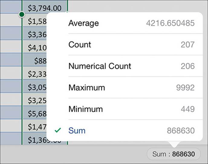
Status bar statistics for a table column that contains numeric values
The status bar displays the statistic that you tap on the menu and makes it the default statistic for future selections in the same computing session.
Build complex formulas
Functions evaluate specific arguments (values defined by parameters) and return the results of that evaluation. This sounds difficult, but Excel simplifies it by leading you through the process, providing AutoComplete suggestions for function names and specifying the required and optional parameters for a function.
Tip
Parameters define the required and optional data that will be evaluated by a function; arguments are the actual values that are passed for the parameters.
The functions available in Excel for iPad are divided into 10 categories: Financial, Logical, Text, Date & Time, Lookup & Reference, Math & Trig, Statistical, Engineering, Info, and Database. The categories are available from the Formulas tab or from the list that appears when you tap the More Functions button near the right end of that tab.
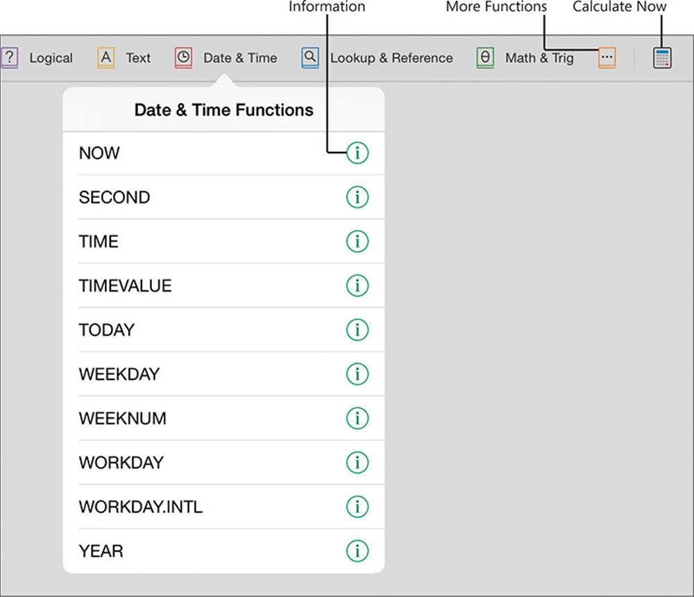
Functions are divided into categories on the Formulas tab
When perusing the categories of functions, you’ll notice that they evaluate parameters including numbers, dates, text values, system information, and conditions. In all, more than 200 functions are available that evaluate a wide variety of parameters and return values based on the arguments provided for those parameters.
An alphabetical list of functions appears when you begin entering a function into the Formula Bar. Tapping the information icon next to a function on a category menu or function list displays the syntax for and definition of the function.
Excel provides the syntax and description of every function to help you manually enter functions
Tapping any function enters the function and its parameters in the Formula Bar. All you have to do is supply the arguments for the parameters. Optional parameters are in a lighter shade of gray with a dashed outline.
Excel guides you through the required syntax for a formula based on the function
To enter a function and its parameters in the Formula Bar
1. Select the cell you want to display the result in.
2. To enter the function, do one of the following:
• On the Formulas tab, tap the function category you want to display. Then flick through the category menu and tap the function you want to use.
• Tap the Insert Function button, enter the first few letters of the function name, and then in the list of matching functions, tap the function you want to use.
• To enter a function that you recently used, tap the Recent button on the Formulas tab. Then on the Recently Used Functions menu, tap the function you want to use.
Tip
You can create nested functions—functions within other functions—by enclosing the inside functions in parentheses. Use nested functions to calculate a value and pass the calculated value to another function.
Refresh calculations manually
When using a desktop version of Excel, workbook authors can put a workbook into manual calculation mode. This mode is useful when a workbook contains either a large number of complex calculations that might slow down the program if they are automatically recalculated when data changes, or calculations that reference external sources that are unavailable or take a long time to connect to.
Excel for iPad doesn’t support switching between manual calculation mode and automatic calculation mode. If you are working in a workbook that has been set to manual calculation mode, you can update the calculations within the workbook by tapping the Calculate Now button at the right end of the Formulas tab.
Display data in charts
Charts are visual representations of data that are created by plotting data points onto a two-dimensional or three-dimensional coordinate system. Charts can be a very useful data analysis tool because they identify trends and relationships that might not be obvious from reviewing the raw data.
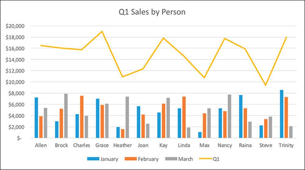
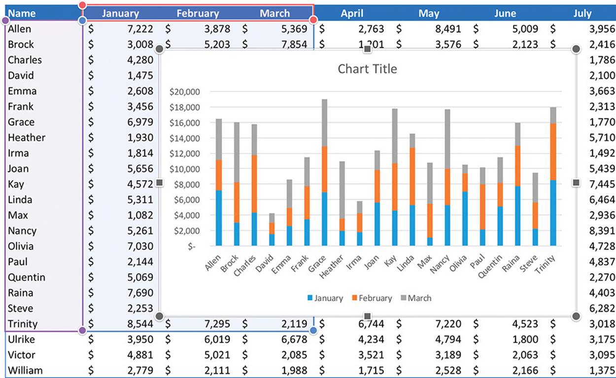
A chart displaying sales by person by month and total sales for the quarter
A single chart can reference up to 255 data series. Different types of charts are best suited for different types of data. Excel for iPad supports the creation of the following chart types:
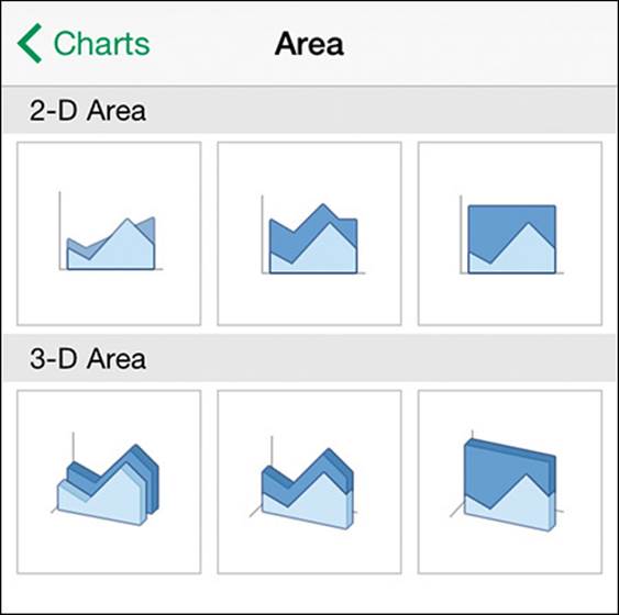
![]() Area Displays multiple data series as cumulative layers showing change over time.
Area Displays multiple data series as cumulative layers showing change over time.
![]() Bar Displays variations in value over time or the comparative values of several items at a single point in time.
Bar Displays variations in value over time or the comparative values of several items at a single point in time.
![]() Column Displays variations in value over time, or comparisons.
Column Displays variations in value over time, or comparisons.
![]() Line Displays multiple data trends over evenly spaced intervals.
Line Displays multiple data trends over evenly spaced intervals.
![]() Pie Displays percentages assigned to different components of a single item as wedges of a circle or doughnut. (Values must be nonnegative and nonzero, and there may be no more than seven values.)
Pie Displays percentages assigned to different components of a single item as wedges of a circle or doughnut. (Values must be nonnegative and nonzero, and there may be no more than seven values.)
![]() Radar Displays percentages assigned to different components of an item, radiating from a center point.
Radar Displays percentages assigned to different components of an item, radiating from a center point.
![]() Stock Displays stock market or similar activity.
Stock Displays stock market or similar activity.
![]() Surface Displays trends in values across two different dimensions in a continuous curve, such as a topographic map.
Surface Displays trends in values across two different dimensions in a continuous curve, such as a topographic map.
![]() X Y (Scatter) Displays correlations between independent items.
X Y (Scatter) Displays correlations between independent items.
Each chart type has multiple layouts. A layout specifies which elements the chart displays and how they are arranged. Chart elements include the chart title, data labels, data table, and legend.
Tip
Some types of charts that plot data points onto standard XY axes are also commonly referred to as graphs.
Create charts
To create a chart, all you have to do is identify the data you want to plot and specify the chart type.
If you want to create a specific type of chart, make sure that your data is correctly set up for that chart type before you start. For example, a pie chart can display only one data series, whereas a bar or column chart can display multiple data series. When you are creating a chart in Excel for iPad, the data you plot must be in a contiguous range of columns or rows. If it isn’t already contiguous, you can move or hide columns and rows until it is.
If you want to plot only a subset of the data that is stored in a data range or table, you have three options: you can create a chart based on all the data and then reduce the amount of data that is included in the chart by selecting less of the data table, you can hide the data you don’t want to plot and then create the chart, or you can select only the data you want to plot and then create the chart.
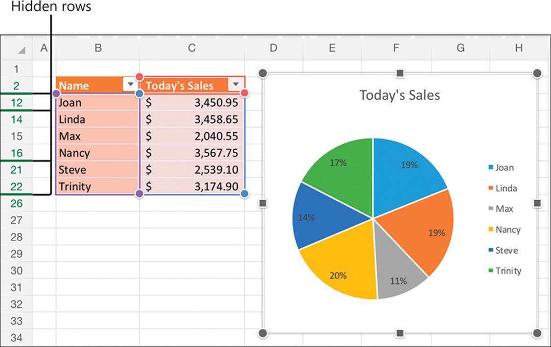
Excel doesn’t plot hidden data
When you’re ready to create the chart, you can choose a chart that Excel recommends based on an analysis of the data pattern, or you can select a chart type on your own. The thumbnails on the Recommended menu display a preview of the actual data you’ve selected for the chart.
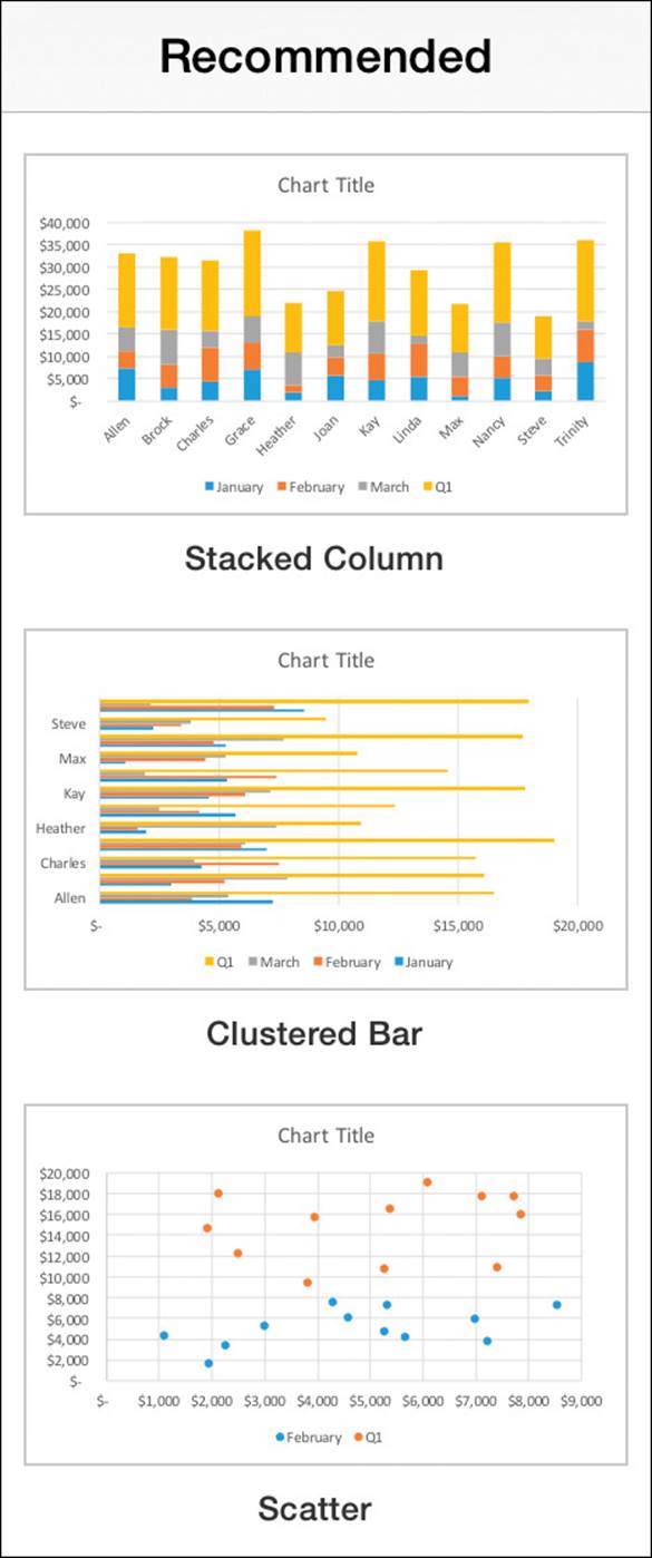
Excel recommends charts based on your specific data
Tip
The charts that Excel recommends might include combination charts that you couldn’t otherwise create in Excel for iPad.
The Charts menu displays generic representations of each chart type.
Simple previews are available for all chart types
To begin plotting an entire data range or table as a chart
1. Locate the data range or table that contains the data you want to plot.
2. Tap any cell in the data range or table. When you create the chart, Excel will plot all the data contained therein.
To select part of a data range or table to plot as a chart
1. Locate the data range or table that contains the data you want to plot.
2. If the data you want to plot is not in a contiguous range, organize the data by doing any of the following:
• Move columns or rows so the data values are adjacent to each other and to the axis values.
• Hide columns or rows that you don’t want to plot.
3. When the data you want to plot is arranged in a contiguous range, tap any cell in the data set.
4. Drag the selection handles to select the data set.
To create a chart
1. Select the data you want to plot.
2. On the Insert tab, tap Recommended.
3. Review the appearance of the selected data in the thumbnails, and then tap the specific chart configuration you want to create.
Or
1. Select the data you want to plot.
2. On the Insert tab, tap Charts.
3. On the Charts menu, tap the type of chart you want to create.
4. On the submenu, review the available versions of the selected chart type.
5. Tap the specific chart configuration you want to create.
Modify chart structure
The area within which the chart (and only the chart) is drawn is the plot area. The larger area that encompasses the plot area and any accompanying chart elements (such as the title, legend, and axis labels) is the chart area. The chart and chart elements change size to fit the chart area. You change the size of a chart by changing the size of the chart area. It might be necessary to specifically change the width or height to make the chart the size you want.
See Also
For information about displaying chart elements, see “Format charts” later in this topic.
Excel creates each chart on the same worksheet as its source data. You can move the chart to a different location on the worksheet or you can move it to its own worksheet. If you plan to present a chart, you can move it to its own worksheet, resize the chart to fill the screen, and then hide the gridlines and headings on the worksheet to focus viewers’ attention on the chart.
A chart is linked to its worksheet data, so any changes you make to the plotted data are immediately reflected in the chart.
If you want to add or remove values from a chart, you simply increase or decrease the range of the plotted data in the worksheet.
You can change the amount of data displayed in the chart
Charts plot data in the order that it appears in the data source. To change the order of the data in the chart, you must change it in the data source. Excel automatically updates the chart to reflect your changes.
Sometimes a chart does not illustrate the results you expect because the data series are plotted against the wrong axes; that is, Excel is plotting the data by row when it should be plotting by column, or vice versa. You can quickly switch the columns and rows to determine whether that produces the effect you want.
Tip
For more precise control of chart content and configuration, edit the chart in a desktop version of Excel.
To select a chart
1. Tap the chart to select it.
Excel displays the chart sizing handles around the chart area, and the Chart tool tab appears on the ribbon.
To move a chart on its current worksheet
1. Select the chart you want to move.
2. To roughly position the chart, drag it to its new location.
Or
To exactly position the chart, follow these steps:
a. On the shortcut bar that appears, tap Cut.
b. Tap the cell in which you want to position the upper-left corner of the chart.
c. Tap the cell a second time to display the shortcut bar, and then tap Paste on the shortcut bar.
Tip
Tapping a chart selects the chart and its data source for editing, and displays the tools you can use to manage the chart: the Chart tool tab, the shortcut bar, and sizing handles. In the data source, shading identifies the plotted chart data and handles appear in the upper-left and lower-right corners of each data element.
To move a chart to another worksheet
1. If necessary, create the worksheet you want to move the chart to.
2. Select the chart you want to move.
3. On the shortcut bar that appears, tap Cut.
4. Switch to the worksheet you’re moving the chart to.
5. Tap the cell in which you want to position the upper-left corner of the chart. Then tap the cell a second time to display the shortcut bar.
6. On the shortcut bar, tap Paste.
To resize a chart
1. Select the chart you want to resize.
2. Drag the chart sizing handles to change the height or width of the chart area.
Excel automatically rearranges the active chart elements to fit the chart.
Tip
The corner sizing handles don’t maintain the aspect ratio of an Excel chart as they do when you are resizing pictures and shapes. For information about resizing graphic elements, see “Insert and format pictures” in Chapter 5, “Add visual elements to documents.”
To change the order of data on a chart
1. Display the source data.
2. Cut and paste columns or rows to put the data in the order you want to present it.
3. Tap the chart to identify the plotted chart data in the data source. If necessary, drag the handles to encompass all the data you want to plot in the chart.
To swap chart data over the axis
1. Select the chart you want to modify.
2. On the Chart tool tab, tap Switch.
To change the data plotted in a chart
1. Select the chart you want to modify.
2. In the data source, drag the selection handles to encompass only the data you want to plot in the chart.
To replot chart data as a different type of chart
1. Select the chart you want to modify.
2. On the Chart tool tab, tap the Types button, tap the chart type you want to create, and then tap the specific chart configuration you want.
Or
On the Chart tool tab, tap the Recommended button, and then tap the specific chart configuration you want.
To finish editing a chart
1. Tap anywhere on the worksheet other than the chart and its data source.
To delete a chart
1. Select the chart you want to delete.
2. On the shortcut menu that appears, tap Delete.
Format charts
When you select a chart type, Excel inserts a generic version of that chart with the default colors and chart elements. You can apply predefined chart styles and color schemes, and you can modify the layout of the chart elements to convey the impression you want.

A pie chart with a title and legend
Chart styles configure a variety of display attributes such as the color of the chart area and data labels, the font of the chart title, the layout of chart elements, and other visual effects such as shadows that give the appearance of depth.
A chart includes many elements, some required and some optional. Each data series is represented in the chart by a unique color. You can add or modify these elements to help people understand the chart:
![]() A chart title can identify the chart content.
A chart title can identify the chart content.
![]() A legend can identify the data series by color.
A legend can identify the data series by color.
![]() Data labels next to or on the chart or a data table below the chart can identify data point values.
Data labels next to or on the chart or a data table below the chart can identify data point values.
![]() Axis titles can identify the axes the data is plotted against.
Axis titles can identify the axes the data is plotted against.
![]() Gridlines can more precisely indicate data point values.
Gridlines can more precisely indicate data point values.
Other optional elements include trend and variance indicators such as trendlines, up/down bars, and error bars.
Tip
Data labels can clutter up all but the simplest charts. If you need to show the data for a chart on a separate chart sheet, consider using a data table instead.
Most chart elements can be displayed in multiple locations within the chart area or plot area (the area defined by the axes). You can remove any or all of the identification elements.
You can configure the display of chart elements in several ways:
![]() By selecting individual chart element settings from the Elements menu
By selecting individual chart element settings from the Elements menu
![]() By applying a chart layout that defines the presence and position of multiple chart elements
By applying a chart layout that defines the presence and position of multiple chart elements
![]() By applying a chart style that incorporates a chart layout
By applying a chart style that incorporates a chart layout
You must set the element display location in one of these ways; you can’t manually position or format any of the chart elements in Excel for iPad.
To change the style of a chart
1. Tap the chart you want to modify.
2. On the Chart tool tab, tap the Styles button.
3. On the Styles menu, review the available styles, noting the chart area color, the presence and position of chart elements, and any visual effects.
4. Tap the style you want to apply to your chart.
To change the color scheme of the data series
1. Tap the chart you want to modify.
2. On the Chart tool tab, tap the Colors button.
3. On the Colors menu, review the available Colorful and Monochromatic color schemes.
4. Tap the color scheme you want to apply to your chart.
To apply a preconfigured layout of chart elements
1. Tap the chart you want to modify.
2. On the Chart tool tab, tap the Layouts button.
3. On the Layouts menu, review the thumbnails of the chart elements.
4. Tap the layout you want to apply.
To configure the display of individual chart elements
1. Tap the chart you want to modify.
2. On the Chart tool tab, tap the Elements button.
3. On the Elements menu, review the available chart elements.
4. Tap an available chart element that you want to configure, and then on the submenu, tap the specific location or setting you want.
Tip
Only the chart elements that are valid for the current chart type are available on the Elements menu. Unavailable chart elements are dimmed.
To remove individual chart elements
1. Tap the chart you want to modify.
2. On the Chart tool tab, tap the Elements button.
3. On the Elements menu, tap the chart element you want to remove, and then tap None.
Display data from PivotTables
PivotTables are excellent tools for displaying views of multidimensional data. In other words, by using PivotTables you can look at a lot of data in a lot of different ways. More importantly, PivotTables make it easy to display many combinations of data fields and help you turn data into information.
You might think of a PivotTable as a kind of Rubik’s Cube, with each colored side representing a data field. In the same way that you can turn each section of the Rubik’s Cube to display different combinations of colors on the faces of the cube, you can group, filter, and sequence data in a PivotTable.
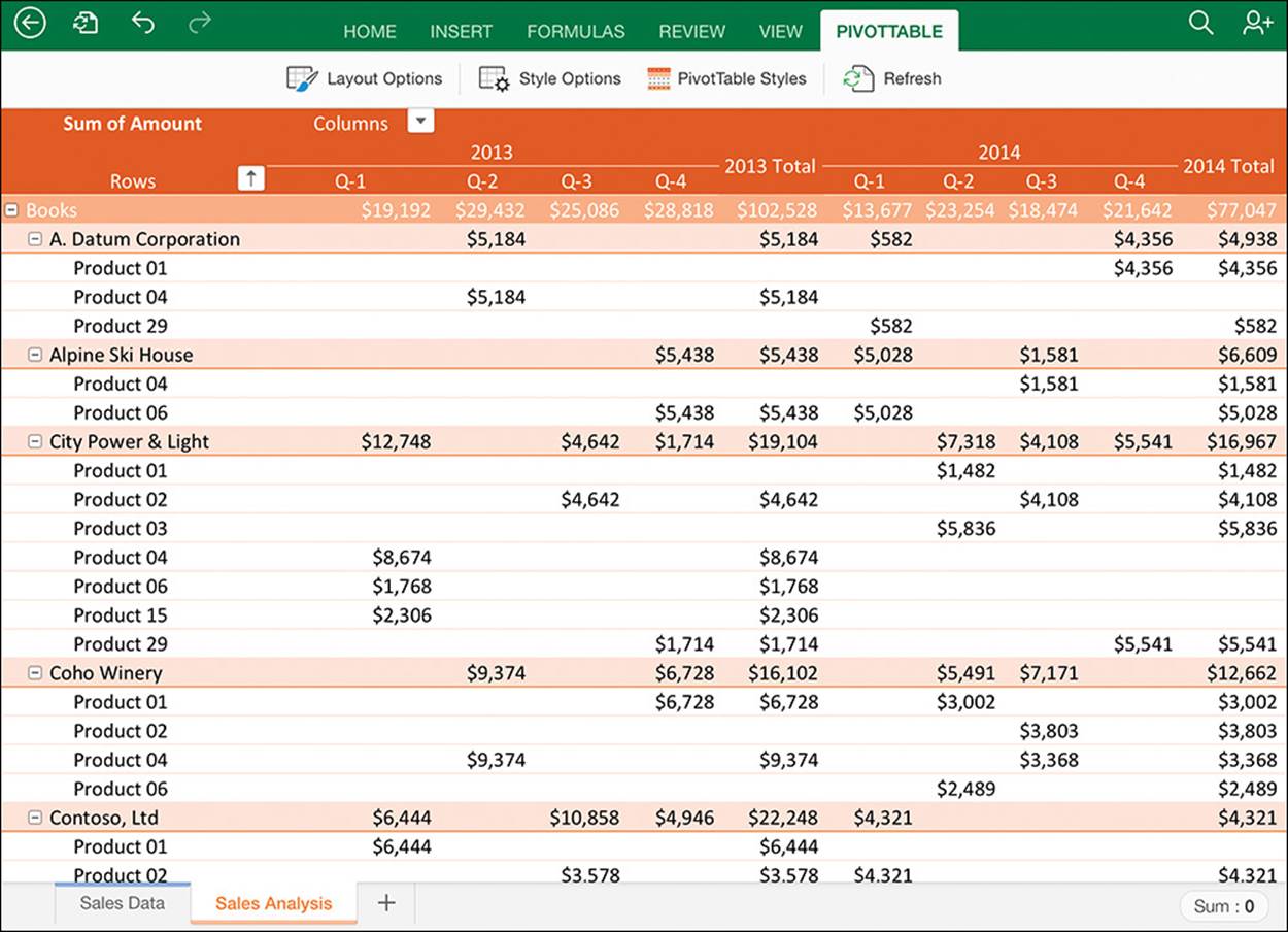
A PivotTable displaying sales of products to customers, grouped by category
See Also
For information about the history of the Rubik’s Cube (and how to solve one), visit Rubik’s official website at www.rubiks.com.
For example, an online retailer might store the following data about inventory items in Excel:
![]() Product information such as name, category, supplier, wholesale price, retail price, shipping weight, material, size, color, pattern, height, width, depth, and whether the item is breakable
Product information such as name, category, supplier, wholesale price, retail price, shipping weight, material, size, color, pattern, height, width, depth, and whether the item is breakable
![]() Target market information such as gender, age, and location
Target market information such as gender, age, and location
![]() Performance information such as sales volume, sales location, return percentage, and reason for return
Performance information such as sales volume, sales location, return percentage, and reason for return
If the retailer’s marketing manager can extract useful information from that data, the marketing team can plan targeted campaigns that build on historical purchasing trends. It would be a lot of work to plan and assemble all the reports that might be pertinent to this effort. This is where PivotTables are valuable. By using a PivotTable, the retailer can quickly and easily identify useful information such as:
![]() Items sold in the month of January of any year, grouped by state
Items sold in the month of January of any year, grouped by state
![]() Sales volume of books purchased by men in the Southwest region of the United States
Sales volume of books purchased by men in the Southwest region of the United States
![]() All items that have a return rate of more than 25 percent, grouped by supplier
All items that have a return rate of more than 25 percent, grouped by supplier
![]() Clothing items for women that have sold more than 1,000 units per year with a return rate of less than 5 percent
Clothing items for women that have sold more than 1,000 units per year with a return rate of less than 5 percent
![]() Gift items that weigh less than 2 pounds and have a profit margin of more than 30 percent
Gift items that weigh less than 2 pounds and have a profit margin of more than 30 percent
The key to a useful PivotTable is the data storage structure. PivotTables can reference data stored in the workbook or in an external database. The data that is referenced in the PivotTable must be stored in a simple, logical structure to return clean results.
You can’t create a PivotTable in Excel for iPad, but you can work with a PivotTable that was created in a desktop version of Excel. You can expand and collapse groups, filter the data to display specific fields, sort the data in groups by field, and drill down from the PivotTable to the details of specific data points. You can modify the structure of the PivotTable to display data differently, and you can change the color scheme applied to the table. If the PivotTable is based on external data, you can refresh the connection to update the results.
Important
At the time of this writing, you can’t add fields to a PivotTable or pivot the data in Excel for iPad. To optimize a PivotTable for display on an iPad, the PivotTable creator should include all fields that people are likely to want to use as filter or sort criteria.
PivotTables can be structured in many ways. All PivotTables consist of at least two fields of information, but most include groups and subgroups. You can expand the groups and subgroups to display more detailed information, or you can collapse them to display only summary information.
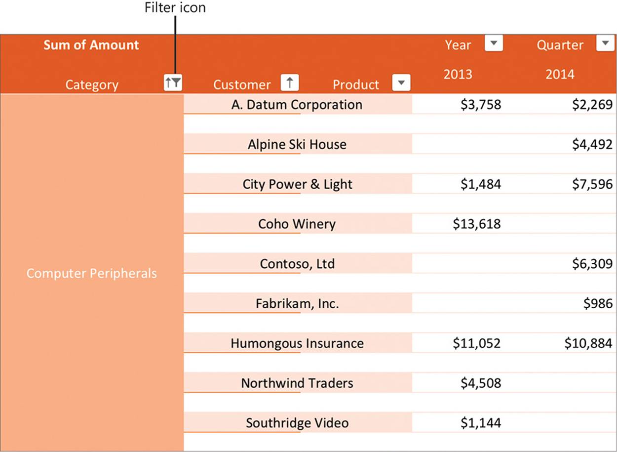
Depending on the design of a PivotTable, a button called a Pivot Filter might be located in the top row, the first column, or both locations. Pivot Filters are similar in appearance and functionality to the Sort & Filter buttons in Excel table column headers.
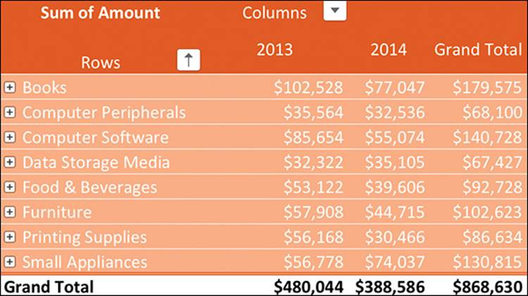
The PivotTable collapsed to show only the primary groups and grand totals
Some PivotTables include one or more Report Filters above the column headers. Report Filters display lists of the entries in a specific field. You can filter the displayed content by selecting fields from either of these tools. Using filters limits the data displayed to only those cells that meet selected criteria.
A filter symbol on a Pivot Filter button indicates that the column or row is filtered.
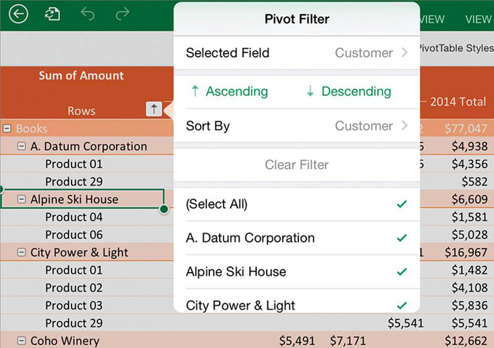
You can sort and filter at the selected level
You can modify five different aspects of the structure of a PivotTable:
![]() The display of subtotals for groups
The display of subtotals for groups
![]() The display of grand totals for columns and rows
The display of grand totals for columns and rows
![]() The form of the PivotTable: compact, outline, or tabular
The form of the PivotTable: compact, outline, or tabular
![]() The frequency of item labels
The frequency of item labels
![]() The display of blank rows after items
The display of blank rows after items
A PivotTable in tabular form with blank rows between items and without grand totals
You can apply the same styles to PivotTables as you can to Word tables and Excel tables. You can choose to emphasize the row headers, emphasize the column headers, band the rows, and band the columns.
Tip
The style options available for Excel PivotTables are very similar to those for Excel and Word tables. For information about applying table styles and selecting style options, see “Present content in tables” in Chapter 5, “Add visual elements to documents,” and “Create and manage Excel tables,” earlier in this chapter.
To display more or less detail in a PivotTable
1. In the row headers or column headers, tap any header at the level you want to modify.
2. Do either of the following:
• To display the next level of detail for all groups at the selected level, tap Expand on the shortcut menu.
• To hide the next level of detail for all groups at the selected level, tap Collapse on the shortcut menu.
To display more or less detail for a specific group in a PivotTable
1. To expand a collapsed group, tap the plus sign (+) on the group’s header.
2. To collapse an expanded group, tap the minus sign (-) on the group’s header.
To display only specific fields in a PivotTable
1. In the row headers or column headers, tap any entry at the level you want to filter.
2. In the first column or row of the table, tap the Pivot Filter button.
Tip
If necessary, tap the ribbon to hide the shortcut menu without selecting a different cell.
3. On the Pivot Filter menu, do any of the following:
• Tap (Select All) to display or hide all entries.
Tip
A green check mark indicates that a field is selected.
• Tap a specific field to display or hide that field.
To display all fields in a PivotTable
1. Tap any Pivot Filter button that displays a filter icon.
2. On the Pivot Filter menu, tap Clear Filter.
3. Repeat steps 1 and 2 to clear any additional filters.
To change the layout of a PivotTable
1. On the PivotTable tool tab, tap the Layout Options button.
2. On the Layout Options menu, do any of the following:
• Tap Grand Totals, and then tap either Off for Rows and Columns, On for Rows and Columns, On for Rows Only, or On for Columns Only.
• Tap Subtotals, and then tap either Do Not Show Subtotals, Show all Subtotals at Bottom of Group, or Show all Subtotals at Top of Group.
• Tap Report Layout. In the top section of the menu, tap either Show in Compact Form, Show in Outline Form, or Show in Tabular Form. In the bottom section of the menu, tap either Repeat All Item Labels or Do Not Repeat Item Labels.
• Tap Blank Rows, and then tap either Insert Blank Line after Each Item or Remove Blank Line after Each Item.
Tip
If the PivotTable you’re working with is connected to an external data source, you can update the PivotTable to reflect changes to the source data by refreshing the connection. To refresh the connection, tap Refresh on the PivotTable tool tab, or tap any cell and then tap Refresh on the shortcut menu.
Collaborate on workbook content
Excel for iPad doesn’t have the robust coauthoring features of Word for iPad—only one person can actively edit a workbook at a time. However, multiple people can display and move around in a locked copy of the workbook. When a second person opens a workbook from a shared storage location, a message box provides the information that the file is locked, and displays these options for working in the locked file:
![]() Read-Only This option opens the file as read-only. You can display the file content and move around in the file. You can also make changes in the file—you simply can’t save those changes in the locked workbook. Instead, you can save a separate copy of the modified file with another name or in another location.
Read-Only This option opens the file as read-only. You can display the file content and move around in the file. You can also make changes in the file—you simply can’t save those changes in the locked workbook. Instead, you can save a separate copy of the modified file with another name or in another location.
![]() Duplicate Save a duplicate copy of the file that you can work in.
Duplicate Save a duplicate copy of the file that you can work in.
Recent desktop versions of Excel include a change-tracking function that highlights changes as users make them. Excel for iPad doesn’t support this feature. When you open a workbook that contains tracked changes, Excel opens a read-only copy and displays an information bar to inform you that the file contains content that isn’t supported by Excel for iPad. You can close the information bar and work in a read-only copy of the workbook, or you can save a copy of the workbook that doesn’t include the tracked changes, and edit the copy.
Workbooks that were created or edited in a desktop version of Excel might contain comments attached to specific worksheet cells. Hidden comments are indicated by a red triangle in the upper-right corner of a cell, and by a comment icon when the cell is selected.
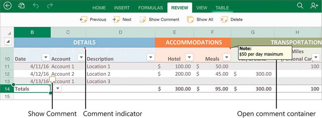
You can review and delete comments created in other versions of Excel
You can’t create or edit comments on a worksheet in Excel for iPad, but you can display, review, and delete them by using the commands on the Review tab of the ribbon.
See Also
For more information about comments, see “Collaborate on document content” in Chapter 6, “Enhance document content.”
To move among comments in a workbook
1. On the Review tab, tap Previous or Next.
Tip
Tapping the Previous or Next button moves among all the comments on all the worksheets in the workbook.
To display or hide a comment
1. Tap the cell the comment is attached to.
2. Tap the comment icon that appears outside the upper-right corner of the cell.
Or
On the Review tab, tap Show Comment.
To display all comments in the workbook
1. On the Review tab, tap Show All.
To delete a comment
1. Tap the cell the comment is attached to.
Or
Tap the open comment container.
2. On the Review tab, tap Delete.
Tip
Tapping an active comment container displays gray handles on the sides and in the corners. The handles are inactive in Excel for iPad. You can modify the comment containers by using these handles in other versions of Excel.
Skills review
In this chapter, you learned how to:
![]() Create and manage Excel tables
Create and manage Excel tables
![]() Perform data-processing operations
Perform data-processing operations
![]() Display data in charts
Display data in charts
![]() Display data from PivotTables
Display data from PivotTables
![]() Collaborate on workbook content
Collaborate on workbook content
Practice tasks

The practice files for these tasks are located in the iPadOfficeSBS\Ch08 folder.
Create and manage Excel tables
Start Excel, open the CreateTables workbook, and then perform the following tasks:
1. Format the range A2:M23 as a table with headers. Notice the default table style.
2. Apply a table style from the Dark category.
3. Add a Total row to the table. Notice that Excel inserts the sum of the December sales at the bottom of the Dec column.
4. Select the Average statistic in cell M24 to display the average sales per person in December. Review the formula in the Formula Bar.
5. In the Total row, insert a calculation from the list for each column. Include at least one instance of each of the eight options.
6. Delete row 22 from the table, and note the changes to the Total row values.
7. Convert the table to a data range.
8. Create a blank table in cells O2:Q10. Apply a table style from the Light category.
9. Extend the blank table by adding two columns to the right edge, and then insert a blank row anywhere inside the table.
Perform data-processing operations
Open the ProcessData workbook, and then perform the following tasks:
1. Review the Schedule worksheet, which provides a structure for scheduling the creation of three products that go through eight process phases. Specifically notice the following:
• Cell B3 contains the project start date.
• Column C is empty.
• E3:L3 contain the phase numbers.
• E4:L4 contain the corresponding process names.
• E5:L5 contain the number of days required to complete each process.
2. If cell E6 displays ###, AutoFit column E to display the date in the cell.
3. Select cell E6 and review the formula in the Formula Bar. Notice that it calculates the Phase 1 (Design) completion date for Product 1 (Widgets) based on the project start date and the number of days allocated to the Design phase.
4. Copy the formula from cell E6 to E7 and then evaluate the formula. Notice that the relative reference tries to calculate the date based on the empty cell B4 and the date in E6.
Tip
To simplify this practice task, the formulas assume that all days are working days. In a real-world situation, you could use the WORKDAY function to omit weekends and holidays from date calculations.
5. Edit the formula in cell E6 to absolutely reference the project start date ($B$3).
6. Edit the formula in cell E7 to =E6+E5. This indicates that the Design team will complete work on Product 1 and then start work on Product 2.
7. Fill the formula from cell E7 to E8 and then evaluate the formula. Notice that the relative formula tries to add E7 to E6.
8. Edit the formula in cell E7 to absolutely reference cell E5 ($E$5) so that it always adds the number of days specified in cell E5 to the completion date of the previous product. Then fill the formula from cell E7 to E8 and verify that the date returned is 12-Feb (February 12).
Tip
AutoFit columns after copying or filling formulas if necessary to display the formula results.
9. Fill only the formula (but not the formatting) from cell E6 to cell F6, and then evaluate it. Notice that it calculates the Phase 2 (Review) completion date based on the project start date instead of the Phase 1 completion date.
10. Edit the formula in cell F6 to =E6+$F$5 so that it adds the specified number of Review days to the previous phase completion date.
11. Copy the formula from F6 to F7 and F8 and verify the calculated dates.
12. Copy the formulas from cells F6:F8 to cells G6:G8, and then evaluate them. Notice that they add four days instead of three.
13. In cell F6, change $F$5 to a mixed reference that always references row 5 of the current column. Then repeat steps 11 and 12 and notice the change in the Document phase dates.
14. Copy the formula from G6:G8 through the remaining project phases and verify that the Delivery date for Product 3, in cell L8, is March 11. Notice that the formula is =K8+L$5.
15. Select column C and delete it. Notice that the formula in cell K8 automatically changes to =J8+K$5 to account for the deleted column.
16. If you want to, update the schedule to use the WORKDAY function, which takes the form =WORKDAY(start_date, number_of_days). The final completion date should be April 8.
17. Experiment with changing the start date in cell B3 and the number of days for each process.
Display data in charts
Open the CreateCharts workbook, and then perform the following tasks:
1. Create a bar chart of your choice based on the entire table. Then move the bar chart to the right of the table.
2. Correct the order of the data in the bar chart by moving the September data in column D to follow the August data in column J.
3. Swap the bar chart data over the axis. Notice that both versions of the bar chart are difficult to read due to the number of data points on each axis.
4. Change the bar chart to a clustered column chart layout that displays the salespeople’s names on the x-axis.
5. Change the clustered column chart to a stacked column chart, and notice the immensely improved readability of the chart.
6. Modify the column chart to include only data from January through June.
7. Apply some of the available chart styles to the column chart. Finish by applying the style that you like best.
8. Apply any monochromatic color set to the column chart. Consider the effect this has on the information presented by the chart.
9. Apply any layout that includes a chart title and a data table. Review the information in the data table, and then remove it from the chart area.
10. Create a line chart of your choice based only on the data in columns A and B of the table.
11. Move the line chart to the January Sales Chart worksheet and resize it to about 25 percent larger. Notice that the chart still references the Sales data in the table on the Sales worksheet.
12. Apply various chart types to the line chart and consider the benefits of each chart type. Finish by applying the chart type and style you like the best.
Display data from PivotTables
Open the PivotData workbook, and then perform the following tasks:
1. Review the table on the Sales Data worksheet, and then review the information in the PivotTable on the Sales Analysis worksheet. Consider the relationship between the table and the PivotTable.
2. On the Sales Analysis worksheet, collapse the Books category.
3. In the Computer Peripherals group, expand the customer records to display the specific products sold to each customer.
4. Use the Columns Pivot Filter to display only data from 2014.
5. Collapse the columns to display only the full year and not the quarters. Then collapse the rows to display only the product categories. Notice that the overview of information is clear and concise, and consider the detail you can drill down to.
6. Change the layout of the PivotTable to display grand totals for rows but not for columns.
Collaborate on workbook content
Open the ReviewComments workbook, and then perform the following tasks:
1. Move among the comments in the workbook. Notice that hidden comments appear only while they are active for review.
2. Hide the $50 per day maximum comment. Then display all the comments in the workbook.
3. Delete any one of the comments.