Microsoft Office 2016 At Work For Dummies (2016)
Chapter 15
Formatting a Presentation
In This Chapter
 Changing the theme
Changing the presentation colors and fonts
Modifying the theme in Slide Master view
Enabling footer placeholders
Formatting text boxes and placeholders
Creating SmartArt graphics
Modifying the structure of a SmartArt graphic
Formatting a SmartArt graphic
One reason PowerPoint is so popular is that it’s easy for anyone to create great-looking presentations. In this chapter, you learn how simple and even fun it is to create different looks for your presentations, including different themes, colors, and fonts. You also learn how to modify the presentation’s overall formatting in Slide Master view, and how to format text boxes and placeholders. Finally, you learn how to create and format SmartArt graphics that can change dull bulleted lists into interesting graphical diagrams.
Understanding templates versus themes
Back in Chapter 14, you learned how to create a presentation based on a template, and the template came with its own theme settings, such as font, color, and background choices. So what’s the difference between a template and a theme? Doesn’t a theme provide all those things too? Perhaps a quick overview is in order before we launch into themes in this chapter.
A template is a file on which you can base new presentations. PowerPoint templates typically have a .potx extension (or a .potm extension if macro-enabled). A template file may contain one or more themes (that is, sets of design choices), plus one or more slides containing sample content.
A theme is both simpler and more complex than a template. A theme can exist either inside of a template or as a separate file with a .thmx extension. A theme is simpler in that it cannot hold some of the things that a template can, such as sample content. A theme can provide only variant, font, color, effect, background, and layout settings. On the other hand, a theme can also do more than a template, in that you can apply a theme saved as a separate file to other Office applications, so you can share the theme’s formatting settings with Word or Excel, for example. You can’t do that with a template.
Change the theme
As you learned in Chapter 9, Office applications share a common set of themes. A theme includes color choices, font choices, and effect choices. Chapter 2 and Chapter 9 offer longer explanations of the features if you didn’t catch them the first time through.
Themes are especially important in PowerPoint because there’s typically more color and flash in a presentation than in a document or a spreadsheet. Accordingly, themes have a few extra features in PowerPoint:
 Many themes provide decorative background graphics that repeat on each slide.
 Certain slide layouts, such as title slides, may have different background graphics than the other slides.
 You can choose variants of a theme. Usually a variant is the same theme with a different background color and color scheme, but for some themes the variants have different background graphics as well.
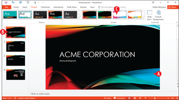
Figure 15-1: Theme features in PowerPoint.
To change the theme, follow these steps:
 On the Design tab, in the Themes group, choose a theme.
You can click More to see additional themes. (See  in Figure 15-2.)
 In the Variants group, click the desired variant of the chosen theme.
Most themes have only a few variants, but if there are more than can be displayed in the Variants group, you can click the More button in that group to see the additional variants. (See ( ) in Figure 15-2.)
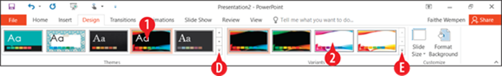
Figure 15-2: Choose a theme and a variant.
 You can modify most aspects of the theme, including removing or repositioning the background graphics and the placeholders, in Slide Master view. See “Modify the theme in Slide Master view” later in this chapter for details.
It is generally expected in business presentations that you will use the same theme across all the slides in your presentation, because it makes for a more consistent and professional look. However, you might occasionally have a situation where you need to use a different theme, or perhaps a different variant of the theme, for certain slides.
To apply a theme or a variant of a theme to only certain slides, do the following:
In the Slides pane in Normal view, or in Slide Sorter view, select the slide(s) to affect.
On the Design tab, right-click the desired theme or variant.
 On the menu that appears, click Apply to Selected Slides.
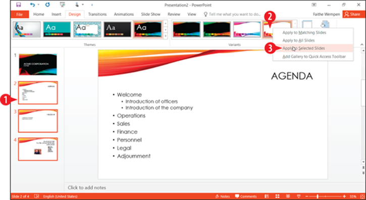
Figure 15-3: Apply a theme or variant to only certain slides.
Change the presentation colors and fonts
Just like in Word and Excel, you can change the color and font schemes separately from the theme itself. The main difference in PowerPoint is in where those commands are located.
Here’s how to access the color schemes:
On the Design tab, click the More button in the Variants group.
Point to Colors.
Click the desired color scheme.
Yes, you can customize the color schemes, just like in Word and Excel. Just click Customize Colors to get started with that. Check out “Create a custom theme” in Chapter 9 for help.
It’s pretty much the same thing for the font schemes:
1. On the Design tab, click the More button in the Variants group.
Point to Fonts.
Click the desired font scheme.
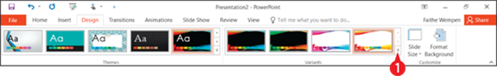
Figure 15-4: Click More in the Variants group.
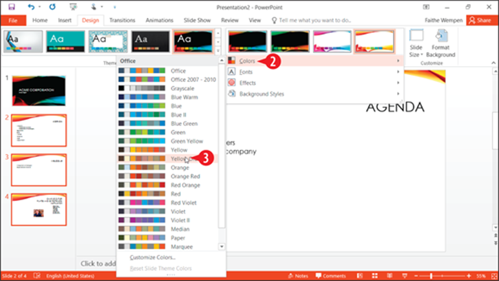
Figure 15-5: Choose a different color scheme.
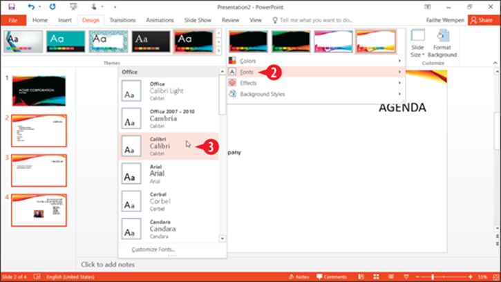
Figure 15-6: Choose a different font scheme.
Modify the theme in Slide Master view
Slide Master view is where you can really get down to the nitty-gritty of formatting a presentation. It enables you to customize the theme formatting by changing colors, backgrounds, layouts, fonts, and more. Here are some things to keep in mind about Slide Master view:
To enter Slide Master view, choose View ⇒ Slide Master.
In Slide Master view, the navigation pane at the left shows thumbnail images of slides.
The topmost thumbnail is the theme master, and it represents the theme as a whole. Any changes you make to this slide affect all slides that use that theme, regardless of their layout.
Each of the thumbnails beneath that topmost one is a layout master and represents an individual layout. Any changes you make to one of these affect only slides that use that layout.
If you need to know which layout a particular thumbnail represents, point at it with the mouse and read the name in the ScreenTip. The ScreenTip also tells how many slides in the presentation use that layout.
If there is more than one theme applied in the presentation (for example, if you chose to apply an alternate theme or variant to selected slides), there will be multiple theme masters in the navigation pane. Scroll down to find the other(s).
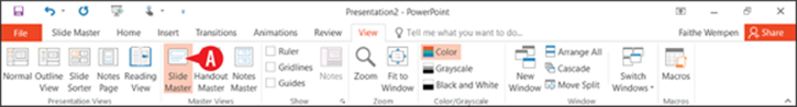
Figure 15-7: Enter Slide Master view.
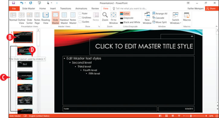
Figure 15-8: Customize slides in Slide Master view to affect many slides in the presentation at once.
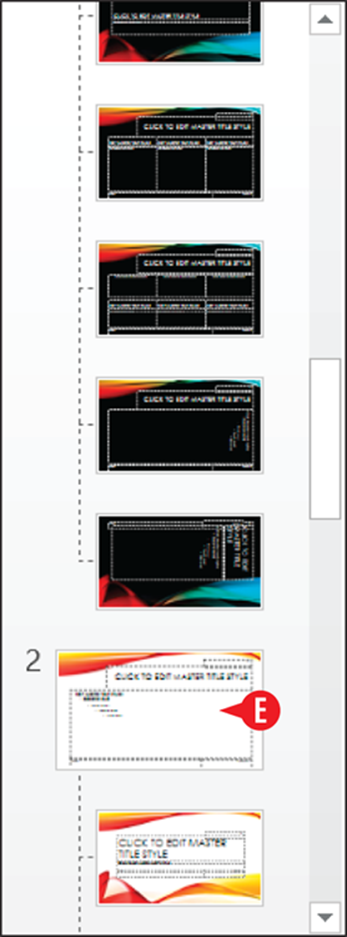
Figure 15-9: Scroll down in the navigation pane to find other themes used in this presentation.
The following sections outline some things you can do in Slide Master view.
Create a new layout
Before you start fiddling with a layout, it’s a good idea to make a copy of it. Then you can make your changes to the copy, and the original layout remains safe.
To duplicate a layout, right-click a layout master and choose Duplicate Layout. (See in Figure 15-10.)
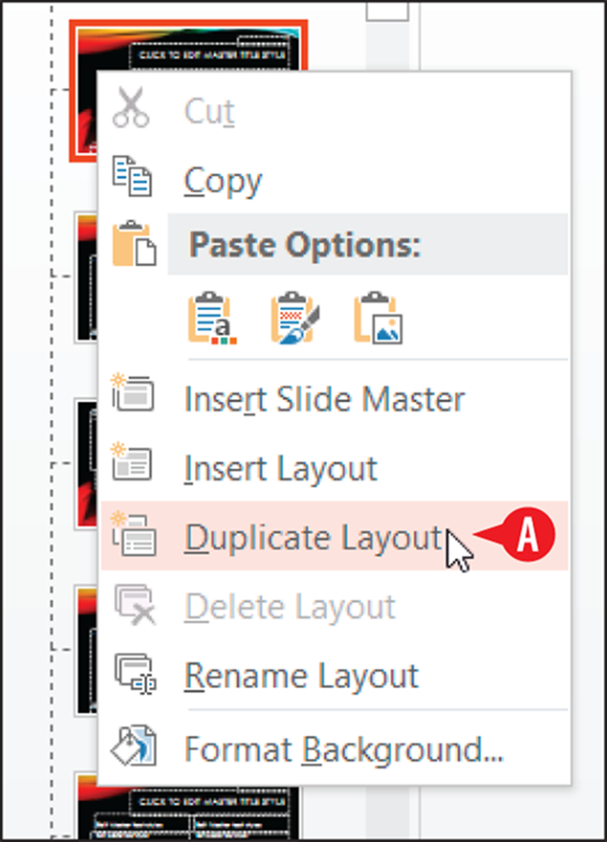
Figure 15-10: Duplicate a layout.
You can also create a new layout from scratch. To do so, follow these steps:
Select the theme master (the big slide at the top of the navigation pane).
Click Insert Layout.
A new layout appears in the navigation pane, below the other layouts for that theme. (See  in Figure 15-12.)
The new layout contains a title placeholder, but no content placeholders. (See  in Figure 15-12.)
If the theme master contains a slide number, footer, or date placeholder, the new layout inherits them. (See in Figure 15-12.)
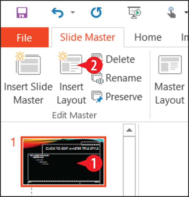
Figure 15-11: Create a new layout.
Figure 15-12: The newly created layout.
To add content placeholders to the new layout, see, “Add placeholders” later in this chapter. To reposition any of the placeholders on the layout, see “Reposition and resize a placeholder.”
Remove placeholders
To remove a placeholder from a layout, select the placeholder’s outer frame and then press Delete on the keyboard.
 Make sure you have the correct layout master or theme master selected in the navigation pane before you delete a placeholder. Deleting a placeholder from the theme master also removes it from all layouts; deleting from a layout master affects only that layout.
Certain placeholders can be hidden (that is, toggled off) without deleting them. That’s useful in case you might want to toggle them back on again later. Consider Figure 15-13:
To temporarily hide the title placeholder, clear the Title check box on the Slide Master tab.
To temporarily hide the slide number, footer, and date placeholders (all of them as a group), clear the Footers check box there.
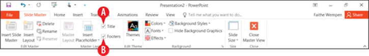
Figure 15-13: You can clear check boxes to hide certain placeholders.
When working with the theme master (not an individual layout master), you can toggle each of the default placeholder elements on or off; this change affects all layouts under that theme. Follow these steps:
Make sure the theme master is selected in the navigation pane.
On the Slide Master tab, click Master Layout.
In the Master Layout dialog box, clear the check box for any element you don’t want to use.
 Click OK.
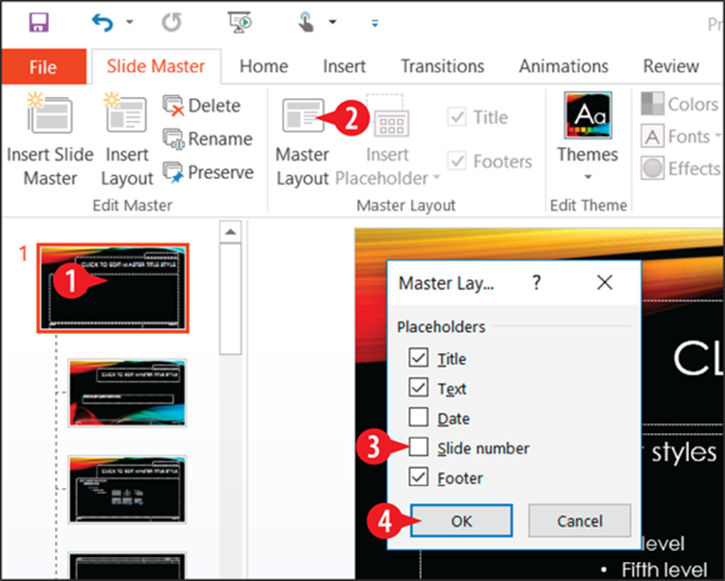
Figure 15-14: The check boxes in the Master Layout dialog box affect all layouts.
Enabling the placeholders for footer, slide number, and date does not make those elements automatically appear on the slides. All it does is define where those items will go if you choose to enable them. See “Enable footer placeholders” later in this chapter to learn how.
Add placeholders
To add a placeholder to a slide, follow these steps:
Make sure the desired layout is selected in the navigation pane.
On the Slide Master tab, click Insert Placeholder.
Click the desired content type. Content is the most flexible; the other choices limit users to a specific type of content.
Drag on the slide to draw a rectangular frame where the placeholder should appear. A colored box appears showing the dimensions of the new placeholder.
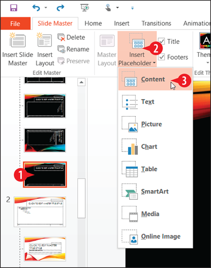
Figure 15-15: Add a placeholder.
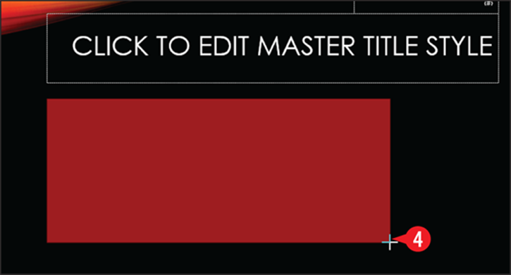
Figure 15-16: Draw the placeholder on the layout master.
When you release the mouse button, the new placeholder appears on the slide. See the next section if you need to move or resize it.
Reposition and resize a placeholder
Placeholders are like any other objects on a slide. You can move and resize them freely:
To move a placeholder, drag its border (but not a selection handle).
To resize a placeholder, drag a selection handle.
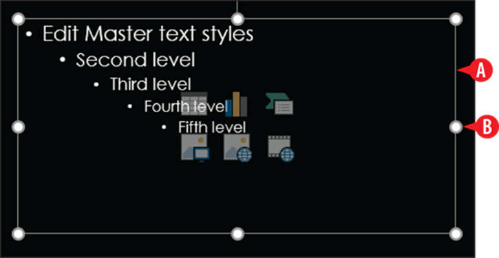
Figure 15-17: Move and resize a placeholder as you would any other object.
Hide or remove a background graphic
First, let’s get one thing straight: there’s a difference between hiding a background graphic and removing it. Removing a background graphic is done on the theme master, and it applies to all layouts. It is not easily reversible; once you delete the graphic, it’s gone — at least until you reapply the default version of the theme, which also erases all your other customizations, too. On the other hand, hiding a background graphic is done on an individual layout and is easily reversible.
To hide a background graphic on an individual layout:
Select the desired layout master.
On the Slide Master tab, mark the Hide Background Graphics check box.
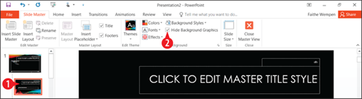
Figure 15-18: Hide the background graphic on an individual layout.
The preceding steps hide any background graphics that have been inherited from the theme master. They do not hide any background graphics that are directly located on the layout master. To delete those, select them and press Delete. (But remember, if you delete, rather than hide, they’re gone for good.)
To delete a background graphic for the entire theme:
Select the theme master.
Select the graphic to be deleted.
3. Press the Delete key.
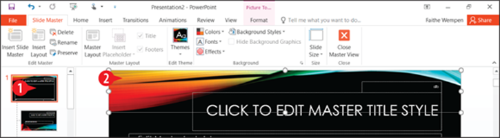
Figure 15-19: Delete a graphic from the theme master.
Change the text size
In most cases, it is best to leave the text in the theme’s placeholders set to the default size. Locking in the text to a fixed size can result in some awkward-looking layouts if you later change themes or fonts. You can change the fonts used by choosing a different font scheme, as you learned earlier in the chapter.
However, sometimes you might need to change the text size, either for all layouts (on the theme master) or for an individual layout. For example, if the bulleted text in a Content placeholder is too small for the audience to read comfortably, you might bump it up a few points.
To change the text size for a text placeholder, you can use any of the standard methods of changing font size that you’ve learned throughout this book. I prefer to use the Shrink Font and Grow Font buttons rather than choosing specific sizes, personally, because that way I can change multiple outline levels at once.
Follow these steps to increase the font sizes for all outline levels on a Content placeholder, for example:
Select the theme master or an individual layout master. (It’s usually better to change the theme master because then the font size is consistent across all layouts.)
Drag to select all the text in the Content placeholder, or click inside the placeholder and press Ctrl+A.
On the Home tab, click the Grow Font button until the fonts are sufficiently larger.
If you wanted the fonts smaller, you could instead click Shrink Font. (See  in Figure 15-20.)
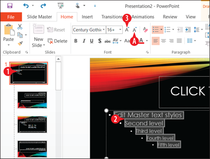
Figure 15-20: Shrink or grow the text in the Content placeholder on the theme master.
Exit from Slide Master view
When you are finished working in Slide Master view, click the Close Master View button on the Slide Master tab. (See in Figure 15-21.)
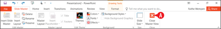
Figure 15-21: Exit from Slide Master view to return to normal editing of individual slides.
There are also Master views for handouts and notes pages. You can these to customize the layout of your printouts of those items. They aren’t covered in this book, but you may want to experiment with the Handout Master and Notes Master buttons on the View tab on your own.
Enable footer placeholders
As I mentioned earlier in this chapter, just having the footer, slide number, and date placeholders on a slide is not enough to make anything appear in them. You have to enable those items.
Those items, by the way, are collectively known as footer placeholders, even though only one of them is technically the footer, and even though, depending on the theme and layout, some of them may appear at the top rather than the bottom of each slide.
To enable one or more of them, follow these steps:
Exit from Slide Master view if you’re still there. See the preceding section.
If you want to affect only certain slides, select them in the Slides pane in Normal view, or select them in Slide Sorter view. Normally you will want the setting to be consistent throughout the entire presentation, but there might be special circumstances, such as wanting to place certain items only on the first or last slide.
3. On the Insert tab, click Header & Footer.
If you want the date or time to appear, mark the Date and Time check box:
You can choose a date or time format from the Update Automatically drop-down list.
Click Fixed if you don’t want the date to update automatically, and then enter the desired date in the Fixed text box, in the format you prefer.
 If you want the slide number to appear, mark the Slide number check box.
 If you want the footer to appear, mark the Footer check box, and then type the desired text in the footer text box.
If you don’t want these elements on the title slide, mark the Don’t Show on Title Slide check box. (See in Figure 15-23.)
 Click Apply to apply the setting only to the selected slides, or click Apply to All to apply it to the entire presentation.
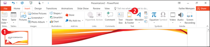
Figure 15-22: Choose Header & Footer to enable footer placeholders.
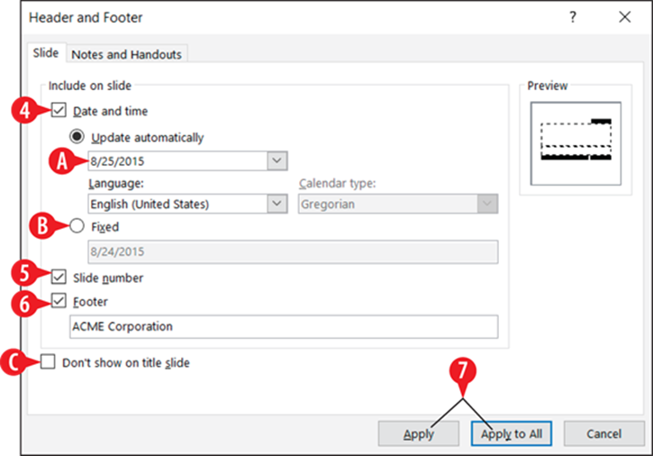
Figure 15-23: Choose what you want to appear as footer information.
Format text boxes and placeholders
Each placeholder box, and each manually placed text box, can be formatted in several ways. Of course, you can format the text itself, like you do with any text, but you can also format its border and its fill:
Border (or outline) refers to the line around the outside of the box. A border can have a line style (like dotted or solid), a line weight (thickness), and a line color.
Fill refers to the background inside the box. A fill can be a solid color or can be a pattern, gradient, texture, or photo.

Figure 15-24: A text box has a border and a fill.
If you have a manually created text box where the text overflows the box, no matter how you try to resize the box, do this: Right-click the text box and choose Format Shape. In the Format Shape task pane, click Text Options and then click the Textbox icon. Change the AutoFit setting to either Do not Autofit or Shrink text on overflow.
Apply a shape style
Shape styles provide a simple way of formatting a text box using one of the theme’s colors. Each shape style includes a fill setting, a border setting (even if that setting is “no border”), and in some cases effect settings such as a beveled edge.
To apply a shape style:
Select the text box.
On the Drawing Tools Format tab, click the More button to open a gallery.
Click one of the shape styles.
Each row contains the same style implemented in a different one of the theme’s colors.
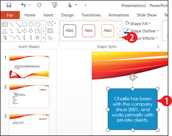
Figure 15-25: Select the text box and then open the Shape Styles gallery.
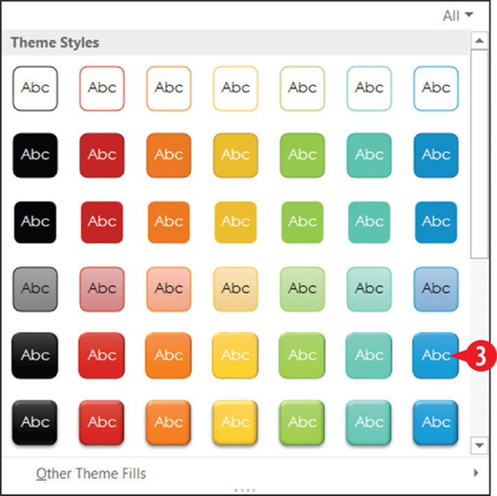
Figure 15-26: Select the desired shape style.
Format a text box border
Don’t like the default outline, or the one that the shape style provided? Set a text box’s outline manually as follows:
1. Select the text box.
On the Drawing Tools Format tab, click Shape Outline.
3. Click the desired outline color.
Choose a theme color to allow the color to change if you change themes or color schemes later.
Choose a standard color to assign a fixed color.
Click More Outline Colors to choose a fixed color from a dialog box.
Click Eyedropper and then click a color somewhere else in the presentation to pick up that color for use as the text box’s border color.
If you want to change the outline weight, click Shape Outline again to reopen the menu. Then click Weight and then click the desired weight.
If you want to change the outline style, click Shape Outline again to reopen the menu. Then click Dashes and then click the desired line style.
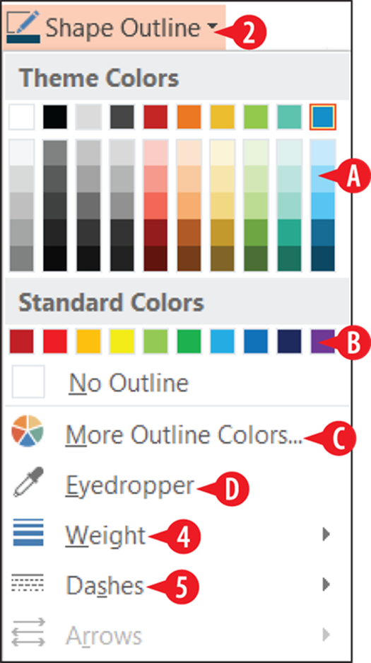
Figure 15-27: Choose the outline color.
Format a text box fill
Text box fill options are similar to those for the outline, as detailed in the previous section. You can choose a theme color or standard color, or you can pick up a color with the Eyedropper.
In addition to those choices, though, you can also do any of the following for the text box’s fill:
Click Picture and then select a picture to use for the text box background.
Point to Gradient and then click the desired gradient option, or click More Gradients to configure a custom gradient.
Point to Texture and then click the desired texture. A texture is a small image that is tiled (repeated) to make it look like one unified surface.
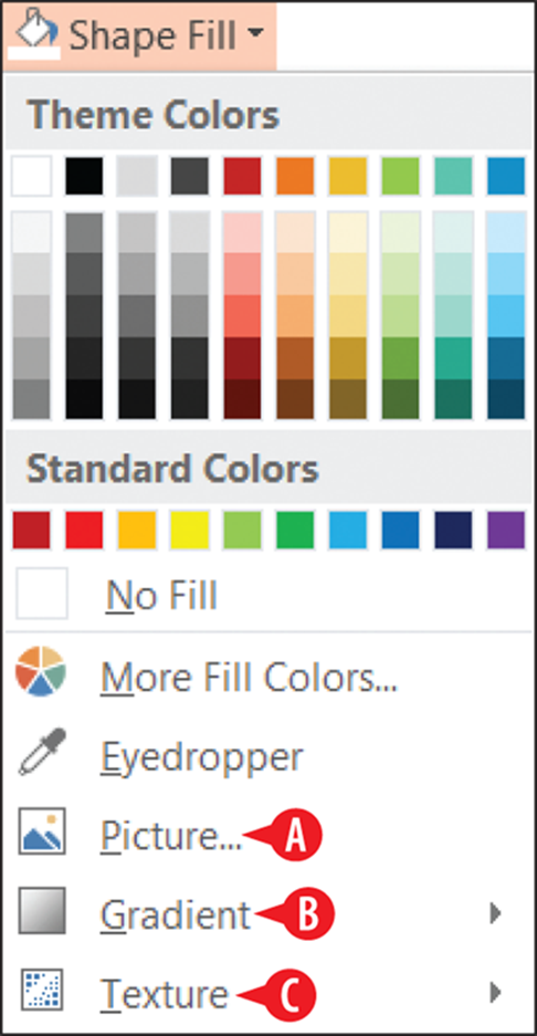
Figure 15-28: Fill options for a text box.
Apply text box effects
The same effects apply in PowerPoint as with objects in the other Office applications, but in PowerPoint these effects are perhaps more useful and relevant because of the graphical nature of a presentation as compared to a spreadsheet or letter.
To apply text box effects, follow these steps:
1. Select the text box.
On the Drawing Tools Format tab, click Shape Effects.
Point to one of the menu options to display its submenu.
Preset offers a variety of presets that span more than one of the effect categories, such as beveling plus 3-D rotation or a shadow. (See in Figure 15-29.)
Click the desired setting on the submenu.
You can click the Options command at the bottom of a submenu to open a task pane containing more options for that effect. (See in Figure 15-29.)
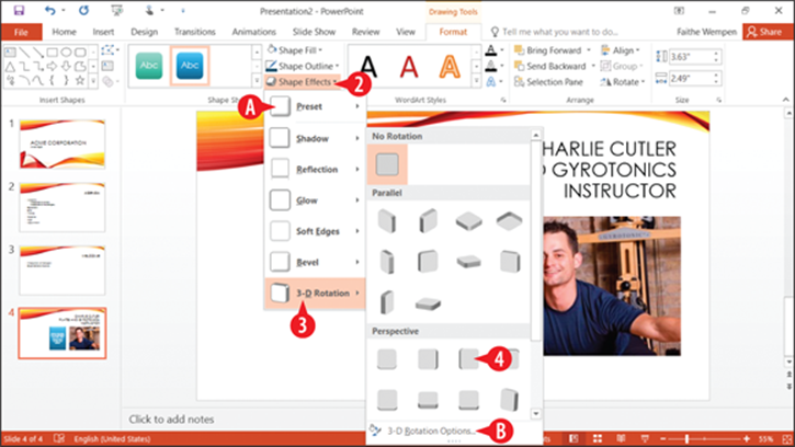
Figure 15-29: Choose an effect.
So what are these text effects? Table 15-1 has a quick summary.
Table 15-1 Text Effects Applied to a Text Box
|
Effect |
Description |
Example |
|
Shadow |
Places a shadow behind the box, as if a light were shining on its face. |
|
|
Reflection |
Shows a faint reflection of the box, as if it were sitting on a shiny surface. |
|
|
Glow |
Adds a colored glow around the outside of the box. |
|
|
Soft Edges |
Makes the edges of the box somewhat fuzzy. |
|
|
Bevel |
Makes the edges of the box look like they are raised and beveled. |
|
|
3-D Rotation |
Tilts the box using 3-D perspective. |
|

Create SmartArt graphics
SmartArt is a special class of graphic object that combines shapes, lines, and text placeholders. SmartArt is most often used to illustrate relationships between bits of text.
You can create a SmartArt graphic from scratch and then enter the text into it, or you can convert the existing paragraphs on a slide into a SmartArt graphic.
Table 15-2 summarizes the types of SmartArt you can create. Note that each of the types has many different designs, so you aren’t limited to the graphic shown in the Example column.
Table 15-2 SmartArt Graphics
|
Type |
Description |
Example |
|
List |
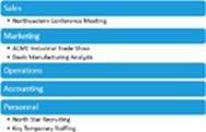
Presents information in a straightforward, text-based way, somewhat like a fancy outline. Useful when the information is not in any particular order, or when the process or progression is not important. |
|
|
Process |
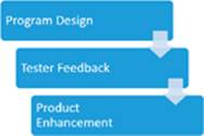
Similar to a list, but with directional arrows or connectors that show the flow of one item to another. |
|
|
Cycle |
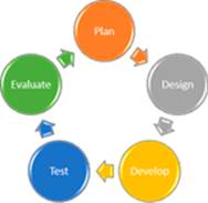
Illustrates a repeating or recursive process in which there is no fixed end point. |
|
|
Hierarchy |
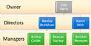
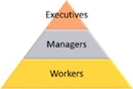
An organization chart, showing structure and relationships between people or things in standardized levels. |
|
|
Relationship |
Illustrates how parts relate to a whole. One common type is a Venn diagram, shown here. |
|
|
Matrix |
Also shows relationships of parts to a whole, but it does so with the parts in orderly looking quadrants and does not reflect a relationship between the items. |
|
|
Pyramid |
A striated triangle with text at various levels, representing the relationship between the items and also implying that some items are more important or less numerous. |
|
|
Picture |
Any of the above types of diagrams that contain placeholders for pictures. |


SmartArt is available in Word and Excel too; it’s not just a PowerPoint feature.
Create a new SmartArt graphic
Here’s how to create a new SmartArt graphic:
Click the SmartArt icon in an empty Content placeholder on the slide.
You can also choose Insert ⇒ SmartArt, but doing so creates a free-floating SmartArt, rather than it being attached to a placeholder. When possible, it’s better for objects to be associated with placeholders, because it makes the transition smoother if you switch designs or layouts.
Click the desired category.
Click one of the designs.
A preview of the selected design appears, along with its description. (See in Figure 15-31.)
Click OK.
Type the text that should appear into each box, clicking a box to move to it as needed. Text automatically resizes as needed to fit in the available space in the shape:
You can also type text in the Text pane.
If the Text pane doesn’t appear, click Text Pane on the SmartArt Tools Design tab.
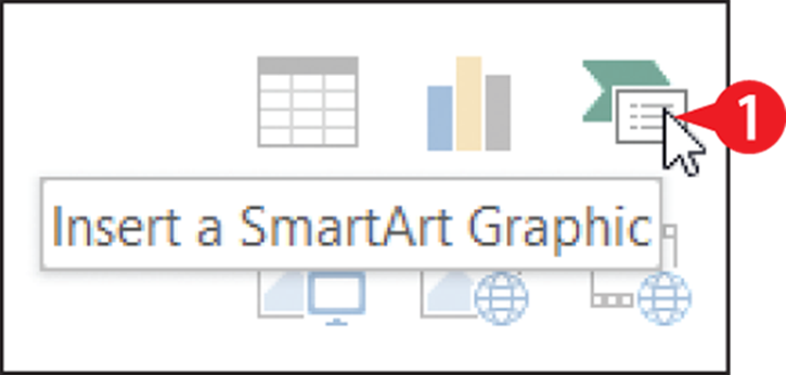
Figure 15-30: Select the SmartArt icon.
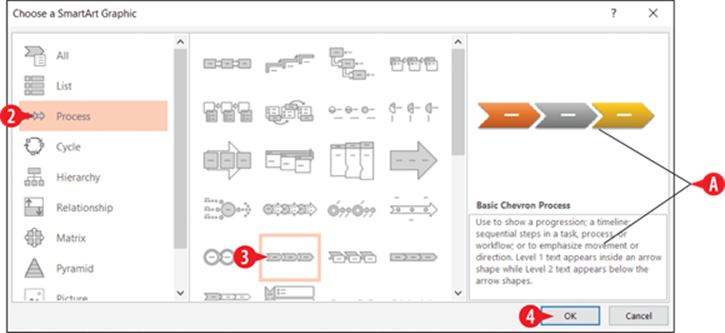
Figure 15-31: Select the SmartArt icon.
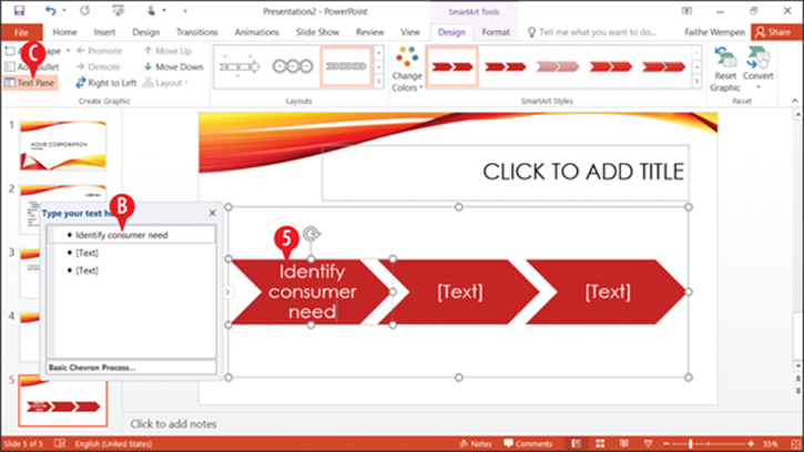
Figure 15-32: Type text into the SmartArt graphic’s placeholders.
Convert existing text to SmartArt
An existing bulleted list (or other set of paragraphs with or without bullets) can easily be converted to a SmartArt graphic. Here’s how:
Select the paragraphs.
On the Home tab, click Convert to SmartArt Graphic.
Click More SmartArt Graphics.
If you happen to see the layout you want, you can click it in step 3 and then skip the rest of the steps. (See in Figure 15-33.)
Click the desired category.
Click one of the designs.
A preview of the selected design appears, along with its description. (See in Figure 15-34.)
Click OK. The text is replaced by a SmartArt graphic that uses that same text.
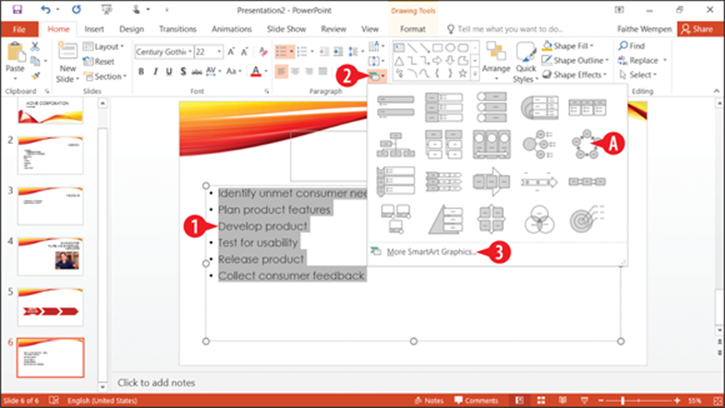
Figure 15-33: Click Convert to SmartArt Graphic on the Home tab.
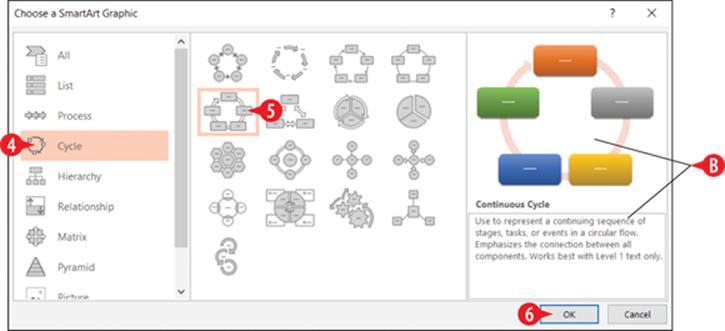
Figure 15-34: Select the design to use.
Edit and format SmartArt text
All SmartArt has text placeholders, which are basically text boxes. You simply click in one of them and type. Use the usual text-formatting controls (Font, Font Size, Bold, Italic, and so on) on the Home tab to change the appearance of the text. Some things to note about SmartArt text:
You can also select the text and then use the formatting tools on the mini toolbar.
You can also type, edit, and format text in the Text pane. The formatting will not preview in the Text pane, however.
Another formatting option is to use WordArt Styles group on the Format tab to apply WordArt formatting.
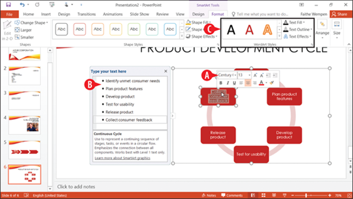
Figure 15-35: Edit SmartArt text.
The text in the outline pane is not always in the order you would expect it to be for the graphic because it forces text to appear in linear form from a graphic that is not necessarily linear. It does not matter how the text appears in the Text pane because only you see that. What matters is how it looks in the actual graphic.
Here are some tips for working with SmartArt text:
· To leave a text box empty, just don’t type anything in it. The [Text] placeholders do not show up in a printout or in Slide Show view.
· To promote a line of text, press Shift+Tab; to demote it, press Tab in the Text pane.
· Text wraps automatically, but you can press Shift+Enter to insert a line break if necessary.
· In most cases, the text size shrinks to fit the graphic in which it is located. There are some exceptions to that, though; for example, at the top of a pyramid, the text can overflow the tip of the pyramid.
· If you resize the SmartArt graphic, its text resizes automatically.
· All of the text in a SmartArt graphic is the same size, so if you enter a really long string of text in one box, the text size in all of the related boxes shrinks too. You can manually format parts of the SmartArt graphic to change this behavior. For example, you can select one shape and choose a different font size for the text in it.
Modify the structure of a SmartArt graphic
The structure of the SmartArt graphic includes how many boxes it has and where they are placed. Even though the graphic types are all very different, the way you add, remove, and reposition shapes in them is surprisingly similar across all types.
Not all SmartArt graphic types can accept different numbers of shapes. For example the four-square matrix graphic is fixed at four squares, and you can’t add or remove shapes.
Insert a shape
To insert a shape:
1. Click a shape that is adjacent to where you want the new shape to appear.
On the SmartArt Tools Design tab, click the arrow on the Add Shape button to open a menu.
Click the desired shape to add. The choices on the menu depend on the graphic type and the type of shape selected.
If you click the face of the Add Shape button instead of the arrow, you add a shape of the same level and type as the selected one, and the menu does not appear. (See in Figure 15-36.)
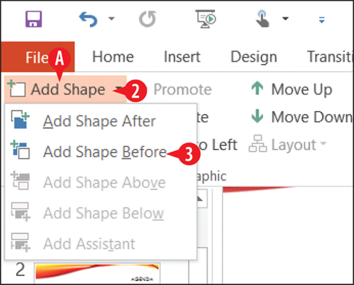
Figure 15-36: Add a shape.
Delete a shape
To delete a shape, click it to select it in the SmartArt graphic, and then press the Delete key on the keyboard. You might need to delete subordinate shapes before you can delete the main shape.
Promote and demote text
The difference between a shape and a bullet is primarily a matter of promotion and demotion in the Text pane’s outline. The Text pane works just as the regular Outline pane does in this regard; you can promote with Shift+Tab or demote with Tab. You can also use the Promote and Demote buttons on the SmartArt Tools Design tab.
Reorder shapes or change the flow direction
You can easily reorder individual shapes. For example, suppose you have a graphic that illustrates five steps in a process and you realize that steps 3 and 4 are out of order. You can move one of them without having to retype all of the labels:
Select a shape and then on the SmartArt Tools Design tab, click Move Up or Move Down.
Each SmartArt graphic flows in a certain direction. A cycle graphic flows either clockwise or counterclockwise. A pyramid flows either up or down. If you realize after typing all of the text that you should have made the SmartArt graphic flow in the other direction, you can change it.
Click the Right to Left button on the SmartArt Tools Design tab. It is a toggle; you can switch back and forth freely.
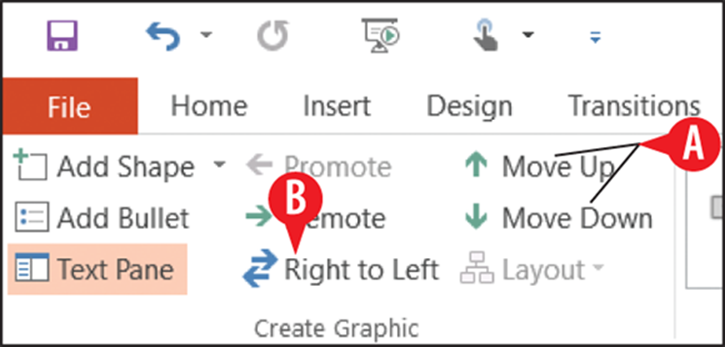
Figure 15-37: Use the buttons on the Design tab to reorder the shapes.
Reposition shapes
You can individually select and drag each shape to reposition it on the SmartArt graphic. Any connectors between it and the other shapes are automatically resized and extended as needed.
Reset a SmartArt graphic
After making changes to a SmartArt graphic, you can return it to its default settings.
On the SmartArt Tools Design tab, click Reset Graphic. This strips off everything, including any SmartArt styles and manual positioning, and makes it exactly as it was when you inserted it, except it keeps the text that you’ve typed. (See in Figure 15-38.)
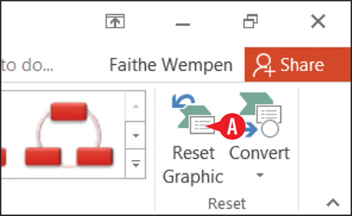
Figure 15-38: Reset the graphic.
Change to a different layout
When you insert a SmartArt graphic you choose a type, and you can change that type at any time later:
To change the layout type, choose from the Layouts gallery on the SmartArt Tools Design tab.
If the type you want doesn’t appear, click More Layouts at the bottom of its menu to redisplay the same dialog box as in Figure 15-34, from which you can choose any layout.
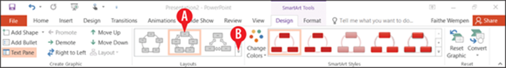
Figure 15-39: Choose a different layout.
Format a SmartArt graphic
Next let’s look at some ways to improve the appearance of a SmartArt graphic. You can format a SmartArt graphic either automatically or manually. Automatic formatting is the default, and many PowerPoint users don’t even realize that manual formatting is a possibility. The following sections cover both.
Apply a SmartArt style
SmartArt Styles are preset formatting specs (border, fill, effects, shadows, and so on) that you can apply to an entire SmartArt graphic. They make it easy to apply surface texture effects that make the shapes look reflective or appear to have 3-D depth or perspective.
To apply a SmartArt style:
1. Select the SmartArt graphic.
 On the SmartArt Tools Design tab, click one of the samples in the SmartArt Styles group.
OR
 Click the More button and then select from a larger list.
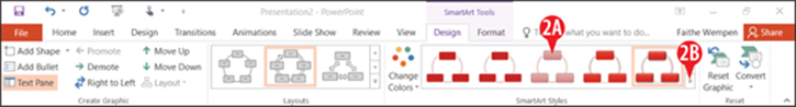
Figure 15-40: Apply a SmartArt style.
Change SmartArt colors
After you apply a SmartArt style, as in the preceding section, you might want to change the colors used in the graphic. You can choose a Colorful scheme (one in which each shape, or the shapes at each level, have their own colors), or you can choose a monochrome color scheme based on any of the current presentation color theme’s color swatches.
To change the colors:
1. Select the SmartArt graphic.
On the SmartArt Tools Design tab, click Change Colors.
Click the desired color combination.
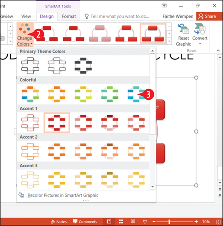
Figure 15-41: Change SmartArt colors.
Manually apply colors and effects to individual shapes
In addition to formatting the entire graphic with a SmartArt Style, you can also format individual shapes using Shape Styles. This is pretty much like formatting text boxes, as you learned earlier in this chapter. Here’s a quick review.
1. Select a shape in a SmartArt graphic.
On the SmartArt Tools Format tab, select a shape style from the Shape Styles gallery.
(Optional) Fine-tune the style by using the Shape Fill, Shape Outline, and/or Shape Effects buttons, and their associated menus.
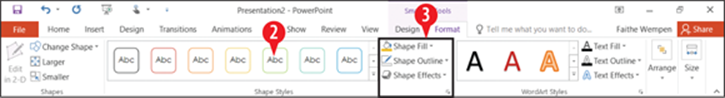
Figure 15-42: Format an individual shape manually.
All materials on the site are licensed Creative Commons Attribution-Sharealike 3.0 Unported CC BY-SA 3.0 & GNU Free Documentation License (GFDL)
If you are the copyright holder of any material contained on our site and intend to remove it, please contact our site administrator for approval.
© 2016-2026 All site design rights belong to S.Y.A.