Programming Windows Store Apps with HTML CSS and JavaSript(2014)
Chapter 7
Collection Controls
It’s a safe bet to say that wherever you are, right now, you’re probably surrounded by quite a number of visible collections. This book you’re reading is a collection of chapters, and chapters are a collection of pages. Those pages are collections of paragraphs, which are collections of words, which are collections of letters, which are (assuming you’re reading this electronically) collections of pixels. On and on….
Your body, too, has collections on many levels, which is what one studies in college-level anatomy courses. Looking around my office and home, I see even more collections: a book shelf with books; scrapbooks with pages and pages of pictures; cabinets with cans, boxes, and bins of food; my son’s innumerable toys; the case of DVDs. Even the forest outside is a collection of trees and bushes, which then have branches, which then have leaves. On and on….
We look at these things as collections because we’ve learned how to generalize specific instances of unique things—like leaves or pages or my son’s innumerable toys—into categories or groups. This gives us powerful ways to organize and manage those things (except for the clothes in my closet, as my wife will attest). And just as the physical world around us is made of collections, the digital world that we use to represent the physical is naturally full of collections as well.
In Chapter 6, “Data Binding, Templates, and Collections,” we learned about the data side of this story: the features of the WinJS.Binding namespace, including binding templates and the observable List class. Now we turn our attention to collection controls through which we visualize and manipulate that data.
In this chapter we’ll explore the three collection controls provided by WinJS—available on both Windows and Windows Phone—that can handle items of arbitrary complexity both in terms of data and presentation (unlike the HTML controls). These are the FlipView, which shows one item from a collection at a time; the Repeater, which when combined with the ItemContainer we saw in Chapter 5, “Controls and Control Styling,” provides a lightweight means to display a collection of multiple items; and the ListView, which displays a collection of multiple items with provisions for layouts, interactivity, drag and drop, keyboarding, cell spanning, and more. As you might expect, the ListView is the richest of the three. Because it’s the centerpiece of many app designs, we’ll be spending the bulk of this chapter exploring its depths.
In this mix we’ll also encounter how to work with some additional data sources, such as files and online feeds, and we’ll cross paths with the concept of semantic zoom, which is implemented through the WinJS SemanticZoom control.
“But hey,” you might be asking, “what about the intrinsic HTML collection controls like <select> and <table>, as well as other list-related elements like <ul>, <ol>, and <datalist>? Don’t these have a place in this discussion?” Indeed they do! Not so much with static content, of course—you already know how to write such HTML. What’s instead really interesting is asking how we can bind such elements to a List so that they, like other controls, automatically reflect the contents of that collection. This turns out to be one of the primary uses of the Win JS Repeater—and our very first topic!
Get a Bing Search API account Three of the SDK samples that we’ll be working with require a Bing Search API account, which is free for under 5000 transactions a month. Visit the Windows Azure Marketplace page for this API to get started. Once you’ve signed up, go to the My Account page. The Primary Account Key listed there is what you’ll need in the samples.
ListView 1.0 to 2.0 changes The ListView control got quite an overhaul between WinJS 1.0 (Windows 8) and WinJS 2.0 (Windows 8.1), resulting in many performance improvements and API changes. This chapter focuses on only the WinJS 2.0 ListView and its features and does not point out the specific changes from WinJS 1.0. For those details, please refer to API changes for Windows 8.1.
Collection Control Basics
In previous chapters we’ve built our understanding of collections, templates, data binding, and simple controls that can be used within a template. Collection controls—the Repeater, the FlipView, and the ListView—bring all these fundamentals together to bring those collections to life in your app’s UI.
Note Technically the WinJS.UI.NavBarContainer control, which we’ll see in Chapter 9, “Commanding UI,” is also a collection control and can, in fact, be used outside of a nav bar. Its utility outside that context is limited, however. You might also come across the WinJS TabContainercontrol, but this is for internal use by the ListView.
Quickstart #1: The WinJS Repeater Control with HTML controls
Here’s a quick quiz question for a quickstart: given all that you know about data binding, the WinJS.Binding.List, data-win-bind, and WinJS.Binding.processAll, how would you take an empty HTML <select> element like this:
<select id="select1"><!--Options to be created at runtime --></select>
and populate it with data from a dynamically-generated array, perhaps from a web API?
varanimals = [{ id: 1, description: "Hamster" },
{ id: 2, description: "Koala" },
{ id: 3, description: "Llama" }];
A quick, brute-force method, which you’ve probably employed at some time in your career, would be to just iterate the array and create <option> elements within the <select>:
var e = document.getElementById("select1");
animals.forEach(function (item) {
var o = document.createElement("option");
o.value = item.id;
o.textContent = item.description;
e.appendChild(o);
});
And you’d generally repeat this process whenever the array contents changed, clearing out the <select> and creating each <option> anew.
Now to detect such changes automatically, we’d want to turn that array into a Binding.List, then drop in a data-win-bind attribute to each <option> element and call Binding.processAll for it:
//Make each item in the List individually bindable
var bindingList = new WinJS.Binding.List(animals, { binding: true });
bindingList.forEach(function (item) {
var o = document.createElement("option");
o.setAttribute("data-win-bind", "value: id; textContent: description");
e.appendChild(o);
WinJS.Binding.processAll(o, item);
});
//Change one item in the list to show that binding is set up.
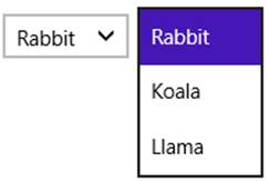
var item = bindingList.getAt(0);
item.description = "Rabbit";
This would work quite well, producing a <select> element as follows:
Now you might be thinking, “We could encapsulate this process into a custom control, declared with data-win-control on the <select> element, yes?” After all, we know that when WinJS.UI.-process[All] sees a data-win-control attribute, it simply calls the given constructor (with options) and lets that constructor do whatever it wants. This means we can really use WinJS controls or a custom control with any container element we’d like, not just div and span: we could put all the above code into control constructor, specify the List through one of its options, and even turn the child elements declared in HTML into a WinJS.Binding.Template that gets rendered for each item in the collection. Then our markup would become very simple (assuming appropriate namespaces):
<select data-win-control="Controls.ListMaker" data-win-options="{data: Data.bindingList}">
<option data-win-bind="value: id; textContent: description"></option>
</select>
If that’s how you’re thinking, you’re well attuned to some folks on the WinJS team who created a little beauty that does exactly this: the WinJS.UI.Repeater control. The Repeater is useful anywhere you need to create multiple copies of the same set of elements where each copy is bound to an item in a collection. It neither adds nor imposes any other functionality, though of course you can have it render whatever interactive content you want, including other WinJS controls and nested Repeaters.
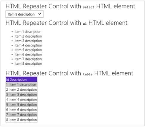
Here’s how it’s used in scenario 1 of the HTML Repeater control sample with <select>, <ul>, and <tbody> elements; note that each Repeater has only one immediate child element (html/scenario1.html):
<select data-win-control="WinJS.UI.Repeater" data-win-options="{data: Data.items}">
<option data-win-bind="value: id; textContent: description"></option>
</select>
<ul data-win-control="WinJS.UI.Repeater" data-win-options="{data: Data.items}">
<li data-win-bind="textContent: description"></li>
</ul>
<table class="table">
<thead class="table-header"><tr><td>Id</td><td>Description</td></tr></thead>
<tbody class="table-body"
data-win-control="WinJS.UI.Repeater" data-win-options="{data: Data.items}">
<tr class="table-body-row">
<td data-win-bind="textContent: id"></td>
<td data-win-bind="textContent: description"></td>
</tr>
</tbody>
</table>
The data option here points to the repeater’s data source, Data.items, which is a WinJS.-Binding.List defined in js/scenario1.js with some thoroughly uninspiring items:
WinJS.Namespace.define("Data", {
items: new WinJS.Binding.List([
{ id: 1, description: "Item 1 description" },
{ id: 2, description: "Item 2 description" },
{ id: 3, description: "Item 3 description" },
//And so on...
])
});
The output for scenario 1 is shown below.
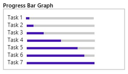
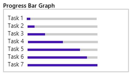
Because the Repeater turns its child element (and there must be only one) into a Template using the extractChild option, those elements are removed from the DOM. Rendering the template for each item in the collection will then create individual copies bound to those items. And because the Repeater just works with a template, you can just as easily declare the template elsewhere and perhaps use it with multiple Repeater controls. In this case you just point to it in the template option, as shown in scenario 2 of the sample where we see both <label> and <progress>elements in the Template control (html/scenario2.html):
<div class="template" data-win-control="WinJS.Binding.Template">
<div class="bar">
<label class="label" data-win-bind="textContent: description"></label>
<progress data-win-bind="value: value" max="100"></progress>
</div>
</div>
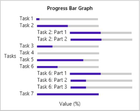
<h3>Progress Bar Graph</h3>
<div class="graph" data-win-control="WinJS.UI.Repeater"
data-win-options="{data: Data.samples2, template: select('.template')}">
</div>
The recommended practice for naming templates, that’s shown here, is to use a class rather than an id (which also works, but we’ll discuss the caveats in “Referring to Templates” later in the chapter). You then use select('<selector>') to refer to the template. Personally, I wouldn’t use a generic name like template; something like barGraphTemplate would be better.
Anyway, the result of this Repeater is as follows, which shows that the Repeater is perfect at creating things like graphs and charts where repeated elements are involved:
With the Repeater and others control that can declaratively reference a template (like the FlipView and ListView), note that it’s important to always declare the template before any references. This is so WinJS.UI.processAll will instantiate the template first; otherwise references to it will not be valid.
It’s also possible to specify an item rendering function for the template option (see scenario 3 in the sample), because that’s ultimately what gets inserted there when you use a declarative template. We’ll come back to this in “How Templates Work with Collection Controls,” and we’ll see more of the Repeater in “Repeater Features and Styling.”
Quickstart #2: The FlipView Control Sample
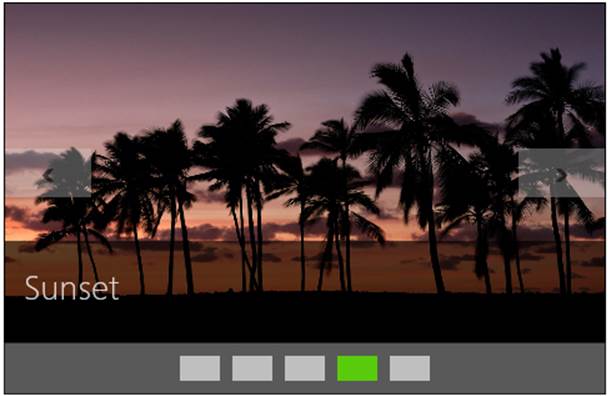
As shown in Figure 7-1, the HTML FlipView control sample is both a great piece of reference code for the FlipView and a great visual tool through which to explore the control itself. For the purposes of this Quickstart, let’s just look at the first scenario of populating the control from a simple data source and using a template for rendering the items, as we’re already familiar with these mechanisms and will become even more so! We’ll come back to the other FlipView scenarios later in this chapter in “FlipView Features and Styling.”
It’s worth mentioning that although this sample demonstrates the control’s capabilities in a relatively small area, a FlipView can be any size, even occupying most of the screen. A common use for the control, in fact, is to let users flip through full-sized images in a photo gallery. SeeGuidelines for FlipView controls for more.
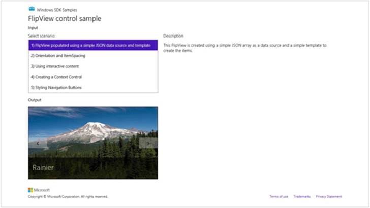
FIGURE 7-1 The HTML FlipView control sample; the FlipView is the control displaying the picture.
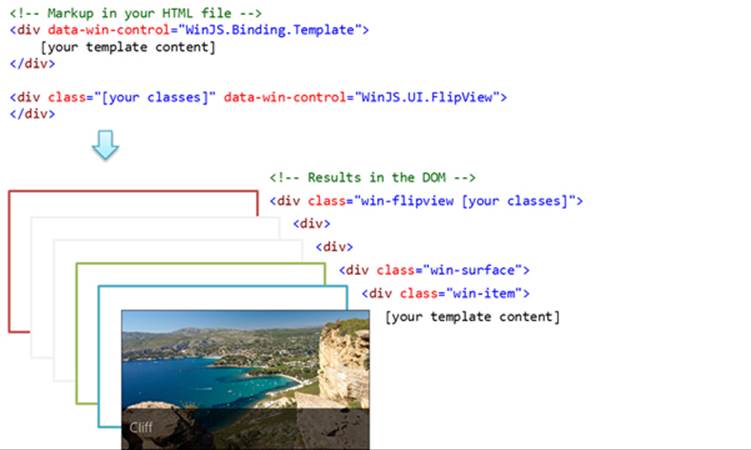
The FlipView’s constructor is WinJS.UI.FlipView, and its primary options are itemDataSource and itemTemplate (html/simpleFlipview.html):
<div id="simple_FlipView" class="flipView" data-win-control="WinJS.UI.FlipView"
data-win-options="{ itemDataSource: DefaultData.bindingList.dataSource,
itemTemplate: simple_ItemTemplate }">
</div>
The Template control (also in html/simpleFlipview.html) is just like those we’ve seen before:62
<div id="simple_ItemTemplate" data-win-control="WinJS.Binding.Template">
<div class="overlaidItemTemplate">
<img class="image" data-win-bind="src: picture; alt: title"/>
<div class="overlay">
<h2 class="ItemTitle" data-win-bind="innerText: title"></h2>
</div>
</div>
</div>
Note again that a template must be declared in markup before any controls that reference them (or you can use a function, see “How Templates Work with Collection Controls”). Anyway, the prosaically named simple_ItemTemplate here is made of img and h2 elements, the latter being contained in a div whose background color is partially transparent (see css/default.css for the .overlaidItemTemplate .overlay selector). As usual, we’re also binding these elements to the picture and title properties of the data source.
Tip Within both FlipView and ListView controls, as with the ItemContainer, you need to add the win-interactive class to any nested controls for them to be directly interactive rather than being treated as static content in the overall item. win-interactive specifically tells the outer item container to pass input events to the inner controls.
There’s one important distinction with the FlipView’s itemDataSource option—did you see it? Instead of directly referring to the WinJS.Binding.List of DefaultData.bindingList (which is created in js/DefaultData.js as we’ve seen many times), we’re binding to the list’s dataSourceproperty:
data-win-options="{ itemDataSource: DefaultData.bindingList.dataSource }"
The dataSource property is an object that provides the methods of the WinJS.UI.IList-DataSource interface, and it exists specifically to adapt a List to the needs of the FlipView and ListView controls. (It exists for no other purpose, in fact.) If you forget and attempt to just bind to theList directly, you’ll see an exception that says, “Object doesn’t support property or method ‘createListBinding’.” In other words, both FlipView and ListView don’t work directly with a List; they work with an IListDataSource. As we’ll see later in “Collection Control Data Sources,” this allows the control to work with other kinds of sources like the file system or online feeds.
Whatever the case, note that itemDataSource sets up one-way binding by default, but you can use other binding initializers to change that behavior.
Quickstart #3: The ListView Essentials Sample
The basic mechanisms for data sources and templates apply to the ListView control exactly as they do to FlipView, Repeater, and any other control. We can see these in the HTML ListView essentials sample (shown in Figure 7-2); scenarios 1 and 2 specifically create a ListView and respond to item events.
The key thing that distinguishes a ListView from other collection controls is that it applies a layout to its presentation of that collection. That is, in addition to the data source and the template, the ListView also needs something to describe how those items visually relate to one another. This is the ListView’s layout property, which we see in the markup for scenario 1 of the sample along with a few other behavioral options (html/scenario1.html):
<div id="listView" data-win-control="WinJS.UI.ListView"
data-win-options="{ itemDataSource: myData.dataSource,
itemTemplate: smallListIconTextTemplate, selectionMode: 'none',
tapBehavior: 'none', swipeBehavior: 'none', layout: { type: WinJS.UI.GridLayout } }">
</div>
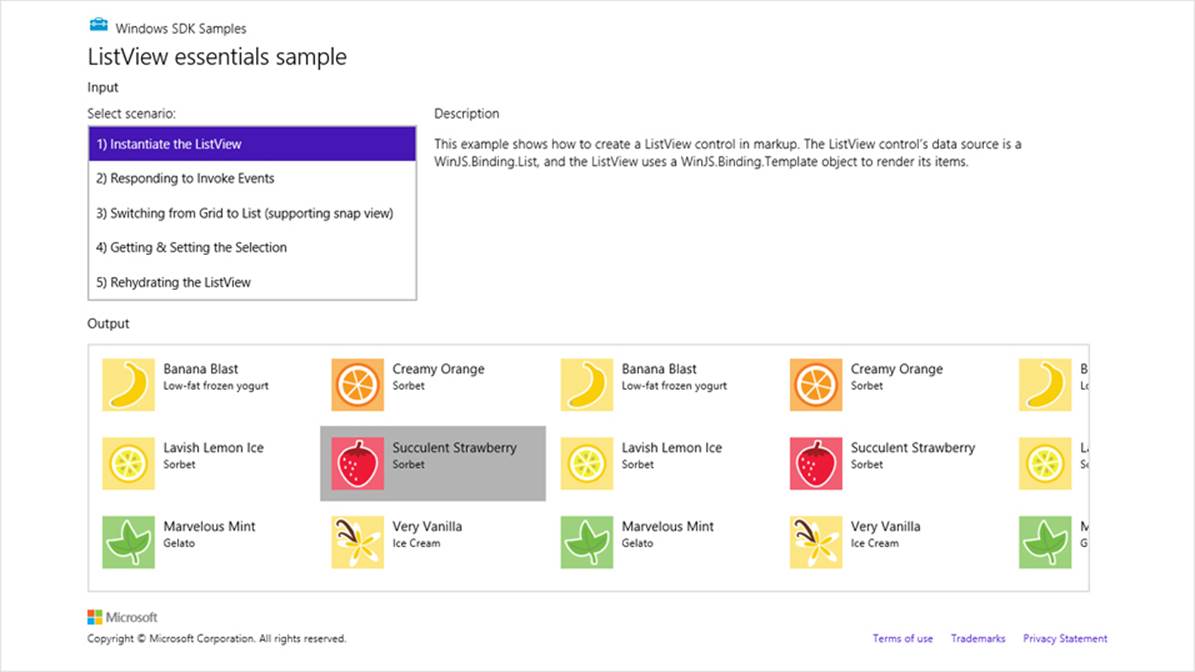
FIGURE 7-2 The HTML ListView essentials sample.
As with the FlipView, the ListView’s itemDataSource property must be an object with the IListDataSource interface, conveniently provided by a Binding.List.dataSource property. Again, we can place other kinds of data sources behind this interface, as we’ll see in the “Collection Control Data Sources” section.
The control’s item template is defined earlier in scenario1.html with the id of smallListIconText-Template and is essentially the same sort of thing we saw with the FlipView (an img and some text elements), so I won’t list it here. And as with the other collection controls you can use a rendering function instead. See “How Templates Work with Collection Controls” later on.
In the control options we see three behavioral properties: selectionMode, tapBehavior, and swipeBehavior. These are all set to 'none' in this sample to disable selection and click behaviors entirely, making the ListView a passive display. It can still be panned, but the items don’t respond to input. (Also see “Sidebar: Item Hover Styling.”)
As for the layout property, this is an object of its own, whose type property indicates which layout to use. WinJS.UI.GridLayout, as we’re using here, is a two-dimensional top-to-bottom then left-to-right algorithm, suitable for horizontal panning (but which can also be rearranged for vertical panning). WinJS provides another layout type called WinJS.UI.ListLayout, a one-dimensional top-to-bottom organization that’s suitable for vertical panning, especially in narrow views. (We’ll see this with the Grid App project template shortly; the ListView essentials sample doesn’t handle narrow widths.) The other layout in WinJS.UI is CellSpanningLayout for variable-sized items, and it’s also a relatively simple matter to create custom layouts. We’ll see all of these in “ListView Features and Styling” except for custom layouts, which are discussed in Appendix B, “WinJS Extras.”
Tip A number of errors will cause the ListView constructor to fail. First, check that your data source is constructed properly and field names match between it and the template. Second, if you’re using a WinJS.Binding.List, be sure to assign its dataSource property to the ListView’sitemDataSource. Third, the ListView will crash if the data source can’t be found or isn’t instantiated yet, so move that earlier in your code. Similarly, the template must always be present before creating the ListView, so its markup should come before the ListView’s. And finally, make sure the reference to the template in the ListView’s options is correct.
Now while the ListView control in scenario 1 displays only passive items, we often want those items to respond to a click or tap. Scenario 2 shows this, where the tapBehavior property is set to invoke (see html/scenario2.html). Technically this should be invokeOnly because invoke isn’t a real option and we’re getting invokeOnly by default. Other options come from the WinJS.UI.Tap-Behavior enumeration. Other variations are toggleSelect, which will select or deselect an item, depending on its state, and then invoke it; anddirectSelect, where an item is always selected and then invoked. You can also set the behavior to none so that clicks and taps are ignored, as we saw in scenario 1.
When an item is invoked, the ListView control fires an itemInvoked event. You can wire up a handler by using either addEventListener or the ListView’s oniteminvoked property. Here’s how scenario 2 does it (slightly rearranged from js/scenario2.js):
var listView = element.querySelector('#listView').winControl;
listView.addEventListener("iteminvoked", itemInvokedHandler, false);
function itemInvokedHandler(eventObject) {
eventObject.detail.itemPromise.done(function (invokedItem) {
// Act on the item
});
}
Note that we’re listening for the event on the WinJS control, but it also works to listen for the event on the containing element thanks to bubbling. This can be helpful if you need to add listeners to a control before its instantiated, because the containing element will already be there in the DOM.
In the code above, you could also assign a handler by using the listView.oniteminvoked property directly, or you can specify the handler in the iteminvoked property data-win-options (in which case it must be marked safe for processing). The event object you then receive in the handler contains a promise for the invoked item, not the item itself, because the underlying data source might deliver the full item asynchronously. So you need to call it’s done or then method to obtain the actual item data. It’s also good to know that you should never change the ListView’s data source properties directly within an iteminvoked handler, because you’ll probably cause an exception. If you have the need, wrap the change code inside a call to setImmediate so that you can yield the UI thread first.
Sidebar: Item Hover Styling
Although disabling selection and tap behaviors on a ListView creates a passive control, hovering over items with the mouse (or suitable touch hardware) still highlights each item; refer back to Figure 7-2. You can control this by styling the .win-container:hover pseudo-selector for the desired control. For example, the following style rule removes the hover effect entirely:
#myListView.win-container:hover {
background-color: transparent;
outline: 0px;
}
Quickstart #4: The ListView Grouping Sample
Displaying a list of items is great, but more often than not, a collection needs another level of organization—such as filtering, sorting, and especially grouping. This is readily apparent when I open the file drawer next to my desk, which contains a collection of various important and not so important papers. Right away, on the file folder tabs, I see my groups: Taxes, Financials, Community, Insurance, Cars, Writing Projects, and Miscellany (among others). Clearly, then, we need a grouping facility within a collection control and ListView is happy to oblige.
There are two parts to this. One is grouping of the data source itself, which we know happens through the List.createGrouped method (along with createFiltered and createSorted), as we saw in Chapter 6. The WinJS.Binding.GroupedSortedListProjection that we get back in that case supplies both its grouped items (through its dataSource property) and a GroupedListProjection of the groups themselves through its groups property. Note that when we refer to groups in a ListView we’ll also use its groups.dataSource property.
The second part is representing the grouped data visually. This is demonstrated in the HTML ListView grouping and Semantic Zoom sample (the output for scenario 1 is shown in Figure 7-3). As with the Essentials sample, the code in js/groupedData.js contains a lengthy in-memory array around which we create a List. Here’s a condensation to show the item structure (I’d show the whole array, but this is making me hungry for some dessert!):
var myList = new WinJS.Binding.List([
{ title: "Banana Blast", text: "Low-fat frozen yogurt", picture: "images/60Banana.png" },
{ title: "Lavish Lemon Ice", text: "Sorbet", picture: "images/60Lemon.png" },
{ title: "Creamy Orange", text: "Sorbet", picture: "images/60Orange.png" },
...
Here we have a bunch of items with title, text, and picture properties. We can group them any way we like and even change the groupings on the fly. As Figure 7-3 shows, the sample groups these by the first letter of the title using both a GridLayout and a ListLayout.
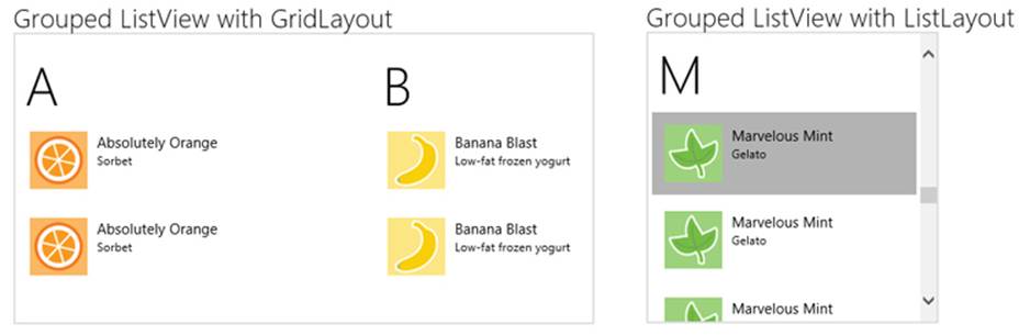
FIGURE 7-3 The output of scenario 1 of the HTML ListView grouping and Semantic Zoom sample.
If you take a peek at the ListView reference, you’ll see that the control works with two templates and two collections: that is, alongside its itemTemplate and itemDataSource properties are ones called groupHeaderTemplate and groupDataSource. The group-capable layouts use these to organize the groups and create the headers above the items.
The header template in html/scenario1.html is very simple:
<div id="headerTemplate" data-win-control="WinJS.Binding.Template">
<div class="simpleHeaderItem">
<h1 data-win-bind="innerText: groupTitle"></h1>
</div>
</div>
This is referenced in the control declaration along with the appropriate grouped projection’s groups.dataSource (other options omitted):
<div id="listView" data-win-control="WinJS.UI.ListView"
data-win-options="{ groupDataSource: myGroupedList.groups.dataSource,
groupHeaderTemplate: headerTemplate }">
</div>
myGroupedList is, of course, created with the original list’s createGrouped method:
varmyGroupedList = myList.createGrouped(getGroupKey, getGroupData);
The getGroupKey function returns a single character to use for the grouping. With textual data, you should always use the Windows.Globalization.Collation.CharacterGroupings class and its lookup method to determine groupings—never assume that something like the first character in a string is the right one! The sample shows how simple this is:
var charGroups = Windows.Globalization.Collation.CharacterGroupings();
function getGroupKey(dataItem) {
return charGroups.lookup(dataItem.title);
}
Remember that this group key function determines only the association between the item and a group, nothing more. It also gets called for every item in the collection when createGrouped is called, so it should be a quick operation. This is why we call CharacterGroupings outside of the function.
Performance tip As noted in Chapter 6, if deriving the group key from an item at run time requires an involved process, you’ll improve overall performance by storing a prederived key in the item instead and just returning that from the group key function.
The sample’s group data function, getGroupData, is called with a representative item for each group to obtain the data that ends up in the groups collection. It simply returns an object with a single groupTitle property that’s the same as the group key, but of course you can make that value anything you want. Note that by using our world-ready getGroupKey function, we’re handling globalization concerns appropriately:
function getGroupData(dataItem) {
var key = getGroupKey(dataItem);
return {
groupTitle: key
};
}
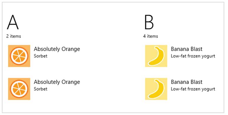
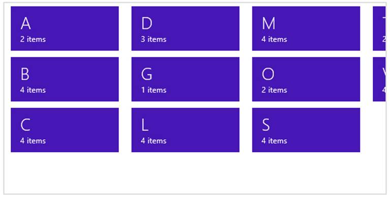
You might be asking, “Why do we have the group data function separated out at all? Why not just create that collection automatically from the group keys?” It’s because you often want to include additional properties within the group data for use in the header template or in a zoomed-out view (with semantic zoom). Think of your group data function as providing summary information for each group. (The header text is only the most basic such summary.) Because this function is called only once per group, rather than once per item, it’s the proper time to calculate or otherwise retrieve summary-level data. For example, to show an item count in the group headers, we just need to include that property in the objects returned by the group data function, then data-bind an element in the header template to that property.
For example, in a slightly modified version of the sample in this chapter’s companion code I use createFiltered to obtain a projection of the list filtered by the current key.63 The length property of this projection is then the number of items in the group:
function getGroupData(dataItem) {
var key = getGroupKey(dataItem);
//Obtain a filtered projection of our list, checking for matching keys
var filteredList = myList.createFiltered(function (item) {
return key == getGroupKey(item);
});
return {
groupTitle: key,
count: filteredList.length
};
}
With this count property in the collection, we can use it in the header template:
<div id="headerTemplate" data-win-control="WinJS.Binding.Template">
<div class="simpleHeaderItem">
<h1 data-win-bind="innerText: groupTitle"></h1>
<h6><span data-win-bind="innerText: count"></span> items</h6>
</div>
</div>
After a small tweak in css/scenario1.css—changing the simpleHeaderItem class height to 65px to make a little more room—the list will now appears as follows:
One other note for scenario 1 is that although it doesn’t use a group sorter function with createGrouped. It actually does an initial (globalized) sort of the raw data before creating the List:
var sortedData = rawData.sort(function (left, right) {
return right.title.localeCompare(left.title);
});
var myList = new WinJS.Binding.List(sortedData);
Although this results in sorted groups, adding new items to the list or a projection would not sort them properly nor sort the groups (especially if a new group is created as a result). It would be better, then, to create a sorted projection first (through createSorted), then the grouped projection from that using a locale-aware group sorter function. The modified sample shows this, but I’ll leave you to examine the code.
The other little bit demonstrated in this sample—in scenario 3—is the ability to create headers that can be invoked. This is done by setting the ListView’s groupHeaderTapBehavior property to invoke (html/scenario3.html; other options omitted):
<div id="listView" data-win-control="WinJS.UI.ListView"
data-win-options="{groupHeaderTapBehavior: WinJS.UI.GroupHeaderTapBehavior.invoke }">
</div>
A header is invoked with a click or tap, obviously, and if it has the keyboard focus the Enter key will also do the job. When invoked, the ListView fires a groupheaderinvoked event where the eventArgs.detail object contains groupHeaderPromise and groupHeaderIndex properties.
ListView in the Grid App Project Template
Now that we’ve covered the details of the ListView control and in-memory data sources, we can finally understand the rest of the Grid App project template in Visual Studio and Blend. As we covered in “The Navigation Process and Navigation Styles” section of Chapter 3, “App Anatomy and Performance Fundamentals,” this project template provides an app structure built around page navigation: the home page (pages/groupedItems) displays a collection of sample data (see js/data.js) in a ListView control, where each item’s presentation and the group headings are described by templates. Figure 7-4 shows the layout of the home page and identifies the relevant ListView elements. As we discussed before, tapping an item navigates to the pages/itemDetail page and tapping a heading navigates to the pages/groupDetail page, and now we can see how that all works with the ListView control.
The ListView in Figure 7-4 occupies the lower portion of the app’s contents. Because it can pan horizontally, it actually extends all the way across; various CSS margins are used to align the first items with the layout silhouette while allowing them to bleed to the left when the ListView is panned.
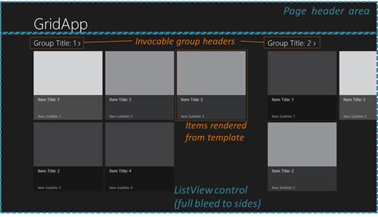
FIGURE 7-4 ListView elements as shown in the Grid App template home page. (All colored items are added labels and lines.)
There’s quite a bit going on with the ListView in this project, so let’s take one part at a time. For starters, the control’s markup in pages/groupedItems/groupedItems.html is very basic, where the only option is to indicate that the items have no selection 'margin-top:12.0pt;margin-right:0cm;margin-bottom: 12.0pt;margin-left:0cm;line-height:normal'><div class="groupeditemslist win-selectionstylefilled" aria-label="List of groups"
data-win-control="WinJS.UI.ListView"
data-win-options="{ selectionMode: 'none' }"
layout: {type: WinJS.UI.GridLayout, groupHeaderPosition:'top'} >
</div>
Switching over to pages/groupedItems/groupedItems.js, the page’s ready method handles initialization:
ready: function (element, options) {
var listView = element.querySelector(".groupeditemslist").winControl;
listView.groupHeaderTemplate = element.querySelector(".headerTemplate");
listView.itemTemplate = element.querySelector(".itemtemplate");
listView.addEventListener("groupheaderinvoked", this._groupHeaderInvoked.bind(this));
listView.oniteminvoked = this._itemInvoked.bind(this);
listView.itemDataSource = Data.items.dataSource;
listView.groupDataSource = Data.groups.dataSource;
listView.element.focus();
}
Here you can see that the control’s templates can be set in code just as easily as from markup, and in this case we’re using a class to locate the template element instead of an id. Why does this work? It’s because we’ve actually been referring to elements the whole time: the app host automatically creates a variable for an element that’s named the same as its id. It’s the same thing. Plus, references to templates ultimately resolve into a rendering function, which we’ll again cover later.
You can also see how this page assigns handlers to the iteminvoked and groupheaderinvoked events. Those handlers call WinJS.Navigation.navigate to go to the itemDetail or groupDetail pages as we saw in Chapter 3:
_itemInvoked: function (args) {
var item = Data.items.getAt(args.detail.itemIndex);
nav.navigate("/pages/itemDetail/itemDetail.html", { item: Data.getItemReference(item) });
}
},
_groupHeaderInvoked: function (args) {
var group = Data.groups.getAt(args.detail.groupHeaderIndex);
nav.navigate("/pages/groupDetail/groupDetail.html", { groupKey: group.key });
},
Here now are the templates for the home page (pages/groupedItems/groupedItems.html):
<div class="headertemplate" data-win-control="WinJS.Binding.Template">
<buttonclass="group-header win-type-x-large win-type-interactive"
role="link" tabindex="-1" type="button">
<span class="group-title win-type-ellipsis" data-win-bind="textContent: title"></span>
<span class="group-chevron"></span>
</button>
</div>
<div class="itemtemplate" data-win-control="WinJS.Binding.Template">
<div class="item">
<img class="item-image" src="#" data-win-bind="src: backgroundImage; alt: title"/>
<div class="item-overlay">
<h4 class="item-title" data-win-bind="textContent: title"></h4>
<h6 class="item-subtitle win-type-ellipsis"
data-win-bind="textContent: subtitle"></h6>
</div>
</div>
</div>
Nothing new here, just Template controls with sprinkling of data-binding syntax.
As for the data itself (which you’ll likely replace), this is defined in js/data.js as an in-memory array that feeds into a Binding.List. In the sampleItems array each item is populated with inline data or other variable values. Each item also has a group property that comes from thesampleGroups array. Unfortunately, this latter array has almost identical properties as the items array, which can be confusing. To help clarify that a bit, here’s the complete property structure of an item:
{
group : {
key,
title,
subtitle,
backgroundImage,
description
},
title,
subtitle,
description,
content,
backgroundImage
}
As we saw with the ListView grouping sample earlier, the Grid App project template uses createGrouped to set up the data source. What’s interesting to see here is that it sets up an initially empty list, creates the grouped projection (omitting the group sorter function), and then adds the items by using the list’s push method:
var list = new WinJS.Binding.List();
var groupedItems = list.createGrouped(
function groupKeySelector(item) { return item.group.key; },
function groupDataSelector(item) { return item.group; }
);
generateSampleData().forEach(function (item) {
list.push(item);
});
This clearly shows the dynamic nature of lists and ListView: you can add and remove items from the data source, and one-way binding will make sure the ListView is updated accordingly. In such cases you do not need to refresh the ListView’s layout—that happens automatically. I say this because there’s occasional confusion with the ListView’s forceLayout method, which you only need to call, as the documentation states, “when making the ListView visible again after its style.display property had been set to ‘none’.” You’ll find, in fact, that the Grid App code doesn’t use this method at all.
In js/data.js there are also a number of other utility functions, such as getItemsFromGroup, which uses List.createFiltered. Other functions provide for cross-referencing between groups and items, as is needed to navigate between the items list, group details (where that page shows only items in that group), and item details. All of these functions are wrapped up in a namespace called Data at the bottom of js/data.js, so references to anything from this file are prefixed elsewhere with Data..
And with that, I think you’ll be able to understand everything that’s going on in the Grid App project template to adapt it to your own needs. Just remember that all the sample data, like the default logo and splash screen images, are intended to be wholly replaced with real data that you obtain from other sources, like a file or some web API, and wrapped in a List. Some further guidance on this can be found in the Create a blog reader tutorial on the Windows Dev Center, and although the tutorial uses the Split App project template, there’s enough in common with the Grid App project template that the discussion is applicable to both.
The Semantic Zoom Control
Because we’ve already loaded up the HTML ListView grouping and Semantic Zoom sample, and have completed our first look at the collection controls, now is a good time to check out another very interesting WinJS control: Semantic Zoom.
Semantic zoom lets users easily switch between two views of the same data: a zoomed-in view that provides details and a zoomed-out view that provides more summary-level information. The primary use case for semantic zoom is a long list of items that a user will likely get bored of panning all the way from one end to the other, no matter how fun it is to swipe the screen with a finger. With semantic zoom, you can zoom out to see headers, categories, or some other condensation of the data, and then tap on one of those items to zoom back into its section or group. Thedesign guidance recommends having the zoomed-out view fit on one to three screenfuls at most, making it very easy to see and comprehend the whole data set.
Go ahead and try semantic zoom through scenario 2 of the ListView grouping and Semantic Zoom sample. To switch between the views, use pinch-zoom touch gestures, Ctrl+/Ctrl- keystrokes, Ctrl+mouse wheel, and/or the small zoom button that automatically appears in the lower-right corner of the control, as shown in Figure 7-5. When you zoom out, you’ll see a display of the group headers, as also shown in the figure. For the dynamic experience, see Video 7-1 in the companion content, where I show the effects both at normal and slow speeds.
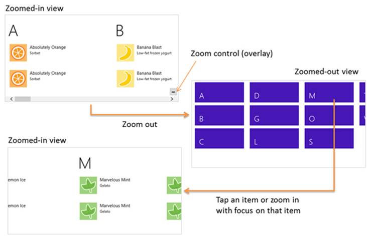
FIGURE 7-5 Semantic zoom between the two views in the ListView grouping and Semantic Zoom sample. The zoom control overlay appears only for the mouse (as does the scrollbar). See Video 7-1 for the dynamic effect.
The control itself is quite straightforward to use. In markup, declare a WinJS control using the WinJS.UI.SemanticZoom constructor. Within that element you then declare two (and only two) child elements: the first defining the zoomed-in view, and the second defining the zoomed-out view—always in that order. Here’s how the sample does it with two ListView controls (plus the template used for the zoomed-out view; I’m showing the code in the modified sample included with this chapter’s companion content):
<div id="semanticZoomTemplate" data-win-control="WinJS.Binding.Template">
<div class="semanticZoomItem">
<h2 class="semanticZoomItem-Text" data-win-bind="innerText: groupTitle"></h2>
</div>
</div>
<div id="semanticZoomDiv" data-win-control="WinJS.UI.SemanticZoom">
<div id="zoomedInListView" class="win-selectionstylefilled"
data-win-control="WinJS.UI.ListView"
data-win-options="{ itemDataSource: myGroupedList.dataSource,
itemTemplate: mediumListIconTextTemplate,
groupDataSource: myGroupedList.groups.dataSource,
groupHeaderTemplate: headerTemplate,
selectionMode: 'none', tapBehavior: 'none', swipeBehavior: 'none'
layout: { type: WinJS.UI.GridLayout } }">
</div>
<div id="zoomedOutListView" data-win-control="WinJS.UI.ListView"
data-win-options="{ itemDataSource: myGroupedList.groups.dataSource,
itemTemplate: semanticZoomTemplate,
selectionMode: 'none', tapBehavior: 'invoke', swipeBehavior: 'none' }">
</div>
</div>
The first child, zoomedInListView, is just like the ListView for scenario 1 with group headers and items; the second, zoomedOutListView, uses the groups as items and renders them with a different template. The semantic zoom control simply switches between the two views in response to the appropriate input gestures. When the zoom changes, the semantic zoom control fires a zoomchanged event where the args.detail value in the handler is true when zoomed out, false when zoomed in. You might use this event to make certain app bar commands available for the different views, such as commands in the zoomed-out view to change sorting or filtering, which would then affect how the zoomed-in view is displayed. We’ll see the app bar in Chapter 9.
The control has a few other properties, such as enableButton (a Boolean to control the visibility of the overlay button; default is true), locked (a Boolean that disables zooming in either direction and can be set dynamically to lock the current zoom state; default is false), and zoomedOut (a Boolean indicating if the control is zoomed out, so you can initialize it this way; default is false). There is also a forceLayout method that’s used in the same case as the ListView’s forceLayout: namely, when you remove a display:none style.
The zoomFactorproperty is an interesting one that determines how the control animates between the two views, something you can see more easily in the slowed-down segment of Video 7-1. The animation is a combination of scaling and cross-fading that makes the zoomed-out view appear to drop down from or rise above the plane of the control, depending on the direction of the switch, while the zoomed-in view appears to sink below or come up to that plane. To be specific, the zoomed-in view scales between 1 and zoomFactor while transparency goes between 1 and 0, and the zoomed-out view scales between 1/zoomFactor and 1 while transparency goes between 0 and 1. The default value for zoomFactor is 0.65, which creates a moderate effect. Lower values (minimum is 0.2) emphasize the effect, and higher values (maximum is 0.8) minimize it.
Where styling is concerned, you do most of what you need directly to the Semantic Zoom’s children. However, to style the Semantic Zoom control itself you can override styles in win-semanticzoom (for the whole control) and win-semanticzoomactive (for the active view). The win-semanticzoombutton style also lets you style the zoom control button if needed.
It’s important to understand that semantic zoom is intended to switch between two views of the same data and not to switch between completely different data sets (again see Guidelines and checklist for the Semantic Zoom control). Also, the control does not support nesting (that is, zooming out multiple times to different levels). Yet this doesn’t mean you have to use the same kind of control for both views: the zoomed-in view might be a list, and the zoomed-out view could be a chart, a calendar, or any other visualization that makes sense. The zoomed-out view, in other words, is a great place to show summary data that would be otherwise difficult to derive from the zoomed-in view. For example, using the same changes we made to include the item count with the group data for scenario 1 (see “Quickstart #4” above), we can just add a little more to the zoomed-out item template (as done in the modified sample in this chapter’s companion content):
The other thing you need to know is that the semantic zoom control does not work with arbitrary child elements. An exception about a missing zoomableView property will tell you this! Each child control must provide an implementation of the WinJS.UI.IZoomableView interface through a property called zoomableView. Of all built-in HTML and WinJS controls, only the ListView and Hub do this (see Chapter 8, “Layout and Views”), which is why you typically see semantic zoom in those contexts. However, you can certainly provide this interface on a custom control, where the object returned by the constructor should contain a zoomableView property, which is an object containing the IZoomableView methods. Among these methods are beginZoom and endZoom for obvious purposes, and getCurrentItem and setCurrentItem that enable the semantic zoom control to zoom in to the right group when it’s tapped in the zoomed-out view.
For more details, check out the HTML SemanticZoom for custom controls sample, which also serves as another example of a custom control. The documentation also has a topic called SemanticZoom templates where you’ll find a few additional template designs for zoomed-out views.
How Templates Work with Collection Controls
As we’ve looked over the collection controls, I’ve mentioned that you can use a function instead of a declarative template for properties like template (Repeater), itemTemplate (FlipView and ListView), and groupHeaderTemplate (ListView). This is an important capability because it allows you to dynamically render items in a collection individually, using its particular contents to customize its view, in contrast to a declarative template that will render each item identically. A rendering function also allows you to initialize item elements in ways that can’t be done in the declarative form, such as building them up in asynchronous stages with delay-loaded images. This level of control provides many opportunities for performance optimization, a subject we’ll return to at the end of this chapter after we’ve explored ListView thoroughly.
For the time being, it’s helpful to understand exactly what’s going on with declarative templates and how that relates to custom template functions. Once you see how they work, you will probably start dreaming up many uses for them!
Struggling for a template design? The documentation has two pages that contain a variety of pre-defined templates (both HTML and CSS). These are oriented around the ListView control but can be helpful anywhere a template is needed. The two pages are Item templates for grid layouts and Item templates for list layouts.
Referring to Templates
When you refer to a declarative template in the Repeater, FlipView, or ListView controls, what you’re actually referring to is an element. You can use an element id as a shortcut because the app host creates variables with those names for the elements they identify. However, I don’t recommend this approach, especially within page controls (which you’ll probably use often). The first concern is that only one element can have a particular id, which means you’ll get really strange behavior if you happen to render the page control twice in the same DOM.
The second concern is a timing issue. The element id variable that the app host provides isn’t created until the chunk of HTML containing the element is added to the DOM. With page controls, WinJS.UI.processAll is called before this time, which means that element id variables for templates in that page won’t yet be available. As a result, any controls that use an id for a template will either throw an exception or just show up blank. Both conditions are guaranteed to be terribly, terribly confusing.
To avoid this issue with a declarative template, place the template’s name in its class attribute (and be sure to make that name unique and descriptive):
<div data-win-control="WinJS.Binding.Template"
class="recipeItemTemplaterecipeItemTemplate" ...></div>
Then in your control declaration, use the select('<selector>') syntax in the options record, where <selector> is anything supported by element.querySelector:
<div data-win-control="WinJS.UI.ListView"
data-win-options="{ itemTemplate: select('.recipemyItemTemplate') }"></div>
There’s more to this, actually, than just a querySelector call. The select function within the options searches from the root of its containing page control. If no match is found, it looks for another page control higher in the DOM, then looks in there, continuing the process until a match is found. This lets you safely use two page controls at once that both contain the same class name for different templates, and each page will use the template that’s most local.
You can also retrieve the template element using querySelector directly in code and assign the result to the appropriate property. This would typically be done in a page’s ready function, as demonstrated in the Grid App project, and doing so avoids both concerns identified here becausequerySelector will be scoped to the page contents and will happen after UI.processAll.
Tip If you’re uncertain about whether your data source is providing the right information to the template, just remove the template reference from the control’s options. Without a template, the control will just output the text of the data source, allowing you to easily examine its contents.
Template Functions (Part 1): The Basics
Whenever you assign a Template object to one of the collection controls’ template properties, those controls detect that it’s an object and uses its render method when needed. However, the collection controls also detect if you instead assign a rendering function to those properties, which can be done both programmatically or declaratively. In other words, if you provide a function directly—which I will refer to simply as a renderer—it will be called in place of Template.render. This gives you complete control over what elements are generated for each individual data item as well as how and when they’re created. (Warning! There be promises in your future!)
Again, we’ll talk about rendering stages at the end of this chapter. For now, let’s look at the core structure of a renderer that applies to the Repeater, FlipView, and ListView controls, examples of which you can find in the HTML ListView item templates, HTML ListView optimizing performance samples, and scenario 6 of the HTML FlipView control sample.
For starters, you can specify a renderer by name in data-win-options in all three controls for their respective template properties. That function must be marked for processing as discussed in Chapter 5 because it definitely participates in UI.processAll. Assigning a function in JavaScript, on the other hand, doesn’t need the mark.
In its basic form, a renderer receives an item promise as its first argument and returns a promise that’s fulfilled with the root element of the rendered template. Here’s what that looks like in practice:
functionbasicRenderer(itemPromise) {
return itemPromise.then(buildElement);
};
function buildElement (item) {
var result = document.createElement("div");
//Build up the item, typically using innerHTML
return result;
}
The item comes as a promise because it might be delivered asynchronously from the data source; thus, we need to attach a completed handler to it. That completed handler, buildElement in the code above, then receives the item data and returns the rendered item’s root element as a result.
The critical piece here is that the renderer is returning the promise from itemPromise.then (which is why we’re not using done). Remember from Chapter 3 that then returns a separate promise that’s fulfilled when the completed handler given to then itself returns. And the return value from that completed handler is what this second promise delivers as its own result. The simple structure shown here, then, very succinctly returns a promise that’s fulfilled with the rendered item.
Why not just have the renderer return the element directly? Well, for one, it’s possible that you might need to call other async APIs in the process of building the element—this especially comes into play when building up the element in stages by delay-loading images, as we’ll see in “Template Functions (Part 2): Optimizing Item Rendering.” Second, returning a promise allows the collection control that’s using this renderer to chain the item promise and the element-building promise together. This is especially helpful when the item data is coming from a service or other potentially slow feed, and with page loading because it allows the control to cancel the promise chain if the page is scrolled away before those operations complete. In short, it’s a good idea!
Just to show it, here’s how we’d make a renderer directly usable from markup, as in data-win-options = "{itemTemplate: Renderers.basic }":
WinJS.Namespace.define("Renderers", {
basic: WinJS.Utilities.markSupportedForProcessing(function (itemPromise) {
return itemPromise.then(buildElement);
})
}
It’s also common to just place the contents of a function like buildElement directly within the renderer itself, resulting in a more concise expression of the exact same structure:
function basicRenderer(itemPromise) {
return itemPromise.then(function (item) {
var result = document.createElement("div");
//Build up the item, typically using innerHTML
return result;
})
};
Inside the element creation function (whether named or anonymous) you then build up the elements of the item along with the classes to style with CSS. As an example, here’s the declarative template from scenario 1 of the HTML ListView item templates sample (html/scenario1.html):
<div id="regularListIconTextTemplate" data-win-control="WinJS.Binding.Template">
<div class="regularListIconTextItem">
<img src="#" class="regularListIconTextItem-Image" data-win-bind="src: picture"/>
<div class="regularListIconTextItem-Detail">
<h4 data-win-bind="innerText: title"></h4>
<h6 data-win-bind="innerText: text"></h6>
</div>
</div>
</div>
And here’s the equivalent renderer, found in scenario 2 (js/scenario2.js):
var MyJSItemTemplate = WinJS.Utilities.markSupportedForProcessing(
function MyJSItemTemplate(itemPromise) {
return itemPromise.then(function (currentItem) {
// Build ListView Item Container div
var result = document.createElement("div");
result.className = "regularListIconTextItem";
result.style.overflow = "hidden";
// Build icon div and insert into ListView Item
var image = document.createElement("img");
image.className = "regularListIconTextItem-Image";
image.src = currentItem.data.picture;
result.appendChild(image);
// Build content body
var body = document.createElement("div");
body.className = "regularListIconTextItem-Detail";
body.style.overflow = "hidden";
// Display title
var title = document.createElement("h4");
title.innerText = currentItem.data.title;
body.appendChild(title);
// Display text
var fulltext = document.createElement("h6");
fulltext.innerText = currentItem.data.text;
body.appendChild(fulltext);
//put the body into the ListView Item
result.appendChild(body);
return result;
});
});
Note that within a renderer you always have the data item in hand, so you don’t need to quibble over the details of declarative data binding and initializers: you can just directly use the needed properties from item.data and apply whatever conversions you require.
You might also notice that there are a lot of DOM API calls in this renderer for what is a fairly simple template. If you took a look at one of the compiled templates discussed in Chapter 6, you will have seen that it does most of its work by assigning a string to the root element’sinnerHTML property. Generally speaking, once you get to about four elements in your item rendering, setting innerHTML becomes faster than the equivalent createElement and appendChild calls. This is because the parser that’s applied to innerHTML assignments is a highly optimized piece of C++ code in the app host and doesn’t need to go through any other layers to get to the DOM API.
Such an optimization doesn’t matter so much for a FlipView control whose items are rendered one at a time, or even a Repeater with a small or moderate number of items, but it becomes very important for a ListView with potentially thousands of items.
Taking this approach, the renderer above could also be written as follows with the same results:
var MyJSItemTemplate = WinJS.Utilities.markSupportedForProcessing(
function MyJSItemTemplate(itemPromise) {
return itemPromise.then(function (currentItem) {
// Build ListView Item Container div
var result = document.createElement("div");
result.className = "regularListIconTextItem";
result.style.overflow = "hidden";
var data = currentItem.data;
var str = "<img class='regularListIconTextItem-Image' src='" + data.picture + "'/>"
str += "<div class='regularListIconTextItem-Detail' style='overflow:hidden'>";
str += "<h4>" + data.title + "</h4>";
str += "<h6>" + data.text + "</h6>";
str += "</div>";
result.innerHTML = str;
return result;
});
});
Creating Templates from Data Sources in Blend
Blend for Visual Studio 2013 offers some shortcuts for creating templates for WinJS controls directly from a data source, where it inserts markup into your HTML file so you can go right into styling. The process is described here, and Video 7-2 provides a walk through.
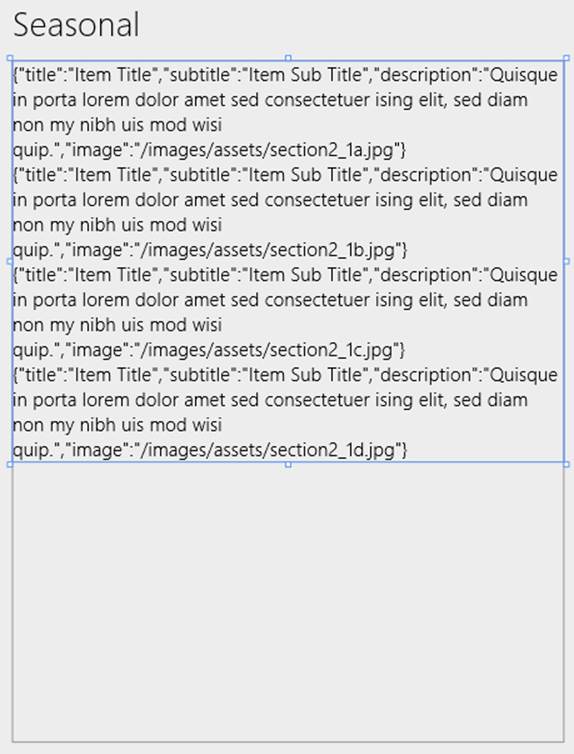
First create your data source in code as you normally would, making sure it’s accessible from markup. In early stages of development you can use placeholder data, of course. As in the video, here’s one that lives in a data.js file and is accessible via Data.seasonalItems:
var slTitle ="Item Title";
var slSubtitle ="Item Sub Title";
var slSubtext ="Quisque in porta lorem dolor amet sed consectetuer ising elit, ...";
var seasonalList =[
{ title: slTitle, subtitle: slSubtitle, description: slSubtext,
image:"/images/assets/section2_1a.jpg"},
{ title: slTitle, subtitle: slSubtitle, description: slSubtext,
image:"/images/assets/section2_1b.jpg"},
{ title: slTitle, subtitle: slSubtitle, description: slSubtext,
image:"/images/assets/section2_1c.jpg"},
{ title: slTitle, subtitle: slSubtitle, description: slSubtext,
image:"/images/assets/section2_1d.jpg"},
];
var seasonalItems =new WinJS.Binding.List(seasonalList);
WinJS.Namespace.define("Data",{
seasonalItems: seasonalItems
});
In markup, or directly in Blend, insert a control wherever you need either through markup or by dragging a control from the Assets pane to the artboard. In the video I use a Repeater control, whose default markup is very simple:
<div data-win-control="WinJS.UI.Repeater"></div>
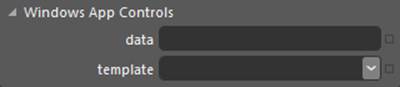
With that control selected, the HTML Attributes pane (on the right) will have a section for Windows App Controls, which lists the relevant properties of the control. For the Repeater we have just data and template:
In the data property, enter the identifier for your data source (Data.seasonalItems in the example). This will create a data-win-options string in your markup, and you should see the untemplated results in the control:
<div data-win-control="WinJS.UI.Repeater" data-win-options="{data:Data.seasonalItems}"></div>
Next, click the drop-down next to the template property and select <Create New Template…>, which brings up the dialog below wherein you’ll conveniently see the members of your data source. Check those you need and give your template a name:
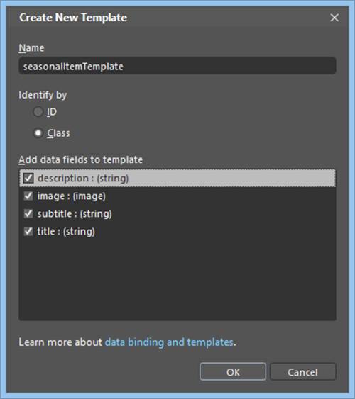
When you press OK, Blend will create unstyled markup in your HTML file and insert the appropriate reference in the control’s options. Because I selected to identify the template with a class, the reference uses the select syntax:
<div class="seasonalItemTemplate" data-win-control="WinJS.Binding.Template">
<div>
<div data-win-bind="textContent:description"></div>
<img data-win-bind="src:image" height="100" width="100">
<div data-win-bind="textContent:subtitle"></div>
<div data-win-bind="textContent:title"></div>
</div>
</div>
<div data-win-control="WinJS.UI.Repeater" data-win-options="{data:Data.seasonalItems,
template:select('.seasonalItemTemplate')}"></div>
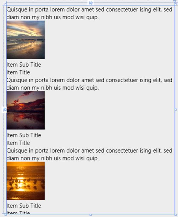
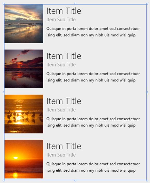
With this, you’ll see the template being rendered (below left), at which point we can just reorder and style the elements as usual, resulting in much better output (below right):
Blend also provides a shortcut to create and edit data-win-bind entries for individual properties, which works especially well inside a template. With a specific control selected (whether inside a template or anywhere else), click the little square to the right of a property in the HTML attributes pane, as shown below for the img element in the template we just created:
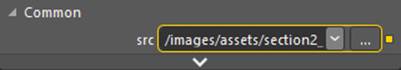
The yellow highlight here means that the property is data-bound already. When you click the square, select Edit Data Binding… on the menu and you’ll see the dialog below, where you can edit the data-win-bind entry or add one if none exists:
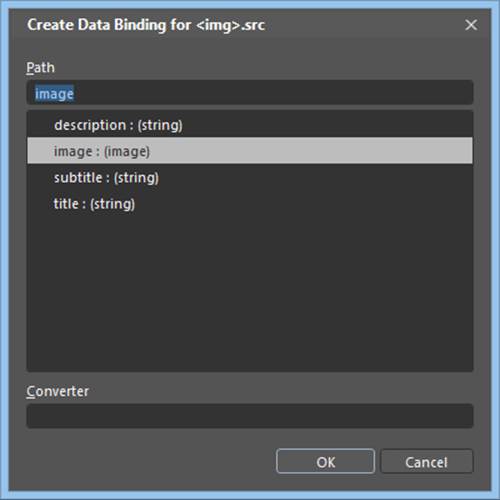
For a data context to appear here, note that WinJS.Binding.processAll must be called somewhere in your code for the element in question, or a suitable parent element. Otherwise no context will appear.
Repeater Features and Styling
In Quickstart #1 we’ve already covered the full extent of the Repeater control’s options. Its data option refers to a Binding.List data source, and template can be used to refer to a template control declared elsewhere in your markup or a rendering function, if the template is not otherwise is declared as a child of the Repeater. Both of these options are, of course, available as read-write properties of the Repeater object at runtime, and changing either one will fire an itemsloaded event.64
Like all other WinJS controls, the read-only Repeater.element property contains the element in which the Repeater was declared; remember that the element also has a winControl property that will container the Repeater object. The only other property of the Repeater is length (read-only), which holds the number of items in the control.
Where methods are concerned, the Repeater has the usual roster of addEventListener, removeEventListener, dispatchEvent, and dispose. Its only custom method is elementFromIndex through which you can easily retrieve the root HTML element for one of the rendered children.
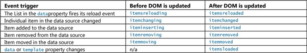
As a collection control, the Repeater is clearly affected by changes to its data source. As its children are bound to the source, they update automatically; when items are added to or removed from the source, the Repeater automatically adds or removes children. In all these cases, theRepeater fires various events:
To see the effect of adding and removing items, scenarios 4-6 of the HTML Repeater control sample all have Add Item and Remove Item buttons that just add and remove an item from the data source.
What’s more interesting in these scenarios is their demonstration of basic styling (scenario 4), using the iteminserted and itemremoved events to trigger animations (scenario 5), and using nested WinJS.Binding.Template controls (scenario 6).
With styling, the Repeater has no default styles because it has no visuals of its own: the repeater’s element will have a win-repeater class added to it, but there are no styles for this class in the WinJS stylesheets. It’s completely for your styling needs.
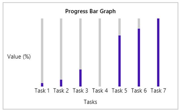
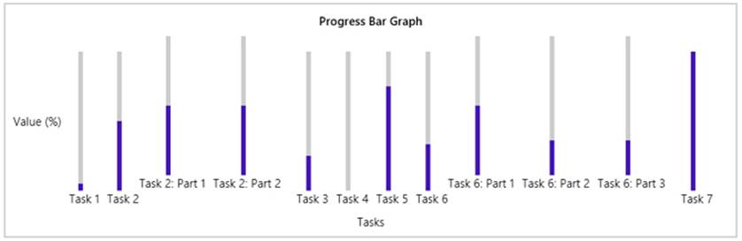
The repeater’s children won’t receive any styling classes of their own either, so it’s up to you to define styles for the appropriate selectors. Scenarios 4, 5, and 6, for example, all have buttons to switch between Horizontal Layout and Vertical Layout, as shown below for scenarios 4 and 5.
In these cases the whole graph is a div (horizontal by default), where the Repeater is used inside for the list of tasks to create each bar (html/scenario4.html):
<div class="template" data-win-control="WinJS.Binding.Template">
<div class="bar">
<label class="label" data-win-bind="textContent: description"></label>
<div class="barClip">
<progress class="progress" data-win-bind="value: value" max="100"></progress>
</div>
</div>
</div>
<div class="graphArea horizontal">
<div class="graphTitle win-type-large">Progress Bar Graph</div>
<div class="graphData" data-win-control="WinJS.UI.Repeater"
data-win-options="{data: Data.samples4, template: select('.template')}">
</div>
<div class="graphTaskAxis">Tasks</div>
<div class="graphValueAxis">
Value (%)
</div>
</div>
The Vertical Layout button will remove the horizontal class and add a vertical class to the graphArea element, and the Horizontal Layout button does the opposite. In css/scenario4.css, you can see that the graphArea element is laid out with a CSS grid and all other elements like the bars with CSS flexboxes. The styling simply controls the placement of elements in the grid and the direction of the flexbox, all of which is specific to the elements that end up in the DOM and isn’t affected by the Repeater itself.
Scenario 5 is the same as scenario 4 but adds small animation effects when items are added or removed, because the Repeater doesn’t include any on its own (unlike the ListView). The effects are created using the WinJS Animations Library that we’ll meet in Chapter 14, “Purposeful Animations.” Here’s a simplified version of the iteminserted handler (js/scenario5.js):
repeater.addEventListener("iteminserted", function (ev) {
var a = WinJS.UI.Animation.createAddToListAnimation(ev.affectedElement);
a.execute();
};
Scenario 6, finally, is very interesting because it shows the ability to nest Template controls, which in this case even nests the same template inside itself! Here the data source also has a nested structure (js/scenario6.js):
WinJS.Namespace.define("Data", {
samples6: new WinJS.Binding.List([
{ value: 5, description: "Task 1" },
{
value: 50,
description: "Task 2",
subTasks: new WinJS.Binding.List([
{ value: 50, description: "Task 2: Part 1" },
{ value: 50, description: "Task 2: Part 2" }
])
},
{ value: 25, description: "Task 3" },
// ... (remaining data omitted)
])
});
Take a close look now at the template in html/scenario6.html:
<div class="template" data-win-control="WinJS.Binding.Template">
<div class="bar">
<label class="label" data-win-bind="textContent: description"></label>
<div class="barClip">
<progress class="progress" data-win-bind="value: value" max="100"></progress>
</div>
<div class="subTasks" data-win-control="WinJS.UI.Repeater"
data-win-options="{template: select('.template')}"
data-win-bind="winControl.data: subTasks">
</div>
</div>
</div>
<div class="graphArea horizontal">
<div class="graphTitle win-type-large">Progress Bar Graph</div>
<div class="graphData" data-win-control="WinJS.UI.Repeater"
data-win-options="{data: Data.samples6, template: select('.template')}">
</div>
<div class="graphTaskAxis">Tasks</div>
<div class="graphValueAxis">
Value (%)
</div>
</div>
Notice how the first Repeater (at the bottom) refers to the full data source, so it generates the first level of the graph. For this repeater, each rendering of the template is bound to a top-level item in the data source. Within the template, then, the second-level Repeater (in the subTaskselement) has its data option bound to a subTasksproperty of that first-level item, if it exists. Otherwise the Repeater will create an empty WinJS.Binding.List to work with so you can still add and remove items, but initially that repeater will be empty.
The initial output of scenario 6 is as follows, shown for both horizontal and vertical layouts:
Nesting the second-level Repeater that refers to the same template is perfectly legal—a template control just renders its child elements when asked, and if that happens to contain a copy of itself, then you’ll have some recursive rendering, but nothing that’s going to confuse WinJS! In fact, the nested template structure will easily accommodate additional levels of data. If you modify “Task 2” in the data (js/scenario6.js) to add details to “Part 1”:
{
value: 50,
description: "Task 2",
subTasks: new WinJS.Binding.List([
{
value: 50,
description: "Task 2: Part 1",
subTasks: new WinJS.Binding.List([
{ value: 12, description: "Task 2: Part 1: Detail A" },
{ value: 24, description: "Task 2: Part 1: Detail B" },
{ value: 36, description: "Task 2: Part 1: Detail C" },
])
},
{ value: 50, description: "Task 2: Part 2" }
])
},
you’ll see this output for Task2 without any changes to the code or markup:
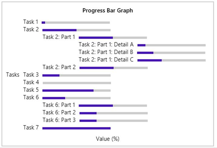
So very cool! Indeed, you can start to see that nested templates and repeaters can work very well to render highly structured data like an XML document or a piece of complex JSON. Of course, in many cases you’ll want the rendered items to be interactive rather than static as we’ve seen here. In that case you can use a WinJS.UI.ItemContainer within a repeater (see sidebar), a ListView control, or possibly nested ListView controls.
Sidebar: Repeater + ItemContainer = Lightweight ListView
One reason that the ItemContainer and Repeater elements were created for WinJS 2.0 was that many developers wanted a UI that worked a lot like a ListView, but without all the ListView features. Thus instead of trying to make a ListView in which all those features could be disabled, the WinJS team instead pulled the per-item ListView behaviors into its own control, the ItemContainer (see Chapter 5), and then created the simple Repeater to make it easy to create such controls bound to items in a data source.
As a result, it’s very straightforward in WinJS 2.0 to create a lightweight type of ListView where you have fully interactive items (select, swipe, drag, and invoke behaviors) but without any other layout policy or list-level interactivity (panning, incremental loading, keyboard navigation, reordering, etc.) In other words, the Repeater and ItemContainer controls are excellent building blocks for creating your own collection controls, which is typically a better choice than trying to bludgeon the ListView into something it wasn’t made to do!
FlipView Features and Styling
The WinJS.UI.FlipView is a very capable and flexible control for any situation where you want to page through items in a data source one at a time. We saw the basics earlier, in “Quickstart #2,” so let’s now see the rest of its features through the other scenarios of the HTML FlipView control sample. (It’s worth repeating that although this sample demonstrates the control’s capabilities in a relatively small area, a FlipView can be any size. Refer again to Guidelines for FlipView controls for more.)
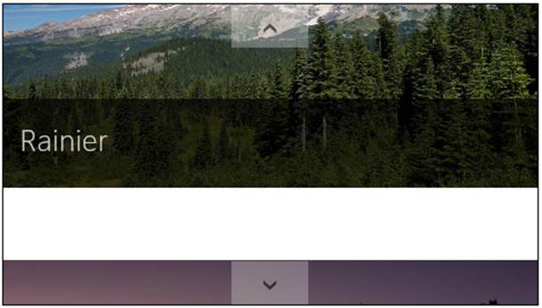
Scenario 2 of the sample (“Orientation and Item Spacing”) demonstrates the control’s orientation property. This determines the placement of the arrow controls: left and right (horizontal) or top and bottom (vertical) as shown below. It also determines the enter and exit animations of the items and whether the control uses the left/right or up/down arrow keys for keyboard navigation. This scenario also let you set the itemSpacing property (an integer), which determines the number of pixels between items when you swipe items using touch (below right). Its effect is not visible when using the keyboard or mouse to flip; to see it on nontouch devices, use touch emulation in the Visual Studio simulator to drag items partway between page stops.
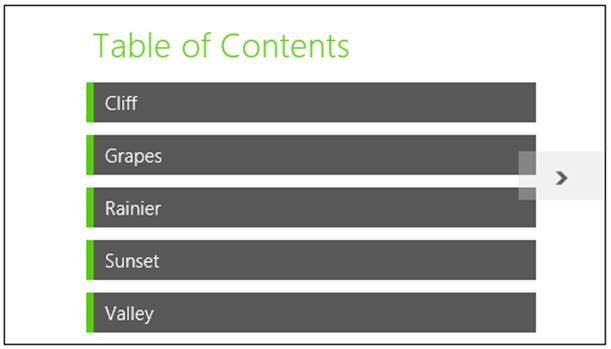
Scenario 3 (“Using interactive content”) shows the use of a renderer function instead of a declarative template, as we learned about in “How Templates Work with Collection Controls.” Scenario 3 uses a renderer (a function called mytemplate in js/interactiveContent.js) to create a “table of contents” for the item in the data source marked with a “contentArray” type:
Scenario 3 also sets up a listener for click events on the TOC entries, the handler for which flips to the appropriate item by setting the FlipView’s currentPage property. The picture items then have a back link to the TOC. See the clickHandler function in the code for both of these actions.
Scenario 4 (“Creating a context control”) demonstrates adding a navigation control to each item:
The items themselves are rendered using a declarative template, which in this case just contains a placeholder div called ContextContainer for the navigation control (html/context- Control.html):
<div>
<div id="contextControl_FlipView" class="flipView" data-win-control="WinJS.UI.FlipView"
data-win-options="{ itemDataSource: DefaultData.bindingList.dataSource,
itemTemplate: contextControl_ItemTemplate }">
</div>
<div id="ContextContainer"></div>
</div>
When the control is initialized in the processed method of js/contextControl.js, the sample calls the FlipView’s async count method. The completed handler, countRetrieved, then creates the navigation control using a row of styled radiobuttons. The onpropertychange handler for each radiobutton then sets the FlipView’s currentPage property.
Scenario 4 also sets up listeners for the FlipView’s pageselected and pagevisibilitychanged events. The first is used to update the navigation radiobuttons when the user flips between pages. The other is used to prevent clicks on the navigation control during a flip. (The event occurs when an item changes visibility and is fired twice per flip, once for the previous item, and again for the new one.)
Scenario 5 (“Styling Navigation Buttons”) demonstrates the styling features of the FlipView, which involves various win-* styles and pseudo-classes as shown here (also documented on Styling the FlipView and its items):
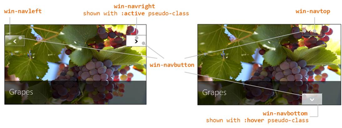
If you were to provide your own navigation buttons in the template (wired to the next and previous methods), hide the default by adding display:none to the <control selector> .win-navbutton style rule.
As we saw with the ItemContainer in Chapter 5, the FlipView creates some intermediate div elements between the root where you declare the FlipView and where the template gets rendered. These layers are classed with win-flipview (the root element), win-surface (the panning region), and win-item (where a template is rendered); you’ll typically use these to style margins, padding, etc.:
The win-surface class is where you style a different background color for the gap created with the itemSpacing property. To demonstrate this, scenario 5 of the modified sample in this chapter’s companion content sets itemSpacing to 50 (html/stylingButtons.html) and adds the following CSS (css/stylingButtons.css):
#stylingButtons_FlipView.win-surface {
background-color: #FFE0E0;
}
Finally, there are a few other methods and events for the FlipView that aren’t used in the sample, so here’s a quick rundown:
• pageCompleted An event raised when flipping to a new item is fully complete (that is, the new item has been rendered). In contrast, the aforementioned pageselected event will fire when a placeholder item (not fully rendered) has been animated in. See “Template Functions (Part 2): Optimizing Item Rendering” at the end of this chapter.
• datasourcecountchanged An event raised for obvious purpose, which something like scenario 4 would use to refresh the navigation control if items could be added or removed from the data source.
• next and previous Methods to flip between items (like currentPage), which would be useful if you provided your own navigation buttons.
• forceLayout A method to call specifically when you make a FlipView visible by removing a display:none style.
• setCustomAnimations A method that allows you to control the animations used when flipping forward, flipping backward, and jumping to a random item.
For details on all of these, refer to the WinJS.UI.FlipView documentation.
Collection Control Data Sources
Before we get into the details of the ListView, it’s appropriate to take a little detour into the subject of data sources as they pertain specifically to collection controls. In all the examples we’ve seen thus far, we’ve been using synchronous, in-memory data sources built withWinJS.Binding.List, which works well up to about 2000–3000 total items. But what if you have a different kind of source, perhaps one that works asynchronously (doing data retrieval off the UI thread)? It certainly doesn’t make sense to pull everything into memory first, and especially not with data sources that have tens or hundreds of thousands of items. For such sources we need a solution that’s scalable and can be virtualized.
For these reasons, collection controls like the FlipView and ListView don’t work directly against a List (like the Repeater)—they instead work against an abstract data source defined by a set of interfaces. That abstraction allows you to implement any kind of data source you want and plug it into the controls. Those sources could be built on top of an in-memory object, like the List, data from a service, object structures from other WinRT APIs or WinRT components, and really anything else. The abstraction is simply a way to shape any kind of data into something that the controls can use.
In this section, we’ll first look at those interfaces and their relationships. Then we’ll see two helpers that WinJS provides: the WinJS.UI.StorageDataSource object, which works with the file system, and the WinJS.UI.VirtualizedDataSource, which serves as a base class for custom data sources.
Tip If you define a data source (like a Binding.List) within a page control, the declarative syntax select('.pagecontrol').winControl.myData.dataSource can be used to assign that source to an itemDataSource or groupDataSource property. Here, pageControl class is a class you’d add to your page control’s root element. That element’s winControl property gets you to the object defined with WinJS.UI.Pages.define, wherein the myData property would return the Binding.List.
Super performance tip I said this in Chapter 6, but it’s very much worth saying again. If you’re enumerating folder contents to display images in a collection control (what is generally called a gallery experience), use metadata to represent file content instead of using file I/O to read that file content. Always use Windows.Storage.StorageFile.getThumbnailAsync or getScaledImageAs-ThumbnailAsync (or the same methods on the StorageFolder object) to retrieve a small image for your data source, which can be passed to URL.createObjectURL and the result assigned to animg element. (The StorageDataSource.getThumbnail method is a helper for this too, as we’ll see later.) This is much faster and uses less memory, as the API draws from the thumbnails cache instead of touching the file contents (as happens if you call URL.createObjectURL on aStorageFile). See the File and folder thumbnail sample for demonstrations. You might also be interested in watching Marc Wautier’s What’s new for working with Files session from //build 2013, where he talks about the improved performance with thumbnails, especially where working with OneDrive is concerned.
The Structure of Data Sources (Interfaces Aplenty!)
When you assign a data source to the itemDataSource property of the FlipView and ListView controls, or the ListView’s groupDataSource property, that object is expected to implement the methods of the interface called IListDataSource.65 Everything these controls do with their data sources happens exclusively through these methods and those of several companion interfaces: IListBinding, IItemPromise, and IItem. The fact that the data source is abstracted behind these interfaces, and that most of the methods involved are asynchronous, means that the data source can work with any kind of data, whether local or remote. On the other side of the picture, collection controls that want to receive change notifications create a handler object with the IListNotificationHandler methods. Together, all these interfaces provide the necessary means to asynchronously manipulate items in the data source and to bind to those items (that is, enumerate them and register for change notifications).
Tip It is entirely expected and recommended that custom collection controls work with these same interfaces to support a variety of data sources. There’s little point in reinventing it all! Also take note of the WinJS.UI.computeDataSourceGroups helper that adds grouping information to a data source give an IListDataSource.
For in-memory source, the WinJS.Binding.List conveniently supplies everything that’s needed through its dataSource property, as we’ve seen. This is why you’ll always see a reference to List.dataSource with the FlipView and ListView: they know nothing about the List itself. As mentioned earlier in this chapter, if you see an exception about a missing method called createListBinding, it’s probably telling you that you’re assigning a List instead of a List.dataSource to one of the FlipView or ListView source properties.
The createListBinding method, in fact, is the one through which a source object (with IListDataSource) provides the binding capabilities expressed through IListBinding, and how a collection control registers an object, with the IListNotificationHandler methods, to listen for data changes. The general relationships between these and the source are illustrated in Figure 7-6.
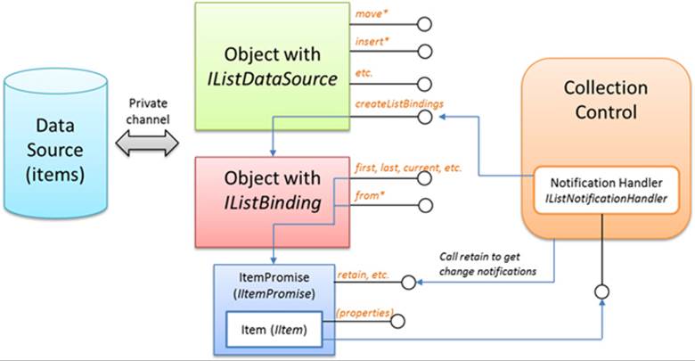
FIGURE 7-6 The general relationships between a data source, the IListDataSource and IListBinding interfaces, and a collection control like the ListView that uses that data source through those interfaces and provides a notification handler with IListNotificationHandler methods.
Looking at Figure 7-6, the relationship between the data source and the objects that represent it is private and very much depends on the nature of the data, but all that’s hidden from the controls on the right. You can also see that items are represented by promises that have the usual then/done methods, of course, but also sport a few others as found in IItemPromise. What these promises deliver are then item objects with the IItem methods. It’s a lot to keep track of, so let’s break it down.
The members of IListDataSource, in the table below, primarily deal with manipulations of items in the source. If you’ve worked with databases, you’ll recognize that this interface expressed the typical set of create, update, and delete operations. The object behind the interface can implement these however it wants. The List.dataSource object, for example, mostly uses List methods like move, splice, push, setAt, etc. But be mindful again that all the IListDataSource methods that affect item content (change, getCount, item*, insert*, move*, and remove) are asynchronous and return item promises (IItemPromise) for the results in question.
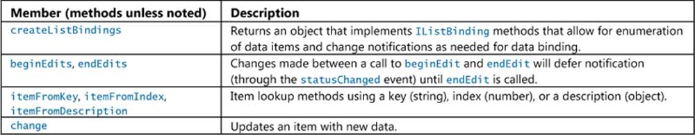
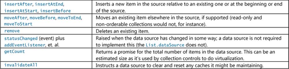
You’ll also find that all operations that reference existing items, like change, move*, insertAfter, and so on, reference items by keys rather than indicies. This was a conscious design decision because indices can be quite volatile in different data sources. Keys, on the other hand, which a source typically assigns to uniquely identify an item, are very stable.
The members of IListBinding, for their part, deal with enumeration of items in the source. All of its methods are asynchronous and return promises with IItemPromise methods:
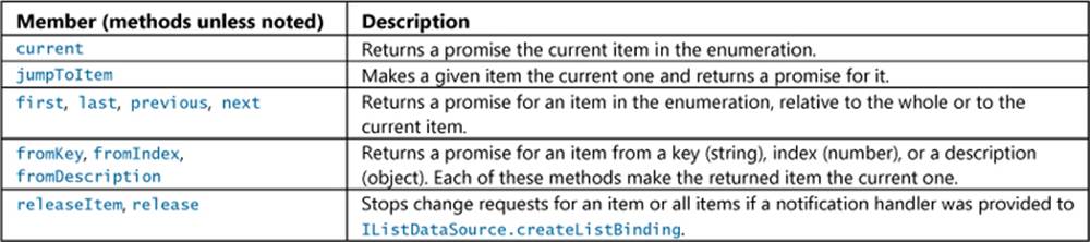
To listen to change notifications on any particular item, the control that’s using the data source must first provide an object with IListNotificationHandler to the createListBinding method, as shown earlier in Figure 7-6. This step provides the handler to the source, but doesn’t actually start notifications. That step happens when the control requests an item (through whatever other method) to get an item promise and calls IItemPromise.retain. When the control is done listening, it retrieves the item from the promise (IItemPromise.then or done) and calls that item’srelease.
This per-item notification is done to support virtualization. If you have a data source with potentially thousands of items, but the control that’s using that source only displays a few dozen at a time, then there’s no reason for the source to keep every item in memory: the control would instead call retain for those items that are visible (or about to be visible), and later call release when they’re well out of view. This allows the data source to manage its own memory efficiently.
That’s the whole relationship in a nutshell. For the most part, you won’t have to deal with all these details. For custom data sources, the VirtualizedDataSource provides a core implementation, as we’ll see later. And when your data source is a List, you can just manipulate that source through the List methods. At the same time, you can also make changes through the IListDataSource and IListBinding methods directly. This is necessary when the data source isn’t a List, and becomes important if you’re creating a custom collection control that supports arbitrary sources.
An example of this can be found in the HTML ListView working with data sources sample. Scenarios 2 and 3 use a ListView to displays letter tiles like those found in many word games:

A series of buttons lets you shuffle the list, add a tile, remove a tile, or swap tiles. In scenario 2, these manipulations are done through the Binding.List to which the ListView is bound. Adding a tile, for example, just happens with List.push (js/scenario2.js):
function addTile() {
var tile = generateTile();
lettersList.push(tile);
}
Scenario 3, on the other hand, does all the same stuff, still using a List, but performs manipulations through IListDataSource methods. Adding a tile, for example, happens through insertAtEnd (js/scenario3.js):66
function addTile() {
var ds = document.getElementById("listView3").winControl.itemDataSource;
var tile = generateTile();
ds.insertAtEnd(null, tile);
}
The shuffling operation is more involved as it must first call createListBinding to get the IListBinding methods through which it can enumerate the collection. This results in an array of item promises, which can be fulfilled with WinJS.Promise.join. It then calls the source’s beginEditsto batch changes, randomly moves items to the top of the list with moveToStart, and then calls endEdits to wrap up. The code is a bit long, so you can look at it in js/scenario3.js.
A FlipView Using the Pictures Library
For everything we’ve seen in the FlipView sample already, it really begs for the ability to do something completely obvious: flip through pictures in a folder. How might we implement something like that? We already have an item template containing an img tag, so perhaps we just need some URIs for those files. We could make an array of these using the Windows.Storage.KnownFolders.picturesLibrary folder and that library’s StorageFolder.getFilesAsync method (declaring the Pictures Library capability in the manifest, of course!). This would give us a bunch ofStorageFile objects for which we could call URL.createObjectURL. We could store those URIs in an array and create a List, whose dataSource property we can assign to the FlipView’s itemDataSource:
varmyFlipView = document.getElementById("pictures_FlipView").winControl;
Windows.Storage.KnownFolders.picturesLibrary.getFilesAsync()
.done(function (files) {
var pixURLs = [];
files.forEach(function (item) {
var url = URL.createObjectURL(item, {oneTimeOnly: true });
pixURLs.push({type: "item", title: item.name, picture: url });
});
var pixList = new WinJS.Binding.List(pixURLs);
myFlipView.itemDataSource = pixList.dataSource;
});
Although this approach works, it can consume quite a bit of memory with a larger number of high-resolution pictures because each picture has to be fully loaded into memory. We can alleviate the memory requirements by loading thumbnails instead of the full image, but there’s still the significant drawback that the images are stretched or compressed to fit into the FlipView without any concern for aspect ratio, and this produces lousy results unless every image is the same size (highly unlikely!).
A better approach is to use the WinJS.UI.StorageDataSource object, a demonstration of which is found in scenario 8 of the modified HTML FlipView sample in this chapter’s companion content. Another example can be found in the StorageDataSource and GetVirtualizedFilesVector sample, which creates a ListView over the Pictures folder as well.
StorageDataSource provides all the necessary interfaces, of course, and works directly with the file system metadata as a data source instead of an in-memory array. It provides automatic change detection, so if you add files to a folder or modify existing ones, it will fire off the necessary change notifications so that bound controls can update themselves. Furthermore, it provides automatic scaling and cropping services for thumbnails—pictures, for example, are auto-cropped with a 0.7 height to width ratio, using the upper part of a picture where the subject is usually found. Videos automatically receive an adornment to distinguish them from pictures, and also use a 0.7 height to width ratio. Music and documents, on the other hand, automatically use a square representation, as befits album art and icons. You can also customize this behavior through theThumbnailMode options that you pass to the StorageDataSource constructor.
The StorageDataSource works with something called a query, which we’ll learn about in Chapter 11, “The Story of State, Part 2.”67 Fortunately, WinJS lets you shortcut the process for media libraries and just pass in a string like “Pictures” (js/scenario8.js):
myFlipView.itemDataSource = new WinJS.UI.StorageDataSource("Pictures");
This will create a StorageDataSource on top of the contents of the Pictures library (assuming you’ve declared the capability, of course).
The caveat with StorageDataSource is that it doesn’t directly support one-way binding: you’ll get an exception if you try to refer to item properties directly in a declarative template. To work around this, you have to explicitly use WinJS.Binding.oneTime as the initializer function for each property (or set it as the default in Binding.processAll). This template is in html/scenario8.html:
<div id="pictures_ItemTemplate" data-win-control="WinJS.Binding.Template">
<div class="overlaidItemTemplate">
<img class="image" data-win-bind="src: thumbnail InitFunctions.thumbURL;
alt: name WinJS.Binding.oneTime"/>
<div class="overlay">
<h2 class="ItemTitle" data-win-bind="innerText: name WinJS.Binding.oneTime"></h2>
</div>
</div>
</div>
In the case of the img.src property, the query gives us items of type Windows.Storage.-BulkAccess.FileInformation (the s variable in the code below), which contains a thumbnail image, not a URI. To convert that image data into a URI, we need to use our own binding initializer:
WinJS.Namespace.define("InitFunctions", {
thumbURL: WinJS.Binding.initializer(function (s, sp, d, dp) {
var thumb = WinJS.Utilities.getMember(sp.join("."), s);
if (thumb) {
var lastProp = dp.pop();
var target = dp.length ? WinJS.Utilities.getMember(dp.join("."), d) : d;
dp.push(lastProp);
target[lastProp] = URL.createObjectURL(thumb, { oneTimeOnly: true });
}
})
});
Note that thumbnails aren’t always immediately available in the FileInformation object, which is why we have to verify that we actually have one before creating a URI for it. This means that quickly flipping through the images might show some blanks. To solve this particular issue, we can listen for the FileInformation.onthumbnailupdated event and update the item at that time. The best way to accomplish this is to use the StorageDataSource.loadThumbnail helper, which makes sure to call removeEventListener for this WinRT event. (See “WinRT Events and removeEventListener” in Chapter 3.) You can use this method within a binding initializer, as demonstrated in scenario 1 of the afore-mentioned StorageDataSource and GetVirtualizedFilesVector sample, or within a rendering function that takes the place of the declarative template. Scenario 9 of the modified FlipView sample does this.
Custom Data Sources and WinJS.UI.VirtualizedDataSource
Creating a custom data source means, when all is said and done, to provide the implementations of all the interfaces we saw earlier in “The Structure of Data Sources (Interfaces Aplenty!).” Clearly, that would be a lot of coding work and would involve change detection and lots of optimization work like caching and virtualization. To make the whole job easier, WinJS provides the WinJS.UI.Virtualized-DataSource class that does most of the heavy-lifting and provides all the IListDataSource and IListBinding methods. The piece you provide is a stateless adapter—an object that implements some or all of the methods of the IListDataAdapter interface—to customize or adapt the VirtualizedDataSource to your particular data store.
Tip The Using ListView topic in the documentation contains a number of performance tips for custom data sources that aren’t covered here. As it notes, the IListDataAdapter interface and the VirtualizedDataSource object are the best means for creating an asynchronous data source.
Walkthrough For more on the concepts around custom data sources and a walkthrough of using an adapter, watch Sam Spencer’s talk from //build 2011, Build data-driven collection and list apps using ListView, specifically between 31:16 and 48:48. It’s interesting to note that he builds a data source on top of WCF data services (OData) talking to a SQL Server database hosted on Windows Azure. An adapter is also applicable to other cloud services, data-related WinRT APIs, and local databases.
If you take a look at IListDataAdapter, you’ll see that it has many of the same methods as IListDataSource, because it handles many of the same functions. Be sure not to confuse the two, however, because there are differences and even methods with the same names might have different arguments.
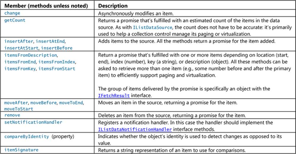
When you look at these methods and think about them in relation to different kinds of data sources, it should be clear that certain methods won’t be needed. A read-only source, for example, has no need for the insert* or move* methods. Fortunately, the adapter interface and theVirtualizedDataSource are designed to be flexible, allowing you to implement only those adapter methods as described in the following table.
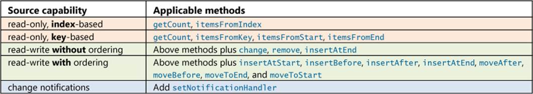
Now for some examples! First, if you’ve been keeping score, you might have noticed that we’ve talked about every scenario in the HTML FlipView sample (the modified one) except for scenario 6. That’s because this particular scenario implements a custom data source to work with images from Bing Search. This is where you’ll need the Bing Search API key that I mentioned at the beginning of this chapter, so if you didn’t get a key yet, do that now.
Scenario 6 is shown in Figure 7-7, using the modified sample in which I’ve changed the default search strings from Seattle and New York to a few things closer to my heart (my son’s favorite train and the community where I live). You can do a lot in this scenario. The controls let you select from different forms of item rendering, which we’ll be talking about later in this chapter, and to select either a virtualized online data source with a configurable delay time—as we’ll be talking about here—or an online source that’s incrementally loaded into a Binding.List.
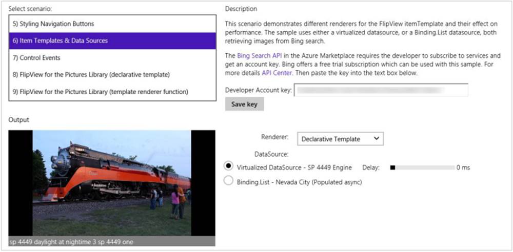
FIGURE 7-7 Scenario 6 of the modified HTML FlipView sample in the companion content (cropped).
When you select the Virtualized DataSource option, as shown in the figure, the code assigns the FlipView and instance of a custom class called bingImageSearchDataSource:
dataSource = new bingImageSearchDataSource.datasource(devkey, "SP4449", delay);
where devkey is the Bing Search API account key, “SP4449” is the search string, and delay is from the Delay range control (to simulate network latency). The class itself is implemented in js/bingImage-SearchDataSource.js, deriving from WinJS.UI.VirtualizedDataSource:
WinJS.Namespace.define("bingImageSearchDataSource", {
datasource: WinJS.Class.derive(WinJS.UI.VirtualizedDataSource,
function (devkey, query, delay) {
this._baseDataSourceConstructor(new bingImageSearchDataAdapter(devkey, query, delay));
})
});
The call to this._baseDataSourceConstructor is the same as calling new on the Virtiualized-DataSource. However you do it, the argument to this constructor is your adapter object. In this case it’s an instance of the bingImageSearchDataAdapter class, which is the bulk of the code in js/bingImageSearchDataSource.js. Because we have a read-only, index-based, nonorderable source without change notification, the adapter implements only the getCount and itemFromIndex methods. Both of these make HTTP requests to Bing to retrieve the necessary data.
In the earlier table, I mentioned that getCount doesn’t have to be accurate—it just helps a collection control plan for virtualization; the sample, in fact, always returns 100 if it successfully pings the server with a request for 10. Typically, once itemFromIndex has been called and you start pulling down real data, you can make the count increasingly accurate.
Speaking of counts, the itemFromIndex method is interesting because it’s not just asked to retrieve one item: it’s might also be asked for some number of items on either side. This specifically supports pre-caching of items near the current point at which a control is displaying a collection because those are the most likely items that the user will navigate to next. By asking the data source for more than one at a time—especially when making an HTTP request—we cut down network traffic and deliver a smoother user experience.
As an optimization, these extra item requests are not hard rules. Depending on the service, the adapter can decide to deliver however many items is best for the service. For example, if itemsFromIndex is asked for 20 items before and after the primary item, but the service works best with requests of 32 items at a time, the adapter can deliver 15 before and 16 after; or if the service is best with 64 items, the adapter can deliver 31 before and 32 after.
To show this aspect of the adapter, here’s the beginning of itemsFromIndex, after which is just the code making the HTTP request and processing the results into an array. The _minPageSize and _maxPageSize properties represent the optimal request range (js/bingImageSearchDataSource.js):
itemsFromIndex: function (requestIndex, countBefore, countAfter) {
// Some error checking omitted
var fetchSize, fetchIndex;
// See which side of the requestIndex is the overlap
if (countBefore > countAfter) {
countAfter = Math.min(countAfter, 10);//Limit the overlap
//Bound the request size based on the minimum and maximum sizes
var fetchBefore = Math.max(Math.min(countBefore,
this._maxPageSize - (countAfter + 1)), this._minPageSize - (countAfter + 1));
fetchSize = fetchBefore + countAfter + 1;
fetchIndex = requestIndex - fetchBefore;
} else {
countBefore = Math.min(countBefore, 10);
var fetchAfter = Math.max(Math.min(countAfter,
this._maxPageSize - (countBefore + 1)), this._minPageSize - (countBefore + 1));
fetchSize = countBefore + fetchAfter + 1;
fetchIndex = requestIndex - countBefore;
}
// Build up a URL for the request
var requestStr = "https://api.datamarket.azure.com/Data.ashx/Bing/Search/Image"
// Common request fields (required)
+ "?Query='" + that._query + "'"+ "&$format=json"+ "&Market='en-us'"+ "&Adult='Strict'"
+ "&$top=" + fetchSize+ "&$skip=" + fetchIndex;
The items, as noted in the table of adapter methods, are returned in the form of an object with the IFetchResult interface. Unlike the others we’ve seen, this one contains only properties, where items is the most important as it contains the item data (objects with IItem). Here’s how the sample builds the fetch result: for each item in the HTTP response, it creates a data object (that can contain whatever information you want) and pushes it into an array called results:
for (var i = 0, itemsLength = items.length; i < itemsLength; i++) {
var dataItem = items[i];
results.push({
key: (fetchIndex + i).toString(),
data: {
title: dataItem.Title,
thumbnail: dataItem.Thumbnail.Url,
width: dataItem.Width,
height: dataItem.Height,
linkurl: dataItem.Url,
url: dataItem.MediaUrl
}
});
}
The return value, that’s ultimately delivered through a promise, then has the results array as the item’s data property, along with two other properties:
return {
items: results, // The array of items
offset: requestIndex - fetchIndex, // The offset into the array for the requested item
totalCount: that._maxCount,
};
The prefetching nature of the item* methods is helpful for the FlipView but essential for the ListView. This is demonstrated more clearly in the HTML ListView working with data sources sample that we saw earlier. Scenario 1 (see Figure 7-8) uses the same Bing Search data source as the FlipView sample with one small change. In the case of the FlipView, though, the page size is set between 1 and 10 and the largest number that the source will pull down at once is 100 items. In the ListView sample, the page size is set to 50 and the max number to 1000, as befits a collection control that will show more items at one time. Otherwise everything about the data source and the adapter is the same.
Another example The PDF viewer showcase sample contains another implementation of a custom data source for reference, which you can find in its js/pdfDataSource.js file.
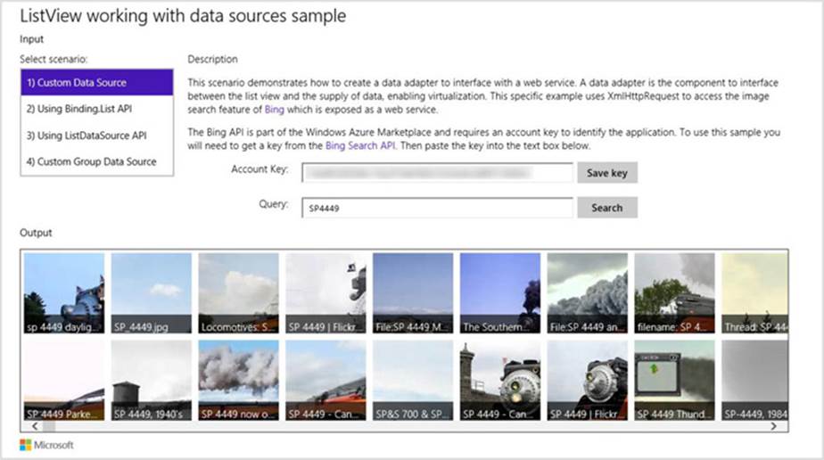
FIGURE 7-8 Scenario 1 of the modified HTML ListView working with data sources sample, which allows you to enter a search term of your choice.
You can see the effect of the ListView’s precaching by adding some console output to the top of the itemsFromIndex method in js/bingImageSearchDataSource.js:
console.log("itemsFromIndex: requestIndex = " + requestIndex + ", countBefore = " +
countBefore + ", countAfter =" + countAfter);
Tip A collection control can call itemFromIndex many times, so console output is often a more efficient way to watch what’s happening than breakpoints.
With this in place, run the sample and page around quickly in the ListView, even dragging the scroll thumb far down in the list. You’ll see console output that shows what the ListView is asking for:
itemsFromIndex: requestIndex = 0, countBefore = 0, countAfter =1
itemsFromIndex: requestIndex = 50, countBefore = 0, countAfter =30
itemsFromIndex: requestIndex = 150, countBefore = 0, countAfter =14
itemsFromIndex: requestIndex = 322, countBefore = 1, countAfter =80
itemsFromIndex: requestIndex = 508, countBefore = 1, countAfter =82
itemsFromIndex: requestIndex = 210, countBefore = 0, countAfter =0
itemsFromIndex: requestIndex = 607, countBefore = 0, countAfter =253
itemsFromIndex: requestIndex = 907, countBefore = 0, countAfter =41
itemsFromIndex: requestIndex = 1000, countBefore = 0, countAfter =0
itemsFromIndex: requestIndex = 543, countBefore = 13, countAfter =148
It’s good to note, even though we haven’t seen it yet, that the fulfillment of item promises—that is, the delivery of items—has a direct effect on the ListView control’s loadingState property and its loadingStateChanged event. The ListView tracks whether its items have been rendered through completion of the item promises. The rest of your UI code, on the other hand, can just watch the ListView’s loadingStateChanged event to track its state: there’s no need to watch the data source directly from that other code.
To wrap up this sample and this section, now, scenario 4 demonstrates a custom data source implemented on top of two JavaScript arrays (items and groups) using two adapters and VirtualizedDataSource. We’re still using a ListView here, but a Binding.List is nowhere in sight.
What’s important in this scenario is that the items returned from the adapter’s itemsFromIndex contain both the key and a groupKey properties of IItem (js/scenario4.js):
// Iterate and form the collection of items. results is returned in
// the IFetchResult.items property.
for (var i = fetchIndex; i <= lastFetchIndex; i++) {
var item = that._itemData[i];
results.push({
key: i.toString(), // the key for the item itself
groupKey: item.kind, // the key for the group for the item
data: item // the data fields for the item
});
}
where the groupKey values in the items match the key values in the itemFromIndex results returned by the group’s data source and are also used in the group’s itemFromKey implementation. Take a look through js/scenario4.js for more—the code is well commented.
Sidebar: Custom Data Sources in C++
Even though the IListDataSource and other interfaces are documented as part of WinJS, there’s nothing that says they have to be implemented on JavaScript objects. The beauty of interfaces is that it doesn’t matter how they’re implemented, so long as they do what they’re supposed to. Thus, if working with a data source will perform better when written in a language like C++, you can implement it as a class in a WinRT Component. This allows you to instantiate the object from JavaScript and still take advantage of the performance of compiled C++. The basics of writing a component are discusssed in Chapter 18, “WinRT Components.”
ListView Features and Styling
Having already covered data sources and templates along with a number of ListView examples, we can now explore the additional features of the ListView control, such as styling, loading state transitions, drag and drop, and layouts. Optimizing item rendering then follows in the last section of this chapter (and applies to FlipView and ListView). First, however, let me answer a very important question.
When Is ListView the Right Choice?
ListView is the hands-down richest control in all of Windows. It’s very powerful, very flexible, and, as we’re already learning, very deep and intricate. But for all that, sometimes it’s also just the wrong choice! Depending on the design, it might be easier to just use basic HTML/CSS layout or the WinJS.UI.Hub control, as we’ll see in Chapter 8.
Conceptually, a ListView is defined by the relationship between three parts: a data source, templates, and layout. That is, items in a data source, which can be grouped, sorted, and filtered, are rendered using templates and organized with a layout (typically with groups and group headers). In such a definition, the ListView is intended to help visualize a single collection of similar and/or related items, where their groupings also have a relationship of some kind.
With this in mind, the following factors strongly suggest that a ListView is a good choice to display a particular collection:
• The collection can contain a variable number of items to display, possibly a very large number, showing more when the app runs on a larger display.
• It makes sense to organize and reorganize the items into various groups.
• Group headers help to clarify the common properties of the items in those groups, and they can be used to navigate to a group-specific page.
• It makes sense to sort and/or filter the items according to different criteria.
• Different groupings of items and information about those groups suggest ways in which semantic zoom would be a valuable user experience.
• The groups themselves are all similar in some way, meaning that they each refer to a similar kind of thing. Different place names, for example, are similar; a news feed, a list of friends, and a calendar of holidays are not similar.
• Items might be selectable individually or in groups so that you can apply commands on them.
On the flip side, opposite factors suggest that a ListView is not the right choice:
• The collection contains a limited or fixed number of items, or it isn’t really a collection of related items at all.
• It doesn’t make sense to reorganize the groupings or to filter or sort the items.
• You don’t want group headers at all.
• You don’t see how semantic zoom would apply.
• The groups are highly dissimilar—that is, it wouldn’t make sense for the groups to sit side-by-side if the headers weren’t there.
• Some items might be selectable or interactive, while others are not.
Let me be clear that I’m not talking about design choices here—your designers can hand you any sort of layout they want and as a developer it’s your job to implement it! What I’m speaking to is how you choose to approach that implementation, whether with controls like ListView and Hub or just with HTML/CSS layout.
I say this because in working with the developers who created the very first apps for the Windows Store (especially before the Hub control was available in Windows 8.1), we frequently saw them trying to use ListView in situations where it just wasn’t appropriate. An app’s hub page, for example, might combine a news feed, a list of friends, and a calendar. An item details page might display a picture, a textual description, and a media gallery. In both cases, the page contains a limited number of sections and the sections contain very different content with very dissimilar items. Because of this, using a ListView gets complicated. It’s better to use a single pannable div with a CSS grid in which you can lay out whatever sections you need, or the Hub control that was created for these scenarios.
Within those sections, of course, you might use ListView controls to display an item collection. I’ve illustrated these choices in Figure 7-9 (on the next page) using an image from the Navigation patterns topic, because you’ll probably receive similar images from your designers. Ignoring the navigation arrows, the hub and details pages typically use a div at the root, whereas a section page is often a ListView. Within the hub and details pages there might be some ListView controls, but where the content is essentially fixed (like a single item), the best choice is a div.
A clue that you’re going down the wrong path, by the way, is if you find yourself trying to combine multiple collections of unrelated data into a single source, binding that source to a ListView, and implementing a renderer to tease all the data apart again so that everything renders properly! All that extra work could be avoided simply by using the Hub or straight HTML/CSS layout.
For more on ListView design, see Guidelines for ListView controls, which includes details on the interaction patterns created with combinations of selection, tap, and swipe behaviors.
Tip I’ll say it again: if you’re creating a gallery experience with thumbnails in a ListView, avoid loading whole image files for that purpose. See the “Super performance tip” in the “Collection Control Data Sources” section earlier in this chapter.
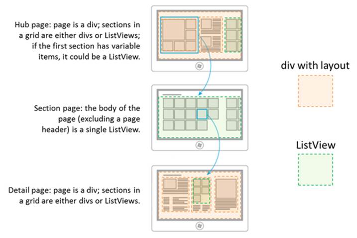
FIGURE 7-9 Breaking down typical hub-section-detail page designs into div elements and ListView controls. The Hub control is typically useful for pannable regions that contain different types of sections.
Options, Selections, and Item Methods
In previous sections we’ve already seen some of the options you can use when creating a ListView, options that correspond to the control’s properties. Let’s look now at the complete set of properties, methods, and events, which I’ve organized into a few groups—after all, those properties and methods form quite a collection in themselves! Because the details for the individual properties are found on the WinJS.UI.ListView reference page, what’s most useful here is to understand how the members of these groups relate (enumerations noted here are also in the WinJS.UInamespace):68
• Data sources and templates We’ve already seen the groupDataSource, groupHeader-Template, itemDataSource, and itemTemplate properties many times, so little more needs to be said on the technical details. For specific item template designs, the documentation provides two galleries of examples that you’ll find in Item templates for grid layouts (11 designs) and Item templates for list layouts (6 designs).
• Addressing items The currentItem property gets or sets the item with the focus, and the elementFromIndex and indexOfElement methods let you cross-reference between an item index and the DOM element for that item. The latter could be useful if you have other controls in your item template and need to determine the surrounding item in an event handler.
• Item visibility The indexOfFirstVisible and indexOfLastVisible properties let you know what indices are visible, and they can be used to scroll the ListView appropriate for a given item. The ensureVisible method brings the specified item into view, if it’s been loaded. Also, thescrollPosition property contains the distance in pixels between the first item in the list and the current viewable area. Though you can set the scroll position of the ListView with this property, it’s reliable only if the control’s loadingState (see “Loading state” group below) is ready, otherwise the ListView may not yet know its actual dimensions. It’s thus better to instead use ensureVisible or indexOfFirstVisible to control scroll position.
• Item invocation The itemInvokedevent, as we’ve seen, fires when an item is tapped, unless the tapBehavior property is not set to none, in which case no invocation happens. Other tapBehavior values from the TapBehavior enumeration will always fire this event but determine how the item selection is affected by the tap: invokeOnly, directSelect, and toggleSelect. You can override the selection behavior on a per-item basis using the selectionchanging event and suppress the animation if needed. See the “Item Tap/Click Behavior” sidebar after this list. Also note that the args.details.itemIndex value that you receive with this event is a zero-based index relative to the current visible items in the ListView.
• Item selection The selectionModepropertycontains a value from the SelectionMode, enumeration, indicating single-, multi-, or no selection. At all times the selection property contains a ListViewItems object whose methods let you enumerate and manipulate the selected items (such as setting selected items through its set method). Changes to the selection fire the selectionchanging and selectionchanged events; with selection-changing, its args.detail.newSelection property contains the newly selected items. For more on this, refer to scenario 4 of the HTML ListView essentials sample and the whole of the HTML ListView customizing interactivity sample, which among other things demonstrates a using the ListView in a master-detail layout (scenario 2). Note also that support for keyboard selection is built in.
• Header invocation The groupHeaderTapBehavior is set to a value from the GroupHeader-TapBehavior enumeration, which can be either invoke or none (the default). When set to invoke, group headers will fire the groupheaderInvoked event in response to taps, clicks, or the Enter key (when the header has the focus). As noted earlier with “Quickstart #4,” a demonstration is found in scenario 3 of the HTML ListView grouping and Semantic Zoom sample. With the keyboard, the Tab key will navigate from a group of items to its header, after which the arrow keys navigate between headers. It’s also recommended that apps also handle the Ctrl+Alt+G keystroke to navigate from items in the current group to the header.
• Swiping Related to item selection is the swipeBehaviorproperty that contains a value from the SwipeBehavior enumeration. This determines the response to swiping or cross-slide gestures on an item where the gesture moves perpendicular to the panning direction of the list. IfswipeBehavior is set to none, swiping has no effect on the item and the gesture is bubbled up to the parent element. If this is set to select, the gesture selects the item.
• Layout As we’ve also seen, the layout property (an object) describes how items are arranged in the ListView, which we’ll talk about more in “Layouts” below. Note that orientation (vertical or horizontal) is a property of the layout and not of the ListView itself. We’ve also seen theforceLayout function that’s specifically used when a display:none style is removed from a ListView and it needs to re-render itself. One other method, recalculateItemPosition, repositions all items in the ListView and is meant specifically for UI designer apps or when changing items within a cell-spanning layout.
• Loading behavior A ListView is set up to provide random access to all the items it contains but keeps only five total pages of items in memory at a time. The total number of items is limited to the maxDeferredItemCleanup property. More on this under “Loading State Transitions” below.
• Loading state The read-only loadingStateproperty contains either "itemsLoading" (the list is requesting items and headers from the data source), "viewportLoaded" (all items and headers that are visible have been loaded from the source), "itemsLoaded" (all remaining nonvisible buffered items have been loaded), or "complete" (all items are loaded, content in the templates is rendered, and animations have finished). Whenever this property changes while the ListView is updating its layout due to panning, the loadingStateChangedevent fires. Again, see “Loading State Transitions.”
• Drag and drop If the itemsDraggable property is true, the ListView can act as an HTML5 drag and drop source, such that items can be dragged to other controls. If itemsReorderable is true, the ListView allows items within it to be moved around via drag and drop. The events that occur during drag and drop are itemDragStart, itemDragLeave, itemDragEnter, itemDragBetween, itemDragChanged, itemDragDrop, and itemDragEnd. See “Drag and Drop” below for more.
• Events addEventListener, removeEventListener, and dispatchEvent are the standard DOM methods for handling and raising events. These can be used with any event that the ListView supports. To round out the event list, there are two more to mention. First, contentanimatingfires when the control is about to run an item entrance or transition animation, allowing you to either prevent or delay those animations. Second, the keyboardnavigating event indicates that the user has tabbed to a new item or a header.
• Semantic zoom The zoomableView property contains the IZoomableView implementation as required by semantic zoom (apps will never manipulate this property).
• Dispose pattern The ListView implements the dispose method and also has a triggerDispose method to run the process manually.
Sidebar: Referring to Enumerations in data-win-options
When specifying values from enumerations in data-win-options, you can use two forms. The most explicit way is to use the full name of the value, as shown here (other options omitted):
<div id="listView" data-win-control="WinJS.UI.ListView"
data-win-options="{
selectionMode: WinJS.UI.SelectionMode.none,
tapBehavior: WinJS.UI.TapBehavior.invokeOnly,
groupHeaderTapBehavior: WinJS.UI.GroupHeaderTapBehavior.invoke,
swipeBehavior: WinJS.UI.SwipeBehavior.none }">
</div>
Because all those values resolve to strings, you can just use the string values directly:
<div id="listView" data-win-control="WinJS.UI.ListView"
data-win-options="{
selectionMode: 'none',
tapBehavior: 'invokeOnly',
groupHeaderTapBehavior: 'invoke',
swipeBehavior: 'none' }">
</div>
Either way, always be careful about using exact spellings here. The forgiving nature of JavaScript is such that if you specify a bogus option, you won’t necessarily see any exception: you’ll just see default behavior for that option. This can be a hard bug to find, so if something isn’t working quite right, really scrutinize your data-win-options string.
Sidebar: Item Tap/Click Behavior
When you tap or click an item in a ListView with the tapBehavior property set to something other than none, there’s a little ~97% scaling animation to acknowledge the tap (this does not happen for headers). If you have some items in a list that can’t be invoked (like those in a particular group or ones that you show as disabled because backing data isn’t available), they’ll still show the animation because the tapBehavior setting applies to the whole control. To remove the animation for any specific item, you can add the win-interactive class to its element within a renderer function, which is a way of saying that the item internally handles tap/click events, even if it does nothing but eat them. If at some later time the item becomes invocable, you can, of course, remove that class.
If you need to suppress selection for an item, add a handler for the ListView’s selection-changing event and call its args.detail.preventTapBehavior method. This works for all selection methods, including swipe, mouse click, and the Enter key.
Styling
Following the precedent of Chapter 5 and the earlier sections on Repeater and FlipView, styling is best understood visually as in Figure 7-10, where I’ve applied some garish CSS to some of the win-* styles so that they stand out. I also highly recommend that you look at the Styling the ListView and its items and How to brand your ListView topics in the documentation.
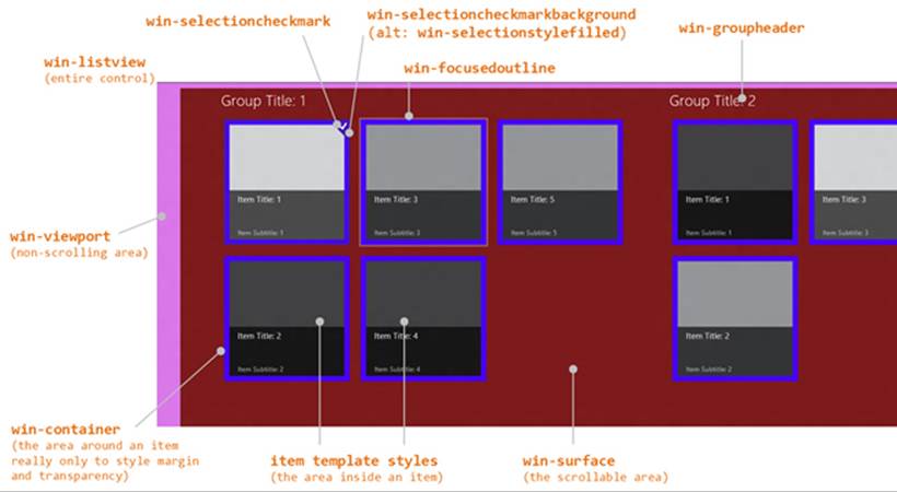
FIGURE 7-10 Most of the style classes as utilized by the ListView control.
Some short notes about styling:
• Remember that Blend is your best friend here!
• As with styling the FlipView, a class like win-listview is most useful with styles like borders around the control. You can also style background colors and nonscrolling images here if the viewport, surface, and items have a transparent background as well.
• To style a background that pans with the items, set background-image for the win-surface selector.
• The ListView will automatically display a <progress> control while loading items, and you can style this with the .win-listview .win-progress selector.
• win-viewport styles the nonscrolling background of the ListView and is the best place to style margins. As the container for the scrollable area, the win-viewport element will also have a win-horizontal or win-vertical class depending on the layout’s orientation.
• win-container primarily exists for two things. One is to create space between items using margin styles, and the other is to override the default background color, often making its background transparent so that the win-surface or win-listview background shows through. Note that if you set a padding style here instead of margin, you’ll create areas around what the user will perceive as the item but that are still invoked as the item. Not good. So always use margin to create space between items.
• Though win-item is listed as a style, it’s deprecated and may be removed in the future: just style the item template directly.
• The documentation points out that styles like win-container and win-surface are used by multiple WinJS controls. (FlipView uses a few of them.) If you want to override styles for a ListView, be sure to scope your selectors with other classes like .win-listview or a particular control’s id or class.
• The default ListView height is 400px, and the control does not automatically adjust itself to its content. You’ll almost always want to override the height style in CSS or set it from JavaScript when you know the space that the ListView should occupy in your overall layout.
• Not shown in the figure is the win-backdrop style that’s used as part of the win-container element. The “backdrop” is a blank item shape that can appear when the user very quickly pans a ListView to a new page and before items are rendered. This is gray by default, but you can add styles in the .win-container .win-backdrop selector to override it.
Selections and selection state take a little more explaining than one bullet item. First, the default selection styling is a “bordered” look (below left). If you want the filled look (below right), add the win-selectionstylefilled class to the ListView’s root element.
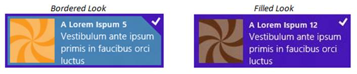
The following styles then apply to the different parts of the selection:
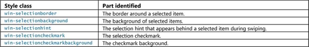
If you’ve read Chapter 5, you’ll recognize these as the same ones that apply to the ItemContainer control, and, in fact, they have exactly the same meaning. For examples on using these classes, refer to the “Styling Gallery: WinJS Controls” in that chapter.
Loading State Transitions
If you’re like myself and others in my family, you probably have an ever-increasing stockpile of digital photographs that make you glad that 1TB+ hard drives keep dropping in price. In other words, it’s not uncommon for many consumers to have ready access to collections of tens of thousands of items that they will at some point want to pan through in a ListView. But just imagine the overhead of trying to load thumbnails for every one of those items into memory to display in a list. On low-level and low-power hardware, you’d probably be causing every suspended app to be quickly terminated, and the result will probably be anything but “fast and fluid”! The user might end up waiting a reallylong time for the control to become interactive and will certainly tire of watching a progress ring.
With this in mind, the ListView always reflects the total extent of the list in its scrollbar. This gives the user has some idea of the size of the list and allows scrolling to any point in the list (random access). At the same time, the ListView keeps a total of only five pages or screenfuls of items in memory at any given time, limiting the number of items to maxDeferredItemCleanup if you set that property. This generally means that the visible page (in the viewport) plus two buffer pages ahead and behind will be loaded in memory at any given time. If you’re viewing the first page, the buffer extends four pages ahead; if you’re on the last page, the buffer extends four pages behind—you get the idea. (The priority at which these different pages are loaded also changes with the panning direction via the scheduler—those pages that are next in the panning direction are scheduled at a higher priority than those in the opposite direction. This is all transparent to your app.)
When the pages first start loading, the ListView’s loadingState property will be set to itemsLoading. When all the visible items are loaded, the state changes to viewportLoaded. Once all the buffered pages are loaded, the state changes to itemsLoaded. When all animations are done, the state becomes complete. The loadingstatechanged event will of course fire on each transition.
Whenever the user pans to a location in the list, any pages that fall out of the viewport or buffer zone are discarded, if necessary, to stay under maxDeferredItemCleanup and loading of the new viewport page and its buffer pages begins. Thus, the ListView’s loadingState property will start again at itemsLoading and then transition through the other states as before. If the user pans some more during this time, the loadingState is again reset and the process begins anew.
Sidebar: Incremental Loading
Apart from potentially very large but known collections, other collections are, for all intents and purposes, essentially unbounded, like a news feed that might have millions of items stretching back to the Cenozoic Era (at least by Internet reckoning!). With such collections, you probably won’t know just how many items there are at all; the best you can do is just load another chunk when the user wants them.
Although the ListView itself doesn’t provide support for automatically loading another batch of items at the appropriate time, it’s relatively straightforward to do within either a data source or an item rendering function. Just watch for item requests near the end of the list (however far you want to make it), and use that as a trigger to load more items. Within an item renderer, check the position of the items being rendered, which tells you where the ListView’s viewport is relative to the collection. In a data source, watch the index or key in IListDataAdapter methods like itemsFromIndex, especially when the countAfter argument exceeds the end of the current list. Either way, you then load more items into the collection, changes that should generate change notifications to the control. The control will call the source’s getCount method in response and update its scrollbar accordingly.
A small demonstration of this can be found in scenarios 2 and 3 of the HTML ListView incremental loading behavior sample, which adds more items to a Binding.List when needed from within the item renderer.
Drag and Drop
It’s very natural when one is looking at a collection of neat stuff to want to copy or move some of that neat stuff to some other location in the app. HTML5 drag and drop provides a standard for how this works between elements, and the ListView is capable of participating in such operations with both mouse and touch.
To briefly review the standard, a draggable element has the draggable="true" attribute. It becomes a source of a dataTransfer object (that carries the data) and sees dragstart, drag, dragenter, dragleave, dragover, and dragend events at appropriate times (for a concise reference, seeDragEvent on MSDN). A target element, for its part, will see dragenter, dragleave, dragover, and drop events and have access to the dataTransfer object. There’s more to it, such as drop effects you set within various events in response to the state of the Ctrl and Alt keys, but those are the basics.
The ListView implements these parts of the HTML5 spec on your behalf, surfacing similar events and giving you access to the dataTransfer object, whose setData and getData methods are what you use to populate and retrieve the data involved.
The ListView can participate in drag and drop in four ways. First, it can be made reorderable within itself, independent of exchanging items with other sources or targets. Second, it can be made a drag source, so you can drag items from the ListView to other HTML5 drop targets. Third, the ListView can be a drop target and accept data dragged from other HTML5 sources. And fourth, items within a ListView can themselves be individual drop targets. (Note that ListView and HTML5 drag and drop is not presently enabled between apps, just within an app.)
Let’s go through each of these possibilities using examples from the HTML ListView reorder and drag and drop sample. Reordering in a ListView is perhaps the simplest: it requires nothing more than setting the itemsReorderable option to true, as demonstrated in scenario 1 (html/scenario1.html):
<div id="listView" data-win-control="WinJS.UI.ListView" data-win-options="{
itemDataSource: myData.dataSource, itemTemplate: smallListIconTextTemplate,
itemsReorderable: true,layout: { type: WinJS.UI.GridLayout } }">
</div>
That’s it—with this one option and no other code (you can see that js/scenario1.js does nothing else), you get the behavior shown in Video 7-3, for both single and multiple items (shown with the mouse as it’s more efficient). Under the covers, reordering of the ListView fundamentally means moving items in the data source, in response to which the ListView updates its display. To be precise, the ListView uses the moveBefore and moveAfter methods of IListDataSourceto do the reordering. This implies, of course, that the data source itself is reorderable. If it isn’t, you’ll get an exception complaining about moveAfter. (If you like throwing exceptions for fun, try adding itemsReorderable:true to the ListView in scenario 1 of the HTML ListView working with data sources sample.)
In short, setting itemsReorderable turns on all the code to reorder items in the data source in response to user action in the ListView. Quite convenient!
Although scenario 1 doesn’t show it, the ListView’s various itemdrag* events will fire when reordering takes place, as they do for all drag and drop activities in the control:
• itemdragstart when dragging begins,
• itemdragbetween as the item is moved around in the list,
• itemdragleave and itemdragenter if the item moves out of and into the ListView,
• itemdragdrop if and when the item is released, making it the one you’d use to detect a reordering, and
• itemdragend when it’s all over (including when the item is dragged out and released, or the ESC key is pressed).
The only event not represented here is itemdragchanged, which specifically signals that items currently being dragged have been updated in the source. Note also that loadingstatechanged will be fired after itemdragdrop and itemdragend as the control re-renders itself.
To serve as a drag source, independent of reordering, set the ListView’s itemsDraggable property to true, as in scenario 2 (html/scenario2.html):
<div id="listView" data-win-control="WinJS.UI.ListView" data-win-options="{
itemDataSource: myData.dataSource, selectionMode: 'none',
itemTemplate: smallListIconTextTemplate,
itemsDraggable: true,layout: { type: WinJS.UI.GridLayout } }">
</div>
When dragging starts in the ListView, it will fire an itemdragstart event, whose eventArgs.detail contains two objects. The first is the HTML5 dataTransfer object, which you populate with your source data through its setData method. The second is a dragInfo object that specifically contains a ListView Selection object for the items being dragged (selected or not). The sample uses dragInfo.getIndices to source the indicies of those items (js/scenario2.js):
listView.addEventListener("itemdragstart", function (eventArgs) {
eventArgs.detail.dataTransfer.setData("Text",
JSON.stringify(eventArgs.detail.dragInfo.getIndices()));
});
The target in this scenario is another div named myDropTarget that simply handles the HTML5 drop event (and a few others to give visual feedback). In the drop handler, the eventArgs.data-Transfer property contains the HTML5 dataTransfer object again, whose getData method returns the goods (an array of indices in this sample):
dropTarget.addEventListener("drop", function (eventArgs) {
var indexSelected = JSON.parse(eventArgs.dataTransfer.getData("Text"));
var listview = document.querySelector("#listView").winControl;
var ds = listview.itemDataSource;
ds.itemFromIndex(indexSelected[0]).then(function (item) {
WinJS.log && WinJS.log("You dropped the item at index " + item.index + ", "
+ item.data.title, "sample", "status");
});
});
You can, of course, do whatever you want with the dropped data. As you can see, the sample simply looks up the item in the ListView’s data source. If you wanted to move the item out of the source list, you would use that index to call the data source’s remove method.
Moving on to scenarios 3 and 4, these make the ListView a drop target. Scenario 3 allows dropping the data at a specific location in the control by setting itemsReorderable is true. Scenario 4, on the other hand, leaves itemsReorderable set to false but then implements a handler for the HTML5 drop event. This is a key difference: you use the ListView’s itemdragdrop event only if the ListView is reorderable, meaning that you’ll have an index for the specific insertion point; otherwise you can use the HTML5 drop event and insert the data where it makes sense. For example, if the data source is sorted, you’d just append the new item to the collection and let its sorted projection figure out the location.
In both cases, of course, data source must support insertions; otherwise you’ll see an exception.
In scenario 3 now, with itemsReorderable:true, dropping something on the ListView will fire an itemdragdrop event. The eventArgs.detail object here will contain the index of the drop location, the insertAfterIndex for the insertion point, and the HTML5 dataTransfer object (js/scenario3.js):
listView.addEventListener("itemdragdrop", function (eventArgs) {
var dragData = eventArgs.detail.dataTransfer &&
JSON.parse(eventArgs.detail.dataTransfer.getData(“Text”));
if (dragData && dragData.sourceId === myDragContent.id) {
var newItemData = { title: dragData.data,
text: ("Source id: " + dragData.sourceId), picture: dragData.imgSrc };
// insertAfterIndex tells us where in the list to add the new item. If we're
// inserting at the start, insertAfterIndex is -1. Adding 1 to insertAfterIndex
// gives us the nominal index in the array to insert the new item.
myData.splice(eventObject.detail.insertAfterIndex + 1, 0, newItemData);
}
});
Scenario 4 with itemsReorderable:false just implements a drop handler with pretty much the same code, only it always inserts the dropped item at the beginning of the list (js/scenario4.js):
listView.addEventListener("drop", function (eventArgs) {
var dragData = JSON.parse(eventArgs.dataTransfer.getData("Text"));
if (dragData && dragData.sourceElement === myDragContent.id) {
var newItemData = { title: dragData.data,
text: ("id: " + dragData.sourceElement), picture: dragData.imgSrc };
var dropIndex = 0;
myData.splice(dropIndex, 0, newItemData);
}
});
Be aware that the myData object in both these cases is a Binding.List; if you use a different data source behind the ListView, use the IListDataSource methods to insert the item or items instead.
The last scenario in the sample shows how to drop data on a specific item in the ListView, rather than into the control as a whole, which simply means adding HTML5 drag and drop event handlers to the items themselves. Scenario 5 does this within the item template (html/scenario5.html):
<div id="smallListIconTextTemplate" data-win-control="WinJS.Binding.Template">
<div class="smallListIconTextItem" ondragover="Scenario5.listItemDragOverHandler(event)"
ondrop="Scenario5.listItemDropHandler(event)"
ondragleave="Scenario5.listItemDragLeaveHandler(event)">
<!-- Other content omitted -->
</div>
</div>
In other words, handling drag and drop on an item in a ListView—or any other collection control or custom control for that matter—is simply a matter of handling the HTML5 events on the items and has nothing to do with the collection control itself. Where the ListView gets involved is just to act as a thin proxy on the HTML5 events so that it can add a little more information to support reordering and selection information.
Layouts
The ListView’s layout property contains an object that’s used to visually organize the list’s items. Whatever layout you provide as an option to the ListView constructor determines the control’s initial appearance. Changing the layout at run time tells the ListView to re-render itself with the new structure, which is how a ListView can easily switch between one- and two-dimensional layouts, between horizontal and vertical orientations, and so on. An example can be found in scenario 3 of the HTML ListView essentials sample.
WinJS.UI contains several prebuilt layouts, each of which is an object class in its own right that follows the recommended design guidelines for presenting collections:
• GridLayout A two-dimensional layout that can pan horizontally or vertically based on the CSS grid. This is the ListView’s default if you don’t specify a layout.
• ListLayout A one-dimensional layout that can pan horizontally or vertically, based on the CSS flexbox.
• CellSpanningLayout A derivative of the GridLayout that supports items of different sizes—that is, items that can span rows and columns.
You can also create custom layouts, which are covered in Appendix B and the HTML ListView custom layout sample.
How you specify a layout depends on whether you’re doing it in markup or code. In markup, the layout option within the data-win-options string has this syntax:
layout: { type: <layout> [, <options>] }
<layout> is the full name of the layout constructor, such as WinJS.UI.GridLayout, WinJS.UI.-ListLayout, WinJS.UI.CellSpanningLayout, or a custom class; <options> then provides options for that constructor. For example, the following configures a GridLayout with headers on the left and a maximum of four rows:
layout: { type: WinJS.UI.GridLayout, groupHeaderPosition: 'left', maximumRowsOrColumns: 4 }
If you create the layout object in JavaScript by using new to call the constructor directly and assigning the result to the layout property, you provide such options directly to the constructor:
listView.layout = newWinJS.UI.GridLayout({ groupHeaderPosition: "left",
maximumRowsOrColumns: 4 });
You can also set properties on the ListView’s layout object in JavaScript once it’s been created, if you want to take that approach. Changing properties will generally update the layout.
In any case, each layout has its own unique options, as described in the following tables, which are also accessible at run time as properties on the layout object. As with the enumerations for ListView options, you can use string values, such as 'horizontal', or the full identifier from the enumeration, such as WinJS.UI.Orientation.horizontal.69
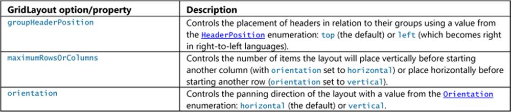
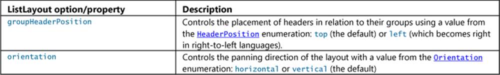
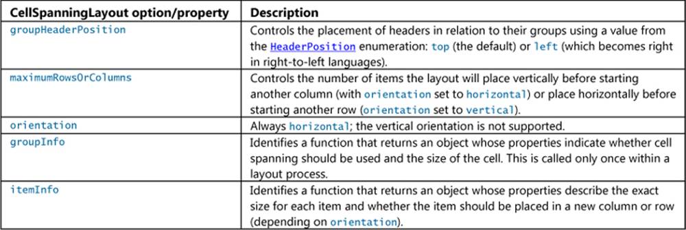
Let’s see these options in action. The horizontal and vertical variations for GridLayout and ListLayout are demonstrated in scenario 6 of the HTML ListView essentials sample. The four layout properties are declared as follows (for different controls, of course; html/scenario6.html), with the output shown in Figures 7-11 and 7-12:
layout: { type: WinJS.UI.GridLayout, orientation: WinJS.UI.Orientation.horizontal}
layout: { type: WinJS.UI.GridLayout, orientation: WinJS.UI.Orientation.vertical}
layout: { type: WinJS.UI.ListLayout, orientation: WinJS.UI.Orientation.vertical}
layout: { type: WinJS.UI.ListLayout, orientation: WinJS.UI.Orientation.horizontal}
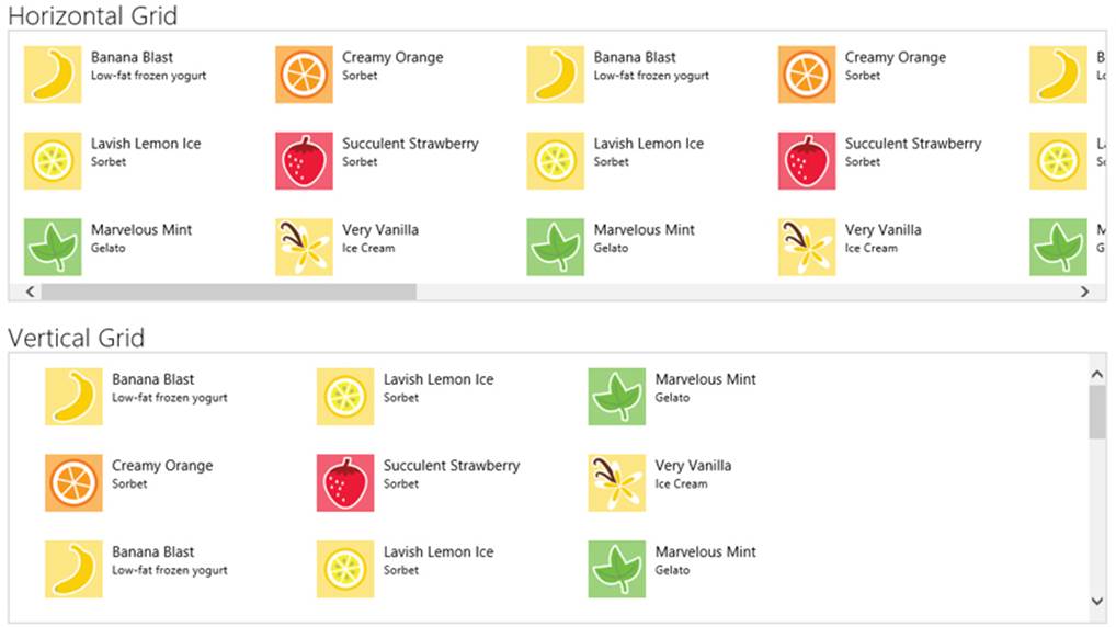
FIGURE 7-11 Horizontal (default) and vertical orientations for the GridLayout; notice the directions in which the items are laid out: top to bottom in horizontal, right to left in vertical (which is reversed with right-to-left languages). I’ve included the scrollbars here to show the panning direction more clearly.
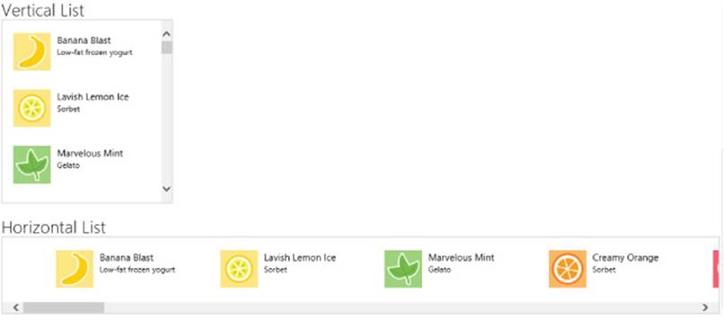
FIGURE 7-12 Vertical (default) and horizontal orientations for the ListLayout. I’ve again included the scrollbars here to show the panning direction more clearly.
In the Vertical Grid of Figure 7-11, the layout was able to fit only three items horizontally before starting a new row on a 1366x768 display, where I took the screenshot. On a larger monitor where the control is wider, I get more horizontal items. If, however, I wanted to always limit each row to three items, I could use the maximumRowsOrColumns options like so:
layout: { type: WinJS.UI.GridLayout, orientation: WinJS.UI.Orientation.vertical,
maximumRowsOrColumns: 3}
With the groupHeaderPosition option, the easiest way to see its effect is to go to scenario 1 of the HTML ListView grouping and Semantic Zoom sample and set the option to left in the ListView declarations of html/scenario1.html. The results are shown in Figure 7-13.
layout: { type: WinJS.UI.GridLayout, groupHeaderPosition: 'left' }
layout: { type: WinJS.UI.ListLayout, groupHeaderPosition: 'left' }
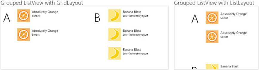
FIGURE 7-13 Using groupHeaderPosition:'left' with GridLayout and ListLayout. With a right to left language, the left position will shift to the right. Compare this to Figure 7-3, and note that I made the controls a little bigger in CSS so that the items would show fully.
For the CellSpanningLayout now, we can turn to Scenarios 4 and 5 of the HTML ListView item templates sample, the output of which is shown in Figure 7-14. (The only difference between the scenarios is that 4 uses a rendering function and 5 uses a declarative template.)
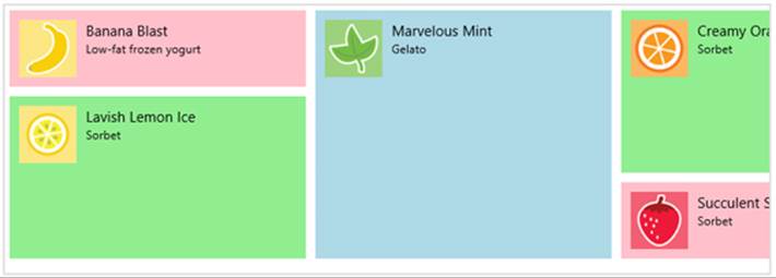
FIGURE 7-14 The HTML ListView item templates sample showing multisize items through cell spanning.
Tip #1 If you start playing with this sample and make changes to the CSS in any given scenario, be aware that it does not scope the CSS for each scenario to the associated page, which means that styles from the most recently loaded scenario might be used by the others. To correct this, I’ve added such scoping to the modified sample in this chapter’s companion content.
Tip #2 If you alter items in a cell spanning layout, call the ListView.recalculateItemPosition method after the change is made. If you’re using a data source other than the Binding.List, also call the IListDataSource.beginEdits before making changes and endEdits afterwards.
The basic idea of cell spanning is to define a layout grid based on the size of the smallest item. For best performance, make the grid as coarse as possible, where every other element in the ListView is a multiple of that size.
You define the cell grid through the CellSpanningLayout.groupInfo property. This is a function that returns an object with three properties: enableCellSpanning, which is set to true (unless you want GridLayout behavior!), and cellWidth and cellHeight, which contain the pixel dimensions of your minimum cell. In the sample (see js/data.js), this function is named groupInfo like the layout’s property. I’ve given it a different name here (and omitted some other bits) for clarity:
functioncellSpanningInfo() {
return {
enableCellSpanning: true,
cellWidth: 310,
cellHeight: 80
};
}
Tip In thinking about the layout of your ListView, know that three styles in the WinJS stylesheets set default item spacing. You can override these with the same selectors depending on your orientation, and they’re important to know for calculations that we’ll see shortly:
.win-horizontal.win-gridlayout.win-container {
margin: 5px;
}
.win-vertical.win-gridlayout.win-container {
margin: 5px 24px 5px 7px;
}
.win-rtl>.win-vertical.win-gridlayout.win-container {
margin: 5px 7px 5px 24px;
}
The second required piece is a function you specify in the itemInfo property, which is called for every item in the list and should thus execute quickly. It receives an item index and returns an object with the item’s width and height properties, along with an optional newColumn property that lets you control whether the layout should start a new column for this item. Here’s the general idea:
function itemInfo(itemIndex) {
//determine values for itemWidth and itemHeight given itemIndex
return {
newColumn: false,
itemWidth: itemWidth,
itemHeight: itemHeight
};
}
In the sample, itemInfo is implemented by performing a quick lookup for the item in a size map (again in js/data.js):
var sizeMap = {
smallListIconTextItem: { width: 310, height: 80 },
mediumListIconTextItem: { width: 310, height: 170 },
largeListIconTextItem: { width: 310, height: 260 },
defaultSize: { width: 310, height: 80 }
};
var itemInfo = WinJS.Utilities.markSupportedForProcessing(function itemInfo(itemIndex) {
var size = sizeMap.defaultSize;
var item = myCellSpanningData.getAt(itemIndex);
if (item) {
size = sizeMap[item.type];
}
return size;
});
With both of these functions in place (and both are required), you then specify them in the ListView’s layout property in code or in markup. Here’s how it’s done declaratively in a data-win-options string (html/scenario4.html and html/scenario5.html):
layout: { groupInfo: groupInfo, itemInfo: itemInfo, type: WinJS.UI.CellSpanningLayout }
Now notice that the heights returned from itemInfoare not exact multiples of the cell height of 80 in groupInfo. The same would be true if we spanned columns, as we’ll see later. This is because we have to take into account the margins between items as determined by the win-containerstyles shown earlier. You do this according to either of the following formulae (which are the same, just rearranged):
itemSize = ((cellSize + containerMargin) x span) – containerMargin
cellSize = ((itemSize + containerMargin) / span) - containerMargin
where Size here is either width of height, depending on the dimension you’re calculating, span is the number of rows or columns an item is spanning, and containerMargin is the top+bottom margin when calculating height or left+right when calculating width.
You use the first formula if you want to start with the cell dimension as defined by the groupInfo function and calculate the size of the item as you’ll report in itemInfo and as you’ll style in CSS. If you want to start from the item size in CSS or itemInfo and get the cell dimension forgroupInfo, use the second formula.
In the sample, we have items with the same widths but spanning one, two, or three rows, so we want to do the calculations for height. Using the first formula, cellSize is 80 (the height from groupInfo); and the top and bottom margins from win-container for a horizontal grid are both 5px, so containerMargin is 10. Plugging in the spans, we get the following itemSize results:
((80 + 10) * 1) - 10 = 80
((80 + 10) * 2) - 10 = 170
((80 + 10) * 3) - 10 = 260
The itemInfo function, then, should return 310x80, 310x170, and 310x260, as we see it does. In CSS the width+padding+margin+border and height+padding+margin+border styles for each item must match these dimensions exactly. This is illustrated nicely in the How to display items that are different sizes topic in the documentation:
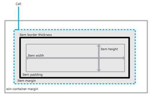
Our styles in in css/scenario4.css and css/scenario5.css are thus the following:
.smallListIconTextItem{
width: 300px;
height: 70px;
padding: 5px;
}
.mediumListIconTextItem{
width: 300px;
height: 160px;
padding: 5px;
}
.largeListIconTextItem{
width: 300px;
height: 250px;
padding: 5px;
}
Now let’s play with the width instead, using a scenario 7 I’ve added to the modified sample in this chapter’s companion content. This gets interesting because of how the CellSpanningLayout fills in gaps when laying out items. That is, although it generally places items in columns from top to bottom, then left to right (or right to left for some languages), it can backfill empty spaces with suitable items it comes across later on.
In this added scenario 7, I’ve create new groupInfo2 method in js/data.js that sets the cell size to 155x80. The small items will be occupy one cell, the medium items will span two columns, and the large items will span two rows and two columns. To make the calculations more interesting, I’ve also set some custom margins on win-container (css/scenario7.css):
.page7.win-horizontal.win-gridlayout.win-container {
margin: 9px7px3px2px; /*top, right, bottom, left*/
}
Applying the first formula again we get these item dimensions:
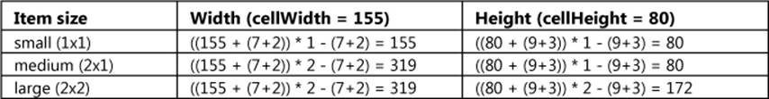
These sizes are what’s returned by the itemInfo2 functions in js/data.js (via sizeMap2), and they are accounted for in css/scenario7.css. The results (with a taller ListView as well) are shown in Figure 7-15, where I’ve also added numbers in the data item titles to reveal the order of item layout (and apologies for clipping the text…experiments must make sacrifices at times!). Take special note of how the layout placed items sequentially (as with 1–5) the backfilled a gap (as with 6).
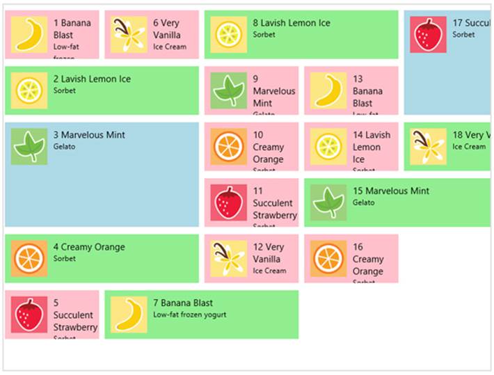
FIGURE 7-15 A horizontal CellSpanningLayoutwith varying item widths, showing infill of gaps.
To play a little with the newColumnproperty in itemInfo, as follows, try forcing a column break before items #7 and #15 because they span odd columns (this code is in a comment in itemInfo2):
newColumn: (index == 6 || index == 14), //Break on items 7 and 15 (index is 6 and 14)
The result of this change is shown in Figure 7-16.
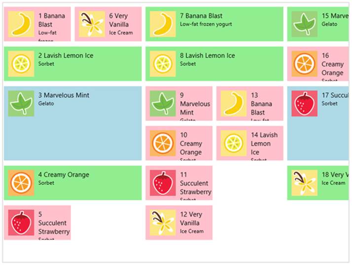
FIGURE 7-16 Using new columns in cell spanning on items 7 and 15.
Three last notes: First, if you’re working with cell spanning and the layout gets all wonky, double-check your match for the item sizes; even making a one-pixel mistake will throw it off. Second, if the item size in a style rule like smallListIconTextItem ends up being smaller than the size of a child element, such as regularListIconTextItem (which includes margin and padding), the larger size wins in the layout, and this can also throw things off. And third, remember that the CellSpanningLayout supports only a horizontal orientation; if you want a vertical experience, you’ll need a custom layout. For details, refer again to Appendix B in the section “Custom Layouts for the ListView Control.”
Template Functions (Part 2): Optimizing Item Rendering
Where managing, displaying, and interacting with large collections is concerned, performance is super-critical. The WinJS team invests heavily in the performance of the ListView control as a whole, but one part is always the app’s responsibility: item rendering. Simply said, it’s the app’s sacred duty to render items as quickly as possible, which keeps the ListView itself fluid and responsive.
When we first looked at template functions or renderers (see “How Templates Work with Collection Controls”), I noted that they give us control over both how and when items are constructed. That when part is very important, because it’s possible to render items in stages, doing the most essential work quickly and synchronously while deferring other asynchronous work like loading thumbnails. Within a renderer, then, you can implement progressive levels of optimization for ListView (and also FlipView, though this is less common). Just using a renderer, as we already saw, is the first level; now we’re ready to see the others. This is a fascinating subject, because it shows the kind of sophistication that the ListView enables for us!
Note Beyond what’s discussed here, refer also to the Using ListView topic in the documentation, where you’ll find a variety of other performance tips.
Our context for this discussion is the HTML ListView optimizing performance sample that demonstrates all these levels and allows you to see their respective effects (also using the Bing Search API data source that we’ve seen elsewhere, so you’ll need your API key again). Here’s an overview:
• A simple or basic renderer allows control over the rendering on a per-item basis and allows asynchronous delivery of item data and the rendered element.
• A placeholder renderer separates creation of the item element into two stages. The first stage returns only those elements that define the shape of the item. This allows the ListView to quickly do its overall layout before all the details are filled in, especially when the data is coming from a potentially slow source. When item data is available, the second stage is then invoked to copy that data into the item elements and create additional elements that don’t contribute to the shape.
• A multistage renderer extends the placeholder renderer to defer expensive visual operations, like loading thumbnails and running animations, until the item is visible and the ListView isn’t being rapidly panned.
• Finally, a multistage batching renderer batches image loading to minimize re-rendering of the DOM as images become available.
With all of these renderers, always strive to make them execute as fast as possible, as described earlier in “Template Functions (Part 1).” Especially minimize the use of DOM API calls, which includes setting individual properties. Use an innerHTML string where you can to create elements rather than discrete calls, and minimize your use of getElementById, querySelector, and other DOM-traversal calls by caching the elements you refer to most often. This will make a big difference.
To visualize the effect of these improvements, the following graphic shows an example of how unoptimized ListView rendering might happen (this is output from some of the performance tools discussed in Chapter 3):
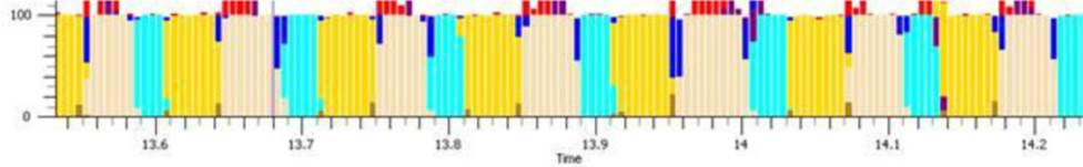
The yellow bars indicate execution of the app’s JavaScript—that is, time spent inside the renderer. The beige bars indicate the time spent in DOM layout, and aqua bars indicate actual rendering to the screen. As you can see, when elements are added one by one, there’s quite a bit of breakup in what code is executing when, and the kicker here is that most display hardware refreshes only every 10–20 milliseconds (50–100Hz). As a result, there’s lots of choppiness in the visual rendering.
After making improvements, the chart can look like the one below, where the app’s work is combined in one block, thereby significantly reducing the DOM layout process (the beige):

Let’s see what steps we can take to make this happen. As a baseline for our discussion, here is a simple renderer—this and all the following code is taken from js/scenario1.js:
function simpleRenderer(itemPromise) {
return itemPromise.then(function (item) {
var element = document.createElement("div");
element.className = "itemTempl";
element.innerHTML = "<img src='" + item.data.thumbnail +
"' alt='Databound image' /><div class='content'>" + item.data.title + "</div>";
return element;
});
}
Again, this structure waits for the item data to become available, and it returns a promise for the element. That is, the return value from itemPromise.then is a promise that’s fulfilled with element, if and when the ListView needs it. If the ListView pans the item out of view before this promise is fulfilled, it will cancel the promise.
A placeholder renderer separates building the element into two stages. The return value is an object that contains a minimal placeholder in the element property and a renderComplete promise that is fulfilled with the remainder of the element:
function placeholderRenderer(itemPromise) {
// create a basic template for the item which doesn't depend on the data
var element = document.createElement("div");
element.className = "itemTempl";
element.innerHTML = "<div class='content'>...</div>";
// return the element as the placeholder, and a callback to update it when data is available
return {
element: element,
// specifies a promise that will be completed when rendering is complete
// itemPromise will complete when the data is available
renderComplete: itemPromise.then(function (item) {
// mutate the element to include the data
element.querySelector(".content").innerText = item.data.title;
element.insertAdjacentHTML("afterBegin", "<img src='" +
item.data.thumbnail + "' alt='Databound image' />");
})
};
}
Note that the element.innerHTML assignment could be moved inside the function in renderComplete because the itemTempl class in css/scenario1.css specifies the width and height of the item directly. The reason why it’s in the placeholder is because it provides the default “…” text, and you could just as easily provide a default in-package image here instead (which would render quickly).
In any case, the element property defines the item’s shape and is returned synchronously from the renderer. This lets the ListView (or other control) do its layout, after which it will fulfill the renderComplete promise. You can see that renderComplete essentially contains the same sort of thing that a simple renderer returns, minus the already created placeholder elements. (For another example, the added scenario 9 of the FlipView example in this chapter’s companion content implements this approach.)
Of course, now that we’ve separated the time-critical and synchronous part of element creation from the rest, we can complete the rendering in asynchronous stages, taking however long is necessary. The multistage renderer uses this capability to delay-load images and other media until the rest of the item is wholly present in the DOM, and to further delay effects like animations until the item is truly on-screen. This recognizes that users often pan around within a ListView quite rapidly, so it makes sense to asynchronously defer the more expensive operations until the ListView has settledinto a stable position.
The hooks for this are a property called ready (a promise) and two methods, loadImage and isOnScreen, that are attached to the item provided by the itemPromise:
renderComplete: itemPromise.then(function (item) {
// item.ready, item.loadImage, and item.isOnScreen available
})
Here’s how you use them:
• ready Return this promise from the first completed handler in any async chain you might use in the renderer. This promise is fulfilled when the full structure of the element has been rendered and is visible. This means you can chain another then with a completed handler in which you do post-visibility work like loading images.
• isOnScreen Returns a promise whose fulfillment value is a Boolean indicating whether the item is visible or not. In present implementations, this is a known value, so the promise is fulfilled synchronously. By wrapping it in a promise, though, it can be used in a longer chain.
• loadImage Downloads an image from a URI and displays it in the given img element, returning a promise that’s fulfilled with that same element. You attach a completed handler to this promise, which itself returns the promise from isOnScreen. Note that loadImage will create an imgelement if one isn’t provided and deliver it to your completed handler.
The following code shows how these are used (where element.querySelector traverses only a small bit of the DOM and is a highly optimized method in the first place, so it’s not a concern):
renderComplete: itemPromise.then(function (item) {
// mutate the element to update only the title
if (!label) { label = element.querySelector(".content"); }
label.innerText = item.data.title;
// use the item.ready promise to delay the more expensive work
return item.ready;
// use the ability to chain promises, to enable work to be cancelled
}).then(function (item) {
//use the image loader to queue the loading of the image
if (!img) { img = element.querySelector("img"); }
return item.loadImage(item.data.thumbnail, img).then(function () {
//once loaded check if the item is visible
return item.isOnScreen();
});
}).then(function (onscreen) {
if (!onscreen) {
//if the item is not visible, then don't animate its opacity
img.style.opacity = 1;
} else {
//if the item is visible then animate the opacity of the image
WinJS.UI.Animation.fadeIn(img);
}
})
I warned you that there would be promises aplenty in these performance optimizations! But all we have here is the basic structure of chained promises. The first async operation in the renderer updates simple parts of the item element, such as text. It then returns the promise initem.ready. When that promise is fulfilled—or, more accurately, if that promise is fulfilled—you can use the item’s async loadImage method to kick off an image download, returning the item.isOnScreen promise from that completed handler. When and if that isOnScreen promise is fulfilled, you can perform those operations that are relevant only to a visible item.
I again emphasize the if part of all this because it’s very likely that the user will be panning around within the ListView while all this is happening. Having all these promises chained together makes it possible for the ListView to cancel the async operations any time these items are scrolled out of view and/or off any buffered pages. Suffice it to say that the ListView control has gone through a lot of performance testing!
Which brings us to the final multistage batching renderer, which combines the insertion of images in the DOM to minimize layout and repaint work. It does this by letting loadImage create the img elements for us, so they’re not initially in the DOM, and then inserting batches of them until there’s a 64-millisecond gap between images coming in.
The sample does this inside a renderComplete that now has this structure (most code omitted):
renderComplete: itemPromise.then(function (i) {
item = i;
// ...
return item.ready;
}).then(function () {
return item.loadImage(item.data.thumbnail);
}).then(thumbnailBatch()
).then(function (newimg) {
img = newimg;
element.insertBefore(img, element.firstElementChild);
return item.isOnScreen();
}).then(function (onscreen) {
//...
})
This is almost the same as the multistage renderer except for the insertion of a call to this mysterious thumbnailBatch function between the item.loadImage call and the item.isOnScreen check. The placement of thumbnailBatch() in the chain indicates that its return value is a completed handler that itself returns another promise, and somewhere in there it takes care of the batching.
The thumbnailBatch function itself is created by another function called createBatch, which is one of the finest examples of promise magic you’ll see:
//During initialization (outside the renderer)
thumbnailBatch = createBatch();
//The implementation of createBatch
function createBatch(waitPeriod) {
var batchTimeout = WinJS.Promise.as();
var batchedItems = [];
function completeBatch() {
var callbacks = batchedItems;
batchedItems = [];
for (var i = 0; i < callbacks.length; i++) {
callbacks[i]();
}
}
returnfunction () {
batchTimeout.cancel();
batchTimeout = WinJS.Promise.timeout(waitPeriod || 64).then(completeBatch);
var delayedPromise = new WinJS.Promise(function (c) {
batchedItems.push(c);
});
returnfunction (v) { return delayedPromise.then(function () { return v; }); };
};
}
This code is designed to be something you can just drop into your own apps with complete blind faith that it will work as advertised: you don’t have to understand (or even pretend to understand) how it works. Still, I know some readers will be curious, so I’ve deconstructed it all at the end of Appendix A, “Demystifying Promises.”
What We’ve Just Learned
• The WinJS.UI.Repeater provides a simple and lightweight means to iterate over a Binding.List and render a data-bound template for each item into a container.
• The WinJS.UI.FlipView control displays one item of a collection at a time; WinJS.UI.ListView displays multiple items according to a specific layout. Both support different options, different behaviors, and rich styling capabilities.
• Central to all collection controls is the idea that a data source exists and an item template defines how each item in that source is rendered. Templates can be either declarative or procedural.
• ListView works with the added notion of layout. WinJS provides three built-in layouts. GridLayout is a two-dimensional, horizontally or vertically panning list; CellSpanningLayout is a horizontal GridLayout that allows items to span rows or columns; ListLayout is for a one-dimensional vertically or horizontally panning list. It is also possible to implement custom layouts, which are explained in Appendix B.
• ListView provides the capability to display items in groups, organizing items into groups according to a group data source. WinJS.Binding.List provides methods to created grouped, sorted, and filtered projections of items from a data source.
• The Semantic Zoom control (WinJS.UI.SemanticZoom) provides an interface through which you can switch between two different views of a data source, a zoomed-in (details) view and a zoomed-out (summary) view. The two views can be very different in presentation but should display related data. The IZoomableView interface is required on each of the views so that the Semantic Zoom control can switch between them and scroll to the correct item. The ListView implements this interface.
• The FlipView and ListView controls work with their data sources through the IListDataSource interface, allowing any kind of source (synchronous or asynchronous) to operate behind that interface. WinJS provides a StorageDataSource to create a collection over StorageFile items, and it also provides the VirtualizedDataSource where an object with the IListDataAdapter interface is used to customize its behavior.
• Procedural templates are implemented as template functions, or renderers. These functions can implement progressive levels of optimization for delay-loading images and adding items to the DOM in batches.
62 In the sample you might notice the inline style="display:none" on the template. This is unnecessary as templates hide themselves automatically.
63 Creating a filtered projection is also useful to intentionally limit the number of items you want to display in a control, where your predicate function returns true for only that number.
64 A bug in the WinJS 2.0 repeater control throws an exception when you change the data or template properties from code when the template is not declared inline. For details and workaround, see my blog WinJS.UI.Repeater bug and workarounds (WinJS 2.0).
65 See “Windows.Foundation.Collection Types” in Chapter 6 for an overview of what interfaces are in JavaScript. For custom sources, you typically get the methods from the VirualizedDataSource class.
66 The sample calls beginEdits and endEdits here, which is not necessary for a single addition or deletion. The methods are effective when swapping items or shuffling the whole set where multiple changes are involved.
67 To be specific, the first argument to the StorageDataSource constructor is a query object that comes from the Windows.Storage.Search API. Queries feed into the powerful StorageFolder.createFileQueryWithOptions function and are ways to enumerate files in a folder along with metadata like album covers, track details, and thumbnails that are cropped to maintain the aspect ratio. Shortcuts like "Pictures", "Music", and "Videos" (which require the associated capability in the manifest) just create typical queries for those libraries.
68 I’ll remind you that the ListView was overhauled for WinJS 2.0, as I describe on ListView Changes between WinJS 1.0 and WinJS 2.0. Here I describe the WinJS 2.0 control; anything you see in the docs that I omit is probably deprecated.
69 Other properties you see in the documentation are either deprecated from WinJS 1.0 or for internal use. You’ll also see many methods on these objects that are how the ListView talks to the layout; apps don’t call those methods directly.