WordPress Responsive Theme Design (2015)
Chapter 4. Learn How to Create the Header and Navigation
The header is most likely the first thing people see when they land on your website. In today's world where the next website is only a click away, you only have a few seconds to make the lasting impressions.
Navigation is also the key component of every website and the design of the website navigation has a huge impact on results. Navigation is like a road map for the visitors of your website, showing them the way to go through the website and where they can find the information they are looking for.
That is why this is probably the most important chapter in our book. Grabbing the attention of people clicking on your website and easily pointing them to your website information is the goal of every website, and creating the memorable header and usable navigation is something that every designer should do!
Are you excited so far? I know I am.
So, let's start!
In this chapter, we will learn:
· How to create the header
· How to create and style the navigation menu
· How to make menus accessible with superfish.js
· How to make menus responsive (making them look good across all devices)
Making our layout centered
Before we deal with the header, we need to customize our page style in order to make everything centered on the page, and we do that by adding a topcat_page class to line 22 in header.php, as shown:
<div id="page" class="hfeed site topcat_page">
We also need to add CSS for this class in content-sidebar.css:
.topcat_page{
background: none repeat scroll 0 0 #fff;
box-sizing: border-box;
margin: 0px auto 0 !important;
max-width: 1000px;
border: 1px black dashed;
}
The most important parts of this code are:
· margin: 0px auto 0 !important;: This code makes our content centered.
· max-width: 1000px;: This code makes our content have a maximum width of 1000 pixels.
I have also created the border to be black and dashed with the border: 1px black dashed; code so that we can distinguish this section from others, as shown next:
Dealing with the header
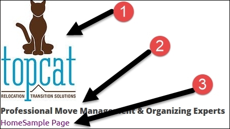
Here is the image of the header of our current TopCat:

Let's analyze each numbered section:
· Section 1 is our logo.
· Section 2 is the menu for which we will change the look and the structure.
· Section 3 is just an advertisement and the contact information. We will put the tagline (description) there.
Note
The tagline can be found and set in wp-admin by navigating to Settings | General.
· In section 4, we have the phone image that takes customers to our contact page. We will take this one out, as we will have a contact us link in the menu.
· In section 5, we have social icons that will stay in the top-right corner.
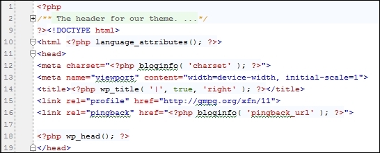
As we have mentioned previously, the header for WordPress websites is handled by the header.php file. In that file, first, we have an HTML markup that any HTML page has and that is mostly the HTML head and meta tags. Then, we have the wp_head(); call, and this function call is actually calling wp_enqueue_styles() and wp_enque_scripts() that we have set in the functions.php file, as you can see in the following screenshot:
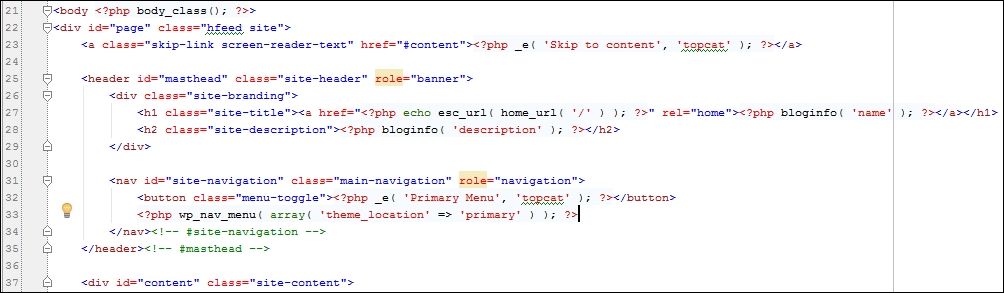
After this, the interesting stuff comes, as you can see from the following screenshot::
Let's take a look at it:
· First, we have a body_class(); call, and this is the function that adds specific classes to the <body> tag based on where on the site you are in relation to the WordPress template hierarchy.
Note
We can pass our own classes by passing myclass as an argument to the function call.
More information is available at http://codex.wordpress.org/Function_Reference/body_class
· Later on, on line 23. we have a "Skip to content" link. This is the link for screen readers to help users who use a screen reader just skip to content, and not to have to link through the menu.
· Then, we have a site title code on line 27 and site description/tagline on line 28.
· Later on, from line 31 till 34, we have a call to the main navigation (main menu).
As the number one is the logo on our first image, we should start from there. In our code, in the previous screenshot, we don't have the image option. However, we had already implemented a custom header option in the previous chapter, and we just have to add the code for the image functionality to our header.php file. This code is available in the custom-header.php file, as shown next:

Now, let's copy this code to our header.php file.
Note
As I don't want to display the site name on this occasion, I've nested this code in the site name's link code.
The copied code is as follows:
<a href="<?php echo esc_url( home_url( '/' ) ); ?>" rel="home">
<?php if ( get_header_image() ) : ?>
<a href="<?php echo esc_url( home_url( '/' ) ); ?>" rel="home"><img src="<?php header_image(); ?>" width="<?php echo esc_attr( get_custom_header()->width ); ?>" height="<?php echo esc_attr( get_custom_header()->height ); ?>" alt=""></a>
<?php endif; // End header image check. ?></a>
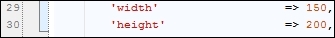
When the user clicks on the logo, he/she will be taken to our site's root/index page. Before we upload the image, we should set the image size in our custom-header.php file on lines 29 and 30 as you can see in the following image.
Note
Our logo is located in the chpt3 directory with the image that has a logo.jpg name. Logo's size is 150 x 250, and we should put these values to the width and height options, respectively.
In order to see our image, we have to go to Appearance | Header in wp-admin and then go to the Select image option and upload it.
Tip
You can upload your own image if you want, but my recommendation is that you follow our book for now, and then later on, if you want, you can change the image.
If you decide to use your image and it's a different size than what's there in the custom-header.php file, you will get the option to crop the image. When you upload the image, this is how your header should look like:
As we can see, section #1 contains the logo. The tagline is in section #2 and the menu is in section #3.
As we can see in the previous screenshot, the site's description (tagline) is under the logo. This is fine for mobile devices, but I recommend that you add .site-description{ display: inline;} in the media query for tablets and desktops. This way, the site's description is displayed on the right-hand side of the logo exactly the way we want. As we also want to make the site's description centered on the page, first, we have to deal with the site-brandingsection, as it's a parent section of the site description:
.site-branding{
position: relative;
border: 1px #008000 dashed;
}
This code makes position relative to the site branding.
Note
I have created a green dashed border for it to be able to distinguish it other sections.
Then, in order to make the site description centered, we have to add the following code:
.site-description{
display: inline;
position: absolute;
bottom: 0px;
left: 25%;
padding: 1em 0;
/* border: 1px orange dashed; */
}
The left: 25% property is making the site description centered. The padding: 1em 0; property is pushing it up a little bit as well.
Tip
As I like to design my layouts more in code than in Photoshop and as it's more realistic to me, these values may change later on.
I have also added the test code for the social menu in the top-right corner in the header.php file:
<div class="social-menu">Social menu here</div>
In content-sidebar.css, I have added this:
.social-menu{
display: inline;
position: absolute;
top: 10%;
right: 5%;
}
We will tackle the social menu later on when we deal with the main menu.
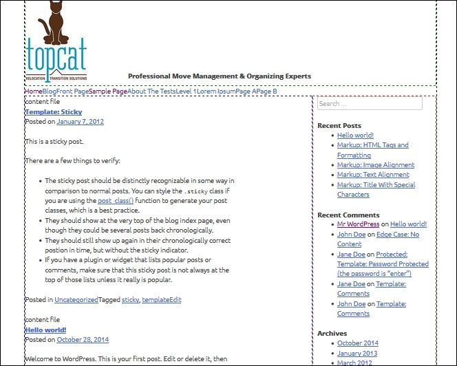
Here is the current look of our header:

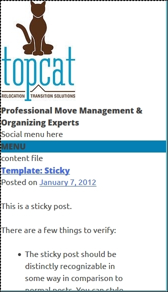
How to create a menu and make it responsive and accessible
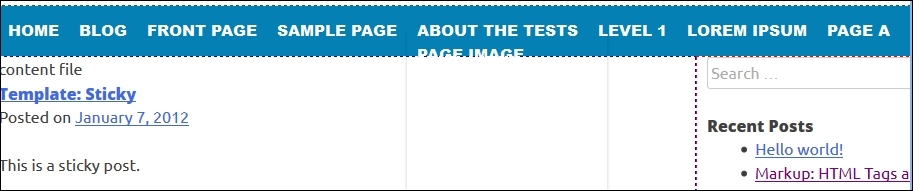
Here is the current look of our menu on the desktop screen:
Now, let's look at our menu on the mobile screen:
As you can see, the code from underscores (_s) changes the look automatically when we change the screen size, but we still have some work to do.
Menu basics
Our main menu is defined in the functions.php file from lines 43 through 46:
// This theme uses wp_nav_menu() in one location.
register_nav_menus( array(
'primary' => __( 'Primary Menu', 'topcat' ),
) );
Then, the menu sections are defined in Appearance | Menus. If you go to Manage locations in this section (the second tab in the header), you will be able to change the assigned menu options.
In order to see the menu, we have this code in header.php:
<?php wp_nav_menu( array( 'theme_location' => 'primary' ) ); ?>
This calls the primary menu from the theme location.
Styling our menu
Dealing with the menu is one of the most important parts in the WordPress theme development, as the menu itself is one of the most important parts of any website. Thanks to underscores (_s) and its architecture, all CSS classes are already covered and we only have to add proper styles to them. Our menu is nested in the navigation tag with the main-navigation class and that's the class that we are going to edit first. This class is located in style.css:
.main-navigation {
font-family: 'Open+Sans', sans-serif;
font-weight: 800;
float: left;
width: 100%;
position: relative;
display: block;
clear: both;
text-transform: uppercase;
background: #0480b5;
}
In this code, we are adding the Open+Sans font family (the same font family that we are planning to use for headings throughout our theme). After that, we are setting the font weight to 800 to make the fonts bolder than they are. Later on, we are floating it to the left and setting the width of the container to 100% in order to make sure that this container takes 100 percent of space. We are also setting the container to display: block in order to make sure nothing else goes on the side of the menu. Later on, we are executing clear: both, as we were using floats (float: left;) previously and we need to clear them. Finally, we our setting our text to uppercase as it's a menu text, and then we set our background to our blue color (background: #0480b5;).
This is how our menu looks like after these changes:
Now, we have to change the look of our links, and we will do that with the .main-navigation a class/selector:
.main-navigation a {
font-size: 15px;
font-size: 1.5rem;
display: block;
text-decoration: none;
color: white;
padding: 14px 10px;}
In this class, we are setting the font size of 15 px, as it helps our menu stand out. We are also using a 1.5 rem size for new browsers, as 15 px is actually the only fallback value for old browsers. Later on, we will display the block settings mentioned in the previous code. After that, we have the text-decoration: none. We need to use this because our menu items are links and we don't want to have underlines below them. Then, we set the link/items color to white, and finally, we set the top and the bottom padding to 14 px and the left and right padding to 10 px. Here is the look of our menu now:
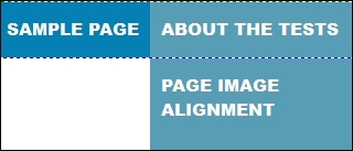
It looks awesome, right? We just set the main level, and in the next step, we will style the dropdowns. In order to see how dropdowns look now, hover about the tests section, as shown in the following screenshot:
As we can see in the previous screenshot, there is a PAGE IMAGE sub link and other things under, as dropdowns are not defined yet. We should change some code for the dropdown in the .main-navigation ul ul class/selector:
.main-navigation ul ul {
/*box-shadow: 0 3px 3px rgba(0, 0, 0, 0.2); */
float: left;
position: absolute;
top: 3.1em;
left: -999em;
z-index: 99999;
background: #579DB5;
}
In the previous code, I've commented out the box-shadow property, set top to 3.1em, and changed background to light-blue (background: #579DB5;).
Now we want to get the code that will change the background color when we hover over the navigation items:
.main-navigation li:hover > a {
color: #fff;
background: #579DB5;
}
The navigation item looks like this after the modifications:

We are making sure that the main color for fonts is white and that we are putting our background as light blue.
With the following code, we will change the background color in the hover for submenu items, which should be the same as our main background color set in the .main-navigation class:
.main-navigation ul ul a:hover {
background: #0480b5;
}
The submenu items look as follows now:
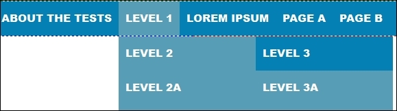
The last part of our code should mark/highlight the current page (the currently active page) in our menu:
.main-navigation .current_page_item > a,
.main-navigation .current-menu-item > a,
.main-navigation .current_page_item > a:hover,
.main-navigation .current-menu-item > a:hover {
background: #579DB5;
}
The previous code highlights the current page in the main menu. The following code highlights the page ancestor:
.main-navigation .current_page_ancestor {
background: #579DB5;
}
If someone has highlighted the subpage and we go through the menu, we will see that page highlighted. In the third (final) part, we are applying the main blue color, so if somebody selects a sub-item from a sub menu, that will be in the darker color, and this way, it will be more distinguished from other sub menu items:
.main-navigation ul ul .current_page_parent,
.main-navigation .current_page_parent .current_page_item > a {
color: #fff;
background: #0480b5;
}
After all the modifications, the navigation menu looks like this:
As you probably noticed, when we hover over some submenu and then its subitems, our menu hides very quickly, and this makes our menu almost unusable. In the next section, we will make our menu accessible, and this will also solve our problem with closing our items too fast.
How to make our menu accessible
As we can't access some submenu items because the menu closes too fast, we want to make the menu accessible for the people who use only keyboard, or some other device, so that they can access the menu normally. For this purpose, we will use the Superfish jQuery plugin, which is available at: http://users.tpg.com.au/j_birch/plugins/superfish/download/.
Please download the archive and unpack it. There is a bunch of files and folders there, and we only need superfish.min.js, which is available at dist/js folder. In order to use this, we should copy and paste that file in our theme's js folder. Now, we should load that file the same way that we load other .js files, and we are doing that with wp_enqueue_script in the functions.php file:
wp_enqueue_script( 'topcat-superfish', get_template_directory_uri() . '/js/superfish.min.js', array('jquery'), '20141123', true );
Tip
We should put this code above all JavaScript wp_enqueue_script calls.
In the previous code, we have topcat-superfish, which is the reference name, we have the file location (get_template_directory_uri() . '/js/superfish.min.js'), and we have array('jquery')—this property says that this code needs jQuery in order to run (there is jQuery dependency). Then, '20141123' is a version number (I've put a current date), and finally, true means that this JavaScript call should be placed in the footer. So, let's refresh the page and check whether we can find this line in our footer:
<script type='text/javascript' src='http://localhost/topcat/wp-content/themes/topcat/js/superfish.min.js?ver=20141123'></script>
We now need to wire Superfish to our menu. In order to do that, we will create another custom JavaScript file where we will wire it to our menu. So, let's create the global.js file in our theme's .js folder and wp_enqueue_script in our functions file just below Superfish's wp_enqueue_script() call
wp_enqueue_script( 'topcat-global', get_template_directory_uri() . '/js/global.js', array('topcat-superfish'), '20141123', true );
The code is almost the same as the previous one. The only difference is that now the dependency is on Superfish instead of jQuery. Finally, we have to wire our custom Superfish to our menu, and we do that with this code, which should go to global.js:
jQuery(document).ready(function($){:
var sfvar = $('div.menu');
sfvar.superfish({
delay: 500,
speed: 'slow'
});
});
In the preceding code, we are wiring Superfish to our outmost menu item, which is div.menu. Then, we set delay: 500, which determines how long the menu will stay open (to fix our previous problem) if we move the mouse from the menu. The speed: 'slow' property is set for the opening animation (the opening of sub menu items).
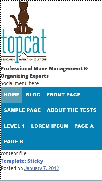
How to make our menu responsive
Our menu looks good on a desktop screen but we have to do some work for mobile screens. Here is the look of our menu now if we resize the browser:
In the preceding screenshot, we can only see the word MENU, and that is not a good user experience. Because of that, we need to change the code in the /* Small menu */ section of style.css, where it says @media screen and (max-width: 600px), which means the code inside of the media query. The current code is as follows:
.menu-toggle,
.main-navigation.toggled .nav-menu {
display: block;
}
.main-navigation ul {
display: none;
}
This code is making toggle part a block element, and it is hiding ul in the main navigation. So, let's delete this part first:
.main-navigation ul {
display: none;
}
Next, we need to add this code:
.main-navigation ul ul {
display:block;
width:100%;
float:none;
position: relative;
top:inherit;
box-shadow:none;
height:auto;
margin:0;
}
.main-navigation ul ul a {
width:100%;
}
In the first section, we are making navigation elements as block elements as with the mobile menu, they should all have their own lines. In the second part, we are giving all sub-elements the width of 100%. Let's see how our menu looks now:
This looks a lot better than before, but our menu elements still aren't in one vertical line as we want. Here is the code that will make this possible:
.main-navigation li {
float: none;
position: relative;
}
With this code, we are resetting our floats and here is the new look:
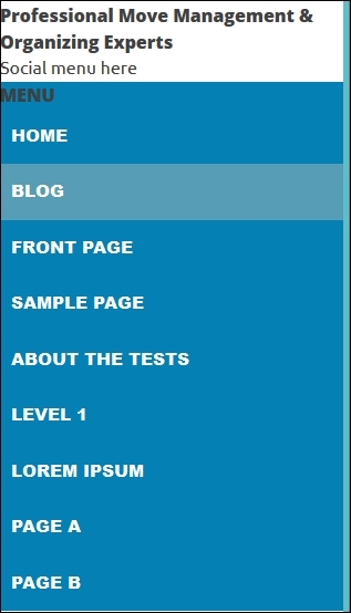
As we can see, it looks a lot better already.
The only issue now is that if we hover over the links that have children, we have the Superfish animation. So, we should disable Superfish for smaller screens, as follows:
var sfvar = jQuery('div.menu');
var phoneSize = 600;
jQuery(document).ready(function($) {
//if screen size is bigger than phone's screen (Tablet,Desktop)
if($(document).width() >= phoneSize) {
// enable superfish
sfvar.superfish({
delay: 500,
speed: 'slow'
});
}
$(window).resize(function() {
if(body.width() >= phoneSize && !sfvar.hasClass('sf-js-enabled')) {
sfvar.superfish({
delay: 500,
speed: 'slow'
});
}
// phoneSize, disable superfish
else if((document).width() < phoneSize) {
sfvar.superfish('destroy');
}
});
});
Let's analyze the previous code
· First, we are setting a sfvar variable to div.menu, as our menu begins on this tag (div.menu).
· Then, we are setting a phoneSize variable that gets the value of 600, which is the breakpoint for a small/phone menu.
· After this, we are checking whether the HTML screen's width is bigger than a phone screen, and if it is bigger, then we activate Superfish.
· The next code is checking whether the screen has been resized, from the phone size to the desktop size. If it has been, it will enable Superfish, and if the screen was resized from the desktop size to the phone size, Superfish will be disabled by using sfvar.superfish('destroy');.
Summary
In this chapter, we have styled our headings, and then we have created our main menu and implemented accessibility features in it. Our menu would not be complete if we didn't make it responsive, and we did that too.
In the next chapter, we will learn about post templates by customizing them and making them responsive as well.