WordPress Responsive Theme Design (2015)
Chapter 6. Responsive Widgets, Footer, and Comments
As we are going to cover a lot of things in this chapter, we will break it into two sections. This way, it will be much more interesting and easier for you to understand. But, don't worry; it will be a lot of fun, and at the same time, you will learn a lot about widgets, the footer, and comments.
Without wasting any time, let's see what we will cover in this chapter.
In the first section, we will:
· Learn more about widgets
· Learn how to customize these widgets
· Learn more about sidebars and how to style them
· Learn how to edit the footer
· Learn how to make our widgets responsive
In the second section, we will:
· Learn more about comments and how to customize them
Widgets
Widgets are small sections or containers that provide some type of functionality to our website. Basically, widgets get deployed into sidebars, which we are going to examine in just a moment. WordPress provides a number of widgets by default, and many plugins define additional widgets; even themes can define widgets. Widgets can be, for example, lists of tags, categories, latest posts, contact forms, or Twitter timelines.
As we can see, they can be almost anything. When we create widgets in a code, they appear in the Widgets section under Appearance, where we can select the widget that we like. We can also add it to any sidebar that we want, as a single theme can have a number of sidebars.
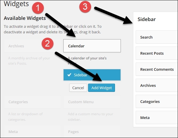
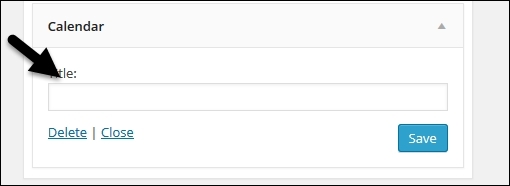
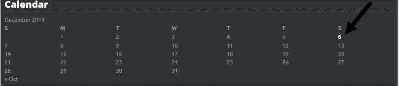
In the previous image, we have first chosen a calendar widget, (#1) and then decided to add it to the sidebar by clicking on the Add Widget option (#2). With this, the calendar widget will be added to the sidebar (#3). Instead of doing it this way, we can simply drag and drop the widget on the sidebar. As soon as we add the widget to the sidebar, we have the option to customize it, too:
Note
Since widgets are separate programs/features, the options available to customize the widgets depend on the code that creates the widget.
In this case, as seen in the preceding image, we have the option to add the title.
Note
Some widgets may not have the option to be customized.
Sidebars
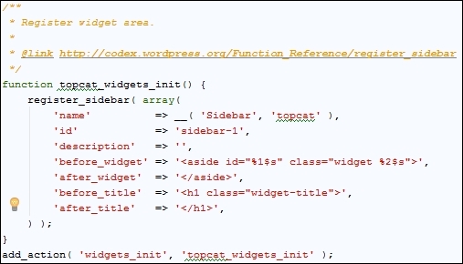
Sidebars are areas that are actually containers for our widgets. A few years ago, when they were first built, they were used for the left and right sidebars; that's why they have this name. Sidebar containers have evolved so much, and now they can be placed anywhere you want them to be: on the left or right side, in the header or footer, and even in the post content area. Sidebar containers are usually defined in the functions.php file using the register_sidebar()function, and this is also the case in our example:
Note
More information about the register_sidebar() function can be found in Chapter 10, Submitting Your Theme to WordPress.org of our book or in it's Codex page at http://codex.wordpress.org/Function_Reference/register_sidebar.
As we can see from the preceding image, we have a function call to topcat_widgets_init(), which is later on called with the add_action( 'widgets_init', 'topcat_widgets_init'); hook. This means that this function is being triggered with the widget_init function. As we can also see from the preceding code, in the register_sidebar() function, we are setting the following:
· name
· id
· description (which is currently empty)
· before_widget and after_widget (where our widgets are going to be nested in, for example, the <aside> tag)
· before-title and after-title (where our title is going to be nested)
Since, for our theme, we want to have more than one sidebar, we will create another one (the footer sidebar) in the same function, just under the first register_sidebar() code:
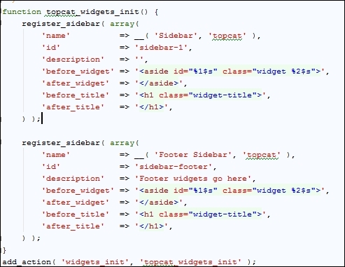
As we can see in the previous image, we just need to add a different title, ID, and a description. Now, we can see our new widget area by navigating to Appearance | Widgets:
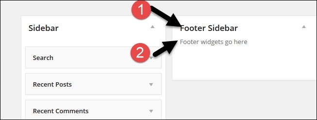
In the preceding image, we can see that our new sidebar, the footer sidebar, has been added beside the old sidebar. Underneath it, our new description Footer widgets go here has been added, too.
Note
We have to click on the arrow in the top-right corner for the area to expand so we can see the new description.
In order to see our sidebars on the live website, we have to complete the following two steps:
· Declare the sidebar (usually in sidebar.php)
· Call the dynamic_sidebar() function in order to display the sidebar in our theme
Note
More information about the dynamic_sidebar() function can be found in Chapter 10, Submitting Your Theme to WordPress.org of our book or in it's Codex page at http://codex.wordpress.org/Function_Reference/dynamic_sidebar.
Since we are using the underscores theme, the sidebar declaration code is provided
in sidebar.php:
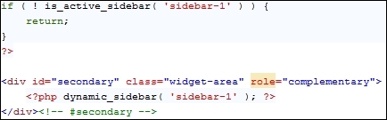
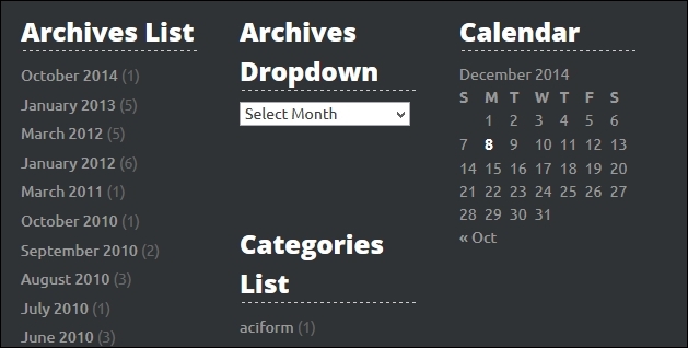
As we can see from the preceding screenshot, we are checking whether the sidebar with the ID sidebar-1 has widgets in it. If it has, the result will return true, and if it doesn't, it will return false. If the result is true, our code will proceed to the next section where the sidebar will be loaded with dynamic_sidebar( 'sidebar-1' );. Since we currently have a number of widgets loaded in the default sidebar, if we go to Appearance | Widgets, we will see the following:
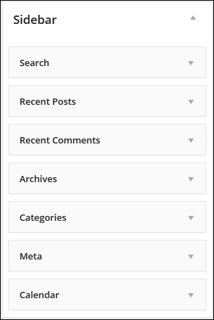
These widgets are also loaded on our home page in the same order:
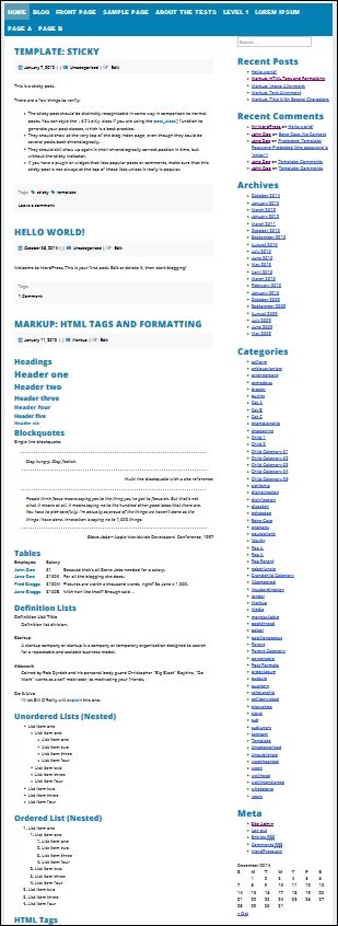
Why do we see this sidebar? We see it because it was called in the index.php, page.php, search.php, and single.php archive templates with the get_sidebar(); function call.
Note
In order to make everything clear, we need to include the sidebar.php file with the get_sidebar() function. On the other side, the dynamic_sidebar() function is actually responsible for displaying the sidebar.
In our case, we are going to use one more sidebar in the footer, sidebar-footer. We need to save the sidebar.php copy as a new file with the name sidebar-footer.php, which we are going to edit for our sidebar footer purpose. Here is the look of our sidebar-footer.php file:
<!-- Custom sidebar code begin -->
<?php
if ( ! is_active_sidebar( 'sidebar-footer' ) ) {
return;
}
?>
<div id="secondary" class="widget-area" role="complementary">
<?php dynamic_sidebar( 'sidebar-footer' ); ?>
</div><!-- #secondary -->
<!-- Custom sidebar code end -->
Note
Note that we have changed the values from sidebar-1 to sidebar-footer.
In order to see this file in the footer, we need to make the call with get_sidebar('footer');.
Note
Note the 'footer' name. If we call our footer sidebar file, namely sidebar-dejan.php, then our call should be get_sidebar(dejan');. Isn't that awesome?
But wait! We still can't see any changes. Do you know why?
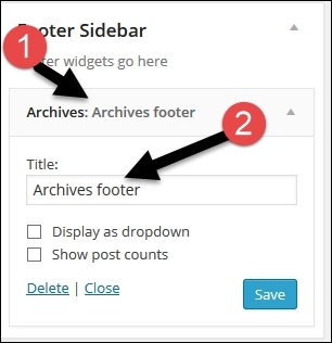
It is because we need to go to Apperance | Widgets first, and add at least one widget to the archives with a title, in our case Archives footer, as you can see it in the next screenshot:
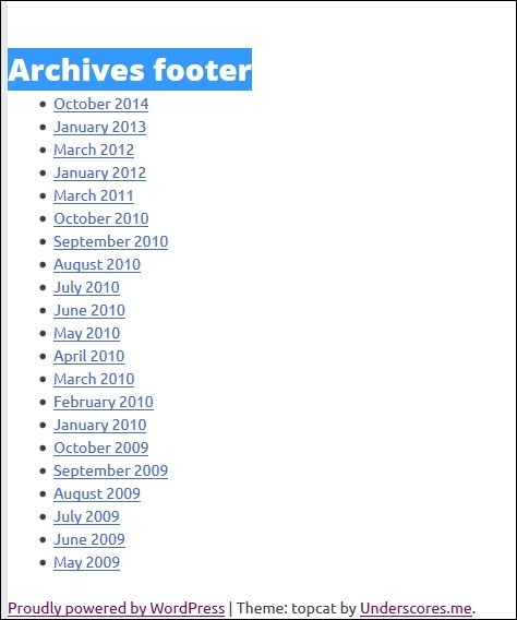
Now, if we scroll to the bottom of our index page or just go to any single post, we will be able to see our archives footer widget, as shown in the following picture:
Styling sidebars
Now that we have created new widget area and are able to add widgets, we should go and style the sidebars. To do this, we need to use the monster widget that we installed in Chapter 1, Responsive Web Design with WordPress. The monster widget contains all the default widgets that come with WordPress. It is a great addition to our toolbox as with this, we don't need to load the widgets one by one. When we load the widgets, we style them with our code in order to make sure that our theme is 100 percent compatible with them. What does "compatible" mean?
It means that if the end user puts any or multiple widgets in our sidebar, they should not break the layout of the page nor the widgets' own the layout.
Before we start making big changes, we need to differentiate the right sidebar from the content, and we can do this by simply adding this line to .widget-area in content-sidebar.css:
background: none repeat scroll 0 0#f8f8f8;
Here is the new look of the right sidebar:
As we can see from the preceding screenshot, we have a dark silver line, which is our background color, on the right. Then, we have our sidebar in light silver color, followed by our content in white.
If we go to our code in the functions.php file, where we defined the sidebar area, we will see the following:
register_sidebar( array(
'name' => __( 'Sidebar', 'topcat' ),
'id' => 'sidebar-1',
'description' => '',
'before_widget' => '<aside id="%1$s" class="widget %2$s">',
'after_widget' => '</aside>',
'before_title' => '<h1 class="widget-title">',
'after_title' => '</h1>',
) );
As we can see, our widgets will be contained in <aside id="%1$s" class="widget %2$s"> with the classname named widget. As I don't like the current padding for this class, we will add padding: 30px 10px. The widget class is located in the widgets area in styless.css.
Here is the look we had before the change:

Here is the new look, after the change:

Widget title fonts are too big, so we will add this style to style.css:
.widget-title
{
font-size: 1.7em;
}
We also need to differentiate widget's title from the content, and we will do this by adding the ensuing code to the widget-title class:
border-bottom: 1px dashed #666;
margin: 10px 0px;
Now we can scroll down through the page to see the changes. The only things that don't look particularly interesting are the links and unstyled lists:
Note
I have first tried to color our links in blue (#0480b5), but they didn't look appealing as our title is of the same color, meaning there was too much of blue everywhere. I have tested numerous colors (and you should do the same too).
Finally, I came up with this solution that will work best for our links:
.widget a,
.widget a:visited,
.widget a:hover
.widget a:active,
#today
{
color: #666;
line-height: 1.6;
text-decoration: none;
font-weight: 500;
}
.widget a:hover{
text-decoration: underline;
}
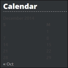
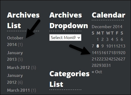
Here, we have set all the links in silver color and with a proper line height. After this, we made sure that all the links, except hover links, are not decorated, as shown in the following image:
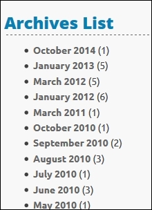
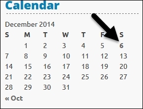
Finally, we put a font weight of 500 to distinguish links from normal fonts (for example, in the calendar widget.)
Note
In the calendar widget, we have a special ID for the current day (#today), which I have used to style that number too.
Now, let's add those styles in order to edit lists:
.widget ul, .widget li{
list-style: none;
margin: 0.3em 0 0;
}
.widget li li { margin-left:1em; }
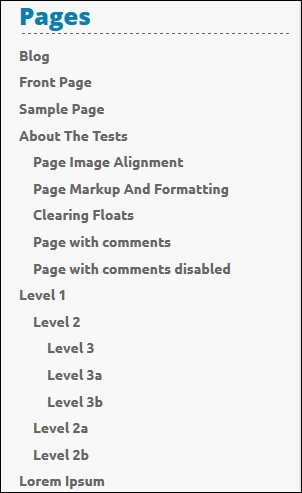
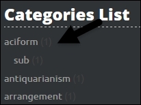
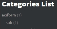
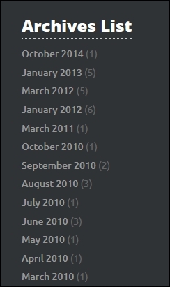
As we can see in the preceding code, we have disabled the width of list styles and then added a margin top of 0.3em. Finally, we added margin-left of 1em for child lists.
Let's see the look of lists that have children:
Editing the footer
Our next step is to edit the footer.
First, we need to make our footer distinctive, and we can do this by changing the background color of the .site-footer class in the content-sidebar.php file:
background: none repeat scroll 0 0 #2f3336;
Now, we are going to create a footer section in the style.css file. Since we have just changed the background color of the footer, we need to change the widget title too:
.site-footer .widget-title
{
font-size: 1.7em;
border-bottom: 1px dashed #ccc;
margin: 10px 0px;
color: #fff;
}
Here, we have changed the title color to white and the bottom border color to silver:
Some links and content are almost unreadable, as can be seen in the following image:
We can solve this problem with the following code:
.site-footer .widget a,
.site-footer .widget a:visited,
.site-footer .widget a:hover
.site-footer .widget a:active,
#today
{
color: #999;
line-height: 1.6;
text-decoration: none;
font-weight: 500;
}
With the preceding code, we are making all the widget links in the footer to be of a medium dark silver color:
Now it's more readable, but we still need to fix some parts, right? That number in the brackets is almost invisible:
.site-footer .widget ul li
{
color: #666;
}
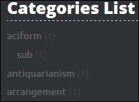
The preceding code solves the problem as with it, we have added a darker shade of silver so we could distinguish the link from the number.
We fixed the visibility issue for a number of widgets, but the calendar widget is still unfinished:
This line of code will solve the problem for all the unfinished widgets:
.site-footer p, .site-footer strong, .site-footer td, .site-footer th, .site-footer caption
{
color: #999;
}
Now let's have a look at the result:
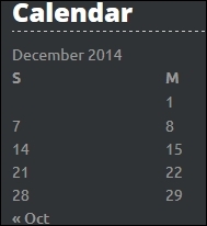
The only missing part is styling for the current day, and we can solve this with the following line of code:
.site-footer #today{
color: #fff;
font-weight: 600;
}
Here is the look after our change:
Now, as our footer and widgets look fine, we should have them rendered side by side for a desktop look instead of having them one above another:
In order to do this, we just need to add this code:
.site-footer .widget {
float: left;
width: 30%;
margin: 0 1rem 2rem 2rem;
}
In the preceding code, we've first made all the widgets float to the left so they could be rendered one beside the other. After this, we gave the widgets a width of 30 percent so we can have three widgets in one row. Finally, we set the margins to 0, 1rem, 2rem, and 2rem (top, right, bottom, and left).
The final step with widgets is to make them fluid; that is, if we resize the browser right now, for example to the mobile size, the widgets will still be one beside the other instead of one above the other:
Note
We have used a percentage width in order to make our layout fluid (part of a responsive layout) but we haven't yet applied the breakpoints. When we apply the breakpoints, the footer will become responsive (it will respond to different sizes of the screen).
In order to make our widgets responsive in the footer, we are going to use the masonry.js library.
Note
Masonry is a great JavaScript grid library that optimizes the layout based on the vertical space size. In our case, it can resize our widgets depending on the layout width. For more information about masonry, visit http://masonry.desandro.com/.
The good thing about masonry is that it already exists in WordPress. We just need to load it in our functions.php file where we are loading all the other .js files:
wp_enqueue_script('topcat-masonry','/js/masonry_custom.js', array('masonry'), false, false);
In the preceding code, we have called our custom masonry file where we are going to set the default values for masonry. As we can see from the code, we set masonry as a dependency with array('masonry'). This way, we are loading masonry first and then our custom masonry code.
Now is the time to create the masonry_custom.js file in our themes js folder.
After this, we should wire the masonry to the footer widgets in our masonry_custom.js file with this code:
jQuery(document).ready(function($) {
var $container = $('#sidebar-footer');
$container.masonry({
itemSelector: '.widget',
columnWidth: '.widget',
isFitWidth: true,
isAnimated: true
});
});
Here, we have set a container to #sidebar-footer and then itemSelector to .widget, obviously. The interesting part about masonry is that you can set a column width to a CSS class instead of a number, and this change makes it even more responsive. Try both on your own, the number (for example, 300 for columnWidth) and CSS class (.widget for columnWidth), and compare the results.
In the sidebar-footer file, we should make sure that our widget container has the sidebar-footer ID:
<div id="sidebar-footer" class="widget-area" role="complementary">
<?php dynamic_sidebar( 'sidebar-footer' ); ?>
</div>
Finally, when we resize the page, the widgets will load nicely (one beside the other):
However, if we minimize the screen too much, the layout will break.
In order to fix this, we have to customize our masonry custom code in a similar way as we did with superfish.js:
var phoneSize = 600;
jQuery(document).ready(function($) {
var $container = $('#sidebar-footer');
if($(document).width() >= phoneSize) {
$container.masonry({
columnWidth: '.widget',
isFitWidth: true,
isAnimated: true,
itemSelector: '.widget'
});
}
$(window).resize(function() {
if($(document).width() >= phoneSize) {
$container.masonry({
columnWidth: '.widget',
isFitWidth: true,
isAnimated: true,
itemSelector: '.widget'
});
}
// < phoneSize disable masonry
else if($(document).width() < phoneSize) {
$container.masonry({
columnWidth: '.widget',
isFitWidth: true,
isAnimated: true,
itemSelector: '.widget'
});
$container.masonry('destroy');
}
});
});
Here, we have set the phone size variable to 480, which is, actually, the same size as that of content-sidebar.css for a media query. After this, in each section (case), we initialized masonry with its default values. For screen sizes less than the phone size, we disabled masonry and had our widgets displayed one per line. For this, we used the CSS placed in @media screen and (max-width: 480px) in style.css:
#sidebar-footer { width: 100%!important; }
#sidebar-footer .widget {
width: 100%;
float: none;
}
When we resize the screen to the phone size, we get only one widget per line:
Working with comments
In this section, we are going to talk about:
· The purpose of comments and why they are important
· Styling comments title
· Styling comments themselves, including the author comments
· Styling comments navigation
The comments feature is a very important part of any website as the comments enable interaction between the site owner and visitors. At the same time, they bring more value to the site, as more information is provided and the site can have more traffic as people who follow or respond to comments can come back. As WordPress has two types of pages, that is, the page and the post (including custom posts), the comments can be displayed on both.
Tip
I recommend that you disable comments on pages of the type "page" on business websites. I don't see the purpose of visitors leaving comments on our "contact us" page or the "about us" page, right?
In order to deal with comments in our theme, we should go to Template: Comments, which can be found by using the search widget with the keyword Template: Comments, or in wpadmin by going to the posts section, searching for the same keyword, and then choosing the Preview option. When we finally go to that post, we will see a lot of comments there. Since we don't need to deal with that many, we can go to Settings | Discussion | Break comments into pages and type the number 5.
Note
Make sure that this option is checked; then, save the changes.
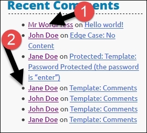
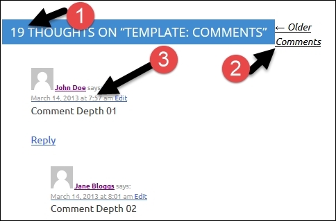
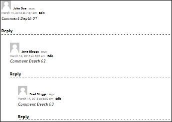
Now we are able to see the number of comments: the comments title (#1), comments toolbar (#2), and comments themselves (#3):
You are probably wondering how the comments are loaded, right?
If we go to single.php, we will see the following code around line 19:
<?php
// If comments are open or we have at least one comment, load up the comment template
if ( comments_open() || get_comments_number() ) :
comments_template();
endif;
?>
As we can see, this code is checking whether comments are enabled and if there are any comments. If the answer is yes to both, we call the comment_template() function, which loads the comments.php file. Since comments.php has a lot of code, I have created a copy of it called comments_old.php.
Note
We are going to make a number of changes to the comments.php file, and in order to avoid the confusion, I will use line numbers as references.
Styling comments title
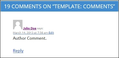
Before we do anything else, we should change the words around line 28, from thought to comment and from thoughts to comments:
This is the code before the change:
printf( _nx( 'One thought on “%2$s”', '%1$s thoughts on “%2$s”', get_comments_number(), 'comments title', 'topcat' ),
number_format_i18n( get_comments_number() ), '<span>' . get_the_title() . '</span>' );
This is the code after the change:
printf( _nx( 'One comment on “%2$s”', '%1$s comments on “%2$s”', get_comments_number(), 'comments title', 'topcat' ),
number_format_i18n( get_comments_number() ), '<span>' . get_the_title() . '</span>' ););
As you can see now, in the code between lines 33 through 39 and again between 50 through 56, we have a comments header. We really don't need both, so let's delete the one on lines 33 through 39. Since we have deleted the first comments header, we now have this code:
<ol class="comment-list">
<?php
wp_list_comments( array(
'style' => 'ol',
'short_ping' => true,
) );
?>
</ol><!-- .comment-list -->
In the preceding code, we have the comment list class and then the function call to wp_list_comments(), which actually displays the comments.
Styling comments
Now, let's change the styling of our comments. In styles.css, comments are located in the comments section:
As we can see in the preceding image, we have to do a lot of changes in order to make this look nice.
At first, we will fix the look of links by making them black and underlining them only when they are hovered over:
.comment-body a,
.comment-body a:visited,
.comment-body a:active
{
text-decoration: none;
color: #000;
}
.comment-body a:hover
{
text-decoration: underline;
color: #000;
}
Secondly, we should have some space between the image and the author's name, the author's name and the word "says", and the timestamp and the word "edit":
.comment-author .fn, .comment-metadata .edit-link
{
margin: 0.5em;
}
After this, let's make the button links (edit and reply) look a little bit different than the other text by making them bold:
.comment-metadata .edit-link, .reply{
font-weight: 600;
}
Then, we make the comment's content text italic:
.comment-content{
font-style: italic;
}
Finally, we make comments distinctive from border-bottom:
.comment-list article{
border-bottom: 1px dashed #666;
}
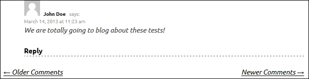
Here is our improved look:
It looks a lot better than it did in the previous image, right? But, if we resize the browser to the mobile size, the list in which comments are located will get more and more nested (indented). To resolve the problem with indentation, add the following code to the media query we used for the sidebar code, which is located at the end of styles.css:
/* comentscomments */
#comments ol.children {
list-style-type: none;
margin-left: 0;
padding: 0;
}
ul, ol {
margin: 0 0 1.5em 0em;
}
Comments navigation
The final step is to style the comments navigation:
Tip
We can have a number of comments on our page/post if, for example, our content is popular. This will make our page too big and it will take a long time to load. To fix this, we can use comments navigation, as with this, the number of comments can be limited; if our readers want to read them all, they can use the comments navigation.
At first, we should take out the word "comments" from the code in functions.php around the lines 45 and 46:
<div class="nav-previous"><?php previous_comments_link( __( "". "<i class='fa fa-arrow-left fa-2'></i> Older ", 'topcat' ) ); ?></div>
<div class="nav-next"><?php next_comments_link( __( "Newer <i class='fa fa-arrow-right fa-2'></i>". "", 'topcat' ) ); ?></div>
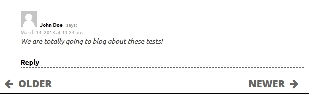
In order to make the look more informed, we should also add font awesome arrows (fa-arrow-left and fa-arrow-right). As comments are less important for us than the content, we should resize font awesome icons with the .fa-2class. Let's analyze the CSS code in style.css:
comment-navigation
.comment-navigation,
.comment-navigation a,
.comment-navigation a:visited,
.comment-navigation a:active
{
color: #666;
font-family: "Open Sans",sans-serif;
font-size: 20px;
font-size: 2.0rem !important;
;
line-height: 20;;
text-transform: uppercase;
font-weight: 800;
padding: 10px;
font-style: normal;
text-decoration: none;
}
In the preceding code, we colored links in the navigation with a darker silver color with text- decoration set to none (meaning links are not underlined) and font-size set to 20px.
.comment-navigation a:hover,.comment-navigation a:hover .fa-arrow-left, .comment-navigation a:hover .fa-arrow-right
{
font-style:normal;
color: #000;
}
Here, we have made the links black when hovered over, and with font-style:normal;, we have made sure that when hovered over, fonts will not be in italic.
.fa-3
{
font-size: 20px !important;
font-size: 2.0rem !important;
;
}
Here, we made sure that font awesome icons are smaller in comment navigation than in the content part.
Here, we will color font awesome icons to black:
.comment-navigation .fa-arrow-left,.comment-navigation .fa-arrow-right
{
color: #666;
}
Let's see the final look of a single comment and the comment navigation under it:
Summary
In this chapter, we learned a lot of useful tips and tricks. In the first section, we learned more about widgets, how to style them, and how to make them responsive. Then, we learned more about sidebars, and finally, we learned how to edit the footer. In the second section, we learned more about comments and how to edit and style them.
I bet you think that you know it all by now, right?
Well, the bad news is that there are a lot of things that we still have to learn; however, the good news is that you are halfway done already!
Go get your coffee and continue on reading, as in the next chapter, we will dive into the wonderful world of images and videos!
In the next chapter, we will learn how to deal with featured images and how to set up and resize these images, image captions, and image galleries. We'll also learn how to make the image galleries responsive.