WordPress Responsive Theme Design (2015)
Chapter 9. Working with Static Pages and Adding the Extra Functionality with Plugins
We have left the best for last. With this chapter, we are wrapping the development part of our book.
Posts are entries listed in reverse chronological order on the blog home page or on the posts page if you have set one wpadmin-> Settings->Reading. If you have created any sticky posts, those will appear before the other posts. If you are using WordPress as a blogging platform you will be mostly using posts there. You can organize your posts by using categories and tags.
Pages are static and are not listed by date. Pages do not use tags or categories. An About page is the classic example of a static page.
Static pages are a crucial part of WordPress themes as we are giving our customers premade solutions that they can configure to their needs.
Let's see what we will cover in this chapter:
· Creating and assigning the page template
· Creating alternative styles for the home page
· Setting the slider plugin
· Setting the services plugin
· Checking whether there are services and how to list them
· Making the home page responsive
· Creating the Contact Us page with a contact us plugin that is a part of Jetpack
Home page
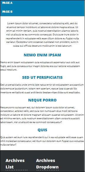
Home page is the landing page of our website and its purpose is to attract customers and provide the most important information. As home page usually has a different look than other pages, we have to create a custom code in order to match our needs. Here is the look that we want for our home page:
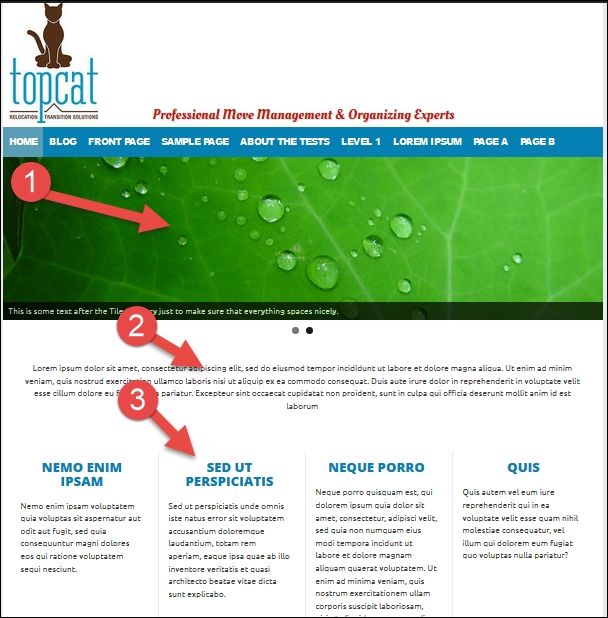
As we can see from the preceding screenshot, we will have three sections there: the slider (1), short description (2) and the list of services (3). All these features are optional, although I advise using them all, as they became a de-facto standard for business-oriented templates in the last few years.
Note
If you want to know more about the features for business templates, check the following sites:
· https://wordpress.org/themes/search/business/
· http://themeforest.net/category/wordpress/corporate
Here, you will see that a majority of themes have the features that I have just mentioned
The home page template
As we have mentioned, we are going to create a custom template that will serve the purpose of the home page. In order to do this we have to go in our editor and create the front-page.php file. In this file, we should add the following code, in order to make this file a page template:
/*
Template Name: Home Page
*/
When we added this code, we got a new option in our page editor. However, before we make any changes, we should go to the page editor by navigating to wpadmin | Pages | Add New and create a new page with the Home name. After this, we will be able to see the template dropdown in the Page Attributes section on the right, and there, we should choose the Home Page template:
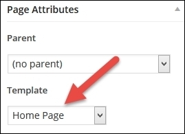
That is how we assign the template to the page in editor.
Tip
We could assign anything to the template name. We are just using Template Name: Home Page for consistency and to make our life easier, as this template name is clearly saying what this template is about.
Now, we should go to Appearances | Customize in wpadmin and assign a Home page as Static Front Page:
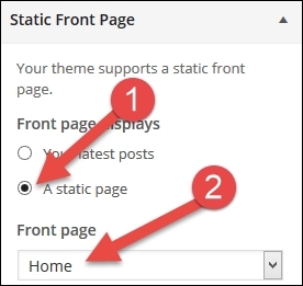
In the previous image, in the step #1, we are choosing a radio option A static page, and in step #2, we are choosing our Home page from the dropdown. Now, when we click on a home link in our menu or on a logo, we will be taken to our new home page.
Styles for the home template
As we were able to see from the first image at the beginning of this chapter, our home page is going to look different than other pages. It will not have the right sidebar and the content will take 100 percent. Because of all this, we should have a separate CSS file for this purpose.
Tip
As we already have a content-sidebar.css file in our layouts folder, I recommend that you create a copy of this file. We can reuse a lot of code there and we should name the new file content.css.
In order to use content.css on our home page, we have to add this code to our functions.php file:
if ( is_page_template( 'front-page.php' ) ) {
wp_enqueue_style( 'topcat-layout-css', get_template_directory_uri() . '/layouts/content.css' );
}
else
{
wp_enqueue_style( 'topcat-layout-css', get_template_directory_uri() . '/layouts/content-sidebar.css' );
}
In the content.css file, we should make some changes. For example, we should change this class:
.site-main {
margin: 0 5% 0 0;
}
To the following:
.site-main {
margin: 0;
}
We should also delete the .site-content .widget-area class, as we are not going to use the widget area in this template.
Then, in the desktop styles media query:
/*desktop styles*/
@media only screen and (min-width:769px) {
We should make the content area taking 100% instead of 70%, and delete the float, as we don't need it :
.content-area {
width: 100%;
}
In order to display the content entered in the editor in our home template, we have to add this code to home-page.php:
<?php if (have_posts()) : while (have_posts()) : the_post();?>
<?php the_content(); ?>
<?php endwhile; endif; ?>
Slider plugin
As we want to make our site more interactive, we should install a slider plugin. There are a lot of free and premium slider plugins that we could use, but as this is a training book, we will use the free one so that everybody can have the access to it. For this purpose, we will use a Meta Slider, which is currently the most popular free slider plugin on the WordPress.org website.
It can be downloaded from here: https://wordpress.org/plugins/ml-slider/.
Note
For my professional projects, I was using a LayerSlider, which is a premium plugin. You can check it out here: http://codecanyon.net/item/layerslider-responsive-wordpress-slider-plugin-/1362246.
The great thing with our Meta Slider plugin is that we can set it up in its own editor, grab a shortcode, paste it in our page, and that's it. Shortcodes are custom features that can be called from the post or page editor; for example, gallery can be called with [gallery]. Our Meta Slider will be called with this code: [metaslider id=1734].
Now, let's set up the slider:
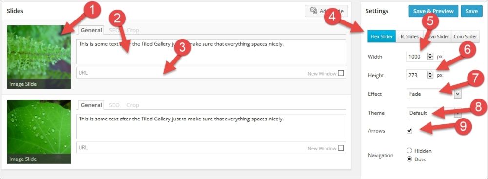
Here, we should first add the first slide, and then choose the image (#1), general description (#2), and URL (#3).
Note
Please note that I didn't choose anything for our URLs at this point.
Then, we should choose which slider we want to use, as Meta Slider has many options. In this case, let's use the first option: Flex slider (#4). As our content width is 1000px, we should choose a width of 1000px (#5), too and a height of 273px (#6).
Note
These sizes work with images that I have used, and I recommend that you use the same images.
These images were provided as a part of the Theme Unit Test Data and we can find them by just choosing the Add slide option in Media Library, and they should be somewhere on the first page.
After dimensions, we should choose the Fade effect (#7) and the Default theme (#8), and we should also select the Arrows checkbox (#9) and Dots for the navigation. Let's look at the advanced settings:
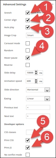
In the advanced settings, we should choose:
· The Stretch option (#1)
· Center align (#2)
· Auto play (#3)
· Hover pause (#4)
· Print CSS (#5)
· Print JS (#6)
For the final step, we should copy the shortcode from the usage section and paste it in the page editor:
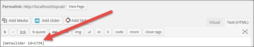
In our case, the code is [metaslider id=1734], and in your case, the code (id number) may be different.
The Services section (list of services)
In this section, we will create the option to list services, and in order to do that, we have to create the option for our users to add services. The best way to do this is to use the plugin, which will add custom post services to our wpadmin dashboard.
Note
Custom posts help end user differentiate one type of post from other as in the database, all posts are saved on the same place. In our example, our user can choose the services option in wpadmin and add new services. Later on, when we want to show results, we are going to search for posts of the type service to display.
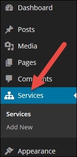
I have created the plugin that will add custom post type services to wpadmin, and this plugin can be downloaded from https://github.com/dejanmarkovic/nyto-services-cpt.
When we download the plugin, we will just have to install and activate it, and then we will see the Services option in wpadmin:
Then, we should go there and add new services, same as we add any other post or page:
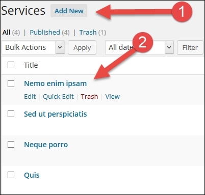
In the step 1 (#1), we will press the Add New button to add a new service, and in the step 2 (#2), we can see the services that are already added.
Note
In your case, you will have to add services first in order to see the results in the step 2.
After we add services to our system, we should go and handle the results in our front-page.php file:
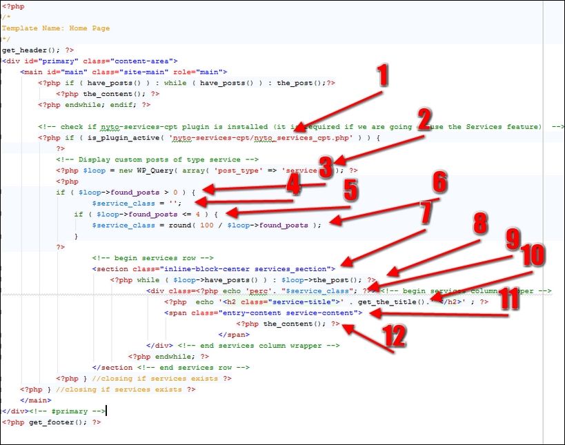
First (#1), we check whether our plugin is installed and activated. If the plugin is not there, we should not display the services. This means that if our end user installs the plugin and adds the services but later on, changes his/her mind and uninstalls the plugin, the services should not be displayed. Next (#2), we execute a query first in order to get posts of the type of service; then (#3), we check whether there are any services in the database, and if there are, then we will display them; if not, we will not display anything in this section. As you can see, each of the sections is optional, as we have mentioned previously. Later on (#4), we define a $service_class variable that is going to be used as a CSS helper for our layout.
Next (#5), we check whether there are 4 or less services in the database, as this solution is customized for up to four services.
Note
This code can handle only up to 4 services, and that will be enough for our project.
Later on (#6), we are doing a calculation for our service class; if there is only one service in the database, the services section will take 100 percent of that width; if there are 2 services, they will take 50 percent each; if there are 3services, each service will take 33 percent; if there are 4 services, each service will take 25 percent. For these cases, we are going to use CSS classes' perc33, perc25, and so on:
/* percentage size of services boxes */
.perc33{
max-width: 33%;
}
.perc25{
width: 25%;
}
.perc100{
width: 100%;
}
.perc50{
width: 50%;
}
Note
This CSS code should go to the content.css file's desktop styles media query:
/*desktop styles*/
@media only screen and (min-width:769px)
Next (#7), we add classes which make sure that services will be center-aligned:
/*align services to center */
.inline-block-center {
text-align: center;
}
.inline-block-center div {
display: inline-block;
text-align: left;
}
Note
This CSS code should go to the style.css file.
Later on (#8), we loop through the list of services:
<?php while ( $loop->have_posts() ) : $loop->the_post(); ?>
Next (#9), we add $service_class, which has the perc prefix (the percentage).
Then (#10), we define the services title and add a service-title class. We should also add the styling to styles.css for the service-title class:
.service-title{
color: #0480b5;
font-size: 2.2rem;
font-size: 22px;
line-height: 22px;
text-transform: uppercase;
font-family: 'Open Sans', sans-serif;
text-align: center;
}
Note
This CSS code should go to the style.css file.
Next (#11), we add the service-content CSS class to the markup, and the code for that class should be the following:
.service-content{
margin: 20px;
}
Finally, (#12) we are displaying the content part with the_content() function.
As our services are nested in the <section> tag, here is more of CSS code that handles margins, padding, and a border:
.services_section
{
margin: 20px 0px;
padding: 10px;
}
section div {
padding: 15px;
margin: 5px;
border-left-style: solid;
border-left-width: 1px;
display: table;
border-color: #ececec;
}
section div:first-child {
border-left-width: 0;
}
Note
This CSS code should go to the content.css file's desktop styles media query:
/*desktop styles*/
@media only screen and (min-width:769px)
Tip
The services functionality is an extra functionality, which means that it is not a design/theme functionality and because of that, it should be put in a plugin as a separate feature. With this option, we give our end user a choice to use that functionality (or not) and at the same time, we follow the best WordPress practices (in this case, separating the content from design). Here is the link to a great article at WP Tavern that explains why we (the theme developers) are doing this: http://wptavern.com/why-wordpress-theme-developers-are-moving-functionality-into-plugins. There is a great library called the TGM Plugin Activation that we can use to require the recommended plugins, and it can be downloaded from http://tgmpluginactivation.com/. Covering this library is out of the scope of this book, but I strongly recommend that you use it.
Making our home page responsive
We have already started making our home page responsive by adding some code to the content.css desktop style media queries. Now, we should make some classes mobile phone friendly, and we will execute all these changes in the mobile phone styles media query in the content.css @media only screen max-width:480px.
At first, we don't really need a slider on the mobile phone size screen, so we should hide it:
.metaslider{
display: none;
}
Then, we should take the display, flex, and the border from section:
section {
margin: 20px 0px;
padding: 10px;
}
section div {
padding: 15px;
margin: 5px;
border-left-style: none;
}
section div:first-child {
border-left-width: 0;
}
Finally, we have to customize our percentage for services' CSS classes:
.perc33{
max-width: 100%;
display: block;
}
.perc25{
max-width: 100%;
display: block;
}
.perc100{
max-width: 100%;
display: block;
}
.perc50{
max-width: 100%;
display: block;
}
With this code, each service will go into its own row.
Here is the final look on the mobile phone size screen:
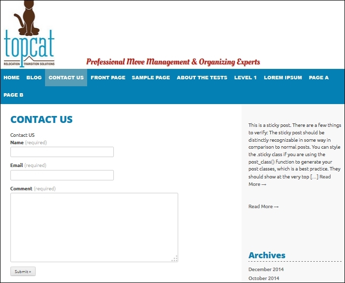
The Contact Us page
What would be the purpose of our business site if our customers can't contact us? This is why we are going to create a contact us page. Before we do this, we should install the Jetpack plugin as one of the options has a contact form plugin:
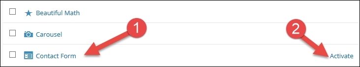
First (#1), we can see the Contact Form option, and then (#2), we should click on Activate to activate the contact form.
After we activate this option, we should create the Contact Us page, and in the editor, we will be able to choose the Add Contact Form option:
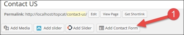
After clicking on Add Contact Form (#1), we will see the form builder where we will be able to choose fields that we want to use:
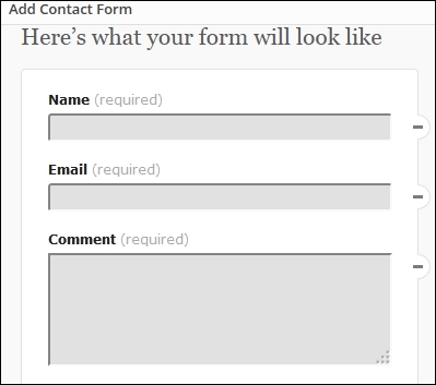
Note
This form doesn't have any kind of captcha option, as it is directly wired to the Akismet service, so it doesn't really need it.
Finally, after we accept all the options, the shortcode will be added to our form:
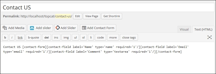
We will just have to publish the page, and that's it:
Summary
In this chapter, we have learned about static pages, slider, shortcodes, how to make our home page responsive, and how to create the contact us page.
By now, you should have a basic understanding of the development of a responsive theme in WordPress.
Now, the only thing left to do is to learn how to test our theme and how to properly submit it to WordPress.org by following the WordPress Codex.
Without further ado, let's move on to our final chapter.