THE RUBY WAY, Third Edition (2015)
Chapter 12. Graphical Interfaces for Ruby
There is nothing worse than a sharp image of a fuzzy concept.
—Ansel Adams
There is no denying that we are in the age of the graphical user interface (GUI). For as far into the future as we can see, some form of graphical interface is going to be the preferred way to interact with a computer.
I don’t see the command line going away anytime soon; it definitely has its place in the world. But even the old-time hackers (who would rather use cp -R than a mouse) still enjoy a GUI when it is appropriate.
However, there are new difficulties when it comes to programming graphically. The first problem, of course, is designing a meaningful, usable “front end” for a program. In interface design, a picture is not always worth a thousand words. This book can’t address these issues; our topic here is not ergonomics, aesthetics, or psychology.
The second problem is that graphical programming is more complex. We have to worry about the sizes, shapes, locations, and behaviors of all the controls that can be displayed and manipulated with mouse, keyboard, or finger.
The third difficulty is that various computing subcultures have differing ideas of what a windowing system is and how it should be implemented. The disparity between these systems has to be experienced to be fully appreciated; many a programmer has attempted to produce a cross-platform tool only to find that the impedance mismatch between the GUIs was the hardest part to deal with.
This chapter can’t help much with these problems. The most I can do is give a gentle introduction to a few popular GUI systems (as they relate to Ruby) and offer a few hints and observations.
The bulk of this chapter is devoted to Shoes, Tk, GTK, and Qt. Whatever your background, there is a good chance you are asking, “Why wasn’t (insert name of favorite GUI) included here?”
There could be several reasons. One reason is limited space, because this book is not primarily about graphical interfaces. Another reason might be that your favorite system doesn’t have a mature set of Ruby bindings yet (in which case you are encouraged to create them). Finally, not all GUI systems are created equal. This chapter tries to cover the most mature and widely used options, and give the rest a passing mention.
12.1 Shoes 4
Shoes is a uniquely “Rubyesque” GUI system—and at present the most widely used way to create graphical programs in Ruby. Shoes provides an extremely simple and straightforward graphics API, and has been used for both teaching and building applications. It was originally created by _why the lucky stiff_ for his teaching tool Hackety Hack, and after _why disappeared, the project was adopted by Steve Klabnik.
The latest version of Shoes runs on JRuby, which is a Ruby interpreter written in Java. It allows Ruby programs to run on the Java Virtual Machine (JVM) with easy access to any Java library. Although it has not always been true, JRuby today is stable, mature, and sometimes even faster than MRI (the main Ruby interpreter).
Today, the team of volunteers working on Shoes 4 is led by Tobias Pfeiffer and Jason R. Clark. They are working to complete _why’s original vision of making it easy for children to create graphical and interactive programs using Ruby.
12.1.1 Starting Out with Shoes
Installing JRuby for Shoes is probably the hardest part of using it. You’ll need to install JRuby, following whatever instructions are appropriate for your current platform. For detailed instructions, see the JRuby website at jruby.org. Another option is to use a Ruby version manager, which is discussed in Section 21.6, “Ruby Version Managers,” of Chapter 21, “Ruby Development Tools.”
Once JRuby is installed and running, installing Shoes is just one command:
gem install shoes -v "~> 4.0.pre"
The version requirement ~> 4.0 tells Rubygems to install Shoes 4.0 or greater, but less than 5.0, whereas the .pre allows prerelease versions.
With the gem installed, Shoes programs can be run with the shoes command. To run a Shoes program saved into the file program.rb, you would run the command shoes program.rb.
The simplest possible Shoes program just creates an empty window when launched:
Shoes.app
The size of the window can be changed by passing height: and width: arguments to the app method. Elements inside the application window are created by passing a block to the app method that declares those elements. There are ten basic elements, and they can be used to create GUI programs containing buttons, text, graphics, text, forms, and links.
12.1.2 An Interactive Button
Buttons in shoes are extremely straightforward to create: Call the button method, and supply the text of the button as the first argument. If a block is passed, it will be run whenever the button is clicked. Here is a small application with a button that will display an alert when clicked:
Shoes.app(height: 30, width: 125) do
button "Declaim poem" do
alert "O freddled gruntbuggly thy micturations " \
"are to me\n As plurdled gabbleblotchits on a " \
"lurgid bee."
end
end
The alert method simply takes a string and displays it in a modal dialog box with an “OK” button. Figure 12.1 displays the application window and the alert that appears when the button is clicked.
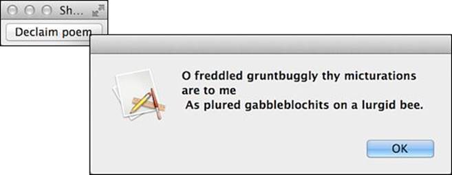
Figure 12.1 Shoes application with alert dialog box
12.1.3 Text and Input
Text can be inserted into the window by passing a string to the para method. After the string, options can be given, including size and stroke (which changes the color of the text). Additional methods are provided as shortcuts for certain sets of options. Larger text can be inserted usingbanner, title, subtitle, and other methods, whereas styled text can be added with the em, strong, and code, among others.
By saving a reference to a text element, it becomes possible to update the contents of that element later. Here, we create a title element as well as a button that, when clicked, changes the text of that title element, as shown in Figure 12.2.
Shoes.app(height: 75, width: 225) do
@book = title "The Urby Way"
button "Correct spelling" do
@book.text = "The Ruby Way"
end
end
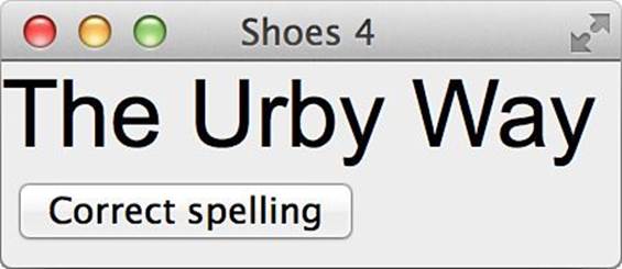
Figure 12.2 Styled title text in Shoes
The title element is saved as @book so that the contents of the title can be updated later, when the button is clicked. Notice that the instance variable @book is available inside both the Shoes.app block and the button block. Each block is run using instance_eval on the instance of the App class that is currently running. This provides the same set of instance variables to every block, no matter which method the block was given to.
Text input is supplied by the edit_line and edit_box methods, which create single-line and multiple-line text entry areas, respectively. If a block is given, it will be called when the field is changed and then passed the field as an argument. Here, we take any string that is entered into the field and display it in reverse, as shown in Figure 12.3.
Shoes.app do
edit_line do |line|
@name.text = line.text.reverse
end
@name = para "", margin: 10
end
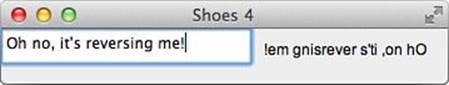
Figure 12.3 Edit line with reversed text
The para containing the reversed text starts out empty (like the edit_field) but updates as each letter is typed into the field.
12.1.4 Layout
As you probably noticed in the last example (especially if you typed a lot of text into the edit_field), new elements fill up the available space left to right and then top to bottom, just like text in a paragraph. In Shoes, this kind of layout is called a flow, and the main Shoes.app block provides a flow for you. The other type of layout is called a stack. Inside a stack, each new element is added underneath the previous element.
Predictably, stacks and flows are created by passing blocks to the methods stack and flow. By combining them together, it is easy to create screens with elements laid out naturally, even with multiple columns. In this example, we create a form with columns containing text, fields, and buttons:
Shoes.app width: 500, height: 240 do
stack width: 220, margin: 10 do
caption "Name"
@name = edit_line
caption "Nation"
@nation = edit_line
caption "Home"
@home = edit_line
caption "Destination"
@destination = edit_line
button "Compose", margin_top: 10 do
@result.clear
@result.append do
caption "#{@name.text} is my name,"
caption "and #{@nation.text} is my nation."
caption "#{@home.text} is my dwelling place,"
caption "#{@destination.text} my destination."
end
end
end
@result = stack width: -220, margin: 20
end
The first stack has a fixed width of 220 pixels. The negative width on the second stack indicates that it should fill the entire width except 220 pixels. Because the main app block creates a flow, the two stacks are placed next to one another to create two columns.
Rather than use the edit_line blocks to create a live-updating result, we create a button that removes all elements (if any) from the right column and adds several text elements. Because the right column is also a stack, each element is stacked onto a new line.
The ultimate effect is one of a form on the left and text on the right, created when the button is clicked. Figure 12.4 shows what using the program might look like.
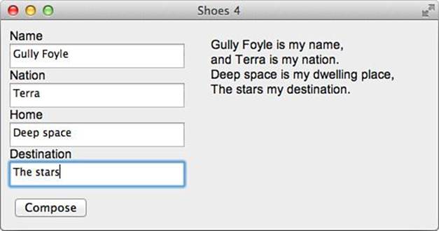
Figure 12.4 Quatrain generator
12.1.5 Images and Shapes
Shoes also provides straightforward graphical elements. Adding images to a Shoes window is as simple as calling the image method with the path to an image. The path can point to a local file or to an image hosted on the internet.
Graphics can be constructed using the basic arc, line, oval, and rect methods. Arbitrary shapes can be constructed as well, using the shape method. Colors can be set by calling stroke to set the outline color and fill to set the interior color before creating the shape. In this example, we simply draw a green oval and then a black rectangle at a 30-degree angle. The result is shown in Figure 12.5.
Shoes.app width: 250, height: 125 do
fill green
nostroke
oval top: 25, left: 125, width: 45, height: 65
rotate 30
rect top: 30, left: 30, width: 60, height: 40
end
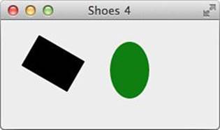
Figure 12.5 Shapes
The stroke and fill are be cleared by nostroke and nofill, whereas the stroke thickness can be set with strokewidth. For more details about drawing and manipulating shapes, see the Shoes manual at shoesrb.com.
12.1.6 Events
We’ve already seen how clicking buttons and changing text fields can cause blocks to run. Shoes provides a few other events that can also be given blocks:
• keypress—Calls the given block with each key pushed while your app is running.
• motion—Runs when the mouse moves, and passes the left and top location of the mouse.
• hover—Runs when the mouse enters a stack or flow.
• click—Runs when the mouse clicks the element.
• release—Runs when the mouse is released after having clicked the element.
• leave—Runs when the mouse exits the stack or flow.
Note that keypress always applies to the entire Shoes app, whereas the other events apply only to the stack or flow that contains them. Using events, we can move shapes whenever someone interacts with our program:
Shoes.app do
@circle = oval top: 5, left: 5, radius: 30
motion do |left, top|
if @track
@circle.left, @circle.top = left - 15, top - 15
else
@circle.left = (width - left)
@circle.top = (height - top)
end
end
click { @track = true }
release { @track = false }
end
In this program, a circle will react to mouse movement, moving to the opposite side of the window. While the mouse is held down, however, the circle will follow the cursor exactly. A screenshot is simply unable to capture the experience, so I encourage you to try it out for yourself.
12.1.7 Other Notes
Any program written in Shoes can be packaged into a standalone executable that can be distributed and run on Windows, Mac OS X, and Linux computers. Work is ongoing on different backends, allowing Shoes to run inside Qt and GTK, which are both examined later in this chapter.
Although Shoes is not very much like other GUI toolkits, its extreme simplicity and its focus on being easy to use with Ruby make it the most popular way to create GUI Ruby applications today. For the latest news and more documentation, including a hand-drawn manual and API reference, see the Shoes website at shoesrb.com.
12.2 Ruby/Tk
The roots of Tk go back as far as 1988, if you count prerelease versions. It has a long association with the Tcl programming language, but now has bindings for many other languages, including Perl and Ruby.
In 2001, Tk was probably the most common GUI in use with Ruby. It was the first one made available and has long been part of the standard Ruby installation. Though it is not as popular as it was then, it is still in use.
Although Ruby/Tk is included in the Ruby standard library, most would say that Tk is showing its age; for those who like clean, object-oriented interfaces, it may be something of a disappointment. However, it still has the advantages of being well known, portable, and stable. The examples shown in this section will work with Ruby on Windows, Mac OS X, and Linux.
12.2.1 Overview
Any Ruby/Tk application must use require to load the tk extension. Following that, the application’s interface is built up piecemeal, starting with some kind of container and the controls that populate it. Finally, a call to Tk.mainloop is made; this method captures all the events, such as mouse movements and button presses, and acts on them accordingly.
require "tk"
# Launch the app...
Tk.mainloop
As with most or all windowing systems, Tk graphical controls are called widgets, and these widgets are typically grouped together in containers. The top-level container is called the root. Although it is not always necessary to specify an explicit root, doing so is a good idea.
Every widget class is named according to its name in the Tk world (by appending Tk to the front). Thus, the Frame widget corresponds to the TkFrame class.
Widgets are naturally instantiated using the new method. The first parameter specifies the container into which the widget is placed; if it is omitted, the root is assumed.
The options used to instantiate a widget may be specified in two ways. The first way is to pass in a hash of attributes and values. (Recall that it is a quirk of Ruby syntax that a hash passed in as the last or only parameter may have its braces omitted.)
my_widget = TkSomewidget.new(borderwidth: 2,
height: 40, justify: "center")
The other way is to pass a block to the constructor that will be evaluated with instance_eval. Within this block, we can call methods to set the attributes of the widget (using methods that are named the same as the attributes). Bear in mind that the code block is evaluated in the context of the object, not the caller. This means, for instance, that the caller’s instance variables cannot be referenced inside this block. This code will create a widget with the exact same settings as the previous example will:
my_widget = TkSomewidget.new do
borderwidth 2
height 40
justify "center"
end
Three geometry managers are available with Tk; they all serve the purpose of controlling the relative size and placement of the widgets as they appear onscreen. The first (and most commonly used) is pack; the other two are grid and place. The grid manager is sophisticated but somewhat prone to bugs; the place manager is the most simpleminded of all because it requires absolute values for the positioning of widgets. We will only use pack in our examples.
12.2.2 A Simple Windowed Application
Here, we’ll demonstrate the simplest possible application—a simple calendar app that displays the current date. For good form, we’ll begin by explicitly creating a root and placing a Label widget inside it:
require "tk"
root = TkRoot.new() { title "Today's Date" }
str = Time.now.strftime("Today is \n%B %d, %Y")
lab = TkLabel.new(root) do
text str
pack("padx" => 15, "pady" => 10,
"side" => "top")
end
Tk.mainloop
After creating the root itself, we create a string containing the date. Then, while creating the label, we set the text to be the value of str and call pack to arrange everything neatly. We tell pack to use a padding of 15 pixels horizontally and 10 pixels vertically, and we ask that the text be centered on the label.
Figure 12.6 shows what the application looks like.
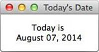
Figure 12.6 A simple Tk application
As we mentioned, the creation of the label could also be done in this way:
lab = TkLabel.new(root) do
text str
pack(padx: 15, pady: 10, side: "top")
end
The units for screen measurement (as used in this example for padx and pady) are in pixels by default. We can also work in another unit by appending a suffix onto the number; the value now becomes a string, of course, but because Ruby/Tk doesn’t care about that, we don’t care either. The available units are centimeters (c), millimeters (m), inches (i), and points (p). All of these are valid padx calls:
pack(padx: "80m")
pack(padx: "8c")
pack(padx: "3i")
pack(padx: "12p")
The side attribute doesn’t actually contribute anything in this case because we have set it to its default. If you resize the application window, you will notice that the text “sticks” to the top part of the area in which it lives. Other possible values are right, left, and bottom, as you might expect.
The pack method has other options that govern the placement of widgets onscreen. We’ll look at just a few.
The fill option specifies whether a widget fills its allocation rectangle (in the horizontal and/or vertical directions). Possible values are x, y, both, and none (the default being none).
The anchor option will anchor the widget inside its allocation rectangle using a “compass point” notation; the default is center, and the other possible values are n, s, e, w, ne, nw, se, and sw.
The in option will pack the widget with respect to some container other than its parent. The default, of course, is the parent.
The before and after options can be used to change the packing order of the widgets in any way desired. This is useful because widgets may not be created in any particular order as compared to their locations onscreen.
All in all, Tk is fairly flexible about placing widgets onscreen. Search the documentation and try things out.
12.2.3 Working with Buttons
One of the most common widgets in any GUI is the pushbutton (or simply button). As you would expect, the TkButton class enables the use of buttons in Ruby/Tk applications.
In any nontrivial application, we usually create frames to contain the various widgets we’ll be placing onscreen. Button widgets can be placed in these containers.
A button will ordinarily have at least three attributes set:
• The text of the button
• The command associated with the button (to be executed when it is clicked)
• The packing of the button within its container
Here is a little example of a button:
btn_ok = TkButton.new do
text "OK"
command { puts "The user says OK." }
pack(side: "left")
end
Here we create a new button and assign the new object to the btn_OK variable; we pass in a block to the constructor, although we could use a hash if we chose. In this case, we use the multiline form (which we prefer), though in practice you can cram as much code onto a single line as you want. Recall, by the way, that the block is executed using instance_eval so that it is evaluated in the context of the object (in this case, the new TkButton object).
The text specified as a parameter to the text method will simply be placed on the button. It can be multiple words or even multiple lines.
The pack method we have already seen. It is nothing interesting, though it is essential if the widget is going to be visible at all.
The interesting part here is the command method, which takes a block and runs the block when the button is clicked.
The action we’re performing here is rather silly. When the user clicks the button, a (nongraphical) puts will be done; the output will go to the command-line window from which the program was started or perhaps an auxiliary console window.
We now offer a better example. Listing 12.1 is a fake thermostat application that will increment and decrement the displayed temperature (giving us at least the illusion that we are controlling the heating or cooling and making ourselves more comfortable). An explanation follows the code.
Listing 12.1 A Simulated Thermostat
require 'tk'
# Common packing options...
top = { side: 'top', padx: 5, pady: 5 }
left = { side: 'left', padx: 5, pady: 5 }
bottom = { side: 'bottom', padx: 5, pady: 5 }
# Starting temperature...
temp = 74
root = TkRoot.new { title "Thermostat" }
tframe = TkFrame.new(root) { background "#606060" }
bframe = TkFrame.new(root)
tlab = TkLabel.new(tframe) do
text temp.to_s
font "{Helvetica} 54 {bold}"
foreground "green"
background "#606060"
pack left
end
# the "degree" symbol
TkLabel.new(tframe) do
text "o"
font "{Helvetica} 14 {bold}"
foreground "green"
background "#606060"
# Anchor-north above text like a degree symbol
pack left.update(anchor: 'n')
end
TkButton.new(bframe) do
text " Up "
pack left
command do
temp += 1
tlab.configure(text: temp.to_s)
end
end
TkButton.new(bframe) do
text "Down"
pack left
command do
temp -= 1
tlab.configure(text: temp.to_s)
end
end
tframe.pack top
bframe.pack bottom
Tk.mainloop
We create two frames here. The upper one holds only a display. We display the temperature in Fahrenheit in a large font for realism (using a small, strategically placed letter o for a degree mark). The bottom frame holds the “up” and “down” buttons.
Notice that we are using some new attributes for the TkLabel object. The font method specifies the typeface and size of the text in the label. The string value is platform dependent; the one shown here is valid on a Mac OS X or Windows system. On a UNIX system, it would typically be a full X-style font name, long and unwieldy (something like -Adobe-Helvetica-Bold-R-Normal-*-120-*-*-*-*-*-*).
The foreground method sets the color of the text itself. Here, we pass in the string "green" (which has a predefined meaning in the internals of Tk). If you wonder whether a color is predefined in Tk, an easy way to find out is simply to try it.
Likewise, the background method sets the color of the background against which the text appears. In this case, we pass it a different kind of string as a parameter, a color in typical red-green-blue hex format, as you would see in HTML or in various other situations. (The string"#606060", for example, represents a nice gray color.)
Notice that we haven’t added any kind of “exit” button here (to avoid cluttering a nice, simple design). As always, you can close the app by clicking the Close button in the upper right (or upper left) of the window frame.
Note that the configure method is used in the commands for the buttons; this changes the text of the top label as it increments or decrements the current temperature. As mentioned earlier, basically any attribute can be changed at runtime in this way, and the change will be reflected onscreen immediately.
We’ll mention two other tricks you can do with text buttons. The justify method will accept a parameter ("left", "right", or "center") to specify how the text will be placed on the button ("center” is the default). We already mentioned that multiple lines could be displayed; the wraplength method will specify the column at which word wrapping should occur.
The button’s style may be changed with the relief method, giving it a slight three-dimensional appearance. The parameter to this method must be one of these strings: "flat", "groove", "raised", "ridge" (the default), "sunken", or "solid". The width and heightmethods will control the size of the button explicitly, and methods such as borderwidth also are available. For a full list of options (which are numerous), check the API documentation.
Let’s look at an additional example of using a button. This new button will have an image on it rather than just text.
I created a pair of GIF images composed of an upward-pointing arrow and a downward-pointing arrow (up.gif and down.gif). We can use the TkPhotoImage class to get references to each of these. Then we can use these references when we instantiate the buttons:
TkButton.new(bframe) do
image TkPhotoImage.new(file: "up.gif")
pack left
command do
temp += 1
tlab.configure(text: temp.to_s)
end
end
TkButton.new(bframe) do
image TkPhotoImage.new(file: "down.gif")
pack left
command do
temp -= 1
tlab.configure(text: temp.to_s)
end
end
This button code simply replaces the corresponding lines in our first thermostat example. Except for the appearance of the buttons, the behavior is the same. Figure 12.7 shows the graphical buttons in the thermostat application.
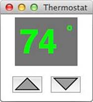
Figure 12.7 Thermostat simulation (with graphical buttons)
12.2.4 Working with Text Fields
A text entry field can be displayed and manipulated using the TkEntry widget. As you would expect, numerous options are available for governing the size, color, and behavior of this widget; we will offer one sizable example that illustrates a few of these.
An entry field is only useful if there is some way to retrieve the value typed into it. Typically the field will be bound to a variable (actually a TkVariable, as you’ll see), though the get method can also be used.
For our code fragment, let’s assume that we’re writing a telnet client that will accept four pieces of information: the host machine, the port number (defaulting to 23), the user ID, and the password. We’ll add a couple of buttons just for looks, for the “sign on” and “cancel” operations.
As we’ve written it, this code fragment also does some little tricks with frames to make things line up and look better, though a real Tk guru would probably disdain our approach. But just for your information, we’ve documented this “quick and dirty” approach to screen layout.
The screenshot is shown in Figure 12.8, and the code in Listing 12.2.
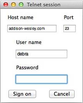
Figure 12.8 A simulated telnet client
Listing 12.2 A Simulated Telnet Client
require "tk"
def packing(padx, pady, side = "left", anchor = "n")
{ padx: padx, pady: pady, side: side, anchor: anchor }
end
root = TkRoot.new() { title "Telnet session" }
top = TkFrame.new(root)
fr1 = TkFrame.new(top)
fr1a = TkFrame.new(fr1)
fr1b = TkFrame.new(fr1)
fr2 = TkFrame.new(top)
fr3 = TkFrame.new(top)
fr4 = TkFrame.new(top)
LabelPack = packing(5, 5, "top", "w")
EntryPack = packing(5, 2, "top")
ButtonPack = packing(15, 5, "left", "center")
FramePack = packing(2, 2, "top")
Frame1Pack = packing(2, 2, "left")
var_host = TkVariable.new
var_port = TkVariable.new
var_user = TkVariable.new
var_pass = TkVariable.new
lab_host = TkLabel.new(fr1a) do
text "Host name"
pack LabelPack
end
ent_host = TkEntry.new(fr1a) do
textvariable var_host
font "{Helvetica} 10"
pack EntryPack
end
lab_port = TkLabel.new(fr1b) do
text "Port"
pack LabelPack
end
ent_port = TkEntry.new(fr1b) do
width 4
textvariable var_port
font "{Helvetica} 10"
pack EntryPack
end
lab_user = TkLabel.new(fr2) do
text "User name"
pack LabelPack
end
ent_user = TkEntry.new(fr2) do
width 21
font "{Helvetica} 12"
textvariable var_user
pack EntryPack
end
lab_pass = TkLabel.new(fr3) do
text "Password"
pack LabelPack
end
ent_pass = TkEntry.new(fr3) do
width 21
show "*"
textvariable var_pass
font "{Helvetica} 12"
pack EntryPack
end
btn_signon = TkButton.new(fr4) do
text "Sign on"
command {} # Does nothing!
pack ButtonPack
end
btn_cancel = TkButton.new(fr4) do
text "Cancel"
command { exit } # Just exits
pack ButtonPack
end
top.pack FramePack
fr1.pack FramePack
fr2.pack FramePack
fr3.pack FramePack
fr4.pack FramePack
fr1a.pack Frame1Pack
fr1b.pack Frame1Pack
var_host.value = "addison-wesley.com"
var_user.value = "debra"
var_port.value = 23
ent_pass.focus
foo = ent_user.font
Tk.mainloop
Let’s get the layout issues out of the way. Note that we begin by creating some frames that will stack vertically from top to bottom. The topmost frame will have two smaller ones inside it, placed onscreen from left to right.
Listing 12.2 also has a method called packing, which exists only to make the code a tiny bit cleaner. It returns a hash with the specified values set for the padx, pady, side, and anchor options.
We use the TkVariable objects just to associate the entry fields with variables. A TkVariable has a value accessor that will allow these values to be set and retrieved.
When we create a TkEntry such as ent_host, we use the textvariable option to associate it with its corresponding TkVariable object. In some cases, we use width to set the horizontal width of the field; if it is omitted, a reasonable default will be picked, usually based on the width of the current value stored in the field. Often it’s acceptable to pick these widths by trial and error.
Fonts work for entry fields as they do for labels; so do colors, which aren’t addressed in this example. If a font is proportional, two fields that are given the same width may not appear equally sized onscreen.
As always, pack must be called. We’ve simplified these calls a little with constants.
The Password field has a call to the show method because it is the one field whose value is kept secret from people reading over our shoulders. The character specified as a parameter to show (here an asterisk) will be displayed in place of each of the user’s keystrokes.
As I said, the buttons are there for show. The Sign on button does nothing at all, and the Cancel button exits the program.
There are other options for manipulating entry fields. We can change the value under program control rather than having the user change it; we can specify the font and the foreground/background colors; we can change the characteristics of the insertion cursor and move it where we want; and much more. For all the details, see the documentation.
Because the topic is entering text, it’s appropriate to mention the related Text widget. It is related to the entry widget in the same way a two-seater plane is related to the space shuttle. It is specifically designed to handle large pieces of multiline text and, in effect, forms the basis for a full-fledged editor. Although it’s too complex to cover here, be sure to investigate it if you plan to provide text editing with Tk.
12.2.5 Working with Other Widgets
Many other widgets are available for Tk. We’ll mention a few here.
A check box is commonly used for a toggled value, such as a simple true/false or on/off field. The Tk terminology is check button, and TkCheckButton is the class name for the widget.
The example shown in Listing 12.3 is a completely bare-bones code fragment because it does not even have any buttons. It displays check boxes for three areas in which you might take coursework (computer science, music, and literature). It prints a message to the console when you select (or deselect) one of these.
Listing 12.3 Tk Check Boxes
require "tk"
root = TkRoot.new { title "Checkbutton demo" }
top = TkFrame.new(root)
pack_opts = { side: "top", anchor: "w" }
cb1var = TkVariable.new
cb2var = TkVariable.new
cb3var = TkVariable.new
cb1 = TkCheckButton.new(top) do
variable cb1var
text "Computer science"
command { puts "Button 1 = #{cb1var.value}" }
pack pack_opts
end
cb2 = TkCheckButton.new(top) do
variable cb2var
text "Music"
command { puts "Button 2 = #{cb2var.value}" }
pack pack_opts
end
cb3 = TkCheckButton.new(top) do
variable cb3var
text "Literature"
command { puts "Button 3 = #{cb3var.value}" }
pack pack_opts
end
top.pack pack_opts
Tk.mainloop
Note that the variable associated with a check box receives the value 1 when the box is selected and 0 when it is deselected. These default values can be changed with the onvalue and offvalue methods. Furthermore, the variable can be set prior to the creation of the check box to establish its initial on/off status.
If for some reason we want a check box to be grayed out, we can use the state method to set its state to disabled. The other states are active and normal; the latter is the default.
Let’s alter the example in Listing 12.3. Suppose we are representing not just areas of potential but actual university majors. Ignoring double majors, it’s not appropriate for more than one option to be selected at a time. In this case, of course, we need radio buttons (implemented by theTkRadioButton class).
The example in Listing 12.4 is nearly the same as the example in Listing 12.3. Obviously the class name is different. Another critical difference is that the radio buttons all share the same variable. In fact, this is how Tk knows that these buttons all belong to the same group. It is possible to have more than one group of radio buttons, but each group must share one variable among its buttons.
Listing 12.4 Tk Radio Buttons
require "tk"
root = TkRoot.new { title "Radiobutton demo" }
top = TkFrame.new(root)
pack_opts = { side: "top", anchor: "w" }
major = TkVariable.new
b1 = TkRadioButton.new(top) do
variable major
text "Computer science"
value 1
command { puts "Major = #{major.value}" }
pack pack_opts
end
b2 = TkRadioButton.new(top) do
variable major
text "Music"
value 2
command { puts "Major = #{major.value}" }
pack pack_opts
end
b3 = TkRadioButton.new(top) do
variable major
text "Literature"
value 3
command { puts "Major = #{major.value}" }
pack pack_opts
end
top.pack pack_opts
Tk.mainloop
The value method is used here to associate a specific value with each of the buttons. It’s important to realize that any values can be used here (strings, for example). We didn’t use strings simply because we wanted to emphasize that there is no direct relationship between the text of the widget and the value that is returned.
Numerous options are available to customize the appearance and behavior of both check boxes and radio button groups. The image method, for example, allows you to display an image rather than a text string. Most of the usual options for formatting and displaying widgets also apply; consult a reference for complete details.
If this book (or even this chapter) were fully devoted to Tk, we would have more to say. However, it’s not possible to cover these topics in detail; they are mentioned only to make you aware of their existence.
The list box (TkListBox) widget allows you to specify a list of values in a pull-down format so that the user can select from these. The selection mode (governed by the selectmode method) makes it possible to select these in single, extended, or browse mode. The first two modes simply determine whether the user can select only one or more than one item at a time. Browse mode is like single mode, except that the selection can be moved around as the mouse button is held down. List boxes can be made fully scrollable and can hold an arbitrary number of items.
Tk has advanced menuing capabilities, including pull-down menus, tear-off menus, cascade submenus, keyboard shortcut facilities, radio button menu items, and much more. Investigate the classes TkMenu, TkMenubar, and TkMenuButton.
Perhaps the sexiest of the widgets is TkCanvas, which enables the programmer to manipulate images more or less at the pixel level. It has facilities for drawing lines and shapes, manipulating colors, and loading images in various graphics formats. If your application involves advanced graphics or user-controlled drawing, this widget will be of interest to you.
The scrollbar widget handles customized scrolling, both horizontal and vertical (for example, synchronized scrolling of two separate windows). The scale widget is basically a slider that represents a numeric value; it can be placed horizontally or vertically and can be used as input or output. An exhaustive list is available in the Tk API documentation.
12.2.6 Other Notes
Although the future of Tk is uncertain (like any software system), it is not going away anytime soon. Tk (along with the Tcl language) continues to be actively developed. At the time of this writing, Ruby/Tk is based on the most recent release, Tk 8.5.
I should also say a few words about operating systems. In theory, Tk is completely platform independent, and the practice is close to the theory. That said, some users have reported that the Windows version is not as stable as the UNIX and Mac OS X versions. All the Tk examples in this chapter have been tested on Windows and are known to work as expected.
12.3 Ruby/GTK3
The GTK library is a byproduct of the GIMP (GNU Image Manipulation Program); the name actually means The GIMP Toolkit. Like UNIX and LSD, GTK comes to us from the University of California at Berkeley.
For those familiar with X/Motif, GTK has a similar look and feel but is more lightweight. GTK originates in the UNIX world and forms the underlying basis for GNOME (an entire UI for Linux users), but it is relatively cross-platform.
12.3.1 Overview
Ruby/GTK3 is a library that allows Ruby applications to use the GTK+ library. It is a product of the Ruby-GNOME2 project, which also provides bindings for GTK2 and many other components of GTK+. GTK+ is open source and is released under the GNU LGPL license, so it may be used freely in commercial applications.
Like most GUI toolkits, GTK+ has such concepts as frames, windows, dialog boxes, and layout managers. It has a rich set of widgets; it includes all the most basic ones, such as labels, buttons, and text edit boxes, as well as advanced widgets, such as tree controls and multicolumn lists.
Although GTK+ was written in C, it was designed with a strong object-oriented flavor. Ruby/GTK3 thus presents an object-oriented API, while also staying close to the underlying C. In addition, Ruby/GTK3 is implemented carefully by hand, not by using a code generator. As a result, the API is very “Ruby like,” using blocks, optional arguments, and so on. The API reference is available at ruby-gnome2.sourceforge.jp.
GTK+ is a conglomerate of projects, built on top of libraries including GLib, Pango, ATK, Cairo, and GDK. It supports nongraphical functions (GLib), layout and rendering of internationalized text using UTF-8 (Pango), accessibility (ATK), graphics (Cairo), low-level graphical objects (GDK), and many widgets and high-level graphical objects (GTK).
The gtk3 gem works with Ruby on Linux, Windows, and Mac OS X, as long as GTK+ 3 is installed. On Mac OS X, it only works inside XQuartz, which is a port of the X Window System to OS X. Although there is an ongoing port to the native Mac OS X UI, it is currently not stable.
GTK+ is object oriented and has a logical widget hierarchy. The concepts of Gtk::Bin and Gtk::Container are powerful, and the combination of the Gtk::Box and Gtk::Table layout managers is simple yet flexible. The Ruby/GTK3 mechanism for setting up signal handlers is also convenient.
Some of the GTK+ widgets include menus, toolbars, tooltips, trees, progress bars, sliders, and calendars. However, one current weakness of GTK+ is that it does not yet provide a good selection of standard dialog boxes, and it is difficult to set them up modally. In addition, the standard multiline text editor widget has some weaknesses.
All strings you pass to Ruby/GTK3 methods must be in UTF-8. Ensure that your programs are configured to convert input into UTF-8 before using them as arguments. For more information about string encodings and conversion, see Chapter 4, “Internationalization in Ruby.”
12.3.2 A Simple Windowed Application
Any program using Ruby/GTK3 must require 'gtk3'. Ruby/GTK3 provides its functionality through the Gtk and Gdk modules, meaning that GTK+ classes are typically prefixed with Gtk:: (or Gdk::).
Normally we call Gtk.init to initialize Ruby/GTK3 and then create a top-level window and a handler for the destroy signal (which results when a window is closed by the user). A call to show_all makes the window (and its children) visible, and a call to Gtk.main initiates the event loop.
We’ll expand on this a little after looking at an example. The following code fragment is similar to the one for Tk, which displays the current date:
require "gtk3"
Gtk.init
window = Gtk::Window.new("Today's Date")
window.signal_connect("destroy") { Gtk.main_quit }
str = Time.now.strftime("Today is \n%B %d, %Y")
window.add(Gtk::Label.new(str))
window.set_default_size(200, 100)
window.show_all
Gtk.main
The Gtk.init call initializes Ruby/GTK3. The main window (of type Gtk:: Window) is created as a “top-level” window with the text that will appear in the title bar. Top-level windows have a standard title bar and generally behave as you would expect the main window of an application to behave.
Next, a handler is created for the destroy signal, which is generated after the main window is closed. This handler (here, a single block) simply exits the main event loop. The Ruby/GTK3 documentation lists all the signals that each widget might receive. (Be sure to look at superclasses, too.) These are typically triggered by mouse or keyboard input, timers, changes in window state, and so on.
The next line of code adds a text label widget directly to the main window. The default size of the label will be calculated automatically based on the size of the text.
By default, GTK+ parent widgets are automatically sized according to the sizes of their children. In this case, the size of the string in the default font will determine the size of the label widget, and the main window would become just large enough to hold the label. That’s pretty small, soset_default_size is used to indicate that the initial size of the main window is 200 pixels wide and 100 pixels tall.
After that, show_all is used to make the main window and all its children visible. By default, the main window is hidden, so it is necessary to invoke this method for the main window of most applications.
The call to Gtk.main starts the GTK+ event loop. This method will not return until GTK+ is terminated. In this application, the destroy event handler will trigger when the window is closed. This will in turn cause Gtk.main to exit, at which point the app will terminate.
12.3.3 Working with Buttons
To create a pushbutton in Ruby/GTK3, we define it using the Gtk::Button class. In the simple case, we set up a handler for the clicked event that is generated when a user clicks the button.
Listing 12.5 will accept a simple line of text in a text entry field and (when the All Caps! button is clicked) will convert the string to uppercase. Figure 12.9 shows the text entry field before the button is clicked.
Listing 12.5 Buttons in GTK
require "gtk3"
class SampleWindow < Gtk::Window
def initialize
super("Ruby/GTK3 Sample")
signal_connect("destroy") { Gtk.main_quit }
entry = Gtk::Entry.new
button = Gtk::Button.new("All Caps! ")
button.signal_connect("clicked") {
entry.text = entry.text.upcase
}
box = Gtk::HBox.new
box.add(Gtk::Label.new("Text:"))
box.add(entry)
box.add(button)
add(box)
show_all
end
end
Gtk.init
SampleWindow.new
Gtk.main
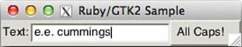
Figure 12.9 A simple GTK pushbutton example
In Listing 12.5, a SampleWindow class is defined; this is a cleaner approach because it allows the class to control its own look and behavior (rather than requiring the caller to configure the window). This main window is derived from Gtk::Window.
As with the “Today’s Date” example, a signal handler for destroy exits the GTK+ event loop when the main window is closed.
This class creates a single-line text entry field using the Gtk::Entry class and a Gtk::Button with the text label All Caps!. The signal handler for the button’s clicked event calls the signal handler. (The clicked event is generated after the user clicks and releases the button.)
The Gtk::Window class is a Gtk::Bin, so it can only contain a single child widget. To put our two child widgets in the window, we place those widgets in a box and add the box to the main window. As widgets are added to a Gtk::Box, they are positioned at the right edge of the box (by default). To stack multiple widgets, pass the symbol :vertical to get a vertically stacking box.
As with the earlier example, show_all is necessary to make the main window (and all its children) visible.
The signal handler of clicked is invoked whenever the button is clicked. It gets the current text out of the entry field, converts it to uppercase, and sets it back into the entry field.
The actual application code is below the SampleWindow class definition. It simply creates the main window and runs the GTK+ event loop.
12.3.4 Working with Text Fields
GTK+ provides the Gtk::Entry class for single-line input, as shown in the previous example. It also has a Gtk::TextView class, which is a powerful multiline editor that we will describe here.
Listing 12.6 creates a multiline edit box and inserts some text into it. As the contents change, the current length of the text is reflected in a label at the bottom of the window (see Figure 12.10).
Listing 12.6 A GTK Text Editor
require "gtk3"
class TextWindow < Gtk::Window
def initialize
super("Text Sample")
signal_connect("destroy") { Gtk.main_quit }
set_default_size(200, 50)
@text = Gtk::TextView.new
@text.wrap_mode = :word
@buffer = @text.buffer
@buffer.signal_connect("changed") {
@status.text = "Length: " + @buffer.char_count.to_s
}
@buffer.create_tag('notice',
'font' => "Times Bold Italic 18",
'foreground' => "red")
@status = Gtk::Label.new
scroller = Gtk::ScrolledWindow.new
scroller.set_policy(:automatic, :never)
scroller.add(@text)
box = Gtk::Box.new(:vertical)
box.add(scroller)
box.add(@status)
add(box)
iter = @buffer.start_iter
@buffer.insert(iter, "This is an editor")
iter.offset = 5
@buffer.insert(iter, "really ", "notice")
show_all
end
end
Gtk.init
TextWindow.new
Gtk.main
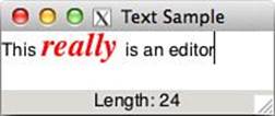
Figure 12.10 A small GTK text editor
The basic structure of the code is similar to the button example: Initialize Ruby/GTK2, define a window class with an event handler to terminate the app cleanly, and set the initial size of the main window. At the end of initialize, show_all is used to make the window visible. The last two lines actually create the window and run the GTK+ event loop.
We create an editor widget named @text. Word wrap is enabled here; the default is to wrap lines regardless of word breaks.
The variable @buffer is the text buffer of @text. We give it a signal handler for the changed event; any time text is inserted, deleted, or modified, this signal will fire, and the signal handler will be called. The signal handler uses char_count to determine the length of the current text in the text editor and creates a message string; that message is displayed by setting @status.text = text.
Next we want to configure the @text widget to display its text in a different style. Create a “notice” tag using create_tag. This tag has the font “Times Bold Italic 18” and a foreground color of red. In a similar way, you can define tags with various other properties usingGtk::TextTag.
In this case, we attempt to use a font from the Times family, which on a Windows platform is likely to bring up some variant of Times Roman. On a Linux/UNIX platform, the parameter would be a standard X Window System font string. The system will return whatever font is the closest match available.
The @status label is initially empty. We will change its text later.
GTK+ provides two ways to add scrollbars to an application. You can directly create Gtk::ScrollBar objects and use signals to synchronize them with the content widget(s). However, in most cases, it is simpler to use the Gtk::ScrolledWindow widget instead.
The Gtk::ScrolledWindow widget is a Gtk::Bin, meaning it can only contain a single child widget. Of course, that child widget could be a Gtk::Box or other container that allows multiple children. Several GTK+ widgets, including Gtk:: TextView, automatically interact with a Gtk::ScrolledWindow, requiring almost no additional code.
In this example, we create a Gtk::ScrolledWindow named scroller and configure it using set_policy. We choose never to display a horizontal scrollbar and to automatically display a vertical scrollbar only when the editor has more lines than can be seen at once. We add the text editor directly to scroller.
We now set up a Gtk::Box that will stack our widgets vertically. The scrolling window that contains the text field is added first, so it will appear at the top of the main window. The @status text will appear at the bottom. The box is then added to our main window.
The next four lines insert text into the text editor. The first line gets the Gtk::TextIter of the beginning of the text (offset = 0) and then inserts a string there. Because there was no text, zero is the only reasonable place to insert. We then insert some additional text at offset five. The result is a text editor containing the string This really is an editor.
Because we already configured the handler for the changed event, it will be triggered by our calls to insert. This means the status will already display correctly, even before the user makes any changes to the text.
12.3.5 Working with Other Widgets
Even a relatively simple GUI may need more than text fields and buttons. Often we find a need for radio buttons, check boxes, and similar widgets. This next example illustrates a few of these.
Listing 12.7 assumes that the user is making an airline reservation. The Gtk::TreeView, Gtk::ListStore, and Gtk::TreeViewColumn classes (representing a multicolumn list) are used for the destination city. A check box (actually called a Gtk::CheckButton) determines whether the ticket is round trip, and a set of radio buttons (class Gtk::RadioButton) is used for the seating. A Purchase button completes the interface (see Figure 12.11).
Listing 12.7 Airline Ticket Example
require "gtk3"
class TicketWindow < Gtk::Window
def initialize
super("Purchase Ticket")
signal_connect("destroy") { Gtk.main_quit }
dest_model = Gtk::ListStore.new(String, String)
dest_view = Gtk::TreeView.new(dest_model)
dest_column = Gtk::TreeViewColumn.new("Destination",
Gtk::CellRendererText.new,
:text => 0)
dest_view.append_column(dest_column)
country_column = Gtk::TreeViewColumn.new("Country",
Gtk::CellRendererText.new,
:text => 1)
dest_view.append_column(country_column)
dest_view.selection.set_mode(:single)
[["Cairo", "Egypt"], ["New York", "USA"],
["Tokyo", "Japan"]].each do |destination, country|
iter = dest_model.append
iter[0] = destination
iter[1] = country
end
dest_view.selection.signal_connect("changed") do
@city = dest_view.selection.selected[0]
end
@round_trip = Gtk::CheckButton.new("Round Trip")
purchase = Gtk::Button.new(label: "Purchase")
purchase.signal_connect("clicked") { cmd_purchase }
@result = Gtk::Label.new
@coach = Gtk::RadioButton.new("Coach class")
@business = Gtk::RadioButton.new(@coach, "Business class")
@first = Gtk::RadioButton.new(@coach, "First class")
flight_box = Gtk::Box.new(:vertical)
flight_box.add(dest_view).add(@round_trip)
seat_box = Gtk::Box.new(:vertical)
seat_box.add(@coach).add(@business).add(@first)
top_box = Gtk::Box.new(:horizontal)
top_box.add(flight_box).add(seat_box)
main_box = Gtk::Box.new(:vertical)
main_box.add(top_box).add(purchase).add(@result)
add(main_box)
show_all
end
def cmd_purchase
text = @city
if @first.active?
text += ": first class"
elsif @business.active?
text += ": business class"
elsif @coach.active?
text += ": coach"
end
text += ", round trip " if @round_trip.active?
@result.text = text
end
end
Gtk.init
TicketWindow.new
Gtk.main
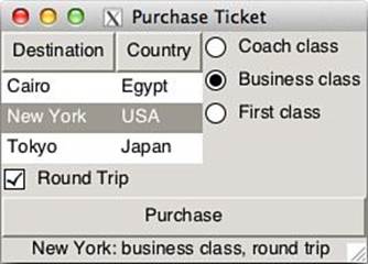
Figure 12.11 Various GTK widgets
This application creates a main window with a signal handler as before. Next, a multicolumn list box widget is created with two columns. This list box is designed around a Model-View-Controller (MVC) design; Gtk::ListStore (the model class) has two String columns.
Then Gtk::TreeView is created. Gtk::TreeViewColumn configures the column. The title of first column is “Destination” and the cell renderer is Gtk:: CellRendererText. The first column (column number zero) of the model (Gtk::ListStore) is used as the text property value. In this way, cell renderers are used to draw the data in the tree model. Several cell renderers come with GTK+ 2.x, including the Gtk::CellRendererText, Gtk::CellRendererPixbuf, and the Gtk:: CellRendererToggle. Then three rows of data are added to the list, and a signal handler is created for the "changed" event. This will be invoked whenever the user selects a different row. The handler will update the @city member variable to contain the text from the first column (column number zero) of the newly selected row.
A simple check box (Gtk::CheckButton) and pushbutton (Gtk::Button) are created. The signal handler for the pushbutton will execute the cmd_purchase method whenever the button is clicked. The label named @result is initially blank but later will be set to a string indicating what type of ticket was purchased.
Three radio buttons are created as a group, meaning that only one of them can be selected at a time. When the user clicks any of these radio buttons, any previously selected button will automatically be deselected. The first parameter to the radio button constructor is the previous radio button within the same group. Therefore, the first radio button doesn’t have the group as an argument, and the rest of the buttons pass the first radio button.
The widgets need to be arranged in a way that will make sense to the user, so a combination of Gtk::Boxes is used. The list box will appear above the check box. The three radio buttons will appear in a vertical stack to the right of the list box. Finally, the purchase pushbutton will appear below all the other widgets.
The cmd_purchase method is straightforward: It builds a string that reflects all the current widget states when the Purchase button is clicked. Radio buttons and check boxes have a method named active? that returns true if the button is selected. The text is then placed in the@result label so it will appear on the screen.
Most applications use menus as a key part of their user interface. This next example demonstrates how to set up menus using Ruby/GTK3. It also shows how easy it is to add tooltips, a nice touch for any program.
Listing 12.8 creates a main window that has a File menu, along with two other dummy items on the menu bar. The File menu contains an Exit item that exits the application. Both the File and Exit items have tooltips.
Listing 12.8 GTK Menu Example
require "gtk3"
class MenuWindow < Gtk::Window
def initialize
super("Ruby/GTK2 Menu Sample")
signal_connect("destroy") { Gtk.main_quit }
file_exit_item = Gtk::MenuItem.new("_Exit")
file_exit_item.signal_connect("activate") { Gtk.main_quit }
file_menu = Gtk::Menu.new
file_menu.add(file_exit_item)
file_menu_item = Gtk::MenuItem.new("_File")
file_menu_item.submenu = file_menu
menubar = Gtk::MenuBar.new
menubar.append(file_menu_item)
menubar.append(Gtk::MenuItem.new("_Nothing"))
menubar.append(Gtk::MenuItem.new("_Useless"))
file_exit_item.set_tooltip_text "Exit the app"
box = Gtk::Box.new(:vertical)
box.pack_start(menubar, expand: false, fill: false, padding: 0)
box.add(Gtk::Label.new("Try the menu and tooltips!"))
add(box)
set_default_size(400, 100)
show_all
end
end
Gtk.init
MenuWindow.new
Gtk.main
Again, the basic structure is like the other examples. In this case, we create a Gtk::MenuItem named Exit and create a signal handler so it will actually exit the program. The signal is activate, and it will be generated when a user actually invokes this item on the menu.
The File menu is created, and the Exit item is added to it. This is all that is required to create a pop-up menu. Next, the File menu item is created—this is what will actually appear on the menu bar. We call submenu= to connect the File menu item with the File menu itself.
We create the Gtk::MenuBar and add its three items: File, Nothing, and Useless. Only the first item is actually functional—the other two are just for show.
Tooltips are fully integrated into all widgets, including menu items. To create a tooltip, call set_tooltip_tip, passing the tooltip text.
A Gtk::Box is used to place the menu bar at the top of the main window, above any other widgets. In this case, instead of using add to place the menu bar in the box, we use pack_start to gain more control over the exact look and placement of the widget.
The first parameter to pack_start is the widget we are placing. The expand option is a Boolean indicating whether this widget should take up all the available space. Note that it won’t make the widget actually grow; instead, it will typically center the widget. In this case, we want the menu bar at the top of the screen, so we pass false.
The fill option is a Boolean for whether this widget should grow to fill all the available space. Because we just want a small menu bar, we pass false for this as well. The padding option is used to create additional space all around the widget. We don’t want any, so we pass zero.
A text label will be in the main window. Finally, we force the initial size of the window to be 400 pixels wide by 100 pixels tall.
12.3.6 Other Notes
Ruby/GTK3 is a part of the Ruby-GNOME2 project. GNOME is a higher-level package that depends on GTK+, and Ruby-GNOME2 has bindings for all GNOME libraries.
The gtk3 gem includes these libraries:
• Ruby/GLib—GLib is the low-level core library that forms the lowest-level infrastructure. It provides data structure handling for C, portability wrappers, Unicode support, and interfaces for such runtime functionality as an event loop, threads, dynamic loading, and an object system. Ruby/GLib is a wrapper for the GLib library. Because Ruby already has good string and list classes, some GLib functions are not implemented. On the other hand, it does provide some important functions to convert C and Ruby objects. This library is required from all other Ruby/GTK libraries.
• Ruby/GIO—This library provides an API for interacting with volumes, drives, files, streams, icons, and DNS.
• Ruby/ATK—This provides a set of interfaces for accessibility. By supporting the ATK interfaces, an application or toolkit can be used with such tools as screen readers, magnifiers, and alternative input devices.
• Ruby/Pango—A library for layout and rendering of text, with an emphasis on internationalization using UTF-8. It forms the core of text and font handling for GTK+ (2.0).
• Ruby/GdkPixbuf—An image loading and manipulation library. It supports numerous image formats such as JPEG, PNG, GIF, and others.
• Ruby/GDK—An intermediate layer that isolates GTK+ from the details of the windowing system.
• Ruby/GTK—This comprises the main GUI widgets.
Along with the core libraries, the Ruby-GNOME2 project provides additional libraries, including additional widgets, configuration, structured graphics, audio, video, OpenGL 3D rendering, HTML, XML, PDF, SVG, and terminal emulation.
The official Ruby-GNOME2 home page is at http://ruby-gnome2.sourceforge.jp/. You can find released files, the install guide, API references, tutorials, and sample code. The official GNOME home page is www.gnome.org, and the GTK+ home page is www.gtk.org.
12.4 QtRuby
Qt is a GUI toolkit created and distributed by Trolltech. The main focus of Qt is to be a multiplatform toolkit that provides the same programmatic interface for the Windows, Mac, and UNIX operating systems. Developers need only write the code once; it compiles on each of the three platforms without modification.
Qt is distributed via dual license—either the GPL or a purchased commercial license for proprietary work. This dual license scenario is also used by other companies such as MySQL. It allows the toolkit to be used by open source projects that may benefit from many of the offered features. It also allows Trolltech a revenue stream from the sale of commercial licenses for customers who may want to use a less restrictive license than the GPL.
12.4.1 Overview
The Qt bindings for Ruby are the result of the work of many people, most notably Arno Rehn and Richard Dale. They are distributed as a gem named qtbindings, which provides not only a large set of GUI-related classes but also a whole suite of application add-ons that are often needed by programmers (such as XML and SQL libraries). The entire Qt toolkit is supported.
A key aspect of Qt, and thus QtRuby, is the concept of signals and slots. Signals are asynchronous events that occur when something spontaneous happens, such as a mouse button press or a user entering some text into a field. A slot is simply a reacting method that will be called when a certain signal happens. We take advantage of them by using the connect method to associate signals with slots.
To take advantage of signals and slots, as well as many other QtRuby features, all of our classes use the Qt::Object class. Furthermore, any GUI classes we may create will inherit from the base class Qt::Widget, which itself inherits from Qt::Object.
12.4.2 A Simple Windowed Application
A QtRuby program must first do a require of the Qt library. QtRuby provides its functionality through the Qt module (meaning that Qt classes are prefixed with Qt::). Because all Qt classes start with the letter Q, this Q is dropped during the conversion from Qt to QtRuby. So, for example, the Qt-based QWidget class becomes Qt::Widget in QtRuby.
require 'Qt'
app = Qt::Application.new(ARGV)
str = Time.now.strftime("Today is %B %d, %Y")
label = Qt::Label.new(str)
label.show
app.exec
Let’s look at the preceding code in detail. The initial call to Qt::Application.new is performed to start up a Qt-based application; it initializes the window system and gets it ready for us to create the widgets we will be using.
Then we create a Qt::Label, which is a simple way of presenting text to the user. In this case, the text is initialized to the string created in the previous line. The next line tells the label to display itself on the screen.
Finally, the application event loop is started with a call to app.exec. This method does not return until the application is told to terminate, generally by the user clicking the close button on the window.
12.4.3 Working with Buttons
Creating a pushbutton with QtRuby is as easy as creating a new instance of Qt::PushButton (see Listing 12.9 and Figure 12.12). Most likely, we will want to perform some event when the button is clicked. This is handled via QtRuby’s signal and slots.
Listing 12.9 Buttons in Qt
require 'Qt'
class MyWidget < Qt::Widget
slots 'buttonClickedSlot()'
def initialize(parent = nil)
super(parent)
setWindowTitle("QtRuby example");
@lineedit = Qt::LineEdit.new(self)
@button = Qt::PushButton.new("All Caps!",self)
connect(@button, SIGNAL('clicked()'),
self, SLOT('buttonClickedSlot()'))
box = Qt::HBoxLayout.new
box.addWidget(Qt::Label.new("Text:"))
box.addWidget(@lineedit)
box.addWidget(@button)
setLayout(box)
end
def buttonClickedSlot
@lineedit.setText(@lineedit.text.upcase)
end
end
app = Qt::Application.new(ARGV)
widget = MyWidget.new
widget.show
app.exec
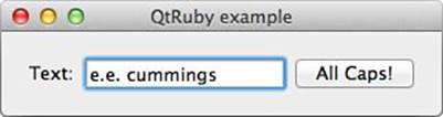
Figure 12.12 Buttons in Qt
In this example, we create our own widget class named MyWidget; this inherits from the generic Qt::Widget class that we use for all custom widget classes.
Before the initializer, we establish a list of the slots we will be defining in this class. Slots are ordinary Ruby class methods, but we must specify them by name so that the QtRuby runtime is aware that we want to be able to use them as slots. The call to the class method slots takes a list of strings, as shown here:
slots 'slot1()', 'slot2()'
The initializer for this class takes an argument named parent; almost all widget classes in the Qt world take such an argument. The parent argument simply specifies a widget that will take ownership of the widget being created. Passing nil as the parent means that it is a “top-level widget” and that no other widget owns it. The “ownership” concept probably makes more sense in the C++ world; parents take ownership of their child widgets, so that when parents are destroyed or removed, their children are removed as well.
The class creates a Qt::LineEdit to allow a user to enter text and a Qt::PushButton with the text All Caps! on it. Note that we pass self as the parent argument to each of these widgets. This means that when a MyWidget instance is created, it “adopts” these widgets.
Next, we use a key part of the Qt toolkit—the capability to connect signals and slots together. The Qt::Pushbutton class defines a clicked signal that is emitted whenever the button is clicked. We can connect that to a slot, which in this case is the ordinary methodbuttonClickedSlot. The name of the slot we connect to is not important; we sometimes use the suffix Slot for emphasis.
Finally, we create an instance of the Qt::HBoxLayout class. This class provides a nice way to have an automatically resizing layout by simply adding widgets to it. It handles the rest for us.
12.4.4 Working with Text Fields
As shown in Listing 12.9, QtRuby provides the Qt::LineEdit class for simple single-line input. The Qt::TextEdit class is for multiline editing.
In Listing 12.10, we see a multiline edit box. As the contents change, the current length of the text is reflected in a label at the bottom of the window, as shown in Figure 12.13.
Listing 12.10 A Simple Qt Editor
require 'Qt'
class MyTextWindow < Qt::Widget
slots 'theTextChanged()'
def initialize(parent = nil)
super(parent)
@textedit = Qt::TextEdit.new(self)
@textedit.setWordWrapMode(Qt::TextOption::WordWrap)
@textedit.setFont( Qt::Font.new("Times", 24) )
@status = Qt::Label.new(self)
box = Qt::VBoxLayout.new
box.addWidget(@textedit)
box.addWidget(@status)
setLayout(box)
@textedit.insertPlainText("This really is an editor")
connect(@textedit, SIGNAL('textChanged()'),
self, SLOT('theTextChanged()'))
end
def theTextChanged
text = "Length: " + @textedit.toPlainText.length.to_s
@status.setText(text)
end
end
app = Qt::Application.new(ARGV)
widget = MyTextWindow.new
widget.setWindowTitle("QtRuby Text Editor")
widget.show
app.exec
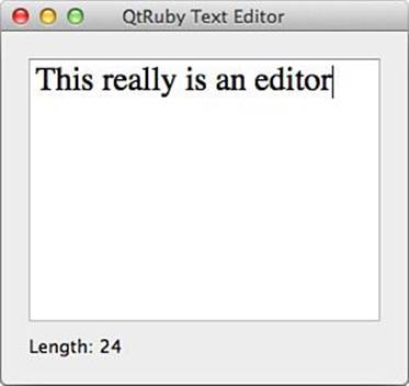
Figure 12.13 A simple Qt editor
We create our own custom widget, much like the earlier button example. In this case, we create an instance of Qt::TextEdit and a Qt::Label used for status updates.
The first interesting thing of note is that we set the font of the @textedit to an instance of a 24-point Times font. Each class inheriting from Qt:Widget (including Qt::TextEdit) has a font property that we can both retrieve and set.
Next, we create a vertical box layout (Qt::VBoxLayout) that holds the child widgets, inserts some text into the @textedit widget, and then performs the connection of the editor widget’s textChanged signal to our custom theTextChanged slot.
Within the slot theTextChanged, we grab the text from the editor and query its length. Then we update the @status label to reflect this length.
Note that all the signal and slot action happens asynchronously. After the application enters into the event loop (app.exec), the GUI event loop takes over. This is why signals and slots are so important. We define the actions that can happen (signals) and the actions we want to take when they do (slots).
12.4.5 Working with Other Widgets
Qt provides many more GUI widgets for general consumption, such as radio buttons, check boxes, and other display widgets. Listing 12.11 shows some more of these, and Figure 12.14 provides a screenshot.
Listing 12.11 Other Qt Widgets
require 'Qt'
class MyWindow < Qt::Widget
slots 'somethingClicked(QAbstractButton *)'
def initialize(parent = nil)
super(parent)
groupbox = Qt::GroupBox.new("Some Radio Button",self)
radio1 = Qt::RadioButton.new("Radio Button 1", groupbox)
radio2 = Qt::RadioButton.new("Radio Button 2", groupbox)
check1 = Qt::CheckBox.new("Check Box 1", groupbox)
vbox = Qt::VBoxLayout.new
vbox.addWidget(radio1)
vbox.addWidget(radio2)
vbox.addWidget(check1)
groupbox.setLayout(vbox)
bg = Qt::ButtonGroup.new(self)
bg.addButton(radio1)
bg.addButton(radio2)
bg.addButton(check1)
connect(bg, SIGNAL('buttonClicked(QAbstractButton *)'),
self, SLOT('somethingClicked(QAbstractButton *)') )
@label = Qt::Label.new(self)
vbox = Qt::VBoxLayout.new
vbox.addWidget(groupbox)
vbox.addWidget(@label)
setLayout(vbox)
end
def somethingClicked(who)
@label.setText("You clicked on a " + who.className)
end
end
app = Qt::Application.new(ARGV)
widget = MyWindow.new
widget.show
app.exec
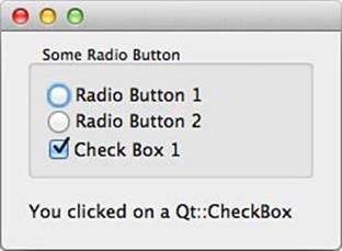
Figure 12.14 Other Qt widgets
In this new class, we first create a Qt::GroupBox, which is a box with a frame and an optional title that can hold other widgets. We then create two Qt::RadioButtons and a Qt::CheckBox, setting the group box as their parent.
Next, we create a Qt::VBoxLayout that holds the radio buttons and check box. Then we set that layout on the group box.
The next important thing is to create a Qt::ButtonGroup and add our check box and radio buttons to it. A Qt::ButtonGroup is a logical grouping of buttons, check boxes, and radio buttons. It has no impact on the visual layout of these widgets; instead, it allows us to group them together logically to provide things such as exclusion (unclicking certain widgets when certain others are clicked). In this case, we use the button group as a source of the buttonClicked signal, which is emitted when one of the buttons in that group becomes clicked.
The emission of this signal is a bit different from what we’ve previously seen, because this signal also emits an argument. In this case, it emits the object that was clicked. Note the C++ style syntax, namely in the use of the QAbstractButton * argument. Remember that Qt is a C++ toolkit, so some use of the C++ notation for certain parameter types is currently unavoidable (though it perhaps may be fixed in future versions).
The final result of the connect statement is that any time a button is clicked, that button is passed into the somethingClicked slot. Finally, we create a Qt::Label and a Qt::VBoxLayout and bring the whole thing together.
In the somethingClicked slot definition, we modify the text of the label every time a button is clicked. In this case, we display the class name of the object that caused the signal to be emitted and the slot to be invoked.
When using built-in widgets is not enough, Qt provides a powerful painting system for creation of your own custom widgets. Listing 12.12 shows a small example to highlight some of those features.
Listing 12.12 A Custom TimerClock Widget
require 'Qt'
class TimerClock < Qt::Widget
def initialize(parent = nil)
super(parent)
@timer = Qt::Timer.new(self)
connect(@timer, SIGNAL('timeout()'), self, SLOT('update()'))
@timer.start(25)
setWindowTitle('Stop Watch')
resize(200, 200)
end
def paintEvent(e)
fastHand = Qt::Polygon.new([Qt::Point.new(7, 8),
Qt::Point.new(-7, 8),
Qt::Point.new(0, -80)])
secondHand = Qt::Polygon.new([Qt::Point.new(7, 8),
Qt::Point.new(-7, 8),
Qt::Point.new(0, -65)])
secondColor = Qt::Color.new(100, 0, 100)
fastColor = Qt::Color.new(0, 150, 150, 150)
side = [width, height].min
time = Qt::Time.currentTime
painter = Qt::Painter.new(self)
painter.renderHint = Qt::Painter::Antialiasing
painter.translate(width() / 2, height() / 2)
painter.scale(side / 200.0, side / 200.0)
painter.pen = Qt::NoPen
painter.brush = Qt::Brush.new(secondColor)
painter.save
painter.rotate(6.0 * time.second)
painter.drawConvexPolygon(secondHand)
painter.restore
painter.pen = secondColor
(0...12).each do |i|
painter.drawLine(88, 0, 96, 0)
painter.rotate(30.0)
end
painter.pen = Qt::NoPen
painter.brush = Qt::Brush.new(fastColor)
painter.save
painter.rotate(36.0 * (time.msec / 100.0) )
painter.drawConvexPolygon(fastHand)
painter.restore
painter.pen = fastColor
(0...60).each do |j|
if (j % 5) != 0
painter.drawLine(92, 0, 96, 0)
end
painter.rotate(6.0)
end
painter.end
end
end
app = Qt::Application.new(ARGV)
wid = TimerClock.new
wid.show
app.exec
In this example, we again create a custom widget, this time called TimerClock. In its initializer, we create an instance of Qt::Timer, which we can set up to emit a signal periodically. In this case, we connect its timeout signal to the update slot of the TimerClock. Theupdate slot is built in; it causes the widget to repaint itself.
The timer is started through a call to the start method. Its argument specifies that it is to time out every 25 milliseconds (and emit a timeout signal). This means that the widget’s update slot will also get executed every 25 milliseconds.
Next, we create the paintEvent method. This method is an override of the method provided by Qt::Widget. When a widget wants to repaint itself (as this one will every time the Qt::Timer expires), this method gets called. Overriding this method allows us to customize how the widget draws itself on the screen. Within this method, the code is responsible for handling the primitive drawing routines for the widget.
From here, it’s all about geometry. We create some Qt::Polygons that represent the hands on the clock we are about to draw. Note that the orientation of the polygons doesn’t matter because we will be able to manipulate them later.
We set up a few properties we will want to use. We define two Qt::Colors for the two hands that will be on the timer. The arguments to the Qt::Color initializer are “RGB” values followed by an optional alpha transparency value.
Because the timer we’re drawing is laid out in a square, it is possible that the window could be rectangular, making our widget an odd shape. We use the side variable to store whichever is smaller between the width and the height of the widget as it will be drawn on the screen. We also grab the current time using Qt::Time.currentTime.
Next, we create a Qt::Painter and use it to begin executing drawing routines.
We set up antialiasing during drawing to make edges look smooth. We also move the painter’s starting coordinate to the middle of the drawing area by the call to painter.translate(width/2, height/2). The painter is also rescaled to a 200:200 frame of reference. This means that all our drawing commands can rely on the fact that the drawing will be 200:200 units. If it gets resized bigger or smaller, the scaling automatically adjusts for us.
From here, we perform a series of drawing operations. In some places where there are transformations such as rotations, they are enveloped inside a call to painter.save and painter.restore. The save operation stores the current painter properties on a stack so that they can easily be restored.
The code draws the two hands after rotating them to the proper angle to represent the time. Also we tell the painter to draw some tick marks at certain intervals along the outer edge of the clock face.
Finally, we tell the painter we’ve finished (with a call to painter.end). We tie up our final loose ends with the four lines of code that create the Qt::Application and our timer clock widget and then start the event loop. Figure 12.15 shows the final result.
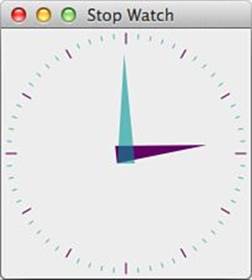
Figure 12.15 The TimerClock widget
12.4.6 Other Notes
Because Qt is a C++ toolkit, some idioms are used in the toolkit that are necessary due to constraints in the language. Sometimes the translation to Ruby isn’t 100% natural because the Ruby way of doing the same thing may be slightly different. So, in some places, there are overrides that let you do some things in QtRuby in a Rubyish way.
For example, the camel-case naming of Qt methods can also be written as underscored names. The following two are equivalent:
Qt::Widget::minimumSizeHint
Qt::Widget::minimum_size_hint
All Qt setters begin with the word set, such as Qt::Widget:: setMinimumSize. This can be overridden in Ruby by dropping the set and using assignment. This means the following three statements are equivalent:
widget.setMinimumSize(50)
widget.minimumSize = 50 # same
widget.minimum_size = 50 # same
Similarly, some Boolean methods in Qt begin with is or has, such as Qt::Widget:: isVisible. Again, QtRuby gives us a more Rubyish way of calling this method:
a.isVisible
a.visible? # same
12.5 Swing
In the Java world, Swing is the GUI of choice. Through the magic of JRuby, it is possible to use Swing directly from Ruby. It is mature and stable, and runs well anywhere Java runs.
A full discussion of Swing is far beyond the scope of this chapter or this book, but the examples here should give you a taste of how it works.
This example will display a single, simple window:
include Java
import javax.swing.JFrame
class SimpleWindow < JFrame
def initialize
super "Just another window..."
init_gui
end
def init_gui
set_size 400, 300
self.default_close_operation = JFrame::EXIT_ON_CLOSE
self.location_relative_to = nil
self.visible = true
end
end
SimpleWindow.new
We start by including the Java module and doing an import (which in JRuby, of course, is a method call). Our SimpleWindow class inherits from JFrame; we initialize it by calling the parent’s initializing method and then calling our custom code (here init_gui) to create the window according to the parameters we want.
Java programmers are used to names such as setSize and setDefaultClose Operation, and these still work fine. But in order to be more Rubylike, we also allow underscore-separated lowercase names as synonyms (set_size and set_default_close_operation). In most cases, a method named, for example, setWhatever(value) can be written as set_whatever(value) but also as self.whatever = value. In the third case, note the use of self to distinguish from a local variable.
Here is a slightly more interesting example involving buttons:
include Java
import javax.swing.JFrame
import javax.swing.JButton
import javax.swing.JPanel
class ButtonWindow < JFrame
def initialize
super "Button example..."
init_gui
end
def init_gui
win = self
panel = JPanel.new
self.content_pane.add panel
panel.layout = nil
eat = JButton.new "Eat Me"
eat.set_bounds 50, 60, 80, 30
eat.add_action_listener {|event| win.set_size 600, 400 }
drink = JButton.new "Drink Me"
drink.set_bounds 50, 90, 80, 30
drink.add_action_listener {|event| win.set_size 200, 150 }
panel.add eat
panel.add drink
self.default_close_operation = JFrame::EXIT_ON_CLOSE
set_size 300, 200
self.location_relative_to = nil
self.visible = true
end
end
ButtonWindow.new
Note that we now use a JPanel as a container to hold two JButton objects. Each button has a code block associated with it, and this block will be executed when the button is clicked. Other than that, this is much the same as the previous example.
Countless books and tutorials (both online and print) cover Swing. We suggest you look at any of these for more information.
12.6 Other GUI Toolkits
As already mentioned, your favorite GUI may not be covered here. We’ll use the remaining space in this chapter to mention some other alternatives.
12.6.1 UNIX and X11
The X Window System is colloquially (though not correctly) referred to as X Windows. It is perhaps not the grandfather of all GUI systems, but it is certainly the ancestor of many of them.
UNIX users of all breeds have long been familiar with X (as users, even if not as developers). The advantages of X are that it is widely known, portable, and has a rich feature set. The disadvantages are that it is complex and difficult to use.
Not surprisingly, there are libraries for using X with Ruby. They aren’t documented here because of their complexity.
We refer you instead to the Ruby Application Archive, where you can find Xlib by Kazuhiro Yoshida (also known as moriq) and Ruby/X11 by Mathieu Bouchard (also known as matju). Either can be used to create X client applications.
12.6.2 FXRuby (FOX)
FOX (Free Objects for X) isn’t as widespread as Tk or GTK+, but was once popular among Ruby programmers. Part of the reason for this was the excellent Ruby binding called FXRuby, the work of Lyle Johnson. Since he left the project in 2010, this library is not maintained as actively as it used to be, but it should still work. Lyle’s excellent book FXRuby: Create Lean and Mean GUIs with Ruby is still available.
12.6.3 RubyMotion for iOS and Mac OS X
RubyMotion allows Ruby programs to directly use the native GUI of iOS and Mac OS X. It is effectively a Ruby runtime written in Objective-C, the native language of iOS and Mac OS X. It also includes a compiler and toolchain for packaging and shipping Ruby applications as machine code binaries for iOS and Mac OS X. The creator of RubyMotion, Laurent Sansonetti, previously created the defunct MacRuby project, a Ruby interpreter written in (and tightly integrated with) Objective-C.
As of this writing, a RubyMotion toolchain and compiler for Android has been announced, but not yet released. Also note that RubyMotion is a commercial tool, sold for $199.
12.6.4 The Windows Win32API
In Ruby, it is possible to access the entire Windows API directly via the WIN32API library. We show one example of this in Chapter 14, “Scripting and System Administration.” This (at least theoretically) allows a Ruby program to create and manipulate native Windows applications and widgets. I don’t necessarily recommend the practice, but you should be aware of the possibility.
12.7 Conclusion
This chapter provided a good overview of the GUI toolkits available for Ruby. We’ve looked at general concepts such as event loops, messages and signals, and more. We’ve looked at widgets of various kinds, including pushbuttons, check boxes, radio buttons, text fields, and more.
We’ve looked at the implementations of these concepts in Tk, GTK, Qt, and Shoes. We’ve also seen some of the special terminology and minor changes in paradigm from one toolkit to another and looked at some of the special features and benefits that each toolkit offers.
Now let’s move on to a different topic entirely. Chapter 13, “Threads and Concurrency,” will discuss how to manipulate threads in Ruby.