k-Nearest Neighbors - Data Science from Scratch: First Principles with Python (2015)
Data Science from Scratch: First Principles with Python (2015)
Chapter 12.k-Nearest Neighbors
If you want to annoy your neighbors, tell the truth about them.
Pietro Aretino
Imagine that you’re trying to predict how I’mgoing to vote in the next presidential election. If you know nothing else about me (and if you have the data), one sensible approach is to look at how myneighborsare planning to vote. Living in downtown Seattle, as I do, my neighbors are invariably planning to vote for the Democratic candidate, which suggests that “Democratic candidate” is a good guess for me as well.
Now imagine you know more about me than just geography — perhaps you know my age, my income, how many kids I have, and so on. To the extent my behavior is influenced (or characterized) by those things, looking just at my neighbors who are close to me among all those dimensions seems likely to be an even better predictor than looking at all my neighbors. This is the idea behindnearest neighbors classification.
The Model
Nearest neighbors is one of the simplest predictive models there is.It makes no mathematical assumptions, and it doesn’t require any sort of heavy machinery. The only thingsit requires are:
§ Some notion of distance
§ An assumption that points that are close to one another are similar
Most of the techniques we’ll look at in this book look at the data set as a whole in order to learn patterns in the data. Nearest neighbors, on the other hand, quite consciously neglects a lot of information, since the prediction for each new point depends only on the handful of points closest to it.
What’s more, nearest neighbors is probably not going to help you understand the drivers of whatever phenomenon you’re looking at. Predicting my votes based on my neighbors’ votes doesn’t tell you much about what causes me to vote the way I do, whereas some alternative model that predicted my vote based on (say) my income and marital status very well might.
In the general situation, we have some data points and we have a corresponding set of labels. The labels could beTrueandFalse, indicating whether each input satisfies some condition like “is spam?” or “is poisonous?” or “would be enjoyable to watch?” Or they could be categories, like movie ratings (G, PG, PG-13, R, NC-17). Or they could be the names of presidential candidates. Or they could be favorite programming languages.
In our case, the data points will be vectors, which means that we can use thedistancefunctionfromChapter 4.
Let’s say we’ve picked a numberklike 3 or 5. Then when we want to classify some new data point, we find theknearest labeled points and let them vote on the new output.
To do this, we’ll need a function that counts votes. One possibility is:
defraw_majority_vote(labels):
votes=Counter(labels)
winner,_=votes.most_common(1)[0]
returnwinner
But this doesn’t do anything intelligent with ties. For example, imagine we’re rating movies and the five nearest movies are rated G, G, PG, PG, and R. Then G has two votes and PG also has two votes. In that case, we have several options:
§ Pick one of the winners at random.
§ Weight the votes by distance and pick the weighted winner.
§ Reducekuntil we find a unique winner.
We’ll implement the third:
defmajority_vote(labels):
"""assumes that labels are ordered from nearest to farthest"""
vote_counts=Counter(labels)
winner,winner_count=vote_counts.most_common(1)[0]
num_winners=len([count
forcountinvote_counts.values()
ifcount==winner_count])
ifnum_winners==1:
returnwinner# unique winner, so return it
else:
returnmajority_vote(labels[:-1])# try again without the farthest
This approach is sure to work eventually, since in the worst case we go all the way down to just one label, at which point that one label wins.
With this function it’s easy to create a classifier:
defknn_classify(k,labeled_points,new_point):
"""each labeled point should be a pair (point, label)"""
# order the labeled points from nearest to farthest
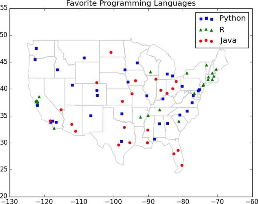
The resultsof the first DataSciencester user survey are back, and we’ve found the preferred programming languages of our users in a number of large cities:
# each entry is ([longitude, latitude], favorite_language)
cities=[([-122.3,47.53],"Python"),# Seattle
([-96.85,32.85],"Java"),# Austin
([-89.33,43.13],"R"),# Madison
# ... and so on
]
The VP of Community Engagement wants to know if we can use these results to predict the favorite programming languages for places that weren’t part of our survey.
As usual, a good first step is plotting the data (Figure 12-1):
# key is language, value is pair (longitudes, latitudes)
plot_state_borders(plt)# pretend we have a function that does this
plt.legend(loc=0)# let matplotlib choose the location
plt.axis([-130,-60,20,55])# set the axes
plt.title("Favorite Programming Languages")
plt.show()
Figure 12-1.Favorite programming languages
NOTE
You may have noticed the call toplot_state_borders(), a function that we haven’t actually defined. There’s an implementation on the book’sGitHub page, but it’s a good exercise to try to do it yourself:
1. Search the Web for something likestate boundaries latitude longitude.
2. Convert whatever data you can find into a list of segments [(long1, lat1), (long2, lat2)].
3. Useplt.plot()to draw the segments.
Since it looks like nearby places tend to like the same language,k-nearest neighbors seems like a reasonable choice for a predictive model.
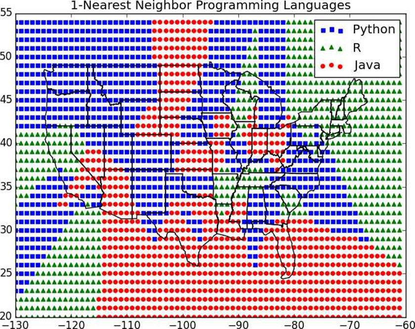
To start with, let’s look at what happens if we try to predict each city’s preferred language using its neighbors other than itself:
printk,"neighbor[s]:",num_correct,"correct out of",len(cities)
It looks like 3-nearest neighbors performs the best, giving the correct result about 59% of the time:
1 neighbor[s]: 40 correct out of 75
3 neighbor[s]: 44 correct out of 75
5 neighbor[s]: 41 correct out of 75
7 neighbor[s]: 35 correct out of 75
Now we can look at what regions would get classified to which languages under each nearest neighbors scheme. We can do that by classifying an entire grid worth of points, and then plotting them as we did the cities:
For instance,Figure 12-2shows what happens when we look at just the nearest neighbor (k= 1).
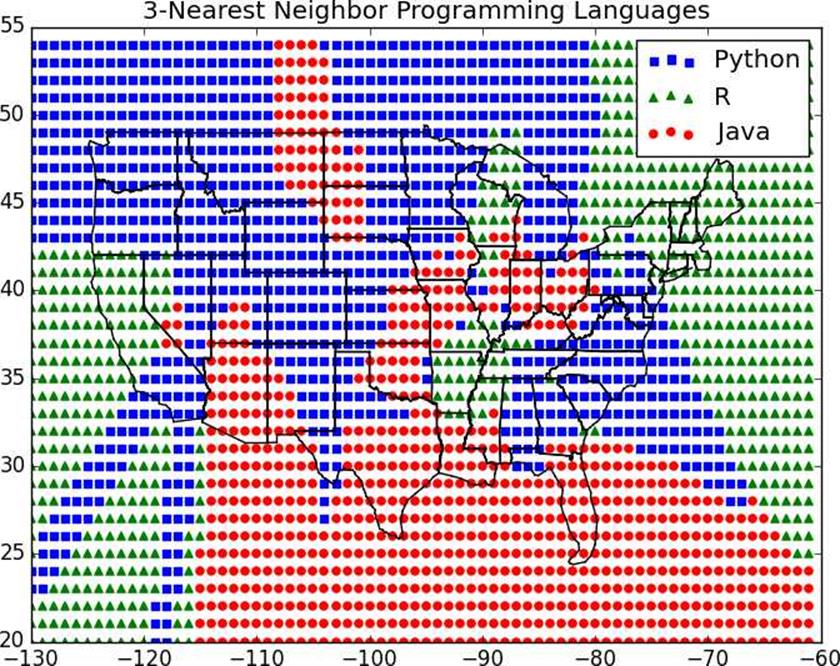
We see lots of abrupt changes from one language to another with sharp boundaries. As we increase the number of neighbors to three, we see smoother regions for each language (Figure 12-3).
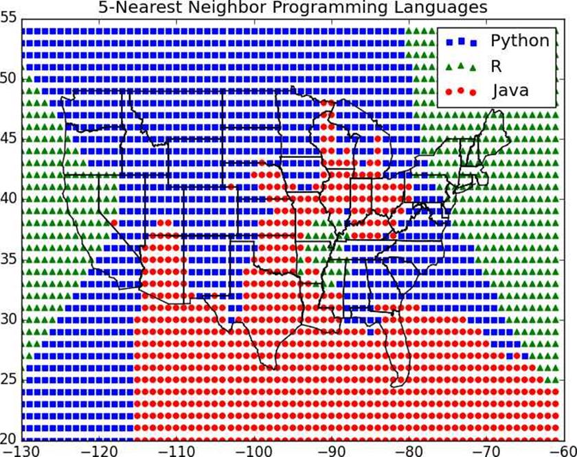
And as we increase the neighbors to five, the boundaries get smoother still (Figure 12-4).
Here our dimensions are roughly comparable, but if they weren’t you might want to rescale the data as we did in“Rescaling”.
Figure 12-2.1-Nearest neighbor programming languages
The Curse of Dimensionality
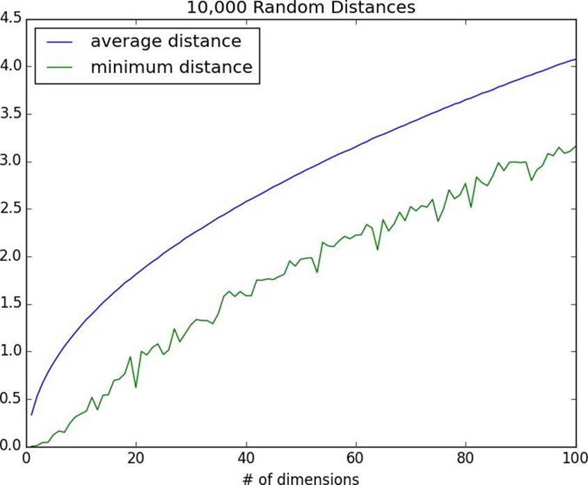
k-nearest neighbors runs into trouble in higherdimensions thanks to the “curse of dimensionality,” which boils down to the fact that high-dimensional spaces arevast. Points in high-dimensional spaces tend not to be close to one another at all. One way to see this is by randomly generating pairs of points in the d-dimensional “unit cube” in a variety of dimensions, and calculating the distances between them.
Figure 12-3.3-Nearest neighbor programming languages
Generating random points should be second nature by now:
defrandom_point(dim):
return[random.random()for_inrange(dim)]
as is writing a function to generate the distances:
Figure 12-4.5-Nearest neighbor programming languages
For every dimension from 1 to 100, we’ll compute 10,000 distances and use those to compute the average distance between points and the minimum distance between points in each dimension (Figure 12-5):
dimensions=range(1,101)
avg_distances=[]
min_distances=[]
random.seed(0)
fordimindimensions:
distances=random_distances(dim,10000)# 10,000 random pairs
avg_distances.append(mean(distances))# track the average
min_distances.append(min(distances))# track the minimum
Figure 12-5.The curse of dimensionality
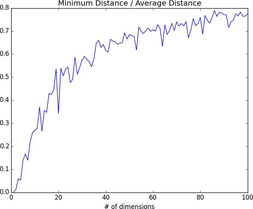
As the number of dimensions increases, the average distance between points increases. But what’s more problematic is the ratio between the closest distance and the average distance (Figure 12-6):
In low-dimensional data sets, the closest points tend to be much closer than average. But two points are close only if they’re close in every dimension, and every extra dimension — even if just noise — is another opportunity for each point to be further away from every other point. When you have a lot of dimensions, it’s likely that the closest points aren’t much closer than average, which means that two points being close doesn’t mean very much (unless there’s a lot of structure in your data that makes it behave as if it were much lower-dimensional).
A different way of thinking about the problem involves the sparsity of higher-dimensional spaces.
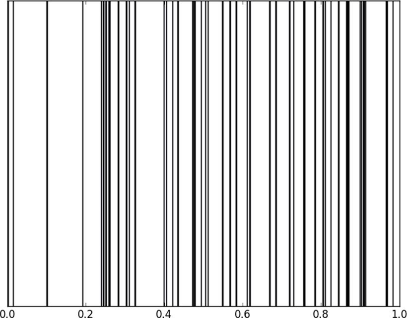
If you pick 50 random numbers between 0 and 1, you’ll probably get a pretty good sample of the unit interval (Figure 12-7).
Figure 12-7.Fifty random points in one dimension
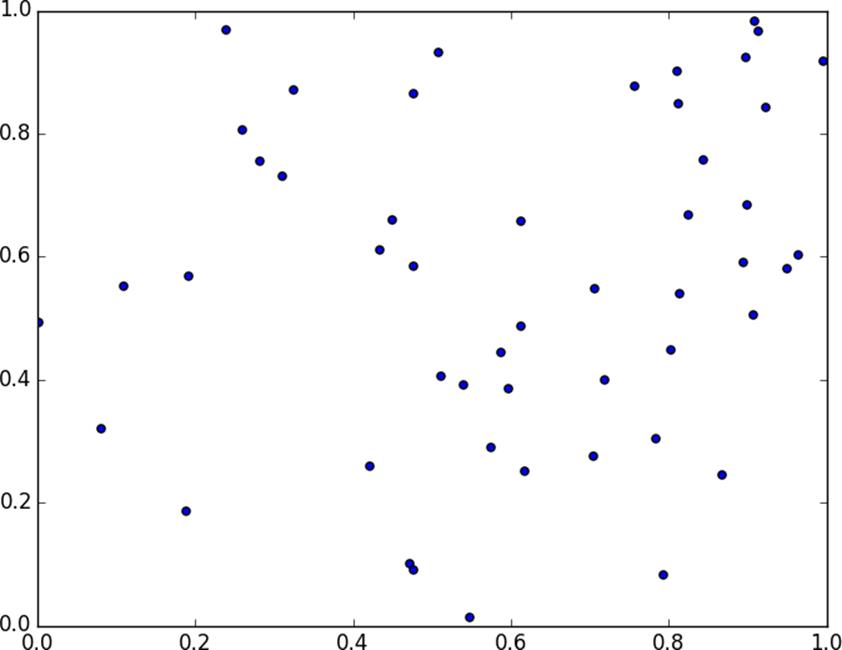
If you pick 50 random points in the unit square, you’ll get less coverage (Figure 12-8).
Figure 12-8.Fifty random points in two dimensions
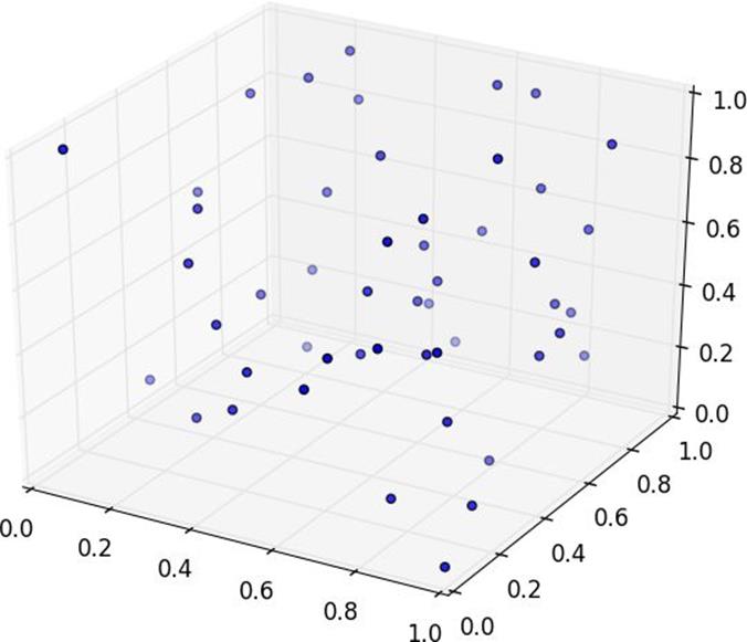
And in three dimensions less still (Figure 12-9).
matplotlibdoesn’t graph four dimensions well, so that’s as far as we’ll go, but you can see already that there are starting to be large empty spaces with no points near them. In more dimensions — unless you get exponentially more data — those large empty spaces represent regions far from all the points you want to use in your predictions.
So if you’re trying to use nearest neighbors in higher dimensions, it’s probably a good idea to do some kind of dimensionality reduction first.
Figure 12-9.Fifty random points in three dimensions