Autodesk Smoke Essentials: Autodesk Official Press (2014)
Chapter 11. Color Correction
Smoke has two levels of color correction that you can apply. Using the Colour Correct or tool in the timeline FX Ribbon, you can quickly apply primary and secondary color adjustments to clips right in the timeline using two different modes: the Colour Corrector or the Colour Warper. When applied to gap effects, these adjustments can be applied to individual clips or to entire scenes; when combined with custom masks drawn using timeline wipe effects, you can create sophisticated color corrections as you continue the process of finishing your program.
Topics in this chapter include the following:
· Finishing log-encoded media
· Adding a color correction
· Setting up your environment
· Navigating a sequence while grading
· Using the Colour Corrector
· Shot matching using the Colour Warper
· Colour Warper primary adjustments
· Copying color corrections
· Colour Warper secondary adjustments
· Applying color corrections as gap effects
· Limiting a color correction using a wipe
Importing the Hallway Scene
In this chapter, you’ll explore the process of using the Autodesk® Smoke® timeline effects for doing color correction to adjust the color and contrast of clips in a program as you continue finishing it prior to final delivery.
This chapter assumes some familiarity with color-correction terminology and procedures from other applications, and it uses a new sequence.
1. Choose the Hallway Scene library in the Media Library; then open the Conform tab, click the Conform Task pop-up menu (with the gear icon), and choose Load New EDL from the context menu. The File Browser panel appears.
2. Use the Bookmarks pop-up menu to navigate to the directory bookmarked in Chapter 2 that contains your downloaded book media, open the Scene EDLs directory, select the Hallway Scene.edl file, and click the Load button.
3. Click the Set Search Location button to open the Set Directory browser, and use the Local Devices list at the left to navigate to your media, double-clicking each volume and directory until you select the folder containing the tutorial media. Click the Set button at the bottom right of this window.
4. Open the Match Criteria pop-up menu, and choose Source Timecode to turn this option on.
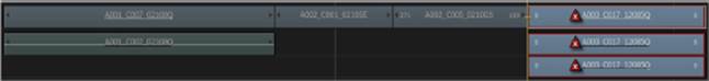
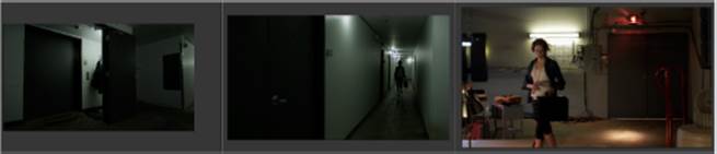
5. Click the pop-up arrow at the right of the Link Selected button, and choose Link Matched Sources from the pop-up menu. Every clip in the imported EDL should now be linked to the downloaded project media, except for the last clip on the timeline (see Figure 11.1), which still can’t be found even though the matching clip is in fact part of your downloads.
FIGURE 11.1 The last clip doesn’t relink automatically because of an inconsistency in the media.
6. Open the Match Criteria pop-up menu, and turn off Source Timecode. The clips should now display an exclamation point icon, indicating that there’s a conflicting match that you need to resolve. Command+click all three clips, and you should be able to see the matching media appear in the Potential Matches bin of the Conform Media bin. Right-click one of the selected clips, and choose Link To A003_C017_12085Q. The icon doesn’t update until you deselect these clips, but now you can see that the clip is matched. However, the clip is not synced correctly.
7. Open the Timeline panel; then move the positioner to the in point of the last clip, turn Link on, choose the Slip tool, and slip the clip so that the first frame of the clip is a few frames after the door starts opening in order to match the action of the previous clip in the timeline. Play through the edit, and slip the last clip as necessary for a smooth match-on-action cut.
As you can see, you never know when something is going to go wrong through a combination of media with differing characteristics. Fortunately, you can force a relink and do simple re-edits as necessary to resolve these types of problems. Now, using this sequence as your starting point, you’ll learn how to use the color-correction features in Smoke to continue the process of finishing a program.
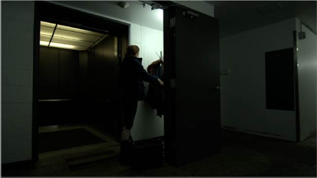
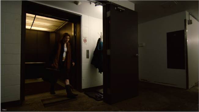
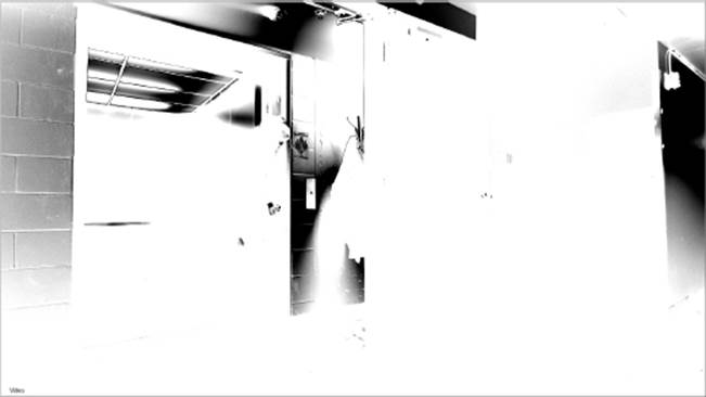
The scene you’ll be working on in this chapter is a simple four-clip transition scene that takes the protagonist from one location to another, and it is designed to show off more of the environment in which the character of the physicist works. If you set the viewer to Log and play through the clip, you’ll see that an elevator takes her through a subterranean basement with dismal lighting. While conceptually this is what the director was going for, the practical lighting shown in Figure 11.2 is a little too dismal for the final project.
FIGURE 11.2 The original, ungraded look of the basement hallway scene
You’ll begin by using timeline effects to apply color corrections to your clips to balance them for a more pleasing look.
Finishing Log-Encoded Media
Since the clips in this scene are log encoded, you have to make a decision about how you’re going to output your project before you begin adjusting the color. If the goal is to output to film, then you may need to deliver log-encoded files. In this case, you’d apply color-correction effects the same way you’ve been applying other effects — monitoring using either the Log mode of the viewer or by applying an appropriate 3D LUT (such as a film print emulation Look Up Table, or LUT) using the viewing settings found in the Options pop-up menu with a LUT selected from the LUT tab of the Preferences, and applying your corrections relative to the viewer’s automatic adjustment. Since the viewer setting doesn’t get rendered into the final output, this means that you can adjust your image relative to the way it will look after film printing while keeping the image data properly log encoded.
If you’re outputting a broadcast video master for Rec.709 playback, however, you’ll need to normalize the signal at the same time as you’re grading it so that your output looks right for general viewing. This can be done in one of several ways. In post-production, normalizing a log-encoded image refers to the process of changing it from its original low-contrast unprocessed state into a final image that’s suitable for viewing.
Using Each Clip’s Pre-Processing Options
If you regularly work with Rec.709-encoded media, you can skip this entire section. However, an increasing number of digital cinema cameras allow for log-encoded capture in order to provide maximum image detail and latitude for grading, so this is valuable information.
One convenient way of normalizing log-encoded clips to give yourself a good starting point for a grade is to use the RGB LUT options found inside of each clip’s Pre-Processing options.
1. Set the viewer to Video mode, and select the first clip in the timeline (the woman leaving the elevator). Then double-click the Pre-Processing button to enter its editor.
2. Click the RGB LUT button, and turn on the Active button to its right to enable a LUT for that clip.
3. Choose Log To Lin to use the same color transformation with which you’ve been monitoring up until now, or Choose 3D LUT and then click the Import button to choose from the numerous LUTs that come with Smoke. For now, choose Log To Lin.
This transformation takes the low-contrast, low-saturation clip and turns it into what you’ve been looking at using the viewer settings — a more pleasing image that uses the full available range of the video signal. These settings permanently affect the image, however, and so you have reason to be concerned that the shadows are currently really dark and the highlights are being clipped. In other words, detail in the highlights is being discarded where it’s brighter than the maximum image value that’s allowed.
Clipping is a particular problem because image data that’s lost here won’t be retrievable in later operations, so you’ll need to readjust the default settings of the Log To Lin parameters if you want to preserve these parts of the signal.
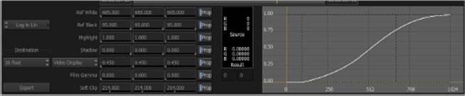
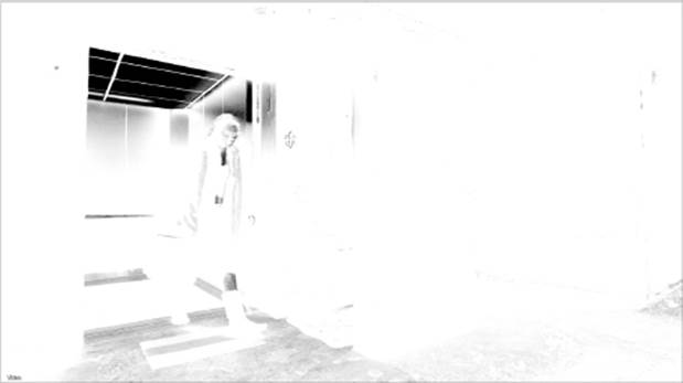
4. Drag one of the Soft Clip parameters to the right until the image detail and color in the highlights of the wall outside the elevator return (around 214.000). As you make this adjustment, the curve to the right, as shown in Figure 11.3, shows you how your adjustment is affecting the image, as a soft roll-off at the top end that’s designed to compress your highlights rather than pushing them outside the boundaries of what’s allowable in the signal. Don’t worry if this looks a bit dim; you’ll be readjusting the image later to look the way you want it to.
FIGURE 11.3 Customizing the Log To Lin settings you’re adjusting to normalize the image before grading
5. Now drag one of the Film Gamma sliders to the right to lighten the shadows a bit (a value of 1.000 is good). You don’t want to overlighten the image, just keep the shadows from being too inky.
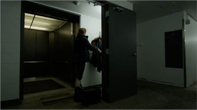
When you’re finished, you still have an image with higher contrast and saturation that you can use as a good starting point for the rest of your grade, but as you can see in Figure 11.4, you’re preserving more highlight and shadow detail for use in subsequent operations via the custom settings you’re applying.
FIGURE 11.4 A normalized image with lower contrast that will be a good starting point for grading
6. Click the EXIT button to return to the timeline. Then drag the Pre-Processing effect from the ribbon, and drop it onto each of the next three video clips in the timeline to copy it.
7. Click the plus button underneath the vertical scrollbar at the right of the timeline three times to make the track tall enough to see the RZ (resize) effect that’s applied to each clip (see Figure 11.5); this is a function of the 16-bit floating-point promotion that each of these clips has gotten as a result of the LUT you added. If you changed the LUT settings in the Pre-Processing editor back to 10-bit, these RZ effects would disappear, but working in 16-bit float is convenient for grading, so it’s fine to leave things as they are.
FIGURE 11.5 The resize effect being automatically applied to each clip to which you copied the updated Pre-Processing LUT

Adjusting Each Clip Manually
Normalizing log-encoded clips using the Pre-Processing option of each clip is convenient but not necessary. You can also choose, if you know what you’re doing, to normalize log-encoded clips as part of the grade you’re applying using the curve options found in the Colour Corrector and Colour Warper effects. The basic idea is to use a multipoint curve that expands the contrast using an s-shaped curve that’s tailored to your particular imagery.
Applying a LUT Using CFX
You can also follow the very same procedure as normalizing, using the Pre-Processing options with CFX, by adding a LUT Editor node. The advantage of this method, especially if you’re creating more complicated grades entirely within the ConnectFX environment, is that you can apply the normalizing operation either before or after your corrective adjustments. Adding a LUT after your grading adjustments makes it possible to retrieve image detail that the LUT might clip out; adding a grading adjustment after a LUT makes it possible to operate on the post-clipped image as a whole in the event that you want to clip out image detail to omit from your grade.
Adding a Color Correction and Setting Up Your Environment
Another advantage of using the LUT Editor node in ConnectFX is that you can apply ConnectFX to a gap effect (covered later in this chapter) so that you can apply a single LUT correction to an entire range of clips on the timeline and change the LUT applied to every clip with one setting.
With the initial state of each clip set by the Pre-Processing effects that you adjusted previously, it’s time to start creating some more detailed color adjustments using the color effect on the timeline.
1. Move the playhead to a frame of the first clip where the woman is just leaving the elevator; then press Command+Shift+A to deselect every other clip on the timeline, and click the FX ![]() Colour Correct button to add that effect.
Colour Correct button to add that effect.
2. Now double-click the Colour Correct button in the ribbon, click the Editor button, or double-click the CC box on the clip in the timeline to open up the Colour Editor.
By default, the Colour Editor opens up into Overlay mode (see Figure 11.6), where the various controls and parameters appear laid on top of the actual image. In this mode, whenever you adjust a control, all of the other controls turn invisible for the duration of the adjustment, allowing you to see the entire image unhindered.
FIGURE 11.6 Color-correction controls in Overlay mode
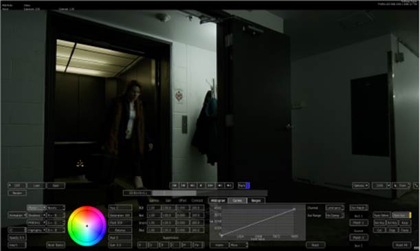
3. Click the Full Screen button at the right of the viewer controls, as shown in Figure 11.7.
FIGURE 11.7 The Full Screen button

The overlay disappears, and the color controls appear in a more conventionally laid out editor. The image is smaller but unobscured by graphical controls. More important, there’s now room to the left and right of the image for the next step.
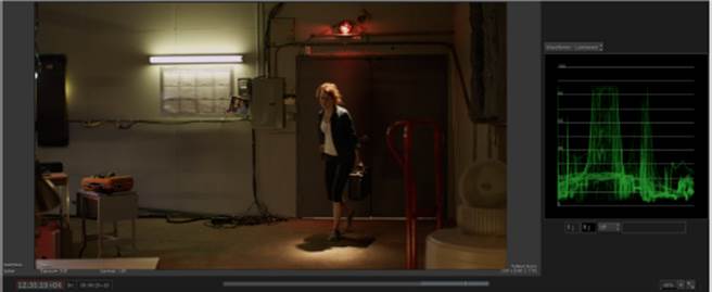
4. Click the Options pop-up menu, and choose Show Vectorscope. A videoscope appears to the right of the image, which is set initially to display a vectorscope using the Smoke-style Colour 2D analysis, as shown in the first image in Figure 11.8. Colored dots appear that show the distribution of hue (as each point’s angle around the scale) and saturation (via each point’s distance from the center) appearing in the image, against a standard vectorscope graticule indicating the neutral desaturated center point of the graph, and boxes indicating the absolute angle of each primary and secondary hue (red/magenta/blue/cyan/green/yellow).
FIGURE 11.8 The Smoke vectorscope set to Colour 2D, compared to Waveforms set to Luminance
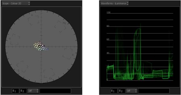
There are two other vectorscope modes you can display: a Monochrome vectorscope that shows a more conventional trace graph of the color analysis and a Colour 3D vectorscope that shows the overall distribution of color and contrast within a three-dimensional RGB cube. The cube represents a space in which all color values fit via three coordinates: R, G, and B values are used to arrange the analyzed points of color similarly to X, Y, and Z coordinates.
You can zoom into or out of any videoscope graph by Shift+dragging within the scope area. You can pan around by Shift+Command+dragging.
5. Click the Scope pop-up menu above the scope view, and choose Waveforms ![]() Luminance to display a waveform analysis of luminance, which shows you the distribution of light and dark tones throughout the image on a scale of 0 (absolute black) to 100 (absolute white), as shown in the second image in Figure 11.8.
Luminance to display a waveform analysis of luminance, which shows you the distribution of light and dark tones throughout the image on a scale of 0 (absolute black) to 100 (absolute white), as shown in the second image in Figure 11.8.
Using a Broadcast Monitor to Grade
For the majority of editing and compositing work presented in this book, it’s not strictly necessary to work with an external broadcast display, although it helps to see what things will really look like to the final viewer. However, when doing color correction, having a display that matches the reference standard for broadcast viewing is essential. With an AJA or Blackmagic I/O interface connected and the appropriate drivers installed, you can use the Broadcast Monitor tab of the Preferences to enable monitor output, sending the active viewport pane to the connected I/O interface for routing to professional videoscopes and broadcast displays.
Navigating a Sequence while Grading
Before getting started with grading this scene, it’s a good idea to do a bit of preparation so that you can work most efficiently.
1. Click the EXIT button to return to the timeline.
2. Drag the CC box from the first clip onto each of the other clips in track V1.1 to copy it.
3. Double-click the CC box on the first clip to reenter the Colour Editor.
Now that you’ve added a Colour Correct effect to each of the clips in the timeline, you can use a pair of keyboard shortcuts to move from clip to clip without needing to leave the Colour Editor.
4. Press Command+up arrow to move to the next clip with a Colour Correct effect applied to it, and notice how the shaded area of the timebar changes to show you which region of the timeline you’re in (see Figure 11.9). Press Command+down arrow to move to the previous clip in the timeline with a Colour Correct effect.
FIGURE 11.9 A shaded region of the timeline shows the position of the current clip you’re color correcting.
When you’re in the Colour Editor, the width of the timeline represents the entire sequence, not just the current clip as with other editors. This means that you can use the Go To Previous and Go To Next buttons to jump the positioner from clip to clip for viewing and comparison.
However, to move to another clip in order to adjust its color, that clip needs to have a Colour Correct effect applied to it, and you need to use the Command+up arrow and Command+down arrow keyboard shortcuts to go to the next or previous clip.
Using the Colour Corrector
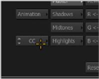
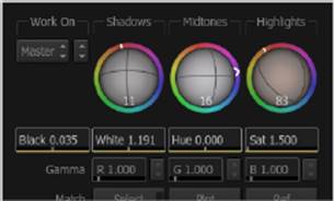
The Colour Correct timeline effect you applied actually has two modes: the Colour Corrector and the Colour Warper. You choose which of these modes to use via the Colour pop-up menu at the left of the Colour Editor (see Figure 11.10).
FIGURE 11.10 The Colour pop-up menu lets you choose which set of color tools to use.
The Colour Corrector provides a basic set of color-correction tools that’s virtually identical to the Colour Corrector node you used in Chapter 9 to match the fake wall to the shot of the actor. It’s a good tool to use when you need to make only a few simple adjustments to get the result you need.
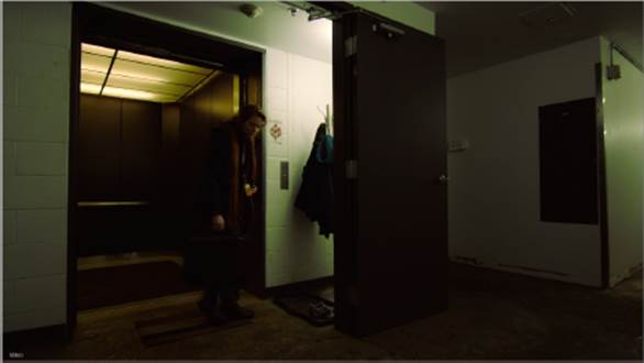
1. Press Command+down arrow until you reach the beginning of the last clip, the one where the woman walks through the door into the lab. Play or scrub through the clip until the woman is inside the room. When making color adjustments, it’s often helpful to see how your adjustment will affect the skin tone of any people in the scene. You’re still displaying the Waveforms – Luminance scope, so you’re seeing an analysis of the overall range of lightness in the image, from the darkest shadow through the lightest highlight, as shown in Figure 11.11.
FIGURE 11.11 The last clip in the sequence with a waveform analysis of its luma component
2. It can be difficult to see some of the lighter traces of the Waveforms graph, so open the Scope Display pop-up menu, choose Vectorscope Settings, and set the Intensity preference to 100 percent.
Now it’s easy to see that this image isn’t occupying the maximum possible tonal range, and you may elect to adjust image contrast as a result. To do so, you can use the RGB Gamma, Gain, and Offset controls or the Contrast and Pivot controls, but there’s another control provided by the Colour Corrector that is also useful.
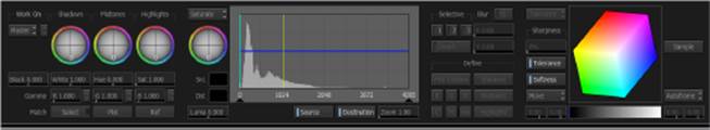
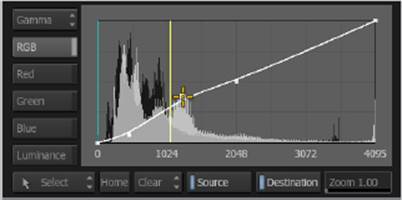
3. Turn off the Auto Key button if it happens to be turned on, and then click the Histogram tab and drag the Min In and Max In triangular slider controls (the ones just underneath the Histogram graph) so that they hug the leftmost and rightmost pixels of Histogram detail, as shown in Figure 11.12.
FIGURE 11.12 Adjusting image contrast using the Histogram control
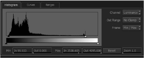
At the same time, you can see the Waveform analysis change. An accurate adjustment will place the very bottom of the waveform at 0 and the top of the waveform at 100, expanding image contrast to occupy the full available range of the video signal so that the highlights are as bright as they can possibly be and the shadows are as dark as they can possibly be. You don’t always want to maximize contrast, but it makes sense for this image since there are clipped light fixtures directly in view to define maximum white, and the low-key lighting scheme implies that the shadows should be quite dark, so a 0 percent black point makes sense.
For some mysterious reason, the Auto Key button likes to turn itself on when you’re making color adjustments, but most of the time you don’t actually want to animate your color corrections, so make sure this is turned off as you work.
4. Next, open the Scope Display pop-up menu above the videoscope in the viewport, and choose Vectorscope ![]() Colour 2D to display the vectorscope’s analysis of the chroma component of the image, as shown in Figure 11.13.
Colour 2D to display the vectorscope’s analysis of the chroma component of the image, as shown in Figure 11.13.
FIGURE 11.13 A vectorscope analysis of the range of hues and saturation in the image
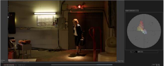
5. Open the Scope Display pop-up menu above the videoscope in the viewport, and choose Vectorscope Settings. Then click the Level button to change it to Bars 75% and click Close. When grading for broadcast, a good rule of thumb is that average hues shouldn’t extend past the 75 percent color targets as seen in the vectorscope. Using the default 100 percent color target positions in the vectorscope may encourage you to be too permissive with oversaturated values.
Notice that the distribution of colored dots mirrors the colors found in the scene with the vectorscope set to Colour 2D. The Colour 2D representation isn’t necessarily as precise an analysis of hue and saturation distributions as the more traditional monochrome view, but it’s a lot easier to read, and the outer boundaries of saturation, which you need to keep track of for quality control purposes, are accurate.
Here are some things that you can learn to spot within the vectorscope graph:
· There are lots of saturated reds and oranges extending far from the center of the Vectorscope due to the spinning police light on the wall, her red hair, and her skin tone.
· There’s a bit of not very saturated blue in the frame, close to the center point of the graph, coming from her blue shirt.
· There’s an unexpected amount of fairly saturated greenish yellow appearing throughout the scene.
The yellow/green tinge comes from the fluorescent practical lighting being used in the scene and also from bounce light coming from the huge greenscreen that happens to be behind the camera. While the lab should look industrial, this is a bit much and should be corrected.
6. Click the Ranges tab in the color controls to reveal the Shadows/Midtones/Highlights range control curves, as shown in Figure 11.14. These curves control what parts of the tonal range of the image each set of color balance and contrast controls influences. For example, you can see that the S (Shadow) curve has the greatest effect at 0 percent black, but its influence falls off through the midtones, leaving the lightest part of the image untouched. The H (Highlights) curve does the exact opposite, while the gray Midtones curve affects the middle tones of the image the most, falling off equally toward the shadows and highlights.
FIGURE 11.14 The Ranges curves that let you see how the Shadows, Midtones, and Highlights controls affect the image and customize these ranges if necessary
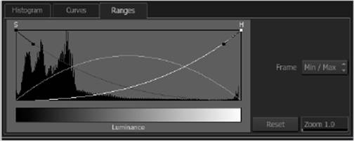
You could choose to readjust these curves to change how the Shadows, Midtones, and Highlights controls work, but for now it’s enough to get an idea of which regions of image lightness each of the color-balance control ranges will affect so that you can most effectively neutralize the color you don’t want. In this case, knowing that the yellow/green in the image is coming from greenscreen spill, a quick glance at the picture confirms that most of the unwanted color falls not in the highlights but in the dim highlights and bright shadows of the image, so the Midtones controls should take care of this.
7. Click the Midtones button, and then drag within the color-balance control (the color wheel) toward the complementary, or opposite, color of the one you’re trying to eliminate. You want to get rid of the yellow, so drag just a bit from the center toward blue. It’s a sensitive control; wherever you click within the color wheel is where the balance control will jump, so it’s easy to add a massive tint to the image when you want to add only a subtle corrective adjustment. Thus, you should keep the control you’re dragging toward the center of the color-balance control for the subtlest results, as shown in Figure 11.15. As you make this adjustment, you should see the vectorscope graph realign closer to the neutral center of the scope where all neutral blacks, grays, and whites in the image appear. Once you’ve found a reasonable correction, you can use the Hue and Gain parameter sliders to fine-tune this adjustment to find the most neutral correction possible.
FIGURE 11.15 Adjusting the Midtones color-balance control to neutralize the yellow spill in the image
8. At this point, the image looks a lot better, but there’s some coloration in the highlights that looks a bit odd because of the greenish cast coming from the fluorescent lights. To fix this, click the Highlights button and drag the color-balance control just a little bit toward a blue/magenta mix to make the white just a little bit whiter, as shown in Figure 11.16. Notice that while there’s only one color-balance control, multiple handles appear when you adjust different zones of image tonality at once.
FIGURE 11.16 Making an adjustment to the highlights
If at any point you don’t like your color-balance adjustment and want to start over, you can click the Balance button to reset just the color adjustment for the selected tonal range.
9. Now the image looks fairly natural, but the colors throughout the image appear lackluster. To remedy this, click the Midtones button again and drag the Saturation parameter slider to the right, to about 140, to increase the intensity of colors falling within the midtones region of tonality to give some pop back to the woman’s red hair and the red lighting in the shot, but not so much as to send the reds in the vectorscope beyond the boundary of the R target. This also puts a bit of coloration back into the light. That’s okay because you don’t want to drain all the interesting variation out of the lighting completely — you just don’t want things to look ugly.
The very last adjustment is to take advantage of the fact that all of the color-adjustment parameters are applied relative to the currently selected Master/Shadows/Midtones/Highlights tonal range. All of the adjustments in this exercise have improved the image, but the lighter shadows falling on the wall of the lab are looking a bit washed out relative to the “mad scientist” vibe that this project is going for.
If at any point you find that you want to reset an individual parameter value without resetting everything else, you can right-click a parameter and choose Reset Channel (Current Value) from the context menu.
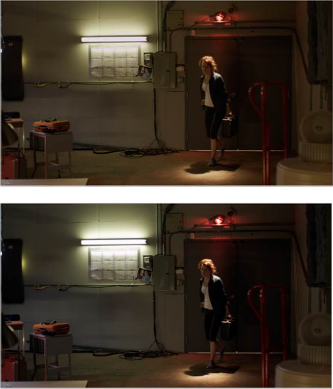
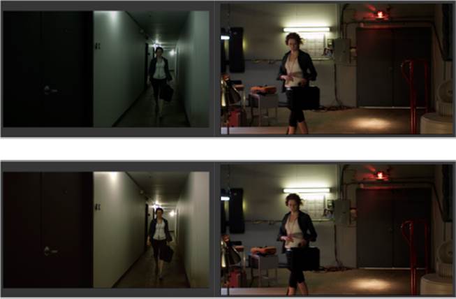
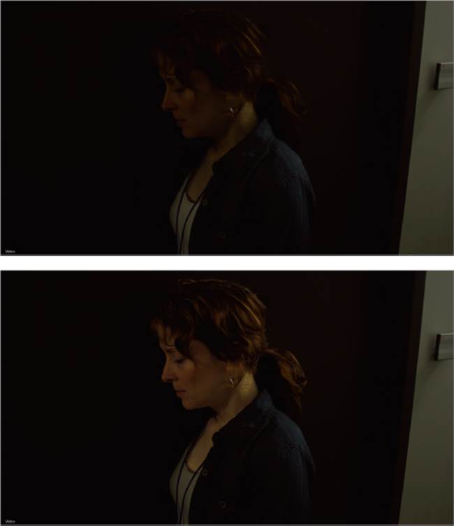
10. Choose Waveforms ![]() Luminance from the Scope Display pop-up so that you can see how the next adjustment affects image luma. Then, with Midtones selected, drag the RGB Gamma parameter slider to the left, to approximately 0.87, to lower the lightness of the very middle of the midtones while smoothly stretching the shadows and highlights as necessary for a smooth result. The result makes the image a bit moodier without slamming the darkest shadows or diminishing the highlights that you’ve created with other adjustments. In Figure 11.17, you can see before and after views of these adjustments.
Luminance from the Scope Display pop-up so that you can see how the next adjustment affects image luma. Then, with Midtones selected, drag the RGB Gamma parameter slider to the left, to approximately 0.87, to lower the lightness of the very middle of the midtones while smoothly stretching the shadows and highlights as necessary for a smooth result. The result makes the image a bit moodier without slamming the darkest shadows or diminishing the highlights that you’ve created with other adjustments. In Figure 11.17, you can see before and after views of these adjustments.
FIGURE 11.17 Before top and after bottom the Colour Correct adjustments made in this exercise
Shot Matching Using the Colour Warper
In this next exercise, you’ll start working with the Colour Warper, which is the second mode of the Colour Correct timeline effect. While the Colour Corrector is a very capable color-correction tool, the Colour Warper provides some additional capabilities, including automatic color matching and secondary color adjustment using the Diamond Keyer.
1. Press Command+up arrow twice to move to the wide-angle shot of the woman walking through the hallway toward the camera.
To set whether the default color correction that’s applied is the Colour Corrector or the Colour Warper, choose from the Timeline Colour Correct pop-up menu in the Timeline FX/CFX tab of the Preferences.
2. Click the Colour pop-up menu to switch to Color Warper (CW) mode. The UI updates to show the Colour Warper controls, as shown in Figure 11.18.
FIGURE 11.18 Controls in the Colour Warper
3. You want to match the look of the hallway to approximate that of the lab, so choose Triptych Player from the View Mode pop-up menu (or press Option+3) to view a 3-Up display in the viewport. By default, this display shows the first frame of the sequence at the left, the first frame of the current clip in the middle, and the last frame of the sequence at the right, as shown in Figure 11.19. However, you can change this arrangement using the Display pop-up menu. In this case, though, there’s no need to do so because you want to work on matching the current clip to the last clip in the sequence, so you’re all set.
FIGURE 11.19 The Triptych display used for shot matching
When switching between the Colour Correction and Colour Warper modes of the Colour effect, each mode’s settings are preserved, so you can always switch to the other mode’s settings. However, you can only apply one mode to your clip at a time.
4. For your first adjustment, drag the positioner in the middle pane to a point where the woman walks into the light, and notice that the overall image is fairly desaturated. Increase saturation to about 1.5. This exaggerates the color cast being created by the lighting fixtures in the hallway.
To match the general lighting scheme in the hallway to that of the lab set, you’ll use the Match controls.
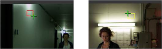
5. Click the Select button, and you’ll be prompted to “Select an area to be modified.” Do this by dragging a bounding box to sample the outer ring of the lighting fixture on the wall. Then click the Select button again, and when prompted to “Select an area to match to,” drag a bounding box to sample an analogous outer falloff section of a lighting fixture in the last clip. The fluorescent fixture on the wall is ideal, as shown in Figure 11.20. When you sample the second image, the Highlights color balance and white point of the clip you’re adjusting are automatically modified to create a match.
FIGURE 11.20 Sampling a highlight in the image you want to adjust (a) and then sampling an analogous highlight in the image to which you want to match the image (b)
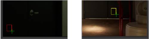
6. Now follow the same procedure to match the lower part of the door at the left of the frame in the current clip to the part of the same door where the red hand truck meets the floor of the lab clip to which you’re trying to match, as shown in Figure 11.21. This time, the black point and Shadows control will be automatically adjusted to create a relatively close match. As you can see, the lightness of the area you sample determines which of the Shadows/Midtones/Highlights controls will be used to make the adjustment.
FIGURE 11.21 Sampling a shadow on the door in the image you’re adjusting (a) and then sampling an analogous shadow in the same door within the image to which you’re matching it (b)
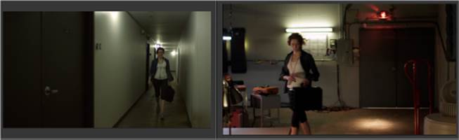
At this point, you’ve made the hallway clip look quite a bit closer to the lab (see Figure 11.22).
FIGURE 11.22 The hallway clip after automatic matching to the lab clip
Colour Warper Primary Adjustments
Now it’s time to finish the match by making a few manual adjustments. Ironically, the automatic matching controls have done such a good job that now the same color cast that you needed to eliminate from the lab shot has reappeared, to a lesser extent, in the hallway shot. Fortunately, this is an easy fix.
1. Drag the Midtones color-balance control toward blue/magenta (see Figure 11.23) until the greenish/yellow cast diminishes.
FIGURE 11.23 Manually getting the green out of the midtones
2. If you look at the histogram at the middle of the control area, you’ll see that all of the automatic adjustments are making the black point of the destination image that’s been adjusted (in white) lighter than the original source image (in black), which was deliberately lit to have a moody silhouette of the physicist as she walks up the hallway. Choose Gamma from the Trackball Option pop-up menu to display the curve controls.
3. Choose Add Points from the Edit Mode pop-up menu (Shift+A), and then click twice to place control points on the bottom half of the curve, dividing it into thirds, as shown in Figure 11.24. Next, choose Select (Shift+M), and adjust the control points you just added to darken the shadows and lighten the midtones just a little.
FIGURE 11.24 Adding control points and then adjusting them to darken the shadows and lighten the midtones
4. This last adjustment to increase RGB contrast raised the saturation, which exaggerated some of the remaining blue/green in the shadows, so make one last adjustment to the Midtones color balance to push the lighting a bit more toward yellow, until there’s a plausible match between the hallway and the lab. Keep in mind that these are two separate environments with differences in lighting that are obvious to the audience. Thus it’s not necessary that they match exactly; they just need to be in the same ballpark so that it’s not jarring as she moves from one location to the next, which can be seen in Figure 11.25.
FIGURE 11.25 Adding control points and then adjusting them to darken the shadows and lighten the midtones
Copying Color Corrections
Now that you’ve matched the hallway shot to the lab, you need to apply the same correction to the other hallway clips.
1. Click the EXIT button to return to the timeline.
2. Move the positioner to the first clip, and then drag the CC box from the second clip onto the first (see Figure 11.26), and you’ll see the copied correction as soon as you drop it.
FIGURE 11.26 Copying a color-correction effect from the second clip to the first by dragging the effect box in the timeline
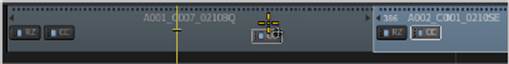
3. Drag the CC box from the second clip onto the third as well. If you play through the entire sequence, you’ll see that now the entire scene is balanced.
Colour Warper Secondary Adjustments
Now that the scene is balanced, it’s time to do some more detailed work to hone the look of this piece. This next exercise will show you how to create secondary corrections to specifically colored areas of the image using the Colour Warper. In Smoke, secondary corrections are also calledselectives.
1. Move the positioner to the first clip, and double-click its CC box to enter the Colour Editor.
This clip is brighter than the other hallway clips, so while it still matches the general color tone in the other clips, it’s a bit exaggerated here (see Figure 11.27), especially because the elevator lighting was yellow and dingy to begin with. You can fix this with a secondary correction.
FIGURE 11.27 The first hallway shot has too much yellow in the elevator.
2. Choose Sel 1 (selective 1) from the Work On pop-up menu that’s to the left of the Shadows control. The image becomes grayscale in preparation for you to sample a range of colors to isolate.
3. Click Pick Custom, and then use the sample cursor to click and drag a single diagonal sample from one edge of the overhead light to the other. They become saturated to show that they’ve been isolated.
4. Choose Matte from the View pop-up menu (underneath the Work On menu) to see the matte you’ve created. Your results will vary depending on what exact part of the image you sampled, but in any event the black area of the matte shows the part you’re trying to isolate, while the white part of the image shows the part that will be excluded from the correction. If gray is bleeding over the woman and the floor, as shown in Figure 11.28, this means that those parts of the image will also be somewhat included in the operation.
FIGURE 11.28 Other parts of the image are bleeding into the key you’re trying to create to limit a color adjustment to the elevator lighting.
5. Using the Luma controls located below the more colorful Diamond Keyer control, drag the Low Softness parameter slider (see Figure 11.29) to the right to raise it until you’ve eliminated all of the floor and most of the woman from the matte. Don’t worry about the portions of the matte that fall on part of the woman’s face and the wall; you’re isolating a region of light, and the matte is simply showing you where there’s strong lighting spill that will be included in the adjustment. This is actually a good thing when you’re grading.
FIGURE 11.29 The Luma Softness and Tolerance parameters for adjusting the region of the image being isolated
![]()
6. Choose Result from the View menu, and then adjust the Highlights color-balance control toward blue to neutralize a bit of the yellow from the lighting.
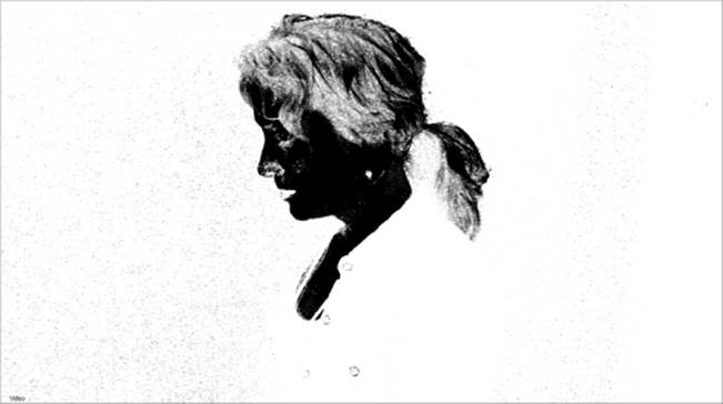
7. Press Command+down arrow twice to move to the close-up of the woman just before she enters the door to the lab, and play through it. The environment of the hallway matches, and the dark doorway is nicely foreboding, but the woman’s face is a bit dark, disappearing into the door during a moment when it would be good to see the pensive expression on her face and neck. You can use a selective to brighten her face to be more visible.
8. Choose Sel 1 from the Work On pop-up menu, and then click Pick Custom and drag along the skin on the woman’s face, avoiding her hair and clothes. When you’re finished, choose Matte from the View pop-up menu to see how good the isolation is (see Figure 11.30). Your results will vary depending on exactly which pixels you sampled.
FIGURE 11.30 The initial matte created by sampling the woman’s face
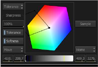
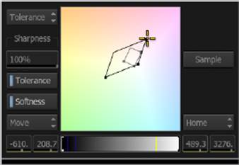
This is a good start, but when doing any sort of contrast adjustment in a grade, you really want a solid matte with good isolation. For this image, you’ll get the best results using the Diamond Keyer control (see Figure 11.31). There are two shapes superimposed over a flattened RGB cube shape: a gray inner Tolerance shape and a black outer Softness shape. By dragging each shape’s control point handles, you can redefine the range of color and saturation that’s used to create the key.
FIGURE 11.31 The Diamond Keyer control
9. Drag the handles of the inner and outer shapes to refine the matte, including as much of the woman’s face and neck and excluding as much of the background as you can. It’s fine if some of her hair is included in the operation. You’ll be shrinking the outer Softness shape, and you will eventually need to zoom and pan into the control to see what you’re doing (see Figure 11.32).
FIGURE11.32 Fine-tuning the Diamond Keyer controls to isolate the woman’s face
Like other controls and viewers in Smoke, you can Control+Command+drag to pan and Control+Option+drag to zoom to get a better view of the parts of the control you want to manipulate.
If you’ve managed to isolate the face, but you’re still having trouble with spots behind her neck and on her chest, there’s another tool that you can use to refine this matte.
10. Click the Plot button, next to the other match controls underneath the color-balance controls, and click on the woman’s neck, or any other portion of the matte you’re having trouble identifying in the Diamond Keyer control, and a black dot shows you where that value is so that you can either include it in or exclude it from the matte. A red line shows the plot sample on the Luma slider control.
11. When you’re satisfied that you’ve isolated as much as you can using the Diamond Keyer control, adjust the Luma Softness parameter sliders below to exclude as much hair as you can. Don’t overadjust so that the matte becomes crunchy; stop at the point where there’s a gentle gray falloff between the parts of her hair that are included in and excluded from the matte, something like what is shown in Figure 11.33.
FIGURE11.33 The final skin-tone matte
12. Now that you have a good key, choose Result from the View menu; then choose Gamma from the Trackball Option menu to see the curve control at the center of the control area, and drag the one control point up to lighten the woman’s face and hair highlights just enough to make her pop out from the background, as shown in Figure 11.34.
FIGURE11.34 Before and after a selective color adjustment to lighten the woman’s face and hair highlights
Applying Color Corrections as Gap Effects
So far, you’ve applied corrections and adjustments on an individual, per-clip basis. However, there’s a way of easily applying all manner of adjustments to multiple clips in a scene, using gap effects. Gap effects describe the ability in Smoke to apply effects to selected gaps in the timeline, creating what is often called an adjustment layer in other applications. When you superimpose a gap effect over other clips in the timeline, all clips appearing underneath have the gap effect applied to them. There are many reasons to do this, and we’ll explore these in the following series of exercises.
Applying One Look to a Whole Scene
A great reason to use gap effects when color correcting is when you want to apply a single “look” or style adjustment to a whole series of clips all at once. In this exercise, you’ll see how to do this.
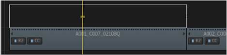
1. Move the positioner to the first clip in the timeline, and select that clip. Then click the Track+ button to create another video track.
2. With the focus of the positioner on track V1.2 and the clip on track V1.1 selected, press Shift+V to select a piece of gap on track V1.2 that’s the same length as the clip underneath, as shown in Figure 11.35.
FIGURE 11.35 Creating a cut — a selected piece of gap in the timeline — in preparation for applying an effect to it
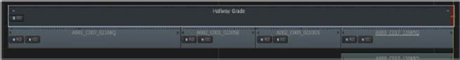
3. Click FX ![]() Colour Correct to add the Colour Correct effect to the selected gap, and it turns into a clip. Select this clip, and the name “Gap” appears over it.
Colour Correct to add the Colour Correct effect to the selected gap, and it turns into a clip. Select this clip, and the name “Gap” appears over it.
4. Right-click the Gap clip, choose Rename from the context menu, enter Hallway Grade in the text-entry dialog, and click or press Return. The gap effect now has a name identifying what it does.
5. Double-click the Hallway Grade gap effect to open the color editor.
Now that you have a basic grade going for the hallway scene, you want to add a bit of style. In particular, you’d like to play off the abundance of fluorescent lighting in the scene to give a more distinctly greenish tone to the overall scene and, in the process, make the entire lab complex seem unsettling. However, you just want to add a tinge of green — you don’t want to wash the entire picture in green. To do this, you’ll use a secondary correction.
6. Switch to Colour Warper mode, choose Sel 1 from the Work On pop-up menu, and then choose Matte from the View menu. At the moment, a white field covers the image, indicating that the entire image is currently selected for adjustment since you’ve not yet picked a range of color or lightness upon which to work.
7. Click the Midtones button in the Define group of controls. This creates an automatically defined Luma key that excludes the brightest highlights and deepest shadows, as shown in Figure 11.36.
FIGURE 11.36 Creating a Luma key matte of just the midtones of the image
8. If you like, you can adjust the Low and High Softness Field parameters to include more of the shadows and highlights, but make sure that you exclude the darkest and lightest parts of the image if you want to avoid creating an overall tint.
9. To make the adjustment, choose Result from the View pop-up menu and then drag the Midtones color-balance control toward an olive green. Figure 11.37 is exaggerated for effect, but it shows one possible adjustment.
FIGURE 11.37 Limiting the green you’re adding to the image using the matte created in Selective 1
10. Click the EXIT button to go back to the timeline, choose the Trim tool from the Editorial Mode pop-up menu (or press R), and make sure Ripple is disabled. Then select the out point of the Hallway Grade clip, move the positioner to the end of the sequence, and press the E key to perform an extend edit, which resizes the clip so that the selected edit point in the timeline is moved to the location of the positioner, as shown in Figure 11.38.
FIGURE 11.38 Doing an extend edit to resize the Hallway Grade clip to the entire length of the sequence
If you move the positioner through the sequence, you can now see that the green Midtones tint is being applied throughout the entire sequence. If you want to make a change, all you need to do is to open the Hallway Grade clip’s Colour Correct effect and alter its settings. Furthermore, if you need to apply custom adjustments to one clip and not another, you can treat a gap effect clip like any other clip, keyframing the effect or cutting it into multiple pieces, each with its own settings.
11. Finally, drag the Hallway Grade clip from the timeline to the Hallway Scene library in the Media Library, and then drag it back into track V1.2 where it came from. As you can see, you can save gap effects into the Media Library for future use, dragging them back to the timeline whenever you like.
Limiting a Color Correction Using a Wipe
In this next exercise, you’ll see how you can use a timeline wipe effect to limit a color correction in a gap effect clip.
1. Move the positioner to the last clip in the sequence. The lab set is nicely lit, but you’d like it to be a more cave-like environment, with a sense of the light falling off at the edges of the frame. Time to add a vignette!
2. Select the last clip in track V1.1; then click Track+ to create another video track, and press Shift+V to select a piece of gap to match the duration of the selected clip.
3. Add a Colour Correct effect to the gap; then open the Colour Editor, and, with Master selected, drag the Gain parameter slider down to around 47.
4. Click the EXIT button to return to the timeline.
5. With the gap effect still selected, click FX ![]() Wipe to add a timeline wipe to the gap and then double-click the WI box or Wipe button in the FX Ribbon to enter the Wipe editor.
Wipe to add a timeline wipe to the gap and then double-click the WI box or Wipe button in the FX Ribbon to enter the Wipe editor.
6. Scrub through the timebar, and you’ll see that, by default, a right-to-left wipe is being created.
7. Click Reset Mask to start with a blank slate; then click the Add button to add a geometry layer and use the draw tools to create a simple oval surrounding the center of the image.
When drawing a mask, you can hold the Shift key down and drag to draw a freeform shape with control points automatically applied to conform to what you draw.
8. At this point, you have the opposite of what you need, with darkening happening at the center of the vignette rather than the edge. Click Outside to invert the mask, and then drag the Offset parameter slider to the left to push the mask softness out from the shape to create a nice, feathered edge, as shown in Figure 11.39.
FIGURE 11.39 Creating an oval using the timeline wipe effect to limit a color correction

9. Click the EXIT button to return to the timeline, and see the final effect you’ve created.
This is an incredibly versatile technique, because you can limit corrections using any mask you can draw. You can track masks to follow moving subjects, and you can even apply multiple timeline effects to a gap effect that is being limited with the mask being applied with a wipe effect.
The Essentials and Beyond
As you can see, combining color-correction timeline effects, gap effects, and timeline wipes to create custom mattes lets you apply primary and secondary corrections in many different ways.
Additional Exercises
· Delete the Hallway Grade gap effect, and create a new one with a completely different look, as if the hallway were well lit, with neutral highlights and desaturated color overall.
· Add a new gap effect to the first clip, use a selective in the Colour Warper to isolate the blue jacket on the coat rack of the elevator, and increase its saturation all by itself.
· Add a new gap effect to the second clip, and use color correction along with a timeline wipe to create a feathered shadow on the floor of the hallway along the bottom of the frame to give the shot more depth.
All materials on the site are licensed Creative Commons Attribution-Sharealike 3.0 Unported CC BY-SA 3.0 & GNU Free Documentation License (GFDL)
If you are the copyright holder of any material contained on our site and intend to remove it, please contact our site administrator for approval.
© 2016-2026 All site design rights belong to S.Y.A.