Improving the Test Process: Implementing Improvement and Change - A Study Guide for the ISTQB Expert Level Module (2014)
Chapter 4. Analytical-Based Improvement
Analytical approaches are used to identify problem areas in our test processes and set project-specific improvement goals. Achievement of these goals is measured using predefined parameters.
Specifically, we’ll first be looking at causal analysis techniques as a means of identifying the root causes of defects. After describing a framework for determining and analyzing data to be analyzed (the GQM approach), we’ll take a good look at the specific data items that can provide insights into our test process when analyzed.
In addition to the task of test process improvement, project-level problems normally dealt with by the test manager may also benefit from the analytical approaches described in this chapter.
As frequently occurs when several potential options are available for achieving a particular objective, a mix of model-based and analytical approaches might be appropriate. We’ll discuss this in more detail in chapter 5, “Selecting Improvement Approaches.”
4.1 Introduction
As you saw in chapter 3, using models for test process improvement can be an effective approach if you need to improve systematically and want the benefit of a strong body of knowledge behind you. But this isn’t always the most appropriate approach. Sometimes specific testing problems are the main focus of improvement efforts. Just imagine a typical status meeting or retrospective in the testing project. These might be some of the common issues that are mentioned:
![]() “Our requirements are so unstable; we need too much effort for creating test cases.”
“Our requirements are so unstable; we need too much effort for creating test cases.”
![]() “Our test results have too many false passes.”
“Our test results have too many false passes.”
![]() “It takes forever to get these defects turned around!”
“It takes forever to get these defects turned around!”
In general, it’s ineffective trying to solve such specific problems by just using a model-based approach. Sure, you’ll get some benefit from using a model to solve a specific problem, but this is a bit like trying to crack a nut with a sledgehammer; models can sometimes be simply too generic for solving specific problems.
This is where using analytical techniques can be helpful. They provide a more focused approach for helping to solve specific problems like these. They help us get a handle on the root causes for specific problems and they enable us to set up a systematic framework for gathering and analyzing the relevant data. In the following sections, we will examine what root causes are, outline a systematic framework, and consider how to select the data to analyze.
4.2 Causal Analysis
Syllabus Learning Objectives
|
LO 4.2.1 |
(K2) Understand causal analysis using cause/effect diagrams. |
|
LO 4.2.2 |
(K2) Understand causal analysis during an inspection process. |
|
LO 4.2.3 |
(K2) Understand the use of standard anomaly classification for causal analysis. |
|
LO 4.2.4 |
(K2) Compare the causal analysis methods. |
|
LO 4.2.5 |
(K3) Apply a causal analysis method on a given problem description. |
|
LO 4.2.6 |
(K5) Recommend and select test process improvement actions based on the results of a causal analysis. |
|
LO 4.2.7 |
(K4) Select defects for causal analysis using a structured approach. |
When problems arise and we want to find the cause, we frequently start off with a mass of information; we simply can’t see the forest for the trees. As test process improvers and test managers, we might have a wealth of different sources of information available to us (e.g., meetings, status reports, defect reports, informal discussions, tools). However, it’s not just the sources of information that are many and varied; we also receive the information in a number of different forms. Take as an example the problem of long defect turnaround time. We might receive information about this in one or more of the following forms:
Causal analysis The analysis of defects to determine their root cause. [Chrissis, Konrad, and Shrum 2004]
![]() Verbal communication (a discussion at a project meeting, a chat in the coffee room, a tip from a colleague, a word of warning from a customer). The information might be received as a statement like, “Hey, it takes forever to get these defects turned around.”
Verbal communication (a discussion at a project meeting, a chat in the coffee room, a tip from a colleague, a word of warning from a customer). The information might be received as a statement like, “Hey, it takes forever to get these defects turned around.”
![]() Written communication (emails, informal notes, formal reports sent to a stakeholder, a user complaint received via the defect management system). The information might be received as a sentence like, “I’ve noticed lately that the defects in the payroll system are taking a long time to fix—what’s going on?”
Written communication (emails, informal notes, formal reports sent to a stakeholder, a user complaint received via the defect management system). The information might be received as a sentence like, “I’ve noticed lately that the defects in the payroll system are taking a long time to fix—what’s going on?”
![]() We may also have metrics and measures at our disposal that we are monitoring to ensure that defect turnaround time does not exceed an agreed-upon limit. We may, for example, be monitoring the time taken between setting the status “new” and the status “closed” for defects logged in our defect management system.
We may also have metrics and measures at our disposal that we are monitoring to ensure that defect turnaround time does not exceed an agreed-upon limit. We may, for example, be monitoring the time taken between setting the status “new” and the status “closed” for defects logged in our defect management system.
Now let’s add to this the different views and prejudices sometimes held by relevant stakeholders:
![]() Testers: It’s the developers.
Testers: It’s the developers.
![]() Developers: It’s the testers.
Developers: It’s the testers.
![]() Users: I don’t care what the cause is, I just want working software.
Users: I don’t care what the cause is, I just want working software.
All of this makes for a hard time in getting a handle on the problem of establishing causality. The methods that we will now describe help us to capture and organize information about particular problems and, in so doing, help us to focus on causality.
By using causal analysis, we can visualize possible links between things that happen (causes) and the consequences they may have (effects). As a result, we have a better chance of identifying the key root causes. In other words, we start to see the forest instead of all those trees.
Having an effective defect and/or incident management process that records defect information is an important precondition for performing causal analysis. The procedure of conducting causal analysis is conducted in the following steps:
![]() Selecting items for causal analysis
Selecting items for causal analysis
![]() Gathering and organizing the information
Gathering and organizing the information
![]() Identifying root causes
Identifying root causes
![]() Drawing conclusions (e.g., looking for common causes)
Drawing conclusions (e.g., looking for common causes)
Each of these basic steps will now be described, after which we’ll take a look at how some of the improvement models you met in chapter 3 incorporate the concept of causal analysis.
4.2.1 Selecting Items for Causal Analysis
In the context of improving the test process, the items chosen for causal analysis typically belong to one of the following categories:
![]() Defects and failures:
Defects and failures:
– A defect that resulted in an operational failure (e.g., loss of a rocket launcher on takeoff).
– A defect found during testing (e.g., an exposed security vulnerability).
– An incident that occurred when using an application (e.g., users report to the help desk that they can’t make secure money transactions from a web-based banking application).
![]() Process issues reported by stakeholders:
Process issues reported by stakeholders:
– An issue raised by one of the stakeholders (e.g., the project leader mentions that test status reports have too little information about product risks covered by the tests performed).
– A problem area identified by a team member during a project meeting or retrospective (e.g., low availability of required testing environments).
![]() Issues detected by performing analysis:
Issues detected by performing analysis:
– Low levels of defect detection in particular parts of an application or in particular test levels.
– Elapsed time between reporting defects and receiving corrected software steadily increasing.
If you get the initial selection of items for causal analysis wrong, you’ll probably end up using your analysis effort inefficiently. You’ll wind up finding the root causes of unimportant items or analyzing “one-off” items that don’t lend themselves so easily to a general improvement to the test process. Faced with these risks, it’s essential that we extract the maximum benefit from our analysis by finding the root cause(s) of items with the highest impact, such as recurring defects that are costly to fix, are damaging to reputations, or endanger safety.
It will be helpful to involve relevant stakeholders in the defect selection process and to establish defect selection parameters (such as those explained later in the section “Defect Categorizations”). This reduces the chance of unintentional bias in the selection and has the added benefit of helping to develop trust regarding the motives for performing causal analysis.
One or more of the following approaches can assist in selecting the right items for causal analysis:
![]() The Pareto Principle (80/20 rule)
The Pareto Principle (80/20 rule)
![]() Defect categorizations
Defect categorizations
![]() Analysis of statistics
Analysis of statistics
![]() Holding project retrospective meetings
Holding project retrospective meetings
Let’s look at each of these approaches in turn.
Use of the Pareto Principle
The Pareto Principle is sometimes referred to simply as the 80/20 rule and is often used in testing where selections need to be made of particular items from a larger whole (e.g., test data, test cases).
When the Pareto Principle is used to select defects for causal analysis, we are making the assumption that 20 percent of defects can be considered as representative of all. The use of the word representative gives us a clue on how to identify the 20 percent we are after: equivalence partitioning.
Applying equivalence partitioning techniques to a collection of defects will help identify equivalence classes from which a single representative defect may be selected. We start by taking a high-level view of all defects and by grouping them. The groups (partitions) are then divided successively in a top-down manner until we have the 20 percent of total defects we are going to analyze. If you’re a bit rusty in using equivalence partitioning, take a look at the ISTQB Foundation Level syllabus [ISTQB_FL], pick up a good book on test design techniques, or ask an experienced test analyst to help you out.
Generally speaking, use of the Pareto Principle is best combined with other approaches to make more informed defect selections.
Pareto analysis A statistical technique in decision-making that is used for selection of a limited number of factors that produce significant overall effect. In terms of quality improvement, a large majority of problems (80 percent) are produced by a few key causes.
Defect Categorizations
The problem with using the Pareto Principle in the way mentioned previously is that we have to spend time defining the groups of defects from which to select a representative defect. Using defect categorizations, we don’t have to do that; the groups are predefined. This gives us the following advantages:
![]() We can capture recurring defect root causes that apply to our particular domain, project, or organization. These are the defects we might be especially interested in if improvement activities have been implemented to reduce their occurrence. (Have the measures worked?)
We can capture recurring defect root causes that apply to our particular domain, project, or organization. These are the defects we might be especially interested in if improvement activities have been implemented to reduce their occurrence. (Have the measures worked?)
![]() We can be on the alert for specific types of defects that are of particular significance to us (see the list in table 4–1 for examples).
We can be on the alert for specific types of defects that are of particular significance to us (see the list in table 4–1 for examples).
![]() We can run through the list relatively quickly, making it a useful approach for use in project retrospectives.
We can run through the list relatively quickly, making it a useful approach for use in project retrospectives.
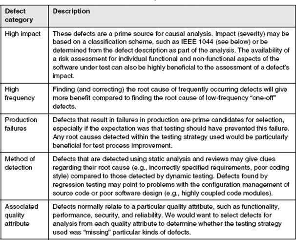
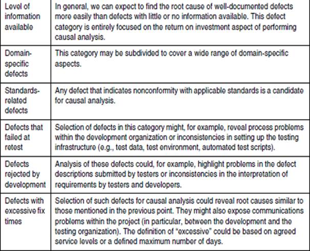
Table 4–1 lists some typical categorizations that will help identify defects for causal analysis.
Table 4–1 Defect categorizations for causal analysis selection
When selecting defects, we can also make use of the categorizations provided in standards such as IEEE 1044 [IEEE 1044]. The standard provides a useful scheme for categorizing the sources of software anomalies and lists the following principal sources (see table 3b in IEEE 1044 “Investigation classification scheme – Sources”):
![]() Specification
Specification
![]() Code
Code
![]() Database
Database
![]() Manual and guides
Manual and guides
![]() Plans and procedures
Plans and procedures
![]() Reports
Reports
![]() Standards/policies
Standards/policies
Analysis of Statistics
A variety of statistical information may be used to help select defects for causal analysis. This information may be in the form of tests for statistical significance, comparisons of parameters (often plotted against time), or simple diagrams (e.g., scatter diagrams). Remember, the main objective here is to enable defects to be selected. We are not engaging in the root-cause analysis itself.
The following examples illustrate how the analysis of statistics can be used in defect selection.
Identifying clusters of defects
Clusters may be identified by showing distributions of defects within a particular defect category. Adding a time dimension to this data may further help identify candidates for causal analysis. Figure 4–1 shows the defect category “rejected by development” plotted over a 30-day test phase.
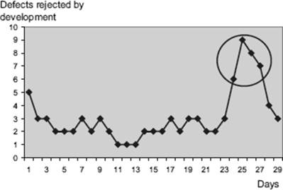
Figure 4–1 Defect selection based on rejects per day
The diagram shows a sudden peak in the number of defects rejected by development toward the end of the test phase. One or more defects taken from the group of 30 defects within the circle would be good candidates for causal analysis. Further selection criteria may be applied to reduce the number of defects selected (e.g., only those with high severity).
Using statistical distributions
Distributions can be useful in identifying “abnormal” defects for causal analysis. As an example, the diagram in figure 4–2 shows a distribution of times to fix a defect (elapsed days between defect status “new” and defect status “ready to retest”). In this example, defect fix times are assumed to follow a normal distribution between “fast” and “lengthy.” As shown in the diagram, we would select defects for causal analysis if their fix time exceeds two standard deviations above the mean (i.e., the top 2.5 percent), which in this case equates to a period of 10 days or more.
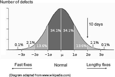
Figure 4–2 Defect selection based on defect resolution time
In the diagram, the central shaded area is less than one standard deviation (sigma) from the mean. For the normal distribution, this accounts for about 68 percent of the defects. Extending to two standard deviations on either side of the mean accounts for a total of about 95 percent of defects. Three standard deviations account for about 99.7 percent of defects.
Logical combinations
Combinations of defect factors can be evaluated (e.g., using filters in a spreadsheet) to enable us to focus on specific defects. For example, we may wish to place emphasis on security defects with high severity that occurred in production (i.e., a combination of three factors).
Holding Project Retrospective Meetings
Selection and/or verification of defects for causal analysis is an activity well suited to being performed as part of a project retrospective meeting.
If selection has taken place before the meeting, the candidate defects may be verified during the meeting. This involves not only a technical verification of the selected defect(s), but also an evaluation of the costs and benefits to be expected from performing the root-cause analysis.
If defect selection has not been performed before the meeting, and if sufficient time is allocated, the actual selection process itself may be conducted. Use of a checklist such as shown in table 4–1 can be an efficient and effective way to do this.
4.2.2 Gathering and Organizing the Information
Earlier we talked about how a clear, well-structured view of the complete picture is important to enable the root causes to be identified for the issues we have selected for analysis. In this section, we’ll look at some initial tasks to perform and then some of the ways to structure information using the following types of diagram:
![]() Cause-effect (Ishikawa) diagrams
Cause-effect (Ishikawa) diagrams
![]() Mind maps
Mind maps
![]() System models
System models
For those of you studying for the ISTQB Expert Level certification, the last two are not part of the syllabus, but they do offer valuable insights into possible alternatives to using Ishikawa cause-effect diagrams.
Getting Started: Select a Suitable Approach
The task of performing causal analysis is both analytic and creative. To get satisfactory results, an approach needs to be set up that provides a supportive framework for the participants.
Inevitably, causal analysis will involve differences of opinion. A person needs to be nominated who can lead a work group through the various steps in causal analysis and keep them focused on the objective; that is, find the root cause(s) of the problem.
The leader sets up a work group and agrees with them on the following issues regarding the approach:
![]() The method(s) to be used
The method(s) to be used
Different methods may be applied to gather and analyze information. The actual choice made may depend on factors such as company standards, own best practices, geographic location of participants, and the required degree of formality. Here are some of the most commonly used methods:
– Workshops
– Brainstorming sessions
– Reviews
![]() Structuring of information (refer to the diagram types described later)
Structuring of information (refer to the diagram types described later)
![]() Required participants
Required participants
The work group should consist of those stakeholders who are affected by the problem. Where necessary, people with particular skills can be added to the work group so that a good balance of specialists and generalists is achieved.
Before starting, it is recommended that the leader performs the following tasks:
![]() Provide members of the work group with an introduction to the methods and diagrams to be used.
Provide members of the work group with an introduction to the methods and diagrams to be used.
![]() Install a sense of group ownership for the results. Remember, ownership of the information is with the group rather than with management [Robson 1995].
Install a sense of group ownership for the results. Remember, ownership of the information is with the group rather than with management [Robson 1995].
Cause-Effect (Ishikawa) Diagrams
These diagrams enable us to focus on a particular defect and structure the potential causes. You’ll also hear these diagrams referred to as Ishikawa diagrams (after the Japanese quality engineer Kaoru Ishikawa, who first developed them) or as “fishbone” diagrams (the reason for which will become obvious). Figure 4–3 shows the basic structure of the diagram.
The basic form portrays the defect as the fish’s head, usually on the right side of the diagram. The backbone provides the main path to the defect, and the possible causes are grouped around the backbone. Each cause is shown using an arrow symbol. These are the fishbones, which are arranged in a tree-like hierarchy of increasingly smaller, finer bones (causes). The depth to which the hierarchy of causes goes is left to your judgment; you just keep adding and regrouping until you have a structure that you feel is sufficiently detailed and well organized.
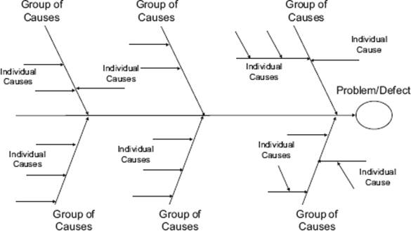
Figure 4–3 Generic structure of cause-effect (Ishikawa) diagrams. You can see why they are also called fishbone diagrams.
Cause-effect diagram A graphical representation used to organize and display the interrelationships of various possible root causes of a problem. Possible causes of a real or potential defect or failure are organized in categories and subcategories in a horizontal tree structure, with the (potential) defect or failure as the root node. [After Juran and Godfrey 2000]
You need to take care when using these diagrams not to think of the finer bones further down the hierarchy as in some way less important than the major bones. This is not the case. Causes that are further down the hierarchy (fine bones) are simply further removed from the defect and depend on a sequence of other factors to get there. These “fine bones” may be the actual root causes you are looking for!
Standard categories can be used to group the information. They give us a good starting point for defining the main bones and support us just like a checklist. Using standard categories helps us to avoid forgetting things (“blind spots”) and can get the ball rolling when creating cause-effect diagrams from scratch. This can be particularly helpful where groups of people perform cause-effect analysis in a workshop situation and where an initial “mental block” may be experienced. Figure 4–4 shows an example.
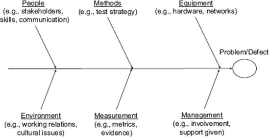
Figure 4–4 Example of classifications of causes
This example is taken from Ishikawa’s website [URL: Ishikawa], which also describes other useful classifications covering, for example, specific types of application or business areas.
Now let’s take a look at an example applied to a fictitious in-flight emergency situation for an aircraft (see figure 4–5). Remember, at this stage it’s all about gathering and organizing the information so that we can later identify root causes.
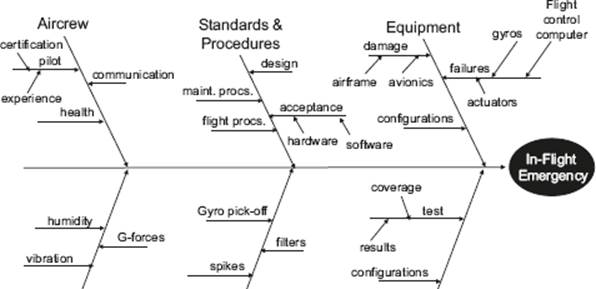
Figure 4–5 Example: Fishbone diagram for an in-flight emergency
What can we observe from this example? Well, perhaps the most obvious point is that the subject of the analysis is an incident in an overall system (in this case, an aircraft), consisisting of hardware, software, people, procedures, and environmental factors. This is typical of many complex systems we find today, where software is just one part of the whole. Indeed, the software may be distributed across many individual applications, each performing different functions within the whole system (this is why the term system of systems or multi-system is often used in this context). If we are performing root-cause analysis of incidents in systems like this, it is quite possible that the suggested improvements do not impact the software testing process. The emergency situation could, for example, have been the result of pilot inexperience or equipment malfunction.
If we take a look at the classifications used in the example shown in figure 4–5, it also becomes apparent that effective cause-effect analysis requires the gathering together of expertise from a wide range of subject areas. This applies not just to multi-systems like aircraft; it also applies to software defects where we might want to involve different stakeholders and people with specific software development or testing expertise (e.g., in evaluating security threats).
Note that in figure 4–5 the standard classifications we looked at earlier have served us well in the initial structuring of the cause-effect diagram. Taking the generic classifications as a starting point, the first step has been to replace some of them with more appropriate groupings. In this example, the generic classification “people” has been renamed “aircrew” and the generic “methods” classification has been replaced by “standards & procedures.” As a next step in structuring the information, the generic classification “management” has been removed and the “software” grouping has been added. We have identified the aspects “configurations,” “test results,” and “test coverage” as potential root causes worthy of analysis, and these have been added to the software “bone” on the diagram.
These are typical decisions that might be made in the initial rounds of gathering information. Remember, these are all just initial steps in the iterative process of gathering, structuring, and analyzing information with a view to finding root causes. At this stage, the fishbone diagram is still high-level.
Mind Maps
As we noted earlier, gathering and organizing information are important steps that allow root-cause analysis to be conducted effectively. The strength of mind maps is the relative ease with which associations between different potential causes can be developed and shown diagrammatically. Mind maps are especially useful for showing the “big picture” and for supporting workshops and brain-storming sessions, especially if tools are used. The following diagram shows a mind map for the in-flight emergency example. It was created using the Mind-Manager tool [URL: MMP].
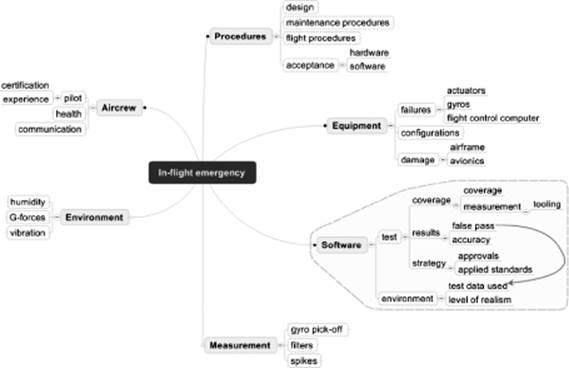
Figure 4–6 Cause-effect analysis using mind maps
Generally speaking, mind maps place the subject (i.e., defect or incident) in a central position and show the main subject areas as branches radiating away from the subject with increasing levels of detail. Used this way, they essentially provide the same information as an Ishikawa diagram but just capture it differently. Mind maps are generally easy to use and several tools (including freeware) are available.
System Models
Any model of the system or parts of the system can be of use in performing causal analysis and identifying test process improvements. Some of these models will be familiar to test analysts; they are often created when designing test cases and frequently detect defects in the specification being used (e.g., requirements). The models developed or used by the test analyst when applying specification-based test design techniques can also be of use when considering the root causes of defects. Why did particular defects get through the net? Where could we tighten up the test design process in order to avoid failures like this in the future? These are among the questions that the system models used in test design can help us to answer. The following models are the most useful to consider here:
![]() State transition diagrams
State transition diagrams
![]() Decision tables
Decision tables
Developers may also create models that can be used for causal analysis, such as, for example, the following:
![]() Use-case descriptions
Use-case descriptions
![]() UML diagrams (e.g., activity diagrams, sequence diagrams)
UML diagrams (e.g., activity diagrams, sequence diagrams)
![]() Data-flow diagrams
Data-flow diagrams
Note that the models referred to here will help mainly in the root-cause analysis of particular failures. To enable test process improvements to be identified, it will generally be required to consider several of these individual evaluations and then form a consolidated conclusion.
In addition the the models mentioned, the creation of systems diagrams (see Quality Software Management, Volume 1 [Weinberg 1992]) can be useful in helping to identify process problems, including those relating to testing. The construction of these diagrams involves the identification of system elements and the flow of information between them (see section 4.2.5).
Responsibilities
Remember, in this book we are focusing mainly on the causes of defects with a view to identifying possible test process improvements. Depending on the nature of the defect, the task of conducting root-cause analysis may be either our own responsibility as test process improvers or allocated to another person (e.g., a line manager) who might take a different focus. This is particularly the case, for example, where the consequences of the defect have been catastrophic and/or when legal or contractual issues are involved.
Other Uses
The types of diagram discussed in this section may also be used for other purposes than test process improvement. In risk management, for example, Ishikawa diagrams may be used to analyze the potential risks of high-impact failures. In this case, the individual risks that may lead to the failure are grouped and the likelihood of them occurring added to the diagram. We can then multiply the individual likelihoods in a potential chain of events to get the total likelihood of the failure occurring for that chain. In addition to showing risk likelihood, the diagrams may show whether a path can actually be defined that leads to the failure (i.e., “can this failure actually occur?”). This can be a particularly useful approach when analyzing safety-critical systems.
Organizing the Information: Summary of Benefits
The diagrams we have covered provide the following general benefits:
![]() They allow information to be gathered and communicated relating to the potential causes of specific defects.
They allow information to be gathered and communicated relating to the potential causes of specific defects.
![]() Standard classifications of causes can help to structure the information and support the thorough consideration of defect causes.
Standard classifications of causes can help to structure the information and support the thorough consideration of defect causes.
![]() Different forms of visualization help to show potentially complex cause-effect interactions.
Different forms of visualization help to show potentially complex cause-effect interactions.
4.2.3 Identifying Root Causes
Once the information about defects has been gathered and organized, you can proceed with the next activity, the task of identifying the root causes. Now, you may be thinking that you can do the information gathering and analysis simultaneously. Certainly, when you gather information about possible root causes you unavoidably start to think about the root causes. You should note these initial thoughts down for later. At this stage, though, it’s better not to focus on root-cause identification straight away. If you try to gather information and analyze simultaneously, you run the risks discussed in the following paragraphs.
The work group gets swamped with premature discussions about root causes before all the relevant information is gathered. Good moderation skills will be needed to guide the discussions in the work group and prevent the group from going off into detailed analysis before the big picture is available.
The information gathered may be incomplete, especially where a fixed amount of time is allocated to the task. You really don’t want to complete your only scheduled information-gathering workshop having drilled down on some areas but having left other areas untouched.
By considering root-causes before finishing the information gathering, there is a natural tendancy to jump to conclusions. This may lead to the wrong conclusions being reached regarding root causes, which is precisely the result we are trying to avoid. A good approach is therefore to separate the information-gathering task from the analysis task as much as possible. This allows ideas about the gathered information to mature for a period of time before the analysis takes place, and reduces the risks previously mentioned.
Let’s now consider how to use the information you have gathered to identify root causes using Ishikawa diagrams. The ISTQB syllabus refers to the following six-step approach proposed by Mike Robson [Robson 1995] regarding the use of Ishikawa diagrams:.
![]() Step 1: Write the effect on the right-hand side of the diagram.
Step 1: Write the effect on the right-hand side of the diagram.
![]() Step 2: Draw in the ribs and label them according to their context.
Step 2: Draw in the ribs and label them according to their context.
![]() Step 3: Remind the work group of the rules of brainstorming.
Step 3: Remind the work group of the rules of brainstorming.
![]() Step 4: Use the brainstorming method to identify possible causes.
Step 4: Use the brainstorming method to identify possible causes.
![]() Step 5: Incubate the ideas for a period of time.
Step 5: Incubate the ideas for a period of time.
![]() Step 6: Analyze the diagram to look for clusters of causes and symptoms.
Step 6: Analyze the diagram to look for clusters of causes and symptoms.
These steps will be explicitly identified when considering the following four generic tasks.
![]() Task 1: Set up the Ishikawa diagram.
Task 1: Set up the Ishikawa diagram.
![]() Task 2: Identify individual “mostly likely” causes.
Task 2: Identify individual “mostly likely” causes.
![]() Task 3: Add information to assist the analysis.
Task 3: Add information to assist the analysis.
![]() Task 4: Work top-down through the hierarchy of causes.
Task 4: Work top-down through the hierarchy of causes.
Each of the four generic tasks for using Ishikawa diagrams will now be explained by developing the “in-flight emergency” example.
Task 1: Set Up the Ishikawa Diagram
Preliminary activities are straightforward since the Ishikawa diagram has a simple structure. Some organizations that use Ishikawa diagrams frequently may have standard templates available. Otherwise, the initial form of the diagram is relatively easy to create.
First, write the effect on the right-hand side of the diagram (step 1 in Robson’s approach). After that, the areas to be analyzed are identified. As you saw earlier, the information you gather may cover a large number of individual areas (as represented, for example, by the bones on an Ishikawa diagram). A good approach is to consider each of these areas in turn. This will keep the work group focused on a particular area and enable particular subject matter experts (SMEs) to participate more easily (there’s nothing worse than having SMEs waiting around for their turn to participate).
Once the areas to be analyzed have been identified, they are drawn onto the diagram as ribs and labeled (Robson’s step 2). If particular areas of the overall diagram are to be considered, they are clearly marked on the diagram. The result is a diagram like the one shown in figure 4–7, which shows the “in-flight emergency” example with the “software” area to be considered shaded.
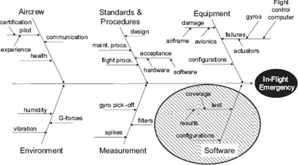
Figure 4–7 Setting up the Ishikawa diagram
Task 2: Identify Individual “Mostly Likely” Causes
With the area to be analyzed in focus, the most likely root causes are identified. These might be the ones that are “shouting” at you from the diagram or that your instinct and experience tells you are a good bet. You need to make a definite statement on these causes; they need to be either ruled out or confirmed as requiring further analysis.
A typical start to this activity is a short brainstorming session (Robson’s step 3). The leader of the work group first reminds the participants of the general rules to be applied:
![]() No criticism is allowed; all ideas are accepted in the brainstorming stage.
No criticism is allowed; all ideas are accepted in the brainstorming stage.
![]() Random, crazy ideas are welcome, as are ideas that extend other people’s ideas.
Random, crazy ideas are welcome, as are ideas that extend other people’s ideas.
![]() The objective is to gather a large number of ideas where possible.
The objective is to gather a large number of ideas where possible.
![]() All ideas will be recorded, including random, crazy, and repeating ideas.
All ideas will be recorded, including random, crazy, and repeating ideas.
![]() We will not evaluate during the session; we will take a break before doing that.
We will not evaluate during the session; we will take a break before doing that.
Checklists are useful to support the brainstorming or the discussions that follow. The checklist shown in table 4–2 lists some common root causes for software failures in flight control software. (Note that this is only a brief example; in reality the list would be much longer!)
Table 4–2 Example checklist of common root causes
Task 3: Add Information to Assist the Analysis
As the discussion develops, the next step is to refine the diagram by adding any further possible causes to it, linking different items of information, and appending any other information that might be of assistance to the analysis (Robson’s step 4). To do this, the work group is often gathered around a white board or sharing diagrams via a conferencing facility or a web-based tool.
Figure 4–8 shows how our Ishikawa diagram could look after we have been through this step. These are the additions made to the “software” area of the diagram:
![]() Some more detailed potential root causes have been identified in the software area and added as “finer” bones to the structure.
Some more detailed potential root causes have been identified in the software area and added as “finer” bones to the structure.
![]() Any potential root causes that are associated with checklist points are identified using their checklist identifier. This is useful because it indicates where the root causes from previous problems might apply.
Any potential root causes that are associated with checklist points are identified using their checklist identifier. This is useful because it indicates where the root causes from previous problems might apply.
![]() An association has been identified between “test data used” and “false pass” and a link has been drawn (remember, a false pass is a test that passes but fails to identify the presence of a defect in the test object. We also call them false negatives).
An association has been identified between “test data used” and “false pass” and a link has been drawn (remember, a false pass is a test that passes but fails to identify the presence of a defect in the test object. We also call them false negatives).
![]() Some probability information has been added. Remember, “certainty” between a particular cause and an effect is frequently not possible. Adding a probability value will help guide the further analysis. In the example, high and low probability are shown. The remaining are considered to have negligible probability.
Some probability information has been added. Remember, “certainty” between a particular cause and an effect is frequently not possible. Adding a probability value will help guide the further analysis. In the example, high and low probability are shown. The remaining are considered to have negligible probability.
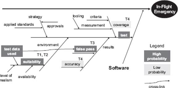
Figure 4–8 Extending the cause-effect analysis in the software test area
The process of adding more detail and information continues until we are satisfied that there is enough material to support the identification of root causes. The decision when to stop is one that requires judgment by the work group. Not enough information may lead to us missing an important root cause (“the devil is in the details”), and adding too much information, apart from consuming resources, may obscure the very thing we are looking for. Let’s assume for the moment that this is enough detail. Note that the ownership of the Ishikawa diagram remains with the work group rather than with management.
![]() Adding information using Tipping-Point theory: To appreciate how Tipping Point theory can help in causal analysis, a brief introduction to the concept is needed. Tipping Point theory [Gladwell 2000] is concerned with the way in which changes take place very quickly by spreading like epidemics to an ever-increasing number of people. It can be useful to apply Tipping Point theory to initiate and orchestrate the rapid spread of desired changes, and this is an important aspect we will be looking at later, in chapter 7. However, you can also use certain concepts from Tipping Point theory to look back on why undesirable epidemic-like changes took place. These are the concepts you can use in performing causal analysis on problems involving several people. Clearly this is not the case for our in-flight emergency; we don’t have a situation where an ever-increasing number of emergencies has spread to many aircraft. However, an awareness of Tipping Point concepts will certainly be useful when you are adding information to your causal analysis diagrams.
Adding information using Tipping-Point theory: To appreciate how Tipping Point theory can help in causal analysis, a brief introduction to the concept is needed. Tipping Point theory [Gladwell 2000] is concerned with the way in which changes take place very quickly by spreading like epidemics to an ever-increasing number of people. It can be useful to apply Tipping Point theory to initiate and orchestrate the rapid spread of desired changes, and this is an important aspect we will be looking at later, in chapter 7. However, you can also use certain concepts from Tipping Point theory to look back on why undesirable epidemic-like changes took place. These are the concepts you can use in performing causal analysis on problems involving several people. Clearly this is not the case for our in-flight emergency; we don’t have a situation where an ever-increasing number of emergencies has spread to many aircraft. However, an awareness of Tipping Point concepts will certainly be useful when you are adding information to your causal analysis diagrams.
The observation from Tipping Point theory that is particularly useful to causal analysis is that the start of epidemic-like change is sensitive to the particular conditions and circumstances in which they occur (i.e., their context). The study of these conditions and circumstances is captured in the “broken windows” concept, which observes that if a window is broken and left unrepaired, people will conclude that no one cares and nobody is in control. This can spiral out of control; more and more windows get broken and whole neighborhoods can fall into disrepair.
When we perform causal analysis in the area of software testing, we can start to look for “broken windows” as the potential triggers for the incidents, failures, and problems that are the focus of the analysis. Take, for example, test case design practices. If several test analysts are engaged in designing test cases in a project, a standard methodology may be required to ensure that the test cases can be shared between all test analysts and to enable a particular test strategy to be implemented. For individual test analysts, applying the standard methodology may place an overhead on their work (e.g., by requiring more formal documentation). A single test analyst who chooses not to apply the standard methodology may “infect” others if the standard practice is not enforced. They ask themselves, “Why should I bother when others don’t apply the methodology and nobody cares?” What could happen as a result? When the standard methodology is not applied, misunderstandings between test analysts might become more frequent. They might mistakenly believe that a test condition has been covered by one analyst. Software failures might then result, where gaps in the test case coverage fail to detect software faults. If we were to be analyzing the root causes of these failures we would identify the initial noncompliance to the standard test design methodolgy as a “broken window” in the test process that spread to some or all test analysts. Awareness of typical broken windows in testing processes and how they can spread if they are not corrected is valuable knowledge when applying causal analysis. We may choose to add this information to an Ishikawa diagram or create a checklist of typical broken windows in testing to support the analysis.
Task 4: Work Top-Down through the Hierarchy of Causes
At this stage we have a good insight into the potential root causes and our diagram(s) have been steadily refined and supplemented with details. Depending on time available, it may be advisable to let the information and ideas “incubate” for some time before continuing (Robson’s step 5).
It’s possible that the “most likely” root causes we selected in step 2 have now become firm favorites, or we may have revealed other candidates when adding the information in step 3. The best way to approach the identification of root causes with Ishikawa diagrams is to work from the top (i.e., near the head of the fish) and trace paths through the hieracrchy of bones. We stop when going down a further level of detail has no added value. At each level of detail we ask, “Where could the path take us now?” in pursuit of a root cause.
In Robson’s six-step approach to using Ishikawa diagrams, he suggests that we may also use the Pareto idea (80 percent of the benefit for 20 percent of the effort) to identify clusters of problems that are candidates to solve (Robson’s step 6). Our example would benefit greatly from this last step because of the relatively low amount of detail described.
The outcome of this step in seldom a surprised shout of “Eureka, we’ve found it!” By now we have a fairly good idea of where the root cause might be. Working top-down this way through the hierarchy of causes enables us to either identifiy the most likely root cause or narrow down the search sufficiently to allow more detailed investigation to be started.
Figure 4–9 shows the Ishikawa diagram of the software area for the in-flight emergency problem.
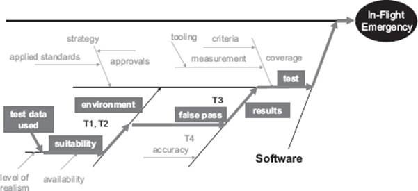
Figure 4–9 Locating the root cause in the software test area
The figure shows the path we have identified from analyzing the information in the diagram (thick arrows). Areas of the diagram that have been discounted as root causes are now shown in grey. Working top-down, we recognized “software test” as a potential root cause and noted that the “false pass” aspect of the results “bone” was an aspect where previous problems had been detected (hence the checklist item T3). From there we noted that we had identified a possible link to the “test data used” item in the “environment” area of the diagram. Note that these items of interest were identified as “high probability.”
After discussion in the work group, the conclusion, in this instance, was that the in-flight emergency had been the result of the following sequence: Test data used in the test environment was unsuitable, leading to false passes being recorded after executing test cases. The software faults that were not detected in these test cases subsequently led to a software failure and the in-flight emergency.
Of course, we would also need to indicate which specific area of the software failed and which specific test cases had been supplied with unsuitable test data and explain why that test data was unsuitable (e.g., taken from a previous project where the data related to a different aircraft type). This would be the additional data to be supplied to enable the root cause of the problem to be really pinpointed.
Cause-effect graph A graphical representation of inputs and/or stimuli (causes) with their associated outputs (effects), which can be used to design test cases.
Our discussion of cause-effect diagrams has so far focused on the principal task of finding the causes of actual problems (effects). Two further uses for these versatile diagrams can also be identified.
The first of these relates to the cause-effect graphing test design technique, which captures the causes and effects using a specific notation. This enables test cases to be defined that cover the causes (test inputs) and their effects (test outputs). The example shown in figure 4–10 is based on the following specification.
When a person takes a train after 9 a.m., they can buy a return ticket at the Super-Saver price. When a person takes a train before 6 a.m., they can buy a return ticket at the Saver price. At other times, a standard return ticket must be purchased. People with a Rail-Card25 receive a 25 percent discount on all tickets except the Super-Saver.
The causes and effects are identified from the specification and shown on a cause-effect graph.
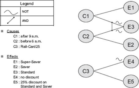
Figure 4–10 Example of a cause-effect graph
As a further step, the cause-effect graph may be represented as a table and test cases defined that cover combinations of inputs (causes). Refer to A Practitioner’s Guide to Software Test Design [Copeland 2003] and the Software Component Testing standard [BS 7925-2] for further details.
Cause-effect diagrams may also be used in the analysis of potential (rather than actual) failures. This can be particularly useful when analyzing safety-critical systems. It involves working back from the “failure mode” order to detect whether any potential paths could be leading to the failure.
4.2.4 Drawing Conclusions
After completing the steps, we should first decide whether conclusions can be drawn or not. Maybe we need more information, maybe we ran out of time, maybe the problem is simply too complex for the work group to consider. There are many reasons why the work group is unable to draw specific conclusions, and these should be clearly communicated to relevant stakeholders.
If the work group is confident that root cause(s) can be identified with reasonable certainty, it must then consider the following questions:
![]() Was this a “one-off” event?
Was this a “one-off” event?
![]() Have we detected something wrong in part(s) of the test process which might lead to the same or similar failures in the future?
Have we detected something wrong in part(s) of the test process which might lead to the same or similar failures in the future?
![]() Do we need to suggest changes to other processes?
Do we need to suggest changes to other processes?
![]() Can we identify any common causes?
Can we identify any common causes?
Root causes that are considered to be one-off events can be problematic for test process improvers. Does “one-off” imply “not important”? Not always. This may be the first of many similar or related software failures if we don’t make changes to the test process. The impact of the one-off event may be severe enough to warrant immediate action.
If we are performing causal analysis regularly, then we should research previous cases for similarities (remember, a single root cause may reveal itself in a number of different ways). We may identify associations with other problems or we might find it useful to revisit a previously conducted causal analysis using any new information available (e.g., about unsuitable test data). Take care with one-offs; it’s not advisable to change the test process for each and every problem that raises its ugly head. This might result in too many small process changes, and you could end up tinkering unnecessarily with the test process. As you will see in chapter 7, introducing too many process changes at the same time is not a good idea.
As test process improvers we are, of course, interested in any root causes that have implications on the test process. We will give this aspect more detailed consideration in chapter 6. Causal analysis may, however, point to root causes in IT processes other than testing. This is frequently the case for those IT processes on which the test process depends. For example, a flawed configuration management process may result in too many regression faults being found (i.e., things that used to work no longer work). The root cause here lies within the configuration management process; we cannot effectively resolve the root cause of the problem by proposing test process improvements. Where conclusions are drawn outside of the test process, we should inform the appropriate stakeholder and provide support as required.
After conclusions have been drawn about the individual issues considered in the causal analysis, a check needs to be made to see if other, similar causes have been identified in the past. When identifying root causes (see section 4.2.3, task 2, “Identify individual most likely causes”), this kind of information can be particularly useful and is often held as a checklist (see table 4–1 for an example). At this stage we may be updating the checklist with additional information, or we may be identifying new common causes to add to the list.
If you are using a defect classification scheme, such as the IEEE 1044, Standard Classification for Software Anomalies [IEEE 1044], the cause will be allocated according to a predefined categorization scheme. For example, IEEE 1044 provides a table with the following principal categories of causes (Table 3a Investigation classification scheme – Actual cause):
![]() Product
Product
![]() Test system
Test system
![]() Platform
Platform
![]() Outside vendor/Third party
Outside vendor/Third party
![]() User
User
Recording information about defects using a common classification scheme such as IEEE 1044 allows an organization to gather statistics about improvement areas to be analyzed (see section 4.2.1) and to monitor the success of improvement initiatives (see section 4.4.). However, schemes like this require an organization-wide approach with tools support, training, and tailoring. The introduction of a classification scheme such as IEEE 1044 may even be considered a test process improvement in its own right.
4.2.5 Causal Analysis with System Diagrams
System diagrams [Weinberg 1992] are a useful way of showing interactions between different elements of a system. The main benefit of system diagrams is their ability to reveal different types of feedback loops within the system and its components. Feedback loops are divided into the following two principal categories:
![]() Balancing
Balancing
![]() Reinforcing
Reinforcing
Systems with balancing feedback loops are stable in nature. A system that contains such loops will reduce any difference between a current and a desired system state until a balanced state is achieved.
Systems with reinforcing feedback loops exhibit unstable characteristics. A system that contains such loops will increase any difference between a current and a desired system state in either a positive or negative sense. With positive reinforcing feedback (sometimes called virtuous circles), a continually improving state is achieved by the system. Negatively reinforcing feedback results in a continuously deteriorating system state and is often referred to as a vicious circle.
Full coverage of this subject is out of scope for the Expert Level syllabus, but test process improvers may benefit by taking a closer look at Weinberg’s interesting analytical approaches.
Benefits and Limitations
Creating system diagrams can be particularly useful when gathering and organizing information (see section 4.2.5). They enable us to identify vicious circles and can therefore make an important contribution to the overall process of problem analysis. The ability to represent the interaction between different elements of a system gives us a “big picture” view of a system as a whole and enables us to investigate particular system aspects that would otherwise be difficult to visualize. The only real “limitation” of creating system diagrams lies in the very nature of the approach to be applied and the notation to be used. This is not highly intuitive; you need training and experience to master it. As a result, difficulties may arise when applying systems thinking in a work group with varying degrees of experience in using the approach. Used in the context of software testing, it is advisable to involve people with the experience of system architectures and development to get the best results for causal analysis.
4.2.6 Causal Analysis during Formal Reviews
An alternative approach to causal analysis involves adaption of the formal review (inspection) process described in the ISTQB Foundation and Advanced syllabi. As you might expect from a formal procedure (see Software Inspection [Gilb and Graham 1993]), using the software inspection process for causal analysis also involves the performance of specific, controlled steps.
Inspection A type of review that relies on visual examination of documents to detect defects, such as, for example, violations of development standards and nonconformance to higher-level documentation. It is the most formal review technique and therefore always based on a documented procedure [After IEEE 610, IEEE 1028].
The following principal activities take place within a two-hour facilitated meeting with two main parts:
![]() Part 1: 90 minutes
Part 1: 90 minutes
– Defect selection
– Analysis of specific defects
![]() Part 2: 30 minutes
Part 2: 30 minutes
– Analysis of generic defects
In part 1 of the meeting, the defects may be preselected for discussion by the inspection leader or they may be the outcome of a project retrospective meeting. Clearly, the approaches covered in section 4.2.1 will be of use in selecting these defects so that the most important defects are considered. The first part of the analysis then looks at the specific defects and their root causes. This will involve any of the approaches discussed in this chapter and produces the following results:
![]() Defect description
Defect description
![]() Cause category (see figure 4–4 for an example)
Cause category (see figure 4–4 for an example)
![]() Cause description, including any chain of events leading to the defect
Cause description, including any chain of events leading to the defect
![]() The process step when the defect was created
The process step when the defect was created
![]() Specific actions to eliminate the cause
Specific actions to eliminate the cause
In part 2 of the meeting the focus is placed on finding patterns, trends, and overall aspects of the defects. The work group considers aspects that have shown recent improvement as well as those areas of the test process that have gone well or badly. The work group may also support the test manager by proposing areas to be tested in a risk-based test strategy.
Benefits and Limitations
Considering causal analysis as an extension of inspections is a good idea if an organization already performs formal reviews. The formalism of the approach may restrict some of the more interactive and creative activities found in other approaches.
4.2.7 Causal Analysis Lessons Learned
Now that causal analysis has been considered, it’s a good idea to reflect on some lessons learned.
The “Causes-Effect Fallacy”
Gerald Weinberg, in his book about systems thinking [Weinberg 1992], discusses this frequently occurring fallacy. The basis for his observation is the incorrect belief held by some that for each problem a cause can always be shown and that cause and problem are directly related to one another. Unless we have a trivial system, these “rules” simply don’t hold up. Sometimes the link from root cause to problem is far from direct.
Saying “We Don’t Know” Is Better Than Guessing
Sometimes we can’t find the root cause to a problem or we are uncertain of our conclusions. It may also be that the underlying root causes are on a different part of the diagram that is not within our responsibility. We may have invested significant resources to analyze a problem and there is pressure to come up with “the cause.” Despite the pressure, we must be honest enough to say, “We don’t know” rather than lead a project or organization in potentially the wrong direction through guesswork.
“Lean and Mean” Work Groups
Occasionally it can be useful to invite people to a workshop or brainstorming session just to give them insight into these activities and increase their sense of involvement. Where causal analysis is concerned, this is not always a good idea. The work is intensive, there may be many proposals put forward for consideration, and there will be much (sometimes heated) debate. What we want in such situations are the people who can contribute directly to the task of finding root causes, and no others. The larger the work group, the greater the potential for unproductive contributions and unhelpful group dynamics. Keep the group “lean and mean.”
Encourage Analytical Thinkers
Group dynamics often play a significant role in causal analysis. Work group participants will inevitably have different ideas about root causes; they may have their own “pet theory,” or they may simply want to impress their peers by being the first ones to find the problem. Good moderation skills will be needed to manage these group dynamics and get the best out of the work group. Don’t forget, the members of the group with strong analytical skills and good intuition may not always be the ones who can communicate them most effectively. They will need encouragement and the space in which to express themselves. They could give you the key to the puzzle.
Step Back and Think
When intensive discussion is taking place and lots of ideas are being proposed, it’s occasionally a good idea to step back, think, and then return to the diagram. This is recommended as a separate step (“incubate ideas”) in Problem Solving in Groups [Robson 1995] before the detailed analysis takes place. However, this is a practice that can be useful at most stages in causal analysis.
4.3 GQM Approach
Syllabus Learning Objectives
|
LO 4.3.1 |
(K2) Describe the Goal-Question-Metric (GQM) approach. |
|
LO 4.3.2 |
(K3) Apply the Goal-Question-Metric (GQM) approach to derive appropriate metrics from a testing improvement goal. |
|
LO 4.3.3 |
(K3) Define metrics for a testing improvement goal. |
|
LO 4.3.4 |
(K2) Understand the steps and challenges of the data collection phase. |
|
LO 4.3.5 |
(K2) Understand the steps and challenges of the interpretation phase. |
4.3.1 Introduction
A well-known and popular software measurement approach is the Goal-Question-Metric (GQM) approach. Measurement is an important aid to test improvement. Measurement is performing data collection and analysis on the processes and products to identify empirical relations. Bottom-up improvement approaches typically include some kind of measurement approach, of which the Goal-Question-Metric approach [Basili 1984] is the most well known. It is a widely accepted approach and much applied in industry. It’s a goal-oriented approach, which makes it especially popular in goal-driven business environments.
Goal-Question-Metric (GQM) An approach to software measurement using a three-level model: conceptual level (goal), operational level (question), and quantitative level (metric).
The GQM method provides a systematic approach for tailoring and integrating goals, based upon the specific needs of the project and the organization, to models of the test process. The approach includes product and quality perspectives of interest [Basili and Caldiera 1994]. The result of the application of the GQM method is the specification of a measurement system targeting a particular set of issues and a set of rules for the interpretation of the measurement data.
We will now present available techniques for GQM measurement. The emphasis of the method is focused on the interpretation of measurement data. Organizations should recognize that an improved understanding is an essential part of continuous improvement. Bottom-up approaches, such as GQM, provide this understanding. It is recommended to apply top-down improvement approaches, as described, for example, in the Testing Maturity Model integration (TMMi) model, in parallel with software measurement.
Even though the GQM approach is mostly considered to be a (test) process measurement approach, it can also be used to measure product quality.
4.3.2 Paradigms
The Goal-Question-Metric (GQM) approach originates from Professor Victor Basili of the University of Maryland. During his involvement at the Software Engineering Laboratory (SEL) at NASA, he developed this approach to study the characteristics of software development. Two important paradigms are important when considering GQM measurement: the GQM paradigm and the Quality Improvement Paradigm (QIP). Both will be introduced briefly.
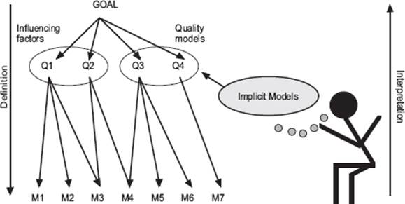
Figure 4–11 The Goal-Question-Metric paradigm
GQM Paradigm
The Goal-Question-Metric (GQM) paradigm represents a systematic approach to tailor and integrate goals with software process and products models. It is based on the specific needs of a project and organization. Within GQM, measurement goals are derived from high-level corporate goals and then refined into measurable values (metrics). GQM defines a certain goal, refines this goal into questions, and defines metrics that must provide the information to answer these questions. When the questions are answered, the measured data can be analyzed to identify whether the goals are attained. Thus, by using GQM, metrics are defined from a top-down perspective and analyzed and interpreted bottom-up, as shown in figure 4–11. As the metrics are defined with an explicit goal in mind, the information provided by the metrics should be interpreted and analyzed with respect to this goal to conclude whether or not it is attained [Van Solingen 2000].
GQM trees of goals, questions, and metrics are built on the knowledge of the testing experts in the organizations. Knowledge acquisition techniques are used to capture the implicit models of those involved in testing built up during many years of experience. Those implicit models give valuable input to the measurement program and will often be more important than the available explicit process models.
Quality Improvement Paradigm
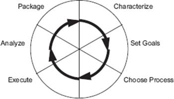
Figure 4–12 The Quality Improvement Paradigm
The general framework defined for continuous bottom-up improvement is the Quality Improvement Paradigm (QIP). QIP stresses the importance of seeing the development and testing of software as an immature process. So that more knowledge can be gained about that process, each project is regarded as an application of methods and techniques, providing an opportunity to increase the insight of the development process. By closely monitoring every project that is carried out, the process by which the software is developed and tested can be analyzed, evaluated, and improved. In theory, QIP is an approach that develops and packages models of software development and testing. The availability of such models is regarded as a major source for improvement because knowledge is made explicit. The steps that QIP describes are characterization, goal setting, process selection, execution, analysis, and packaging (see figure 4–12).
Improvement according to QIP is continuous: the packaged experience forms the basis for a new characterization step, which in turn is followed by the other steps. Process performance is monitored by measurement. QIP is the result of applying scientific method to the problem of software quality improvement and is therefore related to the Shewart-Deming cycle Plan, Do, Check, Act (PDCA). The major difference is that QIP develops a series of models that contain the experience related to the environmental context, while Plan, Do, Check, Act incorporates the experience into the standard process.
Measurement must be applied to evaluate goals defined within the second step of QIP. These goals must be measurable, driven by the models, and defined from various perspectives, such as user, customer, project, or organization. QIP makes use of the GQM approach for defining and evaluating these goals.
For those of you studying for the ISTQB Expert Level certification, QIP is not part of the syllabus, but it does offer valuable insights to ideas behind GQM.
4.3.3 GQM Process
We will now describe the GQM process steps, followed by the two basic GQM activities: definition and interpretation.
GQM Process Steps
The GQM paradigm, as presented in figure 4–11, does not define a process for applying the GQM approach. However, a GQM process model has been developed that reflects the continuous cycle of QIP. The steps to take are applicable when introducing measurement in practice. What follows is a description of the steps defined within the GQM process model. Figure 4–13 shows these steps.
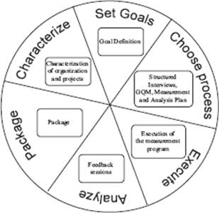
Figure 4–13 The activities for goal-oriented measurement
Step 1: Organization and Project Characterization
Defining the measurement program starts with a characterization of the organization and the project. The results of the characterization are used in the definition, ranking, and selection of the goals and also in establishing the GQM plan.
Step 2: Goal Definition
The second step in the GQM process is defining measurement goals. Measurement goals can directly reflect business goals but also specific project goals or even personal goals. Measurement goals must be carefully selected using criteria such as priority to the project or organization, risk, and time in which a goal can be reached.
Clear and realistic goals must be defined. Two types of goals can be distinguished:
![]() Knowledge goals (“knowing where we are today”) are expressed in terms such as evaluate, predict, and monitor. Examples are evaluating how many hours are actually spent on retesting or monitoring the test coverage. The goal is to gain insight and understanding.
Knowledge goals (“knowing where we are today”) are expressed in terms such as evaluate, predict, and monitor. Examples are evaluating how many hours are actually spent on retesting or monitoring the test coverage. The goal is to gain insight and understanding.
![]() Improvement goals (“what do we want to achieve?”) are expressed in terms such as increase, decrease, improve, and achieve. Setting such goals means that we already know that there are shortcomings in the current test process or environment and that we want to overcome them.
Improvement goals (“what do we want to achieve?”) are expressed in terms such as increase, decrease, improve, and achieve. Setting such goals means that we already know that there are shortcomings in the current test process or environment and that we want to overcome them.
An example of an improvement goal is “decrease the number of testing hours by 20 percent and at the same time maintain a constant level of test coverage.” In order to ascertain this, the following two knowledge goals can be defined:
![]() Evaluate the total number of testing hours per project.
Evaluate the total number of testing hours per project.
![]() Evaluate the achieved levels of coverage per project.
Evaluate the achieved levels of coverage per project.
It is important to investigate whether the goals and the (test) maturity of the organization match. It is pointless to set a goal (i.e., to try to achieve a certain level of coverage) when the necessary resources (knowledge, time, tools) are not (yet) available.
Step 3: Developing the Measurement Program
A major activity when developing a measurement program is refining the selected goals into questions and metrics. It is important to check whether metrics answer questions and that answers to such questions provide a contribution toward reaching the defined goals.
An essential characteristic of a well-defined measurement program is good documentation. Three documents should be developed:
![]() GQM plan
GQM plan
![]() Measurement plan
Measurement plan
![]() Analysis plan
Analysis plan
GQM Plan
A GQM plan describes in a top-down way what has to be measured. It describes the measurement goals and how they are refined into questions and metrics. For each goal, several questions should be derived. They are basically questions that need answers in order to know whether the goals have been met. The questions have to be formulated in such a way that they almost act as a specification for a metric. In addition, it is also recommended that you define responsibilities for supplying the data from which metric values can be calculated. As an example, we’ll use the knowledge goal “provide insight into the effectiveness of testing” [Pol, Teunnissen, and van Veenendaal 2002]. From this goal several questions come to mind. Here, we will limit the number of question to three.
Goal
|
G1: |
Provide insight into the effectiveness of testing |
Questions:
|
Q1.1 : |
How many defects have been found during testing? |
|
Q1.2 : |
How many defects have been reported in the first three months of production? |
|
Q1.3 : |
What level of test coverage has been achieved? |
From the questions, the metrics are derived. The data needed for the metrics will later be gathered during testing. By asking the right questions, one almost automatically arrives at the right set of metrics for the measurement goal. It is important to specify each metric in detail—for example, what is a defect?
G1: Provide insight into the effectiveness of testing
|
Q1.1 : |
How many defects have been found during testing? M1.1 : Total number of defects found per severity category? |
|
Q1.2 : |
How many defects have been reported in the first three months of production? M1.2 : Number of defects reported by users in the first three months of production |
|
Q1.3 : |
What level of test coverage has been achieved? M1.3.1 : Statement coverage achieved M1.3.2 : Requirements coverage achieved |
Here are some hints for defining the metrics:
![]() Start with a limited set of metrics and build them up slowly
Start with a limited set of metrics and build them up slowly
![]() Keep the metrics easy to understand. The definition must appeal to the intuition of those involved. For example, try to avoid using lots of formulas. The more complicated the formulas, the more difficult they are to interpret.
Keep the metrics easy to understand. The definition must appeal to the intuition of those involved. For example, try to avoid using lots of formulas. The more complicated the formulas, the more difficult they are to interpret.
![]() Choose metrics that are relatively easy to collect. The more effort it takes to collect the data, the greater the chance that they will not be accepted.
Choose metrics that are relatively easy to collect. The more effort it takes to collect the data, the greater the chance that they will not be accepted.
![]() Automate data collection as much as possible. In addition to being more efficient, it prevents the introduction of manual input errors in the data set.
Automate data collection as much as possible. In addition to being more efficient, it prevents the introduction of manual input errors in the data set.
Measurement Plan
A measurement plan describes how the measurements shall be conducted. It describes metrics, procedures, and tools to report, collect, and check data. Describing metrics is not the same as identifying them as part of the GQM tree. Typically, a metric is defined by using the following attributes:
![]() Formal definition, including the measurement formula
Formal definition, including the measurement formula
![]() Textual explanation
Textual explanation
![]() Analysis procedure, including hypothesis (possible outcomes) and influencing factors
Analysis procedure, including hypothesis (possible outcomes) and influencing factors
![]() Person that collects the metric
Person that collects the metric
![]() Point of time when the data is measured, such as, for example, which life cycle phase
Point of time when the data is measured, such as, for example, which life cycle phase
Analysis Plan
An analysis plan defines how to provide verified and validated measurement results to the project team at the right abstraction level. It is the basic guideline to support the feedback of measurement information to the project team.
Step 4: Execution of the Measurement Program
In the execution step of the measurement program, the measurement data is collected according to the procedures defined in the measurement plan and the feedback material is prepared as described by the analysis plan. During the test process, a wide variety of data can be collected. This can be done using electronic forms and templates. When you’re designing these forms and templates, the following issues must be taken into consideration:
![]() Which data can be collected using the same form?
Which data can be collected using the same form?
![]() Validation. How easy is it to check that the data is complete and correct?
Validation. How easy is it to check that the data is complete and correct?
![]() Ensure traceability (date, project ID, configuration management data, etc.). Sometimes it is necessary to preserve data for a long time, making traceability even more important.
Ensure traceability (date, project ID, configuration management data, etc.). Sometimes it is necessary to preserve data for a long time, making traceability even more important.
![]() The possibility of automatic processing.
The possibility of automatic processing.
As soon as the data is collected, analysis must start. At this point it is still possible to make changes and ask questions. Waiting too long decreases the chance of recovering the correct data and may negatively impact the motivation of testers to record accurately.
Step 5: Feedback Sessions
Feedback sessions are meetings involving members of the project team. This is an essential tool for analysis and interpretation of the measurement results. Proper feedback is also of importance for the motivation of those involved and the validation of the measurement data. At this step, it is also determined whether the goals have been achieved, which may even signal the start of a new GQM cycle. In this way, one is continuously improving the test process.
As a rule during feedback sessions, avoid complicated statistical techniques and models. Provide feedback to the testers and other stakeholders as quickly as possible. Show them what is being done with the information being gathered.
A more detailed description of a feedback session is provided later.
Step 6: Packaging of Measurement Results
To reuse measurement results and experiences, the results of the measurement program must be packaged. Packaging must be done in such a way that future project teams, or other parties from the organization, are able to use the measurement results.
GQM Definition
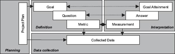
Figure 4–14 The two main parts of the GQM method: definition and interpretation
Application of GQM measurement by means of the process model divides the improvement cycle in two main parts (see figure 4–14). The first part consists of the definition process, during which goals, questions, metrics and additional procedures are defined (steps 1, 2, and 3). The second part (described in the next section) consists of the interpretation process, during which the collected data is analyzed, improvements are identified, and experiences are described (steps 4, 5, and 6).
The definition process for GQM measurement is well described in literature. Many books and papers are available on selecting the right metrics for a specific problem, such as, for example, A Quantitative Approach to Software Management – The AMI Handbook [Pulford, Kuntzmann-Combelles, Shirlaw 1995]. The GQM approach was initially introduced as a technique to define metrics, even though it already encouraged interpretation implicitly.
The definition process for GQM measurement consists of the following activities:
![]() Pre-study:
Pre-study:
Characterization of the organization and project, its problems and goals.
![]() Identify measurement goals:
Identify measurement goals:
Refine informal improvement goals, rank and define them to correspond with GQM goals.
![]() Produce GQM plan:
Produce GQM plan:
Use the GQM paradigm for the definition of questions and metrics. Interview project members to retrieve the necessary information.
![]() Produce measurement plan:
Produce measurement plan:
Define environment in which the defined metrics are collected.
![]() Produce analysis plan, and start measuring:
Produce analysis plan, and start measuring:
Define the analysis in charts and tables according to which the analysis is likely to be done, and start collecting data.
Tools are available for the first three of the activities. For the pre-study, questionnaires have been shown to be useful. For the definition of goals, templates are available and brainstorming sessions can be used. For the production of the GQM plan, interviews must be held that can be supported by abstraction sheets (see section 4.3.4).
GQM Interpretation
Once the goals, questions, and metrics have been defined and the matching plans are developed, data collection can start. Based on this data, an analysis will be performed aimed at answering questions and reaching goals. This is the interpretation process. Remember, it is often easy to get numbers; what is hard is to know that they are right and understand what they mean. Experience has shown that interpreting measurement data is a learning process within a team. Interpreting measurement data properly can be done according to the three principles of goal-oriented measurement:
![]() Measurement must reflect the interest of the data providers and must be based on the knowledge of the team.
Measurement must reflect the interest of the data providers and must be based on the knowledge of the team.
![]() Only those that provide the data can determine its validity. They are the only ones who know all the details (including the data that was not measured) and are therefore the only people allowed to really interpret feedback material.
Only those that provide the data can determine its validity. They are the only ones who know all the details (including the data that was not measured) and are therefore the only people allowed to really interpret feedback material.
![]() Because of the limited amount of time available (e.g., caused by commitments to project planning), conflicts of interest may occur when the test team performs all the measurement tasks. Separate staffing may be needed to support the collection and analysis of the measurement data and perform those activities that do not necessarily have to be carried out by the test team.
Because of the limited amount of time available (e.g., caused by commitments to project planning), conflicts of interest may occur when the test team performs all the measurement tasks. Separate staffing may be needed to support the collection and analysis of the measurement data and perform those activities that do not necessarily have to be carried out by the test team.
To get the most out of measurement, the team must emphasize the interpretation to close the feedback loop. The main objective of measurement is to get interpretations from the team on the collected data. This data can be used to evaluate current processes and identify improvement opportunities. Depending on the results, immediate changes and adjustments to both the test process and the measurement process can be suggested. Through defining conclusions and action points during the interpretation process, test process improvement is started at the project and engineering level.
The motivation for testers to participate in measurement is mainly determined by the way the interpretation process is carried out. For this purpose, so-called feedback sessions can be introduced. These are structured meetings involving members of the project team and measurement team, during which measurement data is analyzed, conclusions are drawn, and corrective actions are identified. A set of guidelines should be developed to improve the organization of the feedback process. These guidelines can also help to identify why a specific feedback process goes wrong.
Quality measurement programs are unsuited to the evaluation of individual developers. Judgment of the performance of individuals based on measurement data violates almost every condition for a successful learning program and may even be illegal in some countries. If measurement is used in this way, the entire measurement program will fail, either quickly or within about a year.
4.3.4 Supporting Tools and Techniques
The following sections present some useful tools and techniques for measurement that are being used in day-to-day practice.
Goal Definition
Goal definition is important for measurement. It defines the scope of the measurement program for a period of time. Refining organizational or project goals into measurement goals is a difficult task that requires skills and knowledge. You must keep in mind that a goal must be reachable, must be measurable, and must be attainable by answering a set of (knowledge) questions. Two tools are available for goal definition: a measurement goal template, and a technique termed the seven questions (described later). Section 4.4 provides a number of standard goals and metrics. Of course, these are not anywhere near complete or exhaustive, but they can be a source for inspiration, especially to those who are not that experienced in applying software measurement by GQM.
Measurement Goal Template
Measurement goals can directly reflect business goals but also project goals or personal goals. To describe measurement goals in a uniform and reachable way, a template is available (see figure 4–15) [Basili and Rombach 1988].
|
Analyze the: |
objects: process, product, or other experience model |
|
for the purpose of: |
understanding, controlling, improving evaluating, predicting |
|
with respect to: |
focus: cost, correctness, defect removal, changes, reliability |
|
from the viewpoint of: |
who: user, customer, manager, developer, corporation |
|
in the context of: |
development team, site, country, task group |
Figure 4–15 Template for a measurement goal
Figure 4–16 shows an example from a measurement project where the goal was to understand the usefulness of code metrics.
|
Analyze the: |
the value of code metrics |
|
for the purpose of: |
understanding |
|
with respect to: |
their usefulness as reliability and maintainability indicators |
|
from the viewpoint of: |
the software engineers |
|
in the context of: |
the projects xxxx and yyyy |
Figure 4–16 Example of a defined measurement goal (using the template)
The Seven Questions
Within a brainstorming session it is always possible to define many goals. However, these must be relevant to the business, represent strategic goals from management, and support high priority processes of the organization. Sometimes it will be clear for a (test) manager what the measurement goals must be (for example, a specific problem that needs attention), but often it is not obvious. In such cases, brainstorming and goal selection by a multi-criteria mechanism is a possibility.
It is also possible to define and select the measurement goals in a meeting. One mechanism to support goal definition and selection in a meeting is by asking the seven questions:
1. What are the strategic goals of your organization?
2. What forces have impact on your strategic goals?
3. How can you improve your performance?
4. What are your major concerns (problems)?
5. What are your improvement goals?
6. How can you reach your improvement goals?
7. What are possible measurement goals, and what are their priorities?
All members of the team should be involved in the definition of the goals and have an interest in achieving them. High motivation of team members can be expected when they set their own goals. However, management involvement is a critical success factor, and it should be clear to them how the measurement goals relate to the business goals and support business improvement.
Abstraction Sheets
The selected goals can be refined into questions and metrics based on interviews. The aim of the interviews is to capture the definitions, assumptions, and models of the team that are related to the goal. The main purpose of these interviews is to make the implicit knowledge of the engineers explicit. Furthermore, the interviews motivate the people for the measurement program because they realize that the data to be collected is related to their own issues.
The information acquired during the interviews must be combined because inconsistencies can exist between the different team members. Those differences become clear during the interviews and must be discussed and clarified.
The interview is supported by so-called abstraction sheets. The use of abstraction sheets during interviews provides a structured approach to focus on the relevant subjects regarding the goals and support the identification of issues that could be overlooked. An abstraction sheet summarizes the main issues and dependencies of a goal and represents this information on the following four quadrants of a sheet:
1. Quality Focus:
What are the measured properties of the object in the goal?
2. Baseline Hypothesis:
What are the expectations about the measurements? What is the current status of knowledge about the measured properties? The current knowledge is made explicit by drawing up baseline hypotheses.
3. Variation Factors:
Which factors are expected to have an essential impact on the measured properties?
4. Impact on Baseline Hypothesis:
How do the variation factors influence the measured properties? Which dependencies are assumed?
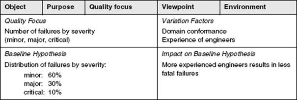
Figure 4–17 Example of an abstraction sheet
Hypotheses are grouped into two quadrants of the abstraction sheet and are matched to the questions of the other quadrants. The four quadrants can be checked because mutual relationships exist. For example, every metric in Quality Focus must have a hypothesis in the Baseline Hypothesis part, and for every metric in Variation Factors, its influence on the hypothesis must be defined in the Impact on Baseline Hypothesis quadrant. An example of an abstraction sheet is presented in figure 4–17. Abstraction sheets are a powerful tool for interviews during the definition process of a measurement program. Abstraction sheets can also be used to structure interpretation of measurement data.
Data Collection Tools
No GQM-specific data collection tools exist. However, some software is available that can be used for measurement. There are tools available that calculate some well-known metrics on test coverage. Database packages can be used to collect data. Testers can then enter specific data, such as effort spent on testing and retesting, into an electronic database. Current database tools provide functionality to easily create specific databases with user friendly interfaces. Finally, it is possible to build data collection forms with a word processor. Such forms must be filled in by the testers and subsequently included in some automated tool.
Feedback Sessions
Feedback sessions are meetings during which data are analyzed by the team based on the procedures defined in the GQM plan. These sessions are important to maintain interest and motivation for the measurement program. This is one of the reasons they should be held often.
There should be enough time between feedback sessions to ensure that there is enough new measurement data and the effort spent is being optimized. This is a kind of paradox: on one hand, feedback must be obtained often; on the other hand, this is not always feasible. In practice, a balance is achieved by running feedback sessions every six to eight weeks, depending on the project-specific goals.
Generally speaking, feedback sessions last between two and three hours. The attendees need to show a high degree of concentration for a feedback session. As a result, a maximum number of 10 slides presenting measurement results can be discussed. Decisions have to be made on which issues to discuss in a feedback session. In the first sessions of a measurement program, it might be necessary to discuss all available material.
Feedback sessions consist of the steps shown in table 4–3.
Table 4–3 10 steps for feedback sessions
The first step is to freeze the database in which the collected measurements are stored. With this data set it is possible to update the basic set of slides to discuss during the feedback session. Extra slides can also be created to study the specific issues raised by the team. Often the total set of slides is by then already too large. Therefore, step 4 must be carried out, during which a selection is made in cooperation with the test manager and team members on the subjects for the feedback session. The slides are always distributed to the attendees of a feedback session one or two days in advance to allow for preparation.
After the individual preparations, the feedback session can take place (step 6). The use of a moderator to guide the discussion during a feedback session is especially necessary for a project team larger than four people. The moderator explains which data is included in a presentation slide, explains the axes of a chart, and if a relationship is visible from a slide, the moderator points it out. After this explanation, the team is asked to interpret. Mostly, the first interpretation already results in a group discussion, which is finished with an overall interpretation and sometimes one or more action points. The conclusions are recorded, and the action points are assigned among the participants of the feedback session.
A feedback session is finalized by an evaluation with all participants involved, followed by an internal GQM team evaluation. The results, conclusions, and corrective actions are reported by the GQM team, including improvements for the measurement program. The specific feedback session then comes to an end, but since this is a continuous process, the next feedback session is already planned.
4.3.5 Bottom-Up Improvement
Most widely used test improvement methods provide a top-down approach. However, the application of bottom-up approaches is also recommended. Such methods, termed software measurement, are focused on collecting data on current practices within the organization. Although it is important to select the right metrics, the process by which the measurement data is analyzed is more important.
Measurement is the starting point for actually improving test processes and products at the project level. Interpreting measurement data is most important. The major benefit of measurement is to raise the level of understanding by the team—in short, learning. Organizations must include such learning activities in their regular planning.
The GQM approach is a powerful technique that supports the collection of data based on a specific problem or organization. The recommendation is to apply an approach such as GQM instead of just collecting some well-known metrics. Especially industrial organizations have positive experiences with GQM because both the method and the organization are goal driven.
Organizations need to improve continuously. This chapter does not claim that top-down improvement approaches such as the TMMi do not work. On the contrary, top-down approaches have proven to be valuable in establishing improvements. They provide a means to set up a solid test engineering working environment and to establish product quality targets. Experiences in practice have shown significant benefits.
This chapter does claim that organizations need to apply a bottom-up approach as well. When such a measurement-based approach is set up, testing will become better understood. Knowledge is the best basis for improvement, and knowledge has to be created within people. Since testing is still a human activity, we must begin to make use of bottom-up improvement approaches as soon as possible.
4.4 Analysis Using Measures, Metrics, and Indicators
Syllabus Learning Objectives
|
LO 4.4.1 |
(K2) Provide examples of the various categories of metrics and how they can be used in a test improvement context. |
|
LO 4.4.2 |
(K5) Recommend appropriate metrics and indicators for tracking improvement trends in a particular improvement situation. |
Measurements are important for the improvement of the test process to assess the consequences of any certain improvement actions by comparing data before and after the action has been implemented. Data analysis is essential for objective test process improvement and a valuable support to purely qualitative assessments, which might otherwise result in imprecise recommendations that are not supported by data.
In short, measurement should be a part of a test improvement program for the following reasons:
![]() To show the benefits of test improvement
To show the benefits of test improvement
![]() To understand the current situation (both for product quality and test process)
To understand the current situation (both for product quality and test process)
![]() For benchmarking
For benchmarking
Often the terms metric, measure, and indicator are used interchangeably. While the semantic differences between the three are small in most circumstances, it is helpful to understand the different meanings.
Measure
Measures are quantifiable figures derived from a product, a process, or a resource. By definition, measures are quantitative, and in the software development industry they can be applied to products, projects, and processes. Measures should be documented and often are substantiated with estimated, planned, and actual values. Examples of measures include start and end dates, size, effort, and defects. Measures are also called absolute measures because they can be taken directly from data without requiring calculations.
Measure The number or category assigned to an attribute of an entity by making a measurement [ISO 14598].
A measure is basically a value that is quantified against a standard at a point in time. For example, if we were to calculate store sales for January 2013, the standard would be the dollar and the total sales for January 2013 would be the measure. A single measure usually has little value without some context. How do we know if $25,000 in sales for that month is good or bad?
Metric
Metrics are used to evaluate products and/or processes, and they enable a quantitative comparison with other products and processes. They typically facilitate a common denominator type of comparison between two or more observed measures. Metrics are most often calculated from (basic) measures or their combinations and are typically compared with a baseline or an expected result. Metrics should deliver orientation support, that is, direction for planning and management of the key processes in an organization.
Suppose we track monthly sales over a 13-month period between January 2012 and January 2013. Now, we have some context to see if our January 2013 sales are trending up or down. A metric is the degree to which a particular subject possesses the quality that is being measured. It is based upon two or more measures. Total Monthly Sales is our metric.
Metric A measurement scale and the method used for measurement [ISO 14598].
Indicator
Indicators compare a metric to a baseline or to an anticipated result. Indicators are collected over a time period to derive trends—often they can serve as early warning indicators. An indicator often consists of a measured variable, a goal (expected by historic experience, industrial average, or best practice), and an analysis technique, allowing a comparison between measurement and goal. It is the comparison between the measurement and the goal that permits one to recognize if some action has to be performed.
Indicator A measure that can be used to estimate or predict another measure [ISO 14598].
In our example, the metric Total Monthly Sales gives us more context and understanding of the relationship between measures. However, the fact that the sales are trending up may not give us the complete perspective of how this store is performing. If we measure the store’s sales against a baseline such as budgeted sales, then we get a truer indicator of performance. Total Monthly Sales to Budget can also be used as an indicator. This provides us with actionable information that we use to drive our business.
Standard Test Performance Indicators and Metrics
Measurement, in the context of test performance improvement, is the continuous process of defining, collecting, and analyzing data on clearly defined—quantifiable—attributes of test performance. These measurements indicate what the results are of the activities that are defined in previous steps to improve the test process. In other words, test performance indicators quantify the effects of the test performance improvement program.
A number of performance indicators can be used in almost every test improvement program. These commonly used performance indicators are based upon metrics on product quality, test effectiveness, lead-time, predictability, efficiency/cost, and test maturity. Note that for all metrics that are discussed hereafter it is important when measuring number of defects to make a distinction between the various priority levels of the defects found.
4.4.1 Test Effectiveness Metrics
Note that the metrics discussed under this heading provide information for the manufacturing view of quality as was discussed in Chapter 2.
Defect Detection Percentage (DDP)
The first indicator that can be used in almost any test improvement process, and is highly recommended by most test experts, is the Defect Detection Percentage (DDP). If you’ve found most (if not all) of the important Defects During Testing, and users/customers found few during real-life usage, your testing is good. Defect detection percentage is defined as the proportion of all the defects known that were actually found by testing. The DDP can be calculated per test stage (e.g., integration, alpha testing, beta testing) or for the all test stages together. DDP is a calculable metric used after a project is finished and users/customers have had some time to find the residual defects on a system.
Figure 4–18 shows the defects found during testing (the white area) and the defects found in a period after release (grey area). This period typically covers the first six months of real-life usage. Undetected defects (the black area in the graph) can of course not be taken into account, but they can be detected by the customer.
Figure 4–18 DDP basics
Three commonly used performance indicators are based on the defects found during alpha testing, during beta testing, and in the first three or six months after release. Finding defects six months after release will make the performance indicator (slightly) more reliable; three months will allow for more rapid feedback.
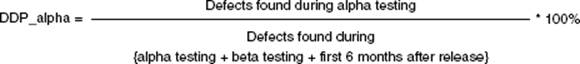
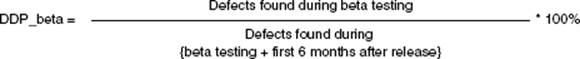
Defect Detection Percentage (DDP)
The number of defects found by a test phase divided by the number found by that test phase and any other means afterward.
Post-Release Defect Rate
This performance indicator is defined as the number of defects found by customers during a certain period after release of the product per kilo lines of code (KLOC). If this rate decreases, then the customers’ perceived quality will increase.
![]()
4.4.2 Test Efficiency / Cost Metrics
Cost of Quality Ratio
The cost of quality ratio is the ratio of “total effort spent on static testing (e.g., inspections and reviews)” and “total effort spent on dynamic testing (e.g., unit, integration, system test).” If this ratio increases, then the efficiency of the defect removal process will increase.
![]()
Early Defect Detection
As stated, the efficiency of the defect removal process will increase if defects are found earlier in the process. Not only is this applicable for static versus dynamic testing, but also for unit and integration versus system and acceptance testing. The performance indicator “early defect detection” measures the total number of defects found during unit and integration testing (early dynamic testing) versus the total number of defects found during dynamic testing.
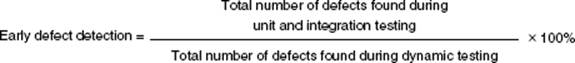
Relative Test Effort
A basic performance indicator is the ratio of the total test effort (or cost) versus the total project effort (or cost) prerelease. Post-release effort spent on activities such as maintenance and after-sales support is not taken into account.
![]()
Test Efficiency
This performance indicator is based on the number of defects found and the effort spent (per test phase). It provides support in determining if the test effort is focused on finding defects; in other words, is testing done efficiently? It is important to take only high-priority defects into account when calculating this performance indicator. Also, defects that are rejected because the tester incorrectly marked them as a defect must not be taken into account.
![]()
Automation Level
The automation level is the ratio of the number of test cases that are executed automatically (e.g., using record and playback tools) to the total number of test cases executed (both manually and automatically).
![]()
Test Productivity
This is the total number of test cases (or test design) for the product related to the total test effort required. Of course, this performance indicator can also be measured per test phase.
![]()
4.4.3 Lead-Time Metrics
Test Execution Lead Time
The lead time of testing is especially important during test execution because during test execution, testing is on the critical path of the project. Lead time is defined as the period (in days or weeks) between two milestones that identify the start and end of one or more test phases. The test execution lead-time performance indicator to test the product should of course be related to the size of the product. This performance indicator can be measured per test phase (e.g., alpha or beta).
![]()
4.4.4 Predictability Metrics
Test Execution Lead-Time Slippage
This is the difference between the actual and estimated test execution lead time required for one or more test phases related to the estimated test execution lead time.
![]()
For project control and improvement purposes, it is often interesting to measure test lead time slippage against the estimation made at the beginning of the project and against the estimation made at the beginning of the test execution phase.
Effort Slip (or Cost)
This metric is the difference between the actual and estimated effort (or cost) required for one or more test phases related to the estimated effort (or cost).
![]()
Test Case Slip
This is the difference between the actual and estimated number of test cases (or test designs) required for one or more test phases related to the estimated number of test cases (or test designs).
![]()
4.4.5 Product Quality Metrics
Metrics for Quality Attributes
A number of attributes are available with which product quality can be described (e.g., functionality, reliability, usability, efficiency, maintainability, portability). These are documented in the ISO 9126 standard [ISO 9126] and its successor, ISO 25000 [ISO 25000]. The attributes and the indicators associated with them are described in the ISTQB Advanced Level syllabus. For example, indicators associated with the software quality attribute reliability may take the form of mean time between failures (MTBF) and mean time to repair (MTTR).
The test process is one of the primary sources of information for measuring these software quality attributes. The capability of the test process to deliver meaningful and relevant product quality information may be considered an area for potential test process improvement.
Mean Time Between Failures (MTBF)
This is the number of post-release failures (defects) found during a defined period related to the duration of that period, e.g., six months.
![]()
Table 4–4 shows a real-life example of metrics for quality attributes that were used during the testing of copier/printer software [van Veenendaal 2010].
Table 4–4 Example of product quality metrics
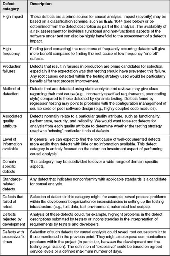
Coverage Indicators
The coverage of requirements and code achieved by testing may be used as indicators of product quality (assuming that higher product quality is related to higher coverage levels) during testing.
Requirements Coverage
Both requirements coverage and code coverage (see the next section) are indirect measures. This means that they do not directly relate to better or improved product quality but are indicators that higher product quality is very likely since more has been covered during testing. Requirements coverage is defined as the number of requirements tested compared to the total number of requirements that have been defined. Note that this performance indicator can be further refined, making a distinction between the number of requirements tested and the number of requirements tested and passed. Test management tools can be used to support the implementation of this performance indicator. If coverage levels increase, testing is becoming better and it is expected that product quality will also increase.
![]()
Code Coverage
Code coverage is defined as the percentage of the total software code that is executed during testing. Various levels of code coverage exist, such as statement coverage, decision coverage, and condition coverage. Numerous tools are available to support code coverage measurements.
![]()
A statement is defined as an entity in a programming language that is typically the smallest indivisible unit of execution.
4.4.6 Test Maturity Metrics
Test Maturity
This is an organization’s test maturity level in terms of the Test Maturity Model integration (TMMi) or the TPI NEXT model. It is assumed that when the maturity increases, the risk of not satisfying the project’s test objectives regarding quality, lead time, and costs will decrease.
Please note that these metrics address the manufacturing, product, and value quality views described in chapter 2 but are not direct measures of the user’s view of quality. Test managers may therefore want to measure user quality by taking specific measures of user/customer satisfaction, by measuring usability characteristics (especially relating to task efficiency and effectiveness), or by using qualitative measures of stakeholder views.
4.5 Exercises
The following multiple-choice questions will give you some feedback on your understanding of this chapter. Appendix F lists the answers.
4-1: Which of the following would you not select for causal analysis ?
A: An incident reported by a user to the help desk
B: A low level of planned test coverage
C: Low levels of defect detection
D: An issue raised by the project leader
4-2 What best describes the Pareto Principle?
A: A large majority of problems are produced by a few key causes.
B: The most significant problems arise from a few key causes.
C: Analyzing a small sample of problems will lead to the principal causes.
D: Most defects come from making a small number of errors.
4-3 Which of the following statements does not apply to Ishikawa diagrams?
A: The backbone shows the main path to the defect.
B: Standard categories can be used.
C: Each possible cause is shown as a fishbone with an arrow symbol.
D: The finer bones are less important than the major bones.
4-4 Which of the following statements applies to systems analysis?
A: Systems with reinforcing feedback loops exhibit stable characteristics.
B: A vicious circle is a positive reinforcing loop.
C: A system that contains balancing feedback loops will reduce any difference between a current and a desired system state until a balanced state is achieved.
D: A virtuous circle is a positive reinforcing loop.
4-5 Which of the following steps would not be performed when using formal reviews for causal analysis?
A: Defect selection
B: Analysis of specific defects
C: Alignment of analysis to business objectives
D: Analysis of generic defects
4-6 Which of the following statements regarding causal analysis would you agree with?
A: It is better to say, “I don’t know” than guess.
B: For each problem, a cause can be shown, and that cause and problem are directly related to one another.
C: Spontaneous “gut feelings” based on experience are more likely to find root causes than ideas incubated over a period of time.
D: Members of the group with strong analytical skills are generally able to communicate ideas most effectively.
4-7 Which of the following statement is not true with respect to the GQM paradigm?
A: Implicit models give valuable input to the measurement program.
B: Measured data will be analyzed to identify whether the goals are attained.
C: In GQM, metrics are defined from a top-down perspective.
D: Knowledge acquisition techniques are used to capture the explicit models.
4-8 In a GQM measurement program, the following goal has been set: Evaluate the number of defects per component. What specific name does GQM use for such a goal?
A: Measurement goal
B: Knowledge goal
C: Improvement goal
D: Product quality goal
4-9 What is the purpose of the baseline hypothesis with GQM?
A: It defines the measured properties of the object in the goal.
B: It defines the expectations about the measurements.
C: It defines which factors are expected to have an essential impact on the measured properties.
D: It defines how the variation factors influence the measured properties.
4-10 To which ISO 9126 quality attribute does the product quality metric MTBF relate?
A: Portability
B: Reliability
C: Availability
D: Maintainability