UX Strategy: How to Devise Innovative Digital Products That People Want (2015)
Chapter 6. Storyboarding Value Innovation
“Reaching beyond existing demand is a key component of achieving value innovation.”[40]
— W. CHAN KIM AND RENÉE MAUGBORGNE, BLUE OCEAN STRATEGY
IF YOUR GOAL IS TO INVENT, YOU NEED TO LOOK FOR THE BENEFITS that will make your product indispensable to users. That means you need to understand how to break out the big UX moments that need to show incredible value before you move into a formal design phase. To get there, you need to mash up the principles of Tenet 2, Value Innovation, with Tenet 4, Killer UX (Figure 6-1).
If you’re a seasoned design professional, be aware that this chapter is not about pushing pixels or making cool-looking deliverables. Instead, it’s about using design hacks to focus your team sharply on identifying and maximizing your product’s potential value innovation. It’s about accelerating your thinking through your product’s ultimate value proposition.
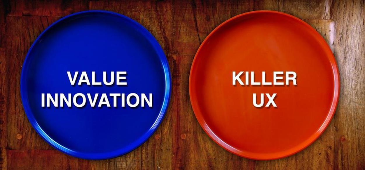
Figure 6-1. Tenet 2 and Tenet 4: Value Innovation and Killer UX
Timing Really Is Everything
In 1990, I devised an interactive animation that fused my software design skills with my love of experimental art and music for my master’s thesis at the New York University Interactive Telecommunications Program. It was a mash-up of technology and art jammed onto an 800 KB floppy disk. The electronic experience was programmed for the Macintosh in HyperCard and VideoWorks. The disk featured an interactive table of contents with links to animations of poetry, games, and rants combined with an industrial noise soundtrack. After numerous sleepless nights, I succeeded in my objective — to create what was to be the world’s first animated electronic magazine. It worked, played, and all fit on one disk! This was Cyber Rag #1, which you can get a glimpse of in Figure 6-2.
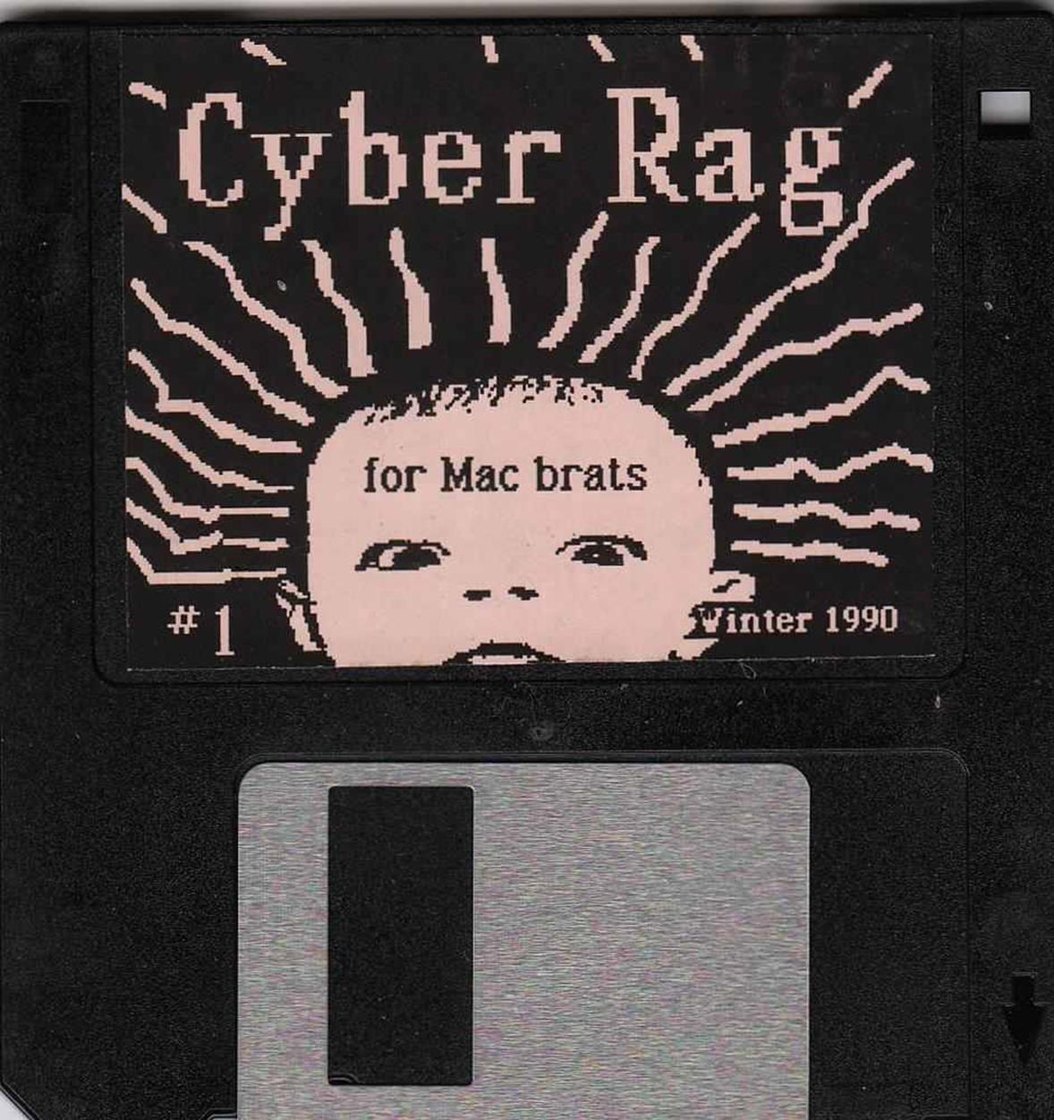
Figure 6-2. Cyber Rag (1990) electronic magazine on floppy disk
Sure, there were some competitors in the marketplace. For instance, there were nonanimated HyperCard stacks with tech-centric content. There was also an interactive art disk that ran on the less popular Commodore Amiga and could be downloaded from a bulletin-board service (BBS). But there was no other digital product like Cyber Rag, and I saw the golden opportunity to make digital content more mainstream and accessible to the masses by placing it on a Mac-based floppy disk.
However, it was one thing to create a completely original electronic magazine on a disk and quite another to get it out to the general public, have them recognize it for its originality, and buy it. Much as in Chapter 3, my younger self had to figure out who her customers were. I eventually learned that my customers weren’t the computer nerds of the 1990s who might download an electronic mag for free off a BBS. Even I did not own a modem (yet). That’s when I realized that my Cyber Rag #1 wasn’t just tied into the experience of a new electronic publishing medium. It also aligned with the DIY attitude of the Generation X who self-published their own fanzines about pop cultures. They just didn’t do it digitally yet. Somehow, I had to reach my Gen X peers in independent book and record stores. This meant that besides creating the physical product, I also had to somehow package it, market it, and distribute it.
A typical Saturday in my mid-20s involved saving copies of Cyber Rag onto hundreds of floppy disks. I glued on labels, printed packaging, sealed the packages, and then I’d walk into independent bookstores in New York City and Los Angeles to pitch my product to the owners. Their typical reaction was bewilderment because they had no concept of my value proposition at the time. Some owners didn’t even have access to a Macintosh to preview the product for themselves. How were they to know if the disks weren’t empty, corrupted, or filled with hardcore porn? I learned that the best tactic was to front the product initially to the storeowners to lessen their fear of selling an unfamiliar publishing medium.
But the disks sold well. Customers were curious and willing to dole out six dollars to experience their first electronic magazine on a computer screen. Typically, a store would call me within a month after my initial pitch to ask me for more product. When I began to gain notoriety in the press, I started selling thousands of disks (Cyber Rag #1, #2, #3 and Electronic Hollywood I and II). The disks were on sale in independent bookstores, in art galleries, and via mail order; they even sold to people all over the world. I had no business model except to keep publishing disks until “something” happened.
Then, “something” finally did happen. After two years, I came home from my job as a typesetter to find a message on my answering machine.
“Hi Jaime! This is Henry from EMI Records. We are calling on behalf of Billy Idol who just bought one of your disk magazines. He wants to see if you are interested in working with him on his new project. Can you please have your people call our people to arrange a meeting? Thanks.”
I was excited but also confused. Who were “my” people? Was I going to have to ask my mom to call Billy Idol?
My mom didn’t call. I did. And I got the gig.
In 1993, EMI released Cyberpunk, Billy Idol’s new album on a CD that featured a floppy disk in a special-edition digipak, as shown in Figure 6-3.

Figure 6-3. Billy Idol Cyberpunk album (1993) with floppy disk
It was the first-ever commercially released interactive press kit (IPK). The floppy disk was essentially a customized version — a “Save As” in Macromedia Director — of my software, bringing my innovation score up from one to two. I was excited and thought this venture was going to make my career. From here, I would finally be able to financially support myself as an interface designer and electronic publisher. Soon everybody from David Bowie to Michael Jackson would call me for custom disk magazines for their future albums. Not just my early adopters but the entire world would finally “get” how cool this new electronic publishing medium was. The ocean seemed so blue!
Sadly, here’s where I hit bumps in the road. Sure, I had successfully innovated a new digital medium, found a blue ocean for it, and pushed it into two user groups (indie bookstore customers and rock-star musicians) who loved it. The thing was, though, Billy Idol was no longer the bigcelebrity he used to be. Instead, critics slammed him, some calling the album pretentious for jumping on the cyberculture bandwagon.[41] His new songs gained little traction on MTV or the radio, and the album flopped. There was also a huge issue with the packaging. The digipaks were so bulky they took up almost three times as much space as a regular CD. This made it hard for record stores to stock it. The Billy Idol Cyberpunk album literally did not have the right product/market “fit.”
I was never hired to make an IPK or custom floppy-disk project again. However, I did learn some valuable lessons.
LESSONS LEARNED
§ Timing is everything. Even if you are first-to-market with a disruptive innovation, there are no guarantees of success. In the case of electronic publishing, digital media really should be distributed digitally. But in 1993, this wasn’t possible. The first web browser for the Internet was still being invented.
§ Context is key. My own floppy disk magazines were “compelling” not just because of the new technology. The content on them, which featured anti–Silicon Valley rants and tips on sneaking into expensive tech tradeshows, was actually a symbiotic part of the value innovation. Billy Idol’s album marketing content was perceived as more of a gimmick.
§ There are many aspects to building successful digital products. Inventing them is just one small part of the fun. You also need sustainable adoption, scalability, wide distribution, revenue streams, and a team bigger than yourself. Basically, you need an innovative business model.
Techniques for Value Innovation Discovery
You have already learned that by doing competitive research your team can gain insights into what digital products and services exist in the marketplace of your value proposition. Obviously, though, this research isn’t just to help your team replicate other products or improve them only marginally. Instead, you want to create new value with a superior invention.
To have a sustainable and marketable product, UX strategy requires you to balance business goals with user value. Even though you aren’t creating the first electronic magazine or even the first ever website, your product should still have a unique something to engage customers in new and different ways. This is especially important if you’re dealing with a free digital product. Your future customers need to want to choose your solution over any other because, a) it’s significantly more efficient than what’s currently out there, b) it solves a pain point they didn’t know they had, and/or c) it creates an undeniable desire where none existed before. Basically, you create a leap in value by taking advantage of the uncontested blue-ocean market space through value innovation.
The value innovation in your value proposition manifests itself as a unique feature set. Features are product characteristics that deliver benefits to the user. In most cases, fewer features equals more value. Here are the top four “secret sauce” value innovation patterns of feature sets that I’ve observed in the digital realm:
§ The product offers a new mash-up of features from competitors and relevant UX influencers. The hybrid then offers a much better existing alternative for accomplishing a task. (Meetup + a payment system = Eventbrite)
§ The product provides an innovative “slice” or a twist to a value proposition from existing larger platforms. (Google Maps + crowd-sourcing = Waze)
§ The product consolidates formerly disparate user experiences into one single simple and crucial solution. It becomes the one-stop shop for a user task. (Vine or Instagram with regard to simplifying how to take and share mobile videos and photos)
§ The product brings two separate and distinct user segments to the table to negotiate a deal that had not been possible before, thus revolutionizing those users’ world. (subletters + travelers = Airbnb)
As you can see, the patterns aren’t about building replicas of existing products. Instead, you want to build on existing design conventions and take those capabilities to the next level. Great ideas are just waiting to be discovered in unexpected, unassuming places. You just need to peruse the Web like a hunter searching for prey!
The rest of this chapter examines poaching techniques for discovering new opportunities for value innovation via these four patterns. Poaching has traditionally been defined as the illegal hunting, killing, or capturing of wild animals, usually associated with land-use rights.[42] However, there is nothing illegal about poaching features and interaction patterns that are the general approach to solving a common type of problem. You’ll be borrowing these kernels from different places and putting them together in a brand-new context to create value innovation. This is how you don’t just beat the competition, you make them completely irrelevant.
The four techniques you are about to learn are how to:
§ Identify the key experiences
§ Take advantage of UX influencers
§ Do feature comparisons
§ Storyboard the value innovation
Be aware that these techniques are more for your personal or your team’s edification. They are not necessarily deliverables that you will present to a client.
Identify the Key Experiences
Generally when the word “key” precedes a term, it means that the words that follow are mission critical. We see the word used in numerous business terms such as “key leverage points,” “key performance indicators” (KPIs), and “key stakeholders.” The first time I saw the term “key experience” was at a Lean UX workshop presentation I co-taught with long-time UX guru Lane Halley (see Figure 6-4).
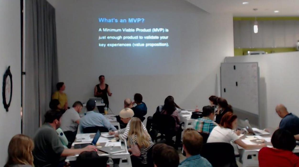
Figure 6-4. Key experience slide at Lean UX presentation in Los Angeles, July 2013 (with Lane Halley in the left corner pretending it’s not her slide)
At the lecture, Lane showed a slide that read “A Minimum Viable Product (MVP) is just enough product to validate your key experiences (value proposition).” Even though Lane later claimed that she didn’t invent the term, I took her definition as the gospel and immediately integrated it into my techniques.
For your purposes, the key experience is the feature set that defines your value innovation. It must exist in order for your product to have a competitive advantage. It defines the experience that sets your product apart from all others. It might be an exotic permutation of features, or it can be a single significant feature (as I described in the patterns earlier). For example, in his book Microinteractions,[43] Dan Saffer describes how “Twitter is built entirely around a single interaction: sending a 140-character message.” And, as discussed in Chapter 2, Twitter has completely revolutionized the way people communicate in the world.
To get your idea juices flowing on the key experience, ask yourself these questions:
§ What will make your provisional personas (hypothesized customers) love this product?
§ What moment or part of the user’s journey makes this product unique?
§ Based on your competitive research and analysis, what scenario or feature resolves a big shortfall?
§ What kind of workarounds are your potential customers currently doing to accomplish their goals?
Your answers might just lead you to the key experience that you’ll eventually deliver through a killer UX design!
However, be careful about confusing your key experience with a list of features. As is described in Chapter 4 and shown in Figure 6-5, this happened to one of my students, Ena, when she took her first pass on defining the key experience for Airbnb for Weddings.
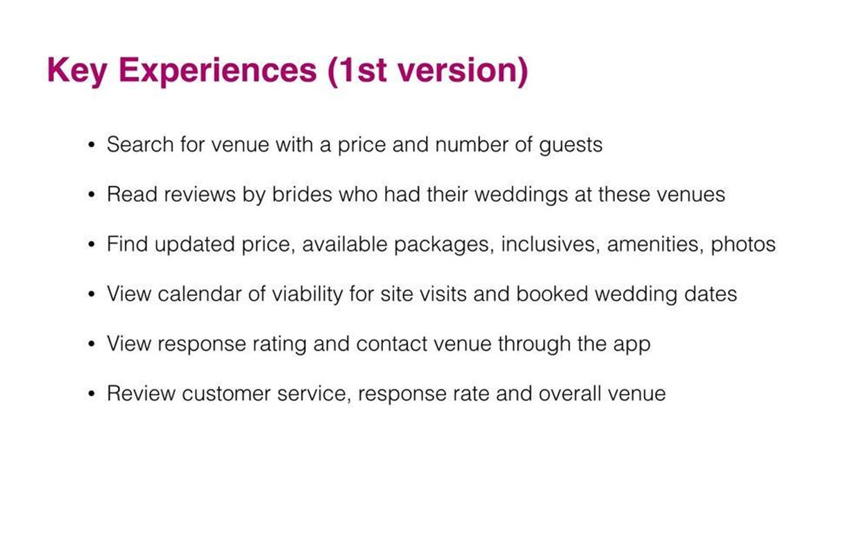
Figure 6-5. Ena’s incorrect key experiences for Airbnb for Weddings (which I asked her to redo)
Ena identified six complex key experiences, which raises an obvious red flag. If “key” means most important, how can there be six? Instead, she created a really important feature list. In the fully baked 1.0 version of her product, it would probably be a good idea to include all these features because brides-to-be will probably want to perform all those functions through the site. But the purpose of the key experience is to be more minimalistic. What feature set is the most integral part of the value proposition? If you look at Twitter again, think about all the features that are part of the platform: direct messaging, the newsfeed, retweeting. Yet, the key experience is the 140 characters. The feature set that creates it is a text field that allows only 140 characters. It is what defines and separates Twitter’s UX from all others for all its users.
So I asked Ena to take another pass at the assignment. I asked her to really think hard about what she learned from her competitive analysis. I also gave her some more specific questions to ponder:
§ What is an example of the most important thing the customer can do with your product that they can’t do with other competitors?
§ What is the pain point that you are trying to solve that is not currently being solved by competitors?
§ How would your solution be presented to the customers on a screen? Is it an interactive interface or a displayed result? Express the benefit that users will see.
§ Finally, what would customers do next after they saw this screen? Would they realize the value proposition? Again, express the benefit as a scenario that the user will see.
Based on those questions, Ena came up with something better, as is demonstrated in Figure 6-6.
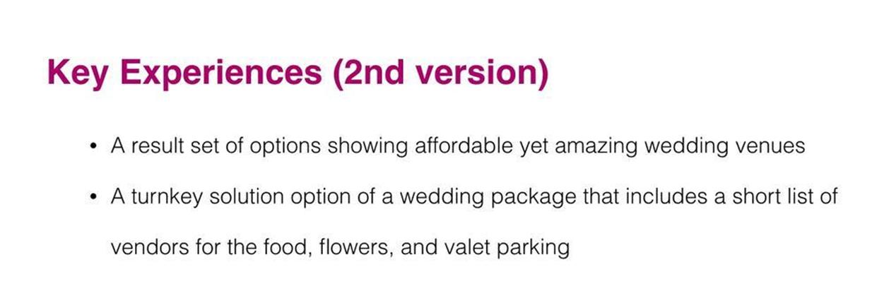
Figure 6-6. Ena’s second attempt at the key experiences for Airbnb for Weddings (which I approved)
Yes, a lot of features were left off Ena’s second version; when you are performing UX strategy, you need to carefully pick your battles. You want to ruthlessly focus your team and resources on the indispensible benefit of the product. In this case, the answer for Ena was to focus on the experiences that would separate her Airbnb for Weddings from the mothership platform Airbnb. The differentiation is what the key experience needs to express.
However, Bita and Ena (who eventually teamed up during the Airbnb for Weddings apprenticeship) realized that they could come up with an even better key experience. During the customer-discovery phase, they learned that a major pain point for both their customers was organizing all the vendors. Because weddings are supposed to be one-time events, the learning curve for a bride-to-be is really steep. It takes a lot of time and energy to learn how to book a venue, plan a menu, order flowers, arrange parking for guests, all for for a one-time deal. Bita and Ena began to wonder if they could make the planning process the key experience for their users by packaging it somehow. And they came up with their solution by utilizing their UX influencers.
Take Advantage of UX Influencers
In Chapter 5, you learned about UX influencers. They are not your direct or indirect competitors; their value proposition has absolutely no relation to your own. However, their user experiences and features can provide insight into your product’s value innovation. The trick is that you need to think outside of the box. Remember how one of our value innovation patterns is mixing and matching disparate feature sets? Well, that’s what happens here. Sometimes by jamming pieces that don’t seem to fit together, you get amazing disruption. You just need to take a leap of faith to see how a noncompetitive product or service could be bent to serve your needs.
For example, Bita and Ena found inspiration in DIRECTV and the paid bundles that it offers its users. That company has absolutely nothing to do with the Airbnb for Weddings value proposition, but the UX around the TV bundles was very well thought out. Obviously, DIRECTV takes its UX very seriously, and Bita and Ena thought this type of UX would make an excellent starting point for their key experience.
First, let’s visit DIRECTV to see how it present its TV packages. Take a look at Figure 6-7; there are quite a few interesting ideas about how to group things together and allow people to customize their own TV package. You might even see a glimmer of a potential new business model. Look closely. (Hint: it’s the concept of a turnkey solutions.)
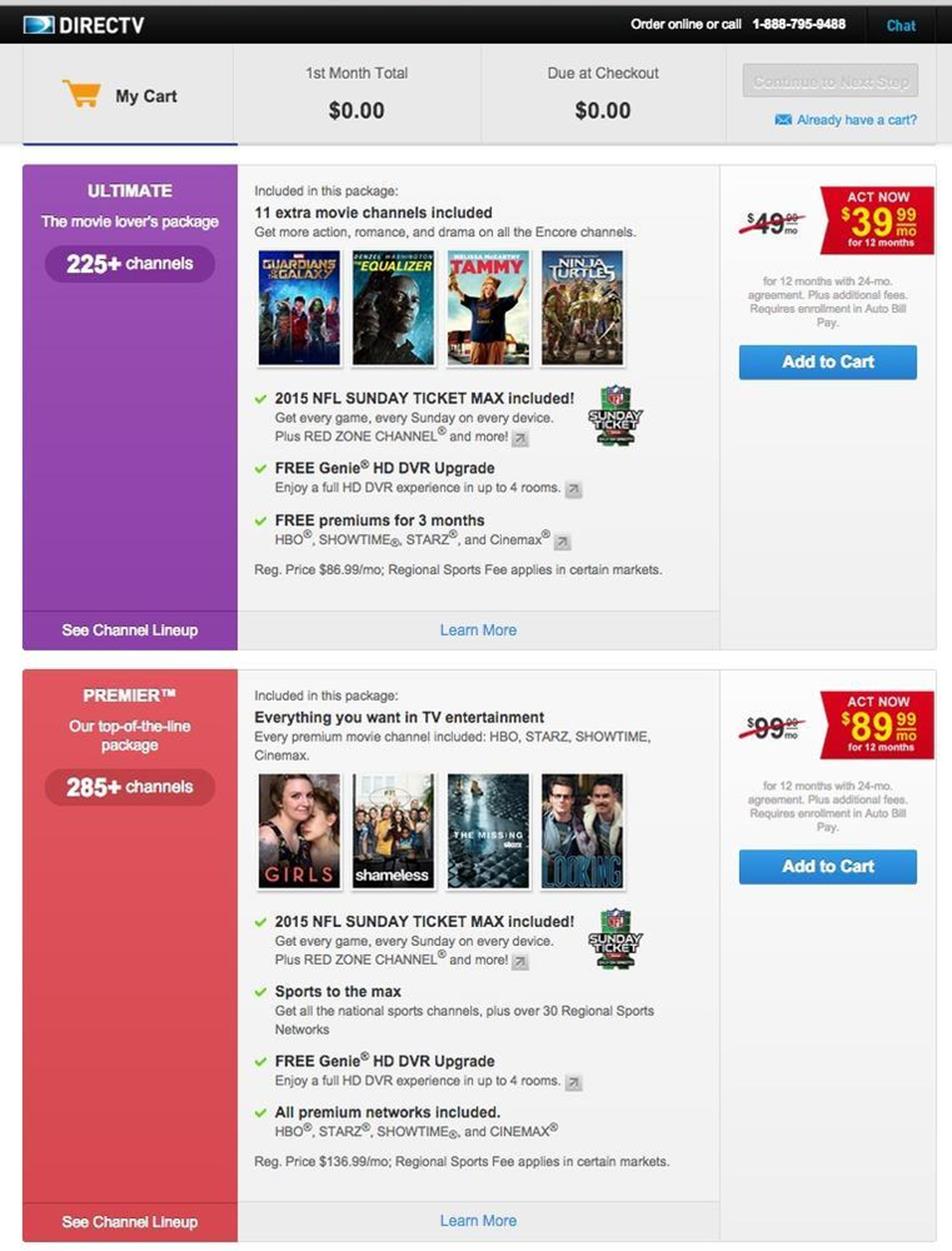
Figure 6-7. DIRECTV package (example of great information design)
When you visit DIRECTV, the first thing you do is type in your zip code. A result set immediately appears presenting you with a handful of packages. It’s not a lot, but it’s just enough for a user to work with. That gave Bita and Ena their first clue for how to present their key experience: do not present more than five packages to a bride-to-be.
Although each package has the same design and layout, they are differentiated by background color. That gave Bita and Ena a second clue: present wedding packages with an obvious differentiation mechanism. Perhaps they could use different background colors. But an even better idea might be to use a recognizable image or icon that denotes the distinction among the packages. For example, a high-end wedding package might show a limousine that says “Just Married” on the back window, whereas an economy package could show a regular compact car. Clues three and four came when they noticed how DIRECTV displayed packages by price from lowest to highest. As the user scrolls down, the more expensive packages list more benefits and take up twice as much space.
You’ll catch clues by looking at all the details and figuring out how to use them for your product. Ideally, you will improve on the concepts, taking them up a notch on the design ladder for your product. But, you’re not trying to design anything just now. Instead, you’re aiming to pluck out the best ideas. After you have them, you’ll mock them up into a storyboard to demonstrate the value innovation.
Do Feature Comparisons
Before you begin creating mock-ups and storyboards, be sure that you look for more than just one comparison reference. Research and identify multiple (three to five) instances of a similar user feature, and put all those references into one document. This way, you can compare different approaches to a single UX problem. The comparison findings can be useless or inspirational. Still, you are looking for new models, and you want to think beyond the familiar to conceive of better ways to browse, search, filter, share, and reach a user objective.
This deconstructed approach is called a feature comparison. You might find it contradictory, especially given that in Chapter 5 I agreed with Steve Blank, who deplores creating a bloated feature requirements list. Nevertheless, now that you are just using tools for discovery without necessarily showing the client, a feature comparison can be very helpful to identify opportunities for value innovation. It takes all the puzzle pieces out of the box and puts them onto the table in plain sight. Then, you can pick out the best pieces and components to build a new interaction pattern. You do whatever is necessary to poach elements and then stitch together a superior UX.
A feature comparison can even take you deeper into the research you already have. When you did your competitor research, you created and captured a short list of the most interesting features of your direct and indirect competitors, as depicted in Figure 6-8. You can return to this list to hunt out your inspiration.
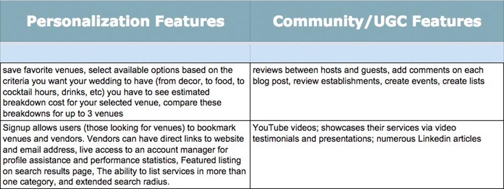
Figure 6-8. Features learned from the competitive research
The answer easily could be staring you in the face. Or, you might need to go a step farther to make your value innovation discovery. You might need to go back to the competitors’ websites, take screenshots of the features, and really study them.
For instance, several years ago, a multinational conglomerate hired me to design the UX of an ebook reader for the iPhone. Because there were already several readers on the market (Stanza, eReader, Kindle, Nook), I did my competitive research and analysis. I downloaded them and captured my data. I captured screenshots of many different functions, features, and experiences, such as how to browse for a book, the UI of the loading screen, the navigation of the table of contents, and how to highlight and annotate. Basically, I documented any feature that touched the key experiences I had to design. I then imported all of my screenshots into iPhoto and organized them based on their relationships to one another. As my final step, I arranged them onto large canvasses in Adobe InDesign so that I could compare them visually side-by-side. Based on these comparisons, I took notes when ideas occurred to me. Figure 6-9 presents a sample of that document.
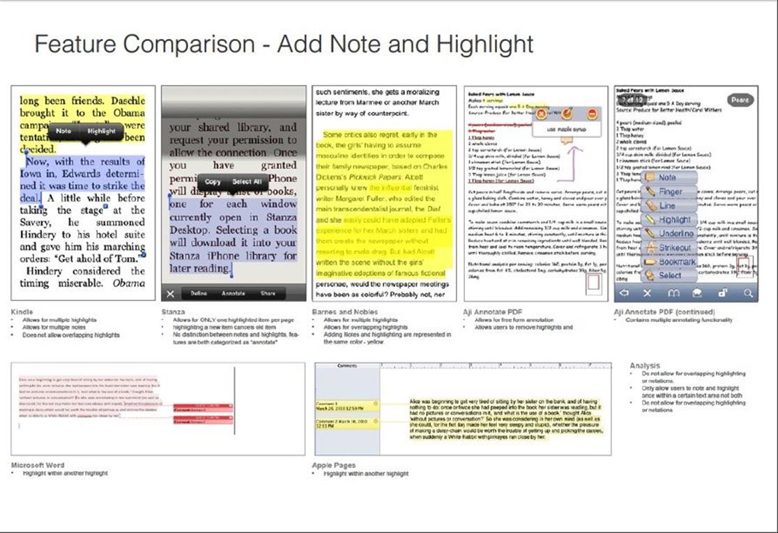
Figure 6-9. eBook reader feature comparison of adding a note or highlight
The process took at least four hours, and the client didn’t ask me or pay me to do any of it. In the end, however, I was able to observe and quantify best practices, lame practices, and the really interesting approaches the competitors were creating for users to accomplish tasks with formal or newfangled design patterns. It also saved me endless design hours. I didn’t need to design the project from scratch, because I didn’t have to reinvent the wheel. Some other benefits included the following:
§ Seeing the common user flows through the apps so that I could quickly make an application or site map.
§ Recognizing the patterns and common ways for helping users accomplish their goal. In other words, if I wanted to lure customers over from another application to my own, I could determine user expectations in advance.
§ Avoiding creating something totally new and making the UI more complicated because I now knew what my competition was already doing well.
§ Dealing with insane stakeholders or a HIPPO (Highest Paid Person’s Opinion) who, based on no empirical evidence, thought that he knew the best way to do my job. With my well-researched evidence, I was able to lead the UX design the way I thought best 95 percent of the time.
Using a feature comparison on competitors and UX influencers, you can compare everything from visual design, to interaction design, to feature sets, to how the content is displayed. The objective is to avoid being as clueless about your competitive environment as our friend in Figure 6-10clearly is. Sometimes, you can capture the necessary iPhone or Android screenshots from the competition’s store or you can just spend the money ($10 to $30) on the applications. Charge the client, or pay for it yourself and bill your client for an extra hour. Ultimately, the comparison will save you and your client time and money. It will open your mind, especially after the deep, focused dive you took in Chapter 4 and Chapter 5.
PERSONAL DISRUPTION
The big payoff of exposing yourself to new experiences outside of your comfort zone is that they make it possible for us to grow as people. You change when you disrupt habitual patterns, and it affords you new ways of doing, being, and experiencing. For example:
§ When I took up ballet at age 45, I finally learned how to stand up straight.
§ When I took up gardening at age 42, I finally learned how to make a tasty fresh salad.
§ When I had my son at age 39, I finally learned how to slow down and just let some things happen.
Looking at everyday things with fresh eyes helps us to look beyond the obvious and unearth new mental models.
Disruption, whether in our professional or personal lives, breaks down the self-imposed walls that lock us into conceiving or designing the same thing over and over again.

Figure 6-10. Not being aware of your surroundings is like the old myth about an ostrich hiding from danger by burying its head in the sand.
Storyboard the Value Innovation
Now that you have identified the key experience of your product, you will want to stitch those moments together into a narrative thread otherwise known as a “story.” And obviously, with your emphasis on the visuals from your feature comparisons, it will be great tool to do that.
The storyboarding process has been around since German filmmaker Lotte Reiniger first drew and colored storyboards for her animated feature film, The Adventures of Prince Achmed, in 1926.[44] Since then, they have become versatile tools used for advertising campaigns, comics, motion pictures, software design, and various other business processes. The reason is that a storyboard promotes visual thinking. Or, as the authors of the book Game Storming: A Playbook for Innovators, Rulebreakers, and Changemakers,[45] write, “[It is a] visioning exercise [that] allows participants to imagine and create possibilities.”
Three steps to storyboarding value innovation
The goal of a storyboard is to tell the story of your key experience(s) visually. You want to use the format to zero in on the most important components of the experience. Say more with less, and finish with a happy ending in that the problem for your user is solved. Here is my recommended framework for building (and presenting) a storyboard:
Step 1: Create your list of panels.
Keep in mind that you do not want to demonstrate all the features of the product (as Ena incorrectly did when she first mapped out her key experiences). You are only showing the most “valuable” moments of your customer’s journey through the storyboard panels. Some of these moments will impact the interface design, and other moments will actually occur offline. Show the progression of the entire experience regardless of whether the experience takes 20 minutes (such as Uber) or two months (Airbnb) in real time.
For Bita and Ena, this meant showing how their bride-to-be experienced her dream wedding coming true rather than showing how account registration on Airbnb for Weddings works. Here are the panels they stitched together:
1. Bride-to-be is looking for a beautiful and affordable venue online.
2. She finds a result set of two to three listings.
3. She sees a detail view of an awesome listing.
4. She selects a package (venue, food, flowers).
5. She receives a confirmation of venue/tour/submission.
6. She gets married on the beach!
Step 2: Decide on your visual format (digital montages versus sketching on paper).
Some people know how to draw or sketch. Others (like me) cannot even draw a meaningful stick figure. What matters the most is that you choose a format that is fast and easy for you and your team to pull your storyboard together. If you are fast in Photoshop, just mash up some interface ideas together as graphics. Do not waste time wireframing a storyboard. It’s fine to use photos from Google or to slightly modify screen grabs from other sites. Create, draw, or gather all your images and make certain that they are the same approximate aspect ratio and that they fit nicely onto your canvas. There is no reason to design an entire user interface at this stage. Instead, zoom into the components of the interface that illustrate the best concept.
Ena decided to use a mix of photos she found on Google Images. She then mocked up her comps quickly in Photoshop. She also used the exact layout from DIRECTV for her results set and the detail view of the listing because it’s not important for her to design something new right now. She just needs to show how the UX might work.
Step 3: Lay out your storyboard on a canvas, add captions below each panel.
Now, review your storyboard. Does it flow well? Is it concise? Is it easy to follow the customer’s ideal experience? If so, you’ve successfully storyboarded your value innovation. Keep the captions brief and in lowercase — less than two lines. Again, less is more.
Figure 6-11 and Figure 6-12 present Bita and Ena’s storyboards, respectively. Don’t they give you a good sense about what the value innovation for their product will be like?
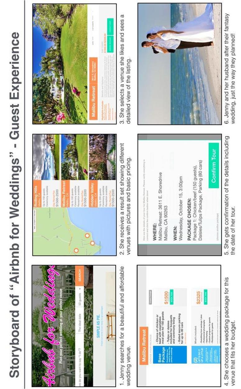
Figure 6-11. Bita’s storyboard showing value innovation for the bride-to-be
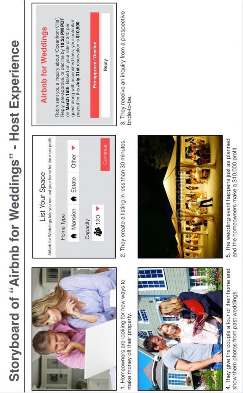
Figure 6-12. Ena’s storyboard showing value innovation for the host
As I mentioned at the beginning of the chapter, storyboards are not necessarily deliverables. There are cases for storyboards in other work environments where they are super helpful to pitch ideas, but for now, we just are using them to map out the key experience in a narrative context.
Business Models and Value Innovation
I’ve discussed how to do value innovation feature poaching in regard to the UX, but don’t forget that they also can be and should apply to your business model. The reason is that value innovation is a competitive advantage that ultimately combines cost leadership with differentiation. This means that your killer UX is related to the business model, and vice versa. These two factors combined will also ultimately leave your competition in the dust and sustain your product in the dynamic marketplace.
Let’s take a look at a marketplace that I wish I had less personal experience with: online dating, and three platforms that exemplify it, eHarmony, OkCupid, and Tinder.
eHarmony’s business model is based on a monthly subscription service. Its value proposition relies on its matching algorithm which focuses on the core traits of its clients, such as agreeableness, spirituality, and extroversion. The onboarding requires users to answer hundreds of questions before they are sent a highly curated set of matches. To get more matches, you need to close out the ones that you have. There is no way to browse profiles on your own. It even provides tools for a more guided communication process, because the platform is designed for “marriage-minded people.”
OkCupid is the polar opposite of eHarmony, even though it exists in the same marketplace. Its business model is free to customers, and over time, its revenue stream evolved from paid advertising, such as with Facebook, to a premium feature service. But the value proposition is intrinsically wrapped up in a powerful UX by which users can filter matches based on qualitative and quantitative data points. Users can also customize their own algorithm by answering highly personalized prompts in a polling feature. The customers are always completely in control of how wide or narrow they cast their nets while OkCupid reaps the benefits of the user data and premium revenue stream.
The latest and most innovative of the online dating products is Tinder. This mobile-only contender already has more than 30 million users[46] and is quickly chipping away at OkCupid’s value proposition. Tinder is all about ease-of-use and immediacy. As Figure 6-13 shows, users sign in with a real or fake Facebook account, upload a few photos, maybe write a bio, and are up and running 15 minutes later.
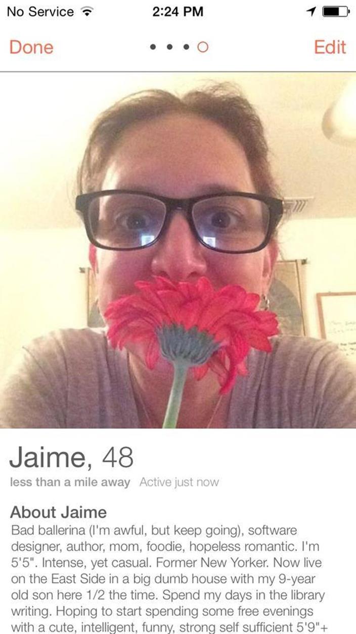
Figure 6-13. My concise user profile on Tinder
Here’s where Tinder’s value innovation kicks in by inverting the historical mental model of dating sites by only allowing users to interact with each other once both parties express mutual interest. With Tinder, users are constantly served up cards that are only curated by distance, age, and gender. That’s key experience #1. The user swipes left if she doesn’t like the profile. She swipes right if she does. If both users swipe right, they can send messages to each other in a native message system. Unlike other dating sites, Tinder provides matches within a one-mile radius. That’s key experience #2. If you live in a traffic-heavy city like Los Angeles or New York, you can zoom in on suitors who live within walking distance. So what started as a hookup app for millennials has now evolved into the go-to place for people of all ages to fall swiftly into an any-length relationship.
In addition to that, Tinder didn’t initially launch with a identified revenue stream because its business model first required mass adoption. Now, Tinder is experimenting with revenue streams such as selling targeted advertising or a paid membership (Figure 6-14), which offers users more sophisticated functionality.
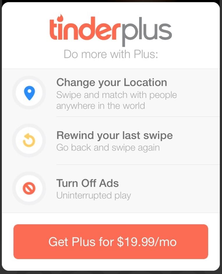
Figure 6-14. The new Tinder revenue stream
Here are the points that I want to make:
§ All these products have completely distinct user experiences and business models.
§ They all have had undeniable success competing in the same customer pool.
What makes each of them innovative is its unique way of hooking users through a permutation of features and business model components, through their finely tuned different parts.
Recap
In this chapter we covered a lot of material and concepts related to ideation and connecting ideas to your final objective: articulating your value innovation! I explained how value innovation for digital products is accomplished by focusing on the primary utility of a product. You learned about the importance of key experiences (showing the value proposition) and how creating a product that is the same or only slightly better than the competition is a waste of time. I showed you how to identify UX influencers. You learned about feature poaching, which you can use to pluck features, interaction patterns, and business model ideas from other products and then mash them up to create something new. Finally, you learned how to tell stories with storyboards that will connect your customers’ journey with the value innovation.
Now, it’s time to leave this fantasyland behind and see if you’re innovating in reality by creating prototypes to run experiments.
[40] Kim, W. Chan and Renée Mauborgne. Blue Ocean Strategy. Harvard Business School Press, 2005.
[41] http://en.wikipedia.org/wiki/Cyberpunk_(album)
[42] http://en.wikipedia.org/wiki/Poaching
[43] Saffer, Dan. Microinteractions, O’Reilly, 2013.
[44] http://meganratner.squarespace.com/lotte-reiniger-art-on-paper
[45] Gray, David, Sunni Brown, Jamews Macanufo. Gamestorming: A Playbook for Innovators, Rulebreakers, and Changemakers. O’Reilly, 2010.
[46] http://www.latimes.com/business/technology/la-fi-tn-tinder-plus-20141106-story.html
All materials on the site are licensed Creative Commons Attribution-Sharealike 3.0 Unported CC BY-SA 3.0 & GNU Free Documentation License (GFDL)
If you are the copyright holder of any material contained on our site and intend to remove it, please contact our site administrator for approval.
© 2016-2026 All site design rights belong to S.Y.A.