Learning Web Application Development (2014)
Chapter 3. The Style
In the previous chapter, we learned to structure the content of an HTML document and some related mental models. But the pages we created left a lot to be desired in terms of design and style.
In this chapter, we’ll attempt to alleviate some of these issues and learn to change the way an HTML document is displayed using Cascading Style Sheets (CSS). As mentioned in the previous chapter, this will give you enough information to get started with CSS, and More Practice and Further Reading will encourage you to explore other resources.
Hello, CSS!
To get our feet wet, we’ll start with a very simple HTML example, similar to the ones from the beginning of the previous chapter. Open up a terminal window and create a directory called Chapter3 in our Projects directory.
Now open up Sublime Text, and open the Chapter3 directory in the same way that we did in the previous chapter. Create the following HTML file and save it in the directory as index.html:
<!doctype html>
<html>
<head>
<title>My First Web App</title>
<link href="style.css" rel="stylesheet" type="text/css">
</head>
<body>
<h1>Hello, World!</h1>
<p>This is a paragraph.</p>
</body>
</html>
This file defines a very simple HTML page with an h1 element and a p element contained in the body element. You’ll immediately notice that the example also includes a new tag contained inside the <head> tag. The <link> tag links to an external stylesheet file that describes how the document should be displayed.
You can create the missing style.css file using Sublime from the file navigation window in the editor. Fill style.css with the following content:
body {
background: lightcyan;
width: 800px;
margin: auto;
}
h1 {
color: maroon;
text-align: center;
}
p {
color: gray;
border: 1px solid gray;
padding: 10px;
}
This is a simple example of a CSS file. This particular CSS file sets the background of the body element to a light bluish color (lightcyan) and tells the browser that the text contained in the h1 element should be rendered in a maroon color. Additionally, we give the body a width of 800 pixels and set the margin to auto so that the body is centered on the page. Last, but not least, we give the text contained in the p element a gray color and create a thin border around it.
Essentially, a CSS file describes how specific elements of the HTML should be displayed by the browser. For example, Figure 3-1 illustrates the preceding HTML file rendered with the CSS file.
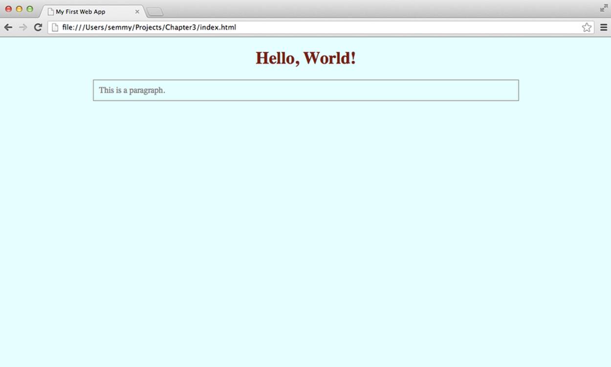
Figure 3-1. index.html opened in Chrome with the added stylesheet
If we don’t include the CSS file, the page would look like Figure 3-2.
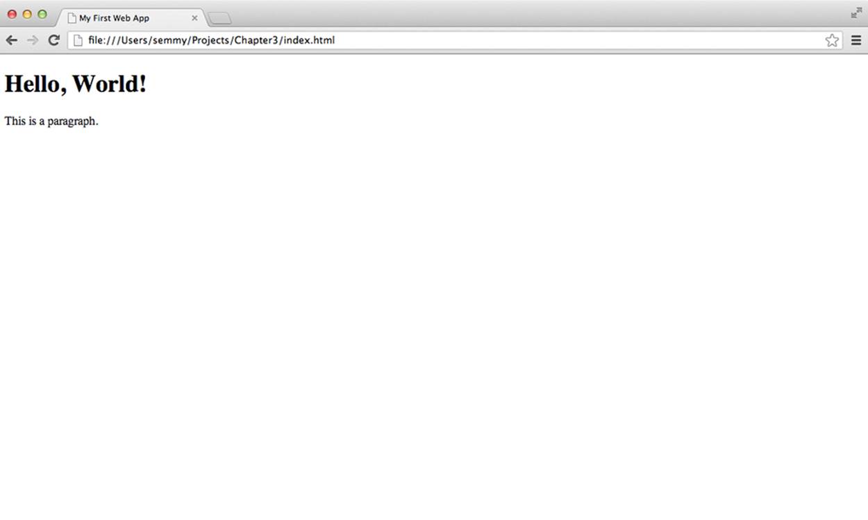
Figure 3-2. index.html opened in Chrome without the added stylesheet
If you have your index.html file and your style.css file in the same directory, you should be able to open the former in your browser and see that it looks the same as the first image. In fact, if you create a second HTML page that has different content and link the same CSS file, it will display both pages as specified by the CSS. That’s one of the nice things about CSS—it allows the style for multiple pages to be defined in the same place!
Rulesets
A CSS file is a collection of rulesets and a ruleset is simply a collection of style rules that are applied to some subset of elements in the DOM (which you will recall is the hierarchical object defined by the HTML document). A ruleset consists of a selector (which we can think of as a tag name for now), an opening curly brace, a list of rules, and a final closing curly brace. Each rule consists of a specific property, followed by a colon, followed by a value (or a list of values separated by spaces), followed by a semicolon:
body {
width: 800px;
background: lightcyan;
color: #ff0000;
}
This is an example of a ruleset that gets applied to the body element in the DOM. In this case, the selector is “body,” which is just the name of the HTML element to which we want to apply the style. These rules will apply to all of the content of the body element, as well as any elements contained in the body element. The ruleset consists of three rules, one specifying the value for the width property, one specifying the value for the background property, and one specifying a value for the color property.
TIP
In CSS, there are two ways to specify colors. The first is with CSS color names for commonly used colors. The second way to specify CSS colors is with a hexadecimal color code. A hex color code consists of six hexadecimal digits (0–9 or A–F). The first pair represents the amount of red in the color, the second represents the amount of green, and the third represents the amount of blue. These three colors are the primaries in the RGB color model.
An experienced CSS developer has a solid knowledge of the types of properties that can be set for a particular element, and the types of values that each property accepts. Several properties, like background and color, can be used to style most HTML elements.
Comments
Our CSS code can also include comments. Like HTML comments, CSS comments are code annotations that are completely ignored by the browser. For example, we can insert comments in the previous CSS ruleset:
/* Here we are styling the body */
body {
width: 800px; /* Set the body width to 800 pixels */
background: lightcyan; /* Set the background to a light bluish color */
color: #ff0000; /* Set the foreground color to red */
}
Some people will suggest that you be very liberal with your comments in all programs. I tend to think that you should let your code speak for itself as much as possible, and minimize places where comments are necessary. In fact, experienced CSS developers would find the preceding comments to be superfluous, because once you know a little these types of comments become redundant. On the other hand, there are times when it won’t be obvious what your code is supposed to be doing, and in those cases it’s a good idea to annotate it.
If you’re just starting out with CSS, I always recommend erring on the side of more comments. I’ll use comments liberally for most of the remainder of this chapter to make things easier to understand.
Padding, Border, and Margin
For the most part, HTML elements are displayed in one of two ways. The first way is inline, which applies to elements that have the type a or span, for example. This means (among other things) that the content will appear on the same line as the surrounding content:
<div>
This is a paragraph and this <span>word</span> appears inline. This
<a href="http://www.example.com">link</a> will also appear inline.
</div>
If we add this code to the <body> tag of the index.html file, the page will render similar to the image in Figure 3-3.
It’s actually more common for elements to be block elements instead of inline elements. This means that the content contained inside the element will appear on a new line outside of the normal flow of text. Block elements that we’ve seen include the p, nav, main, and div elements:
<div>
This is a paragraph and this <div>word</div> appears inline. This
<a href="http://www.example.com">link</a> will also appear inline.
</div>
This code will look different, as illustrated in Figure 3-4.
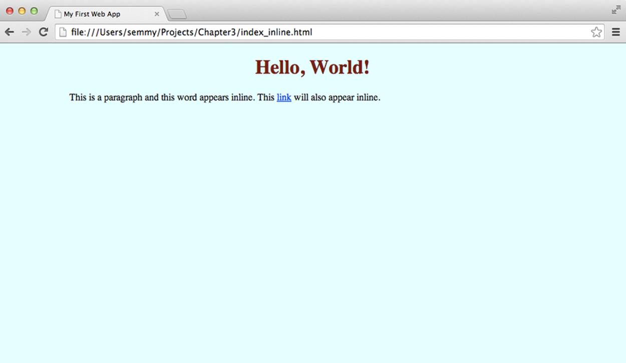
Figure 3-3. An example of inline elements within a block element
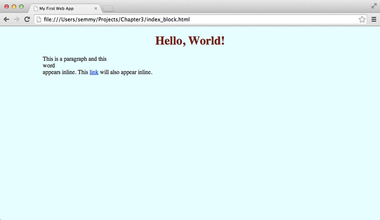
Figure 3-4. An example of block elements within a block element
Both block style elements and inline elements have background and color properties. But block style elements have three other properties that come in very handy when styling the page with custom layouts. They are padding, border, and margin.
The padding property represents the spacing between the content of the element and the border, and the margin is the spacing between the element and its surrounding element. The border property represents the space between the padding and the margin. This is illustrated in Figure 3-5.
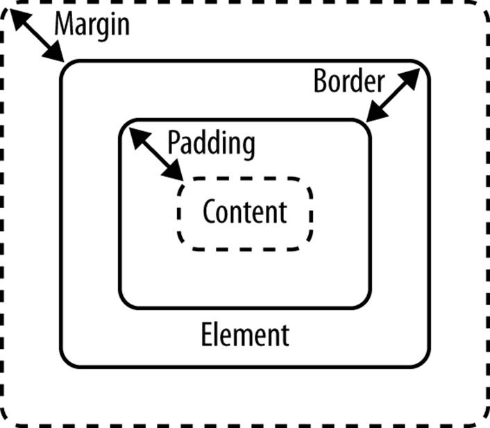
Figure 3-5. The margin, border, and padding of a block DOM element
Here’s a simple example that you can use to manipulate the padding, border, and margin of a few different elements. The first file is margin_border_padding.html:
<!doctype html>
<html>
<head>
<title>Chapter 3 -- Margin, Border, and Padding Example</title>
<link href="margin_border_padding.css" rel="stylesheet" type="text/css">
</head>
<body>
<div>
<p>THIS IS A PARAGRAPH CONTAINED INSIDE A DIV</p>
</div>
</body>
</html>
And here is margin_border_padding.css, which is referenced in the preceding HTML file. You can create these files in the same directory in Sublime, and then open the margin_border_padding.html file in Chrome:
body {
background: linen;
width: 500px;
margin: 200px auto;
}
div {
border: 5px solid maroon;
text-align: center;
padding: 5px;
}
p {
border: 2px dashed blue;
}
If you typed everything in correctly, the page should look similar to Figure 3-6.
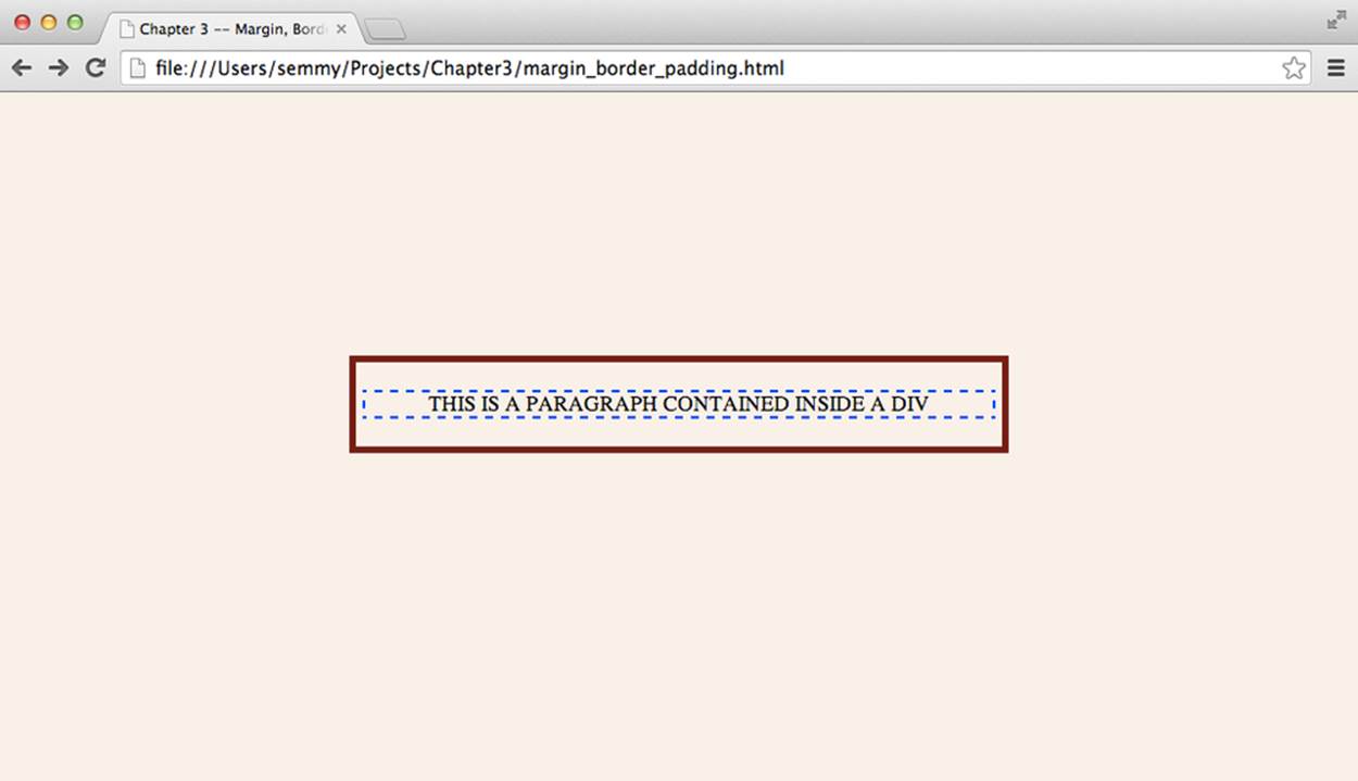
Figure 3-6. A margin/padding/border example to explore
You can see that both elements (the div and the p) are block elements so they each have their own border, margin, and padding properties. If you haven’t already done it, take this opportunity to create the HTML and CSS just shown. Then spend some time changing the padding, border, and margin properties of each element to see how they affect the way the page is displayed.
Selectors
The most important aspect of CSS comes from the effective use of selectors. We’ve seen a basic type selector that uses a tag name to select all elements that have that name. For example, consider the following HTML:
<body>
<h1>Hello World!</h1>
<p>This is a paragraph.</p>
<p>This is a second paragraph.</p>
</body>
And let’s suppose that it’s styled with the following CSS:
h1 {
background: black;
color: white;
}
p {
color: red;
margin: 10px;
padding: 20px;
}
The first ruleset styles the h1 element, and the second ruleset styles both p elements. In many cases, this is exactly the behavior that we would want. In other cases, however, we may want to style the first and second paragraph tags independently.
Classes
In Chapter 2, we saw that we can add a class attribute to <div> tags to differentiate between them. It turns out that we can add a class to any DOM element. For example, we can rewrite the previous HTML to look as follows:
<body>
<h1>Hello World!</h1>
<p class="first">This is a paragraph.</p>
<p class="second">This is a second paragraph.</p>
</body>
Now we can select the specific paragraph tag by its class name:
h1 {
background: black;
color: white;
}
p.first {
color: red;
margin: 10px;
padding: 20px;
}
In this example, the p.first ruleset will only be applied to the first paragraph element. If the class only appears on a certain type of element (which is usually the case), we can omit the tag name and simply use the class:
.first {
color: red;
margin: 10px;
padding: 20px;
}
Pseudoclasses
In the previous chapter, we saw that we could create clickable DOM elements with the <a> tag:
<body>
<a href="http://www.example.com">Click Me!</a>
</body>
The a element can be styled just like any other DOM element via CSS. For example, we can create a CSS file that changes the color of all links:
a {
color: cornflowerblue;
}
It’s often useful, however, to have links with a different color depending on whether or not the user has already clicked them. CSS allows us to change the color of visited links by adding another ruleset:
a {
color: cornflowerblue;
}
a:visited {
color: tomato;
}
In this example, visited is an example of a CSS pseudoclass on the a element. It almost behaves just like a normal class in that we can style elements that have the class in the same way as a normal class. The main difference is that the browser actually implicitly adds the class for us.
One common use case for CSS pseudoclasses is changing the way a link is displayed when a user hovers over it. This can be achieved by using the hover pseudoclass on an a element. In the following example, we modify the previous example so that the link is underlined only when the user is hovering over it:
a {
color: cornflowerblue;
text-decoration: none; /* remove the default underline */
}
a:visited {
color: tomato;
}
a:hover {
text-decoration: underline;
}
More Complex Selectors
As our tree diagram for the DOM gets more complicated, it becomes necessary to create more complicated selectors. For example, consider this HTML:
<body>
<h1>Hello World!</h1>
<div class="content">
<ol>
<li>List Item <span class="number">first</span></li>
<li>List Item <span class="number">second</span></li>
<li>List Item <span class="number">third</span></li>
</ol>
<p>This is the <span>first</span> paragraph.</p>
<p>This is the <span>second</span> paragraph.</p>
</div>
<ul>
<li>List Item <span class="number">1</span></li>
<li>List Item <span class="number">2</span></li>
<li>List Item <span class="number">3</span></li>
</ul>
</body>
This HTML has two lists, several paragraphs, and several list items. We can easily select and style general elements as we’ve discussed previously. For example, if we want to create a rounded border around the ordered list (ol) element, we can apply the following ruleset:
ol {
border: 5px solid darksalmon;
border-radius: 10px;
}
Now suppose we wanted to make it so the list items in the ordered list are brown. To do that, our immediate intuition might be to do the following:
li {
color: brown;
}
But this will change the li elements in both the unordered list and the ordered list. We can get more specific with our selector by only selecting the li elements in the ordered list:
olli {
color: brown;
}
If there are several ordered lists on the page, we may want to get even more specific and select only the li elements that are descendants of the content div element:
.contentli {
color: brown;
}
Now suppose we want to set the background of the first li elements in both lists to yellow. It turns out that there’s a pseudoclass representing elements that are a first-child of their parents:
li:first-child {
background: yellow;
}
Likewise, we can select the elements that are second, third, fourth, etc., children by using the nth-child pseudoclass:
li:nth-child(2) {
background: orange;
}
Cascading Rules
What happens when two different rulesets use selectors that target the same element in CSS? For example, consider a p element with class greeting:
<p class="greeting">Hello, Cascading Rules!</p>
Now suppose that we have two rules that select that element and apply different styles:
p {
color: yellow;
}
p.selected {
color: green;
}
Which rule gets applied to the class above? It turns out that there are a set of cascading rules that browsers apply when conflicts arise. In this case, the more specific rule (the class) takes precedence. But what happens if we do something like the following?
p {
color: yellow;
}
p {
color: green;
}
In this case, the cascading rules specify that the ruleset that appears later in the CSS list will be applied. So in this case, the paragraph(s) will be green. If we swapped the rules, the paragraph(s) would be yellow.
Inheritance
If you haven’t noticed by now, descendants inherit properties of their ancestors. What this means is that if we create a style on an element, all descendants of that element in the DOM will also have that style unless it is overridden by another ruleset that targets that element. So, for example, if we select the body and change the color property, all elements that are descendants of the body (which means all elements appearing on the page) will inherit that color. This is an essential part of CSS and this is why it’s helpful to maintain a visualization of the DOM hierarchy in your head while styling elements:
body {
background: yellow;
}
/**
* Since h1 is a descendant of the body tag
* it will have a yellow background.
*/
h1 {
color: red;
}
/**
* h2 is also a descendant of body, but
* we'll override the background so it's
* not yellow
*/
h2 {
background: green;
}
Though most CSS properties work this way, it’s worth noting that not all properties are inherited by default. The most notable noninherited properties are related to block-style elements (the margin, padding, and border rules aren’t inherited from ancestors):
body {
margin: 0;
padding: 0;
}
/**
* h1 will not inherit the margin and padding of the body,
* even if we don't specify an alternative
*/
h1 {
}
Layouts with Floats
We’ve seen properties that affect the basic style of DOM elements. But there are other more general properties that affect the overall layout of the page relative to a single element. These properties give a developer more control over where objects appear. One of the more commonly used properties of this nature is the float property. This flexible property can allow us to create layouts that are more complicated than the stacked layout that HTML builds automatically.
The float property of a DOM element can be set to left or right. This takes the element out of the normal flow (which typically stacks block elements on top of one another) and pushes it as far to the left or right in the containing element, assuming there’s enough room to do so. For example, consider the following HTML snippet:
<body>
<main>
<nav>
<p><a href="link1">link1</a></p>
<p><a href="link2">link2</a></p>
<p><a href="link3">link3</a></p>
<p><a href="link4">link4</a></p>
</nav>
<p>Lorem ipsum dolor sit amet, consectetur adipisicing elit, sed do
eiusmod tempor incididunt ut labore et dolore magna aliqua. Ut enim
ad minim veniam, quis nostrud exercitation ullamco laboris nisi ut
aliquip ex ea commodo consequat. Duis aute irure dolor in reprehenderit
in voluptate velit esse cillum dolore eu fugiat nulla pariatur.
</p>
</main>
</body>
In this example, a nav element and a p element are contained in a main element. We also create a separate p element for each link because we want the elements to appear as block elements (one on each line). Without any styling, the elements are stacked on top of each other vertically. It looks like Figure 3-7.
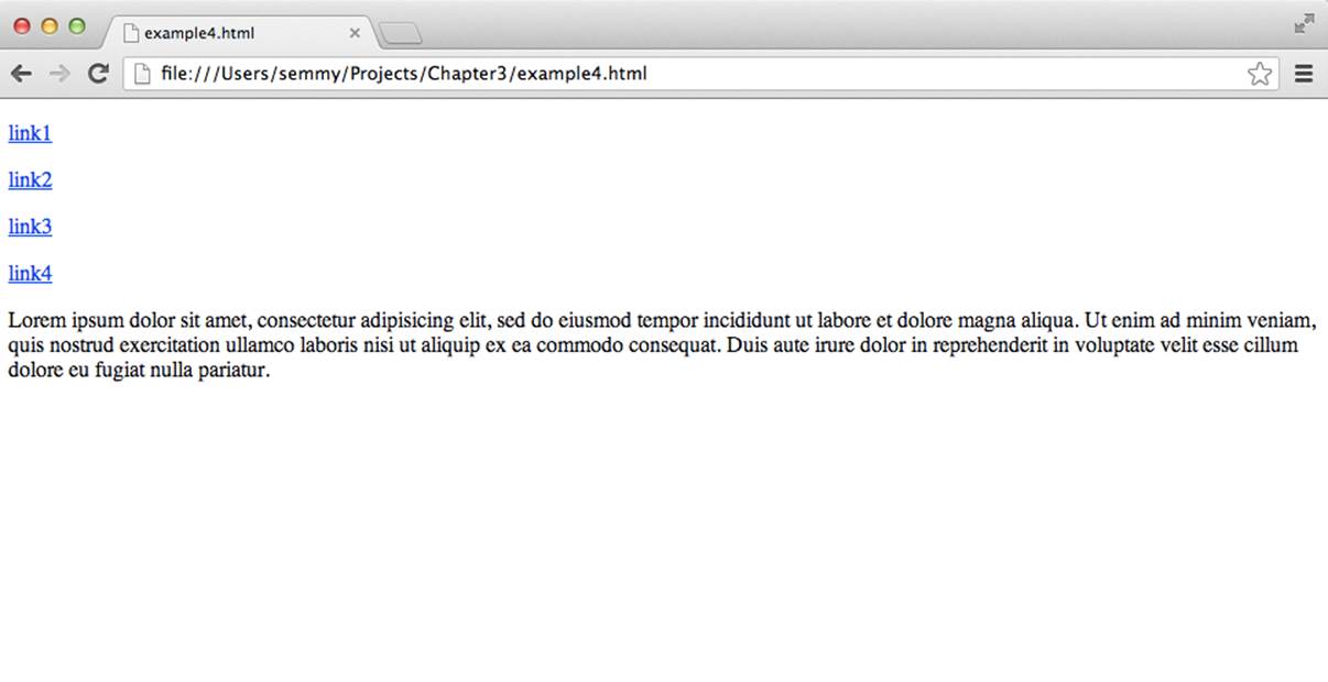
Figure 3-7. The rendered page before CSS is applied
Now, suppose we applied the following CSS to this HTML:
main {
width: 500px;
margin: auto;
background: gray;
}
nav {
/* uncomment the next line to get a border around the nav */
/* border: 3px solid black; */
width: 200px;
float: right;
}
p {
margin: 0; /* zero out the default margin */
}
The result should look similar to Figure 3-8.
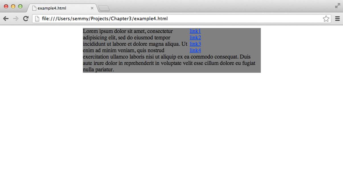
Figure 3-8. An example of an element floating to the right
Note that we’ve made the nav element 200 pixels wide and floated it to the right to create a sidebar layout. Notice how it removes the nav element from the standard stacked layout and moves it to the right. The content of the p element then flows around the nav div. I’ve also included a line that you can uncomment to add a visual border around the floated element. Give that a try!
Though simply floating an element to the right generally works well for images or other inline elements that need to have text flowing around them, we’ll often want to create a two-column grid-type layout. That presents us with a slightly more interesting challenge. In this case, we’ll want to float the p element to the left and make sure that the combined size of the two elements won’t overtake the size of the container. Here is some CSS that will achieve this:
main {
width: 500px;
margin: auto;
background: gray;
}
nav {
width: 100px;
float: right;
}
/* remove defaults on the p elements inside the nav */
navp {
margin: 0;
padding: 0;
}
p {
margin: 0; /* remove the default margin on p */
float: left;
width: 400px;
}
Now if we look at this in the browser, we’ll see that the two columns correctly line up, but our gray background is gone. This is because when all elements contained in an element are floated, the height of the containing element becomes 0. There’s a simple fix for that—we can set theoverflow property of the containing div to auto:
main {
width: 500px;
margin: auto;
background: gray;
overflow: auto;
}
This gives us a layout similar to the one illustrated in Figure 3-9.
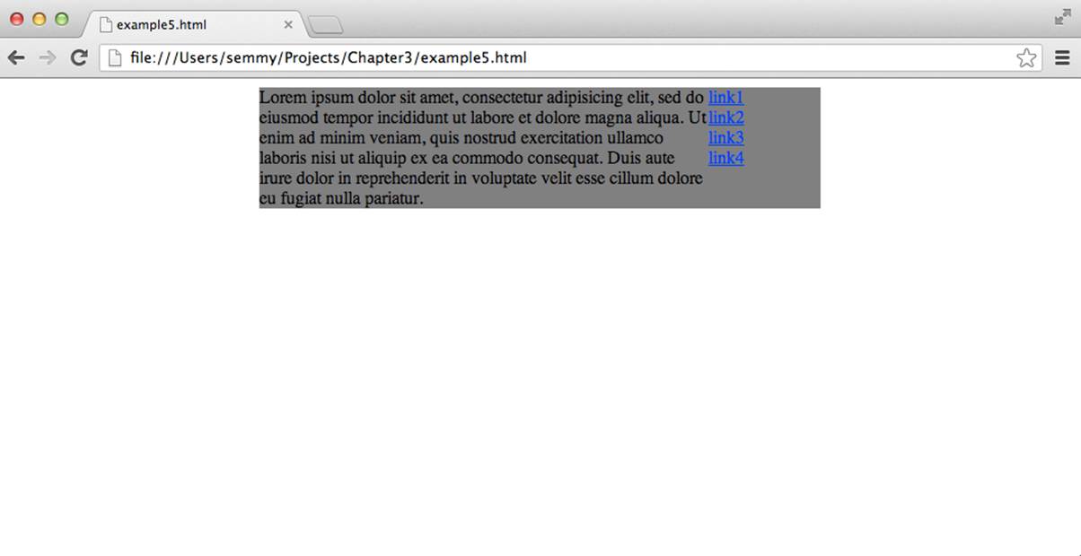
Figure 3-9. A simple two-column layout using floats
Note that we’ve set the sum of the widths of the left and right elements in this example to 500 pixels, which is exactly the width of the containing div. This can cause problems if we add any padding, margin, or border to either element. For example, we may want to push the text of the pelement away from the edges of the element. This will require us to add padding. But if we add 20 pixels of padding to the element, we’ll get something that looks like Figure 3-10.
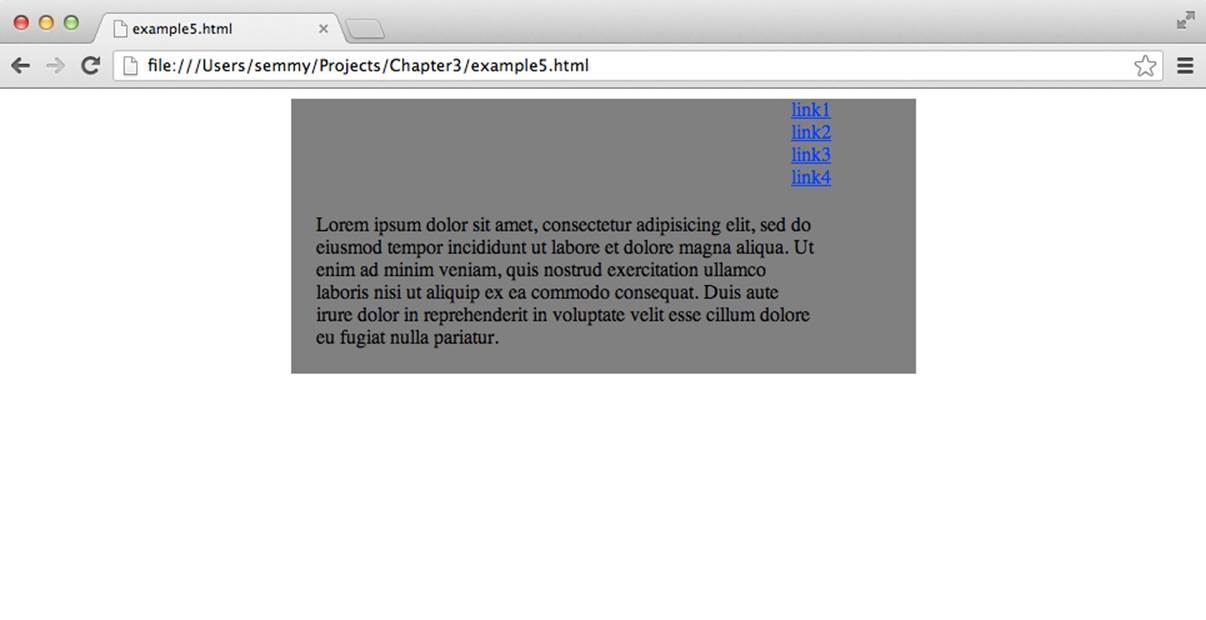
Figure 3-10. Adding padding breaks our layout
This is because the sum of the pixels in the main element is bigger than its width. We can fix this by subtracting twice the padding (because there is both left and right padding of 10 pixels) off of the width of the p element. The final CSS might look something like this:
main {
width: 500px;
margin: auto;
background: gray;
overflow: auto;
}
nav {
width: 100px;
float: right;
}
p {
margin: 0; /* remove the default margin on p */
padding: 10px;
float: left;
width: 380px; /* 400 - 2*10 = 380 */
}
This same trick must be applied whenever we add a nonzero border or margin to elements as well.
The clear Property
One interesting issue can arise when building layouts using floating elements. Here is a slightly different HTML document. This time, our goal is to set up the navigation on the left side with a footer underneath both columns:
<body>
<nav>
<p><a href="link1">link1</a></p>
<p><a href="link2">link2</a></p>
<p><a href="link3">link3</a></p>
<p><a href="link4">link4</a></p>
</nav>
<main>
<p>Lorem ipsum dolor sit amet, consectetur adipisicing elit, sed do
eiusmod tempor incididunt ut labore et dolore magna aliqua. Ut enim
ad minim veniam, quis nostrud exercitation ullamco laboris nisi ut
aliquip ex ea commodo consequat. Duis aute irure dolor in reprehenderit
in voluptate velit esse cillum dolore eu fugiat nulla pariatur.
</p>
</main>
<footer>
<p>This is the footer</p>
</footer>
</body>
The following CSS floats the nav element to the left and clears out the default margins and paddings using the universal selector, which selects all elements in the DOM. It also sets the background of the elements to various distinguishable shades of gray:
* {
margin: 0;
padding: 0;
}
nav {
float: left;
background:darkgray;
}
main {
background:lightgray;
}
footer {
background:gray;
}
When we render this document using this stylesheet, we’ll see something similar to Figure 3-11.
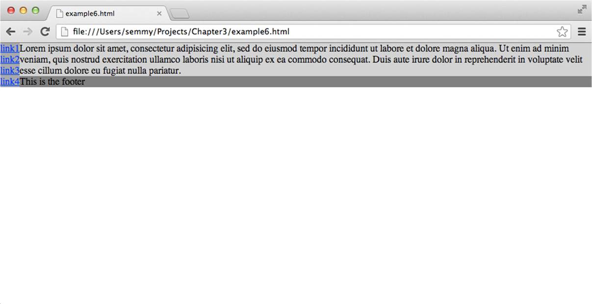
Figure 3-11. Notice that the footer is below the main section, instead of below everything
Note that the footer is actually on the right of the layout, underneath the main section. We’d like the footer to be underneath both elements. This is what the clear property does for us. We can force the footer element to be underneath a floating element on the right, the left, or under both the right and left floating elements by specifying the clear property. So we can change the footer CSS as follows:
footer {
background:gray;
clear: both; /* or we can just use 'clear: left' in this case */
}
And this will render as shown in Figure 3-12.
Now the footer is underneath the floating element, as desired.
Floats tend to be one of the more confusing aspects of CSS for beginners, so I encourage you to spend some time experimenting and building layouts.
Working with Fonts
In the past, working with custom fonts on websites was problematic, because you were limited to the fonts that the viewer of your site had installed on her computer. Web fonts have made that much easier, because you can deliver the fonts over the Internet when they are needed. Google now hosts a number of custom fonts and has made using them a breeze.
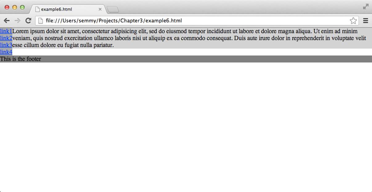
Figure 3-12. We’ve fixed the layout by setting the clear property in the footer
We can start by going to the Google Fonts home page, as shown in Figure 3-13. There we’ll see a list of fonts that we can scroll through.
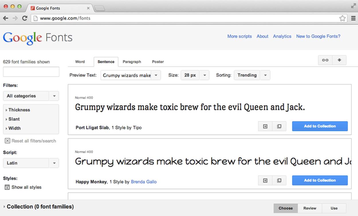
Figure 3-13. The Google Fonts home page
In this example, we’ll use a font called Denk One, which was the first font in the list when I visited the Google Fonts home page. To use this font, we’ll click the Quick-use button, which is one of the two buttons directly to the left of the big blue “Add to Collection” button.
This will bring up instructions on how to use it on our page. We’ll need to add two things: first, we’ll need to add a <link> tag to the head of our HTML. So if we’re using the same example from earlier, we can cut and paste the <link> tag specified on the quick use page, or just add a line similar to the following:
<head>
<title>Amazeriffic</title>
<!-- There's a line break below to make things more readable -->
<link href="http://fonts.googleapis.com/css?family=Denk+One"
rel="stylesheet" type="text/css">
<link href="style.css" rel="stylesheet" type="text/css">
</head>
NOTE
HTML allows either single quotes (') or double quotes (") to delimit strings. I’ve tried to consistently use double quotes throughout this book, but the cut-and-paste code from Google uses single quotes. Because they are interchangable, it doesn’t matter whether you leave them as they are or change them to double quotes.
This will make the web font available on our page. Next, we can use it in our style.css file. For example, if we want to style our h1 element with the Denk One font, we would add a font-family property to our ruleset:
h1 {
font-family: 'Denk One', sans-serif;
}
The first part of the property specifies the font (which should be loaded via the <link> tag) and the second one specifies the font to use if the first one is not available. So, for example, this line says “use the Denk One font if it’s available, and if it’s not available, use the default sans serif font installed on the user’s system.”
Now that we are able to easily display fonts and change their color (via the color property on the associated element), how do we actually change their size? In the past there were multiple ways to do it, but there’s one way that is typically considered best practice.
First, we should consider that the user may change his default text size for the browser, and our pages should respect that. Therefore, in the body ruleset for the document we should set a base font size and then scale all other fonts relative to that one. Fortunately, CSS makes that pretty easy by using em units to specify the length:
body {
font-size: 100%; /* this sets the base font size for everything */
}
h1 {
font-size: xx-large; /* sets it relative to the base font size */
}
h2 {
font-size: x-large;
}
.important {
font-size: larger; /* makes it a little larger than the parent */
}
.onePointTwo {
font-size: 1.2em; /* sets it to 1.2 times the base size */
}
In this example, we set the base font size to 100% of the user’s font size for his browser, and then scale all font sizes relative to it. We can use the CSS absolute size values xx-large and x-large (or, similarly, x-small or xx-small), which will scale the size accordingly. Likewise, we can use relative sizes like larger or smaller to make the font size relative to the current context.
If we need more fine-grained control over font sizes, we use ems, which are meta-units that represent a multiplier on the current font size. For example, if we set our base font size in the body to a specific size like, say, 12pt, then setting another element’s font size to 1.5em will make its actual size 18pt. This is useful because the font sizes will scale according to the base font size, which means to make the text bigger or smaller on the page we simply have to change the base size. This also comes in handy for visually impaired users: they will often set a larger base font size for the browser, so using ems instead of explicit values will make the page scale appropriately.
In the preceding example, we set the paragraph font size to 1.2 times the base size. Figure 3-14 illustrates how the preceding rulesets style a document.
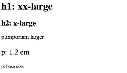
Figure 3-14. Some example fonts based on the previous stylesheet
Resetting Browser Inconsistencies
One controversial tool that you will often see used is a CSS reset.
Remember our float example where we removed the default margin and padding on the paragraph tags? It turns out that various browsers implement their base CSS settings slightly differently, which can lead to your CSS rendering slightly differently in different browsers. A CSS reset is designed to remove all browser defaults. The best known reset is Eric Meyer’s.
Why are CSS resets controversial? There are several reasons, but they can be categorized into three main points. One is accessibility—for example, they can cause problems for people who are navigating via a keyboard. Another criticism is performance. Because they often use the universal selector (*), they can be relatively inefficient. And lastly, they create an awful lot of redundancy because browser defaults are often exactly what you want.
On the other hand, I think resets are excellent from a pedagogical standpoint, and that’s why I’m including them here. They force beginners to explicitly state the way they want certain aspects of the page to appear instead of relying on browser defaults. Since, presumably, you’re reading this because you’re just starting out with CSS, I recommend that you use one.
To make things explicit, I include my reset as a separate stylesheet altogether and add an additional link element to my HTML. We can copy Eric Meyer’s reset into another CSS file called reset.css and link it from the HTML:
<head>
<title>Amazeriffic</title>
<link rel="stylesheet" type="text/css" href="reset.css">
<link rel="stylesheet" type="text/css" href="style.css">
</head>
It’s pretty easy to see the dramatic effect that a reset can have on a page. Consider the following HTML:
<body>
<h1>This is a header</h1>
<h3>This is a slightly less important header</h3>
<p>Lorem ipsum dolor sit amet, consectetur adipisicing elit, sed do eiusmod
tempor incididunt ut labore et dolore magna aliqua. Ut enim ad minim
veniam, quis nostrud exercitation ullamco laboris nisi ut aliquip ex ea
commodo consequat.</p>
<p>Lorem ipsum dolor sit amet, consectetur adipisicing elit, sed do eiusmod
tempor incididunt ut labore et dolore magna aliqua. Ut enim ad minim
veniam, quis nostrud exercitation ullamco laboris nisi ut aliquip ex ea
commodo consequat.</p>
</body>
Figure 3-15 shows the page rendered in Chrome with only the default browser styling applied.
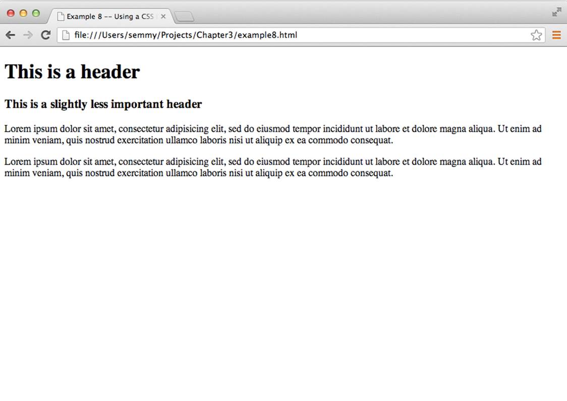
Figure 3-15. A simple page with some default styling
Notice how the h1 elements and the h3 elements already have styled fonts and margins. Likewise, the p elements have margins.
Now we’ll add the reset. I copied the reset file from Eric Meyer’s page and saved it as reset.css in the same directory as my HTML. I modified the <head> tag in my HTML to look like this:
<head>
<title>Example 8 -- Using a CSS Reset</title>
<link href="reset.css" rel="stylesheet" type="text/css">
</head>
Now when I reload the page, it looks like Figure 3-16.
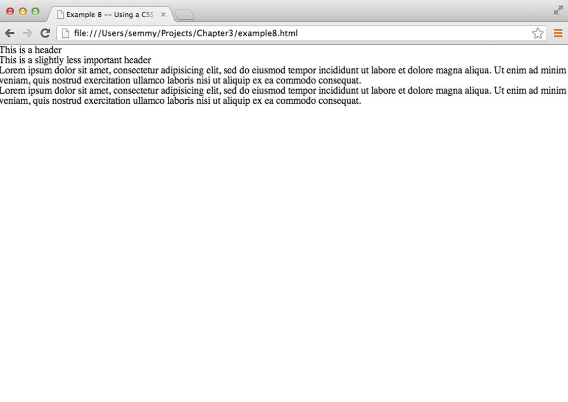
Figure 3-16. A simple page with all the default styling removed via a reset
The margins, padding, and default font sizes have been completely removed from the page. Clearly we don’t want our site to look like this, but the point is that including a CSS reset file that removes the browser’s default styling allows the rules that we supply in our own CSS file to always have the same end effect, regardless of the browser (and its corresponding choice of default rules) the user happens to be using.
Using CSS Lint to Identify Potential Problems
Just like with HTML, it’s sometimes helpful to have a tool that helps us find potential problems with our CSS. For example, can you spot the error in this example CSS?
body {
background: lightblue;
width: 855px;
margin: auto;
h1 {
background: black;
color: white;
}
p {
color: red;
margin: 10px
padding: 20px;
}
If you found it, then you’re wrong! You should have found two of them! I think that the most glaring error is that the body ruleset is missing a closing curly brace at the bottom, prior to the start of the h1 ruleset. But there’s one other one.
You probably noticed the second one after a second look. But if you didn’t, it’s in the ruleset for the p element. There’s a missing semicolon after the margin property.
Like an HTML validator, CSS Lint is a tool that will help us identify potential problems with our code. And like the W3C’s online HTML validator, we don’t have to install any software to use it; we simply visit http://csslint.net (as shown in Figure 3-17) and we cut and paste our CSS.
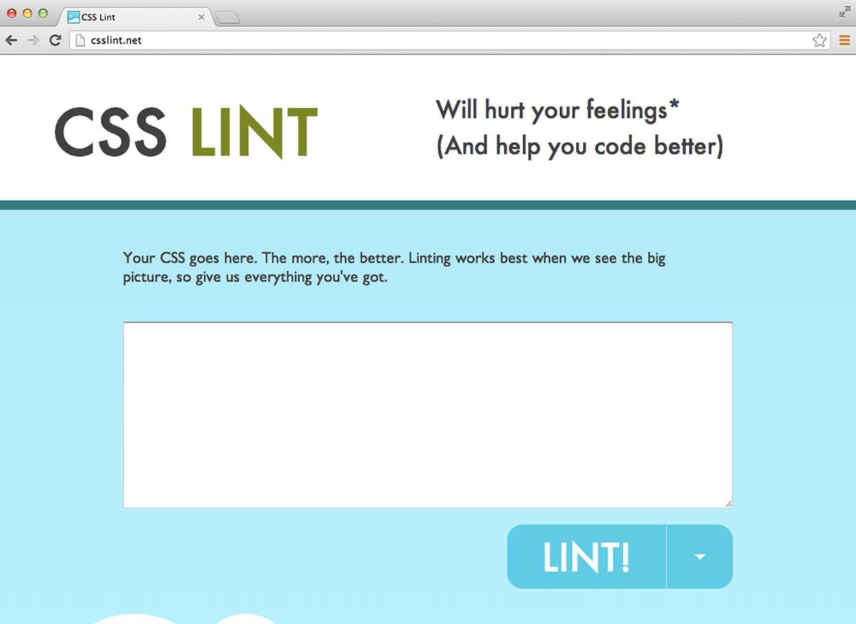
Figure 3-17. The CSS Lint home page
CSS Lint gives a lot more warnings than the HTML validation tool we studied in Chapter 2, but there are options that allow you to customize the warning level. You can see those options by clicking the down arrow right next to the Lint! button on the main page. The options are categorized by the reasons for the warnings. For example, “Disallow universal selector” is under the Performance category. That means that it might make your page render more slowly if you use this particular CSS feature, so CSS Lint warns you about it.
I typically leave all of the options checked in CSS Lint, but you may want it to be a little more flexible. I recommend leaving them all on, and as you’re getting warnings, take the time to do some Google searching to find out why CSS Lint is warning you. It’s almost like having a CSS expert sitting right next to you!
Interacting and Troubleshooting with the Chrome Developer Tools
As is the case with any kind of software development, things will sometimes not work the way that you intend it to. With CSS, that often means your page looks different in the browser than you expect and it’s not clear why that is the case. Fortunately, the Chrome browser includes a nice set of tools that can help you troubleshoot your CSS and your HTML.
Let’s start by opening up margin_border_padding.html in the Chrome browser. Next, go to the View menu in Chrome, select the Developer submenu, and click the Developer Tools option. This should open up the Chrome Developer Tools at the bottom of your browser window. If it’s not already selected, click the Elements tab at the top of the Developer Tools subwindow and you should be presented with something that looks like Figure 3-18.
On the left side you’ll see a portion of some HTML code, along with arrows that can show/hide the descendant elements. If the arrow is pointing to the right, that means you can click it to show the HTML that is contained in that element. Likewise, if it is pointing down, you can click it to hide the contained HTML.
As you hover over HTML elements, you should see the actual elements highlighted above in the display portion of the window. You can select a specific HTML element by clicking its opening tag and its associated line will then appear in blue.
The HTML you see in the Elements tab may or may not be exactly like the HTML code in your HTML file, but even if it’s not, it’s the HTML that Chrome is currently displaying. Like I mentioned in Chapter 2, a browser will often infer things about your code (like closing tags, for instance) and the HTML presented in the Elements tab includes all the assumptions that Chrome is making. For example, if you create an HTML document that only contains a <p> tag (and not an <html>, <header>, or <body> tag), Chrome will insert those tags for you and you will see them in the Elements tab, as shown in Figure 3-19. This can be a helpful way of bridging the sometimes confusing gap between what you actually intended and what Chrome thinks you intended.
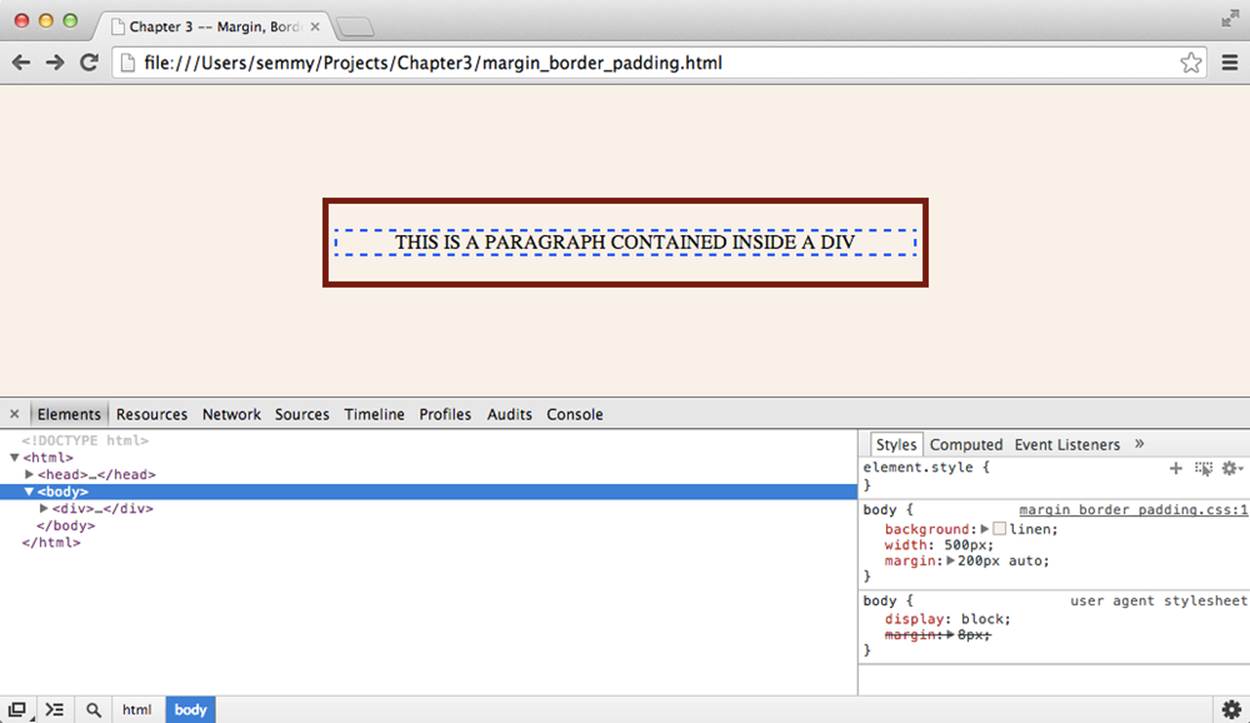
Figure 3-18. The Chrome Developer Tools opened with the margin_border_padding.html example
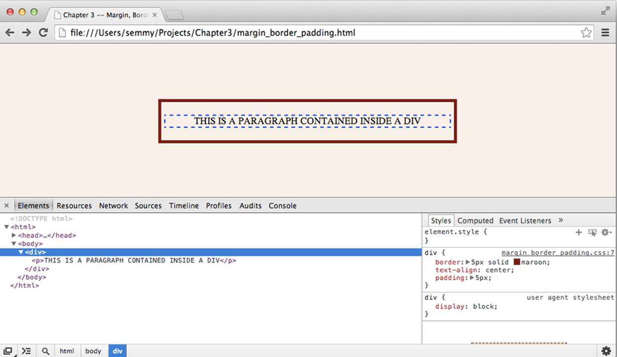
Figure 3-19. The main div is selected and you can see the associated style ruleset on the right
On the right side of the window, you can see the CSS associated with the selected HTML element. Go ahead and select the div element that contains the paragraph. On the right, you’ll see the ruleset associated with it in the Matched CSS Rules subwindow, and when you hover over it, you’ll see checkboxes appear to the left of each rule. You can uncheck a rule’s checkbox to remove it. As you run into problems with your CSS, it’s often helpful to look here to make sure that the style rule that you’re expecting to be applied to a given element is actually being applied. You can see the style rules displayed in the Chrome Developer Tools in Figure 3-19.
But even better than that, you can actually directly manipulate a rule by clicking it and typing in a new value for that rule. You can even add new rules here, but keep in mind that this doesn’t get reflected in your CSS file. So if you find a solution to a styling problem in this window, you’ll have to go back to Sublime to include the style in your CSS file.
You should have already played around with setting the padding, border, and margin by modifying your code. Try similar manipulations, but this time in the Elements tab of the Chrome Developer Tools window. You’ll see that it’s much easier to try out things and get immediate feedback. It’s also important to notice that when you reload the page, all of your changes will be lost and Chrome will return to the page that is defined in your HTML and CSS files.
Styling Amazeriffic
Now let’s put it all together in an example. In the previous chapter, we built the structure for the home page of an app called Amazeriffic. The resulting HTML that defined the structure of our page looked like this:
<!doctype html>
<html>
<head>
<title>Amazeriffic</title>
</head>
<body>
<header>
<h1>Amazeriffic</h1>
<nav>
<a href="#">Sign Up!</a> |
<a href="#">FAQ</a> |
<a href="#">Support</a>
</nav>
</header>
<main>
<h2>Amazeriffic will change your life!</h2>
<p>Lorem ipsum dolor sit amet, consectetur adipisicing elit, sed do
eiusmod tempor incididunt ut labore et dolore magna aliqua.</p>
<h3>Here's why you need Amazeriffic</h3>
<ul>
<li>It fits your lifestyle</li>
<li>It's awesome</li>
<li>It rocks your world</li>
</ul>
<img src="lightbulb.png">
</main>
<footer>
<div class="contact">
<h5>Contact Us</h5>
<p>Amazeriffic!</p>
<p>555 Fiftieth Street</p>
<p>Asheville, NC 28801</p>
</div>
<div class="sitemap">
<h5>Sitemap</h5>
<ul>
<li><a href="#">Home</a></li>
<li><a href="#">About Us</a></li>
<li><a href="#">Privacy</a></li>
<li><a href="#">Support</a></li>
<li><a href="#">FAQ</a></li>
<li><a href="#">Careers</a></li>
</ul>
</div>
</footer>
</body>
</html>
First, we’ll enter the directory that contains our Git project for Amazeriffic. If we’re in our home directory, we can go directly into the Amazeriffic directory by using cd and giving the full path as an argument:
hostname $ cd Projects/Amazeriffic
We can use the ls command to see the contents of the directory and then follow up with git log to see our commit history from the previous chapter. Mine looks something like this:
hostname $ ls
index.html
hostname $ git log
commit efeb5a9a5f80d861119f5761df789f6bde0cda4f
Author: Semmy Purewal <semmy@semmy.me>
Date: Thu May 23 1:41:52 2013 -0400
Add content and structure to footer
commit 09a6ea9730521ed1effd135a243723a2745d3dc5
Author: Semmy Purewal <semmy@semmy.me>
Date: Thu May 23 12:32:17 2013 -0400
Add content to main section
commit f90c9a6bd896d1a303f6c3647a7475d6de9c4f9e
Author: Semmy Purewal <semmy@semmy.me>
Date: Thu May 23 11:45:21 2013 -0400
Add content to header section
commit 1c808e2752d824d815929cb7c170a04267416c04
Author: Semmy Purewal <semmy@semmy.me>
Date: Thu May 23 10:36:47 2013 -0400
Add skeleton of structure to Amazeriffic
commit 147deb5dbb3c935525f351a1154b35cb5b2af824
Author: Semmy Purewal <semmy@semmy.me>
Date: Thu May 23 10:35:43 2013 -0400
Initial commit
Next, we can open up the directory in Sublime, and create two new CSS files. First, we’ll build a reset.css file based on Eric Meyer’s reset. You can type in the code (as described previously) or cut and paste the code from his website. We’ll also create a style.css file that will include our custom CSS.
Before we commit, let’s go ahead and link our CSS files from our HTML file by adding two link tags to the head:
<head>
<title>Amazeriffic</title>
<link rel="stylesheet" type="text/css" href="reset.css">
<link rel="stylesheet" type="text/css" href="style.css">
</head>
Now we can open the file in Chrome. It should look completely unstyled due to the reset file. Mine looks something like Figure 3-20.
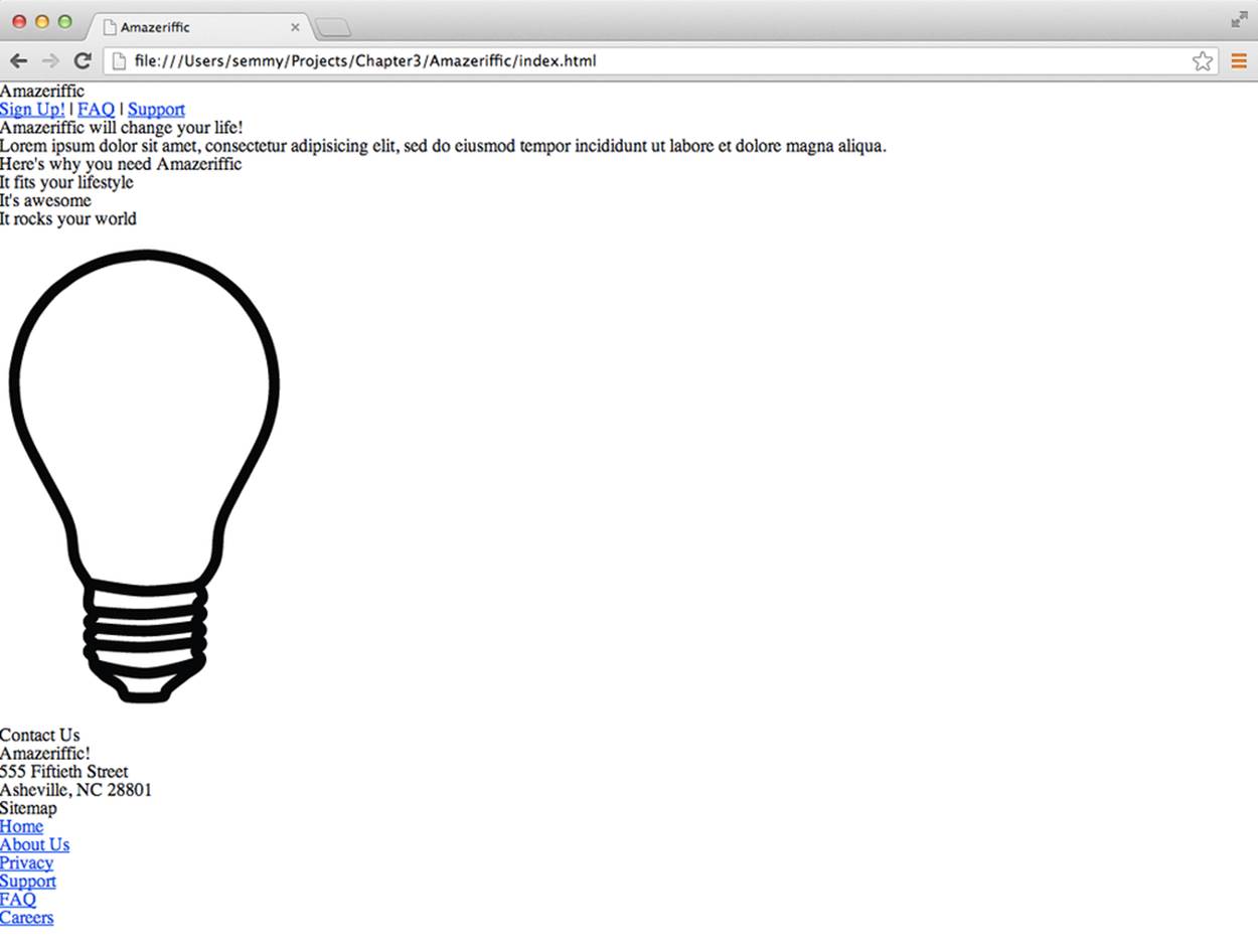
Figure 3-20. The final Amazeriffic HTML, with an included reset
Now we’ll commit the changes to our Git repository:
hostname $ git add reset.css
hostname $ git add style.css
hostname $ git add index.html
hostname $ git status
# On branch master
# Changes to be committed:
# (use "git reset HEAD <file>..." to unstage)
#
# modified: index.html
# new file: reset.css
# new file: style.css
#
hostname $ git commit -m "Add reset.css and style.css, link in index.html"
[master b9d4bc9] Add reset.cssand style.css, link in index.html
3 files changed, 142 insertions(+), 2 deletions(-)
create mode 100644 reset.css
create mode 100644 style.css
The Grid
Now let’s examine the style for Amazeriffic. Notice that the content is horizontally aligned in two columns. The first column takes up about two-thirds of the content area, while the second column takes up about one-third of the content area. Next, notice that the content is vertically aligned in about three rows. This defines a styling grid over the content, which is one basic approach to design layouts.
Another aspect of the design that’s hard to get across in a book is that it’s a fixed width design. This means that as we resize our browser window, the content of the page remains centered at the same width regardless. Figure 3-21 and Figure 3-22 show Amazeriffic in two browser windows of different sizes.
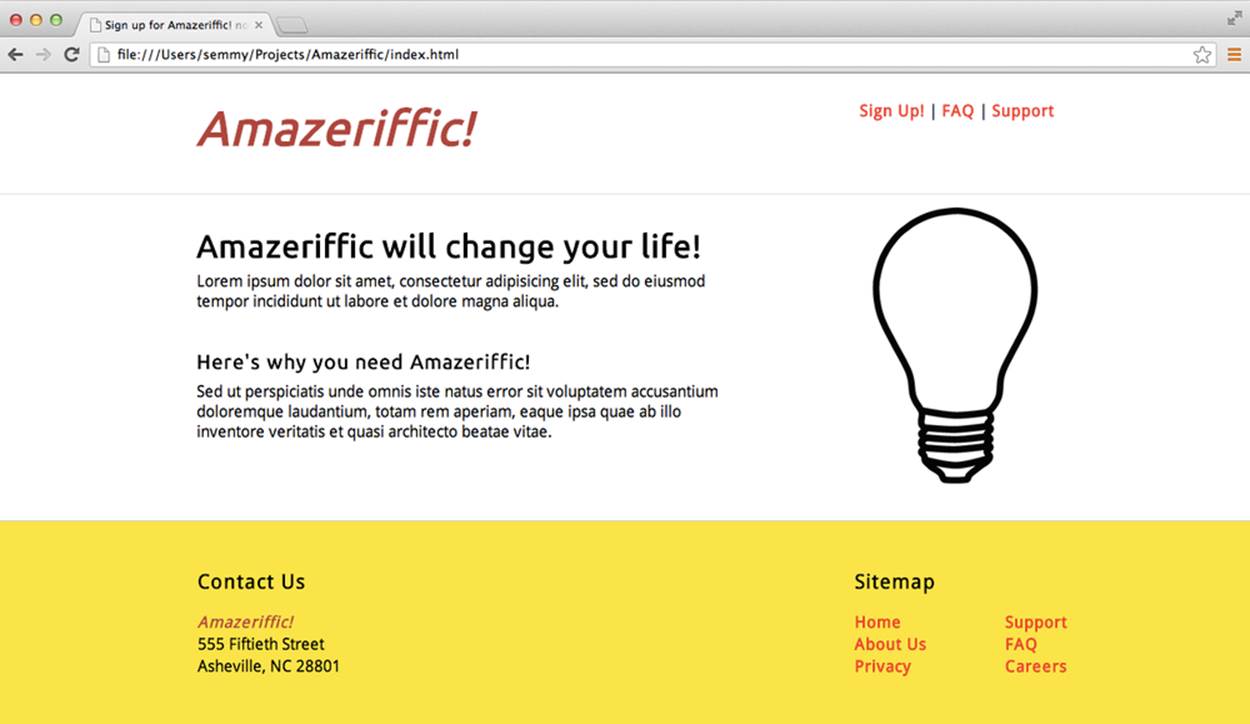
Figure 3-21. Amazeriffic in a 1,250 × 650 browser window
This means the design is not responsive, which is a modern approach to CSS layout that allows the layout to rearrange itself depending on the width of the browser. This is important when designing for the Web, because many people will view the design on a mobile phone or tablet. We’re not going to spend much time on responsive design here, but you’ll have the opportunity to try a few tools that simplify the responsive design process in the exercises at the end of this chapter.
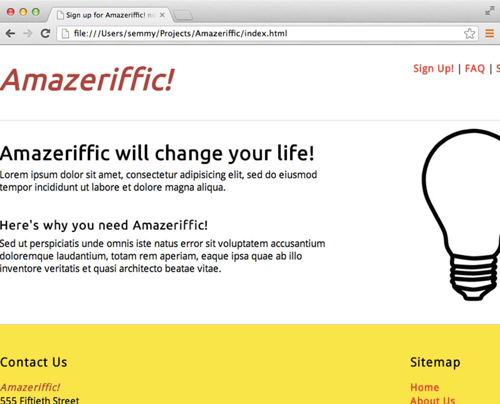
Figure 3-22. Amazeriffic in an 800 × 575 browser window
Our goal is to build this two-column, fixed width design using CSS. To start with, we’ll need to make it so that the rows (which in this case are our header, main, and footer elements) have the fixed width property. The first thing that we can do to assist us in this is to create a ruleset for all of these elements. In our style.css file, we’ll add a ruleset that looks as follows:
header, main, footer {
min-width: 855px;
}
The min-width property makes it so that if the browser is resized to a viewport smaller than 855 px, the remaining part of the page will be hidden from view. Try it out.
Next, notice that the footer has a yellowish color that should fill the bottom of the page as the browser window is expanded vertically. This means that the yellow color will have to be the background color of the entire page, and we’ll need to change the color of the header and the mainelements to white later.
We can add a rule to the body that makes the background of the image that yellow color in the body ruleset. Note that even though I added the previous ruleset first, I’ll still add the body ruleset above it in the style.css file. That’s because it comes prior to the header, main, and footerelements in the HTML file. Keeping the locations (relatively) consistent between these two files makes it easier to find issues and make changes:
body {
background: #f9e933;
}
header, main, footer {
min-width: 855px;
}
Now we’ll see that the entire page is the off-yellow color, so we’ll change the backgrounds of the header and main elements to be white. To do this, we’ll add two new rulesets for the header and main elements in addition to the one that contains the min-width rule. We’ll separate them because we’ll want to add different styling rules to each as we move forward:
header {
background: white;
}
main {
background: white;
}
So now we’ve got things looking similar to Figure 3-23.
WARNING
As of this writing, the <main> tag is not rendering correctly in the Safari browser. If you’re using that browser and having problems, try adding a ruleset for main that includes the display: block; rule.
Now that we have some basic styling set up, it’s probably a good idea to commit the changes to your Git repository. Start by checking the status. The only file that should have changed is style.css. Stage that file (with the add command) and then commit the change with a meaningful commit message.
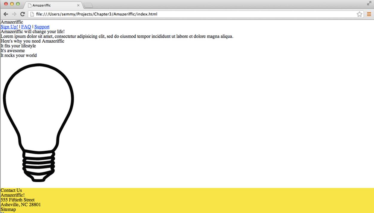
Figure 3-23. Amazeriffic after some (very) basic styling
Next, we’d like the following things to happen. We’d like to have the content centered and fixed at 855 px wide. We’re choosing 855 px because we’d like to have the number of pixels divisible by 3 (because the columns are about two-thirds and one-third wide). Because 855/3 is 285, this gives us the ability to work with whole numbers.
Here’s a potential approach to solving this problem. We could add a max-width rule to the ruleset styling the header, main, and footer, set the width of the body to 855px, and then set the margin on the body to auto. Before moving on, try that and see what happens.
If you actually did it, you probably realized that the header and main content areas are now not stretching to fit the full size of the page and so the background color is filling the spaces to the left and right. This is not what we want.
How do we fix this? This is a case where we’ll want to add a div element to the DOM so we can style the elements independently. We want the header and main elements to span the entire width of the page, but the content contained inside to be 855 px. So we’ll create a container class inside those two elements to hold the content. Go ahead and modify the HTML so that the header, main, and footer elements contain a class called container, which contains the content elements. For example, here’s what we would do with the header div:
<header>
<div class="container">
<h1>Amazeriffic</h1>
<nav>
<a href="#">Sign Up!</a> |
<a href="#">FAQ</a> |
<a href="#">Support</a>
</nav>
</div>
</header>
Now we can make the container content have a max width of 855 px and an automatic margin. When we’re finished, our rulesets should look something like this:
body {
background: #f9e933;
}
header, main, footer {
min-width: 855px;
}
header.container, main.container, footer.container {
max-width: 855px;
margin: auto;
}
header {
background: white;
}
main {
background: white;
}
Now as we resize our browser, our content will remain at a fixed width! This is a good point to drop to the terminal window and commit your changes to your Git repository. This time you have modified two files, so you’ll need to add both to your Git repository before committing.
Creating the Columns
The next thing that we want to do is to create the columns in the content elements. To do this, we’ll float the content that is in the right column to the right, and specify the widths for the right column to be 285 px and the width of the left column to be 570 px. We’ll also set the overflowproperty to auto so that the element won’t shrink to zero when we float both children elements.
When we finish the header rulesets, they will look something like this:
header {
background: white;
overflow: auto;
}
headerh1 {
float: left;
width: 570px;
}
headernav {
float: right;
width: 285px;
}
The header is a little unique because it only contains two child elements—the h1 element and the nav element. This is not true of the main and footer elements. If you’re thinking about this correctly, you’ll most likely need to add additional divs to both of them in order to package the floating left and right content into a single element. And on the right side of the footer, you’ll need to create a subleft/-right layout to style the sitemap. This is by design—you should be able to do this with the skills you have learned in this chapter.
I would work on one section at a time: get the header looking correct, then get the main content area looking correct, and then get the footer looking correct. You should make intermediate commits to your Git repository. I would also periodically run your code through CSS Lint (and the HTML validator, if you’re modifying the HTML) to make sure you don’t have any potential problems.
When we finish with this section, we’ll have something that looks like Figure 3-24.
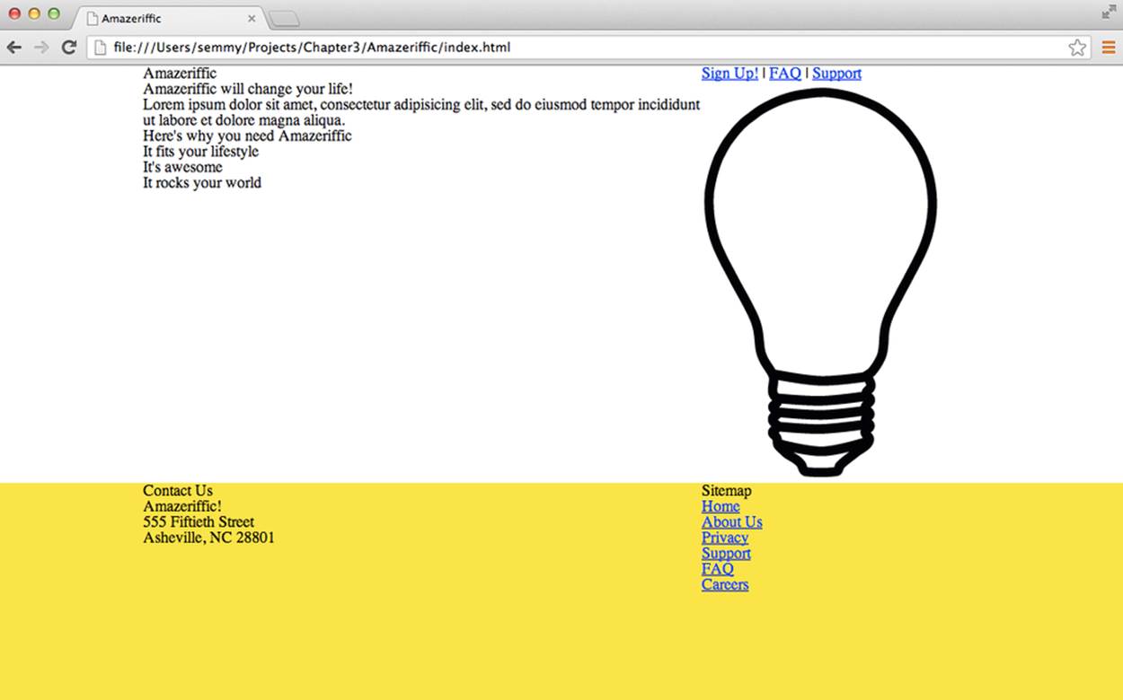
Figure 3-24. Amazeriffic after a little more styling
Once your page looks like this and you’ve identified any potential problems by running your CSS through CSS Lint, it is a good time to make another commit to your Git repository.
Adding and Manipulating Fonts
Next, we’ll add two Google Fonts. For this example, I’ve used the Ubuntu and the Droid Sans fonts. The header tags (<h1>, <h2>, <h3>, and <h4>) are all styled with the Ubuntu font, and the rest of the page content is styled with Droid Sans. This will require us to add two link tags to our HTML file and then rules in the CSS.
After you have the fonts set correctly, commit the changed files to your Git repository. Once you do that, set up a base font size of 100% and modify the font sizes of the elements in an attempt to get them looking as close as possible to the original mock-up image.
After getting the font sizes looking correct, validate your HTML and run your CSS through Lint to try to identify problems. Once you do that, commit the changes to your Git repository.
A Few More Modifications
Finally, you’ll need to add padding and margins to get everything lined up and spaced correctly. This will require experimenting with the margins and padding on various elements. I encourage you to do that in the Chrome Developer Tools. You’ll also need to style the links on the page. All of the links are red and not underlined unless the cursor is hovering over them. That will require you to manipulate the hover pseudoclass of the a elements.
Summary
In this chapter, we used CSS to add style to the structure of our user interface and content. The basic idea behind CSS is that we attach stylistic rulesets to elements in the DOM. Most of these rulesets are inherited, meaning that when we apply them to a certain element in the DOM, they also apply to all descendant DOM elements unless overridden in a ruleset specific to that element. In cases where there’s ambiguity, cascade rules are applied.
We can restrict our CSS rulesets to a subset of DOM elements using CSS selectors. Coming up with the appropriate selector for a DOM element or a set of DOM elements requires practice.
We can set up basic document layouts on a grid using CSS float properties. We can float CSS elements to the left or right to take them out of the normal document flow. If an element has two child elements, and we float one child element to the left and one to the right, they will appear side-by-side, assuming they don’t overlap. We can ensure that they don’t overlap by specifying their width.
CSS Lint is a tool that helps us to avoid common CSS pitfalls and errors, while Chrome has a rich set of interactive CSS tools built in.
More Practice and Further Reading
There are still a couple of issues to fix with Amazeriffic. I encourage you to fix those issues and get it looking as similar to the mock-up as possible.
Memorization
We’ll start by adding a few more steps to our practice. Remember, your goal is to memorize how to do this along with the previous steps listed in the previous chapters:
1. Create a simple style.css file that uses the universal selector to zero out the margin and padding on all elements and change the background of the page to a slightly off-white color.
2. Link the style.css file to your HTML document in the <head> tag, and reload the page to confirm that it’s working correctly.
3. Commit style.css and your index.html changes to your Git repository.
4. Add some basic styling to the header, main, and footer elements.
5. Commit the changes to your repository.
CSS Selectors Practice
Type up the following HTML document and save it in a file called selectorpractice.html:
<!doctype html>
<html>
<head>
</head>
<body>
<h1>Hi</h1>
<h2 class="important">Hi again</h2>
<p class="a">Random unattached paragraph</p>
<div class="relevant">
<p class="a">first</p>
<p class="a">second</p>
<p>third</p>
<p>fourth</p>
<p class="a">fifth</p>
<p class="a">sixth</p>
<p>seventh</p>
</div>
</body>
</html>
Next, attach a CSS file via a link. In the CSS, add a single selector:
* {
color: red;
}
This changes the text color of every element to red. We’ll use this file to practice our CSS selectors. Replace the * with a selector that selects the following element(s) and confirm that only the selected elements change to red:
1. Select the <h1> element.
2. Select the <h2> element by its class.
3. Select all of the relevant paragraphs.
4. Select the first paragraph of the relevant paragraphs.
5. Select the third paragraph of the relevant paragraphs.
6. Select the seventh relevant paragraph.
7. Select all of the paragraphs on the page.
8. Select only the random, unattached paragraph.
9. Select all of the paragraphs with the a class.
10.Select only the relevant paragraphs with the a class.
11.Select the second and fourth paragraphs (HINT: use a comma).
The Mozilla developer documentation has a great tutorial on selectors. Their tutorial covers much more than we’ve seen here. Once you’re comfortable with the selectors I’ve introduced, I encourage you to read it.
Style the FAQ Page for Amazeriffic
If you completed the questions at the end of Chapter 2, you built a FAQ page for Amazeriffic. Link the style.css file to faq.html and add additional style rules to style the content portion of the page. If the structure of the header and footer is the same, you shouldn’t have to modify those rules. You’ll simply add additional rules for the main section to style the FAQ page.
Cascading Rules
In this chapter, I covered CSS’s cascading rules at a very high level. I think that they are pretty intuitive for the most part. On the other hand, knowing the rules in detail is often helpful when troubleshooting CSS issues. The W3C has the rules clearly specified. I encourage you to read them and commit them to memory, particularly if you find yourself doing a lot of work with CSS.
Responsiveness and Responsive Libraries
One major topic relating to CSS that we haven’t learned is responsive design. A design is said to be responsive if it changes its layout based on the height and width of the browser in which it is displayed. This is important in this day and age because of the number of people who view web applications and web pages on mobile phones and tablets.
It’s possible to build responsiveness into your CSS using media queries. But this goes a little beyond the scope of this book. You can read about them on Mozilla’s developer website. I encourage you to do so.
In addition, several CSS frameworks are available that allow you to build responsive designs with minimal work. I’ve used both Twitter Bootstrap and Zurb’s Foundation. If you’ve enjoyed working with layouts and CSS in this chapter, you may want to read the documentation for both of these frameworks and try to rebuild the Amazeriffic layout as a responsive design using one of them. These two frameworks are also great to keep in mind as starting points for future projects.
All materials on the site are licensed Creative Commons Attribution-Sharealike 3.0 Unported CC BY-SA 3.0 & GNU Free Documentation License (GFDL)
If you are the copyright holder of any material contained on our site and intend to remove it, please contact our site administrator for approval.
© 2016-2026 All site design rights belong to S.Y.A.