Salesforce.com For Dummies, 5th Edition (2014)
Part VI. Measuring Overall Business Performance
 Introduce yourself to joined reports and other powerful analytic features at www.dummies.com/extras/salesforcedotcom.
In this part …
· Get an overview of Salesforce’s reporting feature
· Modify an existing report to make it your own and create a new report from scratch
· Use report filters to more quickly get to the data that matters to you
· Build a dashboard to graphically display a set of reports
· Organize and search for your reports and dashboards
Chapter 17. Analyzing Data with Reports
In This Chapter
![]() Defining reports
Defining reports
![]() Creating reports using Report Builder
Creating reports using Report Builder
![]() Exporting to Excel
Exporting to Excel
![]() Organizing your reports
Organizing your reports
How much time do you waste every week trying to prepare reports for your manager, your team, or yourself? You have to chase down the information, get it into a useful format, and then hopefully make sense of the data. By the time you do all that, the information is probably already outdated, despite your best efforts. Have you ever felt less than confident of the details or the totals?
If this sounds like a familiar problem, you can use reports in Salesforce to generate up-to-the-moment data analysis to help you measure your business. As long as you and your teams regularly use Salesforce to manage your accounts, opportunities, and other customer-related information, you don’t have to waste time wondering where to find the data and how to consolidate it. Instead, let Salesforce do that work for you.
And unlike other applications in which the business users often have to spend precious time relying on more-technical people to build their custom reports, you can do this all by yourself in minutes, with no geeky programming. With an easy-to-use reporting wizard, you can customize existing reports or build them from scratch.
This chapter includes an overview of the standard reports provided by Salesforce, building reports from scratch, and modifying existing reports to make them your own. Within a report, we take you through the different ways you can limit the report to get just the information that’s necessary for creating a clearer picture of your business. Finally, be sure to check out our suggestions on how to keep your reports organized in easy-to-find folders as your universe of reports expands.
Discovering Reports
With reports, you can present your data in different formats, select a seemingly infinite number of columns, filter your data, subtotal information, use color to highlight when certain conditions are met, and embed formulas, just to name a few features. And like other pages in Salesforce, you can quickly find the details. So, for example, you can go from the Reports home page to a lead report to a lead record simply by clicking links.
Navigating the Reports home page
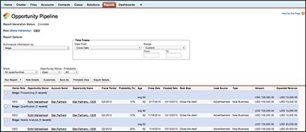
When you click the Reports tab, as shown in Figure 17-1, you’ll see a search bar, a Folders navigation tree in the left panel of your browser, and a list of recently run reports within a particular folder in the main panel of this page. Salesforce has functionality on the Reports home page to help you more easily navigate through a large set of reports and dashboards. Salesforce comes standard with a set of predefined reports and folders that are commonly used for measuring sales, marketing, support, and other functions. For example, the Opportunity Pipeline report is an oft-used report by sales individuals and managers to help prioritize which deals to work on.
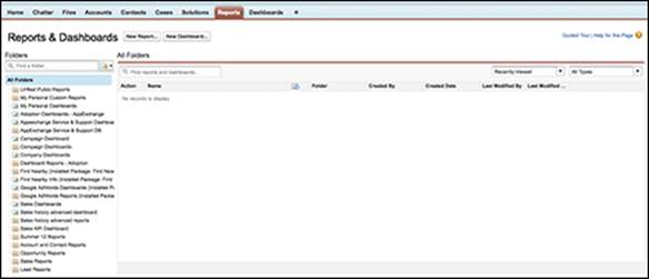
Figure 17-1: The Reports home page.
 You can’t save a custom report in a standard folder. If you’re an administrator, consider creating custom folders using the New Report Folder option that’s accessed from the little folder icon to the right of the Find Folders search bar in the left-side pane, as shown in Figure 17-2. Organize this according to your important functional areas that ultimately replace these standard folders.
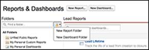
Figure 17-2: Creating a new report folder.
From the Reports home page, you can do the following:
· Find reports. Type keywords into the Find Reports and Dashboards search bar, and while you’re typing, Salesforce will return matching reports based on the report’s name and description fields.
· Search a folder. Use the Find Folders search bar or scroll down the Folders navigation pane to quickly locate a particular folder.
· Create a folder. If you’re an administrator, click the New Folder link as mentioned in the previous tip to create new report folders to house custom reports.
· Select a folder. When you click a folder from the Folders pane, the contents of that report or dashboard folder will appear in the main panel. To backtrack, click the All Reports option at the top of the Folders navigation tree in the Folders pane.
· Filter report lists. Use the filters on the right side of the main pane, as shown in Figure 17-3, to narrow the number of reports that you see within a particular reports folder.
Figure 17-3: Filtering on Reports.
· View recent reports. Select the Recently Viewed option from the filter drop-down list to match the criteria of what reports you want to see. Click and hold down your mouse button over the Scheduled Items icon (that’s its own column heading) to quickly select additional columns to help you more quickly find your report. You can also click and drag column headings to rearrange them or remove them.
· Display the report. Click a report title.
· Edit, delete, or export data to Excel. On standard or custom reports, click the Customize, Delete, or Export Details button. We talk more about exporting your reports in the later section “Exporting Reports to Excel.”
· Create a report. Click the New Report button to start the Report Builder Wizard.
Displaying a report
When you click a report title or run a report from the wizard, a report page appears based on the criteria that was set. For example, under the Opportunity Reports folder, click the Opportunity Pipeline link. The Opportunity Pipeline report appears, as shown in Figure 17-4. This report, as we mention earlier, is one of the most-used standard reports in Salesforce.
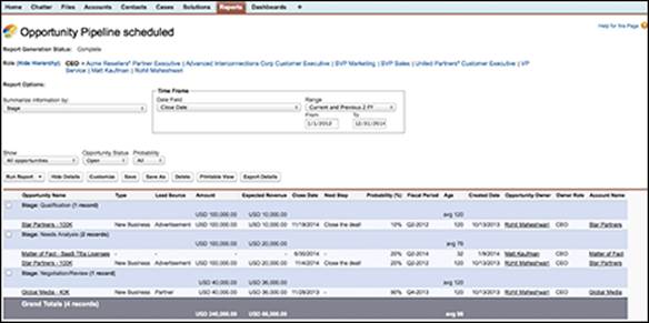
Figure 17-4: Displaying a report.
A basic report page in Salesforce is broken up into a few parts:
· Org Drill Down: You can use this area at the top of the page to quickly limit results based on role hierarchy. This helps reduce the number of redundant reports that you have to create just to see a slightly different view of the data based on a team’s structure. For example, you can use the Org Drill Down to see how the Eastern region team’s numbers are faring. You could drill down even further to see how a specific sales rep in the Eastern region is doing, without having to create a separate report. See Chapter 19 for steps on setting up the role hierarchy.
· Report Options: This section is at the top of the page, just below the Org Drill Down. You can use it to summarize, filter, and perform other operations on a report. For details on report options, see the section “Filtering on a Report,” later in this chapter.
· Additional filters: This optional section is customized by the person building the report, and it allows additional filtering of certain fields that are picklists.
· Generated report: This section shows the report itself. What’s visible depends on the construction of the report and what you have permission to see in Salesforce. See Chapter 19 for more details on sharing.
In the Generated Report section, you can click a column heading to quickly re-sort your report by the selected column.
Developing Reports
Salesforce comes with a huge menu of useful reports, and yet they might not be exactly what you’re looking for. For example, if your company has added custom fields on the account record that are unique to your customer, a standard New Accounts report doesn’t show you all the information you want to see on recent accounts.
The next time you need a custom report, don’t pester the IT geeks. Instead, use Report Builder to build a new report or customize an existing one.
Building a report from scratch
You don’t have to be a technical guru to create a report in Salesforce. Just make sure that you can articulate a question that you’re trying to answer, and then Report Builder will guide you through the steps for creating a custom report that will help you answer the question. Anyone who can view the Reports tab can create a custom report.
To create a report from scratch, click the Reports tab and follow these steps:
1. Click the New Report button.
The Create New Report page appears, as shown in Figure 17-5.
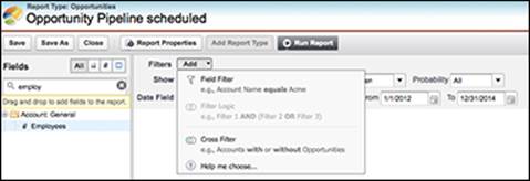
Figure 17-5: Defining the objects for the report.
2. Select the report type that you want to report on, and then click Create.
You do this by first selecting the basic category of object from the Select Report Type panel, which displays a list of folders representing key objects. Clicking a folder then reveals more specific report types to choose from. The standard report types will give you a visual preview of sample data and how it would look in that report template. The Create button is found at the lower-right corner of this page.
When you click Create, the Report Builder drag-and-drop interface appears.
3. Customize your report using the following Report Builder features:
· Adjust your view and time frame. Do you want the report to show just records that you own, ones that you and your underlings own, or all records that your role is able to see? What time range do you want the report to cover? Use the picklists in the Show and Date Field section to narrow your results.
· Add custom filters. To help further narrow your result set, use the Add drop-down list along the Filters row. For example, you can create a custom filter to only show results where the opportunity amount is greater than $10,000.
· Drag and drop fields. Find fields in the left sidebar that may be additional columns that you want to have in your report. Simply click and drag that field name over to the Preview section of the Report Builder and then place that new column among your other headers.
· Add a chart. Look for an optional Add Chart button in the Preview pane to add a graphical summary of your results. Use the Chart Editor to choose a chart type, determine what data to represent, and decide how you want that data to be visually presented.
4. When you’re done creating your report, click the Save button.
The report saves, and a sample preview appears in the Report Builder Preview pane.
You can get pretty advanced with filtering options. As long as you can explain to yourself in plain English what criteria you are looking for, you should be able to build a report for it using options under the Filter⇒Add drop-down list, as shown in Figure 17-6. For example, if you define strategic accounts as companies that did either more than $1 billion in annual revenue or had more than 500 employees plus $500 million in annual revenue, you can generate this report. To do this, add your field filters from the Filters⇒Add picklist and then choose the Filter Logic option. A field will appear where you can order each filter you have and associate it using AND or OR logic.
Customizing existing reports
A fast and easy way to generate reports is to customize an existing report and save it as a new one. For example, if you like the standard Pipeline Report but you want to modify the columns, you can simply work from the existing report.
To customize an existing report, go to the Reports tab and follow these steps:
1. Find a folder that contains a report that you want to customize. After clicking that folder, click a link for that report in the main Reports pane.
The report appears.
2. Click the Customize button.
Using the Customize button, the Report Builder page appears. You can then drag and drop interface fields into columns for that report (as discussed in the previous section). A preview of the report appears while you are customizing it.
3. Continue customizing your report until you’re satisfied, and then click the Run Report button.
The report appears modified based on your settings from the wizard.
4. When you’re done, click Save or Save As.
The Save button replaces the prior custom report. The Save As button saves a new one. In either case, a page appears to save the report.
5. Complete the fields and click Save.
The Reports home page appears, with a link to your new report.
 Creating custom report types
The Report Wizard is pretty darn thorough. At the same time, your company’s quant jocks may want to perform even more advanced reporting than what’s offered in the standard Report Wizard. Or you may want to simplify the number of fields that your report users see when they go through the wizard. Professional, Enterprise, and Performance Edition administrators can create custom report types (CRTs) to address both of these needs.
For more advanced reporting capabilities, in techno-speak, CRTs let you change the joins on the table. So if you have a Projects object and want to report on all accounts with projects and project team members, you can create a CRT and determine which fields show up in your Select Columns to Total step. For more information on setting up CRTs, go to the Help & Training section within Salesforce and search for “Create a Custom Report Type.”
Filtering on a Report
Over time, you’ll develop core reports that have the columns that you want in a format that makes sense to you. One of the huge benefits of reporting in Salesforce is that you can use existing reports on the fly and apply report options to limit or reorder the report results.
All those options and more are possible in seconds without having to use the Customize button. In the following sections, we show you how to filter your reports with tools and enhanced drill-down and break-out options.
Using the Report Options section
When you open a report, it appears with a variety of filters in the Report Options section at the top of the page, as seen in Figure 17-6. By using the filters in the Report Options section, you can look at your data from multiple angles. The available standard filters depend on the type of report that you selected.
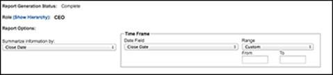
Figure 17-6: Identifying your report options.
To try out the standard filters in the Report Options section by using the Opportunity Pipeline report as an example, first go to the Reports home page and click the Opportunity Pipeline link. The report appears. From the report, you can do the following with the filters in the Report Options section:
· Summarize your report by a field. From the Summarize Information By drop-down list, select a field that determines how your information is summarized. For example, if you want to look at your opportunities by rep, select Opportunity Owner.
· Choose a time frame. From the Time Frame area, first select a date field, and then in the drop-down list to the right, select a standard range or create one of your own. For example, if you want to look at all opportunities created from 2014 to the present, you’d first select Created Date, and then define the interval.
· Choose a scope. From the Show drop-down list, select the scope of records.
· Look at open or closed records. Use the Opportunity Status drop-down list if you want open and/or closed records.
· Limit results. Use the Probability drop-down list if you want to limit the results by probability.
At any particular time, click the Run Report button to apply your selected filters. The report reappears based on the filters you defined.
If you ultimately want to save the report, click the Save or Save As button, and then save the report as usual. (See the section “Building a report from scratch,” earlier in this chapter, for details on saving.)
Hiding and showing details
To see a collapsed or expanded view of your report data, click the Hide/Show Details button in the Report Options section. For example, from the Reports home page, click the Sales by Account report under Sales Reports. When the report appears, click the Hide Details button. The report reappears in a collapsed view, and the Hide Details button morphs into the Show Details button. Now click the Show Details button, and the report expands again. By using Hide Details, you can easily view headings, subtotals, and totals, especially for matrix reports.
Filtering with the drill-down menu
Reports in Salesforce have a drill-down function that you can use to select rows within a report and instantly break them down by a different field. For example, if you’re reviewing an Opportunity by Rep report, you might want to select a specific rep and then sort the rep’s opportunities by stage. With enhanced drill-down and break-out options, you can do this in just a few quick clicks.
To use the drill-down and break-out options (using Sales by Rep as the example), follow these steps:
1. From the Reports home page, click the Sales by Rep link under the Sales Reports folder.
The report appears.
2. In the left column of the report, select check boxes for records you want to view.
If you don’t see check boxes and you know you’ve closed opportunities in Salesforce, select an interval in the Report Options section to see all your historical opportunities and click Run Report to view more records.
3. At the bottom of the page, select a field from the Check Rows to Filter, Then Drill Down By drop-down list to summarize the information, if desired, and then click the Drill Down button.
The report reappears based on your selections. For example, if you chose the Close Month option from the Drill Down By drop-down list, your selected opportunities would be sorted by close month.
4. If you want to use the report in the future, click Save As, and then follow the normal directions for saving reports.
See the section “Building a report from scratch,” earlier in this chapter, for saving details.
Clearing filters
If you have reports with advanced filters, you can easily view and clear the filters to expand the results. For example, if you created and saved the test report in the preceding section, you might want to clear the filter on the selected rep(s) to see all closed opportunities by close month for all reps. The advanced filters, if any, appear just below the Generated Report header on a report page.
To clear a filter, follow these steps:
1. Click the link for a report to which you applied filters.
The report appears, and your criteria filters are listed under the Filtered By header directly below the Generated Report header, as shown in Figure 17-7.
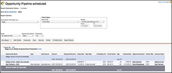
Figure 17-7: Clearing criteria filters in a drill-down report.
2. Right below the Filtered By header, click the Clear link to remove a filter.
The report reappears, displaying a potentially wider universe of data.
3. Be sure to click the Save or Save As button if you want to save this report.
You can quickly modify advanced filters by clicking the Edit link next to the Filtered By header. The Report Builder page appears.
Exporting Reports to Excel
Ideally, you want to run your reports right out of the application, getting rid of that mad scramble of collecting data before your next big meeting. However, sometimes you’ll want to generate a report and then export it to Excel. Maybe you need to run some complex spreadsheet calculations, or you need to plug numbers into an existing macro template. No problem. You can do that with the click of a button.
To export a report, click the Reports tab and follow these steps:
1. Click the Name for the report you want to export.
The report appears. For some reports, you can skip this step by selecting the Export option in the Action drop-down menu next to the report name.
2. Click the Export Details button.
A page appears to define your settings for exporting the file.
3. Complete the fields and click the Export button.
A window appears, prompting you to open or save the file.
4. Follow the steps, as desired.
When the file opens, the report data appears in Excel.
5. Click Done to return to your Salesforce report.
The report page reappears.
Some companies get nervous about certain users having the ability to export company data. If this is a concern, and you have the Enterprise or Performance Edition, you can take one precaution by using custom profiles to eliminate the ability of some users to export to Excel. See Chapter 20 for more details on creating custom profiles.
Organizing Your Reports
A word to the wise: Reports start multiplying like rabbits as you become addicted to reporting in Salesforce. Do yourself a favor: Organize them from day one and lay out a process for maintaining and deleting reports.
Creating new folders
Nothing is worse than seeing a gazillion reports under the Unfiled Public Reports folder. You start wasting a ridiculous amount of time just identifying which one is the report you want. If you have permission to manage public folders, avoid the headache by creating new report folders.
To create a new report folder, click the Reports tab and follow these steps:
1. Click the New Folder link to the right of the Find Folders search bar.
A New Report Folder page appears.
2. Type a name for the folder in the Report Folder Label field.
For example, if you want a folder for operational reports, you might name it Sales Ops Reports.
3. Use the Public Folder Access drop-down list to determine read versus read/write privileges to the folder.
For example, if you select Read/Write, a user with access to the folder could save over the original report.
4. Use the two list boxes and the Add/Remove buttons to select reports in the Unfiled Public Reports folder and move them to the new folder.
5. Use the radio buttons to select who should have access to the folder.
As with other Salesforce folder tools, your choices amount to all, none, and selective.
6. If you chose the Selective option in Step 5, use the two list boxes and Add/Remove buttons to highlight groups or roles and move them to the Shared To list box.
7. When you’re done, click Save.
The Reports home page reappears, and your folder is added to the Folder menu.
Maintaining your report library
Actually, what’s worse than a gazillion reports under Unfiled Public Reports is a universe of reports, some of which are valuable, others of which are useless. Creating public report folders is a good first step, but you might want to apply some of these additional hints on a periodic basis:
· Accurately name your reports. You and your users can’t know what’s behind a report link unless you name it clearly and precisely.
· Consider using report numbers within your report names. For instance, use standard file-naming conventions like 1.1 North America Pipeline. By doing this, managers can refer to report numbers so that everyone’s looking at the same report.
· Delete unnecessary reports. If multiple people in your company have permission to manage public reports, you might want to survey them before accidentally deleting a report. Unnecessary or redundant reports just make it harder for everyone to find what he or she wants. And in case you mistakenly delete a report (you’ll find out soon enough), you have up to 30 days to rescue it from the Recycle Bin.
· Update existing reports as needs arise. For example, if you created an Opportunity Product Report and used an advanced filter such as Product Family Equals Software, make sure that you manually update the report if the product family name changes. Otherwise, your reports will be off.
· Use clear report questions. For example, you might use the Report Question field to summarize certain filters to your report.
Advancing Beyond the Basics
As Salesforce has matured over the years and more users rely on it to house the bulk of its customer-touching information, users’ reporting needs have also matured. Salesforce has done a great job making potentially very complicated database queries still accessible to the business user. Here we talk briefly about some of the more advanced functionality, in case you are feeling stuck about how to get information in your reports in a certain way. Most likely, you have a way to get you what you want but you might need to dig a little deeper into Salesforce.
Building custom summary formulas
Salesforce provides prebuilt functionality that calculates the sum, average, highest value, and lowest value of certain fields that you select for your reports. However, you may need additional summary information based on calculations unique to your business. For example, your business may want to see win-rate percentages or coverage ratios in your reports. Salesforce allows the addition of custom formula calculations for your reports (and dashboards). This means that you can take summary information from other fields and lump them together to come up with a new calculation and corresponding result. It doesn’t matter whether you know old math or new math, Salesforce can derive these values for you using Excel-like commands.
To create a new custom summary formula, follow these steps:
1. Click a link for an existing report.
The report appears.
2. Click the Customize button.
The Report Builder appears.
3. In the Fields column in the left pane of the Report Builder, find the Formulas folder and click into that to drill down. Select the Add Formula option, as shown in Figure 17-8, and drag it into the preview pane as its own column.
The Custom Summary Formula Wizard page pops up.
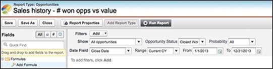
Figure 17-8: Adding a custom formula.
4. Complete the fields, as required:
· Enter a column name as it will appear on the report in the Label field.
Optionally, type a description. Ideally, this field helps explain the math formula in layman’s terms.
· Select the type of format that you want your results to be in from the Format drop-down list. For example, if you want to calculate the revenue per item of all your products in the pipeline this year, you’ll want your result to be Currency.
· Select the number of decimal places to display for your selected data type from the Decimal Places drop-down list.
· Choose where you want the summary calculations to be displayed in the report. Reference the visual guide to assist you in determining if you want the output to appear at all summary levels or just specific ones.
5. Build your formula in the Formula section, as shown in Figure 17-9:
1. Select one of the fields listed in the Summary Fields drop-down list, and then choose the kind of summary type to use in your formula.
This field’s value, and how it will be summarized, are automatically added into your formula. In our example, we select Amount and Average.
2. Click the appropriate operator icons from the drop-down list with the same name.
In our example, we select the / (Divide) option.
3. Repeat these steps, as needed, to build your formula.
If you need to know what functions to use for a particular operation, use the Functions picklist. Salesforce will also return some help text to give you an idea of how those functions should be formatted.
6. Click Check Syntax to check your formula.
Syntax that contains errors is automatically highlighted.
7. Click OK when finished.
The pop-up window closes, and you’re back at the Report Wizard. You should see the new column showing sample data in the Preview section.
 The custom summary formula isn’t saved until you save the report. Clicking Done just includes it in this step of the Report Wizard. Make sure that you save the report.
8. Click Run Report to see the new column showing real data.
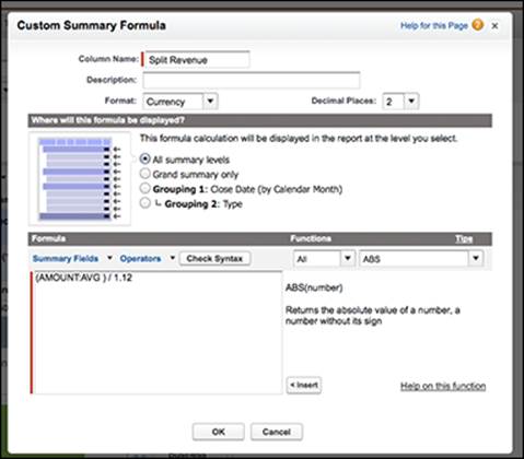
Figure 17-9: Building your custom formula for your report.
Understanding additional reporting options
You can do a lot more fun things with reports. Even many long-term users of Salesforce reports may not fully know about these additional analytics capabilities. Here is a brief summary to get data detectives more excited about it:
· Conditional highlighting: You can apply conditional highlighting to summarize matrix reports and help you easily highlight values that might deserve more of your attention. You can use this with custom summary formulas to highlight high or low percentages, averages, and ratios. You see a lot of syllables in this feature, but conditional highlighting translates into setting thresholds for certain key numerical values and color-coding them to show whether a threshold has been surpassed. In an Opportunity Pipeline by Rep report, you can quickly get an understanding of how people are doing when each rep’s total won opportunities are highlighted in red, green, or yellow.
· Bucketing fields: Bucketing a field lets you select a column in a report, define ranges for data in that field, and group them into “buckets” with names that you get to define. For example, the currency captured in an Amount field could be updated into three categories: small, medium, and large. You can define what currency ranges fall under the small bucket, what range falls under the medium bucket, and so on. You can identify columns in reports that are bucket fields by the little bucket icon to the left of the column name. To see an example of how a bucket field is created, refer to Figure 17-10.
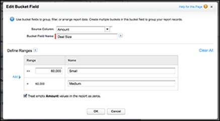
Figure 17-10: Building bucket field ranges.
· Joined reports: This is a powerful tool that allows you to create one report that consists of report “blocks” that are each separate reports that may or may not be reporting off the same objects. So, if you were trying to run a report that showed both your closed won opportunities as well as the opportunity win rate, you could join two reports. One block would show the total of all your closed won opportunities for a time range, while a second block could be based off of all opportunities so that you can calculate that win ratio.
· Scheduled report runs: If you have the fun job of providing the powers that be with the same type of report every Monday morning, or at the end of every month, you can automate the running and e-mailing of a report after you’ve customized it and made it just right for everyone.
For more in-depth information on each of these advanced analytics capabilities, click the Help & Training link in Salesforce and search using the appropriate keywords (conditional highlighting, bucketed fields, and joined reports) in the search bar.