Salesforce.com For Dummies, 5th Edition (2014)
Part VI. Measuring Overall Business Performance
Chapter 18. Seeing the Big Picture with Dashboards
In This Chapter
![]() Planning your dashboard strategy
Planning your dashboard strategy
![]() Creating dashboards
Creating dashboards
![]() Adding and editing components
Adding and editing components
![]() Organizing dashboards
Organizing dashboards
Dashboards are visual representations of custom reports that you create in Salesforce. For example, you can see data in a chart, a graph, or a gauge. You can use dashboards to illustrate key performance indicators (KPIs) and other metrics important to your business. A metric is simply something you want to measure (for example, sales by rep, leads by source, opportunities by partner, cases by agent, and so on).
What does this mean for you? If you’re a sales or service rep, you can track your daily progress against attainment of goals. If you’re a manager, you can easily see how reps stack up against each other and where you need to get involved to hit your numbers. And if you’re on the executive team, you have dashboards with actionable charts and graphs for strategic decision making to improve the business.
In this chapter, we share tips on planning your metric reporting strategy, and then we show you how to create dashboards. We walk you through updating dashboard properties and components. You also discover how to organize dashboards and their related reports so that you know you’re looking at the right information.
Figuring Out Dashboards
Dashboards are pages in Salesforce comprising tables and charts designed to help you understand important aspects of your business, such as opportunities per territory and leads by source. Dashboards are critical to being able to assess the health of your business and spot trends early. The following sections show you some basic concepts so that you can consider your strategies before you start unleashing them on your organization.
Breaking down basic elements
You can build a dashboard with as many as 20 individual charts, tables, metrics, gauges, or custom components; each item is a dashboard component. Similar to building charts with the Report Wizard (see Chapter 17), components are based on reports that you create. In fact, you can click a component on a dashboard to make the underlying report appear. Here’s a quick summary of the components that are available to you:
· Horizontal bar or vertical column charts are great when you want to depict a simple measurement with an x axis and a y axis. For example, use bar charts if you want to create a component that displays pipeline by stage. See Figure 18-1 for an example.
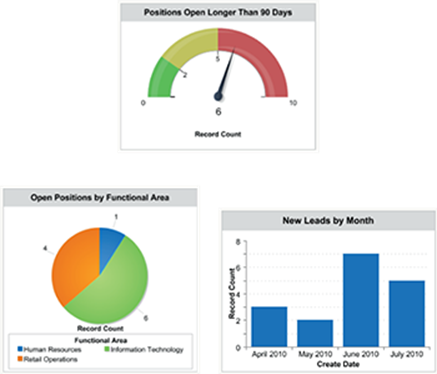
Figure 18-1: A gauge, pie chart, and vertical bar chart.
· Horizontal bar or vertical column grouped charts work well when you want to compare groups of bars with each other. For example, use grouped bar charts if you want to create a chart that displays pipeline by stage broken out for each month.
· Horizontal bar or vertical column stacked charts work well when you want grouping within a bar. For example, use stacked column charts if you want to create a chart that shows cases by status and then by type (such as problems versus feature requests).
· Horizontal bar or vertical column stacked-to-100% charts are excellent when you’re more interested in percentages than amounts. If you’re comparing new versus existing business, stacked-to-100% charts can help you understand what percentage of each stage was new business versus existing business.
· Pie charts work just like the standard bar charts, but the data is shown as a pie with the percentage and amount for each wedge; see Figure 18-1.
· Donut charts work just like pie charts but also show the total for the whole chart. (Goes great with coffee and morning meetings.)
· Funnel charts add an additional visual element to the mix by changing the height of each grouping based on its proportion. For example, use a funnel chart if you want to easily see how much each stage in your pipeline is worth.
· Line charts are helpful if you’re trying to express trends, particularly when time is part of the measurement. For example, use a line chart if you want to analyze the number of newly created opportunities by month for your entire company.
· Grouped line charts add a layer of complexity. For example, a line group chart could help you express the number of newly created opportunities by month broken out by region or unit.
· Cumulative line charts allow you to track the progress of a single metric over time. For example, a line cumulative chart could help you see the number of closed cases by day over the course of an entire month.
· Grouped cumulative line charts allow you to track progress over multiple metrics over time. For example, a line grouped cumulative chart could help you see the number of closed cases grouped by agent per day over the course of an entire month.
· Tables create simple but powerful four-column tables. For example, use tables if you want your dashboard to show the top ten forecasted deals in the quarter in descending value.
 You can create tables in dashboards but not in the charting tool of the Report Wizard.
· Metrics insert the grand total of a report at the end of a dashboard label that you customize. Metrics are compelling when you want to tell a story that might require a bit more explanation. Metrics tend to work well in concert with other components. For example, if you use a pie chart to summarize opportunity by stage, you could add a metric to summarize total pipeline.
· Gauges are useful when you have a specific measurable objective and you want to track your progress — see Figure 18-1. A gauge applies the grand total of a report as a point on a scale that you define. For example, use a gauge if you want to measure actual quarterly new bookings against a quota that you define.
· Scatter charts aid in showing correlation between one to two groupings of data. For example you can look at all closed-won opportunities last quarter, and group those by account owner. On your x-axis you can measure the total amount of those closed-won deals (still grouped by the opportunity owner), and your y-axis can show the annual revenue for each account (which is a standard field on that account record). Do your sales people tend to close a higher value of deals when the customer itself generates more revenue? Let your scatter chart tell you.
· Visualforce Pages allow you to create your own custom dashboard components (or download other people’s). Even if you’re just interested in a snazzier graphic element, go to www.appexchange.com and click the Components category to see what others have created.
If you’re an administrator or a user with permission to manage dashboards, you can create, edit, and organize them. And even if you don’t have such permissions, you can still view them by clicking the Dashboards tab on the home page.
Planning useful dashboards
We always say that the best way to build a system is to envision what you want to ultimately measure. Do you want to know who your top sales reps are? Would you like to understand what your best accounts are buying from you and how much? Do you wonder how long it takes to close a case? This method of starting with the business questions you want to answer applies to your building of reports and is true of dashboards. If you’re an administrator or part of the team responsible for deploying Salesforce, consider these tips as you develop your dashboards:
· Focus on your end users. Meet with sales, marketing, and support management and have them define their KPIs for their teams and business. Knowing this helps you customize Salesforce and construct useful dashboards.
· Create a common set of components to reflect a universal way to look at business health. This is especially true if your company has multiple sales teams. For example, after you determine the key sales metrics for your company’s overall dashboard, you can replicate the dashboard and then customize other dashboards for each sales team. By doing this, everyone in the company is speaking a common language.
Building Dashboards
To build a dashboard, you need to create your custom reports first. You also need to create public folders for your dashboard reports if you want dashboards to be viewable for other users. See Chapter 17 for all the details on creating custom reports and organizing them in folders.
 Only system administrators and users with permission to manage dashboards can add, edit, and delete dashboards. See Chapter 19 for details on how to grant permissions.
In the following sections, we show you how to install a pre-built dashboard and then how to clone a dashboard. Then, we cover the steps to build a dashboard from scratch.
Installing sample dashboards and reports
One of the best ways to get your feet wet with dashboards is to install sample dashboards from the AppExchange. Salesforce not only creates the dashboard for you but also builds the underlying sample reports to generate the components.
To install sample dashboards, follow these steps:
1. In your web browser go to www.appexchange.com.
The AppExchange home page appears.
2. Type Dashboards in the Search bar at the top and click the Magnifying Glass button.
A page full of AppExchange apps appears. The apps with the Salesforce or Salesforce Labs logos are made and provided for free by Salesforce.
3. Click an app’s listing to see more information about it.
The App Overview page appears with a description and images. If you find a set of dashboards that you’d like to download and install, check out Chapter 21 for more information on installing apps from the AppExchange.
If you’re having trouble accessing dashboards, you might not have the proper permissions. In this circumstance, consult with your administrator.
Cloning a dashboard
To save time or repurpose useful features, you can generate a dashboard by cloning an existing one and then modifying it. For example, if you envision creating multiple dashboards for different sales units with common components, you can use this shortcut and then modify the associated reports.
When you clone a dashboard, you don’t clone another set of identical reports. Instead, the newly cloned dashboard references the same custom reports that the original dashboard references. If you want the new dashboard to refer to different reports, see the “Editing a component” section, later in this chapter.
To clone a dashboard, follow these steps:
1. Click the Dashboards tab.
The last dashboard that you viewed appears.
2. Type the name of a dashboard in the Find a dashboard… search bar to search for a dashboard, or browse and select an option from the Find a dashboard… drop-down list to select a dashboard that you want to clone.
In this example, choose the sample dashboard entitled Company Performance Dashboard.
The dashboard appears.
3. Click the Clone button.
The Dashboard Builder page appears, as shown in Figure 18-2.
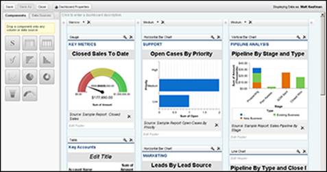
Figure 18-2: The Dashboard Builder page.
4. Update any of the dashboard components as you see fit.
5. Click Save to leave the Dashboard Builder.
The Save Dashboard dialog box appears.
6. Change your new dashboard’s settings, paying close attention to the following:
· Title: Change the title of the dashboard.
· Dashboard Unique Name: This field is automatically populated for you with your title, but any spaces are replaced by underscores. The Dashboard Unique Name is used by Salesforce to distinguish dashboards from a database perspective.
· Save To: Select the folder in which to store this dashboard from this drop-down list.
· Running User: The running user is the user whose security settings will apply to the dashboard. So, any user who can view the dashboard will see what that running user sees.
7. Click Save to view your new dashboard.
Developing a dashboard from scratch
In the preceding sections, you have the opportunity to test the waters and even generate some sample custom reports. In this section, you find out how to develop a dashboard from scratch.
To create a new dashboard, follow these steps:
1. Click the Reports tab.
The Reports & Dashboards home page appears.
You need to build your custom reports before you can develop a dashing new dashboard.
2. Build your custom reports and save them to a public folder.
See Chapter 17 to find out how to build custom reports.
Dashboards that you want others to see can’t use reports in your My Personal Reports folder. For purposes of this running example, find and click the Sales Reports folder (located in the left sidebar of the Reports & Dashboards folder navigation tree on the Reports & Dashboards home page) and click the following reports that show up in the main page:
· Sales by Rep: Modify the Report Options to summarize information by Opportunity Owner and then Stage. Then save the report as Pipe by Rep and Stage to a public folder.
· Sales by Account: Modify the Report Options to summarize information by Account Name. Then, save the report as Top Revenue Customers to a public folder.
You must be an administrator or a user with permission to manage public reports if you want to add report folders.
3. Click back on the Reports tab.
The Reports & Dashboards home page appears.
4. Click the New Dashboard button.
The Dashboard Builder page appears.
5. Drag the horizontal bar chart component from the Components tab on the left to one of the three available dashboard columns on the right.
A New Dashboard Component appears in Edit mode.
6. Complete the fields, entering a header, footer, and/or title.
For this running example, name the header PIPELINE METRICS and enter the title Pipe by Rep and Stage. You could also add a footer at the stage, but don’t bother for this example.
7. Click the Data Sources tab on the left.
A list of reports grouped by folder appears.
8. Find the Pipe by Rep and Stage report you saved in Step 2 by expanding the folder you saved it in.
You can use the plus and minus signs to expand and collapse the report folders.
9. Drag the report onto your dashboard component.
A preview of your dashboard component appears.
10. Click Save.
The Save Dashboard dialog box appears.
11. Enter a title and select a folder to save to. Click the Save and Run Dashboard button to run the dashboard.
Your new dashboard appears with your dashboard component.
Updating Dashboards
Over time, you might have to make changes to your dashboards, whether for cosmetic reasons or to make substantive updates. We can come up with a dozen common edits, but the good news is that updating is easy.
Editing dashboard properties
If you need to change the basic settings of a dashboard — such as the title, folder, or running user — you need to edit the dashboard properties. To edit the properties, follow these steps:
1. Click the Dashboards tab.
A dashboard appears.
2. Select a desired dashboard from the Find a dashboard… … search bar that also doubles as a drop-down list.
The dashboard you are trying to locate appears.
You can also just start typing a portion of the name of one of your dashboards to be presented with a list of matching dashboards.
3. Click the Edit button at the top of the dashboard page.
The Dashboard Builder appears.
4. Click the Dashboard Properties button.
The Dashboard Properties dialog box appears.
5. Modify the settings, as needed, and then click OK.
When you click OK, the Dashboard Builder reappears, and your setting changes are applied.
Editing a component
You might want to add or change — edit — an existing component. To edit a component, follow these steps:
1. Go to a dashboard and click the Edit button.
The Dashboard Builder appears.
2. Click the Wrench icon above a component that you want to modify.
For example, you might want to change the chart type or display units.
The Component Editor dialog box appears, as shown in Figure 18-3.
3. Modify the component data to adjust settings:
· For bar, column, or line charts: From the Group By drop-down list, click on a chart type to select the way multiple groups of values are displayed.
· For unit of measurement: Use the Display Units drop-down list.
· Component type: Click a chart image to select a component type. See the earlier section “Breaking down basic elements” for details on the components. In the example, select the vertical bar chart option. The steps will differ, depending on which component type you select.
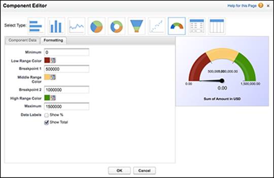
Figure 18-3: Modifying component data.
4. Click the Formatting tab to change the type and formatting of your dashboard component to best display your data:
· Table and chart components: Use the Sort Rows By drop-down list to select the order of sorting. For example, if you want to rank the reps from biggest to smallest pipeline, choose Row Value Descending. You can also sort the row labels if you want to rank the reps by their names.
· Maximum values displayed: (Optional) If you want, enter a number under Maximum Values Displayed.
· Bar, column, scatter, or line charts: Select an option from the Axis Range drop-down list. If you select Manual, the next two fields (Chart Axis Range Minimum and Chart Axis Range Maximum) become available for input.
· Legend position: Select an option from the Legend Position drop-down list to display your graph’s legend to the right of the chart, below it, or to not show it at all.
· Chart labeling: Adjust the chart labeling by selecting the Show Values and the Show Details on Hover check boxes.
· Tables, metrics, and gauges: Set up to two breakpoint values to separate different range colors from each other. Select Range Colors to represent a range of data, separated by the breakpoint values. (See Chapter 17 for more information on conditional highlighting.)
· Gauges: Set your Minimum and Maximum Values to represent the lowest and highest values on the gauge.
5. Click OK.
The Dashboard Builder reappears with the changes you applied to the component.
6. Click Save.
Your changes are saved, and your dashboard reappears.
Modifying the layout
If you need to modify the dashboard layout, you can also perform this while in the Dashboard Builder (refer to Figure 18-3).
Go to a dashboard, click the Edit button, and alter the layout. You can
· Modify a column size: Select Narrow, Medium, or Wide from the drop-down list at the top of each dashboard component. All the components in the column change in size based on your setting.
· Add a component: Drag a component or data source to a column and follow the steps in the section “Developing a dashboard from scratch,” earlier in this chapter.
· Delete a component: Click the X button located at the upper-right corner of a component. A pop-up window appears to confirm the deletion. When you click OK, the pop-up closes and the dashboard reappears, minus the deleted component.
· Add a column: If you have fewer than three columns in your dashboard, you can click the plus button at the upper right or left of a column to insert a new column on that side, respectively.
· Delete a column: Click the X button located at the top of a column. A pop-up window appears to confirm the deletion. When you click OK, the pop-up closes and the dashboard reappears, minus the deleted column.
· Rearrange components: Drag and drop components in your dashboard to arrange them exactly as you see fit.
When you’re satisfied with your changes, click the Done button. The dashboard then reappears with your modifications.
You can add up to 20 components per Dashboard, but best practice is to keep your dashboards simple and easy to read. Your most important components should comprise the top row. The top row’s components for a dashboard are displayed on the home pages of users who have chosen that dashboard as the one to view.
Refreshing the dashboard
Before you make decisions based on your dashboard, you’ll want to make sure that it is based on the latest data. Click any dashboard from your dashboard list. In the upper-right corner of the dashboard is a timestamp starting with As Of. You can use this to find out the last time your dashboard data was updated.
When you want to manually update your dashboard data, simply click the Refresh button at the top of the dashboard page. The components reappear one by one, and when the refresh is completed, a new timestamp appears.
Enterprise and Performance Edition customers can schedule their dashboards to be automatically refreshed on a daily, weekly, or monthly basis. Just use the drop-down list next to the Refresh button.
To schedule a dashboard to automatically refresh, follow these steps:
1. Click the Dashboards tab.
A dashboard appears.
2. Click the down arrow on the Refresh button.
3. Click the Schedule Refresh option.
The Schedule Dashboard Refresh screen appears, as shown in Figure 18-4.
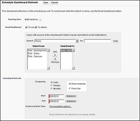
Figure 18-4: Schedule a time to refresh your dashboard.
4. (Optional) Select the To Me and/or the To Others check boxes to e-mail a copy of the dashboard when it’s refreshed.
If you have regularly scheduled meetings, you can automatically e-mail your dashboard to the meeting attendees prior to the meeting to give them a sneak peak of what will be discussed.
5. Select the frequency that you want your dashboard to be refreshed.
Each frequency option has additional options that allow you to specify exactly when the dashboard will be refreshed.
6. Select a start and end date for the frequency that you want your dashboard to be refreshed.
7. Select a refresh time from the Preferred Start Time drop-down list.
The dashboard reappears.
Organizing Your Dashboards
If you have permissions to manage dashboards, manage public reports, and view all data, you can organize your company’s dashboards in folders and define the proper security access for users. By organizing dashboards, you can make sure that the right people are focusing on the right metrics to manage their business.
Viewing dashboard lists
Unlike most other tabs in Salesforce, clicking the Dashboard tab doesn’t take you to its home page. Instead, the last dashboard that you viewed appears.
To access your viewable dashboards, follow these steps:
1. Click the Go to Dashboard List link at the upper-left corner of any dashboard.
A dashboard folder list page appears.
2. Use the Folder drop-down list to select a desired folder.
The Reports & Dashboards home page appears. The page for the selected folder appears in the main window with a list of available dashboards in the folder.
From this list page, users with the permissions mentioned in the preceding section can perform a variety of functions that include
· Re-sort: Click a column header to re-sort a dashboard list. (See Chapter 2 for more details on navigating list pages.)
· View: Click a title name to view a dashboard.
· Modify: Click the downward-pointing triangle in the Action column of the row that matches the dashboard you want to edit. A drop-down list appears. The Edit link appears in the drop-down list for your selection.
· Delete: Click the downward-pointing triangle in the Action column of the row that matches the dashboard you want to delete. A drop-down list appears. The Delete link appears in the drop-down list for your selection. Select the Del link to delete the dashboard.
· Build: Click the New Dashboard that appears to the right of the Reports & Dashboards heading, or the folder icon to the right of the Find a folder… search bar.
Building dashboard folders
From the Reports tab, which takes you to the Reports & Dashboards home page, you can also create and edit folders. Editing a folder is easy when you understand how to create one.
To create a folder, follow these steps:
1. On the Reports page, click the Folder icon to the right of the Find a folder… search bar and select the New Dashboard Folder option in the Folder drop-down list.
A New Dashboard Folder page appears.
2. Type an intuitive name for the folder in the Dashboard Folder field.
For example, if you want a folder for only senior management, you might name it Executive Dashboards.
3. Use the Public Folder Access field to determine read versus read/write privileges to the folder.
4. Use the radio buttons to select who should have access to the folder.
Your choices amount to All, None, and Selective.
5. If you chose Selective in Step 4 (the third radio button), highlight Groups or Roles in the Available for Sharing list box and add them to the Shared To list box.
6. Click Save.
The folder list page reappears, and now you can add dashboards or move existing dashboards to the new folder, which we explain in the section “Editing dashboard properties,” earlier in this chapter.
When naming folders, dashboards, and dashboard reports, consider using a standard numbering convention. For example, you could name the senior management folder 1.0 Executive Dashboards. Then the executive sales subordinate dashboard might be 1.1 and the executive marketing dashboard 1.2. By using a standard numbering methodology, you can more efficiently create, clone, and organize dashboards and dashboard reports.