Enterprise Web Development (2014)
Part II. Enterprise Considerations
Chapter 10. Responsive Design: One Site Fits All
Up until now, we’ve been writing and rewriting the desktop version of the Save The Child application. Will it look good on the small screen of a mobile device? Beginning with this chapter, we’ll deal with mobile devices, too.
Let’s discuss different approaches to developing a web application that can work on both desktop and mobile devices. There are three choices:
Seperate versions of native applications
In addition to your web application that works on desktops, develop a separate version of the native application for multiple mobile devices. Development of native mobile applications is not covered in this book.
Single HTML applications with multiple UIs
Develop a single HTML5 web application, but create various UI layouts that will be applied automatically, based on the screen size of the user’s device.
Hybrid applications
In addition to your web application that works on desktops, develop a hybrid application. This web application on steroids works inside the mobile browser but is packaged as a native app and can invoke the native API of the mobile device, too. Chapter 13 is dedicated to hybrid applications.
This chapter focuses the second approach, called responsive web design (RWD). This term was coined by Ethan Marcotte in his article, “Responsive Web Design.” The concept that underlies RWD is that the design of the web page changes, responding (reacting) to the display size of the user’s device. We’ll modify the design of the Save The Child site to introduce different layouts for the desktop, tablet, and smartphones. By the end of this chapter, the Save The Child site will automatically change its layout (without losing functionality) based on the screen size of the user’s device.
One or Two Versions of Code?
Run any version of our Save The Child application from the first chapters on your desktop and start dragging the right border of the browser’s window to make it narrower. At some point, you’ll see only part of the content; those layouts were not meant to be responsive. The application defines fixed sizes for page sections, which don’t change even if the display area shrinks.
Enter http://savesickchild.org in your mobile phone’s browser. Select the version titled HTML/AJAX. You’ll see either partial content on the page or the entire page with illegible small fonts as in Figure 10-1. This design of the Save The Child application doesn’t look good on all devices.
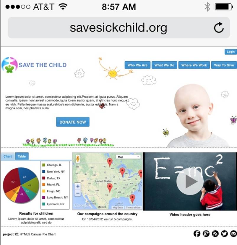
Figure 10-1. Nonresponsive version of the app on iPhone 5
Now try the version titled Responsive Design; this looks more usable on a small screen. Of course, this begs the question: how many versions of the UI do we need to create? People responsible for developing web applications that can run on both desktop and mobile platforms usually begin by making an important decision: HTML5 or native? But even if a decision is made in favor of the web platform, the next question is whether desktop and mobile clients will use the same code.
If a decision is made to go with separate versions of the web application, the web server can be configured to perform redirection to the appropriate code depending on the type of device the user has. Web servers can do it based on the value of the User-Agent attribute of the HTTP request header. For example, mobile web browsers trying to access the BBC (or any other web page) report their User-Agent to the server differently from desktop computers; hence, they receive different content delivered from a different URL. Figures 10-2 and 10-3 show snapshots of the BBC main page that were taken at the same time. Figure 10-2 shows how the page looks on a desktop computer, whereas Figure 10-3 was taken on an iPhone.
TIP
The Safari browser has a Develop menu, where you can select various User Agents to see how the current web page will look on different web browsers. You can also copy and paste a User Agent string from the site the User Agent string website to see how a web page will look in hundreds of devices if the website is user-agent driven.
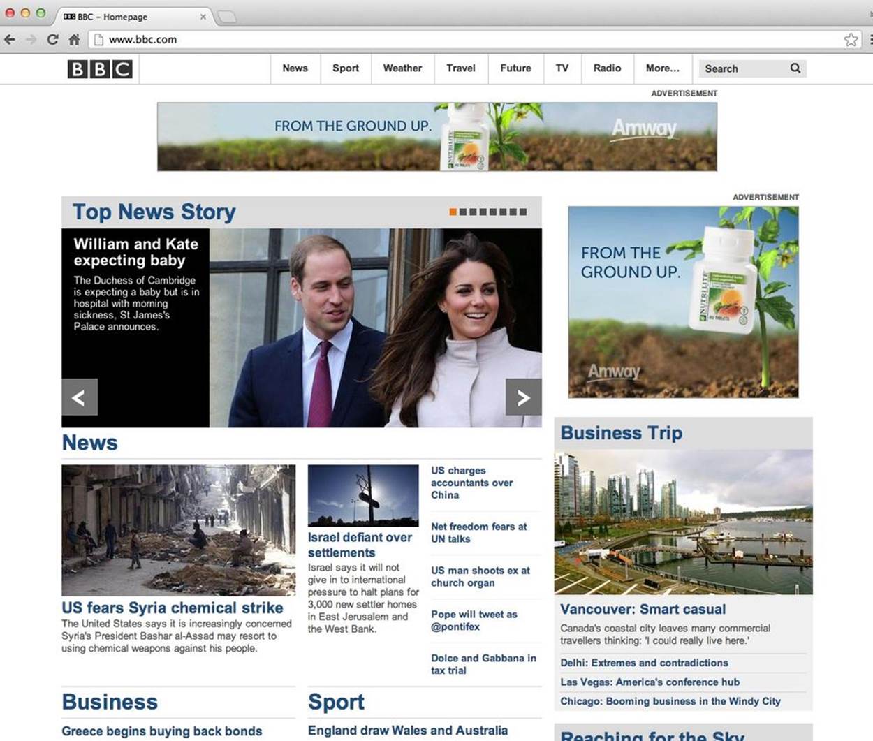
Figure 10-2. The desktop version of bbc.com
The page layout shown in Figure 10-2 delivers more content because that content can be allocated nicely on a large desktop monitor or a tablet. But the mobile version shown in Figure 10-3 substantially limits what’s delivered to the client—not only because the screen is small, but because the user might be accessing the page over a slower network.
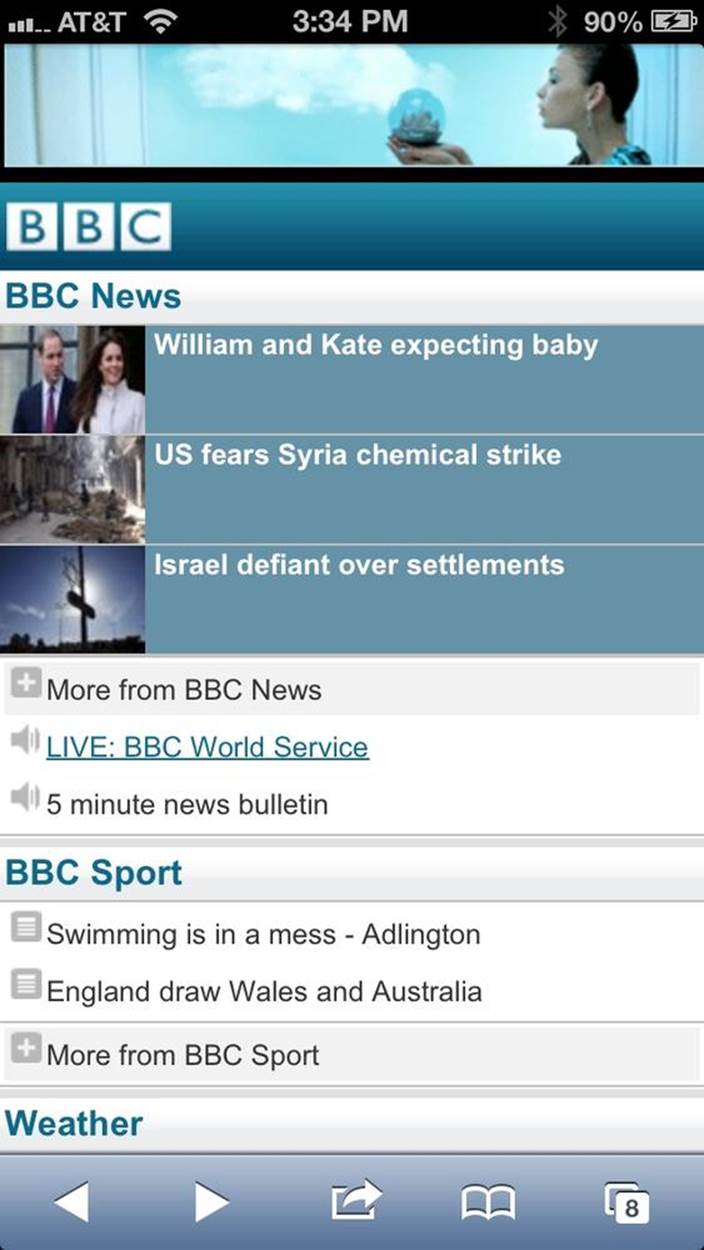
Figure 10-3. The mobile version of bbc.com
Have you ever tried to share the link of a website specifically designed for smartphones? It’s so easy! Just press the button and enter the email of the person with whom you want to share the site. Many mobile websites shared this way won’t look pretty on the large screen. It might just show a wider version of what you see on your mobile screen.
Maintaining two versions of the application code requires more effort than maintaining one: you need to have two sets of HTML, CSS, JavaScript, and images. Besides, most likely your web application will use a third-party JavaScript framework. At some point, you might run into a bug and will need to upgrade the mobile version to use the latest version of, say, the jQuery framework. But the desktop version works just fine. If you have two separate versions of the application, you’ll have to either upgrade jQuery and thoroughly test both mobile and desktop versions of Save The Child, or live with two versions of the framework.
Responsive design makes it possible for you to create one version of the web application, which includes multiple sections of CSS controlling page layouts for different screen sizes. In this chapter, we’ll create yet another version of the Save The Child application that will render its UI differently on desktop and mobile devices. All these versions, will share the same HTML and JavaScript code, but will include several screen layouts using CSS media queries.
Many websites have been built using responsive design. The list that follows presents several examples. Take a few moments to look at them, first from a desktop computer and then from a smartphone (or just lower the width of the desktop browser window), to experience fluid responsive design:
§ Boston Globe
§ Mashable
§ Cafe Evoke
§ Fork CMS
§ A lot more examples
Note that each of these web pages displays content on the desktop in three layouts (often in three, four, six, or twelve imaginary columns). As you make the window narrower, the layout automatically switches to a tablet or a large smartphone mode (usually a two-column layout), and then to the phone mode layout (the one-column layout).
This sounds like a great solution, but if you put all your media queries in the same CSS files, your users will be downloading unnecessary bytes—the entire CSS file that includes all versions of screen layouts. This is not the case in the BBC example, which has different versions of the code that load only what’s necessary for a particular device category.
You can have several CSS files for different devices. Include these files by using the media attributes. But web browsers were not designed to selectively download only those CSS files that are needed. For example, the following HTML loads both CSS files (without blocking rendering) on any user’s device:
<link media="only screen and (max-width: 480px)"
href="css/smartphone.css"rel="stylesheet">
<link media="only screen and (max-width: 768px)"
href="css/tablet.css"rel="stylesheet">
NOTE
Using the Window.matchMedia attribute can make it possible for you to conditionally load CSS in JavaScript. The JavaScript utility eCSSential can help web browsers download CSS faster.
NOTE
Consider combining responsive design on the client with some device-specific component (a.k.a. RESS) optimization on the server.
TIP
Although responsive design allows you to rearrange content based on the screen size, it might not be a good idea to show the same amount of content on desktops and smartphones. Making a web application look good on mobile devices must involve not only web designers and developers, but also people who are responsible for content management.
Now comes the million-dollar questions: Do we need to create 2 versions of the web application or 22? Why not 222? How many different mobile devices are there today, and how many will there be tomorrow?
How Many User Agents Are There
The HTTP header’s User-Agent attribute contains information about the user agent originating the request. Should you decide to create several versions of the UI based on the value in the User-Agent field, you can refer to the website. It lists not two, but hundreds of strings representing possible content of the User-Agent attribute for a variety of desktop and mobile devices. For example, Figure 10-4 shows how the User-Agent string from iPhone 5 is reported and explained by User Agent String. But this information might become unreliable after iOS upgrades.
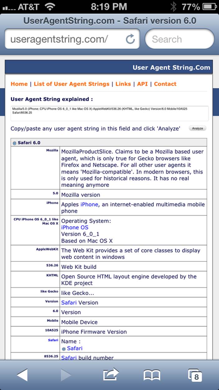
Figure 10-4. The User-Agent string from iPhone 5
There is an easier way to detect on the server that the request came from a mobile device. Wireless Universal Resource File (WURF) is a database of thousands of supported devices and their properties. Such Internet giants as Facebook and Google rely on this service, and your application could, too, if need be. WURF offers APIs from several programming languages to detect specific capabilities of user devices. For example, the following code snippet is how you could access the WURF data from a Java servlet:
protected void processRequest(HttpServletRequest request,
HttpServletResponse response)
throws ServletException, IOException {
WURFLHolder wurfl = (WURFLHolder)getServletContext()
.getAttribute(WURFLHolder.class.getName());
WURFLManager manager = wurfl.getWURFLManager();
Device device = manager.getDeviceForRequest(request);
log.debug("Device: " + device.getId());
log.debug("Capability: " + device.getCapability("preferred_markup"));
It’s impossible to create different layouts of a web application for thousands of user agents. Market fragmentation in the mobile world is a challenge. People are using 2,500 different devices to connect to Facebook. The Android market in particular is extremely fragmented. Figure 10-5 is taken from the report, “Android Fragmentation Visualized” (July 2013) by Open Signal.
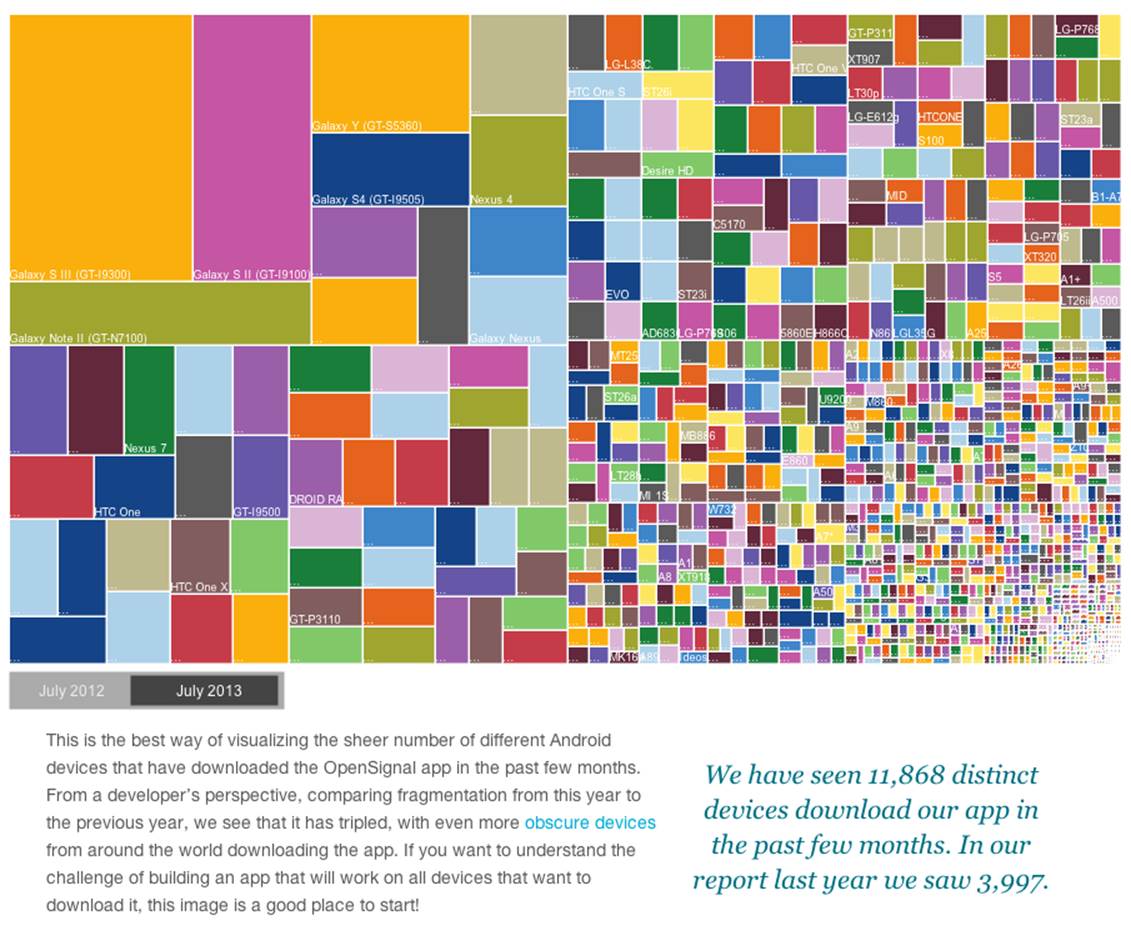
Figure 10-5. Android device fragmentation
Of course, device fragmentation doesn’t equal Android OS version fragmentation, but this situation is similar to the challenge that Microsoft has always faced—making sure that Windows works fine on thousands of types of hardware. It’s not an easy job to do. In this regard, Apple is in a much better position because it is the only hardware and software vendor of all devices running iOS.
It’s great for consumers that Android can be used on thousands of devices, but what about us, the developers? Grouping devices by screen sizes might be a more practical approach for lowering the number of UI layouts supported by your application. Responsive design is a collection of techniques based upon these main pillars:
§ CSS media queries
§ Fluid grids or fluid layouts
§ Fluid media
NOTE
Typography can be also considered one of the pillars of responsive design. This subject belongs to publications written for web designers and will not be covered in this book. Oliver Reichenstein’s article “Responsive Typography: The Basics” is a good introduction to this topic.
A media query is a CSS element. It consists of a media type (for example, @media (min-width: 700px) and (orientation: landscape)) followed by the styles applicable to this media. Using media queries, you can rearrange sections (<div>, <section>, <article>, and so forth) of the page based on the screen size. Fluid grids make it possible for you to properly align and scale the content of these sections. Fluid media is about resizing images or videos.
Data grid components are often included in enterprise applications. Fluid grids are designed by using relative positioning and can scale based on screen sizes. Fluid media is about creating videos and images that react to screen sizes. We’ll talk about the aforementioned pillars in greater detail later in this chapter. But before going into technical details, let’s get back to creating mockups, as we did in Chapter 1, to see how the UI should look on different devices.
Back to Mockups
Recall Jerry, our web designer who we introduced in Chapter 1. Well, he has come up with another set of Balsamiq mockups for the Save The Child application. This time he has four versions: desktop, tablet, large smartphone, and small smartphone. As a matter of fact, Jerry has provided more mockups to accommodate the user holding both smartphones and tablets either in portrait or landscape mode. Figure 10-6 shows the desktop mockup.
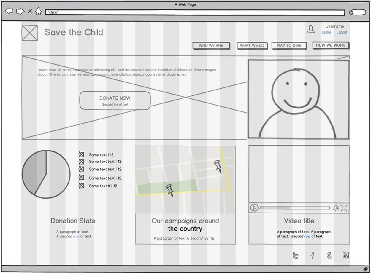
Figure 10-6. The desktop layout
Jerry gives us several versions of the images—with and without the grid background. The use of the grid is explained later, in Fluid Grids. Figure 10-7 depicts the rendering on tablet devices with a screen that is less than 768 pixels wide in portrait mode.
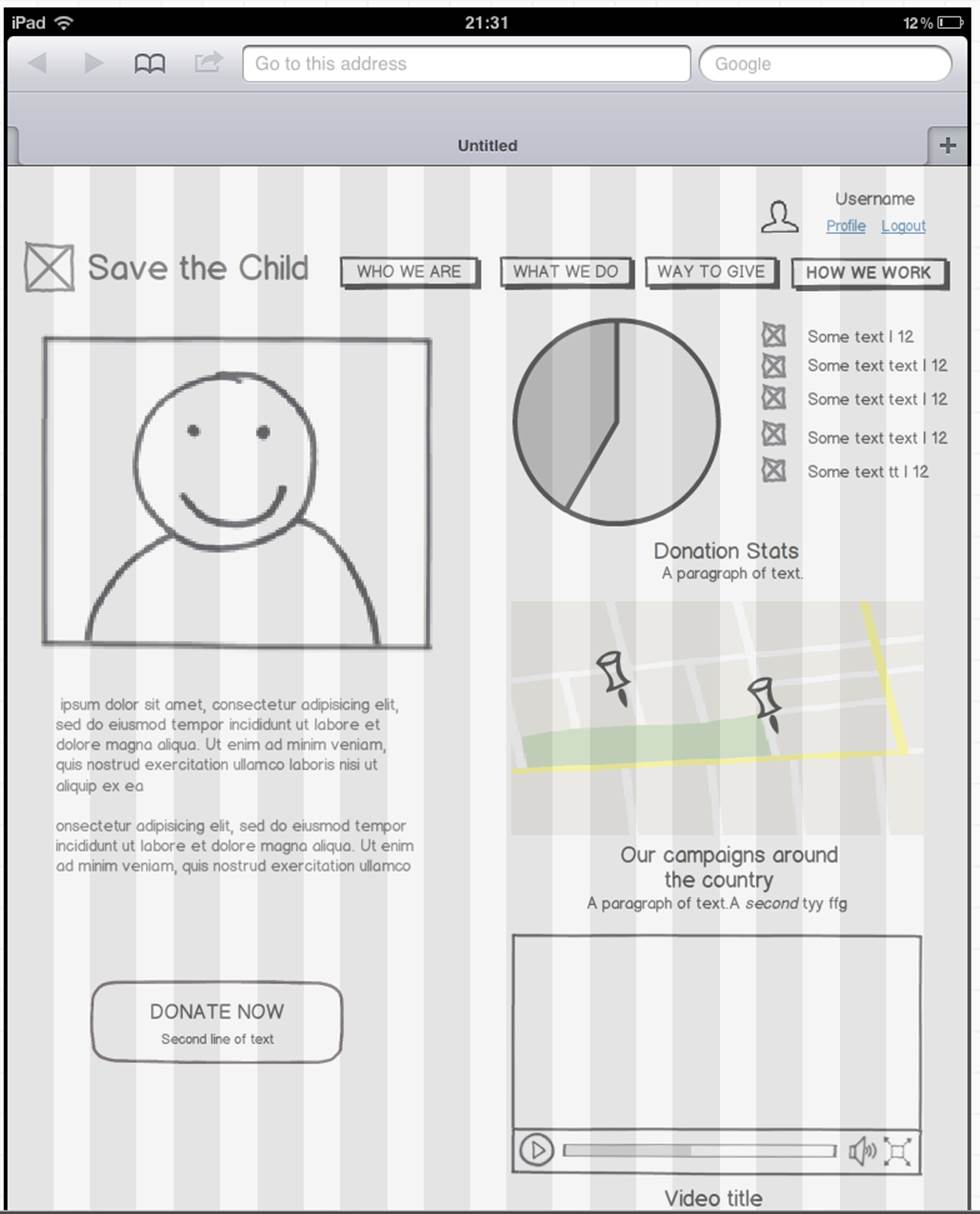
Figure 10-7. The tablet layout (portrait)
Next comes the mockup for large smartphones having a width of up to 640 pixels. Figure 10-8 shows two images of the screen next to each other (a user would need to scroll to see the second image).
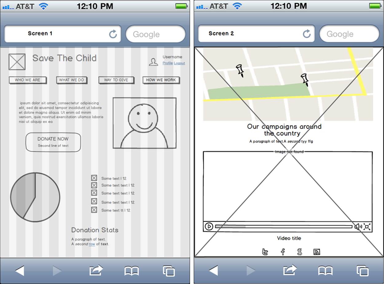
Figure 10-8. The large phone layout (portrait)
The mockup for smaller phones with a width of less than 480 pixels is shown in Figure 10-9. The mockup looks wide, but it actually shows three views of the phone screen next to one another. The user would need to scroll vertically to see the middle or the right view. iPhone 3 falls into this category.
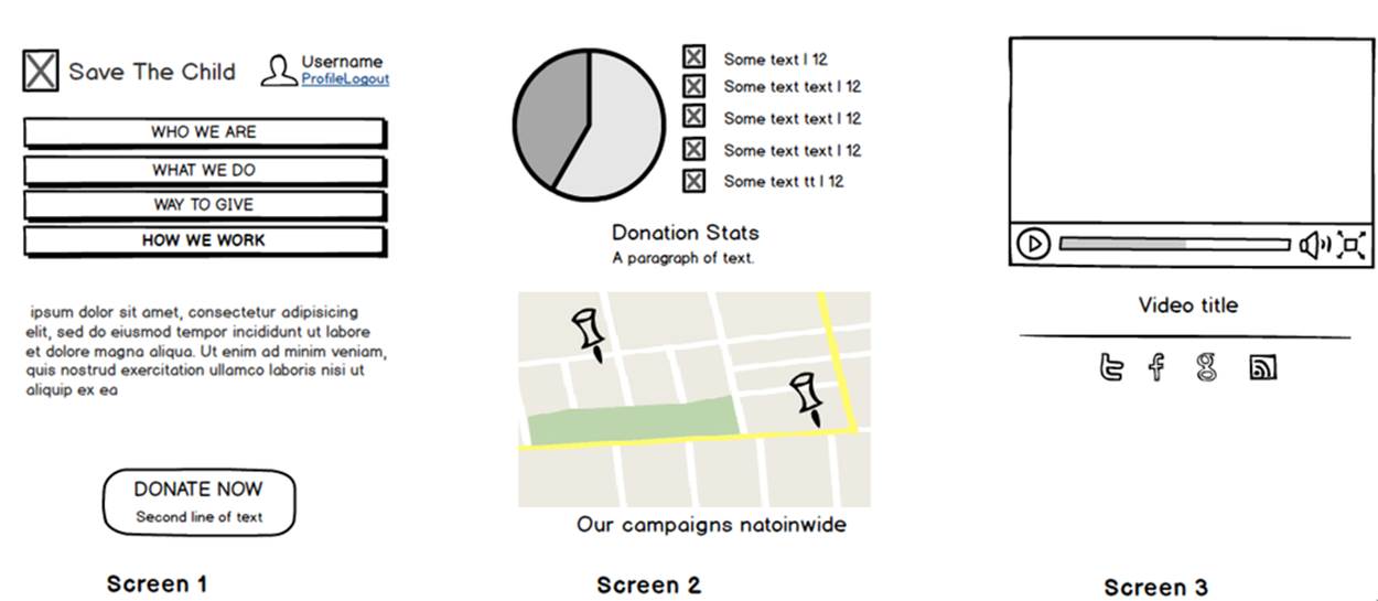
Figure 10-9. The small phone layout (portrait)
If need be, you can ask Jerry to create mockups for real devices with a width less than 320 pixels, but we won’t even try it here. Now we need to translate these mockups into working code. The first subject to learn is CSS media queries.
CSS Media Queries
First, let’s see the CSS media queries in action, and then we’ll explain how this magic is done. Run the project titled Responsive_basic_media_queries, and it will look like Figure 10-10. This is a version for desktops (or some tablets in landscape mode). The section chart, map, and video divide the window into three imaginary columns.
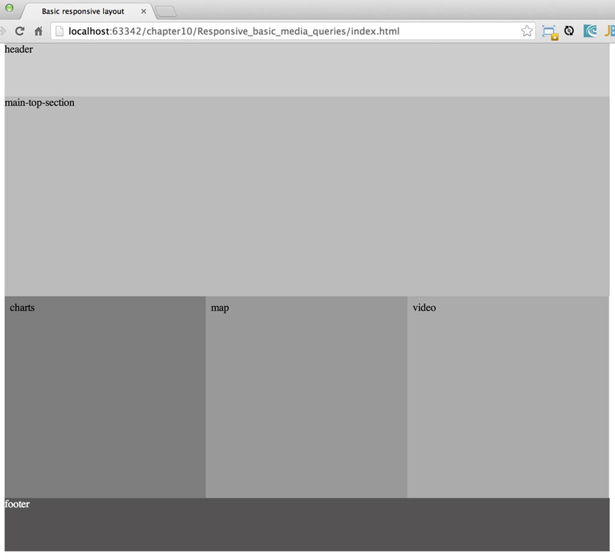
Figure 10-10. The desktop layout implemented
Drag the right border of your desktop web browser’s window to the left to make it narrower. After reaching a certain breakpoint width (in our project it’s 768 pixels), you’ll see how the <div>s reallocate themselves into the two-column window shown in Figure 10-11.
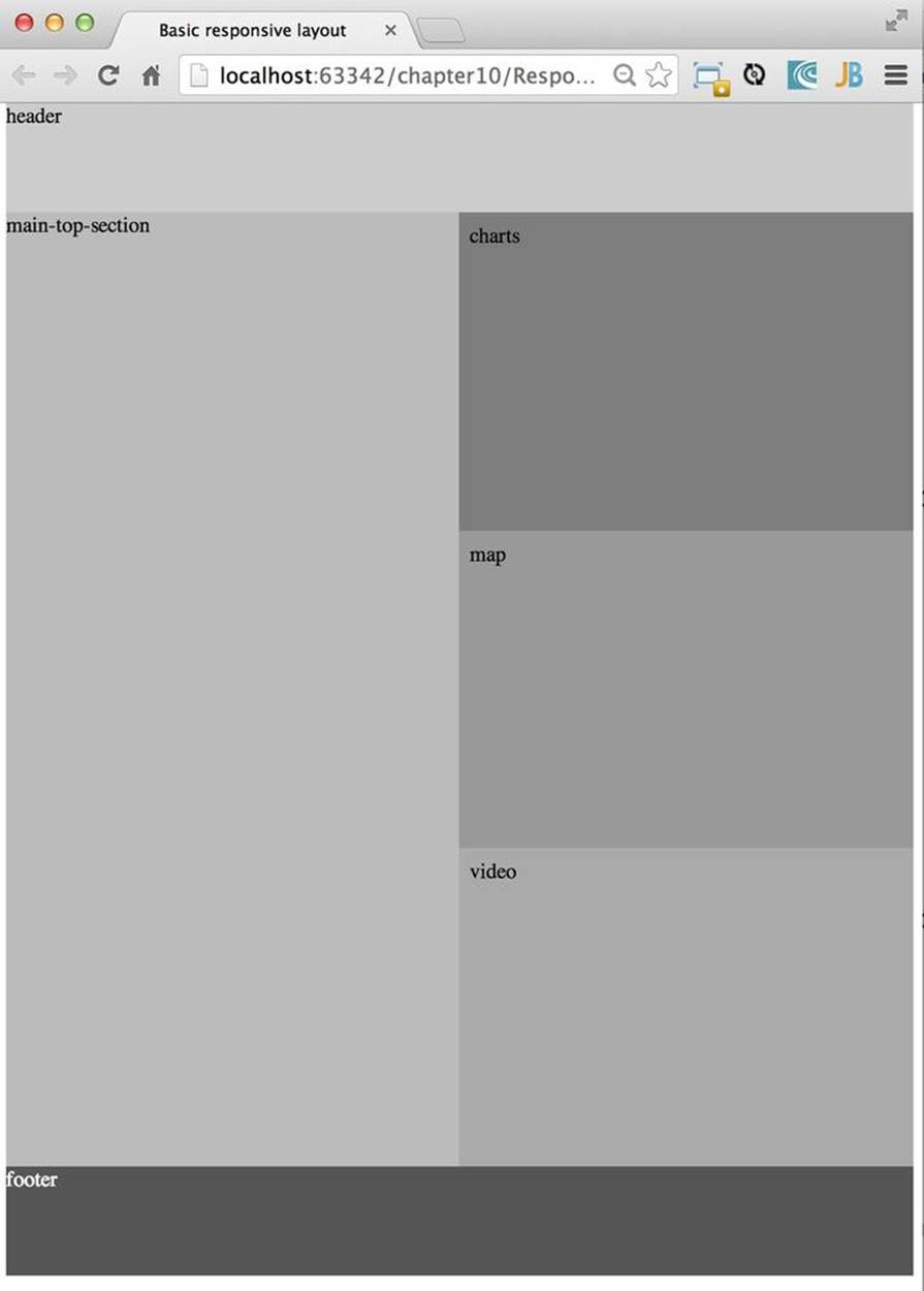
Figure 10-11. The tablet layout (portrait) implemented
Keep making the browser’s window narrower; when the width passes another breakpoint (becomes less than 640 pixels), the window will rearrange itself into one long column, as in Figure 10-12. Users will have to scroll to see the lower portion of this window, but they don’t lose any content.
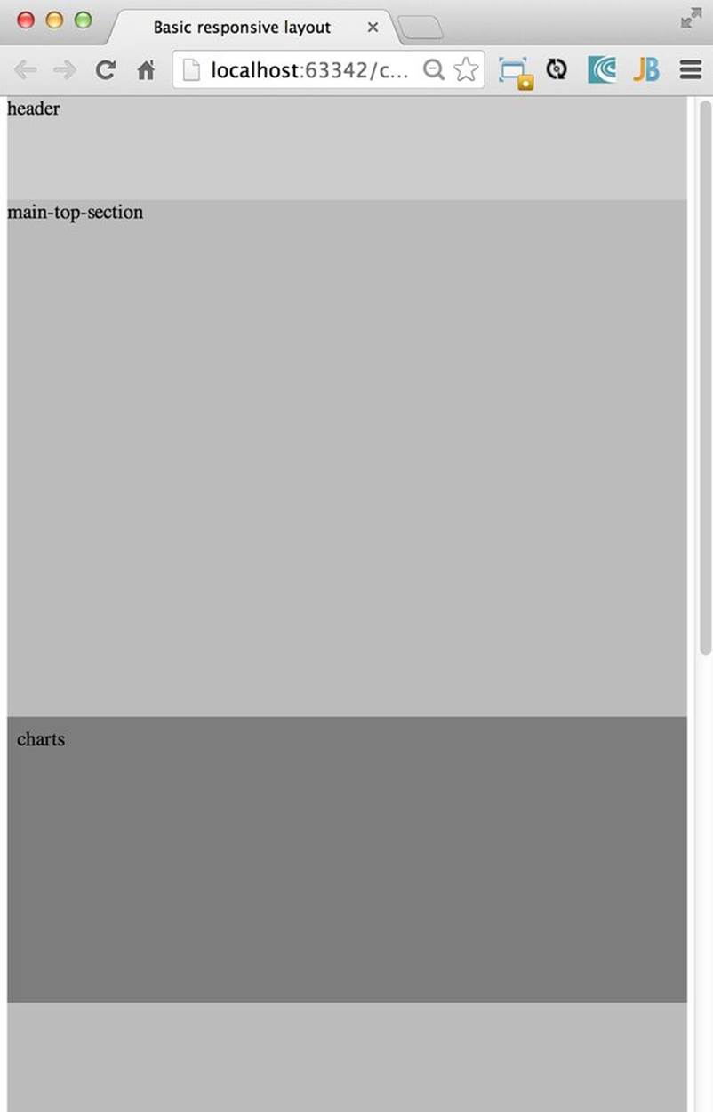
Figure 10-12. The smaller phone layout (portrait) implemented
The W3C recommendation “Media Queries” was introduced in CSS2 and HTML 4. The idea was to provide different stylesheets for different media. For example, you can specify different stylesheets in HTML by using the media attribute for screens that are less than 640 pixels in width:
<link rel="stylesheet" href="assets/css/style.css" media="screen">
<link rel="stylesheet" href="assets/css/style_small.css"
media="only screen and (max-width: 640px)">
You might have several of these <link> tags for different screen widths. But all of them will be loaded, regardless of the actual size of the user’s display area. Modern browsers might preclude loading CSS files that don’t match the current display size.
The other choice is to specify a section in a CSS file by using one or more @media rules. For example, the following style will be applied to the HTML element with the id=main-top-section if the width of the display area (screen) is less than 640 pixels. screen is not the only media type that you can use with media queries. For example, you can use print for printed documents or tv for TV devices. For an up-to-date list of media types, see the document W3C Recommendation “Media Queries”.
@media only screen and (max-width: 640px) {
#main-top-section {
width: 100%;
float: none;
}
}
Two fragments of the CSS file styles.css from the project Responsive_basic_media_queries are shown next. The first one begins by defining styles for windows having a width of 1280 pixels (we use 1140 pixels to leave some space for padding and the browser’s chrome). Example 10-1presents the first fragment.
Example 10-1. CSS for the devices with a width less than 1280 pixels
/* The main container width should be 90% of viewport width */
/* but not wider than 1140px */
#main-container {
width: 90%;
max-width: 1140px; 
margin: 0 auto;
}
/* Background color of all elements was set just as an example */
header {
background: #ccc;
width: 100%;
height: 80px;
}
#main-top-section {
background: #bbb;
width: 100%;
height: 300px;
position: relative;
}
#main-bottom-section {
width: 100%;
}
#video-container, #map-container, #charts-container {
width: 33.333%; 
padding-bottom: 33.333%;
float: left; 
position: relative;
}
#video, #map, #charts {
background: #aaa;
width: 100%;
height: 100%;
position: absolute;
padding: 0.5em;
}
#map {
background: #999;
}
#charts {
background: #7d7d7d;
}
footer {
background: #555;
width: 100%;
height: 80px;
color: #fff;
}
Set the maximum width of the window on a desktop to 1140 pixels. It’s safe to assume that any modern monitor supports the resolution of 1280 pixels in width (minus about 10 percent for padding and chrome).
Allocate one-third of the width for video, charts, and maps each.
float: left; instructs the browser to render <div> starting from the left and adding the next one to the right.
This CSS mandates changing page layouts if the screen size is at or is smaller than 768 or 640 pixels. Based on your web designer’s recommendations, you can specify as many breakout sizes as needed. Suppose that in the future everyone’s monitor is at least 1900 pixels wide; you could provide a layout that would use five imaginary columns. This would be a good idea for online newspapers or magazines, but Save The Child is not a publication, so we’ll keep its maximum width within 1140 pixels. Or you might decide to make a version of Save The Child available for LCDs that are only 320 pixels wide; create a new media query section in your CSS and apply fluid grids to make the content readable. Example 10-2 shows the second fragment of the CSS file that defines media queries.
Example 10-2. Two media queries for a viewport with a width of 768 pixels and 640 pixels
/* media queries */
@media only screen and (max-width: 768px) {
#main-container {
width: 98%
}
#main {
background: #bbb;
}
#main-top-section, #main-bottom-section {
width: 50%;
float: left;
}
#main-top-section {
height: 100%;
}
#video-container, #map-container, #charts-container {
float: none; 
width: 100%;
padding-bottom: 70%;
}
}
@media only screen and (max-width: 640px) { 
#main-top-section, #main-bottom-section {
width: 100%; 
float: none;
}
#main-top-section {
height: 400px;
}
#video, #map, #charts {
height: 60%;
}
}
This media query controls layouts for devices with viewports having a maximum width of 768 pixels.
Split the width fifty-fifty between the HTML elements with the IDs main-top-section and main-bottom-section.
Allocate main-top-section and main-bottom-section next to each other (float: left;), as in Figure 10-11. To better understand how the CSS float property works, visualize a book page that has a small image on the left with the text floating on the right (a text wrap). This is what float: left; can do on a web page.
Turn the floating off so the charts, maps, and video containers will start one under another, as in Figure 10-11.
The media query controlling layouts for devices with viewports with a maximum width of 640 pixels starts here.
Let the containers main-top-section and main-bottom-section take the entire width and be displayed one under another (float: none;), as in Figure 10-12.
TIP
Internet Explorer 8 and older don’t natively support media queries. Consider using Modernizr to detect support of this feature, and load the Media Queries Polyfill, if needed.
THE VIEWPORT CONCEPT
Mobile browsers use the concept of a viewport, which is a virtual window that renders the web page content. This virtual window can be wider than the actual width of the display of the user’s mobile device. For example, by default iOS Safari and Opera Mobile render the page to the width of 980 pixels, and then shrink it down to the actual width (320 pixels on old iPhones and 640 pixels on iPhone 4 and 5). That’s why your iPhone renders the entire web page of, say, The New York Times (yes, the fonts are tiny), and not just its upper-left section.
By using the meta tag viewport, your web page overrides this default and renders itself according to the actual device size. All code samples in this chapter include the viewport meta tag in index.html. All mobile browsers support it even though it’s not a part of the HTML standard yet. Desktop browsers ignore the tag viewport.
<meta name="viewport" content="width=device-width, initial-scale=1.0">
This meta tag tells the browser that the width of the virtual viewport should be the same as the width of the display. This setting will produce good results if your responsive web design includes a version of the page layout optimized for the width of the current user’s device. But if you are rendering a page with a fixed width, which is narrower than the default width of the display (for example, 500 pixels), setting the attribute content="width=500" would instruct the mobile web browser to scale the page to occupy the entire display real estate. In other words, setting a fixed width is like saying, “Dear mobile browser, I don’t have a special layout for this device width—do the best you can and scale the content.”
Setting the initial scaling to 1.0 ensures that the page will render as close to the physical device size as possible. If you don’t want to allow the user to scale the web page, add the attribute user-scalable=no to the meta tag viewport.
WARNING
If you set the initial scale to 1.0 but apply it to a web page that was not built using responsive design principles, users will need to zoom or pan to see the entire page.
For details about configuring the viewport, refer to Apple’s or Opera’s documentation.
An important concept to take away from this example is to switch from pixels to percentages when specifying width. In the next examples, you’ll see how to switch from using the rigid px to more flexible em units. In addition, with the CSS float property, you can control relative (not absolute) positioning of your page components. There are also such CSS units of measure as vw and vh, which represent percentages of the viewport width and height, respectively. But the best practice here is to use rem units. The app can set the font size on BODY and then specify everything in relative-ems that scale only from that number. ems cascade their scale down from their parent, meaning lots of extra math for the developer and the browser to do.
TIP
Install an add-on for Google Chrome called Window Resizer. It adds an icon to the toolbar for easy switching between the browser screen sizes. This way, you can quickly test how your web page looks in different viewports. Another handy add-on for Chrome called Responsive Inspector allows you to see the various media queries for a page and automatically resize to them.
TIP
Google Chrome Developer Tools offers you a way to test a web page on various emulators of mobile devices. You just need to select the “Show Emulation view in console drawer” in Settings, and then you’ll see the Emulation tab under the Elements menu (press the Esc key if it’s not shown).
How Many Breakpoints?
How many media queries is too many? It all depends on the web page you’re designing. In the sample CSS shown previously, we used the breakpoint of 768 pixels to represent the width of a tablet in portrait mode, and this is fine for the iPad. But several tablets (for example, the 10.1-inch Samsung Galaxy) have 800-pixel-wide viewports, whereas Microsoft Surface Pro is 1080 pixels wide.
There is no general rule as to how many breakpoints are needed for a typical web page. Let the content of your page (and where it breaks) dictate where you add breakpoints. Just create a simple Lorem Ipsum prototype of your website and start changing its size. At a certain point (viewport size), your design begins to break. This is where you need to put your breakpoint and define a media query for it. It is recommended to start by designing for the smallest viewports (the Mobile First principle). As the viewport width increases, you might decide to render more content, and hence define a new breakpoint. Technically, this means that the content of your CSS should default to the smaller viewports and only if the screen is larger, apply media queries. This approach will reduce the CSS handling by the browser of the mobile device (no need to switch from large to smaller layouts).
TIP
Use Google Chrome Developer Tools to find out the current width of the viewport. Just type in the console window.innerWidth and you’ll see the width in pixels.
Don’t try to create a pixel-perfect layout by using responsive design. Use common sense, and remember, the more media queries you provide, the larger your CSS file will become. But in a mobile world, you should try to create web applications that are as small as possible.
NOTE
Be prepared to see inconsistencies among desktop browsers in measuring the width of the viewport. Our tests showed that WebKit-based browsers add about 15 pixels to the width, supposedly accounting for the width of the scrollbar. So if your media query has to change the layout at 768 pixels, it will change it at about 783 pixels. Do more testing on different viewports and adjust your CSS as needed.
Fluid Grids
Fluid grids are a very important technique in responsive design. Grids have been used by web designers for ages: a web page is divided by a number of imaginary rows and columns. But the fluid grid, as its name indicates, is flexible and can scale based on screen sizes.
Moving Away from Absolute Sizing
When a browser displays text, it uses a default font size unless that size is overruled by the font-size property. Typically, the default font size is 16 pixels. But instead of using an absolute font size, you can use a relative one by using em units. The default browser’s font size can be represented as 1 em. Because the font size happens to be 16 pixels, 1 em equals 16 pixels.
Absolute sizes are enemies of responsive-design websites, and specifying sizes in em units gives you the freedom to create web pages with relatively flexible and fluid content. The size can be calculated based on a formula offered by Ethan Marcotte in his article on fluid grids:target/context=result, which in the case of fonts becomes size-in-pixels/16 = size-in-em.
For example, instead of specifying the size as 24 pixels, you can set it to 1.5 em: 24/16. In your CSS file, you can write something like padding-bottom: 1.5em. This might not seem a big deal, but it is, because if everything is done in relative sizing, your page will look good and proportional regardless of the screen size and regardless of how big or small 24 pixels might look on a particular screen.
If we are talking about using em units to represent font sizes, the font becomes the context. But what if you want to represent the width of an arbitrary HTML component in a browser’s window or any other container? Then the width of your component becomes the target, and the total width of the container becomes the context. We can still use the previous formula, but we will multiply the result by 100 percent. This way, the width of an HTML component will be represented not in em units, but in a percentage relative to the total width of the container.
Let’s say the total width of the browser’s window is 768 pixels, and we want to create a panel on the left that’s 120 pixels wide. Instead of specifying this width in pixels, we’ll use the formula and turn it into a percentage. We want to calculate the target’s width as a percent of the available context (100 percent):
120 / 768 * 100% = 15.625%
This approach makes the page design fluid. If someone decides to open this page on a 480-pixel-wide screen, the panel will still take 15.625 percent of the screen rather than demanding 120 pixels, which would look substantially wider on a smaller viewport.
Window as a Grid
While designing your page, you can overlay any HTML container or the entire web page real estate with an imaginary grid containing any number of columns. Make it flexible, though; the width of each column has to be specified in percentages.
Adobe Dreamweaver CS6 automates the creation of media queries and introduces the Fluid Grid layout (see Figure 10-13). It also allows you to quickly see how your design will look on a tablet or phone (you can pick screen size, too) with a click of the corresponding status bar button.
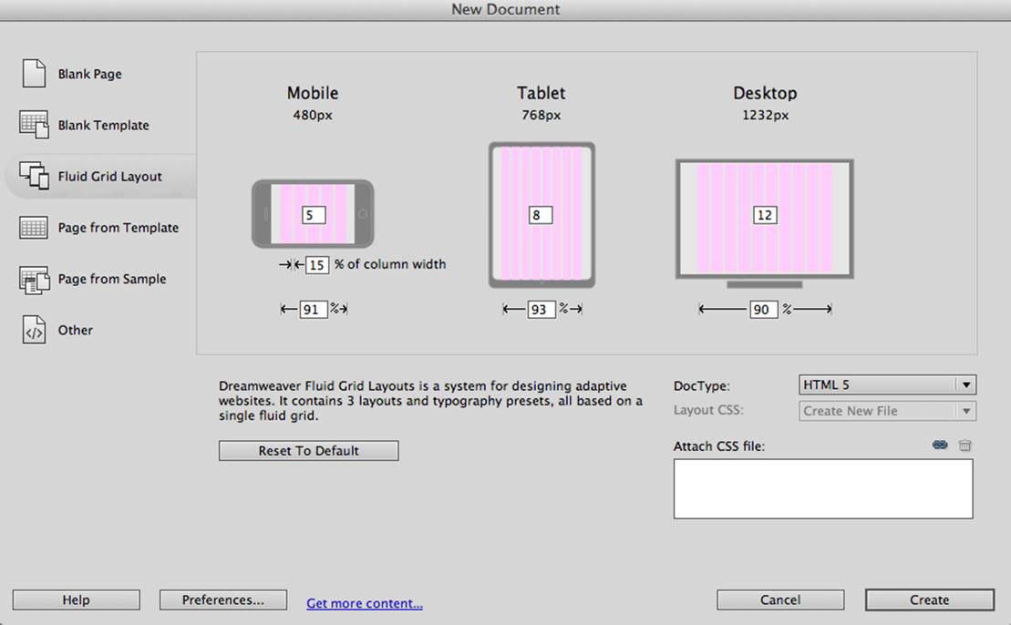
Figure 10-13. Creating a Fluid Grid layout in Dreamweaver
TIP
Adobe’s Creative Cloud includes a tool called Edge Reflow, which helps designers create responsive web pages.
Web designers use different approaches when styling with fluid grids. When you design a new page using Dreamweaver’s Fluid Grid layout, it suggests that you allocate a different number of columns for desktop, tablet, and mobile layouts. For example, its default layout is to allocate 12 columns for desktops, 8 for tablets, and 5 for phones, which is a perfectly solid approach. But our web designer, Jerry, prefers using 12 columns for all screen sizes and then playing with the width percentages for different layouts. You’ll see how he does it in the project Responsive Donation later in this chapter.
Now imagine that you’ll overlay the entire window with an invisible grid containing 12 equally sized columns. Each column will occupy 8.333 percent of the total width. Now, if you need to allocate to an HTML component about 40 percent of the total width, you could do this by allocating 5 grid columns (8.333% x 5 = 41.665%). Accordingly, your CSS file can contain 12 classes that you can use in your page, as shown in Example 10-3.
Example 10-3. Twelve sample classes to support fluid grids
.one-column {
width: 8.333%;
}
.two-column {
width: 16.666%;
}
.three-column {
width: 24.999%;
}
.four-column {
width: 33.332%;
}
.five-column {
width: 41.665%;
}
.six-column {
width: 49.998%;
}
.seven-column {
width: 58.331%;
}
.eight-column {
width: 66.664%;
}
.nine-column {
width: 74.997%;
}
.ten-column {
width: 83.33%;
}
.eleven-column {
width: 91.663%;
}
.twelve-column {
width: 100%;
float: left;
}
Now let’s see the fluid grid in action. Run the project Responsive Fluid Grid, and you’ll see a web page that looks similar to Figure 10-14. This example changes the grid layout if the viewport width is less than one of the following width breakpoints: 768 pixels, 640 pixels, and 480 pixels. In this context, the term breakpoints has nothing to do with debugging; we just want the content of the web page to be rearranged when the width of the viewport passes one of these values.
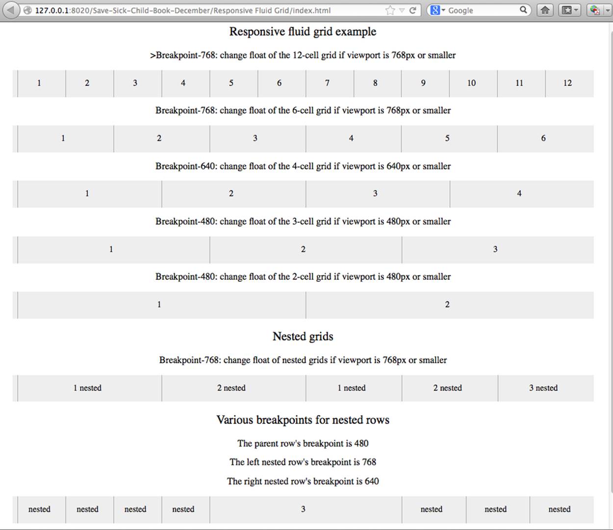
Figure 10-14. Fluid grid on the wide screen
If you narrow the width of the browser’s window, you’ll see how the grid cells begin to squeeze, but the layout remains the same until the window size becomes smaller than one of the predefined breakpoints. Then, another media query kicks in and the layout changes. For example,Figure 10-15 shows a fragment of the web page when the width of the browser’s window narrows to less than 640 pixels. The 12-, 6-, and 4-cell grids display all the cells vertically, one below another. Only the 480-pixel grids still have enough room to display their cells horizontally. But if you keep squeezing the window, all the grids will display their content in one column, as long as the viewport width remains less than 480 pixels.
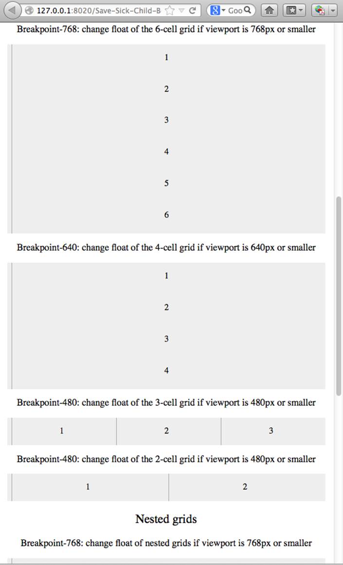
Figure 10-15. Fluid grid on the viewport narrower than 640 pixels
The fragment of index.html from the Responsive Fluid Grid project goes next. For brevity, we’ve replaced some repetitive markup with the comment “A fragment removed for brevity.” This code fragment (see Example 10-4) includes the 12-, 6-, and 4-column grids shown at the top ofFigure 10-14.
Example 10-4. A sample HTML page that uses fluid grid styling
<head>
<meta charset="utf-8">
<title>Responsive fluid grid</title>
<meta name="description" content="Responsive fluid grid example">
<meta name="viewport" content="width=device-width,initial-scale=1">
<link rel="stylesheet" href="css/style.css">
</head>
<body>
<div id="wrapper-container">
<h1 class="temp-heading">Responsive fluid grid example</h1>
<h4 class="temp-heading">Breakpoint-768: change float of HTML elements
if viewport is 768px or smaller</h4>
<div class="row breakpoint-768">
<div class="one-column cell">
1
</div>
<div class="one-column cell">
2
</div>
<div class="one-column cell">
3
</div>
<!-- A fragment removed for brevity -->
<div class="one-column cell last-cell" >
12
</div>
</div>
<h4 class="temp-heading">Breakpoint-768: change float of the 12-cell grid
if viewport is 768px or smaller</h4>
<div class="row breakpoint-768">
<div class="two-column cell">
1
</div>
<div class="two-column cell">
2
</div>
<!-- A fragment removed for brevity -->
<div class="two-column cell">
6
</div>
</div>
<h4 class="temp-heading">Breakpoint-768: change float of the 6-cell grid
if viewport is 768px or smaller</h4>
<div class="row breakpoint-640">
<div class="three-column cell">
1
</div>
<div class="three-column cell">
2
</div>
<div class="three-column cell">
3
</div>
<div class="three-column cell">
4
</div>
</div>
Note that some of the HTML elements are styled with more than one class selector (for example, class="one-column cell"). The entire content of the file styles.css from the Responsive Fluid Grids project is shown in Example 10-5, and you can find the declarations of the class selectors one-column and cell there.
Example 10-5. The styles.css file from the Responsive Fluid Grids project
* {
margin: 0;
padding: 0;
border: 0;
font-size: 100%;
font: inherit;
vertical-align: baseline;
-webkit-box-sizing:border-box;
-moz-box-sizing: border-box;
box-sizing: border-box;
}
article, aside, details, figcaption, figure, footer, header, hgroup, menu, nav,
section {
display: block;
}
ul li {
list-style: none;
}
.row:before, .row:after, .clearfix:before, .clearfix:after {
content: "";
display: table;
}
.row:after, .clearfix:after {
clear: both;
}
/* Start of fluid grid styles */
.row {
padding: 0 0 0 0.5em;
background: #eee;
}
.breakpoint-480 .cell, .breakpoint-640 .cell, .breakpoint-768 .cell,
.breakpoint-960 .cell, .no-breakpoint .cell {
float: left;
padding: 0 0.5em 0 0;
}
.one-column {
width: 8.333%;
}
.two-column {
width: 16.666%;
}
.three-column {
width: 24.999%;
}
.four-column {
width: 33.332%;
}
.five-column {
width: 41.665%;
}
.six-column {
width: 49.998%;
}
.seven-column {
width: 58.331%;
}
.eight-column {
width: 66.664%;
}
.nine-column {
width: 74.997%;
}
.ten-column {
width: 83.33%;
}
.eleven-column {
width: 91.663%;
}
.twelve-column {
width: 100%;
float: left;
}
.right {
float: right;
}
.row.nested {
padding: 0;
margin-right: -0.5em
}
Styling grid rows, which are containers for cells.
Defining common class selectors (floating and padding) for the cells located in the viewports of any width. Please note the property float: left; (it will change in the media queries section).
Dividing 100 percent of the container’s width by 12 columns results in allocating 8.333 percent of width per column. Each cell in the 12-column table in our HTML has the one-column class selector.
Check the HTML for the 6-column grid. Each cell is styled as two-column and will occupy 16.666 percent of the container’s width.
The HTML for the 4-column grid uses the three-column style for each cell that will use 24.999 percent of the container’s width.
Example 10-6 shows the section with media queries in this file (the following is just another fragment of the same CSS file).
Example 10-6. Media queries section from the CSS file
/* --------------- Media queries -------------- */
@media only screen and (max-width: 768px) {
.breakpoint-768 .cell {
float: none;
width: 100%;
padding-bottom: 0.5em
}
}
@media only screen and (max-width: 640px) {
.breakpoint-640 .cell {
float: none;
width: 100%;
padding-bottom: 0.5em
}
}
@media only screen and (max-width: 480px) {
.breakpoint-480 .cell {
float: none;
width: 100%;
padding-bottom: 0.5em
}
}
/*End of fluid grid styles*/
#wrapper-container {
width: 95%;
max-width: 1140px;
margin: 0 auto;
}
/* --- .cell visualisation --- */
.cell {
min-height: 50px;
text-align:center;
border-left: 1px solid #aaa;
vertical-align: middle;
line-height: 50px;
}
.cell .cell:first-child{
border-left:none;
}
/* --- .cell visualisation end --- */
h1.temp-heading, h2.temp-heading, h4.temp-heading {
font-size: 1.4em;
margin: 1em 0;
text-align: center
}
h4.temp-heading {
font-size: 1.1em;
}
p.temp-project-description {
margin: 2em 0;
}
This media query turns off floating (float:none) if the viewport is 768 pixels or less. This reallocates the cells vertically. The width:100% forces the cell to occupy the entire width of the container as opposed to, say, 8.333 percent in the 12-column grid.
The media query for 640 pixels won’t kick in until the viewport width narrows to that size. If you resize the browser window such that it is less than 768 pixels but wider than 640 pixels, note that the 4-column grid (styled as breakpoint-640) has not changed its layout just yet.
TIP
At times, you might need to use a mix of fluid and fixed layouts. For example, you might need to include an image of a fixed size on your fluid web page. In these cases, you can use a fixed width on some elements, and if needed, consider using CSS tables (not to be confused with HTML tables). CSS tables are supported by all current browsers.
Spend some time analyzing the content of index.html and styles.css from the Responsive Fluid Grid project. Try to modify the values in CSS and see how your changes affect the behavior of the fluid grid. In the next section, we’ll apply these techniques to our Save The Child application.
Responsive CSS: The Good News
We have explained how the fluid grid works under the hood, but calculating percentages is not the most exciting job for software developers. The good news is that several responsive frameworks offer CSS, typography, and some JavaScript to jump-start UI development of a web application. They’ll spare you from most of the mundane work with cascading style sheets. Here are some of them:
§ Consider using Twitter’s framework called Bootstrap, which has lots of greatly styled components and also supports a fluid grid system.
§ The Foundation 4 framework promotes Mobile First design and includes a flexible grid.
§ The Skeleton is a collection of CSS files, which includes a scalable grid.
§ Semantic-UI is a collection of styled UI components, which includes a responsive grid, too.
TIP
People who work with CSS a lot use an authoring framework called Compass with the CSS extension SASS or the CSS preprocessor LESS. These systems compile to CSS, allowing code to include variables for tracking and calculating numbers such as column width and more. You can now modularize your CSS as well as your code. In Chapter 12 we use a SASS theme that comes with the Sencha Touch framework.
Making Save The Child Responsive
First, run any previous version of the Save The Child application to make sure it is not responsive. Just make the browser window narrower, and note how some of the page content on the right is cut off. We’ll gradually make the page responsive: the first version will make the header responsive, then the donation section, and, finally, the entire page will become fluid. In a web browser, open index.html from the project Responsive Header. You’ll see a page similar to Figure 10-16.
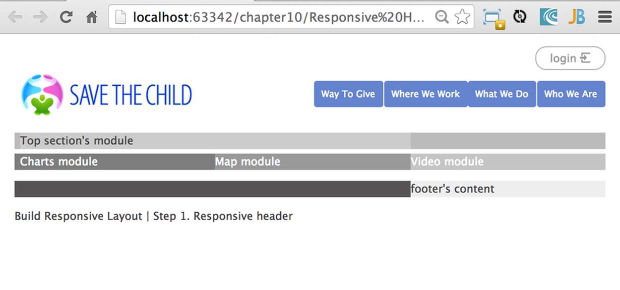
Figure 10-16. Responsive Header (width 580 pixels+)
Example 10-7 is the fragment from index.html that displays the logo image and the header’s menus.
Example 10-7. An HTML fragment for the logo and the menus
<div id="wrapper-container">
<header class="row breakpoint-640">
<h1 id="logo" class="four-column cell">
<img src="assets/img/logo.png" alt="Save The Child logo"/></h1>
<nav class="eight-column cell">
<ul>
<li>
<a href="javascript:void(0)">Who We Are</a>
</li>
<li>
<a href="javascript:void(0)">What We Do</a>
</li>
<li>
<a href="javascript:void(0)">Where We Work</a>
</li>
<li>
<a href="javascript:void(0)">Way To Give</a>
</li>
</ul>
</nav>
Initially, this code uses the four-column style (width: 33.332%; of the container) for the logo and eight-column (66.664%) for the <nav> element. When the size of the viewport changes, the appropriate media query takes effect. Note the breakpoint-640 class selector in the<header> tag. Jerry, our web designer, decides that 640 pixels is not enough to display the logo and the four links from the <nav> section in one row. Besides, he wants to fine-tune the width of other elements, too. Example 10-8 shows the media query for the 640-pixel viewport.
Example 10-8. Media query for the 640-pixel viewport
@media only screen and (max-width: 640px) {
.breakpoint-640 .cell {
float: none;
width: 100%;
padding-bottom: 0.5em
}
header {
margin-top: 1em;
}
#login {
top: 1em;
}
#logo.four-column {
width: 40%;
}
nav {
width: 100%;
margin-top: 0.8em
}
nav ul li {
width: 24.5%;
margin-left: 0.5%
}
nav li a {
text-align: center;
font-size: 0.6em;
}
#login-link-text {
display: none;
}
a#login-submit {
padding: 0.2em 0.5em
}
#login input {
width: 9em;
}
}
As you can see, if the cell has to be styled inside breakdown-640, the float is turned off (float: none;) and each of the navigation items has to occupy 100 percent of the container’s width. The logo, login, and nav elements will change, too. There is no exact science here; Jerry figured out all these values empirically.
Slowly change the width of the viewport, and you’ll see how the layout responds. The styles.css of this project has media queries for different viewport sizes. For example, when the page width is less than 580 pixels but more than 480 pixels, it looks like Figure 10-17.
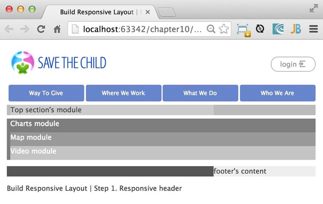
Figure 10-17. Responsive Header 2 (width between 480 and 580 pixels )
When the width of the viewport narrows to less than 480 pixels, the header’s content is rearranged and looks like Figure 10-18. Again, we are not tying the design to a specific device; rather, we’re focusing on a viewport width. The iPhone 4 will render this page using the layout shown inFigure 10-18, but iPhone 5 will use the layout in Figure 10-17. You can’t go by a device type.
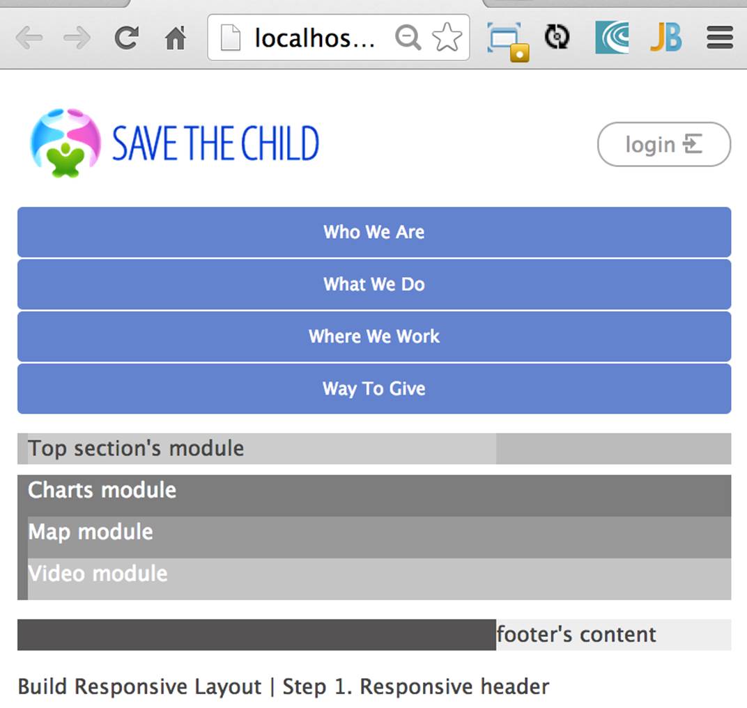
Figure 10-18. Responsive Header (viewport’s width below 480 pixels)
The next project to try is called Responsive Donation. This version makes the donation section fluid. The donation section contains the Lorem Ipsum text and the form, which is revealed when the user clicks the Donate Now button. First, let’s look at the HTML. The index.html file contains the fragment shown in Example 10-9 (some of the content that’s irrelevant for layout was removed for better readability).
Example 10-9. The Donate section’s HTML
<div id="main-content" role="main">
<section id="main-top-section" class="row breakpoint-480">
<div id="donation-address" class="seven-column cell">
<p class="donation-address">
Lorem ipsum dolor sit amet </p>
<button class="donate-button" id="donate-button">
<span class="donate-button-header">Donate Now</span>
</button>
</div>
<div id="donate-form-container">
<h3>Make a donation today</h3>
<form name="_xclick" action="https://www.paypal.com/cgi-bin/webscr"
method="post">
<div class="row nested breakpoint-960">
<div class="six-column cell">
<div class="row nested">
<div id="donation-amount" class="five-column left">
<label class="donation-heading">Donation amount</label>
<input type="radio" name="amount" id="d10" value="10"/>
<label for="d10">10</label>
</div>
<div id="donor-info" class="five-column left">
The donation section is located in the main-top-section of the page. Jerry wants to keep the image of the boy visible for as long as possible in the narrower viewports. The top section of Save The Child has two backgrounds: the flowers (bg-2.png) and the boy (child-1.png). This is how they are specified in style.css:
#main-top-section {
background: url(../img/child-1.png) no-repeat right bottom,
url(../img/bg-2.png) no-repeat 20% bottom;
}
If the viewport is wide enough, both backgrounds will appear. What’s wide enough? Jerry figures it out after experimenting. The seven-column style allocates more than half (58.331%) of the viewport width for the donation-address section and the six-column style allocates 49.998% for for the donation form. For example, Figure 10-19 shows how the donation section will look when the viewport width is 570 pixels.
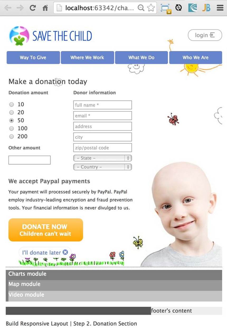
Figure 10-19. Responsive Donate section: 570 pixels
But when the width narrows to less than 480 pixels, there is no room for two background images, and only the flowers will remain on the page background. Example 10-10 presents the media query for a 480-pixel viewport. Note that the background in the main top section has only one image now: bg2.png. Floating is off to show the navigation menu vertically, as is depicted in Figure 10-20.
Example 10-10. Media query for the 480-pixel viewport
@media only screen and (max-width: 480px) {
.breakpoint-480 .cell {
float: none;
width: 100%;
padding-bottom: 0.5em
}
#logo {
padding-bottom: 11em
}
nav ul li {
float: none;
width: 100%;
margin-left: 0;
margin-bottom: 0.5%;
}
#main-top-section {
background: url(../img/bg-2.png) no-repeat 20% bottom;
}
.donate-button {
width: 14em;
margin-left: auto;
margin-right: auto;
}
.donate-button-header {
font-size: 1.1em;
}
.donate-2nd-line {
font-size: 0.9em;
}
#donate-later-link {
display: block;
width: 11em;
margin-left: auto;
margin-right: auto;
}
#make-payment p {
width: 100%;
}
#donation-amount.five-column {
width: 50%
}
#donor-info.six-column {
width: 50%
}
#donate-form-container select, input[type=text], input[type=email] {
width: 90%;
}
}
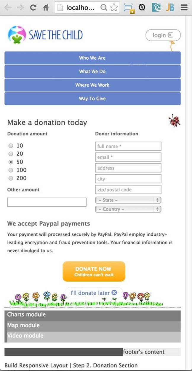
Figure 10-20. The responsive Donate section on a 480-pixel viewport
The project Responsive Final includes the charts, maps, and video. Each of these sections uses the four-column style, which is defined in styles.css as 33.332% of the container’s width (see Example 10-11).
Example 10-11. Charts, maps, and video section styled as a four-column grid
<section id="main-bottom-section" class="row breakpoint-768">
<div id="charts-container" class="four-column cell">
<svg id="svg-container" xmlns="http://www.w3.org/2000/svg">
</svg>
<h3>Donation Stats</h3>
<h5>Lorem ipsum dolor sit amet, consect.</h5>
</div>
<div id="map-container" class="four-column cell">
<div id="location-map"></div>
<div id="location-ui"></div>
</div>
<div id="video-container" class="four-column cell last">
<div id="video-wrapper">
<video id="movie" controls="controls"
poster="assets/media/intro.jpg" preload="metadata">
<source src="assets/media/intro.mp4" type="video/mp4">
<source src="assets/media/intro.webm" type="video/webm">
<p>Sorry, your browser doesn't support the video element</p>
</video>
</div>
<h3>Video header goes here</h3>
<h5><a href="javascript:void(0);">More video link</a></h5>
</div>
</section>
The ID of this section is still main-bottom-section, and it’s shown at the bottom of the page on wide viewports. Now take another look at Figure 10-11. Jerry wants to display these three sections on the righthand side for tablets in portrait mode, as shown in Figure 10-21.
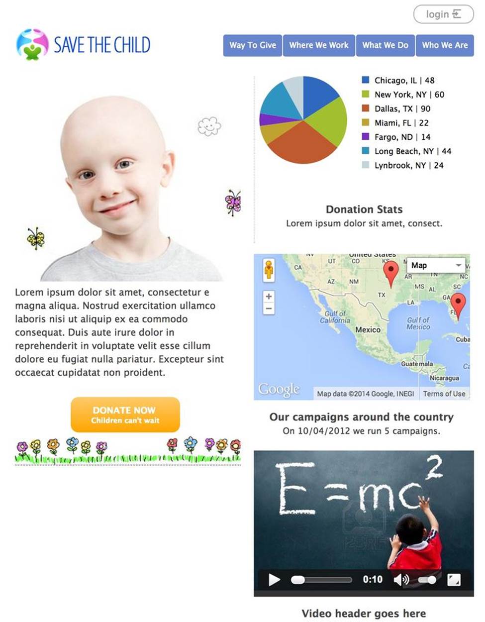
Figure 10-21. Portrait mode on tablets
Example 10-12 shows the relevant code from style.css. The top and bottom sections get about half of the width each, and floating is turned off so that the browser distributes charts, maps, and video vertically.
Example 10-12. Media query for tablets in portrait mode
@media only screen and (max-width: 768px) {
.breakpoint-768 .cell {
float: none;
width: 100%;
padding-bottom: 0.5em;
}
#main-bottom-section, #main-top-section {
width: 49%;
}
NOTE
We’ve explained the use of media queries for applying different styles to the UI based on screen resolutions. But there is a twist. What device comes to mind if you hear about a screen with a resolution of 1920 x 1080 pixels? Most likely you got it wrong unless your answer was the smartphone Galaxy S4 or Sony Xperia Z. The resolution is high, but the screen size is 5 inches. What media query are you going to apply for such a device? Even with this high resolution, you should not apply the desktop’s CSS to a mobile device. The CSS media query device-pixel-ratio can help you distinguish high-resolution small devices from desktops.
Fluid Media
If your responsive web page contains images or videos, you want to make them fluid, too; they should react to the current size of the containers they are in. Our page has a chart image and a video. Both of them are made flexible, but we use different techniques.
If you keep narrowing the viewport, the Responsive Final project will show a layout similar to Figure 10-12. While reading the code of this project, visit the main.js file. There is some work done in the JavaScript, too, which listens to the resize event for the charts container:
window.addEventListener("resize", windowResizeHandler);
function windowResizeHandler() {
drawPieChart(document.getElementById('svg-container'),
donorsDataCache, labelsDataCache);
}
Whenever the size changes, it invokes the function drawPieChart() that recalculates the width of the SVG container (it uses the clientWidth property of the HTMLElement ) and redraws the chart accordingly.
TIP
Consider storing images in the WebP format, which is a lossless format. WebP images are about 25 percent smaller than PNG or JPEG images. Your application needs to check first whether the user’s web browser supports WebP format; otherwise, images in more traditional formats should be rendered. The other choice is to use Thumbor imaging service, which can automatically serve WebP images to browsers that support this format.
The video is flexible, too, and it’s done a lot simpler. We do not specify the fixed size of the video. Instead, we use the CSS property width, instructing the browser to allocate 100 percent of the available container’s width. The height of the video must be automatically calculated to keep the proportional size:
video {
width: 100% !important;
height: auto !important;
}
The !important part disables regular cascading rules and ensures that these values will be applied, overriding more specific width or height declarations, if any. If you prefer to not always use the entire width of the container for the video, you can use max-width: 100%;, which will display the video that fits in the container at its original size. If a video is larger than the container, the browser will resize it to fit inside the container.
Even though the landing page of your web application simply includes links to the required images, the rest of the images should be loaded from the server by making Ajax requests, passing parameters to it regarding the viewport size. This way, the server’s software can either resize images dynamically and include them as Base64-encoded strings or use precreated, properly sized images depending on the viewport dimensions.
TIP
Although using Base64 encoding increases the total size of the image in bytes, it makes it possible for you to group multiple images to minimize the number of network calls the browser needs to make to retrieve these images separately. The other way to combine multiple images into one is via CSS sprites.
Regardless of the width and height of the image, use tools to reduce image sizes in bytes. These tools include TinyPNG and Smush.it. If you use lossy tools, some of the image data will be lost during compression, but in many cases the difference between the original and compressed image is invisible.
TIP
Sencha.io SRC is a proxy server that allows you to dynamically resize images for various mobile screen sizes.
Besides making images responsive, keep in mind that some people have mobile devices with high-resolution Retina displays. The problem is that to make an image look good on such displays, it has to be large, which increases its loading time. There is no common recipe for properly optimizing the image size; plan to spend extra time just preparing the images for your application.
There is a living W3C document, titled “An HTML extension for adaptive images,” that provides developers with a means to declare multiple sources for an image. The proposed HTML element <picture> allows you to specify different images for different media (see demos). For example:
<picture width="500" height="500">
<source media="(min-width: 45em)" src="large.jpg">
<source media="(min-width: 18em)" src="med.jpg">
<source src="small.jpg">
<img src="small.jpg" alt="">
</picture>
Another technique is to use a content delivery network (CDN) that caches and serves images of different sizes for different user agents. The very first time that a request is made from a device with an unknown user engine, this first “unlucky” user will get an image with a low resolution, and then the application makes an Ajax call, passing the exact screen parameters for this device. The CDN server resizes the original high-resolution image for this particular user agent, and caches it, so any other users having the same device will get a perfectly sized image from the get-go.
TIP
Imager.js is an alternative solution to handling responsive image loading, created by developers at BBC News. Imager loads the most suitably sized image and does it once.
Summary
RWD is not a silver bullet that allows using a single code base for all desktop and mobile versions of your HTML5 web application. RWD can be the right approach for developing websites that mainly publish information. It’s not likely that you can create a complex single-code-base web application that works well on Android, iPhone, and desktop browsers.
Responsive design can result in unnecessary CSS code being loaded to the user’s device. This consideration is especially important for mobile devices operating on 3G or slower networks (unless you find a way to lazy-load them).
Responsive design can still can be a practical business solution when the form factor is relatively low (which enterprises can mandate)—for example, if your target group of users operates specific models of iOS and Android devices.
If you take any JavaScript framework that works on both desktop and mobile devices, you’ll get two sets of controls and will have to maintain two different source code repositories. Not using mobile JavaScript frameworks limits the number of user-friendly UI controls. Besides, frameworks spare you from dealing with browsers’ incompatibilities.
In this chapter, you saw how the Save The Child application was built with responsive design principles. Our application has several areas (<div>s), and one of them included a donation form. (We could have added a responsive <div> for the online auction, too.) On the wide screen, we displayed three of these <div>s horizontally and two underneath. On the narrow screen, each of these sections could be scaled down and displayed one under another.
But using responsive design for styling the application to run on tablets or mobile devices will require Jerry-the-designer to work in tandem with a user experience specialist so that the UI will have larger controls and fonts while minimizing the need for manual data entry. And don’t forget that half of a mobile screen could be covered by a virtual keyboard. If you ignore this, the user will look at your application’s UI via a keyhole, and even our fluid <div> sections might not fit.
In Chapters 11 and 12, we work on yet two more versions of the Save The Child application. First, we’ll use the jQuery Mobile framework and then Sencha Touch.
All materials on the site are licensed Creative Commons Attribution-Sharealike 3.0 Unported CC BY-SA 3.0 & GNU Free Documentation License (GFDL)
If you are the copyright holder of any material contained on our site and intend to remove it, please contact our site administrator for approval.
© 2016-2026 All site design rights belong to S.Y.A.