Responsive Web Design, Part 1 (2015)
Building Advanced Responsive Modules With Flexbox
Flexbox Activate!
To turn on flexbox, set display:flex or display:inline-flex on a wrapper element to make it a flex container and indicate that you’re using the new visual formatting model on its children, called flex items. Only the children become flex items, not all descendants of the flex container. The flex value makes the flex container a block-level element, while the inline-flex value makes the flex container an atomic inline-level element (an inline box that doesn't break across lines, like inline-block elements).
<div class="container">
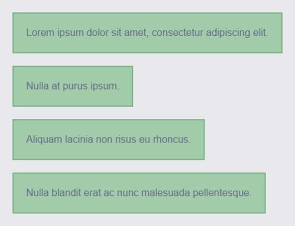
<div><p>Lorem ipsum dolor sit amet, consectetur adipiscing elit.</p></div>
<div><p>Nulla at purus ipsum.</p></div>
<div><p>Aliquam lacinia non risus eu rhoncus.</p></div>
<div><p>Nulla blandit erat ac nunc malesuada pellentesque.</p></div>
</div>
.container {
display: flex;
}
If you’re also using the vendor-prefixed versions of flexbox, add the prefix to the display value, not on the display property itself. For example, display:-webkit-flex.
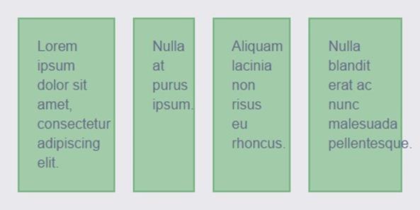
Well, would you look at that — by setting that one little property I’ve already achieved a multi-column layout! The flex items, each one a <div>, change from their default stacking behavior to sitting side by side.
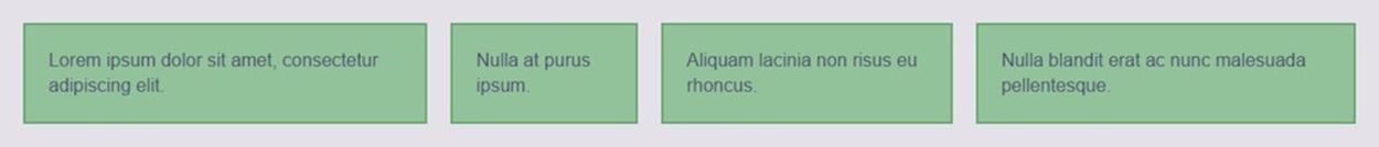
By default, flex items sit side by side as soon as you turn their parent into a flex container.
SETTING ORIENTATION
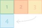
The items lay out side by side because when you create a flex container, the browser automatically sets its flex-direction property to the default value of row.This property, set on the flex container, sets the flow direction of the flex items within it.
In a nutshell, flex-direction lays out the items in rows or columns, horizontally or vertically. It’s setting the direction of the axis along which the flex container's children (flex items) will be displayed. In flexbox terminology, the direction you set is called the main axis, with the other direction being the cross axis. Our flex items are flowing horizontally right now, so that’s the main axis; width, the horizontal dimension, is the main size of its child flex items. If we had set flex-direction to column this would all be reversed.
Plus, flex items can start their layout journey from any side of their container — not just top-to-bottom and left-to-right, but also bottom-to-top and right-to-left, depending on what you tell the flex container to do and the writing mode of the page (the direction in which text flows). The origin point for the flex items along their main axis is called the main start side of the container, and they will flow from there to the main end side. See the graphic below for all of these orientation-related flexbox terms.
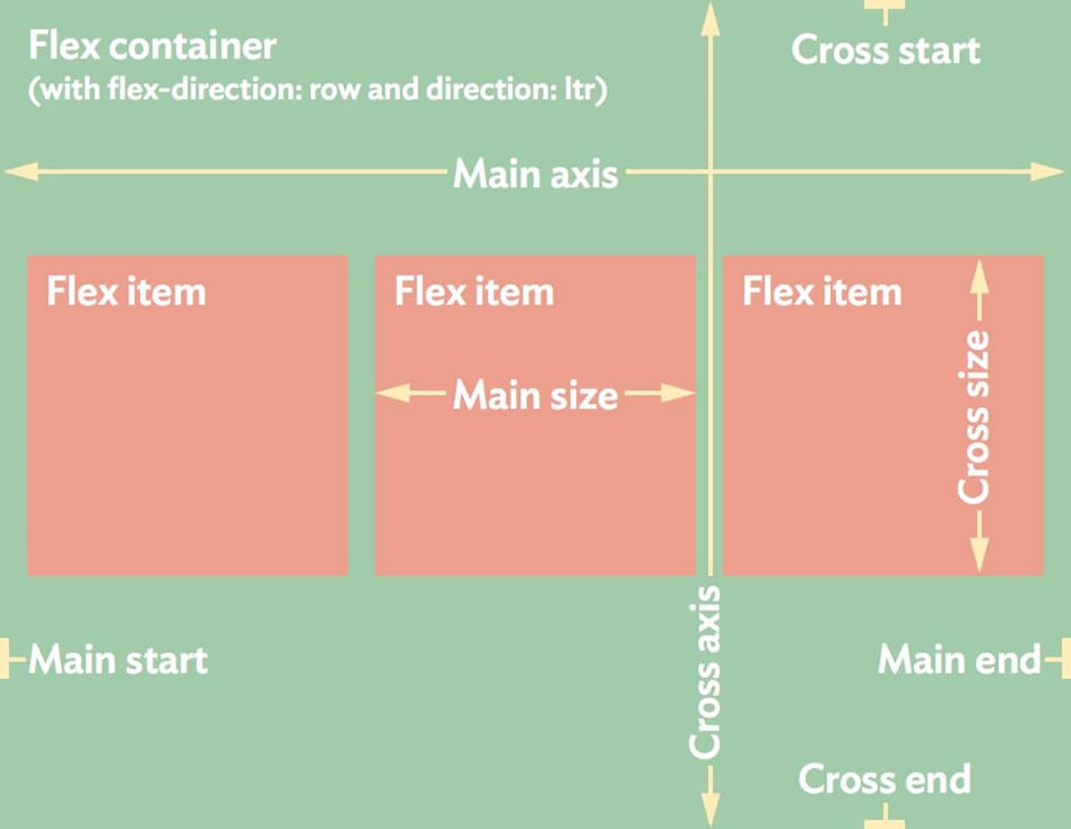
Flexbox is direction-neutral, which is why it uses generic terms like main start instead of absolute terms like top.
Although these axes just sound like W3C mumbo-jumbo syntax detail that you can ignore, it's actually important to remember which axis you're dealing with every time you work with a flex container. That's because the axes affect all of the other flexbox properties that will come later. Flexbox is so flexible because its properties can make items lay out and align in any direction, but it needs to know at what point it’s supposed to start and move out from, and in which direction.
Flex items can be laid out side by side, running from left to right or right to left, depending on the value you choose as well as the writing direction of the language of the page, or stacked vertically, running from top to bottom or bottom to top.
|
row (default) |
Lay out the items horizontally in the same direction as the text direction: left to right for ltr languages and right to left for rtl languages. |
|
|
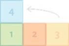
row-reverse |
Same as row but flipped, so right to left for ltr and left to right for rtl. |
|
|
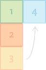
column |
Lay out items following the block direction of the current writing mode; usually this means vertical from top to bottom. |
|
|
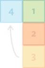
column-reverse |
Same as column but flipped, so usually vertical from bottom to top. |
|
flex-direction: specifying the direction in which to lay out the container’s flex items. (These diagrams are all based on a language that runs from left to right and top to bottom.)
As you can imagine, this makes flexbox great for RWD, since you can change orientation easily at different screen sizes. If you want these same boxes to stack on narrow screens, for instance, you can change flex-direction to column.
.container {
display: flex;
flex-direction: column;
}
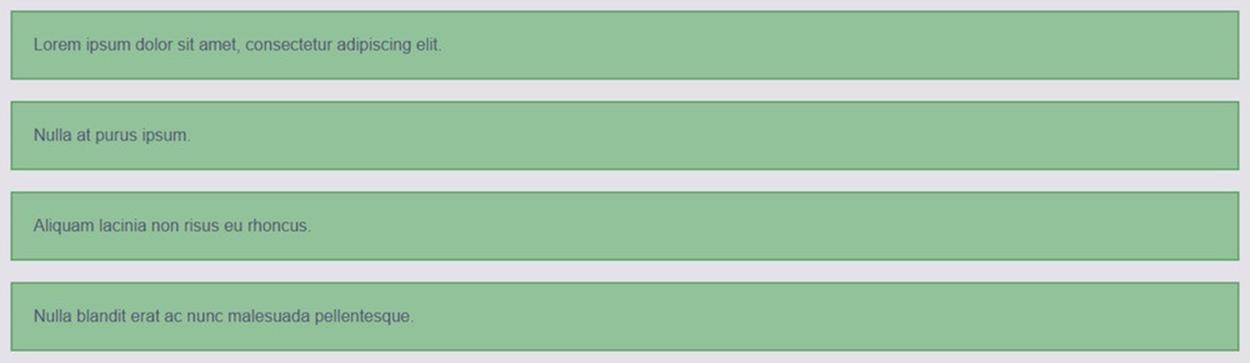
Changing the flex-direction value to column changes the <div>s’ layout from side by side to vertically stacked.
The margins of adjacent flex items don’t collapse together. So, if you have a bunch of vertical flex items with 10 pixels of top and bottom margin each, you’ll end up with 20 pixels of space between them.
In the real world, however, layouts are rarely as simple as this. Most of the time, you’ll probably have a mix of horizontal and vertical elements in all but the narrowest of views. Fortunately, with flexbox you don’t have to pick just one orientation or the other — you can turn a flex item into a flex container itself and give its children a different layout than the parent has.
<div class="container vertical">
<div><p>Lorem ipsum dolor sit amet, consectetur adipiscing elit.</p></div>
<div class="container horizontal">
<p>Nulla at purus ipsum.</p>
<p>Aliquam lacinia non risus eu rhoncus.</p>
</div>
<div><p>Aliquam lacinia non risus eu rhoncus.</p></div>
<div><p>Nulla blandit erat ac nunc malesuada pellentesque.</p></div>
</div>
.container {
display: flex;
}
.horizontal {
flex-direction: row;
}
.vertical {
flex-direction: column;
}
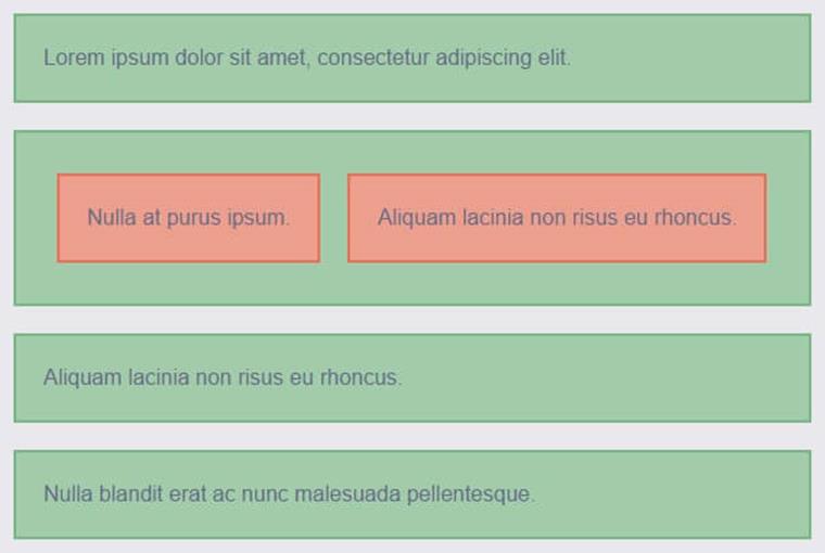
The second green box is both a flex item and a flex container to its child orange boxes, which are laid out horizontally not vertically like their parent and its siblings.
CHANGING ORIENTATION AUTOMATICALLY
So far, flexbox perhaps doesn’t seem all that exciting. “I can stack boxes? I already have display:block for that. I can put boxes side by side? Already have display:inline-block, float, and all sorts of things for that.” You’re right. But by adding another flexbox property, flex-wrap, we can let the browser decide for us when to switch from vertical to horizontal orientation, based on when there’s enough space for the items to fit comfortably side by side.
Technically, the browser isn’t changing orientation — flex-direction will be set to row all along. It’s just that with flex-wrap added and set to the wrap value, the browser is allowed to wrap the flex items onto multiple rows, stacked on top of one another. That’s what the flex-wrap property does: it doesn’t force wrapping to happen, it merely tells the browser whether wrapping is allowed to happen when needed (similar to floats or inline-blockelements); or whether it should never happen but allow overflowing instead (similar to table-cell elements).
|
Value |
Behavior |
flex direction: row |
flex direction: column |
|
nowrap (default) |
Lay out the items in a single line (row or column) regardless if they have to overflow. |
|
|
|
wrap |
Flow the items onto multiple lines if needed (following the writing direction) to make the items fit without overflowing. |
|
|
|
wrap-reverse |
Same as wrap but stack the new lines in the opposite direction to the writing direction. |
|
|
flex-wrap: specifying whether the container’s flex items can wrap if needed and which direction the new lines stack in
There’s a small percentage of browsers still out there that don’t support flex-wrap but do support the rest of flexbox, such as Firefox 27 and Android 4.3. Check your own usage logs and Can I Use5 to decide whether this will be a problem for your users and the way you’re using flexbox.
By default, flex items always stay on the same line together, whether that be a row or a column, thanks to flex-wrap being set by default to nowrap. Sometimes you want this rigidity. But when you do want wrapping to happen, you can simply set flex-wrap to wrap, as I’m doing here to allow items to stack on narrow screens. Even though the orientation isn’t set to column, what we’ll see is vertical stacking on narrow screens, where everything can’t fit on one line.
.container {
display: flex;
flex-wrap: wrap;
}
I could also have used the shorthand flex-flow: row wrap; here, to set both flex-direction and flex-wrap at the same time.
With flex-wrap:wrap, the row-oriented flex container is allowed to make multiple rows when needed, instead of just keeping all the flex items in one row.
If flex-wrap was instead left at its default value of nowrap, the browser would keep the flex items on one row no matter what.
Widen the viewport and your single-column layout will switch to two columns per row automatically, and then more, when there’s enough room for them to fit and without you having to add different layout styles with media queries.
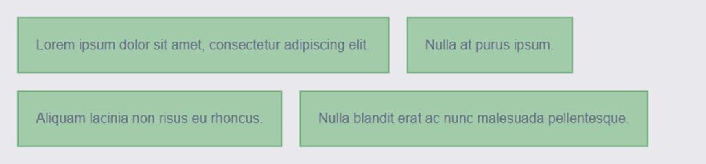
As you widen your viewport, items will begin to sit side by side.
Of course, this doesn’t look so hot when the blocks don’t stretch to fill the width of their container. What we have right now looks no different from using display:inline-block. We need to do something to specify the widths of these blocks. That’s where the flex property comes in, which makes setting dimensions in responsive layouts much easier.