Responsive Web Design, Part 1 (2015)
Building Advanced Responsive Modules With Flexbox
Sizing Boxes
You’re probably familiar with Ethan Marcotte’s famous RWD formula for coming up with the proper percentage widths for columns in a responsive layout: target ÷ context = result. As far as math goes this is pretty simple stuff. But it’s still math and any time math gets involved in design I feel like there has to be a simpler way.
Plus, this only accounts for widths. Throw margin, padding and border sizes into the mix and you’ve got an even trickier equation to solve. Combining different units of measurement in a single layout is called a hybrid layout; and when you’ve got a hybrid layout, you’ve got a headache.
Setting box-sizing:border-box takes care of the problem of mixing pixel- or em-based padding and borders with percentage widths, since the pixels or ems will just get subtracted from the declared width values automatically by the browser. But this doesn’t affect margin. If you want to have 20 pixels of space (gutters) between your columns but you want those columns to have percentage widths, how do you get everything to add up to 100%?
There are clever tricks to work around the problems of hybrid layouts, but none are as simple as what flexbox provides: the flex property. It lets us specify proportional sizes that take margin, padding and border into account so that items can automatically resize to fit the available space perfectly. It’s pretty awesome and powerful, but also really easy to misunderstand and screw up. (Believe me, I’ve learned this the hard way.)
UNDERSTANDING THE FLEX PROPERTY
The flex property is set on flex items directly and affects either their width or height, whichever is the main dimension along the main axis. (See, there are the axes I told you about!)
There are three components to flex, which is a shorthand property: flex-grow, flex-shrink, and flex-basis. Here’s an example of what a flex value might look like, with these three pieces in order:
.stretch-and-squish {
flex: 1 1 200px;
}
The flex-grow value means how much the flex item will grow relative to other items if there’s extra space available on a line; you can think of it as the number of shares of extra space that a flex item gets. In the example above, .stretch-and-squish would get one share of any extra pixels in its line, due to the first value of 1 in the three-part flex value.
The flex-shrink value means how much the flex item will shrink relative to others if there’s not enough space. It’s basically the proportion of the overflowing pixels that it will have lopped off to get everything to fit again. If the .stretch-and-squish element or its siblings are overflowing, it will get one share of the overflowing pixels deducted from its size, due to the second value of 1.
Both flex-grow and flex-shrink are set to unitless integers (0, 1, 2, etc.) since they’re specifying a proportion, not an absolute value. If you set them to 0, you’re saying that you don’t want them to grow or shrink at all. But grow or shrink compared to what? That’s where the very important third component of the flex shorthand comes in, flex-basis.
The flex-basis property is the initial starting dimension before free space is added on or taken away from the item. It can be set to any standard width or height unit (.stretch-and-squish is set to 200px) and these values act the same as their width or height equivalents. For instance, a percentage value for flex-basis is relative to the size of the container, and it affects the size of the content box unless you’ve changed the box model using box-sizing:border-box. The flex-basis property can also be set to one of two special keywords, auto or content, which I’ll explain with an example in a moment.
Browsers first size each of the flex items according to its flex-basis value. If wrapping is turned off, it puts all of them along the same line (row or column). If wrapping is on, it puts as many items along a line as can fit before wrapping and starting a new line. Now that the items are on lines and have starting dimensions, and possibly some padding, border and margin taking up space too, the browser can see how much space is left over or how much space is overflowing on each line. The browser then divvies up this excess space in whatever ratio the flex-grow and flex-shrink values specify.
If flex-grow and flex-shrink are off (set to 0), then flex-basis acts just like standard width or height, setting the flex item to a specific size. If flex-grow is on (set to some positive number) and flex-shrink is off, then flex-basis acts a bit like min-width or min-height: “You can get bigger than this, but no smaller.” Swap that around (flex-grow off, flex-shrink on) and flex-basis acts like max-width or max-height: “You can get smaller than this, but no bigger.” And if both are on, well, flex-basis is like something we’ve never had before! It’s a starting point, and everything else that can affect dimension — margins, padding, border, even just extra pixels on the line — can be flexibly added or removed from that starting point to make everything fit nicely.
If the flex property and process still sounds confusing, you aren't alone: it’s definitely confusing when you first read about it. It took me many attempts to get my head around it. But once you look at real examples, as we will in a moment, and play around with it yourself, you get a clearer sense of how all the pieces work together.
By default, flex items have a flex value of 0 1 auto, which means they won’t grow to fill space but instead size to their content and can shrink to their minimum size (by wrapping text, for instance). If you want your flex items completely inflexible (0 0 auto), you can use flex:none. It’s also acceptable to use only one or two values within the flex shorthand instead of all three, such as flex:1, which the browser would interpret to mean flex-grow:1. See the table below for more information on these values.
|
flex-grow |
flex-shrink |
flex-basis |
|
|
Default value (also equivalent to flex:initial) |
0 |
1 |
auto |
|
Value when omitted from flex shorthand |
1 |
1 |
0% |
FULL-WIDTH AND EQUAL-WIDTH MADE EASY
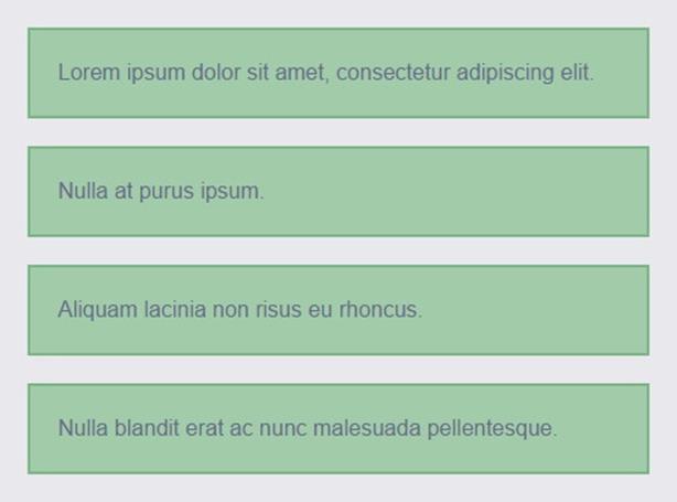
These flex property components probably don’t make a lot of sense without some real examples to look at. Let’s start with the basic colored blocks we were just looking at. What we want to happen is for each item to stretch to fill the full width of the container when there is only one item per line, but when there are multiple items per line, they should have equal widths.
A flex-grow value of 1 will accomplish both of these things. Since it makes items grow when there is extra space in a line, it will stretch each single-line item to take up any space left over on its line. And since all the items have the same flex-grow value of 1s, they will each take up one equal share of the extra space when there is more than one on a line together.
The flex-shrink value isn’t that important here, since our items aren’t overflowing from their gray parent box, which would be the only time flex-shrink would come into effect. Setting it to 0 (no shrinking allowed) or 1 (all items can shrink by one share) is fine. But the value of flex-basis is very important because the initial dimension determines when the items will wrap, as I described in the browser’s layout process above. Let me show you what I mean.
The first flex-basis value we’ll try is auto. This tells the browser to just use whatever the main size is already set to, via the width or height property; if the main size isn’t already explicitly set, it will size the items according to their content.
Setting flex-basis:content directly indicates that you want to size flex items based on their content. But it’s one of the few new additions to the flexbox spec since it became a candidate recommendation and therefore doesn’t yet have good support. For now, you can use auto for flex-basis and get the same effect if width or height are also set to auto, their default values.
.item {
flex: 1 1 auto;
}
Because flex-grow is set to 1 on every box, they each grow to fill the extra space on their line.
At a wider viewport width, two can fit on each line and they still grow to fill the extra space on the line. But they aren’t equal width because their starting dimensions, flex-basis, are based on their content width.
You can see that thanks to the flex-grow value of 1, the items do stretch to fill the full width when they are alone on a line; when there are several on a line, they stretch proportional to their initial width, based on the length of the text block that each contains. The first item is the widest because it has the widest content, for example.
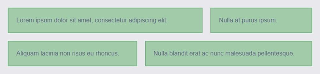
If you don’t want the items to size according to their content but instead match each other in width, you’ll need to give them each the same starting width. That will mean that when browsers add on extra pixels to make them stretch, they will be adding those extra pixels to blocks that are already all the same width. Thus, they will all grow by the same amount and remain equally wide.
Let’s start simple and just set the flex-basis for all of them to 0px.
.item {
flex: 1 1 0px;
}
This gives the boxes equal width when they’re on a line together, but if you narrow your viewport you’ll see that they never wrap. The text just overflows without a care in the world.
When the starting width is 0px for all the boxes, they all grow the same amount and end up of equal width.
The flex-wrap property is still on, but with flex-basis set to 0px the boxes never have a reason to wrap.
This happens because of that 0px value; that’s the starting dimension of each item. The flex-grow property will let the items get bigger than this if there’s room, but if not, there’s nothing stopping them from shrinking all the way back down to their initial size of zero.
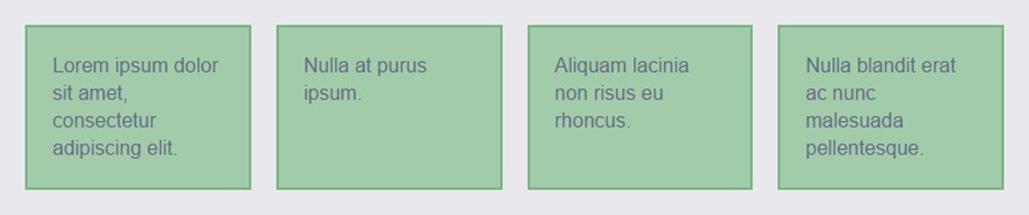
Instead, we need to set flex-basis to some value that we never want the items shrinking below — just like min-width, but with flexibility.
.item {
flex: 1 1 10em;
}
With this change, browsers put as many 10em-wide items as they can on a line, then wrap when room runs out, and then go back to distribute the extra pixels on each line. No more text overflow!
At narrow widths, the boxes will now wrap when they hit the flex-basis value of 10em.
Note that flex-basis doesn’t always act like min-width. It does in this case because flex-wrap is on; once browsers can’t fit items, they just wrap them and so never have to shrink the items smaller than their starting width. If flex-wrap is off and flex-shrink is on, browsers have permission to go smaller than the flex-basis value.
Even with this simple example, you can see how dramatically a layout can change without having to create different versions of that layout within multiple media queries. These four blocks might be four feature stories on your home page that you want to sit in four columns on wide screens, two columns on medium screens, and one column on narrow screens. You don’t have to work out where to put the breakpoints and what crazy percentage widths to assign to your boxes within each breakpoint — browsers do all that.
In fact, I don’t have to put any of this in a media query — I can put it in the default styles outside any media queries and each layout change just kicks in whenever space allows. It’s as if browsers figure out content-driven breakpoints for you. This doesn’t make media queries obsolete, of course (I still love you guys, MQs!), but it’s nice any time you can automate things and keep your CSS simpler.
A non-flexbox fallback for this sort of full-width grid layout that does involve the use of media queries would be to use text-align:justify in combination with percentage widths. Patrick Kunka explains how in “Text-align: Justify and RWD6.” We’ll talk later about the specifics of combining different layout techniques with flexbox layout.
REAL-WORLD RWD USES FOR THE FLEX PROPERTY
I’ve already mentioned that you shouldn’t place your entire page layout in the hands of flexbox, but the flex property does make laying out many responsive components a lot simpler and enables flexible behavior you can’t achieve with any other CSS. Let’s look at a few examples, starting with a form.
It’s not uncommon for forms in responsive web pages to switch between at least two layouts: one with the labels stacked over the fields on narrow screens; and another with the labels beside the fields on wider screens. Switching between these layouts is quite easy to do by writing two sets of layout styles, each in its own media query; but flexbox allows you to write one set of layout styles to control both — no media queries needed. Here’s how that CSS might look:
.label-field-pair {
display: flex;
flex-wrap: wrap;
}
.label-field-pair label {
flex: 0 0 8em;
margin-right: 10px;
}
.label-field-pair input {
flex: 1 1 12em;
}
Let’s look closer at what’s happening here. Setting both flex-grow and flex-shrink to 0 on the labels means they will stay stuck at their flex-basis starting width of 8em. But because I’ve set flex-grow to 1 on the inputs, each will always stretch to fill whatever space is left on its line; their flex-basis value of 12em acts like a minimum width. At wider viewport sizes, there’s room for an 8em label, 10px margin and 12em input all on the same line. As the viewport narrows, browsers figure out when the components can no longer fit beside one another and automatically wrap the input at this point.
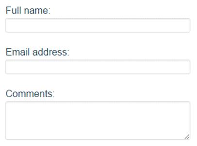
When there aren’t enough pixels to place the input next to the label, the browser can wrap the input and then stretch it to fill its container.
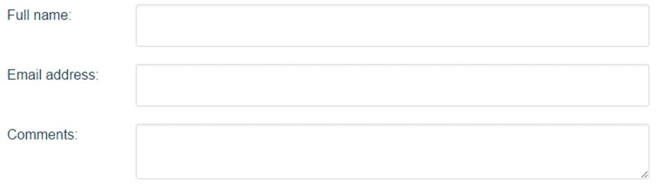
This wider form layout was created with the same CSS as the narrow version. The inputs always stretch to fill the remaining space on a line, making full-width forms easy.
This form is just one simple example of a full-width component with a hybrid layout. The flex property comes in handy any time you want a component to stretch to the full width or height of its container and you don’t have all the inner pieces of the component in the same unit of measurement. You can size some of the pieces with pixels or ems, or just leave them at their initial content-driven size, and then use the flex property on the remaining pieces to get them to stretch and fill up whatever space is left over.
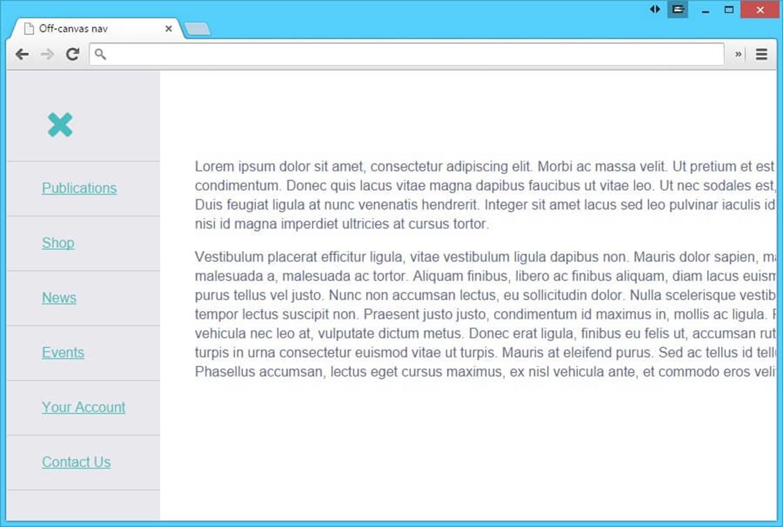
Creating a page with an off-canvas menu can be a more complex hybrid layout to achieve. Let’s say you want the menu to slide in from the left, and instead of pushing the content area off the right side of the screen you want the content area to contract in width to let the menu fit. No big deal if the menu is set to a percentage, but tricky if it’s set to any other unit of measurement — even more so if it has no explicit width at all but rather is sized to its content.
With most off-canvas menus that appear on the left, the content gets cut off on the right.
What we need is flex-grow. Remember, for a full-width hybrid layout, set some pieces to a fixed or content-driven width (the menu) and set the remaining pieces to flex (the content area). In this case, I’ll start out with the menu set to 0 in width since I want it to be hidden by default, and set the content area to flex:1 to take up all the remaining width. (We’ll talk about why this is better than setting it to width:100% in a minute.)
html, body {
height: 100%;
}
.container {
display: flex;
min-height: 100%;
}
.content {
flex: 1;
padding: 100px 40px 40px 40px;
transition: all .3s;
}
.menu {
overflow: hidden;
width: 0;
height: 0;
transition: all .3s;
}
To toggle the menu’s width from 0 to auto and make it visible, I’ll use the :checked pseudo-class on an invisible checkbox to toggle the showing and hiding of the menu without JavaScript. This only works, though, if that checkbox is a sibling of the menu and content blocks, not nested within one of them. Plus, I’ll need a visible label for the checkbox, to act as the menu trigger when clicked; the label can contain a hamburger menu icon using an icon font or image.
<div class="container">
<input id="hamburger" type="checkbox" class="hamburger-checkbox">
<label for="hamburger" class="hamburger-label" role="button" aria-labelledby="menu">É</label>
<nav role="navigation" class="menu">
<ul class="menu-list">
<li class="menu-item">Publications</li>
<li class="menu-item">Shop</li>
<li class="menu-item">News</li>
<li class="menu-item">Events</li>
<li class="menu-item">Your Account</li>
<li class="menu-item">Contact Us</li>
</ul>
</nav>
<main role="main" class="content">
...
</main>
</div>
.hamburger-checkbox {
position: absolute;
opacity: 0;
}
.hamburger-label {
position: absolute;
top: 40px;
left: 40px;
z-index: 1;
display: block;
width: 42px;
height: 42px;
font: 42px/42px FontAwesome;
text-align: center;
cursor: pointer;
}
The .hamburger-label element is both a flex item and absolutely positioned. This is totally fine — the absolutely positioned flex item will be placed relative to the main start corner of the content box of the flex container7. We’ll talk more about how flexbox interacts with other layout methods near the end of the chapter.
Explaining the :checked pseudo-class in detail is beyond the scope of this chapter, but if you’re not familiar with using it in this way, read more about how it works at http://css-tricks.com/almanac/selectors/c/checked/8 and http://css-tricks.com/the-checkbox-hack/9. There are also some issues with its use in older mobile browsers, which you can learn how to address, if needed, at http://timpietrusky.com/advanced-checkbox-hack10.
To make the menu appear when the user clicks or taps on the label, simply change its width from 0 to auto (or 10em, or 200px, or whatever width you want it to be once it’s visible) when hamburger-checkbox is :checked.
.hamburger-checkbox:checked ~ .menu {
width: auto;
height: auto;
padding-top: 6.5em;
}
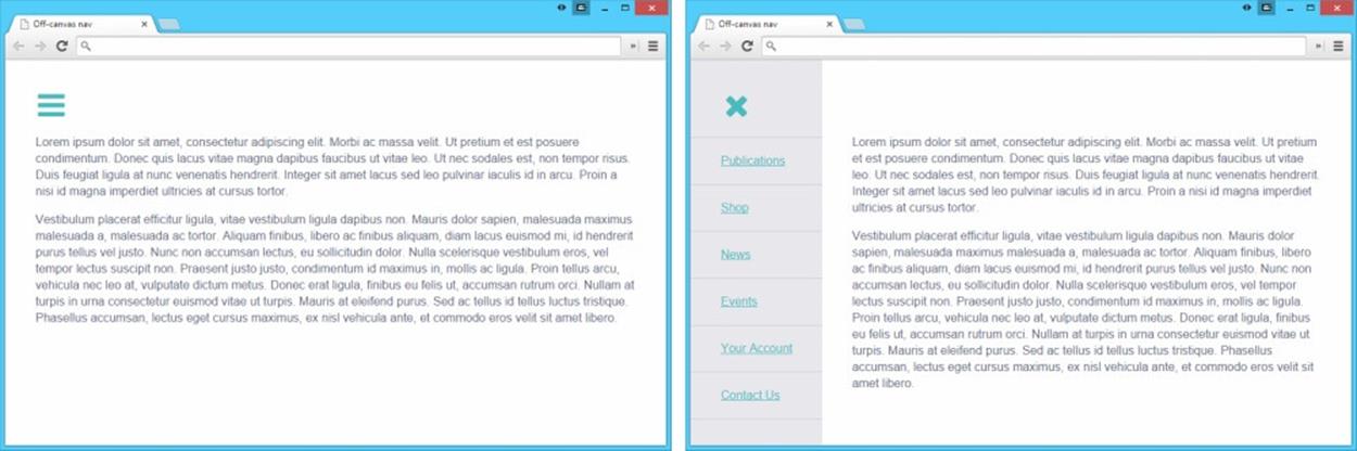
Because it’s set to flex: 1, the main content area fills the space in the viewport perfectly, contracting when the menu is visible despite the menu having no explicit width.
If I had set the content block to width:100% instead of flex:1 to make it stretch to fill the viewport width, it would now be hanging off the right side of the viewport by whatever amount the menu is now taking up. But the flexproperty on the content block keeps this from happening. The content block instead shrinks from 100% to whatever space is left next to the menu, allowing them both to fit perfectly side by side.
I could even take this a step further by changing the placement of the menu at different viewport widths. Perhaps on very narrow screens I don’t want the content block to get so contracted when the menu appears, so I could switch flex-direction from row to column to stack the menu above the content block and make it appear to slide in from the top instead of the left. On very wide screens I might not hide the menu at all but instead have it as an always visible sidebar menu or top nav bar. All of this is trivial to accomplish with a few flexbox properties and some media queries. Full-width hybrid layouts no longer have to be a headache to build.
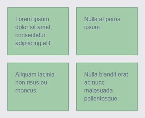
Making a layout or component stretch to full width can sometimes be hard even when you’re not using a hybrid layout but are using the same unit of measurement all the way across a line. Think of a gallery with an unknown or variable number of items in it, each item set to a certain pixel or em width. In a fluid layout, it’s ideal to have a gallery without hardcoded rows, so that the items can simply wrap as needed, varying the number on a line depending on how many can fit in a given viewport width. Using display:inline-block makes this easy. But the problem with display:inline-block is that it won’t stretch the items equally to make each row take up the full width of its container. This can be accomplished with .display:table-cell instead, but then you lose the wrapping ability of inline-block.

Using display:inline-block is an easy way to make a gallery where the items wrap when needed, without having to hard code percentage widths into media queries. But it doesn’t allow the rows to stretch to the full width.
The flex property combined with flex-wrap gives you the best of both worlds. Give each item a flex-basis in pixels or ems, so it starts out at that width; set flex-grow to 1 and items can then stretch farther if needed, as though its width was set to a percentage and filled the full width of its row with its siblings.
.gallery {
display: flex;
flex-wrap: wrap;
margin-right: -20px;
}
.gallery-item {
flex: 1 0 250px;
box-sizing: content-box;
margin: 0 20px 20px 0;
padding: 10px;
border: 1px solid #dddddd;
text-align: center;
}

The items wrap when needed, then stretch to fill their row.
While I’m normally a big fan of box-sizing:border-box, I’ve overridden it here with box-sizing:content-box; then I can set my flex-basis to the width of my largest image (250px), ensuring that it will be the minimum width of the content area of the box, not the total space that the box takes up with padding and border included.
Remember, flex-basis sets the size of whichever box is being used by the box-sizing property, the content box or the border box. IE10 and 11, however, always make flex-basis size the content box, even if you have box-sizing:border-box set, adding padding and border onto the flex-basis size. This is not a big deal if you have flex-shrink on, because it will simply subtract the padding and border away again if needed, but it can cause overflows if flex-shrink is 0. To work around this bug, you can set width/height to the value you want flex-basis to be, since IE treats box-sizing correctly with the width property, and then set flex-basis to auto so it inherits that width, but with the benefit of box-sizing respected.