Responsive Web Design, Part 2 (2015)
Responsive Images
Art Direction
The term art direction with regard to responsive images was first coined9 by Jason Grigsby10. It refers to cases where you want to tailor the displayed image to a specific responsive layout breakpoint. Art direction should be used when your image resources differ not only in their quality, but also in their proportions, crop area, copy text location, shot angle, and so on. The possibilities are limitless!
An example of a page displaying a header image in its full context when space is available and focused on the subject when it is scarce.
In these cases, you need to make sure that the image displayed to your users at a certain design breakpoint is, in fact, the image you intended they’d see. Using srcset for these cases won’t do the trick, since, as we saw, with srcset it is browsers that have final judgment regarding the downloaded resource. Here, we need to have the final say about the downloaded resource, otherwise the page’s layout might be broken, or the image’s subject won’t be displayed clearly.
The art direction syntax goes something like:
<picture>
<source media="(min-width: 45em)" srcset="large.jpg">
<source media="(min-width: 32em)" srcset="med.jpg">
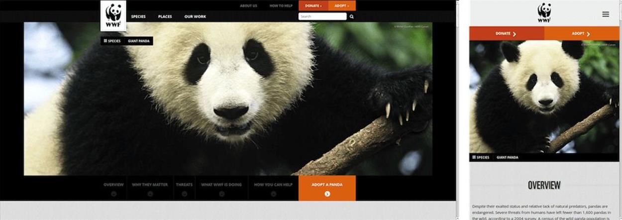
<img src="small.jpg" alt="A panda climbing up a tree.">
</picture>
Here again we hand out a grocery list of resources to browsers. The difference is that this is a list of <source> tags, and their selection algorithm is well-defined by the spec11.
Browsers follow that algorithm to the letter and pick the <source> tag that you intended, every time.
Very much like they do when using the sizes algorithm, browsers go over the list of sources and pick the first one that matches. A match can happen based on both media and type attributes. (Why type? We’ll see that in a bit.)
When both media and type attributes of a <source> either match or are missing (including if one of them matches and the other is missing), that source is picked. In other words, the <source> is picked for either case of:
<source media="matching media query" srcset>
<source type="supported MIME type" srcset>
<source media="matching media query" type="supported MIME type" srcset>
<source srcset>
If none of the <source>s match, the <img> is picked. And once we have an element that’s picked as the source for this image, the resource that will be downloaded is chosen using the <source>’s srcset and sizes attributes, according to the same mechanisms we discussed earlier.
A few things to take note of:
•<source src> does nothing and is ignored during the selection process. Make sure you use <source srcset>.
•Even though <picture> is the parent element, the element doing all the heavy lifting here is the <img>. The <img> uses its <picture> parent and its older <source> siblings to pick a resource to load, but eventually it is the <img>that is used to display the resource. That means that the <img> must be there, or no image will be displayed on screen. That’s also good for fallback purposes: the <img> needs to be there to provide a fallback for older browsers, so it should be there anyway. Regardless, if the <img> is not there, nothing will display.
•Last but not least, if you want to style your image, you need to style <img> like you always have. In the immortal words of Tab Atkins, you should think of <picture> as a “magical span” around your <img>. Same goes for alt text. It should go on your <img> like it always has.
The last point becomes fairly intuitive once we realize that <picture> is simply an extension to the good old <img> tag, and not a replacement. <img> still works as it always has, and is not going anywhere.
WHY CAN’T WE DO ART DIRECTION WITH SIZES/SRCSET?
By design, the sizes/srcset syntax takes into account the viewport’s width as well as the screen’s DPR. Art direction does not take DPR into account, since DPR doesn’t matter much for layout purposes. Therefore, adding art direction into the same syntax would have meant that web developers had to explicitly specify all the DPR and viewport width combinations in the markup.
That would have made the developer’s job much more difficult and would have made the syntax much harder to grasp and significantly more verbose.
Of course, web developers can abuse srcset by including multiple resources that are not the same image at different quality levels, but images that represent different crops or angles of the same subject. However, doing that would pretty much guarantee that at some point browsers will not pick the image intended, and the site’s layout will be broken, or the image will get skewed.
The other way around is also possible. Web developers can abuse <picture> and use it for use cases which aren’t exactly art direction per se. The problem here will be less obvious, but the result would be unnecessary downloads in some cases (e.g. when the viewport is downsized, and the image to be displayed is smaller than the one already displayed), and it would mean that browsers won’t be able to download smaller images in case of network problems, or if the user has set a preference for smaller images at the expense of quality.
WHY CAN’T IT BE BASED ON CONTAINER SIZE?
As we’ve already discussed, both <picture>’s source selection and the sizes attribute are based on media queries and media conditions that are often evaluated based on the viewport’s dimensions.
Web developers often state that it would have been more convenient for them to select the image source (as well as CSS in general) in a way that is based on the container’s dimensions, rather than the viewport’s. The concept is often referred to as element queries (EQs).
The reason current responsive images solutions are not based on element queries is a fairly simple one: the concept is not well defined, at least at the time of this writing. There are multiple obstacles to defining element queries; all of them can be overcome with time and effort, but there is no real reason to hold off responsive images until such a time when these issues will be resolved.
It is not yet clear how EQ-based responsive images would work, nor if they would have to sustain some delay in order to be loaded only after layout is calculated. Time will tell.
If you want to experiment with element queries today, there are several polyfill-like JavaScript libraries that implement them. In case you also need to lazy-load some of your page’s images, libraries such as lazysizes12 can enable both lazy loading and loading of the appropriate image resources according to their display dimensions.
A standards-based alternative is the Clown Car Technique13. One of the advantages of SVG here is that, very much like an iframe, media queries inside it refer to the dimensions of the SVG, rather than the dimensions of the entire page’s viewport. That means that when using this technique, the image resource is picked according to its display dimensions. On the flip-side, that’s also a disadvantage here. Image download would start much later than it would using the native responsive image techniques. For further details on that technique (and all things SVG), be sure to go over Sara Soueidan’s excellent chapter.
The Responsive Images Issues Community Group (RICG14) is currently pushing towards defining element queries, mainly by gathering up the use cases for it. But it is still at a very early stage, and will need a lot of refinement before it is something that’s ready to be implemented in browsers. If this is something you feel strongly about, we could use all the help we can get.
WHAT ABOUT SEPARATION OF CONCERNS?
The introduction of <picture> and sizes adds more CSS-based syntax to HTML. Even though media attributes have existed for a long while now, and HTML5 incorporated15 the media query from CSS into HTML, their use inside HTML isn’t very common, and they aren’t as widespread across the document as <picture> and sizes media queries are likely to be.
There have been some voices expressing concerns that this is likely to violate the separation of concerns principle, and may create a maintenance problem once web developers want to change design breakpoints and have to modify these media queries across multiple pages and in multiple places in every page. Not good.
What is the plan to tackle this obvious problem?
Well, the short-term plan is simple: web developers would be better off using some templating system (either dynamic or as a build step) and keeping their design breakpoints in a single place. If any design breakpoint changes are applicable to multiple pages, they can be changed at a single location and be applied to multiple pages.
But since “The tools will save us” is rarely a good answer in web standards discussions, there’s also a long-term plan. That plan involves an addition to the media queries standard called “custom media queries16”. It’s more or less an equivalent to CSS variables for media queries, and would enable us to define the page’s breakpoints in a single, inline <style> tag in the HTML’s <head>.
Why inline? Because of performance reasons (which is the ultimate goal here), we would still need browsers to be able to evaluate these media queries before any external resources have finished downloading, like they do today.