Responsive Web Design, Part 2 (2015)
Responsive Images
The Different Use Cases
Pretty early on, the community recognized that when people talk about responsive images, they often refer to different things. In an effort to have a productive conversation, the community defined the major use cases for responsive images and even had them stamped as an official paper7.
In the following sections, we will get an overview of the different use cases, and see what’s the best way to tackle each one of them.
FIXED-WIDTH IMAGES
Let’s say that the website you’re building has images that are always of the same dimensions regardless of viewport size. That happens if the site is not really responsive, or at the very least the images in it aren’t. The only thing responsive about these images is that you want them to look good on high-end devices with a higher DPR, but you don’t want to send Retina images to devices that don’t need them.
For example, let’s say you want to write an article with a layout that looks something like the following outline:
An article with a fixed-width image in a wide viewport and in a narrow viewport.
That’s a fairly simple layout, and if we ignore DPR, it can be achieved with a simple <img> element and the src attribute. But we’re not here to ignore DPR, are we?
One thing worth noting is that the various responsive images syntax constructs that we’ll discuss below can all be seen as extensions to the good old <img src> and can be seen as progressive enhancement, where legacy browsers just download the src resource, and supporting browsers download the responsive, better-adapted resource.
Since the image in our example is of a fixed width of 500 CSS pixels, the syntax we would use to achieve that would be:
<img src="dec_500px.jpg"
srcset="dec_750px.jpg 1.5x, dec_1000px.jpg 2x, dec_1500px.jpg 3x"
width="500" alt="The December wallpaper">
Short and sweet, right? No need for too many explanations there. This is just like the good-old <img> element, with the addition of the srcset attribute. Inside srcset, all we do is give browsers a comma-separated list of resources and their x descriptors (describing the image’s pixel density), and the browsers pick the best fit, by matching these values with the screen’s DPR.
How do browsers choose the best resource? That, intentionally, is up to the browsers. It enables browsers to apply optimizations regarding which resource to pick if there’s no resource that perfectly fits the DPR, as well as future optimizations that relate to the user’s preferences, bandwidth considerations, etc.
Currently in Blink, the rendering engine behind Chrome and Opera, the browser picks the resource that is closest to the current screen DPR. In order to do so, the browser sorts all the image candidate resources according to their density (which the web developer defines using the x descriptors, as we’ve seen above). Then it calculates the geometric mean of the densities of each neighboring sorted candidate pair. If the DPR is smaller than the geometric mean, the smaller neighbor gets picked. Otherwise, if the DPR is smaller or equal to the larger candidate’s density, the larger one gets downloaded.
The important thing to note here is that you should not rely on these calculations. They may vary between browsers and between browser versions. You just need to provide browsers with a set of resources in varying quality levels and let them do their thing.
Note that the 1x image resource is defined in the src attribute, where it doubles as a fallback resource. There’s no need to write the same resource twice!
That part of the syntax, usually referred to as the srcset x descriptor, was one of the earliest proposals for a standard to tackle part of the responsive images problem. At the moment of this writing, it is implemented and shipped in Safari, as well as Chrome and Opera.
Since this part is fairly simple and has been around for a while, it has become what many people talk about when they say srcset. However, as we’ll soon see, it is not the most useful part of the srcset syntax when it comes to RWD since it mainly tackles fixed-width images.
VARIABLE-WIDTH IMAGES
Assuming your site is a responsive website with images whose dimensions vary based on the viewport dimensions, the above technique is not enough. It’s better than nothing, sure, but a 1,920px wide screen and a 360px screen with the same density will get the same image, which means you’ll be making significant UX compromises, either on blurriness or on load speed.
What you really want is to define the image resources in a way that allows browsers to pick the right one for the current DPR and viewport size. But how can we do that?
Ideally, we’d want to define the set of available image resources along with their physical dimensions (i.e. their width in pixels), and have browsers download one based on the image’s display dimensions.
But there’s a problem: browsers don’t know what the image’s display dimensions will be when they need to choose which resource to download. The image’s display dimensions depend on the final page’s layout, which often relies on external CSS and can be influenced by the image’s dimensions, as well as the dimensions of other images on the page. That’s some circularity madness right there!
If we want browsers to download the right resource, we need to provide it with a hint regarding the final display dimensions – there’s just no way around that. Also, depending on our design, the image’s dimensions can vary at the various layouts. So, yeah, we have a complex problem on our hands here. Let’s see if we can break it down into smaller pieces.
We can start by adding a header image to our article from earlier on. Something that would look like the following:
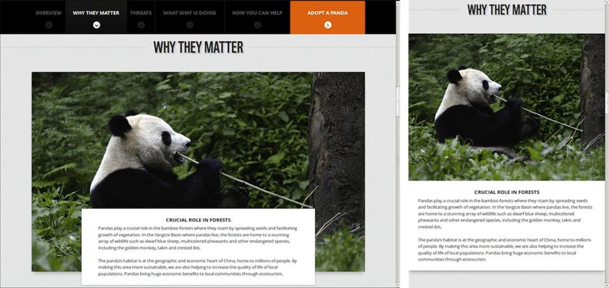
An article featuring a panda header image over a wide and a narrow viewport.
The syntax to define that header image would be:
<img src="panda_fallback.jpg"
srcset="panda_360.jpg 360w, panda_540.jpg 540w, panda_720.jpg 720w, panda_1080.jpg 1080w, panda_2160.jpg 2160w, panda_3240.jpg 3240w"
alt="A panda eating some bamboo.">
Note: Of course, the image resource file names can be just about anything. They include the resource’s width in pixels here only for illustrative purposes.
As you can tell, the srcset attribute here functions very much like the srcset attribute we’ve seen in the previous example, only that instead of having x descriptors that describe the image resource’s density, they have w descriptors that describe the image resource’s physical width in pixels.
Note: You may ask yourself why we only have means to describe the image’s width, but not ones to describe its height. In fact, we at the RICG are planning on adding h descriptors in the future that will enable just that, but because height-based selection is a weaker use case, it was decided that handling height as part of the specification and native implementations would have to be part of the next phase rather than the current one.
But didn’t we just say that browsers cannot wait for the image’s display dimensions to be calculated? Doing so would result in significant delays and possible double downloads. And if browsers can’t wait for the display dimensions, how can they use the image’s physical dimensions to determine which resource to download?
Well, since the image needs to be displayed as 100% of the width of the viewport (it is our header image, after all), we don’t much care that browsers don’t know anything from our markup regarding its display dimensions.
By default, browsers would assume we need the largest image for our viewport. That would be the image that is as wide as our viewport’s width and, therefore, browsers will download the image they actually need to properly display our header image. As we’ll see later, we also have a way to indicate to browsers that we need images that are smaller than that.
Now, let’s say we also want to add an image gallery where each one of the images takes up about a third of the viewport’s width. How can we do that?
Well, changing the CSS so that the image’s container is as wide as 33% of the viewport is not a problem, but how do we tell browsers that the image they need to load won’t be as wide as the viewport but a third of that size?
The proper way of doing that would be:
<img src="tiger_500px.jpg"
sizes="33vw"
srcset="tiger_200px.jpg 200w, tiger_500px.jpg 500w, tiger_800px.jpg 800w,
tiger_1000px.jpg 1000w, tiger_1500px.jpg 1500w, tiger_2000px.jpg 2000w"
alt="Tiger">
srcset here is not at all different than what we’ve seen earlier in our header image. The main difference here is the sizes attribute. It is our way of telling browsers, “This image will be displayed with roughly the width of the CSS length indicated.”
What happens behind the scenes is that browsers take the provided w descriptors and use them along with the sizes value to calculate each provided resource’s image density. You can think of it as browsers translating all the w descriptors into x descriptors internally. Then they perform the same (browser-defined) calculation we saw earlier with x descriptors to find the resource with the density that is closest to the current DPR. That means that w descriptors take DPR into account as well as their sizes-defined CSS length (which is often dependent on the viewport width, by using the vw CSS units). When your screen’s DPR is higher (or when you zoom in), larger images are more likely to get picked.
If you’re not familiar with vw units, they are relatively new CSS units, which represent percentages of the viewport width, after taking the vertical scrollbar into account. A 50vw CSS length, then, translates to 50% of the viewport’s width.
But, you’re not limited to using vw units as part of your sizes CSS lengths. You can use any one of the supported CSS length units such as px, em and others. It is worth noting that relative CSS length units, such as em, behave inside of sizes exactly like they do inside media queries, and are calculated in relation to browsers’ initial8 font size, rather than the current font size of the parent container.
Just like other places that accept CSS lengths, you can also use CSS’s calc() functions to represent lengths that are combined from multiple expressions. For example, calc(50vw - 30px) is a length that represents 50% of the viewport width minus 30 CSS pixels, which can be very useful when adjusting the image’s dimensions to paddings or margins.
Note: Even though it is often used in CSS, % is not a valid unit inside of sizes. The reason is the confusion that it created among developers when encountering it at first ("Percentage of what, exactly?"). With vw being an exact and clear equivalent, support for % as a unit was dropped.
Since browsers use the sizes info only to calculate the image density, which in turn affects the resource picked as well as the image’s intrinsic dimensions, the CSS length we provide to browsers doesn’t have to be totally accurate, as long as the image’s display dimensions are defined elsewhere. An image’s display dimensions are still defined using the same CSS rules or by using the width and height attributes.
Using width alongside sizes is permitted, although somewhat redundant, but it’s worth noting that width doesn’t affect the resource selection algorithm, so it cannot be used as a sizes replacement.
In our case, we defined the image as relative to the viewport width by choosing the vw units. But we could have used px or em to define fixed-width images, or even the vh (percentage from viewport height) units, if we really wanted to complicate things.
That would give us a result that looks something like:
An example of an image gallery where each image is a third of the available viewport width, on narrow and medium sized viewports.
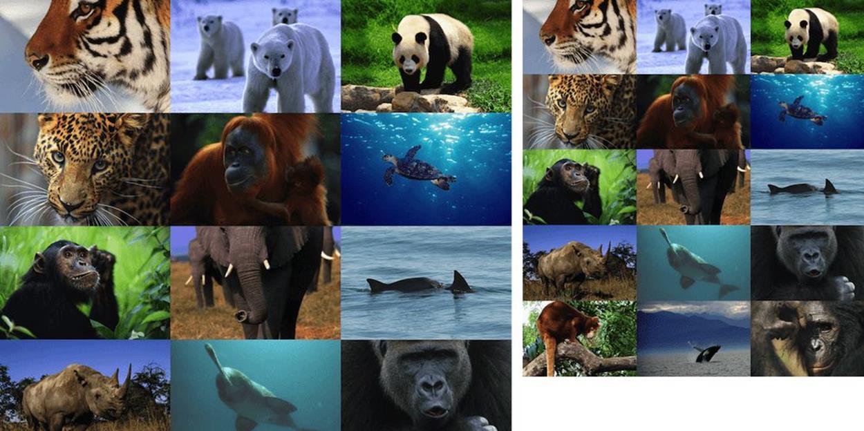
Now we’re trying to tackle a different part of the page that contains a bunch of thumbnails. While trying out different layouts, we realize that if we maintain the thumbnails as wide as a fixed percentage of the viewport width, they’d be too large on wide viewports and too small on narrow ones. RWD to the rescue!
We come up with a new implementation plan. The thumbnails will be displayed at four columns on wide viewports, as a fixed percentage of the viewport width or up to a certain width. On narrow viewports, they’d be displayed in a two-column layout, under similar constraints. Something like this:
A page displaying thumbnail images of animals. For wide viewports, they are displayed in a 4-column layout, whereas for narrow ones they’re displayed as two columns. It goes to show that a narrower viewport doesn’t always mean smaller images.
That’s great as far as the design goes, but how do we notify browsers about all of that, so they don’t download images that are too large for what’s needed?
The way to do that is by defining the image’s sizes attribute with our breakpoints:
<img src="thumb.jpg"
sizes="(min-width: 1200px) 235px,
(min-width: 641px) 24vw,
(min-width: 470px) 235px,
50vw"
srcset="thumb100.jpg 100w,
thumb200.jpg 200w, thumb235.jpg 235w,
thumb300.jpg 300w, thumb470.jpg 470w"
alt="A rad animal.">
Here we can see that the sizes attribute becomes slightly more complex than what we saw earlier. It is comprised of comma-separated value pairs, where the first (optional) value is a media condition (a media query without the media type), and the second value is a CSS length.
Browsers go over the media conditions and look for the first one that matches the current environment. While we can use any arbitrary media feature here, it probably makes the most sense to use viewport dimension media features (such as max-width and max-height), since they are the most likely to have an impact on your design’s breakpoints and, therefore, your image dimensions. Note that for the values themselves, we can use relative CSS length units, like em, as well as px units.
The second, non-optional value of the pair, is a CSS length. That CSS length describes the estimated display dimensions of the image. This is the hint the developer has to give browsers for them to know which resource to pick.
Once browsers find a matching media condition (or there is no media condition at all), the matching CSS length is then used to calculate the density of the various resources inside srcset.
The image’s density for resources with w descriptors is calculated by dividing the resource’s width (as defined by the w descriptor) with the CSS length picked from sizes. If sizes is 400px and the resource is defined with 800w, this resource has density equivalent to a resource defined with 2x.
Browsers can then use the resource density, along with the screen’s DPR (and possibly other factors), to figure out which resource would be the best to download and display.
Going back to our code example above, assuming we’re running with a browser viewport of 1,320 pixels, the browser will go over the sizes pairs and pick the first one: (min-width: 1200px) 235px. That would indicate to it that the image is likely to be displayed at a width of 235 pixels. Therefore, assuming the browser’s DPR value is 1, it will likely try to download the resource closest to 235 pixels, and it would end up downloading thumb235.jpg. If the DPR value is 2, in order to match the screen’s density the required resource needs to be twice as large, so the browser will probably download the resource closest to 470 pixels, which is thumb470.jpg.
Now, if our viewport is 660px wide, the (min-width: 641px) 24vw pair matches, and the image is likely to take up slightly less than a quarter of the viewport’s width. That means browsers will try to download the image that’s closest to 158px wide for a DPR value of 1, and closest to 317px wide for a DPR value of 2. The actual resource picked is likely to be different here between browsers, since there’s no exact match. In Chrome 39, the picked resource for the first case would probably be thumb200.jpg, and for the second case the picked resource would probably be thumb300.jpg. Future versions may modify the selection algorithm, so again, this is not something you should rely on.
As we’ve seen in our first example of this use case, if the sizes attribute is missing, a default value of 100vw is used as the effective size instead, as it represents the largest display dimensions the image might be displayed in without horizontal scrolling.
Why did I use all of those “likely”s and “probably”s in the sections above? Again, they’re there because for the resources insidesrcset browsers are free to pick whatever resource their algorithms see fit. That means that you can’t rely on browsers downloading and displaying the exact resource you want them to. That’s a Good Thing™ since it leaves browsers room to innovate in this space, by adding user preferences, network considerations and other future optimizations to the decision-making process. And since all the different resources should only differ in quality, differing resource choices shouldn’t have any impact on your page’s layout.
But what happens if you want to see slightly different images on different layouts, showing images whose proportions are different, whose subject is more visible, or anything else your creative self desires?
That’s what the art direction use case is all about!