Responsive Web Design, Part 2 (2015)
Responsive Email Design
Emails Aren’t Websites
For anyone new to email design, thinking of emails as single-serving websites isn’t a bad parallel to draw, but it’s important to keep in mind that a lot of the concepts that may be familiar on a website don’t completely translate to email, if at all.
That being said, it doesn’t mean you should throw out the window every principle of good design or development you’ve ever learned. Many of the same concepts translate from web design to email design; they just need a bit of adjustment to work effectively in this new medium.
“ALMOST” IS GOOD ENOUGH
Avoiding slavish adherence to a design is the most important principle to keep in mind when designing and developing email. In this discipline, the mantra that will preserve your sanity is a simple one: pixel-perfect design is a fool’s game.
Because of the differences between how email clients render styles, combined with the sheer number of active email clients out there, exactness of design just isn’t a viable goal. More often than not, trying to get an email to look the same across a variety of clients and platforms only guarantees that you’ll have wasted a vast amount of time. Seriously. Don’t bother. It’s not worth it.
Even something as fundamental as the box model isn’t rendered or handled consistently across email clients. To a web designer, the basic diagram of the box model should look pretty familiar:
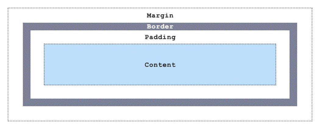
The box model is a foundational standard of the web, so of course it’s totally wonky in email. #yolo
Email designers can’t take box model rendering for granted, however, because some major clients don’t have full support for even the more basic box model properties. Notable examples include Outlook.com, which has no support for margin, and its desktop sibling Outlook 2007 (and newer), which has no support for height, max-width, or min-width, and inconsistent support for padding and width, depending on the element. On top of all of that, desktop Outlook also plays it fast and loose with its dpi scaling6, which can cause your email to look odd.
All this being said, it doesn’t mean you can’t get close to pixel-perfect design in your emails, or that you shouldn’t bother trying to normalize styles across clients, but it’s important to remember that email design is less about remaining perfectly true to some PSD you’ve got, and more about building the best version of that PSD across different clients. Email design is the exact science of inexactness. As Bruce Lee once said, “…be water, my friend.”
AUDIENCE DETERMINES EVERYTHING
Good email design, like web design, requires context. Knowing how to design an email so that it holds up across multiple clients — and avoiding pixel-perfection when you do — is only the first step of the entire design process. Think of it as the mechanical part of the task.
Knowing who you’re designing for, then what you’re designing for them is what actually creates context; it’s the organic bit. Context in email is different from context on the web, however. Websites are generally made to cater to everyone, because there’s a whole planet of people out there who can end up visiting the site. Because of that, design and top-level site content tend to be geared towards a fairly wide audience, and more narrowly focused subjects get relegated to deeper parts of a site.
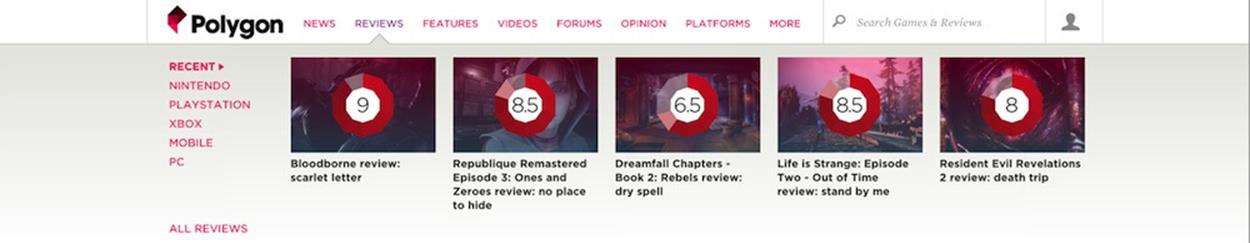
Finding reviews for a specific platform, like Playstation 4, requires drilling down Polygon’s navigation.
One of the chief strengths of email is that it allows you a much greater degree of focus and clarity.
This is because email is based on interest and participation; much more than any website or social media service, email can have an incredible degree of relevance because you can cater to very specific groups of people. Because the user comes to you and signs up for an email (or purchases a product), you have some information to start with, and a purpose to design to. There’s more context because you can ask for it.
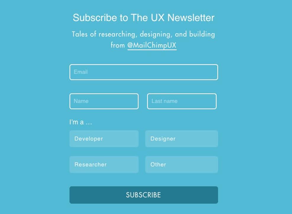
The sign-up form for MailChimp’s UX newsletter allows recipients to choose an area of interest.
A sign-up form is the most basic way to glean a bit of hard information about who your audience is. Having that information is immensely powerful, because it allows you to tailor the design, development and content of your emails to better serve relevant and useful content.
You can focus enough to give that one person — or a group of people who think in similar ways — what they want because email is a much more iterative medium than a website is; it’s possible to test, tweak and tune your message so that you zero in closer and closer to something people value, since feedback is on a quicker timeline.
PURPOSEFUL DESIGN
Another way to achieve that focus is to design an email to have one purpose and to meet a particular goal. The aim of all email falls into four broad categories, which is a good place to start:
1. Read Me emails, also known as newsletters
2. Buy Me, or e-commerce emails
3. Join Me emails, which serve as singular calls to action
4. Transactional emails, built to deliver information
The first three categories of email are known as one-to-many messages: sent from one point and delivered to several, via a list of subscriber emails. They’re so prevalent in our inboxes that clients like Gmail and Outlook.com have entire feature sets dedicated to sorting and categorizing them.
The first category, Read Me, covers emails that are generally centered around the purposes of cultivating relationships and spreading ideas, like MailChimp’s UX newsletter.
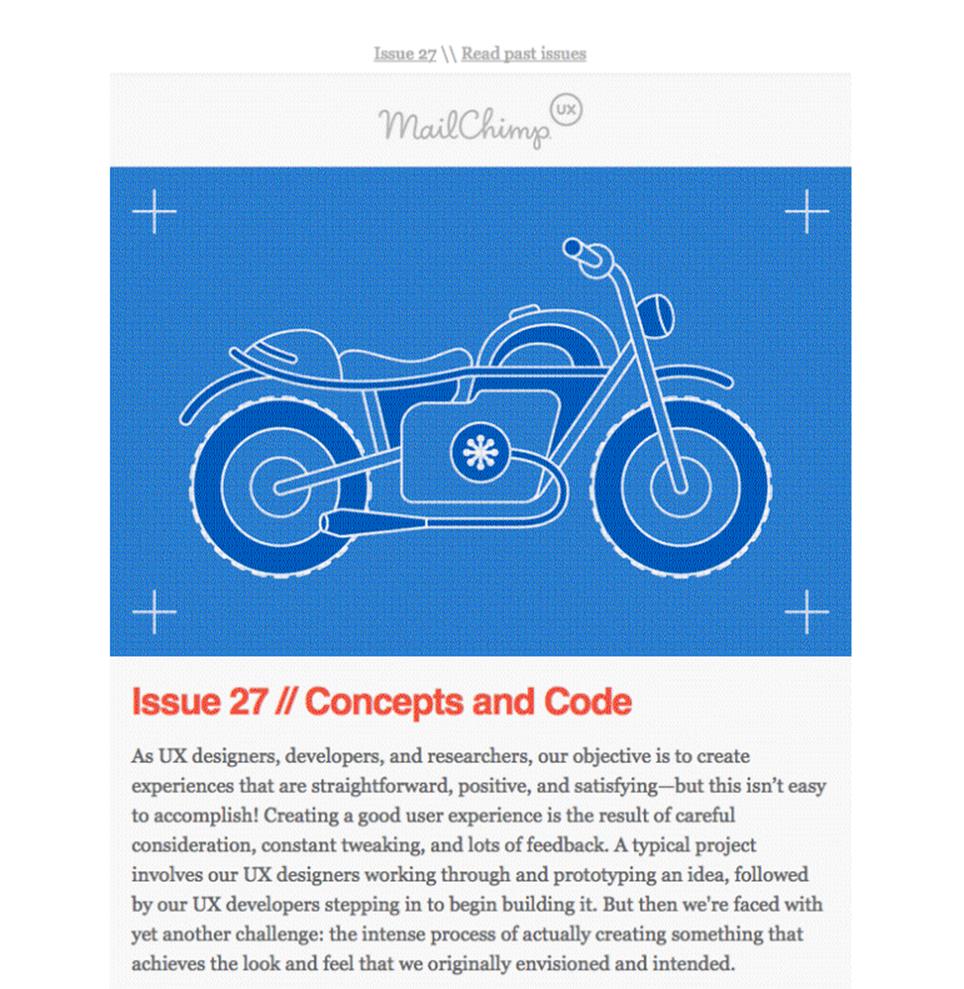
A long-form email covering a variety of subjects, the UX newsletter goes out to over 22,000 subscribers.
Built for the consumption of content, these emails depend on nicely thought out typography and, most importantly, strong writing. They’re also the only type of email that can work well while ignoring the ‘shorter is better’ rule of thumb for email.
The second category, Buy Me, covers retail emails. The best-designed emails in this group focus on a single goal, the creation of enticement in a recipient to spend money.
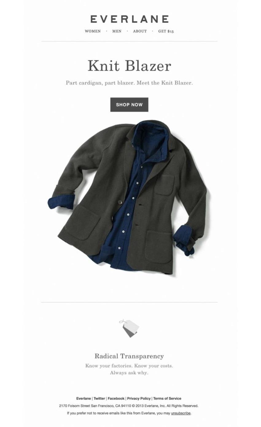
The simplicity of design in Everlane’s emails ensures that the product takes center stage.
A good e-commerce email relies on the use of compelling imagery, clear calls to action and concise copy to focus the recipient’s attention on the act of clicking the ‘Shop Now’ button and spending some money.
The third category of emails, Join Me, are also built around the idea of persuading a recipient to take action, though not necessarily in service to making a buck.

The clear, interesting presentation of important details make Brother Moto’s email a very effective one.
The clear, interesting presentation of important details make Brother Moto’s email a very effective one.
Join Me emails range from event notices to invitations, party announcements to survey requests. In these emails, information hierarchy is the key to their usefulness; it’s best that important details such as date and time be clearly defined and obvious, and calls to action should be bold.
In the final category, Transactional, emails are made to convey information in a straightforward and comprehensive way:
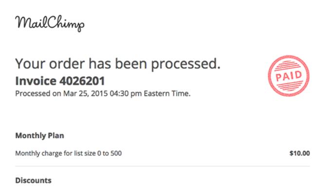
Transactional emails work best with simplified, easy to understand layout and content.
Transactional emails differ from the other three types in that they’re one-to-one messages, and are triggered by — you guessed it — a transaction. A fairly wide variety of emails falls into this category, including receipts, order summaries, and security and delivery notifications. Despite this broad range, they all share a single important feature: clarity of information. Well-designed transactional emails should be focused, practical, and free from as much distraction as possible.
Giving your emails one of these specific purposes and designing with the aim of fulfilling that purpose makes the task of sending more useful and relevant email much simpler, and it’s one of the best things you can do to home in on a better experience for recipients.
TYPOGRAPHY MAKETH THE EMAIL
If there’s one constant that’s threaded across each of these categories of email, it’s type. It’s difficult to overstate how massively important textual content and, in turn, typography is to email, but its significance is easy to grasp: unlike any other sort of content you can drop in an email, it’s the one thing that is consistently rendered across different clients.
In many emails — most of them, I’d venture to say — typography doesn’t get the attention it deserves. Not by a long shot. In emails from retailers especially, real text is often completely ignored in favor of in-image text.
The trouble is that desktop clients like Outlook 2013 and Thunderbird block images by default, and webmail clients like AOL Mail block images from first-time senders. And alt text? It isn’t guaranteed to show, meaning that emails that rely on images for all of their content can end up being entirely meaningless.
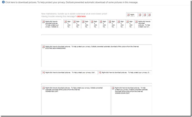
Not even Professor X could tell you what this email is for. Thanks, Outlook 2013.
Ideally, your message should still come across without images, because email recipients will almost always see the text of an email before they see anything else. That makes typography your email’s most important design asset.
Certainly, there are differences between how typography is handled in email and how it’s handled on the web. For starters, there’s a wide amount of variability between the possible units of measurement. The em and rem familiar to web designers all get rendered differently across email clients, if they’re rendered at all — most of the time, measurement units are converted into the kind that the email client prefers. Even if you luck out with unit rendering, some clients may override any styles you provide. Line height is particularly troublesome; there are varied baselines in Gmail (13px), Outlook.com (15px) and Apple Mail (12px), for example. Consequently, they wreak havoc with type that’s sized with the more malleable em or rem.
Which unit is rendered most consistently and explicitly? The almighty pixel. 16px is 16px across most email clients, meaning px should be how you define text sizes and line heights across emails. That doesn’t mean you should rush to set up a perfect typographic baseline for your entire email; pixels may render consistently, but some clients (desktop Outlook, in particular) force a conversion to points, and other clients may force spacing overrides that ignore the styles you set.
Semantically structured content also plays an important role, though this is a point of contention in the email design community. The argument against using semantically meaningful elements like <p> and <h1> in email stems largely from the fact that some email clients have built-in CSS overrides for some elements that make semantically marked-up content more difficult for a developer to style. Older clients can also present problems for semantic markup, as some require the use of the <font> element for any sort of text styling.
Though the line between semantic and non-semantic markup is blurrier in email than it is on the web, ultimately there’s enough consistent support across email clients to stick with the practice — even if it means compromising on some parts of an email’s design. That’s because of one significant reason: semantic markup is hugely important for accessibility. As far as many assistive technologies like screen readers are concerned, an <h1> has a higher semantic importance than an <h2>, which has a higher semantic importance than a <p>, even if it’s in email. I believe this fact trumps the arguments I’ve heard purporting that semantic markup makes email development more difficult.
My view essentially comes down to this: do as much as you can get away with. It doesn’t always work out perfectly, of course; in older desktop clients especially, there’s no appreciable difference between <b> and <strong> and font-weight:bold;, but making your email more accessible is still worth the effort. An email that ends up with a slightly different line height than you intended in one or two clients is a fair trade for it being more easily understood by someone using a screen reader.
You also need to keep track of widely supported cross-platform fonts, and include them in your font stacks after more exotic choices. It’s worth the effort to provide comprehensive font stacks, since it’s relatively little work to ensure wider design fidelity across clients:
.bodyContent{
font-family: 'Open Sans', 'Helvetica Neue', Helvetica, Arial, sans-serif
}
You can most reliably count on quite a few of them, all oldies-but-goodies, to supplement typefaces that more appropriately fit your design:
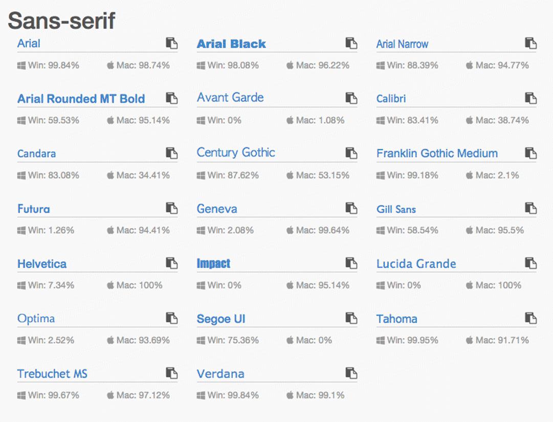
Finding the safest fonts is simple; sites like cssfontstack.com7 have done the work for you.
I’ll grant that the list of typefaces displayed here is pretty damned boring, and I can understand why, from the marketer’s and designer’s perspectives, image-based type is so often preferred. That’s where web fonts can be useful, allowing you more type options without having to resort to image-based text.
WEB FONTS
Web fonts are now a common sight in modern web design, gracing just about every well-designed page you can lay your eyes on. While there isn’t support across the board for web fonts in email clients, you absolutely can use them in your designs — so long as you clear two hurdles.
The first hurdle is being able to serve web fonts without JavaScript8. The two most popular options here are to host the fonts yourself, or to use a service that allows fonts to be served externally via CSS. If you plan to host the fonts, be sure to keep the size of your email list in mind; using a CDN might save your servers from meltdown. Going with a service might be the better option, however. Google Fonts is the most popular, given it costs nothing while still providing a reasonable variety of well-crafted fonts, but other services like Monotype or MyFonts also work very well and tend to have higher quality fonts to choose from.
The second hurdle arises from email clients themselves. Whether or not a particular client supports web fonts is entirely dependent on whether or not it allows external linking. Web-based clients like Gmail and Outlook prevent the import of any sort of external information owing to security considerations, meaning support for web fonts is nonexistent.It’s not all bad, though. Many desktop and mobile clients do allow external linking via the use of <link>, @import, or @font-face; there’s a surprisingly broad selection of clients that import and render web fonts with no problems at all, as evidenced by StyleCampaign’s comprehensive write-up on the subject:
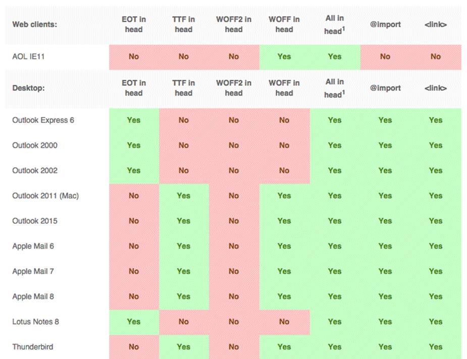
This small portion of StyleCampaign’s web font support9 matrix doesn’t do its thoroughness any justice.
Testing seven linking methods across more than 30 desktop, web-based and mobile email clients, StyleCampaign has created what’s very likely the most exhaustive look at web font support in email ever done, reaching the conclusion that <link> provides the greatest possible coverage, with @font-face coming a close second, and @import third.
Importing and using web fonts is straightforward, employing standard HTML and CSS syntaxes that most web designers are used to seeing. The choice with the most robust support, <link>, is HTML:
<link href="http://fonts.googleapis.com/css?family=Open+Sans" rel="stylesheet" type="text/css">
The first CSS-based method of importing fonts, @font-face, includes exactly what you’d see on visiting the URL in the <link> example above:
<style="text/css">
@font-face{
font-family:'Open Sans';
font-style:normal;
font-weight:400;
src:local('Open Sans'),local('OpenSans'),url('http://fonts.gstatic.com/s/opensans/v10/cJZKeOuBrn4kERxqtaUH3bO3LdcAZYWl9Si6vvxL-qU.woff') format('woff');
}
</style>
The second method, @import, is the cleanest of the CSS-based ones, requiring only the URL to be provided:
<style="text/css">
@import url('http://fonts.googleapis.com/css?family=Open+Sans');
</style>
Regardless of the method you choose, after the import is complete you can set the font-family value as you normally would:
<style="text/css">
.emailContent{
font-family:'Open Sans', 'Helvetica Neue', Helvetica, Arial, sans-serif;
}
</style>
It’s worth noting that each of these methods, along with the use of web fonts in email in general, requires you to consider the performance of an email just as you would for a website.
Keep in mind, too, that depending on the email client, an email may not render fully until the web font is downloaded, and that the number of web font requests adds to the total data load size.
IMAGE FALLBACKS
Sometimes, though, there’s no winning, and you have to resort to setting type in images because design guidelines may demand it. In those cases where staying on brand is mission number one, Arial, Georgia, and even web font choices can leave a little something to be desired when you need a design to wow a recipient, and you may be forced to use image-based type.
Even then, providing a fallback is important. Your first option for doing so, and also the simplest method, is styling an image’s alt text. This is easily done, requiring only that you add text styles to the <img> element:
<a href="..." target="_blank"><img src="..." alt="MANDRILL" height="36" width="140" style="border:0; color:#E5E5E5; display:block; font-family:'Helvetica Neue', Arial, Helvetica, sans-serif; font-size:13px; font-weight:bold; letter-spacing:2px; outline:none; text-decoration:none;"></a>
Using this technique, you ensure that important content like brand names or headings aren’t lost when images aren’t loaded:
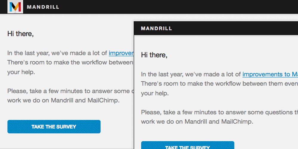
alt text styling means Mandrill’s image-based logo fails from Freight Sans to a similar Helvetica.
Of course, it doesn’t always make sense to provide alt text, styled or unstyled, for your images, because there are times when a text backup doesn’t do enough to convey the same message.
In those cases, there’s a pretty incredible technique you can use to create a unique fallback for an email’s hero image. By slicing an image in such a way that allows its containing table cells to be colored as fallback content, you can mimic an image or provide an analog.
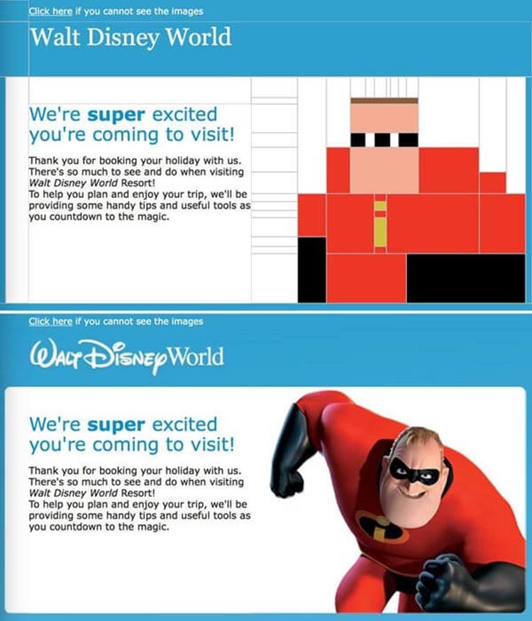
Yep. I made a pun. Forward all groans of disapproval via Twitter or email.
This technique is one that’s becoming quite popular in email design, but it does present a couple of issues that developers should be mindful of. First, it can greatly increase design and development time on an email, and, depending on the design, may not work particularly well in a responsive format.
Second, there’s the matter of the lengthened loading time that the email’s recipient will be forced to wait through; each image has to load sequentially, which could take a while on slower mobile connections. Still, despite these drawbacks, it’s a neat practice and one hell of a delighter.
CODE-BASED BUTTONS
It’s common to see image-based buttons in emails as well. Unfortunately, these suffer from the same problems as other image-based bits of content, failing completely in clients that block images and becoming victim to server issues where the image’s load time could be affected.
Because button-based calls to action tend to have meaningful actions attached to them, like purchasing a product or responding to an invitation, an image-based button provides less than ideal coverage across email clients for a crucial user pathway.
The best, most stable solution is a button built with HTML and CSS, commonly known in the email design world as the bulletproof button. In web design, code-based buttons are a pretty simple affair, generally consisting only of a styled <a> element:
<style type="text/css">
.buyButton{
background:#E85C41;
border-radius:4px;
color:#FFFFFF;
font-family:Helvetica, sans-serif;
font-size:14px;
line-height:16px;
padding:15px 25px;
text-decoration:none;
}
</style>
<a href="..." class="buyButton">Buy Now</a>
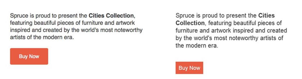
In email, of course, it has to be done a little differently, because some email clients (most notably desktop Outlook) don’t render padding on anchors, meaning buttons end up not looking much like buttons:

If it’s not abundantly clear yet, no, Outlook can’t do anything right.
The most popular method for creating reliable, code-based buttons in email involves using a single-row, single-cell table for the button structure, and a link within that single cell for the button text:
<table border="0" cellpadding="0" cellspacing="0" style="background:#E85C41; border-radius:4px;">
<tr>
<td class="center" valign="middle" style="padding-top:15px; padding-right:25px; padding-bottom:15px; padding-left:25px;">
<a href="..." style="color:#FFFFFF; font-size:14px; line-height:16px; text-decoration:none;">Buy Now</a>
</td>
</tr>
</table>
This type of button provides the most consistent rendering across email clients, as the majority support the use of padding on table cells, though it does have two drawbacks.
The first is fairly obvious: what takes a single line of HTML to do on a website takes seven lines in an email. The second is that only the link text is clickable, and not the entire button itself. The additional code weight isn’t a major issue, as the difference in actual file size is negligible, but a lot of designers and developers have a problem with the entire button not being an actionable area.
If you’re the sort to find that problematic, there’s another method for creating a code-based button that’s fully clickable and renders fairly consistently across clients. Additionally, it requires less code:
<a href="..." style="background:#E85C41; border-top:15px solid #E85C41; border-right:25px solid #E85C41; border-bottom:15px solid #E85C41; border-left:25px solid #E85C41; border-radius:4px; color:#FFFFFF; font-size:14px; line-height:16px; text-decoration:none;">Buy Now</a>
This biggest advantage of using this border-based button is the fact that its entire area is actionable, meaning a little less precision in clicking or tapping is required of the user. Despite its benefits, however, this type of button doesn’t come without its own drawbacks. Because of how it’s built, it’s fairly inflexible in design, so things like background images and gradients could be troublesome or impossible to include.
Additionally, desktop Outlook also has some problems rendering the borders as specified, reducing their size and making the button appear smaller than intended:
The exact same code, with Apple Mail’s rendering on the left, and Outlook 2013’s on the right.
Still, the benefits of the border button method outweigh its downsides, and this type of button is the one I use most in my own work.
These aren’t the only two methods for creating code-based, email-friendly buttons, but they’re the simplest and most reliable, and can prevent a fair amount of hassle in putting an email together; not to mention that they’re not susceptible to the same problems that image-based buttons often suffer, meaning recipients will see that nice, important call to action without having to rely on image loading or well-behaved email clients.
NAVIGATION IN EMAIL
One of the web’s most common sights, the navigation bar, also requires a different treatment when it’s used in email. Navigation is very often found in emails from retailers, and is generally used to convey the existence of different categories of items that shoppers have to choose from:
If you’re thinking eight nav items is too many for an email, you’re right.
Despite their prevalence in e-commerce emails, not everyone agrees that the use of a navigation bar makes sense; there’s a fairly clear divide on the topic, between those for it and against it.
On one side of the debate are those who swear by navigation bars and tout their necessity in making it clear to potential shoppers the different product options available. The opposite side — and the camp I’m in — is that conventional navigation doesn’t make much sense in the case of email, and that there are better methods for revealing the same sort of information.
Navigation is meaningful on websites because every page is linked together into what can be considered a single thread, but an email is a siloed instance of HTML; page-to-page navigation doesn’t (yet) exist, so document traversal is limited to local page anchors, or linking to external sites.
Though there’s obviously a valid case for including external links to other product categories, I feel that there are better solutions than using the navigation bars we are used to seeing — especially since their use seems to be based on the comfort of the familiar, rather than them being more effective than other methods.
A good solution for replacing navigation in an email recalls the old adage of show, don’t tell, and involves using images and text in the form of callout-style navigation blocks.
Of course, you may not always have a say or choice in whether or not a navigation bar is included in an email.
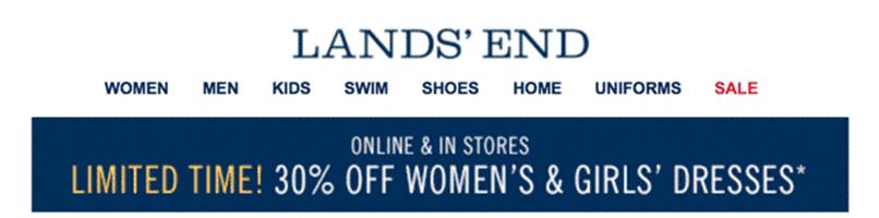
In those cases where you must use navigation, be mindful of available space, especially on small displays. If you can, reducing the navigation bar’s size and limiting the number of options could help simplify the email and focus its message. A small number of retailers, including Banana Republic, take this approach in their emails, including abridged navigation bars.
When navigation is necessary, a pared-down version like Banana Republic’s is a good compromise.
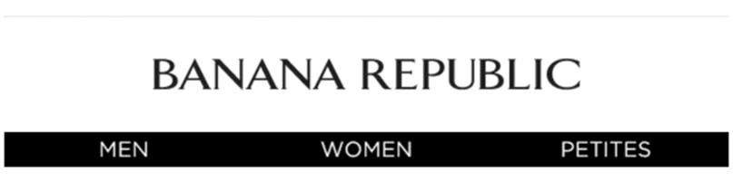
Another good option for dealing with navigation, given the limited real estate on small displays, is to move it from the top of the email to the bottom.
Saks Fifth Avenue uses this technique to good effect, providing a slightly different navigation structure that stays hidden in the footer of emails and shows on small displays in clients that support media queries.
Though Saks Fifth Avenue uses navigation in email, they’re mindful of its purpose and position.
Moving the navigation structure to the bottom of the email means that Saks keeps the most important stuff in their message — the content about their products — up top and free of potential distractions.
MAKING EMAIL MOVE
Animation in email has experienced a surge in popularity in the last couple of years, giving designers another way to add personality and visual interest to messages. There are a few different ways to bring animation to email, though three in particular stand out above the rest, each with their pros and cons.
By far, the most commonly used method for adding motion to an email is the venerable animated GIF.
If you stare at this, wiggle the page, and shake your head really fast, it’ll move. Get a friend to help.
Because of how easy they are to create, and because email client support is incredibly broad, GIFs are the simplest and way to bring animation to your email.
The only real downsides to using GIFs are their generally poor image quality and potentially large file sizes, though both of these issues can be mitigated with the use of desktop and mobile apps10, or video-to-GIF conversion sites like Imgur11’s. There’s one more issue to be aware of as far as GIFs are concerned —they can fail to render or animate in older email clients. Desktop Outlook is the most notable of these; there’s no support for animation, though the first frame of the GIF is rendered as a fallback.
CSS animation12 provides another option for bringing motion to email, though support for the method is much weaker across clients. CSS animation works the same in email as it does on the web, based on the @keyframes rule and related properties:
@keyframes fadeOut{
0%{opacity:1;}
25%{opacity:.75;}
50%{opacity:.5;}
75%{opacity:.25;}
100%{opacity:0;}
}
.vanishingTable{
animation-name:fadeOut;
animation-duration:10s;
animation-iteration-count:infinite;
}
Support for animation is closely related to support for media queries in general, though there are some clients that support media queries but not animation. In addition, CSS animations are a little time-consuming to build, and truly complex, video-like movement is difficult to achieve.
The upshot is that despite the lack of full support you’re still dealing with HTML and CSS, meaning you can easily provide fallbacks in clients where animation isn’t supported. Another benefit is that CSS animation is incredibly lightweight, meaning it reduces the data burden that a recipient has to shoulder.
Finally, there’s HTML5 video. To be honest, I was conflicted on whether or not to even say anything about it, because there are more reasons to warn against its use than there are to recommend it. For starters, support is limited almost exclusively to Apple Mail, iOS Mail (iOS 6 and 7, but not iOS 8), Mozilla Thunderbird and Outlook.com. If that narrow amount of coverage isn’t enough to dissuade you from using HTML5 video in an email, there’s the additional issue of file size; video is heavy, especially where a recipient’s mobile data plan is concerned.
With all of my “please don’t do this” pleading out of the way, adding HTML5 video to an email is a relatively simple affair:
<table border="0" cellpadding="0" cellspacing="0" width="600">
<tr>
<td class="center">
<video height="400" width="600" controls>
<source src="..." type="video/mp4">
<a href="..." ><img src="fallback.jpg" /></a>
</video>
</td>
</tr>
</table>
If you do choose to include video in your email, remember that you’re potentially giving up the opportunity to drive recipient traffic from your email to a landing page where you can extend the video’s usefulness by providing more content and a richer experience for the user, a tactic that many, including Wistia13, feel is more impactful than allowing a video to be watched in an email.