Responsive Web Design, Part 2 (2015)
Responsive Email Design
Email Development Basics
With a good idea of the pitfalls, you’ll face in email development, and some basic design principles in place, we can get into actually writing code. Development of an HTML email is simple enough to be done in only 15 lines of code:
<!doctype html>
<html lang="en">
<head>
<meta charset="UTF-8">
</head>
<body>
<center>
<table border="0" cellpadding="0" cellspacing="0" width="600">
<tr>
<td align="left">
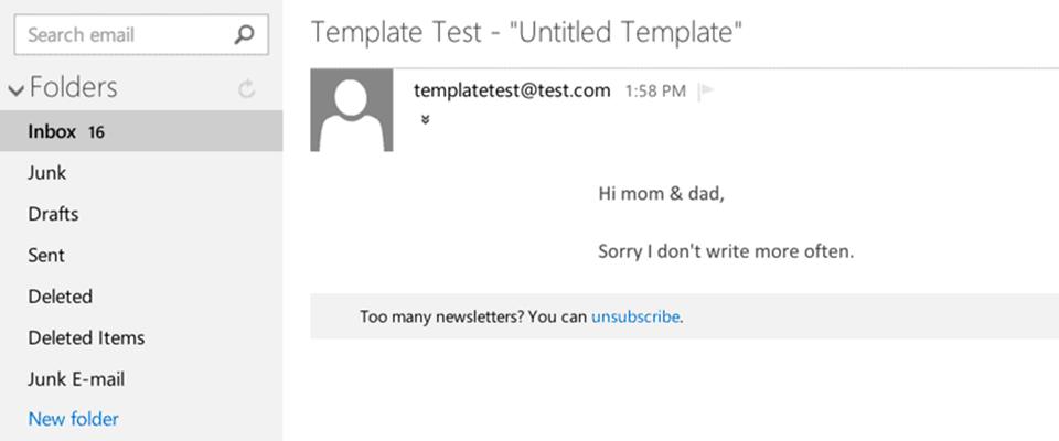
Hi mom & dad,
<br />
<br />
Sorry I don't write more often.
</td>
</tr>
</table>
</center>
</body>
</html>
That’s all it takes to build an HTML email, really.
So… the chapter’s over — thanks for reading!
Actually, we’ve not reached the nitty-gritty yet, but you can plop that little bit of code in your delivery system of choice and just about every email client on the planet will render the message.
Mom? Dad? Did you unsubscribe from my email list?
It’s a pretty simple chunk of code. It opens with the HTML5 doctype and the UTF-8 character set <meta> tag. In the <body> we have our first bit of deprecated code, <center>, which is used to align the email container. The use of this element is based on personal choice and necessity; I use it to provide an old-school fallback, in case the email ends up in a dinosaur of a client.
Following <center>, a standard single-cell <table> is used to hold content. When building an email, it’s important to include and set the values of attributes on <table> and <td> elements; some clients, like desktop Outlook, don’t assume that no attribute or value equals zero, so if cellpadding or cellspacing are left out, you can run into a variety of spacing issues.
RESET AND CLIENT-SPECIFIC CSS
That’s just the bare minimum necessary for an HTML email. From here, we can get a little more complex and start refining the code to create a more robust foundation for our email.
Like in web design, it’s helpful to include some CSS styles in an attempt to reset and normalize rendering across clients. All of this CSS gets placed in a <style> element in the email’s <head>, in anticipation of running the whole thing through an inliner later. I always include a number of basic reset styles:
<style type="text/css">
/* RESET STYLES */
p{margin:1em 0;}
a{word-wrap:break-word;}
table{border-collapse:collapse;}
img, a img{border:0; height:auto; outline:none; text-decoration:none;}
body, #bodyTable{height:100% !important; margin:0; padding:0; width:100% !important;}
...
The most notable style declaration here is border-collapse:collapse;, which is used to ensure that our email’s tables don’t inherit any spacing from email client default styles, which is a must when nesting tables in an email.
Our next addition is a group of client-specific styles, which get a bit more complex. Each requires a bit of explanation, so let’s look at them line by line:
...
/* CLIENT-SPECIFIC STYLES */
#outlook a{padding:0;}
This first rule set is pretty straightforward in its effect, triggering the UI in desktop versions of Outlook to provide a “view in browser” message for the email. Since we know that Outlook renders emails pretty poorly, this gives readers a way to view emails closer to what’s originally intended, thanks to the better HTML rendering available in the browser. Outlook users end up seeing this message at the top of the viewing pane:
The next rule set targets all images, and includes the proprietary Microsoft property -ms-interpolation-mode. This property is used to set the method used by IE to resample images that get resized via CSS or HTML attributes:
img{-ms-interpolation-mode:bicubic;}
Simply put, it makes images look a little better when they’re sized differently from their native sizes, which is useful in mobile-friendly development. The value, bicubic, is for the best-quality interpolation method. This property was deprecated in IE9, but still works in the case of email.
The next rule set includes more Outlook-specific fun. We trot out more proprietary properties, this time to act a bit like the border-collapse reset style declared earlier:
table{'font-size:12.0pt;font-family:"Courier New";color:#999999'>:0pt;'font-size:12.0pt;font-family:"Courier New";color:#999999'>:0pt;}
These Microsoft Office properties set the spacing on the left and right side of a <table> to zero points in Outlook 2007 and beyond. We can also tell Outlook to render line heights as they’re originally set:
p, a, li, td, blockquote{'font-size:12.0pt; font-family:"Courier New";color:#999999'>:exactly;}
Next, because a lot of email and browser apps on mobile devices run some sort of autodetection on phone numbers and turn them into links, we need to set up a style to force proper inheritance of link colors. Unless you’re a fan of that ol’ HTML blue, it’s a good idea to specify that these links take on the colors you define elsewhere in your CSS:
a[href^="tel"], a[href^="sms"]{color:inherit; cursor:default; text-decoration:inherit;}
This reset isn’t a silver bullet, unfortunately; there are times when mobile devices will still force link styles on certain bits of content. In those cases, it’s best to wrap the content in a <span>, then specify a CSS color to attempt an override.
While we’re on a mobile-targeting kick, we can tell Windows- and WebKit-based rendering engines to leave specified text sizes alone, instead of trying to accommodate for small displays on their own:
p, a, li, td, body, table, blockquote{-ms-text-size-adjust:100%; -webkit-text-size-adjust:100%;}
And, finally, another style override for a style override that’s commonly seen in iOS and Mac OS X:
a[x-apple-data-detectors]{color:inherit !important; text-decoration:none !important; font-size:inherit !important; font-family:inherit !important; font-weight:inherit !important; line-height:inherit !important;}
This applies to bits of content that the platforms use to build triggers to open other apps and so receive the x-apple-data-detectors attribute — dates, addresses and phone numbers, to name a few. Similar to the phone number style override covered above, this rule set is included to ensure that the dreaded blue link doesn’t rear its ugly head, and the styles you set take precedence. All told, we end up with the following reset and client-specific styles at the top of the email:
<style type="text/css">
/* RESET STYLES */
p{margin:1em 0;}
table{border-collapse:collapse;}
img, a img{border:0; height:auto; outline:none; text-decoration:none;}
body, #bodyTable, #bodyCell{height:100% !important; margin:0; padding:0; width:100% !important;}
/* CLIENT-SPECIFIC STYLES */
#outlook a{padding:0;}
img{-ms-interpolation-mode:bicubic;}
table{'font-size:12.0pt;font-family:"Courier New";color:#999999'>:0pt;'font-size:12.0pt;font-family:"Courier New";color:#999999'>:0pt;}
p, a, li, td, blockquote{'font-size:12.0pt; font-family:"Courier New";color:#999999'>:exactly;}
a[href^="tel"], a[href^="sms"]{color:inherit; cursor:default; text-decoration:inherit;}
p, a, li, td, body, table, blockquote{-ms-text-size-adjust:100%; -webkit-text-size-adjust:100%;}
a[x-apple-data-detectors]{color:inherit !important; text-decoration:none !important; font-size:inherit !important; font-family:inherit !important; font-weight:inherit !important; line-height:inherit !important;}
</style>
FOUNDATIONAL MARKUP
With those reset and client-specific CSS styles out of the way, we can turn back to the email’s markup. The opening sample was a pretty simplistic one and lacked a few important bits, so let’s take a look at a more comprehensive version and break down the differences between that bare minimum example and this one:
<!doctype html>
<html lang="en">
<head>
<meta charset="UTF-8">
<meta http-equiv="X-UA-Compatible" content="IE=edge">
<meta name="viewport" content="width=device-width, initial-scale=1">
<title>Smashing Book 5: The Email!</title>
<style type="text/css">
(All that stuff covered above.)
</style>
</head>
<body>
<center>
<table class="center" border="0" cellpadding="0" cellspacing="0" height="100%" width="100%" id="bodyTable">
<tr>
<td class="center">
...
</td>
</tr>
</table>
</center>
</body>
</html>
First, at the top alongside the UTF-8 <meta> tag, there’s an Internet Explorer compatibility declaration, used to specify a document mode for the browser14:
<meta http-equiv="X-UA-Compatible" content="IE=edge">
In this case, the value IE=edge tells IE to use the newest available rendering engine which, one would hope, provides the best HTML and CSS support. After that, there’s the familiar viewport declaration, with width=device-width and initial-scale=1 being set for mobile devices:
<meta name="viewport" content="width=device-width, initial-scale=1">
The <title> element also gets included, since some email clients actually display it in their preview panes. In the <body>, the <center> element is still included, but what follows is a little different. The initial <table> included in the earlier example is modified to mimic the <body> element, with class="center" being added, along with height="100%", width="100%", and an id="bodyTable":
<table class="center" border="0" cellpadding="0" cellspacing="0" height="100%" width="100%" id="bodyTable">
<tr>
<td class="center">
...
</td>
</tr>
</table>
This step is an absolute must in every email you build because a handful of clients actually strip out the <body> element when the email’s code is sanitized for the inbox. Though Gmail is the most notable of these clients, other webmail clients are also guilty, which means adding a body table with a single row and cell is a necessity. From this point, all additional structural <table> elements added to the email will be nested inside bodyTable to build the full email.
Nesting tables is a vitally important practice in email development. Though the technique may sound a little messy, and may bloat the code a bit, nesting these elements affords you the greatest amount of control over layout, because all structural spacing can be done using CSS padding on the <td> elements of the email. Relying on padding is preferable to trying to use margin because, as mentioned earlier during all of that box model talk, padding is more widely supported across clients, and you can resort to using cellpadding in a pinch if you need to.
We end up with a template that combines reset and client-specific CSS styles along with some fairly basic markup to form a good foundation for responsive email.