Responsive Web Design, Part 2 (2015)
Responsive Email Design
The Principles Of Responsive Email Development
Building responsive emails is easier said than done, of course, because it isn’t a matter of simply working only with media queries to override CSS styles dependent on device width.
When developing responsive email, it’s best to aim for the broadest possible coverage across clients, and to try to write code in a robust yet flexible manner, because the variance between email clients is fairly large, and isn’t getting smaller. Actually putting all of that into practice requires the combination of different techniques into a development method that’s centered around the use of:
1. Spongy development, for layout flexibility
2. Pattern-based design, for modular content structures
3. Media queries, for progressive enhancement
This layered approach works really well in email because the capabilities of the major email clients are fairly stratified, meaning that once you have the base experience settled, you can heap on more advanced CSS without worrying that it will negatively affect older clients.
Both spongy development and pattern-based design are focused primarily on the markup used in an email; they work together to create a robust foundation of code that’s flexible enough to adapt to email clients new and old based on how the HTML is written and not necessarily on how it’s styled.
The use of media queries carries forward from there, allowing for styling enhancements to take advantage of more modern and capable clients and providing a recipient with a more full and website-like experience.
SPONGY DEVELOPMENT
Let me explain the funny name and it’ll start to make sense. At MailChimp, in late 2012, I needed to develop a solution to the problem of providing users with email templates that were flexible for any use, but robust enough to render properly on as wide a variety of email clients as possible. In particular, the emails needed to work as well as possible in the two most used yet most troublesome clients around: desktop Outlook and the Gmail mobile app.
To that end, the templates needed to have explicitly defined layout structures — because of Outlook’s poor rendering — and common content blocks (like an image with caption) that could adapt nicely into mobile-friendly configurations without using media queries to drive those layout changes — because of Gmail’s lack of media query support.
I called the method spongy development because the resulting templates were malleable enough to fit different containers (or, in this case, email clients or display sizes) but weren’t fully fluid — much like a sponge can fit a glass or a bowl but still retain a structure. Since then, the technique has also become known as hybrid coding15 in the email design world, a name coined by Mike Ragan16, a developer at the agency Action Rocket17 who has done a lot of impressive work in extending the method’s concepts and expanding further on the idea.
Whichever name you prefer, the result is much the same, and the chief benefit of the method is that with a bit of forethought an email could be built to adapt to multiple display sizes without single a line of media query CSS.
This flexibility is dependent on two bits of markup, working in conjunction with each other: the align attribute; and pixel- and percentage-based values in the width attribute; all of which is defined on an email’s structural tables. In a two-column layout, for example, the left and right column tables are given specific widths and placed inside a fluid container. Additionally, each of those column tables is aligned, allowing them to wrap naturally as the fluid container sheds width.
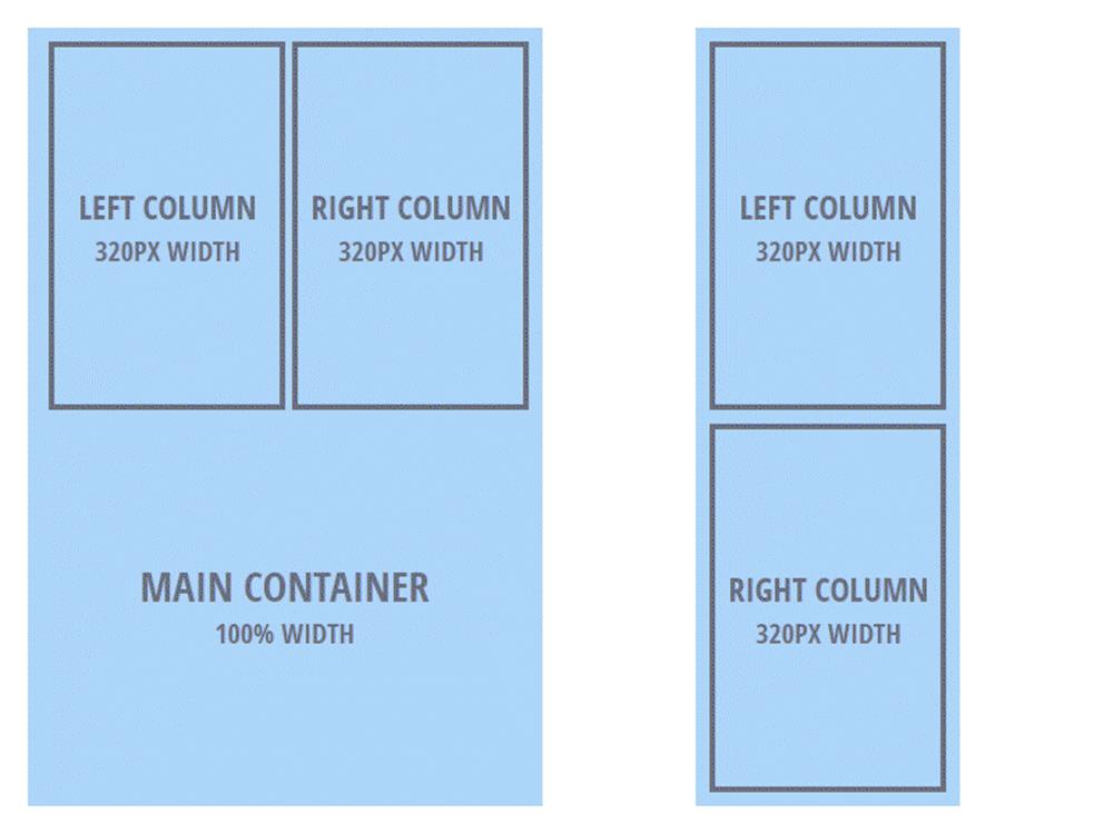
In multi-column layouts, stacking can happen automatically on small displays using widths and alignment.
In multi-column layouts, stacking can happen automatically on small displays using widths and alignment.
The use of the align attribute is absolutely crucial to multi-column email layouts stacking vertically without the use of media queries because it acts almost exactly like the CSS float property when placed on a table element.
Why isn’t float used to shift a layout’s tables? Primarily because Outlook.com — a very widely used client — doesn’t support the property, meaning the tables stack vertically regardless of available space. The align attribute works just fine, however; it’s the float property’s granddaddy, and support for it is broad because it’s from the older HTML 4.01 specification, meaning it’s been baked into the rendering engines of every email client.
Unfortunately, desktop Outlook struggles with align. Though that’s primarily because of its wonky box model rendering, layouts based on aligned tables also suffer because Outlook 2007 and 2010 automatically insert a page break when a document reaches a length of 22 inches, or roughly 1,800 pixels. This oh-so-helpful feature is a direct result of Outlook’s Word-based rendering engine, and it causes aligned tables to wrap.
Without conditionally served markup, Outlook wreaks havoc with free-floating layouts.
Fortunately, there’s a fix for this issue: using Microsoft conditional comments to include additional Outlook-specific tables. This additional markup is used to corral an email’s floated layout structures, keeping them in place by compensating for desktop Outlook’s lack of max-width support, preventing aligned tables from wrapping unintentionally, and keeping the page-break bug from causing too much damage to a layout — all at a single stroke.
Mash the align attribute, fixed and fluid widths, and conditional comments together, and you get spongy development; your emails work across various screen sizes, all without relying on media queries, and even if they exhibit more complicated multi-column layouts.
PATTERN-BASED DESIGN
Achieving that kind of mobile-friendliness without using media queries requires a fair amount of careful planning, and not just with the overall layout structures of an email. To maintain layout and the flexibility established by the spongy development method, while still avoiding having to rely on media queries, we need to turn to the second major principle of robust responsive email: pattern-based design.
Involving the creation of discrete, modular blocks that can be shuffled around the same way the layout structures are, this principle allows for a great degree of flexibility while still retaining the semantically meaningful forms and orders that are critical to content.
These blocks are built in mostly the same way as the spongy layouts are, though they can be considered more micro in scale, as they’re meant to be nested inside broader structures.
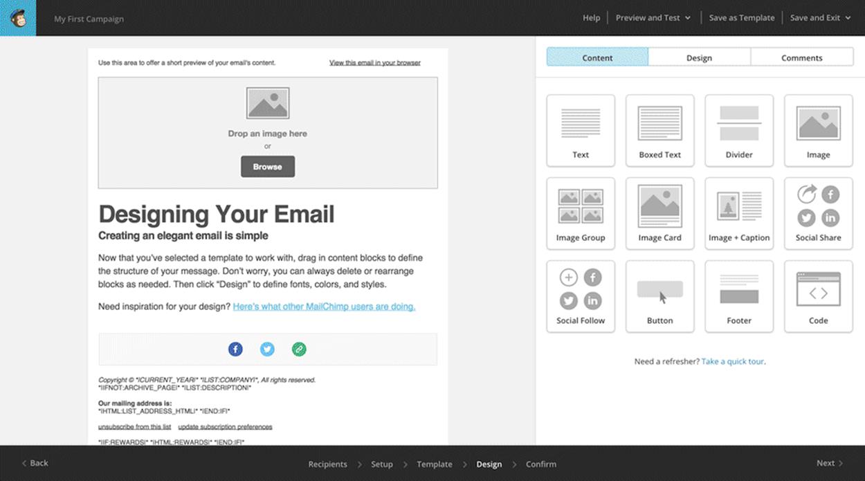
The idea of pattern-based design drives MailChimp’s drag-and-drop email editor.
Putting together a good pattern library requires a fair amount of work on the front end, but also frees you from having to build an email from scratch for every single project — a prospect that can easily become untenable. Additionally, because of email development’s inherent difficulty and the large amount of time that can be spent troubleshooting issues across multiple email clients, using a pattern library vastly reduces the amount of effort required to build an email that works well.
Even if it does make it much easier to quickly build emails later on, the scale of your project should be one of the deciding factors that affect whether or not pattern-based development is a worthwhile investment of your time.
Are you building email infrequently and sending sporadically? Then it might not be worth the effort required to build and maintain a pattern library. If you’re in a situation where sending frequency is high, however, and you’re required to spin up a lot of different emails quickly, then pattern-based design becomes a really attractive option.
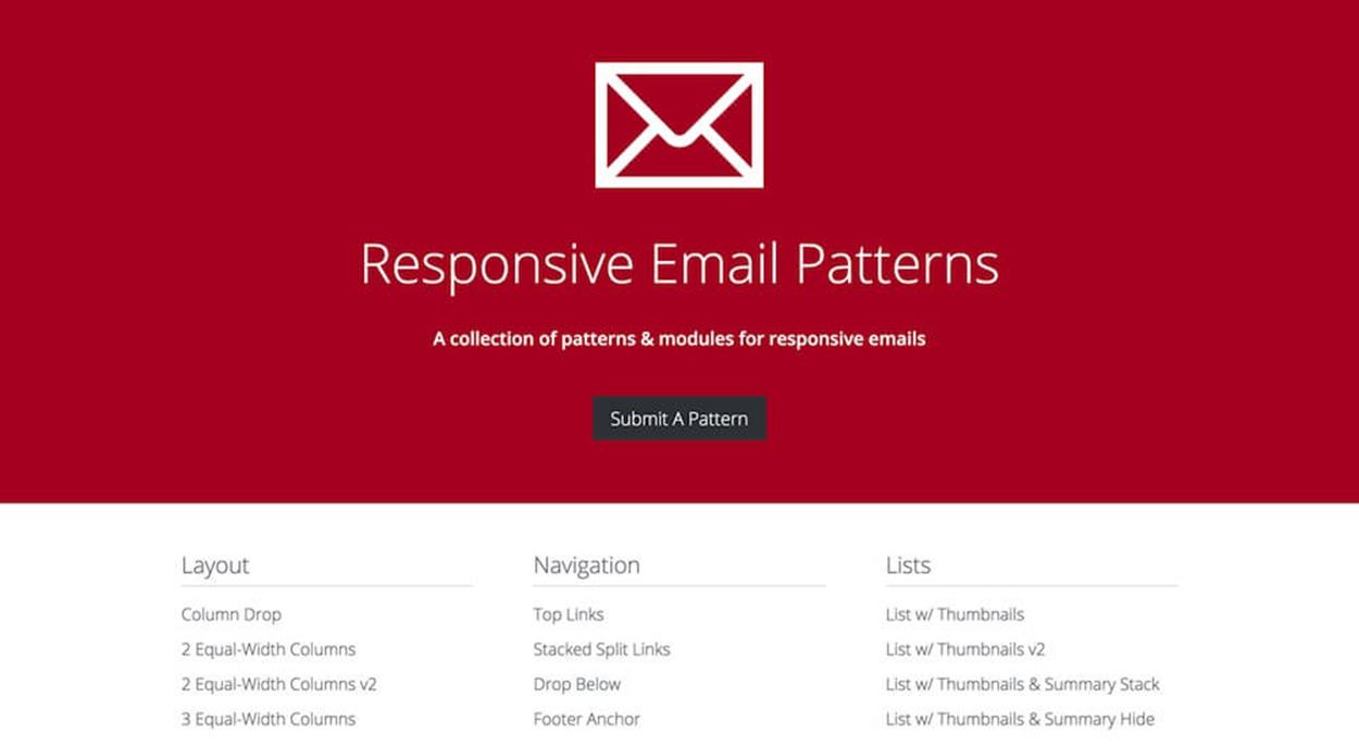
Responsive Email Patterns provides a large number of commonly used, pre-built email patterns.
Pattern-based design lends itself especially well to an automated building process. On this front, DEG’s Brian Graves18 and Code School’s Dan Denney19 have both done a lot of great work.
Graves’ approach, described in the Smashing Magazine article “Improve Your Email Workflow With Modular Design20”, details the creation of a framework of email-ready components, design and all, atop a static site generator; in this case, that generator is the popular Middleman, which also has Sass integrated for CSS.
Denney’s method, dubbed Emayll21, is similar in purpose, though maybe a little simpler in execution. Using a combination of Jekyll, Haml, and YAML, Emayll allows the automated creation of email templates in a markup format that’s a little cleaner than straight HTML.
Regardless of which approach you choose, the creation of a pattern library for email means defining, designing and building patterns using a practical methodology. In figuring out how pattern-based emails would work in MailChimp’s email designer, I worked through a process of:
1. Anticipating common use cases
2. Determining patterns for those use cases
3. Creating modular HTML structures based on those patterns
By anticipating common use cases, you establish rough ideas of just what sorts of content structures you’ll need to develop for your particular requirements. The idea of purposeful design plays a significant role here because those email types discussed earlier lay much of the necessary groundwork in working out an email’s primary use case.
Take the Buy Me email as an example; because we know that they’re built around the enticement to spend money, we can determine a pattern within that use case, the product block.
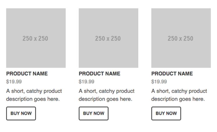
An image, name, price, description and call to action: a commonly seen retail pattern.
Once you know that pattern will be useful in a library, creating a modular HTML structure based on that pattern is the next step. Here, it pays to take time to think on different iterations of the pattern, then build them as well.
Regardless of use case, and despite how different one email might be from the next, they all share common components. Buttons, product blocks, captioned images, callouts, and much more — by examining these common threads between the types of email, some shared design patterns begin to emerge, and you can then compile a list of content blocks your pattern library needs.
MEDIA QUERIES
At their cores, both spongy development and pattern-based design are used as methods to overcome the more significant issues caused by the poor rendering capabilities of desktop Outlook and Gmail mobile clients.
Essentially, each of the methods is focused on the graceful degradation side of the email design equation, and allows an email developer to concentrate on simplicity and stability in an email’s markup, having only to rely on more well-supported HTML elements and CSS2 properties.
But Outlook and Gmail aren’t the only email clients out there, they’re just the worst, and good design and development never serve just the lowest common denominator. You can push an email beyond the basics, to include more sophisticated styling, because the principle of progressive enhancement holds as true in email design as it does in web design.
While it’s true that the media query has varying levels of support across email clients, that support isn’t as weak as you’d expect, especially given the dominance of mobile email; over 50% of all email opens happen on mobile devices, meaning you can take advantage of clients that generally have more competent rendering engines than those found in desktop and webmail clients, and make use of them to enhance the experience of an email as a whole.
The good stuff’s not only happening on mobile, however; many webmail clients have made great strides to further increase support for more advanced CSS in the last couple of years, including media queries. Outlook.com, Yahoo Mail and AOL all support the use of media queries, while Gmail does not. On the desktop client front, Apple Mail, Mozilla Thunderbird, and Windows Live Mail also have media query support. That’s not a bad collection of email clients, truth be told.
Using them in email is virtually no different from doing so on a website; the same syntax applies, and the same media features can be used:
@media only screen and (max-width:480px){
#emailContainer{width:480px !important;}
p{font-size:18px !important;}
}
The only significant difference between media queries for email and media queries for websites is a more liberal use of !important. This is necessary because all CSS in an email must be inlined, meaning those inlined properties have a level of specificity that can only be overridden by the !important declaration.
Combining spongy development with pattern-based design, and using media queries to smooth out the rough edges of both, then going further to provide more advanced styling means you end up with an email that performs well regardless of the email client or display size it’s viewed in.