SEO For Dummies, 6th Edition (2016)
Part I. Getting Started with SEO
Chapter 5. Making Your Site Useful and Visible
In This Chapter
![]() Understanding the basic rule of Web success
Understanding the basic rule of Web success
![]() Knowing why search engines like content
Knowing why search engines like content
![]() Making your site work for visitors and search engines
Making your site work for visitors and search engines
Obviously, it’s important to create Web pages that search engines will read and index, pages that you hope will rank well for important keywords. But if you’re going to build a Web site, you need to step back and figure out what purpose the site should serve and how it can accomplish that purpose.
Learning from Amazon
Creating a useful site is the key. Even if your sole aim is to sell a product online, the more useful the site is to visitors (and, for the same matter, the more user-friendly your site), the more successful it’s likely to be. Take Amazon.com, for instance. It certainly wasn’t the first online retailer of books and music, or any of the other products it offers. But one of Amazon’s real strengths is that it doesn’t just sell products; it’s a really useful site, in many ways:
· It provides tons of information about the products it sells. The information is useful even if you don’t buy from Amazon.
· You can save information for later. If you find a book you’re interested in but don’t want to buy right now, save it in your Wishlist and come back next month, next year, or five years from now.
· You can read sample chapters, look at tables of contents, listen to snippets of music, and so on.
· You can read product reviews from both professional reviewers and consumers.
Would Amazon be so successful if it just provided lists of the products it sells, instead of offering visitors a veritable cornucopia of useful stuff? Absolutely not.
Having done a little consulting work for Amazon, I’ve spent some time looking at the site from an SEO perspective, and what interests me are the many ways in which Amazon drops keywords into their pages. As you discover elsewhere in this book, keywords on Web pages are a huge part of SEO — and Amazon’s pages are scattered with keywords. Take a look at the books pages, for instance, and you’ll find the following:
· Editorial Reviews: These are descriptions of the book by the publisher, stacked full of keywords related to the subject covered by the book.
· Customer Reviews: When someone reviews a book about, say, Search Engine Optimization, they tend to use words related to the subject, such as websites, SEO, programming, PHP, sitemaps, link bait, and so on.
· Customer Discussions: Amazon also has discussion groups for virtually every product it sells. And when people talk about a product, they’re going to use keywords that are related to that product.
· Popular Highlights: For Kindle books, text from the book that has been highlighted by readers.
· Statistically Improbable Phrases: These are unusual phrases that appear in the book, which makes them great keywords, of course.
· Capitalized Phrases (CAPs): A CAP is a list of capitalized phrases in the book (often very relevant keywords).
· Tags customers associate with this product: The tag list is essentially a list of keywords that other customers associate with the book.
· Books on Related Topics: Other books will often have titles containing relevant keywords.
However, many of these features (and the other useful features on Amazon product pages) were added without SEO in mind. Amazon added most of these things to make the site useful — SEO was an afterthought. Reviews, for instance, certainly do add keywords to the page, but they also help buyers make a decision (and can dramatically increase conversion rates — that is, converting shoppers to buyers). So creating a useful site often serves two purposes: It generates traffic through non–search engine channels, and it helps your site rank well in search engines.
 Consider this: The more useful your site is, the greater the chance of success. The more useful or interesting your site, the more people will talk and blog about it, the more they are likely to link to it from social-networking sites (see Chapter 19), the more likely journalists are to write about it, the more likely it is to be mentioned on radio or TV, the more people will link to it from their Web sites, and so on. Search engine marketing and non–search engine marketing are both important because both forms of Web site promotion can lead to more links pointing to, and more traffic arriving at, your site. And, as you find out in Chapter 16, links to your site are critical to search engine success.
With all these byproducts of having a useful Web site in mind, this chapter focuses on the basics about what you need to do to create a successful Web site.
Revealing the Secret But Essential Rule of Web Success
Here’s a simple rule to success on the Web:
Make your site useful and then tell people about it.
That’s not so complicated, really. Figure out how your site can be useful and then find as many ways as possible to let people know about it. You’ll use search engines, of course, but you should be using other methods, too. Remember, search engines are not the only way to get people to your site. In fact, many Web sites have succeeded without using search engines as their primary method of attracting visitors.
 Amazon — Success sans search
It’s unlikely that search engines were a large factor in Amazon’s success; Amazon grew rapidly mainly because of the enormous press attention it received, beginning in 1994. Today, a huge amount of Amazon’s traffic is direct; people already know the Amazon brand and go straight to the site, or they go through the hundreds of thousands of Amazon affiliate sites. On the other hand, you’ve probably noticed that Amazon does remarkably well in the search results for many, many product searches.
Many successful companies have done little or nothing to promote themselves through search engines, yet they still turn up at the top when you search for their products or services. Why? Because their other promotions have helped push them higher in the search engines by creating thousands (even tens or hundreds of thousands) of links to them around the Internet.
The evolving, incorrect “secret”
Over the last couple of decades, a number of popular ideas about what makes a successful Web site have been bandied around, and all are wrong to some degree. Here are some of those dated secrets to successful Web sites:
· Links: When the Web began booming in 1994, it was all about links. You would hear in the press that the secret to a successful Web site was linking to other sites.
· Cool: Then people started saying that the secret of success was to make your site cool. Cool sites were more entertaining and more likely to attract repeat visitors.
· Community: Then people started talking about community; yeah, that’s the ticket! The secret to a successful Web site was creating a community where people could meet and chat with each other.
· Content: Then around 2000, people discovered that the secret was content. By putting more stuff, particularly textual information, on your site, you could be more successful.
· Blogging: At some point, it was decided that the real secret was having a blog on your site.
· MySpace, Facebook, and Twitter: Later, the secret became having associated MySpace, Facebook, and Twitter accounts. (Remember MySpace!?)
Specific, one-size-fits-all secrets to success never make sense.
The most harmful of the preceding ideas was that your site had to be cool. This silly idea led to the expenditure of billions of dollars on useless but pretty Web sites, most of which (thankfully!) have since disappeared. Unfortunately, some of the it’s-all-about-cool crowd is still in the Web business and still convincing companies to spend money on ridiculous, wasteful things, such as Flash intros for their Web sites.
Uncovering the real secret
Ready to hear the real secret of site-creation success? Your Web site has to be useful. The problem with the secrets I mention in the preceding section is that they’re too specific, leading people to build sites that were in many cases inappropriate.
Sure, outgoing links are important to directory sites, but they’re much less important to the vast majority of Web sites. If you own an entertainment site, you may want to make it cool and entertaining. Certainly, community can be an effective tool, but not every site has to have it. Content is very important, too — especially from a search engine perspective — but many successful Web sites don’t have much content. (I talk in more detail about content in the next section because it’s a special case.)
As for MySpace, at one point it was common knowledge that “if you want to do business online you have to have a MySpace site.” You don’t hear that often today, and it was nonsense back then. Today, you hear a lot about Twitter and Facebook, and while they can be very important, not all Web sites can incorporate a successful Twitter and Facebook strategy.
I’ve been writing this since 1997: Forget cool; think useful.
When you’re planning your Web site, think about what kinds of folks you want to attract to the site. Then try to come up with ideas about what features and information might be useful to them. Your site may end up with a lot of link pages, providing a directory of sorts for people in your industry. Or maybe you really need a cool and entertaining site. Or, if you decide to use discussion groups and chat rooms as a way to build community and pull the crowds into your site, that’s fine. Or maybe you decide to create a huge repository of information to attract a particular type of customer. That’s okay, too. Maybe your target audience hangs out in MySpace; if so, perhaps you do need a MySpace page … and Facebook and Twitter accounts, too. Maybe you do all these things. But the important first step is to think about what you can do to make your site more useful, and not be distracted by the hype.
Showing a bias for content
Content is a special case. Search engines are biased toward ranking content-heavy Web sites well for a couple of reasons:
· Search engines were originally academic research tools designed to find text information. Search engines mostly index text — content.
· Search engines need something to base their judgments on. When you type a term into a search engine, it looks for the words you provided. So a Web site built with few words is at a disadvantage right from the start.
As you discover elsewhere in this book — such as in the discussion of PageRank in Chapter 16 — search engines do have other criteria for deciding if a Web site matches a particular search (most notably the number and type of links pointing to the site). But search engines still have a huge bias toward textual content.
Unfortunately, this bias is often a real problem. The real world simply doesn’t work the way search engines see it. Here’s an example: Suppose your business rents very expensive, specialized photographic equipment. Your business has the best prices and the best service of any company renting this equipment. Your local customers love you, and few other companies match your prices, service, or product range. So you decide to build a Web site to reach customers elsewhere and ship rentals by UPS and FedEx.
Search engines base your rank partly on the number and type of keywords in your pages.
To rank well, a competitor has added a bunch of pages about photography and photographic equipment to its site. To compete, you have to do the same. Do your customers care? No, they just want to find a particular piece of equipment that fills their need, rent it, and move on quickly. All the additional information, the content that you’ve added, is irrelevant to them. It’s simply clutter.
This is a common scenario. I once discussed the content issue with a client who was setting up a Web site at which people could quickly get a moving-service quote. The client wanted to build a clean, sparse site that allowed customers to get the quote within a couple minutes. “But we don’t want all that stuff, that extra text, nor do our clients!” he told me, and he had a good point.
You can’t ignore the fact that search engines like content. However, you can compete in other ways. One of the most important ways is getting links from other sites, as you discover in Chapter 16. Search engines like to see links on other sites pointing to your site. Sites that have hundreds or thousands of other sites linking to them often rank well. But they still need at least some content for the search engines to index. And the best situation is to have lots of useful content with lots of incoming links.
Making Your Site Work Well
I’ve been writing about site design for almost twenty years, and I’m happy to say that many of the rules of good site design just happen to match what search engines like. And many of the cool tricks that designers love cause problems with search engines. So I want to quickly review a few tips for good site design that will help both your site visitors and the search engines to work with your site.
Limiting multimedia
Much multimedia used on the Web is pointless because it rarely serves a useful purpose to the visitor. It’s there because Web designers enjoy working with it and because many people are still stuck in the old “you’ve got to be cool” mindset.
Look at the world’s most successful Web sites (with the exception of sites such as YouTube.com, of course, which are all about multimedia), and you’ll find that they rarely use multimedia — Flash animations and video, for example — for purely decorative purposes. Look at Amazon: Its design is simple, clean, black text on white background, with lots of text and very little in the way of animations, video, or sound (except, for instance, where it provides music samples in the site’s CD area and videos demonstrating products). Amazon uses multimedia to serve a purpose, not as decoration. Look at Yahoo!, Google, CNN, or eBay — they’re not cool; they just get the job done.
You can employ multimedia on a Web site in useful ways. I think it makes a lot of sense to use Flash, for instance, to create demos and presentations. However, Flash intros are almost always pointless, and search engines don’t like them because Flash intros don’t provide indexable content. Anytime you get the feeling it would be nice to have an animation, or when your Web designer says you should have some animation, slap yourself twice on the face and then ask yourself this: Who is going to benefit — the designer or the site visitor? If that doesn’t dissuade you, have someone else slap you.
Using text, not graphics
A surprising number of Web sites use graphics to place text onto pages. Many pages appear to have a lot of text, but when you look closely, you see that every word is in an image file. Web designers often employ this technique so that all browsers can view their carefully chosen fonts. But search engines don’t read the text in the images they run across, so this page provides no text that can be indexed by search engines. Although this page may contain lots of useful keywords (you find out all about keywords in Chapter 6), the search engines read nothing. From a usability perspective, the design is bad, too, because all those images take longer to download than the equivalent text would take.
As an SEO friend likes to say, “Google likes black text on a white background.” In other words, search engines like simple. The more complicated your Web pages are, the harder it is for search engines to read and categorize them. (Okay, this isn’t as true as it used to be. Still, lots of complicated technology can get in the way of indexing.)
You must strike a compromise between employing all the latest Web-design technology and tools and ensuring that search engines can read your pages. From a search engine perspective, in fact, one step behind probably isn’t enough!
Don’t be cute
Some sites do everything they can to be cute. The Coca-Cola site was a classic example of this a few years ago, though it finally got the message and changed. The site had icons labeled Tour de Jour, Mind Candy, Curvy Canvas, Netalogue, and so on. What do these things mean? Who knows? Certainly not the site visitor.
This sort of deranged Web design is far less common now than it used to be, but you still see it occasionally — particularly in sites designed by hip Web-design firms. One incredibly irritating technique is the hidden navigation structure. The main page contains a large image with hotspots on it. But it’s unclear where the hotspots are, or what they link to, until you point at the image and move the mouse around. This strikes me as the Web-design equivalent of removing the numbers from the front of the homes in a neighborhood. You can still figure out where people live; you just have to knock on doors and ask.
 Sweet and sickly cuteness doesn’t help your site visitors find their way around and almost certainly hurts you with the search engines.
Making it easy to move around
Web design is constantly getting better, but it still surprises me that designers sometimes make it difficult for visitors to move around a Web site.
Think carefully about how your site is structured:
· Does it make sense from a visitor’s standpoint?
· Can visitors find what they need quickly?
· Do you have dangling or orphaned pages — pages where a visitor can’t find a link to get back into your main site? Search engines don’t like dangling pages. And consider what happens if someone on another site links directly to the page: Visitors can get to the page through those links, but then can’t get to the rest of your site.
Providing different routes
People think differently from each other, so you need to provide them with numerous avenues for finding their way around your site. And by doing so, you’re also giving more information to search engines and ensuring that search engines can navigate your site easily.
Here are some different navigational systems that you can add to your site:
· Sitemap: This page links to the different areas of your site, or even, in the case of small sites, to every page in the site. See www.peterkentconsulting.com/sitemap.htm as an example.
· Table of Contents or Index page: You can sort the page thematically or alphabetically.
· Navigation bars: Most sites have navigation bars these days.
· Navigation text links: These are little links at the bottom of your pages, or along the sides, that can help people find their way around — and help the search engines, too.
Using long link text
It’s a proven fact that Web users like long link text — links that are more than just a single word and actually describe where the link takes you. Usability testing shows that long link text makes it much easier for visitors to find their way around a site. It’s not surprising, if you think about it; a long link provides more information to visitors about where a link will take them.
Unfortunately, many designers feel constrained by design considerations, forcing all navigation links, for instance, to conform to a particular size. You often see buttons that have enough room for only ten or so characters, forcing the designer to think about how to say complicated things in one or two words.
Long links that explain what the referenced page is about are a great thing, not only for visitors, but also for search engines. By using keywords in the links, you’re telling the search engines what the referenced pages are about.
You also have a problem if all the links on your site are on image buttons. Search engines can’t read images, so image buttons provide no information about the referenced page. You can’t beat a well-keyworded text link for passing information about the target page to the search engines.
Don’t keep restructuring
Try to ensure that your site design is good before you get too far into the process. Sites that are constantly being restructured have numerous problems, including the following:
· Links from other Web sites into yours get broken, which is bad for potential visitors as well as for search engines (or, more precisely, bad for your position in the search engines because they won’t be able to reach your site through the broken links).
· If you don’t restructure carefully, all the pages you have indexed in the search engines may be lost, so you have to start over from the beginning — and it may take weeks or months to get fully reindexed.
· Anyone who has bookmarked your page now has a broken bookmark.
On the other hand, you can resolve these problems through the use of a 301 redirect; see Chapter 24 for information.
 It’s a good idea to create a custom 404 error page, which is displayed in your browser if the server is unable to find a page you’ve requested. (Ask your Web server administrator how to create this page; the process varies among servers.) Create an error page with links to other areas of the site, perhaps even a sitemap, so that if visitors and searchbots can’t find the right page, at least they’ll be able to reach some page on your site.
Editing and checking spelling
Check your pages for spelling and editing errors. Error-free pages not only make your site appear more professional but also ensure that your valuable keywords are not wasted. If potential visitors are searching for rodent racing, for example, you don’t want the term rodint racing in your Web pages. (Except, that is, if you are trying to catch traffic from oft-misspelled keywords, which I discuss in Chapter 6.)
Ugly doesn’t sell
Before I move on, I really have to cover this, um, sensitive subject, because I’ve run into a lot of people wasting money on SEO that would be better spent on Web design.
You see, I often get e-mails from people saying that they’ve had their site up “for months now, and haven’t sold a thing; can you take a look and tell me why?” I type the URL into my browser, wait for the page to load, and I’m then knocked out of my chair by the unadulterated grotesqueness of the page. (I now keep a pair of very heavily shaded sunglasses — polarized, UV-filtered, glare-protected glacier glasses — for these very cases. If I get a feeling about the site I’m about to see, on go the glasses.)
I don’t get it. I know some people are colorblind, but are some ugly blind? Can’t they see the ugliness? During my phone-consulting sessions, I’ll sometimes have to load my client’s site into a browser window, load a competitor’s site into another window, and ask the client, “Now which site would you rather buy from?” (For example, the site in Figure 5-1 or the site in Figure 5-2?)
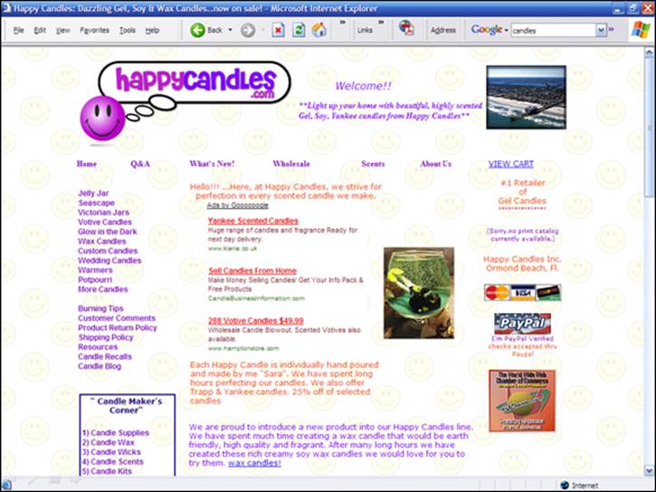
Figure 5-1: Would rather you buy from this site …
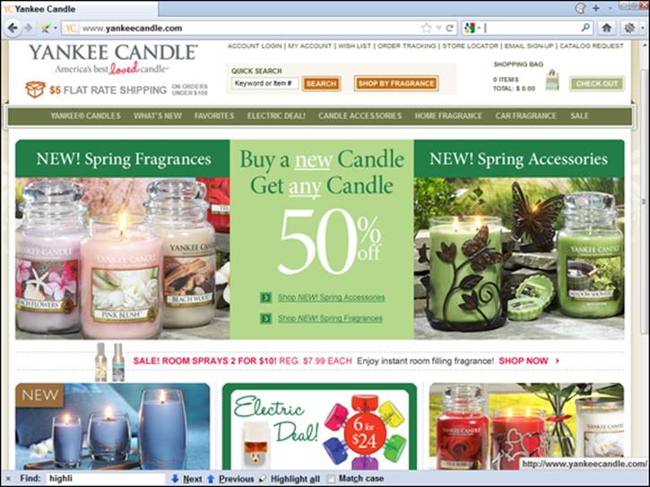
Figure 5-2: …or this one?
Here’s the fact: Ugly doesn’t sell. By ugly, I mean a range of problems:
· Awful color combinations that just don’t work
· Terrible typeface choices that make the pages close to unreadable
· Combinations of fonts and colors that make the text close to unreadable — such as white text on black backgrounds (no, it’s not cool; ask yourself, why do virtually all the world’s top Web sites use black text on a white background?)
· Cutesy backgrounds that look … cutesy, not professional
· Incredibly clunky images that look as though they were created by an amateur in front of the TV one evening
· Messy page layouts that look amateurish
I sometimes help clients build Web sites, but I know my limitations. I’m not a graphic designer and don’t pretend to be one; I’ll build sites but find an expert to do the graphic design. Way too many people out there have decided to play graphic designer. If you’re not one, don’t try to act like one.
Having said that, be careful with graphic designers. Too many people in the Web business build beautiful pages that aren’t particularly functional, and some of them like to use every graphic design tool in the box, making your site beautiful but unusable.
This is not merely a matter of aesthetics. In fact, I’m not saying that you need a beautiful Web site — just a professional-looking site. The fact is, sites that look unprofessional, as though they were built by a couple of guys who just learned HTML last week after they got home from work in the evenings, have trouble converting visitors to buyers. Would you buy from a site that looks as though it were built by one-handed gnomes? Well, if you wouldn’t, why would other people? They don’t.
By the way, I do understand that many small businesses have money issues; they can’t afford a top professional designer. But there is actually no direct correlation between good Web design and dollars. It’s possible to pay very little and get a decent site or to pay a lot and get garbage.
If, thanks to budgetary considerations — you’re stone cold broke and plan to pay the designer with food and beer — you have to use Cousin Joe, the fireman, to create your site, or perhaps your sophomore daughter, Jenny (I’ve seen both situations), and if Joe or Jenny has, let’s say, less-than-adequate design skills, what do you do? Buy some templates! Search online for Web page templates and then spend a few hours looking for something nice. Even if you have the slimmest of budgets and have to use a nondesigner to create your site, you still shouldn’t settle for bad design.
There’s a level below which you must not go. Remember the phrase, “The kingdom was lost for the want of a nail”? Or, “Penny smart, pound foolish”? Well, no amount of search engine optimization will make up for bad Web design. You might have the best SEO in the world and rank #1 for all your keywords — but if your visitors land on a dreadful site, all is for naught.
Panda — Google Endorses Good Design
Starting early in 2011, Google began making major updates to its search algorithm using the code name Panda. This multistage update has continued to this day, as Google keeps getting better at figuring out design issues. (The algorithm is reportedly named after a Google engineer, Navneet Panda.)
Google’s Panda update is an important step in an attempt to weed out Web sites that people are unlikely to appreciate and to downgrade Web sites that people don’t find useful or that are irritating in some way. Google is now not just trying to rank sites based on whether the information someone is searching for is present, but whether that information is presented in a way that people are likely to find acceptable.
Google had a quality-rating panel — a group of real users — look at sites and say what they liked and what they didn’t. Then Google’s programmers “coded” that, so Google’s programs could examine Web pages and decide whether or not people would like them.
What sorts of things have an effect? One thing I know for sure, because Google has publicly stated this, is that Google now looks at page-layout issues and in particular advertising placement. Too many ads, in the wrong places, and your site will be downgraded.
You’ve seen sites that are overwhelmingly ads, right? You land on a page, and have to dig your way through ads to get to the content. Well, you don’t like it, other people don’t like it, and now Google doesn’t like it. As Matt Cutts said on Google’s Inside Search blog (http://insidesearch.blogspot.com/2012/01/page-layout-algorithm-improvement.html):
“… we’ve heard complaints from users that if they click on a result and it’s difficult to find the actual content, they aren’t happy with the experience. Rather than scrolling down the page past a slew of ads, users want to see content right away. So sites that don’t have much content “above-the-fold” can be affected by this change. If you click on a website and the part of the website you see first either doesn’t have a lot of visible content above-the-fold or dedicates a large fraction of the site’s initial screen real estate to ads, that’s not a very good user experience. Such sites may not rank as highly going forward.”
So suddenly, user experience has become much more important. No longer can you worry about merely using the search engines to get people to your site and forget about how people like your site when they get there. Of course, that was always a bad strategy, but it’s even worse now, because Google is now in effect pre-approving sites, removing sites that are great matches for a searcher’s search terms yet that it believes the searcher won’t like when he arrives.
A few years ago, a client asked me to help him get more search-engine traffic to his site because he wasn’t making enough sales. But that wasn’t his problem; his site was dreadful, ugly and unprofessional. I redesigned the Web site, and a few days after the launch, my client called and said, “I don’t know what you did in the search engines, but my phone is ringing off the hook!” In fact, I had not yet done anything much related to SEO; his site already had enough traffic to make the phone ring off the hook. I just had to make the site friendlier — not to search engines, but to real people. So it’s always been a good idea to review your Web site from the perspective of a visitor arriving at the site. It’s just good business sense.
Today, it’s even more important. You need to look at your site from the viewpoint of your visitors and potential customers, think about what they want to see and consider whether they would like the site. Is your site ugly? Is it cluttered with ads? Is it hard to find one’s way around the site? Or is your site interesting, useful, and engaging? Will visitors want to stick around? Or will they almost immediately click the Back button? Today, after Panda, Web site usability has become an SEO issue every bit as much as keyword placement and linking always were.
Note, by the way, that this is not just a Web-page issue, but a sitewide issue. Google will examine your pages and then decide whether your site is nice or nasty. You may have some really good pages on your site, but if the overall site is not liked, even the good pages may not do well in the search results.
So, what sort of specifics should you look for?
· Advertising: Advertising placement is important. Do you have too many ads above the fold (high up on the page)? Does the advertising overwhelm the content?
· Light on content: Pages with lots of navigation links and sitewide template components, but not a lot of content, may be a problem.
· Duplication: If your site contains lots of pages that are essentially duplicates (the same content reworked with different keywords), you may have a problem.
· Garbage content: Is the content on your pages essentially garbage? Badly written text purely created to hold keywords? If Google can’t figure it out now, it will be able to soon.
· Hard to read: Are your Web pages hard to read? Perhaps the font is too small, or you use huge blocks of dense text, which are really hard for people to deal with (break them up into smaller chunks of text, add some whitespace and perhaps some images, and narrow the column!). Or perhaps you use light-color text on a dark background (long known to discourage people from reading). Such problems are disliked by real people and thus likely to end up in Google’s Panda.
· Design issues: Remember, Panda is ongoing; now that Google has started considering user experience on the Web site, it will continue evolving the mechanisms it uses. I’m betting that eventually (maybe already), ugly will become a problem.
However, please don’t over-extrapolate. Don’t think you need a multimillion dollar budget and months of usability testing to compete in the search engines. A little commonsense about site usability goes a long way.
Keep It Fresh (Perhaps)
Finally, a quick word on freshness. Late in 2011, Google announced that it was modifying its algorithm to take content age into account more frequently. As is common in the SEO business, there was talk about how “everything had changed” and dire predictions that in order to compete, every Web site would have to be continually updated. It’s nonsense.
What Google was up to was simply recognizing that for some searches, freshness is essential. That’s just commonsense, and Google was simply announcing that it was planning to do a better job of finding recent content when someone searched, for instance, for information on news, sporting events, celebrities, and the like. So that means if your Web site is related to the type of information that is likely to require up-to-date information, you’d better provide it. It doesn’t mean that pizza parlors and sites related to Egyptology will have to update their content every day in order to stay ranked.