iOS 9 Swift Programming Cookbook (2015)
Chapter 3. The User Interface
3.2 Customizing Stack Views for Different Screen Sizes
Problem
You want to customize the way your stack views appear on the screen, based on the screen size they are running on.
Solution
Use size class customization features of Xcode, right in the attributes inspector.
Discussion
You might have noticed tiny + buttons in various places inside IB. But what are they? Have you used them before? If not, you are missing out on a lot and I’m going to show you how to take advantage of them.
Size classes are encapsulated information about the dimensions of the current screen: possible values are regular, compact and any. These sizes have been defined to stop us from thinking in terms of pixels. You either have a regular size or compact size.
Imagine your iPhone 6+ in portrait mode. The screen width is compact, and the screen height is regular. Once you go to landscape mode, your screen width is regular and your height is compact. Now imagine an iPad in portrait mode. Your screen width is regular and so is your height. Landscape, ditto.
Let’s work on a project to get the idea more clearly. I want us to achieve the effect shown in Figure 3-4 when running our app on iPhone on portrait mode.
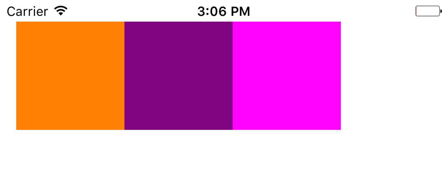
Figure 3-4. In portrait, our views have no spacing between them
And when we go to landscape, I want us to have 10 points spacing between the items, but only when the height of the screen is compact (Figure 3-5).

Figure 3-5. With compact screen height, we want spacing to be applied between our views
We get started by creating 3 colorful views on our main storyboard. I leave the colors to you to decide. Select all your views and then press the little stack button (Figure 3-3) in IB to group your views horizontally. Then place your stacked view on the top left of the view with proper top and left margin spacing (see Figure 3-6).
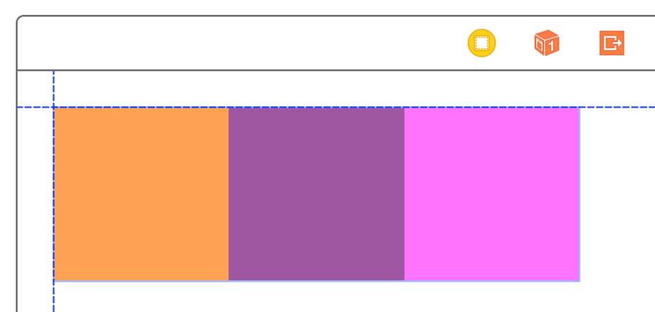
Figure 3-6. The IB guidelines appear when the view is on top left of the super view
Once done, make sure your stacked view is the selected view and then press the Resolve Auto Layout issues button (the right-most button in Figure 3-3). Under Selected Views, choose “Reset to Suggested Constraints”.
Now choose your stack view. In the attribute inspector, under the Spacing section, find the little + button and press it. In the popup, choose Any Width and then under that choose Compact Height. This will give you an additional text field to write the desired spacing value for any screen width while the height of the screen is compact. Put the value of 10 in this box (see Figure 3-7).
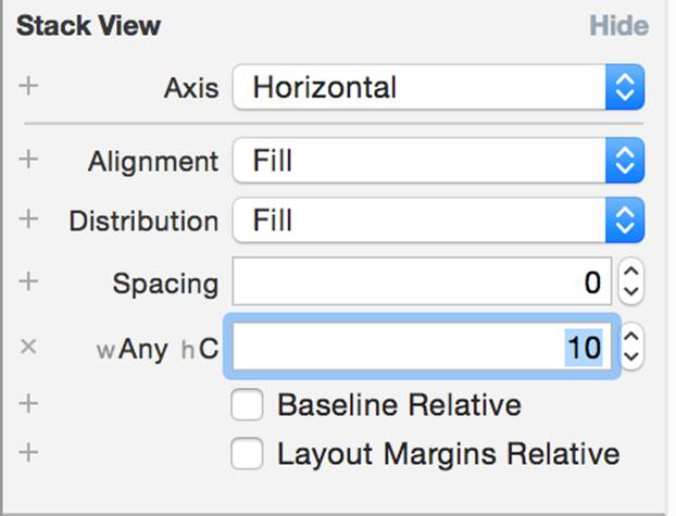
Figure 3-7. Place the value of 10 in the new text box
If you run your app on an iPhone 6+ and then switch to landscape, you won’t see any spacing between the items--so what happened? The problem is that in landscape mode, we are not increasing the width of our stack view. It doesn’t currently have extra width to show the spaces between the views. To account for this, let’s first add a normal width constraint to our stack view. You can do that by selecting the stack view in the list of views that you have, holding down the Control button on your keyboard and dragging from the stack view to the stack view itself. You will now get a popup. Choose Width in this popup (see Figure 3-8).
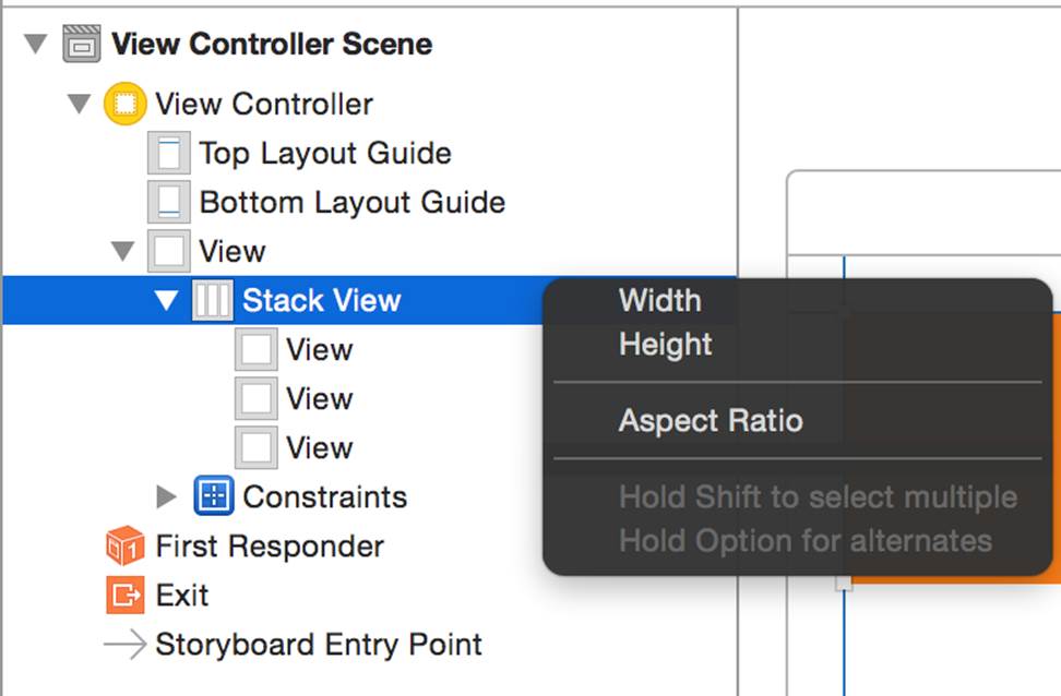
Figure 3-8. Choose the Width option in the popup to add a width constraint to the stack view
While your stack view is selected, go to the Size inspector and double click on the Width constraint that we just created. This will allow you to edit this constraint with size classes. How awesome is that? Next to the Constant text box, I can see the value of 300. You might see a different value based on the width of the views you placed in your stack view. My views were each 100 points wide, hence x3 comes to 300 points. I can also see a little + button next to the Constant box. Press that button and add a new constant for “Any Width and Compact Height” and set the value to N+20, where N is the value of your current constant. For me N is 300, so I’ll enter the value of 320 in the new box (see Figure 3-9).
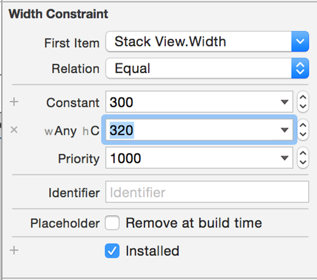
Figure 3-9. Add a new width constant class to the stack view
There is one more thing that we need to tell the stack view in order for it to stack our views correctly when its width changes. Select the stack view and in attributes inspector. Under the Distribution section, change the default value to Equal Spacing. Now run your app and enjoy the awesomeness that you just created. Rotate from protrait to landscape under any iPhone simulator (not iPad).
See Also