Microsoft® Visual C#® 2012 Step by Step (2012)
Chapter 25. Implementing the User Interface for a Windows Store App
After completing the chapter, you will be able to
§ Describe the features of a typical Windows Store app.
§ Implement a scalable user interface for a Windows Store app that can adapt to different form factors and device orientations.
§ Create and apply styles to a Windows Store app.
Microsoft Windows Store apps are based on a new paradigm for applications that is arguably the biggest change in Windows client application development since the advent of the Microsoft .NET Framework just after the turn of the millennium. The continuously connected, touch-driven interface of Windows 8 together with the use of Windows contracts for interacting with other applications, the support for embedded sensors, and an updated application security and life-cycle model changes the way that users and applications work together. Microsoft Visual Studio 2012 enables developers to easily design and implement applications that can take advantage of the new features of the Windows 8 platform.
The purpose of this chapter is to provide a brief description of this new paradigm and help you to get started using Visual Studio 2012 to build applications that operate in this environment. In this chapter, you will learn about some of the new features and tools included with Visual Studio 2012 for building Windows Store apps, and you will start to build a Windows Store app that conforms to the Windows 8 look and feel. You will concentrate on learning how to implement a user interface that scales and adapts to different device resolutions and form factors, and how to apply styling to give the application a distinctive look and feel.
NOTE
There is not enough space in a book such as this to provide a comprehensive treatise on building Windows Store apps. Rather, these final chapters concentrate on the basic principles of building an interactive application that uses the Windows 8 user interface. For detailed information on writing Windows Store apps, visit the “Learn to build Windows Store apps” page on the Microsoft website at http://msdn.microsoft.com/library/windows/apps/xaml/BR229566.
What Is a Windows Store App?
A Windows Store app is a graphical application that has a distinctive look and feel, based on a few simple principles that you will learn about in this chapter and in Chapter 26, and Chapter 27 Windows Store apps are highly interactive, placing the user at the center of their operations. Microsoft has invested a significant amount of time (and money) in studies that examined how users like to work with applications and the most effective ways of displaying data and interacting with that data. The designers at Microsoft have applied this knowledge to develop the model that Windows Store apps should follow.
When a Windows Store app runs, it typically occupies the full screen, although Windows Store apps can operate in different display modes that you will learn about in this chapter. They are chromeless, meaning they do not have borders, drop-down menus, pop-up windows, or many of the other user interface features that can serve as a distraction to users. Instead, you design a Windows Store app to be clean and focused on helping the user to perform a specific set of tasks. Additionally, Microsoft has performed investigations into areas such as readability, and the company has documented guidelines illustrating the standardized use of fonts, weights, spacing, and positioning for text.
NOTE
You can find lots of information about the design features of Windows Store apps online on the Microsoft website. Specifically, the webpage “Designing UX for apps” available at http://msdn.microsoft.com/library/windows/apps/hh779072.aspx provides guidance on planning the features that a Windows Store app should implement and how to design the application to provide the optimal user experience.
Many modern handheld and tablet devices enable users to interact with applications by using touch, and you should design your Windows Store apps based on this style of user experience. Windows 8 includes an extensive collection of touch-based controls that also work with the mouse and keyboard if the user does not have a touch-sensitive device. You don’t need to separate the touch and mouse features in your applications; simply design for touch and users can still operate by using the mouse and keyboard if they prefer or if they are using a device that does not support this style of interaction.
Subtle, fluid, and discrete animations are also an important aspect of the entire user experience. The way in which the graphical user interface (GUI) responds to gestures to provide feedback to the user can greatly enhance the professional feel of your applications. The Windows Store app templates included with Visual Studio 2012 include an animation library that you can use in your applications to standardize this feedback and blend in seamlessly with the operating system and software that Microsoft provides.
NOTE
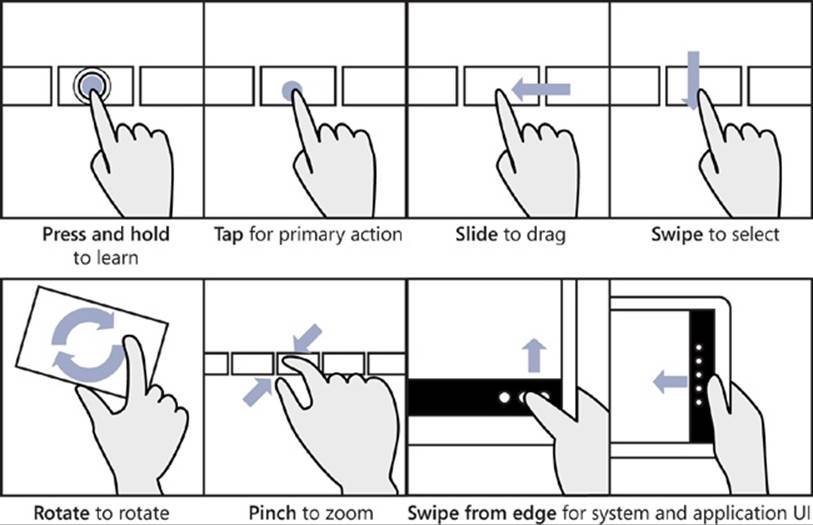
The term gesture refers to the manual touch-oriented operations that a user can perform. For example, a user can tap an item with a finger, and this gesture typically responds in the same way that you would expect a mouse-click to behave. However, gestures can be far more expressive than the simple operations that can be captured by using a mouse. For example, the “rotate” gesture involves the user placing two fingers on the screen and describing the arc of a circle with them; in a typical Windows 8 application, this gesture should cause the user interface to rotate the selected object in the direction indicated by the movement of the fingers. Other gestures include “pinch” to zoom in on an item to display more detail, “press and hold” to reveal more information about an item (similar to performing a right-mouse click), and “slide” to select and drag an item across the screen.
The Windows 8 user interface employs a number of its own specific gestures for interacting with the operating system. For example, you can “swipe” the currently running application to the bottom of the screen to terminate it, or you can swipe from the left or right edge of the display to view the Windows system icons.
Windows 8 is intended to run on a wide range of devices, from desktop computers and laptops through to tablet computers and small handheld devices and smartphones. An important reason for building Windows Store apps is to enable you to construct software that adapts to the environment in which it is running, scaling automatically to the screen size and orientation of the device. This approach opens up your software to an increasingly broad market. Additionally, many modern devices can also detect their orientation and the speed at which the user changes this orientation through the use of built-in devices and accelerometers. Windows Store apps can adapt their layout as the user tilts or rotates a device, enabling the user to work in a mode that is most comfortable for that individual. You should also understand that mobility is a key requirement for many modern applications, and Windows Store apps enable users to roam; their data can migrate through the cloud to whatever device they happen to be running your application on at a particular moment.
Windows Store apps can also support a number of features that enable interactions with other applications as well as the Windows 8 operating system. These features are based on a standardized mechanism known as a contract. A contract defines a Windows 8 interface that enables an application to implement or consume an operating system–defined feature, such as the ability to share data or support search requests. Using contracts, Windows Store apps can communicate with each other without introducing any application-specific dependencies. You will learn more about Windows 8 contracts in Chapter 26.
The lifetime of Windows Store app is somewhat different from that of a traditional desktop application. At any given point in time, Windows 8 just runs the application that occupies the area of focus on the screen, and if you switch to a different application, that application becomes the focus and moves to the foreground while the original application is suspended. Windows 8 may actually decide to close a suspended application if system resources, such as memory, need to be released. When the application next runs, it should be able to resume from where it left off. This means that you need to be prepared to manage application state information in your code, save it to disk, and restore it at the appropriate juncture.
NOTE
You can find more information about how to manage the life cycle of a Windows Store app on the Microsoft website. Look for the page “How to suspend an app” at http://msdn.microsoft.com/library/windows/apps/xaml/hh465115.aspx, and the page “How to resume an app” at http://msdn.microsoft.com/library/windows/apps/xaml/hh465110.aspx.
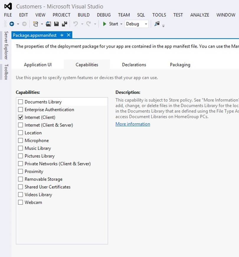
When you build a new Windows Store app, you can package it using the tools provided with Visual Studio 2012 and upload it to the Windows Store. Other users can then connect to the store, download your application, and install it. You can charge a fee for your applications, or you can make them available free of charge. This distribution and deployment mechanism depends on your applications being trustworthy and conforming to security policies specified by Microsoft. When you upload an application to the Windows Store, it undergoes a number of checks to verify that it does not contain malicious code and that it conforms to the security requirements of a Windows Store app. These security constraints dictate how your application accesses resources on the computer on which it is installed. For example, by default a Windows Store app cannot write directly to the file system or listen for incoming requests from the network (two behaviors commonly exhibited by viruses and other malware). However, if your application needs to perform operations such as these, you can specify them as capabilities in the application manifest by using the manifest editor in Visual Studio 2012. You can double-click the Package.appxmanifest file in Solution Explorer to open the manifest editor.
NOTE
You can find more information about the capabilities that Windows Store apps support on the “App capability declarations” page on the Microsoft website at http://msdn.microsoft.com/library/windows/apps/hh464936.aspx.
This information is recorded in the metadata of your application and enables Microsoft to perform additional tests to verify the way in which these features are used in your application. There are also limitations on how these operations work, to protect the computers on which your application is installed. For example, you can indicate that your application requires access to the files in the Documents folder, but you cannot read or write files located elsewhere on the host computer.
Enough theory—let’s get started building a Windows Store app.
Using the Blank App Template to Build a Windows Store App
The simplest way to build a Windows Store app is to use the Windows Store app templates included with Visual Studio 2012 on Windows 8. Visual Studio 2012 provides three primary templates for this purpose: Blank App, Grid App, and Split App. Each of these templates enables you to quickly create applications that conform to Windows 8 user interface guidelines based on the model recommended by Microsoft. In addition, they generate a considerable amount of code, and it helps to understand how this code is structured so that you can adapt it to your own applications and data requirements. The Windows 8 versions of the applications used in earlier chapters made use of the Blank App template, and this is a good place to start.
In the following exercises, you will design and implement the user interface for a simple application for a fictitious company called Adventure Works. This company manufactures and supplies bicycles and associated paraphernalia. The application will enable a user to enter and modify the details of Adventure Works’s customers.
Create the Adventure Works Customers application
1. Start Visual Studio 2012 if it is not already running.
2. On the FILE menu, point to New, and then click Project.
3. In the left pane of the New Project dialog box, expand Templates, expand Visual C#, and then click Windows Store.
4. In the middle pane, click the Blank App (XAML) icon.
5. In the Name field, type Customers.
6. In the Location field, type \Microsoft Press\Visual CSharp Step By Step\Chapter 25 under your Documents folder.
7. Click OK.
The new application is created, and the App.xaml.cs file is displayed in the Code and Text Editor window. You can ignore this file for the time being.
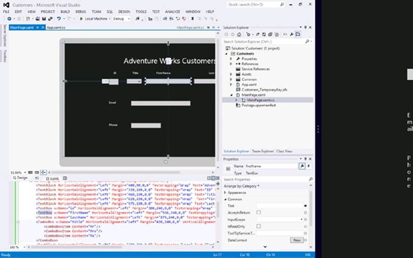
8. In Solution Explorer, double-click MainPage.xaml.
The Design View window appears and displays a blank page. You can drag controls from the Toolbox to add the various controls required by the application, as you did back in Chapter 1 However, for the purposes of this exercise, it is more instructive to concentrate on the XAML markup that defines the layout for the form. If you examine this markup, it should look like this:
<Page
x:Class="Customers.MainPage"
xmlns="http://schemas.microsoft.com/winfx/2006/xaml/presentation"
xmlns:x="http://schemas.microsoft.com/winfx/2006/xaml"
xmlns:local="using:Customers"
xmlns:d="http://schemas.microsoft.com/expression/blend/2008"
xmlns:mc="http://schemas.openxmlformats.org/markup-compatibility/2006"
mc:Ignorable="d">
<Grid Background="{StaticResource ApplicationPageBackgroundThemeBrush}">
</Grid>
</Page>
The form starts with the XAML <Page> tag and finishes with a closing </Page> tag. Everything between these tags defines the content of the page.
The attributes of the <Page> tag contain a number of declarations of the form xmlns:id = “...”. These are XAML namespace declarations, and they operate in a similar manner to C# using directives inasmuch as they bring items into scope. Many of the controls and other items that you can add to a page are defined in these XAML namespaces, and you can ignore most of these declarations. However, there is one rather curious-looking declaration that you should pay attention to:
xmlns:local="using:Customers"
This declaration brings the items in the C# Customers namespace into scope, enabling you to reference classes and other types in this namespace in your XAML code by prefixing them with local (you will see why you might want to do this later in this chapter). The Customersnamespace is the namespace generated for the code in your application.
9. In Solution Explorer, expand MainPage.xaml, and then double-click MainPage.xaml.cs to display it in the Code and Text Editor window.
10.Remember from the exercises earlier in this book that this C# file contains the application logic and event handlers for the form. It looks like this (the using directives at the top of the file have been omitted to save space):
11.// The Blank Page item template is documented at http://go.microsoft.com/
12.fwlink/?LinkId=234238
13.
14.namespace Customers
15.{
16. /// <summary>
17. /// An empty page that can be used on its own or navigated to within a Frame.
18. /// </summary>
19. public sealed partial class MainPage : Page
20. {
21. public MainPage()
22. {
23. this.InitializeComponent();
24. }
25.
26. /// <summary>
27. /// Invoked when this page is about to be displayed in a Frame.
28. /// </summary>
29. /// <param name="e">Event data that describes how this page was reached.
30. /// The Parameter
31. /// property is typically used to configure the page.</param>
32. protected override void OnNavigatedTo(NavigationEventArgs e)
33. {
34. }
35. }
}
This file defines the types in the Customers namespace. The page is implemented by a class called MainPage, and it inherits from the Page class. The Page class implements the default functionality of a XAML page for a Windows Store app, so all you have to do is provide your own code that implements the functionality specific to your application in the MainPage class.
36.Return to the MainPage.xaml file in the Design View window. If you look at the XAML markup for the page, you should notice that the <Page> tag includes the following attribute:
x:Class="Customers.MainPage"
This attribute connects the XAML markup that defines the layout of the page to the MainPage class that provides the logic behind the page.
That’s the basic plumbing of a simple Windows Store app. Of course, what makes a graphical application valuable is the way in which it presents information to a user. This is not always as simple as it sounds. Designing an attractive and easy-to-use graphical interface requires specialist skills that not all developers have (I know, because I lack them myself). However, many graphic artists who do have these skills are not programmers, so although they might be able to design a wonderful user interface, they may not be able to implement the logic required to make it useful. Fortunately, Visual Studio 2012 enables you to separate the user interface design from the business logic, enabling a graphic artist and a developer to cooperate to build a really cool-looking application that also works well. All a developer has to do is concentrate on the basic layout of the application and then let a graphic artist provide the styling.
Implementing a Scalable User Interface
The key to laying out the user interface for a Windows Store app is understanding how to make it scale and adapt to the different form factors available for the devices that users may be running the application on. In the following exercises, you will investigate how to achieve this scaling.
Lay out the page for the Customers application
1. In Visual Studio, review the XAML markup for the MainPage page.
2. The page contains a single Grid control:
3. <Grid Background="{StaticResource ApplicationPageBackgroundThemeBrush}">
4.
</Grid>
NOTE
Don’t worry about the way in which the Background property is specified for the Grid control. This is an example of using a style, and you will learn about using styles later in this chapter.
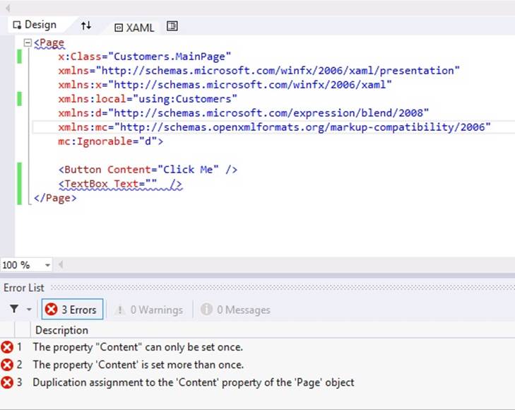
5. Understanding how the Grid control works is fundamental to being able to build scalable and flexible user interfaces. The Page element can only contain a single item, and if you want, you can replace the Grid control with a Button, like this:
NOTE
Don’t type the following code. It is shown for illustrative purposes only.
<Page
...
<Button Content="Click Me"/>
</Page>
However, the resulting application is probably not very useful—a form that contains a button and that displays nothing else is unlikely to win an award for the world’s greatest application. If you attempt to add a second control, such as a TextBox, to the page, your code will not compile and the errors shown in the following image will occur:
The purpose of the Grid control is to enable you to add multiple items to a page. The Grid control is an example of a container control; it can contain a number of other controls, and you can specify the position of these other controls within the grid. Other container controls are also available. For example, the StackPanel control automatically places the controls it contains in a vertical arrangement, with each control positioned directly below its immediate predecessor.
In this application, you will use a Grid to hold the controls necessary to enable a user to enter and view data for a customer.
6. Add a TextBlock control to the page, either by dragging and dropping it from the Toolbox or by typing the text <TextBlock /> directly into the XAML pane on the blank line after the opening <Grid> tag, like this:
7. <Grid Background="{StaticResource ApplicationPageBackgroundThemeBrush}">
8. <TextBlock />
</Grid>
TIP
You can type the code for a control directly into the XAML window for a page. You do not have to drag and drop controls from the Toolbox.
9. This TextBlock will provide the title for the page. Set the properties of the TextBlock control using the values in the following table:
|
Property |
Value |
|
HorizontalAlignment |
Left |
|
Margin |
400,90,0,0 |
|
TextWrapping |
Wrap |
|
Text |
Adventure Works Customers |
|
VerticalAlignment |
Top |
|
FontSize |
50 |
10.You can set these properties either by using the Properties window or by typing the equivalent XAML markup into the XAML window as shown below in bold:
11.<TextBlock HorizontalAlignment="Left" Margin="400,90,0,0" TextWrapping="Wrap"
12.Text="Adventure Works Customers" VerticalAlignment="Top" FontSize="50"/>
13.The resulting text should appear in the Design View window like this:
14.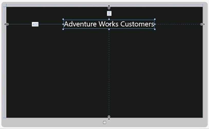
15.Notice that when you drag a control from the Toolbox and drop it on a form, connectors appear that specify the distance of two of the sides of the control from the edge of the container control in which it is placed. In the preceding example, for the TextBlock control these connectors are labeled with the values 400 (from the left edge of the grid) and 90 (from the top edge of the grid). At run time, if the Grid control is resized, the TextBlock will move to retain these distances, and in this case it may cause the distance of the TextBlock from the right and bottom edges of the Grid to change. You can specify the edge or edges to which a control is anchored by setting the HorizontalAlignment and VerticalAlignment properties, and you can set the Margin property to specify the distance from the anchored edges. Again, in this example, theHorizontalAlignment property of the TextBlock is set to Left and the VerticalAlignment property is set to Top, which is why the control is anchored to the left and top edges of the grid. The Margin property contains four values that specify the distance of the left, top, right, and bottom sides (in that order) of the control from the corresponding edge of the container. If one side of a control is not anchored to an edge of the container, you can set the corresponding value in the Margin property to 0.
16.Add four more TextBlock controls to the page. These TextBlock controls are labels that help the user to identify the data that is displayed on the page. Use the values in the following table to set the properties of these controls:
|
Control |
Property |
Value |
|
First label |
HorizontalAlignment |
Left |
|
Margin |
330,190,0,0 |
|
|
TextWrapping |
Wrap |
|
|
Text |
ID |
|
|
VerticalAlignment |
Top |
|
|
FontSize |
20 |
|
|
Second label |
HorizontalAlignment |
Left |
|
Margin |
460,190,0,0 |
|
|
TextWrapping |
Wrap |
|
|
Text |
Title |
|
|
VerticalAlignment |
Top |
|
|
FontSize |
20 |
|
|
Third label |
HorizontalAlignment |
Left |
|
Margin |
620,190,0,0 |
|
|
TextWrapping |
Wrap |
|
|
Text |
First Name |
|
|
VerticalAlignment |
Top |
|
|
FontSize |
20 |
|
|
Fourth label |
HorizontalAlignment |
Left |
|
Margin |
975,190,0,0 |
|
|
TextWrapping |
Wrap |
|
|
Text |
Last Name |
|
|
VerticalAlignment |
Top |
|
|
FontSize |
20 |
17.As before, you can either drag and drop the controls from the Toolbox and use the Properties window to set their properties or you can type the following XAML markup into the XAML pane, after the existing TextBlock control and before the closing </Page> tag:
18.<TextBlock HorizontalAlignment="Left" Margin="330,190,0,0" TextWrapping="Wrap"
19.Text="ID" VerticalAlignment="Top" FontSize="20"/>
20.<TextBlock HorizontalAlignment="Left" Margin="460,190,0,0" TextWrapping="Wrap"
21.Text="Title" VerticalAlignment="Top" FontSize="20"/>
22.<TextBlock HorizontalAlignment="Left" Margin="620,190,0,0" TextWrapping="Wrap"
23.Text="First Name" VerticalAlignment="Top" FontSize="20"/>
24.<TextBlock HorizontalAlignment="Left" Margin="975,190,0,0" TextWrapping="Wrap"
25.Text="Last Name" VerticalAlignment="Top" FontSize="20"/>
26.Add three TextBox controls underneath the TextBlock controls that display the text ID, First Name, and Last Name. Use the following table to set the values of these controls. Notice that the Text property should be set to the empty string, “”. Also notice that the id TextBox control is marked as read-only. This is because customer IDs will be generated automatically in the code that you add later:
|
Control |
Property |
Value |
|
First TextBox |
x:Name |
id |
|
HorizontalAlignment |
Left |
|
|
Margin |
300,240,0,0 |
|
|
TextWrapping |
Wrap |
|
|
Text |
Leave empty |
|
|
VerticalAlignment |
Top |
|
|
FontSize |
20 |
|
|
IsReadOnly |
True |
|
|
Second TextBox |
x:Name |
firstName |
|
HorizontalAlignment |
Left |
|
|
Margin |
550,240,0,0 |
|
|
TextWrapping |
Wrap |
|
|
Text |
Leave empty |
|
|
VerticalAlignment |
Top |
|
|
FontSize |
20 |
|
|
Third TextBox |
x:Name |
lastName |
|
HorizontalAlignment |
Left |
|
|
Margin |
875,240,0,0 |
|
|
TextWrapping |
Wrap |
|
|
Text |
Leave empty |
|
|
VerticalAlignment |
Top |
|
|
FontSize |
20 |
27.The following code shows the equivalent XAML markup for these controls:
28.<TextBox x:Name="id" HorizontalAlignment="Left" Margin="300,240,0,0" TextWrapping="Wrap"
29.Text="" VerticalAlignment="Top" FontSize="20" IsReadOnly="True"/>
30.<TextBox x:Name="firstName" HorizontalAlignment="Left" Margin="550,240,0,0"
31.TextWrapping="Wrap" Text="" VerticalAlignment="Top" Width="300" FontSize="20"/>
32.<TextBox x:Name="lastName" HorizontalAlignment="Left" Margin="875,240,0,0"
33.TextWrapping="Wrap" Text="" VerticalAlignment="Top" Width="300" FontSize="20"/>
34.The Name property is not required for a control, but it is useful if you want to refer to the control in the C# code for the application. Notice that the Name property is prefixed with x:. This is a reference to the XML namespace http://schemas.microsoft.com/winfx/2006/xaml specified in the Page attributes at the top of the XAML markup. This namespace defines the Name property for all controls.
35. NOTE
36. It is not necessary to understand why the Name property is defined in this way, but for more information, you can read the article “x:Name Directive” at http://msdn.microsoft.com/library/ms752290.aspx.
37.The Width property specifies the width of the control, and the TextWrapping property indicates what happens if the user attempts to enter more information that exceeds this width into the control. In this case, all the TextBox controls will wrap the text onto another line of the same width (the control will expand vertically). The alternative value, NoWrap, causes the text to scroll horizontally as the user enters it.
38.Add a ComboBox control to the form, and place it below the Title TextBlock control and between the id and firstName TextBox controls. Set the properties of this control as follows:
|
Property |
Value |
|
x:Name |
title |
|
HorizontalAlignment |
Left |
|
Margin |
420,240,0,0 |
|
VerticalAlignment |
Top |
|
Width |
100 |
|
FontSize |
20 |
39.The equivalent XAML markup for this control is as follows:
40.<ComboBox x:Name="title" HorizontalAlignment="Left" Margin="420,240,0,0"
41.VerticalAlignment="Top" Width="100" FontSize="20"/>
42.You use a ComboBox control to display a list of values from which the user can select.
43.Click the title ComboBox in the Design View window, and in the Properties window expand the Common property category. Then click the ellipsis button that appears alongside the Items property. The Object Collection Editor appears.
44.In the Object Collection Editor, select ComboBoxItem from the drop-down list, and then click Add. In the right pane displaying the properties for the item, expand the Common section if it is not already expanded, and then type Mr in the Content property.
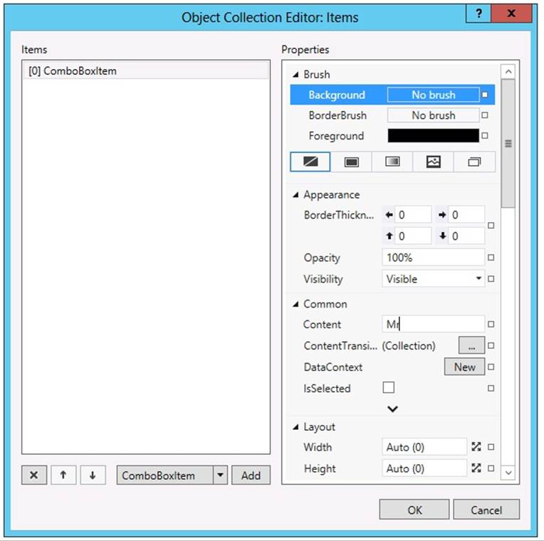
45.Click OK. The Object Collection Editor closes. If you examine the XAML markup for the title ComboBox, it should now look like this:
46.<ComboBox x:Name="title" HorizontalAlignment="Left" Margin="420,240,0,0"
47.VerticalAlignment="Top" Width="100" FontSize="20"/>
48. <ComboBoxItem Content="Mr"/>
</ComboBox>
There are two things to notice here. The first is that the ComboBox markup has been split into an opening <ComboBox> tag and a closing </ComboBox> tag. The second is that, between these tags, Visual Studio has added a ComboBoxItem element with the Content property set to Mr. This item will be displayed in a drop-down list when the application runs.
49.Add the values Mrs and Ms to the title ComboBox. You can either use the Object Collection Editor or type in the XAML markup by hand. The resulting markup should look like this:
50.<ComboBox x:Name="title" HorizontalAlignment="Left" Margin="450,240,0,0"
51.VerticalAlignment="Top" Width="75" FontSize="20"/>
52. <ComboBoxItem Content="Mr"/>
53. <ComboBoxItem Content="Mrs"/>
54. <ComboBoxItem Content="Ms"/>
</ComboBox>
NOTE
A ComboBox control can display simple elements such as a set of ComboBox Item controls that display text, but it can also contain more complex elements such as buttons, check boxes, and radio buttons. If you are adding simple ComboBoxItem controls, then it is probably easier to type in the XAML markup by hand, but if you are adding more complex controls, then the Object Collection Editor can prove very useful. However, you should avoid trying to be too clever in a combo box—the best applications are those that provide the most intuitive user interfaces, and embedding complex controls in a combo box can be confusing to a user.
55.Add two more TextBox controls and two more TextBlock controls to the form. The TextBox controls will enable the user to enter an email address and telephone number for the customer, and the TextBlock controls provide the labels for the text boxes. Use the values in the following table to set the properties of the controls.
|
Control |
Property |
Value |
|
First TextBlock |
HorizontalAlignment |
Left |
|
Margin |
300,390,0,0 |
|
|
TextWrapping |
Wrap |
|
|
Text |
|
|
|
VerticalAlignment |
Top |
|
|
FontSize |
20 |
|
|
First TextBox |
x:Name |
|
|
HorizontalAlignment |
Left |
|
|
Margin |
450,390,0,0 |
|
|
TextWrapping |
Wrap |
|
|
Text |
Leave empty |
|
|
VerticalAlignment |
Top |
|
|
Width |
400 |
|
|
FontSize |
20 |
|
|
Second TextBlock |
HorizontalAlignment |
Left |
|
Margin |
300,540,0,0 |
|
|
TextWrapping |
Wrap |
|
|
Text |
Phone |
|
|
VerticalAlignment |
Top |
|
|
FontSize |
20 |
|
|
Second TextBox |
x:Name |
phone |
|
HorizontalAlignment |
Left |
|
|
Control |
Property |
Value |
|
Margin |
450,540,0,0 |
|
|
TextWrapping |
Wrap |
|
|
Text |
Leave empty |
|
|
VerticalAlignment |
Top |
|
|
Width |
200 |
|
|
FontSize |
20 |
56.The XAML markup for these controls should look like this:
57.<TextBlock HorizontalAlignment="Left" Margin="300,390,0,0" TextWrapping="Wrap"
58.Text="Email" VerticalAlignment="Top" FontSize="20"/>
59.<TextBox x:Name="email" HorizontalAlignment="Left" Margin="450,390,0,0"
60.TextWrapping="Wrap" Text="" VerticalAlignment="Top" Width="400" FontSize="20"/>
61.<TextBlock HorizontalAlignment="Left" Margin="300,540,0,0" TextWrapping="Wrap"
62.Text="Phone" VerticalAlignment="Top" FontSize="20"/>
63.<TextBox x:Name="phone" HorizontalAlignment="Left" Margin="450,540,0,0"
64.TextWrapping="Wrap" Text="" VerticalAlignment="Top" Width="200" FontSize="20"/>
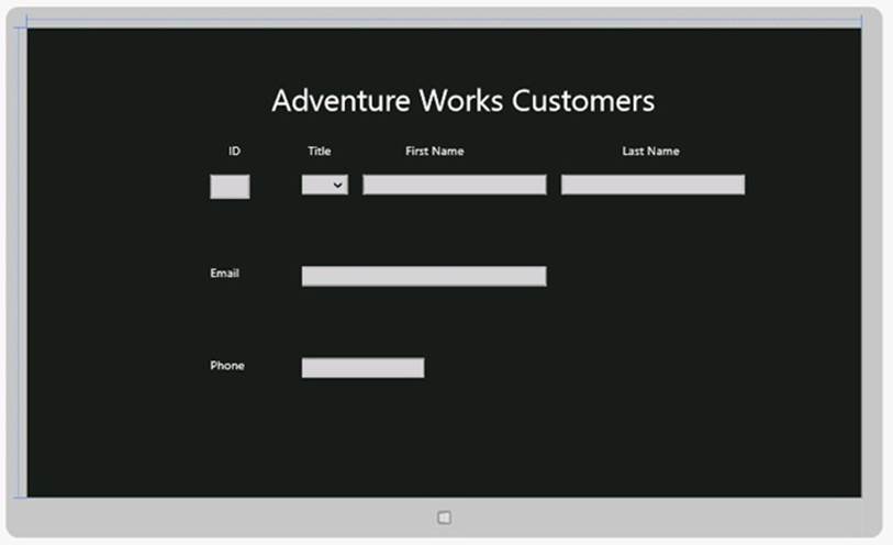
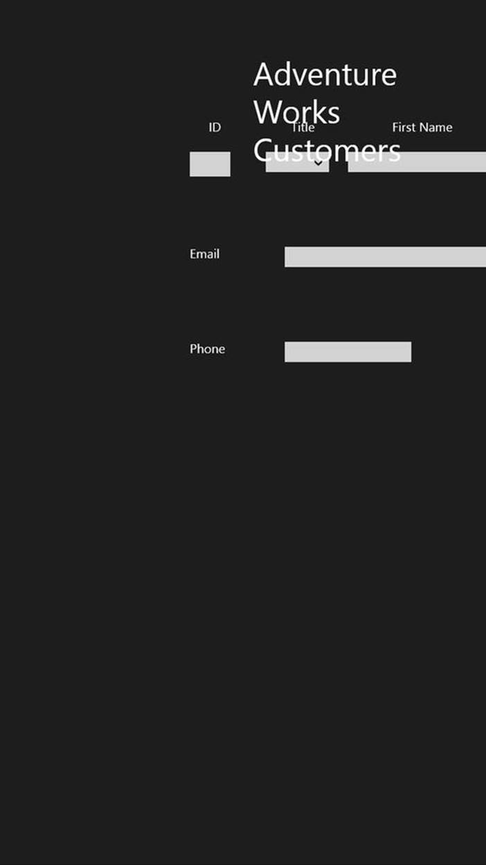
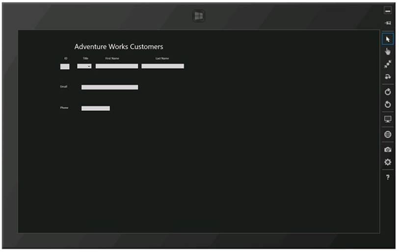
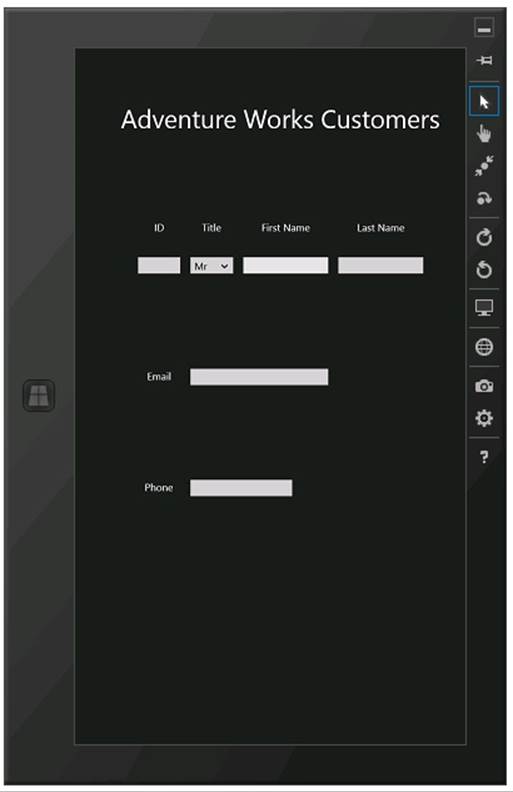
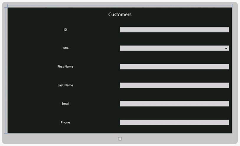
65.The completed form in the Design View window should look like this:
66.
67.On the DEBUG menu, click Start Debugging to build and run the application.
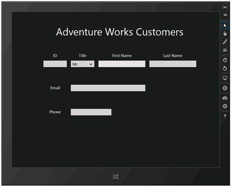
The application starts and displays the form. You can enter data into the form and select a title from the combo box, but you cannot do much else yet.
68.While the application is running, click in the top-left corner of the screen and drag the image of Visual Studio running on the desktop. The Customers application changes to Filled view (this view occupies the entire screen apart from the area 320 pixels wide that displays the desktop icons). Notice how the Last Name field falls off the right edge of the screen:
IMPORTANT
You must be using a display that supports a resolution of at least 1366 × 768 pixels to be able to switch to Filled view. If you are running on a computer with a lower resolution, you can use the Simulator to simulate a device with a higher resolution. See the sidebar Using the Simulator to Test a Windows Store App after this exercise.
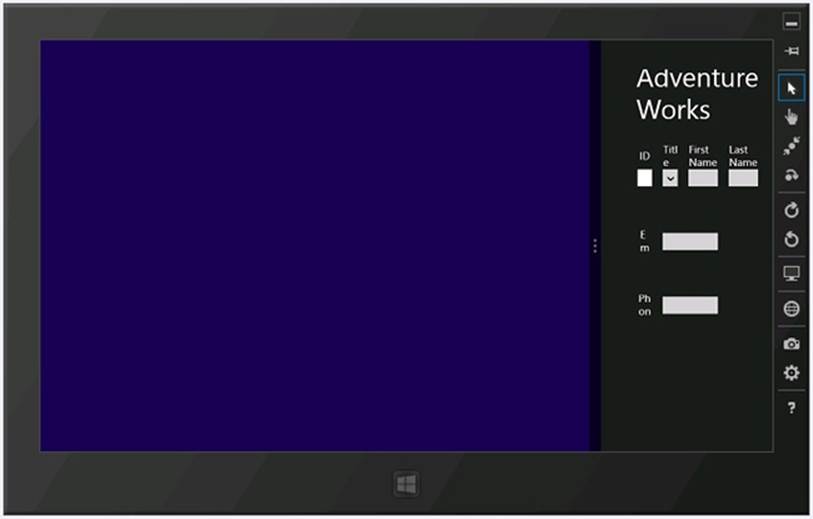
69.Resize the window displaying the Customers application to show it in Snapped view. This time, most of the form disappears (it is displayed in an area that is only 320 pixels wide). Some of the TextBlock content wraps and is displayed vertically, but the form is not usable in this view:
70.Return to Visual Studio, and on the DEBUG menu, click Stop Debugging.
That was a cursory lesson in being careful about how you lay out an application. Although the application looked fine when it ran full-screen, as soon as you switched to the Filled or Snapped view, it became less useful (or completely useless in the case of the Snapped view). Additionally, the application assumes that the user will be viewing the screen on a device in the landscape orientation. If the user is running the application on a tablet that supports different orientations, and the user rotates the device to switch to portrait mode, it will look like this:
The issue is that the layout technique shown so far does not scale and adapt to different form factors and orientations. Fortunately, you can use the properties of the Grid control and another feature called the Visual State Manager to solve these problems.
USING THE SIMULATOR TO TEST A WINDOWS STORE APP
Even if you don’t have a tablet computer, you can still test your Windows Store apps and see how they behave on a mobile device by using the Simulator provided with Visual Studio 2012. The Simulator simulates a tablet device, enabling you to emulate user gestures such as pinching and swiping objects, as well as rotating and changing the resolution of the device.
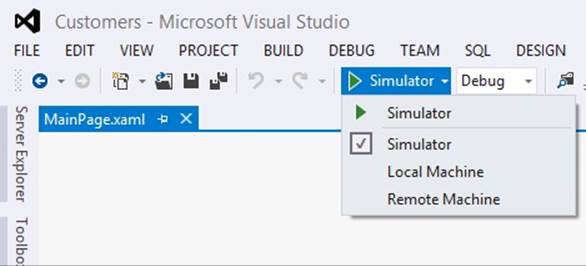
To run an application in the Simulator, click the Debug Target drop-down list box in the Visual Studio toolbar, directly below the DEBUG menu. By default, the debug target is set to Local Machine, which causes the application to run full-screen on your computer, but you can select Simulator from this list, which starts the Simulator when you debug the application. Note that you can also set the debug target to a different computer if you need to perform remote debugging (you will be prompted for the network address of the remote computer when you select this option). The following image shows the Debug Target drop-down list box:
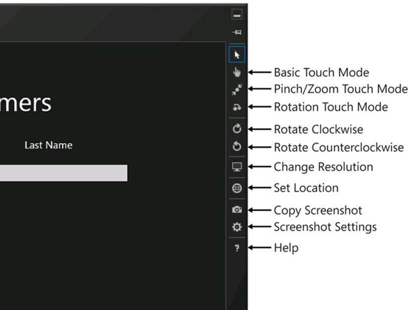
After you have selected the Simulator, when you run the application from the DEBUG menu in Visual Studio, the Simulator starts and displays your application. The toolbar down the left side of the Simulator window contains a selection of tools that enable you to emulate user gestures by using the mouse. You can even simulate the location of the user if the application requires information about the geographic position of the device. However, for testing the layout of an application, the most important tools are Rotate Clockwise, Rotate Counterclockwise, and Change Resolution. The following image shows the Customers application running in the Simulator. The labels down the right side describe the function of each of the buttons for the Simulator.
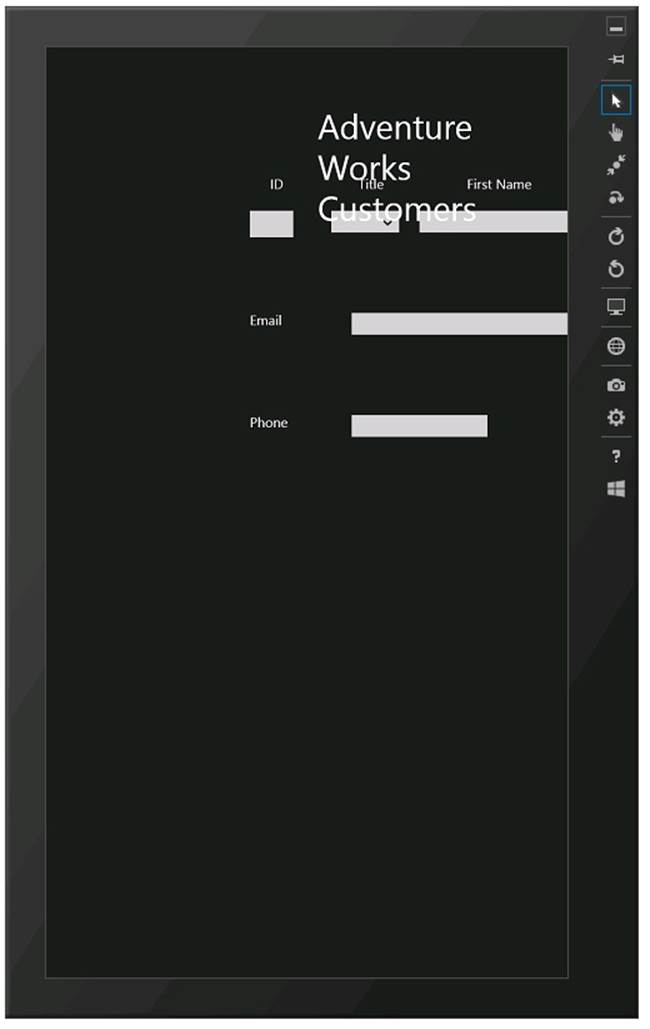
NOTE
The screen shots in this section were taken on a computer with a screen resolution of 1366 × 768. By default, the Simulator starts running in the same resolution as your display. If you are using a different display resolution, then you may need to click the Change Resolution button and switch to 1366 × 768 to get the same results as shown here.”
The following image shows the same application after the user has clicked the Rotate Clockwise button. The application is now running in the portrait orientation:
You can also try seeing how the application behaves if you change the resolution of the Simulator. The following image shows the Customers application running when the Simulator is set to a high resolution (2560 × 1440, the typical resolution of a 27-inch monitor). You can see that the application is squeezed into the top-left corner of the screen:
The Simulator behaves exactly like a Windows 8 computer (it is, in fact, a remote-desktop connection to your own computer). To stop the Simulator, select the Settings charm on the Charms bar, click Power, and then click Disconnect.
NOTE
To test Snapped and Filled views, you need to start one or more additional applications running in the Simulator (Snapped and Filled views only work if there are two or more applications running). A useful application for this purpose is the Weather app, available on the Windows 8 Start screen.
Implementing a Tabular Layout with a Grid Control
You can use the Grid control to implement a tabular layout. A Grid contains rows and columns, and you can specify in which rows and columns other controls should be placed. The beauty of the Grid control is that you can specify the sizes of the rows and columns that it contains as relative values; as the grid shrinks or grows to adapt itself to the different form factors and orientations that users may switch to, the rows and columns can shrink and grow in proportion to the grid. The intersection of a row and a column in a grid defines a cell, and if you position controls in cells, they will move as the rows and columns shrink and grow. Therefore, the key to implementing a scalable user interface is to break it down into a collection of cells and place related elements in the same cell. A cell can contain another grid, enabling you to fine-tune the exact positioning of each element.
If you consider the Customers application, you can see that the user interface breaks down into two main areas: a heading containing the title and the body containing the customers’ details. Allowing for some spacing between these areas, and a margin at the bottom of the form, you can assign relative sizes to each of these areas, as shown in the following diagram:
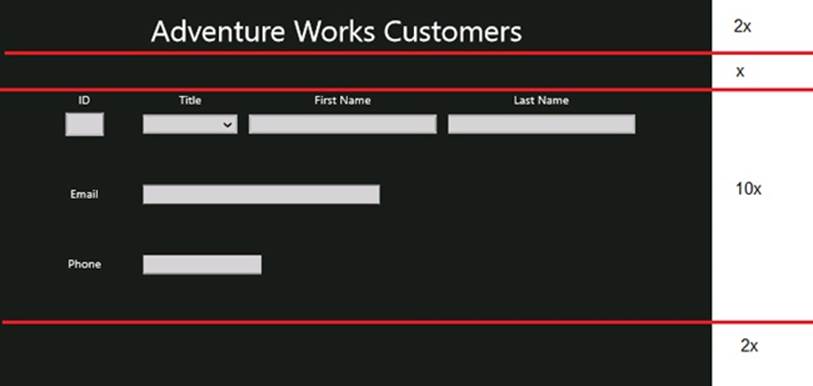
The diagram shows only rough approximations, but the row for the heading is twice as high as the row for the spacer below it. The row for the body is ten times as high as the spacer, and the bottom margin is twice the height of the spacer.
To hold the elements in each area, you can define a grid with four rows and place the appropriate items in each row. However, the body of the form can be described by another, more complex grid, as shown below:
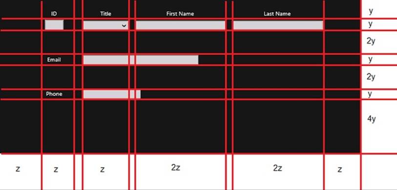
Again, the heights of each of the rows are specified in relative terms, as are the widths of the columns. Also, you can clearly see that the TextBox elements for the Email and Phone information do not quite fit into this grid pattern. If you were being pedantic, you might choose to define further grids inside the body of the form to make these items fit. However, you should keep in mind the purpose of this grid: it is to enable you to define the relative positioning and spacing of elements, and it is acceptable for an element to extend beyond the boundaries of a cell in the grid arrangement.
In the next exercise, you will modify the layout of the Customers application to use this grid format to position the controls.
Modify the layout to scale to different form factors and orientations
1. In the XAML pane for the Customers application, add another Grid inside the existing Grid element. Give this new Grid a margin of 40 pixels from the left edge of the parent Grid and 54 pixels from the top, as shown in bold below:
2. <Grid Background="{StaticResource ApplicationPageBackgroundThemeBrush}">
3. <Grid Margin="40,54,0,0">
4. </Grid>
5. <TextBlock HorizontalAlignment="Left" TextWrapping="Wrap"
6. Text="Adventure Works Customers" ... />
7. ...
</Grid>
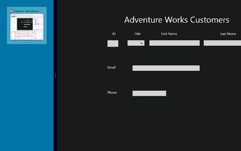
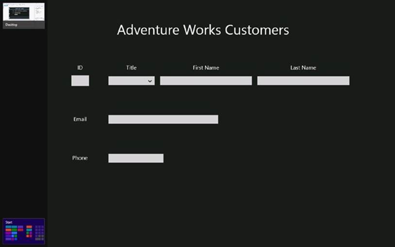
You could define the rows and columns as part of the existing Grid, but to maintain a consistent look and feel with other Windows Store apps, you should leave some blank space to the left and at the top of a page. These margins enable Windows 8 to display its various icons and toolbars, such as the icons showing the applications that are currently running and the Start screen, without overwriting data on the screen. The following image shows an example:
8. Add the following <Grid.RowDefinitions> section shown in bold to the new Grid element.
9. <Grid Margin="40,54,0,0">
10. <Grid.RowDefinitions>
11. <RowDefinition Height="2*"/>
12. <RowDefinition Height="*"/>
13. <RowDefinition Height="10*"/>
14. <RowDefinition Height="2*"/>
15. .</Grid.RowDefinitions>
</Grid>
The <Grid.RowDefinitions> section defines the rows for the grid. In this example, you have defined four rows. You can specify the size of a row as an absolute value specified in pixels, or you can use the * operator to indicate that the sizes are relative and that Windows should calculate the row sizes itself when the application runs, depending on the form factor and resolution of the screen. The values used in this example correspond to the relative row sizes for the header, body, spacer, and bottom margin of the Customers form shown in the earlier diagram.
16.Move the TextBlock control that defines the page heading into the Grid, after the closing </Grid.RowDefinitions> tag.
Add a Grid.Row attribute to the TextBlock control and set the value to 0. This indicates that the TextBlock should be positioned within the first row of the Grid (Grid controls number rows and columns starting at zero).
NOTE
The Grid.Row attribute is an example of an attached property. An attached property is a property that a control receives from the container control in which it is placed. Outside of a grid, a TextBlock does not have a Row property (it would be meaningless), but when positioned inside a grid, the Row property is attached to the TextBlock, and the TextBlock control can assign it a value. The Grid control then uses this value to determine where to display the TextBlock control.
Attached properties are easy to spot because they have the form ContainerType.PropertyName.
Remove the Margin property, and set the HorizontalAlignment and VerticalAlignment properties to Center. This will cause the TextBlock to appear centered in the row.
The XAML markup for the Grid and TextBlock controls should look like this (the changes to the TextBlock are highlighted in bold):
<Grid Margin="40,54,0,0">
<Grid.RowDefinitions>
<RowDefinition Height="2*"/>
<RowDefinition Height="*"/>
<RowDefinition Height="10*"/>
<RowDefinition Height="2*"/>
</Grid.RowDefinitions>
<TextBlock Grid.Row="0" HorizontalAlignment="Center" TextWrapping="Wrap"
Text="Adventure Works Customers" VerticalAlignment="Center" FontSize="50"/>
...
</Grid>
17.After the TextBlock control, add another nested Grid control. This Grid will be used to lay out the controls in the body of the form and should appear in the third row of the outer Grid (the row of size 10*), so set the Grid.Row property to 2 as shown in bold in the following code:
18.<Grid Margin="40,54,0,0">
19. <Grid.RowDefinitions>
20. <RowDefinition Height="2*"/>
21. <RowDefinition Height="*"/>
22. <RowDefinition Height="10*"/>
23. <RowDefinition Height="2*"/>
24. </Grid.RowDefinitions>
25. <TextBlock Grid.Row="0" HorizontalAlignment="Center" .../>
26. <Grid Grid.Row="2">
27. </Grid>
28. ...
</Grid>
29.Add the following <Grid.RowDefinition> and <Grid.ColumnDefinition> sections to the new Grid control:
30.<Grid Grid.Row="2">
31. <Grid.RowDefinitions>
32. <RowDefinition Height="*"/>
33. <RowDefinition Height="*"/>
34. <RowDefinition Height="2*"/>
35. <RowDefinition Height="*"/>
36. <RowDefinition Height="2*"/>
37. <RowDefinition Height="*"/>
38. <RowDefinition Height="4*"/>
39. </Grid.RowDefinitions>
40. <Grid.ColumnDefinitions>
41. <ColumnDefinition Width="*"/>
42. <ColumnDefinition Width="*"/>
43. <ColumnDefinition Width="20"/>
44. <ColumnDefinition Width="*"/>
45. <ColumnDefinition Width="20"/>
46. <ColumnDefinition Width="2*"/>
47. <ColumnDefinition Width="20"/>
48. <ColumnDefinition Width="2*"/>
49. <ColumnDefinition Width="*"/>
50. </Grid.ColumnDefinitions>
</Grid>
These row and column definitions specify the height and width of each of the rows and columns shown in the earlier diagram that depicted the structure of the body of the form. There is a small space of 20 pixels between each of the columns that will hold controls.
51.Move the TextBlock controls that display the ID, Title, Last Name, and First Name labels inside the nested Grid control, immediately after the closing <Grid.ColumnDefinitions> tag.
52.Set the Grid.Row property for each TextBlock control to 0 (these labels will appear in the first row of the grid). Set the Grid.Column property for the ID label to 1, the Grid.Column property for the Title label to 3, the Grid.Column property for the First Name label to 5, and theGrid.Column property for the Last Name label to 7.
53.Remove the Margin property from each of the TextBlock controls, and set the HorizontalAlignment and VerticalAlignment properties to Center.
54.The XAML markup for these controls should look like this (the changes are highlighted in bold):
55.<Grid Grid.Row="2">
56. <Grid.RowDefinitions>
57. ...
58. </Grid.RowDefinitions>
59. <Grid.ColumnDefinitions>
60. ...
61. </Grid.ColumnDefinitions>
62. <TextBlock Grid.Row="0" Grid.Column="1" HorizontalAlignment="Center"
63.TextWrapping="Wrap" Text="ID" VerticalAlignment="Center" FontSize="20"/>
64. <TextBlock Grid.Row="0" Grid.Column="3" HorizontalAlignment="Center"
65.TextWrapping="Wrap" Text="Title" VerticalAlignment="Center" FontSize="20"/>
66. <TextBlock Grid.Row="0" Grid.Column="5" HorizontalAlignment="Center"
67.TextWrapping="Wrap" Text="First Name" VerticalAlignment="Center" FontSize="20"/>
68. <TextBlock Grid.Row="0" Grid.Column="7" HorizontalAlignment="Center"
69.TextWrapping="Wrap" Text="Last Name" VerticalAlignment="Center" FontSize="20"/>
</Grid>
70.Move the id, firstName, and lastName TextBox controls and the title ComboBox control inside the nested Grid control, immediately after the Last Name TextBlock control.
Place these controls in row 1 of the Grid control. Put the id control in column 1, the title control in column 3, the firstName control in column 5, and the lastName control in column 7.
Remove the Margin of each of these controls, and set the VerticalAlignment property to Center. Remove the Width property, and set the HorizontalAlignment property to Stretch—this causes the control to occupy the entire cell when it is displayed, and the control shrinks or grows as the size of the cell changes.
The completed XAML markup for these controls should look like this:
<Grid Grid.Row="2">
<Grid.RowDefinitions>
...
</Grid.RowDefinitions>
<Grid.ColumnDefinitions>
...
</Grid.ColumnDefinitions>
...
<TextBlock Grid.Row="0" Grid.Column="7" ... Text="Last Name" .../>
<TextBox Grid.Row="1" Grid.Column="1" x:Name="id" HorizontalAlignment="Stretch"
TextWrapping="Wrap" Text="" VerticalAlignment="Center" FontSize="20" IsReadOnly="True"/>
<TextBox Grid.Row="1" Grid.Column="5" x:Name="firstName" HorizontalAlignment="Stretch" TextWrapping="Wrap" Text="" VerticalAlignment="Center"
FontSize="20"/>
<TextBox Grid.Row="1" Grid.Column="7" x:Name="lastName" HorizontalAlignment="Stretch"
TextWrapping="Wrap" Text="" VerticalAlignment="Center" FontSize="20"/>
<ComboBox Grid.Row="1" Grid.Column="3" x:Name="title" HorizontalAlignment="Stretch"
VerticalAlignment="Center" FontSize="20">
<ComboBoxItem Content="Mr"/>
<ComboBoxItem Content="Mrs"/>
<ComboBoxItem Content="Ms"/>
</ComboBox>
</Grid>
71.Move the TextBlock control for the Email label and the email TextBox control to the nested Grid control, immediately after the title ComboBox control.
Place these controls in row 3 of the Grid control. Put the Email label in column 1 and the email TextBox control in column 3. Additionally, set the Grid.ColumnSpan property for the email TextBox control to 3; this enables the column to spread to the value specified by its Widthproperty across three columns, as shown in the earlier diagram.
Set the HorizontalAlignment property of the Email label control to Center, but leave the HorizontalAlignment property of the email TextBox set to Left; this control should remain left-justified against the first column that it spans rather than being centered across them all.
Set the VerticalAlignment property of the Email label and the email TextBox control to Center.
The following XAML markup shows the completed definitions of these controls:
<Grid Grid.Row="2">
<Grid.RowDefinitions>
...
</Grid.RowDefinitions>
<Grid.ColumnDefinitions>
...
</Grid.ColumnDefinitions>
...
<ComboBox Grid.Row="1" Grid.Column="3" x:Name="title" HorizontalAlignment="Stretch"
VerticalAlignment="Center" FontSize="20">
...
</ComboBox>
<TextBlock Grid.Row="3" Grid.Column="1" HorizontalAlignment="Center" TextWrapping="Wrap" Text="Email" VerticalAlignment="Center" FontSize="20"/>
<TextBox Grid.Row="3" Grid.Column="3" Grid.ColumnSpan="3" x:Name="email"
HorizontalAlignment="Left" TextWrapping="Wrap" Text="" VerticalAlignment="Center" Width="400" FontSize="20"/>
</Grid>
72.Move the TextBlock control for the Phone label and phone TextBox control to the nested Grid control, immediately after the email TextBox control.
Place these controls in row 5 of the Grid control. Put the Phone label in column 1 and the phone TextBox control in column 3. Set the Grid.ColumnSpan property for the phone TextBox control to 3.
Set the HorizontalAlignment property of the Phone label control to Center, and leave the HorizontalAlignment property of the phone TextBox set to Left.
Set the VerticalAlignment property of both controls to Center.
The following XAML markup shows the completed definitions of these controls:
<Grid Grid.Row="2">
<Grid.RowDefinitions>
...
</Grid.RowDefinitions>
<Grid.ColumnDefinitions>
...
</Grid.ColumnDefinitions>
...<TextBox ..." x:Name="email" .../>
<TextBlock Grid.Row="5" Grid.Column="1" HorizontalAlignment="Center"
TextWrapping="Wrap" Text="Phone" VerticalAlignment="Center" FontSize="20"/>
<TextBox Grid.Row="5" Grid.Column="3" Grid.ColumnSpan="3" x:Name="phone"
HorizontalAlignment="Left" TextWrapping="Wrap" Text="" VerticalAlignment="Center"
Width="200" FontSize="20"/>
</Grid>
73.In the Debug Target drop-down list in the Visual Studio toolbar, select Simulator.
You will run the application in the Simulator so that you can see how the layout adapts in different resolutions and form factors.
74.On the DEBUG menu, click Start Debugging.
The Simulator starts and the Customers application runs. Click Change Resolution and configure the Simulator to display the application using a screen resolution of 1366 × 768. Also, make sure that the Simulator is displayed in landscape orientation (click Rotate Clockwise if it is running in portrait orientation). Verify that the controls are evenly spaced in this orientation.
75.Click the Rotate Clockwise button to rotate the Simulator into portrait orientation.
The Customers application should adjust the layout of the user interface, and the controls should still be evenly spaced and usable:
76.Click Rotate Counterclockwise to put the Simulator back into landscape orientation, and then click Change Resolution and switch the resolution of the Simulator to 2560 × 1400.
Notice that the controls remain evenly spaced on the form, although the labels might be quite difficult to read unless you actually have a 27-inch screen.
77.Click Change Resolution again and switch the resolution to 1024 × 768.
Again, notice how the spacing and size of the controls is adjusted to maintain the even balance of the user interface:
78.Click Change Resolution again and switch the resolution back to 1366 × 768.
79.Resize the window displaying the Customers application to show it in Snapped view.
TIP
To display an application in Snapped view if no other applications are running, use the swipe gesture to grab the top of the application window and then drag the application to the left or right edge of the screen.
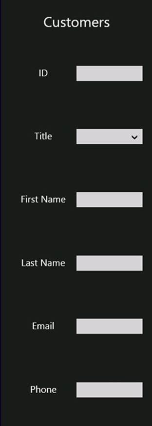
All of the controls remain visible, but the text for the labels wraps, making it difficult to read, and the controls are not particularly easy to use:
80.In the Simulator, display the Charms bar (press Windows+C), click Settings, click Power, and then click Disconnect.
The Simulator closes and you return to Visual Studio.
81.In the Debug Target drop-down list in the Visual Studio toolbar, select Local Machine.
Adapting the Layout by Using the Visual State Manager
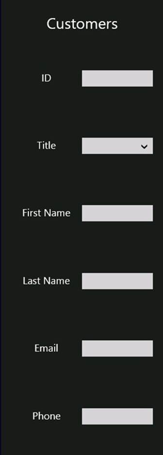
The user interface for the Customers application scales for different resolutions and form factors, but it still does not work well in Snapped view. Additionally, it probably would not look too good on a smartphone, which has a similar height and width as the Snapped view. If you think about it, in these cases the problem is not so much a matter of scaling the controls as actually laying them out in a different way. For example, it would make better sense if the Customers form looked like this in Snapped view:
You can achieve this effect by using the Visual State Manager. All Windows Store apps implement a Visual State Manager that tracks the visual state of an application. It can detect when the application switches between Fullscreen (the default), Filled, and Snapped views. You can catch these visual state transitions and use them to animate the user interface—to move controls around or to display and hide controls, for example. This is what you will do in the next exercises. The first step is to define a layout for the customers’ data that should appear in the Snapped view.
Define a layout for the Snapped view
1. In the XAML pane for the Customers application, add the x:Name and Visibility properties shown in bold in the following code to the Grid control that defines the tabular layout of the various controls:
2. <Grid Background="{StaticResource ApplicationPageBackgroundThemeBrush}">
3. <Grid x:Name="customersTabularView" Margin="40,54,0,0" Visibility="Collapsed">
4. ...
5. </Grid>
</Grid>
You will reference this Grid control in other XAML markup later in this set of exercises, hence the requirement to give it a name. The Visibility property specifies whether the control is displayed (Visible) or hidden (Collapsed). The default value is Visible, but for the time being you will hide this Grid while you define another for displaying the data in a columnar format.
6. After the closing </Grid> tag for the customersTabularView Grid control, add another Grid control. Set the x:Name property to customersColumnarView, set the Margin property to 20,10,20,10, and set the Visibility property to Visible.
TIP
You can expand and contract elements in the XAML pane of the Design View window and make the structure easier to read by clicking the + and – signs that appear down the left edge of the XAML markup.
<Grid Background="{StaticResource ApplicationPageBackgroundThemeBrush}">
<Grid x:Name="customersTabularView" Margin="40,54,0,0" Visibility="Collapsed">
...
</Grid>
<Grid x:Name="customersColumnarView" Margin="10,20,10,20" Visibility="Visible">
</Grid>
</Grid>
7. In the customersColumnarView Grid control, add the following row definitions:
8. <Grid x:Name="customersColumnarView" Margin="10,20,10,20" Visibility="Visible">
9. <Grid.RowDefinitions>
10. <RowDefinition Height="*"/>
11. <RowDefinition Height="10*"/>
12. </Grid.RowDefinitions>
</Grid>
You will use the top row to display the title and the second, much larger row to display the controls into which the user enters data.
13.After the row definitions, add the following TextBlock control. This control displays a truncated title, Customers, in the first row of the Grid control. Set the FontSize to 30.
14.<Grid x:Name="customersColumnarView" Margin="10,20,10,20" Visibility="Visible">
15. <Grid.RowDefinitions>
16. ...
17. </Grid.RowDefinitions>
18. <TextBlock Grid.Row="0" HorizontalAlignment="Center" TextWrapping="Wrap"
19.Text="Customers" VerticalAlignment="Center" FontSize="30"/>
</Grid>
20.Add another Grid control to row 1 of the customersColumnarView Grid control. This Grid control will display the labels and data-entry controls in two columns, so add the row and columns definitions shown in the following code example to this Grid.
21.<TextBlock Grid.Row="0" ... />
22.<Grid Grid.Row="1">
23. <Grid.ColumnDefinitions>
24. <ColumnDefinition/>
25. <ColumnDefinition/>
26. </Grid.ColumnDefinitions>
27. <Grid.RowDefinitions>
28. <RowDefinition/>
29. <RowDefinition/>
30. <RowDefinition/>
31. <RowDefinition/>
32. <RowDefinition/>
33. <RowDefinition/>
34. </Grid.RowDefinitions>
</Grid>
Notice that if all the rows or columns in a set have the same height or width, you do not need to specify their size.
35.Copy the XAML markup for the ID, Title, First Name, and Last Name TextBlock controls from the customersTabularView Grid control to the new Grid control, immediately after the row definitions that you just added. Put the ID control in row 0, the Title control in row 1, the First Name control in row 2, and the Last Name control in row 3. Place all controls in column 0.
36.<Grid.RowDefinitions>
37. ...
38.</Grid.RowDefinitions>
39.<TextBlock Grid.Row="0" Grid.Column="0" HorizontalAlignment="Center"
40.TextWrapping="Wrap" Text="ID" VerticalAlignment="Center" FontSize="20"/>
41.<TextBlock Grid.Row="1" Grid.Column="0" HorizontalAlignment="Center"
42.TextWrapping="Wrap" Text="ID" VerticalAlignment="Center" FontSize="20"/>
43.<TextBlock Grid.Row="2" Grid.Column="0" HorizontalAlignment="Center"
44.TextWrapping="Wrap" Text="ID" VerticalAlignment="Center" FontSize="20"/>
45.<TextBlock Grid.Row="3" Grid.Column="0" HorizontalAlignment="Center"
TextWrapping="Wrap" Text="ID" VerticalAlignment="Center" FontSize="20"/>
46.Copy the XAML markup for the id, title, firstName, and lastName TextBox and ComboBox controls from the customersTabularView Grid control to the new Grid control, immediately after the TextBox controls. Put the id control in row 0, the title control in row 1, the firstName control in row 2, and the lastName control in row 3. Place all four controls in column 1. Also, change the names of all the controls by prefixing them with the letter c (for column). This final change is necessary to avoid clashing with the names of the existing controls in thecustomersTabularView Grid control:
47.<TextBlock Grid.Row="3" Grid.Column="0" HorizontalAlignment="Center"
48.TextWrapping="Wrap" Text="ID" VerticalAlignment="Center" FontSize="20"/>
49.<TextBox Grid.Row="0" Grid.Column="1" x:Name="cId" HorizontalAlignment="Stretch"
50.TextWrapping="Wrap" Text="ID" VerticalAlignment="Center" FontSize="20"/>
51.<TextBox Grid.Row="2" Grid.Column="1" x:Name="cFirstName" HorizontalAlignment="Stretch"
52.TextWrapping="Wrap" Text="" VerticalAlignment="Center" FontSize="20"/>
53.TextBox Grid.Row="3" Grid.Column="1" x:Name="cLastName" HorizontalAlignment="Stretch"
54.TextWrapping="Wrap" Text="" VerticalAlignment="Center" FontSize="20"/>
55.<ComboBox Grid.Row="1" Grid.Column="1" x:Name="cTitle" HorizontalAlignment="Stretch"
56.VerticalAlignment="Center" FontSize="20">
57. <ComboBoxItem Content="Mr"/>
58. <ComboBoxItem Content="Mrs"/>
59. <ComboBoxItem Content="Ms"/>
</ComboBox>
60.Copy the TextBlock and TextBox controls for the email address and telephone number from the customersTabularView Grid control to the new Grid control, after the cTitle ComboBox control. Place the TextBlock controls in column 0 and the TextBox controls in column 1, in rows 4 and 5. Change the name of the email TextBox control to cEmail and the name of the phone TextBox control to cPhone. Remove the Width properties of the cEmail and cPhone controls, and set their HorizontalAlignment properties to Stretch:
61.<ComboBox ...>
62. ...
63.</ComboBox>
64.<TextBlock Grid.Row="4" Grid.Column="0" HorizontalAlignment="Center" TextWrapping="Wrap"
65.Text="Email" VerticalAlignment="Center" FontSize="20"/>
66.<TextBox Grid.Row="4" Grid.Column="1" x:Name="cEmail" HorizontalAlignment="Stretch"
67.TextWrapping="Wrap" Text="" VerticalAlignment="Center" FontSize="20"/>
68.<TextBlock Grid.Row="5" Grid.Column="0" HorizontalAlignment="Center" TextWrapping="Wrap"
69.Text="Phone" VerticalAlignment="Center" FontSize="20"/>
70.<TextBox Grid.Row="5" Grid.Column="1" x:Name="cPhone" HorizontalAlignment="Stretch"
TextWrapping="Wrap" Text="" VerticalAlignment="Center" FontSize="20"/>
The Design View window should display the columnar layout like this:
71.Return to the XAML markup for the customersTabularView Grid control and set the Visibility property to Visible:
<Grid x:Name="customersTabularView" Margin="40,54,0,0" Visibility="Visible">
72.In the XAML markup for the customersColumnarView Grid control, set the Visibility property to Collapsed:
<Grid x:Name="customersColumnarView" Margin="20,10,20,10" Visibility="Collapsed">
The Design View window should display the original tabular layout of the Customers form. This is the default view that will be used by the application.
You have now defined the layout that will appear in Snapped view. You might be concerned that in essence all you have done is duplicated many of the controls and laid them out in a different manner. When you run the form and switch between views, how will data in one view be transferred to the other? For example, if you enter the details for a customer when the application is running in Fullscreen view, and then you switch to Snapped view, the newly displayed controls will not contain the same data that you just entered. Windows Store applications address this problem by using data binding, a technique that enables you to associate the same piece of data to multiple controls, and as the data changes, all controls display the updated information. You will see how this works in Chapter 26. For the time being, you need to consider how to use the Visual State Manager to switch between layouts when the view changes.
Every Windows Store app has a Visual State Manager. Its purpose is to respond to changes in visual state and update the layout of the user interface. To indicate a change in visual state, you can use the GoToState method of the VisualStateManager object. You can specify the changes that the Visual State Manager makes to the layout by implementing a series of visual state transitions in the XAML markup of your application. This is what you will do in the next exercise.
Use the Visual State Manager to modify the layout
1. In the XAML pane for the Customers application, after the closing </Grid> tag for the customersColumnarView Grid control, add the following markup:
2. <Grid x:Name="customersColumnarView" Margin="10,20,10,20" Visibility="Visible">
3. ...
4. </Grid>
5. <VisualStateManager.VisualStateGroups>
6. <VisualStateGroup>
7. <VisualState x:Name="FullScreenLandscape"/>
8. <VisualState x:Name="FullScreenPortrait"/>
9. <VisualState x:Name="Filled"/>
10. </VisualStateGroup>
</VisualStateManager.VisualStateGroups>
You define the visual state transitions by implementing one or more visual state groups. Each visual state group specifies the transitions that should occur when the Visual State Manager switches to the specified visual state. In this case, the default actions will occur when the Visual State Manager switches to the Fullscreen view (in landscape and portrait orientations) and the Filled view. You have already seen these default actions—the controls adjust their widths and positions relative to each other, according to the definitions of the various rows and columns in the Grid controls that contain them.
11.Add the following visual state transition shown in bold to the visual state group:
12.<VisualStateManager.VisualStateGroups>
13. <VisualStateGroup>
14. <VisualState x:Name="FullScreenLandscape"/>
15. <VisualState x:Name="FullScreenPortrait"/>
16. <VisualState x:Name="Filled"/>
17. <VisualState x:Name="Snapped">
18. <Storyboard>
19. <ObjectAnimationUsingKeyFrames Storyboard.TargetName=
20."customersTabularView" Storyboard.TargetProperty="Visibility">
21. <DiscreteObjectKeyFrame KeyTime="0" Value="Collapsed"/>
22. </ObjectAnimationUsingKeyFrames>
23. <ObjectAnimationUsingKeyFrames Storyboard.TargetName=
24."customersColumnarView" Storyboard.TargetProperty="Visibility">
25. <DiscreteObjectKeyFrame KeyTime="0" Value="Visible"/>
26. </ObjectAnimationUsingKeyFrames>
27. </Storyboard>
28. </VisualStateGroup>
</VisualStateManager.VisualStateGroups>
This transition occurs when the application switches to Snapped view. A transition is described in terms of an animation storyboard. Animation in Windows Store apps is a big subject in its own right, and there is not enough space to discuss how animations work in this chapter, but the important point to glean from this code is that this transition contains two animations: the first changes the Visibility property of the customersTabularView Grid control to Collapsed, and the second changes the Visibility property of the customersColumnarView Grid control to Visible.
NOTE
For more information about using animations in Windows Store apps, visit the “Quickstart: Animating your UI” page on the Microsoft website at http://msdn.microsoft.com/library/windows/apps/xaml/hh452703.aspx.
29.In Solution Explorer, expand MainPage.xaml, and then double-click MainPage.xaml.cs to display the code for the MainPage form in the Code and Text Editor window.
30.Add the following method to the MainPage class:
31.void WindowSizeChanged(object sender, WindowSizeChangedEventArgs e)
32.{
33. ApplicationViewState viewState = ApplicationView.Value;
34. VisualStateManager.GoToState(this, viewState.ToString(), false);
}
This is an event handler that will run when the application window changes size (such as when the user switches from Fullscreen to Filled view and from Filled to Snapped view). The code in this event handler queries the static Value property of the ApplicationView class to determine which view the application has switched to (the ApplicationView object is maintained by the Windows runtime and provides a set of static methods that enable an application to obtain information about its current visual state). The data returned by the ApplicationView.Value property is an enumeration, and it can have the values FullScreenLandscape, FullScreenPortrait, Filled, and Snapped. These values just happen to correspond to the names used by each of the visual state groups that you added to the XAML markup for the Customers form. The GoToState method of the VisualStateManager object triggers a view transition on the object specified by the first argument (in this case, the Customers form), using the visual state group with the same name as its second argument. You can ignore the Boolean third argument.
35.In the MainPage constructor, add the following statement shown in bold:
36.public MainPage()
37.{
38. this.InitializeComponent();
39. Window.Current.SizeChanged += WindowSizeChanged;
}
This code subscribes to the SizeChanged event for the current window; the WindowSizeChanged method that you defined in the previous step runs when this event occurs.
40.On the DEBUG menu, click Start Debugging.
The application starts and displays the Customers form in Fullscreen view. The data is displayed using the tabular layout.
NOTE
If you are using a display with a resolution of less than 1366 × 768, start the application running in the Simulator as described earlier. Configure the Simulator with a resolution of 1366 × 768.
41.Resize the window displaying the Customers application to show it in Snapped view.
This time, the data is displayed in the columnar layout:
42.Resize the window displaying the Customers application and switch to Filled view.
The Customers form reverts to the tabular layout.
43.Return to Visual Studio and stop debugging.
Applying Styles to a User Interface
Now that you have the mechanics of the basic layout of the application resolved, the next step is to apply some styling to make the user interface look more attractive. The controls in a Windows Store app have a varied range of properties that you can use to change features such as the font, color, size, and other attributes of an element. You can set these properties individually for each control, but this approach can become cumbersome and repetitive if you need to apply the same styling to a number of controls. Also, the best applications apply consistent styling across the user interface, and it is difficult to maintain this consistency if you have to repeatedly set the same properties and values as you add or change controls. The more times you have to do the same thing, the greater the chances that you will get it wrong at least once!
Windows Store apps enable you to define reusable styles. You can implement them as applicationwide resources by creating a resource dictionary, and then they are available to all controls in all pages in an application. You can also define local resources that apply to only a single page in the XAML markup for that page. In the following exercise, you will define some simple styles for the Customers application and apply these styles to the controls on the Customers form.
Define styles for the Customers form
1. In Solution Explorer, right-click the Customers project, point to Add, and then click New Item.
2. In the Add New Item – Customers dialog box, click Resource Dictionary. In the Name text box, type AppStyles.xaml, and then click Add.
The AppStyles.xaml file appears in the Code and Text Editor window. A resource dictionary is a XAML file that contains resources that can be used by the application. The AppStyles.xaml file looks like this:
<ResourceDictionary
xmlns="http://schemas.microsoft.com/winfx/2006/xaml/presentation"
xmlns:x="http://schemas.microsoft.com/winfx/2006/xaml"
xmlns:local="using:Customers">
</ResourceDictionary>
Styles are one example of a resource, but you can also add other items. In fact, the first resource that you will add is not actually a style but an ImageBrush that will be used to paint the background of the outermost Grid control on the Customers form.
3. In Solution Explorer, right-click the Customers project, point to Add, and then click New Folder. Change the name of the new folder to Images.
4. Right-click the Images folder, point to Add, and then click Existing Item.
5. In the Add Existing Item – Customers dialog box, browse to the \Microsoft Press\Visual CSharp Step By Step\Chapter 25\Resources folder under your Documents folder, click wood.jpg, and then click Add.
The wood.jpg file is added to the Images folder in the Customers project. This file contains an image of a tasteful wooden background that you will add to the Customers form.
6. In the Code and Text Editor window displaying the AppStyles.xaml file, add the following XAML markup shown in bold:
7. <ResourceDictionary
8. xmlns="http://schemas.microsoft.com/winfx/2006/xaml/presentation"
9. xmlns:x="http://schemas.microsoft.com/winfx/2006/xaml"
10. xmlns:local="using:Customers">
11.
12. <ImageBrush x:Key="WoodBrush" ImageSource="Images/wood.jpg"/>
</ResourceDictionary>
This markup creates an ImageBrush resource called WoodBrush that is based on the wood.jpg file. You can use this image brush to set the background of a control, and it will display the image in the wood.jpg file.
13.Underneath the ImageBrush resource, add the following style shown in bold to the AppStyles.xaml file:
14.<ResourceDictionary
15. ...>
16.
17. <ImageBrush x:Key="WoodBrush" ImageSource="Images/wood.jpg"/>
18. <Style x:Key="GridStyle" TargetType="Grid">
19. <Setter Property="Background" Value="{StaticResource WoodBrush}"/>
20. </Style>
</ResourceDictionary>
This markup shows how to define a style. A Style element should have a name (so it can be referenced elsewhere in the application), and it should specify the type of control to which the style can be applied. You are going to use this style with the Grid control.
The body of a style consists of one or more Setter elements. A Setter element specifies the property to set and the value to which the property should be set. In this example, the Background property is set to the WoodBrush ImageBrush resource. The syntax is a little curious, though. In a value, you can either reference one of the appropriate system-defined values for the property (such as “Red” if you want to set the background to a solid red color) or specify a resource that you have defined. To reference a resource, you use the StaticResource keyword and then place the entire expression in curly braces.
21.Before you can use this style, you must update the global resource dictionary for the application and add a reference to the AppStyles.xaml file. In Solution Explorer, double-click App.xaml to display it in the Code and Text Editor window. The App.xaml file looks like this:
22.<Application
23. x:Class="Customers.App"
24. xmlns="http://schemas.microsoft.com/winfx/2006/xaml/presentation"
25. xmlns:x="http://schemas.microsoft.com/winfx/2006/xaml"
26. xmlns:local="using:Customers">
27.
28. <Application.Resources>
29. <ResourceDictionary>
30. <ResourceDictionary.MergedDictionaries>
31.
32. <!--
33. Styles that define common aspects of the platform look and feel
34. Required by Visual Studio project and item templates
35. -->
36. <ResourceDictionary Source="Common/StandardStyles.xaml"/>
37. </ResourceDictionary.MergedDictionaries>
38.
39. </ResourceDictionary>
40. </Application.Resources>
</Application>
41.Add the AppStyles.xaml file to the list of resource dictionaries in the ResourceDictionary.MergedDictionaries element, as shown below in bold:
42.<ResourceDictionary.MergedDictionaries>
43. ...
44. <ResourceDictionary Source="Common/StandardStyles.xaml"/>
45. <ResourceDictionary Source="AppStyles.xaml"/>
</ResourceDictionary.MergedDictionaries>
NOTE
You may be curious to see that the application already defines a resource dictionary called StandardStyles.xaml. This file is in the Common folder in Solution Explorer, and it contains a collection of prebuilt styles designed by Microsoft that you can use in your applications. These styles include the ApplicationPageBackgroundThemeBrush resource currently used to set the background color of the Grid control on the Customers page, although you will switch the Grid control to reference the GridStyle style in the next step. You will learn more about some of the styles in StandardStyles.xaml in Chapter 26.
46.Switch to the MainPage.xaml file displaying the user interface for the Customers form. In the XAML pane, find the outermost Grid control:
<Grid Background="{StaticResource ApplicationPageBackgroundThemeBrush}">
In the XAML markup for this control, replace the Background property with a Style property that references the GridStyle style, as shown in bold below:
<Grid Style="{StaticResource GridStyle}">
The background of the Grid control in the Design View window should switch and display a wooden panel, like this:
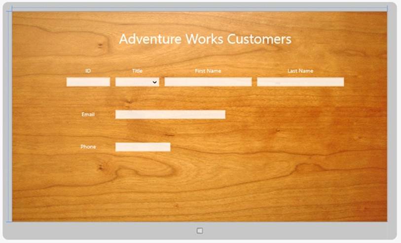
NOTE
Ideally, you should make sure that any background image that you apply to a page or control maintains its aesthetics as the device form factor and orientation changes. An image that looks cool on a 30-inch monitor may appear distorted and squashed on a Microsoft Windows Phone 7 device. It may be necessary to provide alternative backgrounds for different views and orientations and use the Visual State Manager to modify the Background property of a control to switch between them as the visual state changes.
47.Return to AppStyles.xaml in the Code and Text Editor window, and add the FontStyle style shown below after the GridStyle style:
48.<Style x:Key="GridStyle" TargetType="Grid">
49. ...
50.</Style>
51.<Style x:Key="FontStyle" TargetType="TextBlock">
52. <Setter Property="FontFamily" Value="Buxton Sketch"/>
</Style>
This style applies to TextBlock elements and changes the font to Buxton Sketch. This is a font that resembles a handwriting style.
At this stage, it would be possible to reference the FontStyle style in every TextBlock control that required this font, but this approach would not provide any advantage over simply setting the FontFamily directly in the markup for each control. The real power of styles occurs when you combine multiple properties together, as you will see in the next few steps.
53.Add the HeaderStyle style shown below to the AppStyles.xaml file:
54.<Style x:Key="FontStyle" TargetType="TextBlock">
55. ...
56.</Style>
57.<Style x:Key="HeaderStyle" TargetType="TextBlock" BasedOn="{StaticResource FontStyle}">
58. <Setter Property="HorizontalAlignment" Value="Center"/>
59. <Setter Property="TextWrapping" Value="Wrap"/>
60. <Setter Property="VerticalAlignment" Value="Center"/>
61. <Setter Property="Foreground" Value="SteelBlue"/>
</Style>
This is a composite style that sets the HorizontalAlignment, TextWrapping, VerticalAlignment, and Foreground properties of a TextBlock. Additionally, the HeaderStyle style references the FontStyle style by using the BasedOn property. The BasedOn property provides a simple form of inheritance for styles.
You will use this style to format the labels that appear at the top of the customersTabularGrid and customersColumnarGrid controls. However, these headings have different font sizes (the heading of the tabular layout is bigger than that of the columnar layout), so you will create two more styles that extend the HeaderStyle style.
62.Add the following styles to the AppStyles.xaml file:
63.<Style x:Key="HeaderStyle" TargetType="TextBlock" BasedOn="{StaticResource FontStyle}">
64. ...
65.</Style>
66. <Setter Property="FontSize" Value="70"/>
67.</Style>
68.
69. <Setter Property="FontSize" Value="50"/>
</Style>
Note that the font sizes for these styles are slightly bigger than the font sizes currently used by the headings in the Grid controls. This is because the Buxton Sketch font is smaller than the default font.
70.Switch back to the MainPage.xaml file and find the XAML markup for the TextBlock control for the Adventure Works Customers label in the customersTabularView Grid control:
71.<TextBlock Grid.Row="0" HorizontalAlignment="Center" TextWrapping="Wrap"
Text="Adventure Works Customers" VerticalAlignment="Center" FontSize="50"/>
72.Change the properties of this control to reference the TabularHeaderStyle style, as shown below in bold:
73.<TextBlock Grid.Row="0" Style="{StaticResource TabularHeaderStyle}"
Text="Adventure Works Customers"/>
The heading displayed in the Design View window should change color, size, and font, and it should look like this:
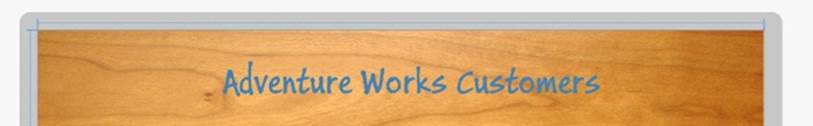
74.Find the XAML markup for the TextBlock control for the Customers label in the customersColumnarView Grid control:
75.<TextBlock Grid.Row="0" HorizontalAlignment="Center" TextWrapping="Wrap"
Text="Customers" VerticalAlignment="Center" FontSize="30"/>
Modify the markup of this control to reference the ColumnarHeaderStyle style, as shown below in bold:
<TextBlock Grid.Row="0" Style="{StaticResource ColumnarHeaderStyle}"
Text="Customers"/>
Note that you won’t see this change in the Design View window because the customers ColumnarView Grid control is collapsed by default. However, you will see the effects of this change when you run the application later in this exercise.
76.Return to the AppStyles.xaml file in the Code and Text Editor window. Modify the HeaderStyle style with the additional property Setter elements shown below in bold:
77.<Style x:Key="HeaderStyle" TargetType="TextBlock" BasedOn="{StaticResource FontStyle}">
78. <Setter Property="HorizontalAlignment" Value="Center"/>
79. <Setter Property="TextWrapping" Value="Wrap"/>
80. <Setter Property="VerticalAlignment" Value="Center"/>
81. <Setter Property="Foreground" Value="SteelBlue"/>
82. <Setter Property="RenderTransformOrigin" Value="0.5,0.5"/>
83. <Setter Property="RenderTransform">
84. <Setter.Value>
85. <CompositeTransform Rotation="-5"/>
86. </Setter.Value>
87. </Setter>
</Style>
These elements rotate the text displayed in the header about its midpoint by an angle of 5 degrees by using a transformation.
NOTE
This example shows a simple transformation. The RenderTransform property enables you to perform a variety of other transformations to an item, and you can combine multiple transformations together. For example, you can translate (move) an item on the x- and y-axes, skew the item (make it lean), and scale an element. For more information, seehttp://msdn.microsoft.com/library/system.windows.uielement.rendertransform.aspx.
Also notice that the value of the RenderTransform property is itself another property/value pair (the property is Rotation, and the value is –5). In cases such as this, you specify the value by using the <Setter.Value> tag.
88.Switch to the MainPage.xaml file. In the Design View window, the title should now be displayed at a jaunty angle:

89.In the AppStyles.xaml file, add the following style:
90.<Style x:Key="LabelStyle" TargetType="TextBlock" BasedOn="{StaticResource FontStyle}">
91. <Setter Property="FontSize" Value="30"/>
92. <Setter Property="HorizontalAlignment" Value="Center"/>
93. <Setter Property="TextWrapping" Value="Wrap"/>
94. <Setter Property="VerticalAlignment" Value="Center"/>
95. <Setter Property="Foreground" Value="AntiqueWhite"/>
</Style>
You will apply this style to the TextBlock elements that provide the labels for the various TextBox and ComboBox controls that the user uses to enter customer information. The style references the same font style as the headings but sets the other properties to values more appropriate for the labels.
96.Go back to the MainPage.xaml file. In the XAML pane, modify the markup for the TextBlock controls for each of the labels in the customersTabularView and customersColumnarView Grid controls; remove the HorizontalAlignment, TextWrapping, VerticalAlignment, and FontSizeproperties; and reference the LabelStyle style, as shown below in bold:
97.<Grid x:Name="customersTabularView" Margin="40,54,0,0" Visibility="Visible">
98. ...
99. <Grid Grid.Row="2">
100. ...
101. <TextBlock Grid.Row="0" Grid.Column="1" Style="{StaticResource LabelStyle}"
102. Text="ID"/>
103. <TextBlock Grid.Row="0" Grid.Column="3" Style="{StaticResource LabelStyle}"
104. Text="Title"/>
105. <TextBlock Grid.Row="0" Grid.Column="5" Style="{StaticResource LabelStyle}"
106. Text="First Name"/>
107. <TextBlock Grid.Row="0" Grid.Column="7" Style="{StaticResource LabelStyle}"
108. Text="Last Name"/>
109. ...
110. <TextBlock Grid.Row="3" Grid.Column="1" Style="{StaticResource LabelStyle}"
111. Text="Email"/>
112. ...
113. <TextBlock Grid.Row="5" Grid.Column="1" Style="{StaticResource LabelStyle}"
114. Text="Phone"/>
115. ...
116. </Grid>
117. </Grid>
118. <Grid x:Name="customersColumnarView" Margin="20,10,20,10" Visibility="Collapsed">
119. ...
120. <Grid Grid.Row="1">
121. ...
122. <TextBlock Grid.Row="0" Grid.Column="0" Style="{StaticResource LabelStyle}"
123. Text="ID"/>
124. <TextBlock Grid.Row="1" Grid.Column="0" Style="{StaticResource LabelStyle}"
125. Text="Title"/>
126. <TextBlock Grid.Row="2" Grid.Column="0" Style="{StaticResource LabelStyle}"
127. Text="First Name"/>
128. <TextBlock Grid.Row="3" Grid.Column="0" Style="{StaticResource LabelStyle}"
129. Text="Last Name"/>
130. ...
131. <TextBlock Grid.Row="4" Grid.Column="0" Style="{StaticResource LabelStyle}"
132. Text="Email"/>
133. ...
134. <TextBlock Grid.Row="5" Grid.Column="0" Style="{StaticResource LabelStyle}"
135. Text="Phone"/>
136. ...
137. </Grid>
</Grid>
The labels on the form should change to the Buxton Sketch font and be displayed in white, in a font size of 30 points:
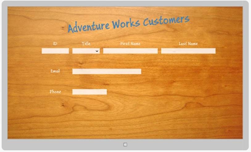
138. On the DEBUG menu, click Start Debugging to build and run the application.
NOTE
Use the Simulator if you are running on a display with a resolution less than 1366 × 768.
139. The Customers form should appear and be styled in the same way that it appears in the Design View window in Visual Studio. Notice that if you enter any text into the various fields on the form, they use the default font and styling for the TextBox controls.
NOTE
Although the Buxton Sketch font is good for labels and titles, it is not recommended as a font for data entry fields, as some of the characters can be difficult to distinguish from each other. For example, the lowercase letter l is very similar to the digit 1, and the uppercase letter O is almost indistinguishable from the digit 0. For this reason, it makes sense to stick with the default font for the TextBox controls.
140. Display the application in Snapped view and verify that the styling has been applied to the controls in the customersColumnarView grid. The form should look like this:
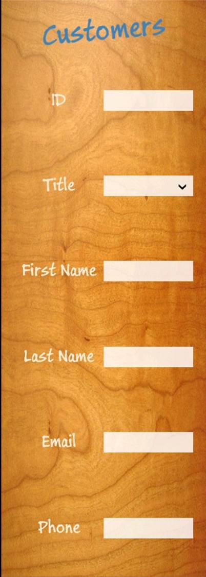
141. Return to Visual Studio and stop debugging.
You can see that styles enable you to easily implement a number of really cool effects. In addition, careful use of styles makes your code much more maintainable than setting properties on individual controls. For example, if you want to switch the font used by the labels and headings in the Customers application, you need to make only a single change to the FontStyle style. In general, you should use styles wherever possible. Besides assisting maintainability, use of styles helps to keep the XAML markup for your forms clean and uncluttered, and the XAML for a form only needs to specify the controls and layout, rather than how the controls should appear on the form.
NOTE
You can also use Microsoft Blend for Visual Studio 2012 to define complex styles that you can integrate into an application. Professional graphic artists can use Blend to develop custom styles and provide these styles in the form of XAML markup to developers building applications. All the developer has to do is add the appropriate Style tags to the user interface elements to reference the appropriate styles.
Summary
In this chapter, you learned how to use the Grid control to implement a user interface that can scale to different device form factors and orientations. You also learned how to use the Visual State Manager to adapt the layout of controls when the user switches between the Fullscreen, Filled, and Snapped views. Finally, you learned how to create custom styles and apply them to the controls on a form. Now that you have defined the user interface, the next challenge is to add functionality to the application, enabling the user to display and update data, which is what you will do in the next chapter.
§ If you want to continue to the next chapter
Keep Visual Studio 2012 running, and turn to Chapter 26.
§ If you want to exit Visual Studio 2012 now
On the FILE menu, click Exit. If you see a Save dialog box, click Yes and save the project.
Chapter 25 Quick Reference
|
To |
Do this |
|
Create a new Windows Store app |
Use one of the Windows Store templates in Visual Studio 2012, such as the Blank App template. |
|
Implement a user interface that scales to different device form factors and orientations |
Use a Grid control. Divide the Grid control into rows and columns, and place controls in these rows and columns rather than specifying an absolute location relative to the edges of the Grid. |
|
Implement a user interface that can adapt to Fullscreen, Filled, and Snapped views |
Create different layouts for each view that display the controls in an appropriate manner. Use the Visual State Manager to select the layout to display when the visual state changes. |
|
Create custom styles |
Add a resource dictionary to the application. Define styles in this dictionary by using the <Style> element, and specify the properties that each style changes. For example: <Style x:Key="GridStyle" TargetType="Grid"> <Setter Property="Background" Value="{StaticResource WoodBrush}"/> </Style> |
|
Apply a custom style to a control |
Set the Style property of the control and reference the style by name. For example: <Grid Style="{StaticResource GridStyle}"> |
All materials on the site are licensed Creative Commons Attribution-Sharealike 3.0 Unported CC BY-SA 3.0 & GNU Free Documentation License (GFDL)
If you are the copyright holder of any material contained on our site and intend to remove it, please contact our site administrator for approval.
© 2016-2025 All site design rights belong to S.Y.A.