Microsoft® Visual C#® 2012 Step by Step (2012)
Chapter 26. Displaying and Searching for Data in a Windows Store App
After completing the chapter, you will be able to
§ Explain how to use the Model-View-ViewModel pattern to implement the application logic for a Windows Store app.
§ Use data binding to display and modify data in a view.
§ Create a ViewModel to enable a view to interact with a model.
§ Implement a Search contract to enable a Windows Store app to integrate with the search functionality of Windows 8.
In Chapter 25, you learned how to design a user interface for a Microsoft Windows Store app that could adapt to the different device form factors, orientations, and views that a customer or other consumer running your application might use. The application you used was a simple one for displaying and editing the details of customers.
In this chapter, you will see how to display data in the user interface and the features that Microsoft Windows 8 provides that enable you to search for data in an application. In performing these tasks, you will also learn about the way in which you can structure a Windows Store app. This chapter covers a lot of ground; in particular, you will look at how to use data binding to connect the user interface to the data that it displays and how to create a ViewModel that enables you to separate the user interface logic from the data model and business logic for an application. You will also see how to use contracts to implement a search feature that integrates into the Windows 8 operating system. While building this application, you will learn a lot more about the templates that Microsoft Visual Studio 2012 provides for helping you to build Windows Store apps.
Implementing the Model-View-ViewModel Pattern
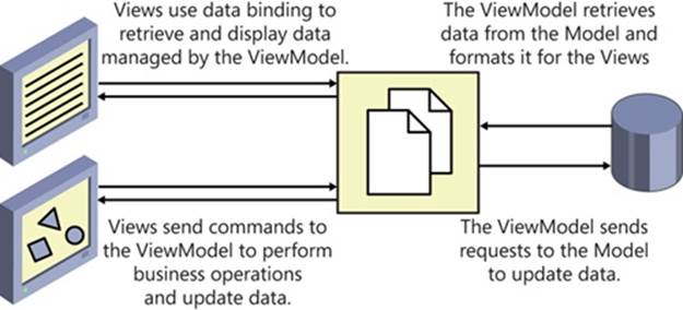
A well-structured Windows Store app enables you to separate the design of the user interface from the data that the application uses and the business logic that comprises the functionality of the application. This separation helps to remove the dependencies between the various components of an application, enabling the different elements to be designed and implemented by individuals who have the appropriate specialist skills. For example, a graphic artist can focus attention on designing an appealing and intuitive user interface, a database specialist can concentrate on implementing an optimized set of data structures for storing and accessing the data, and a C# developer can direct his or her efforts to implementing the business logic for the application. This is a common goal that has been the aim of many development approaches, not just for Windows Store apps, and over the past few years many techniques have been devised to help structure an application in this way. Arguably, the most popular approach is to follow the Model-View-ViewModel (MVVM) design pattern. In this design pattern, the model provides the data used by the application, the view represents the way in which the data is displayed in the user interface, and the ViewModel contains the logic that connects the two, taking the user input and converting it into commands that perform business operations on the model, and also taking the data from the model and formatting it in the manner expected by the view. The following diagram shows a simplified relationship between the elements of the MVVM pattern. Note that an application may provide multiple views of the same data. In a Windows Store app, for example, you might implement Fullscreen, Filled, and Snapped views, which can present information by using different screen layouts. One job of the ViewModel is to ensure that the data from the same model can be displayed and manipulated by many different views. In a Windows Store app, the view can configure data binding to connect to the data presented by the ViewModel. Additionally, the view can request that the ViewModel update data in the model or perform business tasks by invoking commands implemented by the ViewModel.
Displaying Data by Using Data Binding
Before you get started implementing a ViewModel for the Customers application, it helps to understand a little more about data binding and how you can apply this technique to display data in a user interface. Data binding enables you to link a property of a control to a property of an object; if the value of the specified property of the object changes, the property in the control that links to the object also changes. In addition, data binding can be bidirectional: if the value of a property in a control that uses data binding changes, the modification is propagated to the object to which it is linked. The following exercise provides a quick introduction to using data binding to display data. It is based on the Customers application that you started building in Chapter 25.
Use data binding to display Customer information
1. Start Visual Studio 2012 if it is not already running.
2. Open the Customers project, located in the \Microsoft Press\Visual CSharp Step By Step\Chapter 26\Data Binding folder in your Documents folder. This is a version of the Customers application that you built in the previous chapter, but the layout of the user interface has been modified slightly—the controls are displayed on a blue background that enables them to stand out more easily.
NOTE
The blue background was created by using a Rectangle control that spans the same rows and columns as the TextBlock and TextBox controls that display the headings and data. The rectangle is filled by using a LinearGradientBrush that gradually changes the color of the rectangle from a medium blue at the top to a very dark blue at the bottom. The XAML markup for the Rectanglecontrol displayed in the Fullscreen and Filled views looks like this (the XAML markup for the Snapped view includes a similar Rectangle control, spanning the rows and columns used by that layout):
<Rectangle Grid.Row="0" Grid.RowSpan="6" Grid.Column="1" Grid.ColumnSpan="7"...>
<Rectangle.Fill>
<LinearGradientBrush EndPoint="0.5,1" StartPoint="0.5,0">
<GradientStop Color="#FF0E3895"/>
<GradientStop Color="#FF141415" Offset="0.929"/>
</LinearGradientBrush>
</Rectangle.Fill>
</Rectangle>
3. In Solution Explorer, right-click the Customers project, select Add, and then click Class.
4. In the Add New Items – Customers dialog box, ensure that the Class template is selected, type Customer.cs in the Name text box, and then click Add.
You will use this class to implement the Customer data type, and then implement data binding to display the details of Customer objects in the user interface.
5. In the Code and Text Editor window displaying the Customer.cs file, make the Customer class public, and add the following private fields and properties shown in bold to the Customer class:
6. public class Customer
7. {
8. public int _customerID;
9. public int CustomerID
10. {
11. get { return this._customerID; }
12. set { this._customerID = value; }
13. }
14. public string _title;
15. public string Title
16. {
17. get { return this._title; }
18. set { this._title = value; }
19. }
20.
21. public string _firstName;
22. public string FirstName
23. {
24. get { return this._firstName; }
25. set { this._firstName = value; }
26. }
27.
28. public string _lastName;
29. public string LastName
30. {
31. get { return this._lastName; }
32. set { this._lastName = value; }
33. }
34.
35. public string _emailAddress;
36. public string EmailAddress
37. {
38. get { return this._emailAddress; }
39. set { this._emailAddress = value; }
40. }
41.
42. public string _phone;
43. public string Phone
44. {
45. get { return this._phone; }
46. set { this._phone = value; }
47. }
}
NOTE
You might be wondering why these properties are not implemented as automatic properties because all they do is get and set the value in a private field. You will add additional code to these properties in a later exercise.
48.In Solution Explorer, in the Customers project, double-click the MainPage.xaml file to display the user interface for the application in the Design View window.
49.In the XAML pane, locate the markup for the id TextBox control. Modify the XAML markup that sets the Text property for this control, as shown below in bold:
50.<TextBox Grid.Row="1" Grid.Column="1" x:Name="id" ...
Text="{Binding CustomerID}" .../>
The syntax Text=“{Binding Path}” specifies that the value of the Text property will be provided by the value of the Path expression at run time. In this case, Path is set to CustomerID, so the value held in the CustomerID expression will be displayed by this control. However, you need to provide a bit more information to indicate that CustomerID is actually a property of a Customer object. To do this, you can set the DataContext property of the control, which you will do shortly.
51.Add the following binding expressions for each of the other text controls on the form. Apply data binding to the TextBox controls in the customersTabularView and customersColumnView Grid controls, as shown below in bold (the ComboBox controls require slightly different handling, which you will address in the section Using Data Binding with a ComboBox Control later in this chapter):
52.<Grid x:Name="customersTabularView" ...>
53. ...
54. <TextBox Grid.Row="1" Grid.Column="1" x:Name="id" ...
55.Text="{Binding CustomerID}" .../>
56. ...
57. <TextBox Grid.Row="1" Grid.Column="5" x:Name="firstName" ...
58.Text="{Binding FirstName}" .../>
59. <TextBox Grid.Row="1" Grid.Column="7" x:Name="lastName" ...
60.Text="{Binding LastName}" .../>
61. ...
62. <TextBox Grid.Row="3" Grid.Column="3" Grid.ColumnSpan="3"
63.x:Name="email" ... Text="{Binding EmailAddress}" .../>
64. ...
65. <TextBox Grid.Row="5" Grid.Column="3" Grid.ColumnSpan="3"
66.x:Name="phone" ... Text="{Binding Phone}" ..."/>
67.</Grid>
68.<Grid x:Name="customersColumnarView" Margin="20,10,20,110"
69.Visibility="Collapsed">
70. ...
71. <TextBox Grid.Row="0" Grid.Column="1" x:Name="cId" ...
72.Text="{Binding CustomerID}" .../>
73. ...
74. <TextBox Grid.Row="2" Grid.Column="1" x:Name="cFirstName" ...
75.Text="{Binding FirstName}" .../>
76. <TextBox Grid.Row="3" Grid.Column="1" x:Name="cLastName" ...
77.Text="{Binding LastName}" .../>
78. ...
79. <TextBox Grid.Row="4" Grid.Column="1" x:Name="cEmail" ...
80.Text="{Binding EmailAddress}" .../>
81. ...
82. <TextBox Grid.Row="5" Grid.Column="1" x:Name="cPhone" ...
83.Text="{Binding Phone}" .../>
</Grid>
84.In Solution Explorer, expand the MainPage.xaml file, and then double-click the MainPage.xaml.cs file to display the code for the MainPage.xaml form in the Code and Text Editor window. Add the statement shown below in bold to the MainPage constructor.
85.public MainPage()
86.{
87. this.InitializeComponent();
88. Window.Current.SizeChanged += WindowSizeChanged;
89. Customer customer = new Customer
90. {
91. CustomerID = 1,
92. Title = "Mr",
93. FirstName = "John",
94. LastName = "Sharp",
95. EmailAddress = "john@contoso.com",
96. Phone = "111-1111"
97. };
}
This code creates a new instance of the Customer class and populates it with some sample data.
98.After the code that creates the new Customer object, add the following statement shown in bold:
99.Customer customer = new Customer
100. {
101. ...
102. };
this.DataContext = customer;
This statement specifies the object to which controls on the MainPage form should bind to. In each of the controls, the XAML markup Text=“{Binding Path}” will be resolved against this object. For example, the id TextBox and cId TextBox controls both specify Text=“{Binding CustomerID}”, and so they will display the value found in the CustomerID property of the Customer object to which the form is bound.
NOTE
In this example, you have set the DataContext property of the form, so the same data binding automatically applies to all the controls on the form. You can also set the DataContext property for individual controls if you need to bind the different controls to different objects.
103. On the DEBUG menu, click Start Debugging to build and run the application.
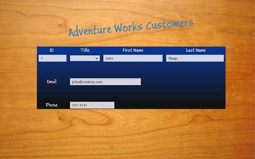
Verify that the form displays the details for the customer John Sharp in Fullscreen view, as shown in the following image:
104. Switch the application to Snapped view and verify that it displays the same data:
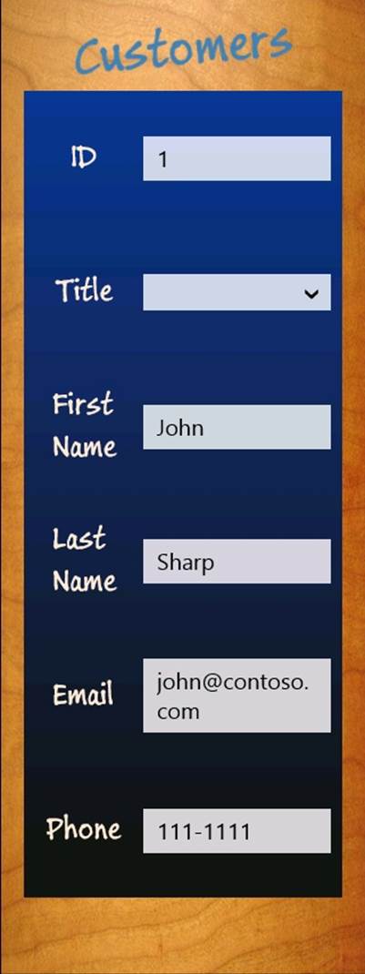
The controls displayed in Snapped view are bound to the same data as the controls displayed in Fullscreen view.
IMPORTANT
You must be using a display that supports a resolution of at least 1366 × 768 pixels to be able to switch to Snapped view. If you are running on a computer with a lower resolution, you can use the Simulator to simulate a device with a higher resolution. See the sidebar Using the Simulator to Test a Windows Store App in Chapter 25 for more information. Additionally, you will need to run an additional application in the Simulator to enable snapping between applications—switch to the Desktop and start the Weather application, for example.
105. In Snapped view, change the email address to john@treyresearch.com.
106. Put the application back into Fullscreen view. Notice that the email address displayed in this view has not changed.
107. Return to Visual Studio and stop debugging.
108. In Visual Studio, display the code for the Customer class in the Code and Text Editor window and set a breakpoint in the set property accessor for the EmailAddress property.
109. On the DEBUG menu, click Start Debugging to build and run the application again.
110. When the debugger reaches the breakpoint for the first time, press F5 to continue running the application.
111. When the user interface for the Customers application appears, switch to Snapped view and change the email address to john@treyresearch.com.
112. Put the application back into Fullscreen view. Notice that the debugger does not reach the breakpoint in the set accessor for the EmailAddress property; the updated value is not written back to the Customer object when the email TextBox loses the focus.
113. Return to Visual Studio and stop debugging.
114. Remove the breakpoint in the set accessor of the EmailAddress property in the Customer class.
Modifying Data by Using Data Binding
In the previous exercise, you saw how easy it is to display the data in an object by using data binding. However, by default, data binding is a one-way operation, and any changes you make to the displayed data are not copied back to the data source. In the exercise, you saw this when you changed the email address displayed in Snapped view; when you switched back to Fullscreen view, the data had not changed. You can implement bidirectional data binding by modifying the Mode parameter of the Binding specification in the XAML markup for a control. The Mode parameter indicates whether the data binding is one-way (the default) or two-way. This is what you will do next.
Implement TwoWay data binding to modify Customer information
1. Display the MainPage.xaml file in the Design View window, and modify the XAML markup for each of the TextBox controls as shown below in bold:
2. <Grid x:Name="customersTabularView" ...>
3. ...
4. <TextBox Grid.Row="1" Grid.Column="1" x:Name="id" ...
5. Text="{Binding CustomerID, Mode=TwoWay}" .../>
6. ...
7. <TextBox Grid.Row="1" Grid.Column="5" x:Name="firstName" ...
8. Text="{Binding FirstName, Mode=TwoWay}" .../>
9. <TextBox Grid.Row="1" Grid.Column="7" x:Name="lastName" ...
10.Text="{Binding LastName, Mode=TwoWay}" .../>
11. ...
12. <TextBox Grid.Row="3" Grid.Column="3" Grid.ColumnSpan="3"
13.x:Name="email" ... Text="{Binding EmailAddress, Mode=TwoWay}" .../>
14. ...
15. <TextBox Grid.Row="5" Grid.Column="3" Grid.ColumnSpan="3"
16.x:Name="phone" ... Text="{Binding Phone, Mode=TwoWay}" ..."/>
17.</Grid>
18.<Grid x:Name="customersColumnarView" Margin="20,10,20,110" ...>
19. ...
20. <TextBox Grid.Row="0" Grid.Column="1" x:Name="cId" ...
21.Text="{Binding CustomerID, Mode=TwoWay}" .../>
22. ...
23. <TextBox Grid.Row="2" Grid.Column="1" x:Name="cFirstName" ...
24.Text="{Binding FirstName, Mode=TwoWay}" .../>
25. <TextBox Grid.Row="3" Grid.Column="1" x:Name="cLastName" ...
26.Text="{Binding LastName, Mode=TwoWay}" .../>
27. ...
28. <TextBox Grid.Row="4" Grid.Column="1" x:Name="cEmail" ...
29.Text="{Binding EmailAddress, Mode=TwoWay}" .../>
30. ...
31. <TextBox Grid.Row="5" Grid.Column="1" x:Name="cPhone" ...
32.Text="{Binding Phone, Mode=TwoWay}" .../>
</Grid>
The Mode parameter to the Binding specification indicates whether the data binding is one-way (the default) or two-way. Setting Mode to TwoWay causes any changes made by the user to be passed back to the object to which a control is bound.
33.On the DEBUG menu, click Start Debugging to build and run the application again.
34.While application is displayed in Fullscreen view, change the email address to john@treyresearch.com, and then switch to Snapped view.
Notice that, despite changing the data binding to TwoWay mode, the email address displayed in Snapped view has not been updated—it is still john@contoso.com.
35.Return to Visual Studio and stop debugging.
Clearly, something is not working correctly! The problem now is not that the data has not been updated, but rather that the view is not displaying the latest version of the data (if you reinstate the breakpoint in the set accessor for the EmailAddress property of the Customer class again and run the application in the debugger, you will see the debugger reach the breakpoint whenever you change the value of the email address and move the focus away from the TextBox control). Despite appearances, the data-binding process is not magic, and a data binding does not know when the data to which it is bound has been changed; the object needs to inform the data binding of any modifications by sending a PropertyChanged event to the user interface. This event is part of an interface called INotifyPropertyChanged, and all objects that support two-way data binding should implement this interface. You will implement this interface in the next exercise.
Implement the INotifyPropertyChanged interface in the Customer class
1. In Visual Studio, display the Customer.cs file in the Code and Text Editor window.
2. Add the following using directive to the list at the top of the file:
using System.ComponentModel;
The INotifyPropertyChanged interface is defined in this namespace.
3. Modify the definition of the Customer class to specify that it implements the INotifyPropertyChanged interface, as follows in bold:
class Customer : INotifyPropertyChanged
4. Add the PropertyChanged event shown below in bold to the Customer class, after the Phone property.
5. class Customer : INotifyPropertyChanged
6. {
7. ...
8. public string _phone;
9. public string Phone {
10. get { return this._phone; }
11. set { this._phone = value; }
12. }
13.
14. public event PropertyChangedEventHandler PropertyChanged;
}
This is the only item that the INotifyPropertyChanged interface defines. All objects that implement this interface must provide this event, and they should raise this event whenever they wish to notify the outside world of a change to a property value.
15.Add the following method to the Customer class, after the PropertyChanged event:
16.class Customer : INotifyPropertyChanged
17.{
18. ...
19. public event PropertyChangedEventHandler PropertyChanged;
20.
21. protected virtual void OnPropertyChanged(string propertyName)
22. {
23. if (PropertyChanged != null)
24. {
25. PropertyChanged(this,
26. new PropertyChangedEventArgs(propertyName));
27. }
28. }
}
The OnPropertyChanged method raises the PropertyChanged event. The PropertyChangedEventArgs parameter to the PropertyChanged event should specify the name of the property that has changed. This value is passed in as a parameter to the OnPropertyChanged method.
29.Modify the property set accessors for each of the properties in the Customer class to call the OnPropertyChanged method whenever the value that they contain is modified, as shown below in bold:
30.class Customer : INotifyPropertyChanged
31.{
32. public int _customerID;
33. public int CustomerID
34. {
35. get { return this._customerID; }
36. set
37. {
38. this._customerID = value;
39. this.OnPropertyChanged("CustomerID");
40. }
41. }
42.
43. public string _title;
44. public string Title
45. {
46. get { return this._title; }
47. set
48. {
49. this._title = value;
50. this.OnPropertyChanged("Title");
51. }
52. }
53.
54. public string _firstName;
55. public string FirstName
56. {
57. get { return this._firstName; }
58. set
59. {
60. this._firstName = value;
61. this.OnPropertyChanged("FirstName");
62. }
63. }
64.
65. public string _lastName;
66. public string LastName
67. {
68. get { return this._lastName; }
69. set
70. {
71. this._lastName = value;
72. this.OnPropertyChanged("LastName");
73. }
74. }
75. public string _emailAddress;
76. public string EmailAddress
77. {
78. get { return this._emailAddress; }
79. set
80. {
81. this._emailAddress = value;
82. this.OnPropertyChanged("EmailAddress");
83. }
84. }
85.
86. public string _phone;
87. public string Phone
88. {
89. get { return this._phone; }
90. set
91. {
92. this._phone = value;
93. this.OnPropertyChanged("Phone");
94. }
95. }
96. ...
}
97.Build and run the application in debug mode.
98.When the Customers form appears in Fullscreen view, change the email address to john@treyresearch.com, and change the phone number to 222-2222.
99.Display the application in Snapped view and verify that the email address and phone number have changed.
100. In Snapped view, change the first name to James, switch back to Fullscreen view, and verify that the first name has changed.
101. Return to Visual Studio and stop debugging.
Using Data Binding with a ComboBox Control
Using data binding with a control such as a TextBox or TextBlock is a relatively straightforward matter. On the other hand, ComboBox controls require a little more attention. The issue is that a ComboBox control actually displays two things: a list of values in the drop-down list from which the user can select an item and the value of the currently selected item. You can implement data binding to display a list of items in the drop-down list of a ComboBox control, and the value that the user selects must be a member of this list. In the Customers application, you can configure the data binding for the selected value in the title ComboBox control by setting the SelectedValue property, like this:
<ComboBox ... x:Name="title" ... SelectedValue="{Binding Title}" ... />
However, remember that the list of values for the drop-down list is hard-coded into the XAML markup, like this:
<ComboBox ... x:Name="title" ... >
<ComboBoxItem Content="Mr"/>
<ComboBoxItem Content="Mrs"/>
<ComboBoxItem Content="Ms"/>
</ComboBox>
This markup does not get applied until the control has been created, so the value specified by the data binding is not found in the list because the list does not yet exist when the data binding is constructed. The result is that the value is not displayed. You can try this if you like—configure the binding for the SelectedValue property as just shown and run the application. The title ComboBox will be empty when it is initially displayed, despite the fact that the customer has the title of Mr.
There are several solutions to this problem, but the simplest is to create a data source that contains the list of valid values, and then specify that the ComboBox control should use this list as its set of values for the drop-down. You also need to do this before the data binding for the ComboBoxis applied.
Implement data binding for the title ComboBox controls
1. In Visual Studio, display the MainPage.xaml.cs file in the Code and Text Editor window.
2. Add the following code shown in bold to the MainPage constructor:
3. public MainPage()
4. {
5. this.InitializeComponent();
6. Window.Current.SizeChanged += WindowSizeChanged;
7.
8. List<string> titles = new List<string>
9. {
10. "Mr", "Mrs", "Ms"
11. };
12.
13. this.title.ItemsSource = titles;
14. this.cTitle.ItemsSource = titles;
15.
16. Customer customer = new Customer
17. {
18. ...
19. };
20.
21. this.DataContext = customer;
}
This code creates a list of strings containing the valid titles that customers can have. The code then sets the ItemsSource property of both title ComboBox controls to reference this list (remember that there is a ComboBox control for each view).
NOTE
In a commercial application, you would most likely retrieve the list of values displayed by a ComboBox control from a database or some other data source rather than using a hard-coded list, as shown in this example.
The placement of this code is important. It must run before the statement that sets the DataContext property of the MainPage form because this is when the data binding to the controls on the form occurs.
22.Display the MainPage.xaml file in the Design View window.
23.Modify the XAML markup for the title and cTitle ComboBox controls as shown below in bold:
24.<Grid x:Name="customersTabularView" ...>
25. ...
26. <ComboBox Grid.Row="1" Grid.Column="3" x:Name="title" ...
27.SelectedValue="{Binding Title, Mode=TwoWay}">
28. </ComboBox>
29. ...
30.</Grid>
31.<Grid x:Name="customersColumnarView" ...>
32. ...
33. <ComboBox Grid.Row="1" Grid.Column="1" x:Name="cTitle" ...
34.SelectedValue="{Binding Title, Mode=TwoWay}">
35. </ComboBox>
36. ...
</Grid>
Notice that the list of ComboBoxItem elements for each control has been removed, and that the SelectedValue property is configured to use data binding with the Title field in the Customer object.
37.On the DEBUG menu, click Start Debugging to build and run the application.
38.In the Fullscreen view, verify that the value of the customer’s title is displayed correctly (it should be Mr). Click the drop-down arrow for the ComboBox control and verify that it contains the values Mr, Mrs, and Ms.
39.Switch to Snapped view and perform the same checks. Note that you can change the title in Snapped view, and when you switch back to Fullscreen view, the new title is displayed.
40.Return to Visual Studio and stop debugging.
Creating a ViewModel
You have now seen how to configure data binding to connect a data source to the controls in a user interface, but the data source that you have been using is very simple, consisting of a single customer. In the real world, the data source is likely to be much more complex, comprising collections of different types of object. Remember that in MVVM terms, the data source is often provided by the model, and the user interface (the view) only communicates with the model indirectly, through a ViewModel object. The rationale behind this approach is that the model and the views that display the data provided by this model should be independent from each other; you should not have to change the model if the user interface is modified, nor should you be required to adjust the user interface if the underlying model changes.
The ViewModel provides the connection between the view and the model, and it also implements the business logic for the application. Again, this business logic should be independent of the view and the model. The ViewModel exposes the business logic to the view by implementing a collection of commands. The user interface can trigger these commands based on the way in which the user navigates through the application. In the following exercise, you will extend the Customers application. You will implement a model that contains a list of Customer objects, and you will create a ViewModel that provides commands that enable the view to move between customers.
Create a ViewModel for managing Customer information
1. Open the Customers project, located in the \Microsoft Press\Visual CSharp Step By Step\Chapter 26\ViewModel folder in your Documents folder. This project contains a completed version of the Customers application from the previous set of exercises; if you prefer, you can continue to use your own version of the project.
2. In Solution Explorer, right-click the Customers project, point to Add, and then click Class.
3. In the Add New Items – Customers dialog box, type ViewModel.cs in the Name text box, and then click Add.
This class will provide a basic ViewModel that contains a collection of Customer objects. The user interface will bind to the data exposed by this ViewModel.
4. In the Code and Text Editor window displaying the ViewModel.cs file, mark the class as public, and add the code shown below in bold to the ViewModel class:
5. public class ViewModel
6. {
7. private List<Customer> customers;
8.
9. public ViewModel()
10. {
11. this.customers = new List<Customer>
12. {
13. new Customer {
14. CustomerID = 1,
15. Title = "Mr",
16. FirstName="John",
17. LastName="Sharp",
18. EmailAddress="john@contoso.com",
19. Phone="111-1111"},
20. new Customer {
21. CustomerID = 2,
22. Title = "Mrs",
23. FirstName="Diana",
24. LastName="Sharp",
25. EmailAddress="diana@contoso.com",
26. Phone="111-1112"},
27. new Customer {
28. CustomerID = 3,
29. Title = "Ms",
30. FirstName="Francesca",
31. LastName="Sharp",
32. EmailAddress="frankie@contoso.com",
33. Phone="111-1113"
34. }
35. };
36. }
}
The ViewModel class uses a List<Customer> object as its model, and the constructor populates this list with some sample data.
37.Add the private variable currentCustomer shown below in bold to the ViewModel class, and initialize this variable to zero in the constructor.
38.class ViewModel
39.{
40. private List<Customer> customers;
41. private int currentCustomer;
42.
43. public ViewModel()
44. {
45. this.currentCustomer = 0;
46. this.customers = new List<Customer>
47. {
48. ...
49. }
50. }
}
The ViewModel class will use this variable to track which Customer object the view is currently displaying.
51.Add the Current property shown below in bold to the ViewModel class, after the constructor:
52.class ViewModel
53.{
54. ...
55.
56. public ViewModel()
57. {
58. ...
59. }
60. public Customer Current
61. {
62. get { return this.customers[currentCustomer]; }
63. }
}
The Current property provides access to the current Customer object in the model.
NOTE
It is good practice to provide controlled access to a data model; only the ViewModel should be able to modify the model. However, this restriction does not prevent the view from being able to update the data presented by the ViewModel—it just cannot change the model and make it refer to a different data source.
64.Open the MainPage.xaml.cs file in the Code and Text Editor window.
65.In the MainPage constructor, remove the code that creates the Customer object and replace it with a statement that creates an instance of the ViewModel class. Change the statement that sets the DataContext property of the MainPage object to reference the new ViewModel object, as shown below in bold:
66.public MainPage()
67.{
68. ...
69. this.cTitle.ItemsSource = titles;
70.
71. ViewModel viewModel = new ViewModel();
72. this.DataContext = viewModel;
}
73.Open the MainPage.xaml file in the Design View window.
74.In the XAML pane, modify the data bindings for the TextBox and ComboBox controls to reference properties through the Current object presented by the ViewModel, as shown below in bold:
75.<Grid x:Name="customersTabularView" ...>
76. ...
77. <TextBox Grid.Row="1" Grid.Column="1" x:Name="id" ...
78.Text="{Binding Current.CustomerID, Mode=TwoWay}" .../>
79. <ComboBox Grid.Row="1" Grid.Column="3" x:Name="title" ...
80.SelectedValue="{Binding Current.Title, Mode=TwoWay}">
81. </ComboBox>
82. <TextBox Grid.Row="1" Grid.Column="5" x:Name="firstName" ...
83.Text="{Binding Current.FirstName, Mode=TwoWay }" .../>
84. <TextBox Grid.Row="1" Grid.Column="7" x:Name="lastName" ...
85.Text="{Binding Current.LastName, Mode=TwoWay }" .../>
86. ...
87. <TextBox Grid.Row="3" Grid.Column="3" ... x:Name="email" ...
88.Text="{Binding Current.EmailAddress, Mode=TwoWay }" .../>
89. ...
90. <TextBox Grid.Row="5" Grid.Column="3" ... x:Name="phone" ...
91.Text="{Binding Current.Phone, Mode=TwoWay }" ..."/>
92.</Grid>
93.<Grid x:Name="customersColumnarView" Margin="20,10,20,110" ...>
94. ...
95. <TextBox Grid.Row="0" Grid.Column="1" x:Name="cId" ...
96.Text="{Binding Current.CustomerID, Mode=TwoWay }" .../>
97. <ComboBox Grid.Row="1" Grid.Column="1" x:Name="cTitle" ...
98.SelectedValue="{Binding Current.Title, Mode=TwoWay}">
99. </ComboBox>
100. <TextBox Grid.Row="2" Grid.Column="1" x:Name="cFirstName" ...
101. Text="{Binding Current.FirstName, Mode=TwoWay }" .../>
102. <TextBox Grid.Row="3" Grid.Column="1" x:Name="cLastName" ...
103. Text="{Binding Current.LastName, Mode=TwoWay }" .../>
104. ...
105. <TextBox Grid.Row="4" Grid.Column="1" x:Name="cEmail" ...
106. Text="{Binding Current.EmailAddress, Mode=TwoWay }" .../>
107. ...
108. <TextBox Grid.Row="5" Grid.Column="1" x:Name="cPhone" ...
109. Text="{Binding Current.Phone, Mode=TwoWay }" .../>
</Grid>
110. On the DEBUG menu, click Start Debugging to build and run the application.
111. Verify that the application displays the details of John Sharp (the first customer in the customers list).
112. Return to Visual Studio and stop debugging.
The ViewModel provides access to customer information through the Current property, but currently it does not supply any way to navigate between customers. You can implement methods that increment and decrement the currentCustomer variable so that the Current property retrieves different customers, but you should do so in a manner that does not tie the view to the ViewModel. The most commonly accepted technique is to use the Command pattern. In this pattern, the ViewModel exposes methods in the form of commands that the view can invoke. The trick is to avoid explicitly referencing these methods by name in the code for the view. To do this, XAML enables you to declaratively bind commands to the actions triggered by controls in the user interface, as you will see in the exercises in the next section.
Adding Commands to a ViewModel
The XAML markup that binds the action of a control to a command requires that commands exposed by a ViewModel implement the ICommand interface. This interface defines the following items:
§ CanExecute. This method returns a Boolean value indicating whether the command can run. This method enables a ViewModel to enable or disable a command depending on the context. For example, a command that fetches the next customer from a list should be able to run only if there is a next customer to fetch; if there are no more customers, the command should be disabled.
§ Execute. This method runs when the command is invoked.
§ CanExecuteChanged. This event is triggered when the state of the ViewModel changes. Under these circumstances, commands that could previously run might now be disabled, and vice versa. For example, if the user interface invokes a command that fetches the next customer from a list, if this is the last customer, then subsequent calls to CanExecute should return false. In these circumstances, the CanExecuteChanged event should fire to indicate that the command has been disabled.
In the next exercise, you will create a generic class that implements the ICommand interface.
Implement the Command class
1. In Visual Studio, right-click the Customers project, point to Add, and then click Class.
2. In the Add New Item – Customers dialog box, select the Class template, enter Command.cs in the Name text box, and then click Add.
3. In the Code and Text Editor window displaying the Command.cs file, add the following using directive to the list at the top of the file:
using System.Windows.Input;
The ICommand interface is defined in this namespace.
4. Make the Command class public and specify that it implement the ICommand interface, as follows in bold:
5. public class Command : ICommand
6. {
}
7. Add the following private fields to the Command class:
8. public class Command : ICommand
9. {
10. private Action methodToExecute = null;
11. private Func<bool> methodToDetectCanExecute = null;
}
The Action and Func types were briefly described in Chapter 20 The Action type is a delegate that you can use to reference a method that takes no parameters and does not return a value, and the Func<T> type is also a delegate that can reference a method that takes no parameters but returns a value of the type specified by the type-parameter T. In this class, you will use the methodToExecute field to reference the code that the Command object will run when it is invoked by the view. The methodToDetectCanExecute field will be used to reference the method that detects whether the command can run.
12.Add a constructor to the Command class. This constructor should take two parameters, an Action object and a Func<T> object, and assign these parameters to the methodToExecute and methodToDetectCanExecute fields, as shown below in bold:
13.public Command : ICommand
14.{
15. ...
16. public Command(Action methodToExecute,
17. Func<bool> methodToDetectCanExecute)
18. {
19. this.methodToExecute = methodToExecute;
20. this.methodToDetectCanExecute =
21. methodToDetectCanExecute;
22. }
}
The ViewModel will create an instance of this class for each command. The ViewModel will supply the method to run the command, and the method to detect whether the command should be enabled when it calls the constructor.
23.Implement the Execute and CanExecute methods of the Command class by using the methods referenced by the methodToExecute and methodToDetectCanExecute fields, as follows:
24.public Command : ICommand
25.{
26. ...
27. public Command(Action methodToExecute,
28. Func<bool> methodToDetectCanExecute)
29. {
30. ...
31. }
32.
33. public void Execute(object parameter)
34. {
35. this.methodToExecute();
36. }
37.
38. public bool CanExecute(object parameter)
39. {
40. if (this.methodToDetectCanExecute == null)
41. {
42. return true;
43. }
44. else
45. {
46. return this.methodToDetectCanExecute();
47. }
48. }
}
Notice that if the ViewModel provides a null reference for the methodToDetectCanExecute parameter of the constructor, the default action is to assume that the command can run, and the CanExecute method returns true.
49.Add the public CanExecuteChanged event to the Command class:
50.public Command : ICommand
51.{
52. ...
53. public bool CanExecute(object parameter)
54. {
55. ...
56. }
57.
58. public event EventHandler CanExecuteChanged;
}
When you bind a command to a control, the control automatically subscribes to this event. This event should be raised by the Command object if the state of the ViewModel is updated and the value returned by the CanExecute changes. In previous versions of Windows, Windows Presentation Foundation (WPF) provided the CommandManager object to detect a change in state and raise the CanExecuteChanged event, but the CommandManager object is not available to Windows Store apps. Consequently, you must implement this feature manually. The simplest strategy is to use a timer to periodically raise the CanExecuteChanged event once a second or so.
59.Add the using directive shown below to the list at the top of the file:
using Windows.UI.Xaml;
60.Add the following field to the Command class, above the constructor:
61.public class Command : ICommand
62.{
63. ...
64. private Func<bool> methodToDetectCanExecute = null;
65. private DispatcherTimer canExecuteChangedEventTimer = null;
66.
67. public Command(Action methodToExecute,
68. Func<bool> methodToDetectCanExecute)
69. {
70. ...
71. }
}
The DispatcherTimer class, defined in the Windows.UI.Xaml namespace, implements a timer that can raise an event at specified intervals. You will use the canExecuteChangedEventTimer field to trigger the CanExecuteChanged event at 1-second intervals.
72.Add the canExecuteChangedEventTimer_Click method shown below in bold to the end of the Command class:
73.public class Command : ICommand
74.{
75. ...
76. public event EventHandler CanExecuteChanged;
77.
78. void canExecuteChangedEventTimer_Tick(object sender, object e)
79. {
80. if (this.CanExecuteChanged != null)
81. {
82. this.CanExecuteChanged(this, EventArgs.Empty);
83. }
84. }
}
This method simply raises the CanExecuteChanged event if at least one control is bound to the command. Strictly speaking, this method should also check whether the state of the object has changed before raising the event. However, you will set the timer interval to a lengthy period (in processing terms), so that any inefficiencies in not checking for a change in state are minimized.
85.In the Command constructor, add the following statements shown in bold.
86.public class Command : ICommand
87.{
88. ...
89. public Command(Action methodToExecute,
90. Func<bool> methodToDetectCanExecute)
91. {
92. this.methodToExecute = methodToExecute;
93. this.methodToDetectCanExecute = methodToDetectCanExecute;
94.
95. this.canExecuteChangedEventTimer = new DispatcherTimer();
96. this.canExecuteChangedEventTimer.Tick +=
97. canExecuteChangedEventTimer_Tick;
98. this.canExecuteChangedEventTimer.Interval =
99. new TimeSpan(0, 0, 1);
100. this.canExecuteChangedEventTimer.Start();
101. }
102. ...
}
This code initiates the DispatcherTimer object and sets the interval for timer events to 1 second before starting the timer running.
103. On the BUILD menu, click Build Solution and verify that your application builds without errors.
You can now use the Command class to add commands to the ViewModel class. In the next exercise, you will define commands that enable a view to move between customers.
Add NextCustomer and PreviousCustomer commands to the ViewModel class
1. In Visual Studio, display the ViewModel.cs file in the Code and Text Editor window.
2. Add the following using directive to the top of the file, and modify the definition of the ViewModel class to implement the INotifyPropertyChanged interface.
3. ...
4. using System.ComponentModel;
5.
6. namespace Customers
7. {
8. public class ViewModel : INotifyPropertyChanged
9. {
10. ...
11. }
}
12.Add the PropertyChanged event and OnPropertyChanged method to the end of the ViewModel class. This is the same code that you included in the Customer class.
13.public class ViewModel : INotifyPropertyChanged
14.{
15. ...
16. public event PropertyChangedEventHandler PropertyChanged;
17.
18. protected virtual void OnPropertyChanged(string propertyName)
19. {
20. if (PropertyChanged != null)
21. {
22. PropertyChanged(this,
23. new PropertyChangedEventArgs(propertyName));
24. }
25. }
}
Remember that the view references data through the Current property in the data-binding expressions for the various controls that it contains. When the ViewModel class moves to a different customer, it must raise the PropertyChanged event to notify the view that the data to be displayed has changed.
26.Add the following fields and properties to the ViewModel class, after the constructor.
27.public class ViewModel : INotifyPropertyChanged
28.{
29. ...
30. public ViewModel()
31. {
32. ...
33. }
34.
35. private bool _isAtStart;
36. public bool IsAtStart
37. {
38. get { return this._isAtStart; }
39. set
40. {
41. this._isAtStart = value;
42. this.OnPropertyChanged("IsAtStart");
43. }
44. }
45.
46. private bool _isAtEnd;
47. public bool IsAtEnd
48. {
49. get { return this._isAtEnd; }
50. set
51. {
52. this._isAtEnd = value;
53. this.OnPropertyChanged("IsAtEnd");
54. }
55. }
}
You will use these two properties to track the state of the ViewModel. The IsAtStart property will be set to true when the currentCustomer field in the ViewModel is positioned at the start of the customers collection, and the IsAtEnd property will be set to true when the ViewModel is positioned at the end of the customers collection.
56.Modify the constructor to set the IsAtStart and IsAtEnd properties, as follows in bold:
57.public ViewModel()
58.{
59. this.currentCustomer = 0;
60. this.IsAtStart = true;
61. this.IsAtEnd = false;
62. ...
}
63.Add the Next and Previous private methods shown below in bold to the ViewModel class, after the Current property:
64.public class ViewModel : INotifyPropertyChanged
65.{
66. ...
67. public Customer Current
68. {
69. get { return this.customers[currentCustomer]; }
70. }
71. private void Next()
72. {
73. if (this.customers.Count - 1 > this.currentCustomer)
74. {
75. this.currentCustomer++;
76. this.OnPropertyChanged("Current");
77. this.IsAtStart = false;
78. this.IsAtEnd =
79. (this.customers.Count - 1 == this.currentCustomer);
80. }
81. }
82.
83. private void Previous()
84. {
85. if (this.currentCustomer > 0)
86. {
87. this.currentCustomer--;
88. this.OnPropertyChanged("Current");
89. this.IsAtEnd = false;
90. this.IsAtStart = (this.currentCustomer == 0);
91. }
92. }
93. ...
}
NOTE
The Count property returns the number of items in a collection, but remember that the items in a collection are numbered from 0 to Count – 1.
These methods update the currentCustomer variable to refer to the next (or previous) customer in the customers list. Notice that these methods maintain the values for the IsAtStart and IsAtEnd properties, and indicate that the current customer has changed by raising thePropertyChanged event for the Current property. These methods are private because they should not be accessible from outside the ViewModel class. External classes will run these methods by using commands, which you will add in the following steps.
94.Add the NextCustomer and PreviousCustomer automatic properties shown below to the ViewModel class.
95.public class ViewModel : INotifyPropertyChanged
96.{
97. private List<Customer> customers;
98. private int currentCustomer;
99. public Command NextCustomer { get; private set; }
100. public Command PreviousCustomer { get; private set; }
101. ...
}
The view will bind to these Command objects to enable the user to navigate between customers.
102. In the ViewModel constructor, set the NextCustomer and PreviousCustomer properties to refer to new Command objects, as follows:
103. public ViewModel()
104. {
105. this.currentCustomer = 0;
106. this.IsAtStart = true;
107. this.IsAtEnd = false;
108. this.NextCustomer = new Command(this.Next, () =>
109. { return this.customers.Count > 0 && !this.IsAtEnd; });
110. this.PreviousCustomer = new Command(this.Previous, () =>
111. { return this.customers.Count > 0 && !this.IsAtStart; });
112. ...
}
The NextCustomer Command specifies the Next method as the operation to perform when the Execute method is invoked. The lambda expression () => { return this.customers.Count > 0 && !this.IsAtEnd; } is specified as the function to call when the CanExecuteMethod runs. This expression returns true as long as the customers list contains at least one customer and the ViewModel is not positioned on the final customer in this list. The PreviousCustomer Command follows the same pattern: it invokes the Previous method to retrieve the previous customer from the list, and the CanExecuteMethod references the expression () => { return this.customers.Count > 0 && !this.IsAtStart; }, which returns true as long as the customers list contains at least one customer and the ViewModel is not positioned on the first customer in this list.
113. On the BUILD menu, click Build Solution and verify that your application builds without errors.
Now that you have added the NextCustomer and PreviousCustomer commands to the ViewModel, you can bind these commands to buttons in the view. When the user clicks a button, the appropriate command will run.
Microsoft publishes guidelines for adding buttons to views in Windows Store apps, and the general recommendation is that buttons that invoke commands should be placed in the app bar. Windows Store apps provide two app bars: one appears at the top of the form and the other appears at the bottom. Buttons that navigate through an application or data are commonly placed in the top app bar, and this is the approach that you will adopt in the next exercise.
NOTE
You can find the Microsoft guidelines for implementing app bars online at http://msdn.microsoft.com/library/windows/apps/hh465302.aspx.
Add Next and Previous buttons to the Customers form
1. Open the MainPage.xaml file in the Design View window.
2. Scroll to the bottom of the XAML pane and add the following markup shown in bold immediately above the closing </Page> tag:
3. ...
4. <Page.TopAppBar >
5. <AppBar IsSticky="True">
6. <StackPanel Orientation="Horizontal" HorizontalAlignment="Center">
7. <Button x:Name="previousCustomer"
8. Style="{StaticResource PreviousAppBarButtonStyle}"
9. Command="{Binding Path=PreviousCustomer}"/>
10. <Button x:Name="nextCustomer"
11.Style="{StaticResource NextAppBarButtonStyle}"
12.Command="{Binding Path=NextCustomer}"/>
13. </StackPanel>
14. </AppBar>
15. </Page.TopAppBar>
</Page>
There are several points to notice in this fragment of XAML markup:
o By default, the app bar pops up when the user right-clicks the form, presses Windows+Z, or swipes from the top or bottom edge of the form. The app bar remains open until the user performs another action in the form, when it disappears again. You can prevent an app bar from disappearing automatically by setting the IsSticky property to true, as shown in this markup. In this case, the app bar remains open until the user right-clicks the form, presses Windows+Z, or swipes the app bar off the top edge of the form. This setting enables the user to quickly move between customers without having to repeat the gesture to display the app bar each time.
o The AppBar control contains a StackPanel control. Like many controls, an AppBar can contain only a single piece of content. If you need to display several items in a control, you must use a container control such as a Grid or a StackPanel. In this case, a StackPanel is the most convenient, and the items it displays will be laid out horizontally.
o The style of each button is specified by using a static resource. Both styles, PreviousApp BarButtonStyle and NextAppBarButtonStyle, are defined in the StandardStyles.xaml file provided in the Common folder. This file is part of the Blank App template, and it contains a range of useful styles that enable you to quickly create applications that maintain a standard look and feel. However, these button styles are not enabled by default (you will enable them in the next step), so the XAML editor will highlight this code and complain that the styles cannot be resolved.
o Each button has a Command property. This is the property that you can bind to an object that implements the ICommand interface. In this application, you have bound the buttons to the PreviousCustomer and NextCustomer commands in the ViewModel class. When the user clicks either of these buttons at run time, the corresponding command will run.
16.In Solution Explorer, in the Customers project expand the Common folder, and then double-click StandardStyles.xaml to display this file in the Code and Text Editor window.
17.In the StandardStyles.xaml file, search for the markup that defines the NextAppBarButton Style and PreviousAppBarButtonStyle styles. (In the version of the template that was available at the time of this writing, these styles started at line 496.). Notice that these styles are commented out.
18.Uncomment these styles as follows: place an end of comment tag, -->, after the closing </Style> tag of the style immediately preceding the NextAppBarButtonStyle style, and add a start of comment tag, <!--, before the opening <Style> tag of the style immediately after thePreviousAppBarButtonStyle, like this:
19....
20.</Style> -->
21.<Style x:Key="NextAppBarButtonStyle" TargetType="ButtonBase"
22.BasedOn="{StaticResource AppBarButtonStyle}">
23. <Setter Property="AutomationProperties.AutomationId"
24.Value="NextAppBarButton"/>
25. <Setter Property="AutomationProperties.Name" Value="Next"/>
26. <Setter Property="Content" Value=""/>
27.</Style>
28.<Style x:Key="PreviousAppBarButtonStyle" TargetType="ButtonBase"
29.BasedOn="{StaticResource AppBarButtonStyle}">
30. <Setter Property="AutomationProperties.AutomationId"
31.Value="PreviousAppBarButton"/>
32. <Setter Property="AutomationProperties.Name" Value="Previous"/>
33. <Setter Property="Content" Value=""/>
34.</Style>
35.<!--<Style x:Key="FavoriteAppBarButtonStyle" TargetType="ButtonBase"
...
The reason that these styles are commented should be apparent by this point. There are an awful lot of button styles defined in the StandardStyles.xaml file, and they provide styles for a large range of buttons. If all the styles were uncommented, you would likely find that your application took a long time to start up as each style is instantiated. Therefore, you should only uncomment the styles that you really need.
36.On the DEBUG menu, click Start Without Debugging.
The Customers form should appear and display the details for John Sharp.
37.Right-click anywhere on the background of the form. The app bar should appear at the top of the form and display the Next and Previous buttons, as shown in the following image.
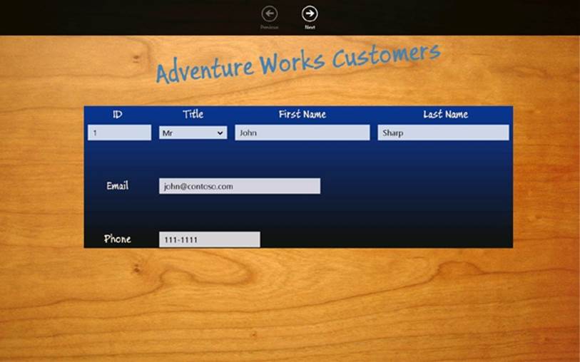
Notice that the Previous button is disabled. This is because the IsAtStart property of the ViewModel is true, and the CanExecute method of the Command object referenced by the Previous button indicates that the command cannot run.
38.In the app bar, click Next.
The details for customer 2, Diana Sharp, should appear, and after a short delay of up to 1 second, the Previous button should be enabled. The IsAtStart property is no longer true, so the CanExecute method of the command returns true. However, the button is not notified of this change in state until the timer object in the command expires and triggers the CanExecuteChanged event, which might take up to a second to occur.
NOTE
Remember that the Console.WriteLine method uses {0} and {1} as placeholders. In the statement shown, {0} will be replaced with the value of x, and {1} will be replaced with the value of y when the program runs. If you require a more instantaneous reaction to the change in state of commands, you can arrange for the timer in the Command class to expire more frequently. However, avoid reducing the time too much, as raising the CanExecuteChanged event too frequently can impact the performance of the user interface.
39.In the app bar, click Next again.
40.The details for customer 3, Francesca Sharp, should appear, and after a short delay of up to 1 second, the Next button should be enabled. This time, the IsAtEnd property of the ViewModel is true, so the CanExecute method of the Command object for the Next button returns true and the command is disabled.
41.Switch to Snapped view and verify that the application continues to function correctly. The Next and Previous buttons should step forward and backward through the list of customers.
42.Right-click anywhere on the background of the form. The app bar should disappear.
43.Return to Visual Studio and stop debugging.
Windows 8 Contracts
Chapter 25 briefly mentioned that a Windows Store app can implement one or more Windows 8 contracts. A contract defines a Windows 8 interface that enables an application to implement or consume an operating system–defined feature such as searching for information, sharing data, or acting as a resource for picking files. A contract provides a standard mechanism that is shared by other Windows Store apps; users running an application that implements a contract do not have to learn any application-specific procedures to perform the tasks that the contract provides. In essence, contracts enable Windows Store apps to work together seamlessly.
The most commonly used contracts are as follows:
§ Share Target contract. This contract enables a Windows Store app to integrate with the Share charm and act as a destination for shared data.
There are actually two sides to sharing: a Windows Store app can register as a sharing source to specify which data it wishes to share and in what formats. A target application that can consume shared data must implement the Share Target contract. After a source application has registered that it can share data, the user can use the Share charm to display a list of applications that implement the Share Target contract and select an application from this list. The Share Target contract defines events to which the target application must respond; the target application uses these events to request and receive the data from the source.
§ File Open Picker contract. This contract enables a Windows Store app to respond to requests from the Windows 8 file picker. Using this contract, a Windows Store app can provide users and other applications with access to the data that it manages in a controlled way. This contract effectively enables a Windows Store app to become a peer of local storage. A Windows Store app that implements the contract is in total control of the data and the views of this data that it presents to the file picker. Windows 8 also provides the File Save Picker contract that enables an application to control the way in which data it manages is stored.
§ Search contract. This contract enables users to search for the data exposed by your application by using the Windows 8 Search charm—this is a standard mechanism used by other Windows 8 applications. Implementing the Search contract means that users do not have to learn any special procedures specific to your application to search for data. Windows 8 provides the basic plumbing for performing a search, and all you have to do is supply the logic that takes a search request and finds the appropriate data.
NOTE
For more information on Windows 8 contracts as well as examples of how to implement them, visit the “App contracts and extensions” page on the Microsoft website at http://msdn.microsoft.com/library/windows/apps/hh464906.aspx.
Implementing the Search Contract
The Customers application works well if you have a small number of records, and you can use the Next and Previous buttons to browse for customer information. However, in a business environment, it is unlikely that you will have such a small number of customers (unless your business is particularly unsuccessful!). Using Next and Previous functionality to browse through a list of hundreds of records to find the details of a specific customer is time consuming and inefficient. To make the application more usable, you should offer a search facility and implement the Search contract.
Visual Studio 2012 includes the Search Contract template. This template generates the code that integrates with the Search charm. When the user selects this charm, all applications that implement the Search contract are listed, together with a data entry field that enables the user to specify the data to search for. If the user chooses to search your application, the search terms or criteria that the user enters are passed to your application. You use this information to filter the data in your application and determine which items match the search terms. Your application can then display a list of all matching records by using a page provided as part of the Search Contract template. This all sounds quite complicated, but in truth much of the complexity is implemented by the Search Contract template. All applications that provide a Search contract should operate in the same way, and so Microsoft was able to factor out much of the code into the template, as you will see in the following exercises. In this exercise, you will add a Search contract to the Customers application that enables a user to search for customers by first name or last name.
Implement the Search contract in the Customers application
1. In Visual Studio, open the Customers project, located in the \Microsoft Press\Visual CSharp Step By Step\Chapter 26\Search folder in your Documents folder. This version of the Customers application has the same ViewModel that you created in the previous exercise, but the data source contains details for many more customers. The customer information is still held in a List<Customer> object, but this object is now created by the DataSource class in the DataSource.cs file. The ViewModel class references this list instead of creating the small collection of three customers used by the previous exercise.
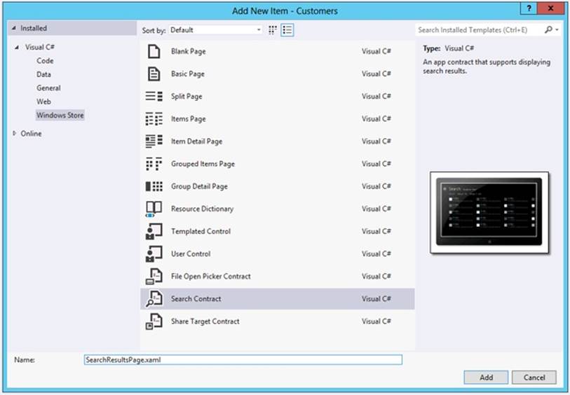
2. In Solution Explorer, right-click the Customers project, point to Add, and then click New Item.
3. In the Add New Item – Customers dialog box, click Windows Store in the left pane, select the Search Contract template in the middle pane, enter SearchResultsPage.xaml in the Name text box, and then click Add, as shown in the following image:
Visual Studio displays a message box with the text “This addition depends on files that are missing from your project. Without these files you must resolve dependencies on the Common namespace manually. Add the missing files automatically?”
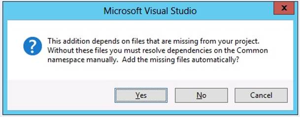
This message occurs because the Customers application was originally created by using the Blank App template, and this template does not include all of the code and other elements required by the Search Contract template. Click Yes to allow the Search Contract template to add these items.
The Search Contract template generates a new XAML page called SearchResultsPage.xaml, together with a code file called SearchResultsPage.xaml.cs, which is displayed in the Code and Text Editor window. A number of new files are added to the Common folder. These files contain code and data types required by the SearchResultsPage.xaml page.
NOTE
Visual Studio might also report some errors in the SearchResultsPage.xaml file. These errors occur because the SearchResultsPage.xaml file is created before the required files are added to the Common folder. They will disappear the next time you build the application.
4. On the BUILD menu, click Build Solution.
5. In Solution Explorer, double-click the SearchResultsPage.xaml file to display it in the Design View window. The page should look like this:
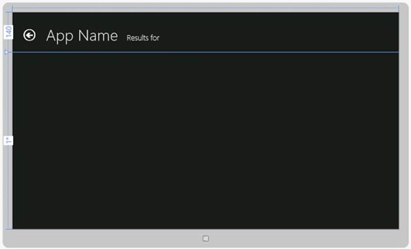
If you examine the XAML markup for this page, you will see that it is laid out by using a Grid control, which contains two further Grid controls: the first is called typicalPanel and is displayed when the application runs in Fullscreen or Filled view, and the other is called snappedPaneland is displayed when the application runs in Snapped view.
The typicalPanel Grid control contains the following items:
o An ItemsControl control named filtersItemsControl. At run time, this control will display a list of filters enabling the user to specify how to apply the search criteria that they entered. In the Customers application, you will define filters that enable the user to apply the search to the first name or last name of customers.
o A GridView control named resultsGridView. The customers that match the search criteria are displayed in this control, and the customers are formatted by using a template called StandardSmallicon300x70ItemTemplate. You can find this template in the StandardStyles.xaml file in the Common folder, and you will modify it to display customer data.
The snappedPanel Grid control contains these items:
o A ComboBox control that enables the user to select from a list of filters. This control fulfills the same role as the ItemsControl in the typicalPanel Grid control, except that it is more suited to the compressed space available in Snapped view.
o A ListView control named resultsListView. The purpose of this control is similar to the resultsGridView control in the typicalPanel Grid control: it displays the list of matching customers but using a list rather than a grid layout. The data itself is formatted by using theStandardSmallIcon70ItemTemplate style in the StandardStyles.xaml file.
Underneath the snappedPanel Grid control is another Grid control that contains the titles and buttons that appear at the top of the page, followed by a TextBlock control called noResultsTextBlock. This TextBlock control is displayed if the search term entered by the user does not match any customers.
At the end of the SearchResultsPage.xaml file are the visual state groups used by the Visual State Manager to switch the layout of the controls when the user changes between views.
NOTE
You can modify the styles used by the elements on this page to give them the same look and feel as the rest of your application, but you should not attempt to change the layout of the page or add or remove controls. The Search contract depends on the correct definitions of these controls to function properly.
6. In the <Page.Resources> section near the top of the SearchResultsPage.xaml file, change the value of the AppName string resource to Customers, as shown below in bold:
7. <Page.Resources>
8. ...
9. <!-- TODO: Update the following string to be the name of your app -->
10. <x:String x:Key="AppName">Customers</x:String>
</Page.Resources>
The title displayed in the Design View window changes to Customers.
11.In Solution Explorer, expand SearchResultsPage.xaml, and then double-click the SearchResultsPage.xaml.cs file to display it in the Code and Text Editor window.
This file contains the code for the SearchResultsPage class. This class defines the following methods:
o LoadState. This method runs when the user enters a search term into the Search charm and selects the Customers application. The criteria provided by the user are passed into this method in the navigationParameter parameter, and the code generated for this method extracts this information and saves it in a local variable called queryText. The purpose of this method is to find all items that match the search term and add them as collections (referred to as filters) to the ViewModel implemented by this page. The code generated by the template creates a default filter called All, which you can populate with the details of every customer, although in this application you will remove the All filter and create filters that contain the details of customers with first names or last names that match the value in the queryText variable.
NOTE
The SearchResultsPage uses its own ViewModel, which is defined in the LayoutAwarePage.cs file in the Common folder. You should not confuse this ViewModel with the one that you created earlier for the Customers application.
o Filter_SelectionChanged. This method runs when the user selects a filter on the SearchResultsPage when it is in Snapped view. The details of the filter are provided in the SelectionChangedEventArgs parameter, and the code generated for this method retrieves this value and stores it in the selectedFilter local variable. In this method, you should update the ViewModel to display the data specified by this filter.
o Filter_Checked. This method runs when the user selects a filter and the SearchResultsPage is in Fullscreen or Filled view. You should not change the code in this method.
This file also contains the definition of the Filter class used by the SearchResultsPage class. Again, you should not change the code in this class.
12.In Solution Explorer, expand App.xaml, and then double-click App.xaml.cs to display the file in the Code and Text Editor window.
13.Add the private _mainPageViewModel field and public MainViewModel property to the start of the App class, as follows in bold:
14.sealed partial class App : Application
15.{
16. private ViewModel _mainViewModel = null;
17. public ViewModel MainViewModel
18. {
19. get { return this._mainViewModel; }
20. set { this._mainViewModel = value; }
21. }
22. ...
}
You will use the MainViewModel property to enable the SearchResultsPage page to access to the ViewModel of the MainPage form.
23.In Solution Explorer, expand MainPage.xaml, and then double-click MainPage.xaml.cs to display the file in the Code and Text Editor window.
24.In the MainPage constructor, add the statement shown below in bold:
25.public MainPage()
26.{
27. ...
28. ViewModel viewModel = new ViewModel();
29. (Application.Current as App).MainViewModel = viewModel;
30. this.DataContext = viewModel;
}
This statement makes the ViewModel for the MainPage form available through the MainViewModel property of the App class. Notice that you can access the App object of the currently running application by using the Application.Current static property and casting the result as theApp type.
31.In Solution Explorer, double-click the ViewModel.cs file to display it in the Code and Text Editor window.
32.In the ViewModel class, add the AllCustomers public property shown below in bold:
33.public class ViewModel : INotifyPropertyChanged
34.{
35. private List<Customer> customers;
36. public List<Customer> AllCustomers
37. {
38. get { return this.customers; }
39. }
40. ...
}
This property makes the customers collection used by the ViewModel class available to other classes; you will require access to this collection in the SearchResultsPage class.
41.Display the SearchPageResults.xaml.cs file in the Code and Text Editor window. Add the following private field shown in bold to the start of the SearchResultsPage class:
42.public sealed partial class SearchResultsPage : ...
43.{
44. private Dictionary<string, List<Customer>> searchResults =
45. new Dictionary<string, List<Customer>>();
46. ...
}
This Dictionary collection will contain the lists of customers that match the search term specified by the user. There will be two lists in this collection: one for customers with a matching first name and another for customers with a matching last name.
47.In the LoadState method, add the statement shown below in bold immediately after the TODO comment:
48.protected override void LoadState(Object navigationParameter,
49.Dictionary<String, Object> pageState)
50.{
51. var queryText = navigationParameter as String;
52.
53. // TODO: Application-specific searching logic...
54. // ...
55.
56. List<Customer> allCustomers =
57. (Application.Current as App).MainViewModel.AllCustomers;
58. ...
}
59.In the LoadState method, comment out the following two lines of code highlighted in bold:
60....
61.var filterList = new List<Filter>();
62.// filterList.Add(new Filter("All", 0, true));
...
The Search contract implemented by the Customers application will not support the All option.
63.After this statement, add the following block of code shown in bold:
64.var filterList = new List<Filter>();
65.// filterList.Add(new Filter("All", 0, true));
66.
67.// Find all customers where the first name
68.// or last name matches the query text
69.queryText = queryText.ToLower();
70.List<Customer> matchingFirstNames = new List<Customer>();
71.List<Customer> matchingLastNames = new List<Customer>();
72.foreach (Customer customer in allCustomers)
73.{
74. string firstName = customer.FirstName.ToLower();
75. string lastName = customer.LastName.ToLower();
76. if (firstName.Contains(queryText))
77. {
78. matchingFirstNames.Add(customer);
79. }
80. if (lastName.Contains(queryText))
81. {
82. matchingLastNames.Add(customer);
83. }
}
This code is the crux of the Search contract. It iterates through the allCustomers collection looking for customers that have a value in the FirstName or LastName property that match the value in the queryText variable. The comparison mechanism eliminates any case-sensitivity by converting all data to lowercase. The code adds a reference for each matching customer to the matchingFirstNames and matchingLastNames collections.
84.Add the following code shown in bold to the LoadState method, after the previous block:
85.filterList.Add(new Filter(
86. "Matching First Names", matchingFirstNames.Count, false));
87.filterList.Add(new Filter(
88. "Matching Last Names", matchingLastNames.Count, false));
89.searchResults.Add("Matching First Names", matchingFirstNames);
90.searchResults.Add("Matching Last Names", matchingLastNames);
91.
92.// Communicate results through the view model
this.DefaultViewModel["QueryText"] = '\u201c' + queryText + '\u201d';
This code adds the details of the matchingFirstNames and matchingLastNames collections to the list of filters that will be displayed by the search results page. This information consists of a name, together with a count of the number of matches. The collections themselves are added to the searchResults collection. The name of each list of customers added to the searchResults collection must match the name of each filter specified in the filterList collection.
93.In the Filter_SelectionChanged method, add the statement shown below in bold immediately after the TODO comment:
94.// TODO: Respond to the change in active filter ...
95.// ...
96.this.DefaultViewModel["Results"] =
this.searchResults[selectedFilter.Name];
This statement causes the list of customers specified by the selected filter to be displayed on the search results page. The list of customers is retrieved from the searchResults collection by using the name of the filter (it will either be “Matching First Names” or “Matching Last Names,” as defined when you added the filters to the filterList collection in the previous step).
97.Comment out the following line at the end of the Filter_SelectionChanged method:
// VisualStateManager.GoToState(this, "NoResultsFound", true);
If there are no items matching items in a filter, the default logic of the Filter_SelectionChanged method is to use the Visual State Manager to put the page in the NoResultsFound state. In this state, the page displays the text “No Results Found.” However, if there are multiple filters, putting the page in this state causes it to stop searching and displaying results as soon as it finds the first empty filter (subsequent filters might contain data that should be displayed). Commenting out this statement enables the page to call the Filter_SelectionChanged method for all filters, even when it finds an empty one.
98.In Solution Explorer, expand the Common folder, and then double-click StandardStyles.xaml to display it in the Code and Text Editor window.
99.Find the StandardSmallIcon300x70ItemTemplate DataTemplate near the end of the file. This is the template that the SearchResultsPage uses to display the details of each matching customer. The Image and TextBlock controls in this DataTemplate control use data binding to display the properties of an object in Fullscreen and Filled views:
100. <DataTemplate x:Key="StandardSmallIcon300x70ItemTemplate">
101. <Grid Width="294" Margin="6">
102. ...
103. <Border ...>
104. <Image Source="{Binding Image}" .../>
105. </Border>
106. <StackPanel Grid.Column="1" Margin="10,-10,0,0">
107. <TextBlock Text="{Binding Title}" .../>
108. <TextBlock Text="{Binding Subtitle}" .../>
109. <TextBlock Text="{Binding Description}" .../>
110. </StackPanel>
111. </Grid>
</DataTemplate>
The Customer class has a Title property, but it doesn’t have Image, Subtitle, or Description properties. Remove the Border control and its associated Image control, and change the data bindings for the Subtitle and Description TextBlock controls to show the FirstName and LastNameproperties instead:
<DataTemplate x:Key="StandardSmallIcon300x70ItemTemplate">
<Grid Width="294" Margin="6">
...
<StackPanel Grid.Column="1" Margin="10,-10,0,0">
<TextBlock Text="{Binding Title}" .../>
<TextBlock Text="{Binding FirstName}" .../>
<TextBlock Text="{Binding LastName}" .../>
</StackPanel>
</Grid>
</DataTemplate>
112. In the StandardSmallIcon70ItemTemplate DataTemplate that immediately follows the StandardSmallIcon300x70ItemTemplate DataTemplate, make the same changes:
113. <DataTemplate x:Key="StandardSmallIcon70ItemTemplate">
114. <Grid Margin="6">
115. ...
116. <StackPanel Grid.Column="1" Margin="10,-10,0,0">
117. <TextBlock Text="{Binding Title}" .../>
118. <TextBlock Text="{Binding FirstName}" .../>
119. <TextBlock Text="{Binding LastName}" .../>
120. </StackPanel>
121. </Grid>
</DataTemplate>
Test the Search contract
1. On the DEBUG menu, click Start Debugging to build and run the application.
2. When the application appears, it should display the details for customer 1, Orlando Gee.
3. Press Windows+C to display the Charms bar, and then click Search.
4. The Search pane should appear, as shown in the following image, displaying the name of the currently running application, along with a text box into which you can type a search term. Underneath the text box is a list of all applications that implement the Search contract, and you can select which application you want to use to search for the data.
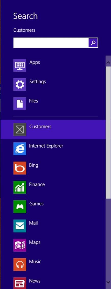
5. Enter the value G into the text box, and then click the icon for the Customers application.
6. The search results page should appear, listing all customers whose first or last name contains the letter G. The data identified by the Matching First Names filter is displayed (this is the first filter in the filterList collection). Notice that the name that you specified when you added the filter to the filterList collection is displayed at the top of the page together with the number of matches.
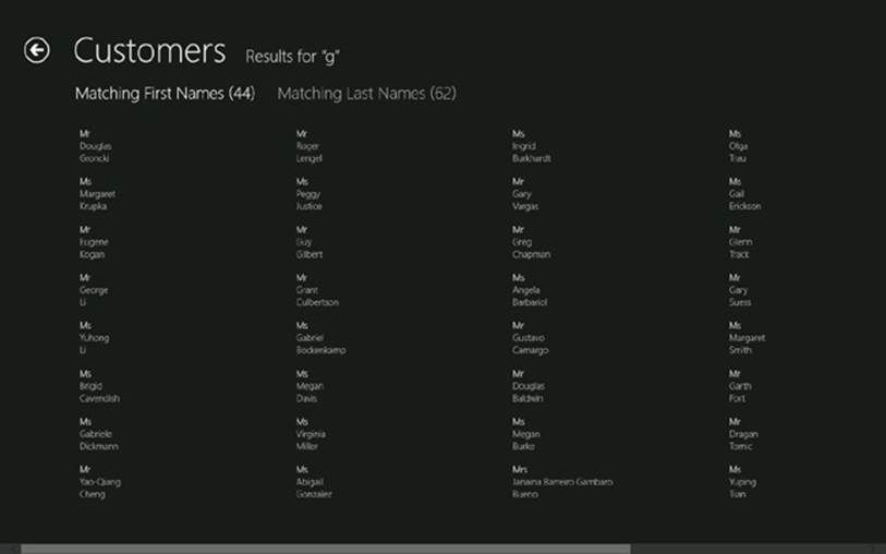
7. Click Matching Last Names. The list of customers whose last name contains the letter G should appear.
8. Return to Visual Studio and stop debugging.
Navigating to a Selected Item
Adding basic search functionality is relatively straightforward, but you can add a number of features to make this functionality more useful. The first is the ability to click a customer name in the search results page and go directly to that user in the Customers application. This is what you will do next.
Display the selected customer from the search results page
1. In Visual Studio, open the ViewModel.cs file in the Code and Text Editor window, and add the GoTo method shown below in bold to the ViewModel class between the Current property and the Next method:
2. public Customer Current
3. {
4. ...
5. }
6.
7. public void GoTo(Customer customer)
8. {
9. this.currentCustomer = this.customers.IndexOf(customer);
10. this.OnPropertyChanged("Current");
11.}
12.
13.private void Next()
14.{
15. ...
}
The GoTo method takes a Customer object as a parameter and uses the IndexOf method to find which customer this is in the customers collection. It then sets this customer to be the currently displayed customer.
16.Open the SearchResultsPage.xaml file in the Design View window.
17.In the XAML pane, find the markup for the resultsGridView GridView control and add the ItemClick property between the IsItemClickEnabled and ItemsSource properties, as shown below in bold:
18.<GridView
19. x:Name="resultsGridView"
20. ...
21. IsItemClickEnabled="True"
22. ItemClick="OnItemClick"
23. ItemsSource="{Binding Source={...}}"
24. ...
</GridView>
The ItemClick property specifies the name of the event-handling method to run when the user clicks an item in the GridView control. You will write this method shortly.
25.Find the XAML markup for the resultsListView ListView control, and add the same ItemClick property:
26.<ListView
27. x:Name="resultsListView"
28. ...
29. IsItemClickEnabled="True"
30. ItemClick="OnItemClick"
31. ItemsSource="{Binding Source={...}}"
32. ...
</ListView>
33.Open the SearchPageResults.xaml.cs file in the Code and Text Editor window and add the OnItemClick method shown below to the SearchResultsPage class, after the constructor:
34.public sealed partial class SearchResultsPage : ...
35.{
36. ...
37. public SearchResultsPage()
38. {
39. this.InitializeComponent();
40. }
41.
42. private void OnItemClick(object sender, ItemClickEventArgs e)
43. {
44. this.Frame.Navigate(typeof(MainPage), e.ClickedItem);
45. }
46. ...
}
The OnItemClick method uses the Frame.Navigate method to display the MainPage form. The value in e.ClickedItem passed as a parameter to the Navigate method will be a reference to the customer whose name the user clicked in the search results page. The Navigate method causes the OnNavigatedTo method in the target page (in this case, the MainPage form) to run, and the item passed as the parameter to the Navigate method is forwarded on to the OnNavigatedTo method.
47.Open the MainPage.xaml.cs file in the Code and Text Editor window and find the OnNavigatedTo method at the end of the MainPage class. This method is currently empty.
48.Add the code shown below in bold to the OnNavigatedTo method:
49.protected override void OnNavigatedTo(NavigationEventArgs e)
50.{
51. Customer selectedCustomer = e.Parameter as Customer;
52.
53. // If the Customer passed in as the parameter is not null
54. // then go to that customer
55. if (selectedCustomer != null)
56. {
57. ViewModel viewModel =
58. (Application.Current as App).MainViewModel;
59. this.DataContext = viewModel;
60. viewModel.GoTo(selectedCustomer);
61. }
62. this.WindowSizeChanged(this, null);
}
This code uses the GoTo method of the ViewModel class to navigate to the specified customer, which will then be displayed on the MainPage form. The OnNavigatedTo method also invokes the WindowSizeChanged method; if the application is running in Snapped view, this method call ensures that the Visual State Manager runs and adjusts the layout of the form.
63.On the DEBUG menu, click Start Debugging to build and run the application.
64.When the application appears, press Windows+C to display the Charms bar and then click Search.
65.Enter the value G into the text box, and then click the icon for the Customers application.
66.On the search results page, click one of the customers, such as Gary Vargas. The MainPage form should reappear, displaying the details of the customer:

67.Return to Visual Studio and stop debugging.
Starting an Application from the Search Charm
The search capability that you have implemented so far depends on the Customers application already running when the user invokes the Search charm. This might not always be the case. If the application is not running when the user performs a search, the user will be faced with a blank screen. So, another useful feature is to enable the application to start up automatically when the user performs a search. This is the purpose of the final exercise in this chapter. Additionally, you will add some more meaningful icons to the Customers application. These icons will replace the standard gray and white check box–style icons that appear by default on the Windows Start screen that the user clicks to launch an application, the splash screen that appears when the application starts running, and the Search pane when the user invokes the Search charm.
Enable the Customers application to start automatically
1. In Visual Studio, open the App.xaml.cs file in the Code and Text Editor window. Scroll to the bottom of this file and find the OnSearchActivated method. This method was added to the App class by the Search Contract template, and it runs when the user performs a search using the application.
This method also acts as an entry point to the application if it was not previously running. If you look at the end of the method, you will see the following statements:
frame.Navigate(typeof(SearchResultsPage), args.QueryText);
Window.Current.Content = frame;
// Ensure the current window is active
Window.Current.Activate();
This code navigates to the SearchResultsPage form, passing in the search term entered by the user, and then makes that form the current page. The problem is that if the MainPage form is not running, then the ViewModel will not have been created, so there is no data available to search. The simple solution is to instantiate the MainViewModel variable if it is currently null before moving to the SearchResultsPage form.
2. Add the following code shown in bold to the OnSearchActivated method:
3. protected async override void OnSearchActivated(...)
4. {
5. ...
6.
7. if (this.MainViewModel == null)
8. {
9. this.MainViewModel = new ViewModel();
10. }
11.
12. frame.Navigate(typeof(SearchResultsPage), args.QueryText);
13. Window.Current.Content = frame;
14.
15. // Ensure the current window is active
16. Window.Current.Activate();
}
17.In Solution Explorer, expand the Assets folder.
This folder contains several graphics images: the default images displayed by the splash screen when the application starts running, the icon that appears on the Start screen, and the icon that appears when the user invokes the Search charm (there is also an image file that you can attach to the application when it is uploaded to the Windows Store). Each image has a specific size: the logo image that appears on the Start screen must be 150 × 150 pixels, the small logo image that appears with the Search charm must be 30 × 30 pixels, and the logo used by the splash screen must be 620 × 300 pixels.
18.Right-click the Assets folder, point to Add, and then click Existing Item.
19.In the Add Existing Item – Customers dialog box, move to the \Microsoft Press\Visual CSharp Step By Step\Chapter 26\Resources folder in your Documents folder, select all three files in this folder, and then click Add.
These new graphics files contain more colorful images than the stock gray and white ones provided by the Blank App template.
20.In Solution Explorer, double-click the Package.appxmanifest file.
The Application Manifest Editor window appears. This tool was briefly described in Chapter 25; you use it to configure the capabilities and metadata of your application. The Application UI tab enables you to specify the way in which your application presents itself to the user, including the logos that are displayed.
21.On the Application UI tab, in the Logo box type Assets\AdventureWorksLogo150x150.png, in the Small logo box type Assets\AdventureWorksLogo30x30.png, and in the Splash screen box type Assets\AdventureWorksLogo620x300.png.
TIP
You can also click the ellipses buttons and browse to the Assets folder to select each image file if you prefer not to type the names.
22.On the BUILD menu, click Build Solution.
23.After the solution has built successfully, on the BUILD menu, click Deploy Solution.
This action installs the application on your computer. In the past, this happened automatically whenever you started the application by using the DEBUG menu, but you are going to start the application from the Search charm instead.
24.Press Windows+C to display the Charms bar, and then click the Search charm.
Notice that the Customers logo has been replaced with an icon that displays the initials “AW” (for Adventure Works):
25.Enter the value G into the text box, and then click the icon for the Customers application.
The search results page for the Customers application should appear, displaying all matching customers. Notice that while the application is starting up, the splash screen appears:
26.Click any customer.
The Customers application should run and display the details of the selected customer.
27.Close the application (use the swipe gesture from the top of the screen)
28.On the Start screen, notice that the icon for the Customers application displays the Adventure Works logo:

If you click this icon, the same splash screen displayed when the application was started by the Search charm will appear.
29.Return to Visual Studio.
Summary
In this chapter, you learned how to display data on a form by using data binding. You saw how to set the data context for a form and how to create a data source that supports data binding by implementing the INotifyPropertyChanged interface. You learned how to use the Model-View-ViewModel pattern to create a Windows Store app. You saw how to create a ViewModel that enables a view to interact with a data source by using commands. Finally, you learned how to implement the Search contract to enable a Windows Store app to integrate search functionality into the features provided by Windows 8.
NOTE
This chapter and Chapter 25 used the Blank App template as the vehicle for showing you how to create a Windows Store app. Visual Studio 2012 provides two other templates that provide a more comprehensive starting point for building Windows Store apps: the Grid App template and the Split App template.
You can use the Grid App template to display and edit hierarchical data that is organized into groups. This template generates an application that has three pages: a top-level page called the Grouped Items page displays a list of groups, a second-level page referred to as the Group Detail page displays the detailed information for a group, and a third-level page known as the Item Detail page displays the items in a group.
The template uses GridView and ListView controls to display information by using data binding, and the pages adapt to different views by using the Visual State Manager. Data is formatted and styled by using the styles and data templates in the same StandardStyles.xaml file that you have been examining and editing in this chapter. The template also includes a sample data source and a simple ViewModel. You can replace the sample data source with your own business data and amend the ViewModel to handle your own data structures. The intention is that you use the pages and ViewModel as a starting point for your own application and augment them with any additional pages and logic that your application requires. You can employ the same techniques and strategies that you have learned in this chapter.
The Split App template is similar in concept and structure to the Grid App template, except that it generates only two pages: a top-level page called the Items page that displays a list of groups and a second-level page called the Split page that displays a list of items in a group on the left side and the details of a selected item on the right side.
§ If you want to continue to the next chapter
Keep Visual Studio 2012 running, and turn to Chapter 27.
§ If you want to exit Visual Studio 2012 now
On the FILE menu, click Exit. If you see a Save dialog box, click Yes and save the project.
Chapter 26 Quick Reference
|
To |
Do this |
|
Bind the property of a control to the property of an object |
Use a data binding expression in the XAML markup of the control. For example: <TextBox ... Text="{Binding FirstName}" .../> |
|
Enable an object to notify a binding of a change in a data value |
Implement the INotifyPropetyChanged interface in the class that defines the object and raise the PropertyChanged event each time a property value changes. For example: class Customer : INotifyPropertyChanged { ... public event PropertyChangedEventHandler PropertyChanged; protected virtual void OnPropertyChanged( string propertyName) { if (PropertyChanged != null) { PropertyChanged(this, new PropertyChangedEventArgs(propertyName)); } } } |
|
Enable a control that uses data binding to update the value of the property to which it is bound |
Configure the data binding as two-way. For example: <TextBox ... Text="{Binding FirstName, Mode=TwoWay} " .../> |
|
Separate the business logic that runs when the user clicks a Button control from the user interface that contains the Button control |
Use a ViewModel that provides commands implemented by using the ICommand interface, and bind the Button control to one of these commands. For example: <Button x:Name="nextCustomer" ... Command="{Binding Path=NextCustomer}"/> |
|
Enable an application to support searching by using the Search charm |
Implement the Search contract by using the Search Contract template. In the LoadState method of the search page, add code to find all data that matches the search term entered by the user and create search filters that contain this data. In the Filter_SelectionChanged method, switch to the search filter specified by the user. Handle the ItemClick event on the search page to navigate to the item selected by the user on the search page and display it in your application. |
All materials on the site are licensed Creative Commons Attribution-Sharealike 3.0 Unported CC BY-SA 3.0 & GNU Free Documentation License (GFDL)
If you are the copyright holder of any material contained on our site and intend to remove it, please contact our site administrator for approval.
© 2016-2025 All site design rights belong to S.Y.A.