Geocomputation: A Practical Primer (2015)
PART III
MAKING GEOGRAPHICAL DECISIONS
10
KERNEL DENSITY ESTIMATION AND PERCENT VOLUME CONTOURS
Daniel Lewis
Introduction
This chapter presents a method for making geographical decisions about services based on the spatial distribution of their users, particularly in terms of analysing existing systems of service provision. Many commercial companies and public services operate in a location-based way, and anyone who wants to use such services has to physically visit them. Young people have to go to school to learn; ill people need to visit a doctor’s surgery or hospital (Chapters 11 and 13) to receive treatment; and hungry people might choose to visit a supermarket to buy food. Each of these services is effectively in competition with each other for pupils, patients, customers and consumers. Making sure that services are successful requires an understanding of the community of people being served, which is a product of both the individual characteristics of service users and their respective geography.
The community of people served by a given facility, like a doctors’ surgery, might ideally be defined as everyone who lives within distance x, or travel time y, according to the capacity of that facility. This, we could claim, is a normative assessment (i.e. a standard or normal expectation) of how people ought to be arranged geographically with respect to any particular service. Unfortunately, reality does not usually reflect a normative distribution. People will often choose (or be constrained) to use particular services for reasons other than simple proximity to their residence or place of work. In the past, researchers often had to rely on models such as the gravity model, or its more sophisticated counterpart, the spatial interaction model, to get a sense of the community of people who used a particular service. Recently, though, the increasing collection and availability of administrative data from local and national government concerning the use of public services, and research cooperation from the commercial sector, has meant that we can look directly at patterns of service use.
A straightforward example might be hospital records. In the UK, for any publically funded (NHS) hospital, administrative records are kept detailing patient visits. These records tell us something about the patient (their demographics), something about the hospital visit (any diagnoses, procedures, operations or outcomes), and also something about the patient’s geography (where they are domiciled). This information can tell us a number of things about how that hospital is used, all of which are very important to delivering efficient and high-quality hospital services. It is more complex than this, though; hospitals are in competition with one another, so we do not just want to know about any one hospital, we also want to know about competing hospitals. Soon enough we are dealing with very large amounts of complex data about patients in multiple hospitals that are difficult to meaningfully assess.
This chapter will discuss the geocomputation of ‘service areas’, also often called ‘catchment areas’ or ‘market areas’. Delineating service areas is an effective way of spatially summarising complex or voluminous data on service use in a way that can help service managers, administrators or policy-makers better understand and make geographic decisions about location-based services. Spatial methods can help us simplify complexity.
Service area analysis methodology
This section will discuss the creation of service areas. The methodology is a three-step process: first a density surface is computed, then it is thresholded according to the percentage volume of service users we wish to enclose, and finally the thresholded surface is contoured to create the service area. In order to make service area analysis accessible, an ArcGIS 10.x Python script tool has been provided on the companion website. The service area tool allows users to input a set of data points and output service areas, whilst the percent volume contour tool allows more advanced users to input a pre-computed density surface and output the service area based upon that surface. The R package adehabitat (http://cran.r-project.org/web/packages/adehabitat/) also implements the method with the kernelUD function (Calenge, 2013).
Service area analysis has existed for many years in the spatial sciences, both conceptually and practically (see Wilson, 2000). It emerged from the work of Von Thunen (1783–1850) and Weber (1868–1958), who theorised the locations of farms and industries, respectively. Applebaum (1965) traced the beginnings of contemporary service area analysis to commercial definitions of ‘market areas’ in store location research in 1930s America. Early research into service areas depended on Reilly’s law of retail gravitation (Reilly, 1931), which constructs service areas in terms of ‘break points’ between cities subject to the relative size of their populations. These kinds of insights from a gravity modelling perspective were important in the development of different attitudes and approaches to service area delineation.
Huff (1964) is one of the first outside of the ‘gravitationalists’ to consider the geographical delineation of retail trading areas, arguing that existing break point and buffer approaches may be subject to errors, including differences with ‘transportation facilities, topographical features, population density, and the locations of competing firms’ (p. 35). Huff (1964) instead focuses on the consumer, not the firm, creating probability surfaces for firms based on the behaviours of consumers, with contours delineating equi-probability of customers visiting a given firm. Huff (1964) and Huff and Batsell’s (1977) service area delineations allow for the possibility of overlapping, or ‘congruent’ areas (Huff and Rust, 1980).
The method implemented in this chapter and used to delineate service areas is also analogous to an approach in ecology designed to tackle a long-standing problem called ‘home range estimation’. A home range is the ‘area traversed by the individual [animal] in its normal activities of food gathering, mating, and caring for young’ (Burt, 1943: 351). Home ranges are also commonly referred to in ecology as ‘utilisation distributions’, which Burt (1943: 351) tells us are ‘rarely, if ever, in convenient geometric designs’.
A key component in this analytical method is that data are required about the locations of service users. The simplest form of data that we can work with requires two variables: the location of the service users; and an identifier for the service location used (assuming data relate to a system of services). Using these two identifiers, we can both locate individuals spatially and group individuals by the service that they use.
In an ideal world we would always work with population data, that is, data that accounts for every user of a given service; however, in reality it is often too expensive, difficult or simply impossible to obtain data on a complete population. If we do not have population data, we instead have sample data, that is, data about a subset of that population. If we are working with sample data it is important to think about the caveats of that sample – the conditions underlying its creation. If, for example, the sample of people has been randomly selected from a known population of all users, we could assume that it is likely to be representative of the population, as the random selection is unlikely to have introduced significant bias. However, if a particular selection strategy has meant that a specific subset of the population has been sampled, we would need to be careful about how we address that sample.
In addition to a basic dataset of locations and service enrolment, it would be nice to have a range of other variables to allow us to create stratified service areas (i.e. service areas for particular subsets of the data, for instance men and women) and also to test hypotheses about the types of people who use the service. Knowing something about individuals and their habits is important to understanding the conditions of service. We might also want to know about characteristics of the service visited, such as the range or type of services provided. In addition to these features of services and service users, we might also want to have some geospatial reference data available, that is, data about the wider environment that the service and its users are located within. Geospatial reference data are important from a visualisation perspective. Finally, we might employ secondary data about the places that are covered by service areas, for instance data from the UK Census of Population, allowing us to compare the service users within a given service area with the whole population of users and non-users.
Creating a service area
Following the procedure set out in ecology by Worton (1989) and subsequently detailed by Gibin et al. (2007) and Sofianopoulou et al. (2012) with reference to public health applications, this section details the three steps required to generate service areas: firstly, the creation of a density surface; secondly, the thresholding of the density surface; and finally, its delineation to form a bounded service area.
Our goal is to create a service area that bounds a particular percentage of the distribution of service users for a given service. We use a density surface to do this as we want to bound the smallest possible area that satisfies a given percentage; this will be defined by the areas of highest density. Density is a commonly used measure of the count of observations per area; you will be aware of it in maps of population density, which measure the number of people per area. One way of creating a continuous density surface is to use a method called kernel density estimation (KDE).
Kernel density estimation is, in essence, a smoothing technique that transforms a discrete distribution of points (such as the location of service users) to a continuous surface. The important property of KDE is that the transformation preserves the density characteristics of the discrete point distribution – areas that have lots of points receive higher density values than areas that have fewer points. When we look at point distributions that relate to service use, we usually find lots of points near to the service in question, and fewer points further away; this is typical of the kind of ‘distance decay’ relationships we expect. Figure 10.1 shows the transformation from a point distribution of users of a service to a continuous density surface using KDE.
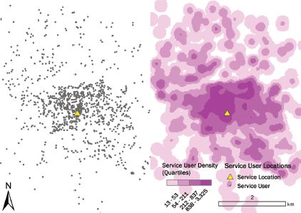
FIGURE 10.1 A point distribution of service users (left), and its density surface (right) computed using KDE (25m cell size, 200m bandwidth, Epanechnikov kernel)
Density surfaces like the one shown in Figure 10.1 are often used to detect the clustering of points, in which areas of high density are referred to as ‘hotspots’. If we look at the location of the service, there is a clearly a high density of service users near to the service location, and a tendency towards lower densities further away from the service location.
Creating the density surface using the KDE method requires the user to make several choices, notably the cell size, bandwidth and the kernel function. Let us consider the significance of each of these in turn.
Cells size is the easiest to deal with: the density of observations is estimated on a continuous surface; this continuous surface is a ‘lattice’, that is, a regular grid of cells. Thus, cell size specifies the resolution of the density surface – the length of the side of each square cell. Large cell sizes produce a grainier image, and smaller cell sizes a sharper image. In Figure 10.1, the density surface would appear more blocky if we increased the cell size from 25m and sharper if we decreased it; however, each time we halve the cell size, we quadruple the number of cells we need to hold the density values for the whole surface. More cells mean larger file sizes and slower processing, therefore we may need to find a compromise between smaller cells sizes and processing time. Generally speaking, though, as computing performance has increased, the need to restrict cell sizes for most applications has lessened.
Bandwidth and kernel function decisions are associated, and determine the process of ‘spreading’ (smoothing) the point distribution. KDE works by positioning a ‘kernel’ over each point in the point distribution. A kernel is a window of a given ‘bandwidth’ that spreads the point over the area of the window according to a mathematical function. Usually we use a function that is peaked over the point itself, and gradually decays as it gets to the edge of the window. It is easy to understand this in one dimension, as shown in Figure 10.2; in both cases the discrete point is spread along the number line (the x-axis) according to the shape of the kernel. The Gaussian kernel (also called the normal kernel) is one of the most used kernels: the bandwidth is the standard deviation of the function. This particular function is ‘unbounded’, meaning that the curve never quite decays to 0, thus a density value is calculated for all cells in your area of interest, for each point. The Epanechnikov kernel is the kernel implemented in ESRI’s ArcGIS KDE tool, and is the kernel used in Figure 10.1. As you can see from Figure 10.2, unlike the Gaussian kernel, the Epanechnikov kernel is ‘bounded’: it is only defined for the bandwidth (in this case from –1 to +1), which means that density values are only calculated within the bandwidth. Once you have positioned a kernel over each point in a point distribution and smoothed the point according the function of the kernel and its bandwidth, you simply add all of the windows together to get your density surface; this is what has happened in Figure 10.1.
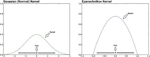
FIGURE 10.2 Two kernel functions smoothing a point
In practical terms, the choice of kernel function will not make a significant difference to our application of calculating service areas, so you may as well use whichever has been implemented in your software (usually either normal or Epanechnikov). However, de Smith et al. (2009) give a good run-down of other possible kernels. The same is not true of the bandwidth, however, the appropriate setting of which is very important to the resultant density surface.
The size of the bandwidth defines how big the window is that we use to smooth the point distribution we are working with. A small bandwidth creates a small window, a large bandwidth a large window, and this has the effect of giving low or high amounts of smoothing, respectively. Unfortunately if we mis-specify the bandwidth we can end up with a density surface that is over- or under-smoothed. An over-smoothed surface will have indistinct features, perhaps looking a bit blurred, whereas an under-smoothed surface will look too rough or spiky. The goal is to find a bandwidth that strikes a balance between over-generalisation and over-discretisation of a point distribution, Figure 10.3 gives an example of what this might look like using a three-dimensional visualisation.
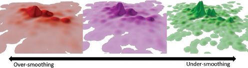
FIGURE 10.3 Over- and under-smoothing of a point distribution
Bowman and Azzalini (1997) describe the ‘normal optimal smoothing’ approach to heuristically specifying a bandwidth (h) for KDE as
![]()
Here σ is the standard deviation of the point distribution, usually the mean of the standard deviation in the x and y directions; n is the number of points in the point distribution. Silverman (1986: 86) notes that equation (10.1) is an appropriate heuristic for Epanechnikov kernels if h is multiplied by 1.77.
In point distributions that represent the locations of service users we often find that a minority of users live a long way away from the service, giving a ‘long-tailed’ distribution. Such distributions can have the effect of inflating the standard deviation of a point distribution, and thereby over-smoothing. Therefore, following Bowman and Azzalini (1997), the average absolute deviation (AAD) or median absolute deviation (MAD) can be substituted for σ in order to counter the inflation of h due to outlying data points:
Figure 10.4 demonstrates the differential effect of bandwidth selection for a general practioner (GP) surgery in Southwark, London. Ultimately, the selection of bandwidth will depend on subjective preference. Although completely automated bandwidth selection procedures do exist, they can be unreliable for the purpose of creating service areas, tending to over-smooth.
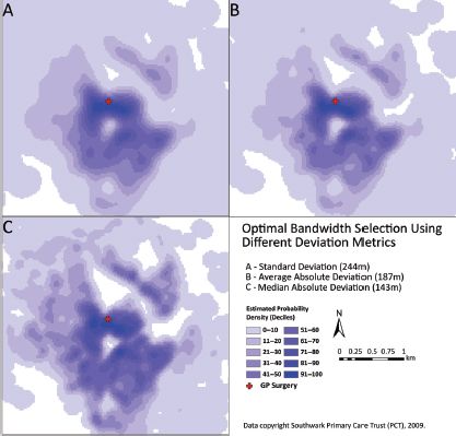
FIGURE 10.4 KDE surfaces using an Epanechnikov kernel, resulting from bandwidth selection using equations (10.1), (10.2) and (10.3) as A, B and C, respectively
Thus far we have considered using a single ‘fixed’ bandwidth. However, a more advanced approach may be undertaken in which ‘adaptive’ bandwidths are used. In this situation bandwidth is dependent upon the local distribution of points, not their global distribution. In adaptive KDE, the bandwidth is allowed to vary so that local areas are neither under- nor over-smoothed as might be the case using a fixed bandwidth. Figure 10.5 gives an example of adaptive KDE using the sparr package in R (Davies et al., 2011) for the same GP surgery as in Figure 10.4: Figure 10.5(a) is the density surface using an adaptive Gaussian kernel, and Figure 10.5(b) gives the hypothetical bandwidths over the study area. It is clear from Figure 10.5(b) that the adaptive bandwidth is much smaller for areas near to the GP surgery, and tends to increase with distance. As might be expected, computing an adaptive KDE for a large dataset, over a large area, on a fine grid is more resource-intensive than the equivalent fixed bandwidth approach.
Having defined an appropriate density surface for a point distribution, a service area can be defined by working out the smallest area within which a predefined percentage of the surface lies, and drawing around that area. This is called a percent volume contour; the term ‘volume’ is used because, as in Figure 10.3, the density surface can be seen as having a volume (edge length squared × cell density value) and hence can be represented arbitrarily in three dimensions. The procedure for thresholding the density surface is as follows:
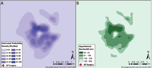
FIGURE 10.5 Kernel density estimate using (a) Gaussian kernel and (b) hypothetical bandwidths
1. Compute the percentage of the total volume of the density surface that each cell contributes.
2. Sort the cells from high volume to low volume.
3. Recode the cells as 1 until a given cumulative percentage is reached; thereafter recode cells as 0. This creates the thresholded density surface.
All that remains is to convert the thresholded density surface into a vector geometry. Converting to a line geometry is the percent volume contour (PVC), whilst converting to polygon geometry is the service area. Figure 10.6demonstrates the 50%, 75% and 95% service areas for a GP surgery in Southwark, London.
Aside from the adaptive KDE methods suggested above, there exist several possible advanced refinements to the service area creation method. Here we will briefly discuss smoothing techniques for zonal data and the use of network KDE. So far we have assumed that data relate to the locations of individuals; however, data will often be aggregated to an administrative geography. When data are reported at an aggregate level of geography, a technique such as KDE, which is applicable to point and line data, is unsuitable; this is because the presence of an aggregate geography implies boundary conditions that are ignored by the kernel approach. The implication of smoothing an areal aggregation using KDE is that values in one area could affect the estimated density in neighbouring areas, despite the fact that we know empirically that those values lie within bounded, neighbouring but non-overlapping areal units. Inferring a surface from an areal aggregation implies a ‘change in support’ – from a larger, irregular areal aggregation, to a finer, regular grid (or set of irregular point locations). Tobler’s (1979) pycnophylactic surface model is a good candidate for effecting a change in support from aggregate administrative units to a fine, regular gridded surface model. An application of Tobler’s pycnophylactic smoothing – pycno – is available for R (Brunsdon, 2011). Kyriakidis (2004) also identifies a subset of the geostatistical technique of ‘kriging’, known as ‘area-to-point kriging’, which would also be applicable. The appropriate model in the case of service area delineation would be area-to-point Poisson kriging, owing to the fact that the areal aggregation containerises counts of service users visiting a particular service; such models are detailed by Goovaerts (2006).
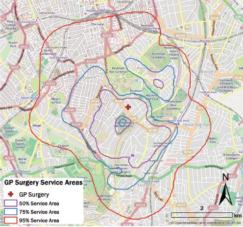
FIGURE 10.6 Service areas computed for the density surface in Figure 10.5
Another assumption we have made is that it is appropriate to conceptualise space as isotropic, that is, uniform in all directions. However, services and their customers are usually constrained to a network of roads and paths, so that most of the time we cannot travel between places in a straight line. Standard KDE implementations use a straight-line distance, but it might be more relevant to use a network-based KDE instead. Network KDE calculates the density of a given set of observations on a network, and thus may be a better representation of the density of customers who utilise a service. Okabe and Satoh (2009) have created the SANET toolkit (Spatial Analysis on NETworks) for ESRI ArcGIS, which supports network KDE. However, network KDE is more computationally expensive than traditional KDE, there is less certainty about how to specify appropriate bandwidths, and creating PVCs is untested. Bounding a subset of a network in order to create a PVC requires thought, although initially implementing a method similar to how network buffers are drawn (using triangulated irregular networks) might be a viable solution.
We recommend using the KDE and PVC approach detailed above for estimating service areas; for the most part it is a fast and efficient procedure that is well integrated and understood in GIS. There is support for choosing the appropriate kernel, cell size and, most importantly, bandwidth. The procedure produces good outputs for visualisation purposes, and is generally acceptable analytically, even in situations where there is a change in support (although there may be some biases or uncertainties introduced here). The primary role of the researcher is to decide what you would consider an appropriate percentage at which to delineate a service area. There are no easy answers to this, although most researchers point towards enclosing a group of ‘core’ users which can range from 50% to around 80% in service area terms, although others, such as Sofianopoulou et al. (2012), use 95%, 98% and 99% service areas owing to the nature of their research question. In the following section we provide a short overview of analytical options using service areas.
Examples of service area analysis
There are a number of different analytical contexts in which service areas can offer new and novel understandings of how existing systems of service work. In many, if not the majority of cases, service area analysis will be implemented simply in order to effectively visualise the distribution of service users for a particular service or system of services. Maps are easily understood forms of communication, and enable the effective transmission of information in a number of areas; this might include operational or managerial situations within a company, as well as customer-facing contexts.
Singleton et al. (2011) define service areas for secondary schools in the UK, presenting a web-based decision support system in order to aid parental choice. Not only is a school’s service area depicted, using data on school and pupil locations from the pupil-level annual schools census, but a whole range of additional data is also presented, at both the school level and the neighbourhood level. The visualisation of service areas, and the association of a wide range of additional data, allow for a comprehensive insight into local secondary school enrolment and attainment.
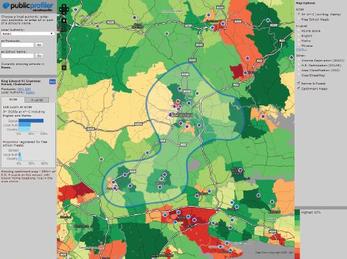
FIGURE 10.7 A school service area in Singleton et al.’s (2011) education profiler (source: http://www.educationprofiler.org/)
Whilst Singleton et al.’s (2011) web-based implementation of service areas is a powerful geovisualisation-based spatial decision support system, it is strictly communicative. We can only make visual comparisons between service areas and their statistics. The next logical step is to begin to compare the spatial congruence, or overlap, between different services. Figure 10.8 demonstrates the overlap for a system of hospital trust service areas in London c. 2009 according to their 50% and 80% service area polygons.
Initially, we might simply enumerate the number of overlaps experienced by hospital trust service areas; this will provide crude estimates for the presence of locally competing markets. However, we can go further by estimating the areal extent of the overlap between hospital trusts; this gives us an idea of the importance of the overlap. Of course, whilst it might be enlightening to consider service area overlaps in terms of shared area, it is actually much more pertinent to think in terms of people, rather than geometry; it is, after all, people who are being provided care.
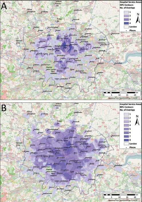
FIGURE 10.8 Overlapping NHS trust service areas for 25 NHS London trusts, for outpatients in 2008/2009
We can use the set of service areas as bespoke geographies, and estimate any number of demographic or socio-economic variables based on the service area geometry. This can give us a richer idea of the kinds of places covered by each service area, and also provide real context for areas of congruence between locally competing services.
A service area can also be used as a sampling frame or geographical filter through which questions about social and spatial processes related to a given service, or system of services, can be answered. Generally speaking, a service area encloses a group of people, some of whom will be users of that service, and some of whom will not. The difference between the community of people that are served, and the community of people that are within a service area but not served, can help answer questions important to particular services. In the case of publically provided schools or health-care services it might provide monitoring information about the spatial equity of provision, whereas commercial companies might use the analysis for marketing purposes to help them target local groups of non-users according to their demographic or socio-economic characteristics.
Harris and Johnston (2008) use service areas to look at segregation in primary schools in Birmingham, UK, demonstrating that there is evidence for the concentration of children of particular ethnicities in particular schools in a way we would not expect given a sampling of eligible children based upon primary school service areas. This raises questions about the reasons for these patterns, and the potential for academic disadvantages to be brought about as a spatial process. Harris and Johnston (2008) use their service areas to select individuals who either fall inside or outside each service boundary, and can use that information to create an index. We can, for example, create a new randomly sampled population for a service based upon its service area, and compare that sample with the observed population. Comparing an observed population to a hypothetical population allows us to say to what extent an observed population might deviate from a hypothetical population.
A similar analysis for GP surgeries in Southwark, London was interested in ethnic drivers of patient choice. Figure 10.9 suggests that there is variation in uptake of local primary care GP services by ethnicity. Indeed, when individual GP surgeries are considered, evidence from Southwark suggests that patient ethnicity is a major factor in the sorting of population by GP surgeries, with some groups, notably African, Muslim and East Asian patients, being over twice as likely to use particular surgeries than might be expected given their proportion in the normal resident population.
As with any research, we have to be careful in our interpretations: whilst using the service area as a sampling frame can help us uncover patterns, and stress the need for better spatial understandings of how people use services, it would be difficult to draw conclusions based upon this analysis alone.
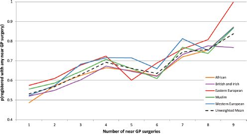
FIGURE 10.9 Registration with GP surgeries in Southwark, London (2009), based upon the number of 50% service areas a patient falls within, stratified by patient ethnicity
Service areas do, however, also offer the potential to contribute to statistical models as the dependent or explanatory variable. Lewis and Longley (2012) consider a range of demographic and spatial explanatory variables in a study of patient choice of GP surgeries; a control variable is defined according to the number of service areas that each patient resides within. This variable is important in accounting for the possible choice set of a given patient, which varies depending on where that patient lives. This measure of accessible GP surgeries by service area is found to be almost as significant an explanatory variable as distance to a GP surgery, or the number of doctors of a GP surgery has, is in explaining why patients might not use their most proximal GP surgery. These kind of insights are significant, as Soufianopoulou et al. (2012) suggest: service areas are unlikely to be coterminous with other administrative boundaries, or in the case of GP surgeries, with doctor-defined service boundaries. There is clearly a spatial component to service provision that is not currently well understood or accounted for.
In the future, there may be scope to use the geometric properties of the service areas of a system of services to actually define the analysis. In analyses of the competition between services it might make sense to create a ‘spatial weights matrix’ that represents the service area overlaps; this would allow for statistical models to adjust for the spatial dependencies created by locally competing services and mitigate the effect of bias on estimates of competition.
Conclusion
This chapter has outlined and illustrated a methodology for defining the service areas of a given service or system of services, and provided an overview of the analysis options available, with examples. In some respects service area analysis is one of the older spatial analytical traditions, with notable examples from some of the most significant spatial thinkers. However, new insights from external disciplines, the increasing availability of appropriate data and modern high-powered desktop computing have the potential to yield new insights in a topic area about which little has been published in the last ten years within the social science literature.
As we continue along an era of growth in spatial analysis and applied geocomputation in both the public and private sectors, detailed and sophisticated ways of dealing with increasingly large datasets will increasingly be sought after. Policies in the public sector that advocate more competition and greater cost savings in services such as health care and education can benefit greatly from spatial approaches, provided a solid data infrastructure is in place. Commercial companies, meanwhile, will seek to understand how location-based analyses of customer demographics can mesh with the increasingly online world of business.
FURTHER READING
Many of the statistical and geostatistical procedures mentioned in this chapter, particularly kernel density estimation, can found in an accessible form in de Smith et al. (2009) or online at http://www.spatialanalysisonline.com. This is an excellent practical resource.
Longley et al. (2011) is an excellent resource for providing a wider context for the application of geographical information science, whilst Cromley and McLafferty (2012) provide an excellent context for the use of GIS in health research, which has been the main focus of this chapter.
Wilson (2000) provides a useful overview of neoclassical models, in a text that is also relevant to spatial interaction modelling. Some of these models have been referenced in the chapter as shaping the early thought on market areas, and should help the reader get a sense of the wider context and roots of geocomputation.
Finally, for applied examples, I recommend any of the literature cited in the ‘Examples’ section above.
All materials on the site are licensed Creative Commons Attribution-Sharealike 3.0 Unported CC BY-SA 3.0 & GNU Free Documentation License (GFDL)
If you are the copyright holder of any material contained on our site and intend to remove it, please contact our site administrator for approval.
© 2016-2026 All site design rights belong to S.Y.A.