Geocomputation: A Practical Primer (2015)
PART III
MAKING GEOGRAPHICAL DECISIONS
9
SOCIAL AREA ANALYSIS AND SELF-ORGANIZING MAPS
Seth Spielman and David C. Folch
Introduction
Maps are flat. Flat in the sense that they are viewed on two-dimensional sheets of paper, or more often computer screens. However, the world described by maps is anything but flat. Here we are not concerned with physical topography of mountains and valleys, but rather this chapter develops a method to describe the social topography of a place. Unlike physical terrain where landscape features are defined by a single variable, elevation, the social landscape is multivariate (see Alexiou and Singleton, Chapter 8). Meaningful social variation occurs at the intersection of variables – race, class, wealth, and the built environment. The classical geographic approach to the visualization of social terrain is the creation of an atlas, a book of maps where each map shows the spatial pattern in an individual variable (see Cheshire and Lovelace, Chapter 1). To discern complex multivariate patterns in an atlas readers must compare map images and remember spatial associations between variables and places. The associations between social variables in geographic space not only structure the geographic world, but also create textures and patterns in a multidimensional abstraction of the real world called ‘attribute space’.
The concept of an attribute space is central to this chapter. An attribute space is a p-dimensional region defined by the p variables selected for a particular analysis. The attribute space contains all of the variation (variance) in the variables selected for an analysis; it is bounded by the maxima and minima of these variables. Throughout the chapter we maintain a distinction between geographic space, i.e. the ‘physical’ world, and attribute space, a world defined by user selected variables. While analogies can be drawn between attribute and physical space (e.g. a univariate attribute space is like a line, bivariate a plane, and three variables a cube), attribute spaces are often bounded by many more than three variables and can thus be difficult to visualize. Nonetheless, the contours, peaks, and valleys of this p-dimensional space represent meaningful social variation such as the cores and edges of neighborhoods.
One can exploit the properties of attribute space to aid in the understanding physical geographic spaces. An alternative to the variable-by-variable approach taken in an atlas is to identify regions in attribute space and project these regions back into geographic space. A region in attribute space is a co-occurrence of observed values within the set of variables defining the attribute space. Such a co-occurrence is commonly called a ‘cluster’. Algorithms that identify these clusters of co-occurring attributes are called clustering algorithms; there are entire books written on the subject of cluster analysis (Everitt, 2011; Kaufman and Rousseeuw, 1990). In a high-dimensional dataset it is rare for observations to be exact duplicates of each other, thus one of the fundamental challenges of cluster analysis is determining how similar observations must be to be considered members of the same group (cluster). In the social sciences cluster analysis applied to geographic space is referred to as ‘geodemographic analysis’.
However, even when applied to zonal geographies, such as US census tracts or UK output areas, these clustering algorithms are not especially spatial in character. That is, cluster identification exploits the spatial properties of attribute space but it does not allow effective visualization of it. Traditional cluster analysis assigns observations to categories, and these categories can be viewed on a map. The enduring appeal of atlases is, at least in part, due to their visual nature. The maps contained within an atlas structure variables visually in space – the map reader’s eye is drawn to regions of wealth (or poverty), ethnic concentrations, or areas with little population. One significant disadvantage of cluster analysis is that the visual appeal of thematic maps is lost since the outputs from cluster analysis are typically more cognitively demanding than a thematic map of a single variable. One of the reasons for this is that while the spatial properties of attribute space are exploited in cluster analysis, attribute space is not directly visualized. Figure 9.1 is an example of the typical outputs of cluster analysis: a map that classifies over 200,000 small geographic zones (US block groups) into 22 categories on the basis of 44 variables.
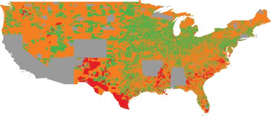
FIGURE 9.1 US block groups (eight types), created using a SOM and kaggle.com data (gray areas indicate missing data)
In this chapter we provide a tutorial on the Kohonen Self-Organizing Map (SOM) algorithm, originally introduced in Kohonen (2001). We apply the general approach to social area analysis, but these methods are easily transferable to other domains. Figure 9.1 is a SOM visualization based on roughly 175,000 US Census block groups and seven variables; this chapter introduces the methods and the code necessary to produce this figure. In many ways SOM-based analysis is identical to other forms of cluster analysis. The principal advantage of the Kohonen SOM algorithm is that it identifies clusters in attribute space and provides a visualization of attribute space. That is, a SOM provides classification of input data and maps of attribute space. From a user’s perspective, another advantage of the SOM is that it uses a fairly intuitive computational strategy to identify these patterns. This chapter focuses on building an intuitive understanding of the SOM algorithm, beginning from basic principles, and then demonstrates an application of the algorithm to a real-world problem: patterns of non-response to federal surveys. This particular problem was part of a data science competition hosted by kaggle.com and sponsored by the US Census Bureau. This chapter describes some of the methods used in the authors’ winning entry into that competition; in particular, we illustrate the use of the SOM to build typologies of input geographies and visualize attribute space.
Before diving into the substance of the chapter a few technical caveats are necessary. All of the examples in this chapter use the R programming language exclusively. R is flexible, open source, free, and widely used, and thus ideal for the pedagogic purposes of this chapter; however, it is not the best available toolset for the Kohonen SOM algorithm. The SOM_PAK software library has superior model fitting tools, but it is distributed in C and can be difficult to compile. While Windows executables are available online, compiling this library on modern OSX and Linux operating systems requires small modifications to source code and is beyond the scope of this chapter. We assume some familiarity with R, but not prior exposure to the SOM algorithm.
Primer on cluster analysis
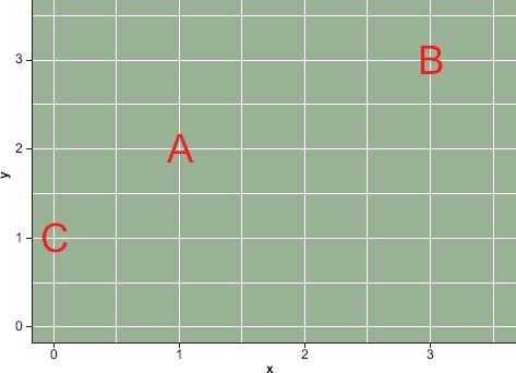
FIGURE 9.2 Two-dimensional attribute space
When thinking about the SOM algorithm, or really any clustering algorithm, similarity and distance are analogous and fundamental concepts. The analogy is especially useful for geographers who tend to think spatially. Observations near each other in attribute space are, by definition, similar across many attributes. Take the simple example shown in Figure 9.2, which contains three observations in a simple two-dimensional attribute space bounded by 0 and 3 in both dimensions. Using the distance analogy, we would say that observations A and C are more similar than observations A and B. One way to measure the similarity between these three observations is to calculate the Euclidean distance between them ![]() , where i and j are observations described by 1, 2, …, p variables. In the simple example in Figure 9.2 the distance between A and C would be
, where i and j are observations described by 1, 2, …, p variables. In the simple example in Figure 9.2 the distance between A and C would be ![]() and the distance between A and B would be
and the distance between A and B would be ![]() Strictly speaking, Euclidean distance measures dissimilarity, i.e. the greater the distance the more dissimilar the observations are. Geographers often presume a relationship between geographic proximity and attribute similarity, an assumption sometimes called the ‘first law’ of geography. However, what is a contestable ‘law’ in geographic space is a simple fact in attribute space.
Strictly speaking, Euclidean distance measures dissimilarity, i.e. the greater the distance the more dissimilar the observations are. Geographers often presume a relationship between geographic proximity and attribute similarity, an assumption sometimes called the ‘first law’ of geography. However, what is a contestable ‘law’ in geographic space is a simple fact in attribute space.
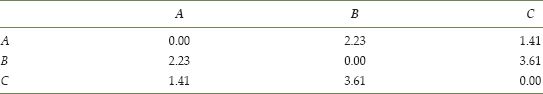
Many of the measures of similarity used in cluster analysis are analogous to measures of Euclidean distance. Thinking of observed data as a set of locations in attribute space, we can measure the similarity of observations by computing the distance between them. The pairwise dissimilarities can be stored in a distance matrix, which in this case would simply be the 3 × 3 matrix shown in Table 9.1.
Extending this example, we can imagine that observations A, B, and C were not single observations but were prototypes or exemplars of broader sets of observations. If we use these three observations as ‘seeds’ to generate data we end up with a plot like Figure 9.3. This plot was generated by taking three sets of 100 samples from a normal distribution, using the observed X and Y locations for observations A, B, C as means and 0.25 as the standard deviation. Each of the lowercase letters is a child of the corresponding capital letter. If we calculated a 300 × 300 matrix of the distance between all of the lowercase letters, we would find that in general the as and the bs are more similar to each other than the as and the cs.
TABLE 9.1 Simple distance matrix
Assume that we did not know the parent and we wanted to assign each lowercase letter to an uppercase letter. We could simply do this on the basis of distance to the original uppercase letters. It is plausible that some of the children of C are closer to A than to their true parent. Simply using distance could result in some misassignment because the division between the as and cs is not as crisp as those between the bs and the other classes. This is one of the central problems in cluster analysis; the ‘parents’ of each observation are usually unknown and the problem is to correctly assign each observation to the type it represents. In practice, however, not only are the prototypes (parents) of each observation unknown but so also is the correct number of types. A naive analyst might assume that both the a’s and c’s in Figure 9.3 were instances of the same type. More precisely, the central problem of cluster analysis is determining the correct number of types and correctly assigning each observation to a type.
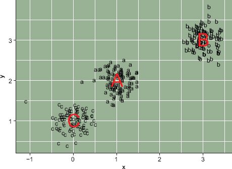
FIGURE 9.3 Three types
In practice, once the number of types has been determined through cluster or other types of geodemographic analysis (see Chapter 8, this volume) the most common way to describe a type is to use the groupwise mean. In this case the groupwise means are contained in a 3 × 2 matrix consisting of the locations of the three uppercase letters used to generate the lowercase letters in Figure 9.3; in a more complex analysis with many variables the groupwise means would be a k × p matrix where k is the number of groups/classes and p is the number of variables. However, determining the similarity among the classes would be more complicated with a high-dimensional dataset; observations might be similar on some characteristics but dissimilar on others.
One of the weaknesses of cluster analysis is that it is difficult to describe the relationship among the classes. This is where the Kohonen SOM algorithm excels. It functions like a cluster analysis, in that observations are assigned to ‘parents’ or exemplars on the basis of similarity. However, the procedure used to assign observations to groups also creates a spatial relationship among the groups. This spatial relationship can be visualized, which makes it possible to map attribute space.
The Kohonen Self-Organizing Map algorithm
A self-organizing map is a network of ‘neurons’. Each neuron is best conceptualized as a list of p values, where p is the number of variables in the analysis. Neurons are typically arranged in a lattice of some type, such that each neuron has some (non-zero) number of neighboring neurons. Figure 9.4 shows an example of a 10 × 6 hexagonal SOM; SOMs can also consist of rectangular neurons. While SOMs are typically organized as a flat two-dimensional network, they have been extended to toroidal and spherical forms (Schmidt et al., 2011). The advantage of these more complex three-dimensional shapes is that they do not suffer from edge effects; however, they add significant complexity to visualization of results.
Initially neurons are assigned arbitrary values for each variable, where the arbitrary values are bounded by the attribute space. The distance (or similarity) between an observation and any given neuron can then be computed using Euclidean distance as described in the previous section. The SOM algorithm iteratively uses observations (data) to adjust the neurons’ values. One way of stating this is that neurons are ‘trained’ using the observed data. The key innovation of the SOM is that when a single neuron’s values are adjusted the values of neighboring neurons are adjusted as well. This creates a spatial structure on the SOM, where observations are assigned to neurons and similar observations occupy proximal neurons. Through creating a SOM one builds a network of neurons; within this network the relationship between proximity and similarity is engineered, i.e. a pattern of spatial association is created through the process of training the SOM. The network of trained neurons that results from training a SOM can be seen as a ‘feature map’ or an atlas of attribute space.
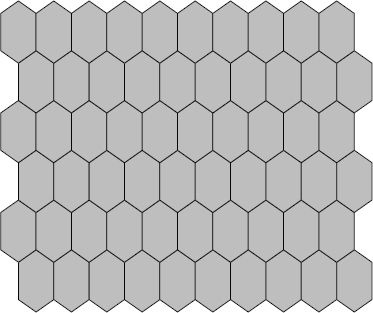
FIGURE 9.4 A SOM network of neurons
Maps preserve topological relationships among objects in space. In the cartographic context, entities and features that are close to each other in the real world are represented close to each other on a map. The concept of a map can also be applied to non-geographic objects; or it can be used to visualize geographic objects (census tracts) in a spatial but non-geographic context. That is, census tracts can be organized in space based upon the similarity of their characteristics rather than their geographic proximity. This is the basic idea behind the Kohonen algorithm that creates SOMs. In the remainder of this section we explain how the algorithm works.
Training a SOM
Training a SOM is like shooting data at a honeycomb. Admittedly, it is hard to shoot data, but imagine it had some physical form. When a piece of data hits the honeycomb it would deform the cell it landed in and those surrounding it. It would be possible to control the extent of the deformation by adjusting the speed at which the data are launched. In training a SOM data are launched at a honeycomb of neurons; each observation (i.e. row of data) is ‘aimed’ at the neuron to which it is the most similar (the shooter never misses the targeted neuron). Once the data hits this specific neuron, which we call the best matching unit (BMU), the deformation in the honeycomb causes nearby neurons to adjust their values to be similar to the BMU that was hit by the data. Because neurons are randomly initialized, where a given observation hits the honeycomb is initially random, but the deformations quickly cause ‘regions’ to emerge on the honeycomb. Since each row of data is repeatedly shot at the honeycomb, observations that are similar to each other will eventually hit BMUs in the same region of the lattice. However, the speed at which data are shot at the honeycomb decreases over time, thus the spatial extent of the deformations, and hence the effect each hit BMU has on its neighbors, is reduced.
In practice, the ‘honeycomb’ is a lattice of square or hexagonal neurons. When the algorithm terminates, each observation is assigned to a final BMU. It is useful to think of these final BMUs as buckets for data; collectively they constitute the feature map. The feature map is a mapping of attribute space. Observations that are similar are placed either in the same bucket or in buckets that are close to one another on the feature map. For example, places with many wealthy householders, with high levels of education, high homeownership rates, and low poverty rates would end up in buckets that are near each other and clustered in a region of the feature map. On the other hand, census tracts where poverty is abundant and residents typically have low levels of education would end up clustered in buckets in a different region of the SOM; probably quite far away from the well-educated and wealthy people because distance on the feature map is analogous to similarity.
Creating a simple SOM in R
Figure 9.3 shows three types of observations, each of which contains 100 instances. In this simple example, the data are two dimensional (defined by an x and a y variable). We could order these types based upon their similarity to each other resulting in a simple list: [C, A, B]. C is more similar to A than B; the distance between A and B is less than the distance between C and B. The simplest type of SOM is a linear one, and we use this form for the first example by creating a three-neuron arrangement with the hope that it reproduces the C, A, B ordering. The goal is then that each c-type observation should be assigned to a single BMU (or bucket), and this BMU should be close to one containing all the a-type observations.
Listing 9.1 contains all of the R code necessary to run this example and will reproduce Figure 9.5. The code depends upon the kohonen R library. Unfortunately the plotting functions in the kohonen library use circles to represent neurons, regardless of their actual geometry.
LISTING 9.1 A simple SOM in R
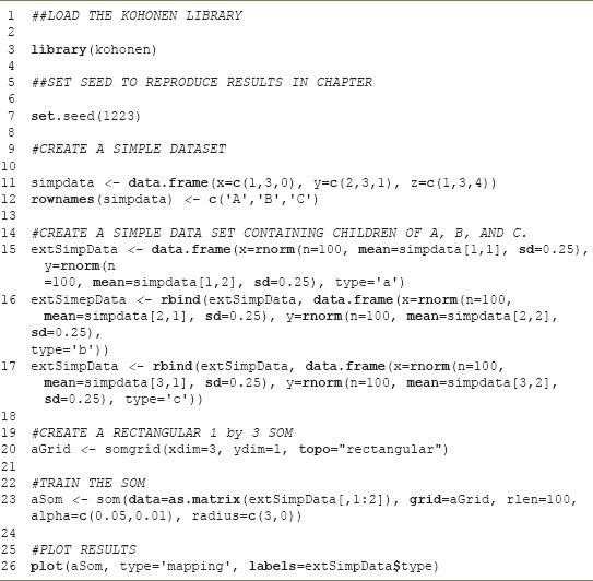
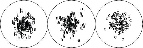
FIGURE 9.5 A simple linear SOM
In this simple analysis there are three key user specified parameters, which are the inputs to the som() function in the kohonen R library:
1. The size and shape of the SOM grid. This is specified in the somgrid() function, which allows the specification of X (xdim) and Y (ydim) dimensions. One can also specify a shape for the neurons (hexagonal or rectangular). Choosing these dimensions is one of the hardest aspects of using a SOM since there is no consistent rule of thumb. In general, if the goal is a fine distinction between categories, then increase the size of the SOM. If more general categories are needed, then use a smaller size. In this case we chose a 1 × 3 SOM because we knew the simple synthetic data had three categories. In practice, we prefer to build a large SOM and then post-process the output via cluster analysis to combine neurons into some desired number of groups. The choice of shape affects the connectivity within the SOM. In a rectangular SOM each bucket (neuron) has four neighbors. It is also possible to specify hexagonal, which gives each neuron six neighbors. It is also possible to create a toroidal SOM, in which the edges are connected to each other.
2. The run length (rlen). This specifies the number of times the data are presented to the SOM. In the example, where rlen=100 is specified, each observation is presented to the SOM 100 times. In training a SOM, data are recycled because each observation affects the overall configuration of the SOM; reusing the data allows refinement of the feature map.
3. The learning rate (alpha). The learning rate controls the velocity at which data are ‘launched’ at the SOM. More precisely, the learning rate controls the influence an observation has on both the neuron it hits and its neighbors. One specifies a range because over the rlen runs of the SOM the learning rate declines. In the example the learning rate declines from 0.05 to 0.01 in a sequence of 100 steps.
4. The fourth and final parameter is the radius. This is the size of the neighborhood, specified as a range of values. This has an intelligent default, so specifying radius is not necessary. The size of the neighborhood declines over the rlen runs of the SOM. Near the end of the training the neighborhood is zero, meaning that data, when shot at the SOM, affect only the BMU.
These are the essential elements and logic of any SOM analysis. Typically, SOM-based analysis involves two training stages and multiple iterations; these have been omitted for simplicity. In the example, we generated data based on three known exemplars. We computed the distance/similarity between these exemplars to establish the relationships between them. We trained a SOM using data generated from the exemplars. The SOM correctly assigned observations to neurons that corresponded to the exemplars, and the spatial structure of the SOM captured the similarity of the exemplars. The visualization of the output is a more complex problem and will be discussed in the next section, which outlines a ‘real-world’ application.
Using the SOM algorithm
In 2012 the US Census Bureau hosted a data analysis competition through kaggle.com. The aim of the competition was to predict survey non-response at the block group level in the USA. Survey non-response occurs when the US Census Bureau attempts to collect information from people but they do not respond to the government’s inquiries. In theory, response to government surveys is legally required; in practice, for the largest annual survey (the American Community Survey) only two-thirds of the sampled households respond. This non-response triggers a very expensive follow-up procedure, and the cost of this process restricts the number of surveys the US Census Bureau is able to collect in a given year. In an effort to understand what causes non-response the US Census Bureau released data on 211,000 block groups and their response rate to the American Community Survey. The goal of the competition was to develop a predictive model of non-response.
Our approach, which won the visualization prize, exploited a SOM. There is significant regional and demographic variation in response rates that makes traditional statistical approaches ineffective. Thus we constructed a SOM, based on 44 variables for over 200,000 zonal geographies. Our entry into the competition was an interactive website. Here we present a simplified version of the analytical work that was necessary to construct the website. The original analysis was done using both R and SOM_PAK, an open source C library available from http://www.cis.hut.fi/research/som_pak/. To simplify the analysis, the example below is restricted to R.
In the competition we trained a large 160 × 100 neuron SOM and then ran a cluster analysis on the 16,000 vectors describing the resulting neurons. The cluster analysis reduced the 16,000 neurons down to a set of 22 clusters using k-means. Applying k-means or a hierarchical cluster analysis to SOM neurons creates regions on the feature map and provides a way to build hierarchical representations using a SOM. The goal of this chapter is not to highlight our specific results, although we do believe that it provides meaningful insights into the US population, but to present a tutorial on the use of the SOM algorithm for social area analysis. To simplify the tutorial we have reduced the original set of 44 variables down to seven variables measuring population density, poverty, percent African-Americans, percent Hispanic, percent Asians, percent of housing units that are owner occupied, and the percent of households that are married couples. The R programming language is not well suited to interactive graphics, so this chapter uses only static visualizations of the SOM results. Moreover, we assume some basic knowledge of R; code related to SOMs is explained in detail but the visualization code is not explained. We have bundled the data necessary for this tutorial into an RData file that is available from the companion website.
The first step in creating a SOM is deciding on the dimensions of the map; these are specified in the somgrid() function. In general, we find that making a large SOM allows more flexibility in the reporting of results. One can reduce complexity on the SOM via a cluster analysis. Unfortunately, training a SOM is computationally intensive, and a large SOM can take some time to train. The code in Listing 9.2 may take many hours to run, depending upon the computer. Reducing the size of the somgrid and the rlen will speed things up substantially. However, if the rlen is too small the resulting SOM may not be well trained.
LISTING 9.2 Fitting a SOM
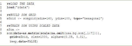
It is important to note that in Listing 9.2 the data input to the SOM has no incomplete cases. All missing data are expunged from the file using na.omit. Incomplete cases can be classified later using the map.kohonen function, which matches observations to BMUs based on available data. The BMU matching code included with this chapter will account for missing data. While incomplete rows cannot be used to train the SOM, they can be assigned to a BMU on the basis of available information. Data are also standardized to have a mean of zero and a unit variance using the scale function.
Once the SOM has been trained, the challenge is what to do with the results. How does one know if they are good? How should one communicate the results to an audience? Standardized answers to these two questions do not exist, and this limits the algorithm’s wider use.
First, it is our opinion that a ‘good’ result cannot be determined without some manual intervention. However, some objective criteria can be helpful. For geographic applications of the SOM, investigation of the unified distance matrix, or u-matrix, is critical. The u-matrix measures the degree of similarity between a neuron and its neighbors. Because geographers often use distance on a SOM as an analogy for similarity, discontinuities in the u-matrix present a problem. Imagine reading a topographic map where different parts of the map sheet had a different scale. One inch on some parts of the map might represent 5 miles and on other parts of the map it might represent 0.5 miles (or 50 miles). Having an irregular scale would make a map of geographic space difficult to use. Having an irregular feature map similarly complicates interpretation of the SOM.
There are two ways to visualize the u-matrix: a Sammon mapping and a simple visualization of the u-matrix. A Sammon mapping projects links between neurons such that the length of the link represents the distance between neurons. One hopes that a Sammon mapping looks like a net when the aim is to use distance on the SOM as an analogy. A net-like Sammon map means that ‘scale’ or similarity as a function of distance is constant on the SOM. Similarly, a u-matrix with relatively constant values implies that a unit of distance on the feature map has the same meaning throughout the map. In practice, these SOMs are never perfect in that distance is never uniform throughout the grid. Discontinuities in the data usually prevent a ‘perfect’ solution; consider the simple 1 × 3 SOM presented earlier. The best analytical solution had discontinuities in the distance between the neurons. Figure 9.6 shows the u-matrix for the aSom object created above. In this case, the lack of variation is a positive indication of the relatively uniform scale on the feature map. There is one notable problem area near the top of the u-matrix, but it involves only a few neurons.
One of the persistent challenges of using a SOM is understanding the patterns on the feature map and how these correspond to geographic patterns and/or locations. One can examine individual component planes to gain an understanding of patterns on the SOM. A component plane is the value of the ith element of the 1 × p vector defining each neuron.
FIGURE 9.6 u-matrix
In this case if i = 1 we are examining the neuron values for population density, if i = 2 we are examining the neuron values for percent poverty. The relative differences in these values show the affinity of the various regions of the SOM for observations with various values of each ‘component’. In reading these component planes it is important to remember that the process of training a SOM is equivalent to adjusting the 1 × p vector for each neuron, following the procedure described previously. Once trained, observations are assigned to their best fitting neuron (BMU). By standardizing the data prior to training the SOM we ensure that each variable has a zero mean and unit variance. This means that the values on the component planes are all on the same scale and can be interpreted with a single legend. Viewing the component planes in conjunction with places with known attributes is key to understating the geography of the feature map.
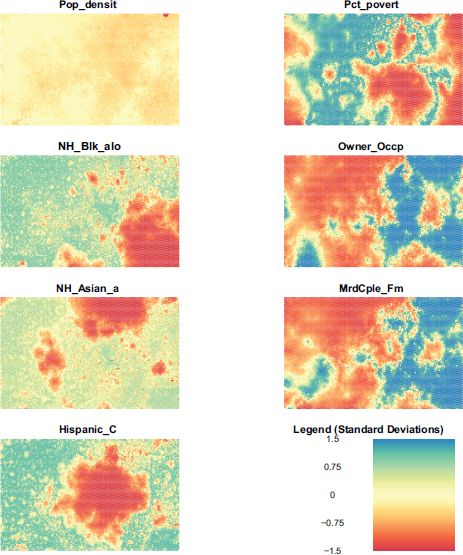
FIGURE 9.7 Component planes
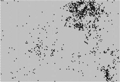
FIGURE 9.8 Geographic activation of neurons; Queens County, New York
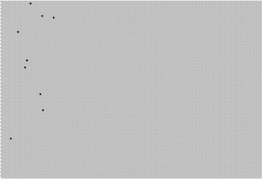
FIGURE 9.9 Geographic activation of neurons; Audubon County, Iowa
Examining Figure 9.7, it is clear that places with a high Hispanic population do not, in general, have a high Asian population. One also notices that areas with a high African-American population and a high Hispanic population overlap with regions of high poverty. However, regions with high poverty do not generally overlap with areas with a high proportion of married couple families. It is also notable how uninteresting population density is as a variable. This is surprising and may be because, relative to other variables, the variance in population density is low.
Another way of examining a SOM is to look for regions with known properties and see how they map onto to feature space. For example, Figure 9.8 shows how the block groups in Queens County, NY, perhaps the most diverse county in the United States, maps onto the SOM. One sees that observations in Queens cover a large portion of the SOM, at least when compared to Audubon County, Iowa, shown in Figure 9.9. The demographic diversity translates into scattered BMUs on the SOM feature map.
Reducing SOM complexity through cluster analysis
One commonly used strategy to reduce the complexity of the SOM is to conduct a cluster analysis on the neurons. When the number of neurons is large, clustering neurons can vastly simplify cartographic display. The clustering can be done by applying k-means, for example, to the vectors describing each neuron. The result is a hierarchical classification system that facilitates interpretation of the results. Classifying regions on the SOM is simple, as seen in Listing 9.3. Figure 9.1 shows all block groups in the US (for which data were available) classified into one of eight types, where color represents a type. Figure 9.10 shows how these eight types map onto the attribute space.
LISTING 9.3 Clustering neurons and visualizing results on a feature map
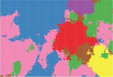
FIGURE 9.10 SOM neurons grouped into eight classes
Conclusion
The Self-Organizing Map algorithm is a useful computational tool for the analysis and visualization of high-dimensional patterns. The SOM is interesting from a geocomputaitonal perspective because it ‘spatializes’ data via the creation of a feature map. One can examine these feature maps and draw connections between feature space and geographic space. The algorithm has seen extensive use in the geographic literature but its use is somewhat complicated by the lack of good tools in the software commonly used by geographers. In this chapter we have explained the logic of the algorithm in plain English and illustrated its use via the R kohonen library and an analysis of demographic patterns in a relatively large dataset of over 200,000 geographic zones. We have augmented this library via some visualization functions that are available online from the companion website; these functions are used to produce the figures in this chapter. Readers familiar with R’s spatial and cartographic functions should be able to easily augment the figures in this chapter for their own purposes.
FURTHER READING
Kohonen (2001) is the central reference work on self-organizing maps. The text provides the details of the algorithm and discusses the use of SOM-PAK, an open source library for computing self-organizing maps.
Skupin and Hagelman (2005) present an interesting application of self-organizing maps to the temporal domain. They explore how neighborhoods move through attribute space over time.
Agarwal and Skupin (2008) provided a detailed discussion of the application of SOMs to geographic problems.