Geocomputation: A Practical Primer (2015)
PART V
ENABLING INTERACTIONS
16
USING CROWD-SOURCED INFORMATION TO ANALYSE CHANGES IN THE ONSET OF THE NORTH AMERICAN SPRING
Chris Brunsdon and Lex Comber
Introduction
Although the term volunteered geographical information (VGI) was coined by Goodchild (2007), the activity which it is used to describe has been in evidence for a long time. There is a long tradition of volunteers collecting and reporting different types information about the environment we live in (Brown, 2011). Robert Marsham started to formally note the arrival of the first swallow in 1736. A recent description notes that ‘This popular science really took off when he reported his records to the Royal Society in 1789 and many other country gentlemen took up the pastime’ (Penn, 2011).
More recently, the rise of the internet – and in particular the idea of web 2.0 where ‘ordinary’ users are encouraged to upload information – has led to the much wider availability of geographical information collated from a broad group of private citizens, typically without formal training, and on a voluntary basis. A related idea is that of citizen science (CS) – see, for example, Cooper et al. (2007) or McCaffrey (2005). Here, information is collated from a large group of citizens – and in several cases this information is also geographically referenced. A third, related concept is that of public participation GIS – see Chapter 18. These concepts are not identical – but in general, both activities are seen as activities involving the collection of data by the public at large, rather than by officially sanctioned agencies. A notable distinction is that the degree of prior understanding required of volunteers in a CS-based project can vary greatly. In some cases the situation is quite similar to that of VGI with virtually no skills required of the volunteers, whereas in others some degree of volunteer instruction – and possibly selection – is necessary, so that the input of information has some degree of formal control. This is generally the case when the collection of information requires some degree of understanding, rather than basic observation or the use of easy-to-use sensors, such as the GPS facility in a smartphone.
There is an increasing amount of such data that could be, and in some cases is being, incorporated into formal scientific analyses. This includes spatially referenced and geolocated data such as the environmental data referred to above, as well as purely locational data (e.g. the location of streets in OpenStreetMap). Also, much historical volunteered information is held by public organisations and agencies which have some kind of obligation or pledge to make their data holdings publicly available (Lister and the Climate Change Research Group, 2011).
However, in many of the above situations the data collection process differs from that of a prescribed scientific experiment – and this should be taken into consideration when analysing the data, calibrating models or testing hypotheses. In science, a key mode of operation is the designed experiment (Myers et al., 2010) – and this is often regarded as a desirable situation for reliable – and more easily interpretable – statistical modelling. Furthermore, in a fortunate situation in which one has a great deal of control over the process of data collection, it is often possible to deduce strategies for data collection, giving optimal calibrations of statistical models, and put these into practice. However, VGI and CS both provide a very different situation from this, as researchers rely on individuals volunteering observations, and lack the control and coordination over data-collection strategies that are needed for such optimally designed experiments.
Despite this disadvantage, there are other benefits to using the public participation approach. The greatest of these is arguably that data are collected by a potentially very large unpaid workforce – for example, although noting the importance of the correct training of staff, Cohn (2008) observe that the use of CS has resulted in the saving of $30,000 per year on one particular project, and at the time of writing, a large amount of data for a diverse range of applications is collected in this way (Hand, 2010). This may seem a small sum compared with the scale of funding of some projects, but for others it could imply the difference between a project being viable and not. The aim of this chapter is not simply to report that this phenomenon is occurring – by now discussion of this is quite widespread, and several examples appear elsewhere in this book – but to consider the issues arising when analysing data of this kind. In particular, attention will be given to a project in the area of phenology – see, for example, Schwartz (1994). Phenology is the study of periodical plant and animal life-cycle events and their relation to climate. In recent years, phenology has been used as an instrument to assess evidence of climate change. In particular, Cayan et al. (2001) and Schwartz and Reiter (2000) use observations of the first bloom and first leaf dates of particular plants recorded over a number of years to assess gradual advances in the onset of spring. The data analysed in these studies contains the recorded first bloom and first leaf dates of lilacs (Syringa) from a series of observation locations, with the data provided by a mixture of trained scientists and others.
Here we provide a demonstration of how data of this kind may be analysed, and in addition to reporting preliminary findings, we discuss and outline some of the issues that were encountered when carrying out the analysis. In the next section, the dataset used is described in detail. The following section demonstrates a problem of misinterpretation that may occur if the data-collection process is not considered. An approach allowing for this is then proposed, and implications are considered.
The lilac data
The data here was downloaded from the website provided by Schwartz and Caprio (2003),1 and is derived from two studies, both spanning a number of decades. The first takes place in the western states of the USA. The second is based mainly in the eastern states, with a small number of locations in Canada also included. The former is described in detail in Cayan et al. (2001), the latter in Schwartz (1994, 1997). In each case, the dataset records the first leaf and first bloom dates of the common lilac, expressed as a number of days since the start of the year. The Schwartz and Reiter (2000) paper combines data from both of these studies to obtain a dataset for the whole of the USA. The locations are shown in Figure 16.1 on a backdrop of national boundaries.2 Clearly, the east–west divide is not an exact one. Also note that the density of observations also changes in the two studies, and that particularly in the Midwest states density is relatively low.
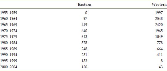
Both studies were implemented via networks of observers. The most detailed description of this is given by Cayan et al. (2001) – who state that the western survey was initiated by Caprio (1957) who describes how the Montana Agricultural Experimental Station set up a network of observers, with contributors from the US Weather Bureau and local garden clubs, to monitor various stages in the annual cycle of the lilac – a very early example of data collected using the CS paradigm. A history of this and the eastern network is provided by the USA National Phenology Network (2011). Over time this activity extended geographically, and continued until 1994. There was a subsequent revival of interest in 1999, until the last observations of the data recorded in this dataset in 2003. The eastern network was initiated after the western one – in 1961 - and saw most activity during the 1960s and 1970s. The numbers of observations from each network in five-year periods are tabulated in Table 16.1. In total there are 15,072 observations (although only 14,265 have recorded the first bloom date) from 1126 distinct observation locations.
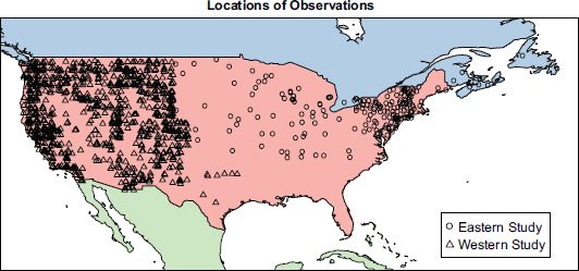
FIGURE 16.1 Locations of lilac observation points
From the table it can be seen that the dominance between eastern and western observations in the dataset changes over time – in the period from 1995 onwards, the majority of the data is composed of eastern observations – while in the first five-year interval, the entirety of the data is provided by the western network. A more balanced pattern in data collection would be desirable. Going back to the notion of experimental design, the ideal situation would be a uniform coverage of all observation points across the USA over the entire time period. In contrast, this is an example of ‘real-world’ data, where events such as the cessation of public funding, the loss of a key organising individual, or the emergence of a new key player can bring about unexpected changes in the pattern of data collection. Whilst not achieving the ideals of the designed experiment, the collection and distribution of this kind of data is at least achievable in terms of resources.
TABLE 16.1 Numbers of observations by five-year period for eastern and western lilac phenology networks
Some problems with an oversimplified analysis
Caprio (1957) suggests that the initial motivation for the data collection was to map the geographical variation in the date of onset of spring, rather than in changes in this date over time. However, currently temporal change in climate is an important research topic, and the motivation here is that these data can be used to investigate climate change, if analysed appropriately.
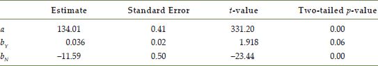
In Schwartz and Reiter (2000) these data were analysed on a site-by-site basis, with a regression model applied at each location. However, since no site can have more than 46 observations (on for each year between 1957 and 2003) – and many have fewer – the aim here is to attempt an analysis of the data pooled for all of the sites. Another issue with this approach is that of multiple hypothesis testing, if regression coefficients are tested for significance – see Brunsdon and Charlton (2011) for an outline of this issue. An initial approach to analysis is to fit a simple linear model of the form Bi = a + bYi + εi to the pooled data, where Bi is the day of first bloom for observation i, Yi is the year in which the ith observation was made3 and εi is a normally distributed random error term for each observation i, with variance σ2. a is the intercept term of the model, and b is the slope, which may be interpreted as the rate of advance (if b < 0) or retreat (if b > 0) of the date of first bloom, in days of advance per year. Given that a relatively slow rate of change is likely, one would expect b to be a fairly small quantity – quite likely fractional. The results of the analysis are given in Table 16.2.
TABLE 16.2 Regression analysis for the model Bi = a + bYi + εi
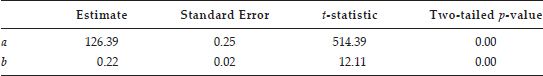
This result suggests that b differs significantly from zero – suggesting that there is evidence that the day of first bloom varies over the study period. However, and rather surprisingly, the estimate for b is positive, indicating that the first bloom date is retreating. That is, it is getting later in the year. A plot of Yi and Bi is given in Figure 16.2. The plot format is a binned hexagon plot, in which scatterplot points are allocated to small hexagonal regions, and the size of hexagon drawn in each region is proportional to the count of points contained there – this method is preferable to a standard scatterplot when there are a large number of points (in this case more than 10,000), and can be created relatively easily using the R statistical programming language (R Core Team, 2013). The regression line is superimposed on the plot.
Both the plot and the regression analysis show the first bloom day to be getting later – suggesting that the accumulation of thermal time, as the driver of plant development, is getting slower over time. This runs counter to expectation but, more importantly from the viewpoint of data analysis, also contradicts the findings of the Schwartz and Reiter analysis of the same data mentioned earlier. Their conclusions from the analyses of each of the individual observation locations suggest a general trend in which the first bloom day gets earlier.
A reason for this discrepancy may be deduced by further consideration of the data-collection process, and in particular the change in geographical concentration seen over the data-collection period. In Figure 16.3 boxplots are given for the first bloom dates of both the eastern and western data. One notable pattern is that the western data has earlier first, second and third quartiles for the first bloom date than the eastern data. Recall, however, that the eastern data are more prominent towards the end of the study. The extreme values are more expanded for the western data, but this could be attributable to the fact that, in general, there were more samples provided by this network. This suggests that one possible explanation for the surprising estimate for b is the fact that the later blooming eastern data dominate the pooled set towards the end of the study period. Put geographically, the ‘centre of gravity’ of the volunteered data collection process has drifted eastwards over time, towards areas where spring tends to arrive later. Therefore, if change in location is not considered as a conditioning factor, the average first bloom date does indeed increase with year of observation for this particular pooled dataset.
This is an example of Simpson’s paradox (Simpson, 1951). The paradox is very succinctly stated by Appleton et al. (1996), who refer to ‘the dangers of ignoring a covariate that is correlated to an outcome variable and an explanatory one’.
In this case, the covariate being ignored is the location of the observation; the explanatory variable is Yi and the outcome is Bi. The situation here is unusual, in that examples of the paradox more usually involve probabilities or rates estimated using categorical data rather than regression analysis applied to continuous data (see, for example, Wagner, 1982), but nevertheless it clearly fits the situation described by Appleton et al.
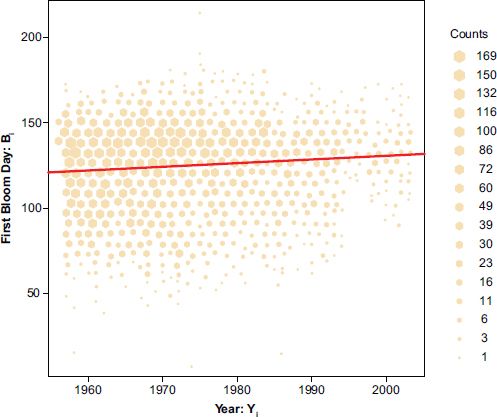
FIGURE 16.2 Plot of first bloom day (Bi) against year (Yi)
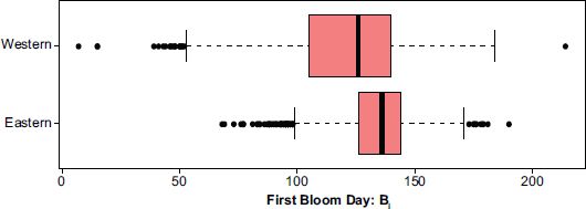
FIGURE 16.3 Boxplots comparing first bloom dates for eastern and western data
One way to address this problem may be to include an indicator variable in the regression model, giving the updated model
![]()
where, in addition to the previously defined variables, bY is the regression coefficient for the year, Ni is the network indicator variable for observation i (0 for eastern, 1 for western), and bN is the regression coefficient for this variable. Thus, this coefficient is a measure of the difference in first bloom date (on aggregate) between the eastern and western networks. Implicit in this model is a uniformity of rate of change of first bloom date across both networks, and a uniformity of the intercept term within each network, if the intercept is considered to be a for the eastern network, and a + bN for the western one.
The results of fitting this model are given in Table 16.3. In this case, the slope for Yi is still positive, but no longer significantly different from zero since p > 0.05. This suggests the possibility that Simpson’s paradox is contributing to the results of the basic model calibration here – as allowing for geography even in a fairly crude way does change the results relating to the slope term.
TABLE 16.3 Regression analysis for the model Bi = a + bY Yi + bN Ni + εi
However, it could be argued that some geographical effects are still ignored. In the paper by Caprio (1957) maps of the first bloom date for the western area show notable geographical patterns exist within that area ‒ and it is a reasonable expectation that similar variation may also occur in the eastern area ‒ surely this at least merits investigation. In the next section, approaches to modelling the data allowing for more comprehensive variational effects in the model coefficients will be considered.
Proposed alternative analyses
The counter-intuitive result due to Simpson’s paradox in the previous section arises essentially from the failure to incorporate sufficient information about geographical variation in the model. As a starting point to address this, we propose a model where the slope (rate of advance/retreat in the onset of spring) is the same everywhere, but that each observation station has a different intercept. That is, we assume there is a ‘green wave’ (Schwartz, 1998) across the USA so that some regions see the first bloom of lilac before others, but the rate of change of onset of this wave is uniform. We can model this by
![]()
where the extra subscript j denotes a quantity relating to observation i at station j – thus Bij is the ith first bloom date at station j, which was observed in the year Yij, and so on. Note that only aj has just the j subscript, suggesting that there is a different first bloom date associated with each station, but not a unique one for each year at each station in the model proposed by equation (16.2).
Such a model could be calibrated using ordinary regression, treating the aj as series coefficients for dummy variables indicating which station each observation occurred at. However, recalling that there are l distinct locations in the data, this would require a large number of coefficients to be calibrated, with a resulting increase of degrees of freedom in the model, and a resultant increase in the standard error of the estimate for bY. An alternative approach is to use a random coefficient model (Longford, 1993) where the aj are themselves assumed to be random variables: for example,
![]()
where a is the distribution mean of the ai and σa2 is the variance. Thus the likelihood of the observed data can be written in terms of just four parameters: a, σa2, bY and σ2, rather than over 1100 parameters as in the model specified in equation (16.2). Another justification of this approach is that since the focus is on the estimation of bY, rather than attempting to calibrate every aj exactly, the aim here is more simply to take into account the fact that aj does vary, and to characterise this variability using a small number of parameters, namely a and σa2.
Note that, by writing aj as the sum of a and a zero-centred random variable υj (with variance σa2), equation (16.2) can be rewritten as
![]()
This is very similar to initial pooled linear model, except that now the random part of the model consists of two terms, representing variation at the observation level and at the location level. For this reason, the model can also be described as a multilevel model (Goldstein, 1986, 1987a, 1987b). In this chapter the convention is adopted that random terms in models predicting the first bloom date will be denoted by Greek letters, and fixed terms will be denoted with Latin letters.
In the basic pooled model the random part of the model is independent for each observation, but for model (16.4) it can be checked that for two observations ij and kl (i.e. the first observation is the ith at station j, and the second is the kth observation at station l), the correlation between the random terms, ρij:kl, is given by
Without focusing too much on this equation, it is sufficient to note that if two observations are made at the same location (but in different years) there will be some positive correlation. If they are made at different locations there will be no correlation. Arguably, this is a crude representation of Tobler’s first law (Tobler, 1970): ‘Everything is related to everything else, but near things are more related than distant things.’ Here, ‘near things’ are considered to be observations taken from the same location, regardless of time.
The results of fitting this model are shown in Table 16.4. From this it may be seen that the estimate for bY is now negative, and is significantly different from zero. With an estimated value of around –0.18, this suggests that the onset of spring advances by around one day every six years.
TABLE 16.4 Regression analysis for the model Bij = a + bY Yij + υj + εij
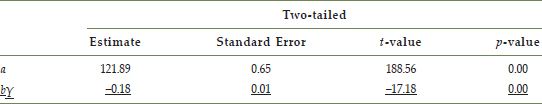
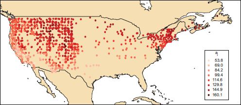
FIGURE 16.4 Map showing estimated aj.
Although the focus of this study has been the estimation of bY, it is still possible to estimate the individual aj via the multi-level model. Effectively, the estimate for each aj is achieved by computing an estimate of the expected value of aj given the respective values of all Bij and Yij observations, and the estimates of a, bY, σ2 and σa2 obtained when calibrating model (16.4). These are shown in map form in Figure 16.4. From this it can be seen that earlier first bloom dates tend to occur along the west coast of the USA, and also that superimposed on this there is a north–south trend, with spring arriving later in the north.
By obtaining a map of the ‘green wave’ as experienced through the first bloom dates of lilacs in this way, we suggest that even the approach of the model of equation (16.1) fails to reflect the full geographical variability in first bloom dates – Figure 16.4 suggests that geographical variation also occurs within both networks, whereas the model in equation (16.1) allows only for between-network variation.
Thus, in this study an estimate of bY (with standard error) taking into account the variability of an intercept term is created. However, this assumes that the relationship between the first bloom date and the year of observation is linear, so that the change in B per year is fixed over the entire study period. A more flexible approach is to estimate a general time effect, so that rather than modelling the temporal change in first bloom date with the regression term bY Yij, an alternative model replaces this by an effect for each year, say ci for each year indexed by i. As with locations, these yearwise effects can be modelled as random effects, so that
![]()
and therefore
![]()
where the single term A replaces a + c to avoid redundancy in the model (any pair of a and c adding up to A would give the same model likelihood for a given dataset). This model is still a random coefficient model, but it can no longer be described as a multi-level model, as the effects are no longer nested – effects for time do not nest within locations. Models of this kind are referred to as crossed-effects models (Baayen et al., 2008). The result of fitting a model of this kind is shown in Figure 16.5. This plot shows the variation in τj over the time period 1956–2003, also giving bands showing standard errors for the estimates, based on bootstrapping techniques (Davison and Hinkley, 1997) – see the next section for detail.
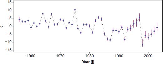
FIGURE 16.5 Graph showing estimated τj against time, with upper and lower pointwise confidence intervals for the individual τj values
The pattern seen in Figure 16.5 shows a general advance in the first bloom date over the study period, although it does suggest that the trend is more complex than the linear model used until now. In particular, in the second half of the study period, it appears that there is some degree of oscillation around a general downward trend, with the oscillation period being just over a decade or so. Also of note is the fact that the standard error bands are notably larger from around 1986 – this was the time when funding of these networks begin to reduce, and in turn, the numbers of observations were also reduced. In terms of the model calibration, this is reflected in greater uncertainty of parameter estimation.
One final parameter of interest may be of use here – this is used to measure the trend of τi over time. Considering this trend strictly, it is not the case that τi is decreasing every year – the oscillatory effect suggests that there will be some pairs of consecutive years when τi increases. However, it is helpful to consider whether there is an overall trend towards lower τi values. A straightforward way to measure this is to compute the difference in mean values of τifor the first and second halves of the study period. That is, the respective periods 1956–1979 and 1980–2003. If this statistic is called ∆, then in mathematical terms
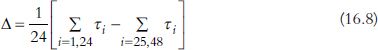
Thus, positive values of ∆ suggest a trend of spring getting earlier, and negative values suggest it is getting later. The estimate of ∆ is 4.65, with 95% bootstrap confidence limits 3.71 and 4.76. From this there is fairly strong evidence of a trend of spring getting earlier. That is, despite some fluctuation around the trend, the average first bloom date in the second half of the study period is earlier than that of the first half.
Computational considerations
In this section, some more detail is supplied about the software tools and techniques that were used to carry out this analysis. All of the statistical modelling was carried out using the R statistical programming language (R Core Team, 2013). In particular, the random coefficient models were calibrated using the lme4 package.
The functions supplied in the R base library and lme4 were sufficient for all of the computations, except for the standard errors associated with the τi values, and ∆. For these, a regression bootstrap approach as set out in Davison and Hinkley (1997) is used. Briefly, this estimates the sampling variation of parameters of interest by simulating datasets drawn from the model that is being fitted to the data (in this case the model given by equation (16.7)). The sampling variation simulated is just that due to the variability in εij – so that rather than randomly assigning new values for the τj and υi for each simulated sample, it is assumed they are fixed at the estimated values.
By simulating a large number of datasets in this way (say, 1000), and applying the random coefficient estimation function supplied by lme4 to each simulated dataset, an estimate of the sampling variability of the τj is obtained.
Conclusions and discussion
In this chapter, a number of models have been used to estimate the degree of change in the onset of spring over the period 1956–2003, calibrated with data on first bloom dates of lilacs collated from a number of networks of volunteers. These dates are strongly linked to the accumulated thermal time of the plants, and hence act as a proxy for patterns in seasonal temperature. From an initial analysis that was distorted due to Simpson’s paradox, the final analysis takes into account the changes in geographical distribution of the networks of people collecting data, and identifies both general trends and fluctuations in the onset of spring.
The uncertainties and biases associated with analysing such data due to the voluntary nature of its collection have long been recognised. For example, hoopoe are birds that are occasionally seen in the UK with a preference for long grass habitats with tree cover. Much historical information in the UK relating to the sighting of these birds records them in the gardens of vicars – a combination of habitat and a nineteenth-century predilection among the clergy for recording nature. However, as yet little work has explored the sensitivity and reliability of crowd-sourced phenology data of the kind considered here. Some ecological research has explored the variation and uncertainties associated with the use of phenological data. Robbirt et al. (2010) compared plant specimens (herbarium data) with field observations and found the response of flowering time to variation in mean spring temperature to be identical and much of the variation in the results to be due to the geographic location of the collection sites – a factor which we have also found to be important in the analysis above. Also, there are other factors which may need to be considered: Miller-Rushing et al. (2006) compared herbarium data with phenological events as recorded in dated photographs. They suggested that first flowering dates may not be ideal measures of plant responses to climate change due to the extremes of flowering distributions being more susceptible to confounding effects than central values – such as the date at which exactly half of the lilacs in a particular site had bloomed. This is perhaps another situation where there is a trade-off between the ideal situation and what may be achieved in practice. Central values, such as means or medians, would need all bloom dates at a given location to be recorded, which may require more observational effort than can be realistically provided by a volunteer network. A compromise may be to obtain a central measure such as the mid-point between the first and last blooms (although this may still suffer from the problem of being sensitive to extremes as it depends on these two extremes). Of course, any such recommendations can only apply to future data, as recording the first bloom date is already a well-established convention – and a great deal of data using this convention already exists.
A further issue relates to the linkage between phenological event timing and temperature: van Oort et al. (2011) explored the sensitivity of phenological events and the possible correlation between temperature and phenology prediction error of rice, and found that phenological models were not as sensitive as thought at the higher end of the temperature range. As this study concentrates more on the timing of the phenological events, this finding perhaps has less direct bearing on the analysis; however, it does perhaps have implications when interpreting the observed patterns. In general it is hoped that one of the main messages in this chapter is that the analytical techniques used when working with VGI and CS data need to reflect issues arising from this unique kind of data acquisition. Any data of this kind are a reflection of both the underlying natural process and the process of data collection and organisation, and reliable analysis of such data needs to reflect this and account for it in any conclusions.
FURTHER READING
The web is a very useful resource for discovering how crowd-sourced phenology information may be collected. The following sites provide some insight into organisations collecting such data:
• https://www.usanpn.org gives some useful discussions relating to the USA National Phenology Network, and the organisation of the data collection process.
• http://www.naturescalendar.org.uk/research/phenology.htm provides a similar set of discussions and examples of how similar data are collected in the UK.
1ftp://ftp.ncdc.noaa.gov/pub/data/paleo/phenology/north_america_lilac.txt.
2http://www.naturalearthdata.com/downloads/50m-cultural-vectors/50madmin-0-countries-2/.
3Yi is centred on 1980, the mid-point of the time interval, as this reduces rounding error when calibrating the model
All materials on the site are licensed Creative Commons Attribution-Sharealike 3.0 Unported CC BY-SA 3.0 & GNU Free Documentation License (GFDL)
If you are the copyright holder of any material contained on our site and intend to remove it, please contact our site administrator for approval.
© 2016-2026 All site design rights belong to S.Y.A.