Geocomputation: A Practical Primer (2015)
PART I
DESCRIBING HOW THE WORLD LOOKS
3
SCALE, POWER LAWS, AND RANK SIZE IN SPATIAL ANALYSIS
Michael Batty
The properties of spatial probability distributions
Many variables in spatial analysis are distributed as probabilities that reflect competition between the elements, objects or individuals that compose them. The typical form of such distributions is quite unlike those that evolve with no direct competition between their elements, with these being normally distributed, in that there are quite low numbers of both large and small objects and high numbers of objects that are of moderate size. Such distributions have well-defined means and are usually shaped with respect to their frequency and size as bell-shaped curves where most of their elements – at least 95% – lie no more than two standard deviations on either side of their mean. The best examples in the human sciences relate to attributes of ourselves – our height, our weight, and other physical characteristics which evolve slowly with no significant interpersonal competition but according to random mutations that change these attributes over many generations. In contrast, when we examine socio-economic characteristics of ourselves (e.g. our incomes), we find that this variable is distributed with a very heavy skew to the right, where most of the elements or individuals forming the distribution have small incomes and an increasingly small number have large. If we define the size (say, height) of each individual i as xi, its frequency f(xi) is distributed according to f(xi) ∝ exp[– λ(xi — μ)2], where λ is a dispersion parameter and µ is its mean. These normal distributions are much rarer in spatial analysis than those that are highly skewed such as income, which can be approximated using power laws which have frequency f(xi) ∝ xi–α where α is the relevant parameter.
Although skew distributions are ubiquitous in spatial analysis, our detailed understanding of how competition orders the elements in these distributions is quite rudimentary, based on random mechanisms or at best theoretical models that operate under tight constraints on where objects can locate and grow in space (Clauset et al., 2009). For example, the most accessible point in a circular market area is its centre, and the number of locations with lesser accessibilities increase geometrically as one travels further and further from the centre. Thus if we then rank-order these accessibilities by location, the greatest frequencies are the lowest and as accessibility (which is a proxy for size) increases, the number of locations successively decreases (Batty, 2013). We do not need to demonstrate that this is a power law, just as we do not need to show that human characteristics are always exactly normally distributed. All we seek to do is argue that typical spatial distributions are skewed, usually to the right, although we can order these both left and right dependent upon the representation of space that we adopt. These probabilities can thus be approximated by a wide class of skew distribution functions of which the power law is perhaps the simplest exemplar (Simon, 1955). In fact the power law has particular properties that make it even more attractive in that it tends to be applicable to systems that scale, that manifest self-similarity at different scales, and that can be generated as fractals. It is easy to see what this means with a simple power law of the kind we have already noted. If the size variable xi is scaled by a factor K, then its probability distribution scales as f(Kxi) ∝ (Kxi)–α = K–αxi–α ∝ xi−α ∝ f(xi). These are important properties that relate to how we might represent and simulate spatial systems, but they lie beyond the scope of this chapter (Batty and Longley, 1994).
Although most spatial analysis has focused on transforming and searching for variables that approximate normal probability distributions, there is an even more important problem when we examine these distributions over time. Although it would appear that many skew distributions are stable with respect to their skewness when observed at different points in time, even over quite long time intervals, the objects that compose them are seldom fixed. In fact they often change quite radically over quite short intervals of time, but their overall distributions can remain quite stable. We will explore these issues in depth in this chapter, but they pose an enormous conundrum with respect to how we explain the way human and socio-economic phenomena organise and self-organise in space. Spatial distributions that remain comparatively stable with respect to how cities are organised appear to achieve a macro-regularity in their form from one time period to the next, but at the same time they admit rather basic volatility between the elements that make up such patterns. We need not only represent how spatial probability distributions are skewed in a stable and regular fashion, but we will also explore how such distributions continually change in their individual elements while at the same time preserving this macro-regularity.
Let us state this paradox in starker terms: if we rank a set of cities by their population sizes that describe some sort of integrated regional or national system, the distribution tends to follow a power law that has strong regularity across many time periods. In fact this regularity is so unerringly strong that Krugman (1996a) was prompted to say:
The size distribution of cities in the United States is startlingly well described by a simple power law: the number of cities whose population exceeds P is proportional to 1 / P. This simple regularity is puzzling; even more puzzling is the fact that it has apparently remained true for at least the past century.
However, if we were to examine the size distributions and the cities that compose them at any two times, we would find that cities move quite quickly in terms of their ranks (and of course their sizes). Taking the two distributions of cities in the USA in 1890 and 1990, in 1890 New York City was ranked 1, as it was in 1990. But Houston was not in the list of the top 100 cities in 1890, yet it had reached rank 4 by 1990. In terms of the top 50 cities in the world at the time of the fall of Constantinople in 1453, only six remain today. This micro-volatility in the face of macro-stability implicit in the power law is puzzling, to say the least, in that we do not have good theories of why city systems can maintain their aggregate stability while at the same time shuffling the objects that make up this stability in such a way that the overall scaling appears almost static. It clearly relates to competition between the objects in some way that suggests that the relative size of any object is always constrained by some upper resource limit that remains largely undefined.
In this chapter, we will first state the nature of the power law, examine its properties, and then explore the archetypical example due to Zipf (1965) who in 1949 was the first to draw popular attention to the distribution of US city sizes. We will introduce various visual mnemonics, in particular the rank clock, which will enable us to explore micro-changes in the city ranks that nest within the wider regularities associated with these size distributions. We will illustrate different trajectories and morphologies that compose these visualisations, and this will provide us with the background to attempt a rudimentary classification of rank clocks that details their particular dynamics. We will then extend our analysis of the US urban system using data for the metropolitan statistical areas (MSAs) from 1969 to 2008, and follow this with an examination of scaling in high buildings (skyscrapers) in New York City. High buildings are distinguished by the fact that newer buildings tend to be higher than old, while a building rarely declines in height due to the fact that high buildings tend to be demolished if they are changed at all. This poses a rather different dynamics that produces somewhat different patterns through time. We then examine the change in scaling associated with hubs in a network whose sizes are based on the number of travellers moving through these locations at different times of the working day. Our illustrations of dynamics will all be related to changes in ranks, exploiting the idea of how ranks change over time, where time is displayed as a clock not organised on the 12-hour cycle per se but calibrated to the time periods over which the dynamics is considered (Batty, 2006). In conclusion, we will argue that the real puzzle is to unpack the way spatial competition, which organises these patterns into strongly regular size distributions, gives rise to a continual shuffling and mix of cities as they move up and down the size distribution.
Power laws explained and rank clocks defined
As Krugman (1996a) noted, the size distribution of US cities follows the simplest power law where the size of a city P varies in inverse proportion to its rank r as P ∝ r−1. Expressed in terms of frequencies as a probability distribution, the frequency of the occurrence of a city of size P is f(P) ∝ P−2, which is the derivative of the previous rank-size expression. This kind of manipulation is quite simple, but it is worth noting that much confusion arises with power laws and rank size because different authors use one or other of these equations and the discussion as to the actual value of the power can become obtuse. In fact the idea that the power of the rank exactly equals 1 or the power of the frequency 2 is an ideal type, although it does appear to be the consequence of a system developing competitively but randomly to a steady state (Gabaix, 1999). A more generic form, however, is to assume that the probability that we introduced above is f(P) ∝ P−α, with its rank-size form as P ∝ r−1/(α−1).
This power law is often contrasted with the Gaussian (or normal) distribution, which is symmetric about its mean and bell-shaped with two very thin tails covering the smallest and largest objects in the size distribution. As we noted above, power laws essentially have long or fat tails that are skewed to the right or left or both (but in this context are usually skewed to the right), where the long tail contains the largest objects for which there is no upper bound. Again there is confusion over fat, thin, long and heavy tails in the literature, but here we will cut through all of this and begin with various city size distributions in the USA for the year 2010. Before we focus on dynamics, we will examine two datasets: the one equivalent to that used by Krugman (1996a) and Zipf (1965) based on cities defined by the US Bureau of the Census; and one based on MSAs defined by the US Office of Management and Budget. We show these distributions as rank (counter-cumulative frequency) size in their untransformed and transformed form (as logP(ri)=logK − βlogri, where β=1/(α−1)) in Figure 3.1. The MSA data cover metro areas that are more than four times as large as the US Census cities data, which are based on counties. The plots shown in Figure 3.1 and their estimates have slopes somewhat lower than the pure Zipf parameter of unity, being 0.726 for the cities and 0.862 for the MSAs. Note that Krugman (1996a) estimates this slope for the top 40 US cities he selected from 1990 data as 1.004, which simply shows that the set of cities chosen and their areal extent can make a substantial difference to these estimates. This suggests that there is no best theoretical value for this parameter with respect to real distributions, and all of them are intrinsically affected by the noise associated with empirical definition (Cristelli et al., 2012).
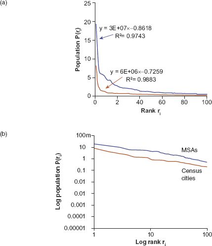
FIGURE 3.1 Rank-size distributions for MSAs and US Census cities 2010 in (a) power law form and (b) logarithmic linear form
If we examine how these rank-size relationships change through time, there is quite remarkable regularity in that the powers vary very little, notwithstanding that there might appear some drift in their values. The best dataset we can use to show this is that on cities from the US Census which we have for the top 100 cities from 1790 to 2000. The rank-size distribution appears extremely stable, as we show in Figure 3.2(a) and as Krugman (1996a) so clearly remarked in our quote above. But these regularities, remarkable enough in themselves, begin to unravel when we examine the individual cities that make up these ranks. If we plot the shift in ranks, there is considerable movement of cities in terms of their size and rank up and down the hierarchy. In Figure 3.2(a) we also display one measure of this shift by plotting the year 2000 city sizes according to the 1940 ranks; one can see that the smaller sizes tend to shift more than the larger. In fact these shifts are not complete because some of the cities at 1940 are no longer in the top 100 ranked cities in 2000; in fact by then the number of cities that are common to both dates has reduced to 60.
We can enhance this by noting that the cities that are in the top 100 ranks over the 210-year period from 1790 can be displayed individually by plotting their ranks and colouring them according to a spectrum that begins with red and transitions through to yellow, then from green to blue as cities appear in the ranking (using the typical heat map convention). So the first city at the top rank in 1790 is coloured red and the last city to appear in the ranking over the next 210 years is coloured blue, with the transition evenly spaced according to the heat map colour spectrum. We show this for what we call the ‘rank space’, which is the size versus rank graph (the so-called ‘Zipf plot’) in Figure 3.2(b), but this is a particularly messy form in which to visualise more than a few objects that comprise the distribution. What this plot does show, however, is that there are several very distinct trajectories defining the space: cities that shoot into the space from outside the top 100 towards the top and vice versa, cities that remain at the same rank defined by vertical lines on the plot, cities that oscillate up and down in terms of rank, and so on.
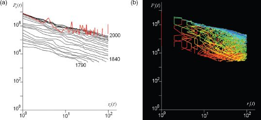
FIGURE 3.2 Rank-size distributions: (a) rank shift, and (b) changes to individual cities in the rank space from 1790 to 2000
A much better mnemonic is to make time explicit and to suppress size; after all, rank is a synonym for size and if the focus is simply on relative position, then rank and time are somewhat more illustrative of volatility in the Zipf plot than rank and size (Batty, 2006, 2010). What we do is to plot time as a regular clock around its circumference, defining the beginning of the time in question (in this case 1790) at the noon–midnight position with the years running in the clockwise direction around the clock until the hand reaches back to noon–midnight at the end of the time period in question (in this case at the year 2000). We can then plot the rank of the city as a radial from the centre of the clock at the appropriate time where we can organise the radial from rank 1 at the centre to rank 100 (or whatever the upper limits of rank) on the circumference, or the other way around, using a linear or logarithmic scale. Here we will use the simplest linear scale with the highest rank at the centre of the clock and the lowest on the circumference. For our 210-year city size distribution taken for the cities defined in the US Census, we show some typical trajectories which compose part of the rank clock in Figure 3.3(a), where it is clear that different cities are associated with quite different trajectories. We will return to this in the next section, where we argue that the clock and its derivatives can be used to think visually about the nature of dynamics in systems that scale.
What is fascinating about this particular clock is that this defines the temporal signature of the development of the US urban system. New York City is the anchor of the clock, being number 1 in rank ever since the Census began in 1790. In some respects, the city is the fulcrum of the entire US system. The opening up of the Midwest, California and the South is also marked out with first Chicago (around 1840), Los Angeles (1890), Houston (1900), then Phoenix (1950) flying into the clock from outside the top 100. Several colonial towns established in the eighteenth century and before, such as Charleston (SC), lose rank and fall out of the top 100, while some colonial settlements in the vicinity of Washington, DC and the northern part of the South lose rank and then begin to stabilise as sprawl makes an impact after the Second World War. Rustbelt cities such as Buffalo (NY) lose rank systematically from the early twentieth century onwards. There are few cities that enter and leave the top 100 in any significant way, but some, such as Atlanta, zoom in only to lose rank as they stabilise, although to some extent boundary changes and suburban sprawl complicate the picture. We have not attempted any classification of different trajectories so far, but the prospect exists for such analysis in future work.
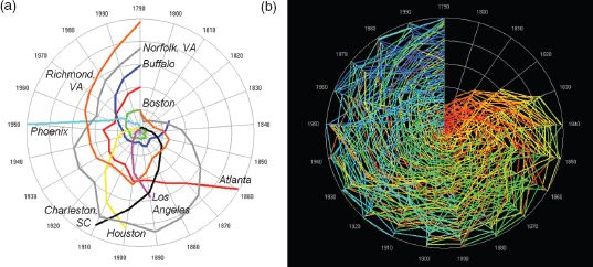
FIGURE 3.3 The US rank clock defining (a) key city trajectories, and (b) cities ranked in the top 100 from 1790 to 2000
We also illustrate the complete rank clock for all cities that are in the top 100 from 1790 to 2000 in Figure 3.3(b). Many cities enter and leave this exclusive set. Before 1840, there were less than 100 cities catalogued in the US Census, and thus the rank clock in Figure 3.3(b) shows this build-up. We have not normalised any of these cities for boundary changes, so our analysis is inevitably crude. Moreover, although after 1840 there are only 100 cities ranked at each time period, in fact over the 210-year period there are 266 cities that are part of the top 100, and this is itself a measure of the volatility of the set, with there being 2.7 times the number of cities appearing in the top 100 over this period. If these cities entered and left the top 100 uniformly, this would mean that on average, about eight cities would enter and leave the top 100 each time period, about 8% per decade. What Figure 3.3(b) clearly illustrates impressionistically through the collage of various trajectories (by their colour) is the substantial volatility of the US system over two centuries. Of the cities in the top 100 in 1840, only 20 cities remained in the top 100 by 2000, consistent with a rate of change of cities being in the top 100 of about 8% per decade.
Trajectories and morphologies of the rank clock
The morphology of the clock is composed of a collage of trajectories of each object, in this case a city, with the trajectories themselves being of different types which we illustrated briefly in Figure 3.3(a), and their intersection forming the overall form of the clock which gives it a distinct morphology as in Figure 3.3(b). Clock-like trajectories can thus be classified into types, although we will only concentrate on the simplest here. First, we show different trajectories. If an object always remains at the same rank, then it will trace out a circular trajectory on the clock, with objects at higher and higher ranks producing smaller and tighter circles to the point where the object is always at rank 1, which is a point at the centre of the clock. Objects that slowly enter the clock and move up towards its centre form inward spirals whose curvature relates to the inverse of the speed at which the objects move up rank. Objects that spiral out of the clock and lose rank perform in the opposite way. The most difficult objects to classify are those that move up and then move down, perhaps even moving in and out of the clock (which always has an upper bound on the number of ranks considered). Objects that oscillate around the clock and stay within it in a regular pattern are more unusual, but, as we will see, when we look at the clocks of transport movements, such oscillations can be seen relating activities to 12-hour, diurnal, weekly and related temporal patterns. In Figure 3.4, we show typical examples of these trajectories.
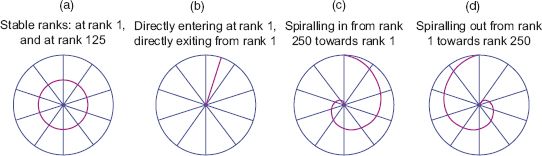
FIGURE 3.4 Classic changes in rank defining idealised trajectories
When we generate a collage of these idealised trajectories, we define different morphologies that we can use as baselines to which we can compare real data. First, for objects that remain at the same rank throughout the temporal period, we define a series of concentric circles starting at the pole of the clock and then splaying outwards. To demonstrate this morphology, we have generated an idealised distribution of objects from a power law where Pt(r) ∝ 1/rfor all t. This produces a distribution that declines with rank but is identical for all time periods; that is, the object that is ranked r at time t, has the same rank t + τ for all τ. We show the rank-size distribution in Figure 3.5(a) and its logarithmic form where the slope is equal to 1 in Figure 3.5(b). The rank clock is shown in Figure 3.5(c) where the colouring of these trajectories is based on the rule defined earlier, which reflects the red–yellow–green–blue spectrum ordered according to the time and the rank when the object first appears in the series.
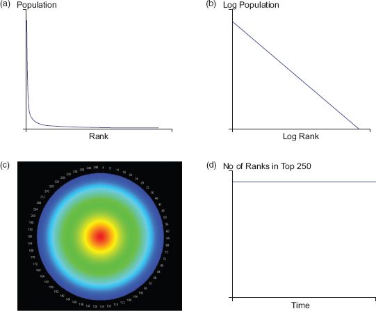
FIGURE 3.5 (a, b) an idealised rank-size distribution based on Zipf’s law, where (b) is a log–log transformation of (a); (c) its rank clock; and (d) a plot of its half-life
Above we examined the shift in ranks between two points in time by showing the distribution at the first point in time using ranks from another. There are many different statistics that relate to these dynamics, but here we will look at only one, the half-life, so-called because it gives us the number of objects at a given time t − τ and t + τ that still exist in the rank-size distribution for any time t. The half-life for the downswing t + τ is the number of years τt+when the number of objects is n / 2, while for the upswing t − τ this is τt−, but of course these can be different. The overall half-life of the entire system for the upswings and the downswings can be defined as the average of the sum of these values over all years T, which are ![]() and
and ![]() , while the average for the total system based on upswings and downswings can be formally defined as
, while the average for the total system based on upswings and downswings can be formally defined as ![]() . Now in our clock with stable ranks where nothing changes over the entire time period T, the number of objects in the distribution at any time t is the same as the number of objects at t − τ and t + τ, and thus there is no point where the number of objects drops to one-half of those at a given time. This is illustrated in Figure 3.5(d) where the number of objects in the top ranks is plotted on the vertical axis against time on the horizontal axis. Note that for all these hypothetical explanations of morphologies and trajectories, n = 250 and T = 250, and the number of objects n is the same at each time t.
. Now in our clock with stable ranks where nothing changes over the entire time period T, the number of objects in the distribution at any time t is the same as the number of objects at t − τ and t + τ, and thus there is no point where the number of objects drops to one-half of those at a given time. This is illustrated in Figure 3.5(d) where the number of objects in the top ranks is plotted on the vertical axis against time on the horizontal axis. Note that for all these hypothetical explanations of morphologies and trajectories, n = 250 and T = 250, and the number of objects n is the same at each time t.
Now if we assume that each object in the distribution enters the distribution at top rank 1 at time t and moves to the bottom rank 2 at time t + 1, implying that there are only ever two objects in the distribution, then the clock is displayed in Figure 3.6(a) where it is clear that it consists of a series of spikes. The half-life is quite straightforward because the number of objects at any time in the distribution is 2, with one of these objects generated at the previous time period, thus the half-life (which is only defined for the downswing) is 1 year. We show this in Figure 3.6(b) where the graph shows the number of objects which pertain to any time t, which is 2, and only one of these remains at time t + 1.
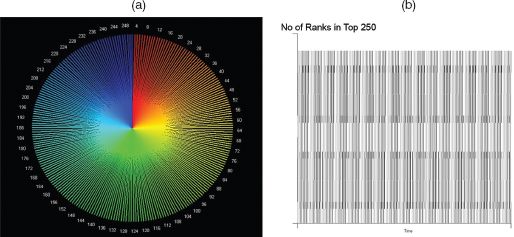
FIGURE 3.6 The rank clock based on (a) an extreme rank-size distribution and (b) a plot of its half-life
We will now examine two other idealisations. First, a distribution where an object enters the rankings at number 1 and then systematically declines until it reaches the lowest rank, one position at a time at the end of its life. The number of objects builds from n = 1 to 250 and thus the last object, n = 250, which enters at position r = 1 at t = 250, starts and finishes its life at this point. The rank clock of this structure is shown in Figure 3.7(a) and its half-life plot is a simple set of lines from the time when each object enters. In fact, the number of objects builds up linearly during the 250 time units, and although the first ranked object declines to rank 250 by the end of the time period, all objects remain in the distribution across all times and thus no half-life can be defined as such. The second distribution is one where the object enters at rank 1 and stays there, but new objects then enter, one at each successive time period. The half-lives are the same as all objects remain in the top ranks and the relevant rank clock is shown in Figure 3.7(b).
Our last ideal type involves each object rising from the lowest rank to the highest then declining again to the lowest, and of course dropping out of the mix if the temporal period is beyond the cycle associated with the object. This in fact is a mix of the previous two types of morphology. We begin with the top ranked object at rank 1, and then this loses rank until it disappears at the end of the temporal period. The object with the lowest rank at time 1 gradually rises in rank to its maximum and then begins to decline. In fact this order from lowest to highest to lowest is associated with each object in sequence, and the way we must illustrate this is according to the clock in Figure 3.8(a). This is complicated because of the way the colours mask the true process, but if we examine Figure 3.8(b), we see that at the beginning of the period the highest rank marked in red declines as an outward spiral to the end of the period. The lowest ranked object at time 1 increases from rank 250 to finish at rank 1 at the end of the time period. This defines the bounds of the trajectories defining the clock. If we take the object which exists at rank 125 (coloured green) at the beginning, this rises to rank 250 in an inward spiral, reaching this at time 125, and then it spirals out to rank 125 again at time 250. We see these trajectories in Figure 3.8(b). One really nice feature of this clock is that we can consider the first object as spiralling out of the clock from rank 1 to 250 (in red) and then spiralling back into the clock, connecting up to the initial object at rank 1 at the next time 250 (or time 1). This is only clear from the three trajectories in Figure 3.8(b). The half lives of all these objects are not defined as all objects remain in the distribution over all time periods. If we were to plot these, then this would be the same plot as in Figure 3.5(d).
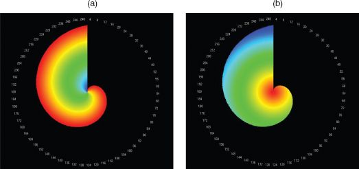
FIGURE 3.7 Rank clocks based on successive objects entering at rank 1: (a) declining according to Zipf’s law; (b) remaining in stable orbit
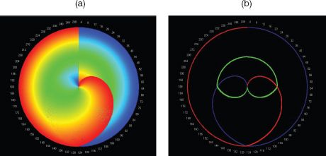
FIGURE 3.8 Rank clocks based on: (a) successive objects entering at all ranks; (b) plots of cities entering at ranks 1 (red), 250 (blue) and 125 (green)
The dynamics of cities, high buildings and transport hubs
To complete this analysis of city systems, we will return to the first dataset that we examined earlier for population associated with the 366 MSAs, and we will extend this to also include total income for each MSA. We have assembled these data in the time series from 1969 to 2008. Its great advantage is that the MSA boundaries are stable and the set of cities is complete, thus implying that the growth dynamics associated with changes in size and rank is clearer than that of the 100 top ranked cities from the US Population Census data. In Figure 3.9 we show the rank-size distributions associated with the population and income measures for the 366 MSAs. These are at a much finer temporal interval than those we examined from the Population Census and thus any measures of shift need to be normalised if comparisons are to be made. In Figures 3.9(a) and (c) we show the rank-size distribution for population and income. These are extremely close to one another, but when we examine their individual clocks in Figures 3.9(b) and (d), these show more volatility. Nothing equivalent to the volatility for the city size distributions from the Census is seen in these distributions, but the time period is much shorter and the urban system is much more mature. In fact the population clock implies that the core cities remain as core, but that there are several smaller cities that rise up the hierarchy, while a few established cities drift down more gradually. Of course this clock implies changes in rank, not size, so although Phoenix, which is ranked 35 in 1969, increases its rank to 12 in 2008, it more than doubles in size. In fact Houston increases its population almost three times while its rank goes from 14 to 6. In the mid-range of the hierarchy, Las Vegas increases its population from about 267,000 to 1.87 million, some 7 times, and its rank from 114 to 30, some 3.8 times. These are substantial shifts given the fact that the system is mature, with a growth rate in metropolitan populations of only around 0.5% per annum.
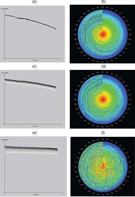
FIGURE 3.9 Population, income and income per capita: (a, c, e) respective rank size and (b, d, f) rank clocks for 366 MSAs from 1969 to 2008
When we examine the income distribution, there is more volatility, with one very obvious shift in income due to oil being discovered in Fairbanks, Alaska, in the late 1960s. There was a boom in pipeline and related infrastructure construction in 1975–1977, leading to a big increase in income, and then the local economy collapsed back to its former trajectory. This is clearly seen in the income rank clock in Figure 3.9(d). The last distribution relates income to population as income per capita, and the rank size and its clock are shown in Figures 3.9(e) and (f). There is considerable mixing implied by this clock, despite the impressively smooth macro-distributions with respect to their form over time. Quite clearly, as we form composite distributions by taking ratios of more basic data, the noise from one combines with the other and differences (variances) can become magnified. There is in fact little experience of such mixing, and we lack real intuition as to its consequences. But it is enough to cast doubt on many of the more stable and regular relationships that we often begin with, such as power laws, and this suggests that our knowledge of this whole area is primitive and subject to more profound scrutiny than anything that we have attempted so far.
There are many systems where competition in space and time determines how their constituent elements grow or are manufactured in size. If we disaggregate populations and examine the internal distribution of such clusters in cities, we have already seen that these intra-urban elements follow power laws, albeit with considerably more noise associated with their spatial and temporal arrangements than entire cities. If we now divert our attention from actual amounts of such activities to the physical environment which accommodates them – from people to the buildings in which they reside or work – we also find that the sizes of these buildings follow power laws. In fact if we examine high buildings, which are usually defined as being greater than six storeys, certainly greater than ten (which require elevators for their operation), then their distribution can also be shown to follow the rank-size rule. There is a major difference between high buildings and population sizes, in that buildings do not grow or decline, at least in the same way as populations; they are manufactured, and rarely are storeys taken off them through partial demolition and rarely are they added to.
There are exceptions of course, but in our analysis here we will exclude these occasional cases. Buildings do get demolished, but in our analysis we have excluded these too for we will illustrate these ideas only on extant skyscrapers – buildings greater than 40 metres – in New York City from 1909 to 2010, also measuring their height in metres. There are 516 buildings in this set, but we will only ever plot the top 100. In fact the rank clock is quite different from that for cities. As the century progresses, a building that is number 1 in rank does not stay there for long. Skyscrapers have got successively higher as building technologies and materials have progressed, and thus the rank clock is marked by a continuing downward spiral of earlier high buildings, many of them leaving the top 100 during the 101 years that the clock portrays. We show the clock in Figure 3.10(a), and the downward spiral provides the dominant morphology of these dynamics. In fact at the start of the clock in 1909 there is rapid growth to 119 high buildings ‘in the top 100’ because there are several ties for height, but the rest of the clock is contained within the envelope of 100.
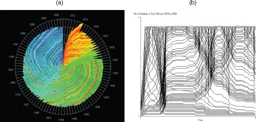
FIGURE 3.10 New York City skyscraper heights, 1910–2000: (a) rank clock; (b) number of buildings defining the half-lives at each time
The other feature of this dynamics is that the clock shows quite distinctly the waves of skyscraper building that have dominated New York. At the start of the period in the early twentieth century before the First World War there was a great wave of such building. Then again after the war in the mid-1920s to early 1930s the boom, which preceded the great recession, was a time of massive investment in high buildings. In fact the highest buildings in the city that still dominate the skyline, such as the Empire State and Chrysler buildings, were constructed then and if you look at the core of the clock – the top ten ranks – you will see that these are dominated by buildings (coloured green) that were constructed in the 1930s. In fact earlier buildings are overwritten at the level of resolution used in the clock and some of the early high buildings such as the Woolworth building only reappear, due to the visual limitations of the clock, once the 1930s wave of building subsides. There are waves in the 1960s and 1980s and then more recently in the 2000s, but buildings in general have not been much taller than those built in earlier times. It is elsewhere in the world that the highest buildings have recently been built, in the Middle East and in China.
An even more graphic demonstration of these dynamics is given by the plot of half-lives for the 101 years that comprise these competitive processes, which are firmly linked to boom and bust. In Figure 3.10(b) we show these half-lives, and it is clear that the dynamics produces clusters that relate to specific ‘economic events’. Remember that the half-life for the set of 100 buildings that exist at a given point in time is the number of years between the time in question and the time when only half the number of buildings at this time remain in the system. We can of course compute half-lives for buildings that are entering the system, as we indicated earlier, and these ultimately compose the 100 in question. This is often different in time span from those that are leaving the system, being knocked out by higher buildings being constructed where the progression is often slower. The times of rapid building are clearly picked out by the half-life plots in Figure 3.10(b), where the 1910s, 1930s, 1950s, 1960s, 1980s and 2000s are periods of very rapid increase in the size of high buildings whose half-lives on the upswing are much shorter than on the downswing which are more muted. Thus increases in rank during an upswing occur much faster than their relative decrease in rank in the downswing. In fact this figure shows how hard it is to produce an average half-life for the entire series. For periods of rapid growth (boom), the upswing half-life appears to be about four years, whereas the subsequent downswing is about 25 years. Also the downswing half-life seems to be shortening whereas the upswing is less variable. Overall we estimate that the average upswing half-life to be about ten years and the downswing 20 years, but the picture is complicated by the volatility and the dominance of boom and bust.
Our third example refers to the size of hubs in spatial networks. It is very clear that the evolution of networks is governed by competitive forces that enable a limited number of hubs to gain more than proportionate numbers of links. Translated into volumes of activities flowing on such links into hubs, this gives rise to distributions that are similar to power laws. This was first demonstrated by Barabási and Albert (1999) but it pertains to many developments in network science pioneered during the last 20 years. There is some debate as to whether or not these distributions are scaling, for their derivations using laws of proportionate effect tend to generate log-normal distributions, but as most of these distributions are modelled with respect to their heavy tails, power laws can form a good approximation to these. Moreover, there are likely to be more constraints on the form of these distributions due to the fact that spatial networks are constrained in space and cannot generate the numbers of links that are generated in unconstrained network structures. In short, planar graphs which dominate spatial networks do not manifest scaling in their pure form (Barthelemy, 2011).
Our example constitutes the hubs that define the rail stations on the London Underground and Overground (the stations serving heavy, mainly suburban, rail services), where the volumes of travellers entering and exiting these hubs define their size on a typical weekday in November 2010. The dynamics of these hubs relates to the fact that during a typical day, all the hubs only operate for 20 hours, for the system is closed from 1.20 a.m. to 5.20 a.m. each day. The dynamics is also dominated by the morning peak and the evening peak hours, and the volumes reflect this. We have organised the data, available on a second by second basis, into bins of 20 minutes each, of which there are 72 defining the 24-hour day. Twelve of these are empty as there are no trains running. There are a total of 6.2 million entries and 5.4 million exits (the difference is due to open barriers where the RFID (Oyster) card, from which the data are taken, is not used), and we will aggregate these entries and exits to form the volumes for each of the 666 hubs that define the system.
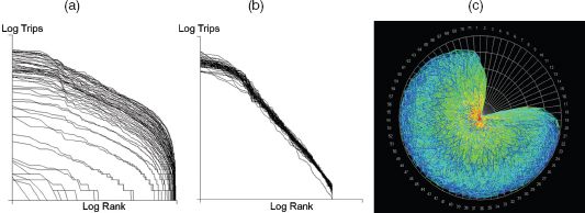
FIGURE 3.11 Sizes of London station trip volumes, November 2010: (a) rank size; (b) collapsed rank size; (c) rank clock
We show the 60 different rank-size distributions in Figure 3.11(a), where it is clear that the differences pertain to different volumes at different times of the day. The dominant cluster of trips is during the two peaks that are clearly evident in Figure 3.11(a), but the shape of these distributions is quite similar at each 20-minute interval, as we show in Figure 3.11(b), where they are collapsed onto one another. We achieve this by taking the distributions from their mean size and normalising by their variance so that they are comparable. It is also clear from Figures 3.11(a) and (b) that the distributions are not scaling but are much closer to log-normal. We show the clock in Figure 3.11(c), from which it is clear there is enormous variability in the way hubs move up and down in the hierarchy of ranks during the day. What we see from this is that some hubs that have low volumes early in the day pick up in the morning peak and then collapse back in the middle of the day to rise again in the evening peak. These are inner suburban hubs, whereas those in the central business and shopping districts tend to remain the biggest during the whole day and close down last. To really explore the meaning of these dynamics, it is necessary to know the actual spatial configuration of rail lines and hubs; to this end, the Rank Clock Visualiser that we introduce in the next section indicates how one can make progress in generating much more satisfactory explanations of these spatial network dynamics.
Next steps: the Rank Clock Visualiser
We have developed a visualiser (O’Brien, 2014) for these kinds of scaling distributions that enables the user to link the objects in the clock to their spatial location. The user can generate a rank clock for many different distributions, which so far are confined mainly to city size and building height distributions but also include Fortune 500 data from 1955 to 2010 (with renormalisation in 1994–1995) and the distribution of US baby names. The London Tube hubs are in the set, as are several distributions of UK, US and Japanese populations by small area/cities. Users can plot the rank clock with the highest rank at the centre or the edge, choose any time periods from the maximum available for each dataset and identify specific objects by name on the clock and map. The link to the spatial distributions uses either OpenStreetMap or Google Earth; the user can point to either a city or object on the map or globe or on the rank clock, and its equivalent in clock, map or globe will show up. There is no animation of the clocks so far in this interface, but this will be done in due course for there are many easy extensions like this.
In the dataset, we have world city sizes from the Population Division of the UN Department of Economic and Social Affairs from 1950 to 2010 (some 576 in all, greater than 1 million population each). We show the rank clock of these in Figure 3.12 from the Rank Clock Visualiser, where we have picked out Adelaide in South Australia, a good example of a 1 million population city that is stable in population but declining in rank. The Google Earth display alongside lets the user visualise all these cities and their sizes, and the user can click on a city and see where its trajectory lies on the clock or identify the name of the city from a drop-down list and activate its trace on the clock and on the map or globe. It is not yet possible to zoom into the clock to identify a hot link to a trajectory because the level of resolution is too fine from the static display, but all these extensions are possible and will be explored in future work. The world cities distribution and its rank clock are shown in Figure 3.12.

FIGURE 3.12 Rank clocks of UN urban areas, 1950–2010, from the Rank Clock Visualiser, showing the trajectory for Adelaide, Australia
We have not so far explored the possibility that the morphology of the rank clock itself provides a shorthand for the kinds of dynamics that characterise the system of interest. We noted earlier that the individual trajectories might be classified, but the shape of the clock also varies, and we can see from those illustrated here how different they might be. For example, clocks with no change in range are perfect circular orbits, while those with regular changes in rank up or down or both reflect spirals. We can thus position any clock on this spectrum, getting an immediate picture of its dynamics. Some examples of this kind of classification can be seen in the clocks portrayed for growing cities such as those in Israel, which are dominated by inward spirals (Benguigui et al., 2008). What we need is to tie the dynamics more consistently to this geometry. In fact a purely regular dynamics is not very useful as it is quite unrealistic in city systems whereas the boom–bust structure of economic dynamics is much more likely. Changes in social taste are also likely to be reflected in urban dynamics, and our quest must be to begin to identify different dynamics that are associated with different geometries of clock so that a deeper, more structured picture of the way this world of cities works can be generated.
To conclude, it is worth saying a little more about the notion of scaling in city systems. Our argument began by suggesting that city-size distributions were scaling, following power laws in their heavy tails, although always predicated on the basis that their underlying distribution is more likely to be log-normal. Power laws are thus a good approximation to the heavy tails, but no more than this. And they simply represent our starting point. The rank clock is a good device if we can assume that population is related to rank by a simple logarithmic transformation, as is consistent with a power law, but once we have the idea of the clock, the fact that it relates rank to population can be conveniently forgotten. The clock has its own integrity in that it displays a kind of dynamics that can be explored more generally, and if a rank clock and a size clock are defined, one related to the other, then all kinds of novel animations and explorations suggest themselves. It is in this spirit that the Rank Clock Visualiser has been developed.
We need much better statistics that pertain to the different kinds of dynamics and their variation over time and space. The idea of the half-life needs to be put on a more consistent footing and defined more rigorously. But in the wider perspective, this chapter is as much about space–time dynamics as it is about power laws and scaling. We need to explore the extent to which the kinds of dynamics that define bifurcations, tipping and turning points, and even catastrophes, relate to scaling. Little has been done to date, but there are strong hints in the notion of fractals, self-similarity and hierarchy that need to be exploited in linking this kind of aggregate spatial analysis to the dynamics of spatial modelling. After 25 years or more of consistent but slow development in the field of spatial dynamics, there are now many fertile ideas that will see this field explode intellectually and in terms of applications during the next 25 years.
FURTHER READING
Readers should examine Zipf’s (1965) seminal book Human Behavior and the Principle of Least Effort, which popularised the rank-size rule, and has led to a renewed interest in distributions that are scale-free. Herbert Simon (1955), winner of the 1978 Nobel Prize in Economics, wrote about power laws focusing on firm size soon after Zipf, and more recently the 2008 winner of the Nobel Prize in Economics, Paul Krugman (1996a), addressed the problem in terms of cities. An excellent summary of the field is in the article by Clauset et al. (2009) in the SIAM Review. I have written about rank clocks elsewhere in my 2006 Nature paper and in my book The New Science of Cities (2013) where I relate these to simple spatial models that generate these distributions. Power laws are ubiquitous in statistical physics and in human systems whose elements are conditioned by competition and evolution, and a good readable summary is by Manfred Schroeder’s (1991) book Fractals, Chaos, Power Laws: Minutes from an Infinite Paradise.
All materials on the site are licensed Creative Commons Attribution-Sharealike 3.0 Unported CC BY-SA 3.0 & GNU Free Documentation License (GFDL)
If you are the copyright holder of any material contained on our site and intend to remove it, please contact our site administrator for approval.
© 2016-2026 All site design rights belong to S.Y.A.