Introduction to Android Application Development, Fourth Edition (2014)
Part III. Android User Interface Design Essentials
Chapter 7. Exploring User Interface Building Blocks
Most Android applications inevitably need some form of user interface. In this chapter, we discuss the user interface elements available within the Android SDK. Some of these elements display information to the user, whereas others are input controls that can be used to gather information from the user. In this chapter, you learn how to use a variety of common user interface controls to build different types of screens.
Introducing Android Views and Layouts
Before we go any further, we need to define a few terms to give you a better understanding of certain capabilities provided by the Android SDK before they are fully introduced. First, let’s talk about the View and what it is to the Android SDK.
The Android View
The Android SDK has a Java package named android.view. This package contains a number of interfaces and classes related to drawing on the screen. However, when we refer to the View object, we actually refer to only one of the classes within this package: the android.view.View class.
The View class is the basic user interface building block within Android. It represents a rectangular portion of the screen. The View class serves as the base class for nearly all the user interface controls and layouts within the Android SDK.
The Android Controls
The Android SDK contains a Java package named android.widget. When we refer to controls, we are typically referring to a class within this package. The Android SDK includes classes to draw most common objects, including ImageView, FrameLayout, EditText, and Button classes. As mentioned previously, all controls are typically derived from the View class.
This chapter is primarily about controls that display and collect data from the user. We cover many of these basic controls in detail.
Your layout resource files are composed of different user interface controls. Some are static, and you don’t need to work with them programmatically. Others you’ll want to be able to access and modify in your Java code. Each control you want to be able to access programmatically must have a unique identifier specified using the android:id attribute. You use this identifier to access the control with the findViewById() method in your Activity class. Most of the time, you’ll want to cast the View returned to the appropriate control type. For example, the following code illustrates how to access a TextView control using its unique identifier:
TextView tv = (TextView)findViewById(R.id.TextView01);
 Note
Note
Do not confuse the user interface controls in the android.widget package with App Widgets. An AppWidget (android.appwidget) is an application extension, often displayed on the Android Home screen.
The Android Layout
One special type of control found within the android.widget package is called a layout. A layout control is still a View object, but it doesn’t actually draw anything specific on the screen. Instead, it is a parent container for organizing other controls (children). Layout controls determine how and where on the screen child controls are drawn. Each type of layout control draws its children using particular rules. For instance, the LinearLayout control draws its child controls in a single horizontal row or a single vertical column. Similarly, a TableLayout control displays each child control in tabular format (in cells within specific rows and columns).
In Chapter 8, “Designing with Layouts,” we organize various controls within layouts and other containers. These special View controls, which are derived from the android.view.ViewGroup class, are useful only after you understand the various display controls these containers can hold. By necessity, we use some of the layout View objects within this chapter to illustrate how to use the controls previously mentioned. However, we don’t go into the details of the various layout types available as part of the Android SDK until the next chapter.
Note
Many of the code examples provided in this chapter are taken from the ViewSamples application. The source code for the ViewSamples application is provided for download on the book’s website.
Displaying Text to Users with TextView
One of the most basic user interface elements, or controls, in the Android SDK is the TextView control. You use it to draw text on the screen. You primarily use it to display fixed text strings or labels.
Frequently, the TextView control is a child control within other screen elements and controls. As with most of the user interface elements, it is derived from View and is within the android.widget package. Because it is a View, all the standard attributes such as width, height, padding, and visibility can be applied to the object. However, because this is a text-displaying control, you can apply many other TextView attributes to control behavior and how the text is viewed in a variety of situations.
First, though, let’s see how to put some quick text up on the screen. <TextView> is the XML layout file tag used to display text on the screen. You can set the android:text property of the TextView to be either a raw text string in the layout file or a reference to a string resource.
Here are examples of both methods you can use to set the android:text attribute of a TextView. The first method sets the text attribute to a raw string; the second method uses a string resource called sample_text, which must be defined in the strings.xml resource file.
<TextView
android:id="@+id/TextView01"
android:layout_width="wrap_content"
android:layout_height="wrap_content"
android:text="Some sample text here" />
<TextView
android:id="@+id/TextView02"
android:layout_width="wrap_content"
android:layout_height="wrap_content"
android:text="@string/sample_text" />
To display this TextView on the screen, all your Activity needs to do is call the setContentView() method with the layout resource identifier where you defined the preceding XML shown. You can change the text displayed programmatically by calling the setText() method on the TextViewobject. Retrieving the text is done with the getText() method.
Now let’s talk about some of the more common attributes of TextView objects.
Configuring Layout and Sizing
The TextView control has some special attributes that dictate how the text is drawn and flows. You can, for instance, set the TextView to be a single line high and a fixed width. If, however, a string of text is too long to fit, the text truncates abruptly. Luckily, there are some attributes that can handle this problem.
 Tip
Tip
When looking through the attributes available to TextView objects, you should be aware that the TextView class contains all the functionality needed by editable controls. This means that many of the attributes apply only to input fields, which are used primarily by the subclass EditText object. For example, the autoText attribute, which helps the user by fixing common spelling mistakes, is most appropriately set on editable text fields (EditText). There is no need to use this attribute normally when you are simply displaying text.
The width of a TextView can be controlled in terms of the ems measurement rather than in pixels. An em is a term used in typography that is defined in terms of the point size of a particular font. (For example, the measure of an em in a 12-point font is 12 points.) This measurement provides better control over how much text is viewed, regardless of the font size. Through the ems attribute, you can set the width of the TextView. Additionally, you can use the maxEms and minEms attributes to set the maximum width and minimum width, respectively, of the TextView in terms of ems.
The height of a TextView can be set in terms of lines of text rather than pixels. Again, this is useful for controlling how much text can be viewed regardless of the font size. The lines attribute sets the number of lines that the TextView can display. You can also use maxLines and minLines to control the maximum height and minimum height, respectively, that the TextView displays.
Here is an example that combines these two types of sizing attributes. This TextView is two lines of text high and 12 ems of text wide. The layout width and height are specified to the size of the TextView and are required attributes in the XML schema:
<TextView
android:id="@+id/TextView04"
android:layout_width="wrap_content"
android:layout_height="wrap_content"
android:lines="2"
android:ems="12"
android:text="@string/autolink_test" />
Instead of having the text only truncate at the end, as happens in the preceding example, we can enable the ellipsize attribute to replace the last couple of characters with an ellipsis (. . .) so the user knows that not all text is displayed.
Creating Contextual Links in Text
If your text contains references to email addresses, Web pages, phone numbers, or even street addresses, you might want to consider using the attribute autoLink (see Figure 7.1). The autoLink attribute has six values that you can use. When enabled, these autoLink attribute values create standard Web-style links to the application that can act on that data type. For instance, setting the attribute to web automatically finds and links any URLs to Web pages.
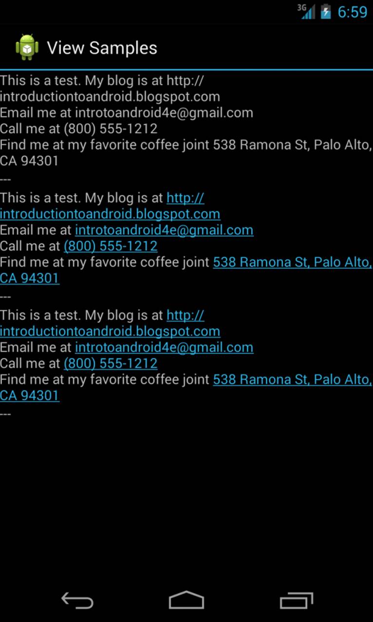
Figure 7.1 Three TextView types: Simple, autoLink all (not clickable), and autoLink all (clickable).
Your text can contain the following values for the autoLink attribute:
 none: disables all linking
web: enables linking of URLs to Web pages
email: enables linking of email addresses to the mail client with the recipient filled in
phone: enables linking of phone numbers to the dialer application with the phone number filled in, ready to be dialed
map: enables linking of street addresses to the map application to show the location
all: enables all types of linking
Turning on the autoLink feature relies on the detection of the various types within the Android SDK. In some cases, the linking might not be correct or might be misleading.
Here is an example that links email and Web pages, which, in our opinion, are the most reliable and predictable:
<TextView
android:id="@+id/TextView02"
android:layout_width="wrap_content"
android:layout_height="wrap_content"
android:text="@string/autolink_test"
android:autoLink="web|email" />
Two helper values are available for this attribute as well. You can set it to none to make sure no type of data is linked. You can also set it to all to have all known types linked. Figure 7.2 illustrates what happens when you click these links. The default for a TextView is not to link any types. If you want the user to see the various data types highlighted but you don’t want the user to click them, you can set the linksClickable attribute to false.
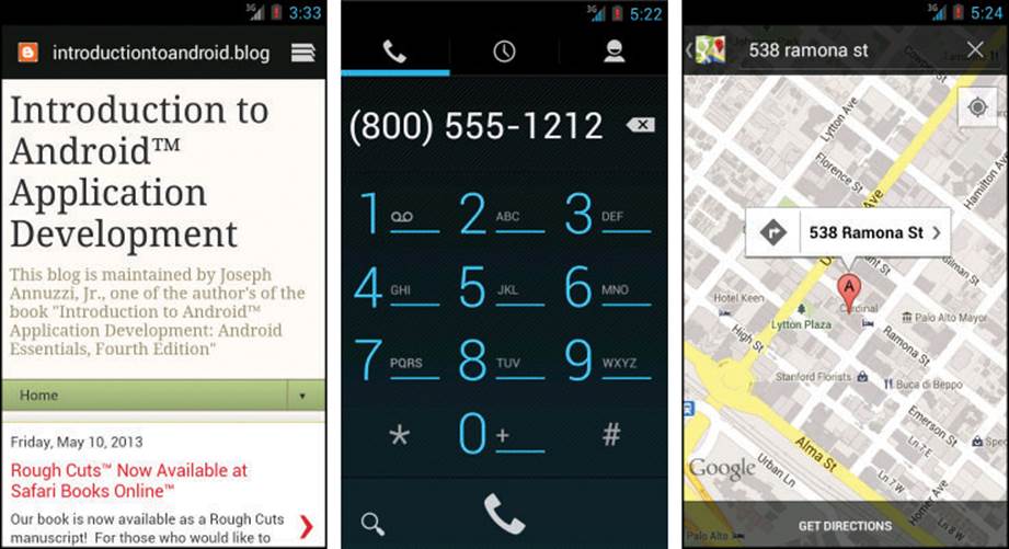
Figure 7.2 Clickable autoLinks: a URL launches the browser, a phone number launches the dialer, and a street address launches Google Maps.
Retrieving Data from Users with Text Fields
The Android SDK provides a number of controls for retrieving data from users. One of the most common types of data that applications often need to collect from users is text. One frequently used text field control to handle this type of job is the EditText control.
Retrieving Text Input Using EditText Controls
The Android SDK provides a convenient control called EditText to handle text input from a user. The EditText class is derived from TextView. In fact, most of its functionality is contained within TextView but is enabled when created as an EditText. The EditText object has a number of useful features enabled by default, many of which are shown in Figure 7.3.
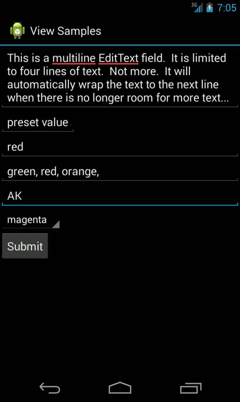
Figure 7.3 Various styles of EditText, Spinner, and Button controls.
First, though, let’s see how to define an EditText control in an XML layout file:
<EditText
android:id="@+id/EditText01"
android:layout_height="wrap_content"
android:hint="type here"
android:lines="4"
android:layout_width="match_parent" />
This layout code shows a basic EditText element. There are a couple of interesting things to note. First, the hint attribute puts some text in the edit box that goes away when the user starts entering text (run the sample code to see an example of a hint in action). Essentially, this gives a hint to the user as to what should go there. Next is the lines attribute, which defines how many lines tall the input box is. If this is not set, the entry field grows as the user enters text. However, setting a size allows the user to scroll within a fixed size to edit the text. This also applies to the width of the entry.
By default, the user can perform a long press to bring up a context menu. This provides some basic copy, cut, and paste operations to the user as well as the ability to change the input method and add a word to the user’s dictionary of frequently used words (shown in Figure 7.4). You do not need to provide any additional code for this useful behavior to benefit your users. You can also highlight a portion of the text from code. A call to setSelection() does this, and a call to selectAll() highlights the entire text entry field.
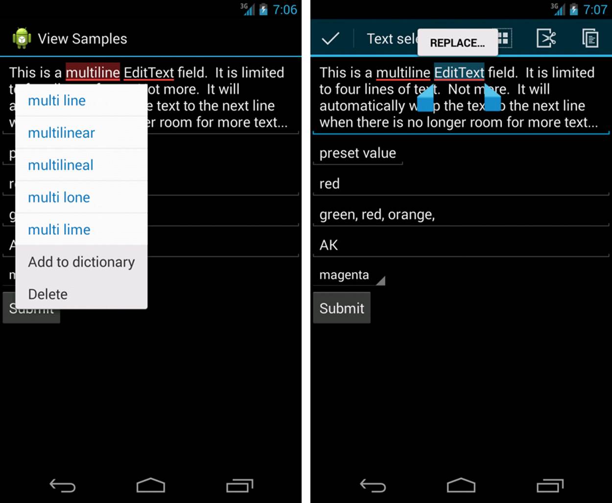
Figure 7.4 A long press on an EditText control typically launches a context menu for selections, cutting, and copying. (The Paste option appears when you have copied text.)
The EditText object is essentially an editable TextView. This means that you can read text from it in the same way as you did with TextView: by using the getText() method. You can also set initial text to draw in the text entry area using the setText() method.
Constraining User Input with Input Filters
There are times when you don’t want the user to type just anything. Validating input after the user has entered something is one way to do this. However, a better way to avoid wasting the user’s time is to filter the input. The EditText control provides a way to set an InputFilter that does only this.
The Android SDK provides some InputFilter objects for use. InputFilter objects enforce such rules as allowing only uppercase text and limiting the length of the text entered. You can create custom filters by implementing the InputFilter interface, which contains the single method called filter(). Here is an example of an EditText control with two built-in filters that might be appropriate for a two-letter state abbreviation:
final EditText text_filtered =
(EditText) findViewById(R.id.input_filtered);
text_filtered.setFilters(new InputFilter[] {
new InputFilter.AllCaps(),
new InputFilter.LengthFilter(2)
});
The setFilters() method call takes an array of InputFilter objects. This is useful for combining multiple filters, as shown. In this case, we convert all input to uppercase. Additionally, we set the maximum length to two characters long. The EditText control looks the same as any other, but if you try to type in lowercase, the text is converted to uppercase, and the string is limited to two characters. This does not mean that all possible inputs are valid, but it does help users to not concern themselves with making the input too long or bother with the case of the input. This also helps your application by guaranteeing that any text from this input is a length of two characters. It does not constrain the input to only letters, though.
Helping the User with Autocompletion
In addition to providing a basic text editor with the EditText control, the Android SDK provides a way to help the user with entering commonly used data into forms. This functionality is provided through the autocomplete feature.
There are two forms of autocomplete. One is the more standard style of filling in the entire text entry based on what the user types. If the user begins typing a string that matches a word in a developer-provided list, the user can choose to complete the word with just a tap. This is done through the AutoCompleteTextView control (see Figure 7.5, left). The second method allows the user to enter a list of items, each of which has auto-complete functionality (see Figure 7.5, right). These items must be separated in some way by providing a Tokenizer to theMultiAutoCompleteTextView object that handles this method. A common Tokenizer implementation is provided for comma-separated lists and is used by specifying the MultiAutoCompleteTextView.CommaTokenizer object. This can be helpful for lists of specifying common tags and the like.
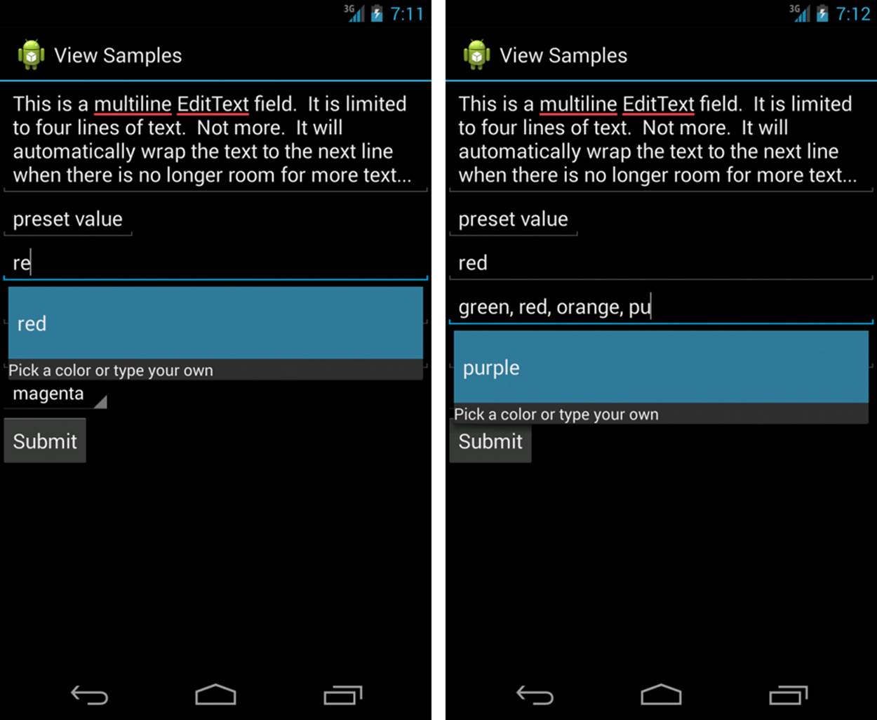
Figure 7.5 Using AutoCompleteTextView (left) and MultiAutoCompleteTextView (right).
Both of the autocomplete text editors use an Adapter to get the list of text they use to provide completions to the user. This example shows how to provide an AutoCompleteTextView that can help users type some of the basic colors from an array in the code:
final String[] COLORS = {
"red", "green", "orange", "blue", "purple",
"black", "yellow", "cyan", "magenta" };
ArrayAdapter<String> adapter =
new ArrayAdapter<String>(this,
android.R.layout.simple_dropdown_item_1line,
COLORS);
AutoCompleteTextView text = (AutoCompleteTextView)
findViewById(R.id.AutoCompleteTextView01);
text.setAdapter(adapter);
In this example, when the user starts typing in the field, if he or she starts with one of the letters in the COLORS array, a drop-down list shows all the available completions. Note that this does not limit what the user can enter. The user is still free to enter any text (such as “puce”). The Adaptercontrols the look of the drop-down list. In this case, we use a built-in layout made for such things. Here is the layout resource definition for this AutoCompleteTextView control:
<AutoCompleteTextView
android:id="@+id/AutoCompleteTextView01"
android:layout_width="match_parent"
android:layout_height="wrap_content"
android:completionHint="Pick a color or type your own"
android:completionThreshold="1" />
There are a couple more things to notice here. First, you can choose when the completion drop-down list shows by filling in a value for the completionThreshold attribute. In this case, we set it to a single character, so it displays immediately if there is a match. The default value is two characters of typing before it displays autocompletion options. Second, you can set some text in the completionHint attribute. This displays at the bottom of the drop-down list to help users. Finally, the drop-down list for completions is sized to the TextView. This means that it should be wide enough to show the completions and the text for the completionHint attribute.
The MultiAutoCompleteTextView is essentially the same as the regular autocomplete, except that you must assign a Tokenizer to it so that the control knows where each autocompletion should begin. The following is an example that uses the same Adapter as the previous example but includes a Tokenizer for a list of user color responses, each separated by a comma:
MultiAutoCompleteTextView mtext =
(MultiAutoCompleteTextView) findViewById(R.id.MultiAutoCompleteTextView01);
mtext.setAdapter(adapter);
mtext.setTokenizer(new MultiAutoCompleteTextView.CommaTokenizer());
As you can see, the only change is setting the Tokenizer. Here, we use the built-in comma Tokenizer provided by the Android SDK. In this case, whenever a user chooses a color from the list, the name of the color is completed, and a comma is automatically added so that the user can immediately start typing in the next color. As before, this does not limit what the user can enter. If the user enters “maroon” and places a comma after it, the autocompletion starts again as the user types another color, regardless of the fact that it didn’t help the user type in the color maroon. You can create your own Tokenizer by implementing the MultiAutoCompleteTextView.Tokenizer interface. You can do this if you prefer entries separated by a semicolon or some other more complex separator.
Giving Users Choices Using Spinner Controls
Sometimes you want to limit the choices available for users to type. For instance, if users are going to enter the name of a state, you might as well limit them to only the valid states, because this is a known set. Although you could do this by letting them type something and then blocking invalid entries, you can also provide similar functionality with a Spinner control. As with the autocomplete method, the possible choices for a spinner can come from an Adapter. You can also set the available choices in the layout definition by using the entries attribute with an array resource (specifically a string array that is referenced as something such as @array/state-list). The Spinner control isn’t actually an EditText, although it is frequently used in a similar fashion. Here is an example of the XML layout definition for a Spinner control for choosing a color:
<Spinner
android:id="@+id/Spinner01"
android:layout_width="wrap_content"
android:layout_height="wrap_content"
android:entries="@array/colors"
android:prompt="@string/spin_prompt" />
This places a Spinner control on the screen. A closed Spinner control is shown in Figure 7.5, with just the first choice, red, displayed. An open Spinner control is shown in Figure 7.6, which shows all the color selections available. When the user selects this control, a pop-up shows the prompt text followed by a list of the possible choices. This list allows only a single item to be selected at a time, and when one is selected, the pop-up goes away.
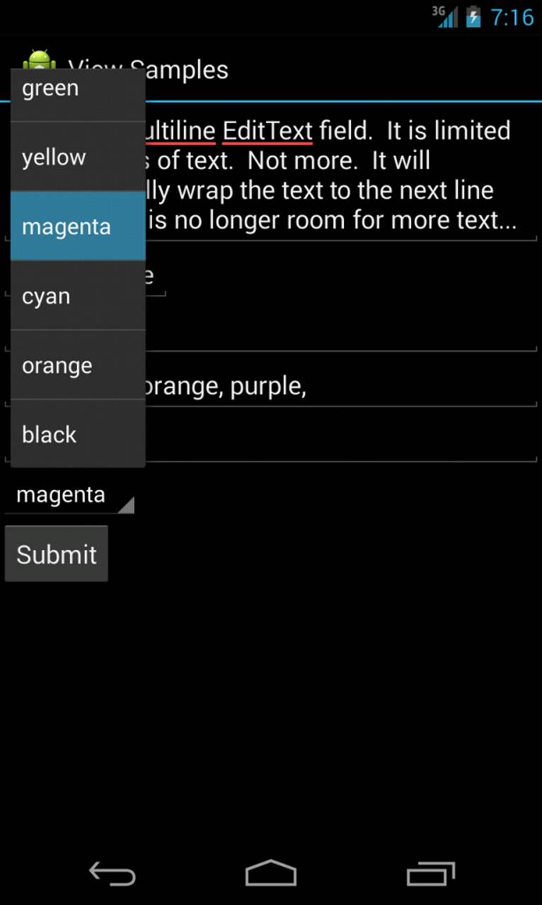
Figure 7.6 Filtering choices with a Spinner control.
There are a couple of things to notice here. First, the entries attribute is set to the value of a string array resource, referred to here as @array/colors. Second, the prompt attribute is defined as a string resource. Unlike some other string attributes, this one is required to be a string resource. The prompt displays when the Spinner control is opened and all selections are displayed. The prompt can be used to tell the user what kinds of values can be selected.
Because the Spinner control is not a TextView, but a list of TextView objects, you can’t directly request the selected text from it. Instead, you have to retrieve the specific selected option (each of which is a TextView control) and extract the text directly from it:
final Spinner spin = (Spinner) findViewById(R.id.Spinner01);
TextView text_sel = (TextView)spin.getSelectedView();
String selected_text = text_sel.getText().toString();
Alternatively, we could have called the getSelectedItem() or getSelectedItemId() method to deal with other forms of selection.
Allowing Simple User Selections with Buttons and Switches
Other common user interface elements are buttons and switches. In this section, you learn about different kinds of buttons and switches provided by the Android SDK. These include the basic Button, CheckBox, ToggleButton, and RadioButton.
A basic Button is often used to perform some sort of action, such as submitting a form or confirming a selection. A basic Button control can contain a text or image label.
A CheckBox is a button with two states—checked and unchecked. You often use CheckBox controls to turn a feature on or off or to pick multiple items from a list.
A ToggleButton is similar to a CheckBox, but you use it to visually show the state. The default behavior of a toggle is like that of a power on/off button.
A Switch is similar to a CheckBox, in that it is a two-state control. The default behavior of a control is like a slider switch that can be moved between “on” and “off” positions. This control was introduced in API Level 14 (Android 4.0).
A RadioButton provides selection of an item. Grouping RadioButton controls together in a container called a RadioGroup enables the developer to enforce that only one RadioButton is selected at a time.
You can find examples of each type of control in Figure 7.7.
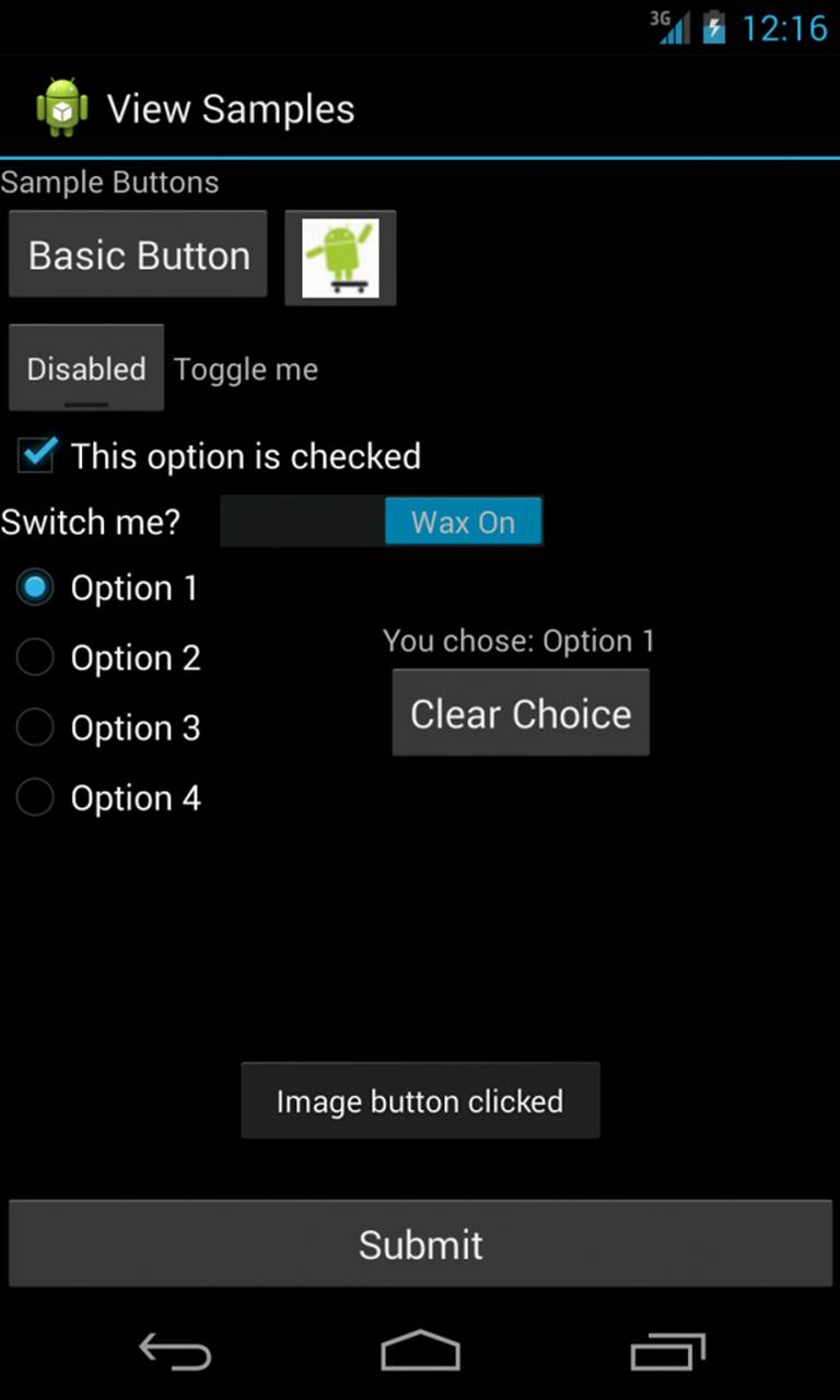
Figure 7.7 Various types of Button controls.
Using Basic Buttons
The android.widget.Button class provides a basic Button implementation in the Android SDK. Within the XML layout resources, buttons are specified using the Button element. The primary attribute for a basic Button is the text field. This is the label that appears on the middle of the button’s face. You often use basic Button controls for buttons with text such as “OK,” “Cancel,” or “Submit.”
 Tip
Tip
You can find many common application string values in the Android system resource strings, exposed in android.R.string. There are strings for common button text such as “Yes,” “No,” “OK,” “Cancel,” and “Copy.” For more information on system resources, see Chapter 6, “Managing Application Resources.”
The following XML layout resource file shows a typical Button control definition:
<Button
android:id="@+id/basic_button"
android:layout_width="wrap_content"
android:layout_height="wrap_content"
android:text="Basic Button" />
Tip
One popular styling method for buttons is the borderless button. To create a button without borders, all you need to do is set the style attribute of your Button in your layout file to style: “?android:attr/borderlessButtonStyle”. To learn more about styling your buttons, seehttp://d.android.com/guide/topics/ui/controls/button.html#Style.
A Button control won’t do anything, other than animate, without some code to handle the click event. Here is an example of some code that handles a click for a basic Button and displays a Toast message on the screen:
setContentView(R.layout.buttons);
final Button basic_button = (Button) findViewById(R.id.basic_button);
basic_button.setOnClickListener(new View.OnClickListener() {
public void onClick(View v) {
Toast.makeText(ButtonsActivity.this,
"Button clicked", Toast.LENGTH_SHORT).show();
}
});
Tip
A Toast (android.widget.Toast) is a simple dialog-like message that displays for a second or so and then disappears. Toast messages are useful for providing the user with nonessential confirmation messages; they are also quite handy for debugging. Figure 7.7 shows an example of a Toast message that displays the text “Image button clicked.”
To handle the click event for when a Button control is pressed, we first get a reference to the Button by its resource identifier. Next, the setOnClickListener() method is called. It requires a valid instance of the class View.OnClickListener. A simple way to provide this is to define the instance right in the method call. This requires implementing the onClick() method. Within the onClick() method, you are free to carry out whatever actions you need. Here, we simply display a message to the users telling them that the button was, in fact, clicked.
A Button-like control whose primary label is an image is an ImageButton. An ImageButton is, for most purposes, almost exactly like a basic Button. Click actions are handled in the same way. The primary difference is that you can set its src attribute to be an image. Here is an example of anImageButton definition in an XML layout resource file:
<ImageButton
android:layout_width="wrap_content"
android:layout_height="wrap_content"
android:id="@+id/image_button"
android:src="@drawable/droid"
android:contentDescription="@string/droidSkater" />
In this case, a small drawable resource is referenced. Refer to Figure 7.7 to see what this “Android” button looks like. (It’s to the right of the basic Button.)
Tip
You can also use the onClick XML attribute to set the name of your click method within your Activity class and implement it that way. Simply specify the name of your Activity class’s click method name using this attribute like so—android:onClick=”myMethod”—and define a public void method that takes a single View parameter and implement your click handling.
Using CheckBox and ToggleButton Controls
The CheckBox button is often used in lists of items where the user can select multiple items. The Android CheckBox contains a text attribute that appears to the side of the check box. Because the CheckBox class is derived from the TextView and Button classes, most of the attributes and methods behave in a similar fashion.
Here is an XML layout resource definition for a simple CheckBox control with some default text displayed:
<CheckBox
android:id="@+id/checkbox"
android:layout_width="wrap_content"
android:layout_height="wrap_content"
android:text="Check me?" />
The following example shows how to check for the state of the button programmatically and how to change the text label to reflect the change:
final CheckBox check_button = (CheckBox) findViewById(R.id.checkbox);
check_button.setOnClickListener(new View.OnClickListener() {
public void onClick (View v) {
CheckBox cb = (CheckBox)findViewById(R.id.checkbox);
cb.setText(check_button.isChecked() ?
"This option is checked" :
"This option is not checked");
}
});
This is similar to the basic Button control. A CheckBox control automatically shows the state as checked or unchecked. This enables us to deal with behavior in our application rather than worrying about how the button should behave. The layout shows that the text starts out one way, but after the user clicks the button, the text changes to one of two different things, depending on the checked state. You can see how this CheckBox is displayed once it has been clicked (and the text has been updated) in Figure 7.7 (center).
A ToggleButton is similar to a CheckBox in behavior but is usually used to show or alter the “on” or “off” state of something. Like the CheckBox, it has a state (checked or not). Also like the CheckBox, the act of changing what displays on the ToggleButton is handled for us. Unlike theCheckBox, it does not show text next to it. Instead, it has two text fields. The first attribute is textOn, which is the text that displays on the ToggleButton when its checked state is on. The second attribute is textOff, which is the text that displays on the ToggleButton when its checked state is off. The default text for these is “ON” and “OFF,” respectively.
The following layout code shows a definition for a ToggleButton control that shows “Enabled” or “Disabled” based on the state of the button:
<ToggleButton
android:id="@+id/toggle_button"
android:layout_width="wrap_content"
android:layout_height="wrap_content"
android:text="Toggle"
android:textOff="Disabled"
android:textOn="Enabled" />
This type of button does not actually display the value for the text attribute, even though it’s a valid attribute to set. Here, the only purpose it serves is to demonstrate that it doesn’t display. You can see what this ToggleButton looks like in Figure 7.7 (“Enabled”).
The Switch control (android.widget.Switch), which was introduced in API Level 14, provides two-state behavior similar to that of the ToggleButton control, only instead of the control being clicked to toggle between the states, it looks more like a slider. The following layout code shows a definition for a Switch control with a prompt (“Switch Me?”) and two states: “Wax On” and “Wax Off”:
<Switch android:id="@+id/switch1"
android:layout_width="wrap_content"
android:layout_height="wrap_content"
android:text="Switch me?"
android:textOn="Wax On"
android:textOff="Wax Off" />
Using RadioGroup and RadioButton
You often use radio buttons when a user should be allowed to select only one item from a small group of items. For instance, a question asking for gender can give three options: male, female, and unspecified. Only one of these options should be checked at a time. The RadioButton objects are similar to CheckBox objects. They have a text label next to them, set via the text attribute, and they have a state (checked or unchecked). However, you can group RadioButton objects inside a RadioGroup that handles enforcing their combined states so that only one RadioButton can be checked at a time. If the user selects a RadioButton that is already checked, it does not become unchecked. However, you can provide the user with an action to clear the state of the entire RadioGroup so that none of the buttons are checked.
Here, we have an XML layout resource with a RadioGroup containing four RadioButton objects (shown in Figure 7.7, toward the bottom of the screen). The RadioButton objects have text labels: “Option 1,” “Option 2,” and so on. The XML layout resource definition is shown here:
<RadioGroup
android:id="@+id/RadioGroup01"
android:layout_width="wrap_content"
android:layout_height="wrap_content">
<RadioButton
android:id="@+id/RadioButton01"
android:layout_width="wrap_content"
android:layout_height="wrap_content"
android:text="Option 1" />
<RadioButton
android:id="@+id/RadioButton02"
android:layout_width="wrap_content"
android:layout_height="wrap_content"
android:text="Option 2" />
<RadioButton
android:id="@+id/RadioButton03"
android:layout_width="wrap_content"
android:layout_height="wrap_content"
android:text="Option 3" />
<RadioButton
android:id="@+id/RadioButton04"
android:layout_width="wrap_content"
android:layout_height="wrap_content"
android:text="Option 4" />
</RadioGroup>
You can handle actions on these RadioButton objects through the RadioGroup object. The following example shows registering for clicks on the RadioButton objects within the RadioGroup and setting the text of a TextView called TextView01, which is defined elsewhere in the layout file:
final RadioGroup group = (RadioGroup)findViewById(R.id.RadioGroup01);
final TextView tv = (TextView)
findViewById(R.id.TextView01);
group.setOnCheckedChangeListener(new
RadioGroup.OnCheckedChangeListener() {
public void onCheckedChanged(
RadioGroup group, int checkedId) {
if (checkedId != -1) {
RadioButton rb = (RadioButton)
findViewById(checkedId);
if (rb != null) {
tv.setText("You chose: " + rb.getText());
}
} else {
tv.setText("Choose 1");
}
}
});
As this layout example demonstrates, there is nothing special you need to do to make the RadioGroup and internal RadioButton objects work properly. The preceding code illustrates how to register to receive a notification whenever the RadioButton selection changes.
The code demonstrates that the notification contains the resource identifier for the specific RadioButton chosen by the user, as defined in the layout resource file. To do something interesting with this, you need to provide a mapping between this resource identifier (or the text label) and the corresponding functionality in your code. In the example, we query for the button that was selected, get its text, and assign its text to another TextView control that we have on the screen.
As mentioned, the entire RadioGroup can be cleared so that none of the RadioButton objects are selected. The following example demonstrates how to do this in response to a button click outside the RadioGroup:
final Button clear_choice = (Button) findViewById(R.id.Button01);
clear_choice.setOnClickListener(new View.OnClickListener() {
public void onClick(View v) {
RadioGroup group = (RadioGroup)
findViewById(R.id.RadioGroup01);
if (group != null) {
group.clearCheck();
}
}
}
The action of calling the clearCheck() method triggers a call to the onCheckedChangedListener() callback method. This is why we have to make sure that the resource identifier we received is valid. Right after a call to the clearCheck() method, it is not a valid identifier but instead is set to the value -1 to indicate that no RadioButton is currently checked.
Tip
You can also handle RadioButton clicks using specific click handlers on individual RadioButtons within a RadioGroup. The implementation mirrors that of a regular Button control.
Retrieving Dates, Times, and Numbers from Users with Pickers
The Android SDK provides a couple of controls for getting date, time, and number input from the user. The first is the DatePicker control (see Figure 7.8, top). It can be used to get a month, day, and year from the user.
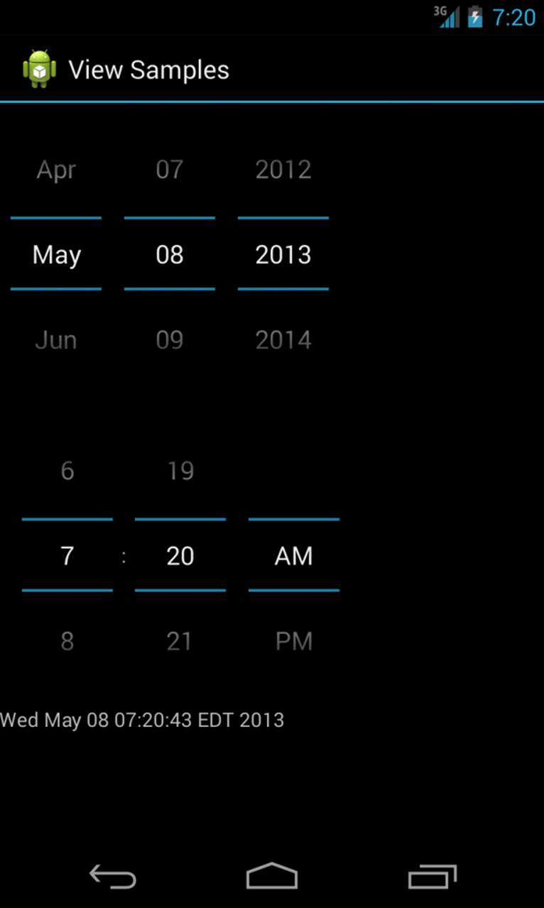
Figure 7.8 Date and time controls.
The basic XML layout resource definition for a DatePicker follows:
<DatePicker
android:id="@+id/DatePicker01"
android:layout_width="wrap_content"
android:layout_height="wrap_content"
android:calendarViewShown="false"
android:spinnersShown="true" />
Tip
If you want to control the minimum or maximum date that a user can choose from a DatePicker, you can set the android:minDate or android:maxDate values in your layout file, or you can set these values programmatically using setMinDate() or setMaxDate().
As you can see from this example, a couple of attributes help control the look of the picker. Setting the calenderViewShown attribute to true, when using API Level 11 and up, will show a full calendar, including week numbers, but may take up more space than you can allow. Try it in the sample code, though, to see what it looks like. As with many of the other controls, your code can register to receive a method call when the date changes. You do this by implementing the onDateChanged() method:
final DatePicker date = (DatePicker)findViewById(R.id.DatePicker01);
date.init(2013, 4, 8,
new DatePicker.OnDateChangedListener() {
public void onDateChanged(DatePicker view, int year,
int monthOfYear, int dayOfMonth) {
Calendar calendar = Calendar.getInstance();
calendar.set(year,
monthOfYear,
dayOfMonth,
time.getCurrentHour(),
time.getCurrentMinute());
text.setText(calendar.getTime().toString());
}
});
The preceding code sets the DatePicker.OnDateChangedListener via a call to the DatePicker.init() method. The DatePicker control is initialized to a specific date (note that the month field is zero based, so May is month number 4, not 5). In our example, a TextView control is set with the date value that the user entered into the DatePicker control.
A TimePicker control (also shown in Figure 7.8, bottom) is similar to the DatePicker control. It also doesn’t have any unique attributes. However, to register for a method call when the values change, you call the more traditional method of TimePicker.setOnTimeChangedListener(), as shown here:
time.setOnTimeChangedListener(new TimePicker.OnTimeChangedListener() {
public void onTimeChanged(TimePicker view,
int hourOfDay, int minute) {
Calendar calendar = Calendar.getInstance();
calendar.set(calendar.get(Calendar.YEAR),
calendar.get(Calendar.MONTH),
calendar.get(Calendar.DAY_OF_MONTH),
hourOfDay,
minute);
text.setText(calendar.getTime().toString());
}
});
As in the previous example, this code also sets a TextView to a string displaying the time value that the user entered. When you use the DatePicker control and the TimePicker control together, the user can set both a date and a time.
Android also provides a NumberPicker widget, which is very similar to the TimePicker widget. You can use a NumberPicker to present to users a selection mechanism for choosing a number from a predefined range. There are two different types of NumberPickers you can present, both of which are entirely based on the theme your application is using. To learn more about the NumberPicker, see http://d.android.com/reference/android/widget/NumberPicker.html.
Using Indicators to Display Progress and Activity to Users
The Android SDK provides a number of controls that can be used to visually show some form of information to the user. These indicator controls include the ProgressBar, activity bars, activity circles, clocks, and other similar controls.
Indicating Progress with ProgressBar
Applications commonly perform actions that can take a while. A good practice during this time is to show the user some sort of progress indicator to indicate that the application is off “doing something.” Applications can also show how far a user is through some operation, such as playing a song or watching a video. The Android SDK provides several types of ProgressBar.
The standard ProgressBar is a circular indicator that only animates. It does not show how complete an action is. It can, however, show that something is taking place. This is useful when an action is indeterminate in length. There are three sizes of this type of progress indicator (see Figure 7.9).
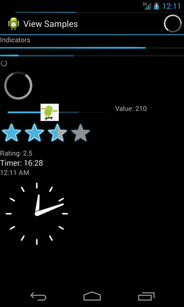
Figure 7.9 Various types of progress and rating indicators.
The second type is a horizontal ProgressBar that shows the completeness of an action. (For example, you can see how much of a file has downloaded.) This horizontal ProgressBar can also have a secondary progress indicator on it. This can be used, for instance, to show the completion of a downloading media file while that file plays.
Here is an XML layout resource definition for a basic indeterminate ProgressBar:
<ProgressBar
android:id="@+id/progress_bar"
android:layout_width="wrap_content"
android:layout_height="wrap_content" />
The default style is for a medium-size circular progress indicator—not a “bar” at all. The other two styles for an indeterminate ProgressBar are progressBarStyleLarge and progressBarStyleSmall. This style animates automatically. The next example shows the layout definition for a horizontal progress indicator:
<ProgressBar
android:id="@+id/progress_bar"
style="?android:attr/progressBarStyleHorizontal"
android:layout_width="match_parent"
android:layout_height="wrap_content"
android:max="100" />
We have also set the attribute for max in this example to 100. This can help mimic a percentage ProgressBar—that is, setting the progress to 75 shows the indicator at 75% complete.
We can set the indicator progress status programmatically as follows:
mProgress = (ProgressBar) findViewById(R.id.progress_bar);
mProgress.setProgress(75);
You can also put a ProgressBar in your application’s title bar (as shown in Figure 7.9). This can save screen real estate and can also make it easy to turn on and off an indeterminate progress indicator without changing the look of the screen. Indeterminate progress indicators are commonly used to display progress on pages where items need to be loaded before the page can finish drawing. This is often employed on Web browser screens. The following code demonstrates how to place this type of indeterminate progress indicator on your Activity screen:
requestWindowFeature(Window.FEATURE_INDETERMINATE_PROGRESS);
requestWindowFeature(Window.FEATURE_PROGRESS);
setContentView(R.layout.indicators);
setProgressBarIndeterminateVisibility(true);
setProgressBarVisibility(true);
setProgress(5000);
To use the indeterminate indicator on your Activity object’s title bar, you need to request the feature Window.FEATURE_INDETERMINATE_PROGRESS, as previously shown. This shows a small circular indicator in the right side of the title bar. For a horizontal ProgressBar style that shows behind the title, you need to enable Window.FEATURE_PROGRESS. These features must be enabled before your application calls the setContentView() method, as shown in the preceding example.
You need to know about a couple of important default behaviors. First, the indicators are visible by default. Calling the visibility methods shown in the preceding example can set visibility on or off. Second, the horizontal ProgressBar defaults to a maximum progress value of 10000. In the preceding example, we set it to 5000, which is equivalent to 50%. When the value reaches the maximum value, the indicators fade away so that they aren’t visible. This happens for both indicators.
Indicating Activity with Activity Bars and Activity Circles
When there is no telling how long an operation will take to complete, but you need a way to indicate to the user that an operation is taking place, you should use an activity bar or an activity circle. You define an activity bar or circle exactly like you define a ProgressBar, with one small change: you need to tell Android that the operation running will continue for an indeterminate amount of time by either setting the attribute within your layout file using android:indeterminate, or from within your code by setting the ProgressBar’s visibility to indeterminate using thesetProgressBarIndeterminateVisibility() method.
Tip
When using an activity circle, there is no need to display any text to users to let them know that an operation is taking place. The activity circle alone is enough for users to understand that an operation is taking place. To learn more about activity bars and activity circles, seehttp://d.android.com/design/building-blocks/progress.html#activity.
Adjusting Progress with Seek Bars
You have seen how to display progress to the user. What if, however, you want to give the user some ability to move the indicator—for example, to set the current cursor position in a playing media file or to tweak a volume setting? You accomplish this by using the SeekBar control provided by the Android SDK. It’s like the regular horizontal ProgressBar but includes a thumb, or selector, that can be dragged by the user. A default thumb selector is provided, but you can use any drawable item as a thumb. In Figure 7.9 (center), we replaced the default thumb with a little Android graphic.
Here, we have an example of an XML layout resource definition for a simple SeekBar:
<SeekBar
android:id="@+id/seekbar1"
android:layout_height="wrap_content"
android:layout_width="240dp"
android:max="500"
android:thumb="@drawable/droidsk1" />
With this sample SeekBar, the user can drag the thumb named droidsk1 to any value between 0 and 500. Although this is shown visually, it might be useful to show the user the exact value selected. To do this, you can provide an implementation of the onProgressChanged() method, as shown here:
SeekBar seek = (SeekBar) findViewById(R.id.seekbar1);
seek.setOnSeekBarChangeListener(
new SeekBar.OnSeekBarChangeListener() {
public void onProgressChanged(
SeekBar seekBar, int progress,boolean fromTouch) {
((TextView)findViewById(R.id.seek_text))
.setText("Value: "+progress);
seekBar.setSecondaryProgress(
(progress+seekBar.getMax())/2);
}
});
There are two interesting things to notice in this example. The first is that the fromTouch parameter tells the code if the change came from the user input or if, instead, it came from a programmatic change as demonstrated with the regular ProgressBar controls. The second interesting thing is that the SeekBar still enables you to set a secondary progress value. In this example, we set the secondary indicator to be halfway between the user’s selected value and the maximum value of the ProgressBar. You might use this feature to show the progress of a video and the buffer stream.
 Note
Note
If you want to create your own activity indicator, you can define a custom indicator. For most situations, the default indicators that Android provides should be enough. If you need to display a custom indicator, you should read more about how to do so here:http://d.android.com/design/building-blocks/progress.html#custom-indicators.
Other Valuable User Interface Controls
Android has a number of other ready-to-use user interface controls to incorporate into your applications. This section is dedicated to introducing the RatingBar and various time controls, such as the Chronometer, DigitalClock, TextClock, and AnalogClock.
Displaying Rating Data with RatingBar
Although the SeekBar is useful for allowing a user to set a value, such as the volume, the RatingBar has a more specific purpose: showing ratings or getting a rating from a user. By default, this ProgressBar uses the star paradigm, with five stars by default. A user can drag across this horizontally to set a rating. A program can set the value as well. However, the secondary indicator cannot be used because it is used internally by this particular control.
Here is an example of an XML layout resource definition for a RatingBar with four stars:
<RatingBar
android:id="@+id/ratebar1"
android:layout_width="wrap_content"
android:layout_height="wrap_content"
android:numStars="4"
android:stepSize="0.25" />
This layout definition for a RatingBar demonstrates setting both the number of stars and the increment between each rating value. Figure 7.9 (center) illustrates how the RatingBar behaves. In this layout definition, a user can choose any rating value between 0 and 4.0, in increments of 0.25, the stepSize value. For instance, users could set a value of 2.25. This is visualized to the users, by default, with the stars partially filled.
Although the value is indicated to the user visually, you might still want to show its numeric representation. You can do this by implementing the onRatingChanged() method of the RatingBar.OnRatingBarChangeListener class, as shown here:
RatingBar rate = (RatingBar) findViewById(R.id.ratebar1);
rate.setOnRatingBarChangeListener(new
RatingBar.OnRatingBarChangeListener() {
public void onRatingChanged(RatingBar ratingBar,
float rating, boolean fromTouch) {
((TextView)findViewById(R.id.rating_text))
.setText("Rating: "+ rating);
}
});
The preceding example shows how to register the listener. When the user selects a rating using the control, a TextView is set to the numeric rating the user entered. One interesting thing to note is that, unlike the SeekBar, the implementation of the onRatingChange() method is called after the change is complete, usually when the user lifts a finger—that is, while the user is dragging across the stars to make a rating, this method isn’t called. It is called when the user stops pressing the control.
Showing Time Passage with the Chronometer
Sometimes you want to show time passing instead of incremental progress. In this case, you can use the Chronometer control as a timer (see Figure 7.9, near the bottom). This might be useful if it’s the user who is taking time doing some task or playing a game where some action needs to be timed. The Chronometer control can be formatted with text, as shown in this XML layout resource definition:
<Chronometer
android:id="@+id/Chronometer01"
android:layout_width="wrap_content"
android:layout_height="wrap_content"
android:format="Timer: %s" />
You can use the Chronometer object’s format attribute to put text around the time that displays. A Chronometer won’t show the passage of time until its start() method is called. To stop it, simply call its stop() method. Finally, you can change the time from which the timer is counting—that is, you can set it to count from a particular time in the past instead of from the time it was started. You call the setBase() method to do this.
Tip
The Chronometer uses the elapsedRealtime() method’s time base. Passing android.os.SystemClock.elapsedRealtime() in to the setBase() method starts the Chronometer control at 0.
In this next code example, the timer is retrieved from the View by its resource identifier. We then check its base value and reset it to 0. Finally, we start the timer counting up from there.
final Chronometer timer =
(Chronometer)findViewById(R.id.Chronometer01);
long base = timer.getBase();
Log.d(ViewsMenu.debugTag, "base = "+ base);
timer.setBase(0);
timer.start();
Tip
You can listen for changes to the Chronometer by implementing the Chronometer.OnChronometerTickListener interface.
Displaying the Time
Displaying the time in an application is often not necessary because Android devices have a status bar to display the current time. However, two clock controls are available to display this information: the DigitalClock and AnalogClock controls.
Using the DigitalClock
The DigitalClock control (Figure 7.9, bottom) is a compact text display of the current time in standard numeric format based on the user’s settings. It is a TextView, so anything you can do with a TextView you can do with this control, except change its text. You can change the color and style of the text, for example.
By default, the DigitalClock control shows the seconds and automatically updates as each second ticks by. Here is an example of an XML layout resource definition for a DigitalClock control:
<DigitalClock
android:id="@+id/DigitalClock01"
android:layout_width="wrap_content"
android:layout_height="wrap_content" />
Using the TextClock
The TextClock control was recently added in API Level 17 and is meant to be a replacement for the DigitalClock, which was deprecated in API Level 17. The TextClock has many more features than the DigitalClock and allows you to format the display of the date and/or time. In addition, theTextClock allows you to display the time in 12-hour mode or 24-hour mode and even allows you to set the time zone.
By default, the TextClock control does not show the seconds. Here is an example of an XML layout resource definition for a TextClock control:
<TextClock
android:id="@+id/TextClock01"
android:layout_width="wrap_content"
android:layout_height="wrap_content" />
Using the AnalogClock
The AnalogClock control (Figure 7.9, bottom) is a dial-based clock with a basic clock face with two hands. It updates automatically as each minute passes. The image of the clock scales appropriately with the size of its View.
Here is an example of an XML layout resource definition for an AnalogClock control:
<AnalogClock
android:id="@+id/AnalogClock01"
android:layout_width="wrap_content"
android:layout_height="wrap_content" />
The AnalogClock control’s clock face is simple. However, you can set its minute and hour hands. You can also set the clock face to specific drawable resources, if you want to jazz it up. Neither of these clock controls accepts a different time or a static time to display. They can show only the current time in the current time zone of the device, so they are not particularly useful.
Summary
The Android SDK provides many useful user interface components that developers can use to create compelling and easy-to-use applications. This chapter introduced you to many of the most useful controls and discussed how each behaves, how to style them, and how to handle input events from the user.
You learned how controls can be combined to create user entry forms. Important controls for forms include EditText, Spinner, and various Button controls. You also learned about controls that can indicate progress or the passage of time to users. We talked about many common user interface controls in this chapter; however, there are many others. In the next chapter, you will learn how to use various layout and container controls to organize a variety of controls on the screen easily and accurately.
Quiz Questions
1. What Activity method would you use to retrieve a TextView object?
2. What TextView method would you use to retrieve the text of that particular object?
3. What user interface control is used for retrieving text input from users?
4. What are the two different types of autocompletion controls?
5. True or false: A Switch control has three or more possible states.
6. True or false: The DateView control is used for retrieving dates from users.
Exercises
1. Create a simple application that accepts text input from a user with an EditText object and, when the user clicks an update Button, displays the text within a TextView control.
2. Create a simple application that has an integer defined in an integer resource file and, when the application is launched, displays the integer within a TextView control.
3. Create a simple application with a red color value defined in a color resource file. Define a Button control in the layout with a default blue textColor attribute. When the application is launched, have the default blue textColor value change to the red color value you defined in the color resource file.
References and More Information
Android Design:
http://d.android.com/design/index.html
Android Design: “Building Blocks”:
http://d.android.com/design/building-blocks/index.html
Android SDK Reference regarding the application View class:
http://d.android.com/reference/android/view/View.html
Android SDK Reference regarding the application TextView class:
http://d.android.com/reference/android/widget/TextView.html
Android SDK Reference regarding the application EditText class:
http://d.android.com/reference/android/widget/EditText.html
Android SDK Reference regarding the application Button class:
http://d.android.com/reference/android/widget/Button.html
Android SDK Reference regarding the application CheckBox class:
http://d.android.com/reference/android/widget/CheckBox.html
Android SDK Reference regarding the application Switch class:
http://d.android.com/reference/android/widget/Switch.html
Android SDK Reference regarding the application RadioGroup class:
http://d.android.com/reference/android/widget/RadioGroup.html
Android API Guides: “User Interface”:
http://d.android.com/guide/topics/ui/index.html