Designing and Developing for Google Glass (2015)
Part III. Develop
Chapter 9. Working with Timeline Cards
The time has finally come. We’ve talked about effective Glassware design that properly conforms to the Five Noble Truths outlined in Chapter 5, we’ve created a new Glassware project in Developers Console in Chapter 7, and we’ve obtained the necessary OAuth credentials in Chapter 8. Now, let’s focus specifically on presentation. We have created a Glassware project. We have the client ID and secret. There’s only one thing left to do—actually create a card and send it to Glass. You may be surprised that building a static card can be as simple as the concept of a card itself, but contained in this incredibly simple concept are many settings that give you lots of power over what you’re sending to a user and how it will look.
We’re going to start simple, learning some basic tools for designing the cards and getting a few onto Glass itself. We’ll then start exploring some of the more advanced formatting features and options that are available as we generate cards. The next chapter continues talking about cards as we learn how users can interact with these compact creations of ours and, almost as importantly, how we find out that they’ve done so.
Just a reminder (we warned you), you’re not going to see a lot of code in here. We’re going to point you to Google’s documentation for the actual code itself while we help make sure you understand the concept. We already know you’re an awesome programmer—here’s where you prove it.
“Hello, World!”, Glass-Style
Let’s dive in! We’ll be doing much of our work for this section using a tool from Google, the Google Mirror API Playground. This lets us create some cards for the timeline and send them to Glass so we can play with them. We can’t do everything using the Playground, but this will help you learn the basic components of how to create a card. When you move to developing your Glassware, you’ll return many times to the Playground to test out new card layouts, so this is a great place to start.
You can get to it from the developer pages by following the Tools section and then the Playground. (You can also go there directly, but it helps to learn to navigate your way around the documentation.) The first thing you’re greeted with is a prompt for your Client ID. Good thing we spent the past two chapters setting up a project and creating the OAuth Client ID! Go ahead and enter it here and click the Authorize button. You’ll go through the OAuth flow to approve access to the timeline, and then you should be all set to use it.
The Playground is separated into several areas. Along the bottom are some sample templates, which we will be working with and adapting. Another tab gives us access to cards that we have already added to the timeline, so we can fiddle with them and update them as appropriate. Above the templates is a larger preview area on the left and the entry area on the right. We’ll be able to enter data either using text, HTML, or JSON, and we can switch between the two (which comes in handy). Figure 9-1 shows the main interface for the Playground.
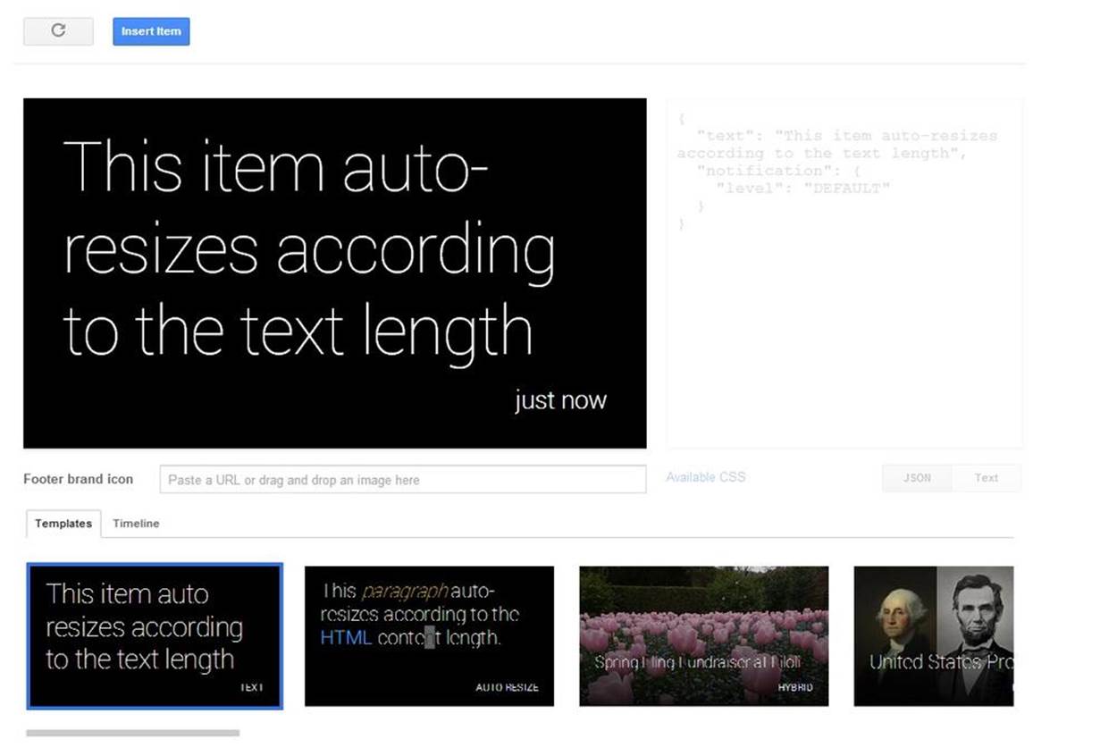
Figure 9-1. Testing prototypes in the Google Mirror API Playground
Poke around a little if you wish, but when you’re ready, select the Text template, which is the first one all the way to the left. Then select the Text button beneath the entry area and replace the text by typing:
Hello Glass
As you’re entering the text, you’ll see the preview area in Figure 9-2 change to reflect what you’ve typed—this holds true for both text and HTML. You can also click the JSON button to see the representation that will be sent to Google. We’ll get to this in a moment.
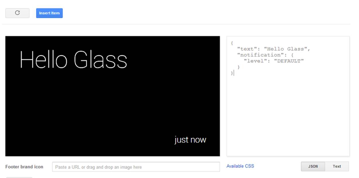
Figure 9-2. A basic vanilla card
Once it looks good, give it a try on Glass—click the blue Insert Item button above the preview area. Several things should happen: you’ll get an audible signal on Glass that you have a new card, and the Template area switches to Timeline view to show you what cards this app has in its timeline. If you were looking, you’d even have seen that the JSON entry area was updated to show you the response from the server with its representation of the item.
You just wrote your first Glassware…really!
You can even update this card. This time, click the JSON button and see what the JSON representation looks like. In the middle of everything, you will see a line that looks like:
“text”: “Hello Glass”,
Let’s change this so we’re a little more verbose, so it looks like:
“text”: “Hello there, from Glass!”,
…and then click the blue Update Item button, shown in Figure 9-3. You’ll see the Preview and Text Entry areas update as you go, and once you click the button, you’ll see the Timeline area at the bottom changes, and your Glass will chirp alerting you that the previous card has been updated.
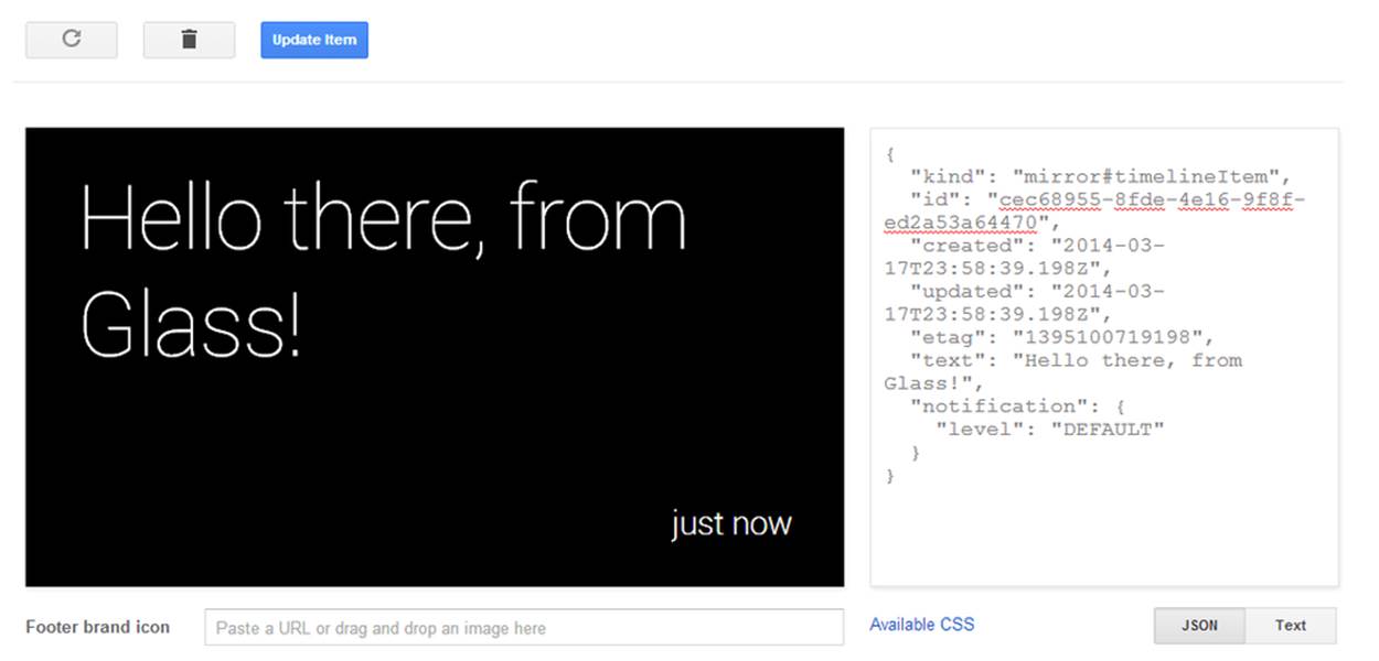
Figure 9-3. Updating existing items
Play with the text a bit. Try hitting Return so you force a new line in the display and see how it is represented in the JSON data, or try some very long text and watch how the text resizes itself dynamically. See if you can figure out how many lines it will eventually condense to. Wonder if you can edit the text on the preview window? (Hint: yes!)
When you’re done playing, let’s take a quick look at the JSON representation and learn a bit about these fields. To do so, we’re going to consult the documentation for a Timeline object. Go ahead and bookmark this URL—we’ll be visiting it frequently. We use this object to send values to Glass, and the object that is returned is a fully populated version with more information. We’ll cover most of these items through this and subsequent chapters, but some won’t get much coverage—we’ve found them not so useful. Feel free to read and experiment with them here.
So we sent an object looking something like so:
{
“text”: “Hello Glass”,
"notification": {
"level": "DEFAULT"
}
}
and got back a fully populated object something like this:
{
"kind": "mirror#timelineItem",
"id": "cec68955-8fde-4e16-9f8f-ed2a53a64470",
"created": "2014-03-17T23:58:39.198Z",
"updated": "2014-03-17T23:58:39.198Z",
"etag": "1395100719198",
“text”: “Hello there, from Glass!”,
"notification": {
"level": "DEFAULT"
}
}
So what do these fields mean? Let’s consult the table of property names and descriptions, which are arranged alphabetically. For the values we set when creating the card:
§ text—Seems simple enough, this is the text that appears on the card. It is a string object and the notes indicate that the property is writeable. (Good thing, since we already wrote to it.)
§ notification—This is a nested object that contains other properties, each of which is described in its own entry in the table. This is what tells Glass that it should chirp when the card is inserted or updated.
§ notification.level—Another writeable property—the documentation as of the time of this writing says the only valid value right now is the string “DEFAULT.”
Seems straightforward enough. What about the values we get after we do the insert?
kind
This will always be set to the string mirror#timelineItem. We see this sort of namespacing pattern for all objects that come from a Google REST API—we will never need to set this value explicitly, but this will always indicate the type of the object returned to us. Most of the time, our host languages will take care of this for us, but on occasion it may be useful for debugging.
id
A unique identifier, sometimes called a “UUID.” This card is ours. There may be others like it, but this is how we know this one is special. We’ll be using this ID later when we update or modify a card. Glass will always set this value for us—we can’t set it ourselves.
created and updated
These are datetime objects representing when the card was (you guessed it) created or last updated. These two times are initially the same, because the card was last updated when it was created. If you make changes, you’ll see that the updated time will change, but the created time (as well as the ID) won’t. We can’t set either of these values, but we’ll see in a moment how we can control the time on the card. The format of a datetime object is fairly simple. While it is probably easy to figure out from the example, you’ll see it is always represented with a four-digit year, a two-digit month, day, hour, minute, and second, followed by three digits containing the thousandths of a second. Fields are separated by hyphens, with a “T” separating the date portion and the time portion. It will always represent the UTC time, and we know this by the “Z” at the end. Your language’s library will probably have converted this to whatever format dates and times are handled in your particular programming language.
etag
The details of what an ETag are can be complex, but you can think of this as a revision indicator for the ID. So while the ID represents a card, no matter what may have changed on the card, the ETag will let you know if the information on the card has changed in some way. It doesn’t tell you what has changed or why—just that something has changed. This will come in useful later, when we read the timeline after we’re told about updates, but we’ll ignore it for the moment.
The notes of the documentation indicate which fields are writeable by us. No notation indicates that Glass will set it for us, and we might not even be able to set these fields using our language’s library.
A METHOD TO OUR MADNESS
We’ve mentioned concepts of “inserting” or “updating” timeline items without really explaining how you’ll do this in your own code. We’re going to stick with the Playground for a while since it makes it easier to understand the concept before you get into syntax, but this is a good place to point out just what commands are, conceptually, possible. Under the list of object properties in the documentation you’ll see a list of methods available with the Timeline object. You can click each if you really want to explore them now, but we suggest you hold off and focus on designing cards with the Playground first.
So we’ve welcomed ourselves to the wonderful world of Glass development. We’re all set to code now, right? Well…the text looks OK, and may be useful for some basic things, but you’ll notice that the good Glassware that we’ve shown you so far isn’t just a wall of text—there are some clear visual elements that help us quickly grasp what the card is about. To do this, we’re going to rely on many of the other templates in the Playground, and these are all based on HTML.
HTML: Even More Style
Let’s take a look at what other templates are available. To our utter shock and amazement (not), we notice that many of the other examples look similar to much of the Glassware we’ve seen over the past few chapters. These design patterns come up over and over because they work. (And because they were in the Playground, and the Glassware developers used the Playground to help come up with their own cards.) Even with the similar design, there is plenty of room for creativity.
All of these layouts use HTML markup to provide structure and semantics for the cards, and supplement this structure with a little bit of CSS styling rules to provide visual clues. If you’re familiar with both, you may need to do some unlearning—many tags don’t work, or don’t work as well as you’d like, others should be avoided because they don’t work as well on Glass, and other features we normally associate with HTML and CSS (namely JavaScript and its associated dynamic functions) just don’t exist at all.
YOUR OWN STYLE
If you’re HTML and CSS savvy already, you may be tempted to skip this section and read the list of styles available through the “Available CSS” link on the Playground. We suggest you go through the chapter first and then supplement your knowledge with the details available there. (And beware—some classes aren’t in the CSS rules.)
You can, of course, use CSS to add your own styling where appropriate (using your own classes or via a “style” attribute), but we strongly recommend that you don’t go overboard—the style rules in Glass are there to help create uniform behavior. You can also use other HTML besides those that we’ll be talking about here, but Glass doesn’t let you do everything you may expect. Check out the documentation of the Timeline object, and the html property specifically, for the list of what tags are accepted, what tags are removed with contents preserved, and what blocks are removed completely.
If you’re not familiar with HTML and CSS—don’t worry. We’re not going to teach you everything, but we’ll cover enough for you to understand what you need to know.
We’ll start by selecting the Auto Resize template and click the HTML button to see what the settings look like:
<article>
<section>
<p class="text-auto-size">
...
</p>
</section>
</article>
JAVASCRIPT’S THERE…JUST NOT FOR US
The secret about Glass is that while JavaScript code isn’t supported for developers, it is running under the covers. If you read through the base styles for CSS on Glass, you might notice in the comments notes about how the size of some text selectors is automatically resized by JavaScript. Sneaky, Google!
Just looking at the framework, we see a structure of nested blocks defined by tags. The outermost <article> tag block, a <section> block inside this, and a <p> block inside this. The <p> block (for paragraph) has a class attribute associated with it that provides additional information about how to handle the contents (we’ll document this as p.text-auto-size in the HTML code block that precedes Figure 9-4, meaning a paragraph block that has text-auto-size set as its “class” attribute). What do these tags and classes mean?
article
Defines a timeline card visually. There are exceptions (and we’ll cover them in a bit), but you can consider that everything defined under the article will appear on a single screen in the timeline. This contains all the other components of the card, which we’ll be going into.
section
This is the main body of our card. You can think of this as where we’re going to put the important part of our message.
p.text-auto-size
A single paragraph of our message that will auto-resize based on how much content it has. We can have multiple paragraphs, and it will make sure each starts on a new line.
Try this bit of HTML out and you should get a card like Figure 9-4:
<article>
<section>
<p class="text-auto-size">
Hello there
</p>
<p class="text-auto-size">
Explorer
</p>
</section>
</article>

Figure 9-4. Working with content in the Mirror API Playground
Then play around a bit. What happens when you put lots more text in just one of the paragraph blocks? What happens if you put more in both? What happens if you put in more text than will fit? You should see that each resizes separately from the other, but you may see some oddities about when it resizes and how it looks when you do. A note of caution: it may appear differently (and usually better) on Glass itself since the Playground doesn’t perfectly emulate what Glass does.
Auto-sizing is fine, but we usually want to be a little more in control of our layout by specifying the size. Change our preceding sample so we’re specifying the size on the first paragraph and leaving the second paragraph at whatever default size Glass picks for us:
<article>
<section>
<p class="text-xx-large">
Hello there
</p>
<p>
Explorer
</p>
</section>
</article>
The text-xx-large class is good for just a couple of words (Figure 9-5). If you play with it, you’ll see that it really dominates the screen. Glass defines a few sizes for you—play around with each and see how they work:
§ text-xx-large
§ text-x-large
§ text-large
§ text-normal
§ text-small
§ text-x-small
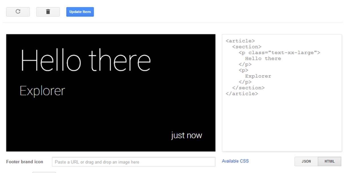
Figure 9-5. Applying text-xx-large
You may wonder which is best—using a fixed-size font or auto-sizing. Fixed sizes are more predictable and present fewer formatting surprises if a user is glancing at the screen. On the other hand, short text can certainly be read easier in a larger font, so it may be useful to see a short message quickly, while making it easier to determine you don’t want to read a longer message. See what is best for your specific application.
Different sized text is great, but what about bold, italics, and colors? You’re covered. Take this chunk of HTML for a spin, which should produce a card not unlike Figure 9-6:
<article>
<section>
<p>
You can do <b>bold</b> (or <strong>strong</strong>)
and <i>italics</i> (or <em>emphasized</em>)
</p>
<p>
You can even do colors like <span class="red">red</span>
</p>
</section>
</article>
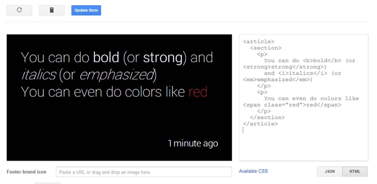
Figure 9-6. Formatting options
Simple text formatting is pretty straightforward, particularly if you’ve used HTML before. HTML folks call them inline blocks, and we have the following ones available:
b or strong
Bold.
i or em
Italics.
span
Inline element without formatting, but can be used to contain the color formatting classes without creating new block-level content like with the <p> and <div> tags.
You can apply these color classes to any of the inline blocks (see the documentation about color for the specific hues applied):
§ red
§ yellow
§ green
§ blue
§ white
§ gray
§ muted
MIX COLORS INSTEAD OF FONT SIZES
One of the things that will drive you batty as a designer on any platform is changing the size of fonts to infer importance, precedence, or immediacy within your content. On Glass, you’ll inevitably run into this because of the need to draw attention to text while making sure it stays visible within the available card space. You may want to highlight a headline so that it stands apart from other text, but you want to make sure it doesn’t push other content away.
A cool trick is to use a set font size for all your textual content, while changing up your use of color. Make prima donna text stand out with bright colors like yellows and greens, while demoting other text with grays and the appropriately named muted class. Since Glass is a glanceable, short attention span medium, you’ll preserve the screen real estate while establishing a hierarchy for your stuff.
A lot of the HTML that you’re already familiar with should just work, although some of the tricks you’re used to won’t. Lists, for example, display fine, but are formatted differently:
<article>
<section>
<ul class="text-x-small">
<li>Vanilla ice cream with nuts and chocolate syrup</li>
<li>Chocolate ice cream with peanut butter topping</li>
<li>Tutti-Frutti on a bed of bananas</li>
</ul>
</section>
<footer>
<p>Available Sundaes</p>
</footer>
</article>
The result should appear like Figure 9-7.
You’ll notice that instead of bullets to the left of each item, there are subtle separator lines in between each list. Each item is confined to a single line by default, and nested lists are discouraged since font size isn’t enough of a distinguisher. We can get rid of the separator line by adding theno-border class, but we strongly suggest you don’t use it—the separator helps break up the items in a subtle way:
<article>
<section>
<ul class="text-x-small no-border">
<li>Vanilla ice cream with nuts and chocolate syrup</li>
<li>Chocolate ice cream with peanut butter topping</li>
<li>Tutti-Frutti on a bed of bananas</li>
</ul>
</section>
<footer>
<p>Available Sundaes</p>
</footer>
</article>
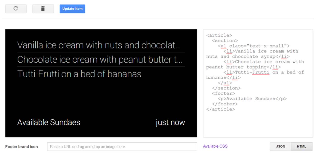
Figure 9-7. Working with lists
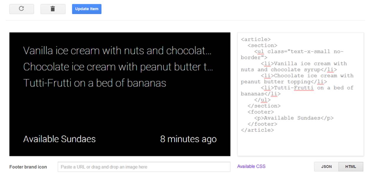
Figure 9-8. Working with tabular data
Tables also work well, and you have access to the no-border class here if you need it (Figure 9-8). The align-justify class does a little fancy work with tables—leftmost cells are left-justified, rightmost are right-justified, and all the rest are centered:
<article>
<section>
<table class="align-justify">
<tbody>
<tr>
<td>email</td>
<td>---</td>
<td class="red">down</td>
</tr>
<tr>
<td>web</td>
<td>2ms</td>
<td class="green">OK</td>
</tr>
<tr>
<td>db</td>
<td>20ms</td>
<td class="yellow">slow</td>
</tr>
</tbody>
</table>
</section>
<footer>
Server Status
</footer>
</article>
Figure 9-9 shows the output.
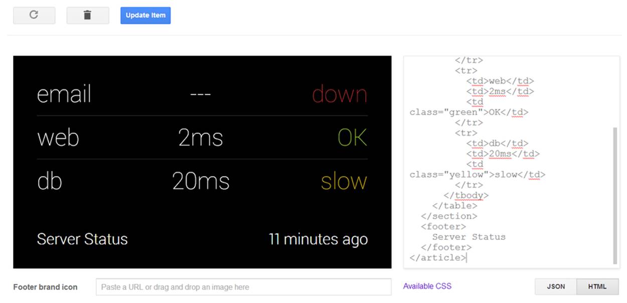
Figure 9-9. Mixing formatting in a card layout
We should caution you, however: don’t try to use tables to do absolute positioning for columns. That way lies pain. There are, however, classes that you can apply to a <div> inside a section, and nested <div> elements will be broken up into columns, as shown in Figure 9-10:
<article>
<section>
<div class="layout-three-column">
<div class="align-center text-x-small">
<p>Mama</p>
<p>too small</p>
</div>
<div class="align-center text-large">
<p>Papa</p>
<p>too big</p>
</div>
<div class="align-center">
<p>Baby</p>
<p>just right</p>
</div>
</div>
</section>
<footer>
<p>Bears</p>
</footer>
</article>
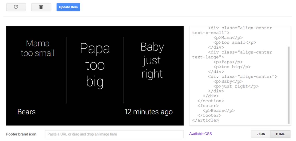
Figure 9-10. Applying the built-in CSS classes
In this illustration, we see layout-three-column doing just that. Experiment a little and see what happens when we use these other layout classes:
div.layout-two-column
Provides two equal columns.
div.layout-three-column
Provides three equal columns (clever, we know).
div.layout-figure
Provides two columns where the leftmost column is slightly narrower than the rightmost. This will be the same width as the <figure> block we describe later.
If you play around with HTML a lot, you’ll discover what works and what doesn’t. You’ll probably be surprised at how much of the basic markup continues to do the right thing. Even things like horizontal rules, superscript, and subscript work correctly (Figure 9-11):
<article>
<section>
<p>1<sup>st</sup></p>
<p>2<sup>nd</sup></p>
<hr/>
<p>A<sub>n</sub> = B<sub>n-1</sub> + C<sub>n-2</sub></p>
</section>
</article>
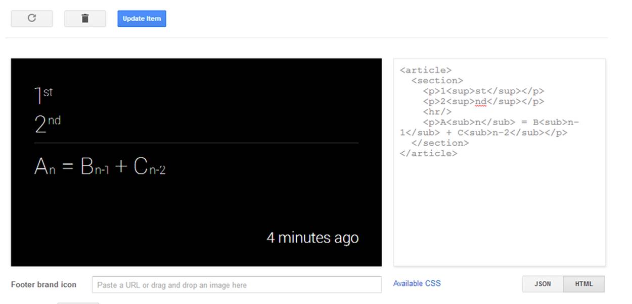
Figure 9-11. Formatting for scientific notation
Glass introduces some convenience classes for text as well. For example, this illustrates how you can easily align text (Figure 9-12):
<article>
<section>
<p class="align-right text-x-small">Right</p>
<p class="align-left text-x-small">Left</p>
<p class="align-center text-x-small">Center</p>
<p class="align-justify text-small">
Or make it so that both margins line up perfectly.
But try to justify that action.
</p>
</section>
</article>
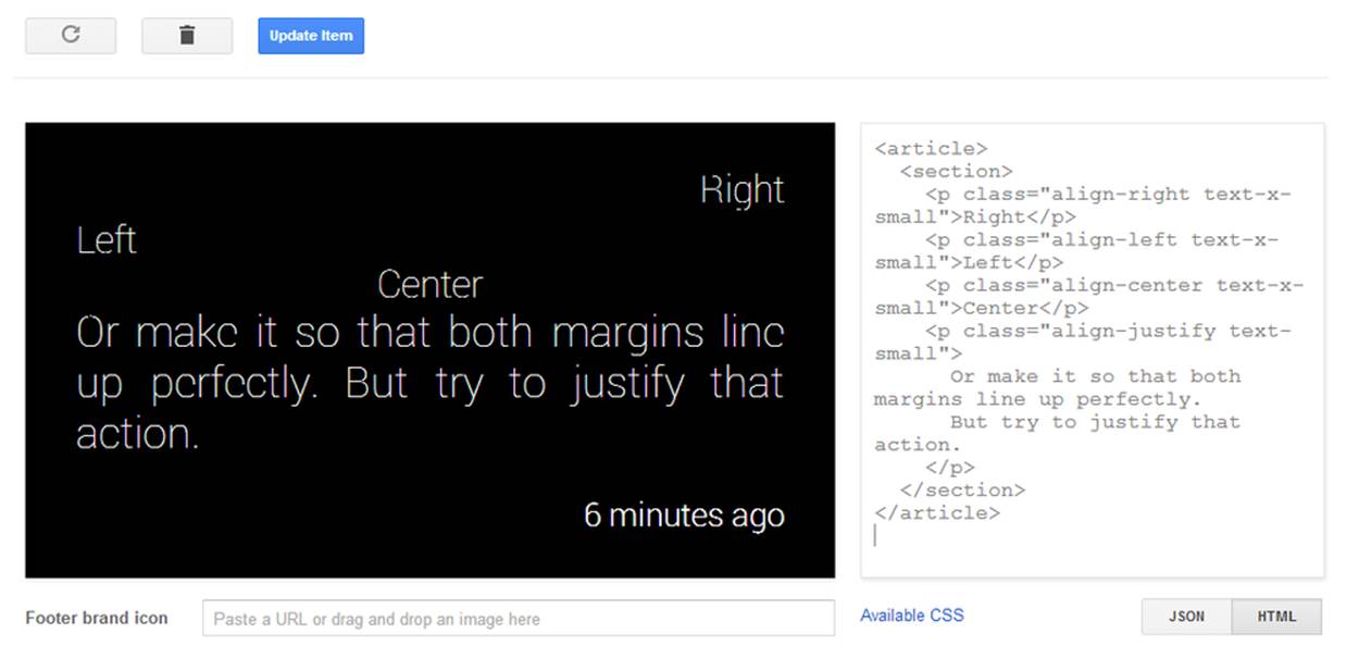
Figure 9-12. Alignment for text
Up until now, we’ve always had a <section> as the only thing directly inside an <article> block. You may have been wondering why, if we were always going to have the main content present, we don’t just include it right under the article. The answer is that there are other components, besides section, and each gets its own block. One of the most significant ones is the footer block.
Every card automatically has a footer, and the timestamp is always on the right side of the card. Glassware that is distributed through MyGlass can also get its icon next to the timestamp. (And we can simulate this through the Playground by providing a URL for the Footer Brand Icon.) But we can also specify footer content that will appear on the left side of the card:
<article>
<section>
<p>
The main text is here.
</p>
</section>
<footer>
<p>
The footer is down here
</p>
</footer>
</article>
This renders the card in Figure 9-13.
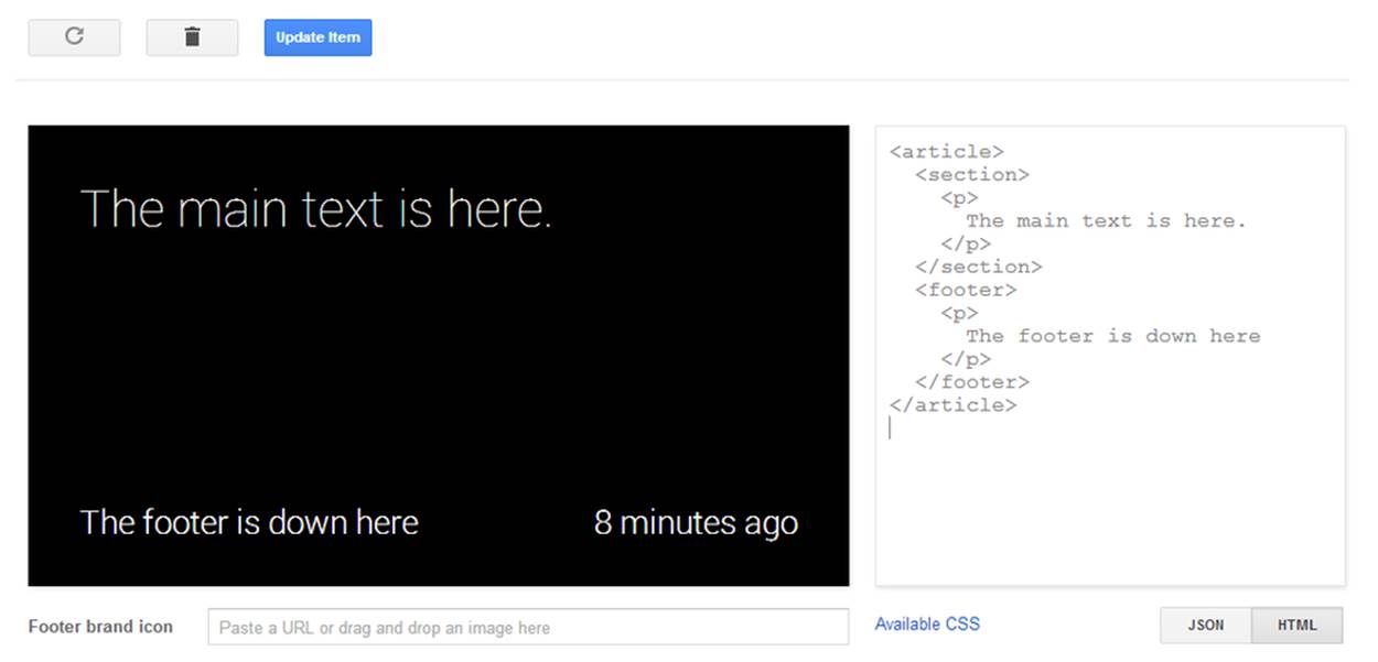
Figure 9-13. Working with the footer
This kind of footer is useful to provide additional secondary context for the main body of your text—perhaps to indicate a filename or additional source of the information. Consider, for example, the Sports template in the Playground, which uses the footer to give actual context to the timestamp it shares a line with.
If your Glassware is getting the information from another location, it makes perfect sense to use the footer to indicate that source. For example, we saw how Winkfeed uses this to indicate which RSS feed a card comes from. We shouldn’t use the footer to simply specify the name of our Glassware, however, since this is amply provided by the icon on the right and doesn’t provide additional information. If your footer always contains the exact same text—it might not be appropriate as a footer.
What About Images?
We have four primary ways we can use imagery in timeline items:
1. As icons accompanying text. We can see examples of these with the Flight and Transit templates.
2. With some special formatting in a header author block.
3. In a background photo such as demonstrated by the Hybrid template.
4. On the left side of the screen as a figure, illustrated by the Image List template.
We’ll go over each one in some detail, since even the basic images are a little different than standard HTML.
Regular icons are pretty straightforward and use the <img> tag, just like with standard HTML. You can even use height and width attributes to force an icon to be resized to meet your needs. One tool to help with this, however, is the icon-small class, which defines a 30 x 30 pixel graphic to be used with the text-small or text-x-small classes on a paragraph element. To illustrate, we can see this with the card in Figure 9-14. See what happens if you remove the img.icon-small class on the selector or change the size of the text on the <p> tag:
<article>
<section>
<p class="text-small">
<img src="https://mirror-api-playground.appspot.com/links/
lincoln-avatar.png" class="icon-small"/>
Honest Abe
</p>
</section>
</article>
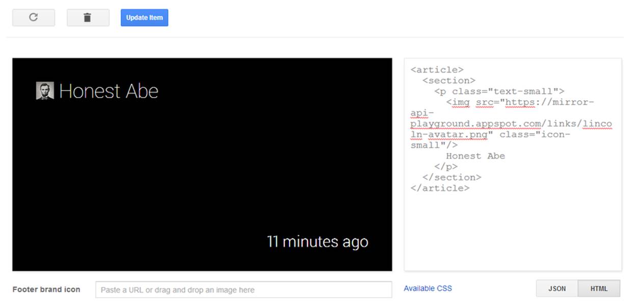
Figure 9-14. Working with small images
The header of a card combines a number of interesting formatting tags that are all enabled if the article has an author class associated with it. In these cases, the <header> block reserves space for a 70 x 70 pixel image (and resizes all images into that square) and two lines of fixed-size text. (There is room for a third line, but it starts crowding into the text, so we suggest avoiding it.) There is also some formatting applied to the <h1> and <h2> blocks inside the header block that force each to a single line:
<article class="author">
<header>
<img
src="https://mirror-api-playground.appspot.com/links/lincoln-avatar.png"/>
<h1>President Abe Lincoln</h1>
<h2>Honest Abe</h2>
</header>
<section>
<p>
Four Score and Seven Years ago
</p>
</section>
<footer>
<p>
Gettysburg Address
</p>
</footer>
</article>
Figure 9-15 is the pleasant UI that this HTML produces.
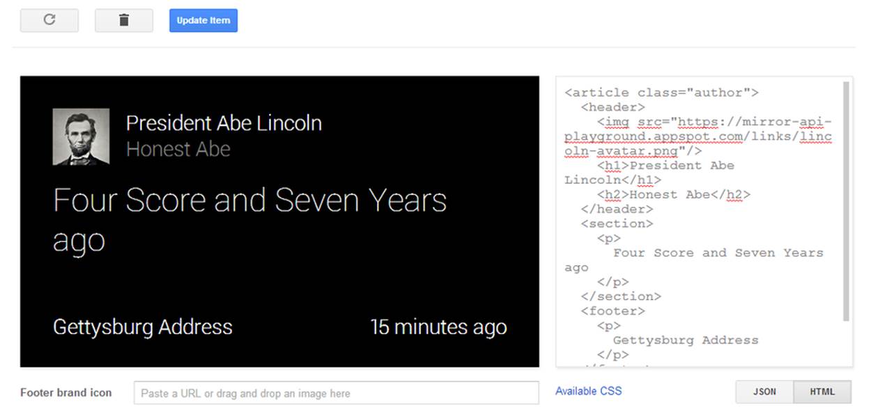
Figure 9-15. Working with medium-sized graphics
THE ONE-LINER
The trick used by the <h1> and <h2> tags to keep everything on one line is a useful one if we want to make sure formatting doesn’t get out of hand. We’ll be revisiting it later when we talk about spreading text over multiple cards and bundles.
Background photos are a pretty common way to show a picture if there is very limited text or none at all. This works particularly well with a footer, although it can be used for any text, and there are some additional tricks we can use to make our text stand out even more against the image.
We’re going to start with the Hybrid Mosaic template as our basis, only we’ll start more basic and build up to it (Figure 9-16):
<article class="photo">
<ul class="mosaic mosaic1">
<li style="background-image:
url(https://mirror-api-playground.appspot.com/links/lincoln.png)"></li>
</ul>
<footer>
Honest Abe
</footer>
</article>
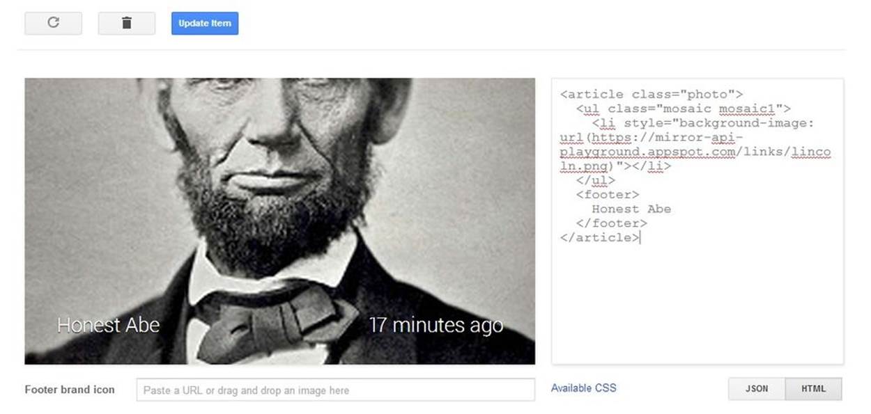
Figure 9-16. Playing with mosaics
That doesn’t look too bad, but there are a few things to notice. The first is that we now have an unordered list directly under the <article> tag. We have several new classes, and we are specifying more than one class for the <ul> tag (classes are separated by spaces). We’ll summarize these new classes in a bit. More confusingly, however, is that we’re introducing a new attribute to the <li> tag—the style attribute, and we’re setting it to a somewhat bizarre value. CSS pros glanced at it and moved on, and we’re going to suggest the rest of you move on as well. You’ll need to put the URL for the image inside the url() portion, but make sure you copy the rest verbatim.
Visually, we can see that the image looks cut off at the top and bottom. This is normal—a full bleed image tends to work best on Glass and is what most people will expect. Trimming the picture instead of providing black bars or pillars makes everything else easier to read. Speaking of easier to read, the footer text gets washed out, too. Before we move on, you may want to experiment with what we get if we change the <footer> to a <section> and what happens if we remove the article.photo selector class. You should probably also play with pictures of different sizes and dimensions to see how they’ll map. (We like http://placekitten.com, but you can pick any image you want to try out.)
The readability of the text, however, might be a bit of an issue. Fortunately, we have a few classes at our disposal that will darken the background a bit by adding a gradient to the footer. Here is our example from earlier with a bit of an overlay on the image:
<article class="photo">
<ul class="mosaic mosaic1">
<li style="background-image:
url(https://mirror-api-playground.appspot.com/links/lincoln.png)"></li>
</ul>
<div class="overlay-gradient-short"/>
<footer>
Honest Abe
</footer>
</article>
This may be enough for the footer, but if we have more text in the body we’ll need more of the background shaded out. We have several classes available to us, ordered here from least obstructing to most obstructing. Unlike some of the previous classes we’ve seen, these classes must be applied to a <div> that is part of the <article> block and has no other content. Make sure you find the one that suits your needs best:
§ overlay-gradient-short
§ overlay-gradient-medium
§ overlay-gradient-tall
§ overlay-gradient-tall-dark
§ overlay-full
Working with Mosaics
You’ve probably been wondering about that mosaic1 class and if there are more mosaic classes and what they do. Very clever of you! There are eight in all, cleverly named mosaic1 through mosaic8, giving you the ability to include up to eight recipients/participants/addresses/players/whatever in two rows of four. As Figure 9-17 shows, the Hangouts Glassware does this to quickly indicate the members of a group chat, with the last space in the lower right showing the other “rollover” members beyond what can be shown in the mosaic.
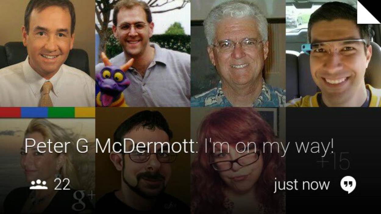
Figure 9-17. Mosaics as applied in Hangouts
They let you add additional images to the background and lay them out in a fairly logical way. Give this a try, and then see what happens if you replace the mosaic2 with other values (including mosaic1) and what happens if there isn’t a matching <li> tag with the background set (Figure 9-18):
<article class="photo">
<ul class="mosaic mosaic2">
<li style="background-image:
url(https://mirror-api-playground.appspot.com/links/washington.jpg)">
</li>
<li style="background-image:
url(https://mirror-api-playground.appspot.com/links/lincoln.png)"></li>
</ul>
<div class="overlay-gradient-short"/>
<footer>
George and Abe
</footer>
</article>
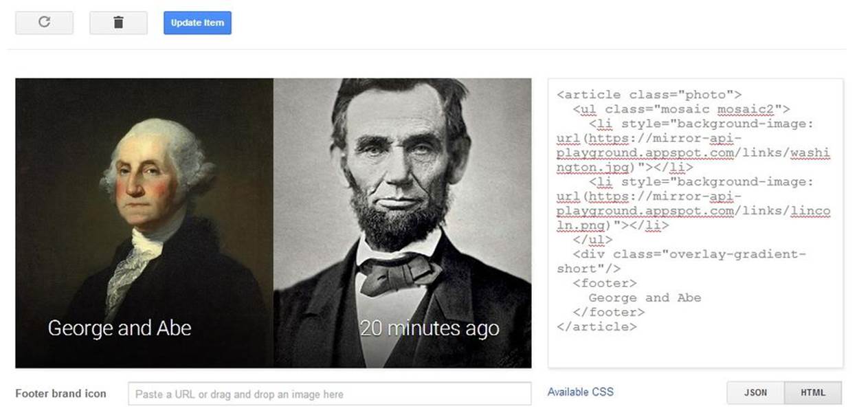
Figure 9-18. A more simple mosaic
Images on the left side of the card, done as a figure, are fairly similar. Consider this minor rework of the last example where we move the mosaic list into a <figure> tag and change the footer text into a normal section:
<article>
<figure>
<ul class="mosaic mosaic2">
<li style="background-image:
url(https://mirror-api-playground.appspot.com/links/washington.jpg)">
</li>
<li style="background-image:
url(https://mirror-api-playground.appspot.com/links/lincoln.png)">
</li>
</ul>
</figure>
<section>
George and Abe
</section>
</article>
GLANCEABLE LAYOUTS AND THE STRUCTURE THEY IMPLY
A hallmark of good wearable design is giving users instant recognition about the composition of the information being presented to them—and again, in the microinteraction universe this means glanceability within fractions of a second. The layout, order, and size of text, icons, and imagery can instantly covey to the users what type of data they’re dealing with.
In messaging applications like Hangouts and Gmail, a photo of a message’s sender sits at the top of the mosaic of particpants and is larger than images of other recipients, taking up half of the region. This visually relays a sense of structure and hierarchy. This is a good pattern to emulate with your own designs, and one you get for free in both the Mirror API (as a list) and the GDK (when repeatedly calling the CardBuilder.addImage() method).
Figure 9-19 is a UI that stacks images vertically on the left side of the card with room for text in a <section> element.
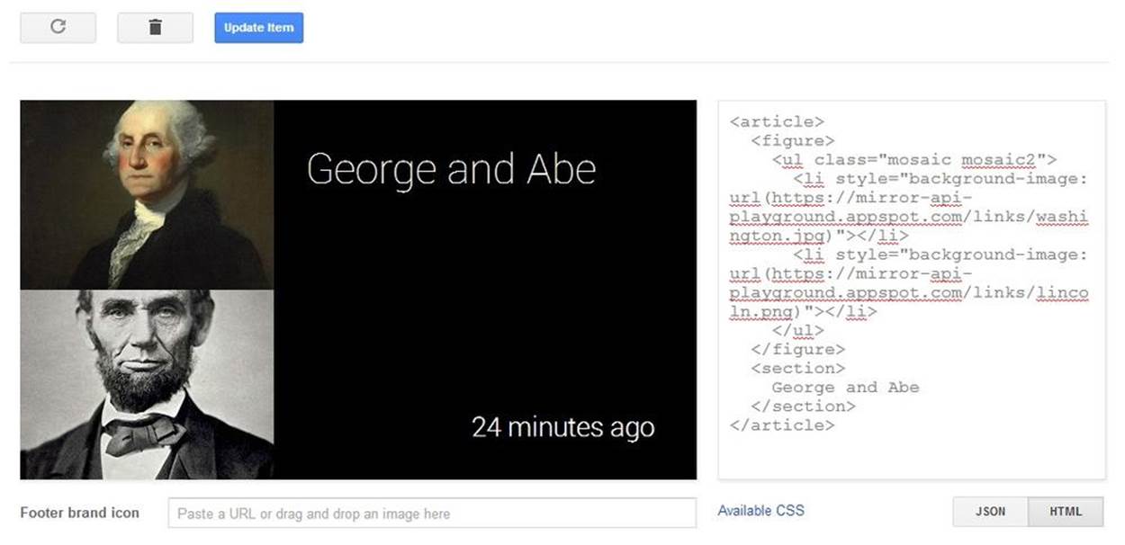
Figure 9-19. Stacking images
WHO’S ON FIRST?
When you’re using either of the list-based image layouts, here’s a good tip to keep in mind. The person the message is from is always listed first. Others are listed later, usually in order of participation. You can get the list of people addressed in a message from the Timeline.recipients property.
For some applications, it may not always be obvious who the “from” may be, but don’t be arbitrary about this convention. For instance, Gmail’s Glassware uses a generic avatar to denote contacts whose avatars aren’t set and also a “+15” structure not unlike the Hangouts example to show how many users in all a message was sent to. It’s great quick visual reference.
When is it best to use one over the other? As always, it depends on your exact needs, but a good rule of thumb is to use the figure layout when you’re representing participants in what is represented on the card, while the background image is best when the text is about that image itself. As we’ve seen, figures are typically used for things like Gmail while the background image is used for something like Field Trip.
Rendering an In-Card Map
Glass provides us with a special image URI, glass://map, which renders maps, markers, and paths using styles that work best for the heads-up display. You can set various parameters on the query string for this URI, assigning it as the src attribute for an <img> tag, which will generate and update maps:
w
The map’s width in pixels (required).
h
The map’s height in pixels (required).
center
The comma-separated latitude/longitude coordinates the map uses as its base.
zoom
The magnification level for the map, between 0 and 21, matching the zoom levels you’ll find on Google Maps.
marker
The marker type—a “0” indicating a pin or a “1” indicating a start or current position—then a semicolon, followed by the comma-separated latitude and longitude. You can specify multiple marker parameters.
polyline
Parameters used to create a path overlay, consisting of a comma-separated width in pixels with a color, followed by a semicolon, and then a comma-delimited list of vertices of the latitude and longitude. You can specify multiple polyline parameters.
If you leave out the width and color details for a polyline, default values will be used. Also, if the parameters for a polyline are set but the center and zoom parameters are not, the map will automatically center and zoom itself to accommodate the drawn path.
As of the current release of the Mirror API, maps are rendered in the 2D map view, and cannot be set to satellite view or Earth view.
It won’t show up correctly in the Google Mirror API Playground, but entering the following HTML in the Playground’s editor—remember to place the map within <article> tags—produces some overly simplistic navigation from New York to Mountain View via Houston:
<article>
<figure>
<img src="glass://map?w=240&h=360&marker=1;40.7056308,
-73.9780035&marker=0;37.422,-122.084058&polyline=;40.7056308,
-73.9780035,29.8171779,-95.4012915,37.422,-122.084058"
height="360" width="240">
</figure>
<section>
<p class="text-auto-size">New York to Mountain View</p>
<p class="text-x-small muted">With a stopover in Houston!</p>
</section>
</article>
Figures 9-20 through 9-22 show various ways to lay out data while displaying maps.
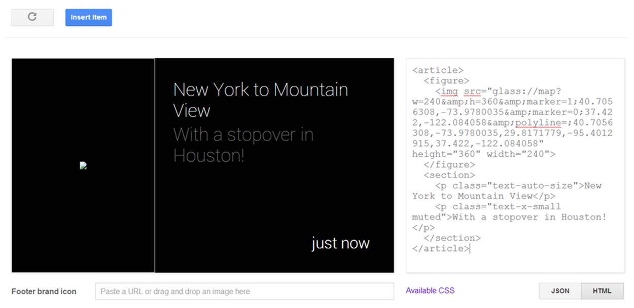
Figure 9-20. Maps don’t render in the Playground
So let’s see it live. Click the Insert Item button to send the card to Glass and render a nice cross-country trek.
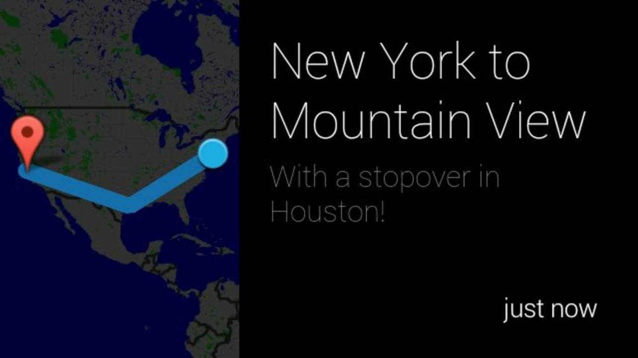
Figure 9-21. Our example when sent to Glass
We expect that your maps will want to be a bit more local. Possibly to use one as the background as the visual card when presenting things about tropical island paradises where one of your authors never has to worry about things like buying antifreeze or snow treads for his tires:
<article>
<img src="glass://map?w=640&h=360&zoom=10¢er=13.4502076,144.7874584"
width="640" height="360">
<footer>
Guam
</footer>
</article>
Either way, you see that maps can be used the same was as in other images, but need to be used with caution. They still must be glanceable to convey the basic information. Don’t try to pack too much into an image and expect your user to get a lot out of it.
The map image is a bit tricky to use and get right, especially since you can only see the finished product live on Glass and not in the Playground, but we think there are some pretty good applications just crying out to use maps. You’ll find them even more useful when you learn how to trigger navigation in Chapter 10 and can tap into the user’s location in Chapter 12.
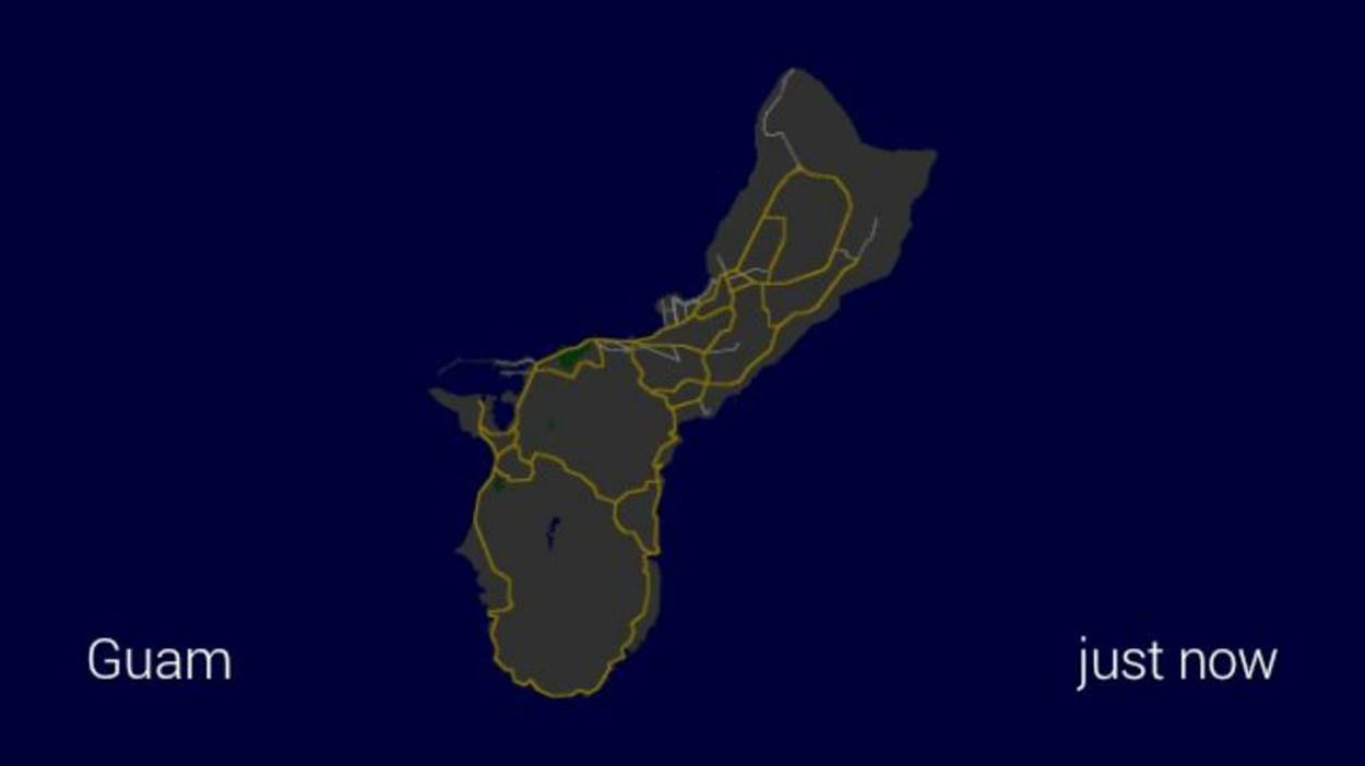
Figure 9-22. High-level view of a map
Simple Audio
If you’ve examined the JSON for all of the preceding examples, you would have noticed a common block in all of them:
"notification": {
"level": "DEFAULT"
}
and probably some of you are wondering what this means. Setting the notification level to DEFAULT means, in short, that Glass should emit a short audible tone to alert the wearer that a new card, or new data, has arrived. The DEFAULT sound is the only one currently defined, but what if you don’t want to make any noise at all? You can omit the notification property completely or set the level to "null". We suggest the latter, since it works better when doing updates and makes it clearer what you’re trying to do.
A better question is why would you do such a thing? It will be rare to do it for new cards, but quite common when updating timeline items that are already in the timeline (which we’ll be covering later in this chapter and in Chapter 11). Certainly for things that update frequently, you don’t want to annoy users with constant chirping in their skulls. It can even come in handy in some limited cases even when inserting new items, however. Consider, for example, news applications that allow their users to set “quiet periods” (we saw some examples of these in Chapter 4) but still wish to send out very important updates. They can send out the update without any notification; the card will be inserted for the user to discover later if appropriate, but won’t send out an alert that may cause problems during that period.
The notification sound is a pretty basic use of audio in your Glassware, but what about having the contents of your cards read aloud? This becomes a little more complex, but is still fairly straightforward to set up. We’ll be dealing with the JSON representation of an item, so let’s start with our original text object and expand upon it:
{
"text": "Hello Glass",
"notification": {
"level": "DEFAULT"
},
"speakableText": "hello there Glass",
"menuItems": [
{"action": "READ_ALOUD"}
]
}
We’ve added two new object properties here. We’re going to be covering menu items more extensively in the next couple of chapters, so consider this a bit of a tease.
The menuItems property contains an array of, you guessed it, menu items. Each menu item has an action associated with it, and we’re going to be using one of the predefined actions to specify the card can be read aloud.
When selected, Glass will do a text-to-speech reading of the contents of the speakableText property. If that property isn’t set, Glass will try to do a text-to-speech reading of the contents of the text property or, if that isn’t available, the html property after stripping out any markup tags.
In our example, we could have omitted speakableText to demonstrate, but we suggest that you always include it if you want your user to listen to your card, and we strongly suggest you always include the option for your users. So why would you have the two of them different? Consider reading an email out loud. If just the text of the email were vocalized, you would miss a lot of additional metadata: who the email was from, what the subject was, and even that this was email you were listening to. All of this can, and should, be included in the speakable text.
Give it a try—if you don’t specify text and speakableText, the menu item is ignored. Nevertheless, you should make sure you always set text and speakableText when you are writing things with HTML. And since the primary method of formatting Glass cards is HTML, that will pretty much be “always.” We’ll be returning to how these three fields work together in Chapter 11 when we talk about sharing timeline resources with other Glassware. Be careful when you’re converting your HTML to text, however—you want to convert HTML entities to the actual characters they represent and not a jumble of what the markup contains. Make sure your text actually looks like text!
NOTE
If you take a look at the timeline item object description (and if you haven’t—you should), you’ll also notice a field called speakableType and wonder what role it plays with the Read aloud menu item. We’ve seen it used inconsistently, so we generally suggest that you set this to the name of your Glassware, but otherwise not worry about it.
See Don’t Neglect Audio for ideas on using audible feedback.
Bundles of Fun
So far, we have focused on squeezing all our information onto a single card, but this is pretty unrealistic for many things. Text will sometimes span multiple pages or it may make sense to show conversation threads or other related items as a single bundle. While the user may treat them all as “multiple cards,” we have several different tools at our disposal to implement them, and we should be careful to pick the one that best represents the data we’ll be using.
In Figure 9-23, a timeline is displayed, which at any given point likely contains several bundles in addition to singular cards.
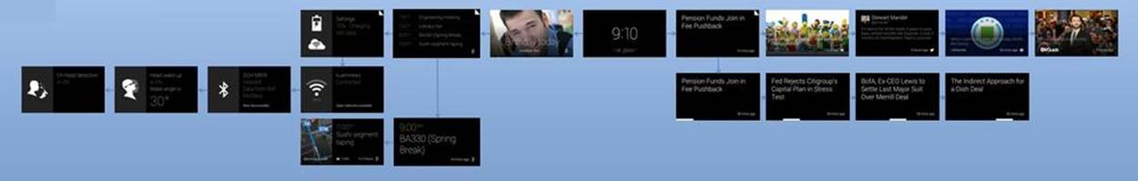
Figure 9-23. Bundles let you better organize related content
The easiest way to show multiple cards at once is to create multiple cards at once and send them at the same time. This requires nothing special on each card—all we need to do is specify more than one article, and each one has its own contents. Consider the following, all as one entry in the Playground as in Figure 9-24:
<article>
<section>
<p>Page One</p>
</section>
<footer>
Hover/Tap to read more
</footer>
</article>
<article>
<section>
<p>Page Two</p>
</section>
</article>
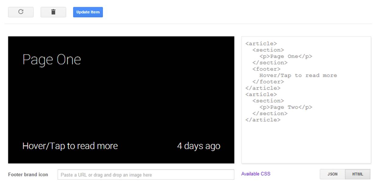
Figure 9-24. A sample card for a bundle
If we hover over the preview area, we should see an arrow on the right, indicating that there are more cards that we can scroll to see. Scrolling to that one, we now find an arrow on the left. If we add more cards than these two, we can keep scrolling through them in the order they’re listed. If we send this to Glass and view it there, we can tap on the first card and the system has automatically created a Read more menu item we can tap; select it, and we can swipe between the various articles (Figure 9-25).
This works well if we know how we want to break up our contents, or if they logically divide into components we can compute ahead of time. It doesn’t work as well for long text that the wearer may want to scroll through. For this, we can take advantage of an article that the system will automatically split between multiple pages. To do this, we will assign the auto-paginate class to the article block, and we will remove any section, figure, header, or footer sections:
<article class="auto-paginate">
<p>
Bacon ipsum dolor sit amet shank kevin pork chop dolore shankle sirloin, boudin
veniam corned beef cillum ball tip. Tri-tip et ball tip occaecat sed veniam
sirloin biltong. Ex biltong pork, sunt occaecat landjaeger excepteur brisket
consectetur sausage pork belly aute leberkas ribeye. Pig beef ribs ground round
nulla, est adipisicing drumstick. Et bacon beef magna pork chop.
</p>
</article>
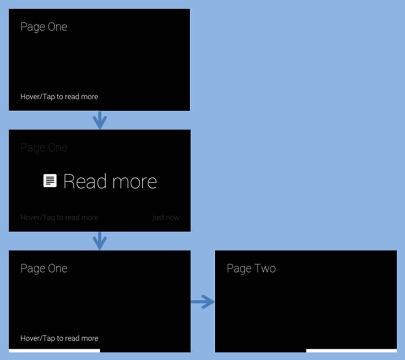
Figure 9-25. A typical bundle flow
You’ll see the behavior, as laid out in Figure 9-26, is much the same as with the manual pagination.
Both of these methods, however, have some drawbacks. The biggest is that there is no indication that there is actually more to read. We’ve hinted at it in the footer of the first card in the manual pagination, but if you’re using the footer for other things, this may be impractical. Fortunately, we can combine these two methods, and some additional formatting classes, to make it more obvious.
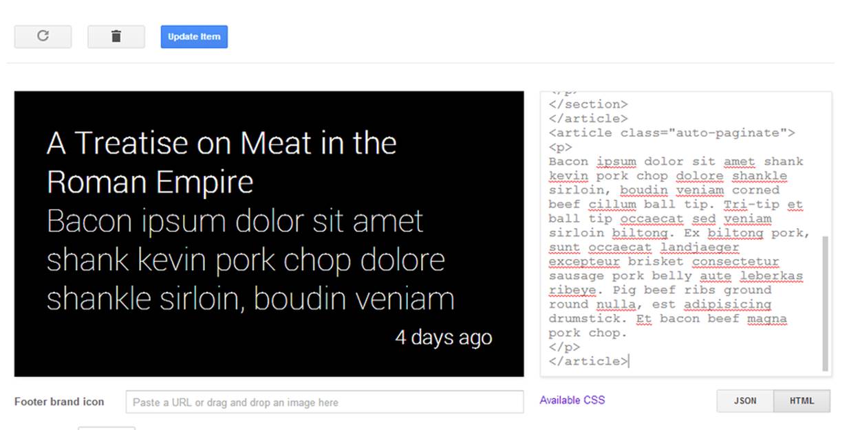
Figure 9-26. Applying the auto-paginate class
We’ll create one timeline item with two articles on it. The first one will contain the content, and we’ll let Glass truncate the contents. For good measure, and for some reasons you’ll see in a moment, we’ll also include a title here, but you could add a header or footer if you wished instead. The second article will contain the content again, but we will let Glass auto-paginate it for us (Figure 9-27).
<article>
<section>
<p><b>A Treatise on Meat in the Roman Empire</b></p>
<p>
Bacon ipsum dolor sit amet shank kevin pork chop dolore shankle sirloin, boudin
veniam corned beef cillum ball tip. Tri-tip et ball tip occaecat sed veniam
sirloin biltong. Ex biltong pork, sunt occaecat landjaeger excepteur brisket
consectetur sausage pork belly aute leberkas ribeye. Pig beef ribs ground round
nulla, est adipisicing drumstick. Et bacon beef magna pork chop.
</p>
</section>
</article>
<article class="auto-paginate">
<p>
Bacon ipsum dolor sit amet shank kevin pork chop dolore shankle sirloin, boudin
veniam corned beef cillum ball tip. Tri-tip et ball tip occaecat sed veniam
sirloin biltong. Ex biltong pork, sunt occaecat landjaeger excepteur brisket
consectetur sausage pork belly aute leberkas ribeye. Pig beef ribs ground
round nulla, est adipisicing drumstick. Et bacon beef magna pork chop.
</p>
</article>
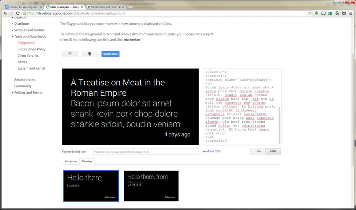
Figure 9-27. The Playground lets you preview bundles, too
Figure 9-28 shows how the content appears on Glass laid out in cards on the timeline, when you click the Update Item button in the Playground.
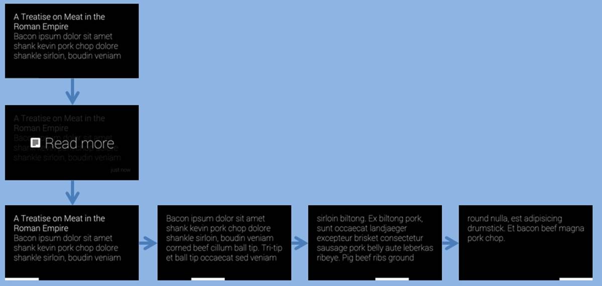
Figure 9-28. The revised bundle flow
This is an improvement, but it still doesn’t really give us any cue that we need to tap it to read the rest. We also get to read that cover card a few times, and that is pretty redundant. We’ll fix all of these with a few additional classes.
For starters, we’ll add the cover-only class to the first article, to indicate that when we go to read more, it doesn’t need to show it again. We’ll also add the single-line class to the title to make sure it remains a known size and adds an ellipsis to the end of it. We want it to remain on one line to make sure we know how many lines the rest of the text will be, because the auto-overflow class we’ll be adding to it also needs some additional attributes to indicate how many lines to show before it adds an ellipsis as well. This ellipsis will be the cue to our users that they can tap on the card to read more.
The other notable change with this HTML block is that the content is now distributed across three cards, instead of four in the previous example. So this technique may save a bit of space, giving your users one less item to swipe through. After having dissected a few examples so far for building, styling, and organizing card content, let’s combine these ideas with the cover-only class, which is the pattern you should always use. The rendered output is an appealing layout of cards, and supports Read aloud in an intelligent way:
<article class="cover-only">
<section>
<p class="single-line"><b>A Treatise on Meat in the Roman Empire</b></p>
<p class="auto-overflow" style="-webkit-line-clamp: 4">
Bacon ipsum dolor sit amet shank kevin pork chop dolore shankle sirloin, boudin
veniam corned beef cillum ball tip. Tri-tip et ball tip occaecat sed veniam
sirloin biltong. Ex biltong pork, sunt occaecat landjaeger excepteur brisket
consectetur sausage pork belly aute leberkas ribeye. Pig beef ribs ground round
nulla, est adipisicing drumstick. Et bacon beef magna pork chop.
</p>
</section>
</article>
<article class="auto-paginate">
<p>
Bacon ipsum dolor sit amet shank kevin pork chop dolore shankle sirloin, boudin
veniam corned beef cillum ball tip. Tri-tip et ball tip occaecat sed veniam
sirloin biltong. Ex biltong pork, sunt occaecat landjaeger excepteur brisket
consectetur sausage pork belly aute leberkas ribeye. Pig beef ribs ground round
nulla, est adipisicing drumstick. Et bacon beef magna pork chop.
</p>
</article>
…which when updated in the Playground looks like Figure 9-29.
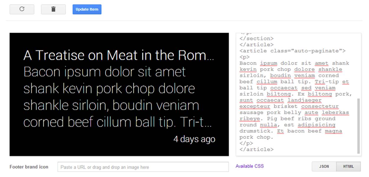
Figure 9-29. Updating the code to use a cover card
…and when inserted into a live timeline on Glass, the final flow of the items, as in Figure 9-30.
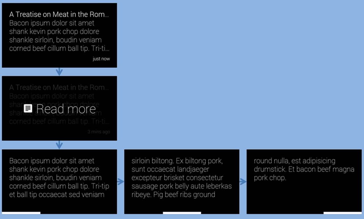
Figure 9-30. Flow with a card designated as the cover
There are some drawbacks to creating a single event that represents multiple cards, although most of them won’t be obvious to you until Chapter 10 and Chapter 11. If we examine the JSON that is returned to us for all of the preceding examples, we’ll see that there is a single ID created for the whole collection of cards. This makes sense, but it also means that if (and when) we want to make changes to a card, we end up updating all the cards. It also means that all of the cards have to have the same menu items, even if it makes sense for each to have some slightly different controls. Finally, we may just want to keep track of each card individually so it matches our own internal organization of the data. All of these problems are solved by organizing cards in a bundle.
To bundle cards together, we need to set the bundleId timeline item property on each to the same value. What value should we pick for each? It doesn’t really matter, as long as they’re the same. If you’re bundling things together, you probably have some internal identifier that you’re already using to identify this group, and you should use it here.
Create the first card in a bundle as you’d create any card, but make sure the JSON in the Playground includes a bundleId. We’re going to use text in our example in Figure 9-31 to make it easier to read, but you can use HTML:
{
"text": "Joe Montana",
"bundleId": "mistaken-identity",
"notification": {
"level": "DEFAULT"
}
}

Figure 9-31. Our first “Joe” card
So far so good. There’s nothing new here. Now create another card, like Figure 9-32, making sure you specify the same bundleId. Make sure you also specify it as a new card and you’re not updating the previous card:
{
"text": "Joe Mantegna",
"bundleId": "mistaken-identity",
"notification": {
"level": "DEFAULT"
}
}
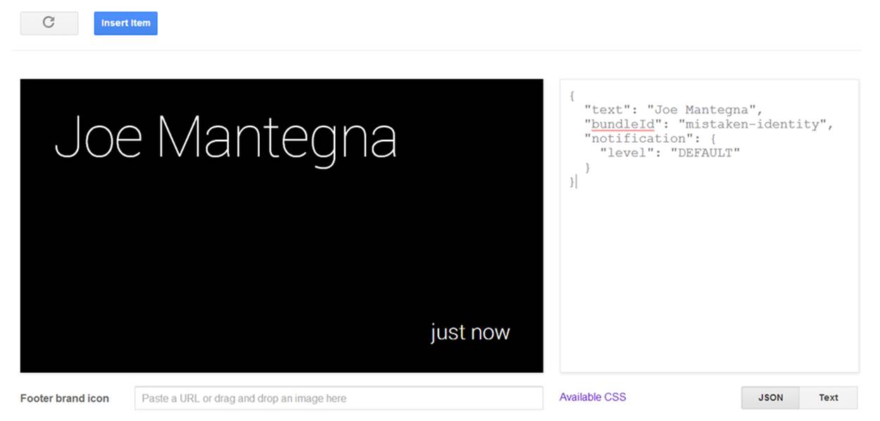
Figure 9-32. Our second “Joe” card
Click the Insert Item button and after receiving the cards on Glass, swipe through them, noticing how the items created at completely different times are now linked by their bundleId. And as we’ve mentioned before, Glass arranges the cards with last in, first out (LIFO) ordering, so Joe Mantegna’s item is the de facto cover card for the bundle and the first item in it, as displayed in Figure 9-33.
Replicating this example in the Playground and on your own Glass hardware effectively differentiates between the quarterback Joe Montana and the actor Joe Mantegna, a common misconception (never let it be said that we didn’t give you a thorough education in this book). Here we begin to see some of the limits of the Playground. Although it shows it as two different timeline items, we need to go to Glass to see how they get bundled together. We’ll see the Page 2 card in our timeline, with the dog-eared corner indicating there is more in this bundle. Tapping on it, we’re directly taken into a sub-timeline where we can scroll between the cards. There is no “Read more” prompt—it isn’t necessary in this case.
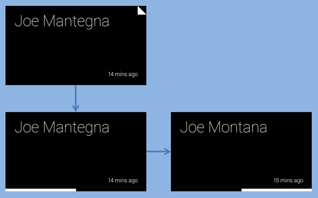
Figure 9-33. The default ordering
This subtimeline works exactly the same as the main timeline does. Cards are arranged in chronological order, and we can see that they will change if we reinsert Joe Montana. We’ll also see that Joe Montana would become the new cover card. This actually poses a bit of a problem sometimes, just as it did when we were managing the cards as a single item earlier. Is there any way to designate one of them as a cover card, or assign a completely different card as the cover?
It turns out there is. There is the isBundleCover timeline item property, which expects a Boolean value, which we can set to true. Do this for a new page, keeping the same bundleId, and you can see what we mean:
{
"text": "Know your Joes",
"bundleId": "mistaken-identity",
"isBundleCover": true,
"notification": {
"level": "DEFAULT"
}
}
This organization in Figure 9-34 we find to be a bit cleaner for this example, not giving away the interior content on the cover card. Other uses of this pattern would be recipes, with the name of the dish as the cover card, then subsequent cooking steps as contained cards within a bundle.
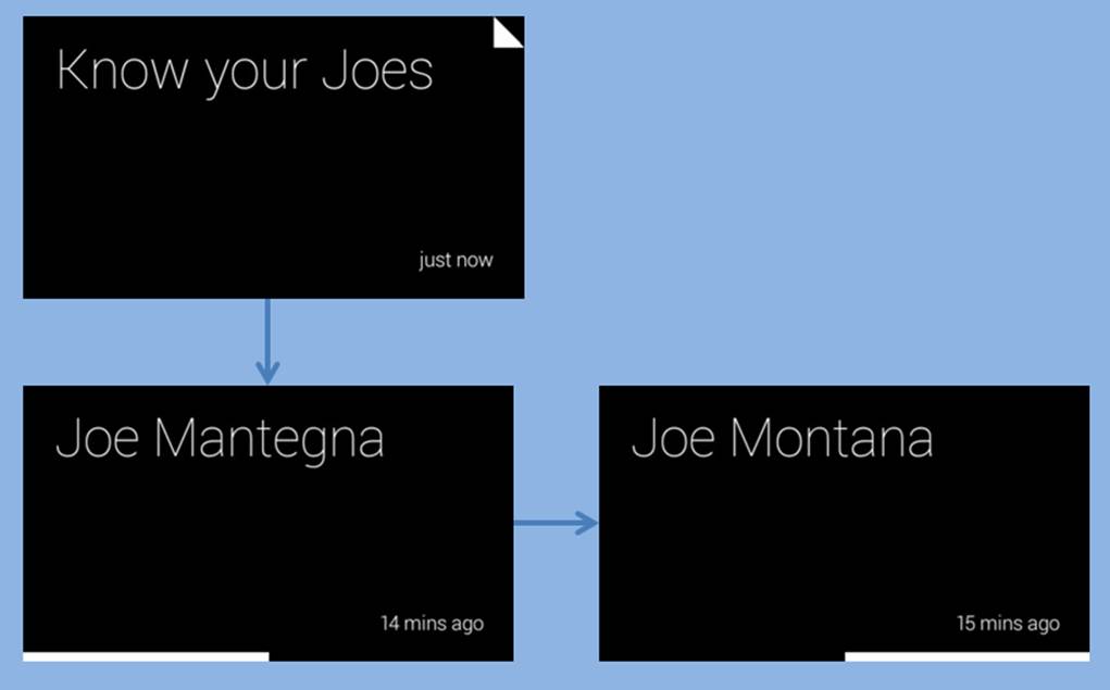
Figure 9-34. Cleaning things up with a dedicated cover card
Things can start to get really hairy when you mix bundles, explicit pagination, and auto-pagination…but we’ll let you experiment with that on your own. We will also point out that if it starts looking like a mess to you, your users will think it is even worse. This may be one of those signs that your design is getting a bit too complicated.
Going Beyond the Playground
We are nearing the limits of what we can do with the Playground, but we have come pretty far using it! As you develop your Glassware, don’t underestimate the power of the Playground to let you experiment with formatting your cards.
But now it is time to start working with the Mirror API more directly yourself. Create a new set of OAuth credentials (you don’t want to use the same credentials that you used for the Playground) and get ready to dig in.
As we promised we’d remind you—you’re not going to see a lot of code samples in the language of your choice. Instead, we’re going to make sure we can show you the concept and leave the syntax to the expert: you. Google provides some code samples along with the documentation and full API documentation for each library, and those, plus your knowledge and experience with the language, will guide you on those details.
API EXPLORER
Google does provide some tools to help you experiment with the API without having to write code yourself. Known as the API Explorer, you can access it through the Developers Console. Under the “APIs and auth” section, you can click the Mirror API listing and you’ll see a list of all the API methods that are available. Clicking each one gives you a list of the mandatory and option parameters for that method and a brief description of what the parameter means, and lets you authenticate and try out some values to see what happens.
The API Explorer certainly has its uses, and if you’re going to do a lot of work with Google APIs, we suggest you learn how to use it. But it still has some limitations for what we’re going to be working on shortly, so we won’t be…exploring…it in any further detail.
Figure 9-35 shows you how can examine the methods used by the Mirror API and its associated collections. Figure 9-36 lets you filter cards on a timeline by setting property values.
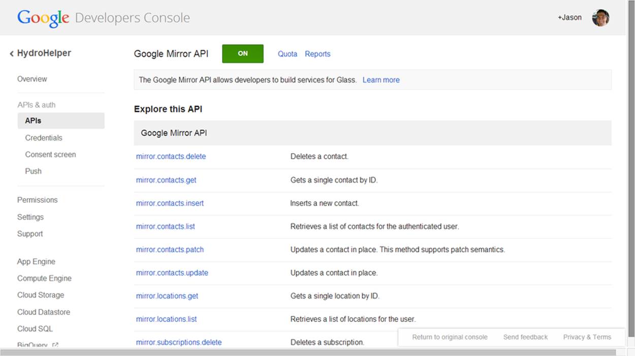
Figure 9-35. Examining methods in the API Explorer
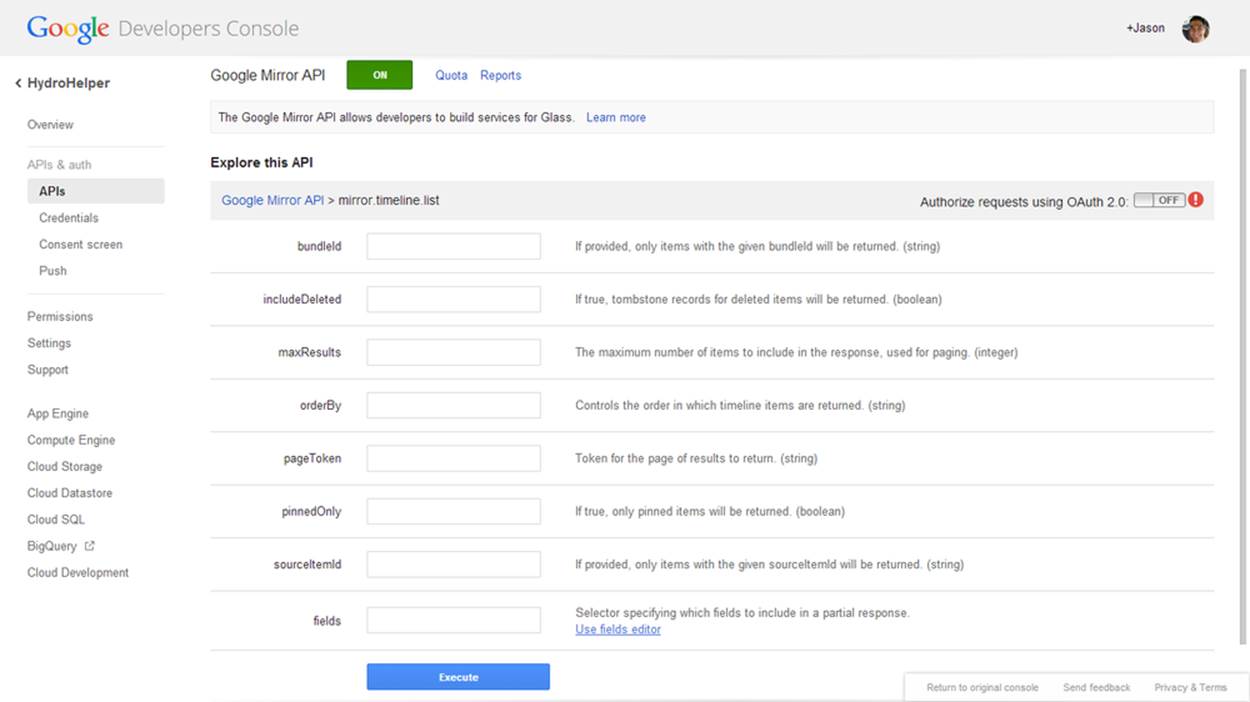
Figure 9-36. Create custom timeline views
Where are you going to find all this wonderful documentation from Google that we keep hinting about? We’ll demonstrate by taking a look at the API method we’ve been playing with so far without you actually knowing: Timeline.insert.
We’ll find reference documentation for all the API methods at https://developers.google.com/glass/v1/reference/. The body of the page contains a brief summary of all the resource types and methods we have at our disposal (you may notice that they roughly correspond to the next few chapters of this book) while the left navigation lets us jump quickly to one of them. Selecting an item on the left navigation takes us to a more detailed page about the resource, which helps us understand the properties that resource has. When using your own API, you can be assured that each of these properties are represented in the language’s native property formats—getters and setters for Java, property accessors in .NET, and so forth.
If we go to the Timeline resource, for example, we see the JSON representation of a timeline item, which we’ve begun to get familiar with. Underneath the JSON view and a list of properties we find a summary of the available methods. We also see these methods on the left side navigation.
Let’s visit the insert method. We’ll see some URL information, which we can generally ignore. We’ll also see the list of parameters that are accepted or required for this method and the properties that can be part of the body of the request. What is the difference between a parameter and a body property? For your purposes, not much, although you’ll need to know which values you’re working with are parameters and which are properties. For the Mirror API, the body properties are the object that we’re working with—in this case, the timeline item object. Parameters are often used as reference or query fields—we’ll see examples of these with Timeline.get and Timeline.list although there are none that we’re interested in for Timeline.insert.
If we continue down the page (or find the link right at the top), we get to the Examples section. This is your guide to using this method for your own language—select the tab with your language. Looking at the examples for Timeline.insert, we see that they all illustrate inserting a timeline item by taking a few parameters, turning them into the language-specific representation of a timeline resource, setting the text and notification properties on it, adding an attachment, and sending it off.
DON’T BELIEVE EVERYTHING YOU READ
Don’t just copy and paste the examples into your own code, make sure you understand them in light of what we’re teaching you in this book. To illustrate—some of the sample code has (or hopefully had, by the time you read this) documentation saying that the notification parameter can have the value "AUDIO_ONLY". If you read the resource description (not to mention our section earlier), however, you’ll see that this value should be "DEFAULT". You’ll also notice that all the examples use text as the content of the card—you should be able to extrapolate and figure out how to send HTML instead. We know you can do it!
On the other hand, you also need to make sure you keep up with the latest version (and documentation) for your library. There are occasional changes to the API, and if you started work with a previous version of the library, you may miss out on the newer features. A good rule of thumb is that if you’re trying to do something that is shown in the example documentation, and your system balks, download the latest version of the library and try again.
Waitaminnit. Adding an attachment? You can do that? You certainly can—we’ll go into a few details next.
Media Matters
Timeline item attachments are conceptually somewhat simple—just like with our email messages, we may want to attach some media to a timeline item to display or make available as part of that time. The implementation, however, gets complicated rather quickly. All the client libraries support one attachment of either an image or video no larger than 10MB when the card is created or updated.
The API allows for more than the single attachment—go ahead and look at the documentation for the Timeline resource and you’ll see the attachments property, but it isn’t marked as writeable, so it isn’t obvious how to add them. You’ll need to use theTimeline.attachments.insert method after a card is created to add additional attachments, which may create a race condition between when you upload the attachment and when you reference it as part of the item.
Speaking of which—how do you access the item anyway? Glass provides a special URL you can use to reference each attachment. The first attachment is referred to as attachment:0, with later attachments incrementing the counter. You can also use the URL cid:attachment-identifier to refer to the attachment by the attachment ID. In general, you’ll probably find the former easier to use—and you’ll typically only be using a single attachment.
You may be confused by this suggestion to stick to a single attachment. In our earlier examples, we showed how we might put up to eight profile photos in the background or figure section. Shouldn’t these be attachments? Not necessarily, and probably not. If we make each of these profile images an attachment, it means that the image will need to be sent along with each card. It also means that Glass can’t take advantage of caching to fetch the profile image once and use it with multiple cards. Where possible, you should use a public profile image (such as the one provided by Google+) and reference it by public URL instead of a private image.
Oh, CRUD…
We’ve talked a lot about how we insert items, but very little about anything else we can do with them. To some extent, that will be the subject of the next three chapters (what, you thought this was it?), but if you think about what we were doing with the Playground, you’ll see there are a few more things we can do.
How many of you noticed the trash icon when you were looking at timeline items you had inserted? A few hands? Good. Unsurprisingly, you’ll learn that this maps to the Timeline.delete method. Pretty straightforward—you need to know the ID of the item to delete, but since you inserted it, you should be able to keep track of it.
Similarly, if you edited a card in the Playground and sent it to Glass, you’d have seen that it replaces the original card with the updated version. There are two methods that let us do this: Timeline.update and Timeline.patch. The two seem similar, although the documentation states that Timeline.patch “supports patch semantics.” What does this mean?
In short, if you want to change the contents of the card, you can either rewrite the entire card by sending all the properties over again with Timeline.update. Any properties you omit will be as if you never sent them the first time around. The Timeline.patch method, however, assumes that if you didn’t send a property, it should have the same value as it did the last time. If you want to remove an item with Timeline.patch, you need to explicitly send it a “null” or “nil” value. Again, in each case you’ll need to know the item ID.
If you’ve done any database programming, Timeline.update is akin to executing a SQL statement where every one of the fields in a row in a table are populated, even ones that haven’t changed. Timeline.patch is the same as applying new data to an existing row but only specifying those fields where data has been modified.
Which one is better? It really depends on your needs. Sometimes it is difficult for you to keep track of what has changed, and it is just easier for you to resend the entire card. In this case, feel free to use Timeline.update. In other cases, you may have a huge html property and not want to re-create and resend it because that would be inefficient. This would be an ideal time to use Timeline.patch. Keep both in mind as we go forward—we’ll be using these techniques over the next couple of chapters.
For those of you who are used to thinking about things in terms of CRUD operations (Create, Read, Update, Delete), first of all, our condolences, but more importantly, you may have realized that we only talked about three of those when it comes to timeline operations: creating, updating (and patching), and deleting. You’ve seen the documentation, so you’re probably wondering why we haven’t talked about reading items or searching for them. There’s no conspiracy theory—but we couldn’t come up with a good explanation of why you would want to read them until we explained how you’d be notified about changes to them.
And that doesn’t come until the next chapter.