HTML5, JavaScript and jQuery (Programmer to Programmer) - 2015
Part III HTML5 Multimedia
Lesson 26 CSS3: Part I
Just like HTML, CSS is evolving over time. The latest version of CSS is called CSS3 and adds several important modules to CSS that will be explored over the next two lessons.
Nothing fundamental has changed with CSS in version 3: The language still uses selectors to identify elements and still allows a set of stylistic properties to be defined for these elements. CSS3 is important, however, because it specifies a number of new selectors style properties. Together, these selectors and properties greatly improve the expressiveness of CSS.
Unlike with HTML, you may have noticed that it is not necessary to specify which version of CSS you are using. CSS3 is entirely backwards compatible; therefore, if you want to use CSS3 features, you simply include them in your existing style sheets, and the browser will simply ignore them if it does not support them.
The next two lessons will not provide an exhaustive introduction to CSS3, but they will introduce the most interesting features, and will further help consolidate your knowledge of CSS.
Selectors
CSS3 provides a number of new selectors for selecting elements based on a wider set of criteria.
CSS3 includes one new operator called the tilde operator. This is used to select elements that are siblings of a specified element, and are declared anywhere after that element. For instance, in contacts.css, you might want to style tfoot elements differently if they have a sibling element of type thead; this could be achieved as follows:
thead ∼ tfoot {
font-size: 0.75em;
text-align:right;
}
This will only match tfoot elements if a sibling that is a thead precedes them.
This operator is similar to the + operator introduced in CSS2, but the + operator only finds elements that are immediately preceded by the specified element, which it is not in this case.
The + operator could be used to match tbody elements that are preceded by thead elements because tbody is directly preceded by thead. Therefore, the following rule could be used in contacts.css:
thead + tbody {
CSS3 also greatly enhances the way selectors can interact with attribute values. Before looking at these, I will briefly examine three additional CSS2 selectors that allow CSS selections based on attributes.
To match an attribute name, the following selector can be used:
[required] {
Notice that this uses the same square bracket notation seen with jQuery. Additionally, in order to match both the attribute name and value, the following syntax can be used:
[name= "emailAddress"] {
Often, you match attribute values based on more complex rules. For instance, you may want to match any name attribute that has a value beginning with email. This can be achieved with the following selector:
[nameˆ= "email"] {
Alternatively, you may want to match attributes with values ending in a specific value. For example, the following CSS3 rule will color two labels red (the contactName and companyName labels):
label[for$= "Name"] {
background:red;
}
Finally, you may want to match any element that has an attribute value containing specified text. For instance, the following will select any elements that have an inline style attribute that contains a display property override:
[style*= "display"] {
Most of the other new selectors are pseudo-class and pseudo-element selectors. As you will remember from earlier in the book, pseudo-class and pseudo-element selectors directly tie CSS rules to the state of the DOM: If the DOM changes, elements will dynamically be selected or deselected based on their state.
Some of these have already been introduced earlier in the book. The remainder of the most widely used selectors are introduced in the selection listed in Table 26.1, but this is not an exhaustive list.
Table 26.1: CSS3 Selectors
|
Selector |
Purpose |
|
:checked |
Finds radio buttons or checkboxes that are checked. |
|
:disabled |
Finds input fields that are disabled, and that therefore restrict user entry. Input fields can be disabled via the disabled attribute. |
|
:empty |
Finds elements that do not have any children. |
|
:enabled |
This is the opposite of :disabled. |
|
:invalid |
As you have seen in earlier lessons, this selects elements that have failed validation. |
|
:not |
Selects elements that do not meet specific criteria. For instance, the following rule selects any elements that are not divs: :not(div). |
|
:nth-child |
Selects elements that have a specific index among their siblings. For instance, the following finds the third element within the tbody element, provided it is a tr element: tbody > tr:nth-child(3). |
|
:nth-of-type |
This is essentially the same as :nth-child, except it only looks for elements of the specified type. For example, this selector finds the third tr element that is a child of the tbody element: tbody > tr:nth-of-type(3). |
|
:optional |
Selects any input fields that are not marked as required. |
|
:read-only |
Selects any input fields that have been marked with the readonly attribute. |
|
:read-write |
Selects any input fields that are not marked as readonly or disabled. |
|
:valid |
Selects all the input fields that have passed validation, or that do not need validation. |
CSS Borders
You have already seen numerous examples of CSS borders using the border property. Although these borders allow you to express the style of the border, the thickness of the border, and the color of the border, they are somewhat limited.
CSS3 adds three important capabilities, each of which will be explored in this section. All the examples in this section will be added to the div element shown in the following example:
<!DOCTYPE html>
<html lang="en">
<head>
<meta charset="utf-8">
<style>
div {
margin:50px;
width:300px;
height:300px;
background:#cdcdcd;
}
</style>
</head>
<body>
<div></div>
</body>
</html>
CSS3 allows for curved corners on borders. Curved corners are commonly used as a stylistic device to soften the impact of the border. In order to demonstrate this, you need to ensure the element already has a border, so add the following to the div rule:
border: 1px solid #555555;
Then simply add one additional property:
border-radius: 20px;
The value specifies how much the corners should be curved. If you open the web page, it will look like what you see in Figure 26.1.

Figure 26.1
The second addition to borders is the ability to use images for borders. This allows you to create more interesting borders because you are not limited to simple lines. Imagine that you have the photographic pattern shown in Figure 26.2, and you want to use it for a border.
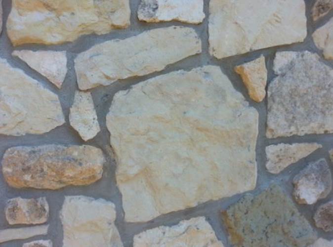
Figure 26.2
This picture is available on the book's website, named border.png. You can begin by specifying a transparent border with the required thickness:
border: 30px solid transparent;
The width of the border should be the thickness you want the photographic image to appear, in this case 30 pixels. With that in place, you can use the border-image property to specify the image that should be used for the border:
border-image:url("border.png") 30 30 30 30 stretch;
This property accepts the following parameters:
· The file that should be used.
· Four different values specifying how to slice the image—these will be discussed shortly. These can either be percentages or pixels. Oddly, if they are percentages, the % sign must be used, but if the values are pixels, the px suffix cannot be used.
· How to deal with the fact that the image may not be the same size as the border. In this case, I have specified that the image should be stretched. Other possible values are:
· repeat: The border image will be repeated as many times as necessary.
· round: The image will be repeated to fill the area, and it will ensure that there are a round number of repetitions, scaling the image if necessary.
This produces the effect shown in Figure 26.3.
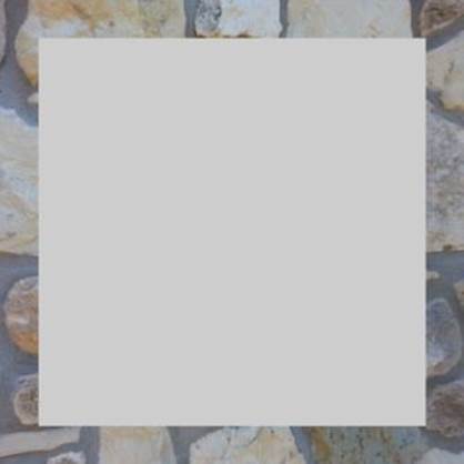
Figure 26.3
The four values used (all of which were set to 30 pixels) effectively state how much of the image should be used for the top, right, bottom, and left of the border. I have specified these as the same size as the border, meaning the image does not need to be stretched in order to fit into each position.
Note
If you are referring to images from an external CSS style sheet, it is important to realize that the file locations will be relative to the style sheet location, not the web page itself.
The third main enhancement to borders is the ability to add shadows to elements, just as you saw with the Canvas API. This feature is not explicitly linked to borders because it is possible to add shadows to any element, regardless of whether it has a border or not.
In order to demonstrate the use of shadows, add the following property to the div element:
box-shadow: 10px -10px 10px #888888;
The parameters used are as follows:
· The horizontal position of the shadow: Because this is a positive number, the shadow will appear on the right side of the div.
· The vertical position of the shadow: Because this is a negative number, the shadow will appear above the div.
· The amount of blur to use: If a value of 0 is used, there is no blur at all to the shadow, whereas in this case, the blur extends for 10 pixels.
· The color of the shadow. In the example above this has been specified as a shade of grey.
This example produces the effect in Figure 26.4.

Figure 26.4
It is possible to place a border around the entire element using an optional parameter immediately before the color. This specifies the size of the border:
box-shadow: 0 0 10px 10px #888888;
In this case, a 10-pixel border, with 10 pixels of blur, extends around all four sides of the element. Notice that I have set the first two parameters to 0 to indicate that the border is not offset to the left, right, top, or bottom.
It is also possible to produce a shadow inside the element. This is produced by specifying inset as the final parameter. For example:
box-shadow: 0 0 10px 10px #888888 inset;
This produces the effect in Figure 26.5.

Figure 26.5
Custom Fonts
One problem with specifying fonts is that there is no guarantee which fonts will be available inside each browser. This is the reason that fonts have been specified as follows:
font-family: Arial, Helvetica, sans-serif;
This allows the browser to select the best available font that matches your requirements. If Arial or Helvetica are available, they will be used; otherwise, the default browser sans-serif font will be used.
Note
A serif is a small line attached to the end of a line on a character. Serif fonts are typically used in print books because it is argued that they are more readable. Web pages, on the other hand, tend to use sans-serif fonts.
This approach can be problematic. As a result of the difference in size of different characters in different fonts, a web page may look quite different if an alternative font is used. In order to circumvent this problem, it is possible for a website to provide its own fonts, have the browser download them, and use them in the CSS.
One of the reasons that different browsers support different fonts is that many fonts need to be licensed from their creators. In this section, you will use the Open Sans font, which was commissioned by Google and is available for use with an open license.
Note
The main disadvantage of using your own fonts is that the user needs to download them, and they can be several megabytes in size.
Open Sans is an ideal font for web pages because it strives to present a neutral impression that is pleasing to the eye and easy to read.
In order to get started with Open Sans, you need to obtain a copy of the font files. These are made available in a collection of files with .ttf extensions (for true-type font). Different files are available for regular font, bold font, italic font, and bold-italic font. These can be found on the book's website.
Note
Open Sans actually provides 10 variants, including light, semi-bold, and extra bold. If you download these and wish to use them, it is possible to indicate the variant that should be used via the font-weight property: Along with values such as bold, this can be assigned a number between 100 and 1000. 400 is the same as normal, and 700 is the same as bold; therefore, 600 will use a semi-bold font, provided that variant is supported by your chosen font.
Once they are downloaded, you need to refer to them in your style sheet or the style section of the web page. For example:
@font-face {
font-family: "Open Sans";
src: url(OpenSans-Regular.ttf);
font-weight: normal;
}
@font-face {
font-family: "Open Sans";
src: url(OpenSans-Bold.ttf);
font-weight: bold;
}
@font-face {
font-family: "Open Sans";
src: url(OpenSans-BoldItalic.ttf);
font-weight: bold;
font-style: italic;
}
@font-face {
font-family: "Open Sans";
src: url(OpenSans-Italic.ttf);
font-weight: normal;
font-style: italic;
}
Notice that these are not regular CSS selectors because they do not select elements from the DOM. Instead, these rules define the name of the font and the location of the font file.
You can now add a font-family style, confident that you do not need to provide any fallback options:
body {
font-family: "Open Sans";
}
Finally, you can add the following markup to the page to use this font:
<p>This is open sans</p>
<p><strong>This is open sans bold<strong></p>
<p><em>This is open sans bold<em></p>
Note
Remember that the b and i tags for bold and italics have been deprecated, but it is considered acceptable to use strong and em (short for emphasis). These tags are considered acceptable because they describe the effect that should be used, rather than exactly how this effect should be achieved.
This will produce the web page shown in Figure 26.6.
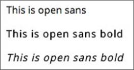
Figure 26.6
Try It
In this Try It, you will create a layout that appears as tabs, using a number of the techniques learned in this lesson.
The goal is to create a set of tabs, as shown in Figure 26.7.
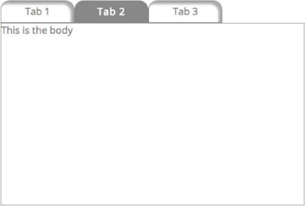
Figure 26.7
This Try It will only contain very general hints rather than specific steps. This lesson, together with the lessons on CSS, provides all the necessary information to implement this panel.
Lesson Requirements
You will need a text editor for writing the code and the Chrome browser for running the code.
Step-by-Step
1. Start by creating a standard HTML5 web page.
2. Create a layout for the various elements on the page. I used div and a elements: Each of the tabs is an a element, and the three tabs are surrounded by a div. I also used a div for the tab content and surrounded the entire structure with a div.
3. The font I have used is Open Sans, so import this into the style sheet, and declare that the tabs use Open Sans.
4. I have two distinct types of tabs. Active tabs use a white font and a dark background, while inactive tabs use the inverse of this.
5. The inactive tabs have a shadow around the top and right sides.
6. The tabs should have rounded corners on the top edges. The border-radius property can accept four sizes representing the radius of all four corners, starting in the top left. This can be used to prevent rounded corners appearing on the bottom border of the tabs.
7. The example that follows does not implement functionality for changing tabs, but you can try implementing behavior if you like: Every time the user clicks a tab, you could set it to the active tab and change the contents of the panel.
My version can be found on the book's website, and is named tryit.html.
Reference
Please go to the book's website at www.wrox.com/go/html5jsjquery24hr to view the video for Lesson 26, as well as download the code and resources for this lesson.