HTML5, JavaScript and jQuery (Programmer to Programmer) - 2015
Part III HTML5 Multimedia
Lesson 27 CSS3: Part II
This lesson will continue where the previous lesson left off, and continue looking at CSS3 features. The features introduced in this lesson may seem somewhat familiar because many of these features were introduced with the Canvas API, such as linear gradients, transformations, and transitions.
These features have been introduced to allow browsers to natively implement complex visual effects that previously could only be achieved with images, or DOM manipulation.
Note
Before beginning this lesson, it is worth reiterating that CSS3 is a major specification in its own right; thus, this lesson will only touch the surface of what can be achieved with these features.
Linear Gradients
CSS3 linear gradients have a lot in common with those introduced with the Canvas API. A line is imagined for the gradient to run through, and colors are defined for points along the line. The browser is then responsible for creating a smooth transition from one color to the next.
In order to define a linear gradient, it is necessary to use a CSS function called linear-gradient. Although I have not discussed CSS functions so far, you have seen them in action. For instance, in the previous lesson a URL was defined as follows:
url("border.png")
A CSS function is just like a JavaScript function: It accepts parameters and returns a value. Throughout this lesson, you will use a number of useful CSS functions, beginning with linear-gradient. The main difference between CSS and JavaScript functions is that you cannot create your own CSS functions.
The simplest form of the linear-gradient function accepts the following parameters:
· The angle of the line that the gradient runs through
· The start color
· The end color
For instance, after creating an HTML page with a single div element, add the following style to create a linear gradient that runs at a 45-degree angle through a div.
<style>
div {
margin:20px;
width:250px;
height:250px;
background:linear-gradient(45deg, white, black);
}
</style>
This produces the effect seen in Figure 27.1.

Figure 27.1
Rather than specifying an angle in degrees, it is possible to use one of the following shortcuts:
· to top: The gradient runs from the bottom to the top of the element. This is equivalent to 0 degrees.
· to bottom: The gradient runs from the top to the bottom of the element. This is equivalent to 180 degrees.
· to left: The gradient runs from the right to the left of the element. This is equivalent to 270 degrees.
· to right: The gradient runs from the left to the right of the element. This is equivalent to 90 degrees.
For instance, the following creates a linear gradient that changes from white to black as it progresses from left to right:
background: linear-gradient(to right, white, black);
The linear-gradient function accepts as many colors as required and automatically creates a linear gradient from one color to the next. For example:
background:linear-gradient(45deg, red, white, blue);
These are equivalent to color stops seen with the Canvas API, and, as with the Canvas API, it is possible to specify where each color stops based on pixels or percentages. For example:
background: linear-gradient(45deg, red 0%, white 20%, blue 100%);
Calc Function
Another useful CSS function introduced in CSS3 is the calc function. This allows you to specify sizes as calculations, which can be extremely useful when you need to size elements using a combination of two or more units of measure.
When laying out web pages, there are generally two ways to size elements:
· As absolute sizes, for instance specifying width and height in pixels: This approach is great for providing a consistent user experience but means content must be sized for the smallest supported browser resolution.
· As percentages, specifying how much of the available space each element should use: This is great for taking advantage of the user's entire browser but can cause issues if the browser is sized too small because there may not be enough space available for a specific element.
The calc function essentially provides the best of both worlds because it lets you mix and match units. For instance, imagine a case where you want a div to use 30 percent of the space available, minus 20 pixels. This can be specified as follows:
width:calc(30% - 20px);
The calc function allows you to perform calculations using any combination of addition, subtraction, division, and multiplication, and also lets you specify operator precedence. For instance:
width:calc((30% / 2) - 20px);
CSS3 also specifies two companion functions that have the potential to be even more useful. Consider a case where you want the width of an element to use 30 percent of its available space, but never be less than 200 pixels. This can be achieved with the min function:
width:min(30%, 200px);
Likewise, it is possible to use the max function to specify that the width should be the greater of two values.
Unfortunately min and max have not appeared in most browsers as yet, but expect them to be added in the near future.
Text Effects
Although a wealth of textual information is contained in web pages, it has never been possible to control the presentation of text in web pages to the degree that is possible with other formats, such as PDF.
CSS3 has countered this problem from two angles. The first is pseudo elements, which allow you to add classes to specific portions of an element, such as the first line of a paragraph; the other is via text effects.
This section will look at the text effects that have been implemented in most browsers. CSS3 also specifies a number of other text effects that have not been adopted by any browsers but are likely to appear in the future.
To begin, let's look at text shadows. Just as it is possible to provide shadows for elements, it is possible to provide shadows for text. For instance, the following example adds a text shadow to any h1 elements on a web page:
h1 {
font-family: Arial, sanf-serif;
text-shadow: 3px 3px 5px #888888;
}
In this case, the shadow extends 3 pixels below and 3 pixels to the right of the text, and has 5 pixels of blur. This produces the effect shown in Figure 27.2.
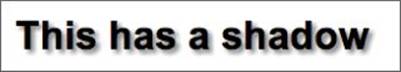
Figure 27.2
A number of the other text effects introduced deal with how to handle overflowing text. Very long words can cause a particular problem to browsers because the web browser does not know how to break them, and therefore, by default, never does break them. In the example in Figure 27.3, the text is placed inside the div but overflows its boundary:
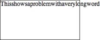
Figure 27.3
It is now possible to specify that the web browser can break the word by using the following property:
word-wrap:break-word;
This will produce the result shown in Figure 27.4.
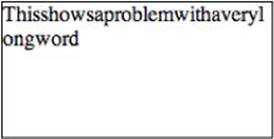
Figure 27.4
Another common overflow problem occurs when text is too long for its containing element. This can be a particularly difficult problem when using relative sizing because the size available will depend on the resolution of the user's web browser. This can lead to the effect shown in Figure 27.5.
Figure 27.5
You will notice in this case that the text overflows to the right rather than the bottom. The following property created this effect:
white-space: nowrap;
The nowrap value means that text does not wrap when it reaches the right-hand boundary of an element. In order to prevent the text spilling outside its boundary it is possible to use the following property:
overflow: hidden;
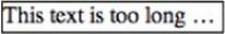
This presents a problem however because it simply truncates any text that overflows the element, and it not obvious that the text has been truncated. CSS3 therefore supports a more graceful alternative by adding a text-overflow property:
text-overflow:ellipsis;
This produces the result shown in Figure 27.6.
Figure 27.6
Unfortunately the technique outlined here only works when the text overflows to the right of the element, not when it overflows below an element.
2D Transformations
The concept of a transformation matrix was introduced in Lesson 25 in relation to the Canvas API. This allowed canvas features to be scaled, skewed, or offset based on a matrix of values provided to the API. As discussed, a transformation matrix is a generic mechanism for transforming shapes.
CSS3 also introduces the concept of a transformation matrix and allows elements to be manipulated in a manner almost identical to the Canvas API. CSS3 introduces a function called matrix that allows the six non-constant values to be provided for the transformation matrix, but before looking at this, you will look at the functions that allow you to control the individual aspects of the transformation.
Note
Many of the 2D Transformation functions are only supported via browser-specific prefixes. Where appropriate, the examples that follow will use -webkit- prefixes (for Chrome and Safari), but remember to also include prefixes for other browsers where appropriate: moz for Firefox and ms for Internet Explorer.
When adding CSS properties that require prefixes, it is also best practice to also provide a non-prefixed version of the property. This will ensure that when the property is eventually supported, the CSS does not need to be changed. A typical example will look as follows:
-webkit-property=value
-moz-property=value
-ms-property=value
property=value
All the examples in this section will operate on the two div elements defined in the following web page:
<!DOCTYPE html>
<html lang="en">
<head>
<meta charset="utf-8">
<style>
div {
height:200px;
width:200px;
border:1px solid black;
margin:50px;
background:#888888;
float:left;
}
#div2 {
background:#bcbcbc;
}
</style>
</head>
<body>
<div id="div1"></div>
<div id="div2"></div>
</body>
</html>
To begin, you will scale the div with the ID div2 so that it is 50 percent the size of the other div. This can be achieved by adding the following rule to #div2:
transform: scale(0.5,0.5);
In these examples, the property name will always be transform, while the function names utilized will vary. The two parameters passed to the function in this case refer to the width and the height, although it is possible to use scaleX or scaleY if you only need to scale a single axis. This produces the result shown in Figure 27.7.
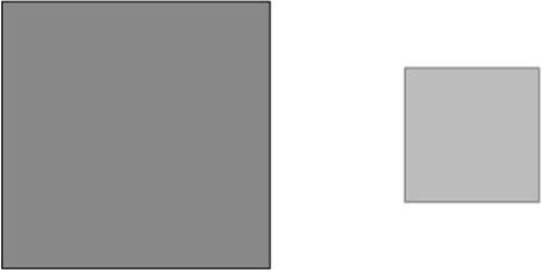
Figure 27.7
It is also possible to skew elements by using the rotate function. For example:
-webkit-transform: rotate(45deg);
You can also skew an element by defining an angle for the X and Y-axis respectively. For example:
-webkit-transform: skew(10deg,-45deg);
This produces the result shown in Figure 27.8.
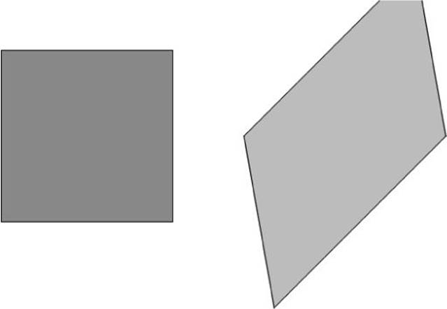
Figure 27.8
Finally, it is possible to move elements from where they otherwise would be placed by using the translate function. As with the Canvas API, the best way to think about this is that it is a mechanism for offsetting where the 0,0 coordinate would be for each element. For instance, the following code will position an element 40 pixels to the right and 40 pixels above where it otherwise would be positioned:
transform: translate(40px,-40px);
If you only want to offset the X- or Y-axis, you can use the translateX and translateY functions respectively.
If you wish to invoke more than one of the translate functions, you can simply list them in a space-separated manner. For example:
transform: translate(40px,-40px) scale(0.5,0.5);
Alternatively, if you are transforming more than one aspect of an element, you can use the matrix function. This accepts the following parameters:
· The scaling for the X parameter, with 1 being the default.
· The amount to skew the X-axis by. A value of 0.45 is equivalent to 45 degrees.
· The amount to skew the Y-axis by.
· The scaling for the Y parameter, with 1 being the default.
· The X-axis offset. Offsets are expressed in pixels, but the px suffix must be omitted.
· The Y-axis offset.
I hope you noticed that this list is exactly the same as with the Canvas API.
The following is an example use of the matrix function:
transform: matrix(0.5, 0.45, -0.45, 0.5, -300, 0);
This produces the result shown in Figure 27.9.
Note
The transitions demonstrated in this section have been 2D transitions because they adjust the element in two dimensions. CSS3 also supports three-dimensional transitions. Although these are beyond the scope of this book, you may want to explore them in your own time. The CSS functions supporting this are translate3d, scale3d, rotate3d, and matrix3d. These are essentially the same as the functions demonstrated in this section, except they accept parameters representing the third dimension.
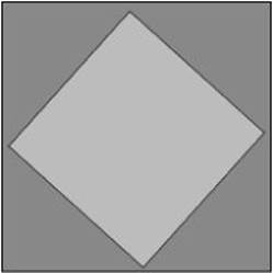
Figure 27.9
Transitions
Earlier in the book, I introduced simple animation effects with jQuery. These effects essentially controlled the behavior as an element transitioned from one state to another, usually from hidden to visible, or vice versa.
CSS3 has also introduced a form of animation called CSS Transitions. These achieve many of the same effects as the jQuery animation libraries, but because they are implemented directly by the browser, tend to produce smoother effects.
CSS Transitions allow you to define when a transition effect will begin, how long the transition will last, and the behavior the transition will take (for instance, run at a constant speed, speed up as it nears completion, or slow down as it nears completion).
In order to see transitions in action, consider the following web page:
<!DOCTYPE html>
<html lang="en">
<head>
<meta charset="utf-8">
<style>
div {
height:20px;
width:200px;
margin:50px;
background:black;
color:white;
transition:height 3s, color 2s, background 2s, border 2s;
}
div:hover {
background: white;
color:black;
border: 1px solid black;
height:200px;
}
</style>
</head>
<body>
<div id="div1">Hover to expand</div>
</body>
</html>
This defines a single div element. The aspect of the code that allows for transition effects is the following CSS property:
transition:height 3s, color 2s, background 2s, border 2s;
This property defines how long the browser will take to transition from one state to another when various stylistic properties on the element are changed. The times are expressed in seconds, but can also be expressed in milliseconds by using the ms suffix.
By itself this property does not do anything. CSS Transitions rely on the stylistic properties being manipulated in some manner. In this case the styles are changed when the user hovers over the element (since the hover pseudo-class modifies the value of various properties), but they could be changed in other ways, such as through JavaScript manipulation of the DOM.
When a CSS property is changed, the browser checks to see whether there is a transition rule associated with that property. If there is, it applies those rules as the property is changed.
If you open this web page and hover over the element, you will notice that it takes 3 seconds for the height to change from 20 pixels to 200 pixels. Likewise, you will notice that it takes 2 seconds for the background to change from black to white, and that it changes in a linear manner, starting as a dark grey and gradually becoming lighter, until finally it is white.
In this example, the only aspect of the transition that is controlled is the time taken to complete the transition. It is also possible to control the effect that will be used and the delay that will occur before the effect begins.
As an example, you may want to specify that the effect does not begin for 1 second, and that the effect eases in and eases out:
transition-delay: 1s;
transition-timing-function: ease-in-out;
These effects can also be specified directly on the transition property, and therefore can be different for different properties. For example:
transition:height 3s ease-in-out, color 2s linear 1s, background 2s ease-in 2s, border 1s ease-out 3s;
Combining different delays, durations, and effects is a useful way of creating a more interesting transition effect.
Naturally, not all CSS properties can be animated when their values change. For instance, it is not possible to animate changing from one font to another. The vast majority of properties that change the size or color of an element in any way can be animated, however.
Try It
In this Try It, you will use some of the transformation and transition techniques learned in this lesson. Begin by writing the following web page that defines a single div element:
<!DOCTYPE html>
<html lang="en">
<head>
<meta charset="utf-8">
<script src="jquery-2.1.1.js"></script>
<style>
div {
height:200px;
width:200px;
margin:50px;
background:green;
}
</style>
</head>
<body>
<div id="div1"></div>
</body>
</html>
You will then add a click listener so that when the div is clicked, it transitions through four sets of colors, and rotates by 90 degrees as it changes color.
Lesson Requirements
You will need a text editor for writing the code and the Chrome browser for running the code.
Step-by-Step
1. Start by creating the web page with the div element. Be sure to import the jQuery library because this will be used to add a click listener.
2. The div CSS rule needs to be given a transition property, which needs to contain values for changes to the background color and transformation (this will be -webkit-transform because you will use the rotate function, and this uses browser prefixes), so add two sets of transition rules specifying the number of seconds the transition should take, and the effect for the transition.
3. Create a script block in the web page and add an array of four colors. For example:
var colors = ['green', 'teal', 'indigo', 'purple'];
4. Add a click listener to the div element. When this is clicked, perform Steps 5–7.
5. Increment a counter variable by 1, and then use the modulus operator to determine whether this is state 0, 1, 2, or 3.
6. Change the background color to the next value in the array, cycling back to the start when the end is reached.
7. Use the rotate function to rotate the div by an additional 90 degrees. The easiest way to do this is to multiply 90 by 0, 1, 2, or 3.
My version of the web page can be found on the book's website, and is named tryit.html:
Reference
Please go to the book's website at www.wrox.com/go/html5jsjquery24hr to view the video for Lesson 27, as well as download the code and resources for this lesson.