HTML5, JavaScript and jQuery (Programmer to Programmer) - 2015
Part I HTML and CSS
Lesson 6 HTML Forms
The HTML tags examined up until this point have all been used to display content to the user. This lesson examines HTML forms, which allow the user to submit data back to the web server. Any time you enter data into text fields, or select values from drop-down lists, you are using HTML forms.
This lesson will provide an introduction to HTML forms, but will also look at some of the interesting changes that have occurred to forms in HTML5. These changes were originally called Web Forms 2.0, but have since been integrated into the HTML5 standard. Therefore, even if you are familiar with HTML forms, this lesson is recommended.
What Is a Form?
A form is a set of input fields, grouped together inside a single element, with the purpose of obtaining a set of information from the user. Forms have historically consisted primarily of the following fields:
· Text fields
· Select lists
· Text boxes (multiline text fields)
· Checkboxes
· Radio buttons
· Password fields
As you will see shortly, this list has been greatly enhanced with HTML5.
In addition, fields contain a Submit button that causes their contents to be posted to a specified URL on the server. The server can then process this data as required and return a new web page as a result.
In this book, you will make extensive use of forms but will not post their contents to a server. You will instead extract and process their data using JavaScript. In this chapter, I will present a more conventional view of forms but will not provide server-side code for processing the form information because this would require me to introduce a whole new set of technologies.
This section of the lesson introduces a very simple form and examines its component parts. You will then create a more complicated form for the Contacts web page.
Create a new page called simpleform.html and add the following body to it:
<body>
<form action="submit.html" method="post">
<label for="firstName">First Name</label>:
<input id="firstName" name="firstName" type="text"/>
<p>
<label for="lastName">Last Name</label>:
<input id="lastName " name="lastName" type="text"/>
<p>
<input type="submit" value="Submit">
</form>
</body>
If you open this in Chrome, it will look like Figure 6.1.
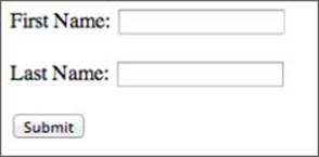
Figure 6.1
Notice that all the input fields are nested inside a form element. All of the input fields within a form should represent a related set of data that is processed together.
The form element contains two important attributes. The action attribute is the address on the web server that the contents of the form will be posted to when the form is submitted. It is assumed that this address will be capable of processing the contents of the form and redirecting the user to a new web page as a result.
The method attribute refers to the HTTP method that will be used to send the data to the server. When you simply type an address in a browser address bar, you are using an HTTP method called GET. This is a simple mechanism for requesting a web page, although it can contain data if required.
When you send form data to the server, you typically have a large quantity of data that needs to be sent; therefore, you use the HTTP POST method. With this method, all the input fields and their values are included in the body of the HTTP request rather than encoded in the URL. You do not need to understand HTTP methods to progress through the book, although you will look at them in slightly more detail when AJAX is introduced.
In this particular case, the form consists of two labels and two input fields.
Obviously, labels do not allow the user to provide input; thus, you may be wondering why you need to use them rather than just adding text to the form. Labels have the following benefits:
· Clicking on the label puts the cursor focus in the input field. This relies on the fact that the value of the for attribute is the id of the input field that it relates to.
· Labels provide more structure to the document because they make it obvious that the label is associated with a specific input field.
HTML uses an element called input for many, but not all, input fields. For this reason, an attribute is added to the element specifying the type of input it accepts. In this particular case, you have specified that the type is text (which is the default).
Finally, a button is added to the form allowing it to be submitted. Notice that this is also an input element, but because it is given a type of submit, it displays as a button rather than an input field.
When the submit button is clicked, the fields are serialized into a textual string of name/value pairs. The name attribute for each input field is used as the name, and the current value of the field is used as the value. The textual string is then placed in the body of an HTTP request and posted to the server.
If I enter Dane and Cameron into the two fields, and then press the submit button, it will post an HTTP request to the server, as shown in Figure 6.2 (this was captured from the Network tab of Chrome's developer tools after first clicking the Preserve Log option).
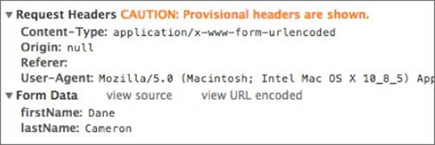
Figure 6.2
Adding Fields to a Form
In this section, you create the form for capturing information about a person in your Contacts web application.
To complete this section, open the contacts.html file as it stood at the end of Lesson 5, or download it from the book's website.
Start by adding the following content to the contactDetails div:
<div id="contactDetails"><h2>Contact details</h2>
<form method="post">
<div class="formRow">
<label for="contactName">Contact name</label>
<input name="contactName" id="contactName" type="text"/>
</div>
</form>
</div>
This adds a form with a single input field. The label and input elements have been placed in a div with a class of formRow, which ensures that each pair will be placed on a row of its own.
Because you want all your labels and fields to have a consistent size, add the following to contacts.css:
label {
width:150px;
display: inline-block;
vertical-align: top;
}
input {
width:200px;
}
Notice that you need to change the display type of the label in order to set its width.
You can now add input fields for the email address and phone number fields:
<div class="formRow">
<label for="phoneNumber">Phone number</label>
<input name="phoneNumber" id="phoneNumber" type="text"/>
</div>
<div class="formRow">
<label for="emailAddress">Email address</label>
<input name="emailAddress" id="emailAddress" type="text"/>
</div>
Because you also want some space between each row, add the following to the style sheet. Figure 6.3 shows what the form should look like.
.formRow {
margin-bottom:10px;
}
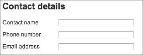
Figure 6.3
Next you will add a field for capturing the company of the contact. In this case, you may want the user to select from a list of companies that have already been added into the system. This can be achieved with a different input type called a select list. Start by adding this to the form:
<div class="formRow">
<label for="companyName">Company name</label>
<select name="companyName" id="companyName">
<option value="-1">Please select</option>
<option value="1">ABC Incorporated</option>
<option value="2">XZY Ltd</option>
<option value="3">ACME iInternational</option>
</select>
</div>
Notice that the select list is encapsulated inside an element called select. Within this, you have a series of option elements providing the various possibilities. Each option consists of two values: The text between the opening and closing option tag is the text that will be presented to the user. Each option tag also has a value attribute, however, and this is the value that will be assigned to the field when the form is submitted.
It is possible for the text and the value to carry the same value, but it is also common for them to differ. For instance, in this case the value may represent a unique code for each company, as assigned by an accounting system.
By default, a select list selects the first option, although it is possible to add a selected attribute to any other option to make it the default. This is a Boolean attribute; thus, it does not require a value. For example:
<option value="3" selected>ACME iInternational</option>
You will now add one more field for capturing notes about the contact. This will be slightly different from the other text-based fields because you want to provide space for a large amount of text to be captured. You will notice that the input fields you have used up until now do not even allow line breaks, so they are not appropriate for capturing large quantities of text.
You therefore want to add a different input type called a textarea:
<div class="formRow">
<label for="notes">Notes</label>
<textarea cols="40" rows="6" name="notes" ></textarea>
</div>
Notice that the text area allows you to specify the number of columns and rows that the textarea contains. Although these dictate the size of the element, and therefore are semi-presentational, they are still valid attributes in HTML5.
With this in place, the form should now look like Figure 6.4.
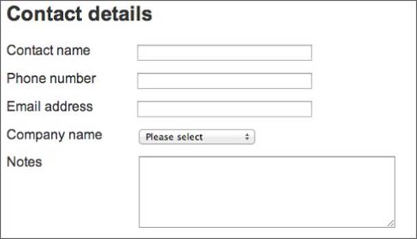
Figure 6.4
Finally, add a submit button to the bottom of the form. Because you want this to be smaller than other input fields, you will use an inline style.
<div class="formRow">
<input style="width:70px" type="submit" value="Save"/>
</div>
HTML5 Input Fields
There is one final field you should add: You want to capture the date that the contact was last spoken to or emailed by your staff. Users generally expect to provide this information by selecting a date from a calendar.
Up until the release of HTML5, you needed to resort to JavaScript libraries in order to achieve this. One of the great enhancements in HTML5 is the introduction of a whole set of new input types, including a date input type. This allows browsers to provide native support for selecting dates.
In order to see this in action, add the following row to the form, before the row with the submit button:
<div class="formRow">
<label for="lastContacted">Last contacted</label>
<input name="lastContacted" id="lastContacted" type="date"/>
</div>
Notice that the only difference between this and other input fields is that the type has been specified as date. If you open this in Chrome, however, you will see that a date picker has been provided for you, as shown in Figure 6.5.
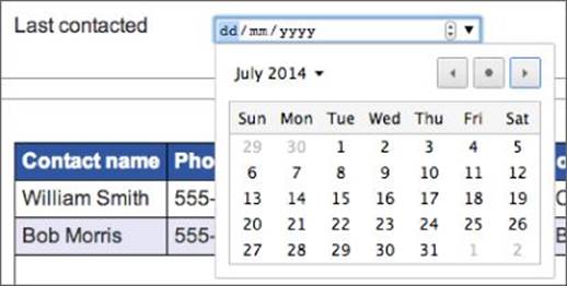
Figure 6.5
The great thing about native support for calendars is that different browsers can implement them in the most appropriate way they see fit. For instance, if you viewed this page on an iPad, the date picker would look like the example in Figure 6.6.

Figure 6.6
As you can see, this has been optimized for a touch-based operating system.
The main problem with the date input type is that all browsers do not support it. This means that, for now, you will probably need to rely on a technique called polyfills, as outlined later in Lesson 10.
HTML5 actually specifies many additional input types. As with the date input type, the specification does not tell browsers how they should implement each type, and in fact, many are not widely supported, but the following are some of the input types that have been included in the specification:
· email: Allows the user to capture an email address.
· color: Allows the user to capture a color, presumably from a color picker.
· number: Limits the user to entering a number in an input field, and allows the user to increase or decrease the value by a step amount.
· range: Lets the user specify a number from a possible range of numbers. This will also be introduced in Lesson 10.
· tel: Lets the user capture a telephone number.
· url: This lets the user capture a URL.
· datetime: This is similar to date, but allows the user to select time as well as date information.
· time: This is also similar to date, but limits the selection to the time of day.
In order to see what these elements do, change the email address and phone number fields to use email and tel respectively. If you now reload the page, you probably will not notice any difference.
As you will see in Lesson 8, this is not entirely true; HTML5 provides native support to validate fields based on their type. In addition, although Chrome on a desktop does not treat these types any differently from text fields, this may not be true of other browsers.
For instance, if you were to click on either of these fields in a mobile phone or tablet browser, you can envisage that the software-based keyboard would change to reflect the keys needed by the input type. The same would be true if the input type was set to number.
It is worth reiterating that one of the key strengths with the HTML5 specification is that it does not second-guess how browsers should implement features. A browser on a phone may therefore attempt to auto-complete phone numbers based on the user's phone book if it determines this is useful to the user.
Datalist Element
HTML5 also contains a new input type called a datalist. This is similar to a select list, but it does not limit the user to the values in the list: It allows the user to type his or her own value if required. The following is an example:
<input list="companies" name="companyName">
<datalist id="companies">
<option value="ABC Incorporated">
<option value="XZY Ltd">
<option value="ACME iInternational">
</datalist>
As you can see, this element is made up of two distinct tags. The first is an input field, which, because its type is not specified, defaults to a text input field. This specifies a special attribute called list.
The next element is a datalist, which has the same id as the list specified on the input field. This then provides a default list for the user to select from, and also allows the value to be autocompleted as the user types.
Although you will not use this in the contacts web page, if you were to add it, it would display as you see Figure 6.7.
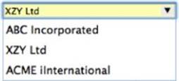
Figure 6.7
Form Attributes
In addition to new input types, HTML5 provides a number of new attributes for existing input types. You will look at several of these in Lesson 8 when you look at HTML5 validation, but it is worth mentioning a number of them in this lesson.
The placeholder attribute allows you to provide a hint to users to help them enter a value. For instance, if you changed the telephone input field as follows:
<input placeholder="Include area code" name="phoneNumber" type="tel"/>
the field would display as you see in Figure 6.8. Notice the gray text in the field. This will disappear as soon as the user starts typing in the field.
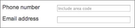
Figure 6.8
The autocomplete attribute can be used to specify whether the browser should attempt to autocomplete text entered by the user based on values that they have provided before. The following is an example that turns autocomplete off on the contact name field:
<input autocomplete="off" name="contactName" type="text"/>
The autocomplete attribute can also be used on the form as a whole.
The autofocus attribute is used to automatically set the cursor in a specific field when the page loads. It has always been possible to do this with JavaScript, but this attribute makes it far simpler. For instance, if you added the following to contact name field, you will notice that the cursor is in this field when the page loads:
<input autofocus autocomplete="off" name="contactName" type="text"/>
Finally, the form attribute can be used to specify that an input field is part of a form, even if it is not nested inside of it. If this attribute is given a value corresponding to the id of a form, it will be included in the post to the server when the form is submitted, regardless of where it is placed in the page.
This can be useful if you have a field that is located in a completely different area of the screen from other fields.
Try It
In this Try It, you will experiment with the various form elements and input fields introduced in this lesson. This Try It also covers the few remaining form elements not covered so far in the lesson.
You are encouraged to experiment here; the goal is to gain an understanding of how the form elements work. If you get stuck, my version is available on the book's website in a file called tryit.html, or you can watch the screencast online.
Lesson Requirements
You will also need a text editor and a web browser.
Step-by-Step
1. Start by creating a simple HTML5 web page that you can use to add the elements outlined in this lesson.
2. Begin by adding a form element to the web page and adding a method of post to this. Because you will not submit this form, you do not need to add an action.
3. Start by adding a simple text input field with the name of fullName. Use the placeholder attribute to provide a hint to the user, and request that this field receives focus when the page loads.
4. Add a label for this field, and use the for attribute to specify the id of the field that this relates to.
5. You want to add radio buttons to specify whether the person is male or female. Add the following markup to the web page:
6. <label for="male">Male</label>
7. <input checked type="radio" name="gender" id="male" value="male">
8. <label for="female">Female</label>
<input type="radio" name="gender" id="female" value="female">
Notice in this example that both input types are given the same name. This is how the browser knows that the two radio buttons are connected, and ensures that only one can be selected. When the form is submitted, the field will be given the value of the radio button currently selected.
6. Add a checkbox to the form asking if the user wants to subscribe to your newsletter. A checkbox is identical to a radio button, but the type of the input field is checkbox. In addition, you do not need to specify a value with checkboxes: The value of the field will be set to either on or off.
7. Add a textarea for capturing notes. This should be sized to capture 5 rows and 30 columns.
8. Add a “Date of birth” input field that uses an input type of date.
9. Add a salary field to the form. Specify this as type number, and define a step attribute with a value of 500.
10.Add a submit button to the bottom of the form to allow the contents to be submitted.
11.Ensure that you have added a <br> before each label to make sure the inputs are placed on separate lines.
The finished result should look something like the screenshot in Figure 6.9, but you are encouraged to experiment, and try out the other features outlined in this lesson.
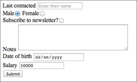
Figure 6.9
You should notice one new feature on this form: if you enter a value into the salary field, Chrome provides up and down arrows for increasing and decreasing this value by the step amount. This also ensures that the value is rounded down to a multiple of the step amount.
Reference
Please select the video for Lesson 6 online at www.wrox.com/go/html5jsjquery24hr. You will also be able to download the code and resources for this lesson from the website.