Pro HTML5 Accessibility: Building an Inclusive Web (2012)
C H A P T E R 3
JavaScript Isn’t a Dirty Word, and ARIA Isn’t Just Beautiful Music
For a long time, JavaScript was a very dirty word in accessibility circles. It was pretty much a pariah, found in the bargain basement of web development among the Bread albums and unloved Pokémons. This wasn’t helped by the first version of Web Content Accessibility Guidelines (WCAG) pretty much banning it from use, and there was a division among developers regarding their attitude to using JavaScript. There was also snobbery that questioned whether it was even a proper coding language at all. The low barrier to entry, as well as its ability to work even when poorly written, didn’t help its image either. This has now all changed.
In this chapter, we’ll look at how JavaScript and other technologies can be used to build dynamic accessible web sites and Rich Internet Applications (RIAs). These are commonly developed using a combination of HTML, Cascading Style Sheets (CSS), JavaScript, and the new kid on the block, WAI-ARIA. WAI is the Web Accessibility Initiative, which is based in the W3C, and ARIA stands for Accessible Rich Internet Applications. Sometimes it is referred to as just ARIA.
This chapter covers some common approaches to accessible design using these languages and developing dynamic content that works for everyone—by paying attention to some basic good-scripting practices. We’ll also look at the current more accessibility friendly JavaScript libraries. This chapter also gives you a good basis to help you transition to accessible HTML 5 development, because much of what is covered here can be applied equally to HTML 4 and HTML5. I’ll also outline some backward-compatibility techniques you might still need to use when developing to support older assistive technologies (AT).
 Note The part of this chapter about scripting is not intended to be an exhaustive JavaScript how-to guide; instead, it presents an overview of some simple principles. I’ve taken some good advice from friends when writing this. (Take a bow, Gez Lemon. I owe you one.) I also borrowed some examples from existing resources. When it comes to scripting in general, there really are lots of ways to do similar things, so I’ll leave a lot of the nitty-gritty details of how to apply the scripty bits to your own preference, and concentrate instead on some simple principles you should stick to that will make your projects more accessible.
If you need a good introduction to JavaScript, I recommend books by Christian Heilmann, who has written extensively on the subject and is an expert in accessibility, as well as DOM Scripting: Web Design with JavaScript and the Document Object Model (friendsofED, 2010) by Jeremy Keith and Jeffrey Sambells, which is also excellent. This chapter assumes you have some scripting experience, but don’t worry if it isn’t that advanced—you’ll get the general idea.
A useful tool to help you to write better JavaScript is JSLint, which was originally developed by Douglas Crockford. This will show you common errors, such as missing semicolons at the end of a line; curly braces without an if, for, or while statement; or those pesky return, throw,continue, or break statements that stop your code from running. There is an online version available at www.jslint.com.
JavaScript: Useful When Used Well
Previous versions of HTML were primarily document markup languages. They were designed at a time when webpages were pretty much just that—pages. They were the online equivalent of a textual Word document. As time went on, they became more sophisticated, and images (then video content) could be embedded within them. Ultimately, the web evolved into the application space that it is today, where web sites behave more like desktop applications and the user can do far more sophisticated stuff within the browser.
All of this Web 2.0 stuff (for want of a better term for more advanced functionality) was made possible by a relatively simple document markup language combined with CSS and, yes, some JavaScript. The fact is, there are times when you just cannot use HTML on its own and some tasteful use of JavaScript can really add to the accessibility of your web sites by providing extra instructions for your users, helping with form validation, and providing more meaningful alerts.
Note The Section 508 guidelines in the US that state when a timed response is required from the user (when booking concert tickets, for example), you must inform the user. This would be practically impossible using HTML alone—JavaScript needs to be used.
Note that JavaScript is totally independent of HTML or any of the host of other languages that it can be applied to. It consists largely of a host of behaviors and can be thought of as occupying that layer in the web development stack. It is used largely for determining how your content will behave when activated or moved around, and how it will respond to particular events that fire.
JavaScript is a client-side language, which means that it operates entirely within the browser. There are other languages, such as PHP, that operate on the server side and can be used together with JavaScript for more sophisticated server/client interaction.
WAI-ARIA: What Is It?
Later in this chapter I’ll talk a lot about WAI-ARIA (or ARIA, as it is sometimes called). As previously mentioned, WAI-ARIA is a technology specification that was developed by the Web Accessibility Initiative (hence the WAI) in the W3C to bridge the semantic gap between markup languages like HTML 4 and HTML5.
Note Over the past few years, the web moved from the static webpage to the AJAX/Web 2.0 space and became more application-like. The idea with ARIA was to develop a language that could be plugged in to a host language like HTML/XHTML (it can also be used with SVG), and that could make these applications more accessible to people with disabilities using AT.
HTML5, of course, has a whole new range of controls (which we will look at later) that improve the accessibility of web sites and applications. However, while developers were waiting for HTML5 (and let’s face it, it was a long wait), there was a need for something that could describe the purpose, sometimes the state, and other properties of hand-rolled dynamic interactive widgets and components that developers were making for assistive technologies. So some very clever people got their heads together and WAI-ARIA was born.
What’s Wrong with HTML 4, 3, 2…?
I’m amazed at how much has been achieved in terms of sophisticated online applications, using what was practically a limited document markup language. (This is a posh way of saying, “How the hell did the web develop the way it did?”)
Only two types of elements within HTML 4 could natively receive focus via the keyboard alone: <ahref> anchor tags and <form> controls. As stated earlier, keyboard accessibility is the bedrock of accessible web development. In HTML5, a great many controls are already keyboard accessible to several of the main browsers like Opera 11, Safari 5, IE 9, Firefox 6, and Chrome 13—either fully or partially. These include the <audio> element; the <datalist> element; the <color> input element; the <date> input element; the <date and time> input element; the <month>,<number>, <range>, and <search> input elements; as well as <time>, <week>, and <summary> elements.
Even though the palette of focusable elements and controls isn’t nearly as limited anymore, it’s worth noting some of the techniques that were developed to make elements focusable within the browser, because they will still be very useful—in particular, for issues like backward compatibility with older AT and browsers that don’t yet (or won’t) support HTML5.
You should also realize that while many of the new controls in HTML5 can be accessed via the keyboard, this doesn’t mean they’re fully accessible. For this to happen, their role and other information need to be exposed via an accessibility API to the assistive technology. This isn’t yet the case with several of the new HTML5 controls I just listed.
So technically while the user might be able to get to the control using the keyboard alone, it doesn’t actually mean they can find out what the control actually is or what it does!
Tip To handle situations like the one just described, you might need to add accessibility information using WAI-ARIA. I’ll go into more detail later on how accessible the new HTML5 controls are and how well they expose their role and other information to AT via the native accessibility APIs.
Accessible JavaScript
In terms of accessibility and barriers that poor scripting practices could create for the end user, many developers didn’t really care. This attitude wasn’t consciously directed at people with disabilities. Developers just liked that they could do more stuff with scripting that made pages more interesting to author and use, as well as more dynamic, and they got caught up in the new language. However, the barriers created were often very real to people using AT.
Some of these barriers were due to the fact that back then some users had JavaScript turned off or the user was behind a firewall or somehow just in a limited browsing environment. (Corporate environments can be very locked down.) So not having access to JavaScript meant that many of these scripted interfaces just wouldn’t work properly.
However, over the past few years this has all changed (apart from the locked-down corporate environment). JavaScript is enabled by default in many browsers, and users of AT such as a screen reader can happily use many JavaScript-heavy web sites and applications without too much trouble, as long as the principles and practices that I outline here are followed.
Note WebAIM, one of the world’s leading online web-accessibility web sites, researched screen reader usage and found that 98 percent of screen-reader users had JavaScript enabled.
For more information, see http://webaim.org/projects/screenreadersurvey3/#javascript.
Progressive Enhancement
One of the first principles of developing accessible scripted content is the idea of progressive enhancement. To build sites according to this principle, you think of your scripts like you think of your CSS—you separate them into their own files, or layers. Your HTML is the content layer, the CSS is the presentation layer, and the JavaScript is the behavior layer. This way of thinking of scripts has been well documented and makes a lot of sense, because it helps with code management and makes project hand-offs easier and less confusing. As an extra benefit, it’s good for people with disabilities using AT, because the basic content is always available and not totally dependent on scripting to work. That means progressively enhanced content can also be parsed more easily by your favorite search engine.
Note You can think of the Google search engine as a blind user. It will parse the code that people don’t see on the surface—rather in the same way that a screen reader will—and then work its algorithm magic and return results. So be nice to people with disabilities in your designs and you will also serve Big G.
When you do separate your stuff, you start with an accessible webpage (well-structured HTML content, correctly labeled form controls, suitable alternate text, and so on), add a separate CSS file for all your presentational stuff, and then add JavaScript functionality to aspects of the site to enhance its functionality to user agents that can handle them correctly.
The core idea of progressive enhancement is that user agents (browsers) that can take full advantage of newer technical specifications and authoring methods can and will, and your code won’t break those that can’t, don’t, or won’t. A progressively enhanced web site, therefore, will be keyboard accessible and keyboard-only users will be able to perform the tasks they need to when they visit your web site.
That being said, JavaScript must still be applied in a way that is device independent, meaning that it doesn’t require a mouse to be used for the JavaScript to work (as can often be the case).
Unobtrusive JavaScript
It is also vital that the use of JavaScript is unobtrusive. This approach aims to give a diverse range of your users a more seamless user experience. They might not recognize the technology (all good technology should be, to some degree, invisible), but they’ll recognize unwanted behaviors when they come across them, and they’ll certainly recognize things that just don’t work. Unnecessary movement on a webpage, complex and generally unintuitive widget functionality, and weird or unfamiliar controls are all over the web. Don’t contribute to the canon.
Note What’s the difference between progressive enhancement and unobtrusive JavaScript? Well, it’s a little like ying and yang, because they are intertwined. They both support the idea of layered development, but progressive enhancement outlines the model of serving behaviors in a staggered way to user agents that support them, and not breaking content for those that don’t. Something that is unobtrusive doesn’t get in the way or disturb the user experience if unsupported. A good example is the NOSCRIPT issue. (See the upcoming section.) They are different sides of the same coin.
Tidy Coding
In CSS, you write declarations that are defined globally, use them to control appearance via <div> elements or id or class attributes (also known as hooks), and then tell the browser to present it, or render it, in different ways. Rather than adding lots of fussy CSS code to your HTML, you can add more discreet hooks that you then write presentational rules for in your CSS file. You can think of JavaScript in the same way. One good practice is to define global behaviors in your JavaScript file that attach themselves to the ID and class hooks in your HTML, so that the behaviors will cascade (if you will) down through your HTML file.
Note that you can give your ids and class names behavior-like’ names, such as popup or expand_menu, that are easy to understand while you are coding. Or you can piggyback on existing ID and class names. For example, consider this snippet: <a href="http://www.somewebsite.com" class="expand_menu">Expand me</a>
Note The proper method for adding many JavaScript events to your hooks is to define the element, then the event, and finally the action. There are several methods for doing this, such as getElementbyId, getElementsByTagName (when you want to target several elements with a similar behavior), and getAttribute. Each method can be used to traverse the DOM of the HTML document; look for specific IDs, element types, or attributes; and then do something to them when the document loads. Adding the window.onload=prepareLinks(); function will also ensure that your JavaScript doesn’t fire before the page has loaded. This is important if your scripts are in an external file that might load before the rest of your HTML!
Common JavaScript Accessibility Problems
Note The term event handler will be used a lot in the coming section. An event handler is really a method containing program statements executed in response to an event, so event handler and method can be used interchangeably. Event handlers are added to your HTML code and activated, or triggered, by some kind of user interaction. They can also be triggered by the browser itself, when a page loads for example, or when some section of the webpage has been updated asynchronously using the XHR object (which is common with AJAX development).
Most of the accessibility problems that arise from the use of JavaScript come about because it has been used incorrectly, or because there is a general lack of awareness about the impact your code can have on the user experience for people with disabilities in particular. It is largely understandable how this happens, because the developers might just be unaware that how they are actually applying scripting is even a problem.
There are also lots of ways to do similar things with JavaScript that appear to produce the same result but might be more “black hat” than “white hat.” It’s only when you look at a heavily scripted interface from the perspective of someone with a disability that you can appreciate that adopting methods like progressive enhancement really makes sense. This chapter is a call for more “white hat” JavaScript, so be good to your users!
There are more low-hanging fruit accessibility issues—or more accurately, usability issues—for which you can just use common sense as a guide to fix. If you think your scripted web site or interface is complex and difficult to use, then guess what—it’s probably complex and difficult to use for lots of other people! It seems kind of daft when it’s spelled out like that, but it’s true.
However, there are other less obvious accessibility issues:
· Lack of keyboard accessibility: JavaScript has some event handlers that can be activated only by using the mouse, such as onClick, onMouseOver, onMouseOut, and onDblClick. Other methods are less device specific—such as onFocus, onBlur, onSelect, and onChange. They’re activated when an item or object receives focus, and this can be via the mouse, the keyboard, or any input devices, such as a switch (as described in the previous chapter). The latter method is a device independent way of adding a behavior to an object in your webpage, and it’s a simple but powerful example of a more accessible way to add JavaScript to your content.
· Lack of Control: Taking the previous example a step further, if a webpage has been developed with only onClick methods, these functions often are not accessible to a keyboard user. The user might not be able to use the widgets/controls at all and therefore is blocked out of the web site. This can also be an issue when content is hidden or removed on certain events and the user either cannot undo an action or just can’t get to some content.
Approaches for handling a variety of such situations are outlined in detail in the WCAG 2.0 Success Criteria. We’ll look at some of their advice for accessible scripting in the upcoming section “JavaScript and WCAG 2.0.”
· Too much going on: Overengineered, overcooked interfaces have become more common these days. They are tolerated less and less as the user experience has become much more important in an age of seemingly infinite choice. When users have a bad experience with a web site, they are fortunate enough to not have to go back, and there are plenty of competing web sites that will be glad to acquire their business. When an organization is a public sector or federal agency, that’s a different situation, and there is a mandate to ensure that their web interfaces meet a certain standard.
However, we’ve all seen pages where functions, animations, and dynamic behaviors have been added for their own sake. Many webpages clearly reflect the era of their design, as they feature behaviors that were fashionable at a particular time. Someday, AJAX interfaces, rounded corners, and the like will seem like old effects, but nothing is as bad as a confusing and disorientating interface where the designer has gone nuts adding extras to an unintuitive interface that only he or she can use or understand. These interfaces can be confusing, especially for older people and people with cognitive impairments, and they can be totally counterproductive, actually blocking many people from using the site’s functionality.
Keyboard Accessibility, Mouse-Only Events, and Keymapping
There are many other event handlers that can be layered on top of a simple onFocus method, which is the bedrock of accessible scripting. If you pay attention to these foundations of your scripts, you will find that you can develop sophisticated sites and applications that are also highly accessible. I also mentioned earlier that the user might not be able to use the controls because onClick will actually work very well for a keyboard-only user (or indeed any other switch device that simulates an Enter keypress).
I’ll group all of these devices under the umbrella of keyboard accessible. This is because you can call a scripting function (like onClick) and attach it to a control within the browser that has native keyboard-accessibility (such as a link or button), or you can make a <div> focusable by the keyboard by using tabindex="0". Under the hood, the onClick event is actually mapped to the default action of a link or button. The name is misleading because the event will activate upon the pressing of the Enter key. There are situations where you have to be a little careful, however—in particular, when you add onclick events to <div> elements. This is because the onclick events will fire fine on elements within the natural source order of a document and often <div> elements don’t follow this. I noticed this in particular when building the HTML5 video player (which is coming up in Chapter 6) because the onclick events wouldn’t fire from the keyboard in Firefox, Safari, and Chrome. (IE 9 doesn’t support the <video> element.)
It might also be a good idea in your projects to consider mapping some of the more commonly used mouse-only events with some keyboard-friendly and accessibility-friendly event handlers, such as those outlined in Table 3-1.
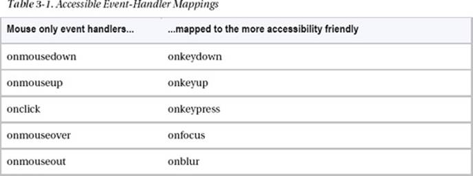
You can provide the two event handlers if you need to, when building JavaScript controls, to ensure that they can be used both by the mouse and via the keyboard. You will see an example of this in Chapter 6, when we build an accessible HTML 5 <video> player.
To trigger a behavior via the keyboard, sometimes you might need to script the actual key that you want to fire the event. Some of the most commonly used are the Space and Enter keys. You have to be careful with event handlers like onkeypress because it will fire regardless of the key the user presses. So if you mean a specific key, it’s best to define that.
For this to work you have to call a key code that you can map to the particular function. For the Space bar, the key code is 32, and for the Enter key, the key code is 13. Attaching these event types to various input keys takes the following form in order to activate the event. The following code sample is your playVideo function reworked to respond to the keypress event. It also checks to see whether it’s the correct key:
function someFunction(objEvent) {
if (objEvent.type == 'keydown')
{
var iKeyCode = objEvent.keyCode;
if (iKeyCode != 13 && iKeyCode !=32) {
return true;
}
}
someFunction();
}
A nice live tool that gives you keycodes to help you figure out what code represents what key can be found at http://asquare.net/javascript/tests/KeyCode.html.
Caution As mentioned previously, be careful not to confuse onKeyPress with onClick. onKeyPress (unless mapped to a specific key) will fire an event or call a function as soon as any key is pressed—so use it with caution. It can be a rather blunt instrument.
Some Event Handler Accessibility Best Practices
While we’re on the subject of event handlers, here are some general good practices:
· Avoid using the onDblclick method because there is no accessible keyboard equivalent.
· Avoid mapping mouse co-ordinates to event handlers. This won’t work because the user can’t move the system caret or focus on these within the browser via the keyboard or other devices.
· Avoid using the onChange event handler in your drop-down boxes. A nonsighted person using a screen reader will use the arrow keys to navigate up and down between the options contained in the drop-down box and find out what the options are by having the screen reader output them as speech. If the onChange event handler is applied to the menu, rather than allowing the screen reader user to navigate through it, the event will be triggered when the user hits the arrow keys as she navigates the controls. The user will then be taken to whatever the default URL is, or the URL of the default item in the list. Generally, allowing the user to navigate the menu items and then let her press the Tab key to select a Go button or similar UI element is better.
· Coding items that can be activated only by a specific event handler is also not good practice. There should be a real URL or link that an event handler is added to, so when JavaScript is disabled the real URL can still be given focus.
· Don’t use the createEvent(), initEvent(), and dispatchEvent() handlers to give an element focus. Use element.focus() instead.
· Don’t use named anchors (# attributes within an <ahref> element) or inline code, such as javascript:window.open(), to control dynamic menus or popup windows. Neither of these will work if JavaScript is off, because the href element has no way of then passing an instruction to the browser (as it usually does when opening a URL) without scripting enabled. This is an example of how a native behavior has been hijacked by the script, making the interaction entirely dependent on the new technology (the JavaScript) and removing the ability of the href element to behave in its default manner, because it has no URL to give focus to.
Creating Accessible Pop-up Menus and Inline Event Handlers
When using pop-up menus, you should inform the user that a popup will be launched before they actually launch it by including this information—ideally, within the link text itself (whether you use script or not). However, pop-up menus should be used with caution, and only as needed. More often than not, you won’t really need to. In the following examples, even if JavaScript is off, the user isn’t left high and dry and can still get to a useful page:
<p> Here is a my <a href="http://www.myusefulpopup.html" target="_blank">really interesting
and useful pop box [Opens in new Window] </a></p>
To be sure that your popUp function degrades gracefully, use real URLs (as shown in the preceding example).
The following examples invoke a function called popUp, which takes the general form shown here:
<script type="text/javascript">
function popUp(X)
{
window.open(X);
}
</script>
The following are inline examples (which aren’t best practice but are used here for illustration purposes):
<a href="http://www.myusefulpopup.html" onclick="popUp('http://www.myusefulpopup.html');
return false;"> Here is my really interesting and useful pop box [Opens in new Window] </a>
This seems like a duplication of functions, and it is. You can simplify it by using JavaScript to just point to the element it’s attached to:
<a href="http://www.myusefulpopup.html" onclick="popUp(this.getAttribute('href')); return
false;"> Here is my really interesting and useful pop box [Opens in new Window] </a>
Or you can use the snazzier version:
<a href="http://www.myusefulpopup.html" onclick="popUp(this.href); return false;"> Here is my
really interesting and useful pop box [Opens in new Window] </a>
The point to remember is that the href value is a real URL, so when scripting is off it will still work. These are examples of inline scripting, or scripting that is contained in the code. It’s better to have the script in a separate file, like you do with CSS, and then point to that file in your header, referencing IDs, referencing class names, or searching for element IDs and types as JavaScript allows you to do.
Note The “return false” bit of the script stops the event from firing. This is useful when you have lots of event handlers and you want to embed them and control how they behave in a more granular fashion. Don’t want event propagation? Then use “return false” on your event handlers. That sends a big “Don’t activate this” flag to the browser. Remember that the window object has an open() method that it uses to determine specific features. It takes the following general form:
Window.open(url, name, features)
Use of TabIndex and More Advanced Focus Techniques
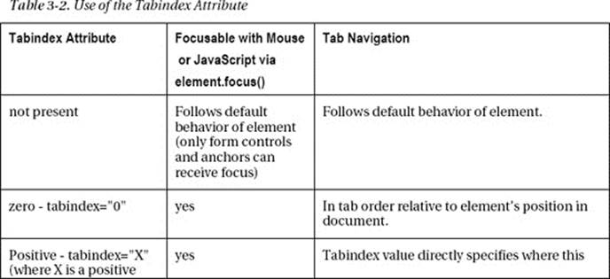
The most common way of allowing any element to receive keyboard focus is by setting a tabindex value for the element. The tabindex attribute can take several values, and a common way to make sure it will receive focus is to add 0 or -1 to the attribute (tabindex="0" or tabindex="-1"). A common way to then give focus is to use the element.focus() method. This allows the keyboard user to navigate via the arrow keys.
Using tabindex="0" on a <div> element as shown in the following code sample means the <div> can receive focus in the normal course of tabbing through the items on a page:
<div tabindex="0">
//Some content here
</div>
By using a negative value (tabindex="-1"), the element can receive focus but will be taken out of the tab order. Why would you want to do that? Well, you might have widgets that reveal functionality as the user progresses through them, so they are more customizable or responsive to the user needs.
<div id="some_control" tabindex="-1">
//Some content here
</div>
A simple bit of JavaScript will find the name element (in this case, I used the ID ‘some_control’) and call the focus method to do just that:
var objDiv = document.getElementById('some_control');
// Hit me
objDiv.focus();
Table 3-2 is an important chart that demonstrates how elements that have the tabindex attribute applied to them will behave. The tabindex attribute can take various arguments, and the argument used will affect how the attribute behaves. It is important to understand when to use them and how they will behave. For example, you might want to dynamically change the behavior of your control—sometimes giving it focus and sometimes not—or vary the order in which the items become focusable.
More information on these core behaviors can be found at www.w3.org/TR/wai-aria-practices/#kbd_focus.
Tip Using the negative tabindex="-1" value will remove the element from the document source order, so the user cannot then tab to the element. Using tabindex="0" will give the element focus but still keep it in the document tab order.
Note When I talk about “Tab order” or “source order,” I’m talking about the sequence in which elements appear within the document source code. This is important because it defines exactly what links, buttons, and form controls get focused on, and in what order. So simply rearranging the order of elements can improve the accessibility and usability of your web site.
JavaScript and WCAG 2.0
In the first version of WCAG 1.0 (which you can find at www.w3.org/TR/WCAG10/), JavaScript was referred to under “Guideline 6. Ensure that pages featuring new technologies transform gracefully.”
The full guideline covered issues that didn’t relate entirely to JavaScript, such as using CSS and ensuring that documents could still be read if their style sheets were missing—still good advice. Here is an excerpt from the Web Content Accessibility Guidelines 1.01:
“Ensure that pages are accessible even when newer technologies are not supported or are turned off.”
The idea was to encourage content developers to use new technologies that solve problems raised by existing technologies, while continuing to ensure that their pages work with older browsers and for people who choose to turn off features.
This is still sound advice and worth applying in your project. The checkpoints that related to JavaScript were as follows:
· 6.2 Ensure that equivalents for dynamic content are updated when the dynamic content changes. [Priority 1]
__________
1 www.w3.org/TR/WCAG10/#gl-new-technologies
· 6.3 Ensure that pages are usable when scripts, applets, or other programmatic objects are turned off or not supported. If this is not possible, provide equivalent information on an alternative accessible page. [Priority 1]
· 6.4 For scripts and applets, ensure that event handlers are input device-independent. [Priority 2]
· 6.5 Ensure that dynamic content is accessible or provide an alternative presentation or page. [Priority 2] For example, ensure that links that trigger scripts work when scripts are turned off or not supported (e.g., do not use “javascript:” as the link target). If it is not possible to make the page usable without scripts, provide a text equivalent with the NOSCRIPT element, or use a server-side script instead of a client-side script, or provide an alternative accessible page.
Why No NOSCRIPT?
I’ve covered most of the preceding issues already, and for the most part, this is good advice. However, I don’t agree with the recommendation regarding NOSCRIPT. The use of unobtrusive scripting methods is a better idea than relying on the use of fallback content. This is to say, build your projects and add JavaScript in a way that won’t break the experience for users who might not be able to access it for whatever reason. This approach will result in a more streamlined experience than fallback content can provide. There might be times when you have no alternative to the use of fallback content, but with the judicious use of unobtrusive JavaScript you can avoid doing so for the most part.
I’ll talk about Checkpoint 6.2, “Ensure that equivalents for dynamic content are updated when the dynamic content changes. [Priority 1],” a little later and in the context of the new WCAG 2.0 guidelines, because the implications of this checkpoint have changed and become more technical since the advent of AJAX and asynchronous (clients-side) content updates.
NOSCRIPT is a little like the “You don’t have the latest, grooviest browser, so we are blocking you out of our flashy, cool web site while you go back to your totally uncool life!” kind of messages that you used to get back in the day. It’s amazing anyone ever thought serving these kind of condescending messages were a good idea, but there you go.
Tip My friend Gez Lemon writes about how there are better alternatives to NOSCRIPT on his excellent JuicyStudio web site. And yes, <NOSCRIPT> is still technically allowed in HTML5. Evidently, someone still thinks <NOSCRIPT> is a good idea. Gez outlines why it isn’t such a good idea in this article:
http://juicystudio.com/article/say-no-to-noscript.php.
For an interesting article on how to replace NOSCRIPT with accessible and unobtrusive JavaScript, see Frank M. Palinkas’ article on Dev.Opera at http://dev.opera.com/articles/view/replacing-noscript-with-accessible-un.
Client-Side Scripting Techniques for WCAG 2.0
One of the big differences between WCAG 1.0 and 2.0 is that the second iteration of the guidelines has been designed to be much more rigorously testable. There are also a lot of useful real-world examples for you to get your teeth into. There are techniques, guidelines, and outlines of the success criteria, as well as a list of common failures.
I am including the list of all the client-side scripting techniques here, and I’ve cherry-picked a few of them for you so that you can look at them in more detail. I want you to get a feel for them in total, and they are published here pretty much as is. I encourage you to study these and the others not shown here, which you can do online at www.w3.org/TR/WCAG20-TECHS/client-side-script.html. Of course, you can tweak them to suit your projects.
Note These scripting techniques relate to specific WCAG success criteria, and you can look at these online. Some of them might seem a little old. I’m including the techniques here so that you can get a feel for how scripting advice is related to WCAG 2.0, rather than this book being a WCAG “how to” guide. It should be pretty clear, however, that many of these techniques are still practical and useful.
You’ll notice that the !DOCTYPE in these examples is for HTML 4, but the principles outlined here will apply equally well to HTML 5 (because it’s just the host language for the script). There aren’t currently any HTML5 test cases for WCAG 2.0, but they are being developed.
What follows is a list of the client-side scripting techniques2 that you can find online at www.w3.org/TR/WCAG20-TECHS/client-side-script.html. A selection of them is available in full in Appendix A at the end of the book and has been included to reinforce some of what I covered earlier, as well as to introduce some new techniques you will find useful. All the following techniques are published in accordance with the W3C copyright policy. Thanks to Michael Cooper (W3C/WAI) for his advice and help.
Here is the full list of client-side scripting techniques:
· SCR1: Allowing the user to extend the default time limit
· SCR2: Using redundant keyboard and mouse event handlers
· SCR14: Using scripts to make nonessential alerts optional
· SCR16: Providing a script that warns the user a time limit is about to expire
· SCR18: Providing client-side validation and alert
__________
2 Copyright © 2007 W3C® (MIT, ERCIM, Keio). All Rights Reserved. W3C liability, trademark and document use rules apply.
· SCR19: Using an onchange event on a select element without causing a change of context
· SCR20: Using both keyboard and other device-specific functions.
· SCR21: Using functions of the Document Object Model (DOM) to add content to a page
· SCR22: Using scripts to control blinking and stop it in five seconds or less
· SCR24: Using progressive enhancement to open new windows on user request
· SCR26: Inserting dynamic content into the Document Object Model immediately following its trigger element
· SCR27: Reordering page sections using the Document Object Model
· SCR28: Using an expandable and collapsible menu to bypass block of content
· SCR29: Adding keyboard-accessible actions to static HTML elements
· SCR30: Using scripts to change the link text
· SCR31: Using script to change the background color or border of the element with focus
· SCR32: Providing client-side validation and adding error text via the DOM
· SCR33: Using script to scroll content, and providing a mechanism to pause it
· SCR34: Calculating size and position in a way that scales with text size
· SCR35: Making actions keyboard accessible by using the onclick event of anchors and buttons
· SCR36: Providing a mechanism to allow users to display moving, scrolling, or auto-updating text in a static window or area
· SCR37: Creating Custom Dialogs in a Device Independent Way
Common Scripting Failures in WCAG 2.0
The following are some of the common WCAG 2.0 failures that relate to dynamic content and scripting:
Note The list of all common WCAG 2.0 failures can be found here: www.w3.org/TR/WCAG20-TECHS/failures.html. Advice on how to fix them is also provided.
· F37: Failure of Success Criterion 3.2.2 due to launching a new window without prior warning when the status of a radio button, check box, or select list is changed
· F42: Failure of Success Criterion 1.3.1 and 2.1.1 due to using scripting events to emulate links in a way that is not programmatically determinable
· F44: Failure of Success Criterion 2.4.3 due to using tabindex to create a tab order that does not preserve meaning and operability
· F50: Failure of Success Criterion 2.2.2 due to a script that causes a blink effect without a mechanism to stop the blinking at 5 seconds or less
· F52: Failure of Success Criterion 3.2.1 and 3.2.5 due to opening a new window as soon as a new page is loaded
· F54: Failure of Success Criterion 2.1.1 due to using only pointing-device-specific event handlers (including gesture) for a function
· F55: Failure of Success Criteria 2.1.1, 2.4.7, and 3.2.1 due to using script to remove focus when focus is received
· F59: Failure of Success Criterion 4.1.2 due to using script to make div or span a user interface control in HTML
· F60: Failure of Success Criterion 3.2.5 due to launching a new window when a user enters text into an input field
· F61: Failure of Success Criterion 3.2.5 due to complete change of main content through an automatic update that the user cannot disable from within the content
· F62: Failure of Success Criterion 1.3.1 and 4.1.1 due to insufficient information in DOM to determine specific relationships in XML
· F85: Failure of Success Criterion 2.4.3 due to using dialogs or menus that are not adjacent to their trigger control in the sequential navigation order
Note I won’t list them all here in any detail (but you should check them out online). Even a cursory look should help you to understand that they are related to several of the issues discussed previously, such as using device-independent event handlers, using accessible form validation, informing the user of content updates, and so on.
Accessible JavaScript Toolkits
As the use of JavaScript has become more common and important as a part of the web developer’s toolbox, there has also been the rise of the library. JavaScript libraries are bunches of ready-made scripts, widgets, and components you can copy and paste, or generally just plug in—as is—to your web projects. You will then refer, within the header part of the document, to where these scripts reside on the client or server.
Using scripting libraries and toolkits is a mixed blessing. On one hand, it can save you the egregious task of having to learn a lot of JavaScript; on the other, it can be a pain because you have to trust that the components you use are quality components and accessible and usable by the widest audience. This isn’t always the case. In fact, it’s the exception rather than the rule.
Note As with all things you don’t build yourself, when you are not familiar with the architecture under the hood, it can be harder to modify the code without breaking internal dependencies that you are not aware of. Having said that, the better ones can provide good documentation and internal commenting that can make tweaking them to suit your needs easier.
However, there are a few JavaScript libraries that aren’t bad when it comes to accessibility and that are worth exploring further. There are a couple that I suggest you avoid, but rather than explicitly mentioning them here, I’ll stick with the ones that are worthy of attention because they considered accessibility in their architecture.
Note The main reason that the following toolkits can be considered to be more accessible than others is because of their support for and implementation of the WAI-ARIA specification. WAI-ARIA provides a semantic toolkit that describes the function of widgets and other scripted controls via the Accessibility API to assistive technologies, such as screen readers. We will be looking at WAI-ARIA in some detail later on in this chapter.
DOJO (DIJIT)

DIJIT 1.6 is the DOJO core and has support for keyboard-accessible widgets and a high-contrast mode for vision-impaired users, as well as increasing support for WAI-ARIA. The range of widgets includes interactive menus, dialog boxes, progress bars, lightboxes, and so on.
· DOJO Explorer: Check out the Dojo Feature Explorer page, where you’ll find useful demos of all of Dojo’s features. All demos include their source code, either in HTML markup, JavaScript, or both. You can access the page at http://dojocampus.org/explorer.
· DIJIT Accessibility (A11y): You can find out more about how DOJO widgets are designed to be accessible and support device-independent interactions, as well as to provide role and state information for AT at the following web site: http://livedocs.dojotoolkit.org/dijit/a11y.
· DOJO Accessibility Statement: For the full DOJO accessibility statement and how the toolkit relates to WCAG 2.0 and Section 508 compliance, go to http://dojotoolkit.org/reference-guide/dijit/a11y/statement.html.
jQuery UI

The jQuery UI framework sits on top of the core jQuery toolkit. Several widgets have accessibility built in, and there are many accessible plugins you can add to your projects. jQuery UI has a very active accessibility team, support for CSS3, and a wide range of widgets that include accessible drag and drop, tabbed menus, sortable tables, accessible lightboxes, and form validation.
· Download jQuery UI: To download jQuery UI, go to http://jqueryui.com.
· Accessible jQuery Plugins: For the full range of accessible plugins, go to http://plugins.jquery.com/plugin-tags/accessibility?page=1.
FLUID Project: Infusion

Fluid Infusion sits on top of the jQuery toolkit and combines JavaScript, CSS, HTML, and user-centered design principles to provide a powerful inclusive toolkit.
Here are some interesting facts about Fluid Infusion:
· Flexible markup ensures you’re free to change component designs as you see fit, without worrying about breaking JavaScript code.
· Infusion uses a powerful events system to notify your code when something has happened, so that you can take interactions even further.
· No black boxes. Everything in Infusion is designed to be modified, reworked, and adapted to suit your needs.
· Ideal for portals, mashups, and content management systems. Infusion is fully namespaced and plays nice with other code.
· Infusion comes with a lightweight and convenient CSS library to help you quickly flesh out your layouts.
Fluid “How-to” Guides
Fluid comes with some good tutorials for you to get started. For more information, see http://wiki.fluidproject.org/display/docs/How-to+Guides.
· Fluid Components: Fluid components are reusable user interfaces that take the hard work out of supporting rich interaction in a Web application. Components are often larger than familiar widgets in a UI toolkit, taking into account user workflows and sequences. For more information, see http://wiki.fluidproject.org/display/fluid/Components.
· Fluid Demos: The Fluid Demo page provides you with a nicely designed ‘shop window’ for the components. I like the way it is laid out and you can select a component and easily see the CSS, HTML and JavaScript that was used to create it. Everything from accessible drag and drop, the Grid reordering systems are available. For more information, see http://build.fluidproject.org/infusion/demos.
Note Other toolkits that support WAI-ARIA to a greater or lesser degree are the YUI Library and GWT (Google Web Toolkit). There are others, and support is growing all the time. If you are not sure and you have a toolkit that you like, it’s always a good idea to let the company know directly that accessibility is important to you. So drop them a line, and if you have a mind to, get involved!
Tip If you use Wordpress, there are a slew of ARIA enabled plugins that were developed as a part of the AEGIS project. For a full list of the plugins, go to http://wordpress.org/extend/plugins/profile/theofanis1999.
WAI-ARIA: How to Do It!
WAI-ARIA provides a way for the developer to describe some new navigation structures, such as tree-type controls, create accessible drag-and-drop functionality, add accessible progress meters so that a blind user can be informed of how far a download is progressing (in real time), include accessible sliders to change the values of various kinds of user input, or modify a selection for a search query (such as minimum or maximum values if you are searching for a house to rent or buy).
For example, WAI-ARIA also allows you to mark regions of a webpage that are commonly used and lets you use them with AT. These can be menus, primary content, secondary content, banner information, and so on.
Tip Using WAI-ARIA, you can identify landmarks and live regions of a webpages and a screen reader user will be able to “see” these in the same way that they can navigate by headings or links and bounce around the page.
For example, WAI-ARIA live regions are used on pages that update frequently, such as stock tickers and chat logs. The JAWS preferences ensure that the ARIA property value is not set to off. If it is on, the screen reader will automatically detect if there has been an update and will announce the update or the changed content. This is really useful because the screen-reader user does have to lose focus on whatever part of the page he happens to be browsing at any given time.
This issue of not losing focus and having a live update being announced is a powerful and useful new feature that enables a more complete user experience. Also, it’s worth noting that not disrupting focus for the user is an important part of accessible web development, and care should be taken to support this—in particular, when you are developing heavily scripted applications.
Tip A common way to break current focus is to force unnecessary page refreshes. So keep these to a minimum and do as much form validation on the client side as possible. Or if you’re using scripting to change the DOM and to add new content, wrap this functionality in a live region!
Live Region Properties
As with any live aspect of communication (among humans), you don’t want to be the chatterbox or rudely interrupt a person when she’s trying to tell you something or do something. Live regions have the ability to set the level of interruption in a way that won’t disturb the user unnecessarily. These regions can be set to be off, polite, or assertive. Most of the time, you’ll probably use the polite value, but there are times when you want to say to the screen-reader user, “This is really important—you must know about this right now,” so you will vary the value to assertive. There used to be a rude property for live regions!
Setting the value to polite will not interrupt the screen-reader user. When there is a break or pause in the user interaction, the user will then be informed of the update. Setting the value to assertive will notify the screen-reader user immediately, and that setting is really useful when some user input is required or something critical has happened that needs attention.
There are many reasons why you would create a live region—among others, you can use them as containers for live streams of data, such as stock market info, weather, or updating new items.
Note Live regions can also be used for form validation or to inform the user that some action has been completed. Basically, any input/data source—whether it’s PHP, ASP, JSON, or XML—can be used.
A basic live region takes the following form:
<div role="region">
<div id="SingleLiveRegion" aria-live="polite" aria-atomic="false"></div>
</div>
In the preceding example, the ARIA role region is added to the parent <div> element. This makes it “live.” The ID of "SingleLiveRegion” provides the hook for your datasource. The use of aria-live="polite" causes the updated contents of the widget to be announced only when the user has finished interacting with the webpage—so the user won’t be interrupted in the usual course of browsing the webpage with the screen reader.
The use of the aria-atomic="false" property determines whether the screen reader will update only some of the info contained within the live region (which is the entire <div> that has the role of Region applied), or all of it.
The default behavior is that the AT will not look at the contents of the entire region because it assumes the atomic-value is set to false. It’s useful to use when there are several nodes within the same Live Region that will be updating, because it gives more granular control over what the AT will announce.
Consider the example in Figure 3-1, which displays a stock market widget with five separate live streams. The code used to create it is shown in Listing 3-1.

Figure 3-1. Fantasy accessible live region
 Note Sometimes in code examples I use ellipses such as “[…]” to indicate that some of the code in a sample isn’t relevant or has been intentionally left out. Also, I haven’t included the CSS because you can experiment with that yourself. This example and others that follow are presented primarily to illustrate the semantics needed to make these patterns accessible. You can style them to your own taste.
Listing 3-1. Semantic Code for Building the Fantasy Accessible Live Region Widget
<!DOCTYPE HTML>
<html>
<head>
<meta charset=”UTF-8">
<title>Multiple Embedded Live Region Table</title>
</head>
<body>
<div id="marketwatch" aria-live="polite" aria-atomic="false">
<h4><a href="http://www.somemarketurl.com">SomeMarket</a></h4>
<span>(live accessible market data)</span>
<span id="marketwatchTicker">
<a href="http://www.somemarketurl.com/ticker.html">SomeMarket Ticker</a>
</span>
</div>
<table id="somemarket_items" summary="A LiveRegion sample of current market values for
major international indexes. Data will update in a polite manner (unlike stock market traders)
which won't interfere with screen reader browsing" class="marketdata">
<thead>
<tr>
<th>Market Name</th>
<th>Current Value</th>
<th>Movement</th>
<th>Change</th>
<th>Percentage Change</th>
</tr>
</thead>
<tbody>
<div id="DowJones_LiveRegion1">
<tr class="up">
<td class="marketname" >
<ahref="http://www.somemarketurl.com/dow_jones_live/">Dow Jones</a>
</td>
<td class="current">11644.49</td>
<td class="movement"><span><img src="arrow.up"></span></td>
<td class="change">166.36</td>
<td class="percentageChange">1.45%</td>
</tr>
</div>
<div id="Nasdaq_LiveRegion2">
<tr class="up">
<td class="marketname">
<ahref="http://www.somemarketurl.com/Nasdaq_live/">Nasdaq</a>
</td>
<td class="current">2667.85</td>
<td class="movement"><span><img src="arrow.up"></span></td>
<td class="change">47.61</td>
<td class="percentageChange">1.82%</td>
</tr>
</div>
<div id="FTSE_LiveRegion3">
<tr class="up">
<td class="marketname">
<a href="http://www.somemarketurl.com/FTSE_live/">FTSE 100</a>
</td>
<td class="current">5466.36</td>
<td class="movement"><span><img src="arrow.up"></span></td>
<td class="change">62.98</td>
<td class="percentageChange">1.17%</td>
</tr>
</div>
[...]
</tbody>
</table>
</body>
</html>
Note The code in Listing 3-1 is a fantasy accessible live region widget not because it’s inaccessible but because the stock is going up.
Rolling Your Own? Using ARIA to Label and Describe
Web developers and designers often want to design their own custom, hand-rolled components. This means you might wish to design your own graphics for use in your interfaces, such as for buttons and other customized controls.
For a sighted user, being able to look at the browser is often enough to be able to understand what the control is and even what it does. A good design has particular affordances that will intuitively lead the user to an understanding of what to do. If you have to explain it to the user, it might already be too complicated!
A nonsighted person cannot make these kinds of connections visually, and the identity of a hand-rolled graphic or entire widget is unknown unless the object is described somehow. When a user of AT activates it, what can that user expect? Describing both what an element is and what its function is, therefore, is at the core of accessible web development and the correct application of semantics to these controls.
If you use the native HTML controls, you should know that they have inherent semantics that are used to describe an element and what it will do when used with AT. If not, ARIA is an excellent way of providing these semantics. The following are examples of how you can do this using some of the new ARIA properties.
You’re probably familiar with the accessibility poster child/rock star that is the alt attribute of the <img> element. This is the first thing most developers learn when they start to learn about accessible web development. This is where you describe an image by using alternate text. You can also describe the function of an image to assistive technology (when it is to behave like a link) by adding alternate text to your graphics. It takes the following form for descriptive images:
<img src="dir/somegraphic.jpg"alt="Picture of Ruairí bouncing in his bouncer!"> or for
functional images of <a><img src="dir/button_graph.png" alt="Submit your personal info"></a>
Tip Sometimes you’ll want to use alternate descriptions to describe what a hand-rolled element does and not what it looks like. I’ll say more about this and the use of alternate text in HTML5 later.
So we’ve looked at using the alt attribute of the image element to provide some semantics for AT to understand the identity and sometimes the purpose of an object. ARIA expands on this idea and brings some powerful new properties to the table. You can use these to describe both the identity and purpose of custom controls to AT, as well as other relationships, states, and so on.
Here is a list of some of these:
· Aria-labelledby: This is a way of accessibly pointing to an existing element that labels the current hand-rolled element. You should use aria-labelledby when you’re pointing to text from an element that is actually onscreen and you want to give an element a name (such as “button”) that can be recognized by assistive technology. It can be used when you create bespoke controls and aren’t using generic real HTML controls that have inherent semantics.
· Aria-label: This can be used like aria-labelledby when text is not positioned onscreen.
· Aria-describedby: This property is very similar to aria-labelledby but is designed to describe additional information about an object. If you create a web page component (such as a button) and you wish to describe the purpose of the button or what will happen when it is activated to assistive technology, you can do so by using aria-describedby.
Aria-describedby can be thought of as providing a cue for assistive technology. When a sighted person looks at a list of items on a webpage, say in an online shop, she can make the association between the picture of an item, the description of the item, and any controls such as buttons. Blind users cannot do this in the same way, so they rely on these cues to be provided programmatically.
Consider the following code example, in which the description of an item is clear visually and also programmatically:
<div>
<label for="imei">IMEI Code</label>
<input type="text" name="imei" id="imei" aria-describedby="imeidesc">
<span class="cue" id="imeidesc">
International Mobile Equipment Identity: 15-digit code to identify
a mobile phone, found by dialing *#06#
</span>
</div>
To see some of these new ARIA properties in action, have a look at the web site WebA11y: Adventures in Web Accessibility,3 where there are some good examples of how to augment button text with ARIA. Many thanks to Becky Gibson (IBM) for allowing me to reproduce her samples here.
On the page www.weba11y.com/Examples/connectionsInvite.html, you’ll find various examples of using ARIA to augment the text of a button. You’ll find a set of sample invites to connect to various colleagues. There are a series of Accept and Reject buttons that are repeated for each invitation using a mixture of the ARIA property.
Different ARIA methods are used and documented in each of the following examples, and the screenshots show the various samples Becky created, followed by the code used:
· Example 1: The Amy Jones example uses a separate, offscreen span (pushed offscreen using a CSS declaration that’s shown in Figure 3-2) to label the button. In the companion Listing 3-2, the span element contains the text for the label of the button, to be spoken by the screen reader when the button is given focus.
__________
3 www.weba11y.com
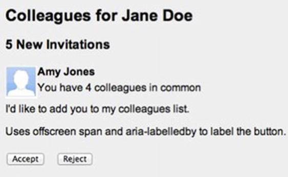
Figure 3-2. Screenshot from weba11y.com
Listing 3-2. A Spoken Button Label
.offscreen {
position: absolute;
margin-top: -9999px;
}
<button aria-labelledby="invite_1_accept"…>
<span class="offscreen" id="invite_1_accept">accept invitation from Amy Jones</span>
<span>Accept</span>
</button>
· Example 2: The Bill Green example shown in Figure 3-3 and Listing 3-3 uses an offscreen span inserted within the button element after the visible text. Thus, the visible text for the button, “accept” or “reject” is spoken before the offscreen text.
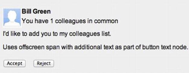
Figure 3-3. Screenshot from weba11y.com
Listing 3-3. CSS That Will Push the Description Off Screen, but Screen Readers Will See It
.offscreen {
position: absolute;
margin-top: -9999px;
}
<button…>Accept<span class="offscreen"> invitation from Bill Green</span></button>
· Example 3: The Ima Clone example uses aria-label, as shown in Figure 3-4 and the snippet that follows it.
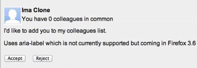
Figure 3-4. Screenshot from weba11y.com
<button aria-label="accept invitation from Ima Clone"…>Accept </button>
Tip An elegant way to inform the user would be to create a live region in the webpage that updates when either button is activated.
ARIA Required
Adding info about required fields is an important part of accessible web development. There are a couple of things to note about the following example:
1. It’s really easy to do.
2. It’s pretty water tight (as you shall see).
3. It’s really useful.
4. See point number 1.
The example in Figure 3-5 and Listing 3-4 contains the word “Required” inside the text label for each input box. This means that as soon as the input box is given focus by the screen-reader user, the contents of the label—both the name of the control and the keyword “Required”—are announced. This will also work with older screen readers, so it’s already backward compatible. Sighted users (even those with poor vision) will see that the field is required also. This is a much better technique than using asterisks (*) to denote required fields. They are really, really easy to miss for users with vision impairments, and the screen-reader output of “star” might be missed in the course of general user interaction.
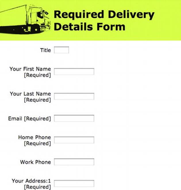
Figure 3-5. Basic form with inline [Required] text for backward-compatibility
Listing 3-4 shows the code that generates Figure 3-5.
Tip You can wrap the input controls in <divs> and style them as you please using CSS. I left that out here so that you can concentrate on the structural markup that is vital for the forms to be made accessible.
Listing 3-4. Basic Form with Inline [Required] Text
<!DOCTYPE html>
<html lang="en">
<head>
<meta charset="UTF-8">
<title>Required Delivery Details Form</title>
</head>
<body>
<h1>Required Delivery Details Form</h1>
<form id="a11y_delivery">
<div id="col-blk">
<div class="colms">
<label for="title">Title</label>
</div>
<div class="colms">
<input id="title" type="text" name="title" />
</div>
</div>
<div class="clrflt"></div>
<div id="col-blk">
<div class="colms">
<label for="first_name">Your First Name [Required]</label>
</div>
<div class="colms">
<input id="firstname" type="text" name="firstname" aria-required="true" />
</div>
</div>
<div class="clrflt"></div>
<div id="col-blk">
<div class="colms">
<label for="last_name">Your Last Name [Required]</label>
</div>
<div class="colms">
<input id="lastname" type="text" name="lastname" aria-required="true" />
</div>
</div>
<div class="clrflt"></div>
<div id="col-blk">
<div class="colms">
<label for="email">Email [Required]</label>
</div>
<div class="colms">
<input id="email" type="text" name="email" aria-required="true" />
</div>
</div>
<div class="clrflt"></div>
<div id="col-blk">
<div class="colms">
<label for="homephone">Home Phone [Required]</label>
</div>
<div class="colms">
<input id="homephone" type="text" name="homephone" aria-required="true" />
</div>
</div>
<div class="clrflt"></div>
<div id="col-blk">
<div class="colms">
<label for="workphone">Work Phone</label>
</div>
<div class="colms">
<input id="workphone" type="text" name="workphone" />
</div>
</div>
<div class="clrflt"></div>
<div id="col-blk">
<div class="colms">
<label for="address1">Your Address:1 [Required] </label>
</div>
<div class="colms">
<input id="address1" type="textarea" name="address1" aria-required="true" />
</div>
</div>
<div class="clrflt"></div>
<div id="col-blk">
<div class="colms">
<label for="address2">Your Address:2 [Required]</label>
</div>
<div class="colms">
<input id="address2" type="textarea" name="address2" aria-required="true">
</div>
</div>
<div class="clrflt"></div>
</form>
</body>
</html>
Note You might be wondering why I have both an id value and a name value on the input controls. This is for backward compatibility with older browsers and AT that don’t understand the id value. While you may say, “Wow, some people must be using ancient technology.” Yes, that’s right. They are.
You could go a little further and add some old-school HTML accessibility magic and wrap some of the controls in a <fieldset> and <legend>, to add some more useful data. (See Figure 3-6 and Listing 3-5.) Doing this will help a screen-reader user (as well as a sighted person) understand how the form controls are grouped. This relationship is announced by the screen reader when the various input fields that are wrapped in <legend> and <fieldset> elements are given focus by the keyboard. These two elements are well supported by older AT also, and they make your forms a bit more backward compatible and robust.
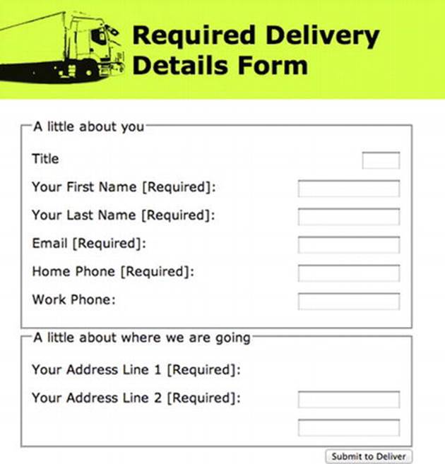
Figure 3-6. ARIA “Required” example with <fieldset> and <legend>
Listing 3-5 shows how to produce Figure 3-6.
Listing 3-5. Using <legend> and <fieldset>
<h1>Required Delivery Details Form</h1>
<form id="a11y_delivery">
<fieldset>
<legend>A little about you</legend>
<label for="title">Title</label>
<input id="title" type="text" name="title" />
<label for="first_name">Your First Name [Required]:</label>
<input id="firstname" type="text" name="firstname" aria-required="true" />
<label for="last_name">Your Last Name [Required]:</label>
<input id="lastname" type="text" name="lastname" aria-required="true" />
<label for="email">Email [Required]:</label>
<input id="email" type="text" name="email" aria-required="true" />
<label for="homephone">Home Phone [Required]:</label>
<input id="homephone" type="text" name="homephone" aria-required="true" />
<label for="workphone">Work Phone:</label>
<input id="workphone" type="text" name="workphone" size="20">
</fieldset>
<fieldset>
<legend> A little about where we are going</legend>
<label for="address1">Your Address Line 1 [Required]: </label>
<input id="address1" type="textarea" name="address1" aria-required="true" />
<label for="address2">Your Address Line 2 [Required]:</label>
<input id="address2" type="textarea" name="address2" aria-required="true" />
</fieldset>
<input type="button" value="Submit to Deliver" />
</form>
HTML5 also has a required attribute that we’ll look at later. And, yes, applying it is very similar to how you do it with ARIA.
Note Adding the inline word [Required] as a part of the label for the input box means that this will get announced by the screen reader (including some older ones) on focus. Also, when the user agent supports the aria-required="true" property, this will also get announced. So Requiredgets announced twice, using newer agents. The addition of <fieldset> will mean that the contents of the field set will be announced on focus for each item that you tab through. Although it’s useful for the first one or two, it might not be needed, or it might get annoying for longer forms. Ultimately, you have to try to judge what will benefit your users most—there is a fine line between too much accessibility and a good user experience for people with disabilities.
Want a Desktop Type Menu? Use ARIA Menubar
Listing 3-6 is the basic outline of an ARIA-enabled menu bar, designed to look like and behave similar to the menu you would find in a desktop application.
Listing 3-6. An ARIA Menu
<h1> Menubar test </h1>
<ul role="menubar" id="menu_css">
<li role="menuitem" aria-haspopup="true" aria labelledby="OpenFileLabel">
<span id="OpenFileLabel">File</span>
<ul role="menu">
<li role="menuitem">New</li>
<li role="menuitem">Open...</li>
<li role="menuitem">Save</li>
<li roles="menuitem">Save As...</li>
<li roles="menuitem">Print</li>
</ul>
</li>
<li role="menuitem" aria-haspopup="true" aria-labelledby="ViewFileLabel">
<span id="ViewFileLabel">View</span>
<ul role="menu">
<li role="menuitem">Undo</li>
<li role="menuitem">Redo...</li>
<li role="menuitem">Cut</li>
<li roles="menuitem">Copy</li>
<li roles="menuitem">Paste</li>
</ul>
</li>
<li role="menuitem" aria-haspopup="true" aria-labelledby="EditFileLabel">
<span id="EditFileLabel">Edit</span>
<ul role="menu">
<li role="menuitem">Bullet List</li>
<li role="menuitem">Numbered List</li>
<li role="menuitem">Date</li>
<li roles="menuitem">Order ID</li>
<li roles="menuitem">Supplier</li>
</ul>
</li>
</body>
</html>
You can style it with CSS as you please, and you’ll also need to provide some script (using your library of choice) to provide focus to the elements (such as Show and Hide within the menu) and to initiate whatever behaviors you wish them to have. This is a skeleton outline of an ARIA-enabled menu. As you can see, it’s quite simple in that it is a basic series of HTML list items that are given the ARIA role of menubar:
<ul role="menubar">
The <li> elements are given the two extra properties of aria-haspopup, and aria-labelledby. The aria-labelledby property we have come across before, and it means that the contents of the <span> that have the label will be announced by the screen reader on focus—for example, File, Edit, View, and so on.
<li role="menuitem" aria-haspopup="true" aria-labelledby="OpenFileLabel"><span
id="OpenFileLabel">File</span>
The following roles of menu and menuitem are natural subclasses, and they perform as their name implies:
<ul role="menu">
<li role="menuitem">New</li>
<li role="menuitem">Open…</li>
<li role="menuitem">Save</li>
<li roles="menuitem">Save As...</li>
<li roles="menuitem">Print</li>
</ul>
Note You can ascribe various JavaScript behaviors to the list items by giving them unique identifiers and then attaching a scripting function to them, or by using numbered arrays to ascribe different functions or behaviors to these nodes numerically, whatever you prefer. The following example gives an ID to each of the items. However, if you want them to behave in a common way, menu items should just receive a class identifier that can act as a hook for scripted behaviors.
<ul role="menu">
<li role="menuitem" id="NewItem">New</li>
<li role="menuitem" id="OpenItem">Open…</li>
<li role="menuitem" id="SaveItem">Save</li>
<li roles="menuitem" id="SaveAsItem">Save As...</li>
<li roles="menuitem"id="PrintItem">Print</li>
</ul>
Document Landmarks and ARIA
Most web sites follow a well-established convention of form (well not most of them, but a lot do). This is similar to the following: a banner at the top, the navigation area to the left, and the content on the right, straddling the middle. Most developers (the good ones, using CSS to lay out pages—I hope that’s you) will wrap each of these sections in a <div> and position them using CSS.
A sighted person can look at a page and quickly understand the purpose of each of these sections, how they relate to each other, and so on. This is not the same for nonsighted people. For them to understand the purpose of each of these sections, they need semantics that describe what the purpose of each of these sections or chunks of the page are. Earlier versions of HTML didn’t have semantics for such common layout structures, and ARIA provides them.
Note HTML5 also has a very similar set of semantics that will allow you to pretty much do the same thing as I describe here.
Figure 3-7 is a sample webpage design and layout along the lines of what I just mentioned. Note that any similarity to other Groovy organizations is entirely coincidental.
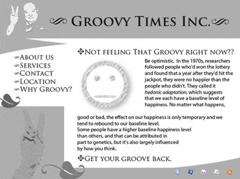
Figure 3-7. Groovy Times Inc web site
Here you have a banner at the top, a navigation menu on the left, and the main content to the right of the page that straddles the middle. There’s also a footer.
As a wireframe, the basic outline looks something like Figure 3-8.
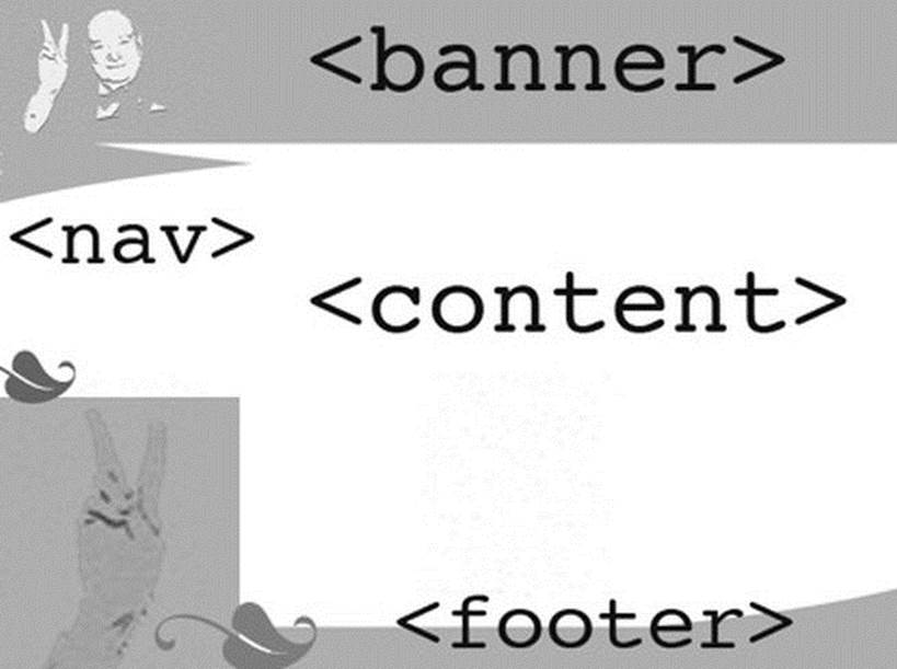
Figure 3-8. Groovy Times Inc wireframe
WAI-ARIA now provides a way to describe the purpose of these sections of web content to users of AT, like screen readers. This is shown in Listing 3-7.
Listing 3-7. Describing Section Content
<div role="banner">
[...]
</div>
<div role="navigation">
[...]
</div>
<div role="main">
[...]
</div>
<div role="contentinfo">
</div>
You can see that by simply adding the text role="banner" or role="navigation" or role="main" you can easily describe the purpose of each of these sections.
Note Remember that the <div> and <span> elements are semantically neutral elements. They have no meaning, poor things, and are merely empty hooks—ciphers for you to do with what you will. They cheer up to no end when you give them meaning. Existential crisis averted!
There are more landmark roles that you can use, and they are as follows:
· application: Represents a region of the page that executes a set of tasks for its users, or that is expected to behave like a desktop application. It can be an entire page or a section of a page. The role="application" attribute should not be used on an entire page, however. There are also some issues with how AT deals with sections that have the role of application, because the screen-reader virtual cursor is disabled and the screen-reader user cannot browse by headings, extract links, and so on. I’ll say more about that in the next chapter.
· banner: As you saw earlier, this is the section that can contain the logo or the site title.
· complementary: Any section that is meaningful on its own but supports the main content of the site.
· contentinfo: This can be copyright info, accessibility statements, a footer, and so on. This can be thought of as child content.
· main: The main content in a document.
· navigation: A list of links used for navigating the web site.
· search: The sites search tool.
Note There are also landmark roles for Form and Search. You’ll notice that they pretty much do what you expect and are easy to add to your pages. The great thing is that when older browsers come across these pieces of ARIA code and don’t understand them, they just ignore them, so they won’t break anything. Breathe a sigh of relief.
A more extensive list of ARIA roles and controls are contained in Appendix B at the end of this book. Look ahead now if you wish to familiarize yourself with them. Now we’ll look at WAI-ARIA and see how it relates to HTML5.
WAI-ARIA and HTML 5
As you can see, lots of these roles are similar to some of the elements and controls you’ll find in HTML5. The reason you might want to use them is that some of the HTML5 elements might not be supported by assistive technology, whereas many of the roles outlined here are.
Many of these ARIA roles can be used in conjunction with HTML5 elements as a way of making them backward compatible with legacy versions of AT. Also, when the browser comes across a combination of HTML5 controls and WAI-ARIA, in general the ARIA control will trump the HTML5 control and be rendered by the browser rather than the native functionality of the HTML5 element.
Caution When ARIA is added to any host language, it trumps the semantics of the host language. In general, adding ARIA functionality will override the default semantics of the element is attached to. The preceding examples of landmarks had no native semantics. By adding some, you give them meaning. Happy days.
WAI-ARIA also has other states and properties that can be used in conjunction with the more descriptive roles that you saw earlier to more fully describe to AT what the current state of a control is. This could be describing whether a check box is selected or deselected, to use a simple example. You’ll recognize some of the states and properties from what we have covered in this chapter, but I’m including them in total so that you can get a feel for how flexible ARIA is. The following examples from the W3C are used with permission.
The following states and properties can be used to create sophisticated Web applications when used in conjunction with event handlers and listeners.
· aria-activedescendant: Identifies the currently active descendant of a composite widget.
· aria-atomic: Indicates whether assistive technologies will present all, or only parts of, the changed region based on the change notifications defined by the aria-relevant attribute. See the related aria-relevant attribute in this list.
· aria-autocomplete: Indicates whether user-input completion suggestions are provided.
· aria-busy (state): Indicates whether an element and its subtree are currently being updated.
· aria-checked (state): Indicates the current checked state of check boxes, radio buttons, and other widgets. See the related aria-pressed and aria-selected attributes in this list.
· aria-controls: Identifies the element (or elements) whose contents or presence are controlled by the current element. See the related aria-owns attribute in this list.
· aria-describedby: Identifies the element (or elements) that describes the object.
· aria-disabled (state): Indicates that the element is perceivable but disabled, so it is not editable or otherwise operable. See the related aria-hidden and aria-readonly attributes in this list.
· aria-dropeffect: Indicates what functions can be performed when the dragged object is released on the drop target. This allows assistive technologies to convey the possible drag options available to users, including whether a pop-up menu of choices is provided by the application. Typically, drop-effect functions can be provided only after an object has been grabbed for a drag operation because the drop-effect functions available are dependent on the object being dragged.
· aria-expanded (state): Indicates whether the element, or another grouping element it controls, is currently expanded or collapsed.
· aria-flowto: Identifies the next element (or elements) in an alternate reading order of content which, at the user’s discretion, allows assistive technology to override the general default of reading in document source order.
· aria-grabbed (state): Indicates an element’s grabbed state in a drag-and-drop operation.
· aria-haspopup: Indicates that the element has a pop-up context menu or sublevel menu.
· aria-hidden (state): Indicates that the element and all of its descendants are not visible or perceivable to any user as implemented by the author. See the related aria-disabled attribute in this list.
· aria-invalid (state): Indicates the entered value does not conform to the format expected by the application.
· aria-label: Defines a string value that labels the current element. See the related aria-labelledby attribute in this list.
· aria-labelledby: Identifies the element (or elements) that labels the current element. See the related aria-label and aria-describedby attribute in this list.
· aria-level: Defines the hierarchical level of an element within a structure.
· aria-live: Indicates that an element will be updated, and describes the types of updates the user agents, assistive technologies, and user can expect from the live region.
· aria-multiline: Indicates whether a text box accepts multiple lines of input or only a single line.
· aria-multiselectable: Indicates that the user can select more than one item from the current selectable descendants.
· aria-orientation: Indicates whether the element and orientation are horizontal or vertical.
· aria-owns: Identifies an element (or elements) in order to define a visual, functional, or contextual parent/child relationship between DOM elements where the DOM hierarchy cannot be used to represent the relationship. See the related aria-controls attribute in this list.
· aria-posinset: Defines an element’s number or position in the current set of listitems or treeitems. It’s not required if all elements in the set are present in the DOM. See the related aria-setsize attribute in this list.
· aria-pressed (state): Indicates the current pressed state of toggle buttons. See the related aria-checked and aria-selected attributes in this list.
· aria-readonly: Indicates that the element is not editable but is otherwise operable. See the related aria-disabled attribute in this list.
· aria-relevant: Indicates what user agent change notifications (additions, removals, and so on) assistive technologies will receive within a live region. See the related aria-atomic attribute in this list.
· aria-required: Indicates that user input is required on the element before a form can be submitted.
· aria-selected (state): Indicates the current selected state of various widgets. See the related aria-checked and aria-pressed attributes in this list.
· aria-setsize: Defines the number of items in the current set of listitems or treeitems. It’s not required if all elements in the set are present in the DOM. See the related aria-posinset attribute in this list.
· aria-sort: Indicates if items in a table or grid are sorted in ascending or descending order.
· aria-valuemax: Defines the maximum allowed value for a range widget.
· aria-valuemin: Defines the minimum allowed value for a range widget.
· aria-valuenow: Defines the current value for a range widget. See the related aria-valuetext attribute in this list.
· aria-valuetext: Defines the human-readable text alternative of aria-valuenow for a range widget.
WAI-ARIA and JAWS
Table 3-3 outlines how a major screen reader like JAWS currently supports many of the roles and states mentioned. Note this is very much subject to change. Table 3-3 is illustrative, and since the time of publication might have gotten better. Screen-reader support for WAI-ARIA is improving all the time. Several screen readers—like JAWS, NVDA, and VoiceOver—already have advanced support for ARIA.
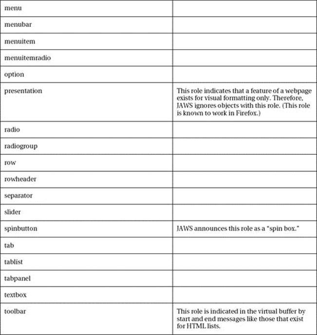
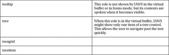
ARIA States
The same principle of reasonable common usage applies to ARIA states as applied in Table 3-3 to the roles.
 Note Some states, such as those related to drag and drop, have been omitted from the list in Table 3-4.
Table 3-4 provides a list of states that JAWS recognizes.
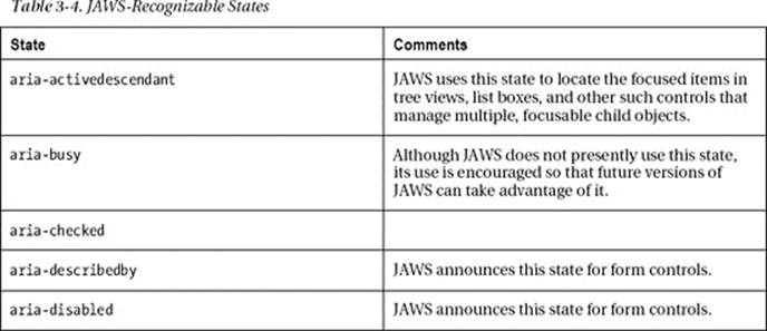
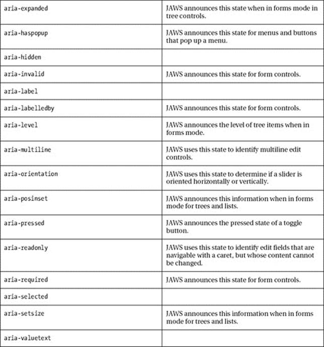
Copyright Freedom Scientific, used with permission.
Using JAWS and Landmarks
JAWS will announce the type of ARIA landmarks that you’ve defined. It also provides the screen-reader users the ability to navigate the page using the landmarks in the same way they would bounce around the page by headings or links.
You can get to the next and previous landmark on the page using the SEMICOLON and SHIFT+SEMICOLON quick navigation keys. In addition, pressing INSERT+CONTROL+SEMICOLON should bring up a dialog box containing a list of landmarks that the screen-reader user can use with his arrow keys to navigate with.
JAWS supports the following landmark roles:
· APPLICATION
· BANNER
· COMPLEMENTARY
· CONTENTINFO
· FORM
· MAIN
· NAVIGATION
· REGION
· SEARCH
Accessible Drag and Drop
JAWS also supports the ARIA drag-and-drop properties aria-grabbed and aria-dropeffect. These can be added to objects, and the screen reader will be able to announce to the user whether the item is either grabbable, grabbed, or droppable. The keystroke WINDOWS Key+CTRL+EQUALS opens the ARIA Drag and Drop dialog box, which shows a list of droppable objects on the page.
Conclusion
In this chapter, we had a good intro to some accessible JavaScript techniques, as well as the excellent WAI-ARIA specification. We covered some of the basics that you need to be aware of when using scripting in your web sites and applications. More advanced techniques can then be built upon solid accessible foundations. You can build complex scripted interfaces that will work, and I hope this chapter helped to show you that it is as much about your approach as anything else. In the next chapter we will look at how screen-reading technology works, what’s going on under the hood in terms of the DOM, accessibility APIs, and the off-screen model (OSM).