Creating a Website: The Missing Manual (2015)
Part 2. From Web Page to Website
Chapter 8. Page Layout
In this book, you’ve covered some serious ground with CSS. In Chapter 3, you used styles to polish up drab web pages. And in Chapter 7, you learned to build larger, more ambitious style sheets to standardize the design of an entire website. In this chapter, you’ll extend your style sheet skills to deal with page layout.
Up to now, your pages have been locked into fixed layouts based on the order of their HTML elements. So if you put a heading at the beginning of your markup, that heading shows up at the top of your page. This behavior makes perfect sense, but it doesn’t suit more complicated layouts. For example, a typical modern website uses headers, fat footers, and sidebars (often on both sides of a page) to place major elements like headers, menus, advertisements, links, galleries, social media plug-ins, and more. If you lock each ingredient to a specific spot in your page, you’ll have a hard time replicating the layout on every page and a heck of a time changing your site’s layout in the future.
Once again, you’ve met a problem that styles can solve. With a well-organized style sheet—like the kind you built in the previous chapter—you can carve your page into logical sections, and then use CSS to slip those sections into the right arrangement.
In this chapter, you’ll see exactly how CSS-based layouts work. You’ll learn to use modern layout techniques like floating boxes, side-by-side columns, and overlapping pictures and text. But first, you’ll consider the challenges of layout on the Web and learn why online viewing isn’t as straightforward as it seems.
Understanding Style-Based Layout
In the early, lawless days of the Web, designers had to improvise their layout tools. One of their favorites was the invisible table, which uses the <table> element you learned about in Chapter 2 to position rows and columns of content. Although ghost tables worked well enough, they left a tangled mess of markup in their wake. Today, web developers have given up on table-based layouts in favor of a cleaner, more powerful approach: style-based layout.
You’ve already taken your first tentative steps toward style-sheet nirvana by learning about borders and boxes (Chapter 3), floating images (Chapter 4), and logical containers (Chapter 7). With these tools, you have almost everything you need to lay out a full page. So before you go any further, it’s a good idea to review these basics.
Structuring Pages with the <div> Element
Before you start placing elements in specific positions on a page, you need a way to bundle related content together, into a single, neat package. In an old-fashioned table-based layout, that package was the table cell. When you use style-based layout, that package is the <div> element—the all-purpose container you learned about on Divisions and Spans.
Imagine you want to create a box with several links in it on the left side of your page. Positioning each link in that column is as much fun as peeling grapes. By using the <div> element, you can group all those links together and manipulate them as a single unit:
<div class="Menu">
<a href="...">Home Page</a>
<a href="...">Buy Our Products</a>
<a href="...">File a Lawsuit</a>
...
</div>
Whenever you create a <div> element, you should choose a class name that describes the type of content it contains (like Menu, Header, AdBar, and so on). Using that class name, you can create a style rule that positions this <div> element and sets its font, colors, and borders.
Remember, a <div> element doesn’t have any built-in formatting. In fact, on its own, it doesn’t do anything at all. The magic happens when you combine a <div> element with a style sheet rule.
Floating Boxes
Ordinarily, HTML pages use a “flow” layout model. The elements in your web page flow from the top of the browser window to the bottom, appearing in the same order as they appear in your HTML markup. But when you use CSS layout properties, you take selected elements out of this system and arrange them according to different rules—the rules that you define in your style sheet.
One of the simplest ways to lay out a web page is to take a small portion of content and float it outside of the main layout of your page (see Figure 8-1). That way, the floating box sits wherever you place it, and the rest of the content flows around that box. In fact, you already used this technique in Chapter 4, to make pictures float using the style sheet property, float. A floating layout works just as readily with <div> elements as it did with those <img> elements, with one exception: You need to supply a width for the <div> element.
NOTE
When you float an image, browsers automatically make the floating box as wide as the image. When you float a <div> element with text inside, you must specify how wide it should be.
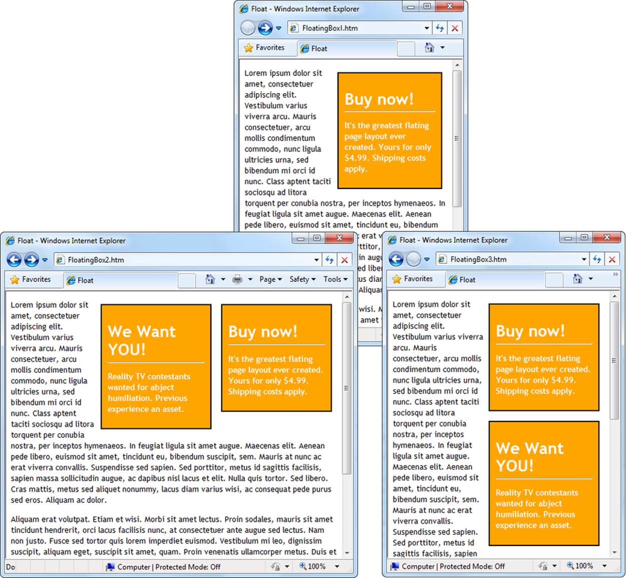
Figure 8-1. Here are three examples of floating layouts. Top: A standard floating box. Bottom left: You can stack place more than one floating box at a time. Your browser adds each new box to the left of the one before it. Bottom right: To stack the boxes, add the clear:both style sheet property (page 136) to force the second floating box to appear under the first.
Here’s a style that defines a class and floats an element on the right side of some text:
.FloatingBox {
float: right;
width: 150px;
background-color: red;
border-width: 2px;
border-style: solid;
border-color: black;
padding: 10px;
margin: 8px;
font-weight: bold;
color: white;
}
And here’s the <div> that uses that style:
<div class="FloatingBox">
<h1>Buy now!</h1>
<p>...</p>
</div>
You’ll notice that the FloatingBox class sets the width of the box but not its height. Browsers handle the latter task, making the box just tall enough to fit the content inside. You could specify a fixed height using the height property, but you might truncate the end of your text (if you make the box too small) or leave extra white space at the bottom (if it’s too big).
Fixed Boxes
The examples in Figure 8-1 are called floating boxes because they “float” around the page to different positions. When a browser encounters a <div> element that uses the float property, it positions that element on the side of the page (left or right) you specify in your style sheet. It positions the top of the <div> at the point in the page where it encounters the <div> element in the HTML. So if a browser finds a <div> halfway down the HTML for a page, it puts the floating box halfway down that page.
Style sheets give you another option: You can place an element in a set, unchanging position. To do that, you use the position property (set to absolute in this case) in conjunction with the properties top, left, bottom, and right. Here’s an example:
.FixedBox {
position: absolute;
top: 20px;
left: 0px;
width: 150px;
background-color: orange;
border-width: 2px;
border-style: solid;
border-color: black;
padding: 10px;
margin: 8px;
font-weight: bold;
color: white;
}
Unlike floating boxes (which float at the sides of a page), fixed boxes can go anywhere. When you specify the location of an element using absolute positioning, you remove that element from the normal “flow” of the page. As a result, the rest of your content won’t wrap around a fixed box. Instead, the box sits on top of the content, as you can see in Figure 8-2.
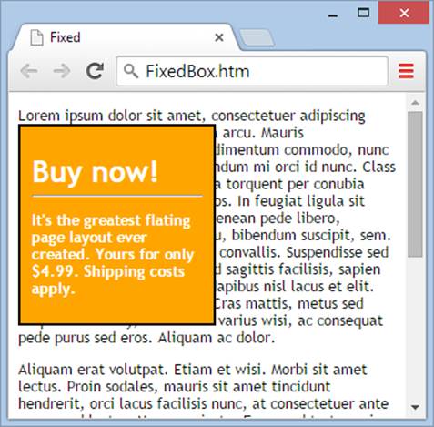
Figure 8-2. HTML positions a fixed box at the coordinates you specify. The box never moves, nor does it wrap the content that runs underneath it.
At first glance, fixed boxes seem like a problem. After all, who wants to deal with a jumble of overlapping content? But if you’re careful, you can carve the page into distinct sections that don’t clash. The most common way to do this is by creating columns, as you’ll see shortly.
Choosing Your Layout
When you design a page for print, you take into account the physical size of your final document. You’d use much larger text on a poster than you would on a business card, for example. But in the world of the Web, this system breaks down, because your website visitors can resize their browser windows (as well as the text itself) to all sorts of different dimensions, and they may view your site with tablets and smartphones that have small screens. These details affect how much display space your web pages have. The higher the resolution and the bigger the browser window, the more of your content fits onscreen. This raises a dilemma—how do you make sure your pages look their best when you don’t know your visitors’ screen settings?
You deal with variable screen sizes using one of two basic layout strategies:
§ Go for flexibility with proportional sizing. With proportional sizing, your layout expands or shrinks to fit the available space in a browser window. For example, if you create a proportionally sized web page with a fixed-size menu panel (on the left) and a variable content area (on the right), the menu section always stays at the same width, while the content area grows or contracts to fit the browser window, no matter how big or small your guest makes that window. If you’re in doubt, proportional sizing is the way to go, because it ensures that your web pages will conform to any size browser window. However, you might want to impose a maximum or minimum width to prevent your pages from being scrambled beyond recognition. You’ll learn how to do that in this chapter.
§ Pick a reasonable fixed width. Sometimes, too much flexibility can cause its own problems. For example, if you shrink a proportionally sized page to extremely small dimensions, some page elements might get bumped into odd positions. If you have a complex layout with lots of graphics and floating elements, the result can be a bit of a mess. On the other hand, extremely large windows can cause problems, too. For example, if you stretch a proportionally sized page to the full width of a widescreen monitor, you might end up with extremely long lines of text that are hard to read. One solution is to use fixed-width pages that look good at a range of common browser settings.
Both approaches make sense, but in different scenarios. For a typical site that presents ordinary text, like a blog post or news story, fixed-width sizing works best. Figure 8-3 shows it at work on the Wall Street Journal’s website (www.wsj.com).
On other websites, proportional sizing works better, because it lets the website make the best use of whatever screen space a visitor’s got. For example, perform a text search on Google and you’ll get a page of results that uses a fixed layout. But perform an image search on Google, and you’ll notice that the image results stretch to fill the whole width of the browser window, even on the widest widescreen monitor (Figure 8-4).
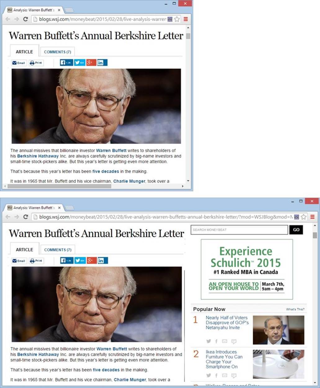
Figure 8-3. Top: To read the text of this article without scrolling side to side, you need a window that’s around 600 pixels wide. Just about every computer screen can accommodate that. Bottom: Widen the window to about 1,000 pixels and you see frills like videos, ads, a search box, and a list of popular articles. If you make the window any wider, all you’ll get is extra blank space.
These days, some sites get even fancier by creating multiple layouts that they swap in and out as needed, depending on destination device. For example, people viewing this sort of site on a widescreen monitor will see one version of the site, while people viewing it on a smartphone get a different view, governed by different style sheet rules. This approach is more complex, and it requires the latest version of the style sheet language, CSS3. You’ll learn more in the box on A Few More Layout Techniques.
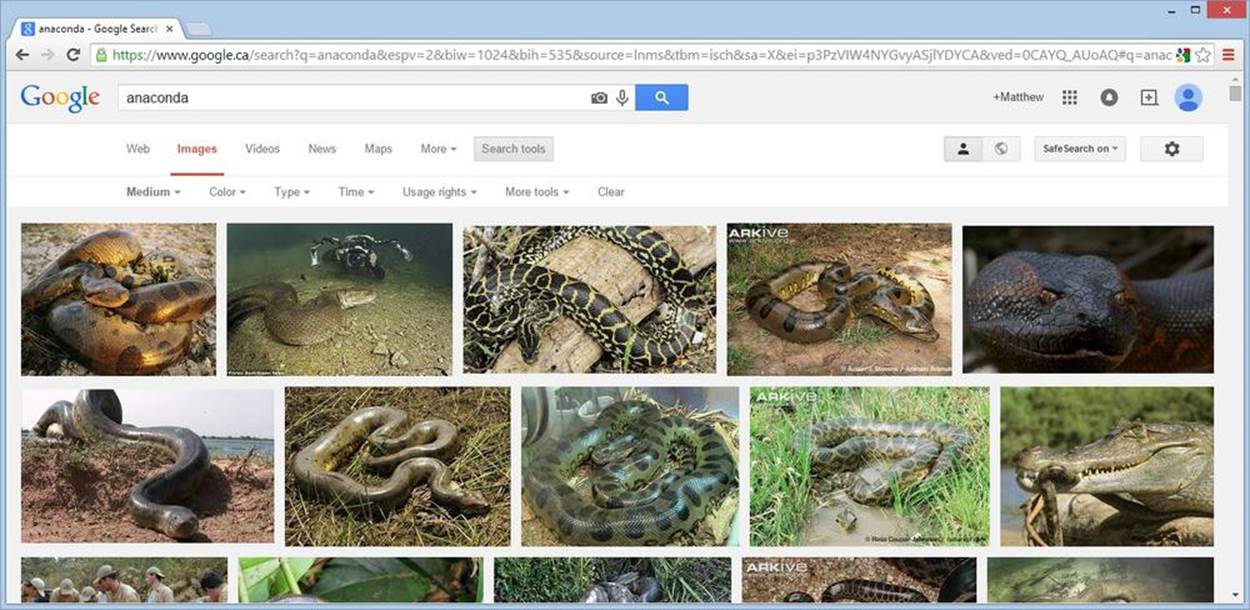
Figure 8-4. Proportional sizing has the potential to adapt to the needs of your web visitors. Although it makes sense to fill a browser window with images, the same approach wouldn’t work well with text, because very long lines become difficult to follow. For this reason, you may want to cap the maximum width of a proportional web page, as described on page 248.
No matter which layout strategy you choose, you should test your pages at a variety of browser sizes to make sure your visitors see the best side of your work. In this chapter, you’ll learn to build a couple of multiple-column layouts, one of which uses fixed widths, and one that uses proportional sizing.
The 1,000-Pixel Rule of Thumb
If you opt to create a standard fixed-width layout, you need to figure out how wide that layout should be. Of course, you have no way of knowing the size of a visitor’s browser window, which is the most important factor in page layout. Fortunately, there’s a good rule of thumb to help you out: Make sure your pages look great at a width of 1,000 pixels. (Pixels are the tiny dots on your computer screen. For a deeper explanation, see the box on Understanding Resolution.) The Wall Street Journal example in Figure 8-3 meets this guideline.
The 1,000-pixel mark is an arbitrary number, but it works surprisingly well for everyone. Very old computers may have monitors that top out near that range, which means people using those computers can see everything on a 1,000-pixel-wide page, as long as they enlarge their browser window to fill the whole screen. The 1,000-pixel rule also works for folks with wider displays. Even though they have more room to spare, they’re less likely to stretch their browser windows to the full possible width (if they did, wider columns lead to extremely long lines of text, which are difficult to read).
UP TO SPEED: UNDERSTANDING RESOLUTION
A pixel is the smallest unit of measure on a monitor, and is otherwise known as a “dot.” For example, a resolution of 1366 x 768 means that a monitor displays a grid of pixels that’s 1,366 pixels wide and 768 pixels high (for a total of just over 1 million pixels). The smallest resolution you’re likely to find on a desktop or laptop computer today is 1024 x 600, which are the dimensions of a teeny netbook screen (a netbook is a tiny and somewhat underpowered laptop). But remember, people with large monitors won’t necessarily size their browser windows to fill up the entire screen. For that reason, 1,000 pixels is a good lower-limit assumption you can make for the width of a browser window.
To get some perspective, you might want to figure out what screen resolution you’re using—or even change it. To do so on a Windows PC, right-click the desktop, choose Personalize, click Display Settings, and then adjust the resolution using the handy slider. In earlier versions of Windows, you can find the same settings when you right-click the desktop and then select Properties→Settings. In Mac OS X, click System Preferences→Displays, and then select from the list of resolutions.
A 1,000-pixel-wide display works on tiny smartphone screens, too, sort of. However, even though your page will technically fit on a smartphone display (because smartphones cram plenty of pixels into their super-sharp screens), the text on your page will be too small to read without squinting. That means visitors with mobile devices are in for a bit of zooming and scrolling. You can avoid this using a technology called media queries, but it takes a bit of work (see the box on Super-Flexible Sites: The Zen of Web Design).
TIP
Some web page editors let you open pages in a range of browser window sizes. For example, in Expression Web you can choose File→“Preview in Browser,” which has options for a few standard, but old, window sizes. And some web browsers have add-ons that do the same thing. For example, Chrome and Firefox fans can use the Web Developer extension (http://chrispederick.com/work/web-developer), which adds a toolbar packed full of handy web design tools, including an option to quickly change the size of the browser window.
The best way to understand the difference between fixed and proportional layouts, and to see the 1,000-pixel rule in action, is to put these techniques into practice. And that’s exactly what you’ll do in the next section.
Tutorial: Creating a Layout with Multiple Columns
One of the most common web page layouts is a two- or three-column design. The column on the left typically holds navigation buttons or other links. The column in the middle includes the main content for the page, and it takes up the most space. The column on the right, if present, displays additional information, like an advertisement or another set of links.
In the following tutorial, you’ll take a basic web page and create a classic three-column layout. You’ll make it a fixed-width layout first, then you’ll try out a resizable layout, and finally you’ll add a few more refinements. By the time you finish, you’ll know exactly how to arrange your site with styles.
TIP
You get the practice files for this tutorial from the Missing CD (available at www.missingmanuals.com/cds/caw4). Look for the Tutorial-8-1 folder (which stands for “Chapter 8, first tutorial”). Inside is the Start folder, which has the set of pages you begin the exercise with, and the End folder, which shows the solution. This tutorial has two solutions, and each one is in a separate subfolder inside the End folder. For example, the first page you’ll develop has a fixed layout, and you can check the finished page at Tutorial-8-1\End\FixedWidth. The second has a resizable layout, with the final page at Tutorial-8-1\End\Resizable.
Laying the Groundwork
Before you write any style rules, you need to plan your layout.
As you’ve already seen, you can use style rules to place elements in precise locations on a page. To create a multicolumn layout, for example, you need to create a box for each column and then put each box in a separate location on the page. If you arrange the columns properly, you’ll end up with a page divided into a tightly interlocked grid of <div> elements, each with its own content (Figure 8-5).
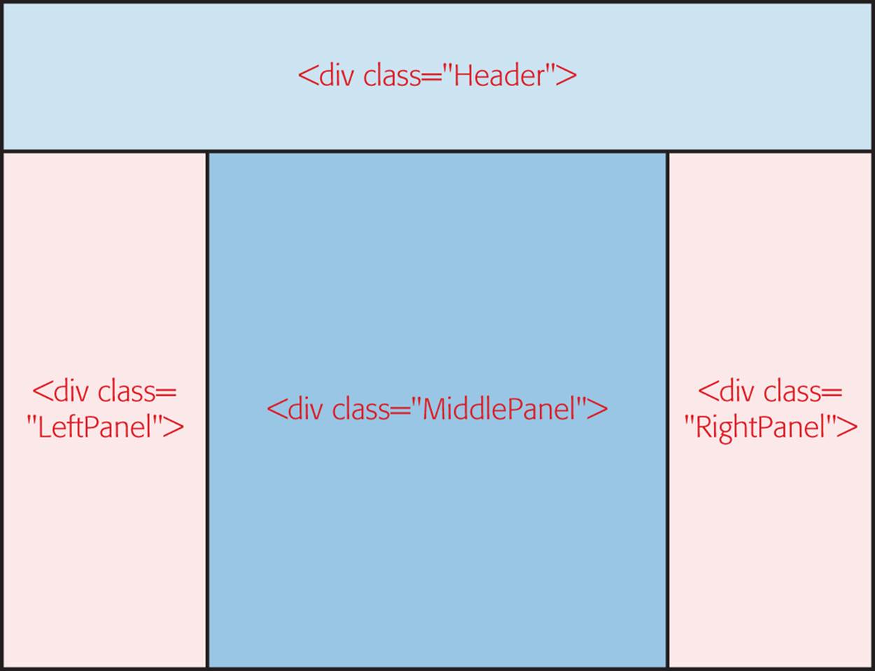
Figure 8-5. Here, a grouping of four <div> elements creates a classic three-column page design, with a header at the top. The <div> boxes line up snugly against one another, but there’s no overlap.
You don’t need to map out the exact dimensions of your layout just yet. First, you need to decide how many sections you want and what each section will contain. Once you do that, you’ll know everything you need to write your HTML.
Figure 8-6 shows a page that uses the three-column layout outlined in Figure 8-5. You can find this page, named ThreeColumns.htm, in the Start folder for this tutorial. Initially, the page has all its content but none of the organization (Figure 8-6). It’s up to you to enclose each section in a<div> element.
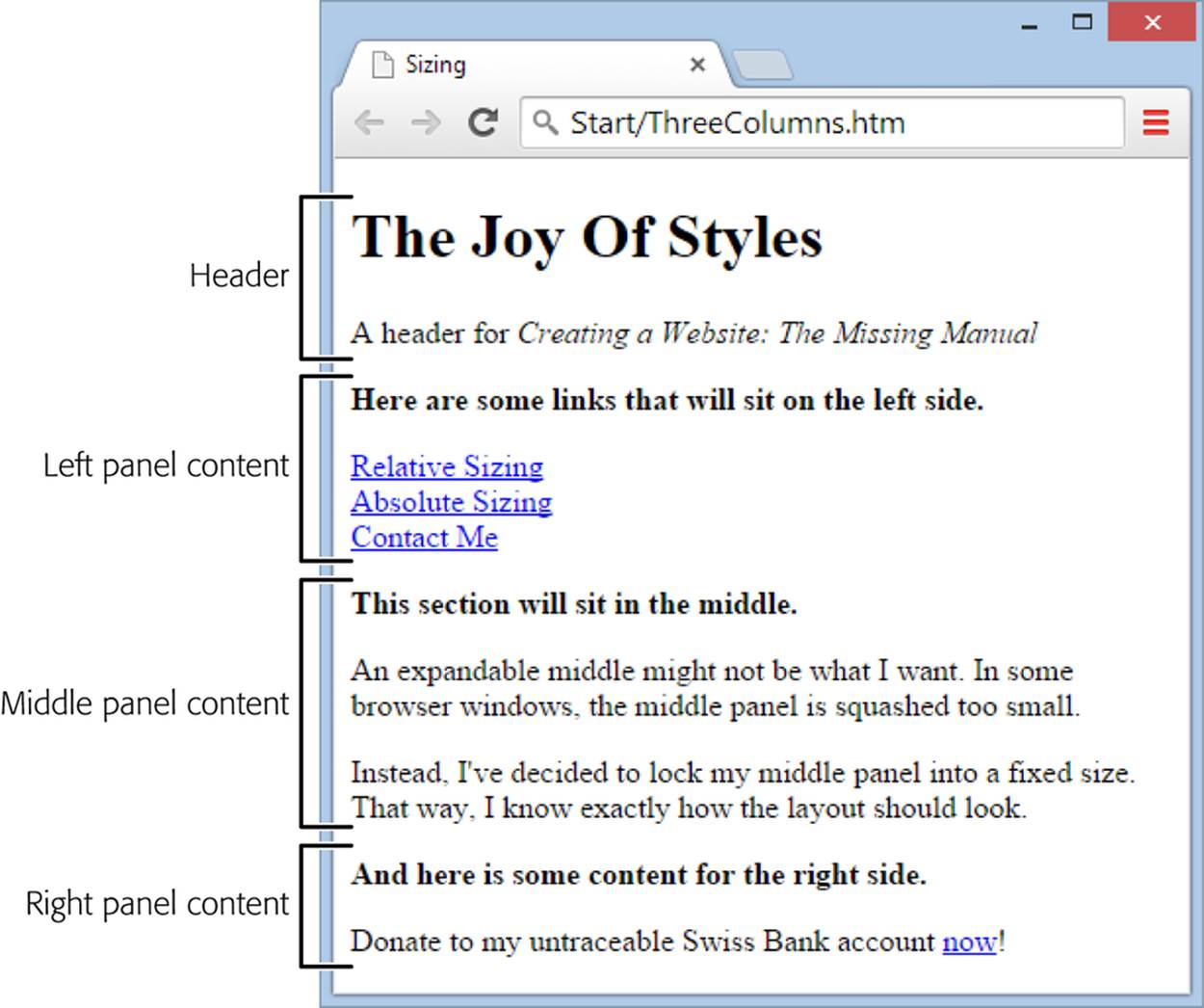
Figure 8-6. In this layout tutorial, you start out with a page that includes all the content, but none of the layout. Your first step is to carve the text up into sections, so you can position each section appropriately.
Give each <div> a class name that corresponds to its position in Figure 8-5. For example, the page begins with this content, which represents the header:
<h1>The Joy Of Styles</h1>
<p>A header for <i>Creating a Website: The Missing Manual</i></p>
Here’s how you wrap that header in a <div> element:
<div class="Header">
<h1>The Joy Of Styles</h1>
<p>A header for <i>Creating a Website: The Missing Manual</i></p>
</div>
Repeat this process to add <div> elements for each of the three columns. Altogether, you have to add four <div> elements. Here’s what the final HTML should look like:
<div class="Header">
<h1>The Joy Of Styles</h1>
<p>A header for <i>Creating a Website: The Missing Manual</i></p>
</div>
<div class="LeftPanel">
<p><b>Here are some links that will sit on the left side.</b></p>
<a href="...">Page 1</a><br />
<a href="...">Page 2</a><br />
...
</div>
<div class="MiddlePanel">
<p><b>This section will sit in the middle.</b></p>
<p>An expandable middle might not be ...</p>
</div>
<div class="RightPanel">
<p><b>And here is some content for the right side.</b></p>
<p>Donate to my untraceable Swiss Bank account ...</p>
</div>
When you finish, the page won’t look any different—your content will still have the boring, column-less layout shown in Figure 8-6, but you’ve laid the groundwork to apply your styles and layout settings.
Attaching Your Style Sheet
The ThreeColumns.htm example comes with a ready-made style sheet, named (rather logically) ThreeColumns.css. You’ll find both files in the Start folder for this tutorial.
You need to add two details. First, the ThreeColumns.css style sheet lacks the layout instructions necessary to structure your page. All it has is a dash of formatting, which sets a nicer font for the page (Trebuchet MS) and tweaks the font size all around.
Second, the ThreeColumns.htm page doesn’t actually use the ThreeColumns.css style sheet. You can rectify that by opening ThreeColumns.htm and adding a <link> element in the <head> section of the page, like so:
<head>
<title>Sizing</title>
<link rel="stylesheet" href="ThreeColumns.css" />
</head>
By this point in the book, attaching a style sheet is nothing new. Now you’re ready to move on to the real work, writing the layout rules.
Building a Fixed-Width Layout
Before you can position the <div> elements that shape your page, you need to decide whether you want a fixed-width or a resizable layout. (Flip back to Choosing Your Layout for a summary of the differences.) In the following sections, you’ll learn to create both, but you’ll start with a classic fixed-width layout.
To set up a fixed-width layout, you need to decide on the exact pixel width of each <div> element. Here are some good starting widths for this example:
§ 100 pixels for the left panel
§ 450 pixels for the middle panel
§ 150 pixels for the right panel
This adds up (with a bit of margin space in between), to a total of about 700 pixels.
TIP
If you go with a fixed layout, follow the 1,000-pixel guideline to make sure visitors don’t need to do any side-to-side scrolling. It’s also a good idea to restrict any individual column of text to a maximum width of 600 to 700 pixels. Any wider and you run into the problem of long lines of text, where readers can lose their place as they skip to a new line and have to scan back across the page to the left edge.
Once you decide how to allocate your space, you simply need to create three style rules, one for each column. As in the examples you saw earlier, you control the horizontal placement of a column by setting its left coordinate, and you let the content determine its total height.
The following style rule defines a panel that’s 100 pixels wide and positioned along the left side of a page:
.LeftPanel {
position: absolute;
left: 0px;
width: 100px;
padding: 15px;
}
The middle panel starts at the 120-pixel mark and takes up another 450 pixels. That leaves 20 pixels of blank space between the right side of the left panel and the left side of the middle panel. The middle panel also separates itself from the content on the left side using border properties.
.MiddlePanel {
position: absolute;
left: 120px;
width: 450px;
border-left-width: 1px;
border-right-width: 1px;
border-top-width: 0px;
border-bottom-width: 0px;
border-style: solid;
border-color: blue;
padding: 15px;
}
Finally, the panel on the right side starts at the 605-pixel mark and takes up 150 pixels.
.RightPanel {
position: absolute;
left: 605px;
width: 150px;
padding: 15px;
}
Although you could use absolute positioning for the <div> that holds the header at the top of the page, you don’t need to, because the header comes first in the HTML. As a result, a browser displays the header and then starts adding the other <div> elements at the locations you specified, so that the top of each panel starts just underneath the header. (Another option is to manually set the height property for the header and the top property for the two side panels, to explicitly set the horizontal placement of each section.)
You can see the result in Figure 8-7. And if you run into trouble, you can double-check your changes against the official solution in the Tutorial-8-1\End\FixedWidth folder.
The remarkable thing about this example is that your HTML document is free of messy formatting details. Instead, it’s a small miracle of clarity, with content divided into several easy-to-understand sections. And because all the style rules are in an external style sheet, you can build a second page using the same HTML and without spending any time puzzling out the correct formatting.
DESIGN TIME: CENTERING A FIXED-WIDTH LAYOUT
Sometimes, webmasters center fixed-width layouts horizontally. That way, their content always appears in the center of a browser window rather than smushed up against the left edge.
Implementing this design is fairly easy in theory, but it can be a bit tricky in practice. First, you need to wrap your entire layout in another <div> element. In this example, it’s named BodyContainer:
<div class="BodyContainer">
<div class="Header">...</div>
<div class="Left">...</div>
<div class="Middle">...</div>
<div class="Right">...</div>
</div>
Then you need to set the width of this <div> to the total width of your full layout, and you need to set the right and left margins to auto:
.BodyContainer {
width: 750px;
margin-left: auto;
margin-right: auto;
}
When you set auto margins on both sides, the browser automatically makes them equal. The result is that your <body> element ends up centered in the middle of the browser window.
But using this technique presents another problem: you can’t absolutely position any of the <div> elements for the columns. The workaround is to float all the <div> columns on the left, one after the other. As long as you set a fixed width for each column and add them in the right order, this technique works without a hitch. To see it in practice, check out the AbsoluteSizing_Centered.htmfile with the examples for this chapter on the companion site (http://prosetech.com/web).
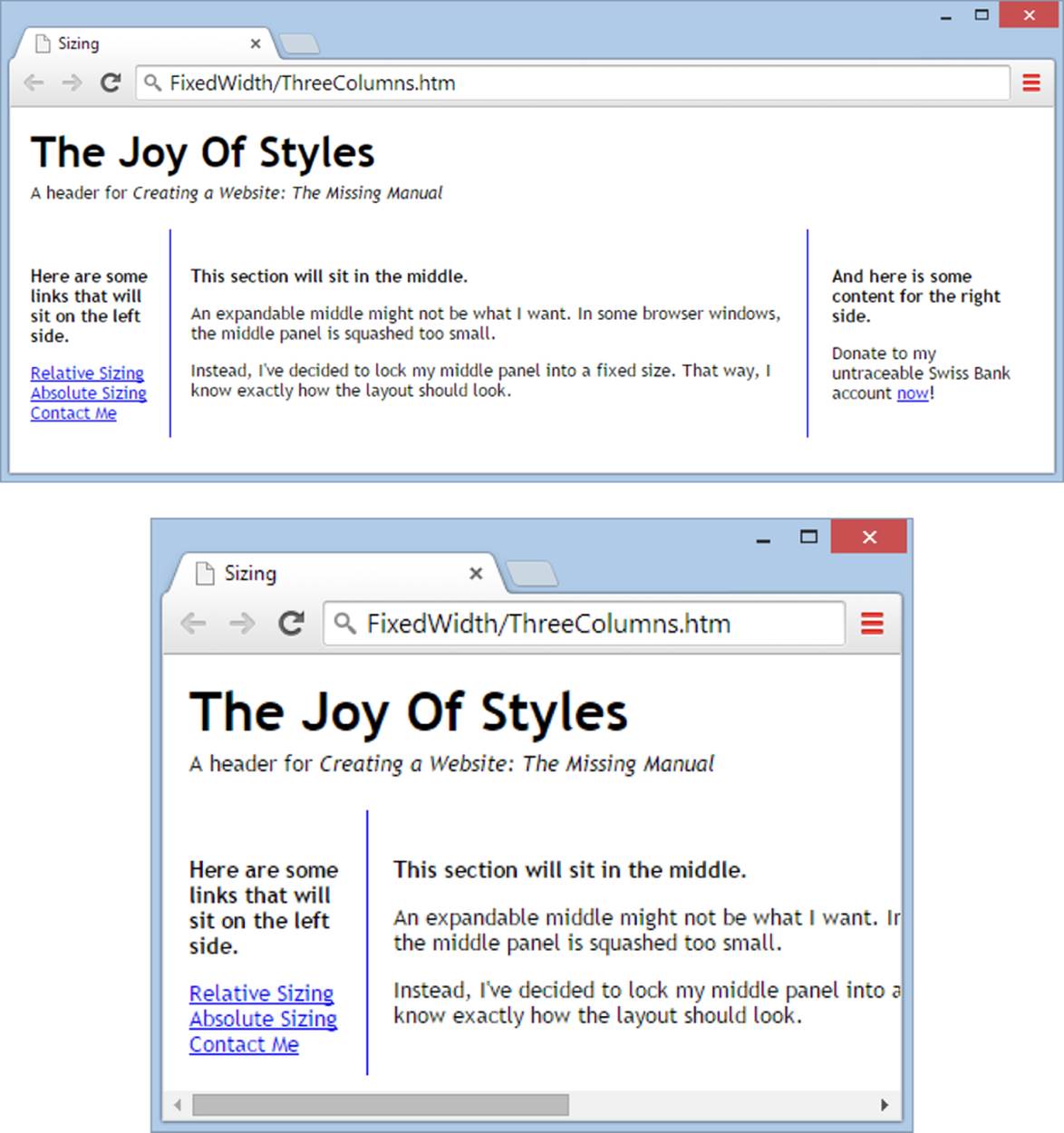
Figure 8-7. A fixed-width layout (top) maintains the integrity of your page design as guests resize their browser windows. The tradeoff is that if you pick too wide a width, visitors will have to scroll from side to side to see everything (bottom), which is sure to exasperate them. Another side effect, one that visitors with large, high-resolution monitors might see, is a page that appears “airy” because of all the empty white space on either side of the page.
Switching to a Resizable Layout
A resizable layout is one in which the middle column—the one with the main content of your page—expands to take advantage of the available browser space. Figure 8-8 shows the difference.
One of the great joys of style-based layout is the fact that you can change your page design without changing the structure of your HTML. For example, the easiest way to create the resizable layout shown in Figure 8-8 is to adapt the fixed-width style sheet you built in the previous section. (If you’re starting from scratch, just grab it from the folder Tutorial-8-1\End\FixedWidth.) You can convert it into a resizable layout by making a few small changes to the style rules that govern the three columns.
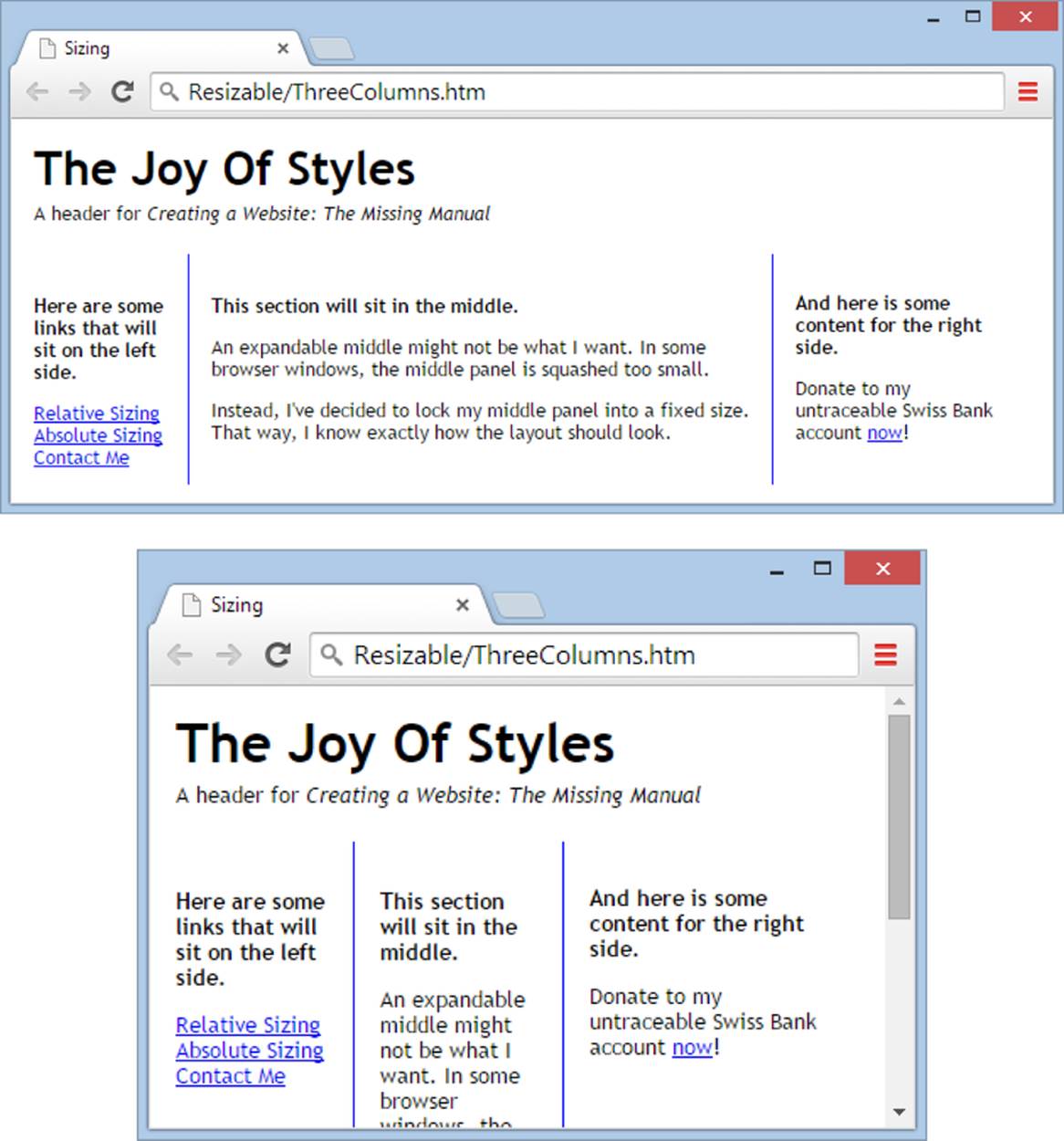
Figure 8-8. Top: At small sizes, this layout looks the same as its fixed-width counterpart. Bottom: Shrink or stretch the window a bit, and you’ll see the difference: the side panels stay the same size, but the middle panel resizes itself to fit.
First, consider the rule for the left panel. Interestingly, you don’t need to change this style at all. It can still use absolute positioning to lock onto the side of the page:
.LeftPanel {
position: absolute;
left: 0px;
width: 100px;
padding: 15px;
}
The panel on the right is slightly different. Because you don’t know how wide the middle section will be, you don’t know what its left coordinate should be. You get around this in an interesting way: by using the right position property. This places the <div> for the right panel in relation to the right side of the browser window, so 0px is smack up against the right edge, 100px is 100 pixels to the left, and so on. In this example, you give the panel 10 pixels of extra space to make sure its content doesn’t rub up against the right border of the browser window. Here’s the new style rule with the changed line highlighted in bold:
.RightPanel {
position: absolute;
right: 10px;
width: 150px;
padding: 15px;
}
The final step is to define the content section that sits between these two panels. You can’t use absolute positioning for this, because you don’t know how wide your guest’s browser will be. Fortunately, there’s another trick you can use—margin space. To make this work, you pretend that your middle panel has the full run of the browser window, like any normal piece of content. However, you pad the left and right margins with enough space to leave room for the side panels.
In this example, the left panel measures 100 pixels wide. Add 20 pixels of space in between, and that means your center panel needs a left margin of 120 pixels. The right margin is 190 pixels, because you need 150 pixels to accommodate the width of the right panel, plus 30 pixels of margin space for both sides of the center panel, and 10 extra pixels to compensate for the space you left between the right panel and the right edge of the browser window. Here’s the final style sheet rule:
.MiddlePanel {
margin-left: 120px;
margin-right: 190px;
border-left-width: 1px;
border-right-width: 1px;
border-top-width: 0px;
border-bottom-width: 0px;
border-style: solid;
border-color: blue;
padding: 15px;
}
Notice that the middle panel no longer has the position: absolute setting.
This solution presents a problem, however. Because the middle panel no longer uses absolute positioning, the right panel gets bumped down the page, so that the top of the right panel aligns with the bottom of the middle panel. To fix this, you could reshuffle your markup, putting the <div>elements for the left and right panels before the <div> for the middle panel. But it’s always better if you can make layout changes without touching your markup. In this case, the problem is more easily solved by explicitly moving the right panel up the page, back to its proper position, with the help of the top property. Here’s the style rule, which assumes a header that’s 90 pixels high:
.RightPanel {
position: absolute;
top: 90px;
right: 10px;
width: 150px;
padding: 15px;
}
Now, just five small style sheet changes later, you’ve replaced the layout of your page. And you don’t need to stop there—with a few more edits, you can change the panel widths, swap the panels from one side to the other, or even transform a panel into a footer.
UP TO SPEED: SUPER-FLEXIBLE SITES: THE ZEN OF WEB DESIGN
Style sheets not only let you apply formatting and layout to a page, they also let you change the formatting and layout in one (immensely gratifying) step. This is the holy grail of web design—a simple, efficient way to update, revamp, and customize an entire site as your needs change. Figure 8-9 shows the CSS Zen Garden example website, which demonstrates this vision.
Here’s a quick recap of the design steps you need to follow to make flexible design work on your website:
1. Plan your pages before you write a single HTML tag. Divide your page into distinct regions.
2. Put each region into a separate <div> element.
3. Give each <div> element a unique class name that reflects its purpose, not its format. Do this for every section of a page, even if you don’t intend to apply style sheet rules to it right now.
4. Finally, write the style sheet rules that position and format each <div> element. This is the most time-consuming part of your markup to write, but it’s time well spent—you can tweak your formatting rules at any time, without disturbing your content.
Maximum Width: The Safety Net
When you create a resizable layout, you can run into two types of trouble. The first problem occurs if your visitor shrinks her browser window to ridiculously narrow dimensions. Space becomes so constricted that even a single word can’t fit in the middle column, and the separate sections begin to overlap. This isn’t a huge problem—after all, most people don’t expect a website to keep looking pretty when squashed paper-thin—but it’s still a bit short of a professional page.
The second issue rears its head if a visitor expands his browser window to fill all the space on a widescreen, high-resolution monitor. In that case, the middle panel is so wide that the text fits on just two or three lines. Besides looking odd, it’s extraordinarily difficult to read.
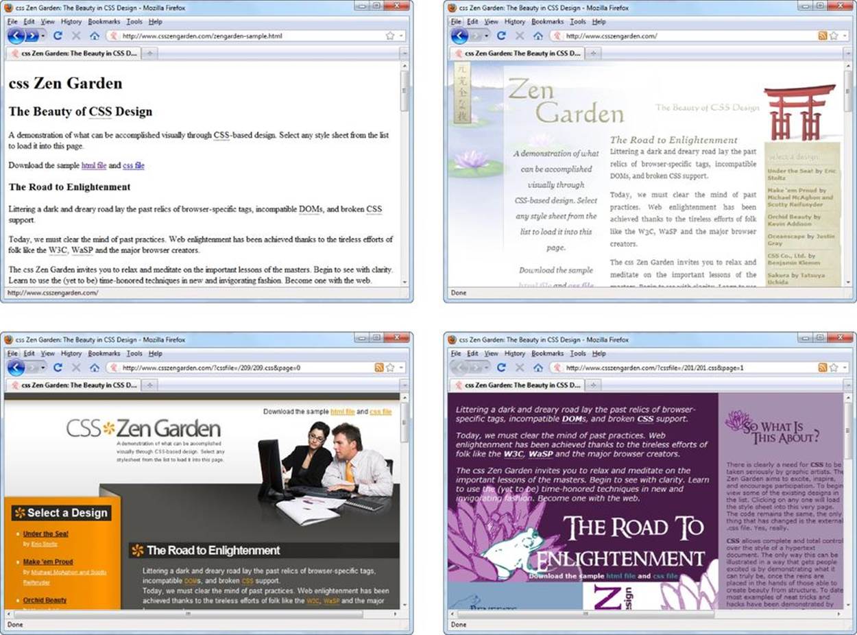
Figure 8-9. One page, dozens of looks. The website www.csszengarden.com shows you how you can thoroughly reformat and reorganize an ordinary page (top left) just by switching the style sheet it uses. Best of all, you can download the HTML and dozens of sample style sheets for this page so you can see the power of style sheets for yourself.
You can prevent both these problems using two more CSS properties: max-width and min-width. The max-width property sets a maximum width beyond which an element will not expand, and the min-width property sets a minimum width beyond which an element will not shrink. Essentially, when you hit these limits, your page turns into a fixed layout. Expand the page further than the maximum, and you get extra white space. Shrink it smaller than the minimum, and the browser gives you scroll bars.
You might think that you can put this technique into practice by applying max-width and min-width to the middle panel only. And you can—but the result won’t be exactly what you want. If you limit the growth of the middle panel, the right panel will still follow the right edge of the browser and will gradually move farther and farther away from the center panel’s content. The solution is to wrap the entire page, with all its panels, in another <div> container, as shown here:
<!DOCTYPE html>
<html>
<head>
...
</head>
<body>
<div class="BodyContainer">
<div class="Header">...</div>
<div class="LeftPanel">...</div>
<div class="RightPanel">...</div>
<div class="MiddlePanel">...</div>
</div>
</body>
</html>
Then you can set maximum and minimum size rules for this <div>:
.BodyContainer {
position: absolute;
max-width: 1000px;
min-width: 100px;
}
This creates a perfect compromise between flexible and fixed-width sizing. Now the middle column adapts to the best possible width within reasonable constraints, and the page looks professional no matter the size of the browser window. You can find the final solution for this exercise in the Tutorial-8-1\End\Resizable folder.
POWER USERS’ CLINIC: SWITCHING BETWEEN LAYOUTS USING A MEDIA QUERY
The hottest new trend in website design is a CSS3 feature called media queries, which let you switch between different layouts.
Using media queries, you can create one layout that works for wide windows (usually a fixed layout), and then switch to another one for narrower windows, and maybe even a third one for really tiny screens, like those on smartphones. The advantage to this approach is that it lets you create a site that gracefully adapts itself to a range of devices. The disadvantage is that it’s significantly more complicated to pull off, because you need to juggle another layer of overlapping style rules that extend or override your original rules. And because media queries are a relatively new part of CSS, not all browsers support them.
If you’re interested in experimenting with media queries, you’ll find an entire chapter on the subject in HTML5: The Missing Manual. Or you can jump into the deep end with a Smashing Magazine article on the subject at http://tinyurl.com/mq-for-mobile. And if you simply want to take a peek and tinker, you can find a version of the three-column layout example that uses media queries in the MediaQueries folder, found with the example files for this chapter. It uses media queries to rearrange the layout for very narrow pages, putting the left panel at the top, above the content, and the right panel at the bottom, after the content. Expand the browser window and the panels spring back to their proper positions, at the side of the main content.
A Few More Layout Techniques
Now that you’ve taken your first steps to becoming a style sheet layout guru, it’s time to cover a few more techniques you might need to know. You won’t use all of them, but they’re good to keep in your back pocket.
Stretching Column Height
So far, you’ve focused on making columns the correct width, but you haven’t worried much about height. After all, a browser takes care of that by making an element just big enough to fit its content, along with any extra padding you specified with the padding property (Text Alignment and Spacing).
But there are several situations in which you need to size a column based on the height of the browser window, rather than on the content it contains. For example, you might need to apply a background color that fills an entire column, not just the portion with text in it. Or you might want to use borders that stretch to the bottom of the window (unlike the borders in the examples you’ve seen so far, which end with the text). Figure 8-8 shows this effect in practice.
Fortunately, you can dictate height using the min-height property. The trick is to use a percentage size instead of a pixel size. For example, if you set min-height to 100 percent, the column will stretch to fill the browser window, even if you have only a small amount of content.
Here’s the formatting rule for the side panels in Figure 8-10:
.LeftPanel {
position: fixed;
top: 0px;
left: 0px;
left-padding: 10px;
width: 150px;
min-height: 100%;
background-color:#eee;
border-right-width: 1px;
border-right-style: solid;
border-right-color: black;
padding-bottom: 8px;
}
.RightPanel {
position: fixed;
top: 0px;
right: 0px;
width: 150px;
min-height: 100%;
background-color:#eee;
border-left-width: 1px;
border-left-style: solid;
border-left-color: black;
}
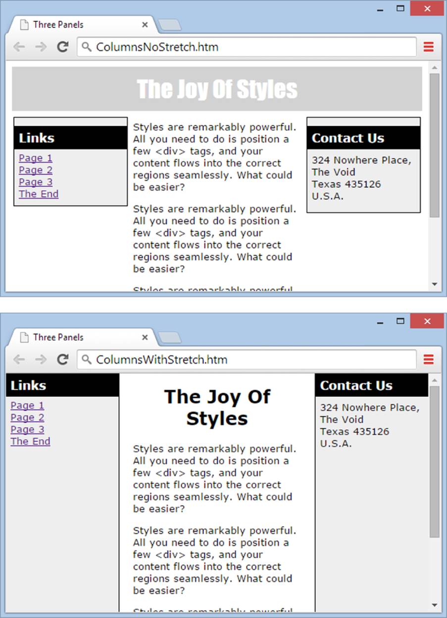
Figure 8-10. Top: This three-panel layout includes a few refinements, like fine-tuned borders, fonts, and background colors. Bottom: A variation of the same design sets the height of the side panels to 100 percent, so they always fill up a browser window.
It’s important to note that this example includes a slight change to the position property. Before, you set it to absolute, which placed an element on a page using absolute coordinates. A value of fixed places the element using absolute coordinates, too, but it positions the element relative to the viewport—that’s the window of content your browser displays on a single screen. In many cases, absolute and fixed have the same effect, but in this situation the distinction is important. That’s because you want to size the panels relative to the size of the browser window, not relative to the size of the entire web page. If you use absolute positioning, the side panels might grow larger than necessary, forcing the browser to show scroll bars.
Sticky Headers
Fixed positioning is also the kernel of another neat trick: sticky headers. A sticky header is a bar that sticks to the top of the window and stays there, even when you scroll down. Usually, the point of a sticky header is to keep a small set of navigation links or buttons handy even as guests move through a lengthy page. The fanciest sticky headers incorporate JavaScript code that shrinks the header to just the essentials (like navigation buttons) and keeps it at the top of the screen as guests scroll down. It’s particularly common on blogs and news sites (see the news and gossip sitewww.salon.com for an example).
To create a sticky header, you add two <div> elements, one for the header, and one for everything else. Here’s the basic arrangement:
<body>
<div class="Header">
<h1>The Joy Of Styles</h1>
<p>A sticky header for <i>Creating a Website: The Missing Manual</i></p>
</div>
<div class="BodyContainer">
...
</div>
</body>
For the header, set the position property to fixed, the top property to 0 (to put the header at the top of the page), and the width property to 100% (so the bar stretches from side to side). You must also set the background property to give the bar a background color, so the rest of your content won’t show through the bar when a visitor scrolls the page. You can also optionally add a border to separate the header from the rest of the page.
.Header {
position: fixed;
top: 0px;
width: 100%;
background: #6F4D8F;
color: white;
border-bottom: 3px solid #351456;
padding: 15px 15px 0px 15px;
}
For the <div> that holds the content underneath, you simply need to set the margin-top property to the approximate height of the header. That way your content won’t bump into the header.
.BodyContainer {
margin-top: 80px;
padding: 20px 70px;
}
You put the rest of your layout inside the second <div>. You can even use one of the multicolumn layouts you just studied. Figure 8-11 shows a sticky header in action.
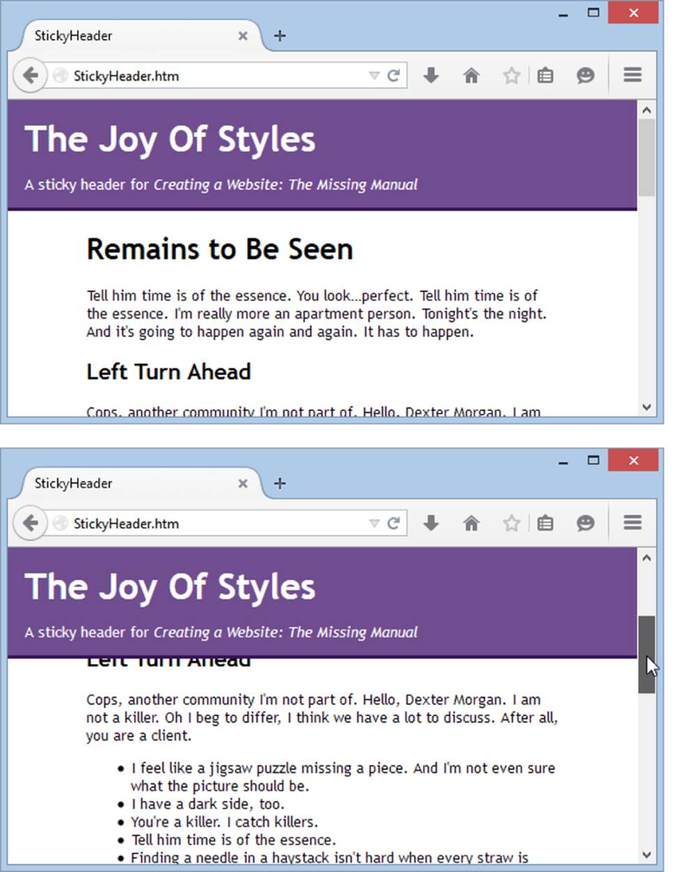
Figure 8-11. At first glance (top), this looks like any ordinary page with a header at the top. But when you scroll down, the content moves but the header floats above it, locked in place at the top of the browser window (bottom).
You can use the same approach to create a sticky footer that’s locked to the bottom of the browser window. In this case, you set the bottom property instead of the top property, because you want to position the footer relative to the bottom edge of the browser window.
Layered Elements
Remember how you need to position elements carefully when you use absolute positioning to make sure you don’t overlap one element with another? Interestingly, advanced web pages sometimes deliberately overlap elements to create dramatic effects. For example, you might create a logo by overlapping two words or create a heading by partially overlapping a picture. These designs use overlapping layers.
To use overlapping layers, you need to tell your browser which element goes on top. You do this through a simple number called the z-index. Browsers put elements with a high z-index in front of elements with a lower one.
For example, here are two elements positioned absolutely so that they overlap:
.Back {
z-index: 0;
position: absolute;
top: 10px;
left: 10px;
width: 150px;
height: 100px;
background-color: orange;
border-style: dotted;
border-width: 1px;
}
.Front {
z-index: 1;
position: absolute;
top: 50px;
left: 50px;
width: 230px;
height: 180px;
font: xx-large;
border-style: dotted;
border-width: 1px;
}
The first class (Back) defines an orange background square. The second class (Front) defines a large font for text. You set the z-index property of both elements so that the browser superimposes the Front box (which has a z-index of 1) over the Back box (which has a z-index of 0). In the example above, the HTML adds a dotted border around both elements to make it easier to see how the boxes overlap on a page.
NOTE
The actual value for the z-index isn’t important, but the relative value—how one z-index value compares to others—is. For example, if you have two elements with z-index settings of 48 and 100, you’ll get the same effect as two elements with values of 0 and 1: The second element overlaps the first. If two or more elements have the same z-index value, the one that’s first in the HTML gets shoved underneath those that come later.
In your HTML, you need to create both boxes using <div> elements. It also makes sense to supply some text for the Front box:
<div class="Back">
</div>
<div class="Front">
This text is on top.
</div>
Load this page in a browser and you’ll see a block of text that stretches over part of the orange box and out into empty space (see Figure 8-12, left).
You can swap the z-index values to change the example (Figure 8-12, right):
.Back {
z-index: 1;
...
}
.Front {
z-index: 0;
...
}
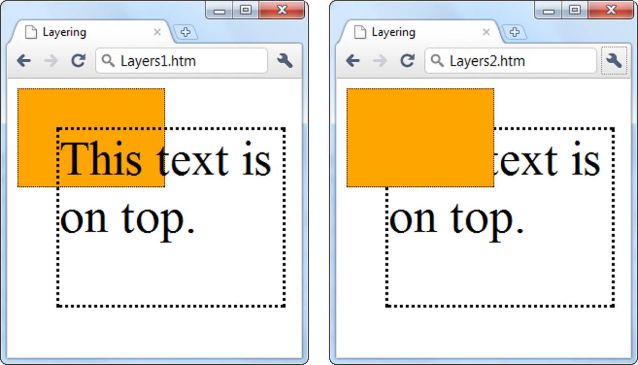
Figure 8-12. Left: The colored box has the lower z-index. Right: Now the colored box has the higher z-index and obscures the text.
Combining Absolute and Relative Positioning
Style sheet experts know that they don’t need to stick to just absolute or relative positioning. They can get the best of both worlds with a little careful planning.
To understand how this works, you need to know the following style-sheet secret: When you use absolute positioning, your browser interprets the coordinates relative to the container. As you saw in several examples earlier, when you put a <div> element in the <body> section of a page, your browser positions that element in relation to the page. Set the <div> element’s left coordinate to 10 pixels, and your browser positions the element 10 pixels from the left edge of the page. But here’s a nifty experiment: Try placing the same <div> element inside another element, like a table cell. Now your browser positions the <div> element 10 pixels from the left edge of the table cell, no matter where you place that table cell on the page. It’s as if the <div> element exists in its own private world—and that’s the world of the container that it lives in, not in the world of the main page.
So how can you use this understanding to your advantage? One technique is to use absolute positioning to create a special effect, like text superimposed on a photo. To try this out, create a page with several <div> elements. But don’t use absolute positioning—instead, let these <div>elements fit themselves into the page one after the other, the normal web way. In the first and last <div> elements, add ordinary content (text, pictures, and whatever else you like). But in the middle <div>, let loose with absolute positioning.
Figure 8-13 shows an example. Here, the first <div> element holds an ordinary paragraph, as does the third <div> element. But the middle <div> element uses absolute positioning to add white text over the picture of a tombstone.
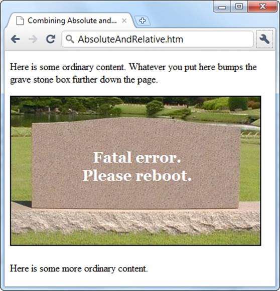
Figure 8-13. On this page, the middle section uses absolute positioning to place text over a picture. The neat part is that the rest of the page is perfectly normal, and even if you shrink the browser window, thereby bumping the picture down the page, the text and picture stay locked together.
Here’s the content of the page:
<div>
<p>Here is some ordinary content. Whatever you put here
bumps the grave stone box further down the page.</p>
</div>
<div class="GraveContainer">
<img alt="Tombstone" src="tombstone.jpg" />
<p class="GraveText">Fatal error.<br />Please reboot.</p>
</div>
<div>
<p>Here is some more ordinary content.</p>
</div>
The middle <div> element uses two rules to apply all the style properties this example needs. The GraveText rule turns on the absolute positioning:
p.GraveText {
position: absolute;
top: 60px;
left: 115px;
color: white;
font-size: x-large;
font-weight: bold;
text-align: center;
}
And the GraveContainer rule sizes the <div> element. Ordinarily, a <div> element enlarges itself to fit its contents. But when you use absolute positioning, the <div> element no longer knows how big it should be, and it shrinks itself down to nothing. Here’s the rule that gives the <div>element the correct height and ensures that the subsequent content on the page (the third <div> element, with the final paragraph in it) appears in the correct place:
div.GraveContainer {
position: relative;
height: 250px;
}
You’ll notice that the GraveContainer rule uses relative positioning. This allows it to fit into the flow of your web page, without any hassle.
As a general rule, use relative positioning to make sure a page’s layout is as flexible and adaptable as possible. But as you see in this example, it’s perfectly reasonable to use a <div> element and absolute positioning to style smaller regions—in fact, doing so gives you the chance to add some nifty effects.
Sizing Tables
The time when tables were used to shape the layout of a page is distant history. However, tables still play a role in web pages as an easy way to show grids of information (like the population statistics in Figure 8-14).
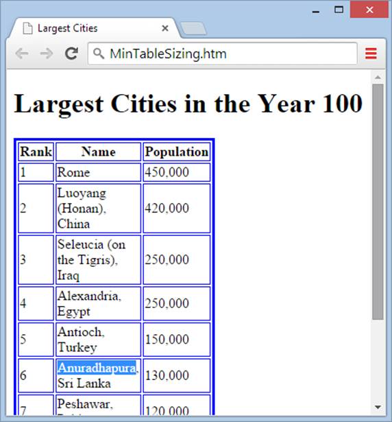
Figure 8-14. In this example, the style sheet calls for a table width of 1 pixel. But the browser doesn’t shrink the table down that far because the content influences the table’s minimum size. The city name Anuradhapura is the longest unsplittable value, so the browser uses that name to determine the width of the column. If you really want to ratchet the size down another notch, try shrinking the text by applying a smaller font size.
Ordinarily, HTML makes a table as wide as necessary to display all its columns, and each column grows just wide enough to fit the longest line of text (or to accommodate other content, like a picture). However, there’s one additional rule: The table can’t grow wider than the browser window. Once a table reaches the full width of the current window, the browser starts wrapping the text inside each column, so that the table grows taller as you pile in more content.
Of course, there are some circumstances when you need to take control of table sizing. For example, you might want to give more space to one column than another. In such a situation, you use the same width and height properties you used to size <div> elements when you organized a page into columns (see Tutorial: Creating a Layout with Multiple Columns).
Sizing an Entire Table
In most cases, you want to explicitly set the width of your table and its individual columns. When you do, the table respects those dimensions and wraps text to accommodate those widths.
When sizing a table, you can use a pixel width or a percentage width. For example, the following rule limits the table to half the width of its current container (which, in an ordinary page, makes it half the width of the page):
table.Cities {
width: 50%;
}
To display the table, you cite the table class in your HTML document:
<table class="Cities">
...
</table>
The table dynamically resizes as you resize the browser window so it keeps to its half-window width.
If you use exact pixel widths, the table dimensions never change. For example, the following rule creates a table that’s a generous 500 pixels wide:
table.Cities {
width: 500px;
}
There’s one important caveat to table sizing: Although you can make a table as large as you want (even if it stretches beyond the borders of a browser window if you used absolute sizing), you don’t have the same ability to shrink a table. If you specify a table size that’s smaller than the minimum size the table needs to display your content, the table ignores your settings and appears at this minimum size (see Figure 8-14).
Sizing a Column
Now that you know how to size a table, you probably want to know what your browser does if a table has more than enough space for its content. Once a table reaches its minimum size (just large enough to fit all its content), your browser distributes any extra space proportionately, so that every column increases in width by the same amount.
Of course, this isn’t necessarily what you want. You might want a wide descriptive column paired with a narrow column of densely packed text. Or you might want to set columns to a specific size so that all your pages look uniform, even if the content differs.
To set a column’s size, you use the width property in conjunction with the <td> and <th> elements. Once again, you can do this proportionately, using a percentage, or exactly, using a pixel width. However, proportional sizing has a slightly different effect when you use it with columns. Earlier, when you used a percentage value for table width, you sized the entire table relative to the width of the page. In that example, you had a table width of 50 percent, which means the table occupied 50 percent of the full width of the page. But when you use a percentage value to set acolumn width, you’re defining the percentage of the table width that the column should occupy. So when you set a column width of 50%, the column takes up 50 percent of the table.
When you specify the width for columns, you need to create a style rule and unique class name for each one, unless you want them all to have exactly the same width.
The following style rules set different widths for each column in the table you saw in Figure 8-14.
th.Rank {
width: 10%;
}
th.Name {
width: 80%;
}
th.Population {
width: 10%;
}
In this example, the class names match the column titles, which makes it easy to keep track of which rule applies to which column.
NOTE
When you use percentage widths for columns, you don’t need to specify values for all three columns. If you leave one out, the browser sizes that column to fill the rest of the space in the table. If you do decide to include percentage widths for each column (as in the previous example), make sure that they add up to 100 percent; otherwise, the browser will override one of your settings, and you won’t know how your table will actually appear.
For these rules to take effect, you need to apply them to the corresponding cells:
<table class="Cities">
<tr>
<th class="Rank">Rank</th>
<th class="Name">Name</th>
<th class="Population">Population</th>
</tr>
<tr>
<td>1</td>
<td>Rome</td>
<td>450,000</td>
</tr>
...
</table>
Notice that you specify widths only for the column elements in the first row (the ones that contain the cell headers in this example). You could apply the rule to every row, but there’s really no point. When the browser builds a table, it scans the whole table structure to determine the required size, based on the cell content and any explicit width settings. If you apply a different width to more than one cell in the same column, the browser simply uses the largest value.
Sizing a Row
You can size a row just as easily as you size a column. The best approach is to use the height property in the <tr> attribute, as shown here:
tr.TallRow {
height: 100px;
}
When you resize a row, you affect every cell in every column of that row. However, you’re free to make each row a different height.
TIP
Need more space inside your table? Style rules make it easy. To add more space between the cell content and its borders, increase the padding property for the <td> and <tr> elements. To add more space between the cell borders and any adjacent cells, up the margin width for the <td> and <tr> elements.
Putting the Same Content on Multiple Pages
As you start building bigger and more elaborate websites, you’ll no doubt discover one of the royal pains of website design: making a common ingredient appear on every page.
For example, you might decide to add a menu of links that lets visitors jump from one section of your site to another. You can place these links in a <div> element, and you can use a style rule to put this <div> in the correct position on your page. Add that style rule to your external style sheet, and the menu shows up in the right spot across your entire website.
But style sheets have their limits. They can’t help you put the same content in more than one page. So if you want a menu on every page, you’re stuck copying the big block of HTML that has all the links in it and pasting it into each page. If you’re not careful—say you inadvertently place the menu in a slightly different spot in a page—one page can end up with a slightly different version of the same menu. And when you decide to make a change to the menu, you face the nightmare of updating every one of your pages. Website creators who try this approach don’t get out much on the weekend.
So how do web designers create site-wide chunks of content? Big websites use content management systems or custom web applications that assemble HTML pages on the fly (see the box on Multipart Pages on Big Websites). But if you aren’t relying on one of these tools, you need a different approach.
You can choose from three potential solutions:
§ Server-side includes. A server-side include is a command that injects the contents of one HTML file inside another. This lets you create a block of HTML content (for example, a menu) and reuse it in multiple pages. However, there’s a caveat: Server-side includes aren’t part of the HTML standard. Instead, they’re an extension to HTML that work only if your web server supports them. Fortunately, almost all web servers do.
§ Seamless frames. This is a new HTML5 feature that lets you inject the contents of one page into another using the <iframe> element (<iframe> (Inline Frame)). It’s like a server-side include, except that the browser makes the magic happen, not the web server. Seamless frames sound like a great solution, but hands off for now—at present, not a single browser supports them.
§ Web templates. Some high-powered web page editors (namely, Dreamweaver and Expression Web) include a template feature. You begin by creating a template that defines the structure of your web pages and includes the repeating content you want to appear on every page (like a menu or header). Your web editor then generates the final pages. But don’t get too excited, because this technique has a few hidden deal-breakers. The most significant problem is that minor changes (like adding a link to a menu) force your editor to open, update, and upload every page in your entire site. Another serious problem is that web templates aren’t standardized in any way, which means that once you start using web templates, you’re locked in—you can’t switch to another web editor without rewriting your entire site.
The best way for the average web developer to solve the problem is with server-side includes, and you’ll learn how to do that in the next section. Seamless frames are best ignored—the feature has gotten little attention in the web world, meaning its future prospects are doubtful. Web templates may make sense for some people, if they’re developing tiny sites and don’t mind limiting their editing options in the future. You’ll find templates covered on PHP Includes.
Using Server-Side Includes
Even though you can’t write a web application on your own, you can borrow a few tricks from the web application model—if your web host supports it. The simplest example is a technology called server-side includes (SSIs), which is a scaled-down version of the HTML-assembling technique used on sites like Amazon and Expedia.
Essentially, a server-side include is an instruction that tells a web server to insert the contents of one HTML file into another. For example, imagine you want to use the same menu on several pages. You would begin by saving the menu as a separate file, which you could name menu.htm. Here are its contents:
<h1>Menu</h1>
<a href="...">Page 1</a><br />
<a href="...">Page 2</a><br />
<a href="...">Page 3</a><br />
<a href="...">The End</a>
HOW’D THEY DO THAT?: MULTIPART PAGES ON BIG WEBSITES
Popular websites don’t seem to have a problem dealing with repeating content. No matter what product you view on Amazon, for example, you see the familiar tabbed search bar at the top. No matter what vacation you check out in Expedia, you keep the same set of navigation tabs. That’s because Amazon and Expedia, like almost all of the Web’s hugest and most popular sites, are actuallyweb applications. When you request a page from one of these sites, a custom-tuned piece of software actually creates the HTML page.
For example, when you view a product on Amazon, a web application reads the product information out of a gargantuan database, transforms it into an HTML page, and tops it off with the latest version of the search bar. Your browser displays the end result as a single page. This technique lets Amazon assemble any pieces of content into a slick web page, without forcing the site designers to maintain thousands (or even millions) of HTML files. The web application approach is a bit like the server-side include approach described below (in both cases, the process involves assembling a whole page out of pieces on the web server), but it’s more elaborate.
This sort of custom web application is beyond the reach of an average person. Ordinary people can use a content-management system like WordPress (http://wordpress.org), but this involves giving up on the dream of designing everything yourself. If that doesn’t suit your vision, you need to use the techniques described in this chapter.
Notice that menu.htm isn’t a complete HTML document. It lacks elements like <html>, <head>, and <body>. That’s because menu.htm is a building block that you embed in other, full-fledged HTML pages.
Now you’re ready to use the menu in a web page. To do that, you need to add a special instruction to your page where you want the menu to appear. It looks like this:
<!--#include file="menu.htm" -->
The #include command disguises itself as an HTML comment (Where Are All the Pictures?) using the <!-- characters at the beginning of the line and the --> characters at the end. But its core tells the real story. The number sign (#) indicates that this command is actually an instruction for the web server, and the file attribute points to the file you want to use. In this case, that’s the snippet of HTML that holds the menu.
Here’s the #include command at work in a complete web page:
<!DOCTYPE html>
<html>
<head>
<title>Server-Side Include Test</title>
<link rel="stylesheet" href="styles.css" />
</head>
<body>
<div class="Header">
<h1>Templates Rule!</h1>
</div>
<div class="MenuPanel">
<!--#include file="menu.htm" -->
</div>
<div class="Content">
<p>This is the welcome page. Just above this text is the handy menu
for this site.</p>
</div>
</body>
</html>
When you request this page, the web server scans through it, looking for instructions. When it finds the #include command, it retrieves the specified file and inserts its contents into that position on the page. It then sends the final, processed file to you. In the current example, that means your web browser receives a web page that actually looks like this:
<!DOCTYPE html>
<html>
<head>
<title>Server-Side Include Test</title>
<link rel="stylesheet" href="styles.css" />
</head>
<body>
<div class="Header">
<h1>Welcome to a Multipart Page</h1>
</div>
<div class="MenuPanel">
<h1>Menu</h1>
<a href="...">Page 1</a><br />
<a href="...">Page 2</a><br />
<a href="...">Page 3</a><br />
<a href="...">The End</a>
</div>
<div class="ContentPanel">
<p>This is the welcome page. Just to the left of this text is the
handy menu for this site.</p>
</div>
</body>
</html>
Figure 8-15 shows the final page as it appears in your browser.
The advantage to this technique is obvious. You can add the #include command to as many pages as you want and still keep just one copy of your menu. That lets you edit your menu easily and ensures that all your pages will have the same version of it.
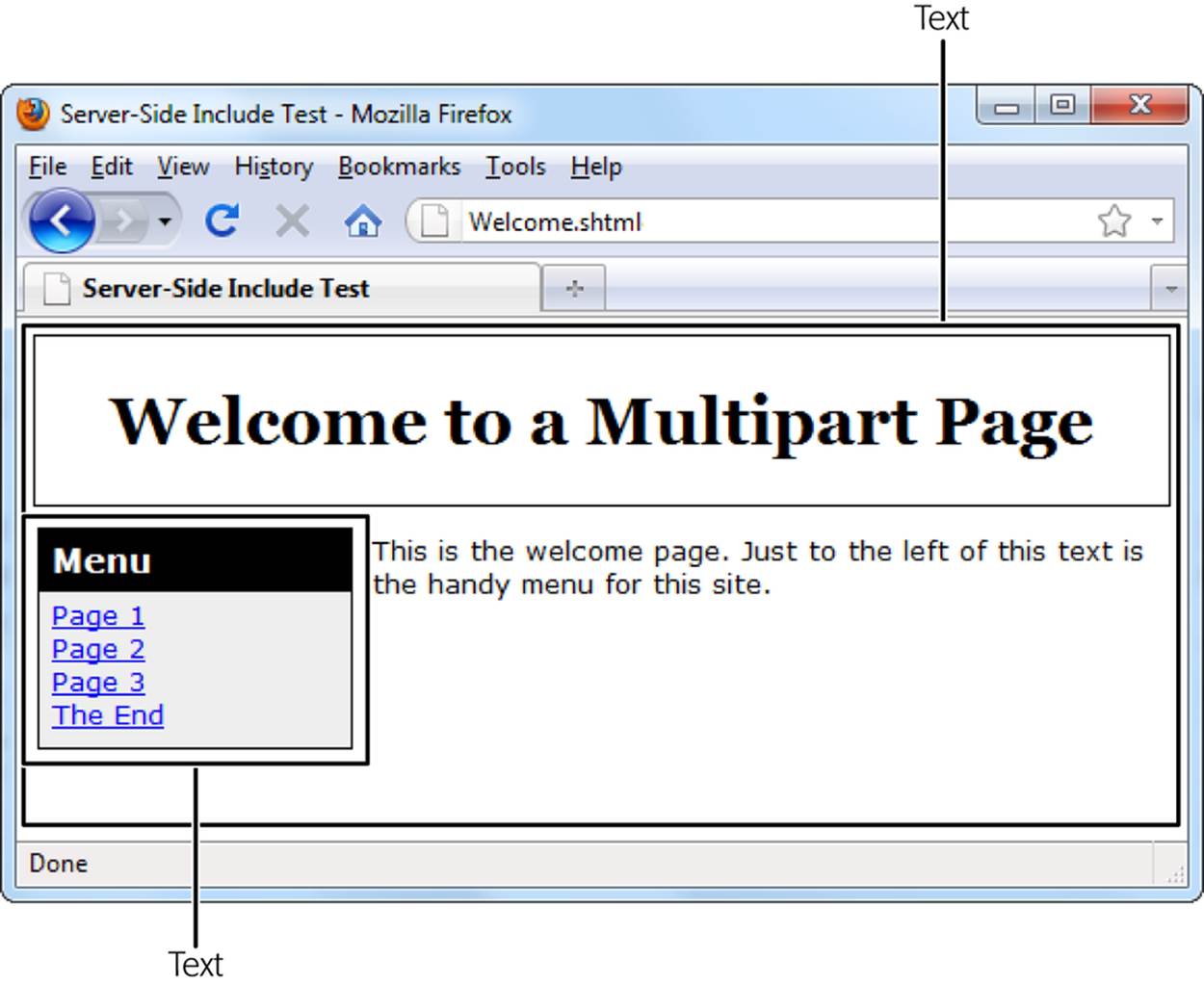
Figure 8-15. Although this page looks normal enough, it takes some magic to make it happen. Just before the web server sends this page to your browser, it reads the menu links from a separate file and inserts them into the page.
If this discussion sounds a bit too good to be true—well, it is. You may face a number of complications:
§ Web server support. Not all web servers support server-side includes. To get the lowdown, contact your web hosting company.
§ Page types. For a server-side include to work, the web server has to process your page and scan for server-side includes. This process happens automatically, but only if you use the right page type. Usually, you need to use the extension .shtml instead of .htm or .html, but you’ll need to check with your web hosting company.
NOTE
Don’t worry about changing the extension of your pages. The HTML markup inside them will continue to work exactly the same as it did before.
§ Design difficulties. Server-side includes come into effect only when there’s a web server at work. If you open a web page stored on your hard drive, your browser ignores the Include instruction, and you won’t see the menu at all. That makes it difficult to test your site without uploading it to a live web server. Dreamweaver gives you partial relief—if you open a web page that uses server-side includes, you’ll see the contents of the included files in Dreamweaver’s design window while you edit the page.
If you know that your web host supports server-side includes and you aren’t fazed by the design difficulties, why not give them a whirl?
PHP Includes
Server-side includes are nearly as old as the Web itself. These days, web weavers more commonly use the include command in PHP, which is a popular server-side programming language. The PHP include command works in almost exactly the same way as the #include command you saw in the previous section, but it looks like this:
<?php include "menu.htm"; ?>
Here, the <?php tag designates the start of a PHP script block, and the ?> marks the ending. Inside the block, you put as many lines of PHP as you want. In this case, the script block has just a single line, which injects the contents of the menu.htm file into the page.
There’s one more difference with the PHP include command. As you just learned, pages that use includes need a different file extension than the ordinary .htm or .html. If you use server-side includes, you probably need the extension .shtml. If you use PHP includes, you definitely need the extension .php (as in Welcome.php). But don’t worry: if you rename a page to reflect a newly added PHP include command, you can still keep editing it in your favorite web editor and keep viewing it in your favorite browser.
At this point, you’re probably wondering, “If server-side includes and PHP includes are almost identical, why would you prefer one over the other?” The reason is that PHP is commonly used for all sorts of programming tasks, like validating forms and reading from giant databases of information. So if there’s a chance your site might use PHP, you may as well use PHP’s include command. And if you aren’t using PHP—which describes you, as a beginning website builder—there’s no harm in getting yourself ready for the future.
NOTE
If the .php extension really bothers you, it’s possible to change the configuration on your web server so that it checks all your HTML pages for PHP code. That way, you can use the include command in ordinary .html or .htm files. Making this change is usually as simple as adding a single line to a configuration file on your website (see http://tinyurl.com/php-in-html). However, this is one configuration task you don’t want to mess up, so talk to your web host first.
Web Templates
So far, you’ve seen how you can put the same content on a whole batch of pages using server-side includes. This approach is great—if you don’t mind the design challenges. After all, the alternative (making a separate copy of the repeated content on each page) is a surefire way to fry the last few neurons of your overworked brain.
However, web designers who own Adobe Dreamweaver have one more option: They can create a web template that sets out the structure of their site pages, and then reuse that template relentlessly. The technique is similar to server-side includes, but instead of having a web server do the work, you give the task to your web page editing program (Figure 8-16).
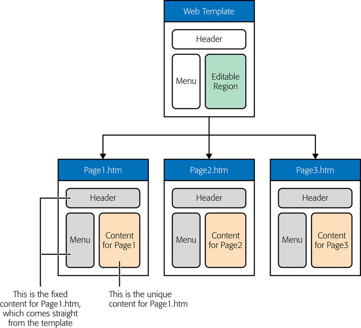
Figure 8-16. A web template holds the content you want to appear on every page in your site. (Here, that’s a header and a menu.) You then use your template to build all your web pages. Best of all, if you change your template, Dreamweaver updates your pages to reflect that change.
Before you get started with templates, it’s time to face a few drawbacks:
§ More time. Every time you change a template, your web design tool needs to update all the pages that use the template. For this reason, web templates aren’t a great idea for huge websites, because the updating process takes too long.
§ More fragile. As you’ll see, the template system is based on a few secret comments you bury in your HTML pages. Unfortunately, it’s all too easy to accidentally delete or move one of these comments and break the link between a page and its template. When using templates, you need to edit your pages with extra caution.
§ Nonstandard. Web templates work differently in different web editors. If you use templates to craft the perfect website in Expression Web, you can’t switch your site over to Dreamweaver (or vice versa)—at least not without a painstaking conversion process that you have to carry out by hand.
If you’re willing to put up with these shortcomings to create true multipart pages, keep reading.
NOTE
Expression Web’s template system is similar to Dreamweaver’s. But, as you learned in Chapter 5, Expression Web is nearing the end of its life, and its template system will die with it. For that reason, we don’t recommend building a site with Expression Web templates—the risk is just too great that you’ll need to switch editors and you’ll have no way to take your carefully crafted template file with you.
Creating a Web Template
To use Dreamweaver’s template system, you need to create a .dwt file, which stands for Dreamweaver Web Template. In a typical website, you create one template that standardizes your layout. Then you use that template to create all the HTML pages on your site.
To create a new, empty template in Dreamweaver, follow these steps:
1. Before getting started, make sure you define your website, as described on Defining a Dreamweaver Site.
Dreamweaver always puts templates in the Templates subfolder of your website folder. If you don’t define a website, you’ll still be able to create a template, but you won’t be able to apply it to other pages, which makes it relatively useless.
2. Choose File→New.
Dreamweaver’s New Document window appears.
3. On the left, choose Blank Page. In the Page Type list, choose HTML Template.
In the Layout list, keep the standard option (“<none>”) highlighted. You can use other layouts, but this example assumes you’re creating the entire template from scratch.
This is also a good time to pick the doctype you want from the DocType list, so you don’t need to change it by hand after you create the template.
4. Click Create.
This creates a new template, with the bare minimum of markup. In the following sections, you’ll learn how to customize the template.
After you finish perfecting your template, choose File→Save; the Save As Template dialog box opens. From the Site list, pick the defined site where you want to store the template. It starts out with a name like Untitled_1.dwt, but you can type in a better name, and then click Save to make it official. Dreamweaver stores the template in the Templates subfolder of your website folder.
You now have a brand-new web template. But right now your template is little more than a basic HTML skeleton. To turn it into something useful, you need to understand a bit more about how templates work.
Surprisingly, a web template looks a whole lot like an ordinary web page. In fact, you can edit your template in Dreamweaver in the same way you edit any other HTML file. However, there’s a difference: Any HTML markup that you put in a template becomes fixed content.
Dreamweaver uses fixed content as the basis for every page you create with the template. For example, if you pop a menu bar and a bunch of <div> elements into the template, every page gets that same menu bar and those same <div> elements. And you can modify this fixed content only in the page template itself; you can’t edit fixed content in the pages the template creates. To be able to edit any part of a page created from a template, you need to include one or more editable regions.
Adding Editable Regions to Your Template
The trick to designing a good template is to add editable regions wherever you need them, in the midst of your fixed content. Editable regions are areas where you insert each page’s unique content.
To create an editable region, Dreamweaver uses specialized comments. Although these look like ordinary HTML comments, they actually identify the editable sections of a page. These comments come in pairs, so the first one defines the start of an editable region, while the second one demarcates its end:
<!-- TemplateBeginEditable name="body" -->
...
<!-- TemplateEndEditable -->
There are two things to notice here. First, comments begin with the standard comment indicator <!-- followed by a specific command (like TemplateBeginEditable). That’s how Dreamweaver recognizes that the comment is actually a template instruction. Second, you can see that the comments give your editable region a name. In this example, the region is named “body.”
To really understand how editable regions work, you need to see them in the context of a complete example. Figure 8-17 shows a suitable candidate—a simple multipart page with a header and a menu. It closely resembles the server-side include example you saw earlier (Using Server-Side Includes).
In this example, the header and navigation bar are fixed, unchangeable elements. The editable content region is the portion that appears under the header and just to the right of the menu bar.
The most straightforward way to create an editable region is to type the magic comments into Code view on your own (Figure 8-18). Alternatively, you can choose Insert→Template Objects→Editable Region. Web designers in a hurry can press the shortcut key combination Alt+Ctrl+V.
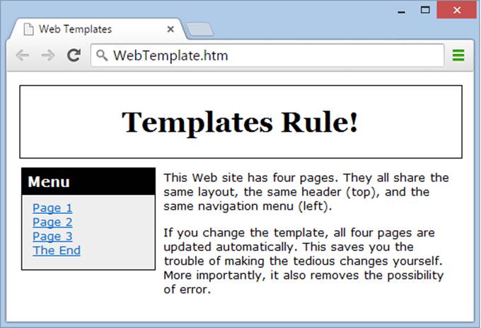
Figure 8-17. Every page on this website gets the same header and menu.
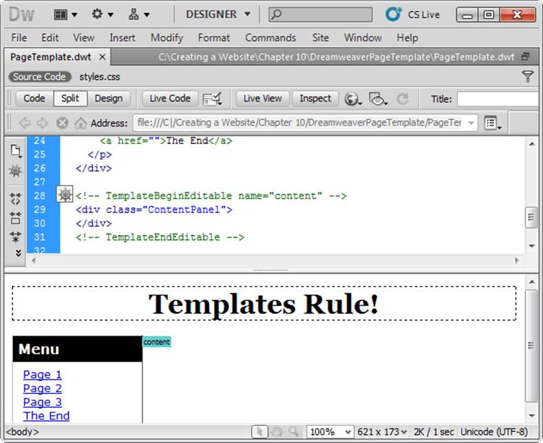
Figure 8-18. Editing a template is just like editing an ordinary web page. You can use the same Design view and the same commands. But if you look at the page in Code view, you’ll stumble across the special comments that indicate editable sections.
Here’s the finished template for the page in Figure 8-17:
<!DOCTYPE html>
<html>
<head>
<!-- TemplateBeginEditable name="title" -->
<title></title>
<!-- TemplateEndEditable -->
<link rel="stylesheet" href="styles.css" />
</head>
<body>
<div class="Header">
<h1>Templates Rule!</h1>
</div>
<div class="MenuPanel">
<h1>Menu</h1>
<p>
<a href="">Page 1</a><br />
<a href="">Page 2</a><br />
<a href="">Page 3</a><br />
<a href="">The End</a>
</p>
</div>
<!-- TemplateBeginEditable name="content" -->
<div class="ContentPanel">
</div>
<!-- TemplateEndEditable -->
</body>
</html>
Notice that this example actually creates two editable regions. One is the content that appears to the right of the menu panel, and the other is the title at the top of the browser window. Thanks to this latter detail, you can give all your pages a unique title.
You’ll also notice that both editable regions include some content (like the tags for the <title> element or a <div> element). When you create a page from this template, the editable regions always include these elements. However, you’re free to change or replace them with something completely different.
NOTE
Because templates use comments, they’re a bit fragile. Seemingly minor changes, like deleting one of the comments in a pair, changing a section name, or rearranging comments in the wrong order, can cause problems. At worst, Dreamweaver will become so confused that updating the template will erase part of your page. To avoid issues like these, always make a backup of your website before you begin editing it, especially when templates are involved.
Using Your Web Template
Once you finish your template, you’re ready to use it to create some pages. Here’s how it goes down:
1. Choose File→New.
Dreamweaver’s New Document window opens.
2. On the left of the New Document window, choose “Page from Template.” Then, in the Site list, choose your website.
You’ll see all the templates in your website’s Templates folder listed.
3. Select the template you want, and then click Create.
You’ll see the markup for both fixed and editable content in your new page. You won’t be able to change the fixed content, which comes directly from the template. Dreamweaver displays the fixed content in light gray to remind you that it’s off limits.
Make sure you keep the “Update page when template changes” checkbox selected. This way, when you change your template, Dreamweaver updates all the pages that use it.
To create the page shown in Figure 8-17, you simply add a title and a couple of paragraphs of text in the editable content region. Here’s the finished page in Dreamweaver:
<!DOCTYPE html>
<html>
<!-- InstanceBegin template="/Templates/PageTemplate.dwt"
codeOutsideHTMLIsLocked="false" -->
<head>
<!-- InstanceBeginEditable name="title" -->
<title>Web Templates</title>
<!-- InstanceEndEditable -->
<link rel="stylesheet" href="styles.css" />
</head>
<body>
<div class="Header">
<h1>Templates Rule!</h1>
</div>
<div class="MenuPanel">
<h1>Menu</h1>
<p>
<a href="">Page 1</a><br />
<a href="">Page 2</a><br />
<a href="">Page 3</a><br />
<a href="">The End</a>
</p>
</div>
<!-- InstanceBeginEditable name="content" -->
<div class="ContentPanel">
<p> This website has four pages. They all share the same layout,
the same header (top), and the same navigation menu (left).</p>
...
</div>
<!-- InstanceEndEditable -->
</body>
<!-- InstanceEnd --></html>
When you use a template to build a page in Dreamweaver, the new page’s comments are slightly different from those in the original page. For example, Dreamweaver replaces the TemplateBeginEditable instruction with an InstanceBeginEditable command.
NOTE
When it’s time to upload your website to a server, remember that you want to upload your web pages, not your templates. The templates are for your design convenience, and you use them only on your computer.
This example shows just a single page. You see the real advantages of a template when you create dozens of pages based on it. In every case, to create a new page, you need do nothing more than set a title and add a bit of content.
But you’ll see the biggest benefit when you change the original template. For example, imagine you modify the template to use a spiffy new graphic for its header:
<div class="Header">
<img src="TemplatesRule.jpeg" alt="Templates Rule!" />
</div>
Once you save your changes, your web page editor asks if you want to apply those changes to all the linked pages in the current website. Say Yes, and the editor quickly and quietly opens all the pages that use the template and updates them with the new content. The result is an instant face-lift for your site (see Figure 8-19).
NOTE
Although this chapter gives you a basic introduction to the template system, you may need to consider other subtleties. For example, you may make changes to a template so dramatic that the edited template becomes incompatible with the pages that currently use it. Or you might want to rewire an existing page to use a different template. To learn about the finer points of web templates, consult a dedicated Dreamweaver resource, such as Dreamweaver CC: The Missing Manual (O’Reilly).
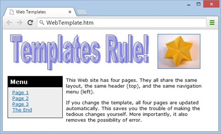
Figure 8-19. This header graphic really makes your web pages stand out. But the best part is that you never cracked open Page1.htm to add this graphic. Instead, your web page editor did the updating for you.