Excel® 2016 Formulas and Functions (2016)
Part III: Building Business Models
16. Using Regression to Track Trends and Make Forecasts
In This Chapter
Choosing a Regression Method
Using Simple Regression on Linear Data
Using Simple Regression on Nonlinear Data
Using Multiple Regression Analysis
In these complex and uncertain times, forecasting business performance is increasingly important. Today, more than ever before, managers at all levels need to make intelligent predictions of future sales and profit trends as part of their overall business strategy. By forecasting sales six months, a year, or even three years down the road, managers can anticipate related needs such as employee acquisitions, warehouse space, and raw material requirements. Similarly, a profit forecast enables a company to plan for its future expansion.
Business forecasting has been around for many years, and various methods have been developed—some of them more successful than others. The most common forecasting method is the qualitative “seat of the pants” approach, in which a manager (or a group of managers) estimates future trends based on experience and knowledge of the market. This method, however, suffers from an inherent subjectivity and a short-term focus because many managers tend to extrapolate from recent experience and ignore the long-term trend. Other methods (such as averaging past results) are more objective but generally are useful for forecasting only a few months in advance.
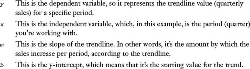
This chapter presents a technique called regression analysis. Regression is a powerful statistical procedure that has become a popular business tool. In its general form, you use regression analysis to determine the relationship between one phenomenon and another. For example, car sales might be dependent on interest rates, and units sold might be dependent on the amount spent on advertising. The dependent phenomenon is called the dependent variable, or the y-value, and the phenomenon upon which it’s dependent is called the independent variable, or the x-value. (Think of a chart or graph on which the independent variable is plotted along the horizontal [x] axis and the dependent variable is plotted along the vertical [y] axis.)
Given these variables, you can do two things with regression analysis:
![]() Determine the relationship between the known x- and y-values and use the results to calculate and visualize the overall trend of the data.
Determine the relationship between the known x- and y-values and use the results to calculate and visualize the overall trend of the data.
![]() Use the existing trend to forecast new y-values.
Use the existing trend to forecast new y-values.
As you’ll see in this chapter, Excel is well stocked with tools that enable you to both calculate the current trend and make forecasts no matter what type of data you’re dealing with.
Choosing a Regression Method
Three methods of regression analysis are used most often in business:
![]() Simple regression—Use this type of regression when you’re dealing with only one independent variable. For example, if the dependent variable is car sales, the independent variable might be interest rates. You also need to decide whether your data is linear or nonlinear:
Simple regression—Use this type of regression when you’re dealing with only one independent variable. For example, if the dependent variable is car sales, the independent variable might be interest rates. You also need to decide whether your data is linear or nonlinear:
• Linear means that if you plot the data on a chart, the resulting data points resemble (roughly) a line.
• Nonlinear means that if you plot the data on a chart, the resulting data points form a curve.
![]() Polynomial regression—Use this type of regression when you’re dealing with only one independent variable, but the data fluctuates in such a way that the pattern in the data doesn’t resemble either a straight line or a simple curve.
Polynomial regression—Use this type of regression when you’re dealing with only one independent variable, but the data fluctuates in such a way that the pattern in the data doesn’t resemble either a straight line or a simple curve.
![]() Multiple regression—Use this type of regression when you’re dealing with more than one independent variable. For example, if the dependent variable is car sales, the independent variables might be interest rates and disposable income.
Multiple regression—Use this type of regression when you’re dealing with more than one independent variable. For example, if the dependent variable is car sales, the independent variables might be interest rates and disposable income.
You’ll learn about all three methods in this chapter.
Using Simple Regression on Linear Data
With linear data, the dependent variable is related to the independent variable by some constant factor. For example, you might find that car sales (the dependent variable) increase by 1 million units whenever interest rates (the independent variable) decrease by 1%. Similarly, you might find that division revenue (the dependent variable) increases by $100,000 for every $10,000 you spend on advertising (the independent variable).
Analyzing Trends Using Best-Fit Lines
You make these sorts of determinations by examining the trend underlying the current data you have for the dependent variable. In linear regression, you analyze the current trend by calculating the line of best fit, or the trendline. This is a line through the data points for which the differences between the points above and below the line cancel each other out (more or less).
Note
Excel 2016 includes a new tool called Forecast Sheet that simplifies many of the tasks and calculations that I present in this chapter. To use it, select your data, click the Data tab, and then click Forecast Sheet. This opens the Create Forecast Worksheet dialog box, which shows a basic best-fit trendline. You can click Options and change the default settings to gain a bit more control over the result. Click Create to add the new forecasting worksheet.
Plotting a Best-Fit Trendline
The easiest way to see the best-fit line is to use a chart. Note, however, that this works only if your data is plotted using an XY (scatter) chart. For example, Figure 16.1 shows a worksheet with quarterly sales figures plotted on an XY chart. Here, the quarterly sales data is the dependent variable and the period is the independent variable. (In this example, the independent variable is just time, represented, in this case, by fiscal quarters.) You can add a trendline through the plotted points.
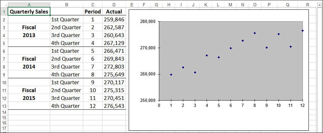
Figure 16.1 To see a trendline through your data, first make sure the data is plotted using an XY chart.
Note
You can download this chapter’s sample workbooks at www.mcfedries.com/books/book.php?title=excel-2016-formulas-and-functions.
The following steps show you how to add a trendline to a chart:
1. Select the chart and, if more than one data series are plotted, click the series you want to work with.
2. Select Design, Add Chart Element, Trendline, More Trendline Options. Excel displays the Format Trendline task pane, shown in Figure 16.2.
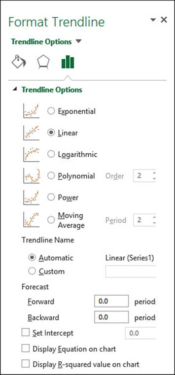
Figure 16.2 In the Format Trendline task pane, use the Trendline Options tab to select the type of trendline you want to see.
3. On the Trendline Options tab, click Linear.
4. Select the Display Equation on Chart check box. (See the next section, “Understanding the Regression Equation.”)
5. Select the Display R-Squared Value on Chart check box. (See “Understanding R2,” later in this chapter.)
6. Click Close (X). Excel inserts the trendline. Note that you might need to drag the regression equation text box away from the trendline to read the values.
Figure 16.3 shows the best-fit trendline added to the chart.
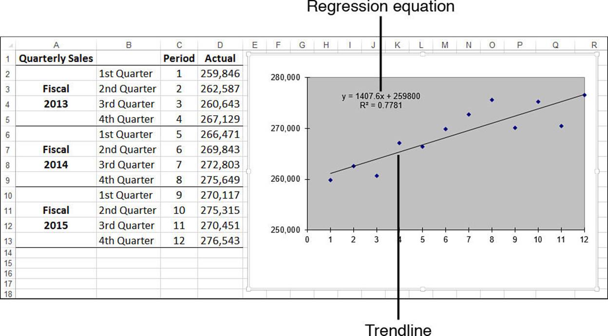
Figure 16.3 The quarterly sales chart with a best-fit trendline added.
Understanding the Regression Equation
In the steps outlined in the previous section, I instructed you to select the Display Equation on Chart check box. Doing this displays the regression equation on the chart, as pointed out in Figure 16.3. This equation is crucial to regression analysis because it gives you a specific formula for the relationship between the dependent variable and the independent variable.
For linear regression, the best-fit trendline is a straight line with an equation that takes the following form:
y = mx + b
Here’s how you can interpret this equation with respect to the quarterly sales data:
Here’s the regression equation for the example (refer to Figure 16.3):
y = 1407.6x + 259800
To determine the first point on the trendline, substitute 1 for x:
y = 1407.6 * 1 + 259800
The result is 261,207.6.
Caution
It’s important not to view the trendline values as somehow trying to predict or estimate the actual y-values (sales). The trendline simply gives you an overall picture of how the y-values change when the x-values change.
Understanding R2
When you click the Display R-Squared Value on Chart check box when adding a trendline, Excel places the following on the chart:
R2 = n
Here, n is called the coefficient of determination (which statisticians abbreviate as r2 and Excel abbreviates as R2). This is actually the square of the correlation; as you learned in Chapter 12, “Working with Statistical Functions,” the correlation tells you something about how well two things are related to each other. In this context, R2 gives you some idea of how well the trendline fits the data. Roughly, it tells you the proportion of the variance in the dependent variable that is associated with the independent variable. Generally, the closer the result is to 1, the better the fit. Values below about 0.7 mean that the trendline is not a very good fit for the data.
![]() To learn more about correlation, see “Determining the Correlation Between Data,” p. 280.
To learn more about correlation, see “Determining the Correlation Between Data,” p. 280.
Tip
If you don’t get a good fit with a linear trendline, your data might not be linear. Try using a different trendline type to see if you can increase the value of R2.
You’ll see in the next section that it’s possible to calculate values for the best-fit trendline. Having those values enables you to calculate the correlation between the known y-values and the generated trend values by using the CORREL() function:
CORREL(array1, array2)
Here, array1 is a range reference to the dependent variable values that you know (such as the sales figures in D2:D13 in Figure 16.3), and array2 is a range or an array containing the calculated trend points. Note that squaring the CORREL() result gives you the value of R2.
Calculating Best-Fit Values Using TREND()
The problem with using a chart best-fit trendline is that you don’t get actual values to work with. If you want to get some values on the worksheet, you can calculate individual trendline values using the regression equation. However, what if the underlying data changes? For example, those values might be estimates, or they might change as more accurate data comes in. In that case, you need to delete the existing trendline, add a new one, and then recalculate the trend values based on the new equation.
If you need to work with worksheet trend values, you can avoid having to perform repeated trendline analyses by calculating the values using Excel’s TREND() function:
TREND(known_y's[, known_x's][, new_x's][, const])
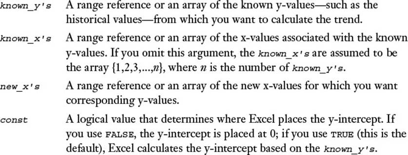
To generate the best-fit trend values, you need to specify the known_y’s argument and, optionally, the known_x’s argument. In the quarterly sales example, the known y-values are the actual sales numbers, which lie in the range D2:D13. The known x-values are the period numbers in the range C2:C13. Therefore, to calculate the best-fit trend values, you select a range that is the same size as the known values and enter the following formula as an array:
{=TREND(D2:D13, C2:C13)}
Figure 16.4 shows the results of this TREND() array formula in column F. For comparison purposes, the sheet also includes the trend values (in column E) generated using the regression equation from the chart trendline shown in Figure 16.3. (Note that some of the values are slightly off. That’s because the values for the slope and intercept shown in the regression equation have been rounded off for display in the chart.)
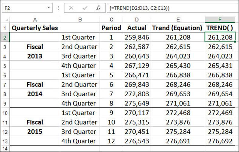
Figure 16.4 Best-fit trend values (F2:F13) created with the TREND() function.
Tip
In the previous section, I mentioned that you can determine the correlation between the known dependent values and the calculated trend values by using the CORREL() function. Here’s an array formula that provides a shorthand method for returning the correlation:
{=CORREL(array1, TREND(known_y's, known_x's))}
Calculating Best-Fit Values Using LINEST()
Using TREND() is the most direct way to calculate trend values, but Excel offers a second method that calculates the trendline’s slope and y-intercept. You can then plug these values into the general linear regression equation—y = mx + b—as m and b, respectively. You calculate the slope and y-intercept by using the LINEST() function:
LINEST(known_y's[, known_x's][, const][, stats])
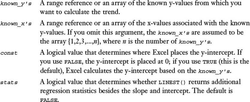
When you use LINEST() without the stats argument, the function returns a 1×2 array, where the value in the first column is the slope of the trendline and the value in the second column is the intercept. For example, the following formula, entered as a 1×2 array, returns the slope and intercept of the quarterly sales trendline:
{=LINEST(D2:D13, C2:C13)}
In Figure 16.5, the returned array values are shown in cells H2 and I2. This worksheet also uses these values to compute the trendline values by substituting $H$2 for m and $I$2 for b in the linear regression equation. For example, the following formula calculates the trend value for period 1:
=$H$2 * C2 + $I$2
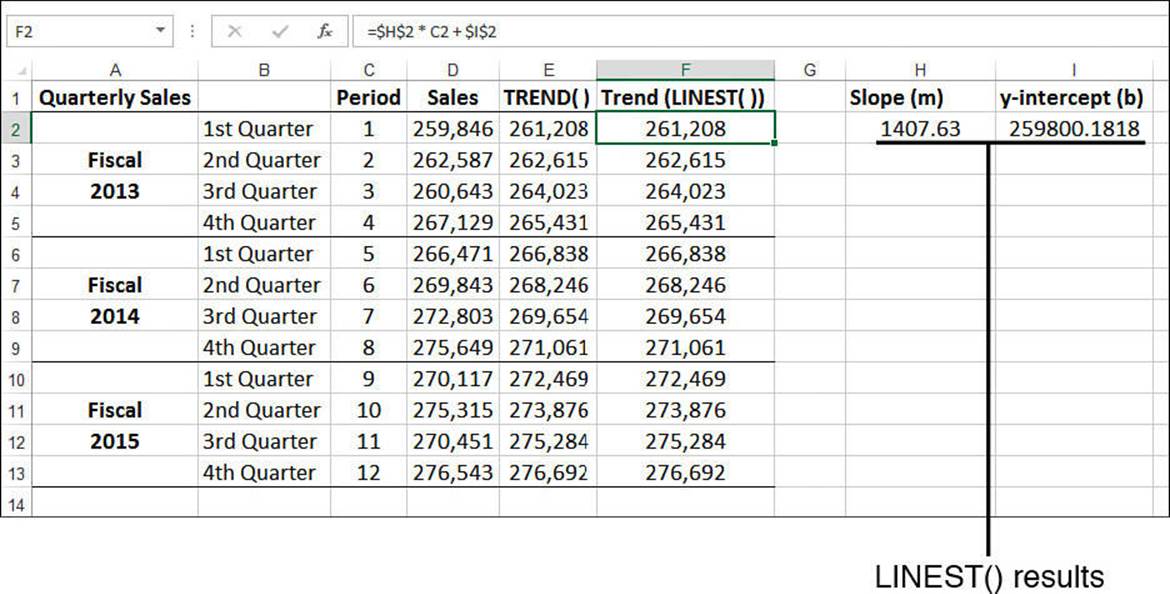
Figure 16.5 Best-fit trend values (F2:F13) created with the results of the LINEST() function (H2:I2) plugged into the linear regression equation.
If you set the stats argument to TRUE, the LINEST() function returns 10 regression statistics in a 5×2 array. The returned statistics are listed in Table 16.1, and Figure 16.6 shows an example of the returned array.
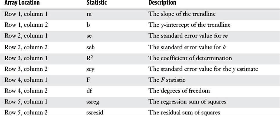
Table 16.1 Regression Statistics Returned by LINEST() When the stats Argument Is Set to TRUE
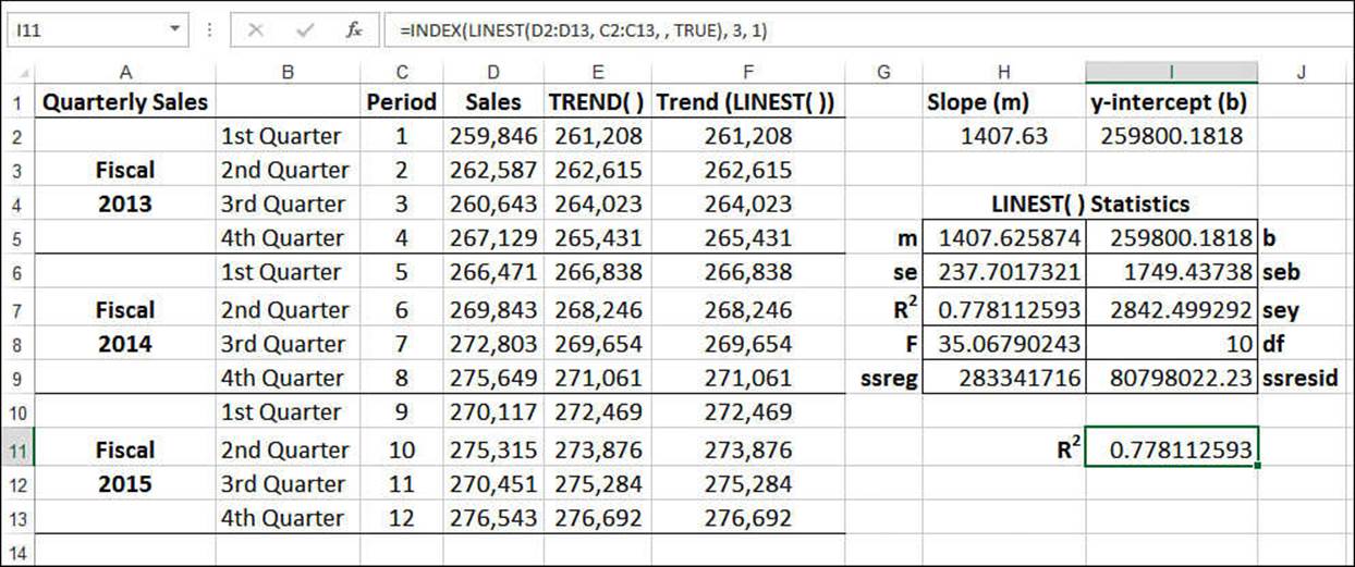
Figure 16.6 The range H5:I9 contains the array of regression statistics returned by LINEST() when its stats argument is set to TRUE.
Note
These and other regression statistics are available via the Analysis ToolPak’s Regression tool. Assuming that the Analysis ToolPak add-in is installed (see “Loading the Analysis ToolPak” in Chapter 6, “Understanding Functions”), select Data, Data Analysis, click Regression, and then click OK. Use the Regression dialog box to specify the ranges for the y-values and x-values and to select which statistics you want to see in the output.
Most of these values are beyond the scope of this book. However, notice that one of the returned values is R2, the coefficient of determination, which tells how well the trendline fits the data. If you want just this value from the LINEST() array, use this formula (see cell I11 in Figure 16.6):
=INDEX(LINEST(known_y's, known_x's, , TRUE), 3, 1)
Note
You can also calculate the slope, intercept, and R2 value directly by using the following functions:
SLOPE(known_y's, known_x's)
INTERCEPT(known_y's, known_x's)
RSQ(known_y's, known_x's)
The syntax for these functions is the same as that of the first two arguments of the TREND() function, except that the known_x’s argument is required. Here’s an example:
=RSQ(D2:D13, C2:C13)
Analyzing the Sales Versus Advertising Trend
We tend to think of trend analysis as having a time component. That is, when we think about looking for a trend, we usually think about finding a pattern over a period of time. But regression analysis is more versatile than that. You can use it to compare any two phenomena, as long as one is dependent on the other in some way.
For example, it’s reasonable to assume that there is some relationship between how much you spend on advertising and how much you sell. In this case, the advertising costs are the independent variable and the sales revenues are the dependent variable. You can apply regression analysis to investigate the exact nature of the relationship.
Figure 16.7 shows a worksheet that does this. The advertising costs are in A2:A13, and the sales revenues over the same period (these could be monthly numbers, quarterly numbers, and so on—the time period doesn’t matter) are in B2:B13. The rest of the worksheet applies the same trend-analysis techniques that you’ve learned in the past few sections.
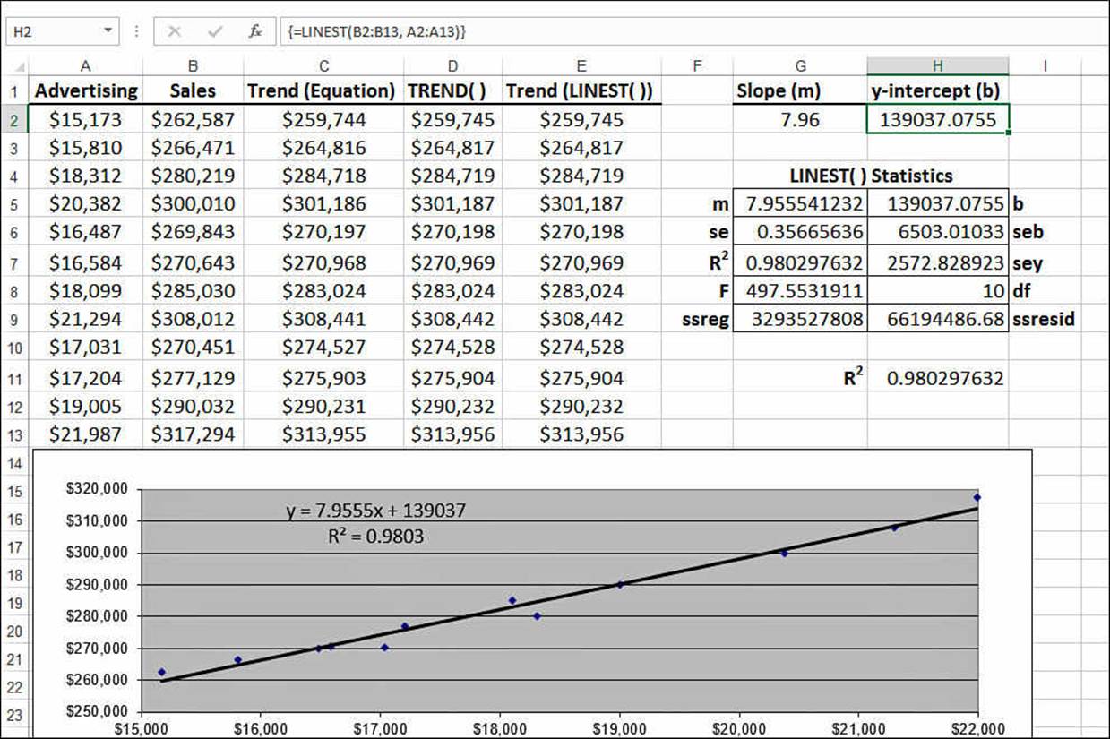
Figure 16.7 A trend analysis for advertising costs versus sales revenues.
Making Forecasts
Knowing the overall trend exhibited by a data set is useful because it tells you the broad direction that sales or costs or employee acquisitions is going, and it gives you a good idea of how related the dependent variable is to the independent variable. But a trend is also useful for making forecasts in which you extend the trendline into the future (what will sales be in the first quarter of next year?) or calculate the trend value given some new independent value (if we spend $25,000 on advertising, what will the corresponding sales be?).
How accurate is such a prediction? A projection based on historical data assumes that the factors influencing the data over the historical period will remain constant. If this is a reasonable assumption in your case, the projection will be a reasonable one. Of course, the longer you extend the line, the more likely it is that some of the factors will change or that new ones will arise. As a result, best-fit extensions should be used only for short-term projections.
Plotting Forecasted Values
If you want just a visual idea of a forecasted trend, you can extend the chart trendline that you created earlier. The following steps show you how to add a forecasting trendline to a chart:
1. Select the chart and, if more than one data series are plotted, click the series you want to work with.
2. Select Design, Add Chart Element, Trendline, More Trendline Options to display the Format Trendline task pane.
3. On the Trendline Options tab, click Linear.
4. Select the Display Equation on Chart check box. (See “Understanding the Regression Equation,” earlier in this chapter.)
5. Select the Display R-Squared Value on Chart check box. (See “Understanding R2,” earlier in this chapter.)
6. Use the Forward text box to select the number of units you want to project the trendline into the future. (For example, to extend the quarterly sales number into the next year, set Forward to 4 to extend the trendline by four quarters.)
7. Click Close (X). Excel inserts the trendline and extends it into the future.
Figure 16.8 shows the quarterly sales trendline extended by four quarters.
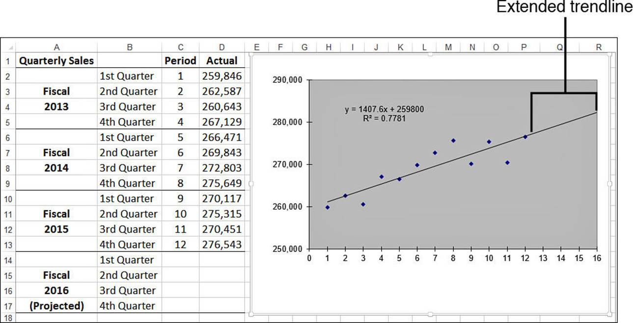
Figure 16.8 The trendline has been extended four quarters into the future.
Extending a Linear Trend with the Fill Handle
If you prefer to see exact data points in your forecast, you can use the fill handle to project a best-fit line into the future. Here are the steps to follow:
1. Select the historical data on the worksheet.
2. Click and drag the fill handle to extend the selection. Excel calculates the best-fit line from the existing data, projects this line into the new data, and calculates the appropriate values.
Figure 16.9 shows an example. Here, I’ve used the fill handle to project the period numbers and quarterly sales figures over the next fiscal year. The accompanying chart clearly shows the extended best-fit values.
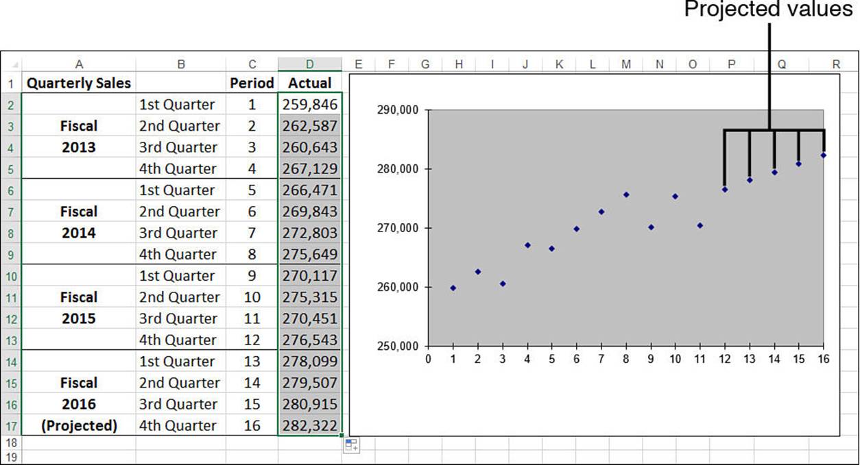
Figure 16.9 When you use the fill handle to extend historical data into the future, Excel uses a linear projection to calculate the new values.
Extending a Linear Trend Using the Series Command
You also can use the Series command to project a best-fit line. The following steps show you how it’s done:
1. Select the range that includes both the historical data and the cells that will contain the projections (and ensure that the projection cells are blank).
2. Select Home, Fill, Series. Excel displays the Series dialog box.
3. Select AutoFill.
4. Click OK. Excel fills in the blank cells with the best-fit projection.
The Series command is also useful for producing the data that defines the full best-fit line so that you can see the actual trendline values. The following steps show you how it’s done:
1. Copy the historical data into an adjacent row or column.
2. Select the range that includes both the copied historical data and the cells that will contain the projections. (Again, ensure that the projection cells are blank).
3. Select Home, Fill, Series. Excel displays the Series dialog box.
4. Select the Trend check box.
5. Click the Linear option.
6. Click OK. Excel replaces the copied historical data with the best-fit numbers and projects the trend onto the blank cells.
In Figure 16.10, the trend values created by the Series command are in E2:E13 and are plotted on the chart with the best-fit line on top of the historical data.
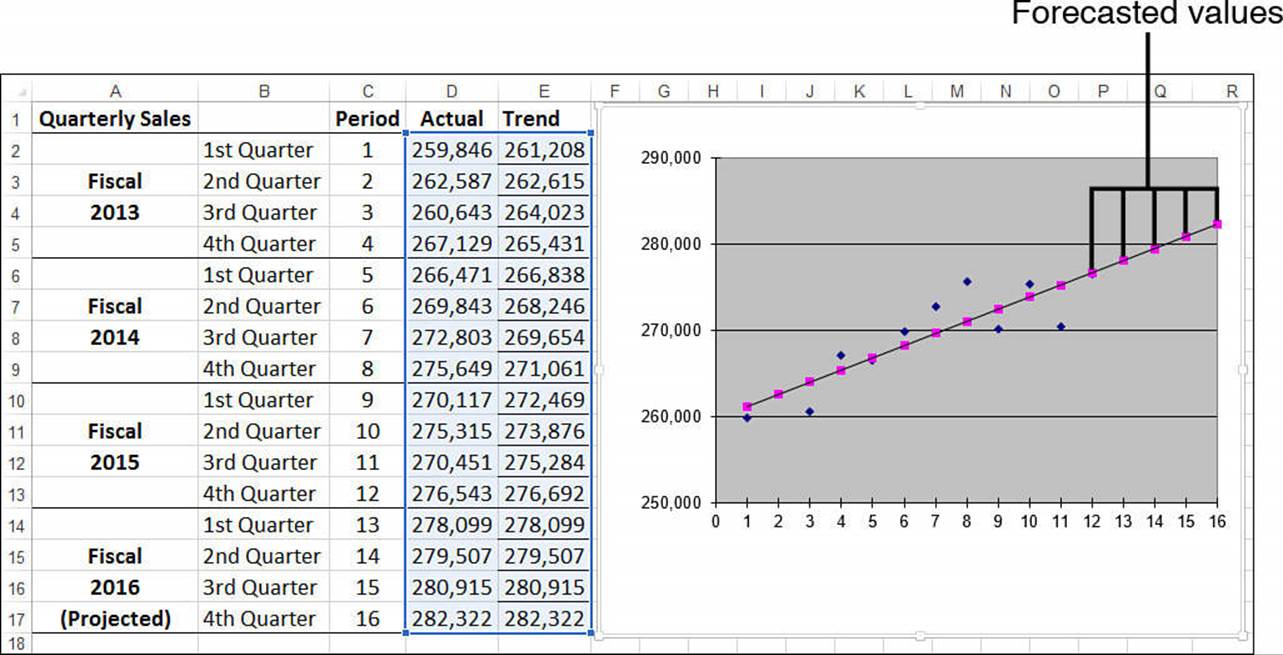
Figure 16.10 A best-fit trendline created with the Series command.
Forecasting with the Regression Equation
You can also forecast individual dependent values by using the regression equation that is returned when you add the chart trendline. (Remember that you must click the Display Equation on Chart check box when adding the trendline.) Recall the general regression equation for a linear model:
y = mx + b
The regression equation displayed by the trendline feature gives you the m and b values, so to determine a new value for y, just plug in a new value for x.
For example, in the quarterly sales model, Excel calculated the following regression equation:
y = 1407.6x + 259800
To find the trend value for the 13th period, you substitute 13 for x:
y = 1407.6 * 13 + 259800
The result is 278,099, the projected sales for the 13th period (first quarter 2016).
Forecasting with TREND()
The TREND() function is also capable of forecasting new values. To extend a trend and generate new values, you need to add the new_x’s argument to the TREND() function. Here’s the basic procedure for setting this up on the worksheet:
1. Add the new x-values to the worksheet. For example, to extend the quarterly sales trend into the next fiscal year, you’d add the values 13 through 16 to the Period column.
2. Select a range large enough to hold all the new values. For example, if you’re adding four new values, select four cells in a column or row, depending on the structure of your data.
3. Enter the TREND() function as an array formula, specifying the range of new x-values as the new_x’s argument. Here’s the formula for the quarterly sales example:
{=TREND(D2:D13, C2:C13, C14:C17)}
Figure 16.11 shows the forecasted values in F14:F17. The values in column E were derived using the regression equation and are included for comparison.
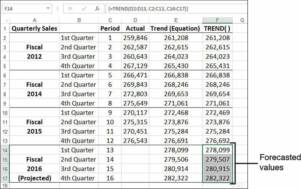
Figure 16.11 The range F14:F17 contains the forecasted values calculated by the TREND() function.
Forecasting with LINEST()
Recall that the LINEST() function returns the slope and y-intercept of the trendline. When you know these numbers, forecasting new values is a straightforward matter of plugging them into the linear regression equation along with a new value of x. For example, if the slope is in cell H2, the intercept is in I2, and the new x-value is in C14, the following formula will return the forecasted value:
=$H$2 * C14 + $I$2
Figure 16.12 shows a worksheet that uses this method to forecast the Fiscal 2016 sales figures.
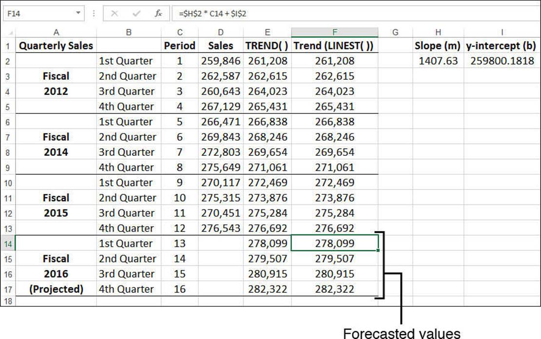
Figure 16.12 The range F14:F17 contains the forecasted values calculated by the regression equation, using the slope (H2) and intercept (I2) returned by the LINEST() function.
Note
You can also calculate a forecasted value for x by using the FORECAST() function:
FORECAST(x, known_y’s, known_x’s)
Here, x is the new x-value that you want to work with, and known_y’s and known_x’s are the same as with the TREND() function (except that the known_x’s argument is required). Here’s an example:
=FORECAST(13, D2:D13, C2:C13)
Case Study: Trend Analysis and Forecasting for a Seasonal Sales Model
This case study applies some of the forecasting techniques from the previous sections to a more sophisticated sales model. The worksheets explore two different cases:
![]() Sales as a function of time—Essentially, this case determines the trend over time of past sales and extrapolates the trend in a straight line to determine future sales.
Sales as a function of time—Essentially, this case determines the trend over time of past sales and extrapolates the trend in a straight line to determine future sales.
![]() Sales as a function of the season (in a business sense)—Many businesses are seasonal; that is, their sales are traditionally higher or lower during certain periods of the fiscal year. Retailers, for example, usually have higher sales in the fall, leading up to Christmas. If the sales for your business are a function of the season, you need to remove these seasonal biases to calculate the true underlying trend.
Sales as a function of the season (in a business sense)—Many businesses are seasonal; that is, their sales are traditionally higher or lower during certain periods of the fiscal year. Retailers, for example, usually have higher sales in the fall, leading up to Christmas. If the sales for your business are a function of the season, you need to remove these seasonal biases to calculate the true underlying trend.
About the Forecast Workbook
The Forecast workbook includes the following worksheets:
![]() Monthly Data—Use this worksheet to enter up to 10 years of monthly historical data. This worksheet also calculates the 12-month moving averages used by the Monthly Seasonal Index worksheet. Note that the data in column C—specifically, the range C2:C121—is a range named Actual.
Monthly Data—Use this worksheet to enter up to 10 years of monthly historical data. This worksheet also calculates the 12-month moving averages used by the Monthly Seasonal Index worksheet. Note that the data in column C—specifically, the range C2:C121—is a range named Actual.
![]() Monthly Seasonal Index—Calculates the seasonal adjustment factors (the seasonal indexes) for the monthly data.
Monthly Seasonal Index—Calculates the seasonal adjustment factors (the seasonal indexes) for the monthly data.
![]() Monthly Trend—Calculates the trend of the monthly historical data. Both a normal trend and a seasonally adjusted trend are computed.
Monthly Trend—Calculates the trend of the monthly historical data. Both a normal trend and a seasonally adjusted trend are computed.
![]() Monthly Forecast—Derives a three-year monthly forecast based on both the normal trend and the seasonally adjusted trend.
Monthly Forecast—Derives a three-year monthly forecast based on both the normal trend and the seasonally adjusted trend.
![]() Quarterly Data—Consolidates the monthly actuals into quarterly data and calculates the four-quarter moving average (used by the Quarterly Seasonal Index worksheet).
Quarterly Data—Consolidates the monthly actuals into quarterly data and calculates the four-quarter moving average (used by the Quarterly Seasonal Index worksheet).
![]() Quarterly Seasonal Index—Calculates the seasonal indexes for the quarterly data.
Quarterly Seasonal Index—Calculates the seasonal indexes for the quarterly data.
![]() Quarterly Trend—Calculates the trend of the quarterly historical data. Both a normal trend and a seasonally adjusted trend are computed.
Quarterly Trend—Calculates the trend of the quarterly historical data. Both a normal trend and a seasonally adjusted trend are computed.
![]() Quarterly Forecast—Derives a three-year quarterly forecast based on both the normal trend and the seasonally adjusted trend.
Quarterly Forecast—Derives a three-year quarterly forecast based on both the normal trend and the seasonally adjusted trend.
Tip
The Forecast workbook contains dozens of formulas. You’ll probably want to switch to manual calculation mode when working with this file.
The sales forecast workbook is driven entirely by the historical data entered into the Monthly Data worksheet, shown in Figure 16.13.
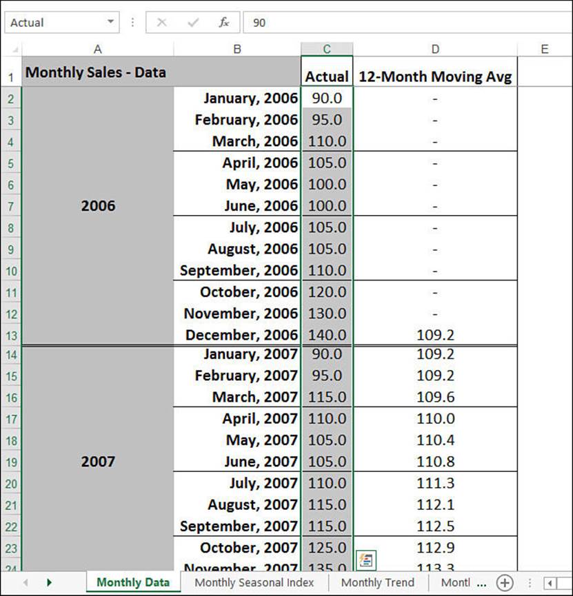
Figure 16.13 The Monthly Data worksheet contains the historical sales data.
Calculating a Normal Trend
As I mentioned earlier, you can calculate either a normal trend that treats all sales as a simple function of time or a deseasoned trend that takes seasonal factors into account. This section covers the normal trend.
All the trend calculations in the workbook use a variation of the TREND() function. Recall that the TREND() function’s known_x’s argument is optional; if you omit it, Excel uses the array {1,2,3,...,n}, where n is the number of values in the known_y’s argument. When the independent variable is time related, you can usually get away with omitting the known_x’s argument because the values are just the period numbers.
In this case study, the independent variable is in terms of months, so you can leave out the known_x’s argument. The known_y’s argument is the data in the Actual column, which, as I pointed out earlier, has been given the range name Actual. Therefore, the following array formula generates the best-fit trend values for the existing data:
{=TREND(Actual)}
This formula generates the values in the Normal Trend column of the Monthly Trend worksheet, shown in Figure 16.14.
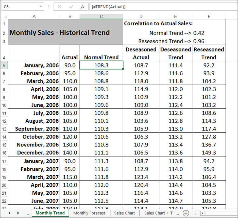
Figure 16.14 The Normal Trend column uses the TREND() function to return the best-fit trend values for the data in the Actual range.
Note
The values in column B of the Monthly Trend sheet are linked to the values in the Actual column of the Monthly Data worksheet. You use the values in the Monthly Data worksheet to calculate the trend, so technically you don’t need the figures in column B. I included them, however, to make it easier to compare the trend and the actuals. Including the Actual values is also handy if you want to create a chart that includes these values.
To get some idea of whether the trend is close to your data, cell F2 calculates the correlation between the trend values and the actual sales figures:
{=CORREL(Actual, TREND(Actual))}
The correlation value of 0.42—and its corresponding value for R2 of about 0.17—shows that the normal trend doesn’t fit this data very well. You’ll fix that later by taking into account the seasonal nature of the historical data.
Calculating the Forecast Trend
As you saw earlier in this chapter, to get a sales forecast, you extend the historical trendline into the future. This is the job of the Monthly Forecast worksheet, shown in Figure 16.15.
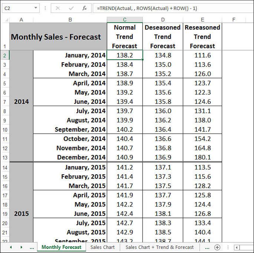
Figure 16.15 The Monthly Forecast worksheet calculates a sales forecast by extending the historical trend data.
Calculating a forecast trend requires that you specify the new_x’s argument for the TREND() function. In this case, the new_x’s are the sales periods in the forecast interval. For example, suppose that you have a 10-year period of monthly data from January 2006 to December 2015. This involves 120 periods of data. Therefore, to calculate the trend for January 2016 (the 121st period), you use the following formula:
=TREND(Actual, , 121)
You use 122 as the new_x’s argument for February 2016, 123 for March 2016, and so on.
The Monthly Forecast worksheet uses the following formula to calculate these new_x’s values:
ROWS(Actual) + ROW() - 1
ROWS(Actual) returns the number of sales periods in the Actual range in the Monthly Data worksheet. ROW() - 1 is a trick that returns the number you need to add to get the forecast sales period. For example, the January 2016 forecast is in cell C2; therefore, ROW() - 1 returns 1.
Calculating the Seasonal Trend
Many businesses experience predictable fluctuations in sales throughout their fiscal year. Beach resort operators see most of their sales during the summer months; retailers look forward to the Christmas season for the revenue that will carry them through the rest of the year. Figure 16.16shows a sales chart for a company that experiences a large increase in sales during the fall.
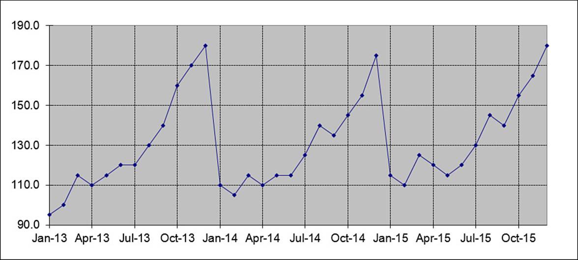
Figure 16.16 A chart for a company showing seasonal sales variations.
Because of the nature of the sales in companies that see seasonal fluctuations, the normal trend calculation doesn’t give an accurate forecast. You need to include seasonal variations in your analysis, which involves four steps:
1. For each month (or quarter), calculate a seasonal index that identifies seasonal influences.
2. Use these indexes to calculate seasonally adjusted (or deseasoned) values for each month.
3. Calculate the trend based on these deseasoned values.
4. Compute the true trend by adding the seasonal indexes to the calculated trend (from step 3).
The next few sections show how the Forecast workbook implements each step.
Computing the Monthly Seasonal Indexes
A seasonal index is a measure of how the average sales in a given month compare to a “normal” value. For example, if January has an index of 90, January’s sales are (on average) only 90% of what they are in a normal month.
Therefore, you first must define what “normal” signifies. Because you’re dealing with monthly data, you define normal as the 12-month moving average. (An n-month moving average is the average taken over the past n months.) The 12-Month Moving Avg column in the Monthly Data sheet (see column D in Figure 16.13) uses a formula named TwelveMonthMovingAvg to handle this calculation. This is a relative range name, so its definition changes with each cell in the column.
For example, here’s the formula that’s used in cell D13:
=AVERAGE(C2:C13)
In other words, this formula calculates the average for the range C2:C13, which is the preceding 12 months.
This moving average defines the “normal” value for any given month. The next step is to compare each month to the moving average. This is done by dividing each monthly sales figure by its corresponding moving-average calculation and multiplying by 100, which equals the sales ratio for the month. For example, the sales in December 2006 (cell C13) totaled 140.0, with a moving average of 109.2 (D13). Dividing C13 by D13 and multiplying by 100 returns a ratio of about 128. You can loosely interpret this to mean that sales in December were 28% higher than sales in a normal month.
To get an accurate seasonal index for December (or any other month), however, you must calculate ratios for every December for which you have historical data. Take an average of all these ratios to reach a true seasonal index (except for a slight adjustment, as you’ll see).
The purpose of the Monthly Seasonal Index worksheet, shown in Figure 16.17, is to derive a seasonal index for each month. The worksheet’s table calculates the ratios for every month over the span of the historical data. The Avg. Ratio column then calculates the average for each month. To get the final values for the seasonal indexes, however, you need to make a small adjustment. The indexes should add up to 1,200 (100 per month, on average) to be true percentages. As you can see in cell B15, however, the sum is 1,214.0. This means that you have to reduce each average by a factor of 1.0116 (1,214/1,200). The Seasonal Index column does that, thereby producing the true seasonal indexes for each month.
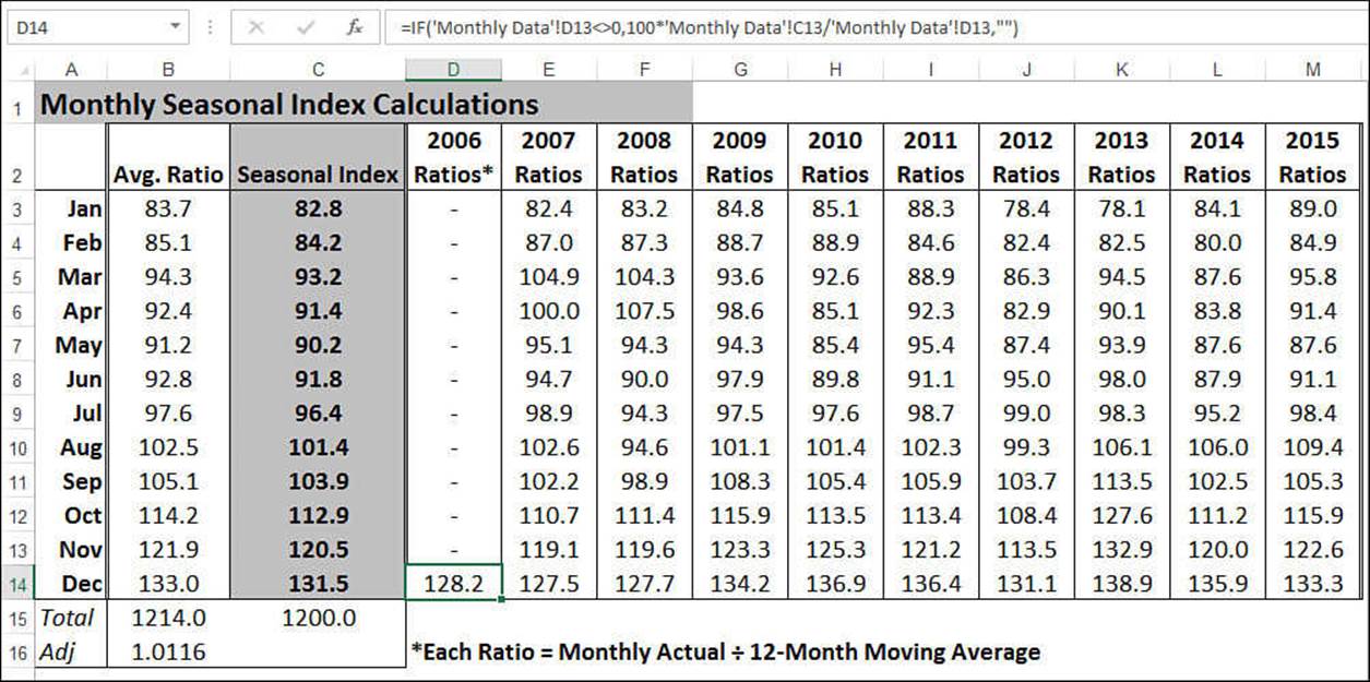
Figure 16.17 The Monthly Seasonal Index worksheet calculates the seasonal index for each month, based on monthly historical data.
Calculating the Deseasoned Monthly Values
When you have the seasonal indexes, you need to put them to work to “level the playing field.” Basically, you divide the actual sales figures for each month by the appropriate monthly index (and multiply them by 100 to keep the units the same). This effectively removes the seasonal factors from the data. (This process is called deseasoning, or seasonally adjusting, the data.)
The Deseasoned Actual column in the Monthly Trend worksheet performs these calculations (see Figure 16.18). Following is a typical formula (from cell D5):
=100 * B5 / INDEX(MonthlyIndexTable, MONTH(A5), 3)
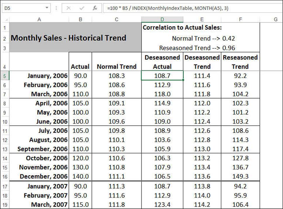
Figure 16.18 The Deseasoned Actual column calculates seasonally adjusted values for the actual data.
B5 refers to the sales figure in the Actual column, and MonthlyIndexTable is the range A3:C14 in the Monthly Seasonal Index worksheet. The INDEX() function finds the appropriate seasonal index for the month (given by the MONTH(A5) function).
Calculating the Deseasoned Trend
The next step is to calculate the historical trend based on the new deseasoned values. The Deseasoned Trend column uses the following array formula to accomplish this task:
{=TREND(DeseasonedActual)}
The name DeseasonedActual refers to the values in the Deseasoned Actual column (D5:D124).
Calculating the Reseasoned Trend
By itself, the deseasoned trend doesn’t amount to much. To get the true historical trend, you need to add the seasonal factor back into the deseasoned trend. (This process is called reseasoning the data.) The Reseasoned Trend column does the job with a formula similar to the one used in the Deseasoned Actual column:
=E5 * INDEX(MonthlyIndexTable, MONTH(A5), 3) /100
Cell F3 uses CORREL() to determine the correlation between the Actual data and the Reseasoned Trend data:
=CORREL(Actual, ReseasonedTrend)
Here, ReseasonedTrend is the name applied to the data in the Reseasoned Trend column (F5:F124). As you can see, the correlation of 0.96 is extremely high, indicating that the new trend “line” is an excellent match for the historical data.
Calculating the Seasonal Forecast
To derive a forecast based on seasonal factors, combine the techniques you used to calculate a normal trend forecast and a reseasoned historical trend. In the Monthly Forecast worksheet (see Figure 16.15), the Deseasoned Trend Forecast column computes the forecast for the deseasoned trend:
=TREND(DeseasonedTrend, , ROWS(DeseasonedTrend) + ROW() - 1)
The Reseasoned Trend Forecast column adds the seasonal factors back into the deseasoned trend forecast:
=D2 * Index(MonthlyIndexTable, MONTH(B2), 3) / 100
D2 is the value from the Deseasoned Trend Forecast column, and B2 is the forecast month.
Figure 16.19 shows a chart comparing the actual sales and the reseasoned trend for the past three years of the sample data. The chart also shows two years of the reseasoned forecast.
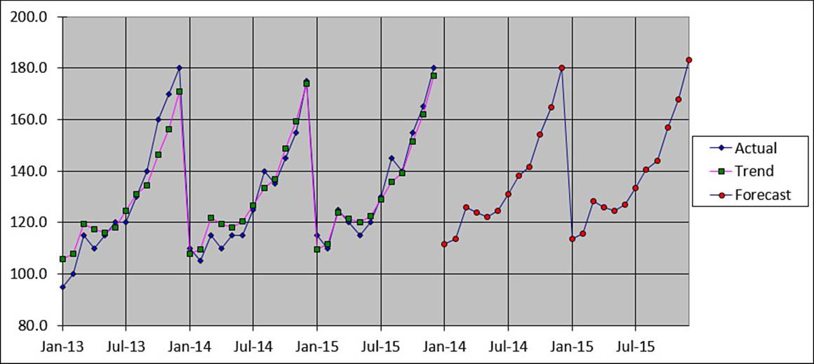
Figure 16.19 A chart of the sample data, which compares actual sales, the reseasoned trend, and the reseasoned forecast.
Working with Quarterly Data
If you prefer to work with quarterly data, the Quarterly Data, Quarterly Seasonal Index, Quarterly Trend, and Quarterly Forecast worksheets perform the same functions as their monthly counterparts. You don’t have to reenter the data because the Quarterly Data worksheet consolidates the monthly numbers by quarter.
Using Simple Regression on Nonlinear Data
As you saw in the case study, the data you work with doesn’t always fit a linear pattern. If the data shows seasonal variations, you can compute the trend and forecast values by working with seasonally adjusted numbers, as you also saw in the case study. But many business scenarios aren’t either linear or seasonal. The data might look more like a curve, or it might fluctuate without any apparent pattern.
These nonlinear patterns might seem more complex, but Excel offers a number of useful tools for performing regression analysis on this type of data.
Working with an Exponential Trend
An exponential trend is a trend that rises or falls at an increasingly higher rate. Fads often exhibit this kind of behavior. A product might sell steadily but unspectacularly for a while, but then word starts getting around—perhaps because of a mention in the newspaper or on television—and sales start to rise. If these new customers enjoy the product, they tell their friends about it, and those people purchase the product, too. They tell their friends, the media notice that everyone’s talking about this product, and a bona fide fad ensues.
This is called an exponential trend because, as a graph, it looks much like a number being raised to successively higher values of an exponent (for example, 101, 102, 103, and so on). This is often modeled using the constant e (approximately 2.71828), which is the base of the natural logarithm. Figure 16.20 shows a worksheet that uses the EXP() function in column B to return e raised to the successive powers in column A. The chart shows the results as a classic exponential curve.
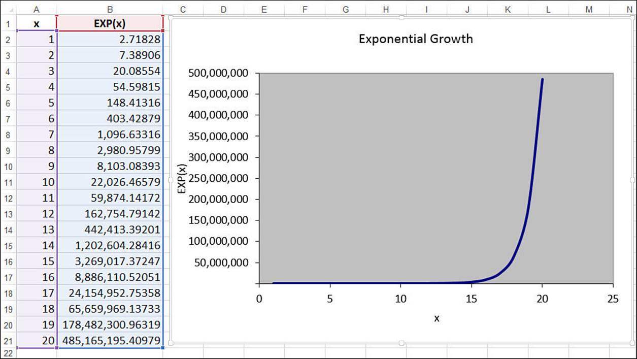
Figure 16.20 Raising the constant e to successive powers produces a classic exponential trend pattern.
Figure 16.21 shows a worksheet that contains weekly data for the number of units sold of a product. As you can see, the unit sales hold steady for the first eight or nine weeks and then climb rapidly. As this chart illustrates, the sales curve is very much like an exponential growth curve. The next couple sections show you how to track the trend and make forecasts based on such a model.
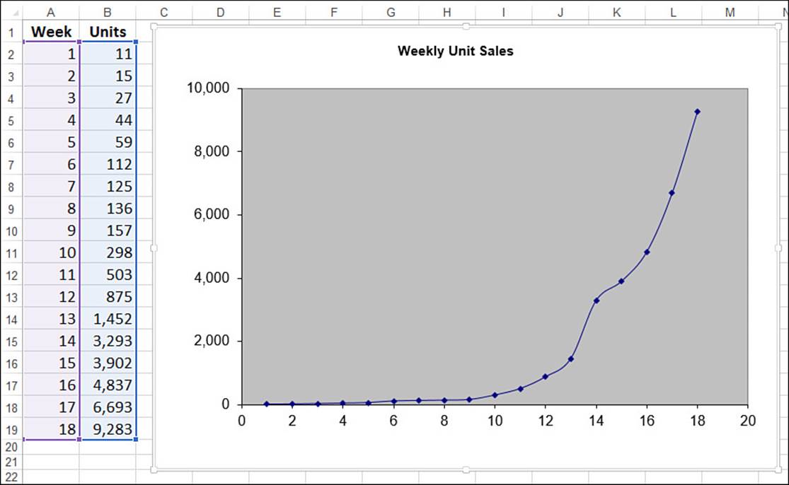
Figure 16.21 The weekly unit sales show a definite exponential pattern.
Plotting an Exponential Trendline
The easiest way to see the trend and forecast is to add a trendline—specifically, an exponential trendline—to the chart. Here are the steps to follow:
1. Select the chart and, if more than one data series are plotted, click the series you want to work with.
2. Select Design, Add Chart Element, Trendline, More Trendline Options to display the Format Trendline task pane.
3. On the Trendline Options tab, click Exponential.
4. Click to select the Display Equation on Chart and Display R-Squared Value on Chart check boxes.
5. Click Close (X). Excel inserts the trendline.
Figure 16.22 shows the exponential trendline added to the chart.
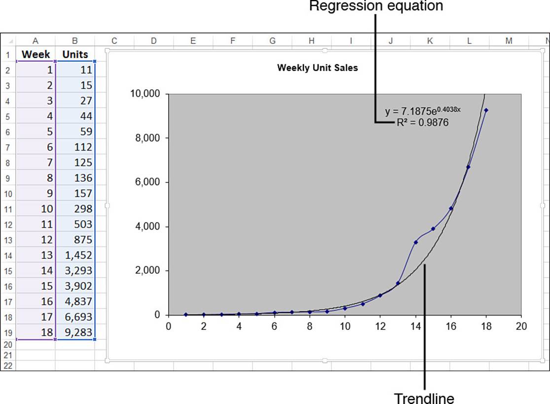
Figure 16.22 The weekly unit sales chart with an exponential trendline added.
Calculating Exponential Trend and Forecast Values
In Figure 16.22, notice that the regression equation for an exponential trendline takes the following general form:
y = bemx
Here, b and m are constants. So, knowing these values, given an independent value x, you can compute its corresponding point on the trendline using the following formula:
=b * EXP(m * x)
In the trendline of Figure 16.22, these constant values are 7.1875 and 0.4038, respectively. So, the formula for trend values becomes this:
=7.1875 * EXP(0.4038 * x)
If x is a value between 1 and 18, you get a trend point for the existing data. To get a forecast, you use a value higher than 18. For example, using x equal to 19 gives a forecast value of 15,437 units:
=7.1875 * EXP(0.4038 * 19)
Exponential Trending and Forecasting Using the GROWTH() Function
As you learned with linear regression, it’s often useful to work with actual trend values instead of just visualizing the trendline. With a linear model, you use the TREND() function to generate actual values. The exponential equivalent is the GROWTH() function:
GROWTH(known_y's[, known_x's][, new_x's][, const])
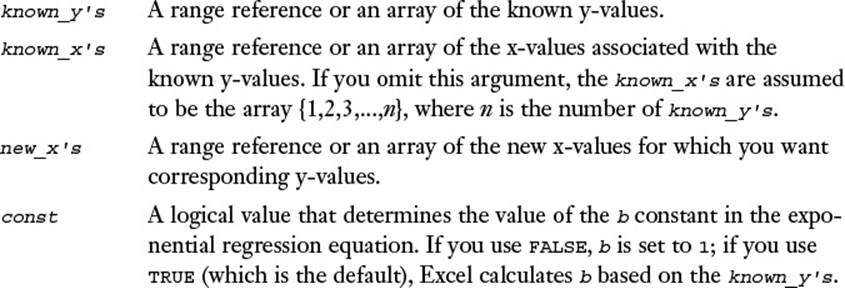
With the exception of a small difference in the const argument, the GROWTH() function syntax is identical to that of TREND(). You use the two functions in the same way as well. For example, to return the exponential trend values for the known values, you specify the known_y’sargument and, optionally, the known_x’s argument. Here’s the formula for the weekly units example, which is entered as an array:
{=GROWTH(B2:B19, A2:A19)}
To forecast values using GROWTH(), add the new_x’s argument. For example, to forecast the weekly sales for weeks 19 and 20, assuming that these x-values are in A20:A21, you use the following array formula:
{=GROWTH(B2:B19, A2:A19, A20:A21)}
Figure 16.23 shows the GROWTH() formulas at work. The numbers in C2:C19 are the existing trend values, and the numbers in C20 and C21 are the forecast values.
What if you want to calculate the constants b and m? You can do that by using the exponential equivalent of LINEST(), which is LOGEST():
LOGEST(known_y's[, known_x's][, const][, stats])
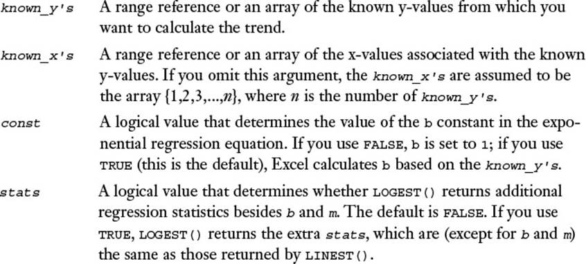
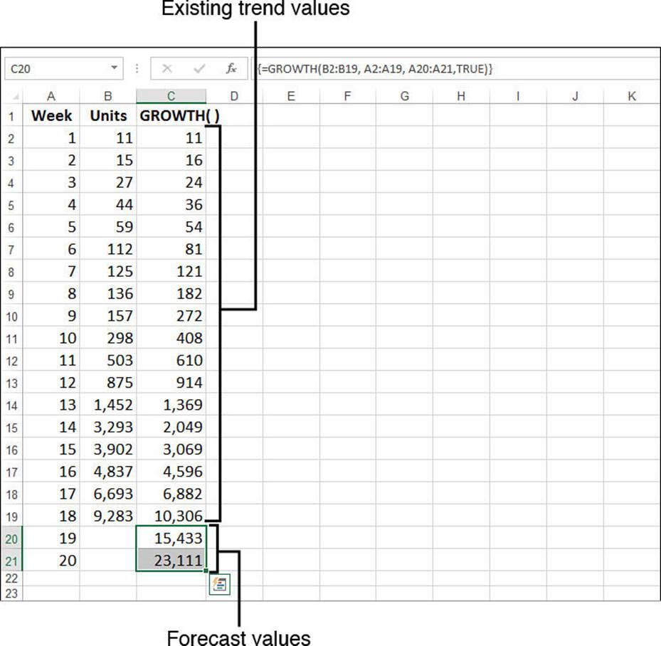
Figure 16.23 The weekly unit sales with existing trend and forecast values calculated by the GROWTH() function.
Actually, LOGEST() doesn’t return the value for m directly. That’s because LOGEST() is designed for the following regression formula:
y = bm1x
However, this is equivalent to the following:
y = b * EXP(LN(m1) * x)
This is the same as our exponential regression equation, except that we have LN(m1) instead of just m. Therefore, to derive m, you need to use LN(m1) to take the natural logarithm of the m1 value returned by LOGEST().
As with LINEST(), if you set stats to FALSE, LOGEST() returns a 1×2 array, with m (actually m1) in the first cell and b in the second cell. Figure 16.24 shows a worksheet that puts LOGEST() through its paces:
![]() The value of b is in cell H2. The value of m1 is in cell G2, and cell I2 uses LN() to get the value of m.
The value of b is in cell H2. The value of m1 is in cell G2, and cell I2 uses LN() to get the value of m.
![]() The values in column D are calculated using the exponential regression equation, with the values for b and m plugged in.
The values in column D are calculated using the exponential regression equation, with the values for b and m plugged in.
![]() The values in column E are calculated using the LOGEST() regression equation, with the values for b and m1 plugged in.
The values in column E are calculated using the LOGEST() regression equation, with the values for b and m1 plugged in.
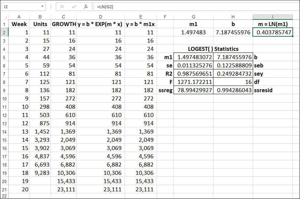
Figure 16.24 The weekly unit sales with data generated by the LOGEST() function.
Working with a Logarithmic Trend
A logarithmic trend is a trend that is the inverse of an exponential trend: The values rise (or fall) quickly in the beginning and then level off. This is a common pattern in business. For example, a new company hires many people up front, and then hiring slows over time. A new product often sells many units soon after it’s launched, and then sales level off.
This pattern is described as logarithmic because it’s typified by the shape of the curve made by the natural logarithm. Figure 16.25 shows a chart that plots the LN(x) function for various values of x.
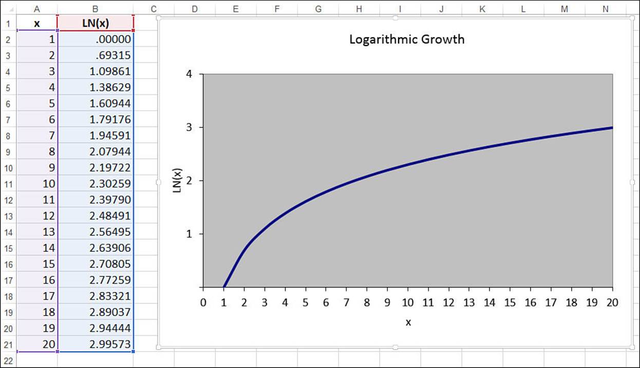
Figure 16.25 The natural logarithm produces a classic logarithmic trend pattern.
Plotting a Logarithmic Trendline
The easiest way to see the trend and forecast is to add a trendline—specifically, a logarithmic trendline—to the chart. Here are the steps to follow:
1. Select the chart and, if more than one data series are plotted, click the series you want to work with.
2. Select Design, Add Chart Element, Trendline, More Trendline Options to display the Format Trendline task pane.
3. On the Trendline Options tab, click Logarithmic.
4. Click to select the Display Equation on Chart and Display R-Squared Value on Chart check boxes.
5. Click Close (X). Excel inserts the trendline.
Figure 16.26 shows a worksheet that tracks the total number of employees at a new company. The chart shows the employee growth and a logarithmic trendline fitted to the data.
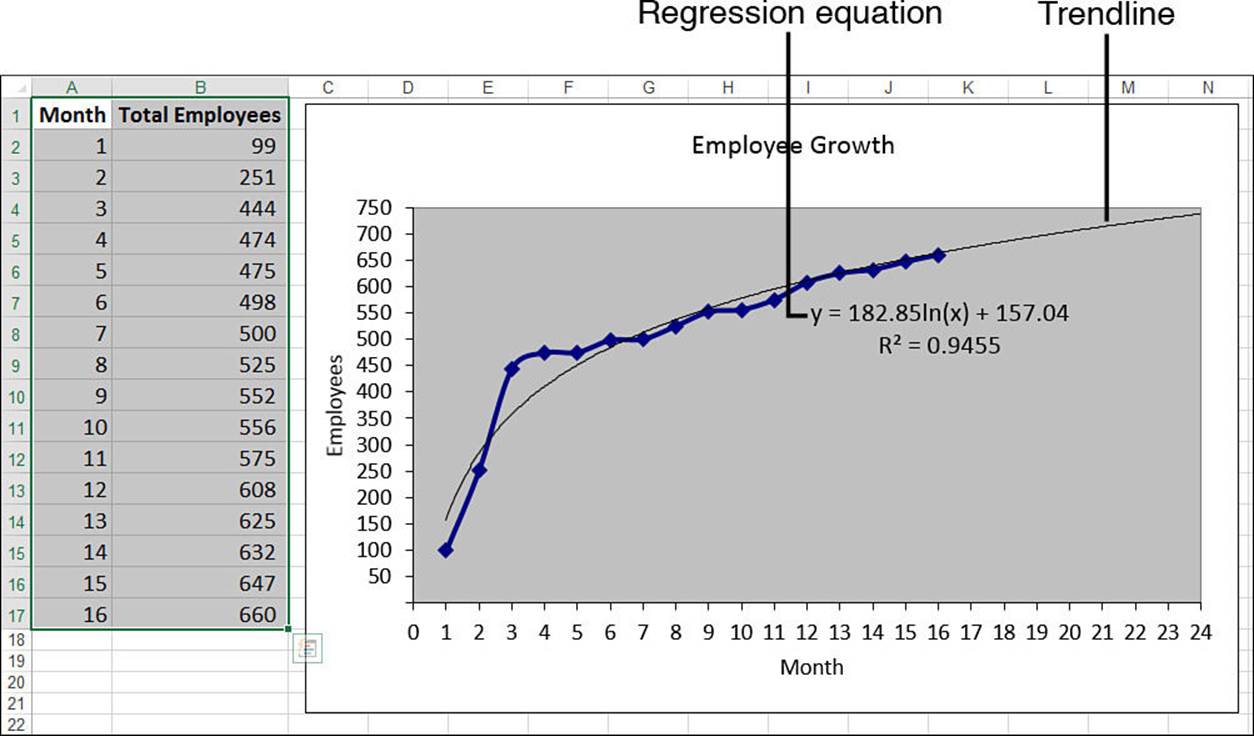
Figure 16.26 Total employee growth, with a logarithmic trendline added.
Calculating Logarithmic Trend and Forecast Values
The regression equation for a logarithmic trendline takes the following general form:
y = m * LN(x) + b
As usual, b and m are constants. So, knowing these values, given an independent value x, you can use this formula to compute its corresponding point on the trendline. In the trendline in Figure 16.26, these constant values are 182.85 and 157.04, respectively. So the formula for trend values becomes this:
=182.85 * LN(x) + 157.04
If x is a value between 1 and 16, you get a trend point for the existing data. To get a forecast, you use a value higher than 16. For example, using x equal to 17 gives a forecast value of 675 employees:
=182.85 * LN(17) + 157.04
Excel doesn’t have a function that enables you to calculate the values of b and m yourself. However, it’s possible to use the LINEST() function if you transform the pattern so that it becomes linear. When you have a logarithmic curve, you “straighten it out” by changing the scale of the x-axis to a logarithmic scale. Therefore, you can turn your logarithmic regression into a linear one by applying the LN() function to the known_x’s argument:
=LINEST(known_y's, LN(known_x's))
For example, the following array formula returns the values of m and b for the Total Employees data:
{=LINEST(B2:B17, LN(A2:A17))}
Figure 16.27 shows a worksheet that calculates m (cell E2) and b (cell F2) and that uses the results to derive values for the current trend and the forecasts (column C).
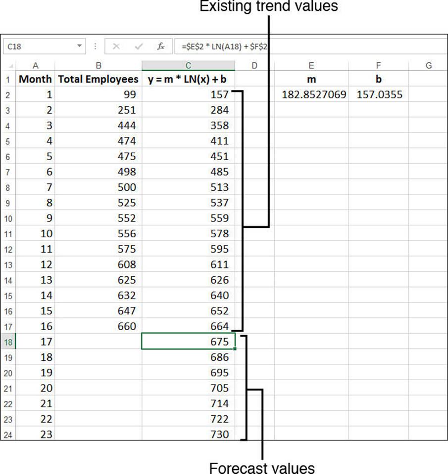
Figure 16.27 The Total Employees worksheet, with existing trend and forecast values calculated by the logarithmic regression equation and values returned by the LINEST() function.
Working with a Power Trend
The exponential and logarithmic trendlines are both “extreme” in the sense that they have radically different velocities at different parts of the curve. The exponential trendline begins slowly and then takes off at an ever-increasing pace; the logarithmic trendline shoots off the mark and then levels off.
Most measurable business scenarios don’t exhibit such extreme behavior. Revenues, profits, margins, and employee head count often tend to increase steadily over time (in successful companies, anyway). If you’re analyzing a dependent variable that increases (or decreases) steadily with respect to some independent variable, but the linear trendline doesn’t give a good fit, you should try a power trendline. This is a pattern that curves steadily in one direction. To give you a flavor of a power curve, consider the graphs of the equations y = x2 and y = x-0.25 in Figure 16.28. The y = x2 curve shows a steady increase, whereas the y = x-0.25 curve shows a steady decrease.
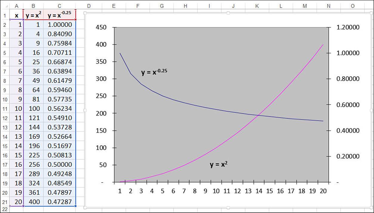
Figure 16.28 Power curves are generated by raising x-values to some power.
Plotting a Power Trendline
If you think that your data fits the power pattern, you can quickly check by adding a power trendline to the chart. Here are the steps to follow:
1. Select the chart and, if more than one data series are plotted, click the series you want to work with.
2. Select Design, Add Chart Element, Trendline, More Trendline Options to display the Format Trendline task pane.
3. On the Trendline Options tab, click Power.
4. Click to select the Display Equation on Chart and Display R-Squared Value on Chart check boxes.
5. Click Close (X). Excel inserts the trendline.
Figure 16.29 shows a worksheet that compares the list price of a product (the independent variable) with the number of units sold (the dependent variable). As the chart shows, this relationship plots as a steadily declining curve, so a power trendline has been added. Note, too, that the trendline has been extended back to the $5.99 price point and forward to the $15.99 price point.
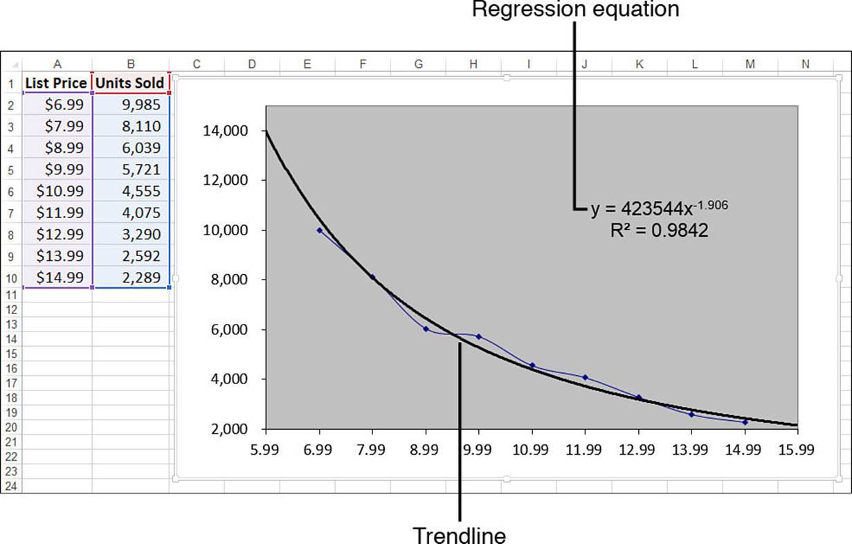
Figure 16.29 A product’s list price versus unit sales, with a power trendline added.
Calculating Power Trend and Forecast Values
The regression equation for a power trendline takes the following general form:
y = mxb
As usual, b and m are constants. Given these values and an independent value x, you can use this formula to compute its corresponding point on the trendline. In the trendline in Figure 16.29, these constant values are 423544 and -1.906, respectively. Plugging these into the general equation for a power trend gives the following:
=423544 * x ^ -1.906
If x is a value between 6.99 and 14.99, you get a trend point for the existing data. To get a forecast, you use a value lower than 6.99 or higher than 14.99. For example, using x equal to 16.99 gives a forecast value of 1,915 units sold:
=423544 * 16.99 ^ -1.906
As with the logarithmic trend, Excel doesn’t have functions that enable you to directly calculate the values of b and m. However, you can “straighten” a power curve by changing the scale of both the y-axis and the x-axis to a logarithmic scale. Therefore, you can transform the power regression into a linear regression by applying the natural logarithm—the LN() function—to both the known_y’s and known_x’s arguments:
=LINEST(LN(known_y's), LN(known_x's))
Here’s how the array formula looks for the list price versus units sold data:
{=LINEST(LN(B2:B10, LN(A2:A10))}
The first cell of the array holds the value of b. Because it’s used as an exponent in the regression equation, you don’t need to “undo” the logarithmic transform. However, the second cell in the array—let’s call it m1—holds the value of m in its logarithmic form. Therefore, you need to “undo” the transform by applying the EXP() function to the result.
Figure 16.30 shows a worksheet performing these calculations. The LINEST() array is in E2:F2, and E2 holds the value of b (cell E2). To get m, cell G2 uses the formula =EXP(F2). The worksheet uses these results to derive values for the current trend and the forecasts (column C).
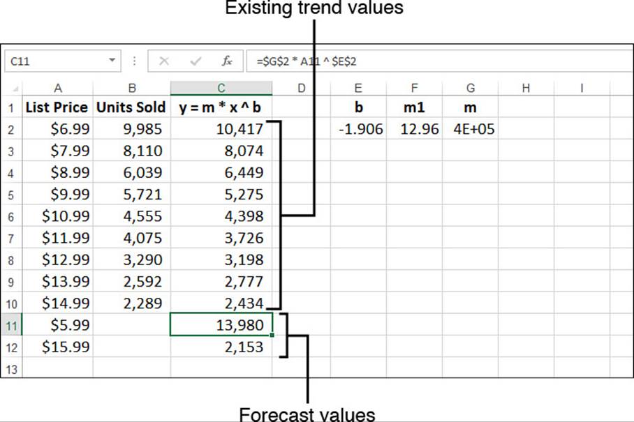
Figure 16.30 The worksheet of list price versus units sold, with existing trend and forecast values calculated by the power regression equation and values returned by the LINEST() function.
Using Polynomial Regression Analysis
The trendlines you’ve seen so far have been unidirectional. That’s fine if the curve formed by the dependent variable values is also unidirectional, but that’s often not the case in a business environment. Sales fluctuate, profits rise and fall, and costs move up and down, thanks to varying factors such as inflation, interest rates, exchange rates, and commodity prices. For these more complex curves, the trendlines covered so far might not give either a good fit or good forecasts.
If that’s the case, you might need to turn to a polynomial trendline, which is a curve constructed out of an equation that uses multiple powers of x. For example, a second-order polynomial regression equation takes the following general form:
y = m2x2 + m1x + b
The values m2, m1, and b are constants. Similarly, a third-order polynomial regression equation takes the following form:
y = m2x3 + m2x2 + m1x + b
These equations can go as high as a sixth-order polynomial.
Plotting a Polynomial Trendline
Here are the steps to follow to add a polynomial trendline to a chart:
1. Select the chart and, if more than one data series are plotted, click the series you want to work with.
2. Select Design, Add Chart Element, Trendline, More Trendline Options to display the Format Trendline task pane.
3. On the Trendline Options tab, click Polynomial.
4. Use the Order spin box to select the order of the polynomial equation you want.
5. Click to select the Display Equation on Chart and Display R-Squared Value on Chart check boxes.
6. Click Close (X). Excel inserts the trendline.
Figure 16.31 displays a simple worksheet that shows annual profits over 10 years, with accompanying charts showing two different polynomial trendlines.
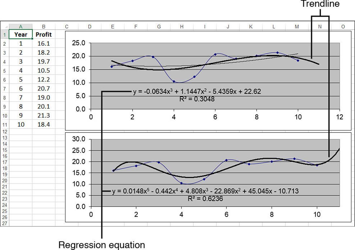
Figure 16.31 Annual profits with two charts showing different polynomial trendlines.
Generally, the higher the order you use, the tighter the curve will fit your existing data, but the more unpredictable will be your forecasted values. In Figure 16.31, the top chart shows a third-order polynomial trendline, and the bottom chart shows a fifth-order polynomial trendline. The fifth-order curve (R2 = 0.6236) gives a better fit than the third-order curve (R2 = 0.3048).
However, the forecasted profit for the 11th year seems more realistic in the third-order case (about 17) than in the fifth-order case (about 26).
In other words, you’ll often have to try different polynomial orders to get a fit that you are comfortable with and forecasted values that seem realistic.
Calculating Polynomial Trend and Forecast Values
You’ve seen that the regression equation for an nth-order polynomial curve takes the following general form:
y = mnxn + ... + m2x2 + m1x + b
So, as with the other regression equations, if you know the value of the constants, for any independent value x, you can use this formula to compute its corresponding point on the trendline. For example, the top trendline in Figure 16.31 is a third-order polynomial, so we need the values of m3,m2, and m1, as well as b. From the regression equation displayed on the chart, we know that these values are, respectively, -0.0634, 1.1447, -5.4359, and 22.62. Plugging these into the general equation for a third-order polynomial trend gives the following:
=-0.0634 * x ^ 3 + 1.1447 * x ^ 2 + -5.4359 * x + 22.62
If x is a value between 1 and 10, you get a trend point for the existing data. To get a forecast, you use a value higher than 10. For example, using x equal to 11 gives a forecast profit value of 16.9:
=-0.0634 * 11 ^ 3 + 1.1447 * 11 ^ 2 + -5.4359 * 11 + 22.62
However, you don’t need to put yourself through these intense calculations because the TREND() function can do it for you. The trick here is to raise each of the known_x’s values to the powers from 1 to n for an nth-order polynomial:
{=TREND(known_y's, known_x's ^ {1,2,...,n})}
For example, here’s the formula to use to get the existing trend values for a third-order polynomial using the year and profit ranges from the worksheet in Figure 16.31:
{=TREND(B2:B11, A2:A11 ^ {1,2,3})}
To get a forecast value, you raise each of the new_x’s values to the powers from 1 to n for an nth-order polynomial:
{=TREND(known_y's, known_x's ^ {1,2,...,n}, new_x's ^ {1,2,...,n})}
For the profits forecast, if A12 contains 11, the following array formula returns the predicted value:
{=TREND(B2:B11, A2:A11 ^ {1,2,3}, A12 ^ {1,2,3})}
Figure 16.32 shows a worksheet that uses this TREND() technique to compute both the trend values for years 1 through 10 and a forecast value for year 11 for all the second-order through sixth-order polynomials.
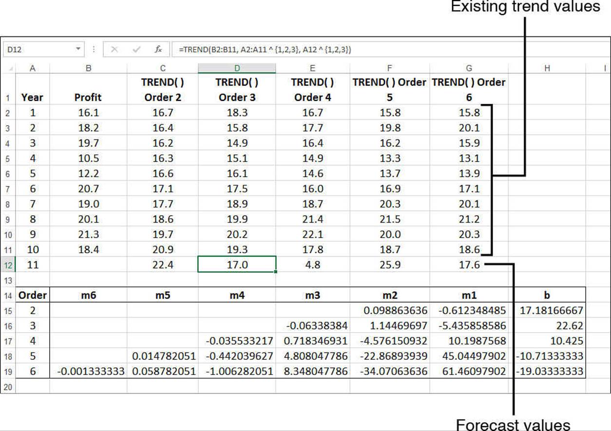
Figure 16.32 The profits worksheet, with existing trend and forecast values calculated by the TREND() function.s
Note, too, that Figure 16.32 calculates the mn values and b for each order of polynomial. This is done using LINEST() by again raising each of the known_x’s values to the powers from 1 to n, for an nth-order polynomial:
{=LINEST(known_y's, known_x's ^ {1,2,...,n})}
The formula returns an n + 1×1 array in which the first n cells contain the constants mn through m1, and then the n+1st cell contains b. For example, the following formula returns a 3×1 array of the constant values for a third-order polynomial using the year and profit ranges:
{=LINEST(B2:B11, A2:A11 ^ {1,2,3})}
Using Multiple Regression Analysis
Focusing on a single independent variable is a useful exercise because it can tell you a great deal about the relationship between the independent variable and the dependent variable. However, in the real world of business, the variation that you see in most phenomena is a product of multiple influences. The movement of car sales isn’t solely a function of interest rates; it’s also affected by internal factors such as price, advertising, warranties, and factory-dealer incentives, as well as external factors such as total consumer disposable income and the employment rate.
The good news is that the linear regression techniques you learned earlier in this chapter are easily adapted to multiple independent variables.
As a simple example, let’s consider a sales model in which the units sold—the dependent variable—is a function of two independent variables: advertising costs and list price. The worksheet in Figure 16.33 shows data for 10 products, each with its own advertising costs (column A) and list price (column B), as well as the corresponding unit sales (column C). The upper chart shows the relationship between units sold and list price, whereas the lower chart shows the relationship between units sold and advertising costs. As you can see, the individual trends look about right: Units sold goes down as the list price goes up; units sold goes up as the advertising costs go up.
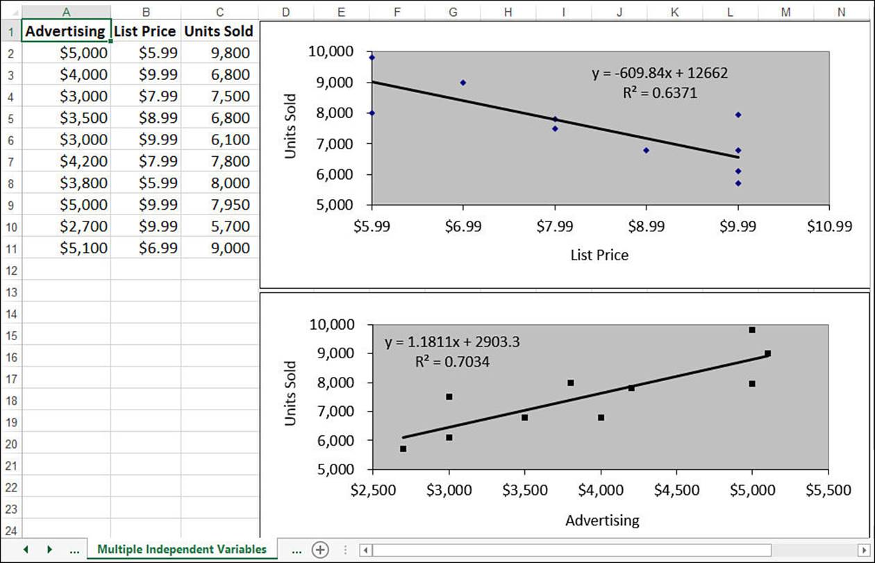
Figure 16.33 This worksheet shows raw data and trendlines for units sold versus advertising costs and list price.
However, the individual trends don’t tell us much about how advertising and price together affect sales. Clearly, a low advertising budget combined with a high price will result in lower sales; conversely, a high advertising budget combined with a low price should increase sales. What we really want, of course, is to attach some hard numbers to these seat-of-the-pants speculations. You can get those numbers using that linear regression workhorse, the TREND() function.
To use TREND() when you have multiple independent variables, you expand the known_x’s argument so that it includes the entire range of independent data. In Figure 16.33, for example, the independent data resides in the range A2:B11, so that’s the reference you plug into the TREND()function. Here’s the array formula for computing the existing trend values:
{=TREND(C2:C11, A2:B11)}
In multiple regression analysis, you’re most often interested in what-if scenarios. What if you spend $6,000 in advertising on a $5.99 product? What if you spend $1,000 on a $9.99 product?
To answer these questions, you plug the values into the new_x’s argument as an array. For example, the following formula returns the predicted number of units that will sell if you spend $6,000 in advertising on a $5.99 product:
{=TREND(C2:C11, A2:B11, {6000, 5.99)}
Figure 16.34 shows a worksheet that puts the multiple regression form of TREND() to work. The values in D2:D11 are for the existing trend, and values in D12:D13 are forecasts.
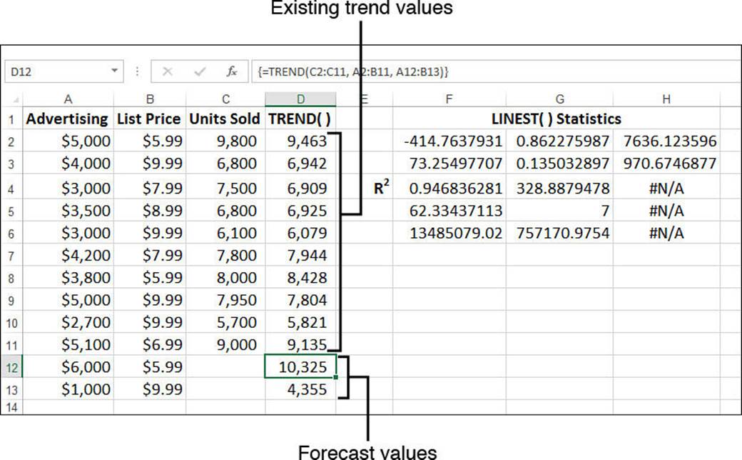
Figure 16.34 Trend and forecast values calculated by the multiple regression form of the TREND() function.
Notice, too, that the worksheet in Figure 16.34 includes the statistics generated by the LINEST() function. The returned array is three columns wide because you’re dealing with three variables (two independent and one dependent). Of particular interest is the value for R2 (cell F4)—0.946836. It tells us that the fit between unit sales and the combination of advertising and price is an excellent one, which gives us some confidence about the validity of the predicted values.
From Here
![]() For detailed coverage of arrays, see “Working with Arrays,” p. 87.
For detailed coverage of arrays, see “Working with Arrays,” p. 87.
![]() You can use INDEX() to return results for the LINEST() and LOGEST() arrays directly. See “The MATCH() and INDEX() Functions,” p. 202.
You can use INDEX() to return results for the LINEST() and LOGEST() arrays directly. See “The MATCH() and INDEX() Functions,” p. 202.
![]() To learn more about correlation, see “Determining the Correlation Between Data,” p. 280
To learn more about correlation, see “Determining the Correlation Between Data,” p. 280
![]() For coverage of many of Excel’s other statistical functions, see Chapter 12, “Working with Statistical Functions,” p. 257.
For coverage of many of Excel’s other statistical functions, see Chapter 12, “Working with Statistical Functions,” p. 257.
All materials on the site are licensed Creative Commons Attribution-Sharealike 3.0 Unported CC BY-SA 3.0 & GNU Free Documentation License (GFDL)
If you are the copyright holder of any material contained on our site and intend to remove it, please contact our site administrator for approval.
© 2016-2026 All site design rights belong to S.Y.A.